 Dev Design Library
Animated Badge Components
Dev Design Library indexes 31 Animated badge components from 16 open-source UI libraries, with the most coming from Shadcn Space, Spectrum UI, Kinetics, UI Lab and transitions.dev. Each one links to its page with the source code, a live preview where available, the library license and the install command. These are the badge components tagged as animated: motion on hover, on scroll or on load, usually built with CSS transitions or Framer Motion. Badge components belong to the Feedback group.
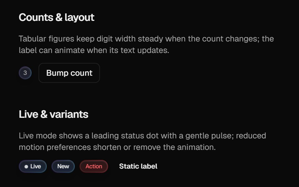 Halo BadgeCult UI · ReactBadge with optional layout animation, live status dot, and gradient rim aligned with Halo Button / Card
 Notification Badgetransitions.dev · HTML/CSS
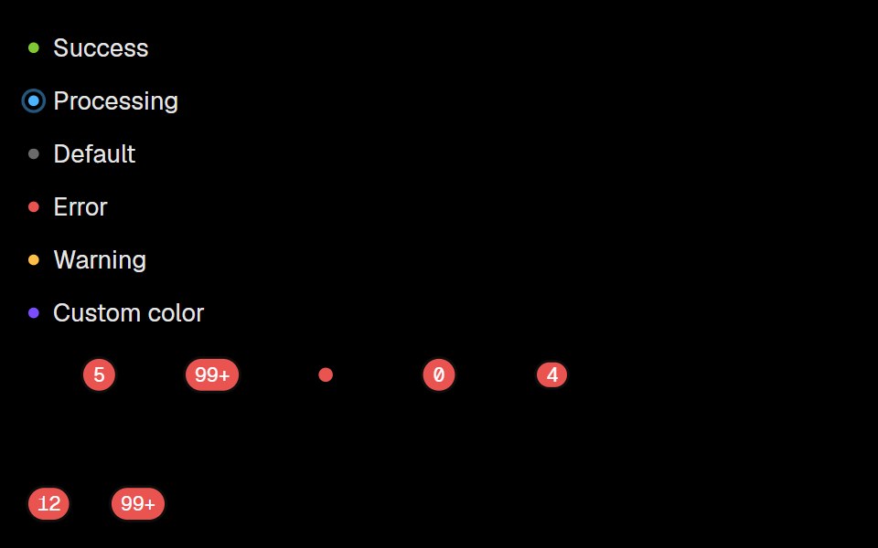 BadgeLobe UI · React
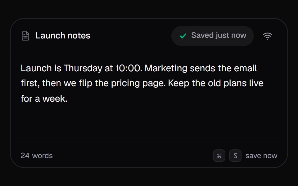 Save StatusKokonut UI · React"An autosave pill for editors that says Editing, Saving or Saved, counts changes while offline, and syncs them when…
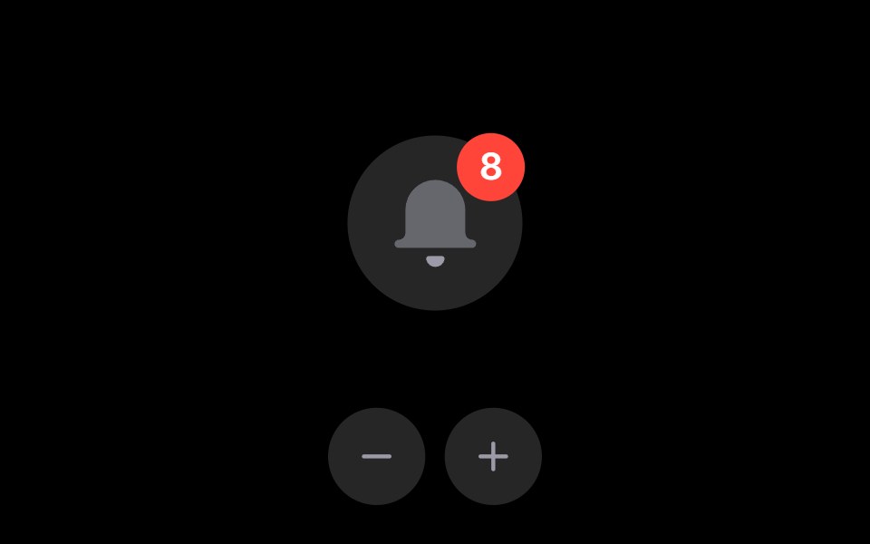 Notification BellRare UI · ReactAn iOS-style notification bell with an unread count badge.
 Event Badge 3DSpectrum UI · Reactcomponent for the Event Badge 3D
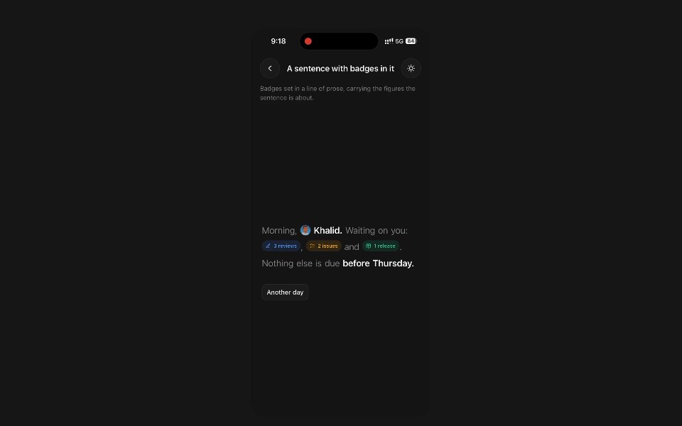 Animated BadgePanel UI · React NativeStatus pill whose icon and label roll over when the status changes.
 Badge-02 - CountShadcn Space · ReactBadge component
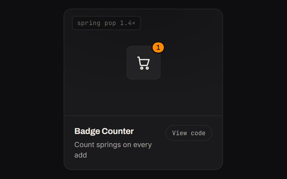 Badge CounterKinetics · HTML/CSSCount springs on every add
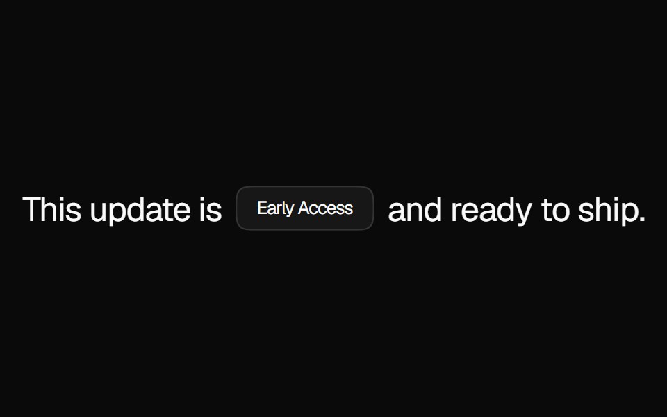 BadgeNexvyn UI · ReactA compact status label with solid, muted, and dot variants for tagging content inline.
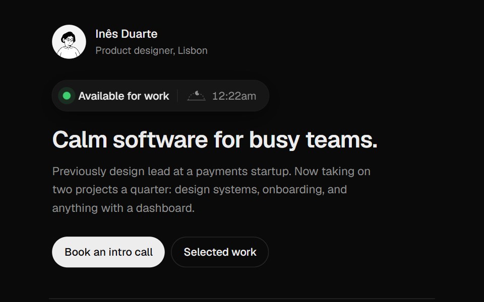 Availability BadgeUI Lab · ReactShows when the owner is working, and when that overlaps with your day.
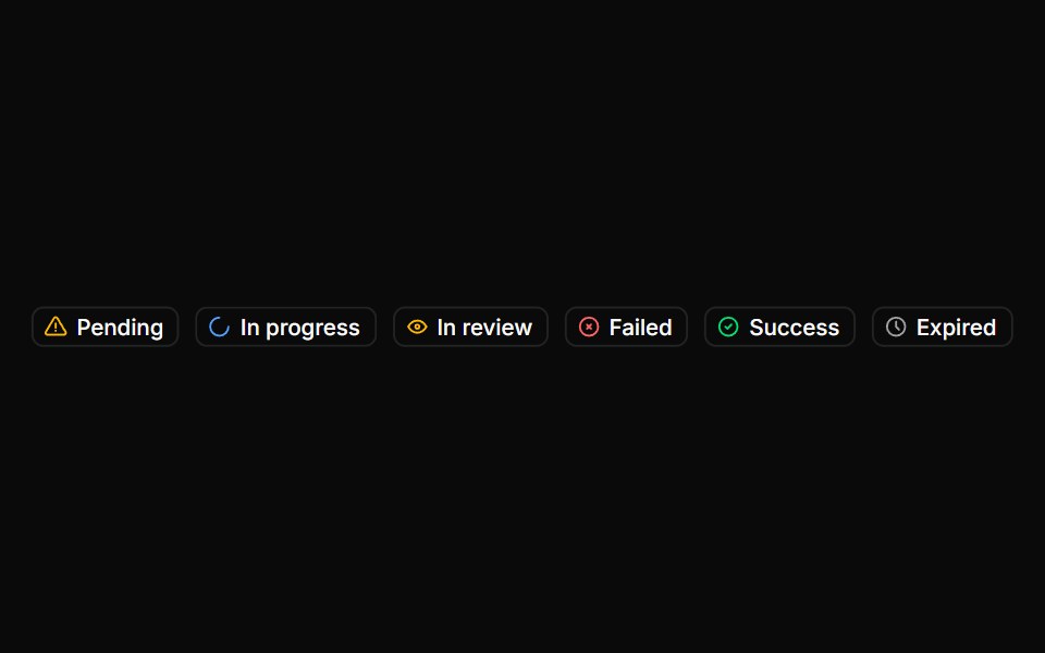 BadgeHextaUI · ReactStatus labels with colored dots, removable tags that slide closed and counts that roll to their new value.
 Sliding Arrow LabelMicroKit · ReactA text label that gets a bright surface while an arrow slides in beside it.
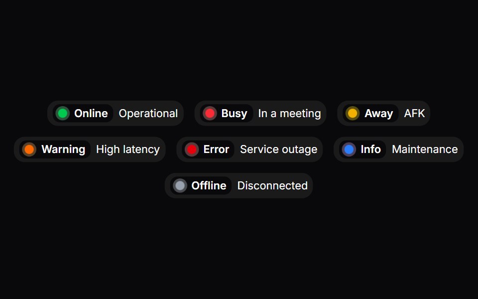 Status BadgeSpaceUI · ReactDisplays a real-time status indicator with a pulsing dot and color coding to show whether a service or user is online…
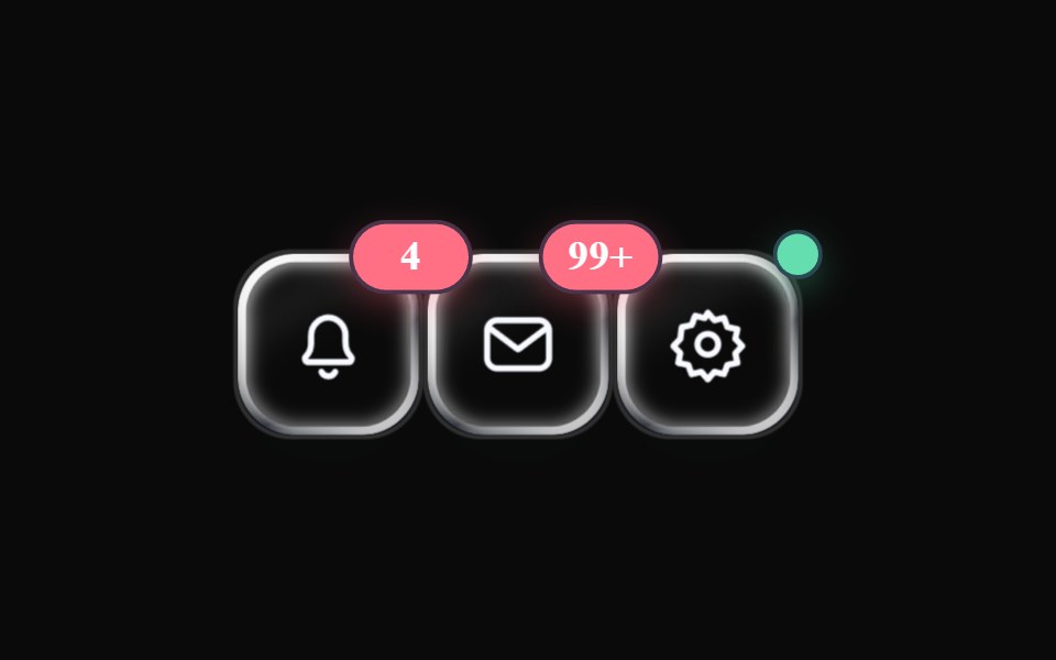 Liquid BadgeLiquefy UI · ReactBadge in liquid glass style. Selo em estilo vidro líquido.
 Images BadgeAceternity UI · React
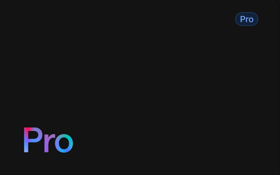 Pro Gradient Texttransitions.dev · HTML/CSS
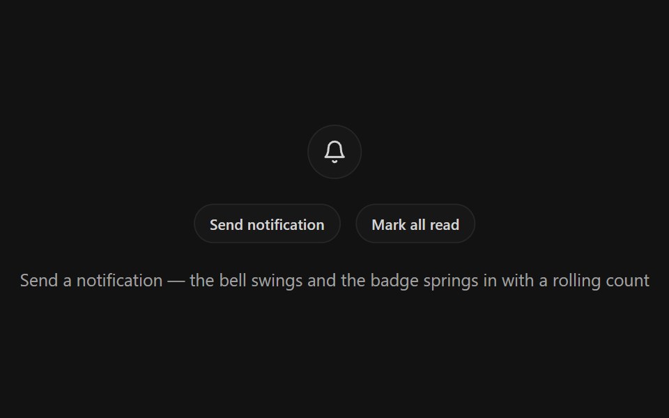 Notification BellSpectrum UI · ReactA bell icon button with a ring-shake swing, springy unread badge with rolling odometer count, and a pinging dot mode
 Badge-07 - SuccessShadcn Space · ReactAnimated success badge with top glow and letter-by-letter reveal
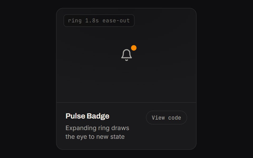 Pulse BadgeKinetics · HTML/CSSA notification dot emits expanding rings forever — pure CSS
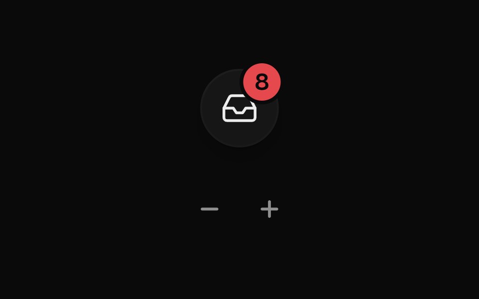 Badge CounterUI Lab · ReactRolls its digits the way the count moved and bumps each time it changes.
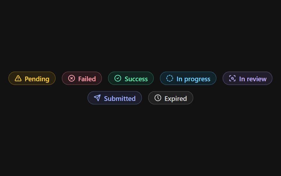 Status BadgeSpectrum UI · Reactcomponent for the Status Badge
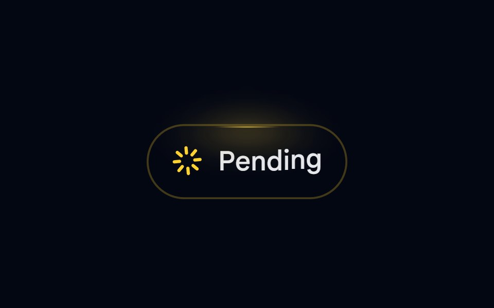 Badge-08 - PendingShadcn Space · ReactAnimated pending badge with spinning loader and top glow
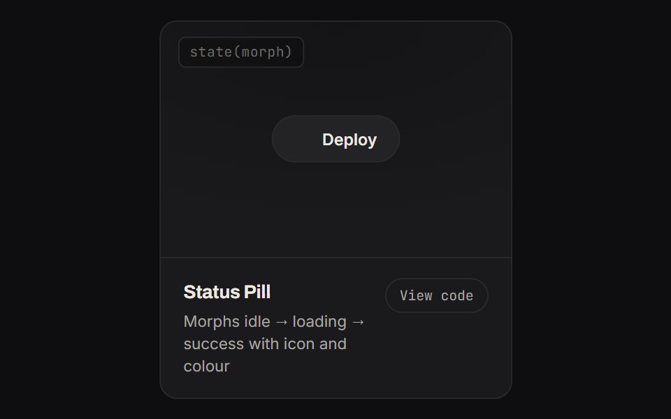 Status PillKinetics · HTML/CSSMorphs idle → loading → success with icon and colour
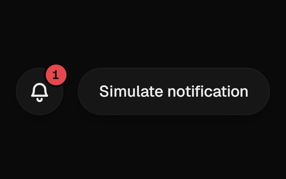 Notification BellUI Lab · ReactRings when something new arrives, and the badge rolls up with each one.
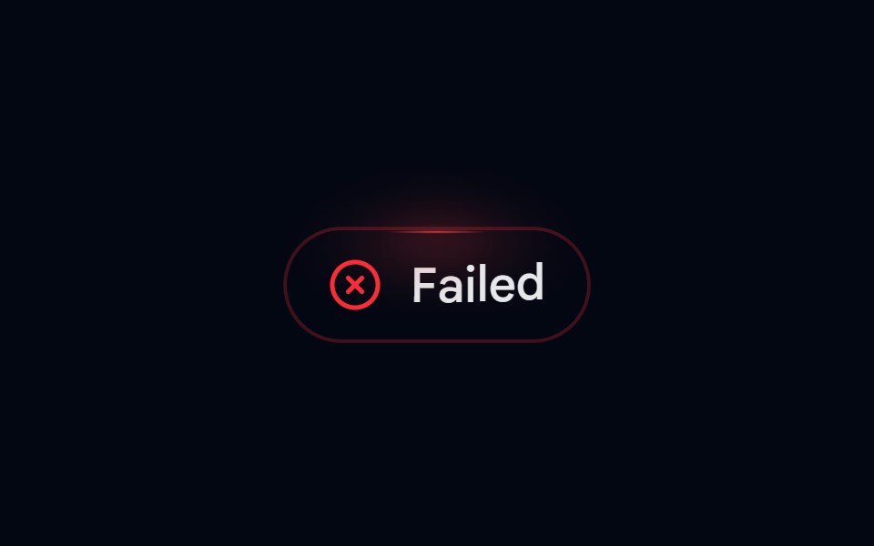 Badge-09 - FailedShadcn Space · ReactAnimated failed badge with top glow and letter-by-letter reveal
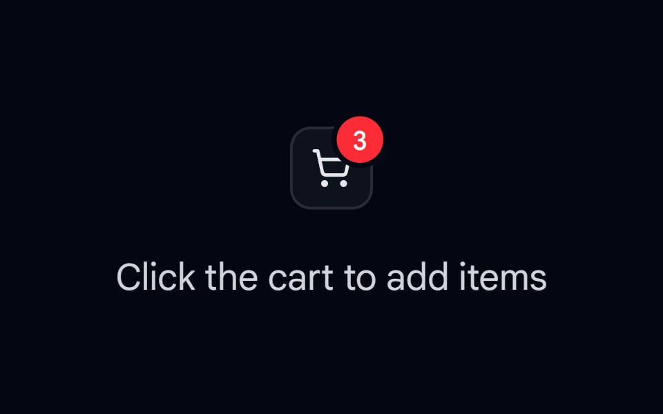 Badge 11 - Count PopShadcn Space · ReactNotification/cart count badge that springs and pops on every count change
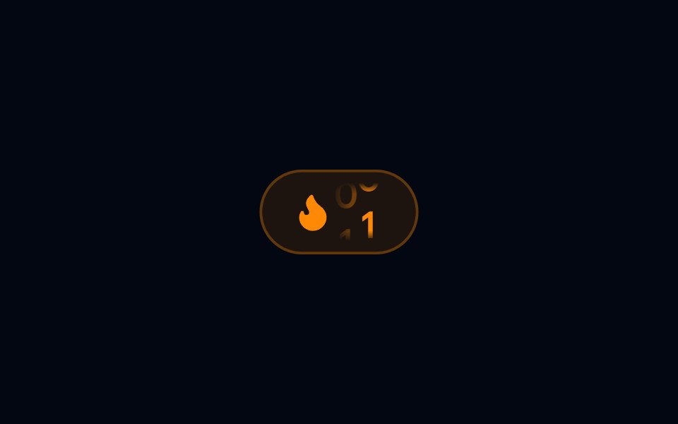 Badge 13 - Streak DisplayShadcn Space · ReactFlame streak badge with a flickering icon loop and an animated roll-in day count
 Label 06 - Floating LabelShadcn Space · ReactFloating label that transitions from inside the input to the top on focus or fill
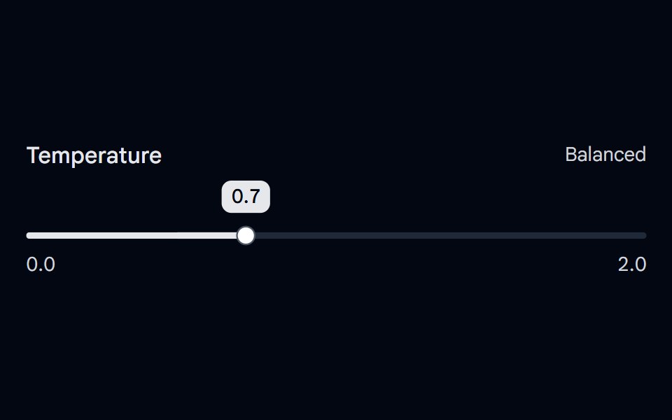 Slider 10 - Floating Value LabelShadcn Space · ReactDecimal slider with a value label that follows the thumb, grows while dragging, and a Precise / Balanced / Creative…
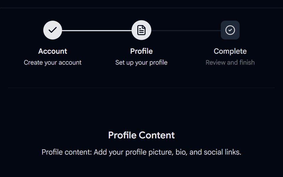 Stepper 01 - Custom Square BadgesShadcn Space · ReactResponsive stepper component with customizable indicators, checkmarks for completed steps, active and pending states…
Libraries with Animated badge components
Related categories
- Badge Components
- React Badge Components
- Tailwind CSS Badge Components
- Svelte Badge Components
- shadcn/ui Badge Components
- Animated Feedback Components
- Animated Spinner Components
- Animated Progress Components
- Animated Skeleton Components
- Animated Progress Bar Components
- Animated Status Indicator Components
- Animated Typing Indicator Components
- Animated Empty State Components
- Animated Chip Components
- Animated Notification Components
- Animated Alert Components
- Animated Progress Circle Components
- Animated Scroll Progress Components
- Animated Banner Components
- Animated Loading Screen Components
- Animated Error State Components