 Dev Design Library
Animated Progress Circle Components
Dev Design Library indexes 16 Animated progress circle components from 10 open-source UI libraries, with the most coming from Kinetics, Spectrum UI, React Bits, Amicro Micro Transitions and ReactFrame. Each one links to its page with the source code, a live preview where available, the library license and the install command. These are the progress circle components tagged as animated: motion on hover, on scroll or on load, usually built with CSS transitions or Framer Motion. Progress circle components belong to the Feedback group.
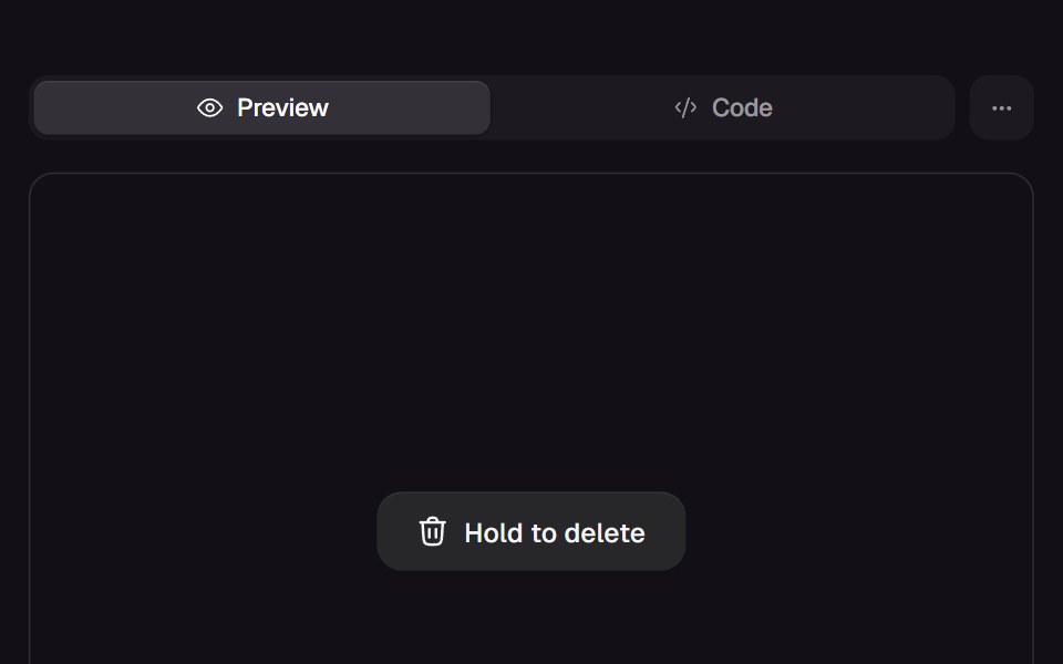 Hold ButtonReact Bits · ReactHold-to-confirm button whose liquid fill rises while pressed, snaps back on an early release and swaps its label…
 Progress CircleTremor · React
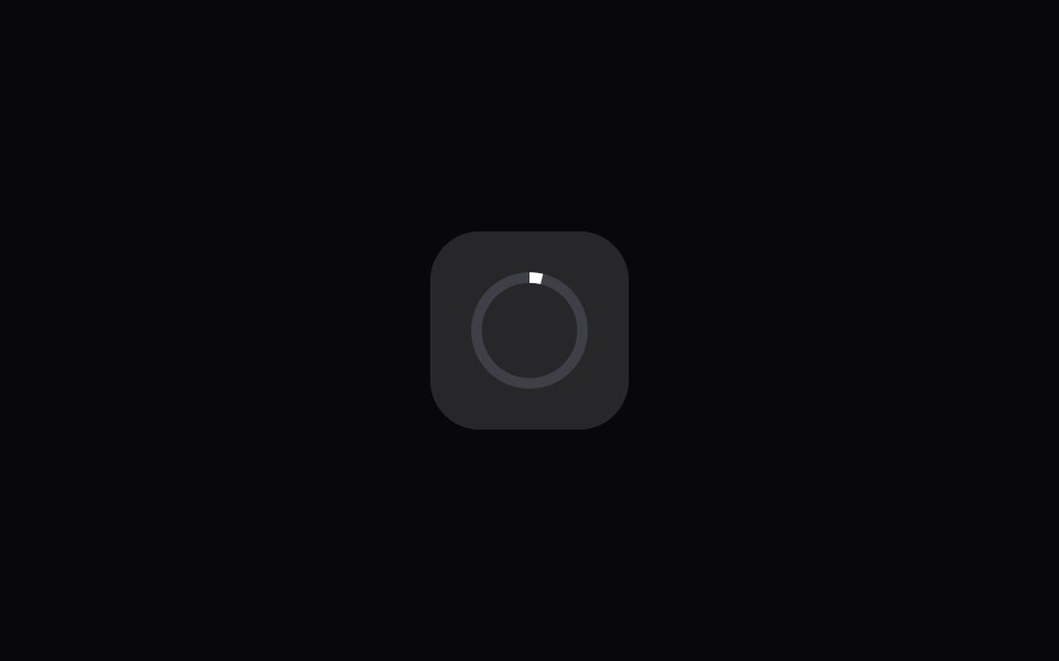 App Icon LoadAmicro Micro Transitions · ReactApp Icon Load loading animation.
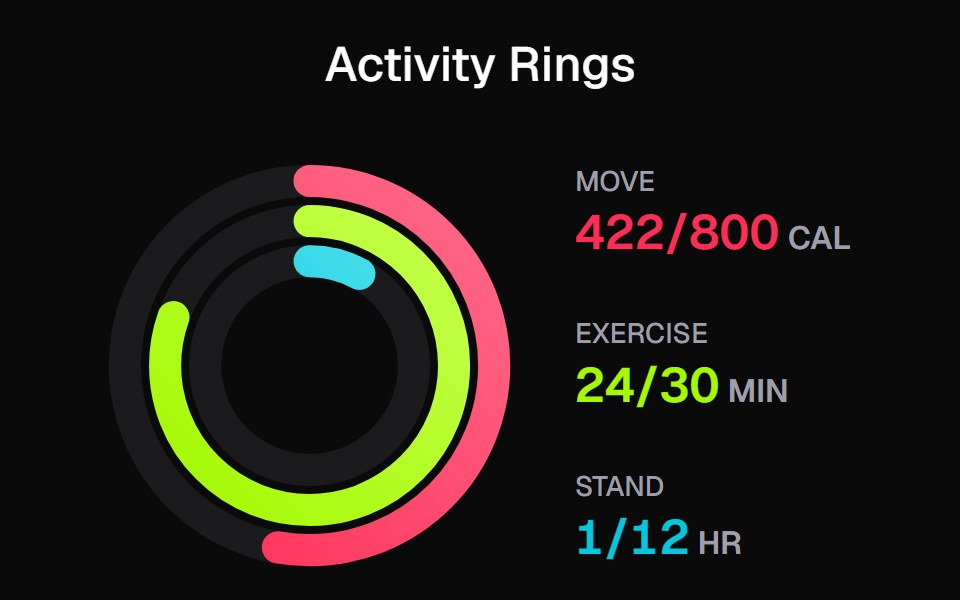 Apple Activity CardKokonut UI · ReactActivity rings that draw with a count-up, lap past 100% with a shadowed end cap and dim to focus, built with React and…
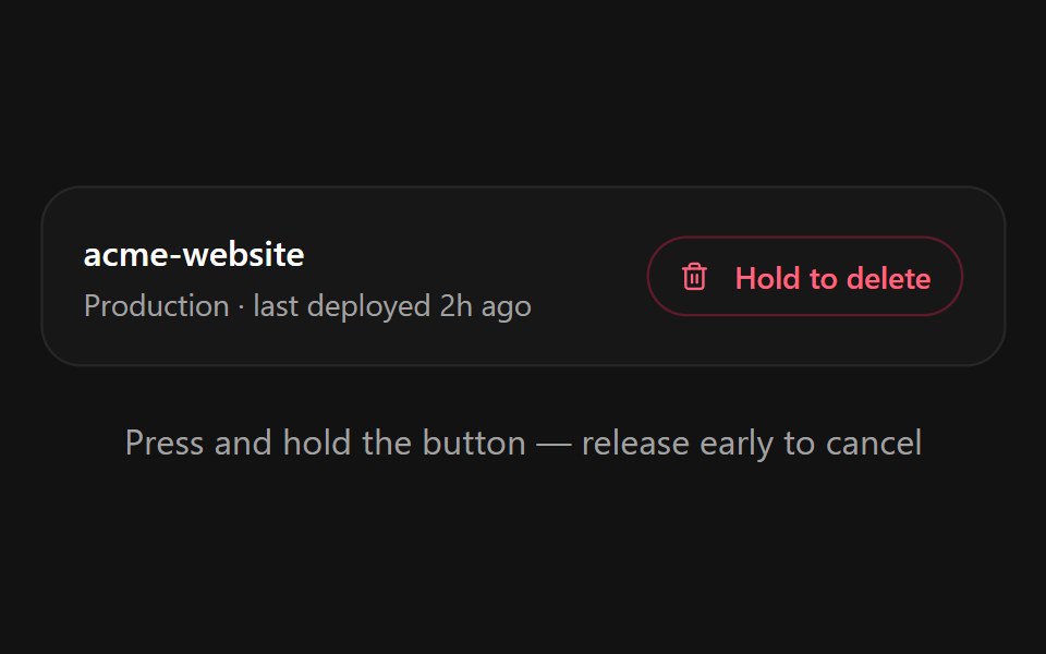 Hold to ConfirmSpectrum UI · ReactA press-and-hold confirmation button for destructive actions with a filling progress ring, spring-back on early…
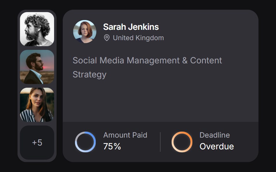 Client Carduselayouts · ReactA client CRM card with payment and deadline rings, plus a morphing avatar stack.
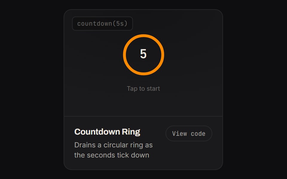 Countdown RingKinetics · HTML/CSSDrains a circular ring as the seconds tick down
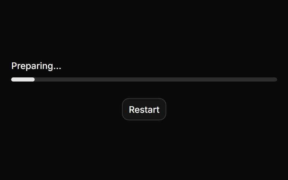 ProgressHextaUI · ReactA bar or ring that shows how far a task has come, eases between updates and slides while the total is unknown.
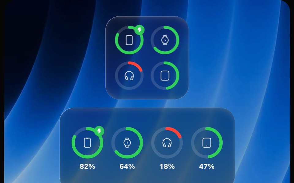 Battery WidgetOpaline · ReactBatteries widget with device rings that fill, turn red when low and show charging.
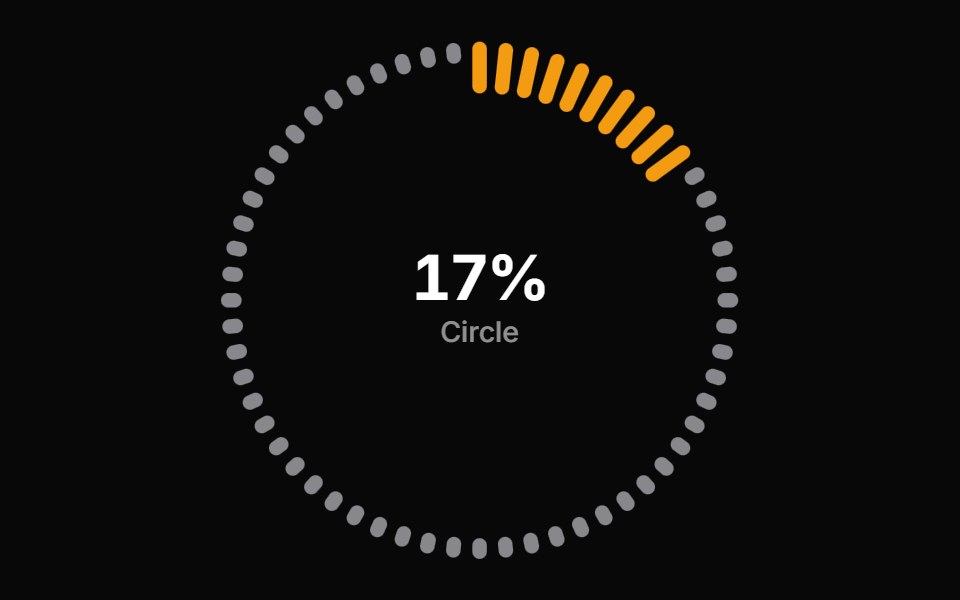 Progress Circle BarsReactFrame · ReactA circular progress indicator with ring, gauge, and dashes arc styles, scroll-triggered count-up animation, color…
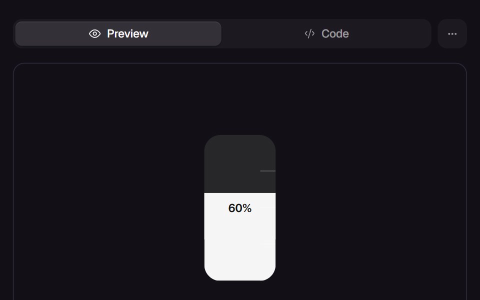 Slosh GaugeReact Bits · ReactTank gauge whose liquid chases the value with mass, tilts with its own speed and splashes against the top when it…
 Segmented Arc MeterAmicro Micro Transitions · ReactStepped 4-bar discrete vertical gauge with percentage readout.
 Undo PillSpectrum UI · ReactAn inline undo pill with a draining countdown ring that pauses on hover and fires undo or expire callbacks
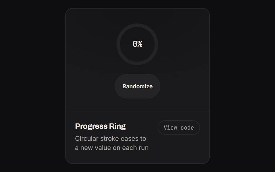 Progress RingKinetics · HTML/CSSCircular stroke eases to a new value on each run
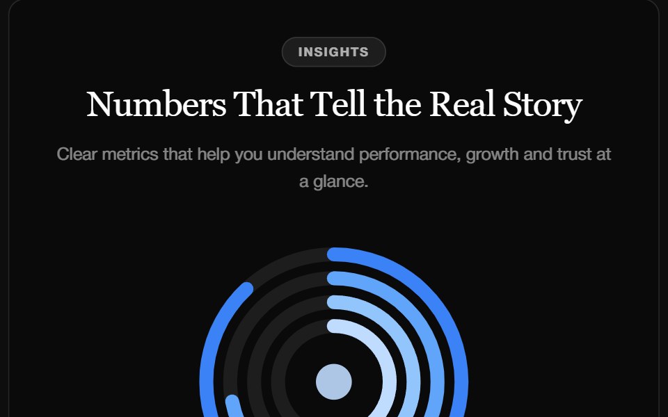 Stat FeatureReactFrame · ReactA metrics section with a concentric ring chart, a trend caption and count-up stats that enter with a blur, slide, fade…
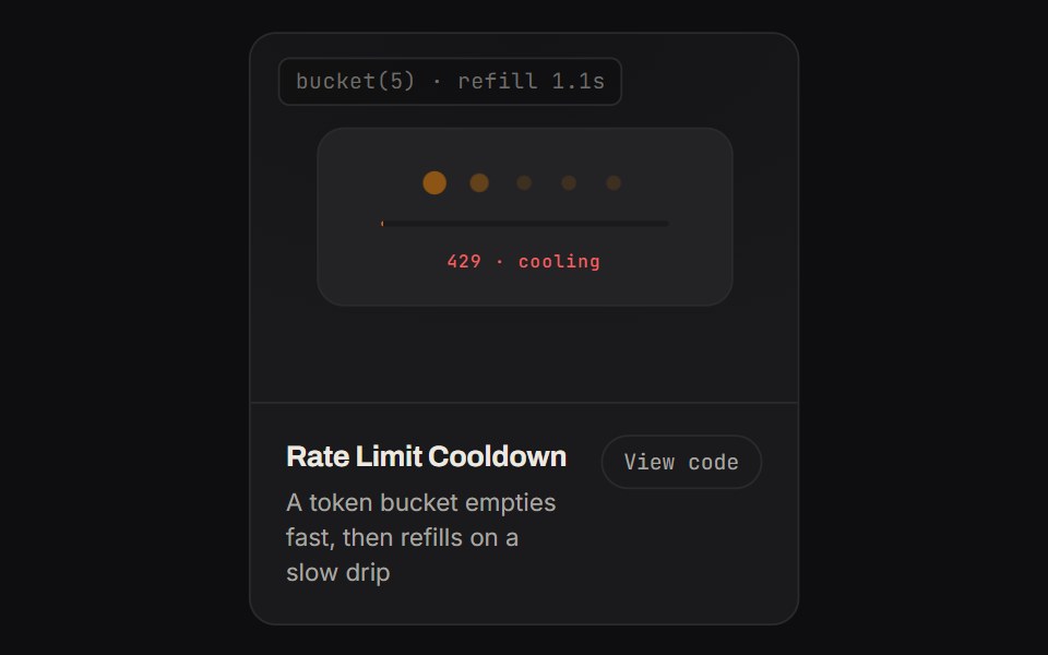 Rate Limit CooldownKinetics · HTML/CSSA token bucket empties fast, then refills on a slow drip
Libraries with Animated progress circle components
Related categories
- Progress Circle Components
- React Progress Circle Components
- Tailwind CSS Progress Circle Components
- Animated Feedback Components
- Animated Spinner Components
- Animated Progress Components
- Animated Skeleton Components
- Animated Progress Bar Components
- Animated Status Indicator Components
- Animated Typing Indicator Components
- Animated Empty State Components
- Animated Badge Components
- Animated Chip Components
- Animated Notification Components
- Animated Alert Components
- Animated Scroll Progress Components
- Animated Banner Components
- Animated Loading Screen Components
- Animated Error State Components