 Dev Design Library
Tailwind CSS Progress Circle Components
Dev Design Library indexes 30 Tailwind CSS progress circle components from 21 open-source UI libraries, with the most coming from OpenSourceUI, Spectrum UI, Amicro Micro Transitions, LocalMode and ReactFrame. Each one links to its page with the source code, a live preview where available, the library license and the install command. Every library in this list styles its components with Tailwind CSS utility classes. Progress circle components belong to the Feedback group.
 Progress CircleHeroUI · ReactA circular progress indicator that shows determinate or indeterminate progress.
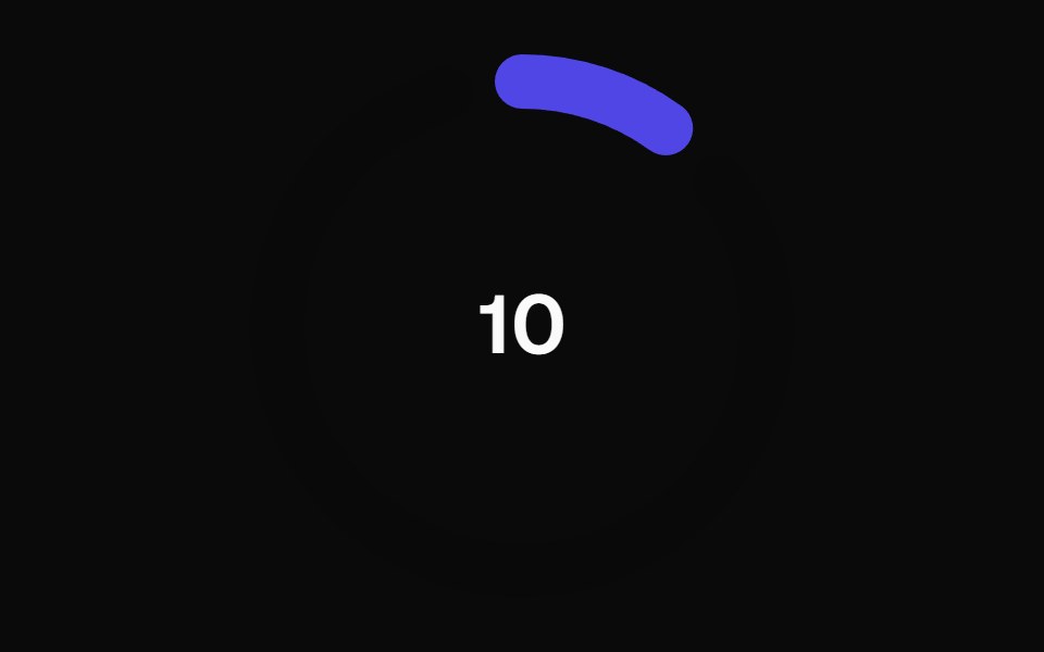 Animated Circular Progress BarMagic UI · ReactAnimated Circular Progress Bar is a component that displays a circular gauge with a percentage value.
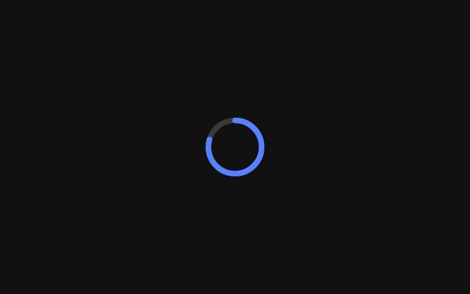 Progress CircleReact Spectrum · ReactProgressCircles show the progression of a system operation such as downloading, uploading, or processing, in a visual…
 Progress CircleTremor · React
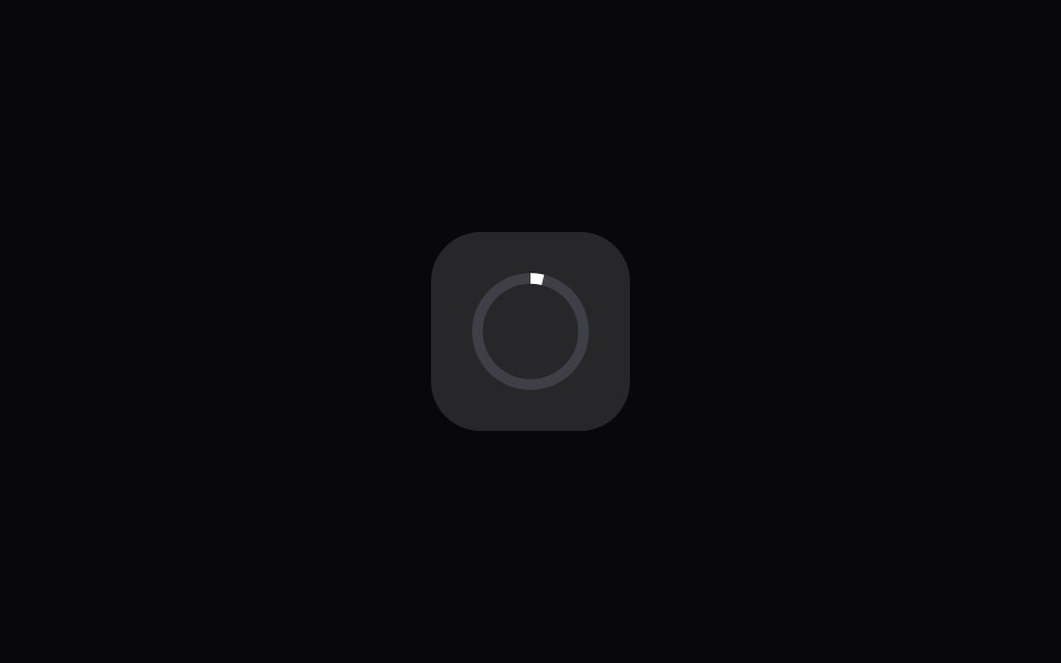 App Icon LoadAmicro Micro Transitions · ReactApp Icon Load loading animation.
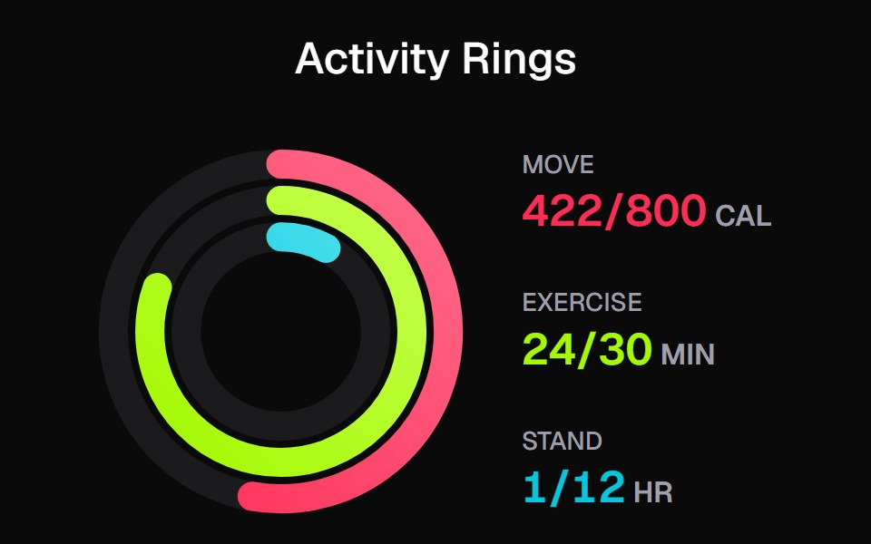 Apple Activity CardKokonut UI · ReactActivity rings that draw with a count-up, lap past 100% with a shadowed end cap and dim to focus, built with React and…
 progress-circleIntent UI · Reactprogress-circle
 Progress IndicatorsUntitled UI React · React
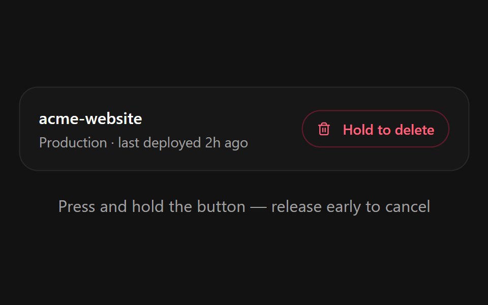 Hold to ConfirmSpectrum UI · ReactA press-and-hold confirmation button for destructive actions with a filling progress ring, spring-back on early…
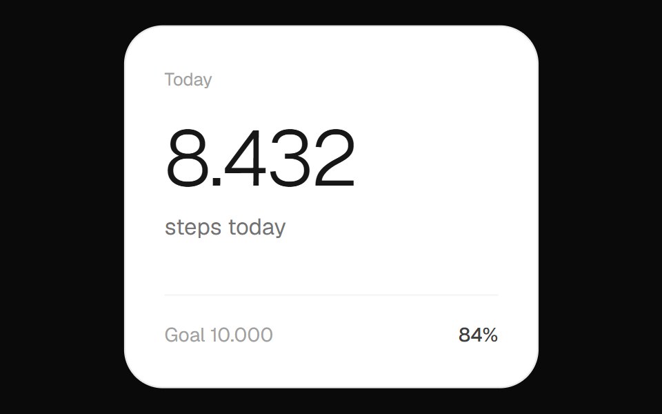 Step Count WidgetOpenSourceUI · ReactFitness widget showing the day's step count with a circular progress ring toward the goal.
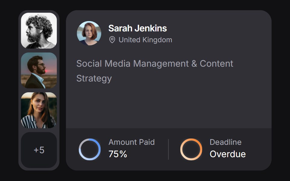 Client Carduselayouts · ReactA client CRM card with payment and deadline rings, plus a morphing avatar stack.
 Progress CircleTremor Blocks · React
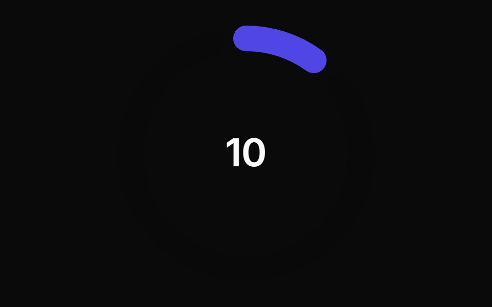 Animated Circular Progress BarAnimations (Svelte) · SvelteA circular progress bar component with animated transitions between primary and secondary colors.
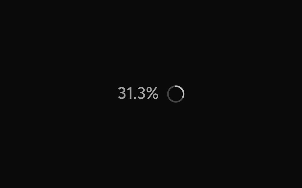 ContextAI Elements (Svelte) · SvelteA hover-card-based context window usage component with token, cost, and model usage breakdowns.
 Circular ProgressShark UI · ReactShows task progress with a circular indicator.
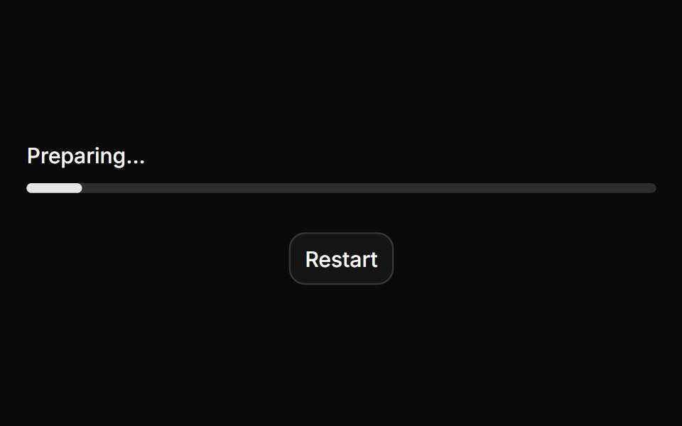 ProgressHextaUI · ReactA bar or ring that shows how far a task has come, eases between updates and slides while the total is unknown.
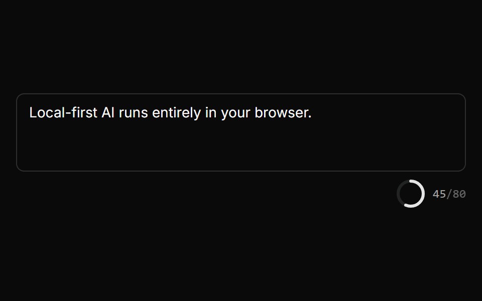 Char Limit IndicatorLocalMode · ReactA radial progress ring + n/MAX monospace counter that turns error-colored when over the limit, deriving the percentage…
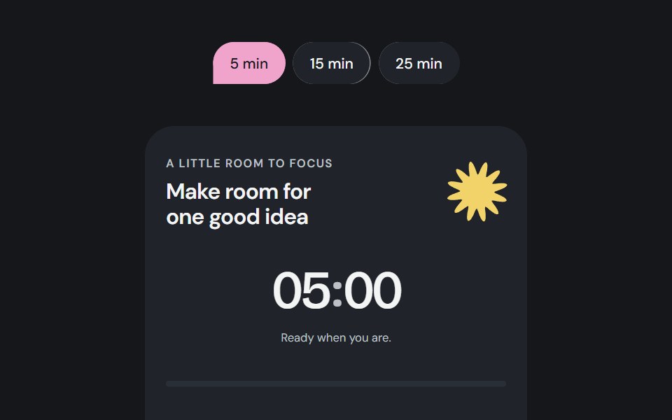 Focus sessionCojeev UI · ReactA local focus timer composed from Cojeev cards, progress, badges and native controls.
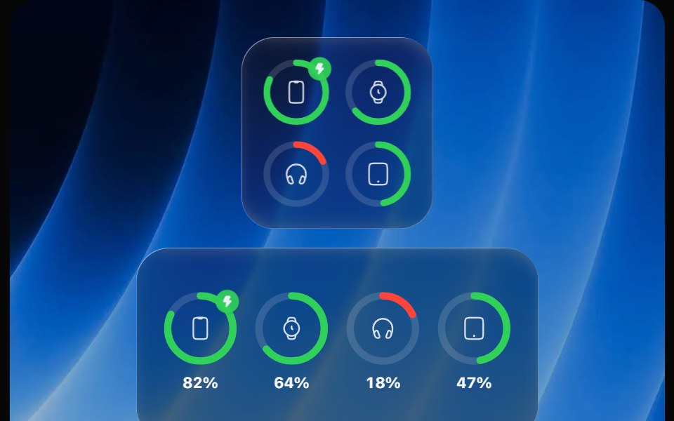 Battery WidgetOpaline · ReactBatteries widget with device rings that fill, turn red when low and show charging.
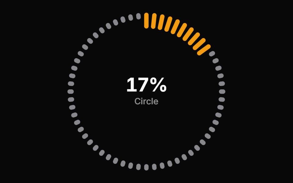 Progress Circle BarsReactFrame · ReactA circular progress indicator with ring, gauge, and dashes arc styles, scroll-triggered count-up animation, color…
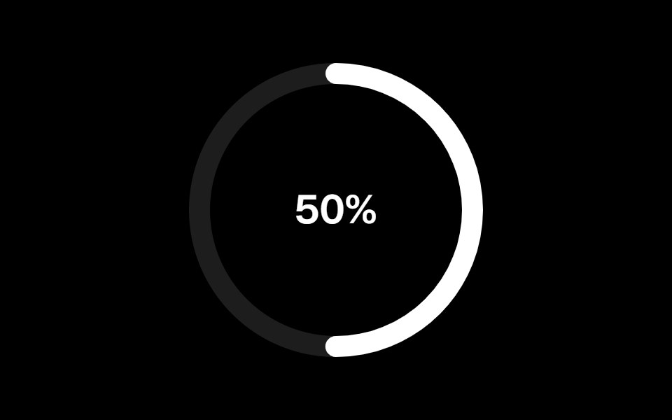 Progress Circularark-cn · ReactA shadcn-style progress circular component built with Ark UI primitives.
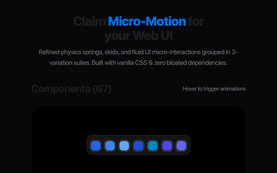 Segmented Arc MeterAmicro Micro Transitions · ReactStepped 4-bar discrete vertical gauge with percentage readout.
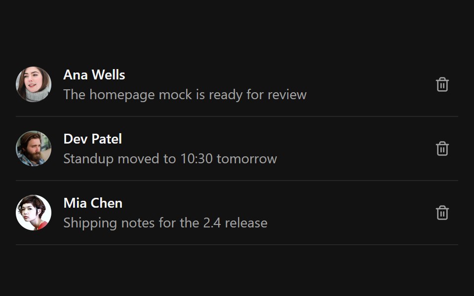 Undo PillSpectrum UI · ReactAn inline undo pill with a draining countdown ring that pauses on hover and fires undo or expire callbacks
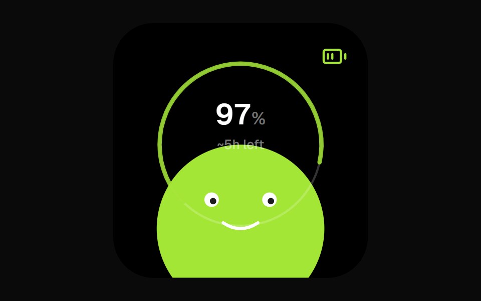 Battery Face WidgetOpenSourceUI · React
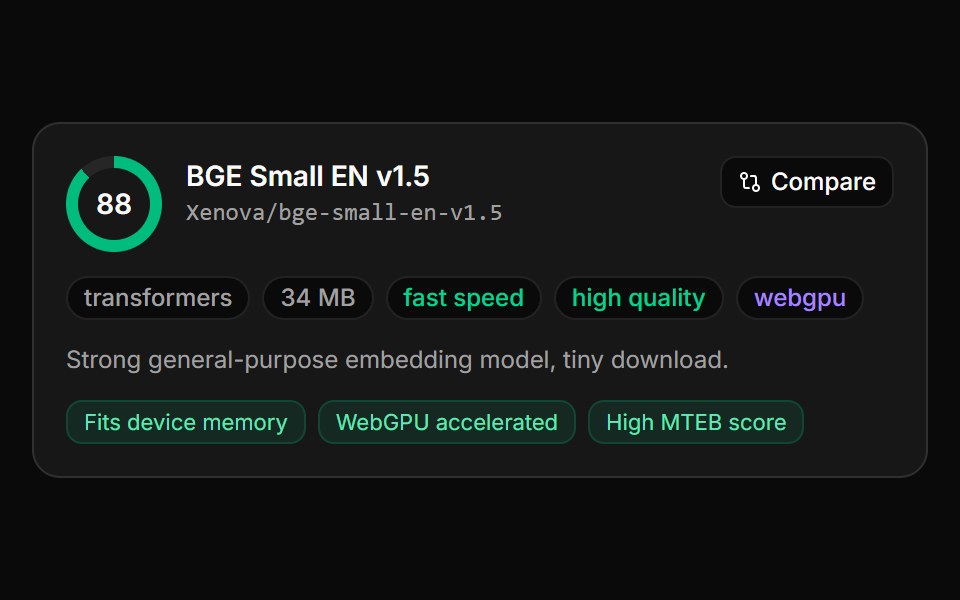 Model Recommendation CardLocalMode · ReactA single scored recommendation: a radial score dial (0–100), the model name, a monospace model id, a badge row…
 Stat FeatureReactFrame · ReactA metrics section with a concentric ring chart, a trend caption and count-up stats that enter with a blur, slide, fade…
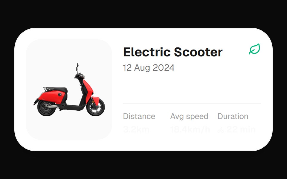 Electric Scooter WidgetOpenSourceUI · React
 Ios Earbuds WidgetOpenSourceUI · React
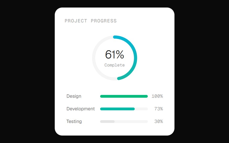 Progress Ring CardOpenSourceUI · React
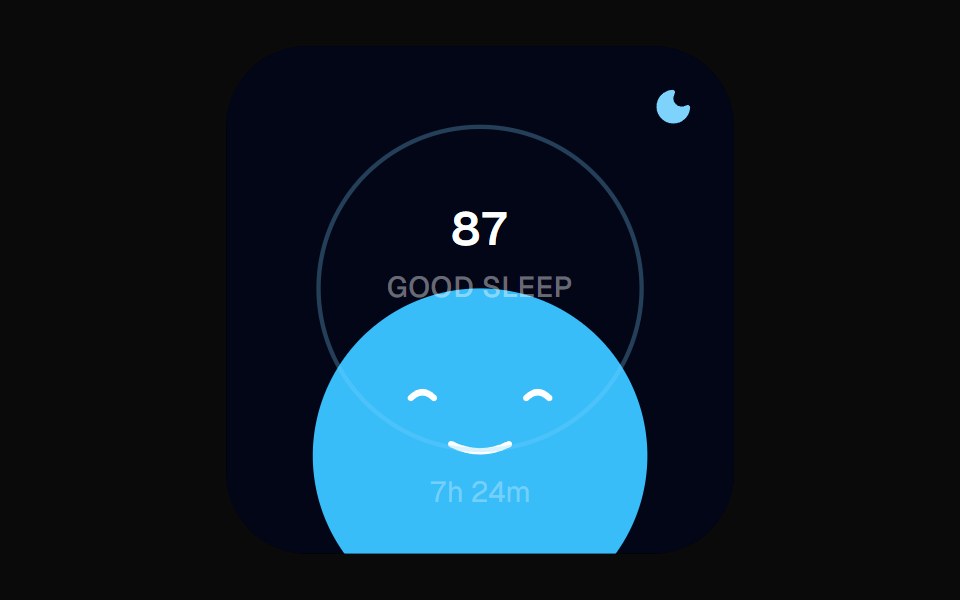 Sleep Score WidgetOpenSourceUI · React
Libraries with Tailwind CSS progress circle components
Related categories
- Progress Circle Components
- React Progress Circle Components
- Animated Progress Circle Components
- Tailwind CSS Feedback Components
- Tailwind CSS Spinner Components
- Tailwind CSS Badge Components
- Tailwind CSS Progress Components
- Tailwind CSS Alert Components
- Tailwind CSS Chip Components
- Tailwind CSS Progress Bar Components
- Tailwind CSS Empty State Components
- Tailwind CSS Notification Components
- Tailwind CSS Banner Components
- Tailwind CSS Status Indicator Components
- Tailwind CSS Skeleton Components
- Tailwind CSS Typing Indicator Components
- Tailwind CSS Error State Components
- Tailwind CSS Scroll Progress Components
- Tailwind CSS Success Animation Components