 Dev Design Library
Tailwind CSS Progress Components
Dev Design Library indexes 162 Tailwind CSS progress components from 52 open-source UI libraries, with the most coming from Tremor Blocks, UI Lab, LocalMode, Spectrum UI and ReUI. Each one links to its page with the source code, a live preview where available, the library license and the install command. Every library in this list styles its components with Tailwind CSS utility classes. Progress components belong to the Feedback group.
Showing 120 of 162, a mix from every library. Open a library to see all of its components.
 Progressshadcn/ui · ReactDisplays an indicator showing the completion progress of a task, typically displayed as a progress bar.
 ProgressdaisyUI · CSS (Tailwind)
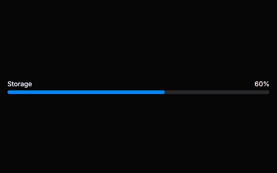 MeterHeroUI · ReactA meter represents a quantity within a known range, or a fractional value.
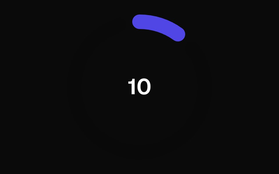 Animated Circular Progress BarMagic UI · ReactAnimated Circular Progress Bar is a component that displays a circular gauge with a percentage value.
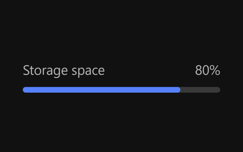 MeterReact Spectrum · ReactMeters are visual representations of a quantity or an achievement. Their progress is determined by user actions…
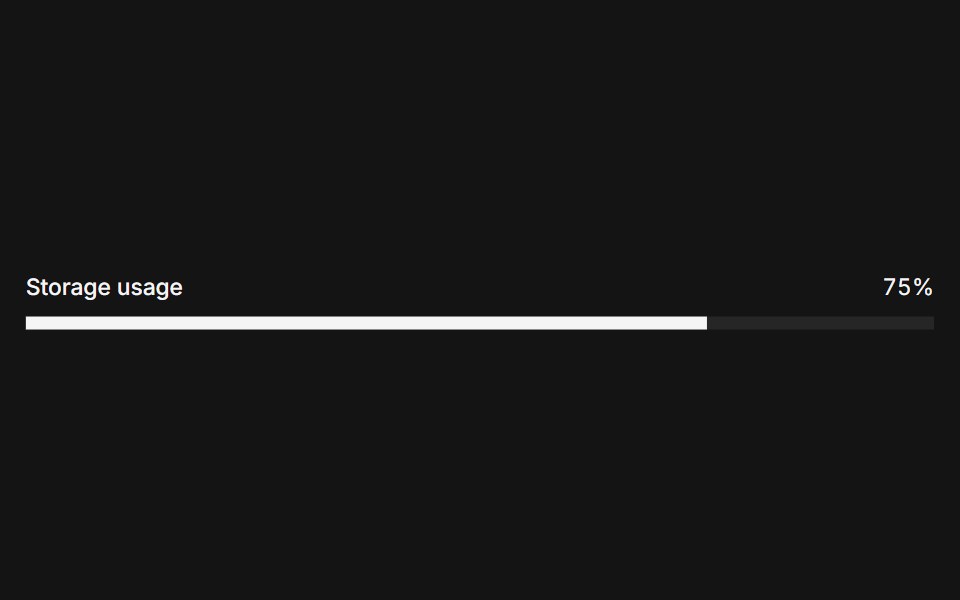 Metercoss ui · ReactA graphical display of a numeric value within a range.
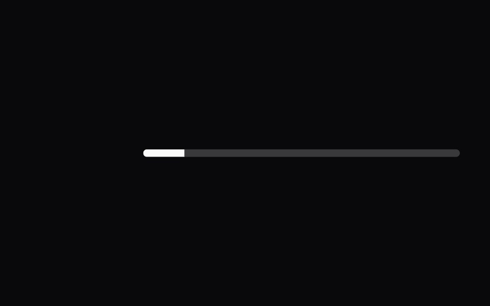 ProgressOrigin UI · ReactDisplays the status of a task that takes a long time.
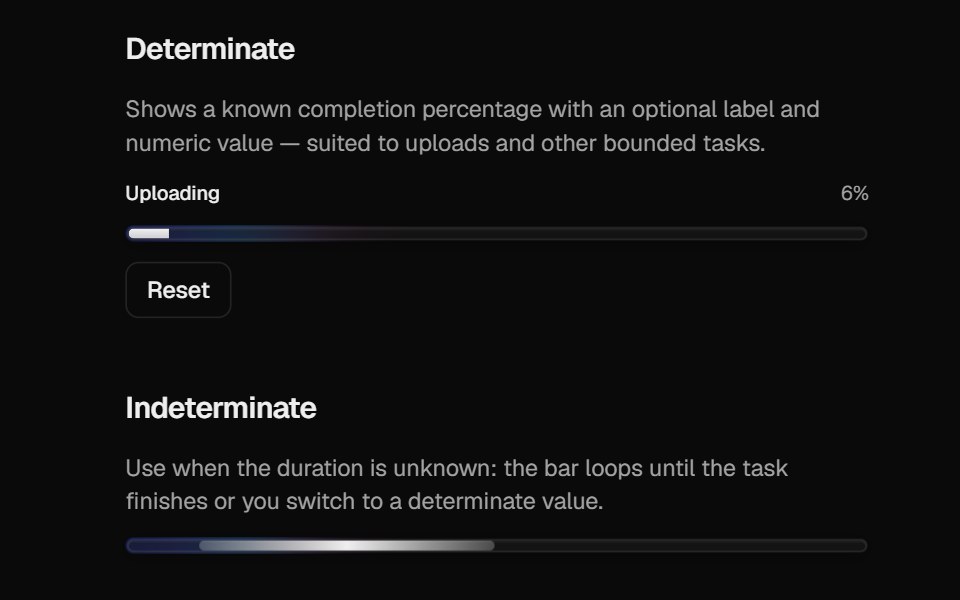 Halo ProgressCult UI · ReactProgress bar with spring-driven determinate fill and indeterminate gradient strip
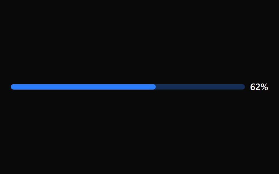 Progress BarTremor · React
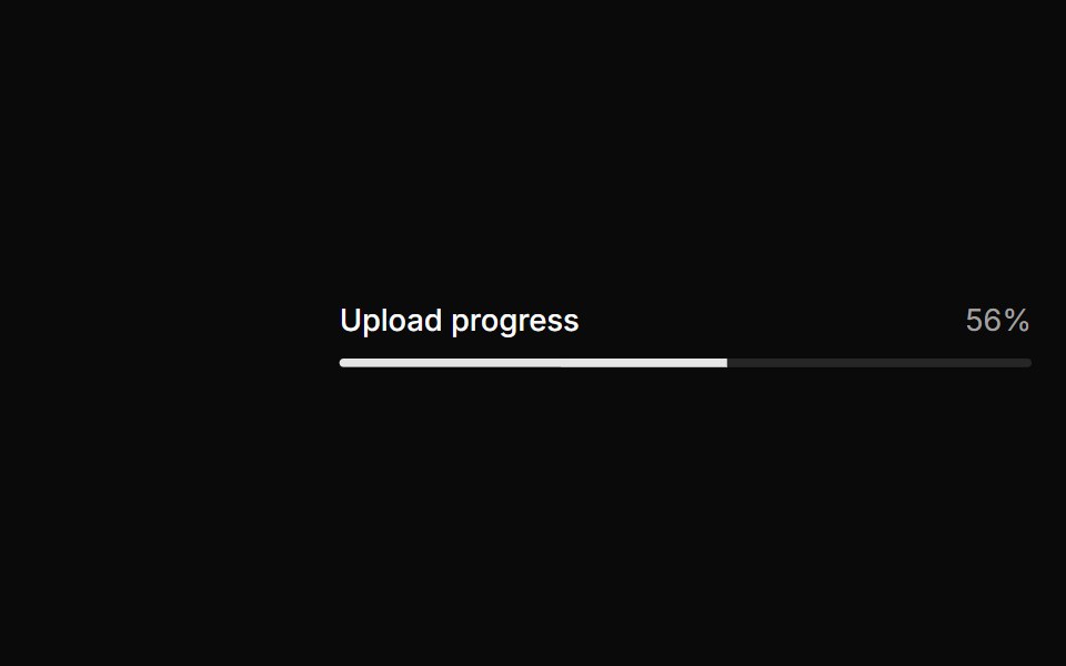 Basic progress.ReUI · ReactBasic progress.
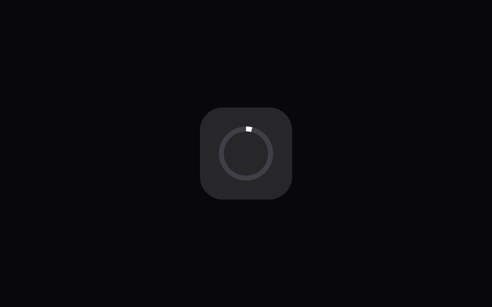 App Icon LoadAmicro Micro Transitions · ReactApp Icon Load loading animation.
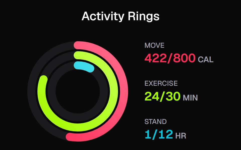 Apple Activity CardKokonut UI · ReactActivity rings that draw with a count-up, lap past 100% with a shadowed end cap and dim to focus, built with React and…
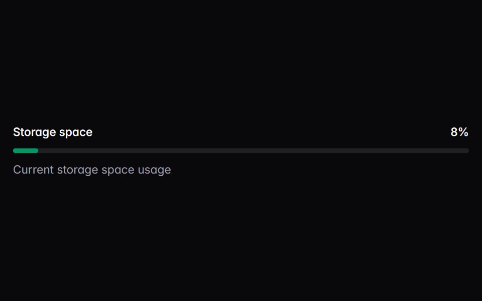 meterIntent UI · Reactmeter
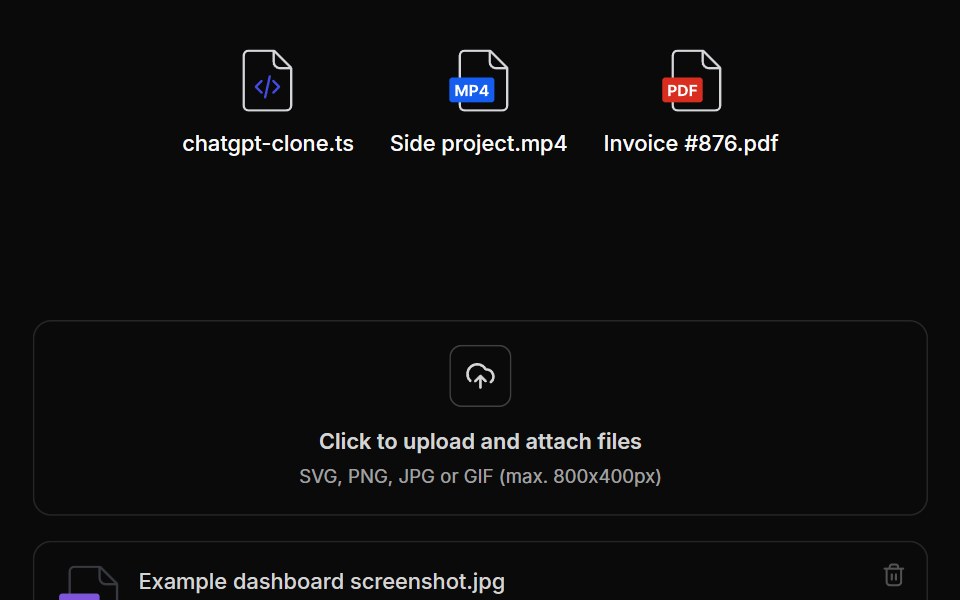 File UploadUntitled UI React · React
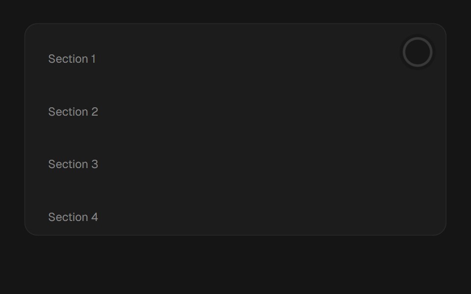 Scroll ProgressbeUI · ReactReading-progress indicator — fixed bar or circular ring — driven by scroll position via useSmoothScroll, with spring…
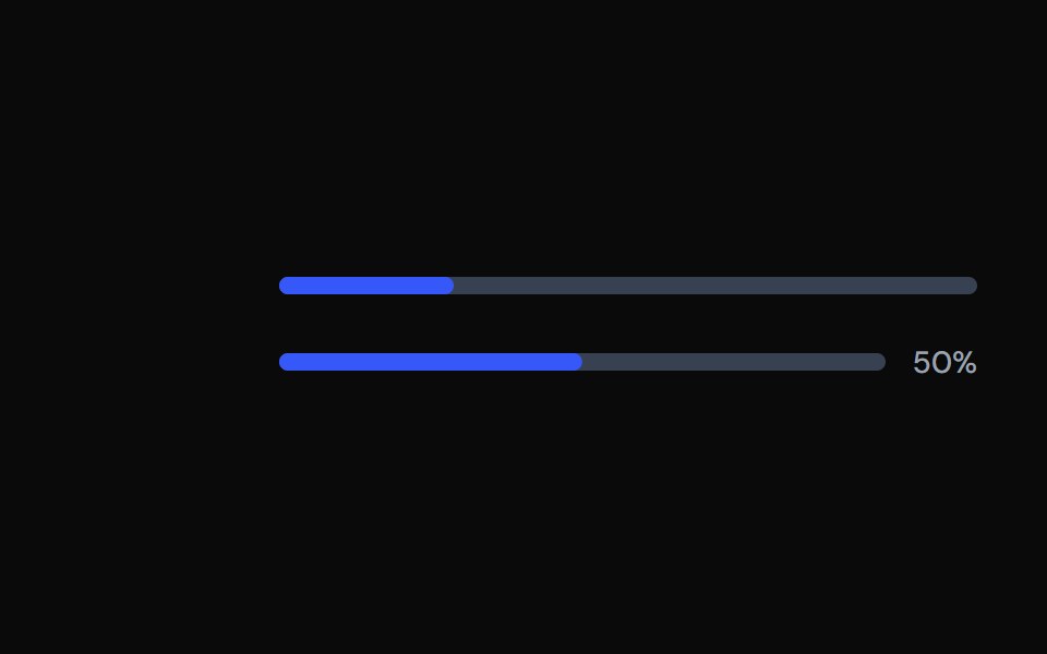 ProgressTailGrids · ReactA progress bar component with multiple variants.
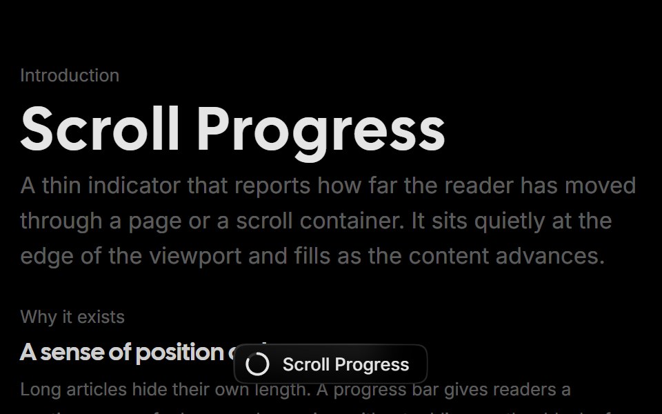 Scroll ProgressRare UI · ReactA scroll progress pill that tracks reading position and expands into a squircle menu of sections you can jump to.
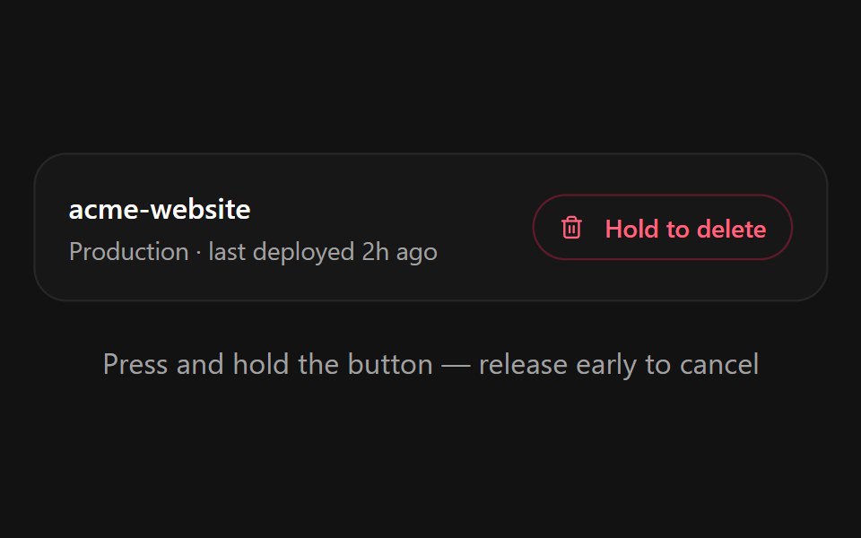 Hold to ConfirmSpectrum UI · ReactA press-and-hold confirmation button for destructive actions with a filling progress ring, spring-back on early…
 ProgressVengeance UI · React
 ProgressToolcraft · React
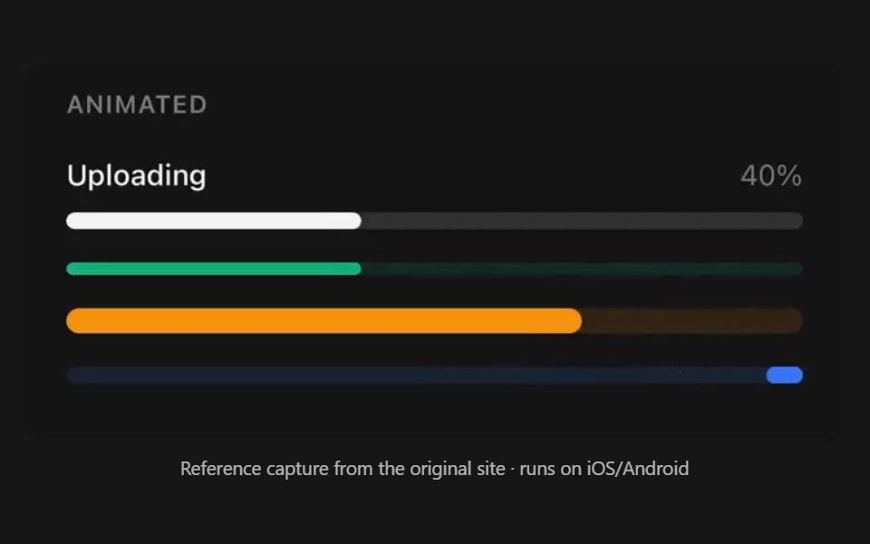 ProgressPanel UI · React NativeDeterminate and indeterminate progress bar.
 Popover 05 - Download ProgressShadcn Space · ReactDownload progress popover with pause/resume/cancel controls and background fill animation.
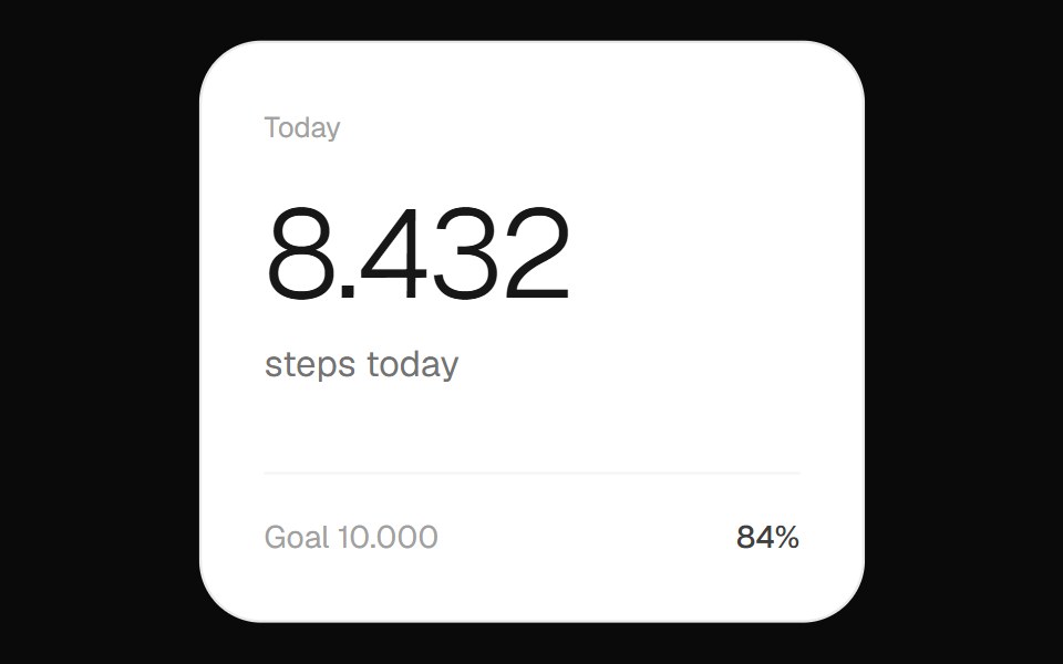 Step Count WidgetOpenSourceUI · ReactFitness widget showing the day's step count with a circular progress ring toward the goal.
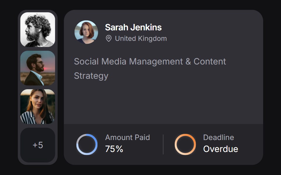 Client Carduselayouts · ReactA client CRM card with payment and deadline rings, plus a morphing avatar stack.
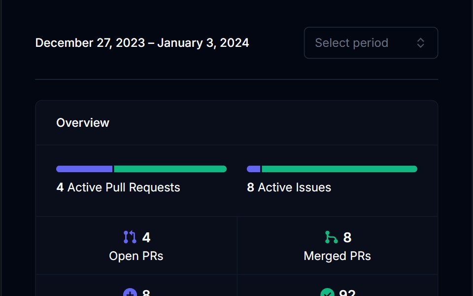 Category BarTremor Blocks · ReactSingle horizontal bar split into coloured segments, with threshold labels and an optional marker for the current value.
 ProgressShadcn Dashboard · React
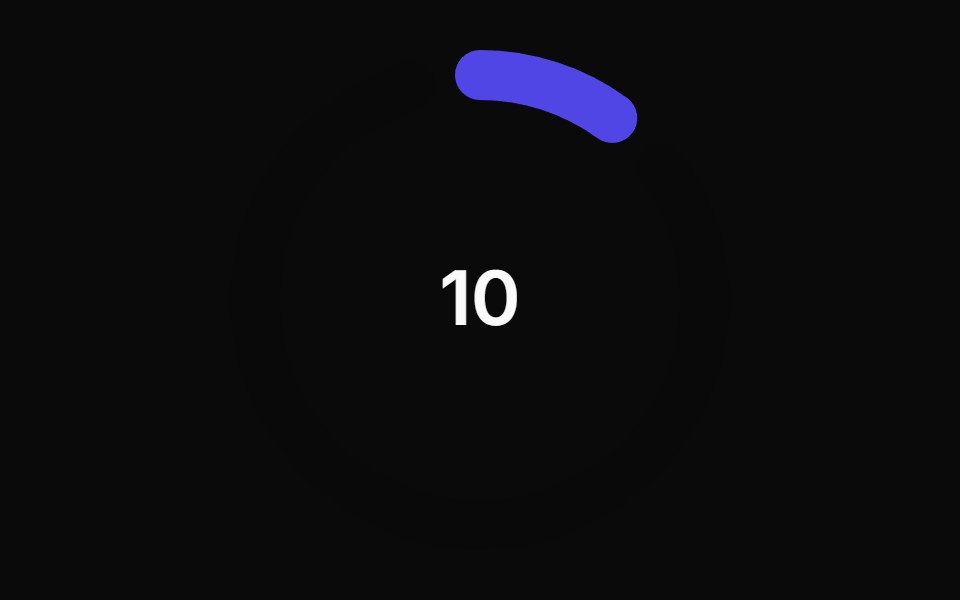 Animated Circular Progress BarAnimations (Svelte) · SvelteA circular progress bar component with animated transitions between primary and secondary colors.
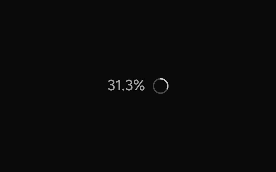 ContextAI Elements (Svelte) · SvelteA hover-card-based context window usage component with token, cost, and model usage breakdowns.
 ProgressObsidianUI · React
 Chat MinimapNotra · ReactA rail of lines that maps a conversation, built on shadcn Button, Card, HoverCard and Tooltip.
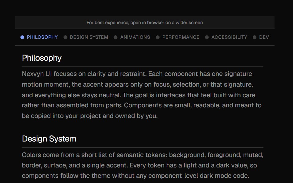 Scroll IndicatorNexvyn UI · ReactA vertical scroll progress indicator with tick marks, section labels, and a floating position readout.
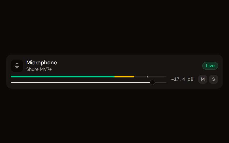 Channel Stripaudiocn · ReactOne channel of a mixer: header, status, meter, fader, value, controls and a notice, as a row or a console strip. The…
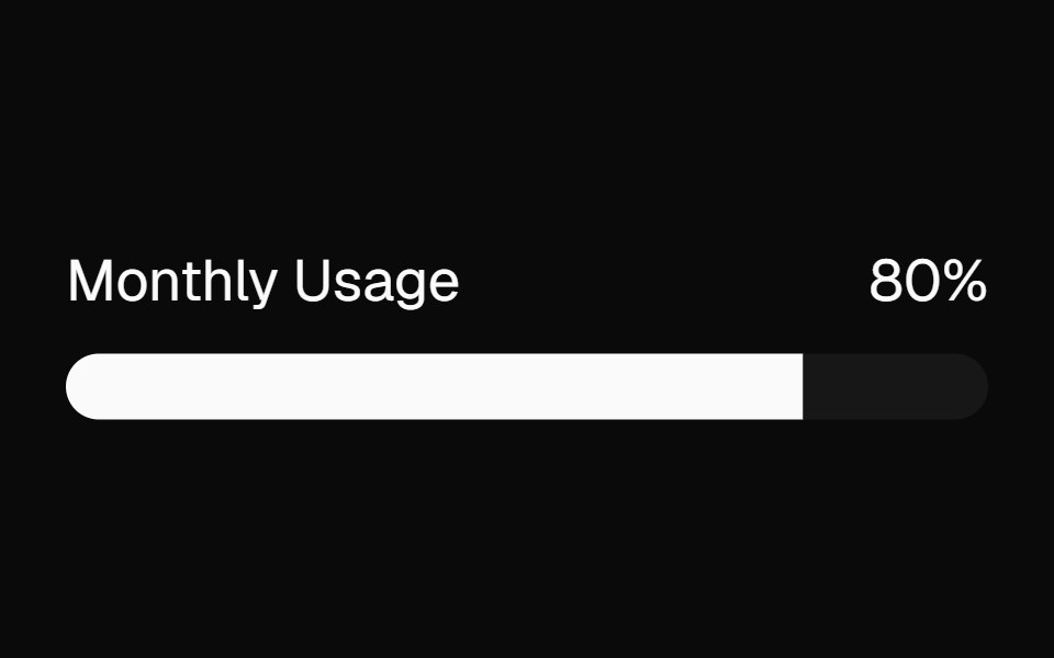 meterBaseLayer · ReactA meter represents a quantity within a known range, or a fractional value.
 Circular ProgressShark UI · ReactShows task progress with a circular indicator.
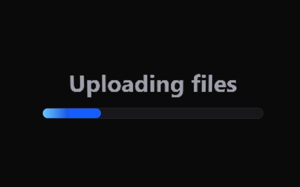 Labeled Progress IndicatorWatermelon UI · React
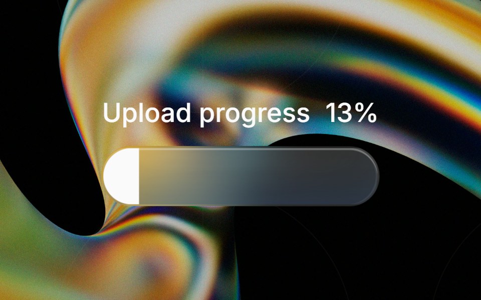 Glass Progressglasscn · ReactGlass Progress with five variants: clear, frosted, subtle, liquid, and liquid-refract
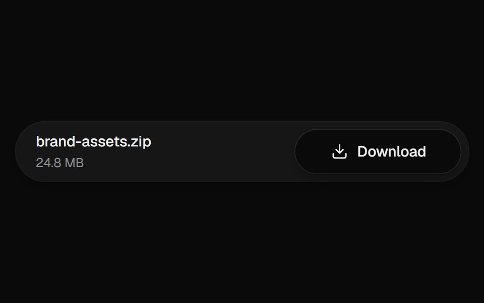 Download ButtonUI Lab · ReactThe arrow drops into the tray while the button fills with progress.
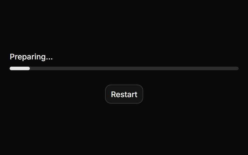 ProgressHextaUI · ReactA bar or ring that shows how far a task has come, eases between updates and slides while the total is unknown.
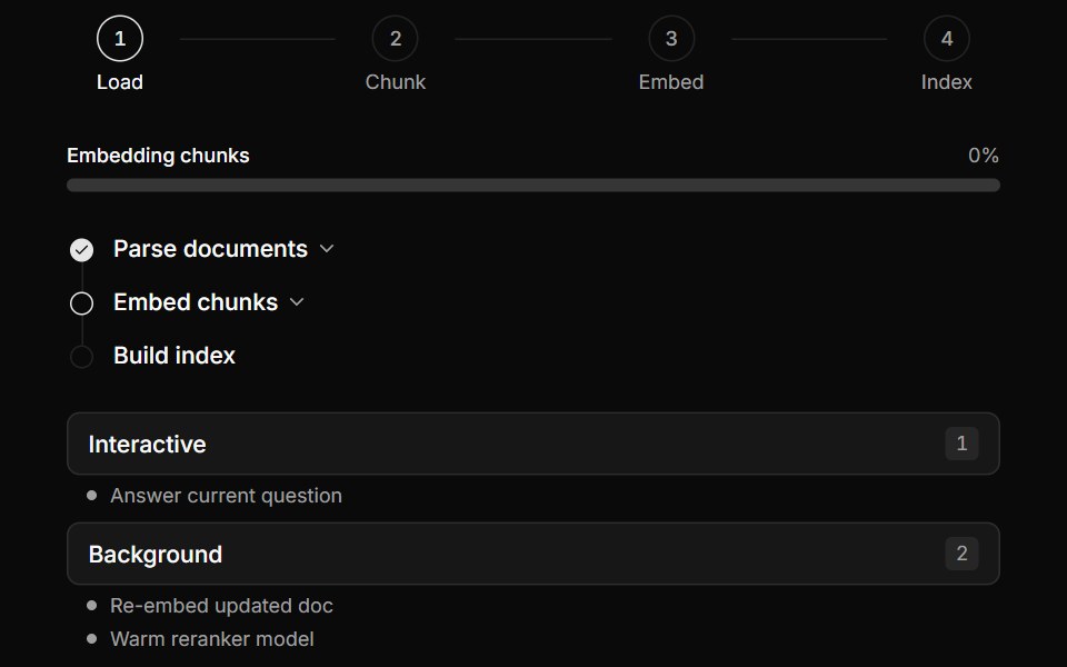 Multi-Step Pipeline TrackerLocalMode · ReactProgress surfaces for local workflows: a horizontal numbered-step indicator (active/completed/pending), a…
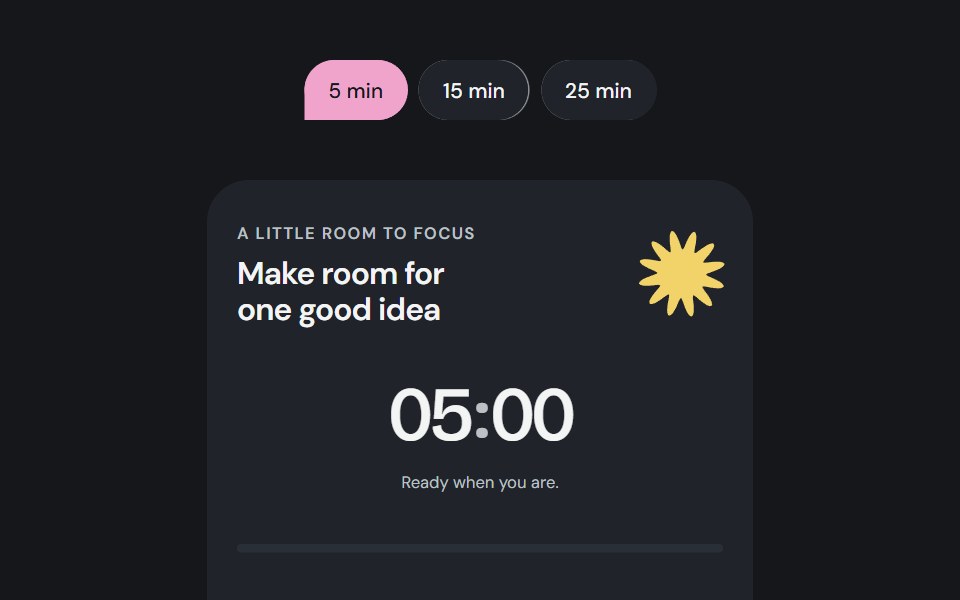 Focus sessionCojeev UI · ReactA local focus timer composed from Cojeev cards, progress, badges and native controls.
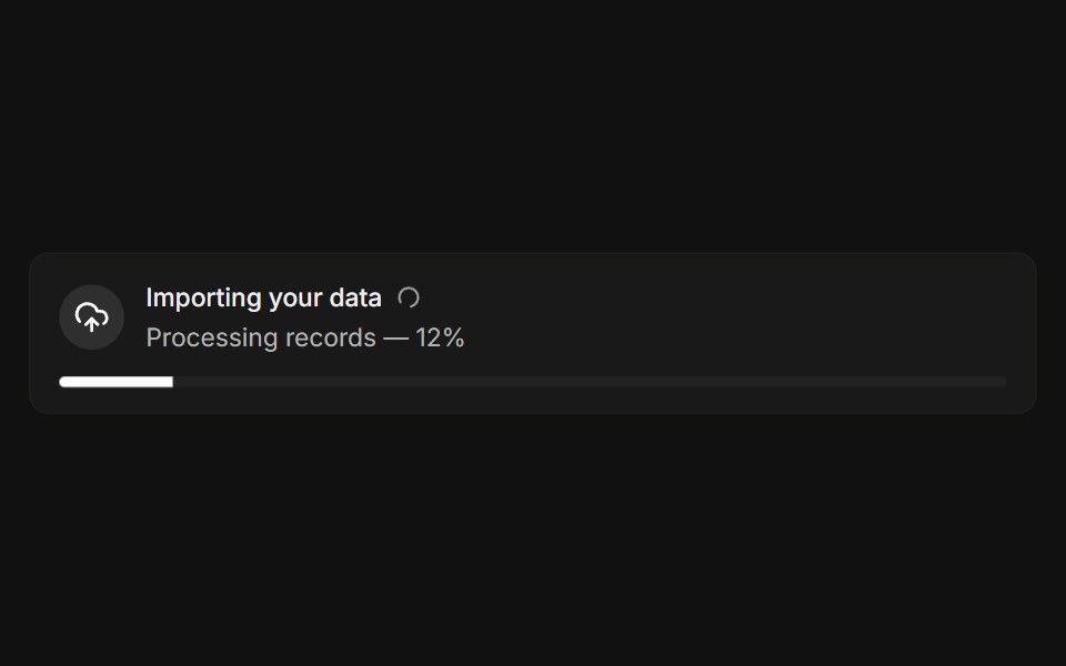 With progressFLX UI · ReactLive import banner with a spinner and a progress bar.
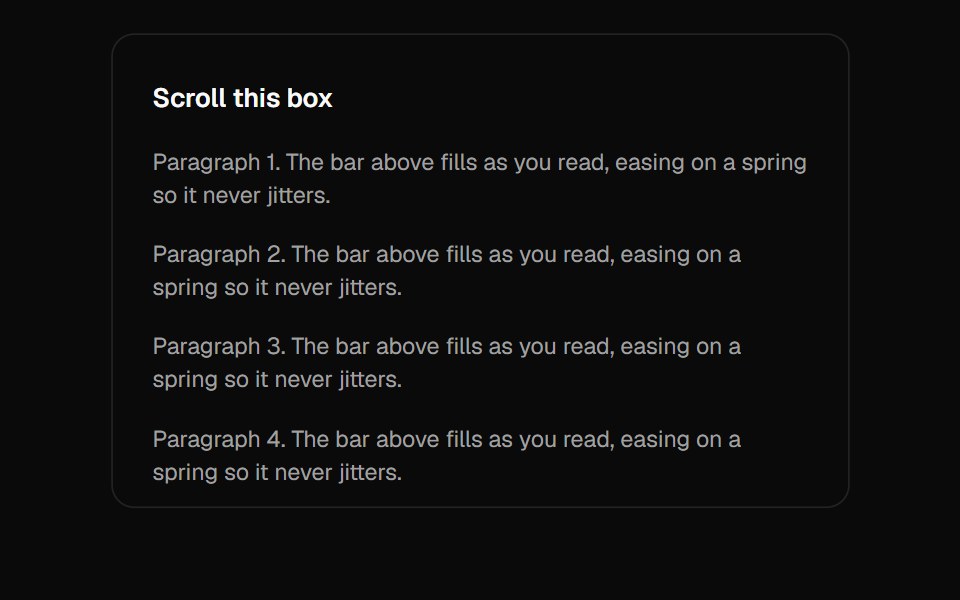 Scroll ProgressVelora UI · ReactGradient page-progress bar pinned to the top.
 Password Input With Strength Indicatorsv-particles · Svelte
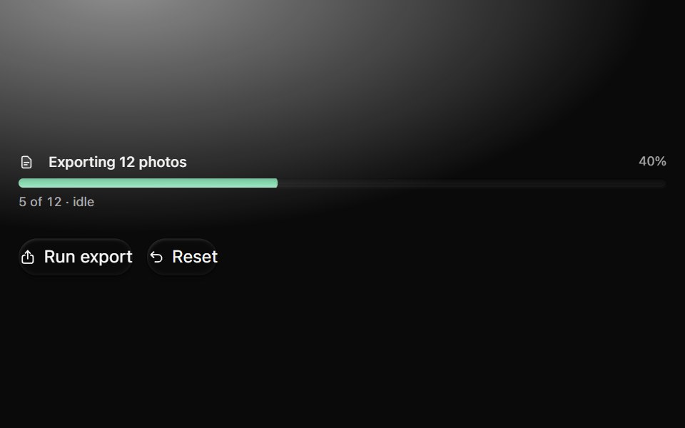 ProgressMetal UI · React + SwiftUITask amount and explicit idle, running, paused, failed, cancelled and complete states. Bars, slim bars, rings…
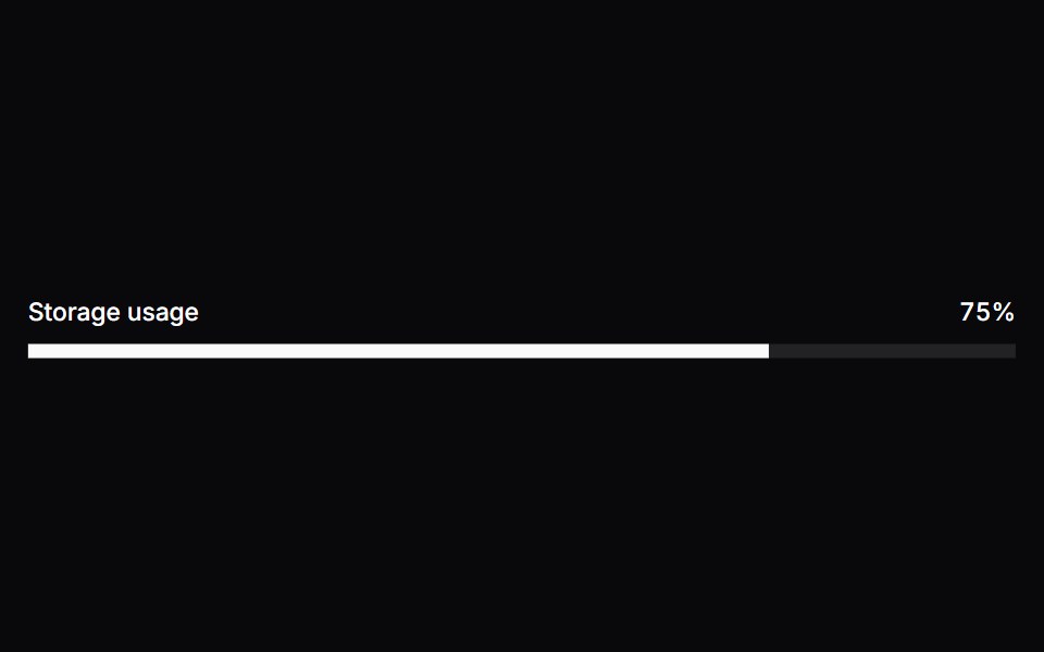 MeterSpaceUI · ReactDisplays a visual gauge bar showing a quantity within a known range, such as battery level, disk capacity, or password…
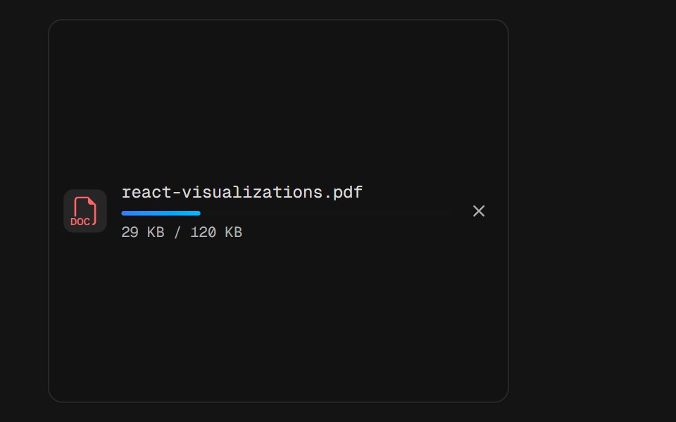 File UploadD2Studio UI · ReactA single upload row mid-flight: a PDF badge, the filename, a thin progress rail and the byte count under it. The bar…
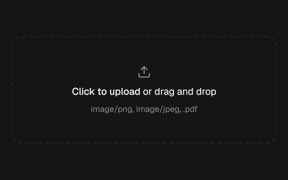 File UploadEaseUI · ReactDropzone that also opens the native file picker, with a list below it that pops each file in and collapses smoothly on…
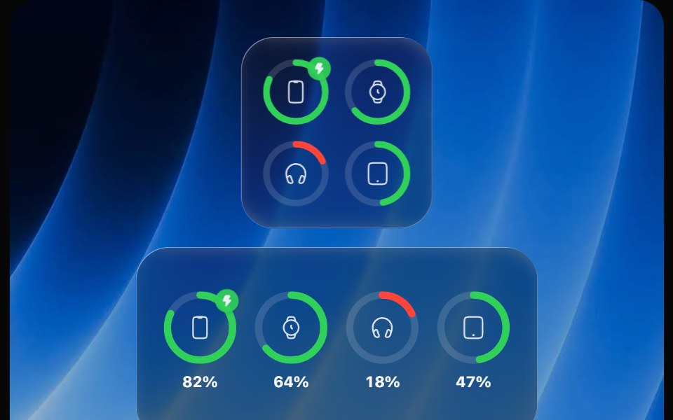 Battery WidgetOpaline · ReactBatteries widget with device rings that fill, turn red when low and show charging.
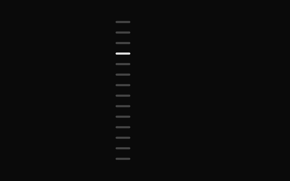 Chapter ScrubberFibo · ReactA rail of marks that swell under the pointer like the Dock, previewing the chapter at the crest.
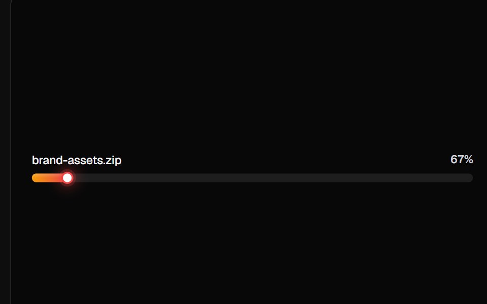 Linear Progress BarsReactFrame · ReactA card of linear progress rows, plain ratio bars, file-upload rows with icons/subtitles/shimmer, milestone ticks, and…
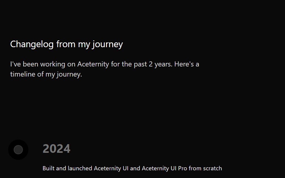 TimelineAceternity UI · React
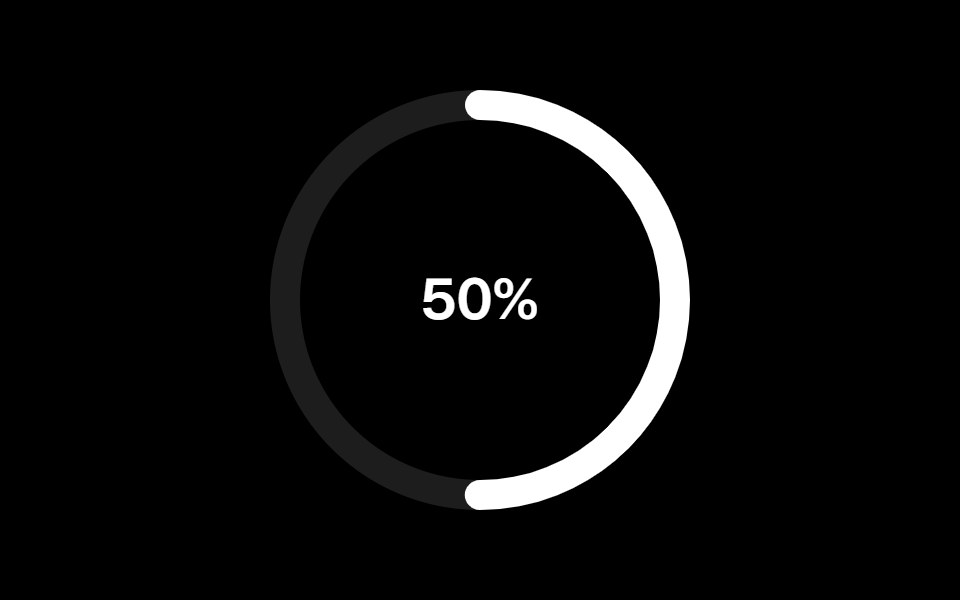 Progress Circularark-cn · ReactA shadcn-style progress circular component built with Ark UI primitives.
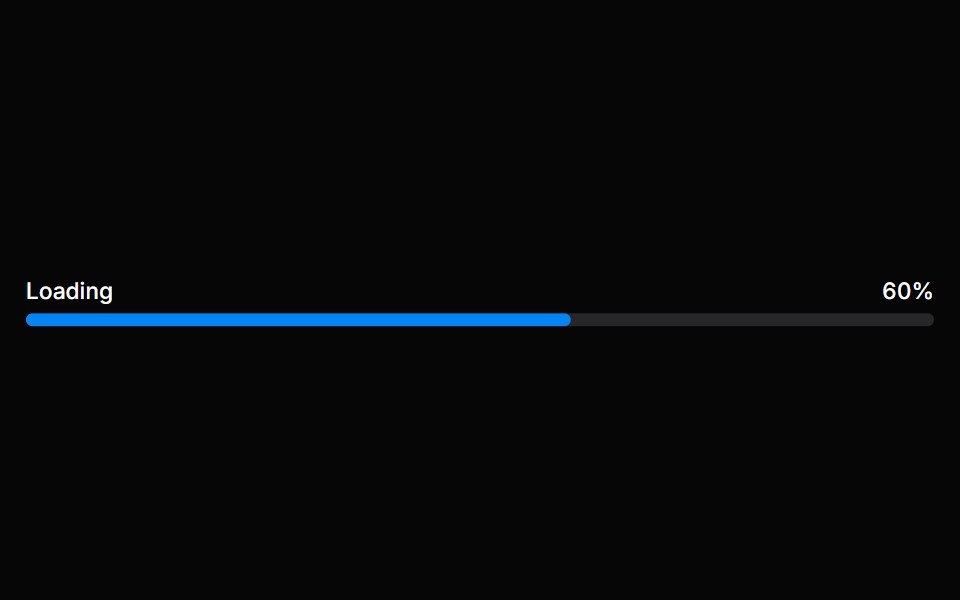 Progress BarHeroUI · ReactA progress bar shows either determinate or indeterminate progress of an operation over time.
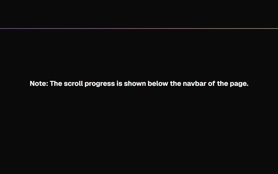 Scroll ProgressMagic UI · ReactAnimated Scroll Progress for your pages
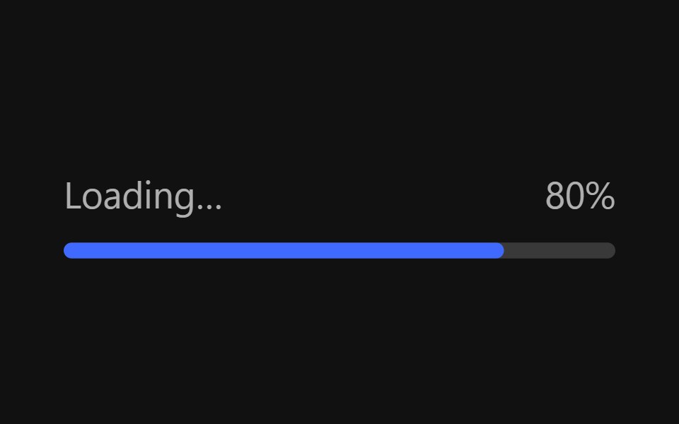 Progress BarReact Spectrum · ReactProgressBars show the progression of a system operation: downloading, uploading, processing, etc., in a visual way…
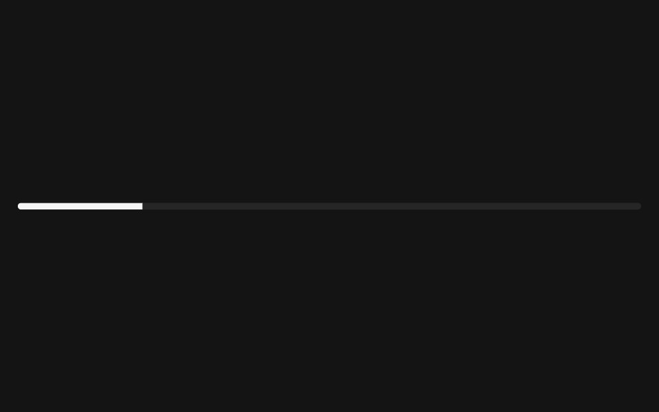 Progresscoss ui · ReactDisplays the status of a task that takes a long time.
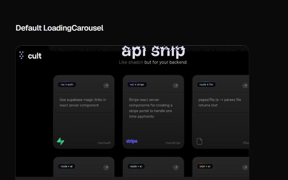 Loading CarouselCult UI · ReactLoading carousel component with smooth transitions and customizable content
 Progress CircleTremor · React
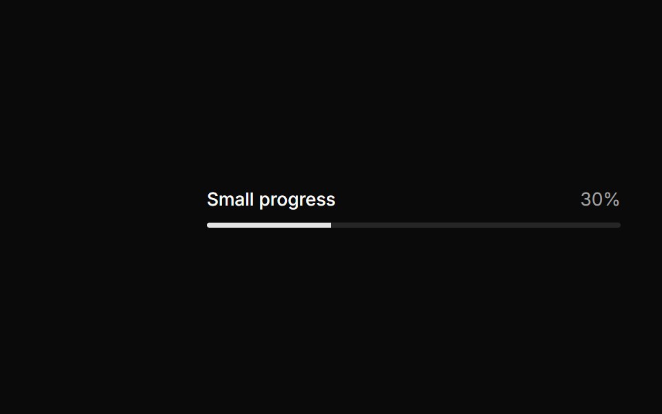 Small progress.ReUI · ReactSmall progress.
 Progress IndicatorAmicro Micro Transitions · ReactHorizontal page scroll progress indicator bar.
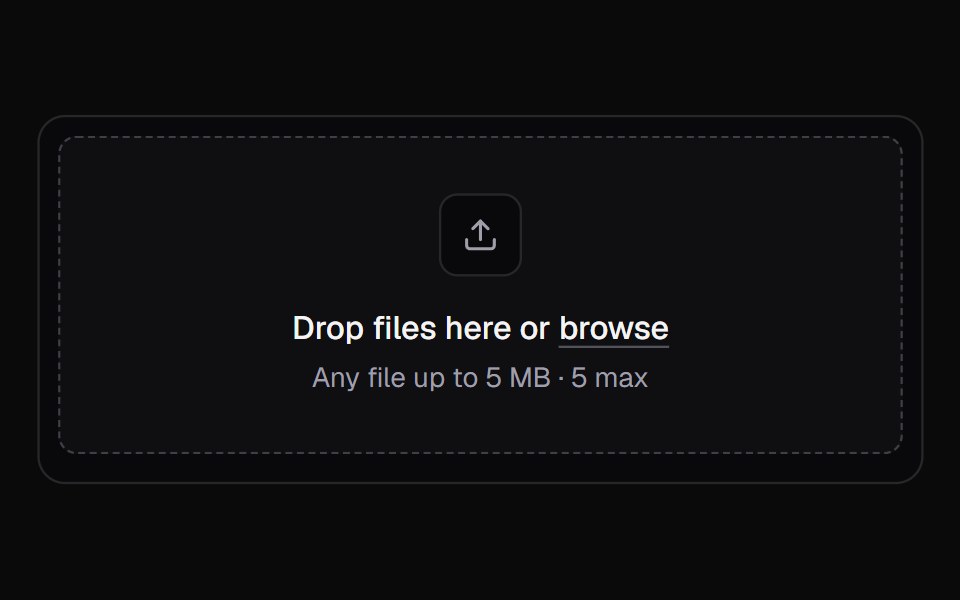 File UploadKokonut UI · ReactA multi-file upload queue with per-file progress, retry and cancel.
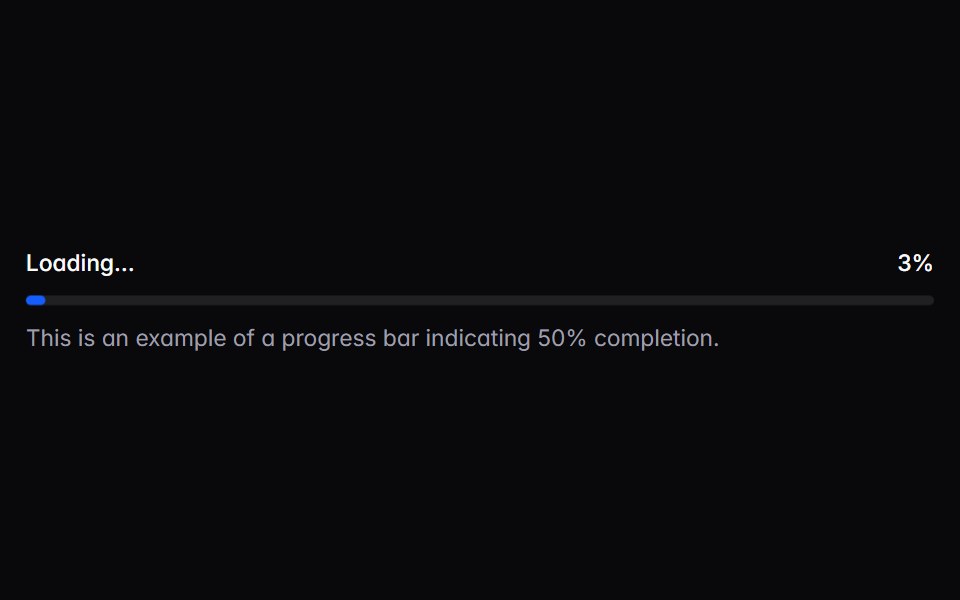 progress-barIntent UI · Reactprogress-bar
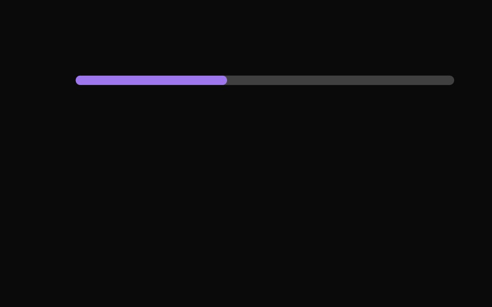 Progress IndicatorsUntitled UI React · React
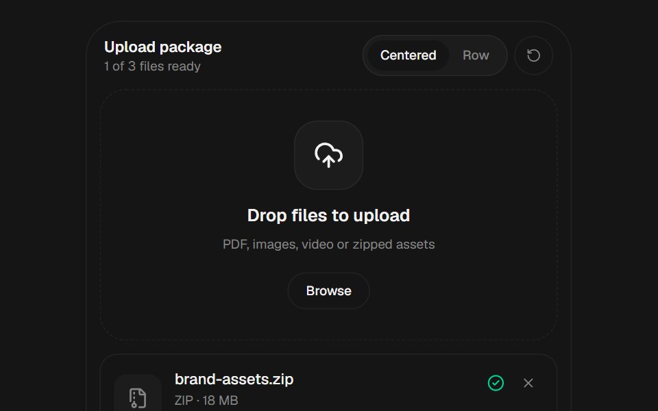 File UploadbeUI · React
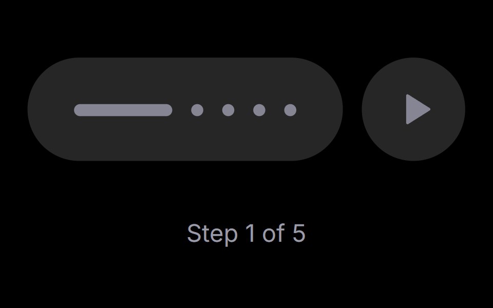 Step PlayerRare UI · ReactAn iOS-style stepped progress track with a play, pause and replay control. The active step stretches into a bar that…
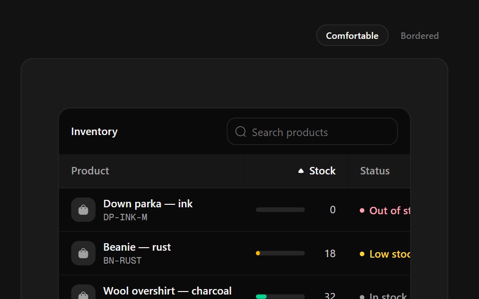 Inventory TableSpectrum UI · ReactStock management with SKU tiles, capacity meters that change color at thresholds and status labels.
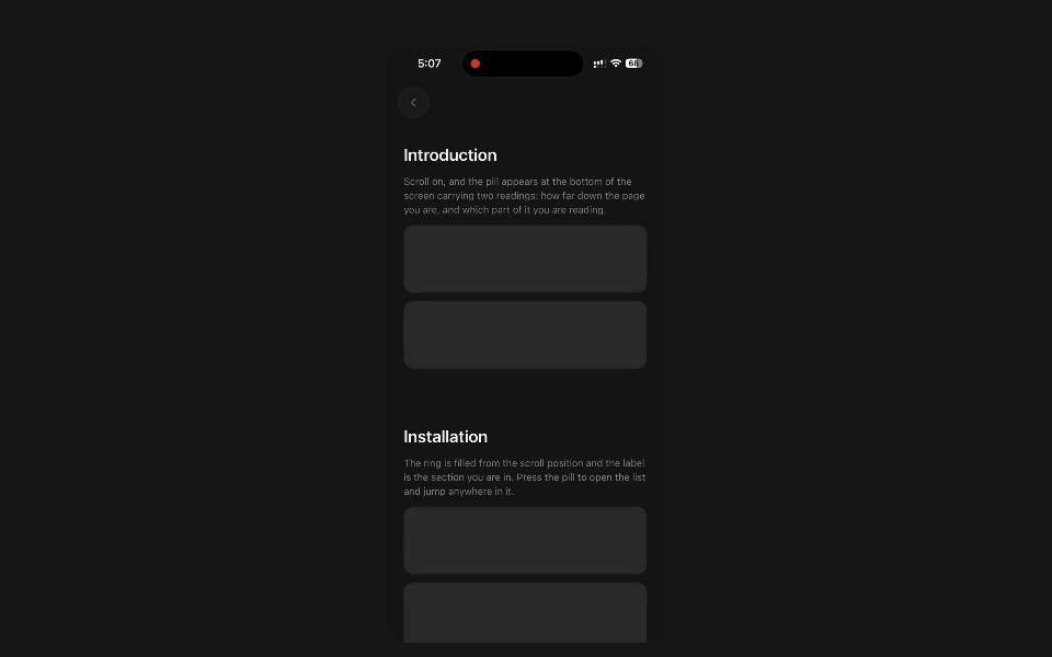 Section ProgressPanel UI · React NativeFloating pill with a scroll ring and the section being read.
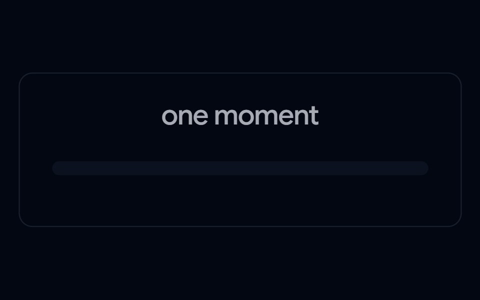 Progress 04 - Shimmer Status ProgressShadcn Space · ReactAnimated progressbar with real-time text updates, smooth entrance and exit animations, and a polished UI.
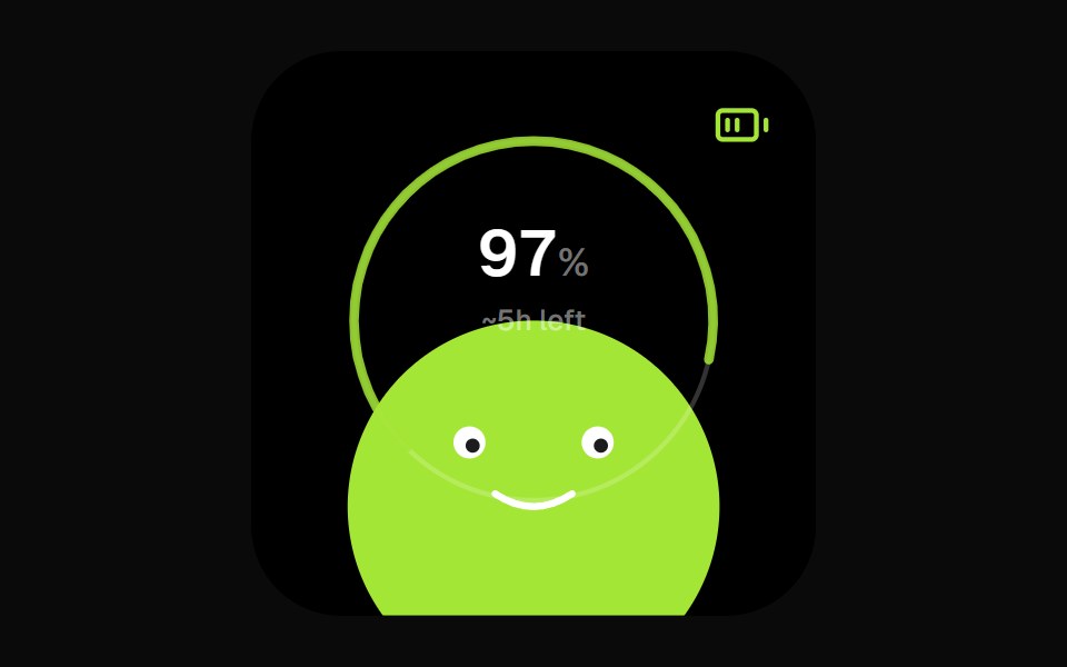 Battery Face WidgetOpenSourceUI · React
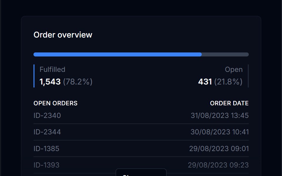 Progress BarTremor Blocks · React
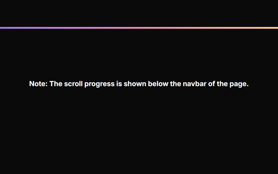 Scroll ProgressAnimations (Svelte) · SvelteA fixed progress bar component that indicates page scroll progress with a gradient color effect.
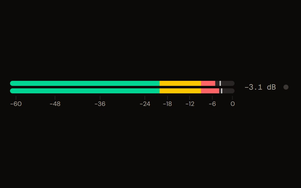 Level Meteraudiocn · ReactA peak and RMS level meter: mono or stereo, horizontal or vertical, solid, segmented or gradient, with zones, peak…
 ProgressShark UI · ReactDisplays task progress with a linear indicator.
 Labeled Progress Indicator BaseWatermelon UI · React
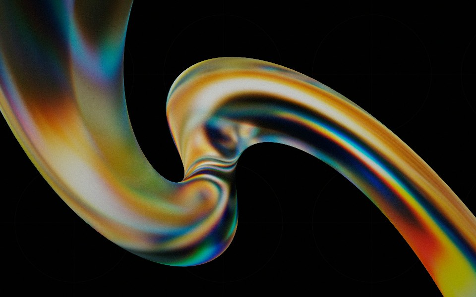 Progressglasscn · React
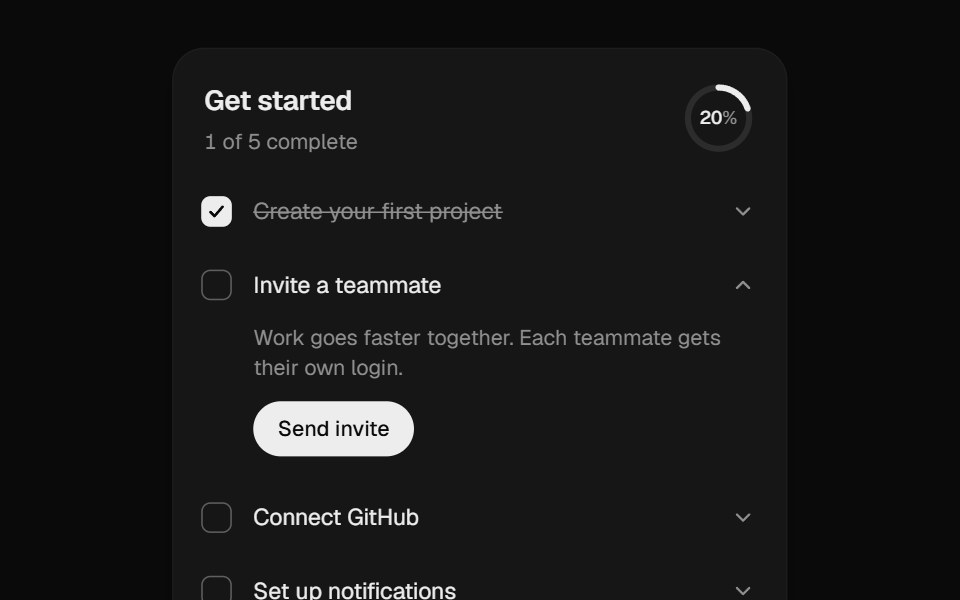 Onboarding ChecklistUI Lab · ReactA setup checklist that counts up as you go and celebrates the finish.
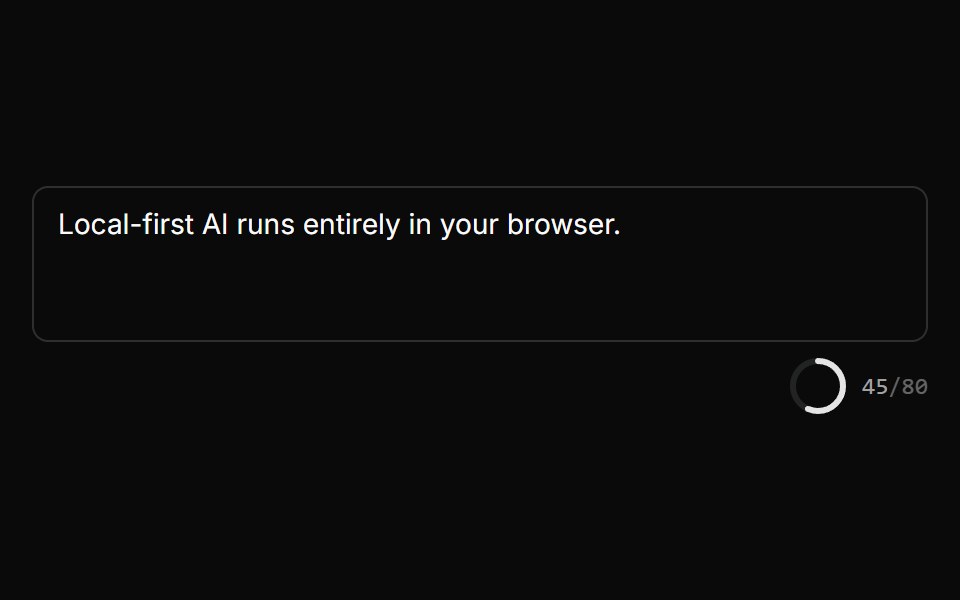 Char Limit IndicatorLocalMode · ReactA radial progress ring + n/MAX monospace counter that turns error-colored when over the limit, deriving the percentage…
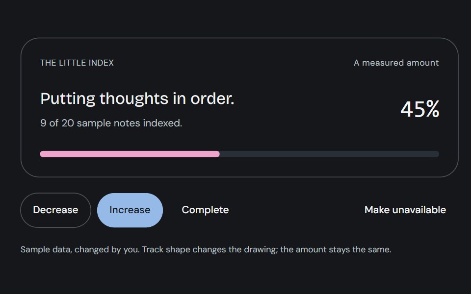 ProgressCojeev UI · ReactOne measured amount, explained as an inline task, a small report or connected milestones—with independent organic…
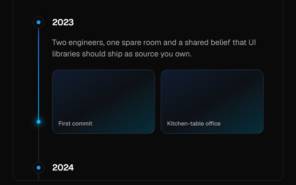 TimelineVelora UI · ReactVertical timeline with sticky labels and a gradient beam that fills as you scroll.
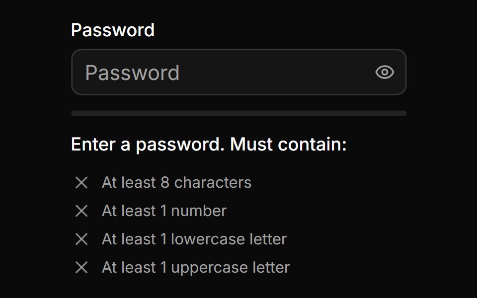 Password Input With Strength Inidicatorsv-particles · Svelte
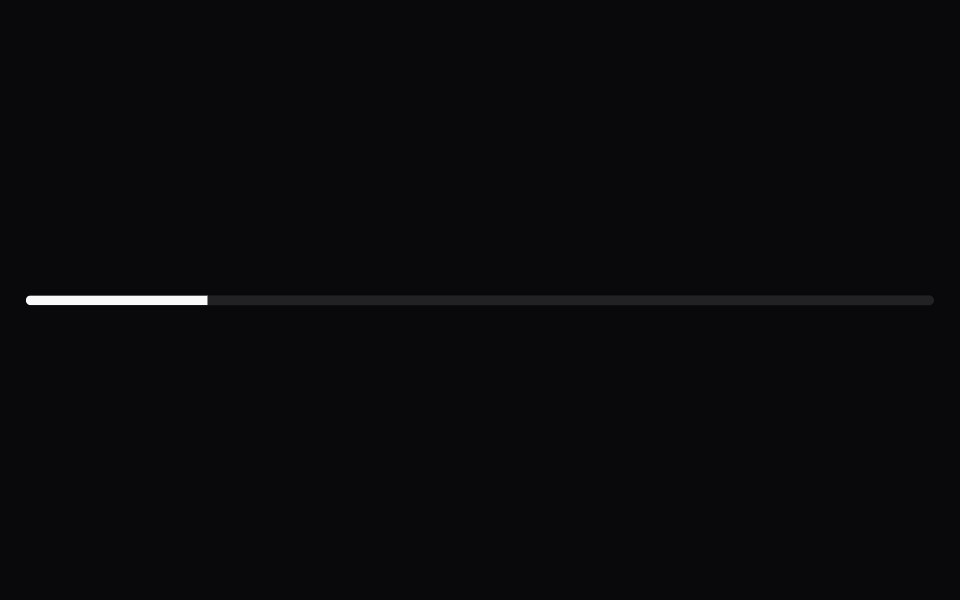 ProgressSpaceUI · ReactDisplays an animated progress bar indicating how much of a task or file upload has completed so users know how long to…
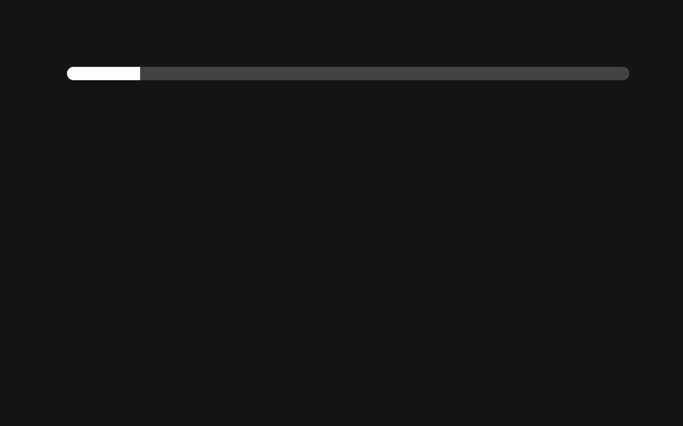 ProgressD2Studio UI · ReactDisplays an indicator showing the completion progress of a task.
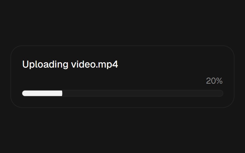 ProgressEaseUI · ReactProgress bar that fills with scale instead of width, plus an indeterminate state for unknown durations.
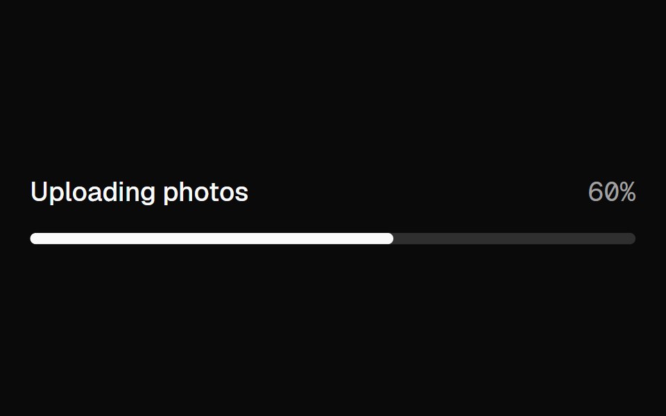 ProgressFibo · ReactShows how far a task has got, or that it's under way.
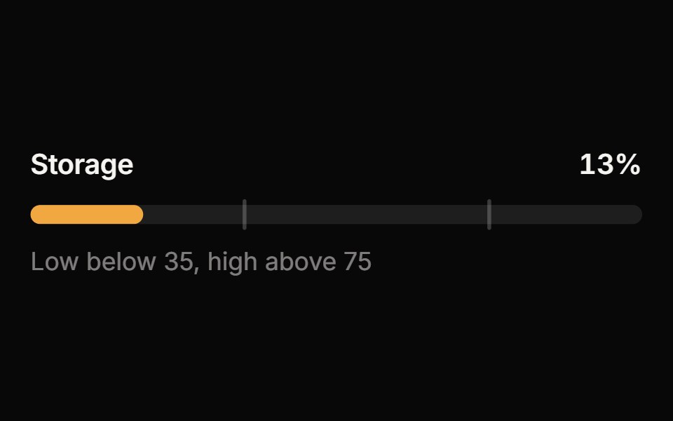 MeterReactFrame · ReactA meter for a value within a known range: bar, semicircle gauge or segmented variants with threshold zones, animated…
 Tracing BeamAceternity UI · React
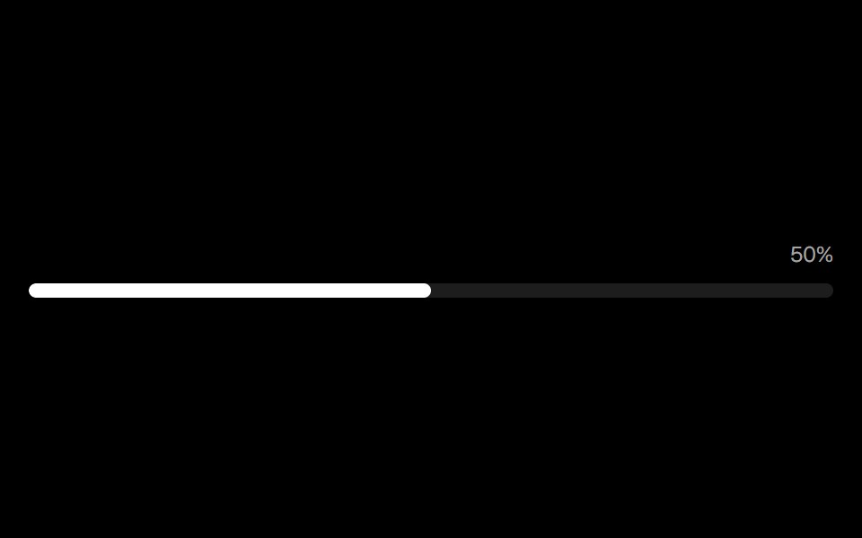 Progress Linearark-cn · ReactA shadcn-style progress linear component built with Ark UI primitives.
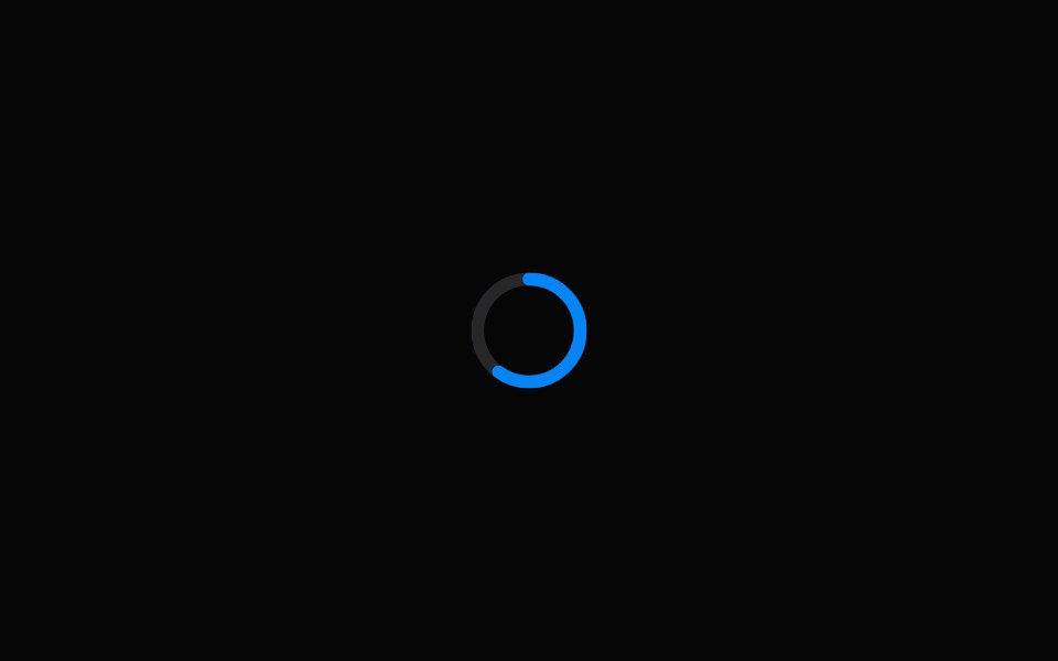 Progress CircleHeroUI · ReactA circular progress indicator that shows determinate or indeterminate progress.
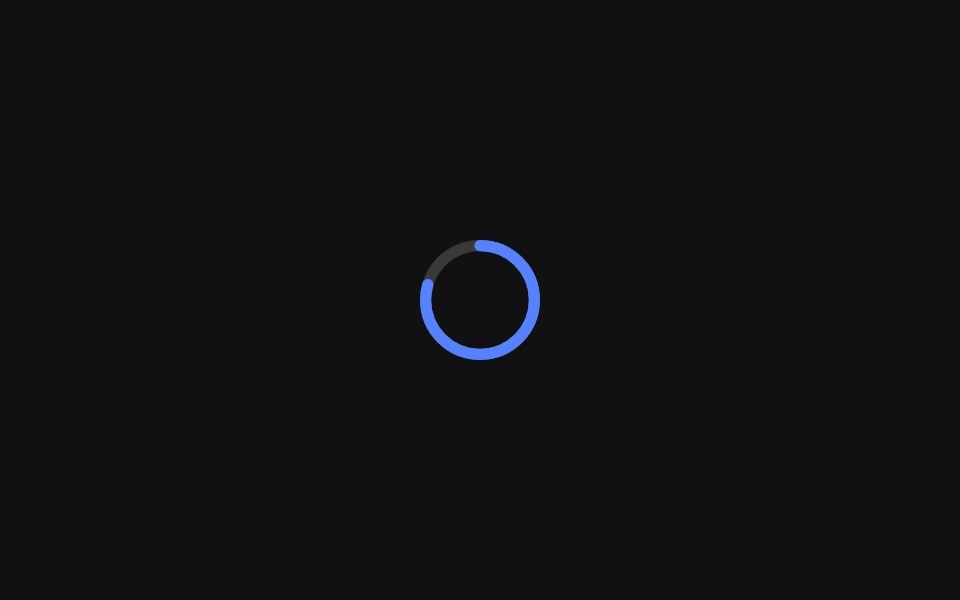 Progress CircleReact Spectrum · ReactProgressCircles show the progression of a system operation such as downloading, uploading, or processing, in a visual…
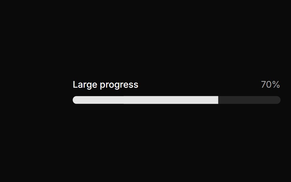 Large progress.ReUI · ReactLarge progress.
 Progress StepperAmicro Micro Transitions · ReactHorizontal step line (STEP 1 → STEP 2 → STEP 3) with animated fill bar.
 progress-circleIntent UI · Reactprogress-circle
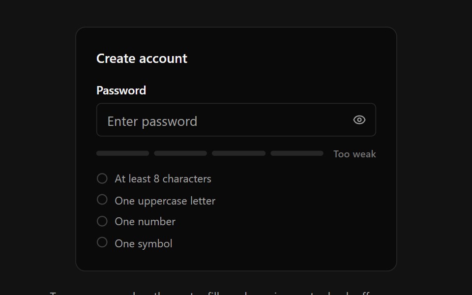 Password StrengthSpectrum UI · ReactA password input with an animated four-segment strength meter, crossfading strength label, requirements checklist with…
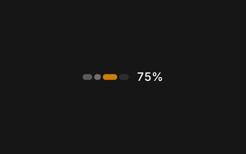 Web UsagePanel UI · React NativeA usage and credits panel for an AI app: credit used, renewal date and context compaction.
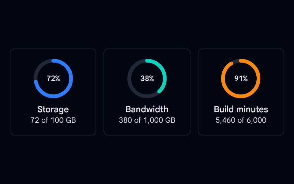 Progress 05 - Circular RingsShadcn Space · ReactSVG circular progress rings for storage, bandwidth, and build minutes with a centered percentage and usage details.
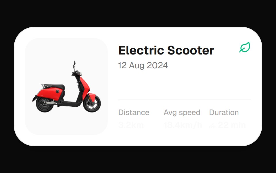 Electric Scooter WidgetOpenSourceUI · React
 Progress CircleTremor Blocks · React
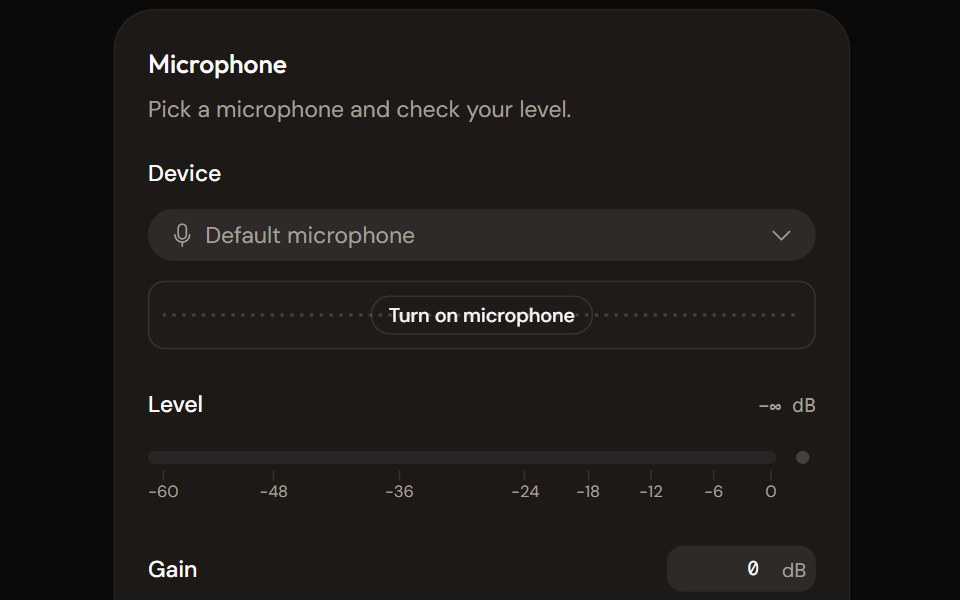 Microphone Setupaudiocn · ReactChoose and check a microphone: device select with a live preview, a level meter, gain, mute and a level check that…
 ProgressWatermelon UI · React
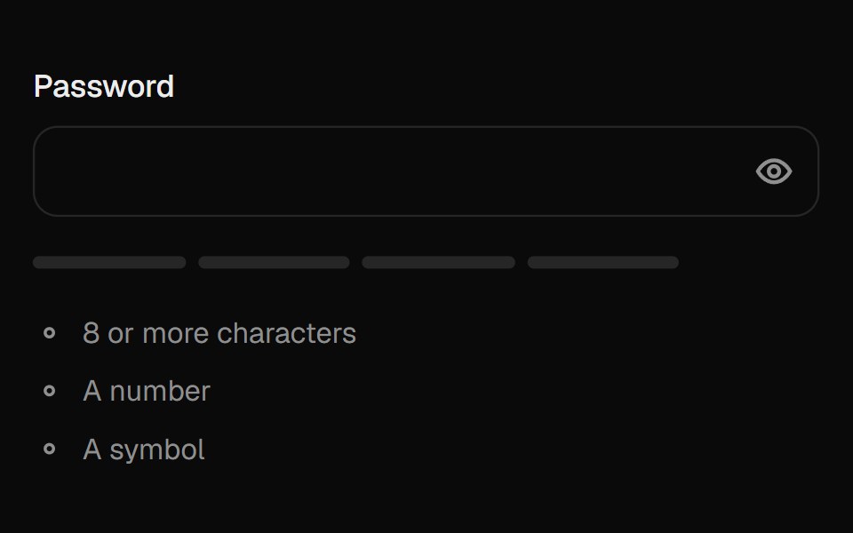 Password FieldUI Lab · ReactReveals the password with a wave of dots turning into letters; the meter fills as it gets stronger.
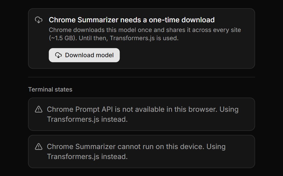 Chrome AI Download GateLocalMode · ReactThe gate a user sees when a Chrome Built-in AI capability exists but its on-device model has not been fetched yet…
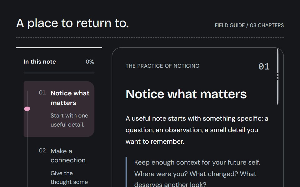 Reading trailCojeev UI · ReactKeep your place with a connected spine, an expandable bookmark or a descriptive chapter overview—all following actual…
 Tracing BeamVelora UI · ReactGradient line that draws itself down long-form content.
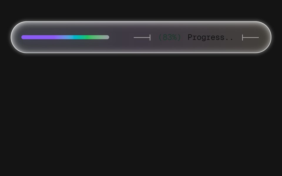 Progress BarD2Studio UI · ReactA frosted-glass progress pill with technical-drawing leader lines bracketing a monospace readout. Three levels of…
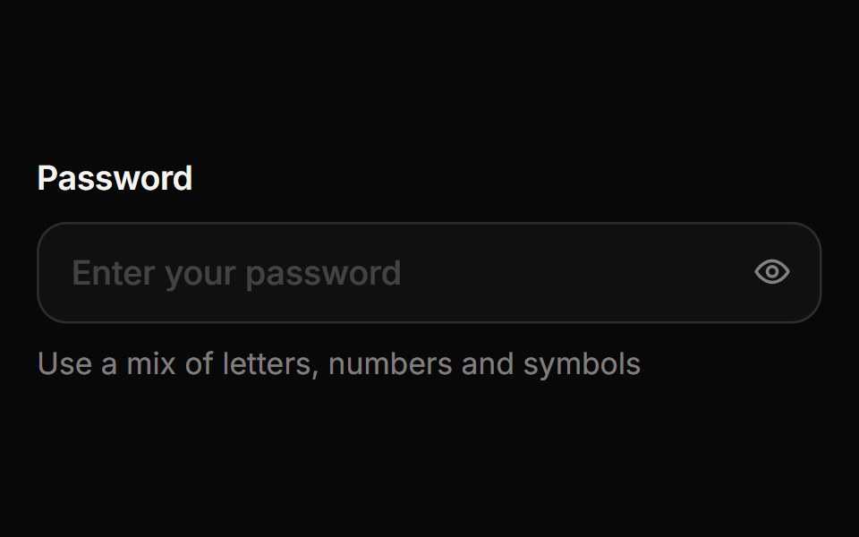 Password InputReactFrame · ReactA password field with an animated show/hide eye toggle, a four-segment strength meter, a live requirements checklist…
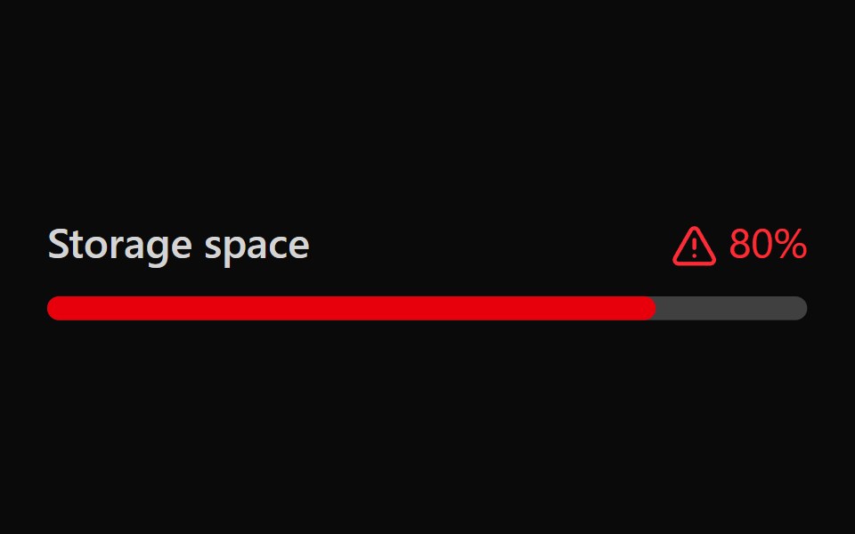 Tailwind MeterReact Spectrum · React
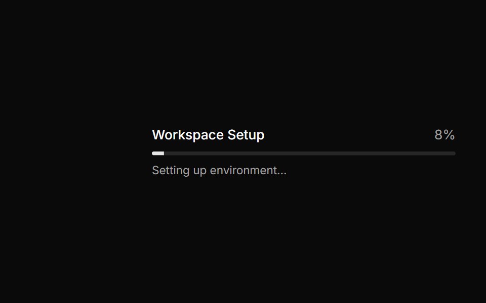 Progress bar with status messages.ReUI · ReactProgress bar with status messages.
 Segmented Arc MeterAmicro Micro Transitions · ReactStepped 4-bar discrete vertical gauge with percentage readout.
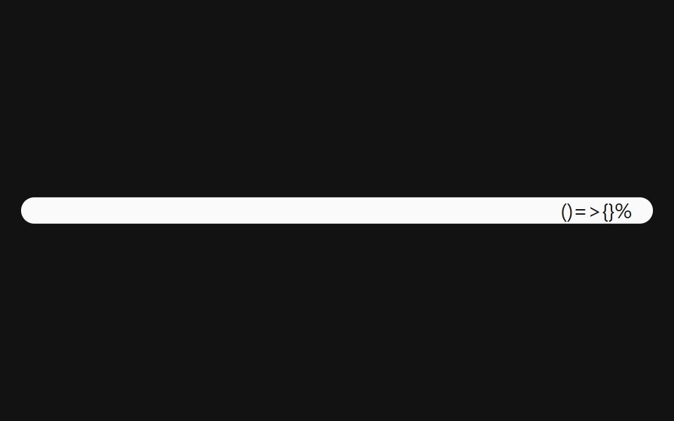 Progress With ValueSpectrum UI · Reactcomponent for the Progress With Value
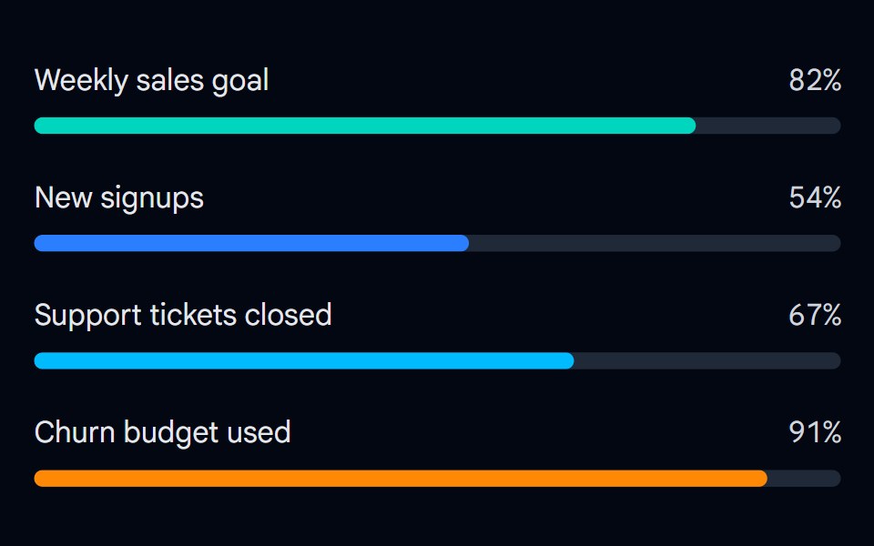 Progress 06 - Labeled ColorsShadcn Space · ReactGoal progress bars with a label, a percentage value, and a different color per bar, composed from the progress…
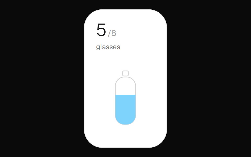 Hydration WidgetOpenSourceUI · React
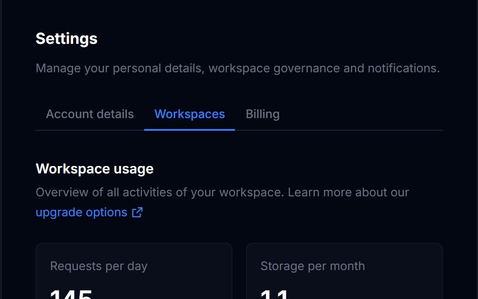 Billing Usage 01Tremor Blocks · React
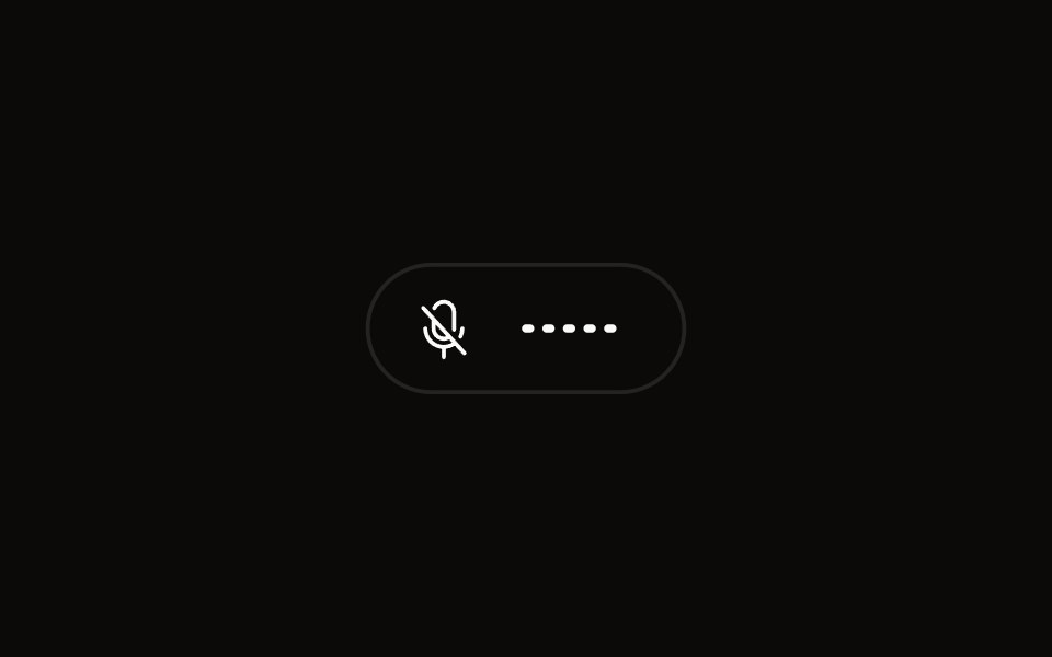 Quick Audio Popoveraudiocn · ReactCompact microphone and system audio controls behind one toolbar button that shows a live level.
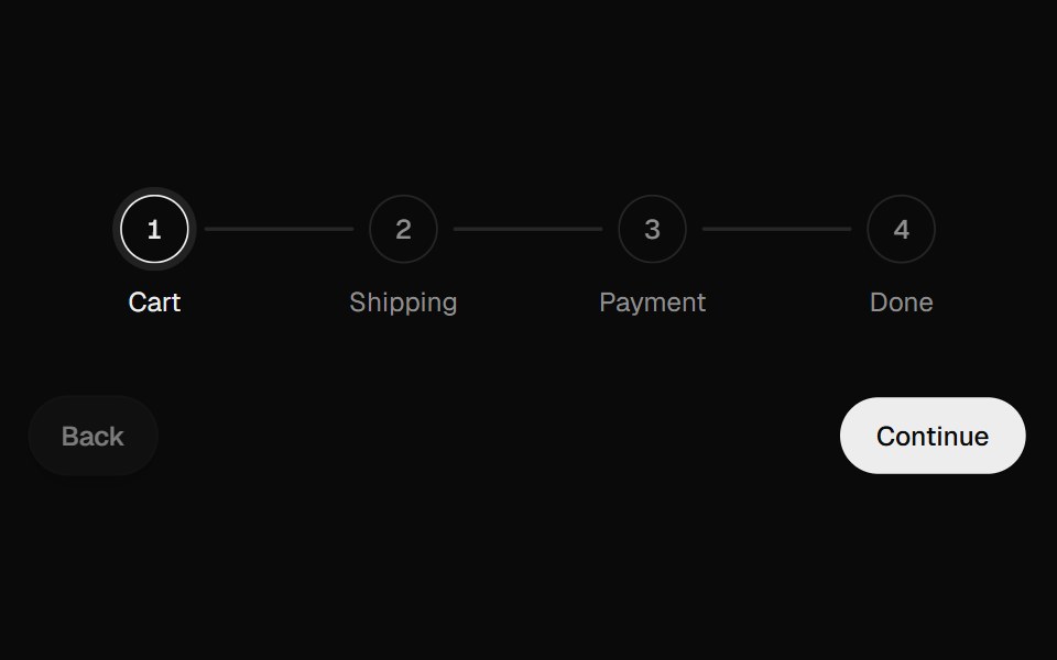 Progress StepperUI Lab · ReactFills the line toward the next step and unfills it in reverse.
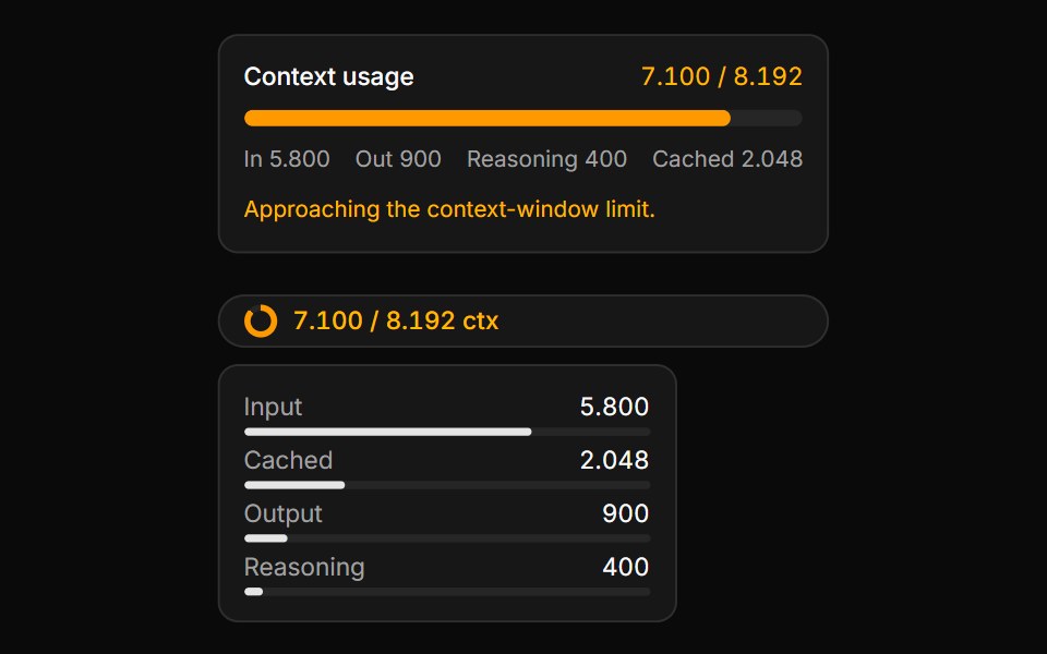 Context Usage MeterLocalMode · ReactA token / context-window budget meter (with composable Context/ContextTrigger/ContextContent/ContextInputUsage/ContextO…
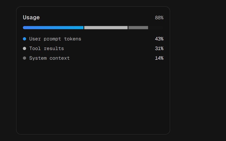 Usage SplitD2Studio UI · ReactToken usage split three ways across one shared track. The segments sit in a single rail rather than three of their…
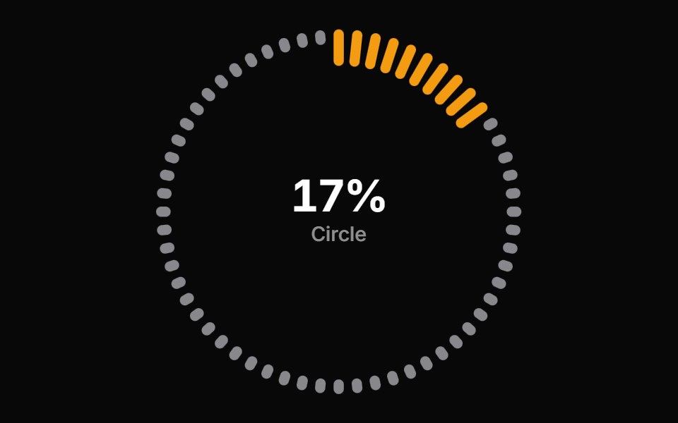 Progress Circle BarsReactFrame · ReactA circular progress indicator with ring, gauge, and dashes arc styles, scroll-triggered count-up animation, color…
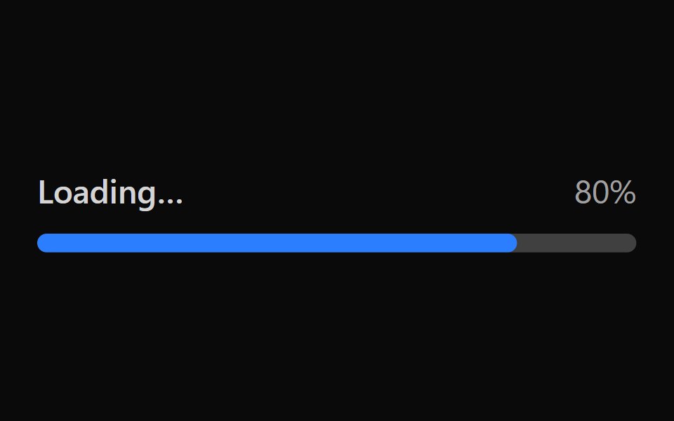 Tailwind Progress BarReact Spectrum · React
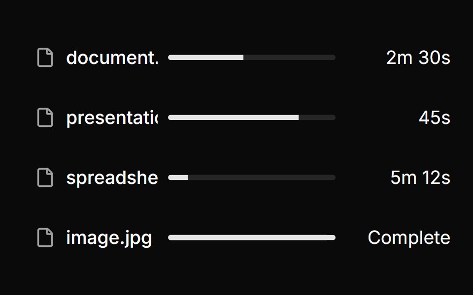 File upload list with progress & status.ReUI · ReactFile upload list with progress & status.
 Segmented Step BarAmicro Micro Transitions · ReactBattery-style multi-segment discrete progress bar with stepped fill.
Libraries with Tailwind CSS progress components
Related categories
- Progress Components
- React Progress Components
- Animated Progress Components
- shadcn/ui Progress Components
- Tailwind CSS Feedback Components
- Tailwind CSS Spinner Components
- Tailwind CSS Badge Components
- Tailwind CSS Alert Components
- Tailwind CSS Chip Components
- Tailwind CSS Progress Bar Components
- Tailwind CSS Empty State Components
- Tailwind CSS Notification Components
- Tailwind CSS Banner Components
- Tailwind CSS Status Indicator Components
- Tailwind CSS Skeleton Components
- Tailwind CSS Typing Indicator Components
- Tailwind CSS Progress Circle Components
- Tailwind CSS Error State Components
- Tailwind CSS Scroll Progress Components
- Tailwind CSS Success Animation Components