Progress
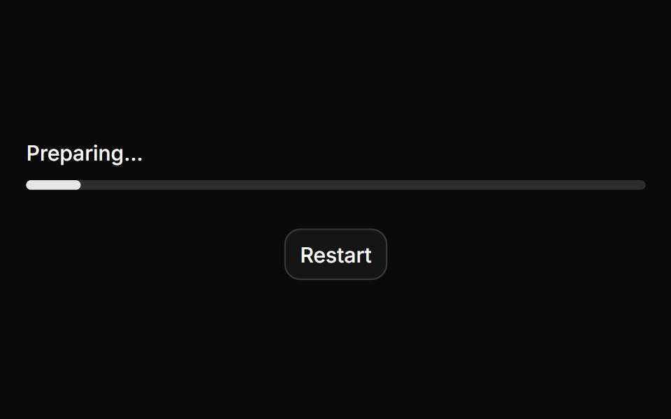
A bar or ring that shows how far a task has come, eases between updates and slides while the total is unknown.
- Library
- HextaUI
- Framework
- React
- Type
- ui
- License
- MIT
- Dependencies
- @base-ui/react@^1.8.0, class-variance-authority, cn
- Install
npx shadcn@latest add https://hextaui.com/r/progress.json- Files
components/ui/progress.tsx
- Source
- https://github.com/preetsuthar17/hextaui
Categories
- Feedback Components
- React Feedback Components
- Tailwind CSS Feedback Components
- Animated Feedback Components
- Progress Components
- React Progress Components
- Tailwind CSS Progress Components
- Animated Progress Components
- Progress Bar Components
- React Progress Bar Components
- Tailwind CSS Progress Bar Components
- Animated Progress Bar Components