 Dev Design Library
Tailwind CSS Progress Bar Components
Dev Design Library indexes 109 Tailwind CSS progress bar components from 41 open-source UI libraries, with the most coming from Tremor Blocks, LocalMode, ReUI, UI Lab and Spectrum UI. Each one links to its page with the source code, a live preview where available, the library license and the install command. Every library in this list styles its components with Tailwind CSS utility classes. Progress bar components belong to the Feedback group.
 Progressshadcn/ui · ReactDisplays an indicator showing the completion progress of a task, typically displayed as a progress bar.
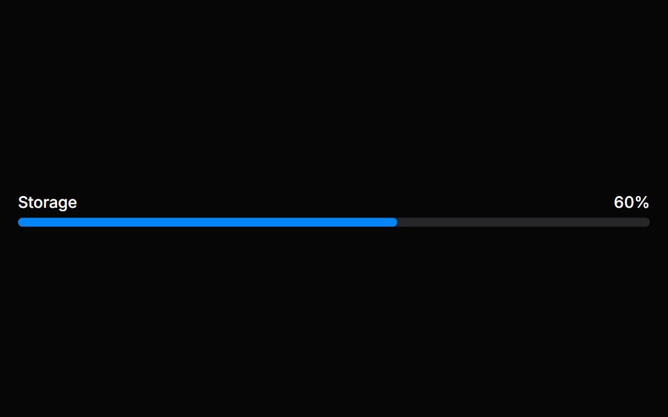 MeterHeroUI · ReactA meter represents a quantity within a known range, or a fractional value.
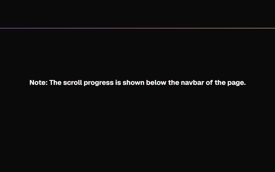 Scroll ProgressMagic UI · ReactAnimated Scroll Progress for your pages
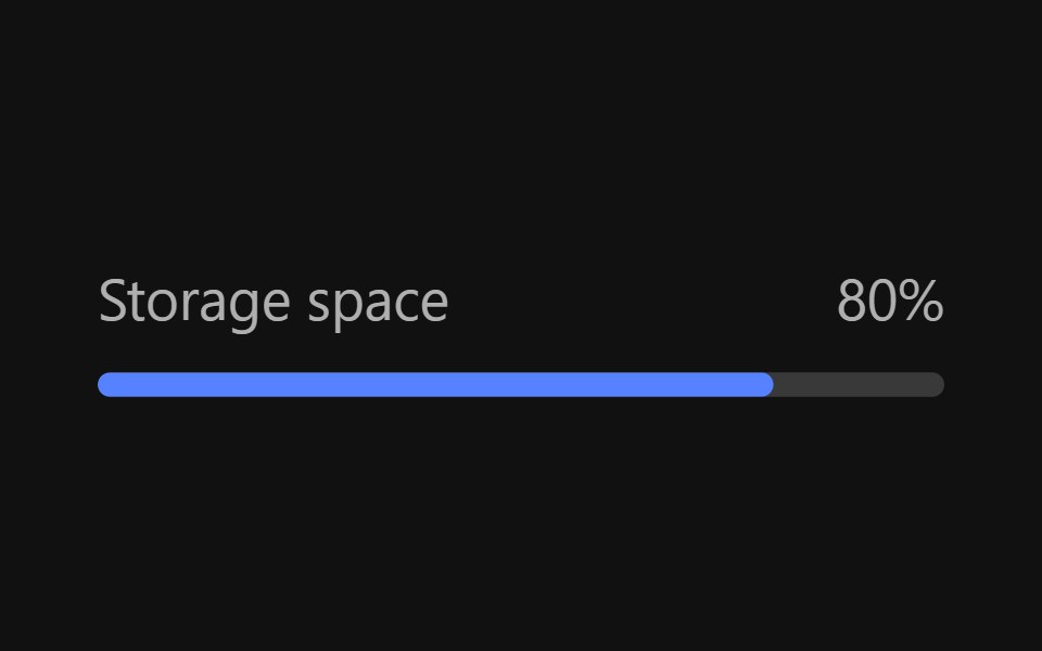 MeterReact Spectrum · ReactMeters are visual representations of a quantity or an achievement. Their progress is determined by user actions…
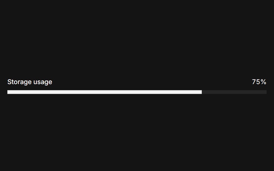 Metercoss ui · ReactA graphical display of a numeric value within a range.
 ProgressOrigin UI · ReactDisplays the status of a task that takes a long time.
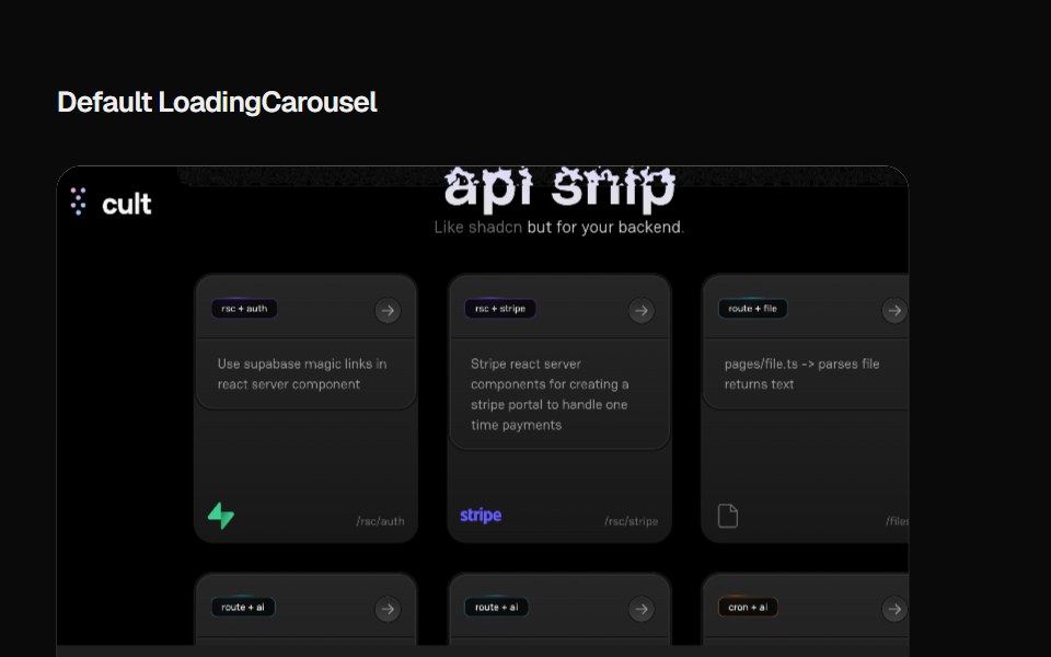 Loading CarouselCult UI · ReactLoading carousel component with smooth transitions and customizable content
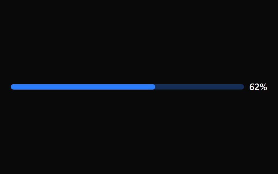 Progress BarTremor · React
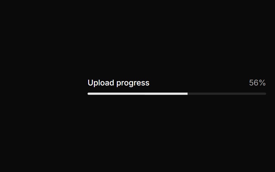 Basic progress.ReUI · ReactBasic progress.
 Progress IndicatorAmicro Micro Transitions · ReactHorizontal page scroll progress indicator bar.
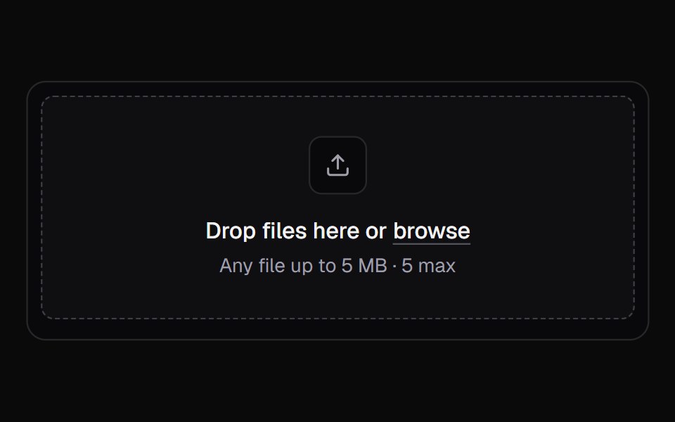 File UploadKokonut UI · ReactA multi-file upload queue with per-file progress, retry and cancel.
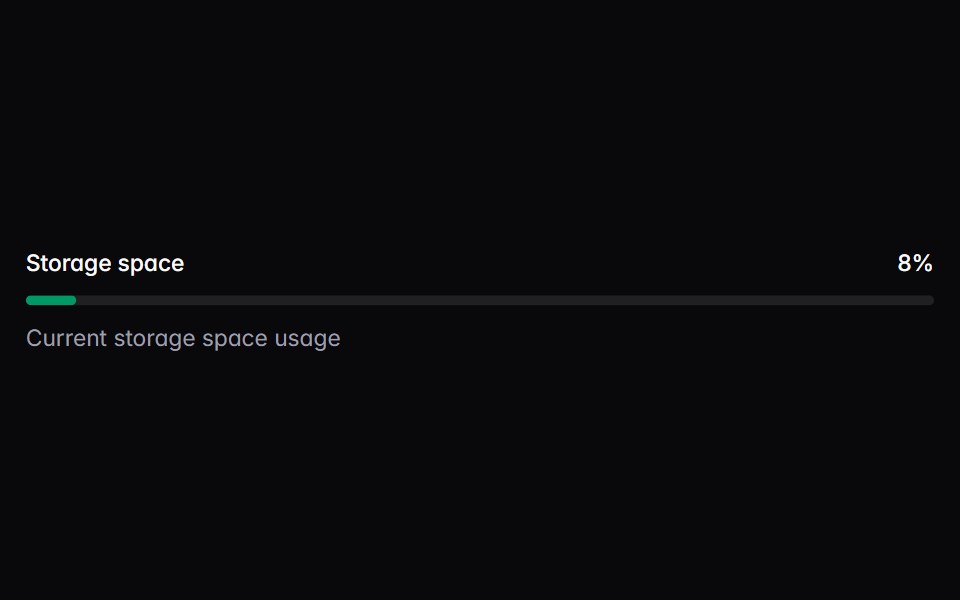 meterIntent UI · Reactmeter
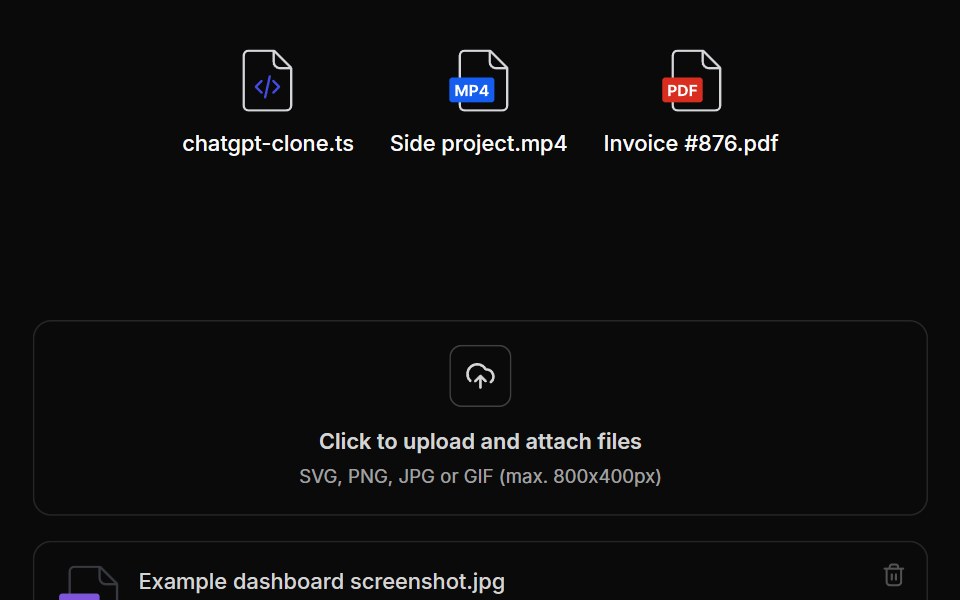 File UploadUntitled UI React · React
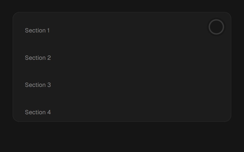 Scroll ProgressbeUI · ReactReading-progress indicator — fixed bar or circular ring — driven by scroll position via useSmoothScroll, with spring…
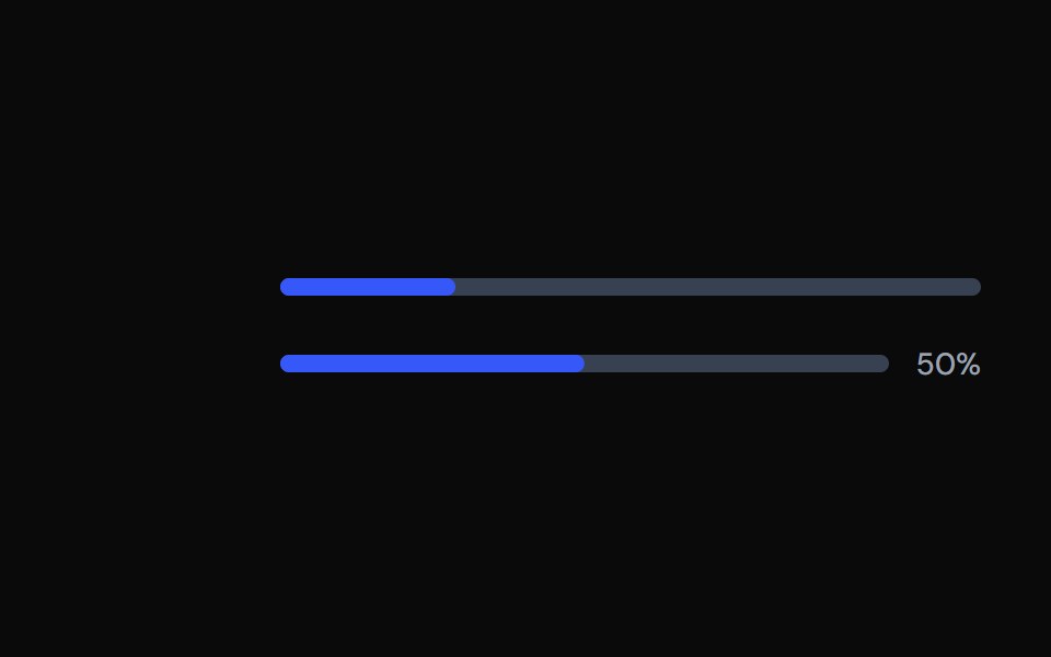 ProgressTailGrids · ReactA progress bar component with multiple variants.
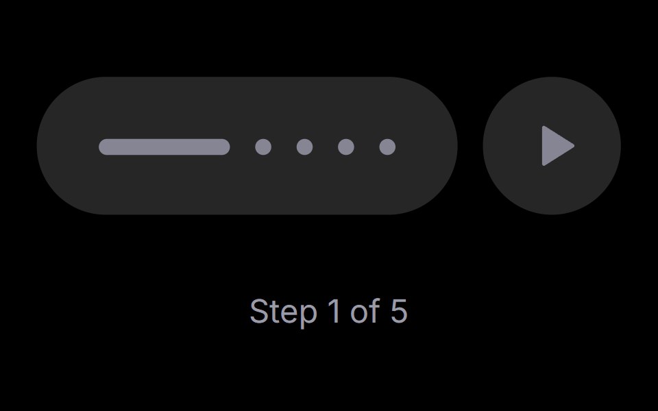 Step PlayerRare UI · ReactAn iOS-style stepped progress track with a play, pause and replay control. The active step stretches into a bar that…
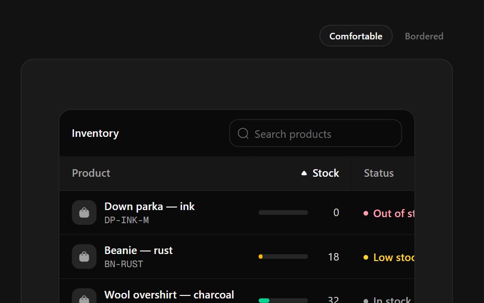 Inventory TableSpectrum UI · ReactStock management with SKU tiles, capacity meters that change color at thresholds and status labels.
 ProgressVengeance UI · React
 ProgressToolcraft · React
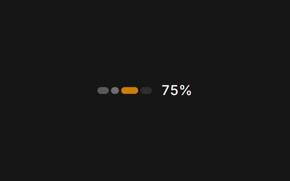 Web UsagePanel UI · React NativeA usage and credits panel for an AI app: credit used, renewal date and context compaction.
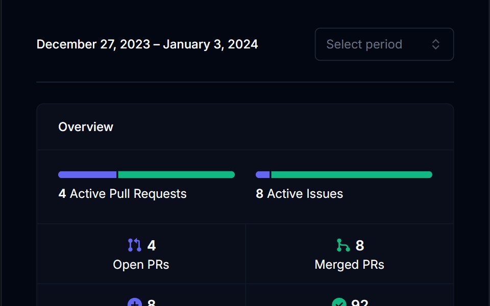 Category BarTremor Blocks · ReactSingle horizontal bar split into coloured segments, with threshold labels and an optional marker for the current value.
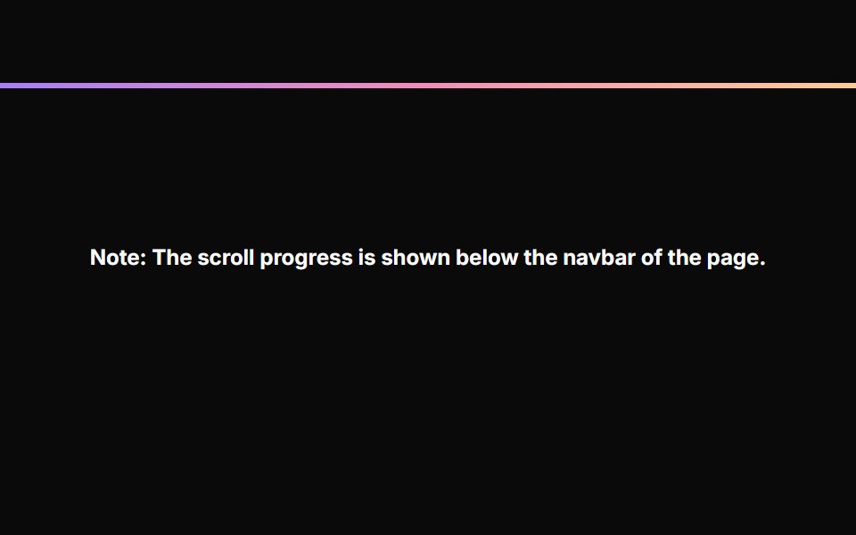 Scroll ProgressAnimations (Svelte) · SvelteA fixed progress bar component that indicates page scroll progress with a gradient color effect.
 ProgressObsidianUI · React
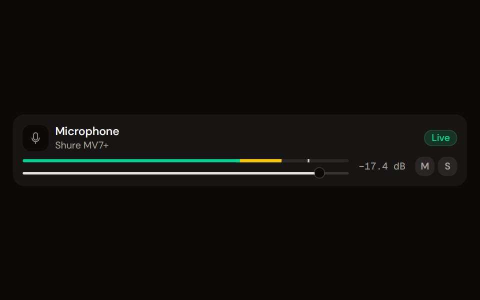 Channel Stripaudiocn · ReactOne channel of a mixer: header, status, meter, fader, value, controls and a notice, as a row or a console strip. The…
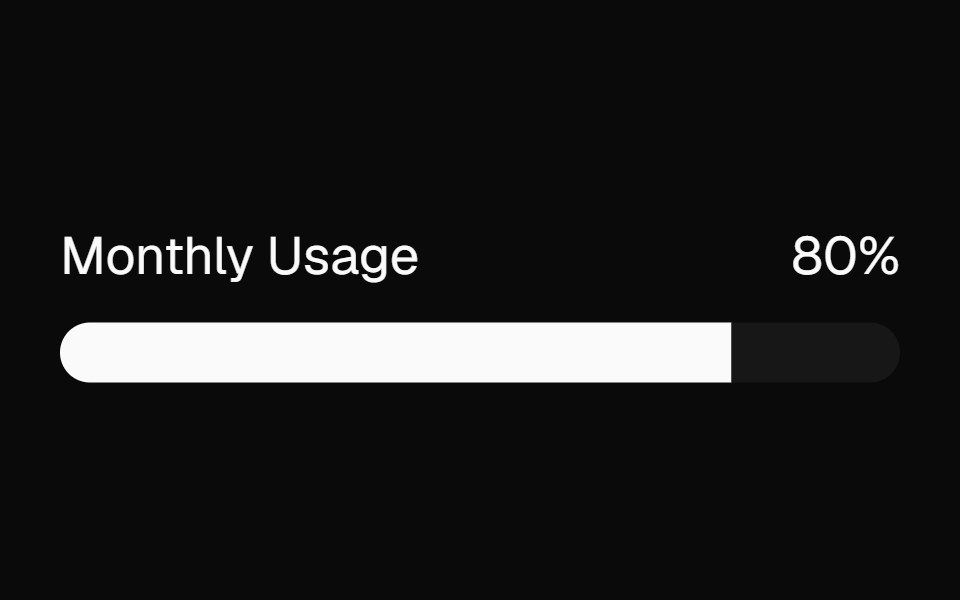 meterBaseLayer · ReactA meter represents a quantity within a known range, or a fractional value.
 ProgressShark UI · ReactDisplays task progress with a linear indicator.
 Labeled Progress IndicatorWatermelon UI · React
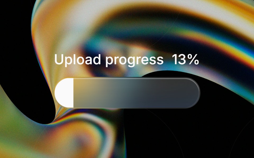 Glass Progressglasscn · ReactGlass Progress with five variants: clear, frosted, subtle, liquid, and liquid-refract
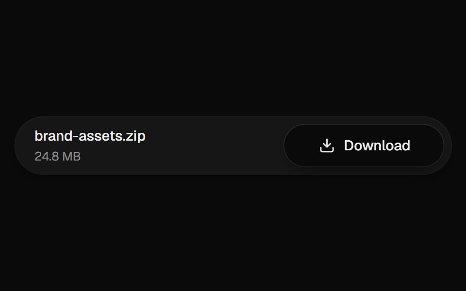 Download ButtonUI Lab · ReactThe arrow drops into the tray while the button fills with progress.
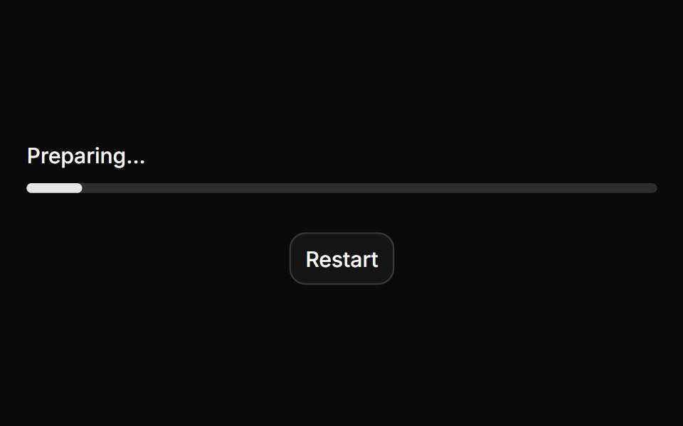 ProgressHextaUI · ReactA bar or ring that shows how far a task has come, eases between updates and slides while the total is unknown.
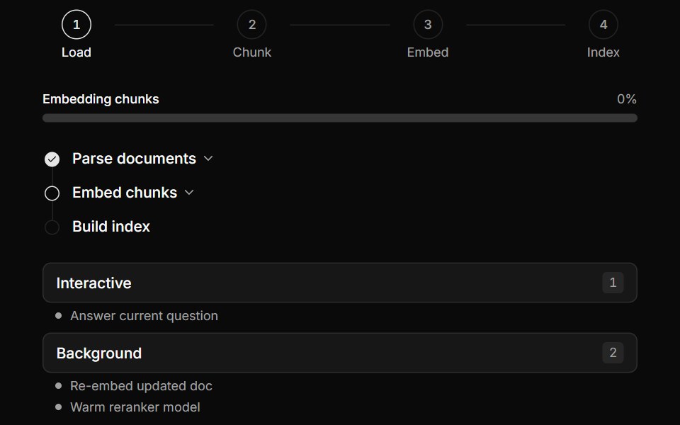 Multi-Step Pipeline TrackerLocalMode · ReactProgress surfaces for local workflows: a horizontal numbered-step indicator (active/completed/pending), a…
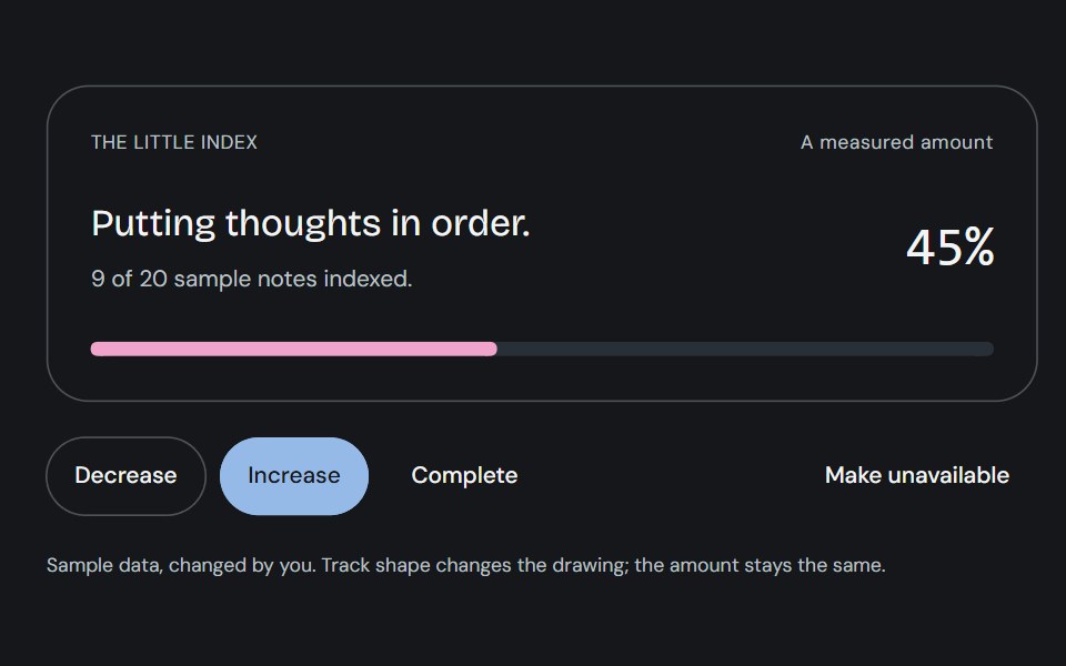 ProgressCojeev UI · ReactOne measured amount, explained as an inline task, a small report or connected milestones—with independent organic…
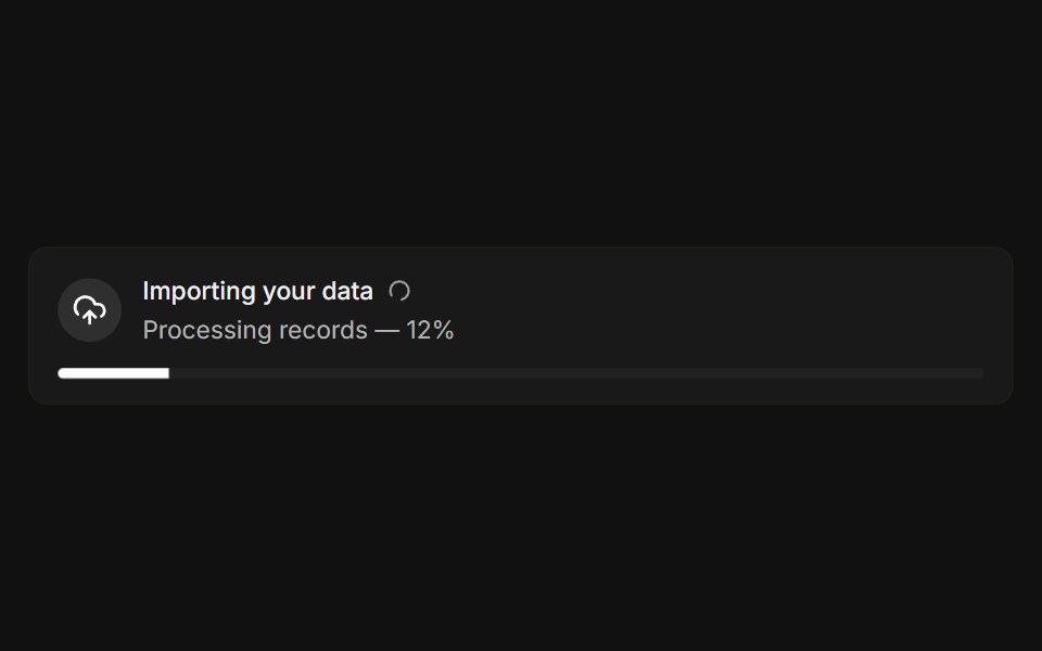 With progressFLX UI · ReactLive import banner with a spinner and a progress bar.
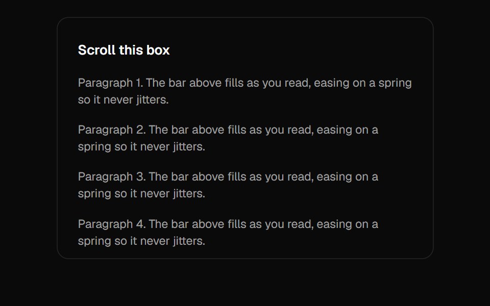 Scroll ProgressVelora UI · ReactGradient page-progress bar pinned to the top.
 Password Input With Strength Indicatorsv-particles · Svelte
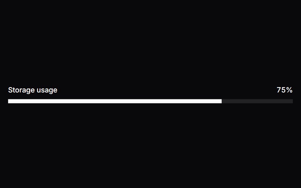 MeterSpaceUI · ReactDisplays a visual gauge bar showing a quantity within a known range, such as battery level, disk capacity, or password…
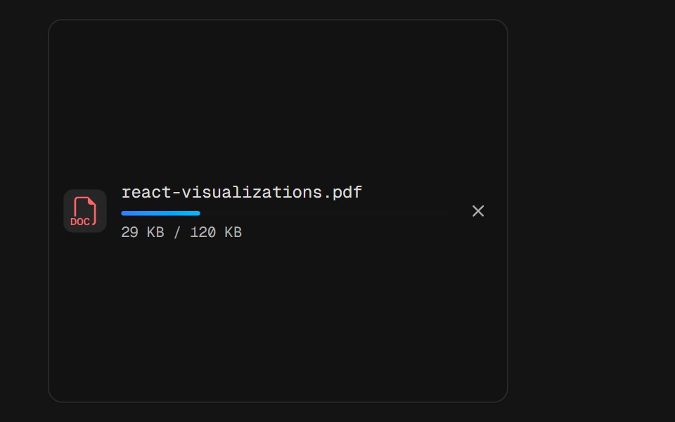 File UploadD2Studio UI · ReactA single upload row mid-flight: a PDF badge, the filename, a thin progress rail and the byte count under it. The bar…
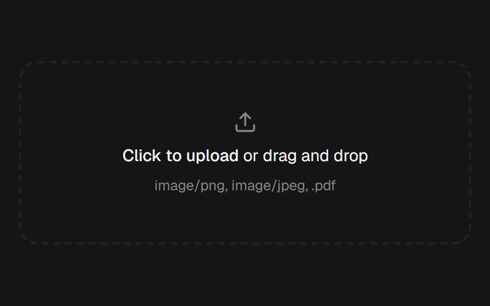 File UploadEaseUI · ReactDropzone that also opens the native file picker, with a list below it that pops each file in and collapses smoothly on…
 Chapter ScrubberFibo · ReactA rail of marks that swell under the pointer like the Dock, previewing the chapter at the crest.
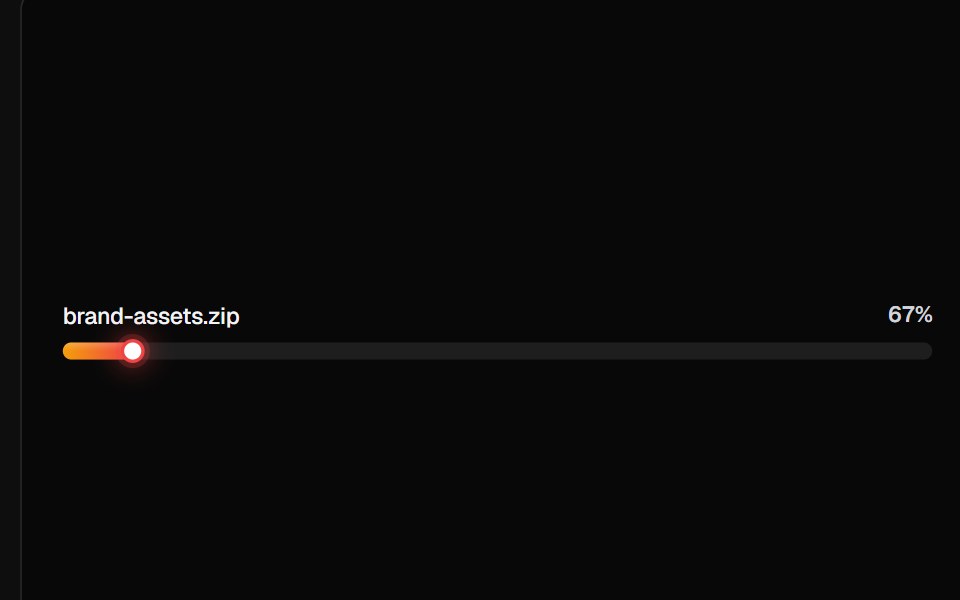 Linear Progress BarsReactFrame · ReactA card of linear progress rows, plain ratio bars, file-upload rows with icons/subtitles/shimmer, milestone ticks, and…
 Progress Linearark-cn · ReactA shadcn-style progress linear component built with Ark UI primitives.
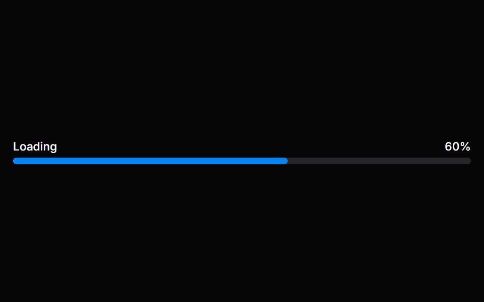 Progress BarHeroUI · ReactA progress bar shows either determinate or indeterminate progress of an operation over time.
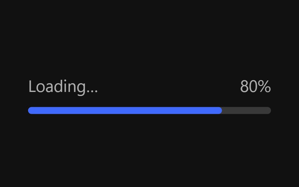 Progress BarReact Spectrum · ReactProgressBars show the progression of a system operation: downloading, uploading, processing, etc., in a visual way…
 Progresscoss ui · ReactDisplays the status of a task that takes a long time.
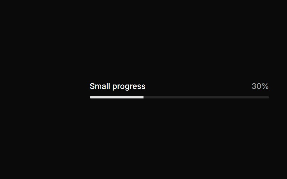 Small progress.ReUI · ReactSmall progress.
 Progress StepperAmicro Micro Transitions · ReactHorizontal step line (STEP 1 → STEP 2 → STEP 3) with animated fill bar.
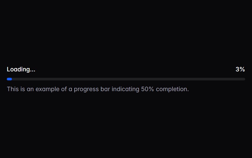 progress-barIntent UI · Reactprogress-bar
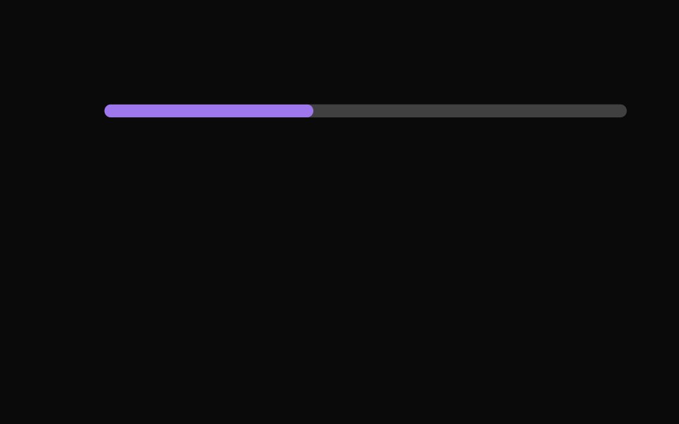 Progress IndicatorsUntitled UI React · React
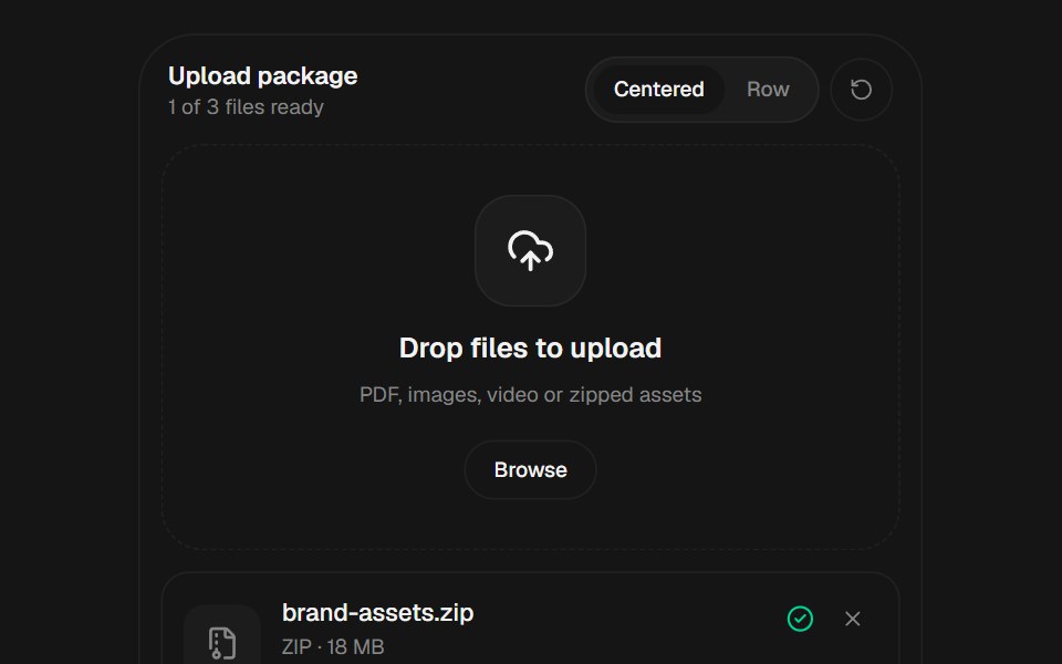 File UploadbeUI · React
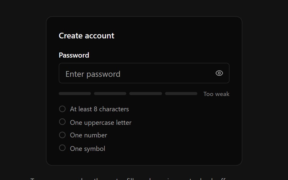 Password StrengthSpectrum UI · ReactA password input with an animated four-segment strength meter, crossfading strength label, requirements checklist with…
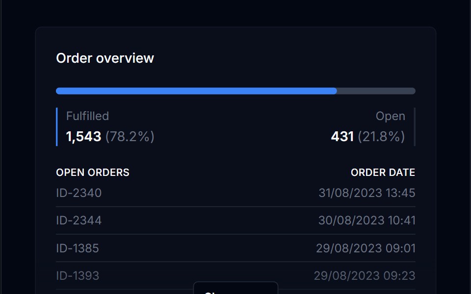 Progress BarTremor Blocks · React
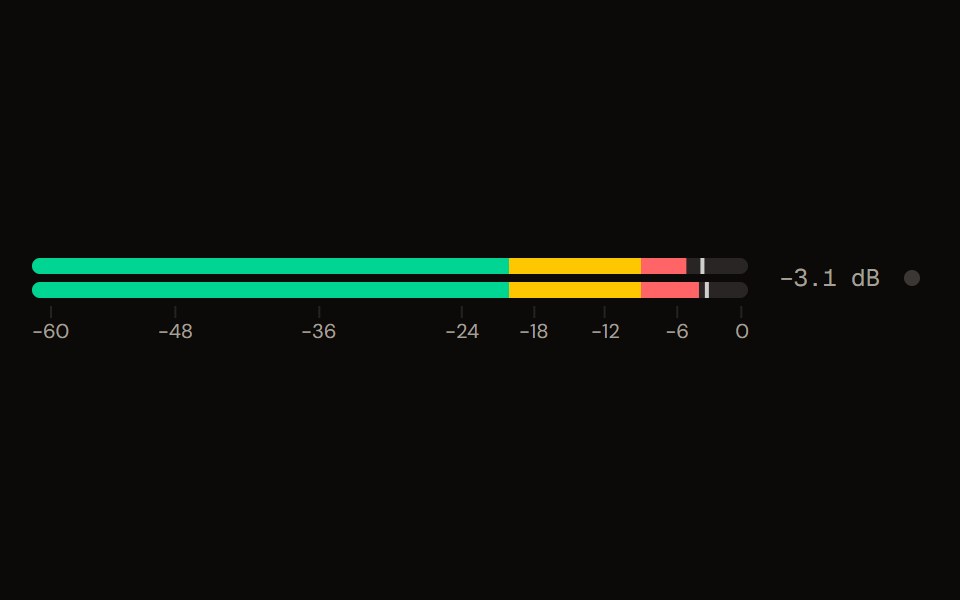 Level Meteraudiocn · ReactA peak and RMS level meter: mono or stereo, horizontal or vertical, solid, segmented or gradient, with zones, peak…
 Labeled Progress Indicator BaseWatermelon UI · React
 Progressglasscn · React
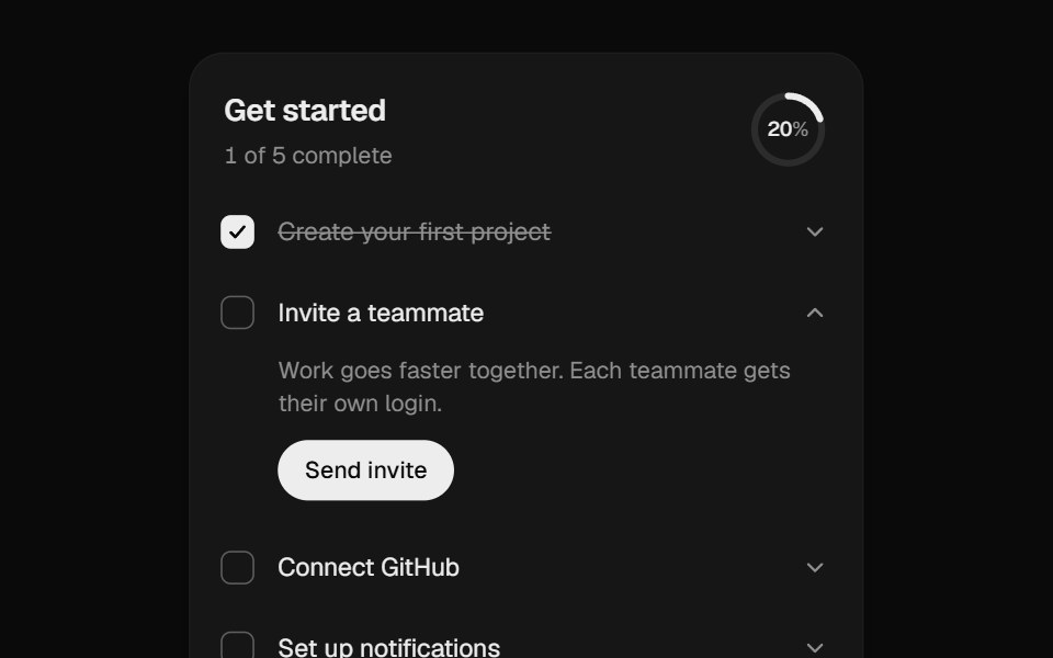 Onboarding ChecklistUI Lab · ReactA setup checklist that counts up as you go and celebrates the finish.
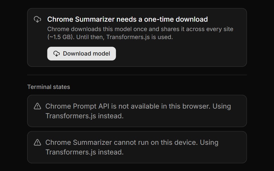 Chrome AI Download GateLocalMode · ReactThe gate a user sees when a Chrome Built-in AI capability exists but its on-device model has not been fetched yet…
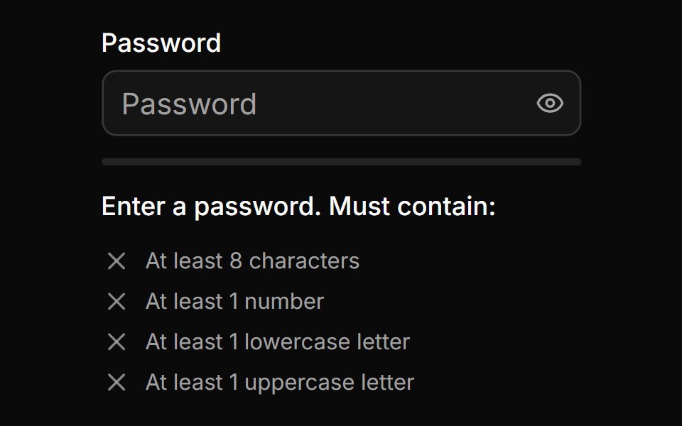 Password Input With Strength Inidicatorsv-particles · Svelte
 ProgressSpaceUI · ReactDisplays an animated progress bar indicating how much of a task or file upload has completed so users know how long to…
 ProgressD2Studio UI · ReactDisplays an indicator showing the completion progress of a task.
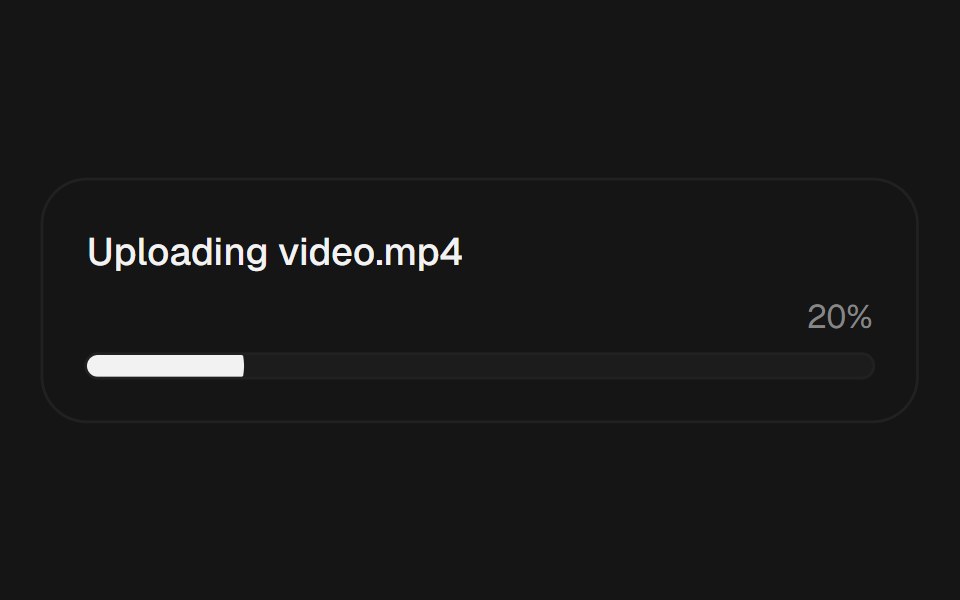 ProgressEaseUI · ReactProgress bar that fills with scale instead of width, plus an indeterminate state for unknown durations.
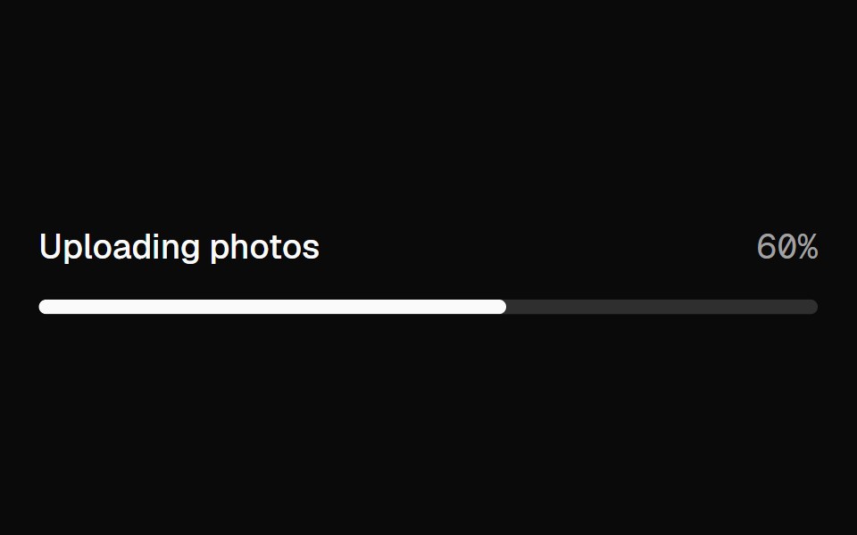 ProgressFibo · ReactShows how far a task has got, or that it's under way.
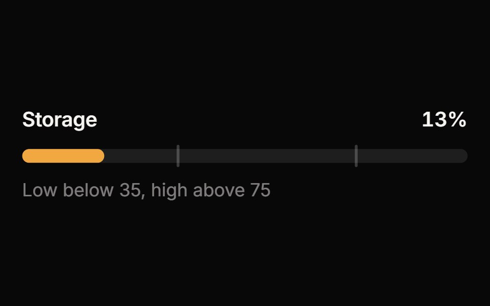 MeterReactFrame · ReactA meter for a value within a known range: bar, semicircle gauge or segmented variants with threshold zones, animated…
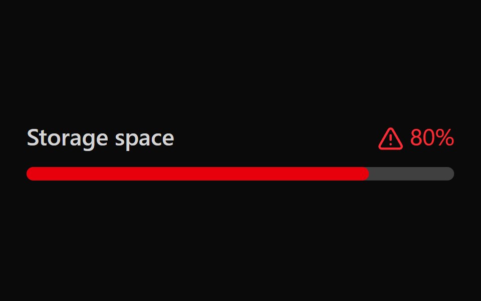 Tailwind MeterReact Spectrum · React
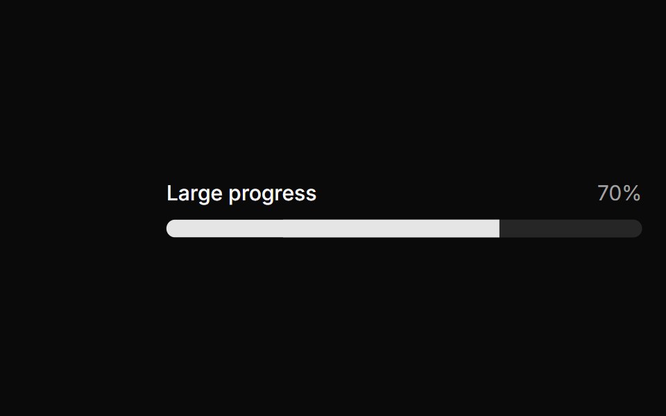 Large progress.ReUI · ReactLarge progress.
 Segmented Step BarAmicro Micro Transitions · ReactBattery-style multi-segment discrete progress bar with stepped fill.
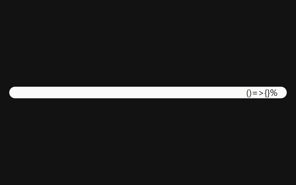 Progress With ValueSpectrum UI · Reactcomponent for the Progress With Value
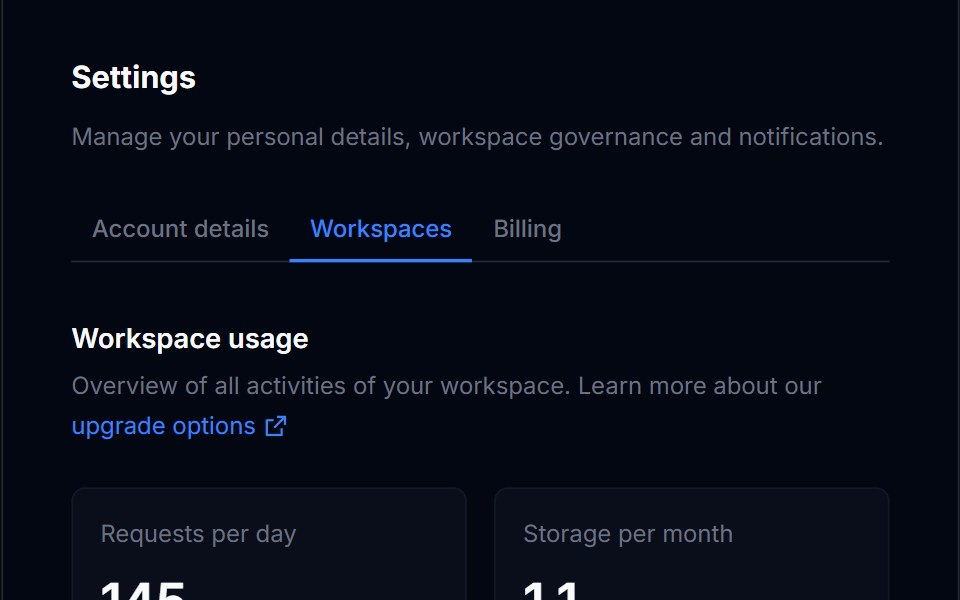 Billing Usage 01Tremor Blocks · React
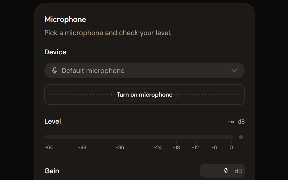 Microphone Setupaudiocn · ReactChoose and check a microphone: device select with a live preview, a level meter, gain, mute and a level check that…
 ProgressWatermelon UI · React
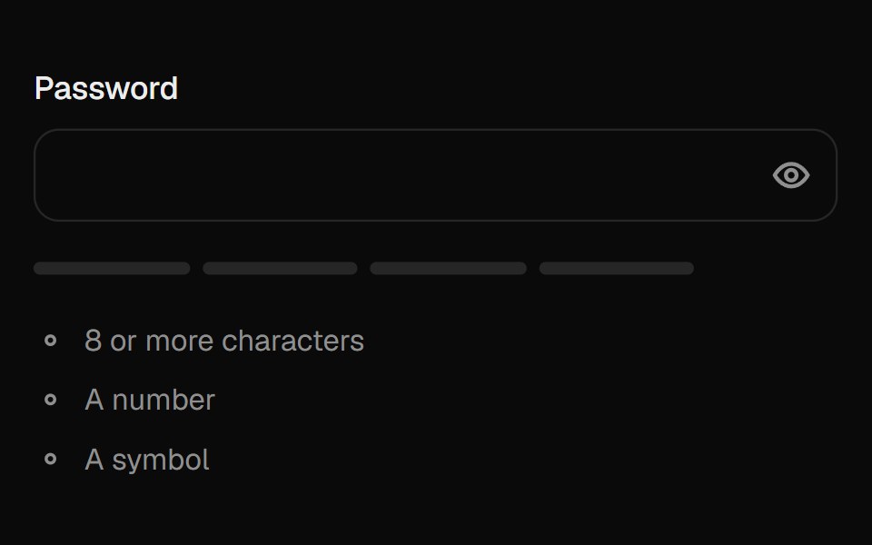 Password FieldUI Lab · ReactReveals the password with a wave of dots turning into letters; the meter fills as it gets stronger.
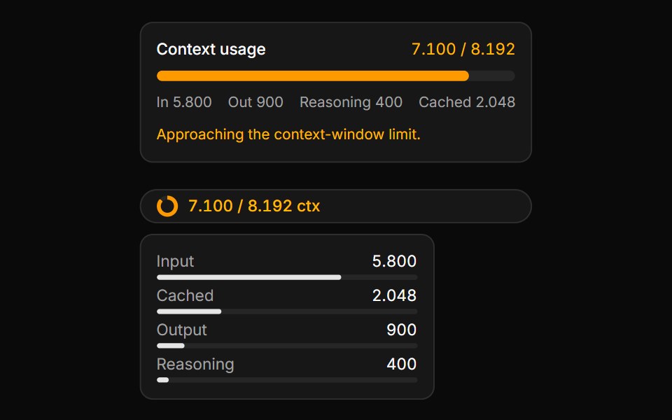 Context Usage MeterLocalMode · ReactA token / context-window budget meter (with composable Context/ContextTrigger/ContextContent/ContextInputUsage/ContextO…
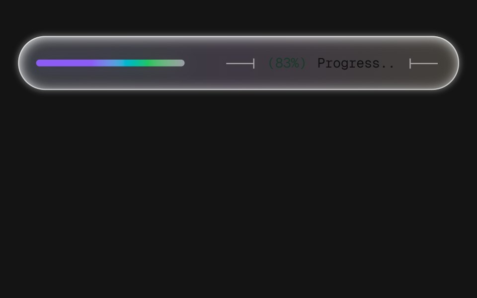 Progress BarD2Studio UI · ReactA frosted-glass progress pill with technical-drawing leader lines bracketing a monospace readout. Three levels of…
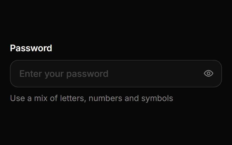 Password InputReactFrame · ReactA password field with an animated show/hide eye toggle, a four-segment strength meter, a live requirements checklist…
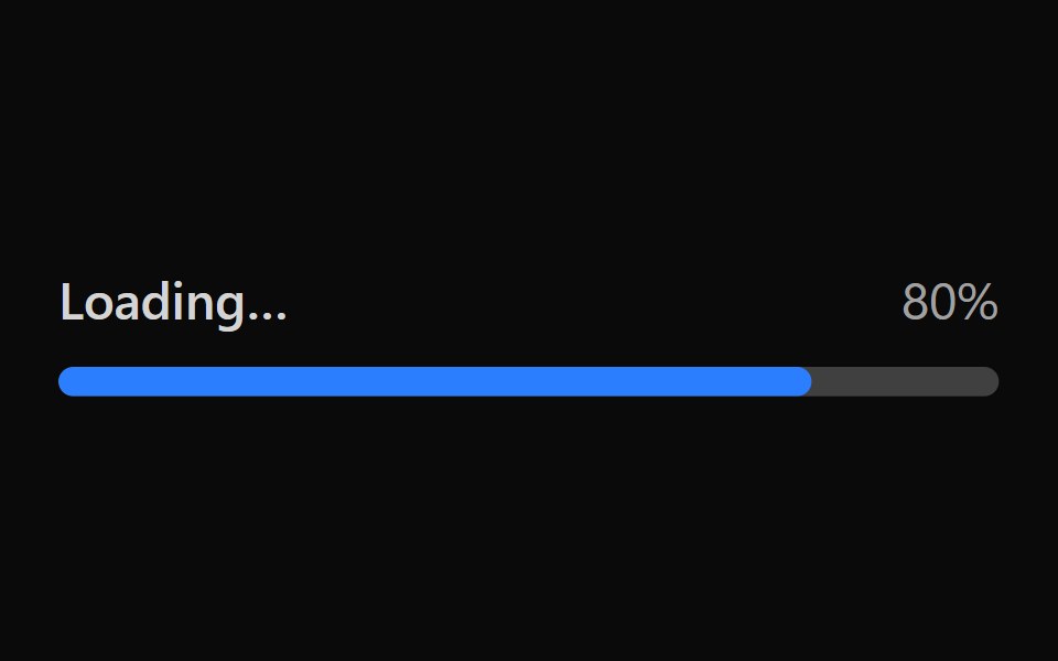 Tailwind Progress BarReact Spectrum · React
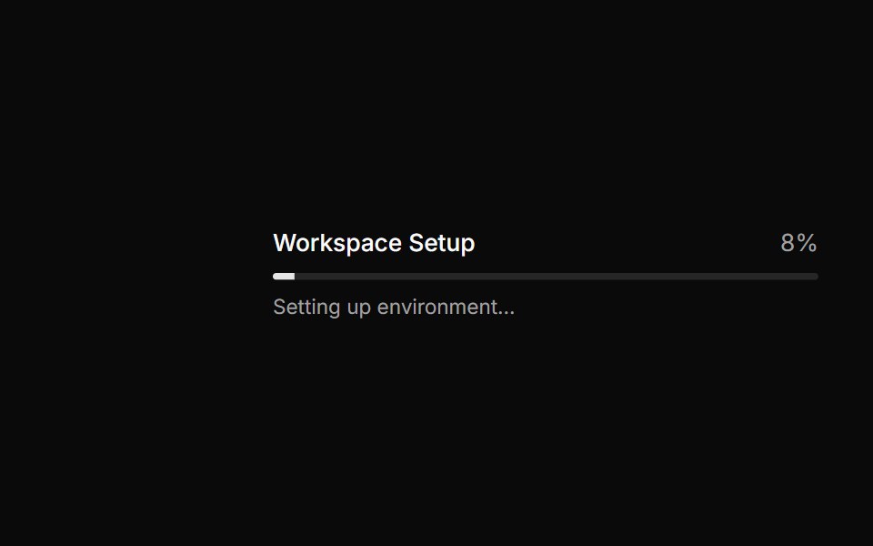 Progress bar with status messages.ReUI · ReactProgress bar with status messages.
 Segmented Stepper DotsAmicro Micro Transitions · ReactPill-morphing connected page dots with spring expansion indicator.
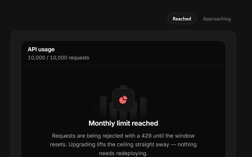 Limit ReachedSpectrum UI · ReactA quota wall with a full meter, seven days of history and a reset clock.
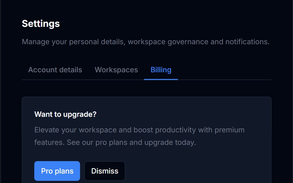 Billing Usage 02Tremor Blocks · React
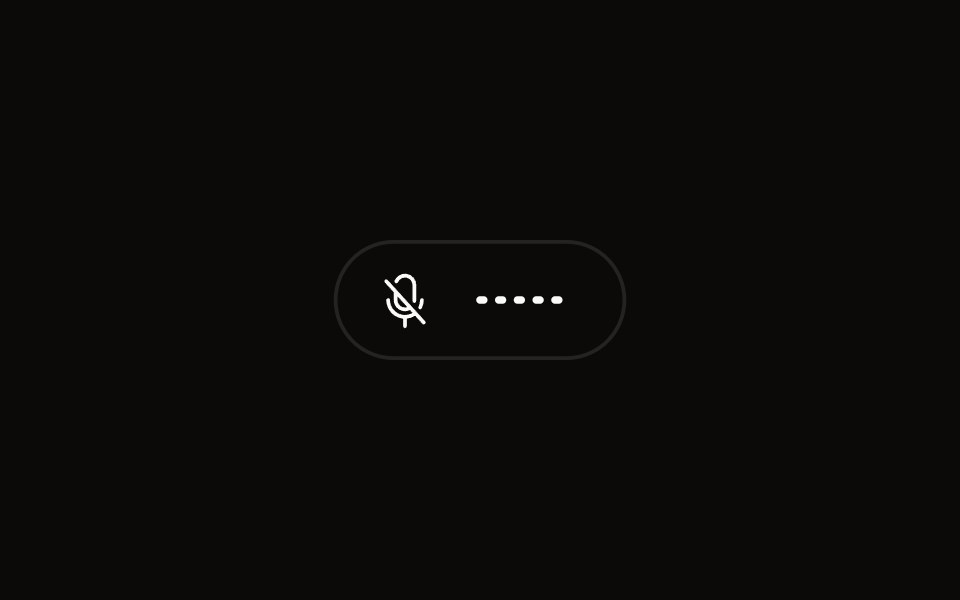 Quick Audio Popoveraudiocn · ReactCompact microphone and system audio controls behind one toolbar button that shows a live level.
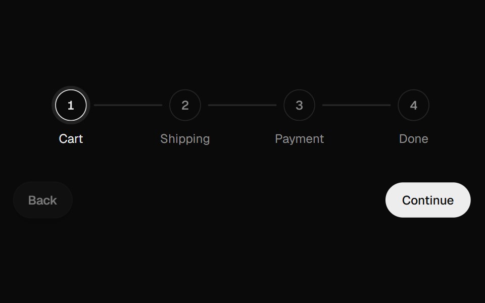 Progress StepperUI Lab · ReactFills the line toward the next step and unfills it in reverse.
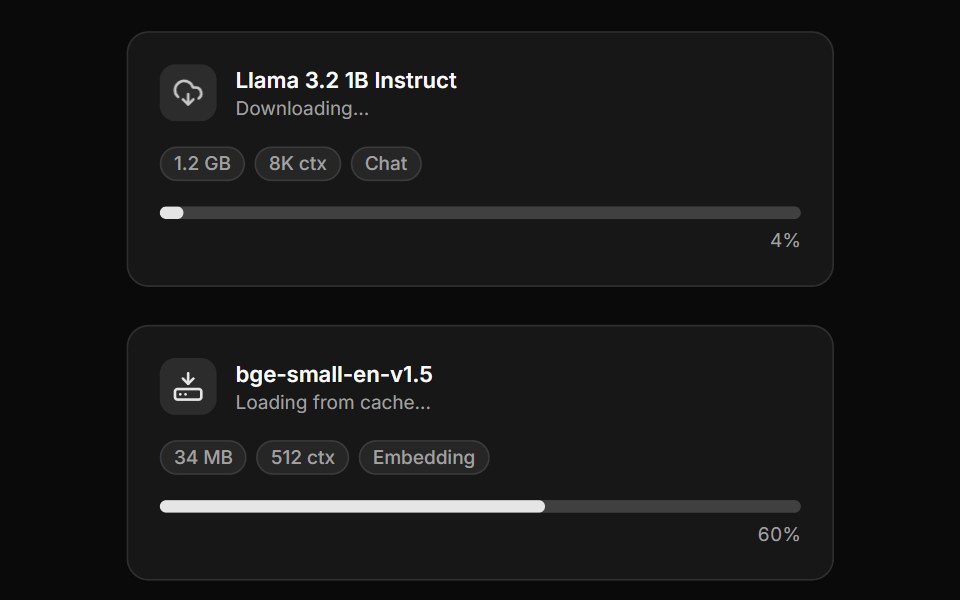 Model DownloaderLocalMode · ReactThe headline local-first card a user sees while a model loads on-device: model name, size, context length, category, a…
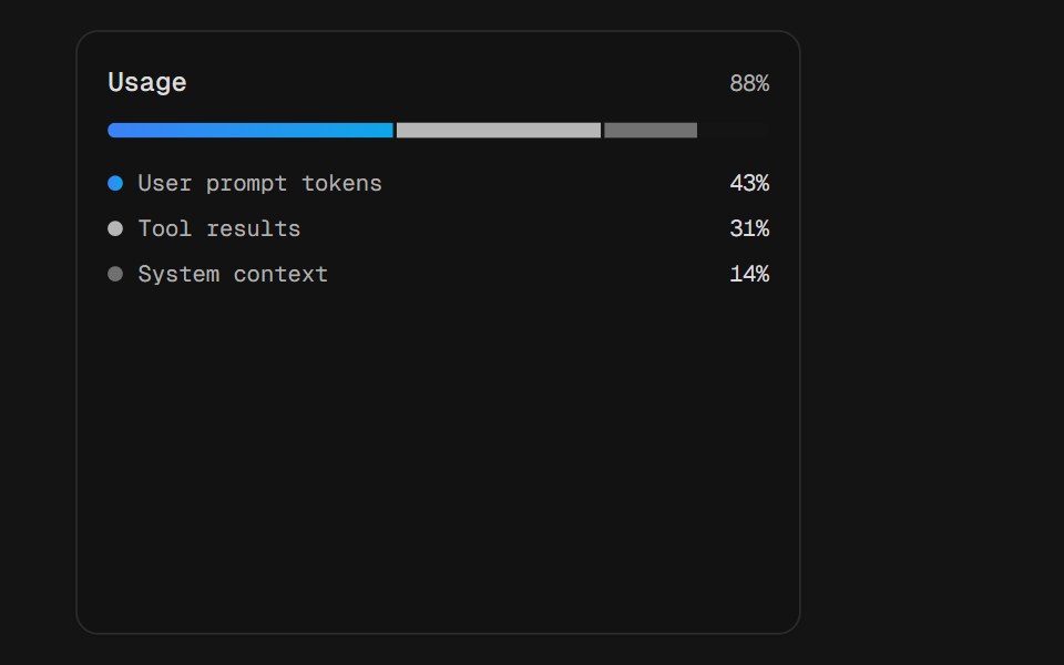 Usage SplitD2Studio UI · ReactToken usage split three ways across one shared track. The segments sit in a single rail rather than three of their…
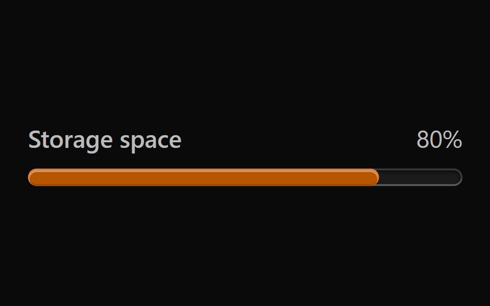 Vanilla MeterReact Spectrum · React
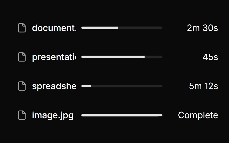 File upload list with progress & status.ReUI · ReactFile upload list with progress & status.
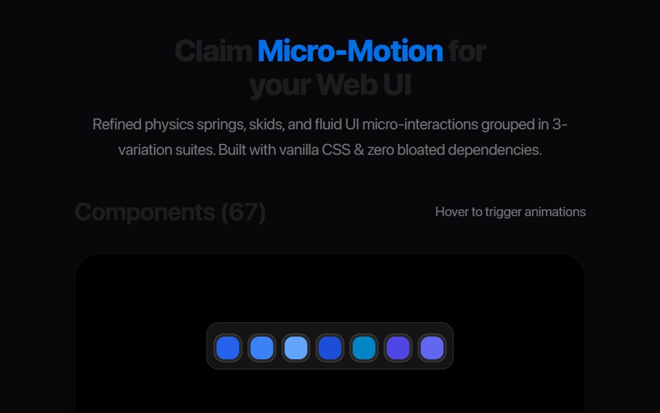 Gear Tooth StepAmicro Micro Transitions · React
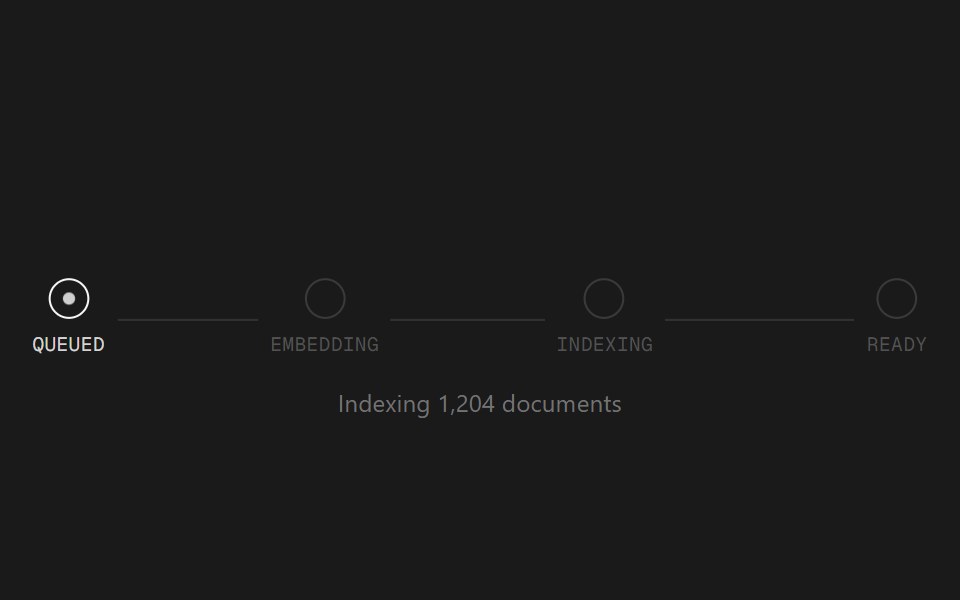 Status TrackerSpectrum UI · ReactA staged progress tracker for long-running AI jobs.
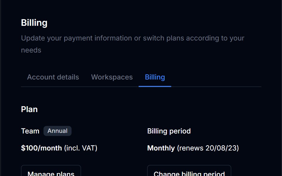 Billing Usage 03Tremor Blocks · React
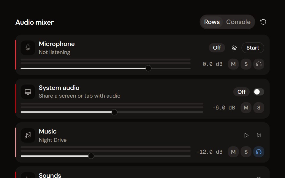 System Audio Mixeraudiocn · ReactThe complete mixer: microphone, system audio, music and sound pads with meters, faders, mute, solo, monitor and…
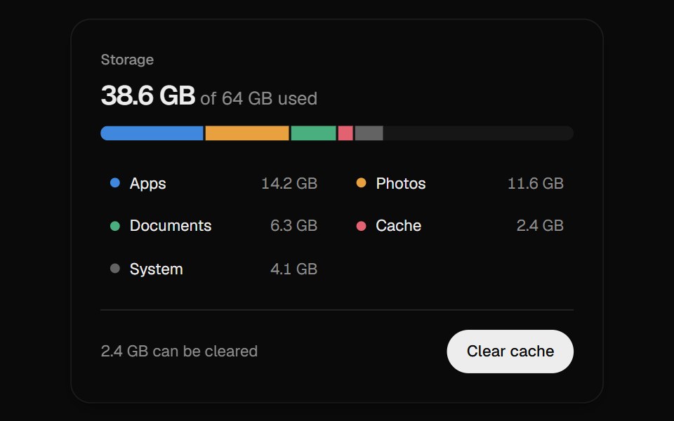 Storage MeterUI Lab · ReactPoint at any slice to read its size, then clear the cache and watch the total count down.
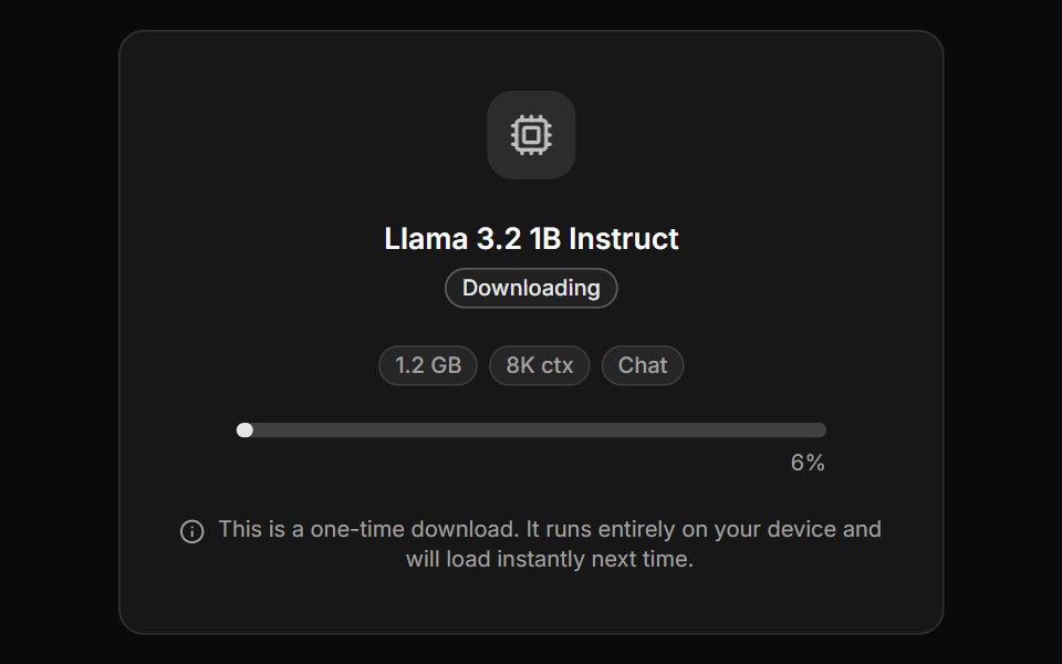 Model Loading PanelLocalMode · ReactA full-height "waiting for model" splash — the richer blocking sibling of ModelDownloader — combining model metadata…
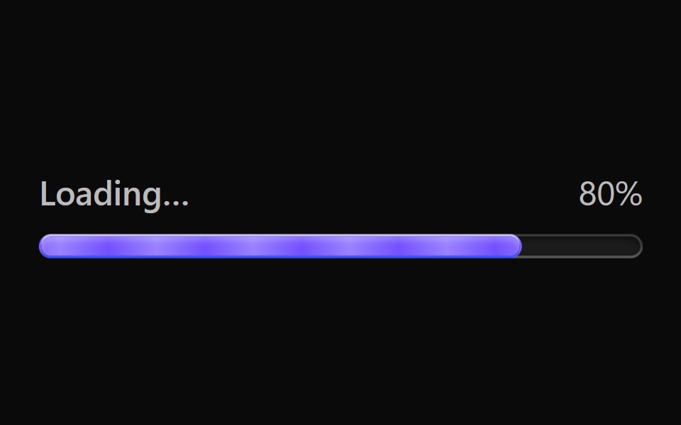 Vanilla Progress BarReact Spectrum · React
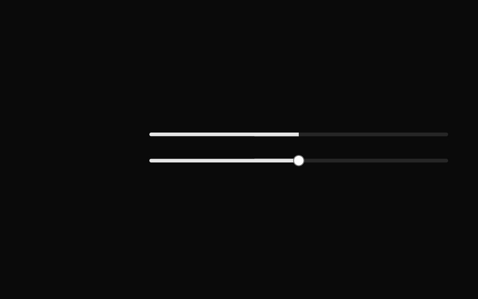 Progress bar with slider.ReUI · ReactProgress bar with slider.
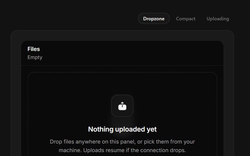 Drop FilesSpectrum UI · ReactA drop zone with real drag handling and per-file upload meters.
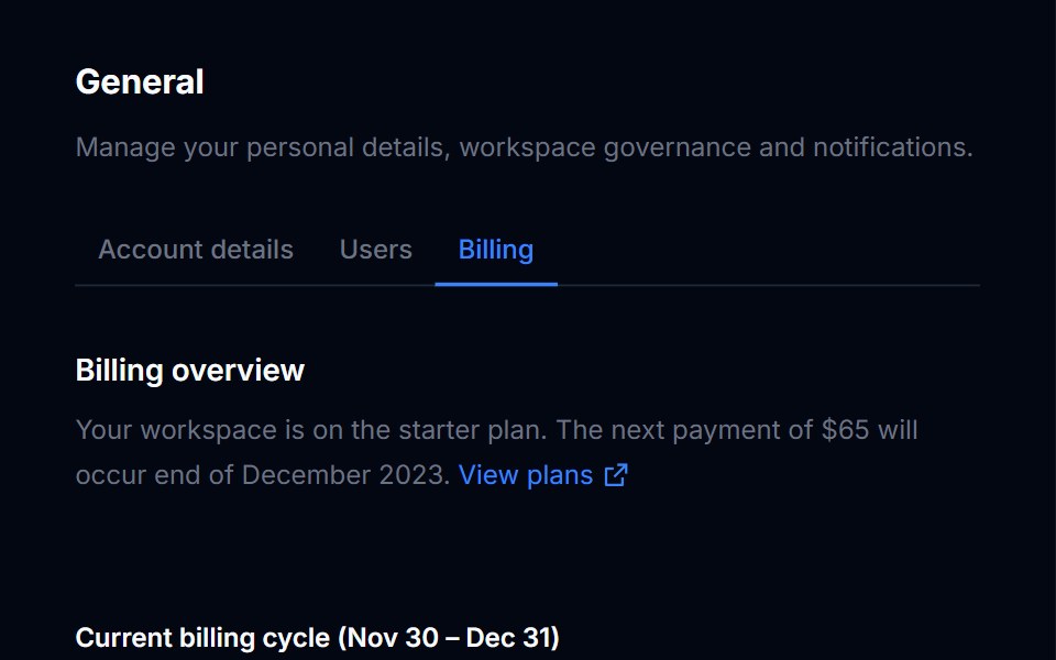 Billing Usage 04Tremor Blocks · React
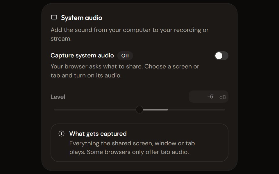 System Audio Settingsaudiocn · ReactTurn system audio capture on, set its level, watch its meter and explain what the browser will capture.
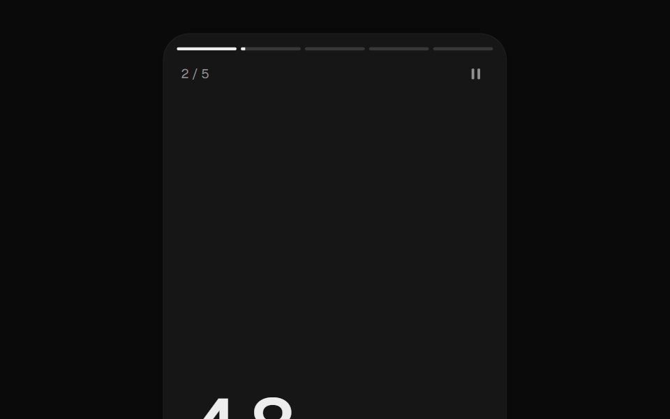 Story ProgressUI Lab · ReactTap through stories, hold to pause.
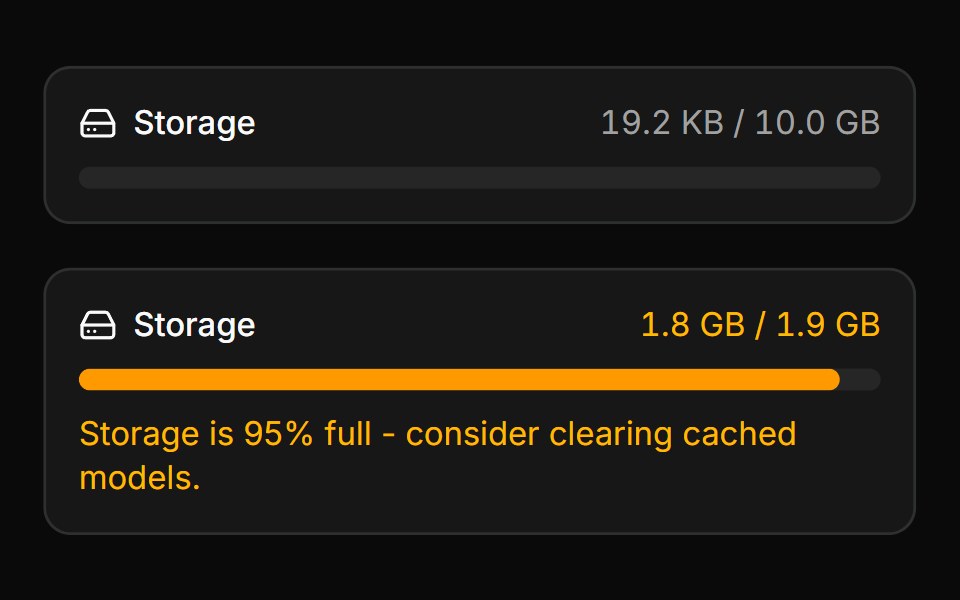 Storage MeterLocalMode · ReactShows origin/IndexedDB storage usage against quota as a meter, with a warning state past a configurable threshold and…
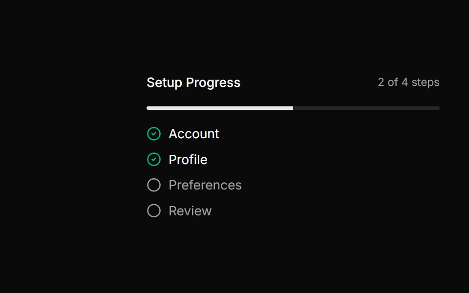 Multi-step progress indicatorReUI · ReactMulti-step progress indicator
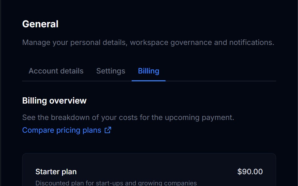 Billing Usage 05Tremor Blocks · React
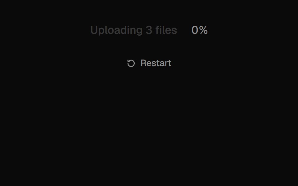 Text ProgressUI Lab · ReactFills the label itself with ink as the upload runs.
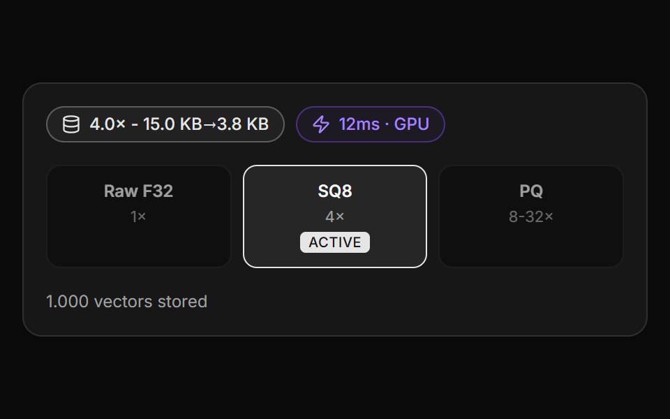 Vector Storage ObservabilityLocalMode · ReactVectorDB observability complementing StorageMeter (quota): a compression-stats badge (SQ8 ratio + before/after size…
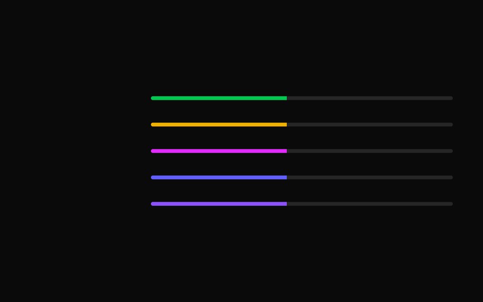 Progress bar with custom colors.ReUI · ReactProgress bar with custom colors.
 Billing Usage 06Tremor Blocks · React
 Upload ButtonUI Lab · ReactShrinks into a progress ring, fills, then checks off.
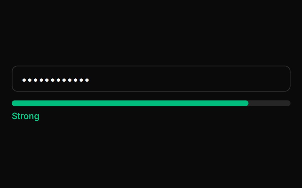 Password Strength BarLocalMode · ReactA presentational password/passphrase strength meter — a themed bar + label driven by a caller-computed 0–100 strength…
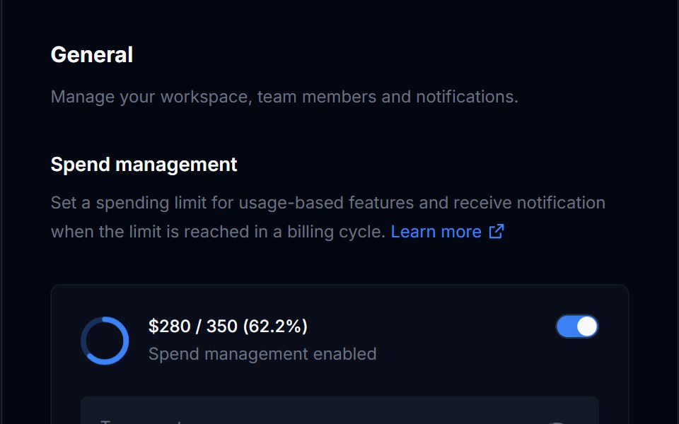 Billing Usage 07Tremor Blocks · React
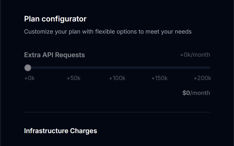 Billing Usage 08Tremor Blocks · React
 Billing Usage 09Tremor Blocks · React
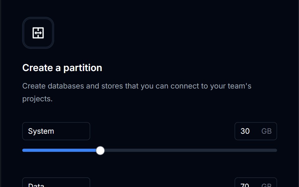 Billing Usage 10Tremor Blocks · React
Libraries with Tailwind CSS progress bar components
Related categories
- Progress Bar Components
- React Progress Bar Components
- Animated Progress Bar Components
- shadcn/ui Progress Bar Components
- Tailwind CSS Feedback Components
- Tailwind CSS Spinner Components
- Tailwind CSS Badge Components
- Tailwind CSS Progress Components
- Tailwind CSS Alert Components
- Tailwind CSS Chip Components
- Tailwind CSS Empty State Components
- Tailwind CSS Notification Components
- Tailwind CSS Banner Components
- Tailwind CSS Status Indicator Components
- Tailwind CSS Skeleton Components
- Tailwind CSS Typing Indicator Components
- Tailwind CSS Progress Circle Components
- Tailwind CSS Error State Components
- Tailwind CSS Scroll Progress Components
- Tailwind CSS Success Animation Components