 Dev Design Library
Tailwind CSS Badge Components
Dev Design Library indexes 220 Tailwind CSS badge components from 53 open-source UI libraries, with the most coming from Watermelon UI, ReUI, Shadcn Space, Tremor Blocks and Origin UI. Each one links to its page with the source code, a live preview where available, the library license and the install command. Every library in this list styles its components with Tailwind CSS utility classes. Badge components belong to the Feedback group.
Showing 120 of 220, a mix from every library. Open a library to see all of its components.
 Badgeshadcn/ui · ReactDisplays a badge or a component that looks like a badge.
 BadgedaisyUI · CSS (Tailwind)
 BadgeHeroUI · ReactDisplays a small indicator positioned relative to another element, commonly used for notification counts, status dots…
 BadgeReact Spectrum · ReactBadges are used for showing a small amount of color-categorized metadata, ideal for getting a user's attention.
 Badgecoss ui · ReactA badge or a component that looks like a badge.
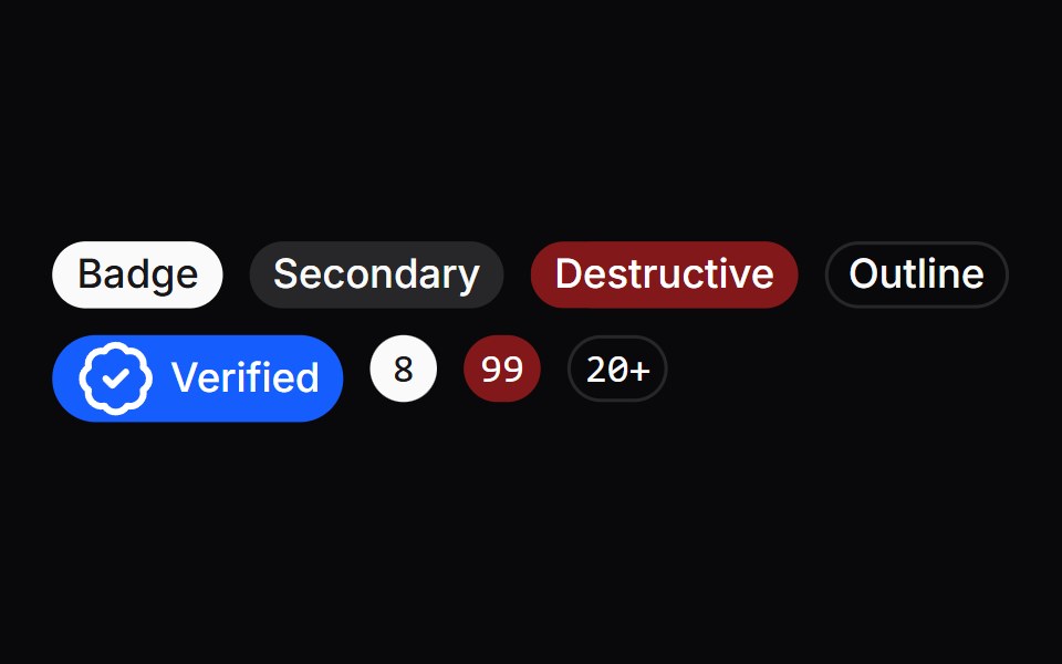 BadgeOrigin UI · ReactA badge or a component that looks like a badge.
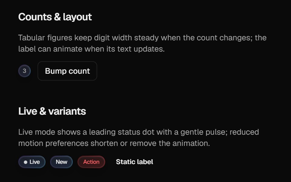 Halo BadgeCult UI · ReactBadge with optional layout animation, live status dot, and gradient rim aligned with Halo Button / Card
 BadgeTremor · React
 BadgeReUI · ReactBadges are used to highlight items, notify users, or display statuses.
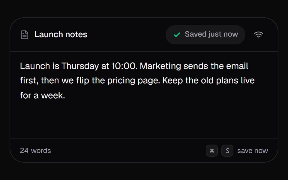 Save StatusKokonut UI · React"An autosave pill for editors that says Editing, Saving or Saved, counts changes while offline, and syncs them when…
 badgeIntent UI · Reactbadge
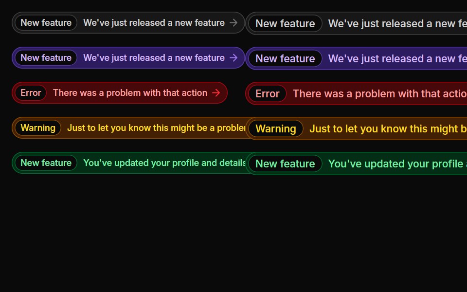 BadgesUntitled UI React · React
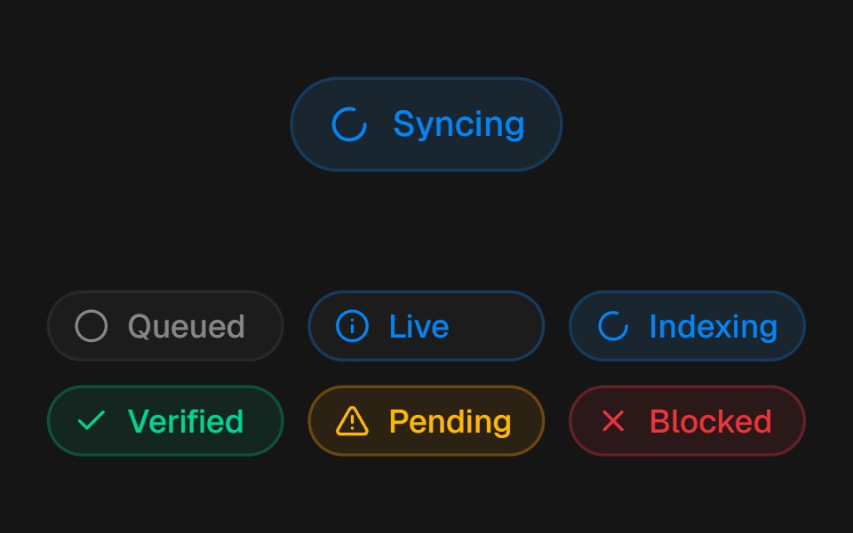 Animated BadgebeUI · ReactStatus badge with animated state icons, pulse feedback and compact size variants.
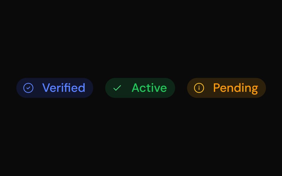 BadgeTailGrids · ReactBadge component with multiple colors, sizes, and support for prefix/suffix icons.
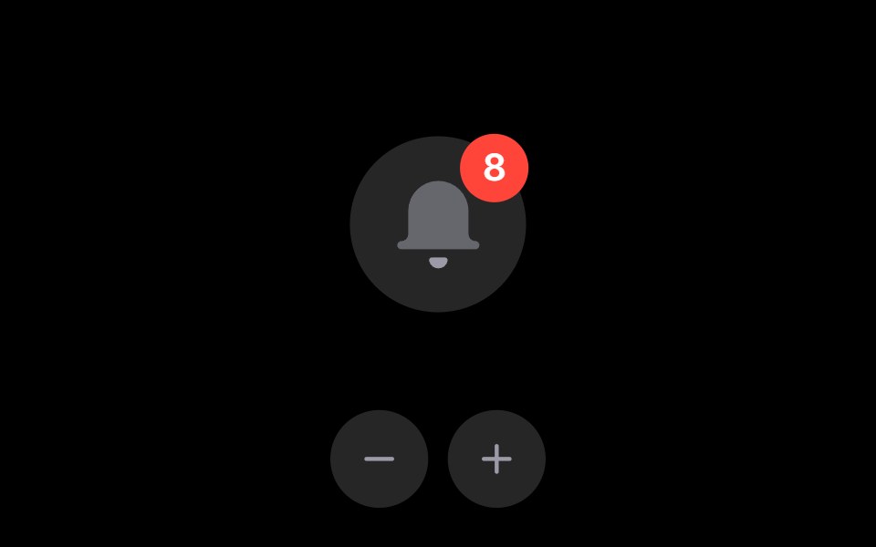 Notification BellRare UI · ReactAn iOS-style notification bell with an unread count badge.
 Event Badge 3DSpectrum UI · Reactcomponent for the Event Badge 3D
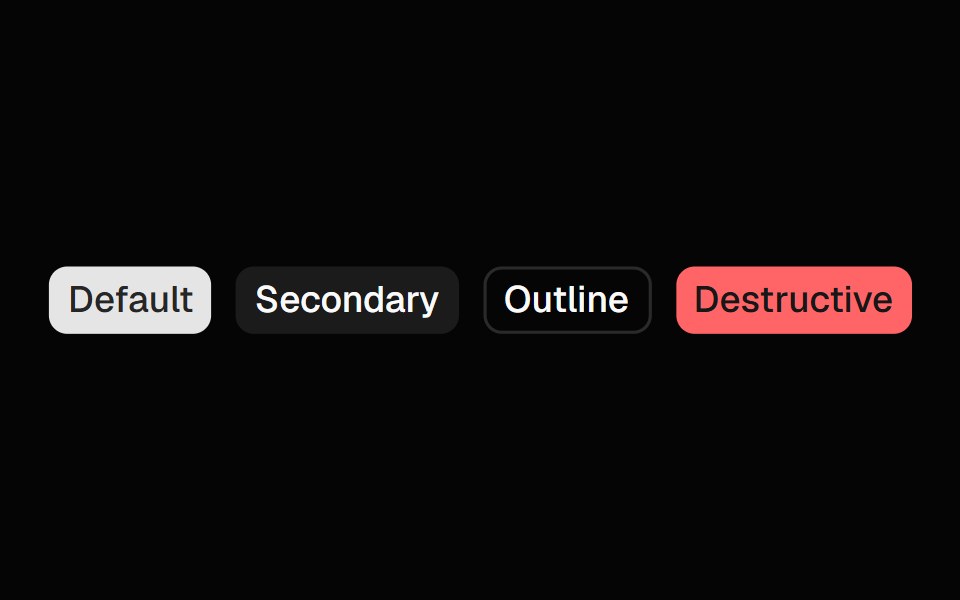 BadgeSpell UI · ReactA badge component with multiple color variants and sizes.
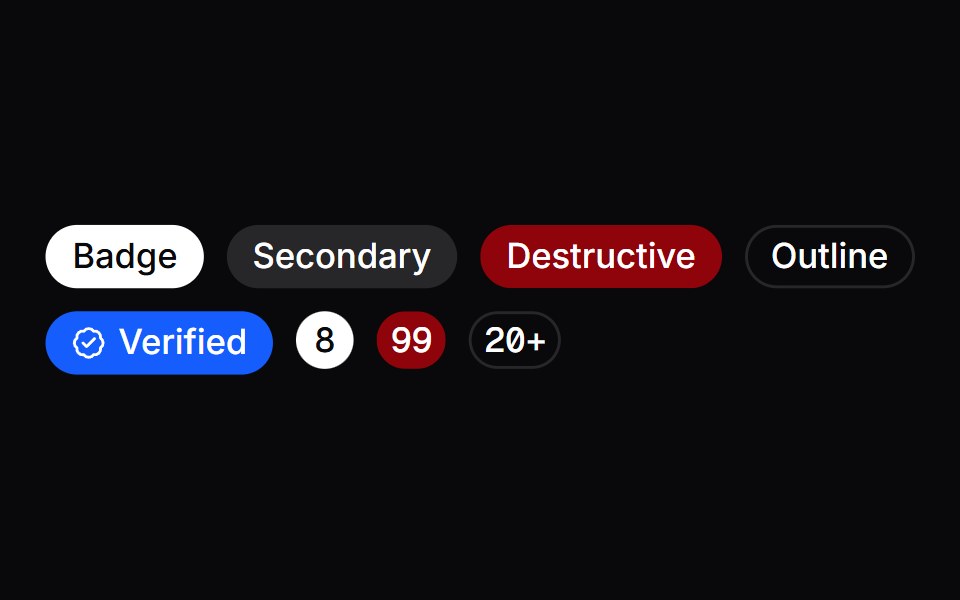 BadgeVengeance UI · React
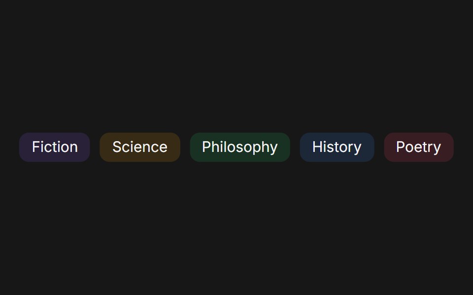 BadgeFluid Functionalism · ReactCompact label with solid, dot, and ghost variants, Tailwind color palette, and three sizes.
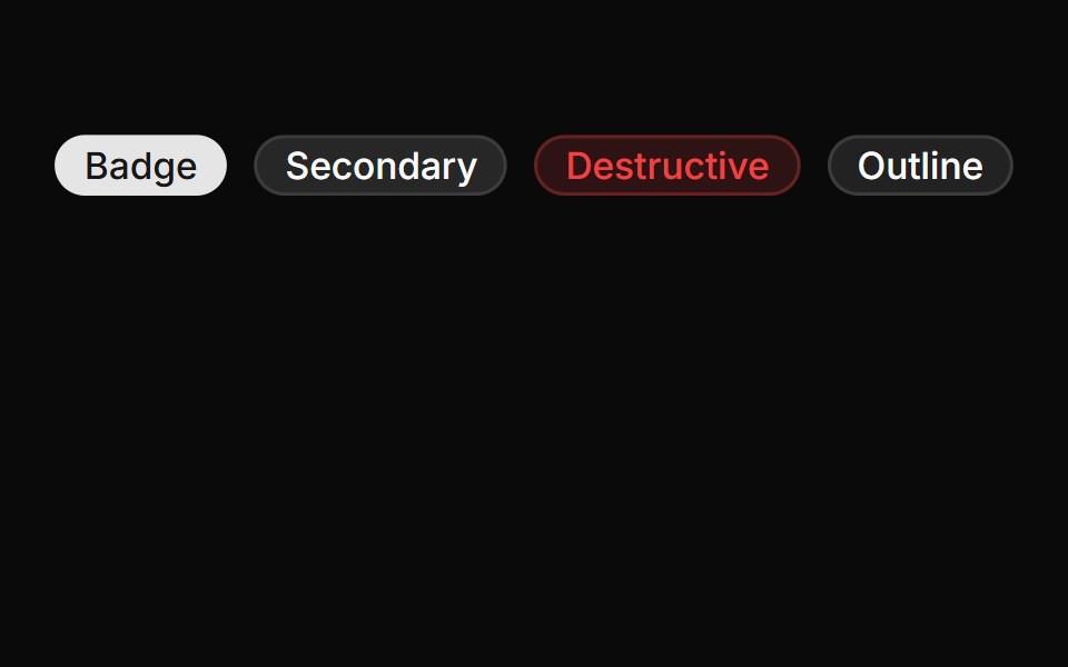 BadgeToolcraft · React
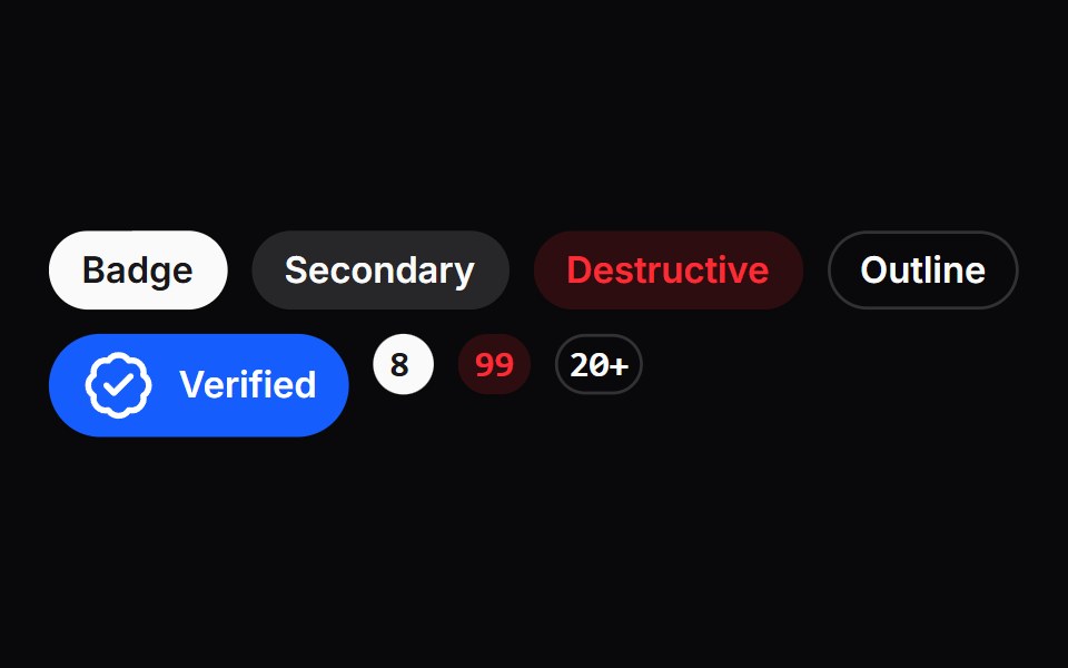 BadgeLaunch UI · React
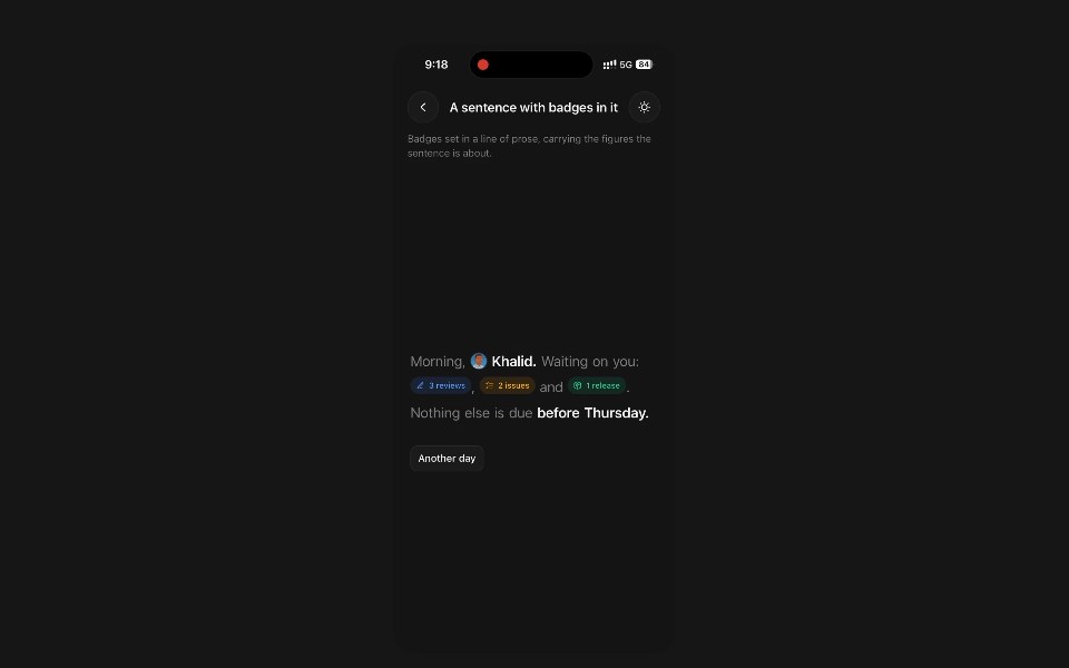 Animated BadgePanel UI · React NativeStatus pill whose icon and label roll over when the status changes.
 Avatar-03 - BadgeShadcn Space · ReactBadge avatar component
 Notification DropdownOpenSourceUI · React
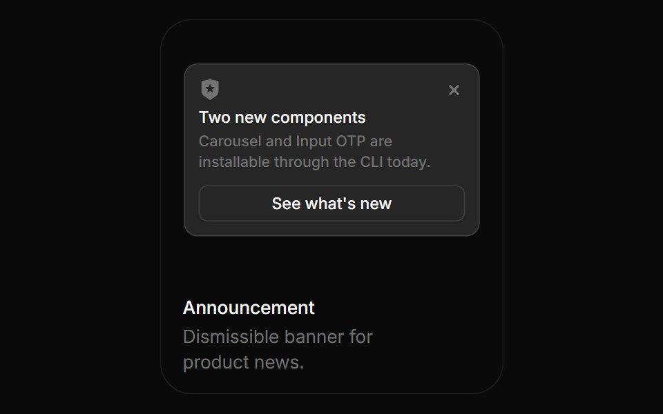 AnnouncementBoardUI · ReactDismissible banner for product news.
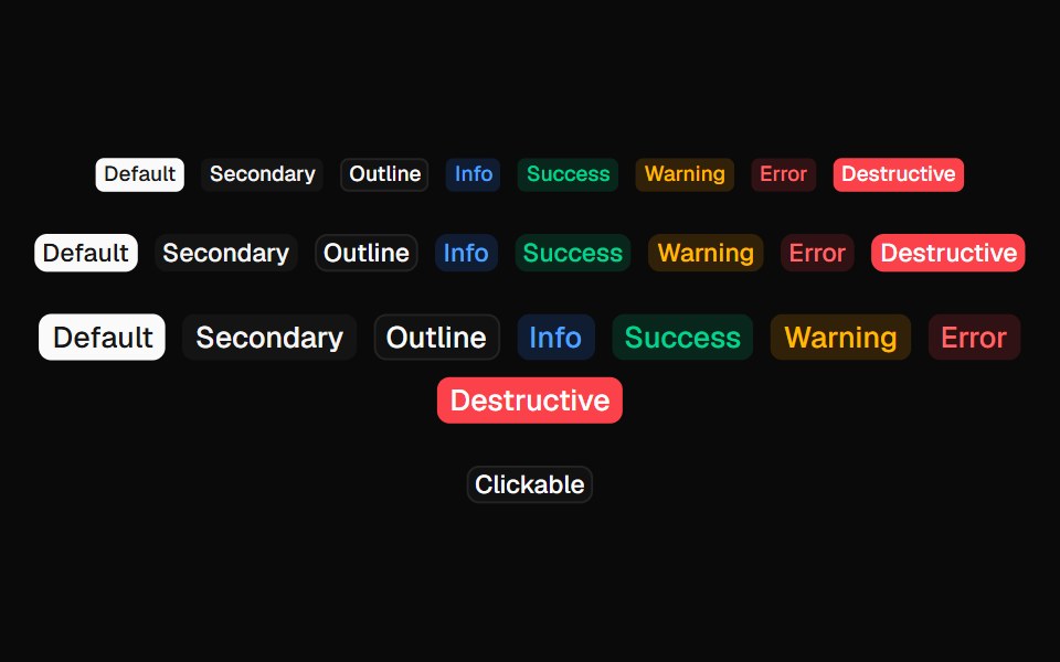 Coss BadgeComponentry · React
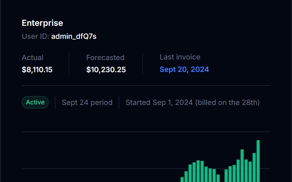 BadgeTremor Blocks · React
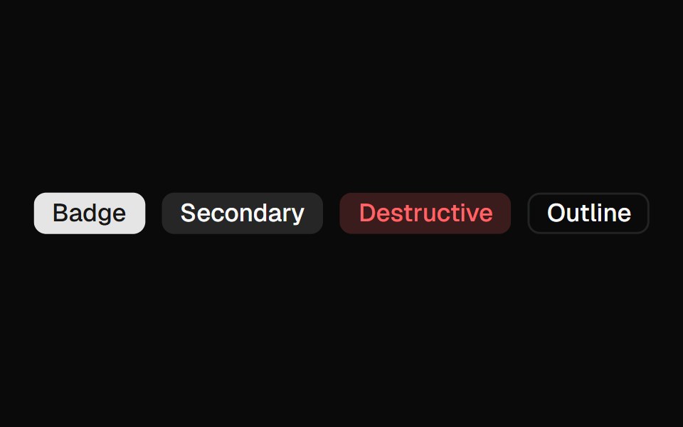 BadgeShadcn Dashboard · React
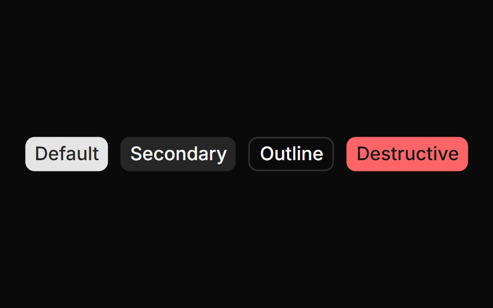 Spell BadgeAnimations (Svelte) · Svelte
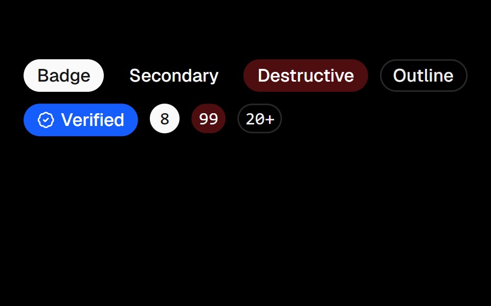 BadgeObsidianUI · React
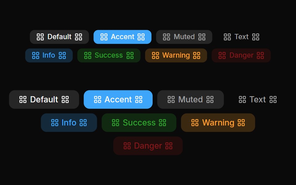 Badges 04Oxbow UI · AstroLeft and right badge
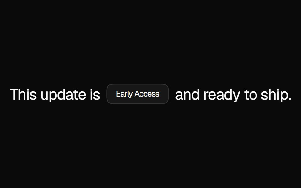 BadgeNexvyn UI · ReactA compact status label with solid, muted, and dot variants for tagging content inline.
 badgeBaseLayer · ReactA badge is a small label that can be used to display information or status.
 BadgeShark UI · ReactA badge or an element styled as a badge.
 Announcement 1Watermelon UI · React
 Glass Badgeglasscn · ReactGlass Badge with five variants: clear, frosted, subtle, liquid, and liquid-refract
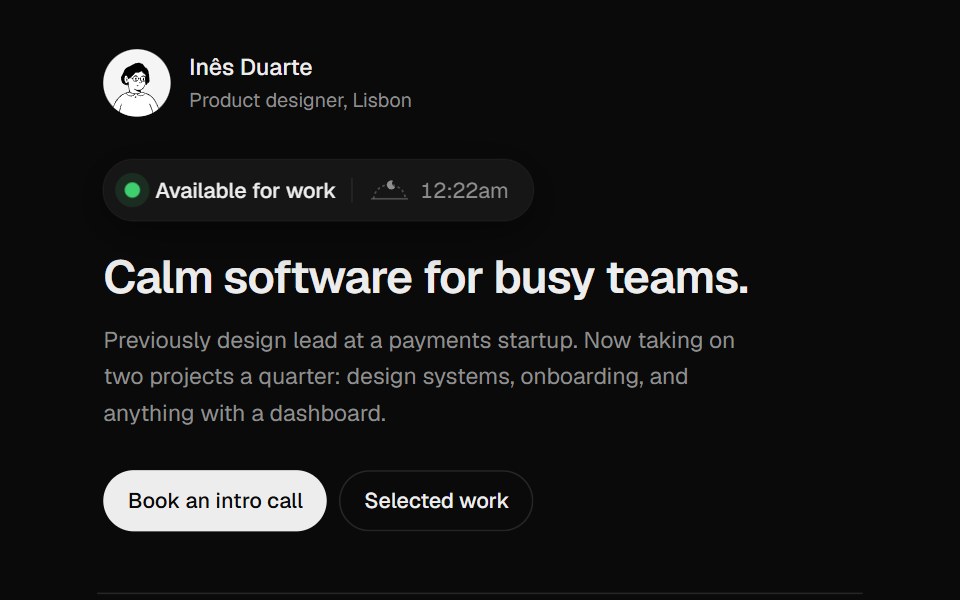 Availability BadgeUI Lab · ReactShows when the owner is working, and when that overlaps with your day.
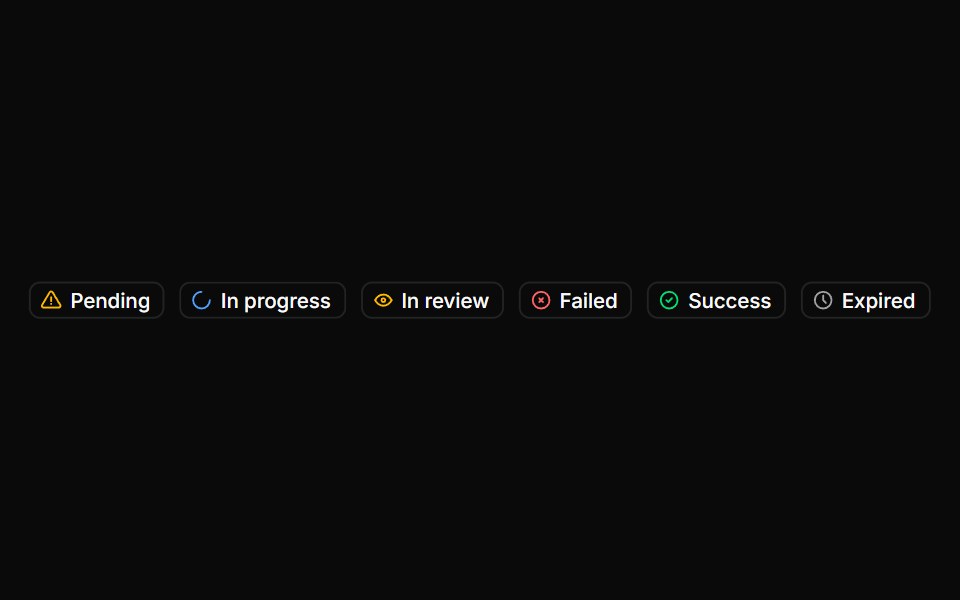 BadgeHextaUI · ReactStatus labels with colored dots, removable tags that slide closed and counts that roll to their new value.
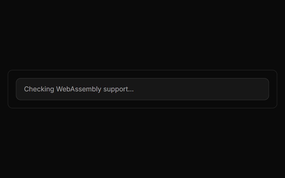 Language Detector BlockLocalMode · ReactDebounced (400 ms) automatic language detection across 110 languages (up to five candidates with name + ISO code +…
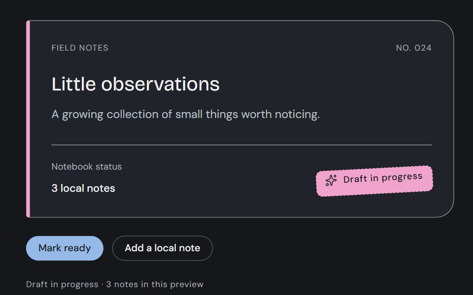 BadgeCojeev UI · ReactStamp a review state, attach a filing tag or count a collection. Three compact treatments with one clear meaning in…
 Sliding Arrow LabelMicroKit · ReactA text label that gets a bright surface while an arrow slides in beside it.
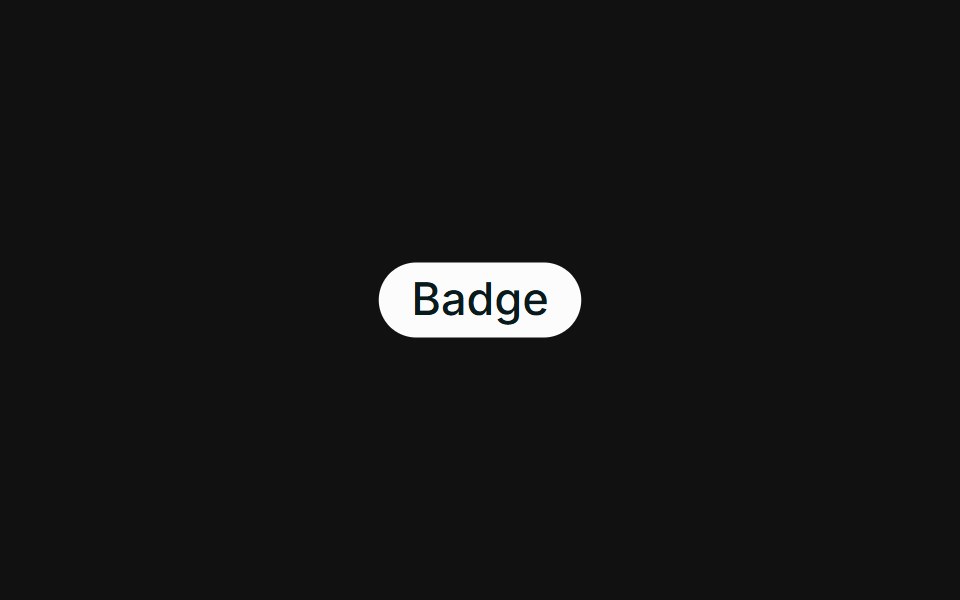 BasicFLX UI · ReactA single default badge.
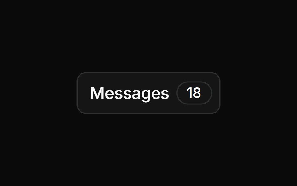 Message Notificationsv-particles · Svelte
 LabelMetal UI · React + SwiftUIText in a set role: engraved, small, title, heading, query, count, cell, value, display, readout, on-graphite and…
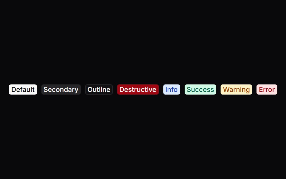 BadgeSpaceUI · ReactDisplays small colored label tags for status flags, counts, or categories, helping users quickly scan and spot key…
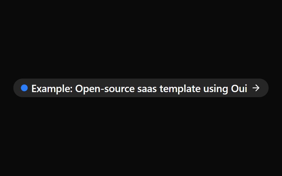 BadgeOUI · ReactA className function to style a react aria component as a shadcn Badge
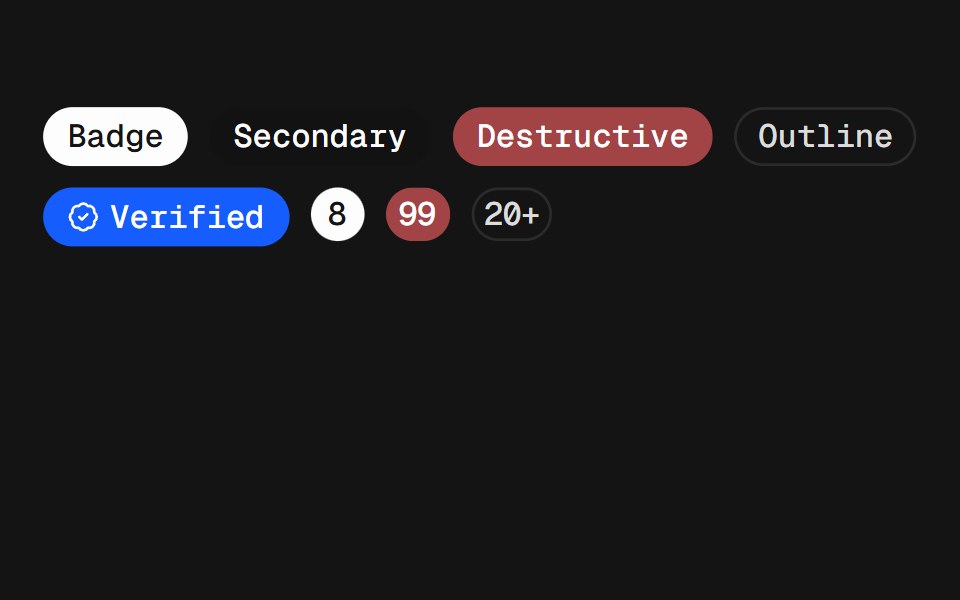 BadgeD2Studio UI · ReactDisplays a badge or a component that looks like a badge.
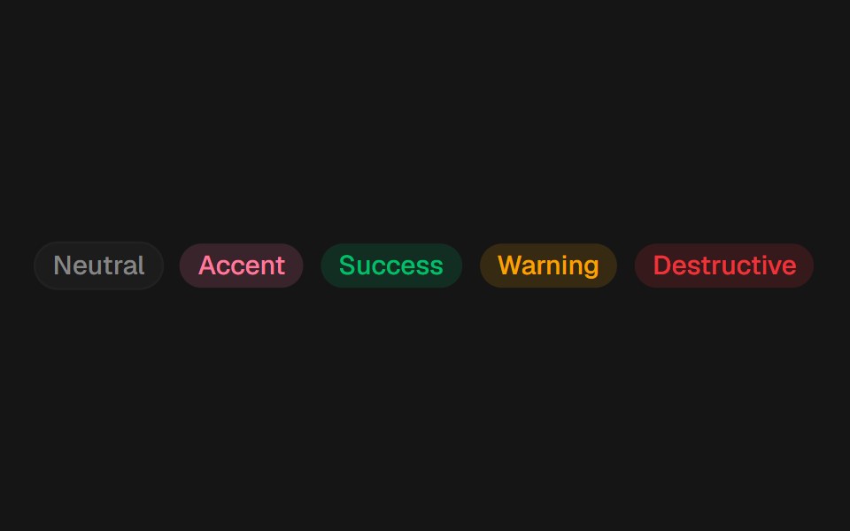 BadgeEaseUI · ReactSmall status pill in five colors, with a crossfade for when its variant changes.
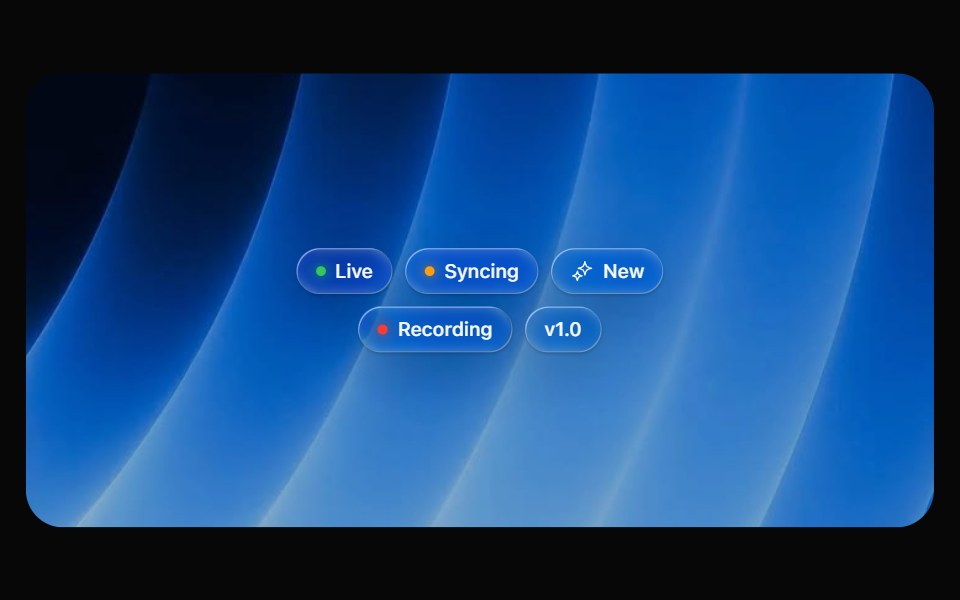 Glass BadgeOpaline · ReactSmall glass chip with an optional glowing status dot.
 BadgeFibo · ReactA short label for status, category or count.
 Badges KitReactFrame · ReactA status badge with 8 tone presets, light/dark variants, 3 sizes, 6 icon styles (check, cross, minus, dot, spinner…
 Images BadgeAceternity UI · React
 Badgeark-cn · ReactA shadcn-style badge component built with Ark UI primitives.
 LabeldaisyUI · CSS (Tailwind)
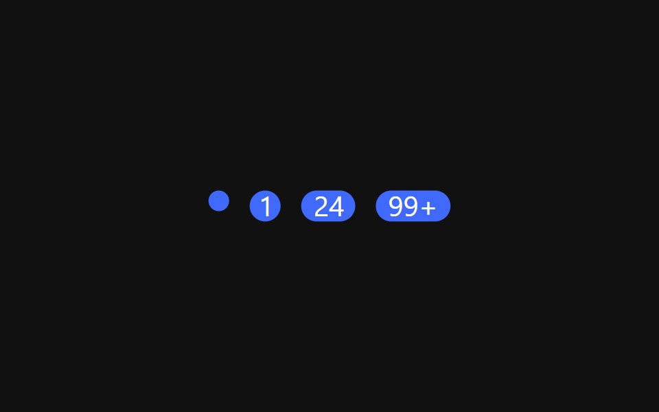 Notification BadgeReact Spectrum · ReactNotification badges are used to indicate new or pending activity .
 Comp 413Origin UI · React
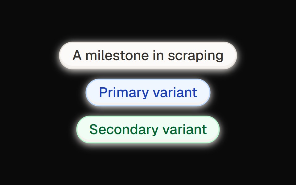 Neumorph EyebrowCult UI · ReactNeumorphic eyebrow component with soft shadow effects and modern styling
 LabelTremor · React
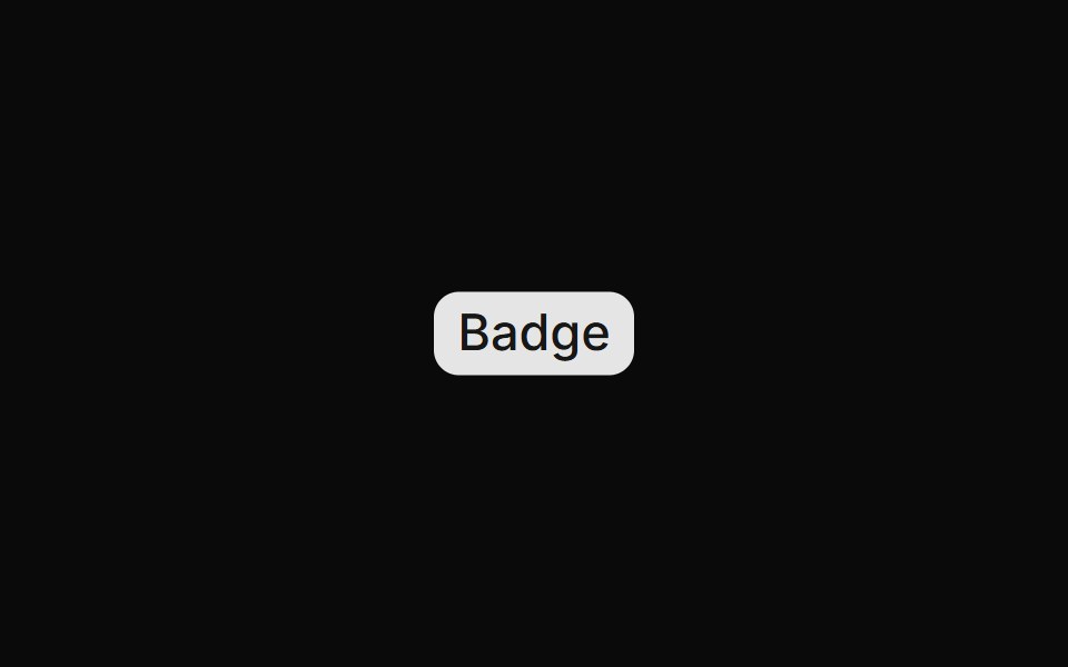 Default badgeReUI · ReactDefault badge
 Rating BadgeUntitled UI React · React
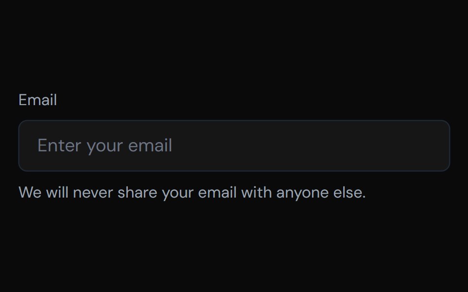 DescriptionTailGrids · ReactA description component that provides additional context or instructions for form fields.
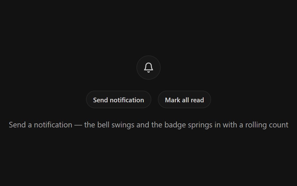 Notification BellSpectrum UI · ReactA bell icon button with a ring-shake swing, springy unread badge with rolling odometer count, and a pinging dot mode
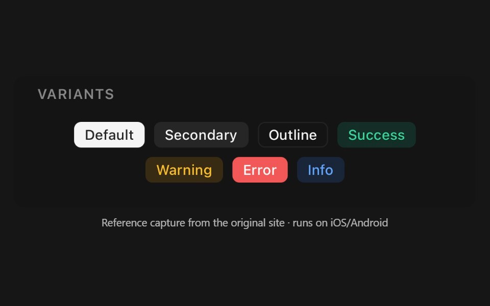 BadgePanel UI · React NativeCompact status label, dot, or notification count.
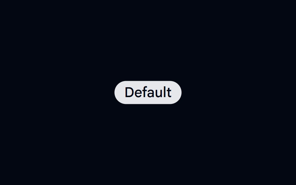 Badge-01 - DefaultShadcn Space · ReactBadge component
 BadgesBoardUI · React
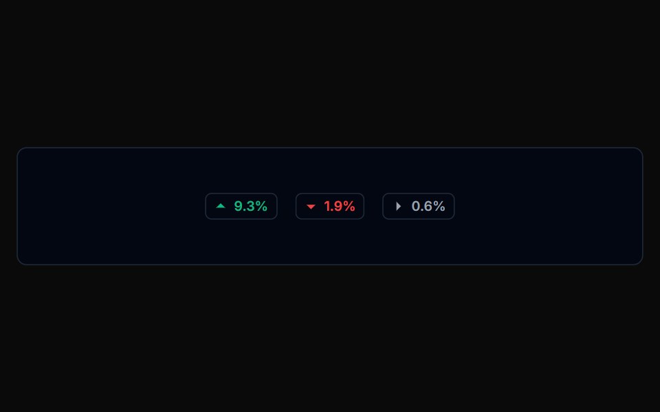 Badge 01Tremor Blocks · React
 LabelShadcn Dashboard · React
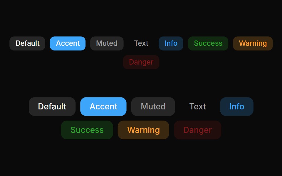 Badges 01Oxbow UI · Astro
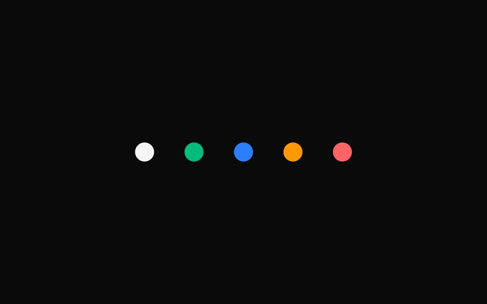 StatusShark UI · ReactColor-coded status for process or state.
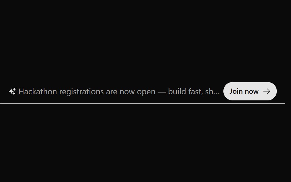 Announcement 2Watermelon UI · React
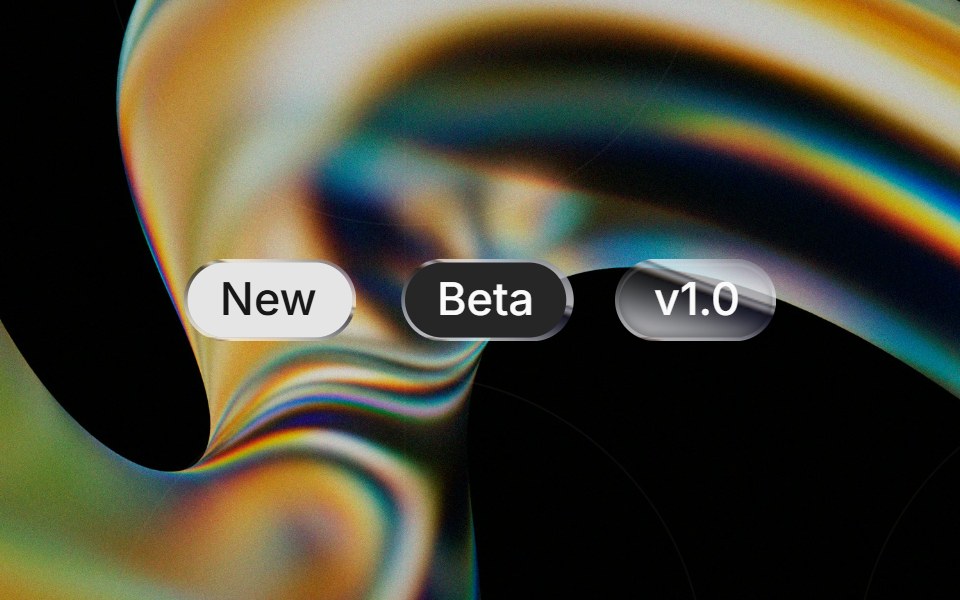 Liquid Badgeglasscn · ReactA liquid-glass badge wrapper that keeps the base badge fill and applies the effect to the border.
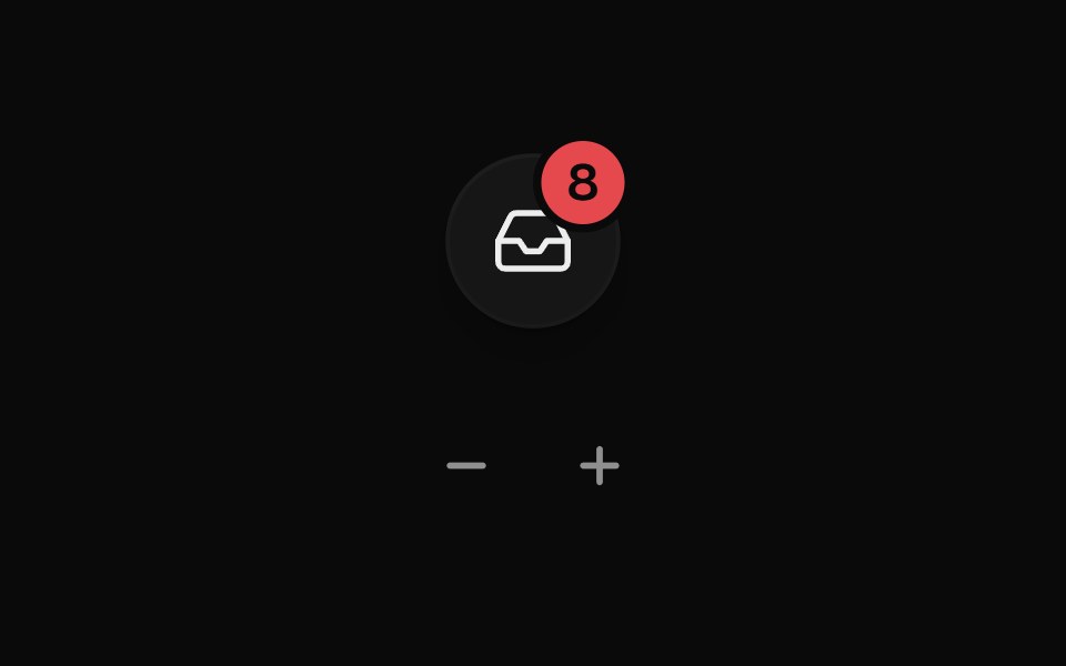 Badge CounterUI Lab · ReactRolls its digits the way the count moved and bumps each time it changes.
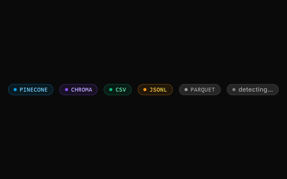 Format Detection BadgeLocalMode · ReactA small badge displaying an auto-detected data format (PINECONE / CHROMA / CSV / JSONL or custom) with a per-format…
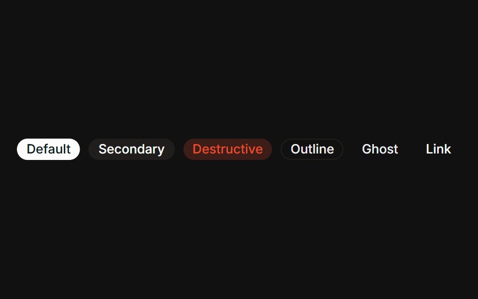 VariantsFLX UI · ReactAll six variants side-by-side: default, secondary, destructive, outline, ghost, link.
 With Badgesv-particles · Svelte
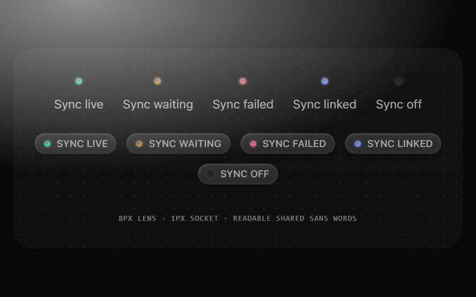 Status badgeMetal UI · React + SwiftUIA readable 26pt status plate with words and a sunk LED or retained morphing meaning glyph. Quiet, opaque strong tint…
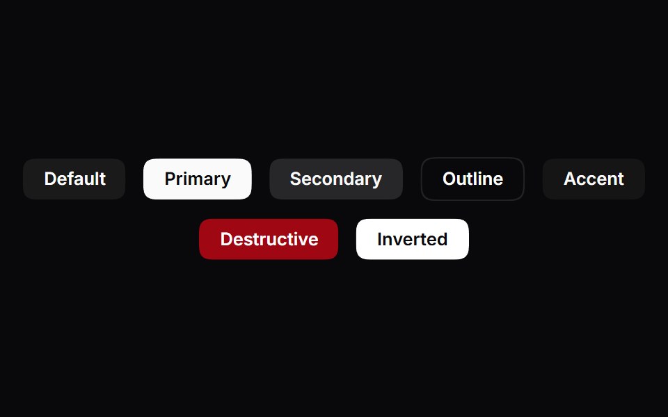 Badge SquircleSpaceUI · ReactTactile squircle badge components featuring dynamic curvature morphing on hover with polymorphic Base UI render support.
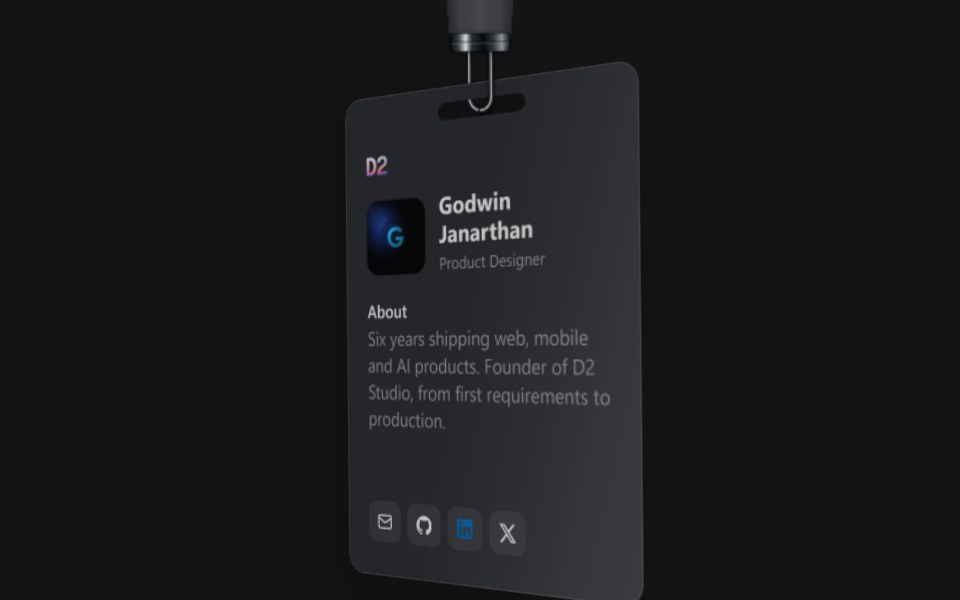 ID CardD2Studio UI · ReactAn event badge on a D2 strap: a portrait, name, role and a short about, with contact links at the foot. The strap is a…
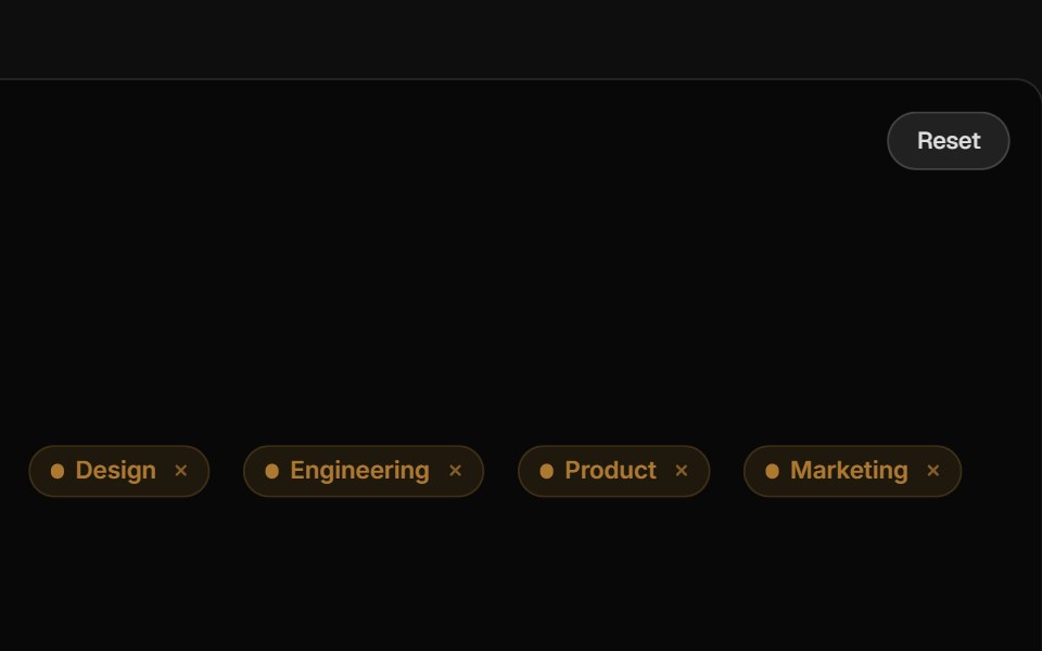 TagReactFrame · ReactA compact label tag with soft, solid and outline variants, 6 colors, 3 sizes, an optional pulsing dot, icon, count…
 Comp 414Origin UI · React
 Info outline badgeReUI · ReactInfo outline badge
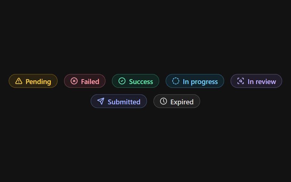 Status BadgeSpectrum UI · Reactcomponent for the Status Badge
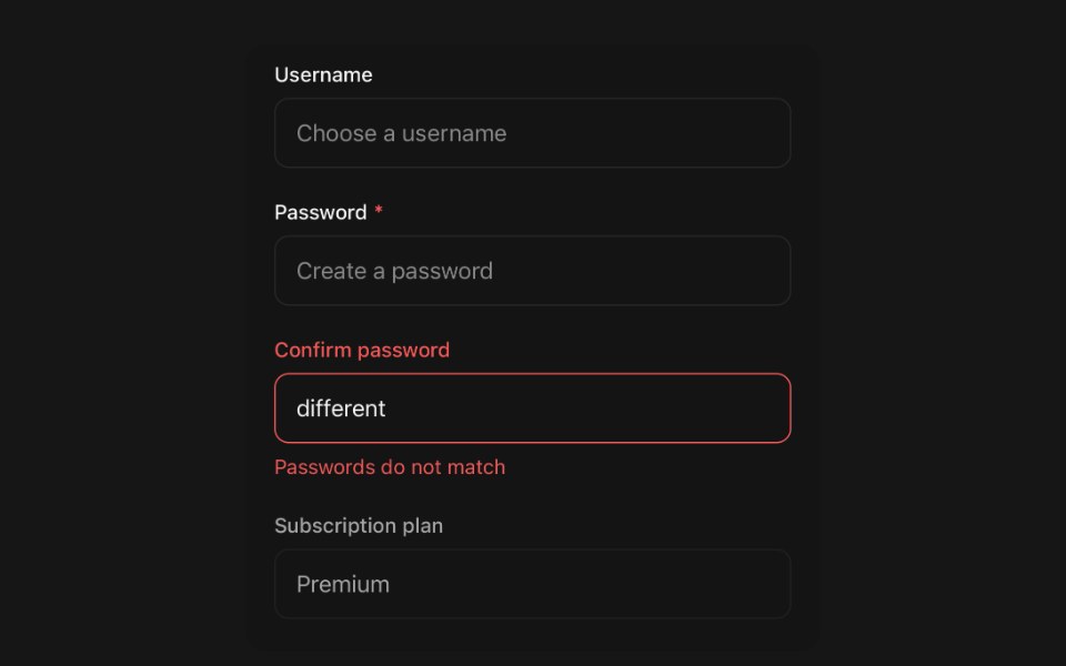 LabelPanel UI · React NativeForm field label with required, invalid and disabled states.
 Badge-02 - CountShadcn Space · ReactBadge component
 Badge 02Tremor Blocks · React
 Badges 02Oxbow UI · Astro
 Announcement 3Watermelon UI · React
 Badgeglasscn · React
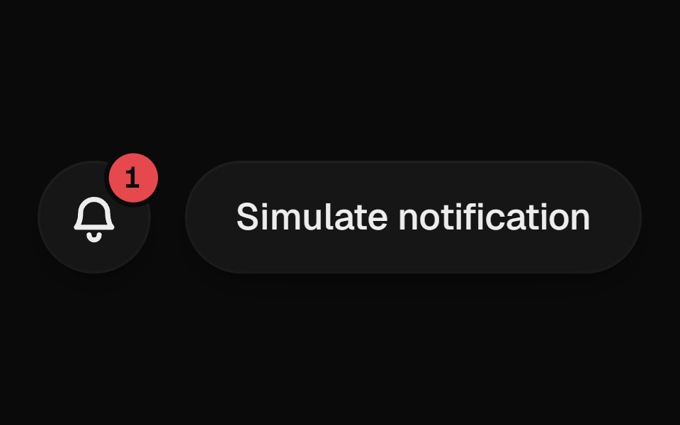 Notification BellUI Lab · ReactRings when something new arrives, and the badge rolls up with each one.
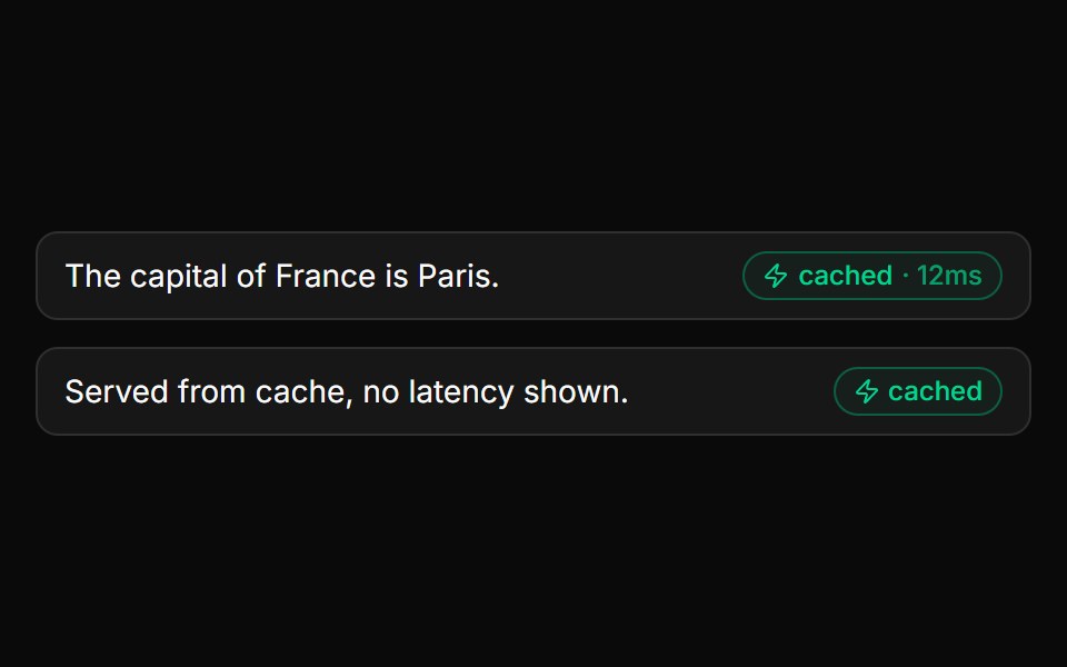 Cache BadgeLocalMode · ReactAnnotates a result as served from the semantic cache, optionally with the hit latency (e.g. "cached · 12ms"). Drive…
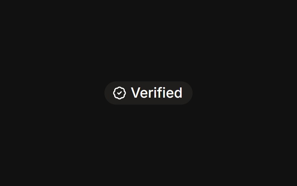 With iconFLX UI · ReactLeading verified icon before the label.
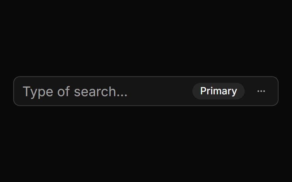 With Badge And Menusv-particles · Svelte
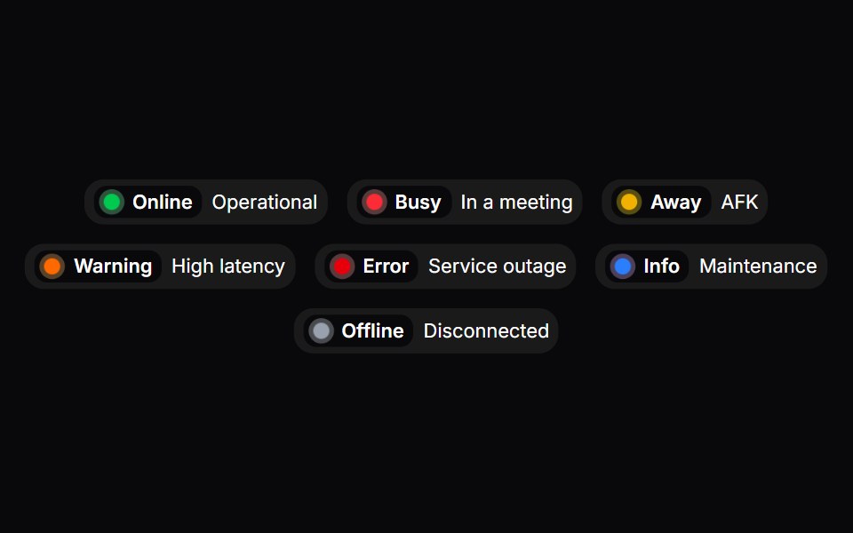 Status BadgeSpaceUI · ReactDisplays a real-time status indicator with a pulsing dot and color coding to show whether a service or user is online…
 Comp 415Origin UI · React
 Success outline badgeReUI · ReactSuccess outline badge
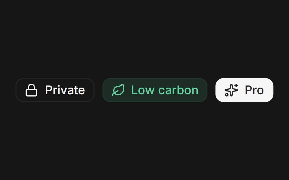 Web BadgePanel UI · React NativeSmall status and label badges with icons, in several tones.
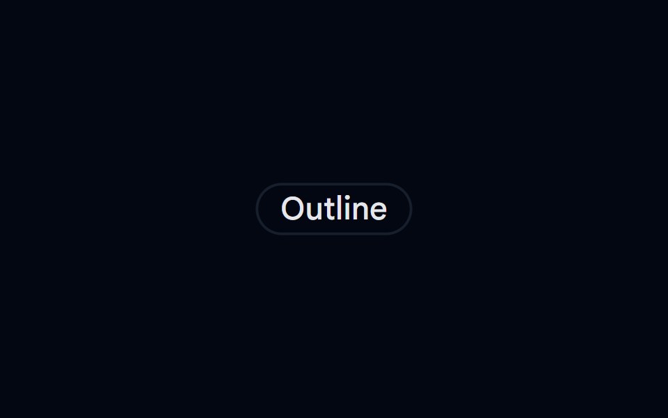 Badge-03 - OutlineShadcn Space · ReactBadge component
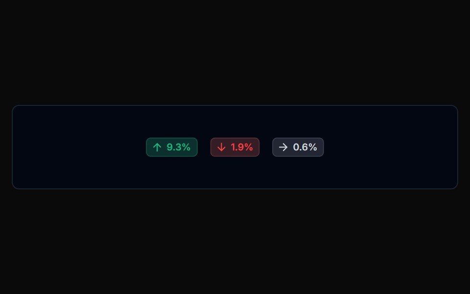 Badge 03Tremor Blocks · React
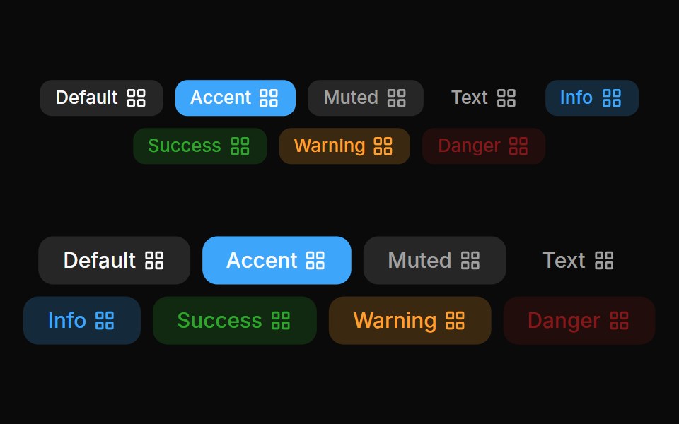 Badges 03Oxbow UI · Astro
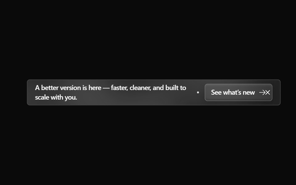 Announcement 4Watermelon UI · React
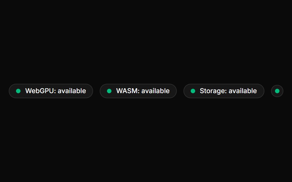 Device BadgeLocalMode · ReactA local-first capability badge. Detects WebGPU / WASM / IndexedDB support via a bundled useCapabilities() hook…
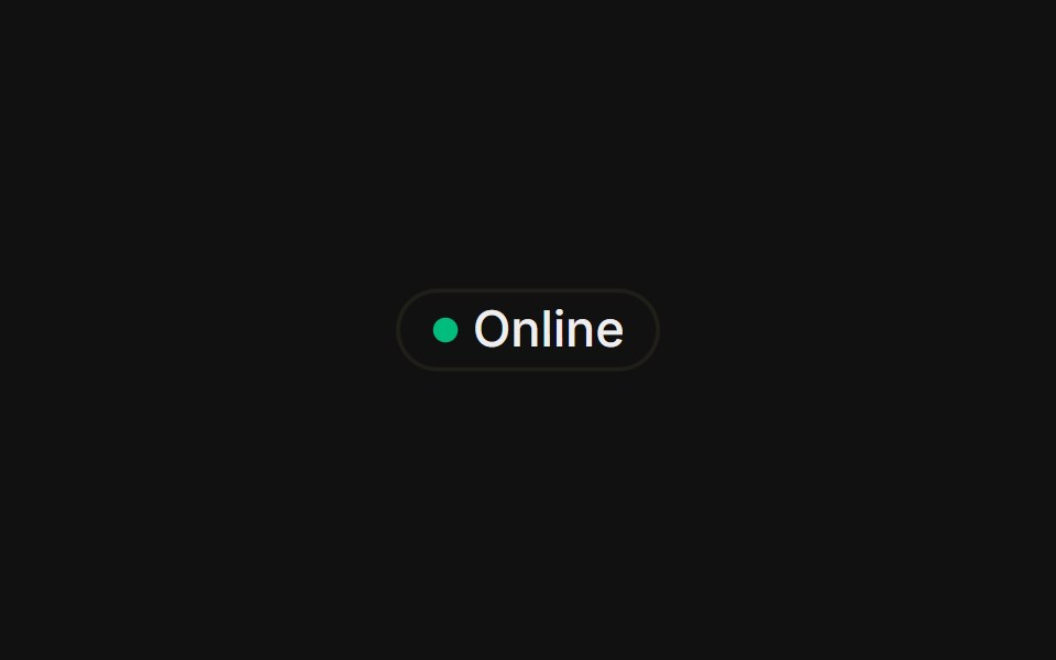 With status dotFLX UI · ReactA colored presence dot beside an outline label.
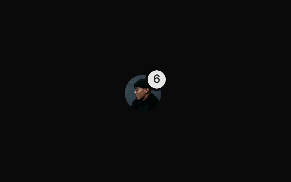 With Notification Badgesv-particles · Svelte
 Comp 416Origin UI · React
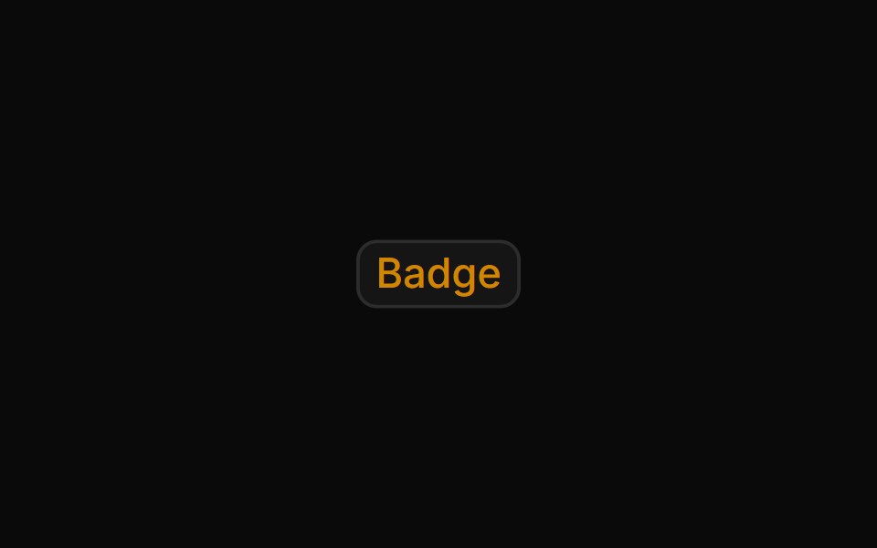 Warning outline badgeReUI · ReactWarning outline badge
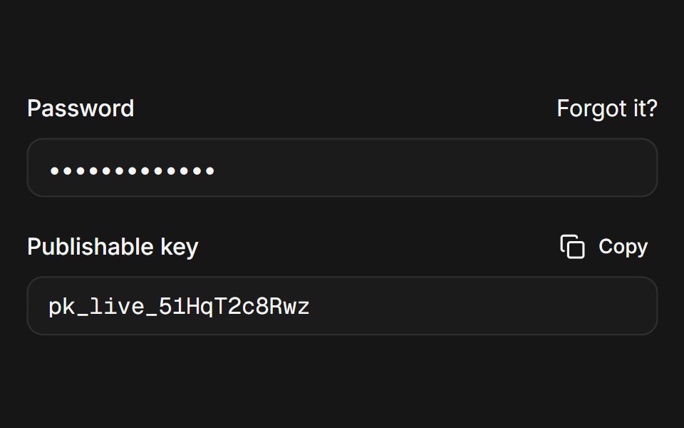 Web LabelPanel UI · React Native
 Badge-07 - SuccessShadcn Space · ReactAnimated success badge with top glow and letter-by-letter reveal
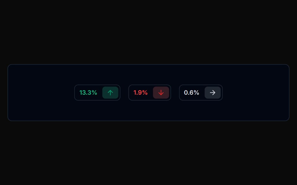 Badge 04Tremor Blocks · React
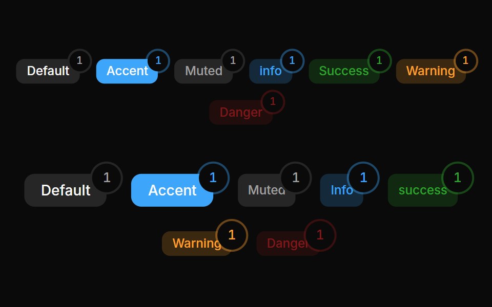 Badges 05Oxbow UI · Astro
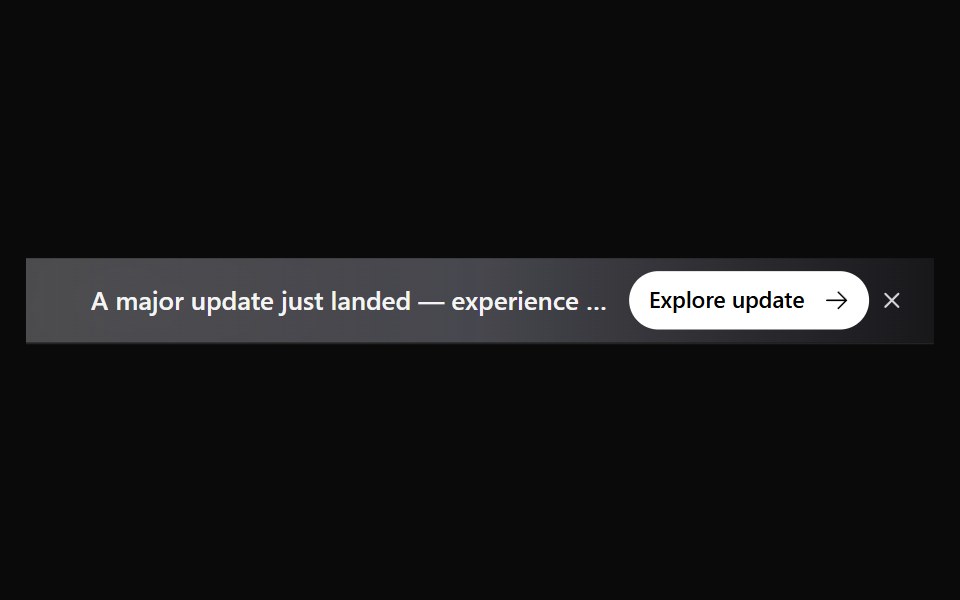 Announcement 5Watermelon UI · React
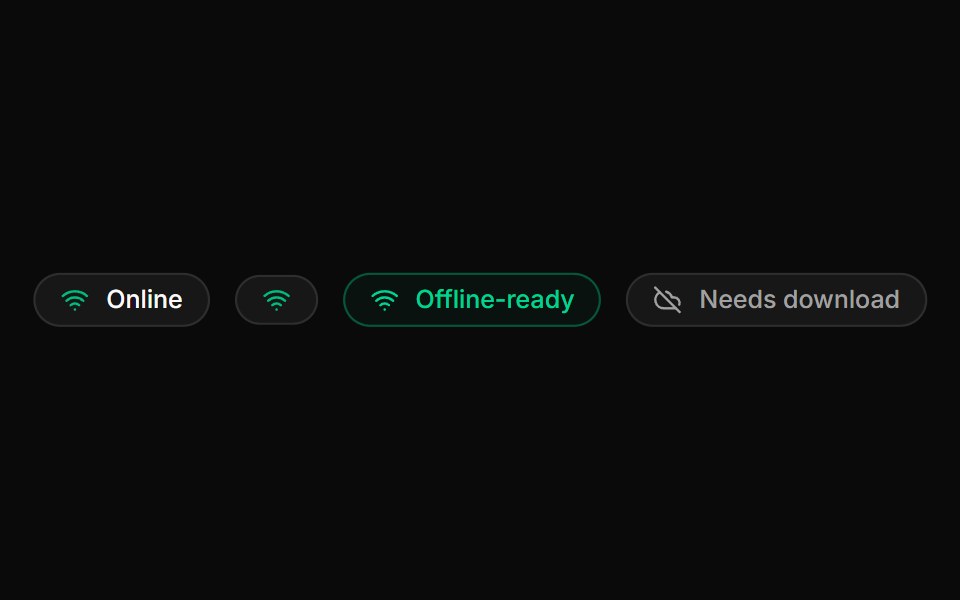 Network BadgeLocalMode · ReactA reactive online/offline indicator (NetworkBadge) sourced from useNetworkStatus, plus an OfflineReady badge that…
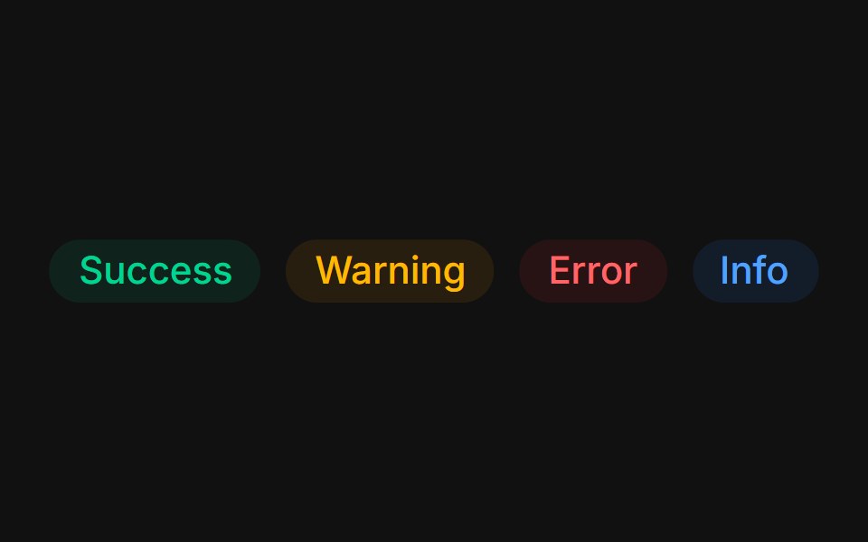 Status colorsFLX UI · ReactTinted success, warning, error, and info states.
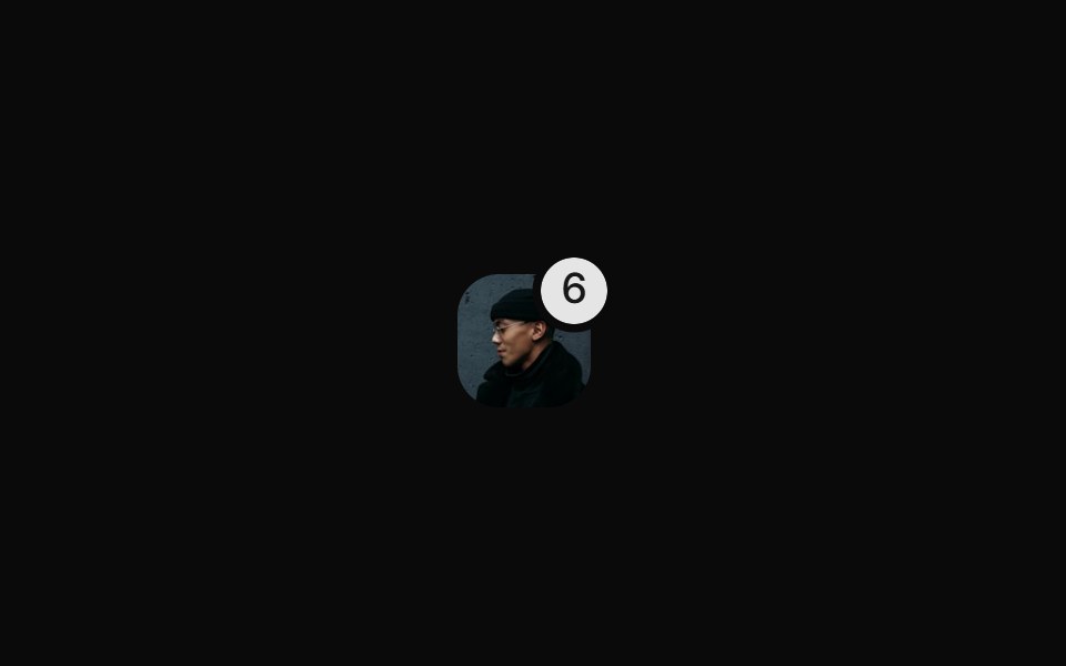 With Rounded Notification Badgesv-particles · Svelte
 Comp 417Origin UI · React
 Primary light badgeReUI · ReactPrimary light badge
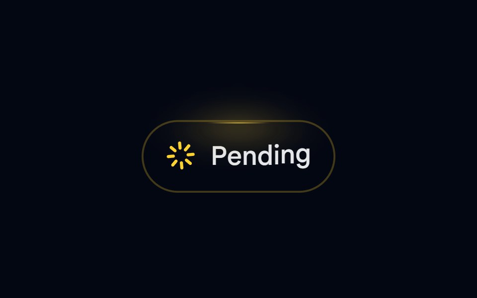 Badge-08 - PendingShadcn Space · ReactAnimated pending badge with spinning loader and top glow
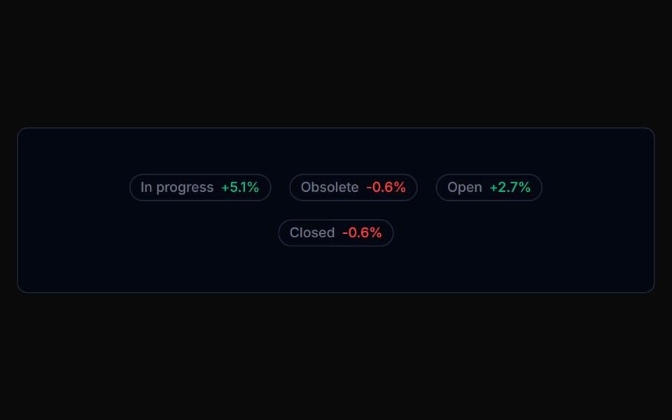 Badge 05Tremor Blocks · React
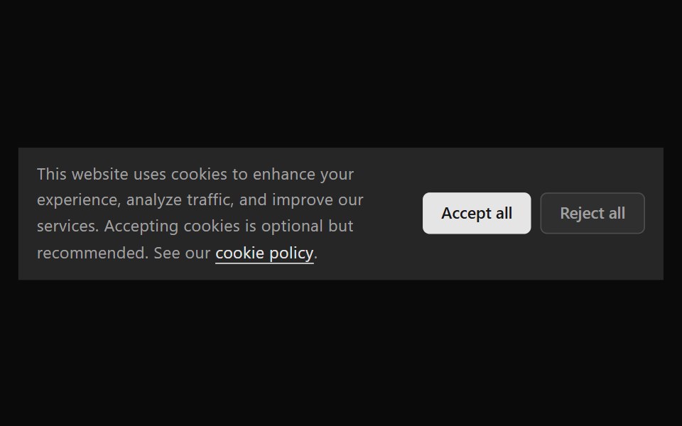 Announcement 6Watermelon UI · React
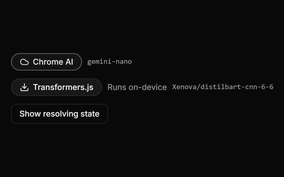 Provider BadgeLocalMode · ReactDisplays the RESOLVED provider identity - composing ProviderFallbackBadge for the tier and name - alongside the model…
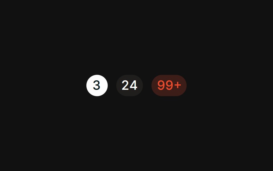 CountFLX UI · ReactPill-shaped numeric counts with tabular figures.
Libraries with Tailwind CSS badge components
Related categories
- Badge Components
- React Badge Components
- Svelte Badge Components
- Animated Badge Components
- shadcn/ui Badge Components
- Tailwind CSS Feedback Components
- Tailwind CSS Spinner Components
- Tailwind CSS Progress Components
- Tailwind CSS Alert Components
- Tailwind CSS Chip Components
- Tailwind CSS Progress Bar Components
- Tailwind CSS Empty State Components
- Tailwind CSS Notification Components
- Tailwind CSS Banner Components
- Tailwind CSS Status Indicator Components
- Tailwind CSS Skeleton Components
- Tailwind CSS Typing Indicator Components
- Tailwind CSS Progress Circle Components
- Tailwind CSS Error State Components
- Tailwind CSS Scroll Progress Components
- Tailwind CSS Success Animation Components