 Dev Design Library
Tailwind CSS Chip Components
Dev Design Library indexes 133 Tailwind CSS chip components from 32 open-source UI libraries, with the most coming from ReUI, Origin UI, Tremor Blocks, FLX UI and Oxbow UI. Each one links to its page with the source code, a live preview where available, the library license and the install command. Every library in this list styles its components with Tailwind CSS utility classes. Chip components belong to the Feedback group.
Showing 120 of 133, a mix from every library. Open a library to see all of its components.
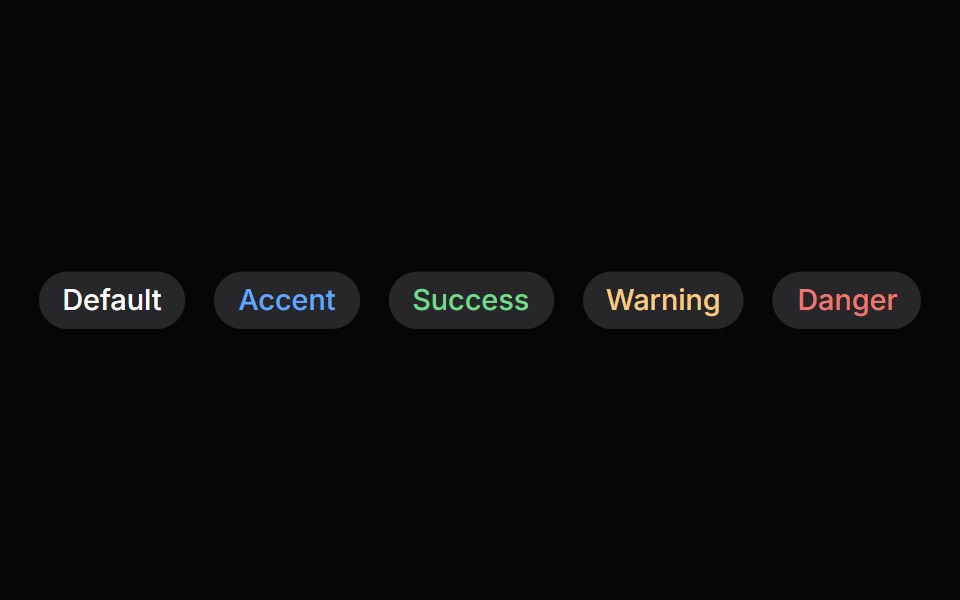 ChipHeroUI · ReactDisplays a compact element in a capsule shape.
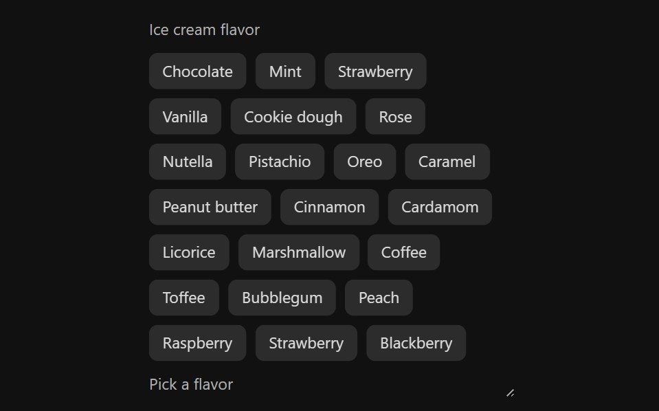 Tag GroupReact Spectrum · ReactTags allow users to categorize content. They can represent keywords or people, and are grouped to describe an item or…
 Comp 397Origin UI · React
 BadgeReUI · ReactBadges are used to highlight items, notify users, or display statuses.
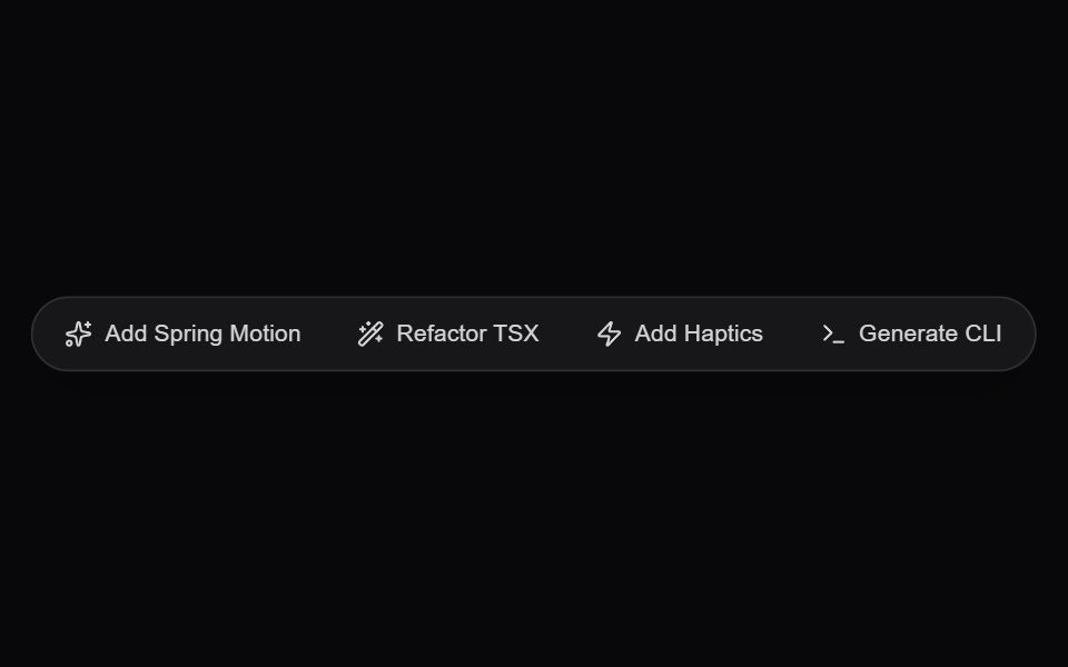 AI Floating Action PillAmicro Micro Transitions · ReactGlassmorphic floating quick-action pill dock for instant generative prompts and actions.
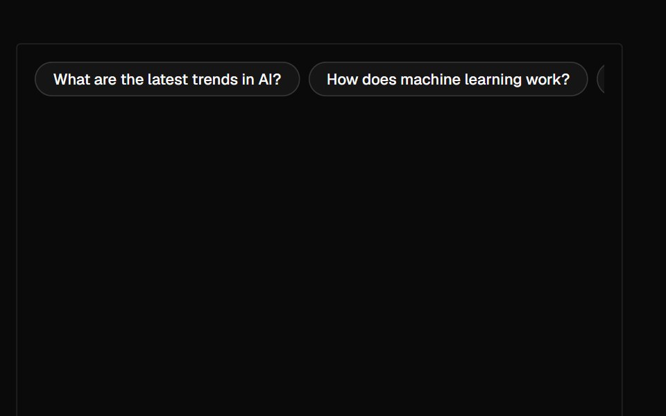 SuggestionAI Elements · ReactA suggestion component that displays a horizontal row of clickable suggestions for user interaction.
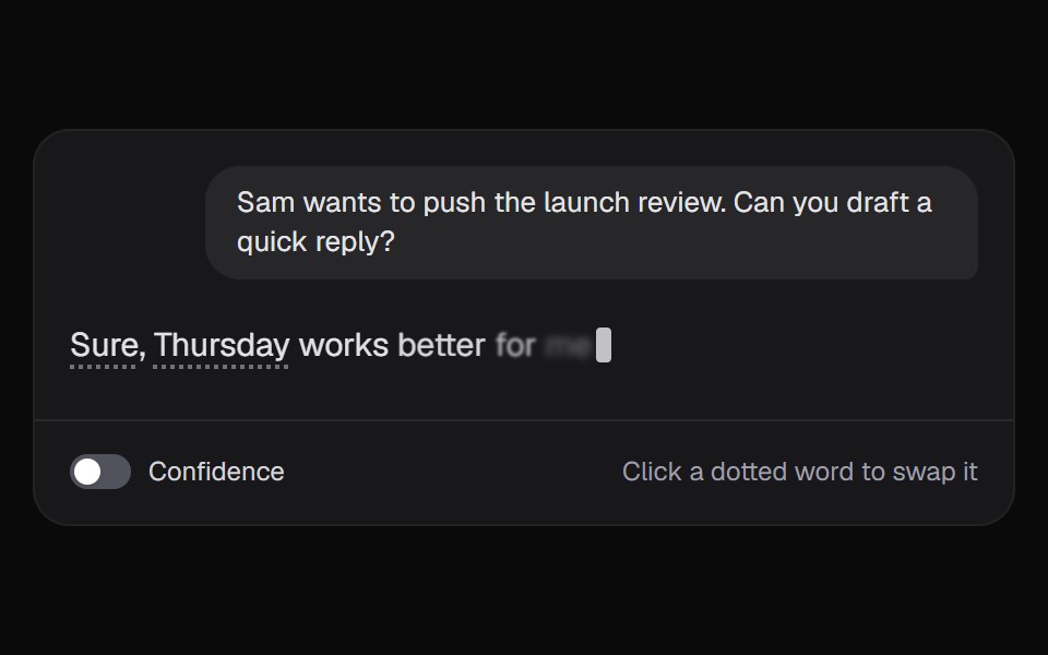 AI Token AlternativesKokonut UI · ReactAn answer where every unsure word shows what else the model weighed. Pick another word and the reply writes itself…
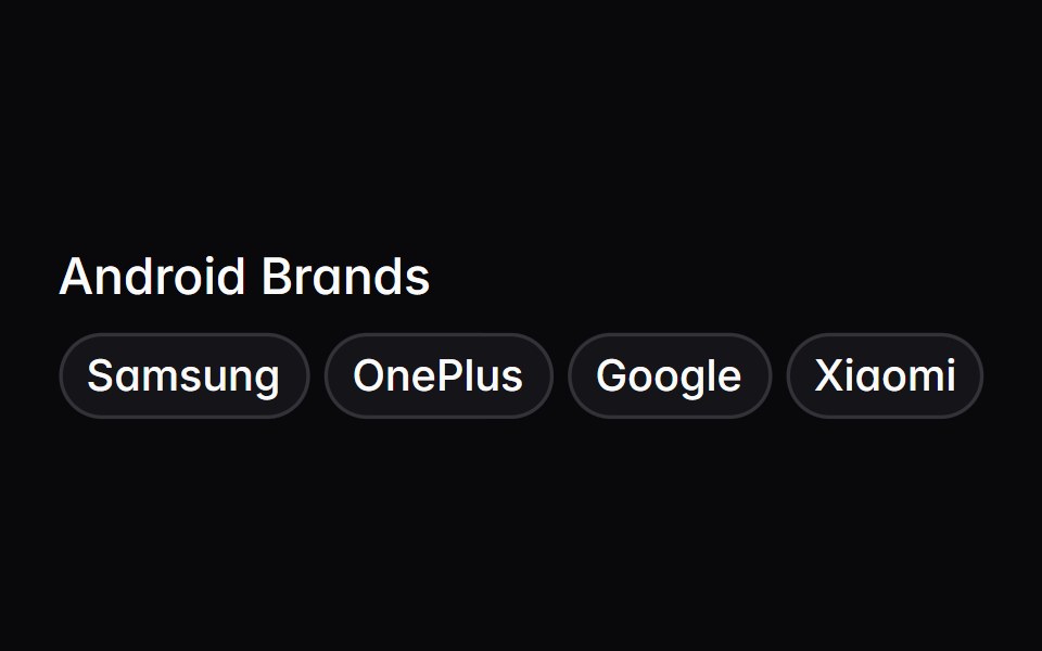 tag-groupIntent UI · Reacttag-group
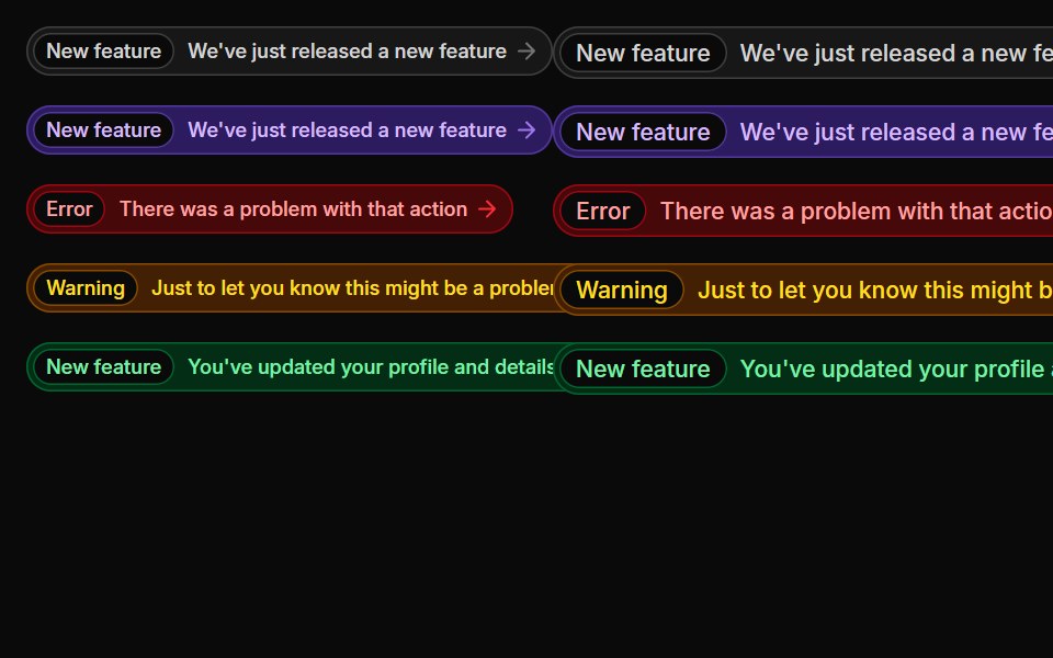 BadgesUntitled UI React · React
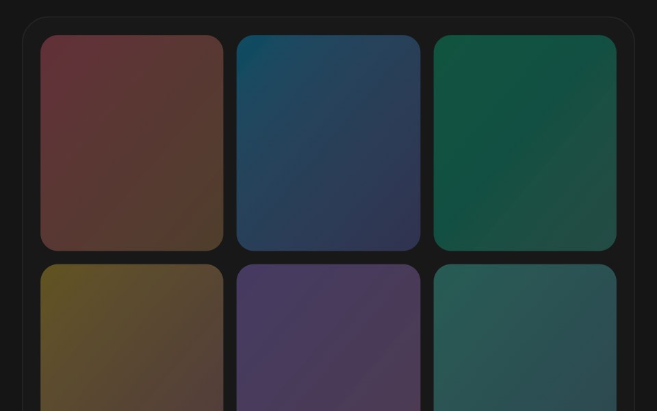 Morphing Search ChipsbeUI · React
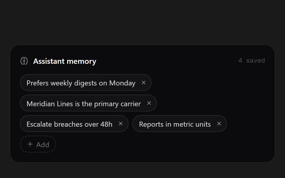 Memory ChipsSpectrum UI · ReactWhat the assistant remembers, as removable chips.
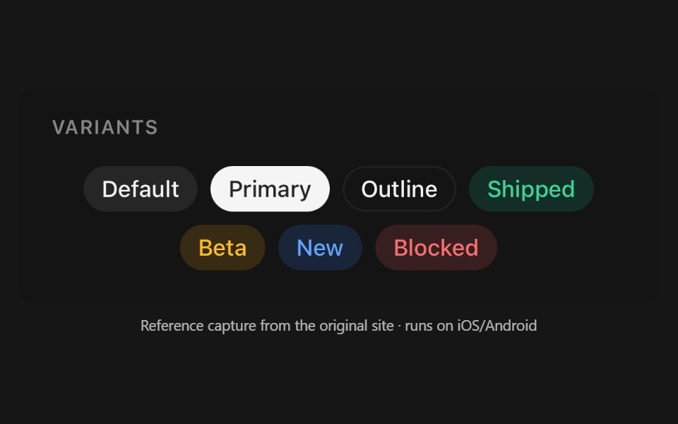 ChipPanel UI · React NativeInteractive pill — a filter, a tag, or a removable token.
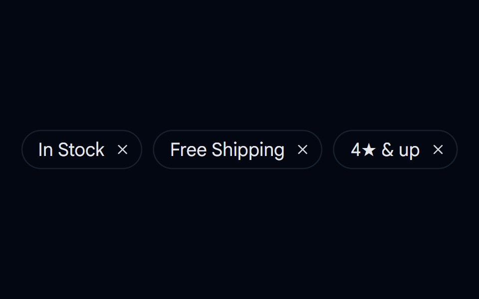 Badge 12 - Removable Filter ChipShadcn Space · ReactDismissible filter chip badge with hover/tap micro-interactions and animated removal
 Text Inline Chip RevealPixel Perfect · ReactA headline whose words resolve from a hue-shifting glow into solid ink, around inline chips that sit in the text flow.
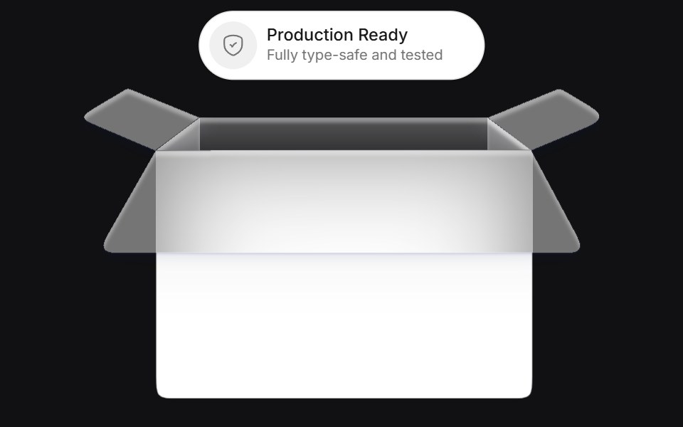 Bucketuselayouts · ReactAn interactive card component that simulates a bucket where chips are tossed and replaced with smooth physics-inspired…
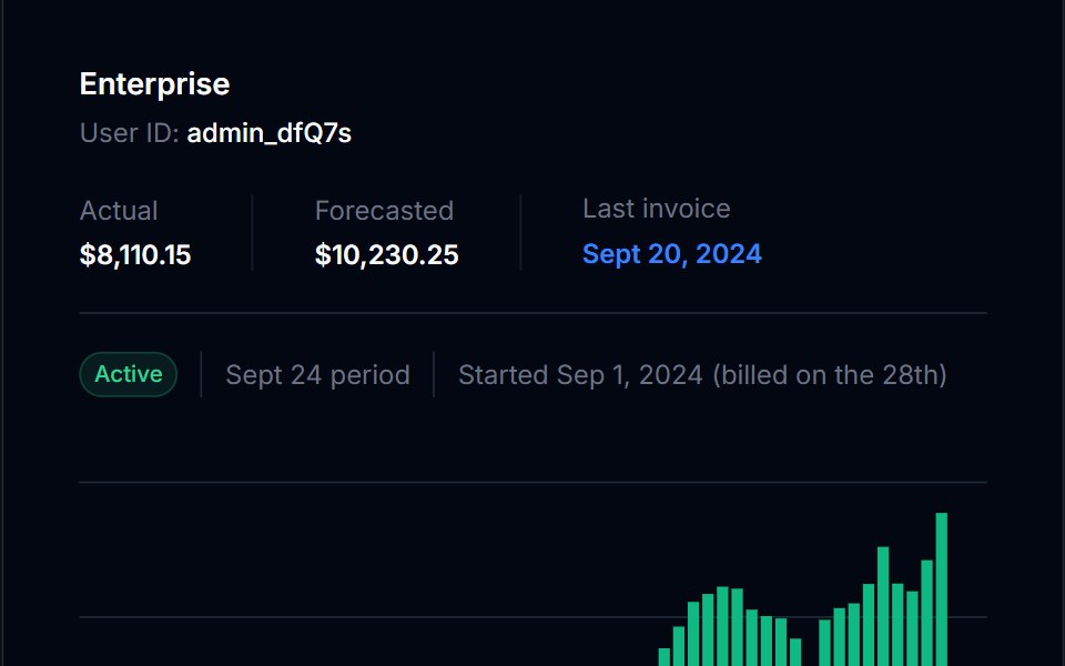 BadgeTremor Blocks · React
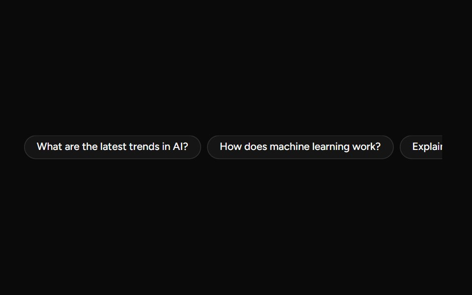 SuggestionAI Elements (Svelte) · SvelteA compact suggestion button set for displaying prompt ideas and quick actions.
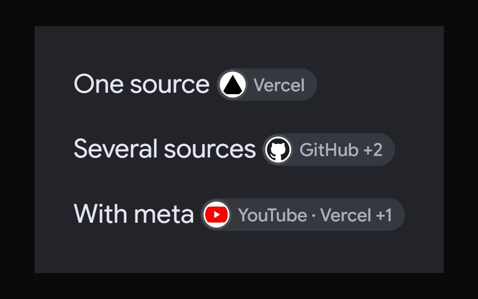 AI Overview CitationNotra · ReactA source chip built on shadcn Badge and HoverCard.
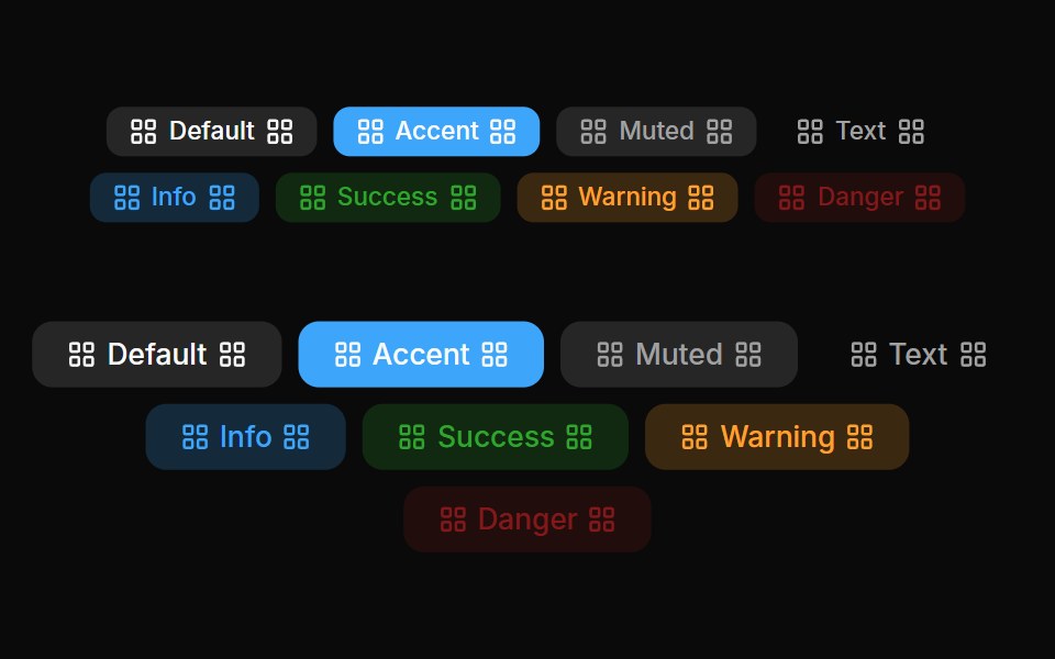 Badges 04Oxbow UI · AstroLeft and right badge
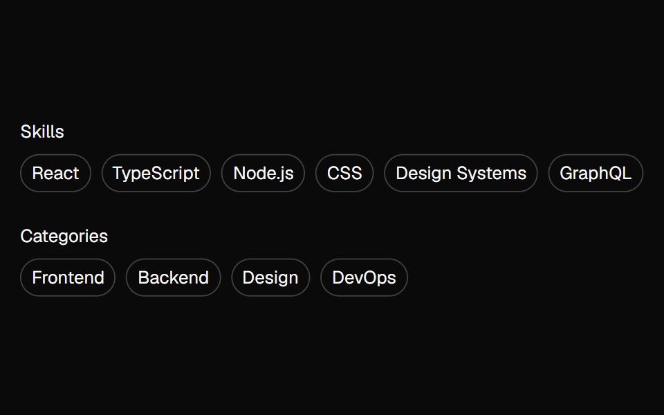 tag-groupBaseLayer · ReactA tag group is a focusable list of labels, categories, keywords, filters, or other items, with support for keyboard…
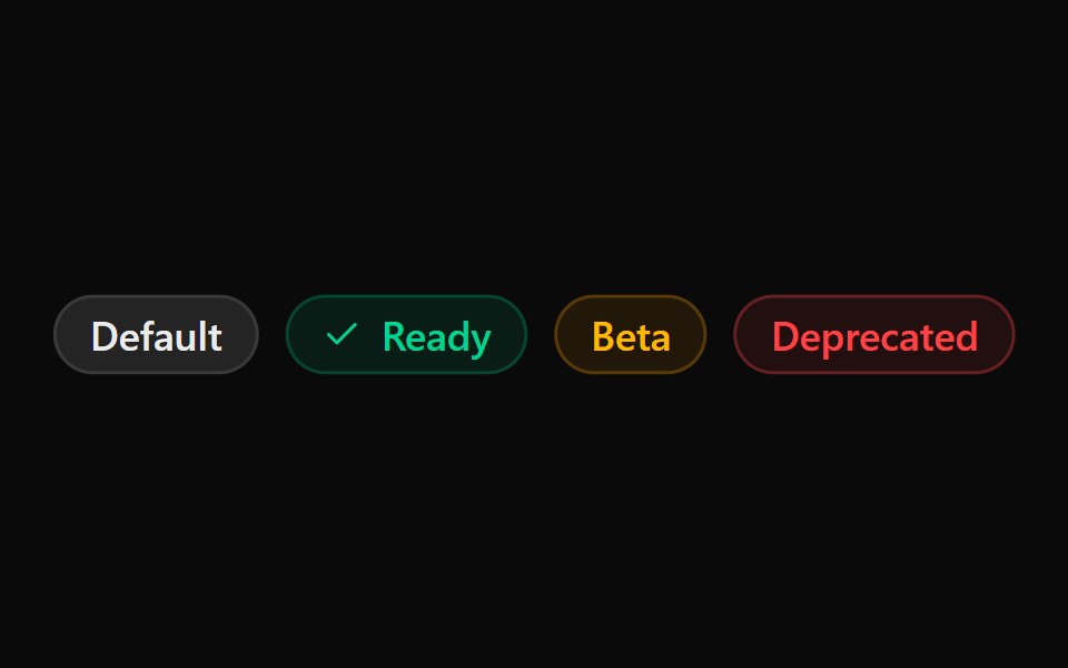 ChipSona UI · React
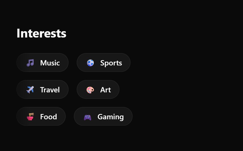 Emoji Spree Choice ChipsWatermelon UI · React
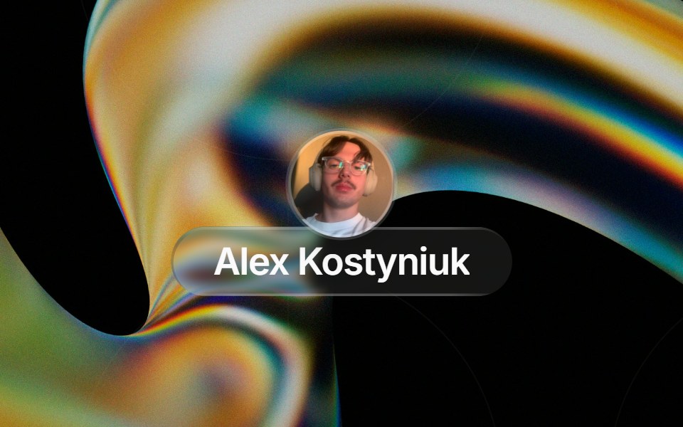 Glass Contact Pillglasscn · ReactLiquid-glass contact chip with an avatar (image or initials fallback) and name, for messaging apps
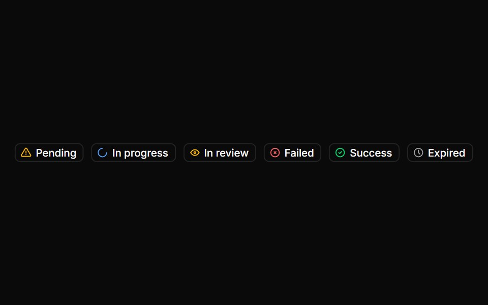 BadgeHextaUI · ReactStatus labels with colored dots, removable tags that slide closed and counts that roll to their new value.
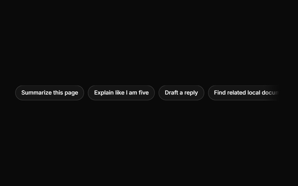 SuggestionsLocalMode · ReactA horizontal row of selectable prompt chips; each Suggestion invokes a callback with its text to seed the composer.
 BasicFLX UI · ReactA single default badge.
 ChipMetal UI · React + SwiftUIA small pill with an optional leading LED or glyph and trailing actions: suggestion, glass, glass-action and tag.
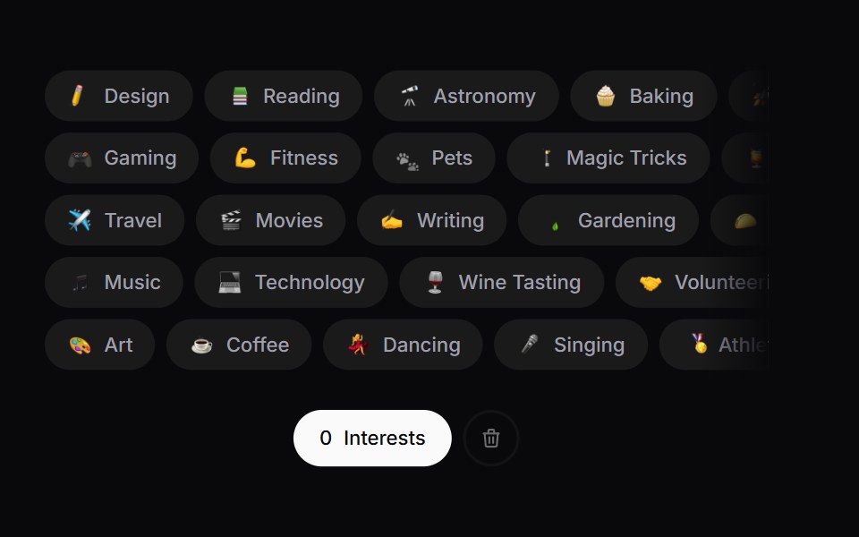 Interest PickerSpaceUI · ReactA draggable row-packed interest picker with an emoji burst on select and a shake-to-explode clear action.
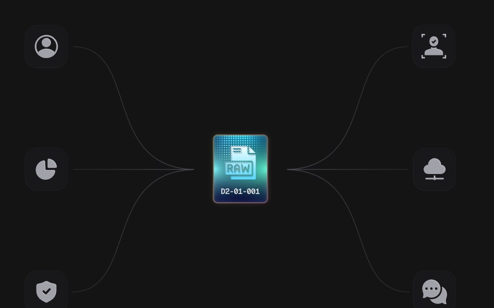 Power ChipD2Studio UI · ReactAn animated SVG illustration: a RAW chip charges and sends power along six wires to the tiles around it. Plain SVG and…
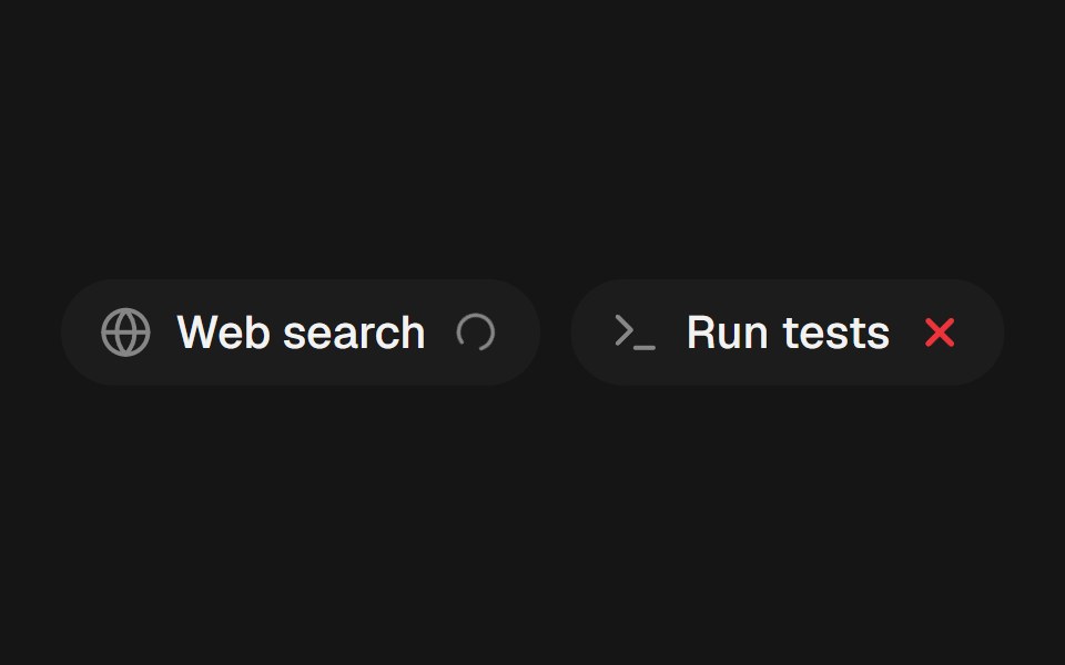 Tool ChipEaseUI · ReactA small pill naming a tool an agent used, with a spinner, check, or error mark that crossfades in place as its status…
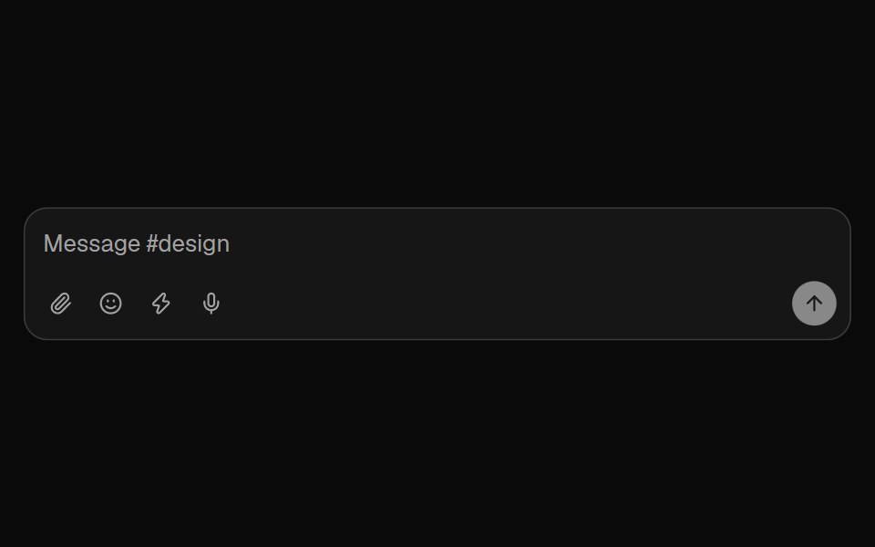 Chat ComposerFibo · ReactA message box built from parts around one draft, so each chat surface composes its own.
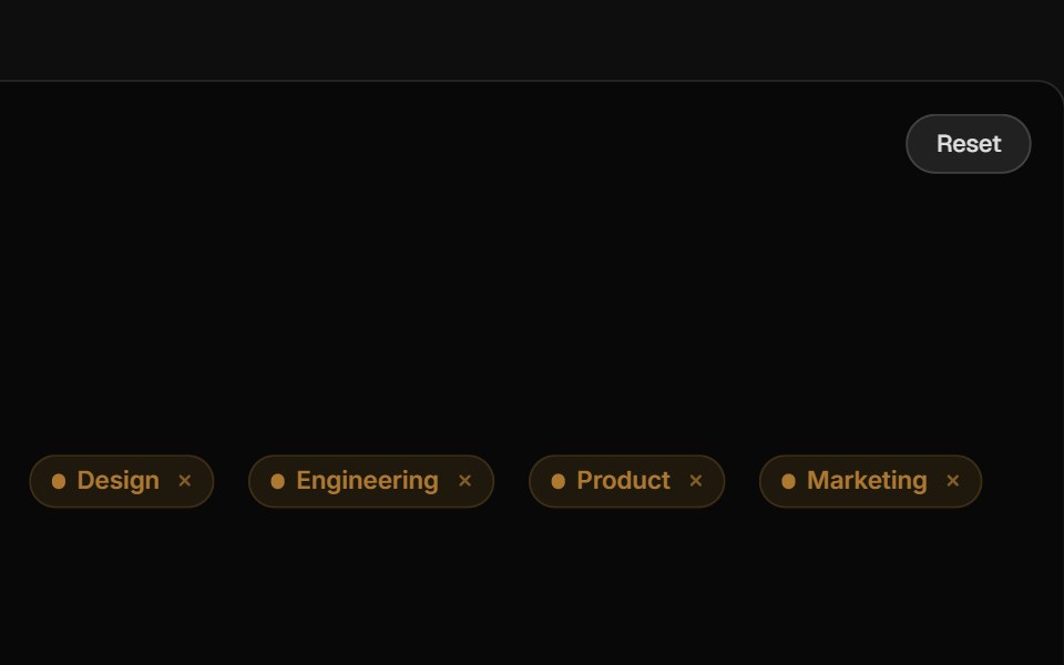 TagReactFrame · ReactA compact label tag with soft, solid and outline variants, 6 colors, 3 sizes, an optional pulsing dot, icon, count…
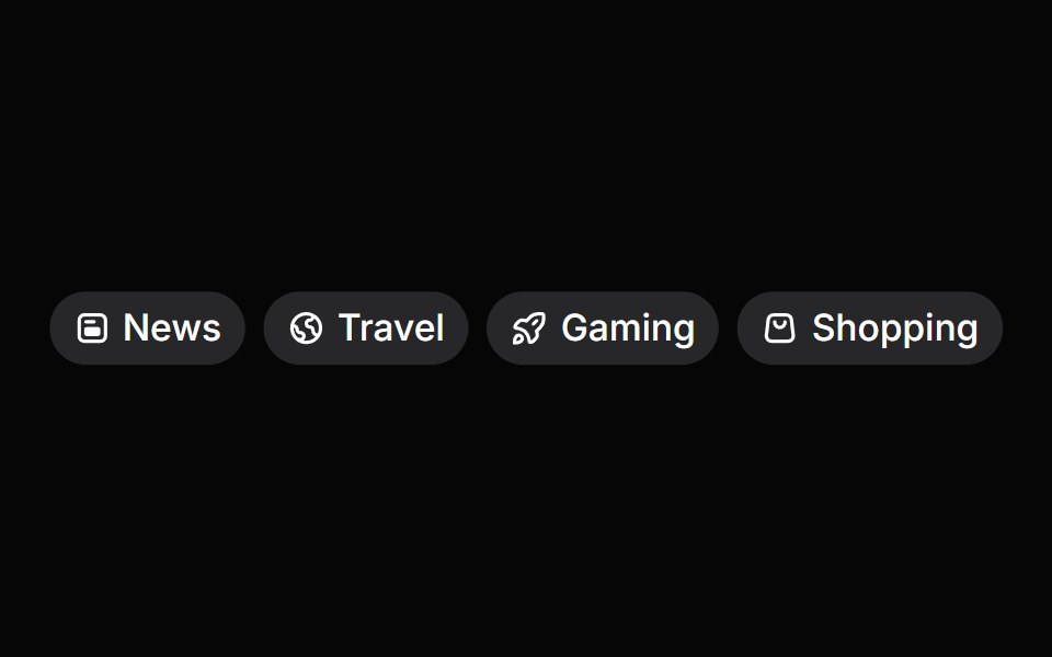 Tag GroupHeroUI · ReactA compound component for displaying and managing selectable tags with optional removal.
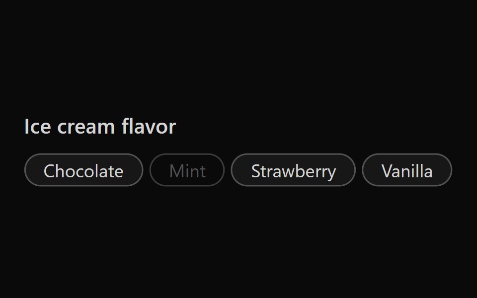 Tailwind Tag GroupReact Spectrum · React
 Comp 398Origin UI · React
 Default badgeReUI · ReactDefault badge
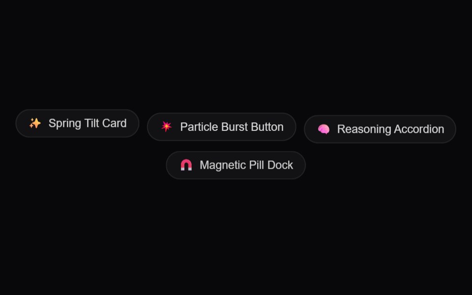 AI Prompt Suggestion ChipsAmicro Micro Transitions · ReactCategorized quick-prompt suggestion chips with spring physics bounce and one-tap populating.
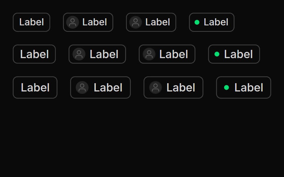 TagsUntitled UI React · React
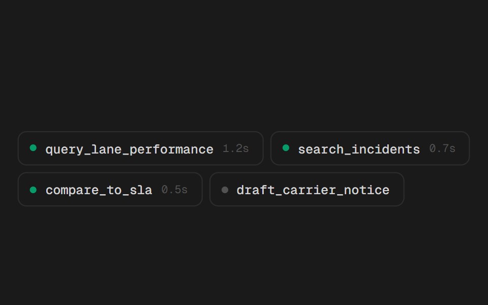 Tool ChipsSpectrum UI · ReactCompact tool-call chips that expand into their arguments and result.
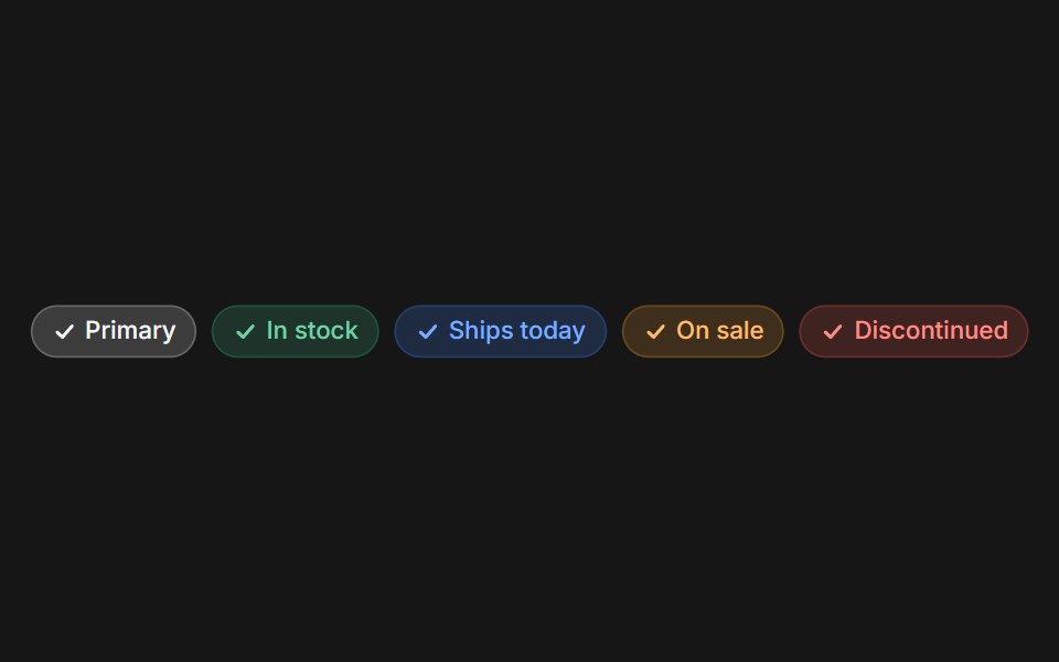 Web ChipPanel UI · React NativeChips for filters, tags and stock or status labels.
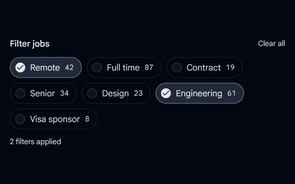 Checkbox 12 - Filter ChipsShadcn Space · ReactPill shaped checkbox chips for filtering with result counts, a checked style, and a clear all action.
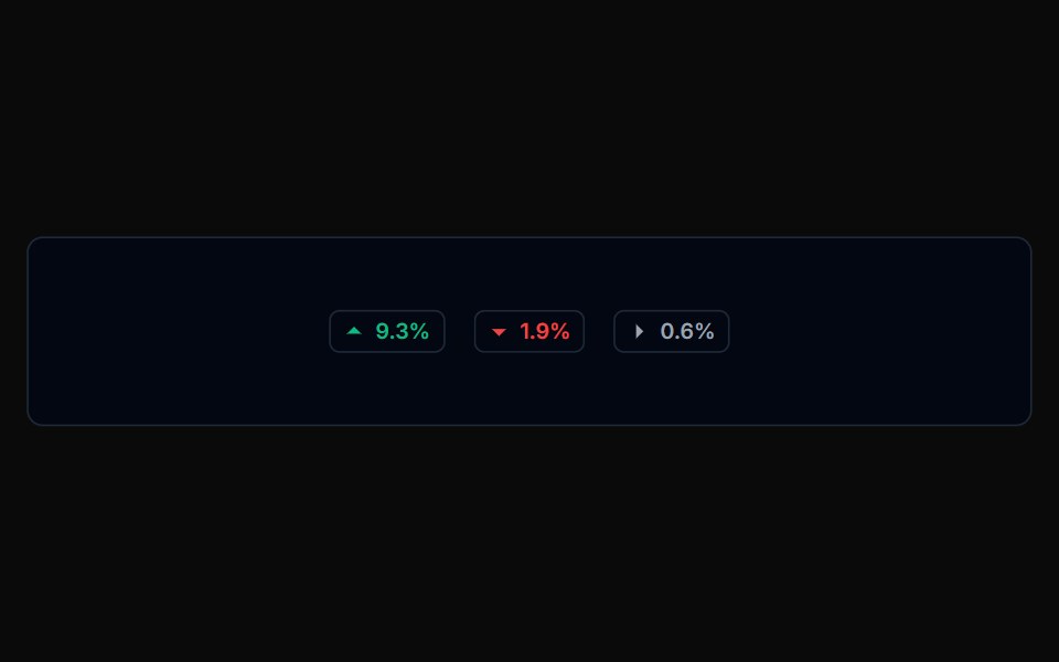 Badge 01Tremor Blocks · React
 ChatGPT Source ChipNotra · ReactAn inline citation pill with a hover card.
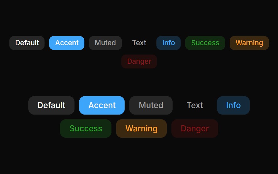 Badges 01Oxbow UI · Astro
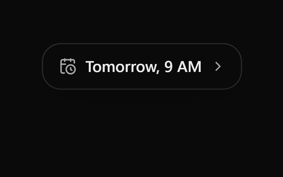 Schedule ChipSona UI · React
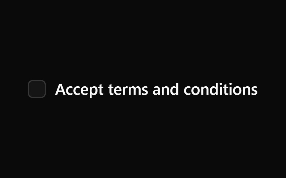 LabelWatermelon UI · React
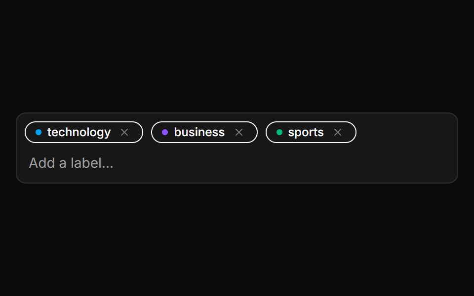 Editable Label SetLocalMode · ReactAn editable set of color-cycling removable chips managing a candidate-label list (zero-shot candidate labels or any…
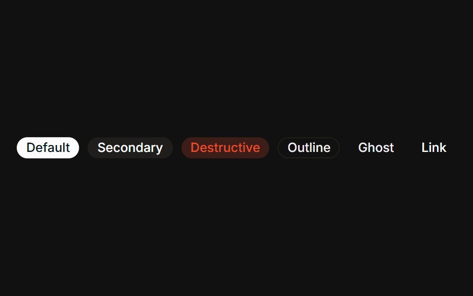 VariantsFLX UI · ReactAll six variants side-by-side: default, secondary, destructive, outline, ghost, link.
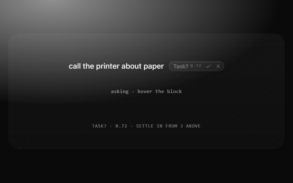 Suggestion chipMetal UI · React + SwiftUIOne question the recognizer asks at middle confidence, beside its block: Chip(suggestion) with the question, its…
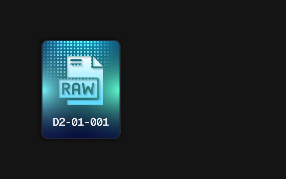 RAW ChipD2Studio UI · ReactThe RAW chip from Power Chip on its own: a static SVG illustration with no dependencies.
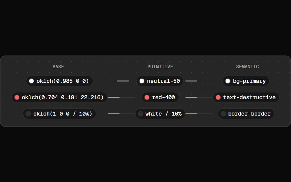 Token FlowFibo · ReactWalks a colour token from raw value to primitive to semantic role.
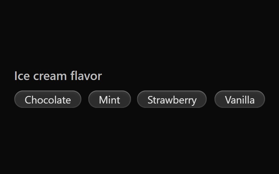 Vanilla Tag GroupReact Spectrum · React
 Comp 399Origin UI · React
 Info outline badgeReUI · ReactInfo outline badge
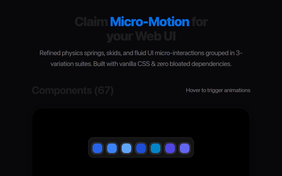 Elastic Tag SnapAmicro Micro Transitions · ReactMinimalist luggage tag with bungee spring snap and vertical recoil.
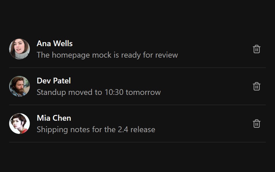 Undo PillSpectrum UI · ReactAn inline undo pill with a draining countdown ring that pauses on hover and fires undo or expire callbacks
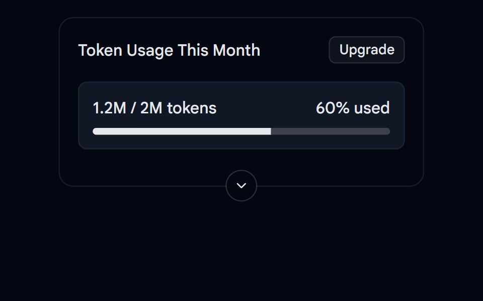 Collapsible 05 - Token UsageShadcn Space · ReactA collapsible usage card with a progress bar, summary and details.
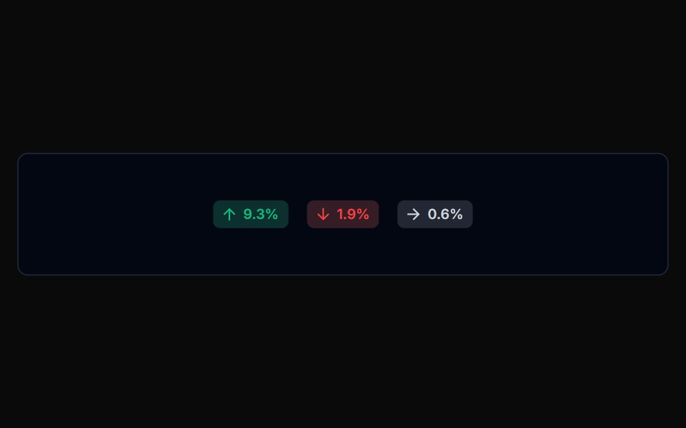 Badge 02Tremor Blocks · React
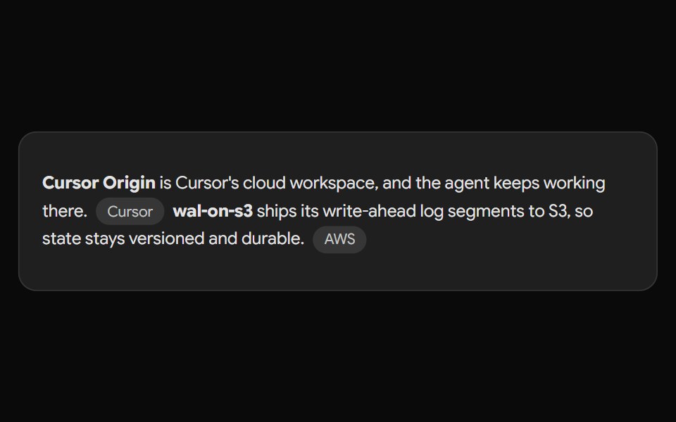 Gemini Source ChipNotra · ReactAn inline source pill with a hover card.
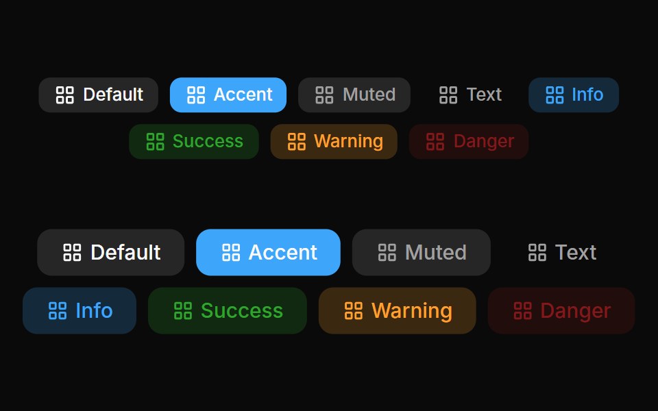 Badges 02Oxbow UI · Astro
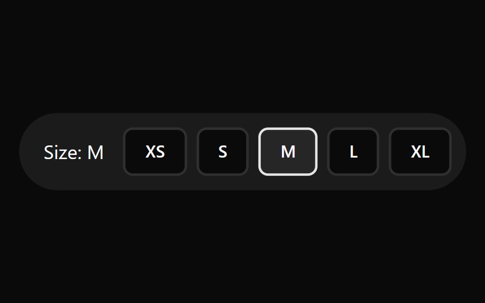 Label SelectorWatermelon UI · React
 With iconFLX UI · ReactLeading verified icon before the label.
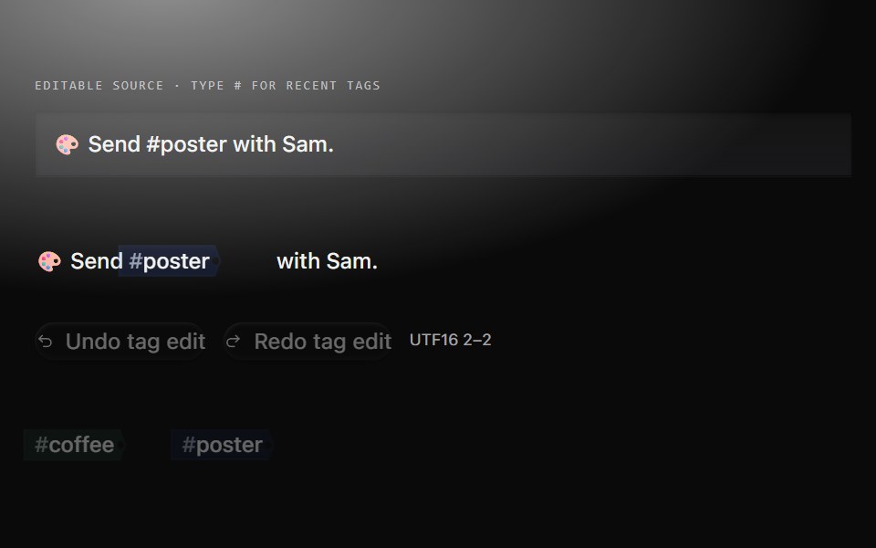 Tag cueMetal UI · React + SwiftUIRecent source tags cycle with canonical identity colour; a shared autocomplete chooses tags for a captured unfinished…
 Comp 413Origin UI · React
 Success outline badgeReUI · ReactSuccess outline badge
 Filter Tag PillAmicro Micro Transitions · React
 Pagination 01 - Floating PillShadcn Space · ReactA floating pill-style pagination with smooth morphing animations.
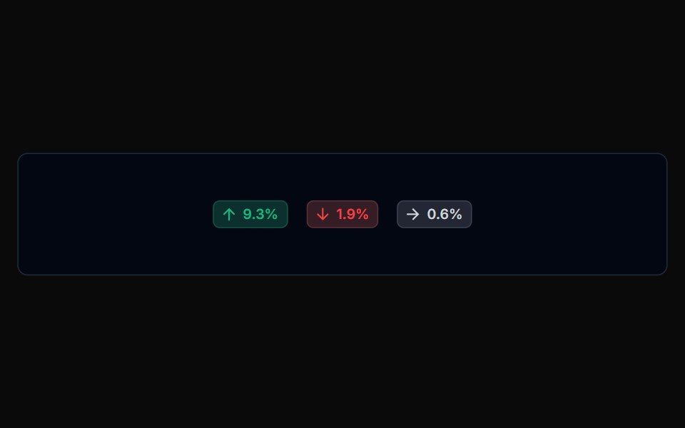 Badge 03Tremor Blocks · React
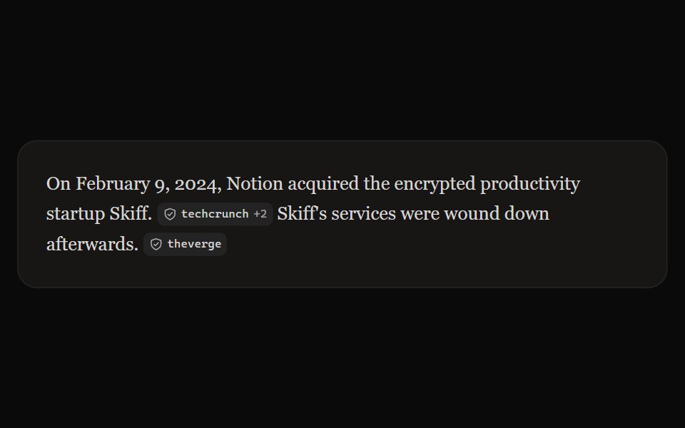 Perplexity CitationNotra · ReactAn inline source pill with favicon, label and +N count, built on shadcn Badge.
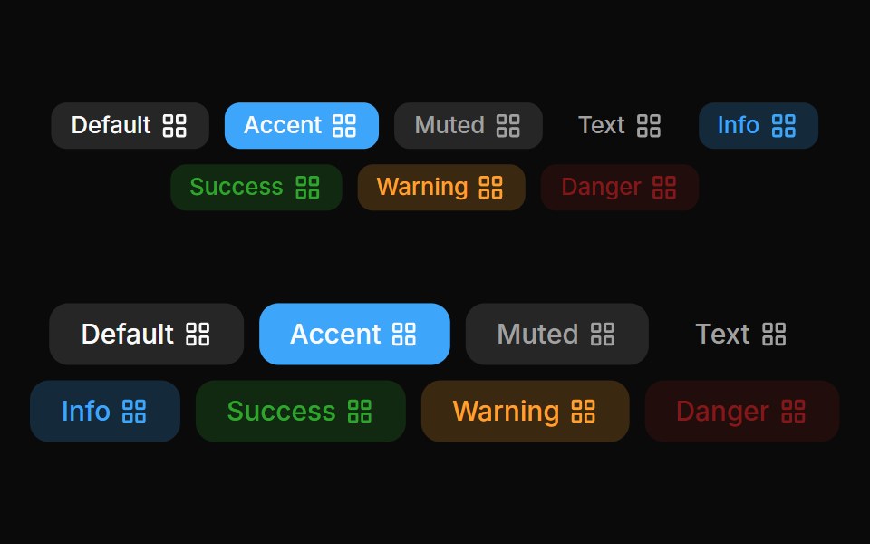 Badges 03Oxbow UI · Astro
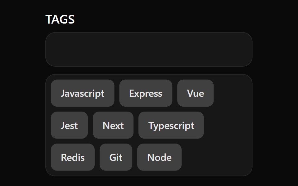 TagsWatermelon UI · React
 With status dotFLX UI · ReactA colored presence dot beside an outline label.
 Comp 414Origin UI · React
 Warning outline badgeReUI · ReactWarning outline badge
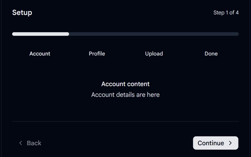 Stepper 04 - Segmented Progress PillShadcn Space · ReactMinimal segmented stepper with a spring-animated progress pill sliding across rounded segments, clickable step labels…
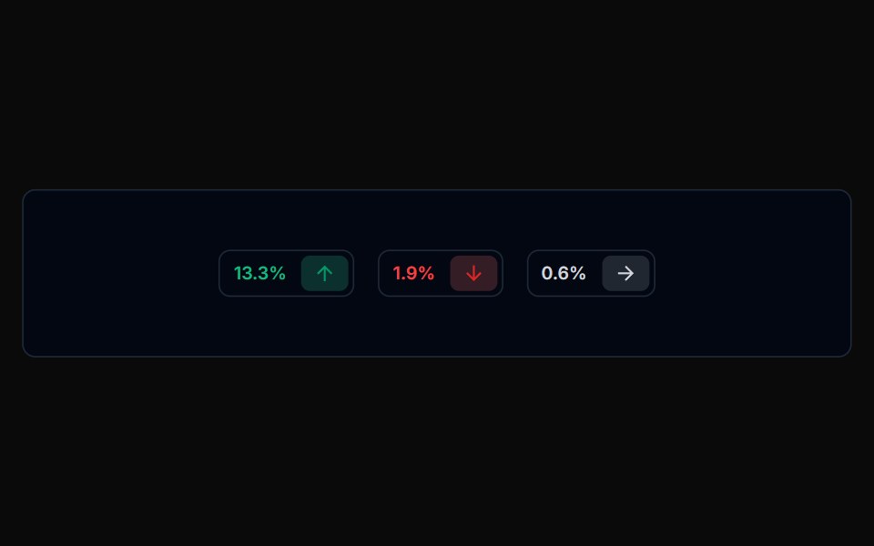 Badge 04Tremor Blocks · React
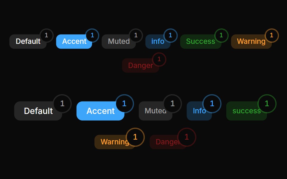 Badges 05Oxbow UI · Astro
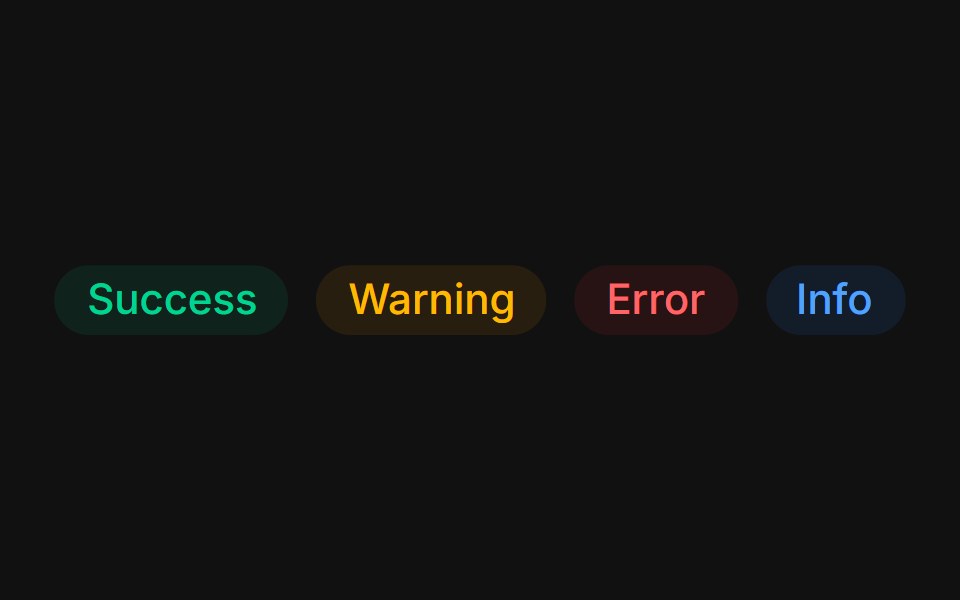 Status colorsFLX UI · ReactTinted success, warning, error, and info states.
 Comp 415Origin UI · React
 Primary light badgeReUI · ReactPrimary light badge
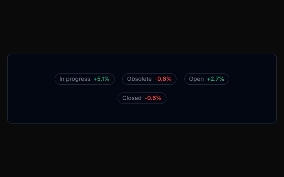 Badge 05Tremor Blocks · React
 CountFLX UI · ReactPill-shaped numeric counts with tabular figures.
 Comp 416Origin UI · React
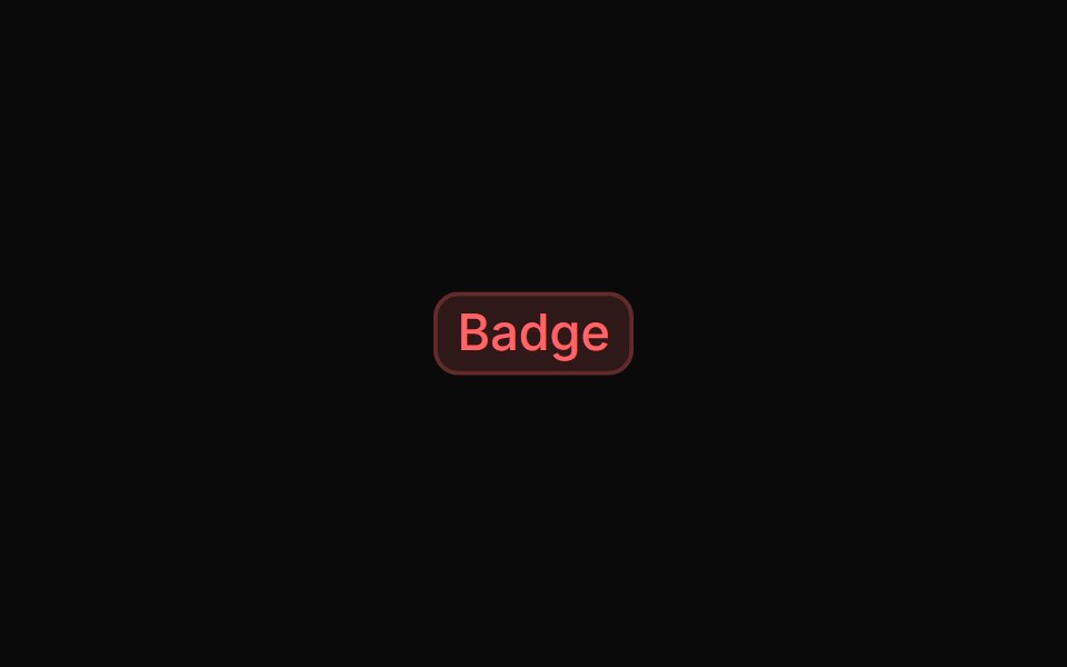 Destructive light badgeReUI · ReactDestructive light badge
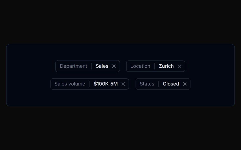 Badge 06Tremor Blocks · React
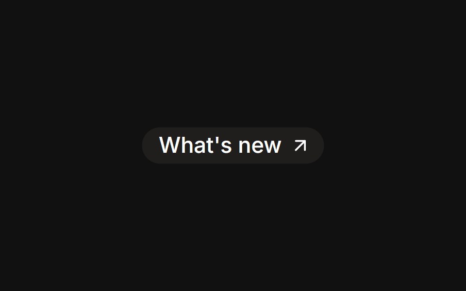 As linkFLX UI · Reactrender prop renders the badge as an anchor with a trailing icon.
 Comp 417Origin UI · React
 Success light badgeReUI · ReactSuccess light badge
 Badge 07Tremor Blocks · React
 RemovableFLX UI · ReactDismissible tag chips with a trailing remove button.
 Comp 418Origin UI · React
 Info light badgeReUI · ReactInfo light badge
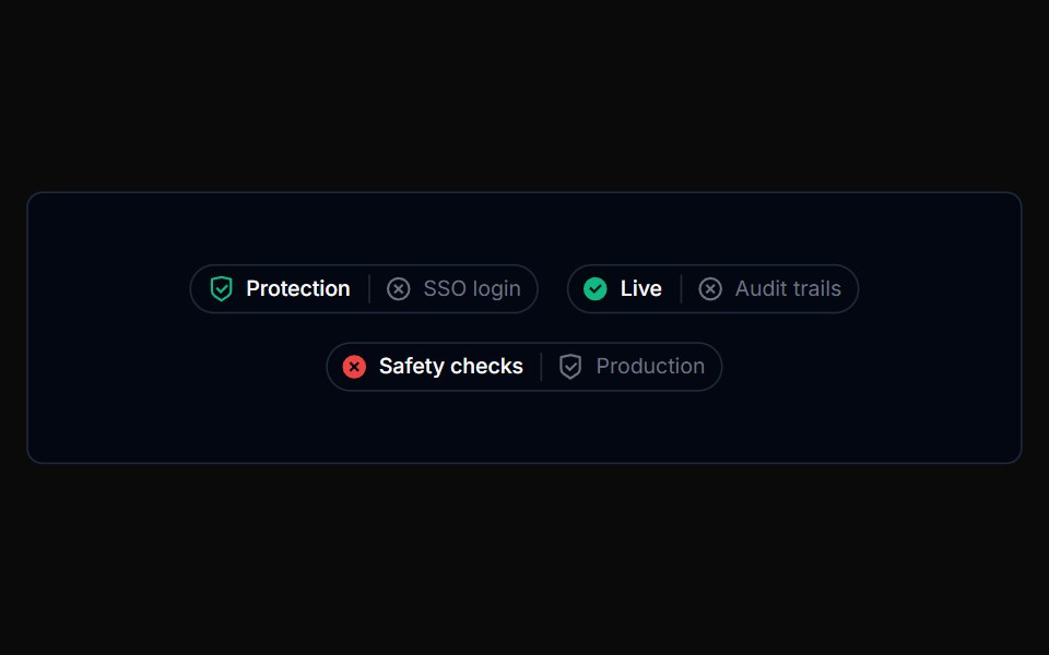 Badge 08Tremor Blocks · React
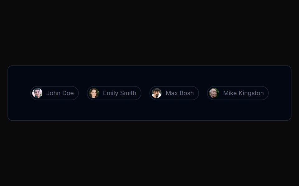
 With avatarFLX UI · ReactAssignee chip with a leading avatar inside the badge.
 Comp 419Origin UI · React
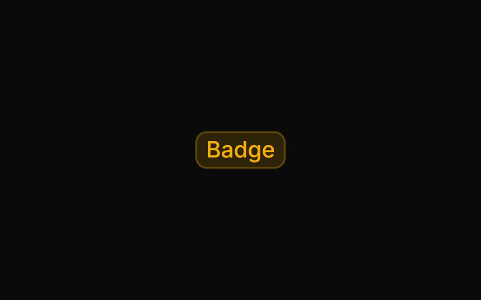 Warning light badgeReUI · ReactWarning light badge
 Badge 09Tremor Blocks · React
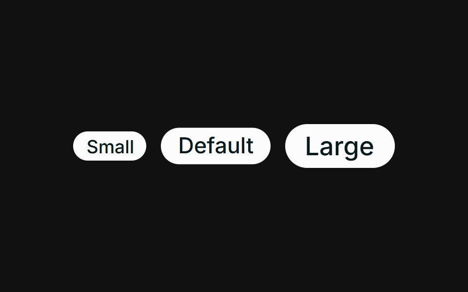 SizesFLX UI · ReactSmall, default, and large sizes via className.
 Comp 420Origin UI · React
 Badge size variationsReUI · ReactBadge size variations
 Badge 10Tremor Blocks · React
 Trend deltaFLX UI · ReactUp and down arrows with tinted gain / loss percentages.
 Comp 421Origin UI · React
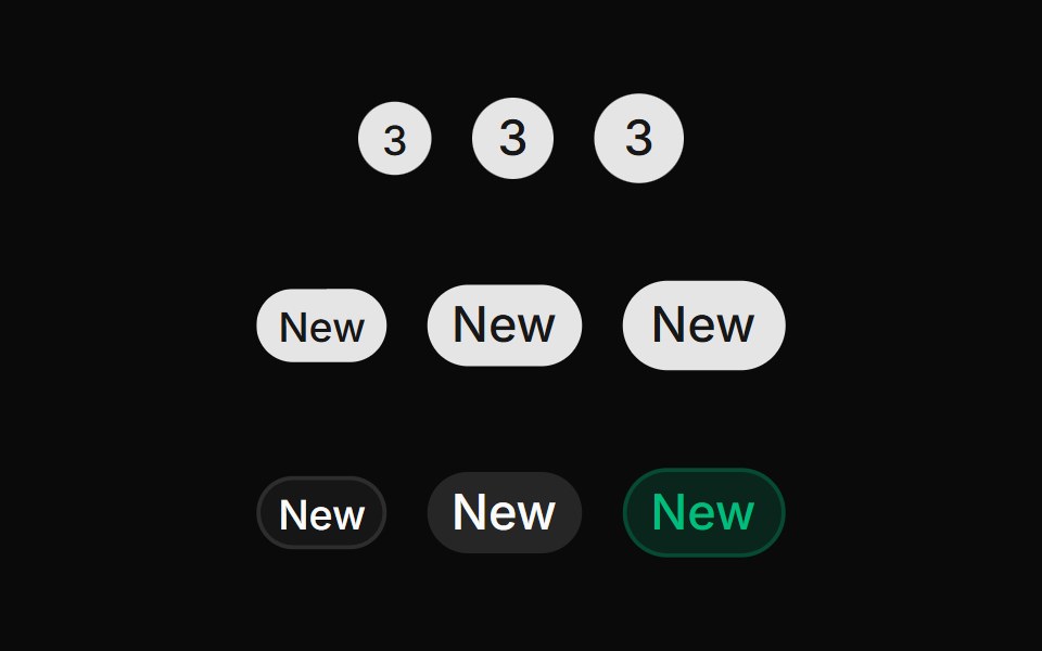 Badge with full radius (radius="full")ReUI · ReactBadge with full radius (radius="full")
 Badge 11Tremor Blocks · React
 Icon onlyFLX UI · ReactRound icon-only badges across variants.
 Comp 422Origin UI · React
 Secondary badgeReUI · ReactSecondary badge
 Badge 12Tremor Blocks · React
 Tag listFLX UI · ReactA wrapping group of outline badges as tags.
 Comp 423Origin UI · React
 Badge with an iconReUI · ReactBadge with an icon
 Badge 13Tremor Blocks · React
 Comp 424Origin UI · React
 Badge with a dismiss buttonReUI · ReactBadge with a dismiss button
 Comp 425Origin UI · React
 Badge with a status dotReUI · ReactBadge with a status dot
 Comp 477Origin UI · React
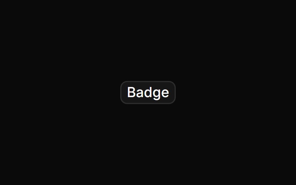 Badge rendered as a linkReUI · ReactBadge rendered as a link
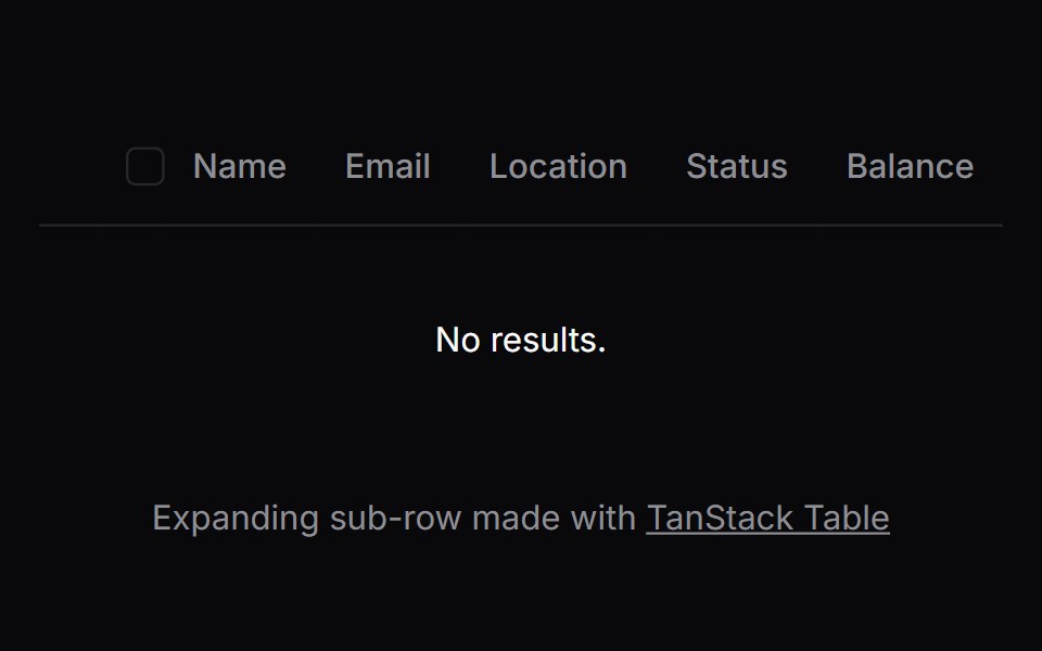 Comp 482Origin UI · React
Libraries with Tailwind CSS chip components
Related categories
- Chip Components
- React Chip Components
- Animated Chip Components
- shadcn/ui Chip Components
- Tailwind CSS Feedback Components
- Tailwind CSS Spinner Components
- Tailwind CSS Badge Components
- Tailwind CSS Progress Components
- Tailwind CSS Alert Components
- Tailwind CSS Progress Bar Components
- Tailwind CSS Empty State Components
- Tailwind CSS Notification Components
- Tailwind CSS Banner Components
- Tailwind CSS Status Indicator Components
- Tailwind CSS Skeleton Components
- Tailwind CSS Typing Indicator Components
- Tailwind CSS Progress Circle Components
- Tailwind CSS Error State Components
- Tailwind CSS Scroll Progress Components
- Tailwind CSS Success Animation Components