 Dev Design Library
Chip Components
Dev Design Library indexes 149 chip components from 43 open-source UI libraries, with the most coming from ReUI, Origin UI, Tremor Blocks, FLX UI and Oxbow UI. Each one links to its page with the source code, a live preview where available, the library license and the install command. Chip components belong to the Feedback group.
Showing 120 of 149, a mix from every library. Open a library to see all of its components.
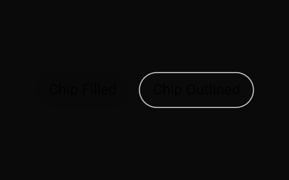 ChipMUI / Material UI · React
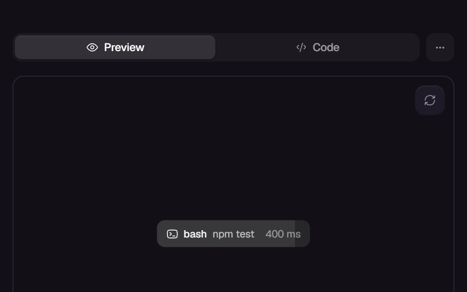 Call ChipReact Bits · ReactInline tool-call chip whose fill wipes across while a live ms counter ticks, completing with a green wash on success…
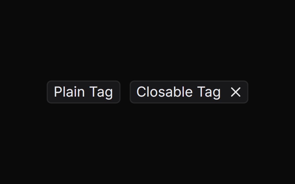 TagChakra UI · ReactUsed for categorizing or labeling content
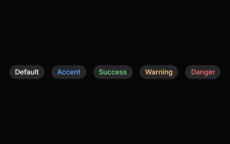 ChipHeroUI · ReactDisplays a compact element in a capsule shape.
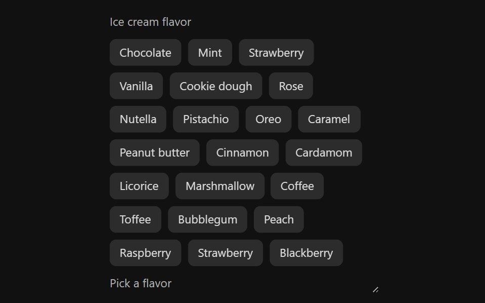 Tag GroupReact Spectrum · ReactTags allow users to categorize content. They can represent keywords or people, and are grouped to describe an item or…
 Comp 397Origin UI · React
 BadgeReUI · ReactBadges are used to highlight items, notify users, or display statuses.
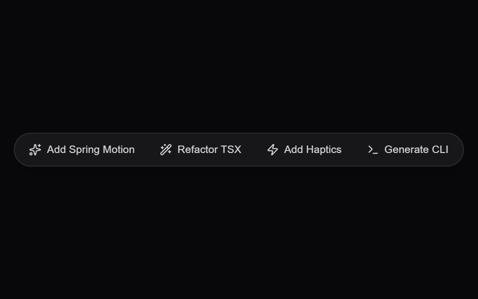 AI Floating Action PillAmicro Micro Transitions · ReactGlassmorphic floating quick-action pill dock for instant generative prompts and actions.
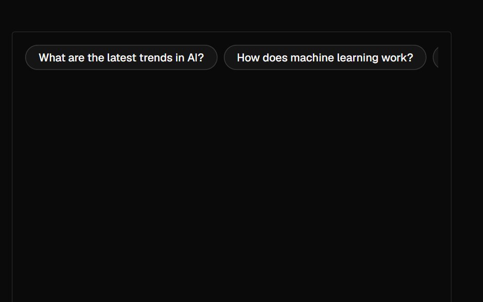 SuggestionAI Elements · ReactA suggestion component that displays a horizontal row of clickable suggestions for user interaction.
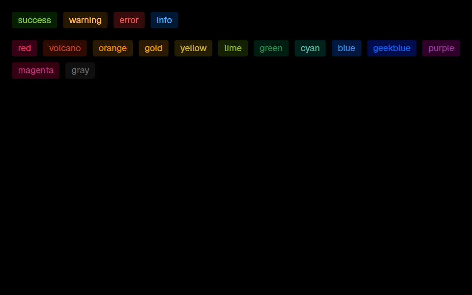 TagLobe UI · ReactStandalone colored tag for statuses and categorization, with preset and hex colors, sizes, shapes, variants, and a…
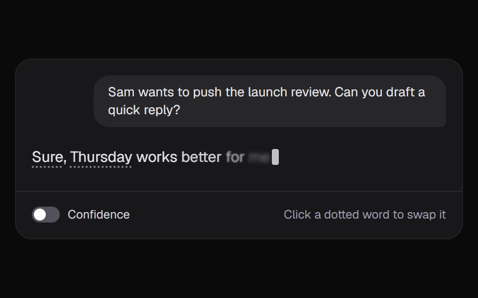 AI Token AlternativesKokonut UI · ReactAn answer where every unsure word shows what else the model weighed. Pick another word and the reply writes itself…
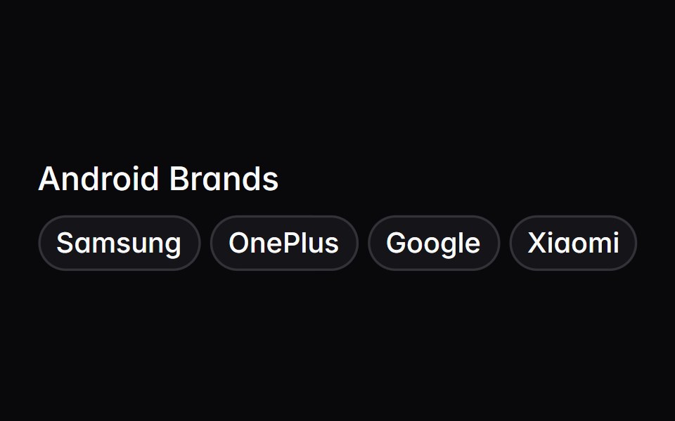 tag-groupIntent UI · Reacttag-group
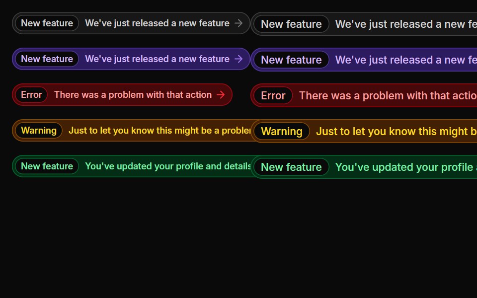 BadgesUntitled UI React · React
 Morphing Search ChipsbeUI · React
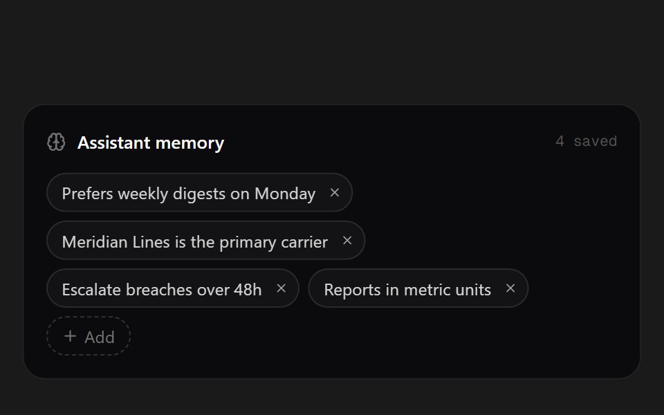 Memory ChipsSpectrum UI · ReactWhat the assistant remembers, as removable chips.
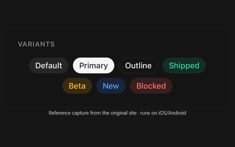 ChipPanel UI · React NativeInteractive pill — a filter, a tag, or a removable token.
 Badge 12 - Removable Filter ChipShadcn Space · ReactDismissible filter chip badge with hover/tap micro-interactions and animated removal
 Text Inline Chip RevealPixel Perfect · ReactA headline whose words resolve from a hue-shifting glow into solid ink, around inline chips that sit in the text flow.
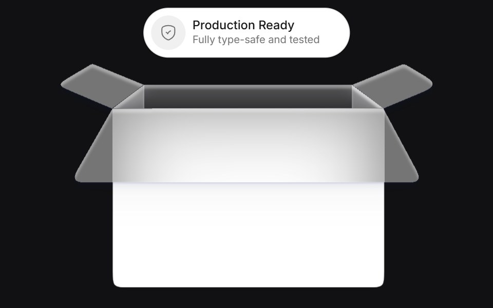 Bucketuselayouts · ReactAn interactive card component that simulates a bucket where chips are tossed and replaced with smooth physics-inspired…
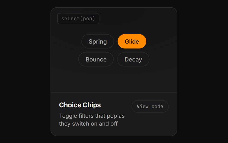 Choice ChipsKinetics · HTML/CSSToggle filters that pop as they switch on and off
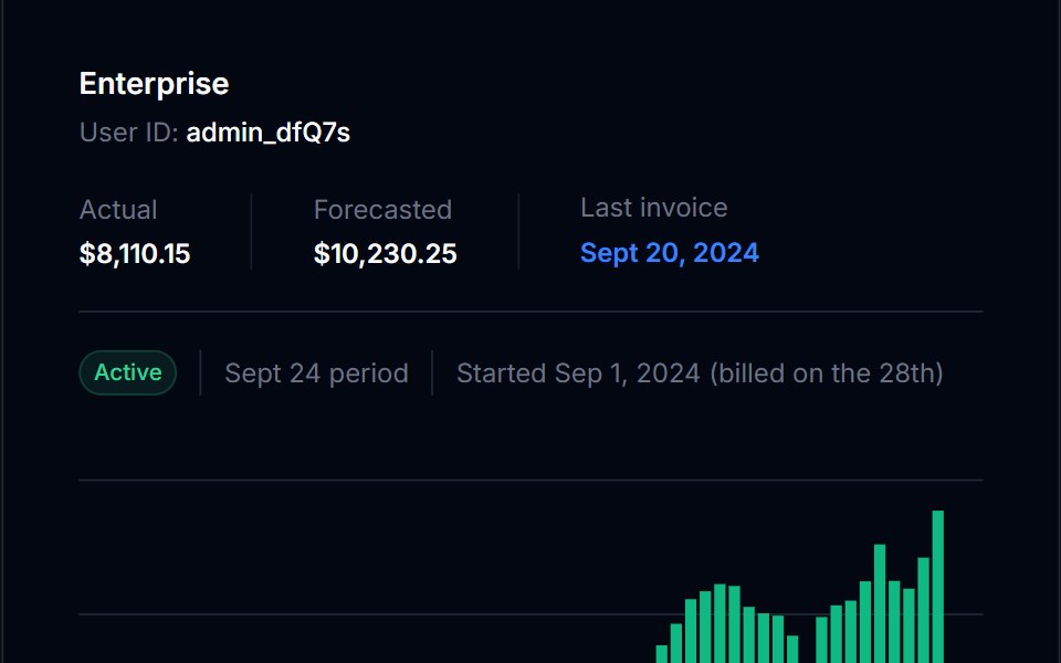 BadgeTremor Blocks · React
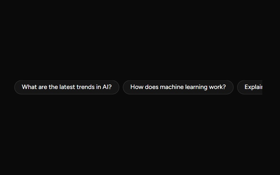 SuggestionAI Elements (Svelte) · SvelteA compact suggestion button set for displaying prompt ideas and quick actions.
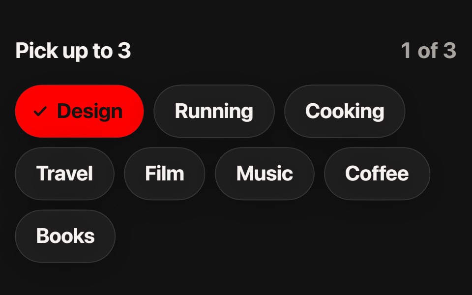 Interest ChipsSwiftPieces · SwiftUIWrapping glass chips for picking several things: each floods red as its check grows in, and a limit dims the rest and…
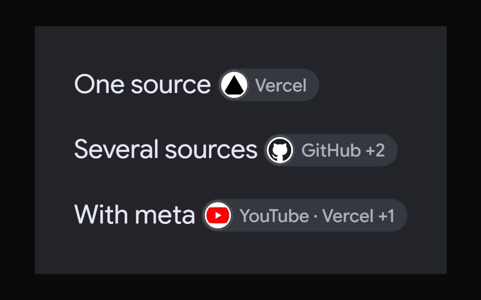 AI Overview CitationNotra · ReactA source chip built on shadcn Badge and HoverCard.
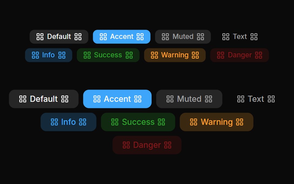 Badges 04Oxbow UI · AstroLeft and right badge
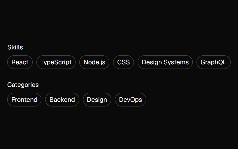 tag-groupBaseLayer · ReactA tag group is a focusable list of labels, categories, keywords, filters, or other items, with support for keyboard…
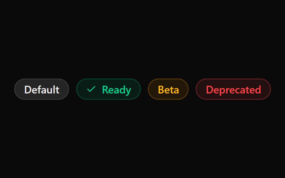 ChipSona UI · React
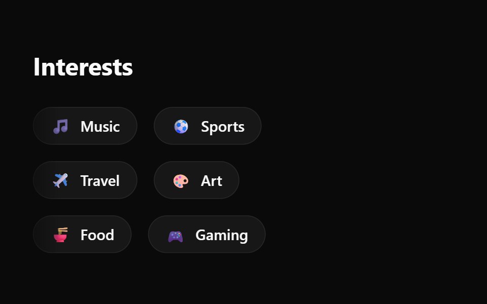 Emoji Spree Choice ChipsWatermelon UI · React
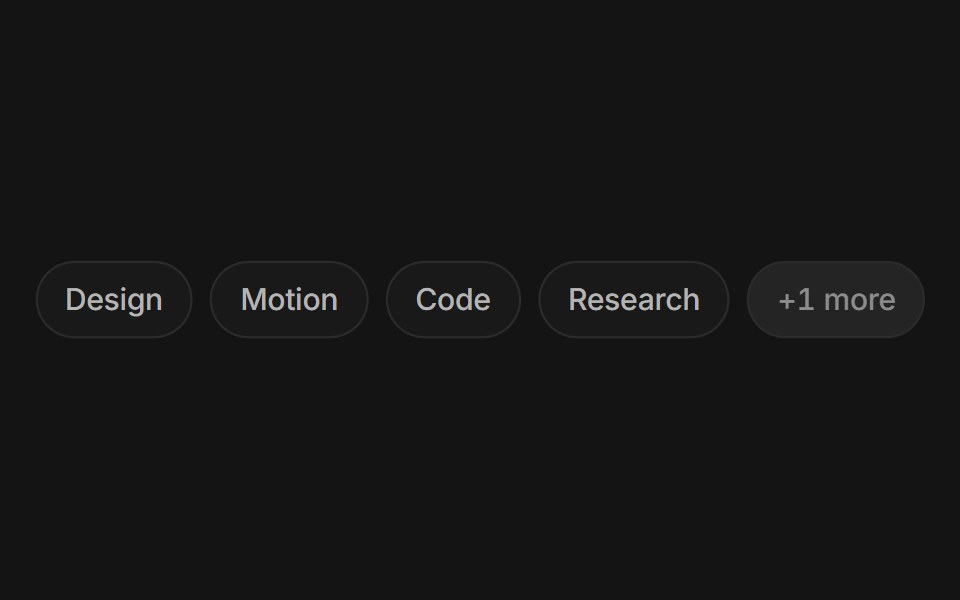 Chip groupArc Library · ReactFilter by a few facets with chips that morph as you pick them.
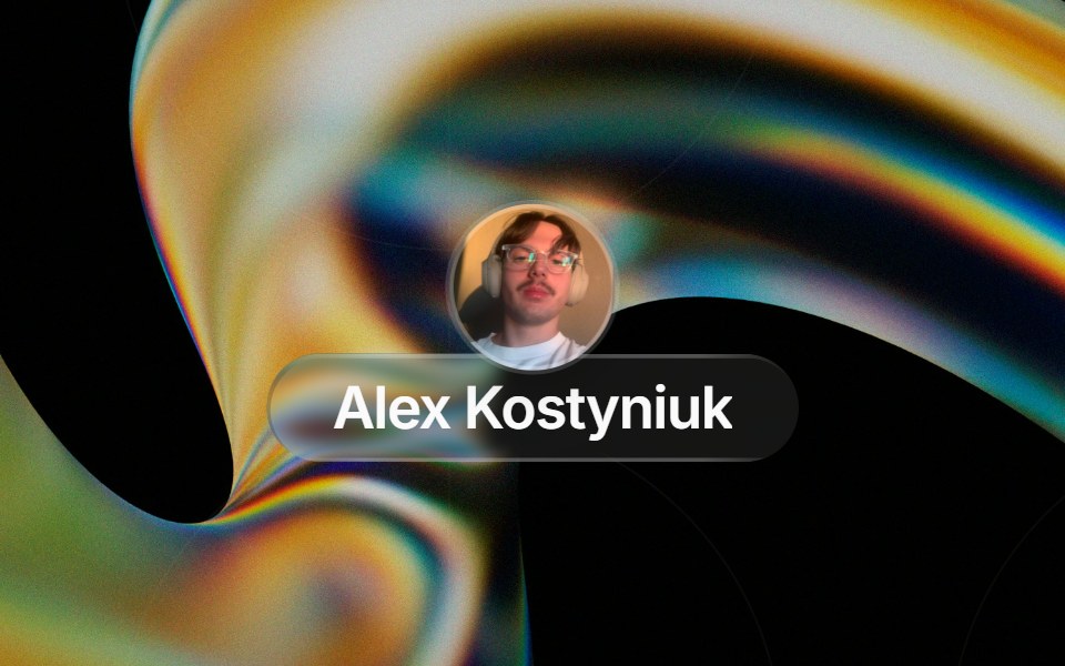 Glass Contact Pillglasscn · ReactLiquid-glass contact chip with an avatar (image or initials fallback) and name, for messaging apps
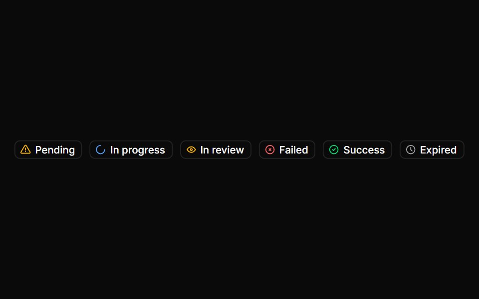 BadgeHextaUI · ReactStatus labels with colored dots, removable tags that slide closed and counts that roll to their new value.
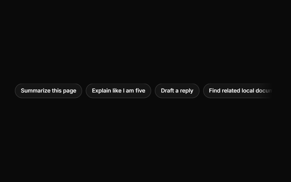 SuggestionsLocalMode · ReactA horizontal row of selectable prompt chips; each Suggestion invokes a callback with its text to seed the composer.
 BasicFLX UI · ReactA single default badge.
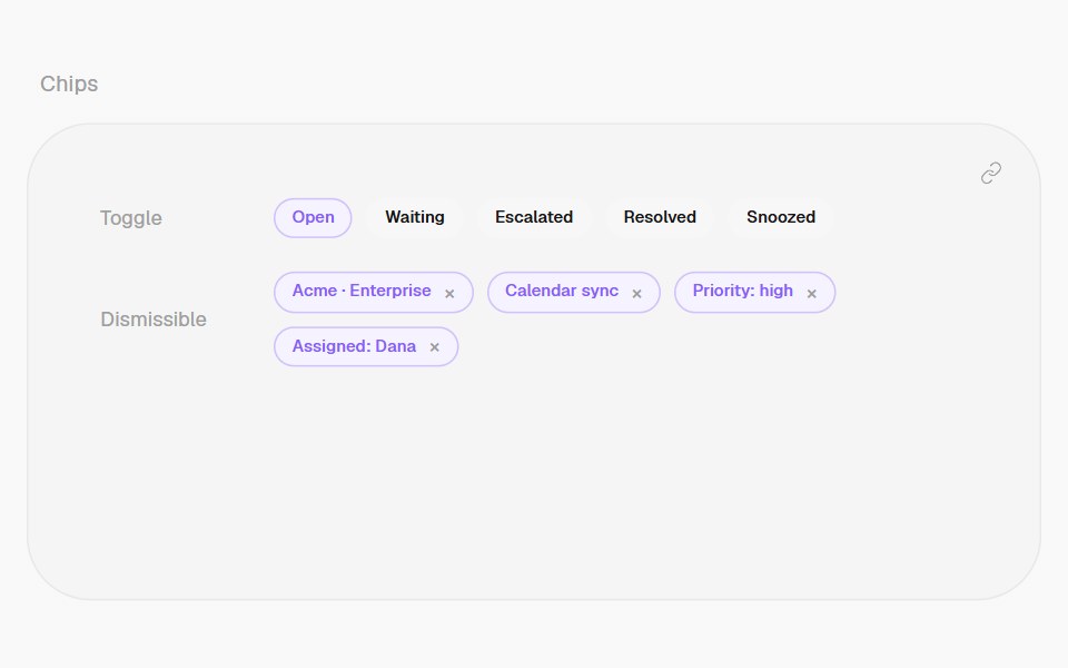 ChipHalaska UI · React
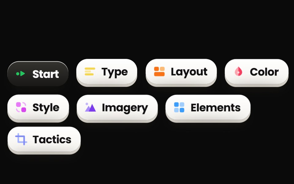 ChipsPin UI · React
 ChipMetal UI · React + SwiftUIA small pill with an optional leading LED or glyph and trailing actions: suggestion, glass, glass-action and tag.
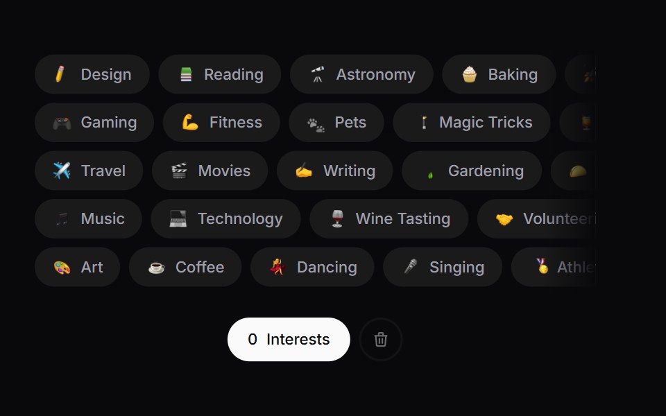 Interest PickerSpaceUI · ReactA draggable row-packed interest picker with an emoji burst on select and a shake-to-explode clear action.
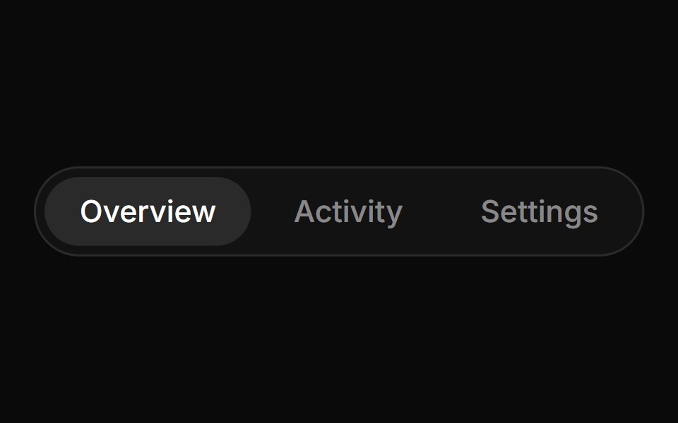 Tabs PillCue Foundations · React
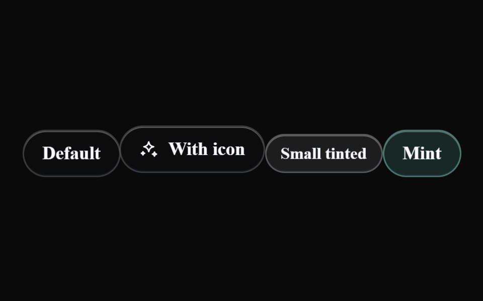 Liquid ChipLiquefy UI · ReactChip in liquid glass style. Etiqueta em estilo vidro líquido.
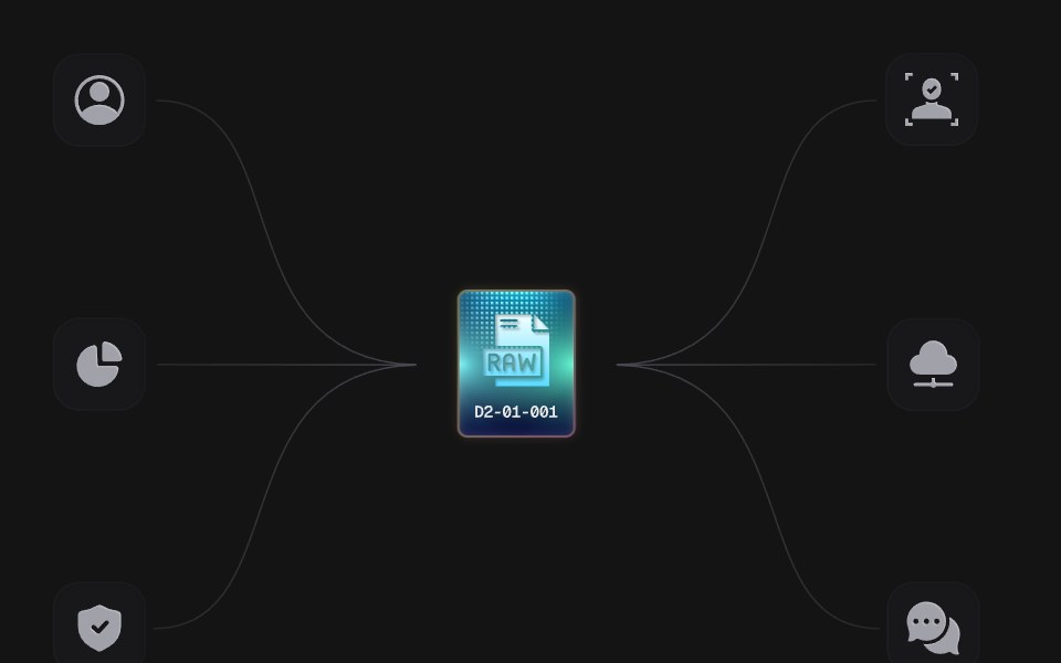 Power ChipD2Studio UI · ReactAn animated SVG illustration: a RAW chip charges and sends power along six wires to the tiles around it. Plain SVG and…
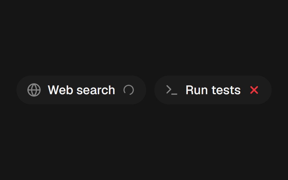 Tool ChipEaseUI · ReactA small pill naming a tool an agent used, with a spinner, check, or error mark that crossfades in place as its status…
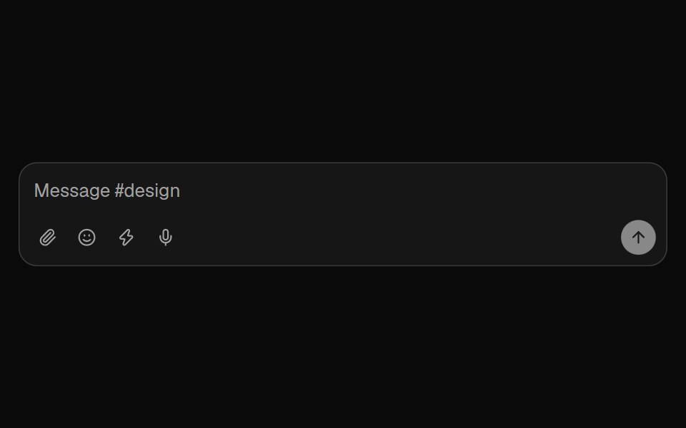 Chat ComposerFibo · ReactA message box built from parts around one draft, so each chat surface composes its own.
 TagReactFrame · ReactA compact label tag with soft, solid and outline variants, 6 colors, 3 sizes, an optional pulsing dot, icon, count…
 Tag GroupHeroUI · ReactA compound component for displaying and managing selectable tags with optional removal.
 Tailwind Tag GroupReact Spectrum · React
 Comp 398Origin UI · React
 Default badgeReUI · ReactDefault badge
 AI Prompt Suggestion ChipsAmicro Micro Transitions · ReactCategorized quick-prompt suggestion chips with spring physics bounce and one-tap populating.
 Base Ui TagLobe UI · React
 TagsUntitled UI React · React
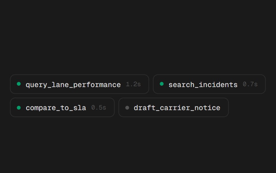 Tool ChipsSpectrum UI · ReactCompact tool-call chips that expand into their arguments and result.
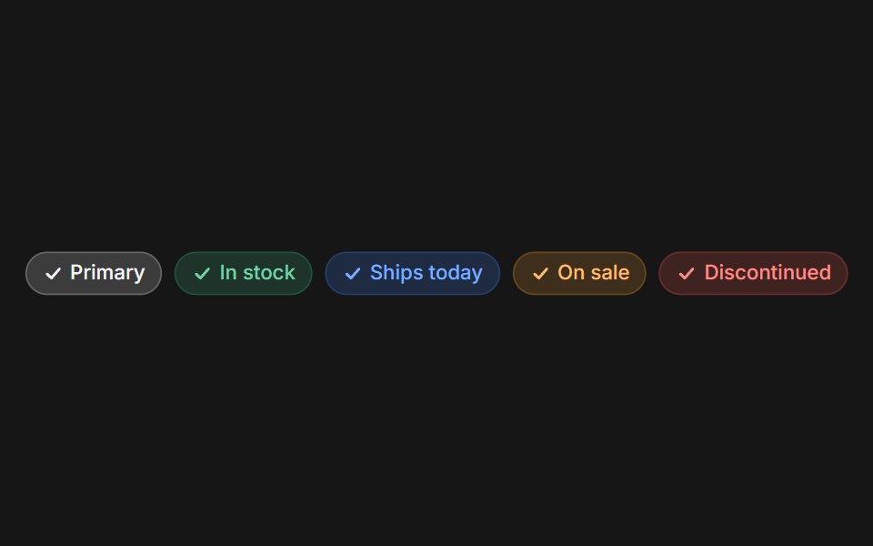 Web ChipPanel UI · React NativeChips for filters, tags and stock or status labels.
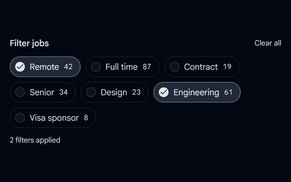 Checkbox 12 - Filter ChipsShadcn Space · ReactPill shaped checkbox chips for filtering with result counts, a checked style, and a clear all action.
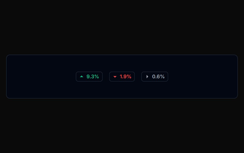 Badge 01Tremor Blocks · React
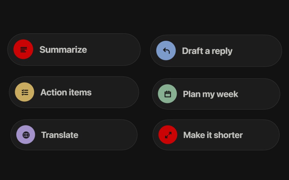 Prompt ChipsSwiftPieces · SwiftUILiquid glass prompt chips above a composer that cascade in, then melt into the one you tap as it drops its text into…
 ChatGPT Source ChipNotra · ReactAn inline citation pill with a hover card.
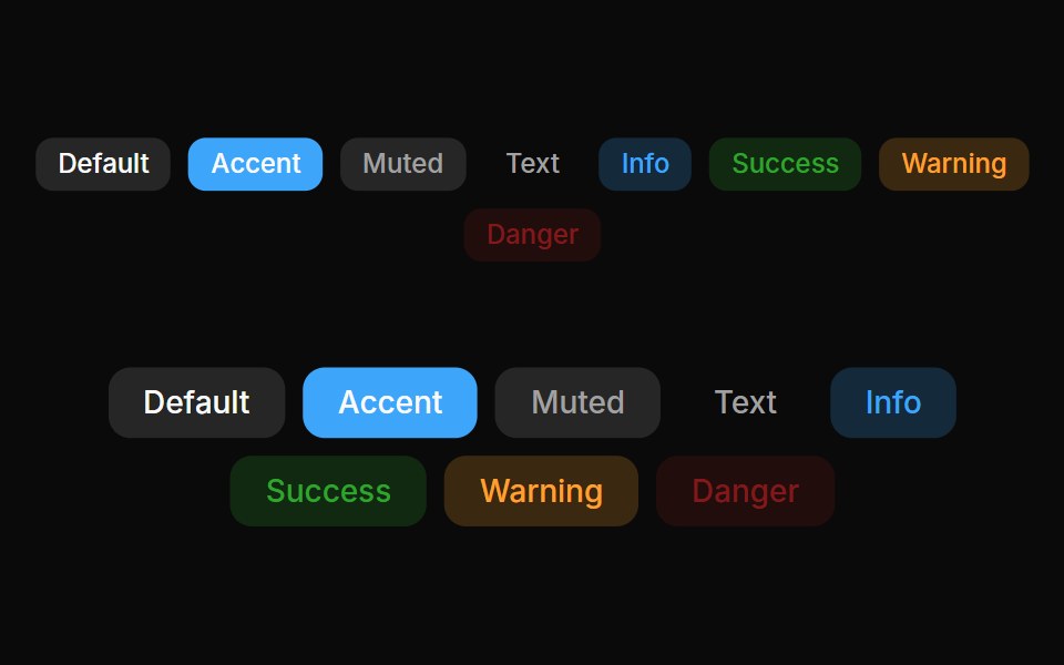 Badges 01Oxbow UI · Astro
 Schedule ChipSona UI · React
 LabelWatermelon UI · React
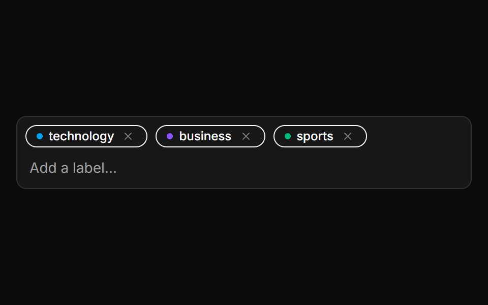 Editable Label SetLocalMode · ReactAn editable set of color-cycling removable chips managing a candidate-label list (zero-shot candidate labels or any…
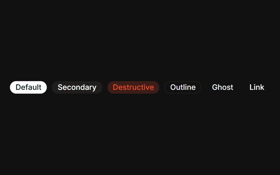 VariantsFLX UI · ReactAll six variants side-by-side: default, secondary, destructive, outline, ghost, link.
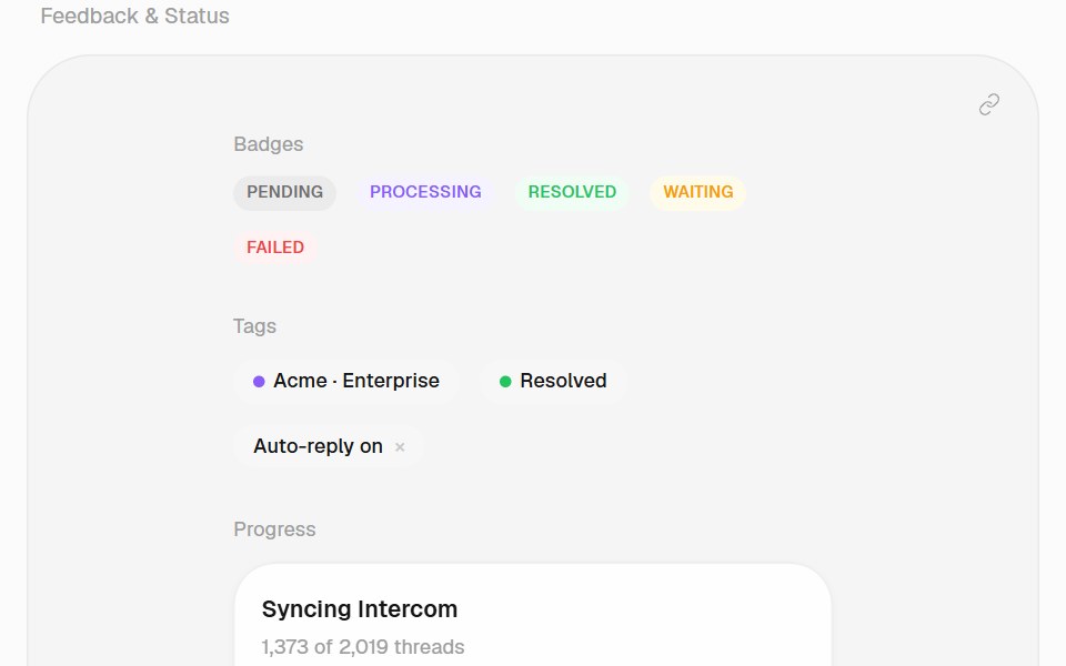 TagHalaska UI · React
 Request ChipPin UI · React
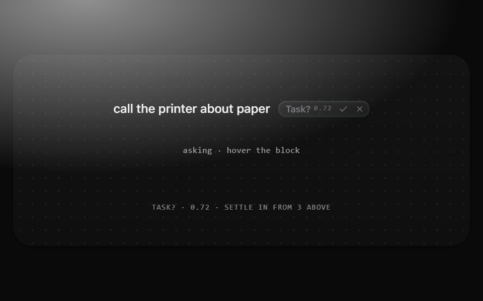 Suggestion chipMetal UI · React + SwiftUIOne question the recognizer asks at middle confidence, beside its block: Chip(suggestion) with the question, its…
 RAW ChipD2Studio UI · ReactThe RAW chip from Power Chip on its own: a static SVG illustration with no dependencies.
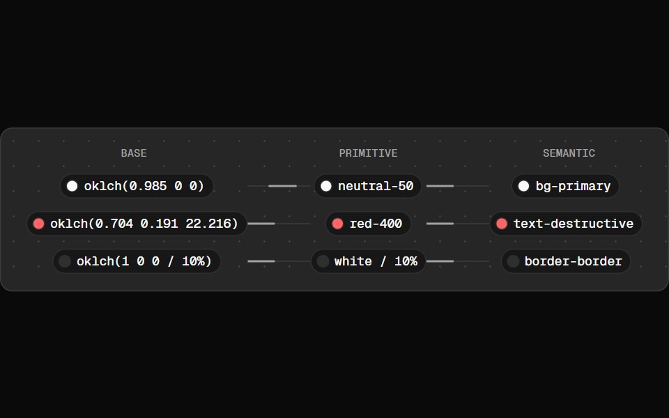 Token FlowFibo · ReactWalks a colour token from raw value to primitive to semantic role.
 Vanilla Tag GroupReact Spectrum · React
 Comp 399Origin UI · React
 Info outline badgeReUI · ReactInfo outline badge
 Elastic Tag SnapAmicro Micro Transitions · ReactMinimalist luggage tag with bungee spring snap and vertical recoil.
 Chat Token TagLobe UI · React
 Undo PillSpectrum UI · ReactAn inline undo pill with a draining countdown ring that pauses on hover and fires undo or expire callbacks
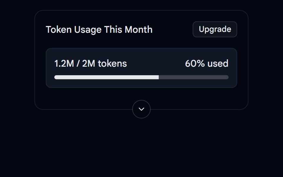 Collapsible 05 - Token UsageShadcn Space · ReactA collapsible usage card with a progress bar, summary and details.
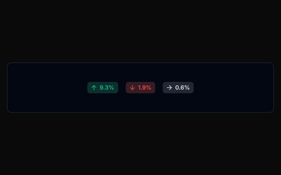 Badge 02Tremor Blocks · React
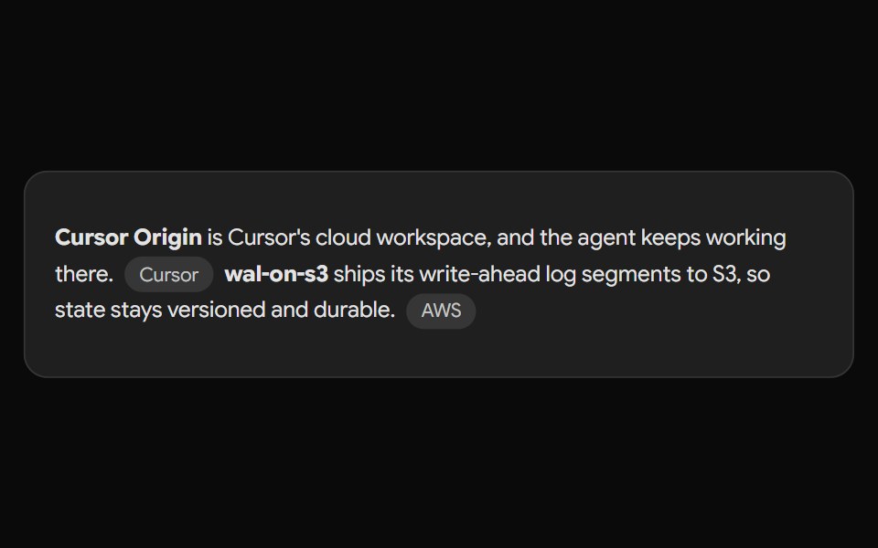 Gemini Source ChipNotra · ReactAn inline source pill with a hover card.
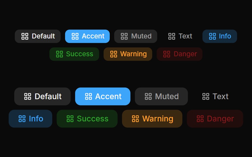 Badges 02Oxbow UI · Astro
 Label SelectorWatermelon UI · React
 With iconFLX UI · ReactLeading verified icon before the label.
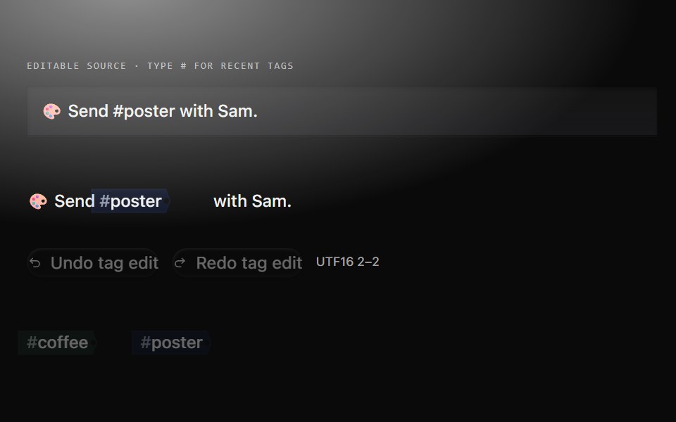 Tag cueMetal UI · React + SwiftUIRecent source tags cycle with canonical identity colour; a shared autocomplete chooses tags for a captured unfinished…
 Comp 413Origin UI · React
 Success outline badgeReUI · ReactSuccess outline badge
 Filter Tag PillAmicro Micro Transitions · React
 Pagination 01 - Floating PillShadcn Space · ReactA floating pill-style pagination with smooth morphing animations.
 Badge 03Tremor Blocks · React
 Perplexity CitationNotra · ReactAn inline source pill with favicon, label and +N count, built on shadcn Badge.
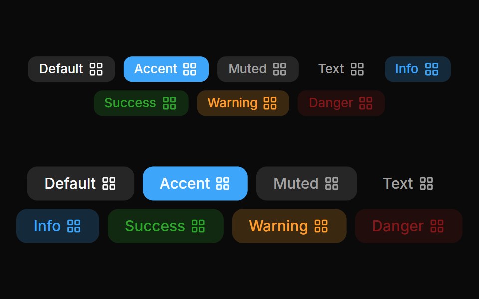 Badges 03Oxbow UI · Astro
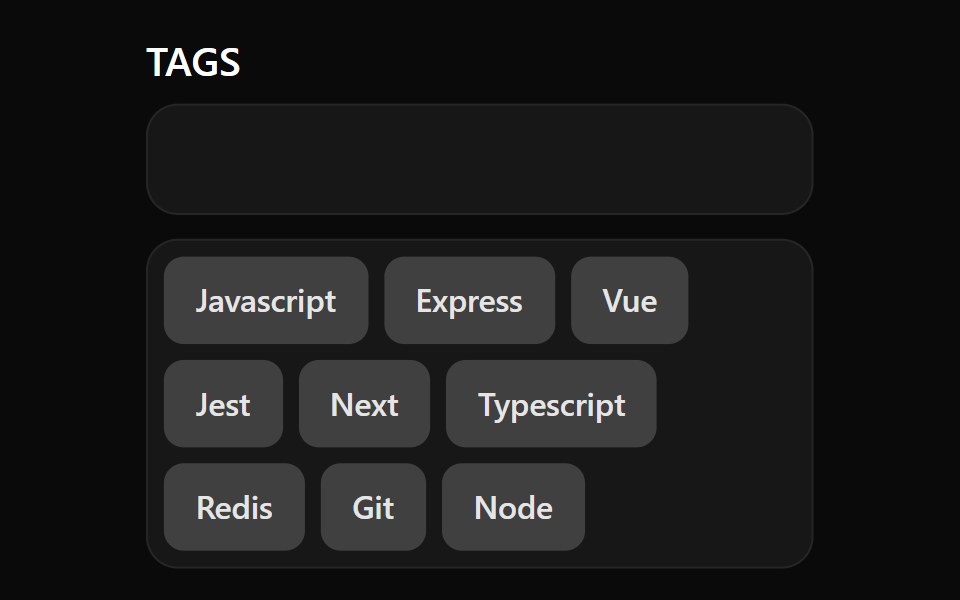 TagsWatermelon UI · React
 With status dotFLX UI · ReactA colored presence dot beside an outline label.
 Comp 414Origin UI · React
 Warning outline badgeReUI · ReactWarning outline badge
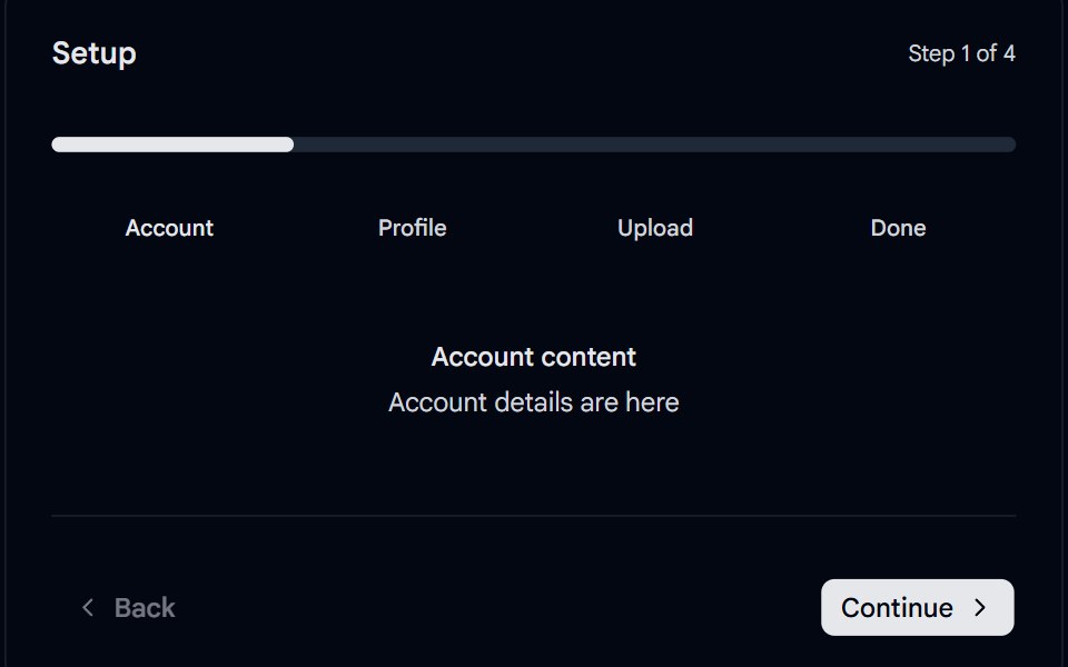 Stepper 04 - Segmented Progress PillShadcn Space · ReactMinimal segmented stepper with a spring-animated progress pill sliding across rounded segments, clickable step labels…
 Badge 04Tremor Blocks · React
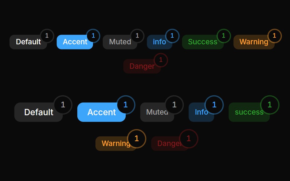 Badges 05Oxbow UI · Astro
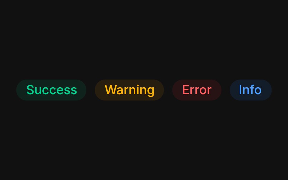 Status colorsFLX UI · ReactTinted success, warning, error, and info states.
 Comp 415Origin UI · React
 Primary light badgeReUI · ReactPrimary light badge
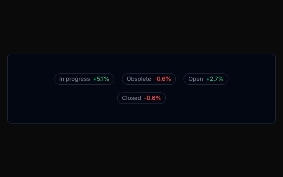 Badge 05Tremor Blocks · React
 CountFLX UI · ReactPill-shaped numeric counts with tabular figures.
 Comp 416Origin UI · React
 Destructive light badgeReUI · ReactDestructive light badge
 Badge 06Tremor Blocks · React
 As linkFLX UI · Reactrender prop renders the badge as an anchor with a trailing icon.
 Comp 417Origin UI · React
 Success light badgeReUI · ReactSuccess light badge
 Badge 07Tremor Blocks · React
 RemovableFLX UI · ReactDismissible tag chips with a trailing remove button.
 Comp 418Origin UI · React
 Info light badgeReUI · ReactInfo light badge
 Badge 08Tremor Blocks · React
 With avatarFLX UI · ReactAssignee chip with a leading avatar inside the badge.
 Comp 419Origin UI · React
 Warning light badgeReUI · ReactWarning light badge
 Badge 09Tremor Blocks · React
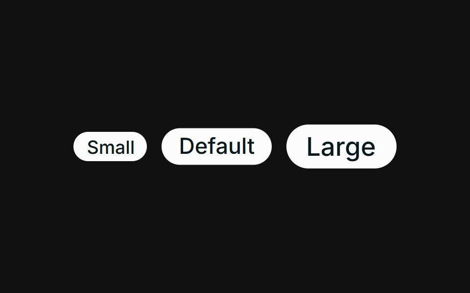 SizesFLX UI · ReactSmall, default, and large sizes via className.
 Comp 420Origin UI · React
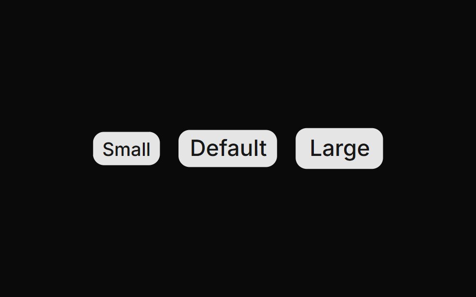 Badge size variationsReUI · ReactBadge size variations
 Badge 10Tremor Blocks · React
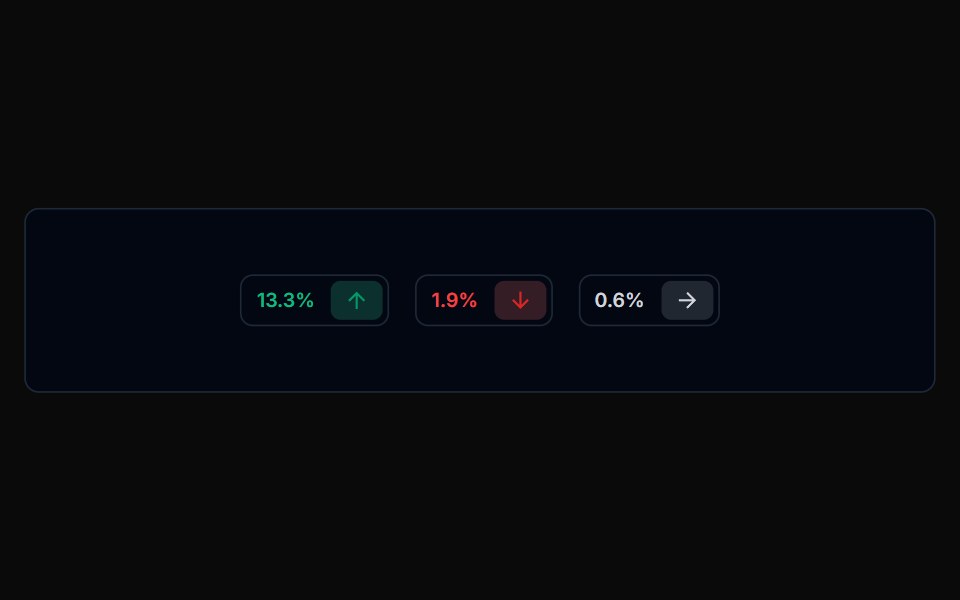
 Trend deltaFLX UI · ReactUp and down arrows with tinted gain / loss percentages.
 Comp 421Origin UI · React
 Badge with full radius (radius="full")ReUI · ReactBadge with full radius (radius="full")
Libraries with chip components
Related categories
- React Chip Components
- Tailwind CSS Chip Components
- Animated Chip Components
- shadcn/ui Chip Components
- Feedback Components
- Badge Components
- Spinner Components
- Progress Components
- Alert Components
- Progress Bar Components
- Empty State Components
- Notification Components
- Status Indicator Components
- Skeleton Components
- Banner Components
- Typing Indicator Components
- Progress Circle Components
- Error State Components
- Success Animation Components
- Scroll Progress Components