 Dev Design Library
Progress Components
Dev Design Library indexes 199 progress components from 66 open-source UI libraries, with the most coming from Tremor Blocks, UI Lab, LocalMode, Spectrum UI and Kinetics. Each one links to its page with the source code, a live preview where available, the library license and the install command. Progress components belong to the Feedback group.
Showing 120 of 199, a mix from every library. Open a library to see all of its components.
 Progressshadcn/ui · ReactDisplays an indicator showing the completion progress of a task, typically displayed as a progress bar.
 Circular ProgressMUI / Material UI · React
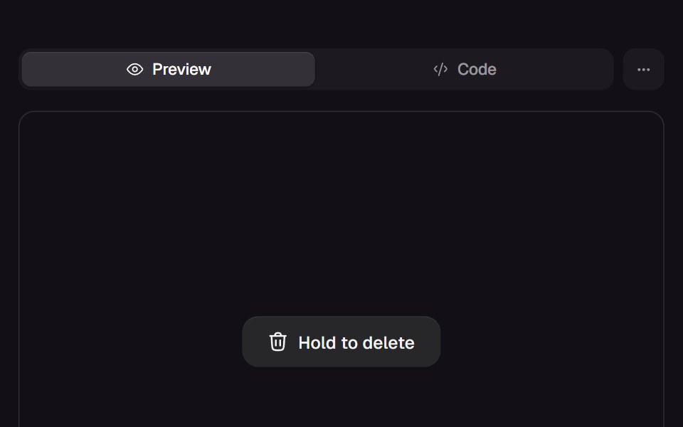 Hold ButtonReact Bits · ReactHold-to-confirm button whose liquid fill rises while pressed, snaps back on an early release and swaps its label…
 ProgressdaisyUI · CSS (Tailwind)
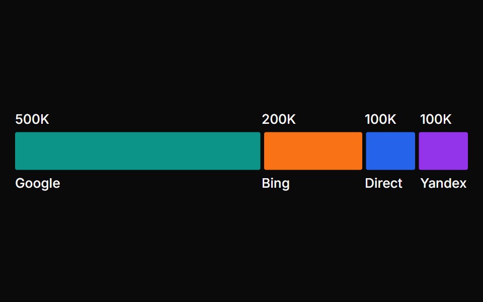 Bar SegmentChakra UI · ReactUsed to display data as segments within a horizontal bar, showing proportions and part-to-whole relationships between…
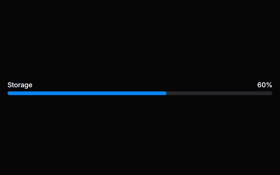 MeterHeroUI · ReactA meter represents a quantity within a known range, or a fractional value.
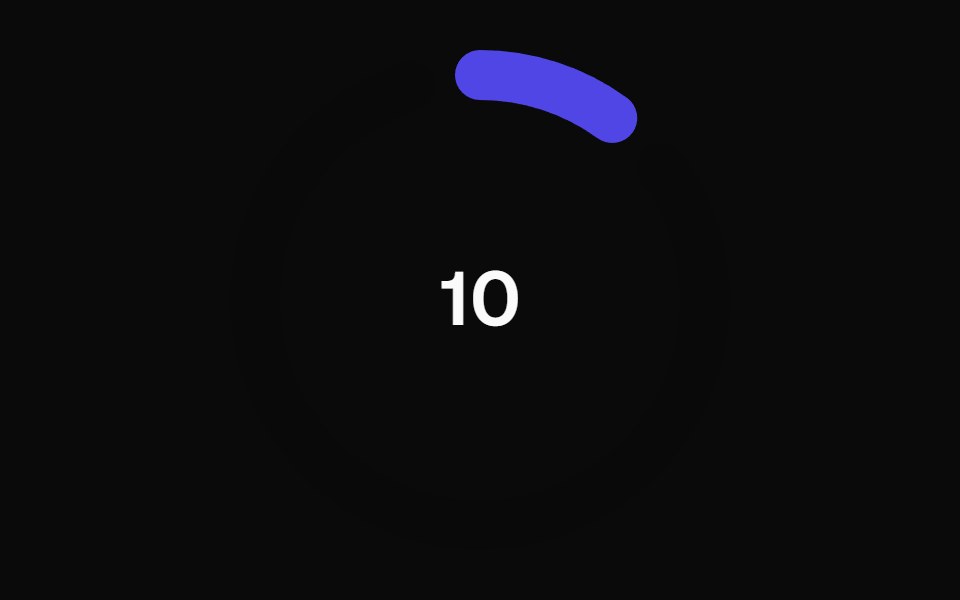 Animated Circular Progress BarMagic UI · ReactAnimated Circular Progress Bar is a component that displays a circular gauge with a percentage value.
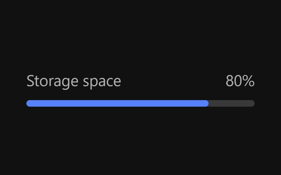 MeterReact Spectrum · ReactMeters are visual representations of a quantity or an achievement. Their progress is determined by user actions…
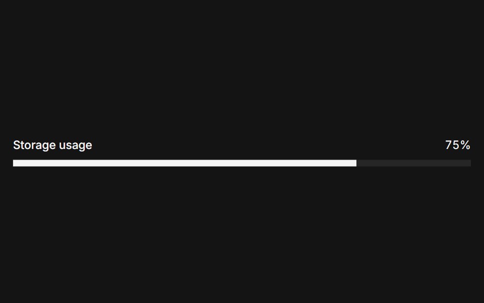 Metercoss ui · ReactA graphical display of a numeric value within a range.
 ProgressOrigin UI · ReactDisplays the status of a task that takes a long time.
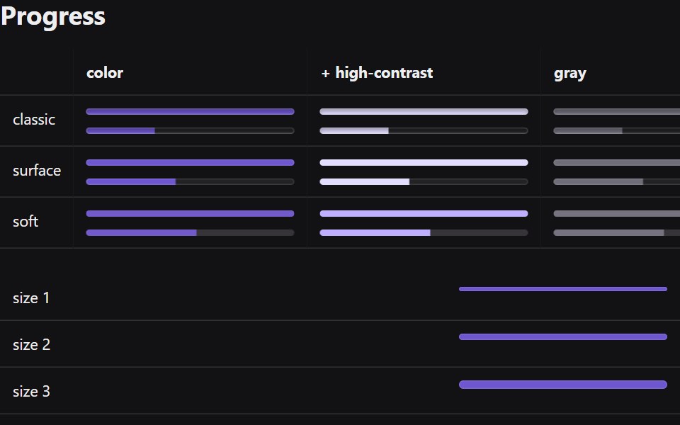 ProgressRadix Themes · React
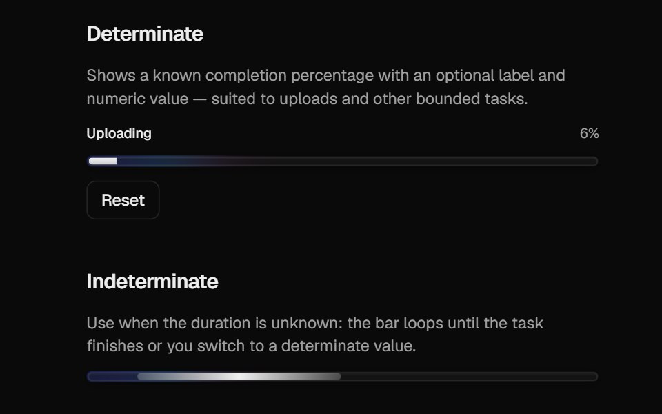 Halo ProgressCult UI · ReactProgress bar with spring-driven determinate fill and indeterminate gradient strip
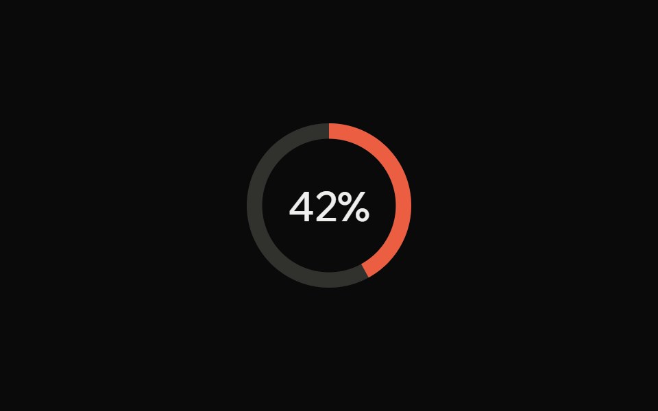 ProgressArk UI · React
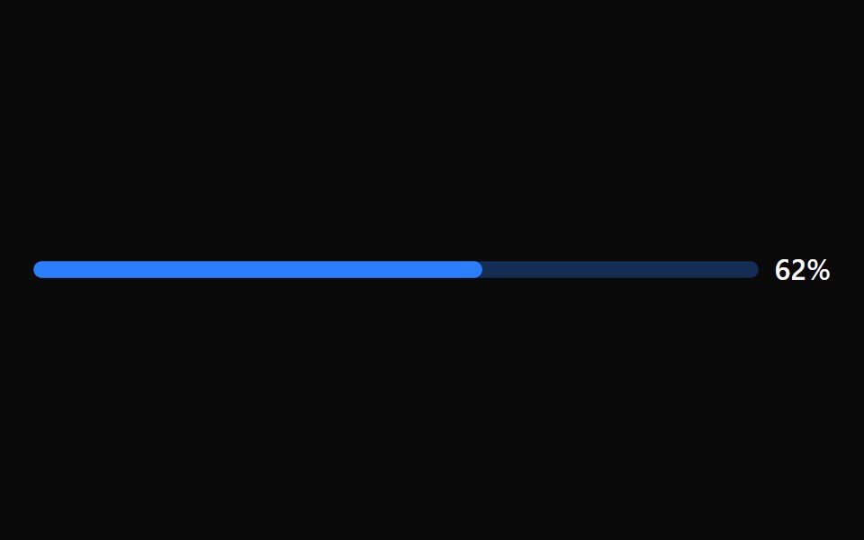 Progress BarTremor · React
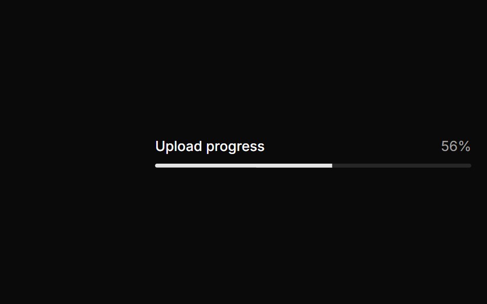 Basic progress.ReUI · ReactBasic progress.
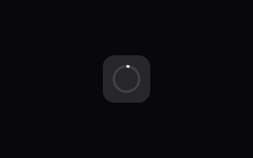 App Icon LoadAmicro Micro Transitions · ReactApp Icon Load loading animation.
 ProgressPark UI · ReactA display component for showing task completion and loading states.
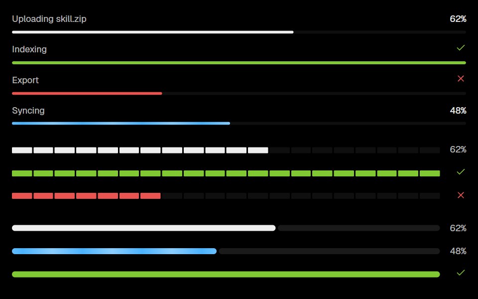 ProgressLobe UI · React
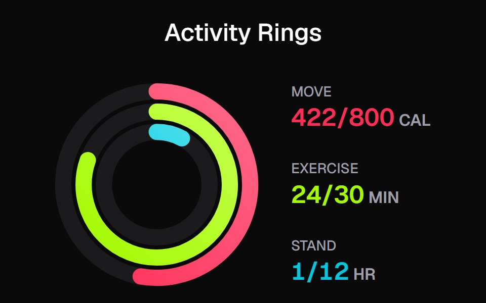 Apple Activity CardKokonut UI · ReactActivity rings that draw with a count-up, lap past 100% with a shadowed end cap and dim to focus, built with React and…
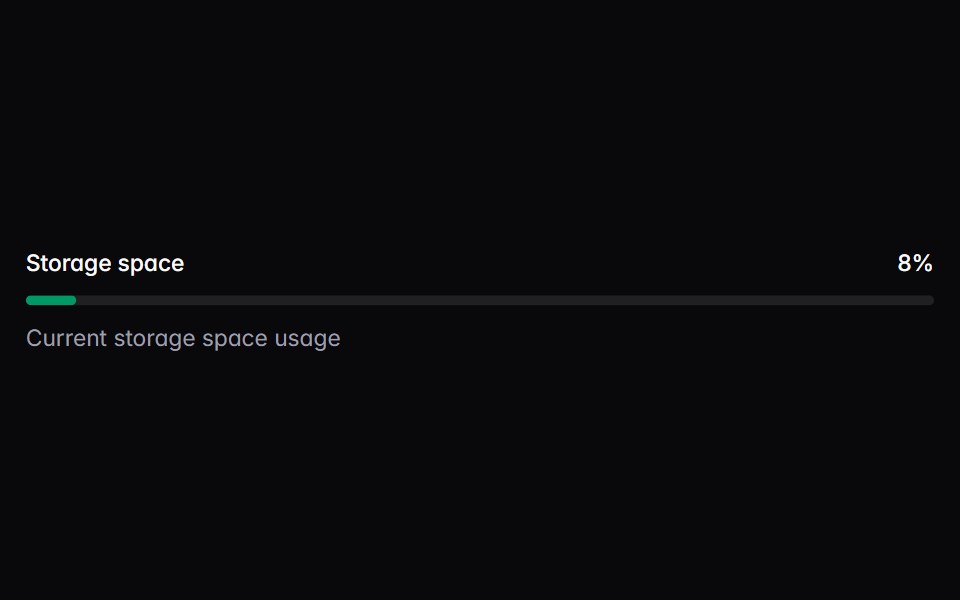 meterIntent UI · Reactmeter
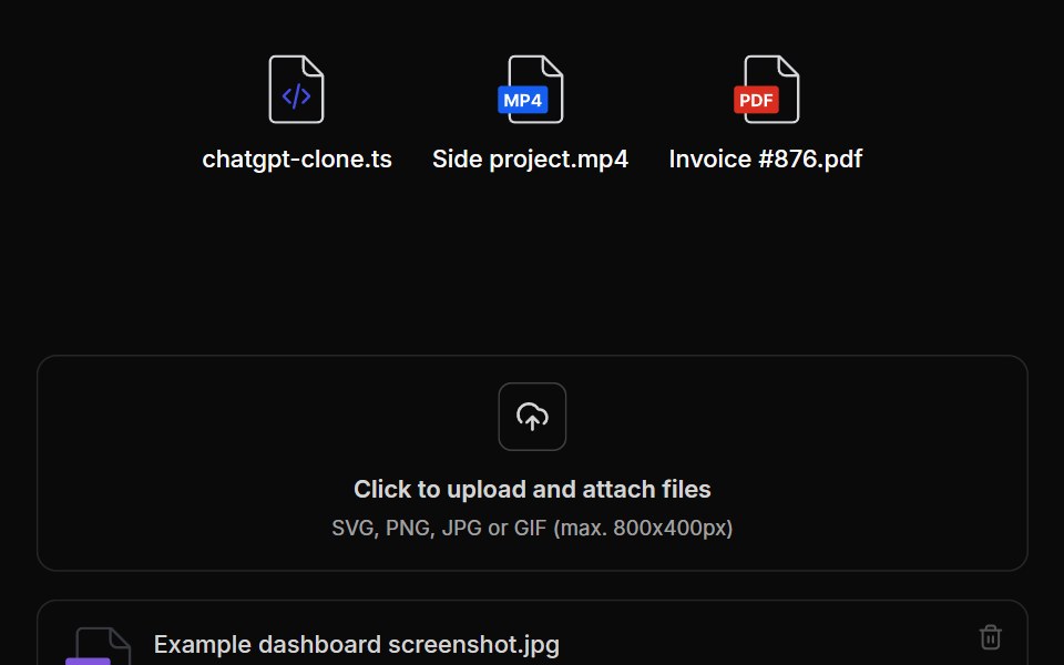 File UploadUntitled UI React · React
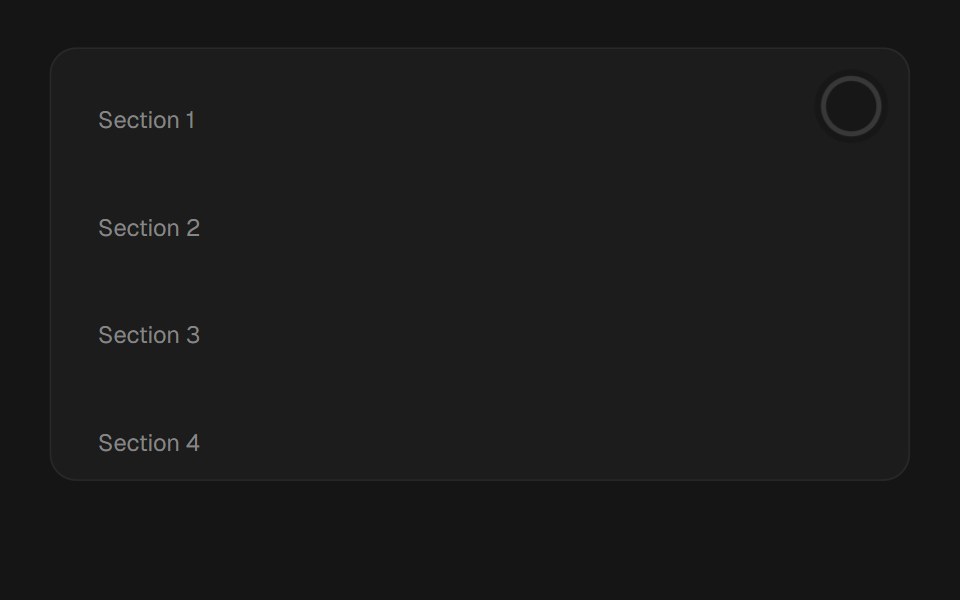 Scroll ProgressbeUI · ReactReading-progress indicator — fixed bar or circular ring — driven by scroll position via useSmoothScroll, with spring…
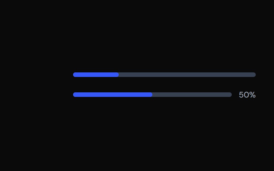 ProgressTailGrids · ReactA progress bar component with multiple variants.
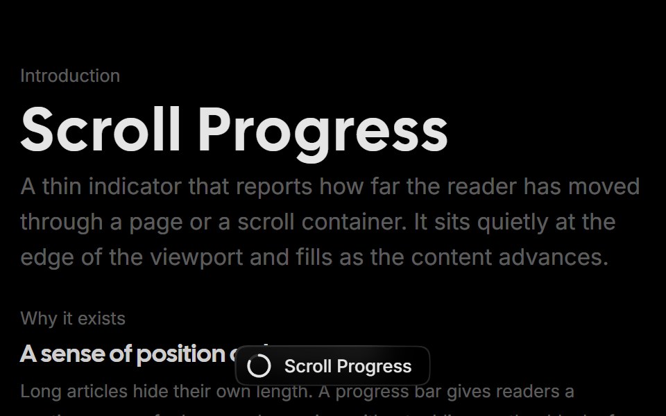 Scroll ProgressRare UI · ReactA scroll progress pill that tracks reading position and expands into a squircle menu of sections you can jump to.
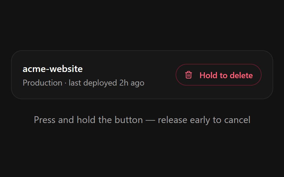 Hold to ConfirmSpectrum UI · ReactA press-and-hold confirmation button for destructive actions with a filling progress ring, spring-back on early…
 ProgressVengeance UI · React
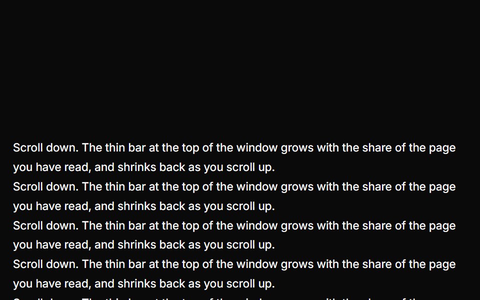 Reading ProgressUser Interface Wiki · React
 ProgressToolcraft · React
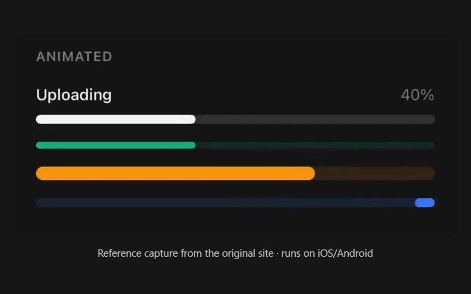 ProgressPanel UI · React NativeDeterminate and indeterminate progress bar.
 Popover 05 - Download ProgressShadcn Space · ReactDownload progress popover with pause/resume/cancel controls and background fill animation.
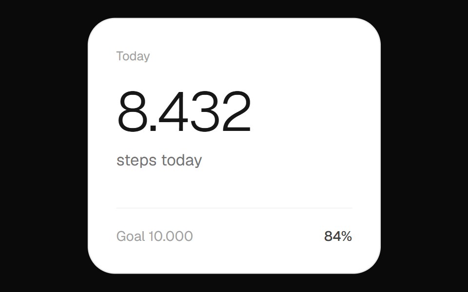 Step Count WidgetOpenSourceUI · ReactFitness widget showing the day's step count with a circular progress ring toward the goal.
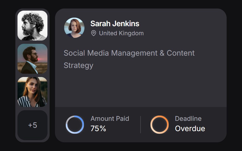 Client Carduselayouts · ReactA client CRM card with payment and deadline rings, plus a morphing avatar stack.
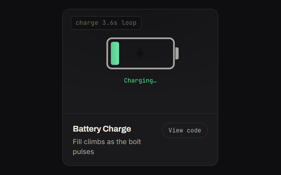 Battery ChargeKinetics · HTML/CSSFill climbs as the bolt pulses
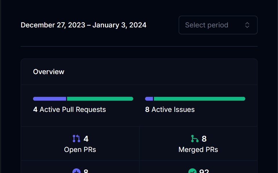 Category BarTremor Blocks · ReactSingle horizontal bar split into coloured segments, with threshold labels and an optional marker for the current value.
 ProgressShadcn Dashboard · React
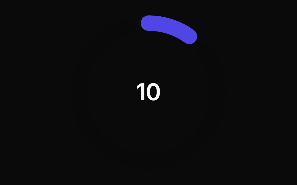 Animated Circular Progress BarAnimations (Svelte) · SvelteA circular progress bar component with animated transitions between primary and secondary colors.
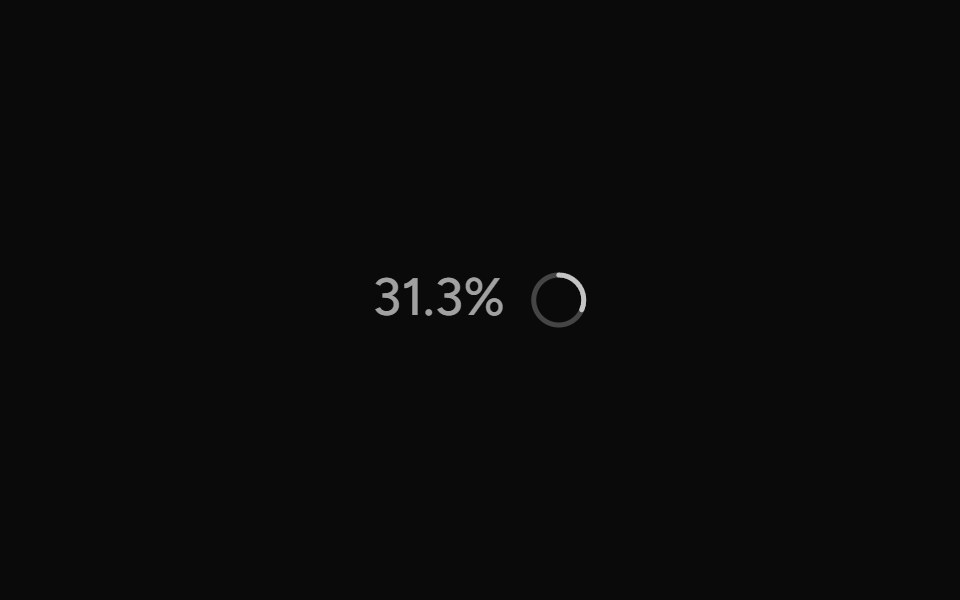 ContextAI Elements (Svelte) · SvelteA hover-card-based context window usage component with token, cost, and model usage breakdowns.
 ProgressObsidianUI · React
 Chat MinimapNotra · ReactA rail of lines that maps a conversation, built on shadcn Button, Card, HoverCard and Tooltip.
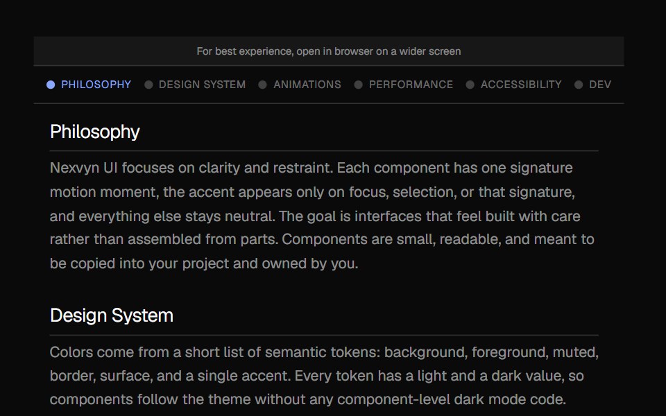 Scroll IndicatorNexvyn UI · ReactA vertical scroll progress indicator with tick marks, section labels, and a floating position readout.
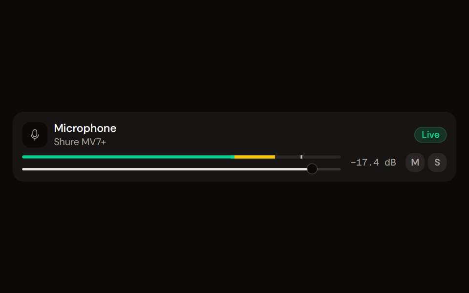 Channel Stripaudiocn · ReactOne channel of a mixer: header, status, meter, fader, value, controls and a notice, as a row or a console strip. The…
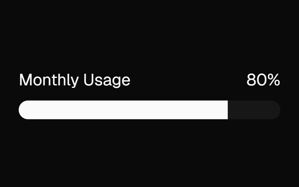 meterBaseLayer · ReactA meter represents a quantity within a known range, or a fractional value.
 Circular ProgressShark UI · ReactShows task progress with a circular indicator.
 Labeled Progress IndicatorWatermelon UI · React
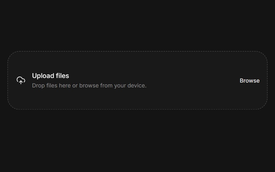 File uploadArc Library · ReactA complete file selection flow with constraints, progress, and error feedback.
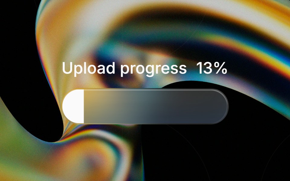 Glass Progressglasscn · ReactGlass Progress with five variants: clear, frosted, subtle, liquid, and liquid-refract
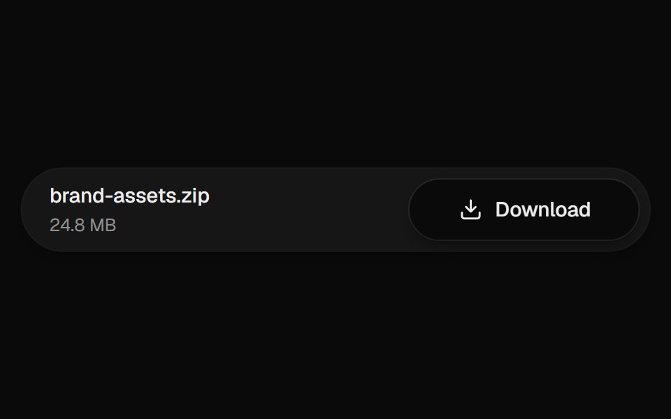 Download ButtonUI Lab · ReactThe arrow drops into the tray while the button fills with progress.
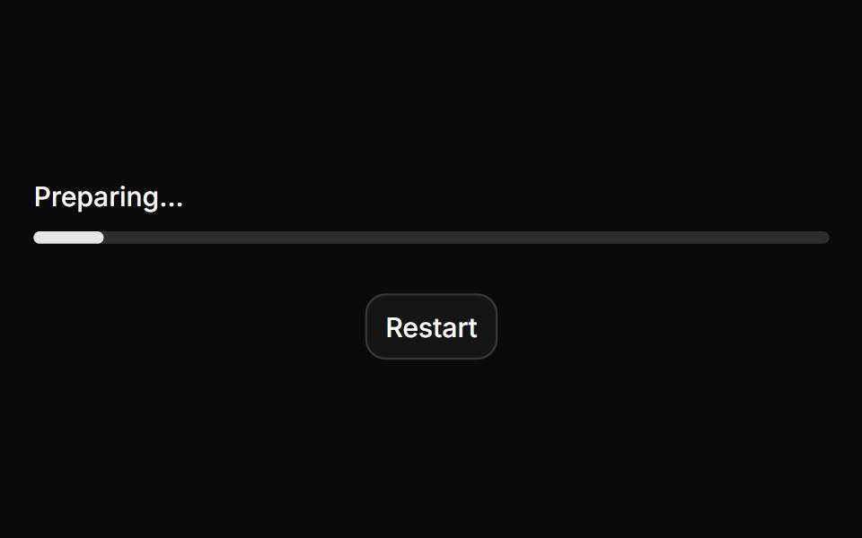 ProgressHextaUI · ReactA bar or ring that shows how far a task has come, eases between updates and slides while the total is unknown.
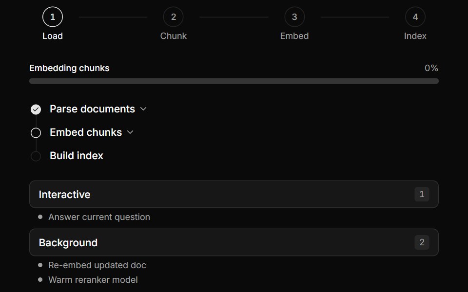 Multi-Step Pipeline TrackerLocalMode · ReactProgress surfaces for local workflows: a horizontal numbered-step indicator (active/completed/pending), a…
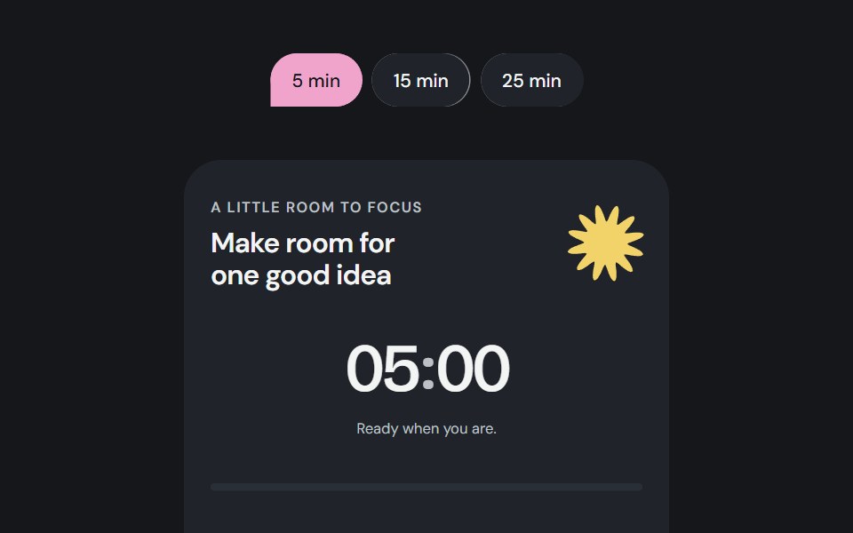 Focus sessionCojeev UI · ReactA local focus timer composed from Cojeev cards, progress, badges and native controls.
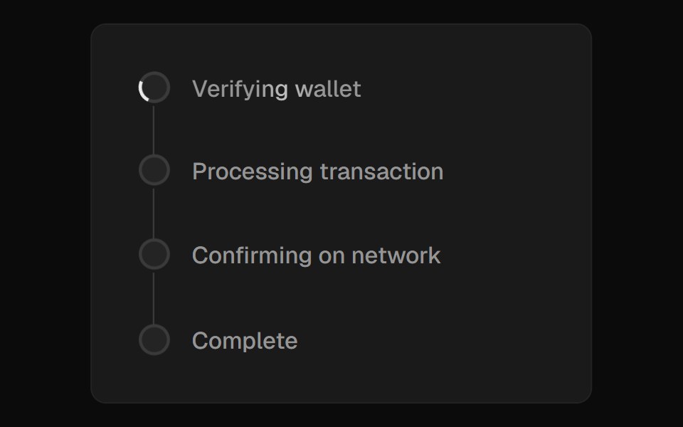 Progress CardROI UI · ReactA file upload progress card with multiple file tracking.
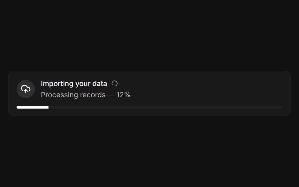 With progressFLX UI · ReactLive import banner with a spinner and a progress bar.
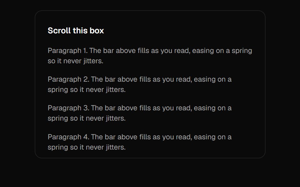 Scroll ProgressVelora UI · ReactGradient page-progress bar pinned to the top.
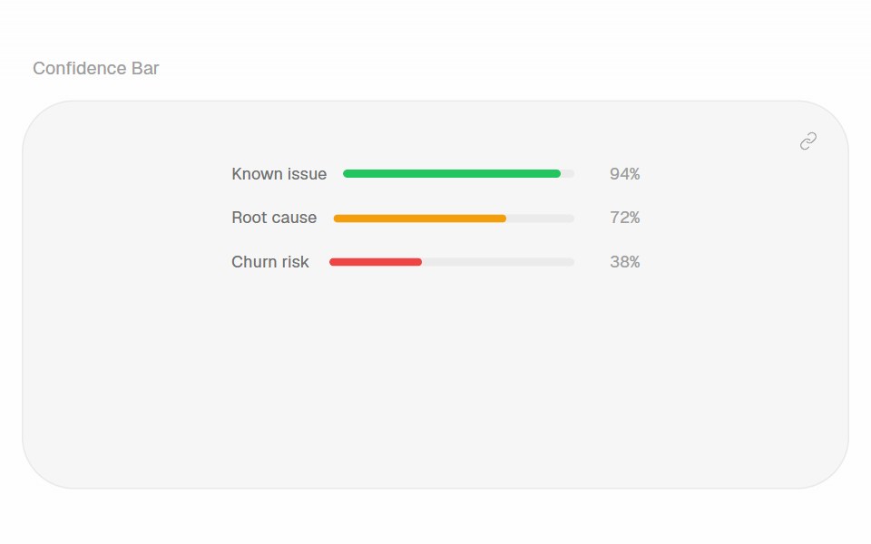 Confidence BarHalaska UI · React
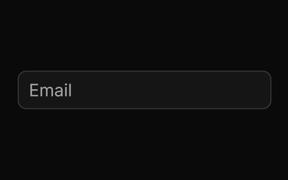 Password Input With Strength Indicatorsv-particles · Svelte
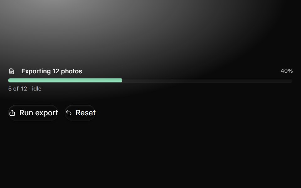 ProgressMetal UI · React + SwiftUITask amount and explicit idle, running, paused, failed, cancelled and complete states. Bars, slim bars, rings…
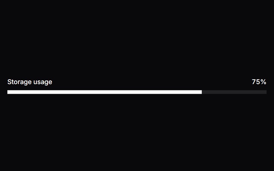 MeterSpaceUI · ReactDisplays a visual gauge bar showing a quantity within a known range, such as battery level, disk capacity, or password…
 Aria ProgressReScript shadcn · ReScript
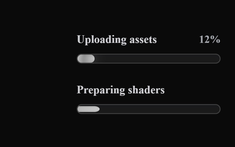 Liquid ProgressLiquefy UI · ReactProgress bar in liquid glass style. Barra de progresso em estilo vidro líquido.
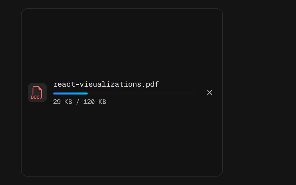 File UploadD2Studio UI · ReactA single upload row mid-flight: a PDF badge, the filename, a thin progress rail and the byte count under it. The bar…
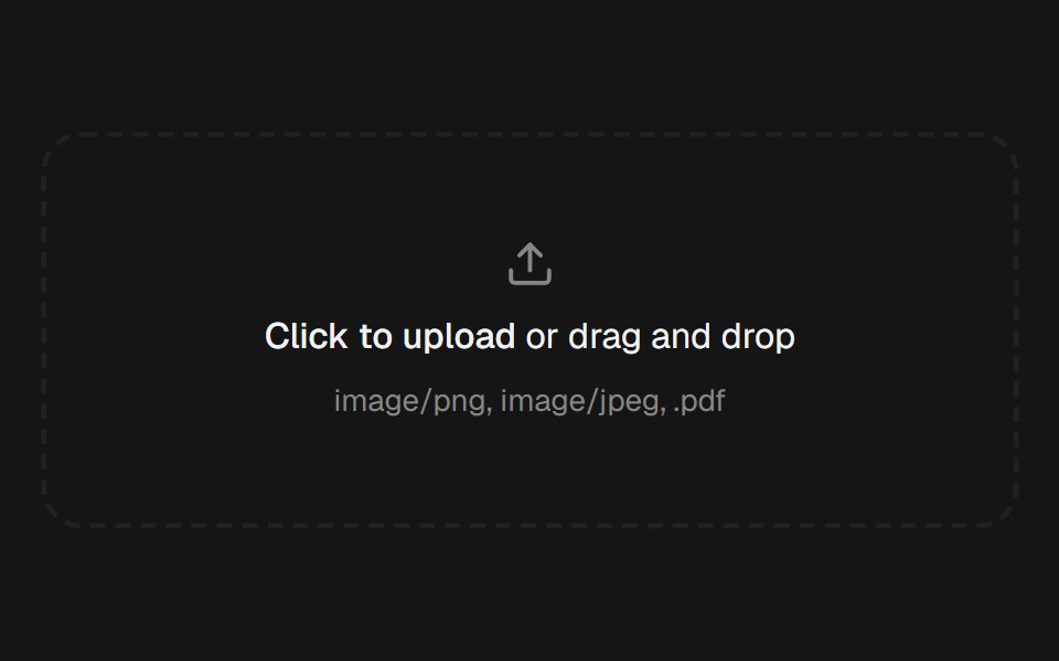 File UploadEaseUI · ReactDropzone that also opens the native file picker, with a list below it that pops each file in and collapses smoothly on…
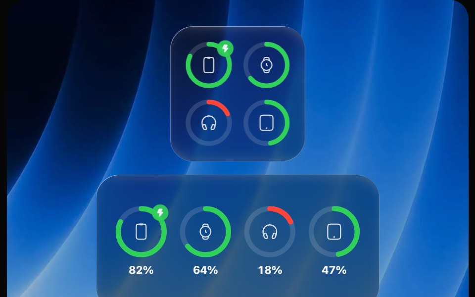 Battery WidgetOpaline · ReactBatteries widget with device rings that fill, turn red when low and show charging.
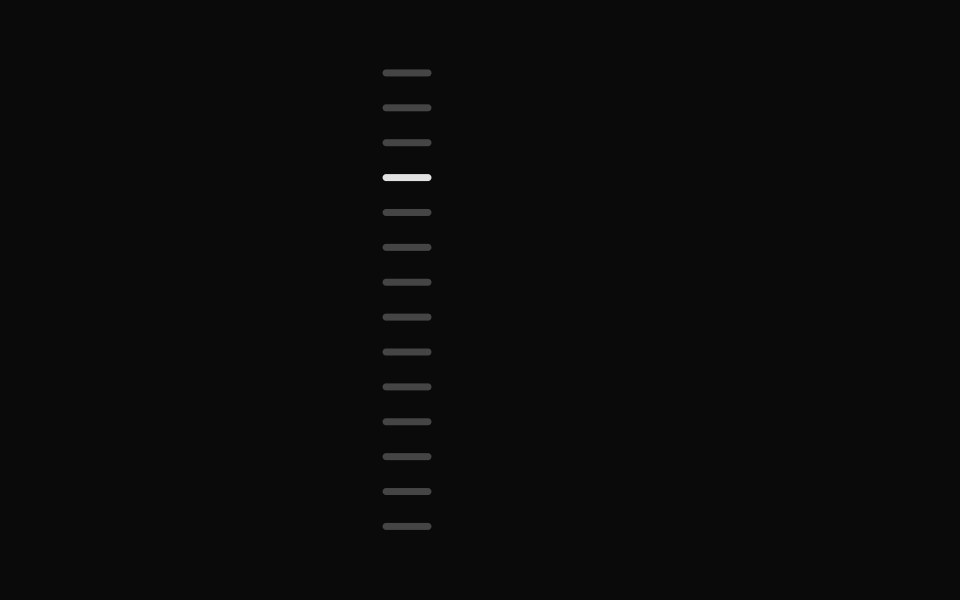 Chapter ScrubberFibo · ReactA rail of marks that swell under the pointer like the Dock, previewing the chapter at the crest.
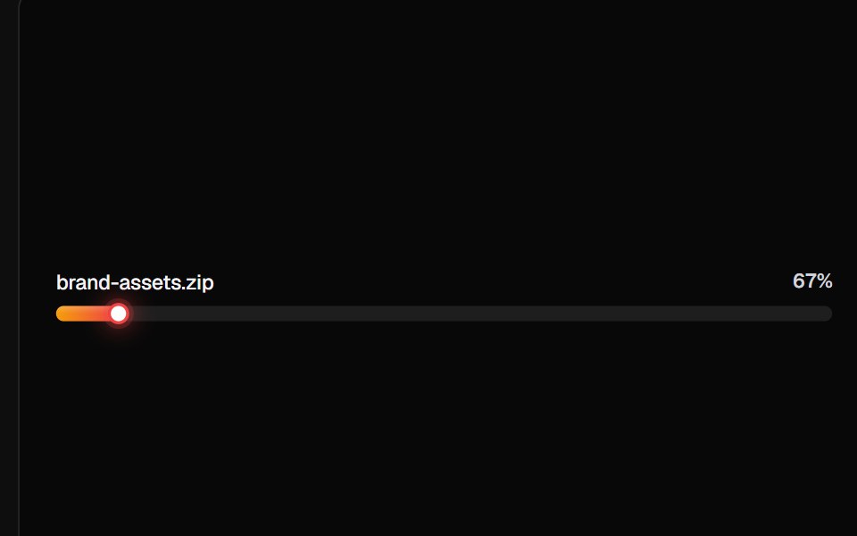 Linear Progress BarsReactFrame · ReactA card of linear progress rows, plain ratio bars, file-upload rows with icons/subtitles/shimmer, milestone ticks, and…
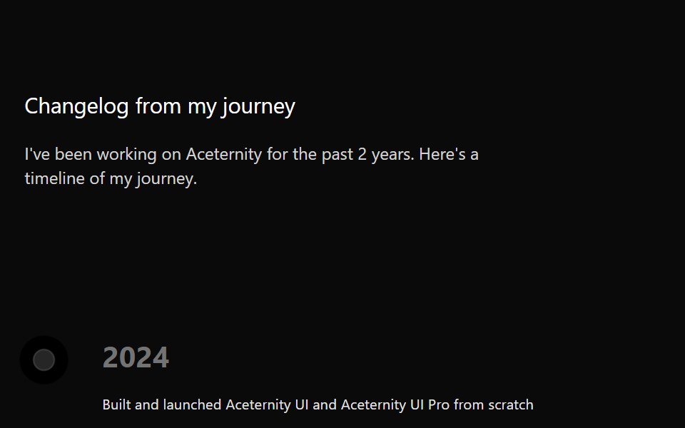 TimelineAceternity UI · React
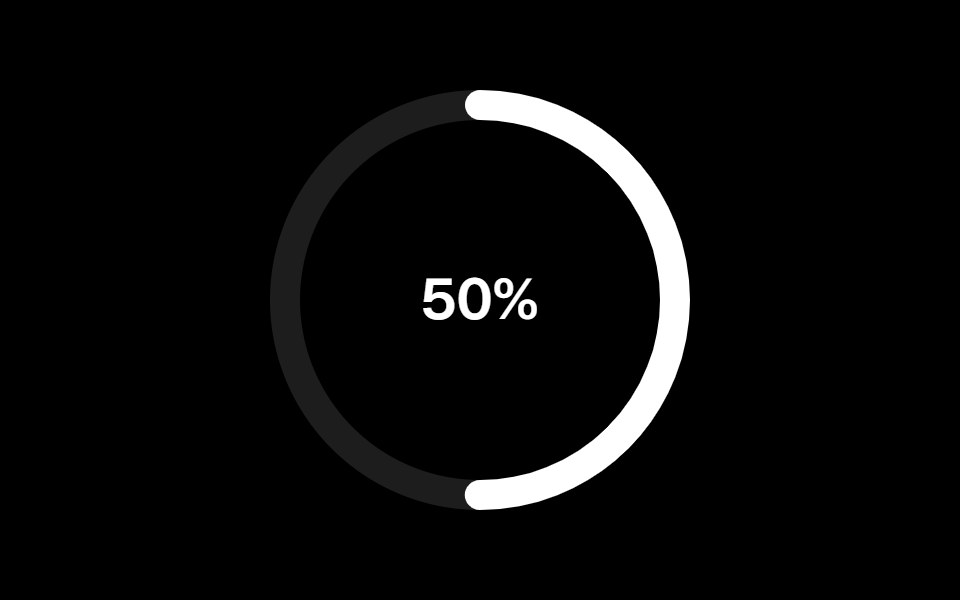 Progress Circularark-cn · ReactA shadcn-style progress circular component built with Ark UI primitives.
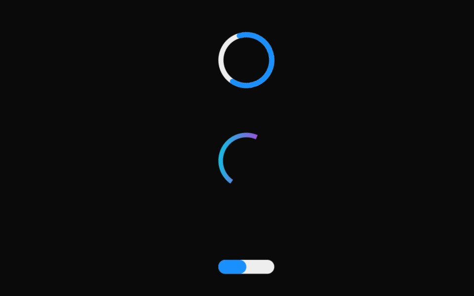 Linear ProgressMUI / Material UI · React
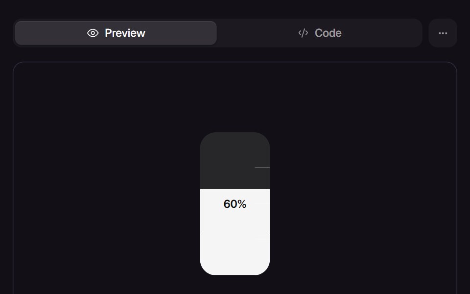 Slosh GaugeReact Bits · ReactTank gauge whose liquid chases the value with mass, tilts with its own speed and splashes against the top when it…
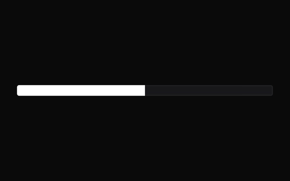 ProgressChakra UI · ReactUsed to display the progress status for a task.
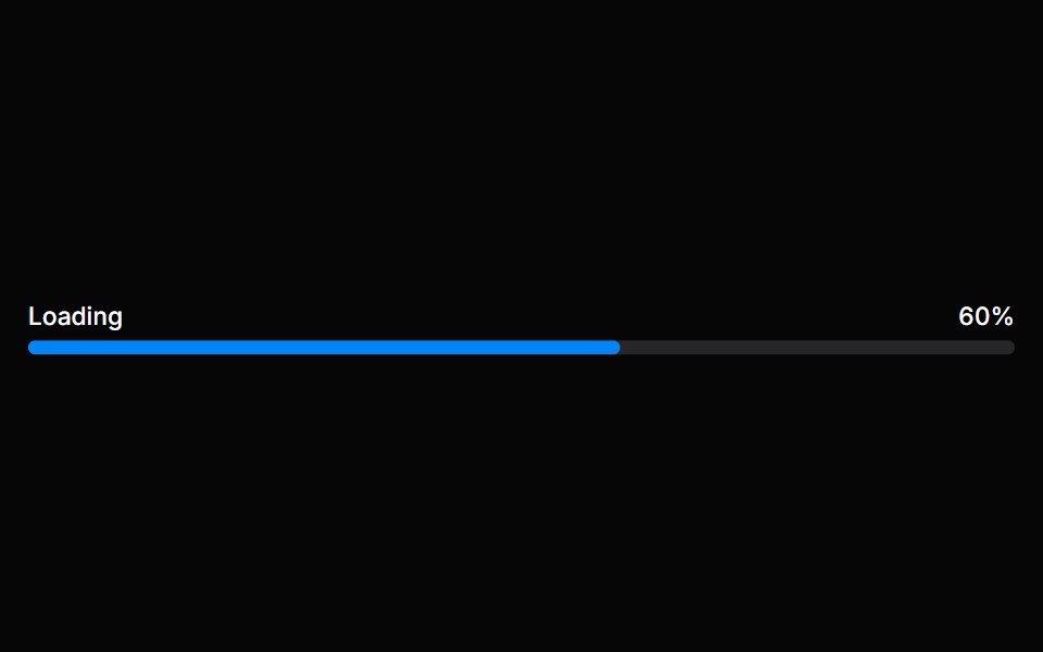 Progress BarHeroUI · ReactA progress bar shows either determinate or indeterminate progress of an operation over time.
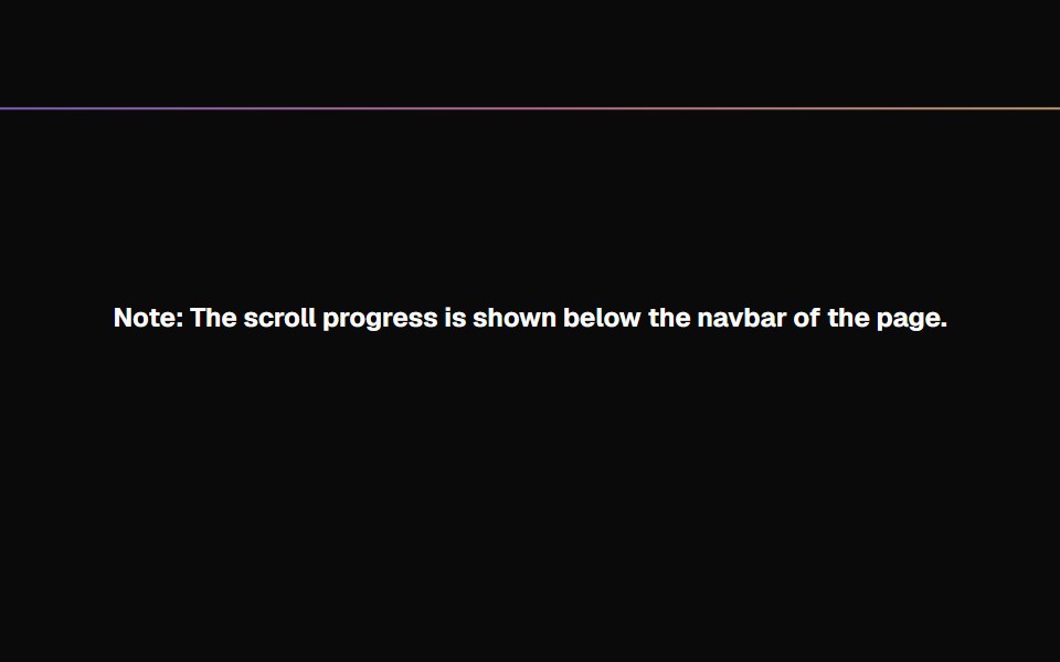 Scroll ProgressMagic UI · ReactAnimated Scroll Progress for your pages
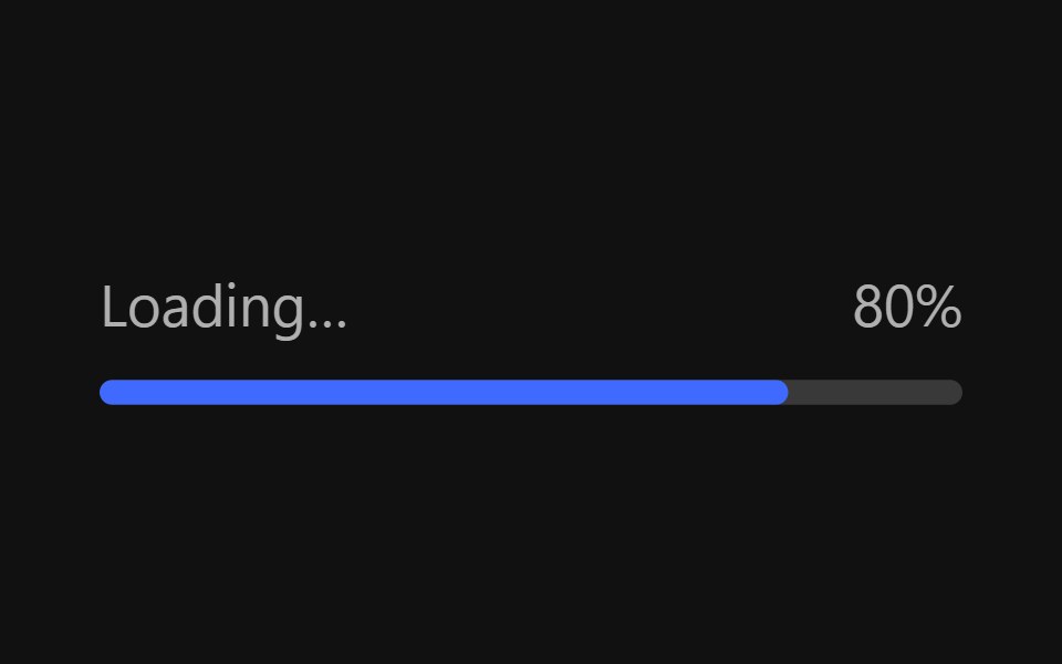 Progress BarReact Spectrum · ReactProgressBars show the progression of a system operation: downloading, uploading, processing, etc., in a visual way…
 Progresscoss ui · ReactDisplays the status of a task that takes a long time.
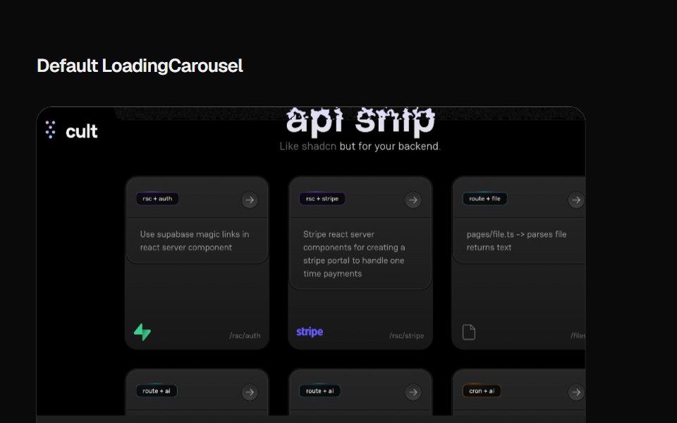 Loading CarouselCult UI · ReactLoading carousel component with smooth transitions and customizable content
 Progress CircleTremor · React
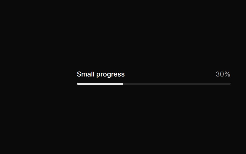 Small progress.ReUI · ReactSmall progress.
 Progress IndicatorAmicro Micro Transitions · ReactHorizontal page scroll progress indicator bar.
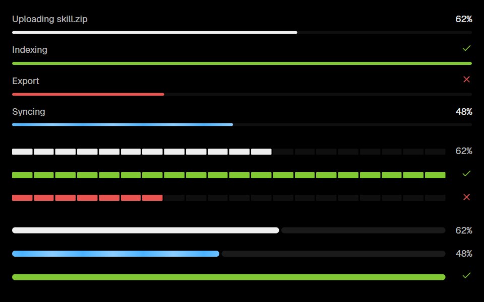 Base Ui ProgressLobe UI · React
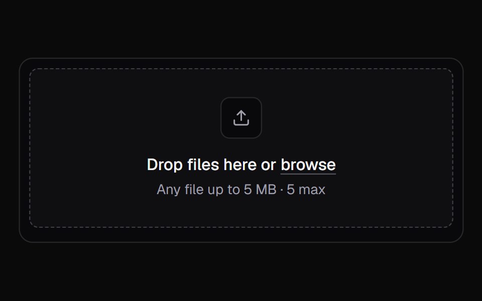 File UploadKokonut UI · ReactA multi-file upload queue with per-file progress, retry and cancel.
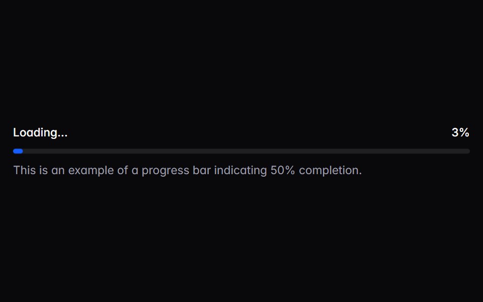 progress-barIntent UI · Reactprogress-bar
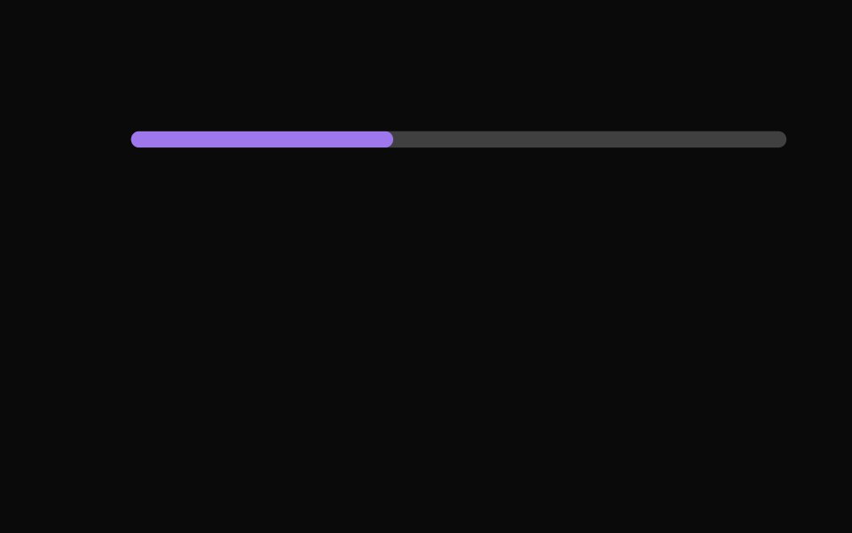 Progress IndicatorsUntitled UI React · React
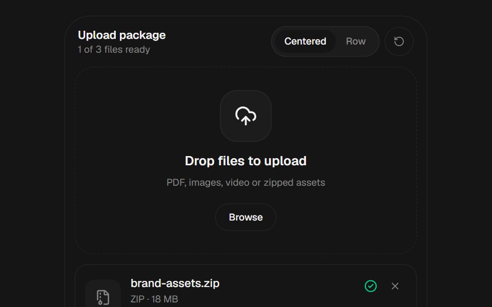 File UploadbeUI · React
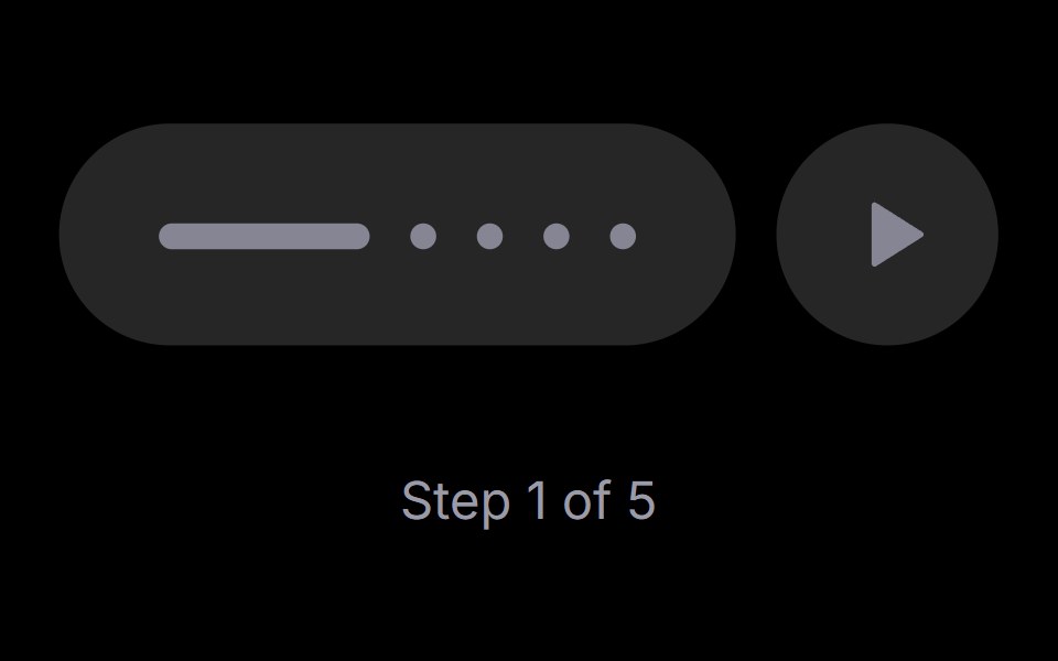 Step PlayerRare UI · ReactAn iOS-style stepped progress track with a play, pause and replay control. The active step stretches into a bar that…
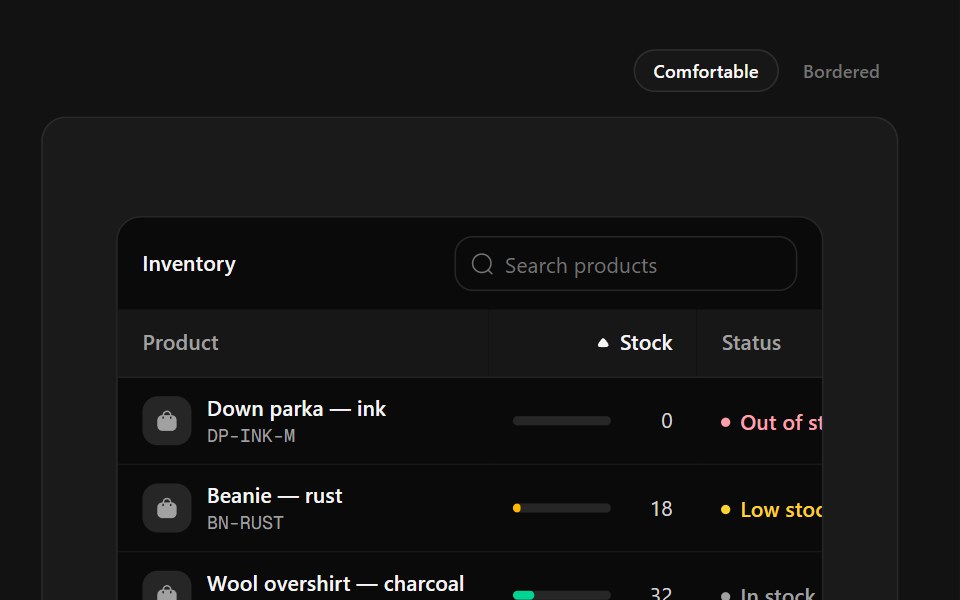 Inventory TableSpectrum UI · ReactStock management with SKU tiles, capacity meters that change color at thresholds and status labels.
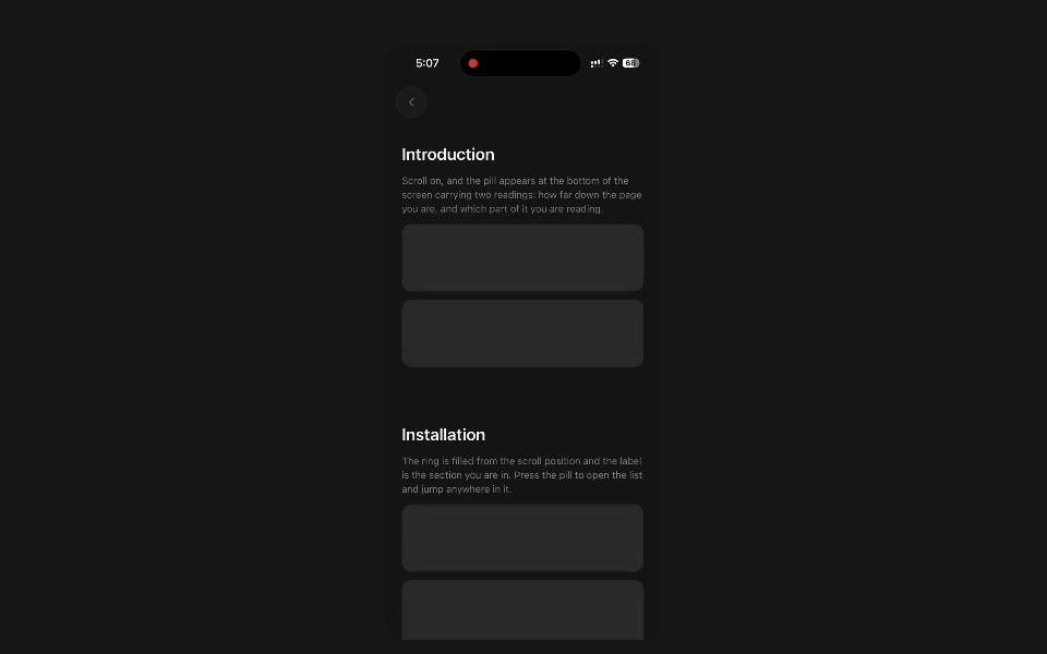 Section ProgressPanel UI · React NativeFloating pill with a scroll ring and the section being read.
 Progress 04 - Shimmer Status ProgressShadcn Space · ReactAnimated progressbar with real-time text updates, smooth entrance and exit animations, and a polished UI.
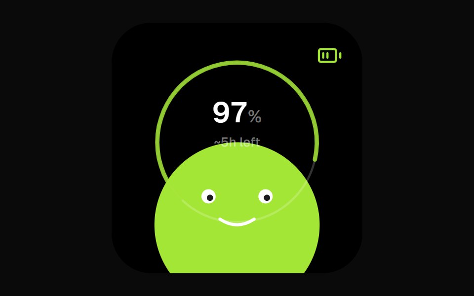 Battery Face WidgetOpenSourceUI · React
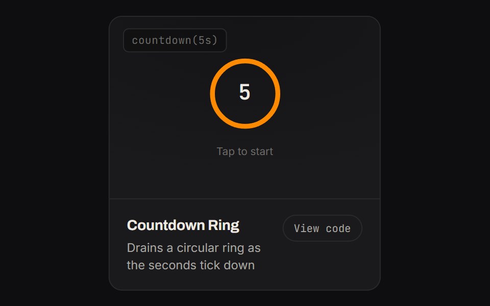 Countdown RingKinetics · HTML/CSSDrains a circular ring as the seconds tick down
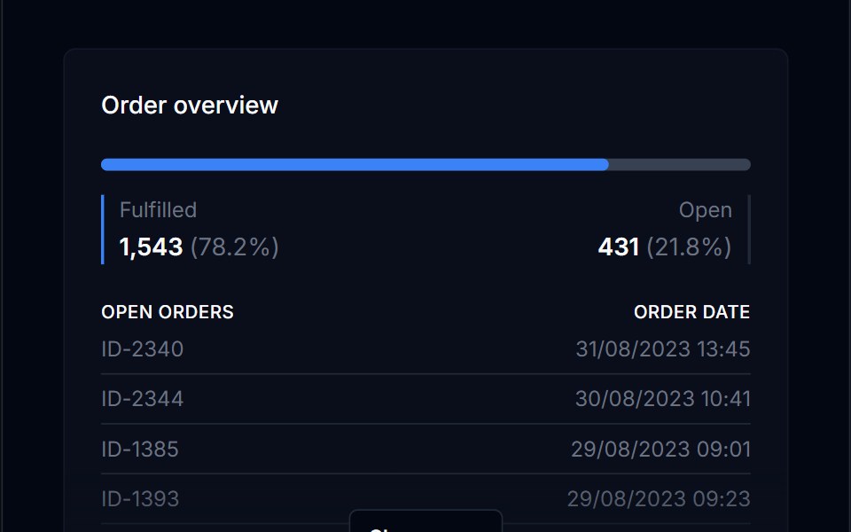 Progress BarTremor Blocks · React
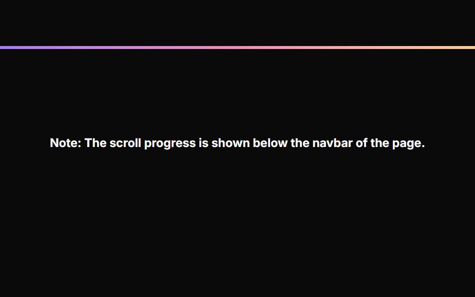 Scroll ProgressAnimations (Svelte) · SvelteA fixed progress bar component that indicates page scroll progress with a gradient color effect.
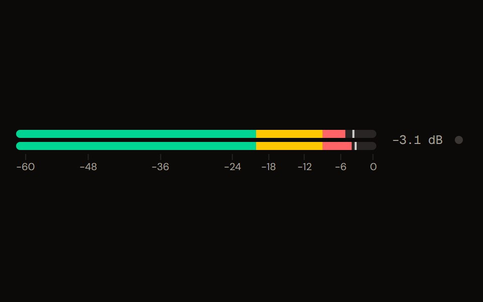 Level Meteraudiocn · ReactA peak and RMS level meter: mono or stereo, horizontal or vertical, solid, segmented or gradient, with zones, peak…
 ProgressShark UI · ReactDisplays task progress with a linear indicator.
 Labeled Progress Indicator BaseWatermelon UI · React
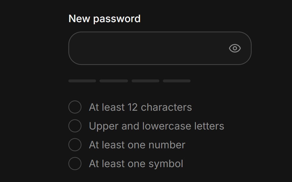 Password strengthArc Library · ReactShow how strong a new password is while it is typed.
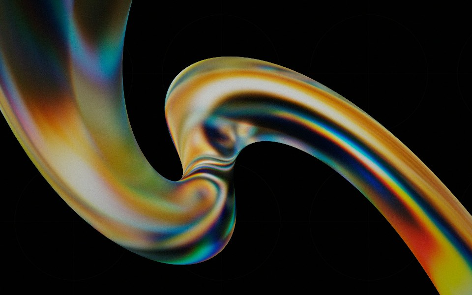 Progressglasscn · React
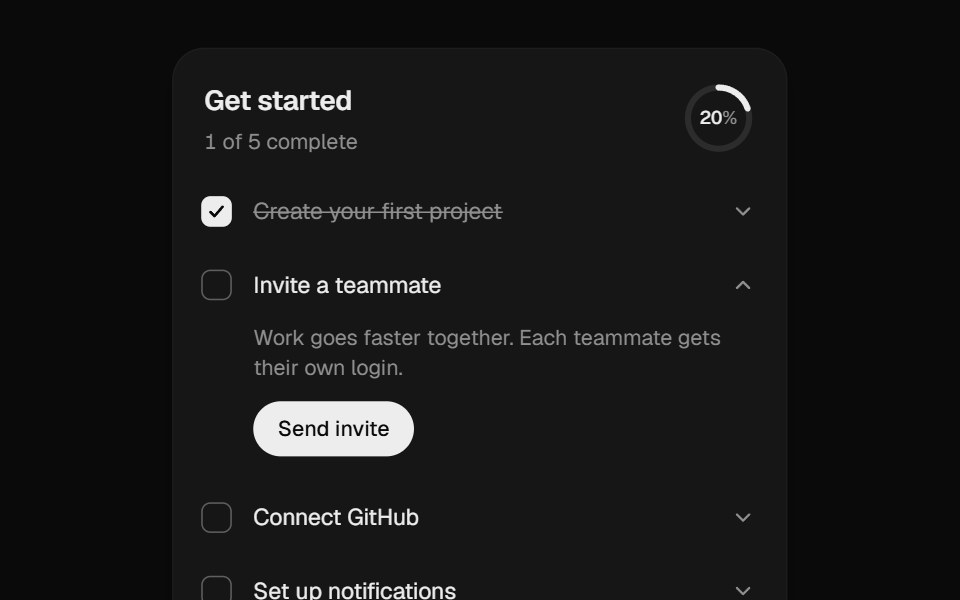 Onboarding ChecklistUI Lab · ReactA setup checklist that counts up as you go and celebrates the finish.
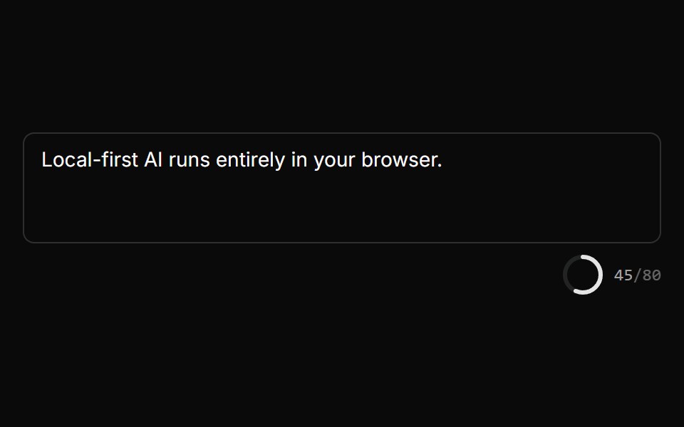 Char Limit IndicatorLocalMode · ReactA radial progress ring + n/MAX monospace counter that turns error-colored when over the limit, deriving the percentage…
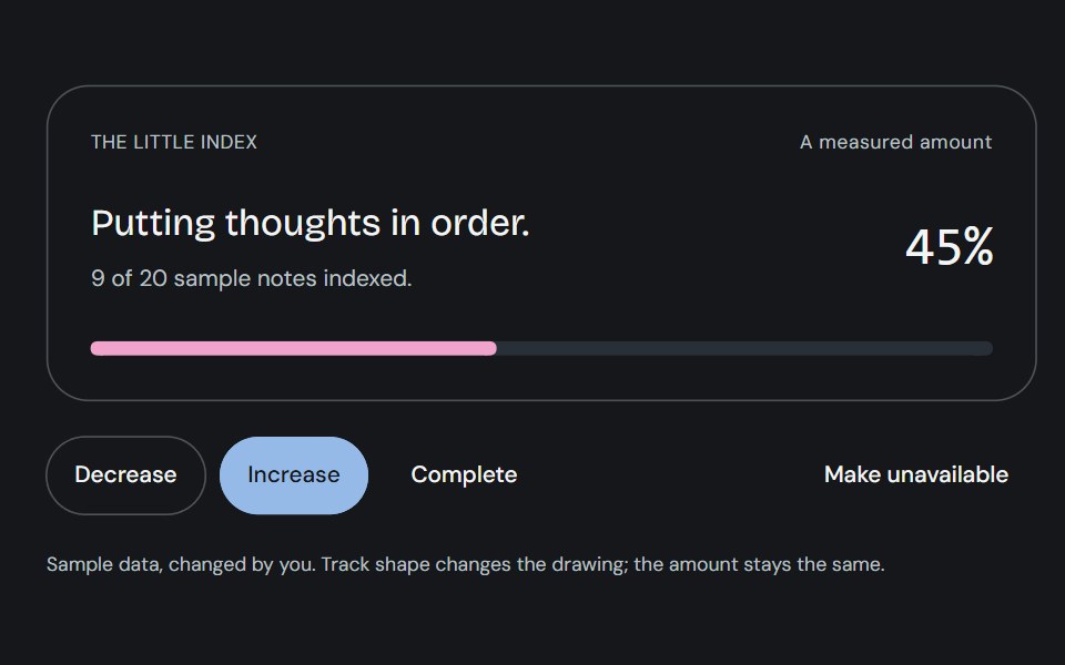 ProgressCojeev UI · ReactOne measured amount, explained as an inline task, a small report or connected milestones—with independent organic…
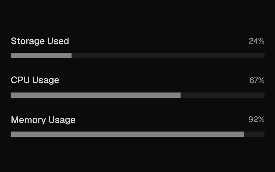 MeterROI UI · ReactA graphical display of a numeric value within a range.
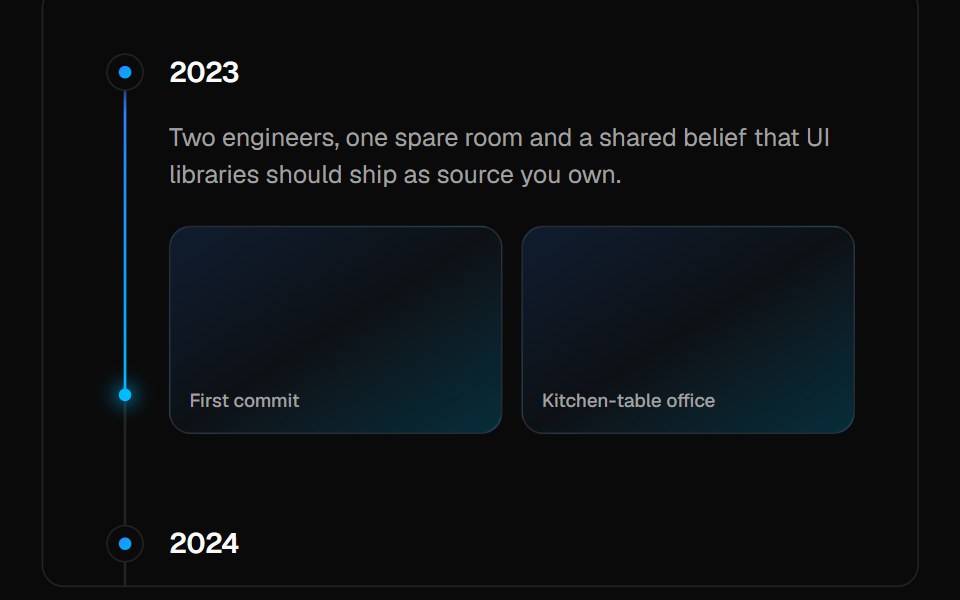 TimelineVelora UI · ReactVertical timeline with sticky labels and a gradient beam that fills as you scroll.
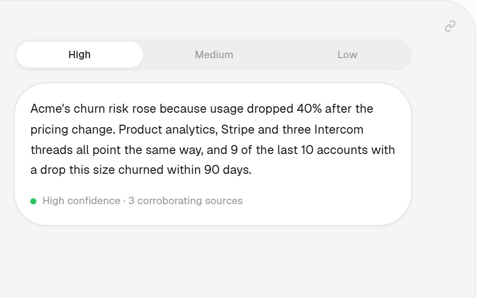 Confidence PatternHalaska UI · React
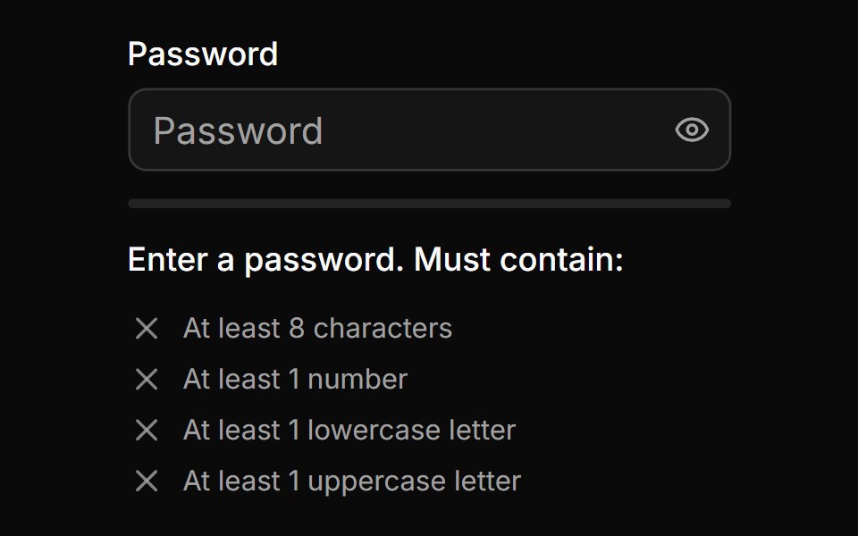 Password Input With Strength Inidicatorsv-particles · Svelte
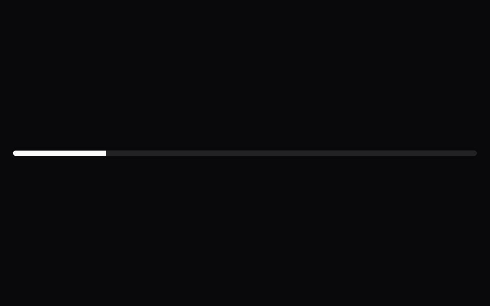 ProgressSpaceUI · ReactDisplays an animated progress bar indicating how much of a task or file upload has completed so users know how long to…
 Base ProgressReScript shadcn · ReScript
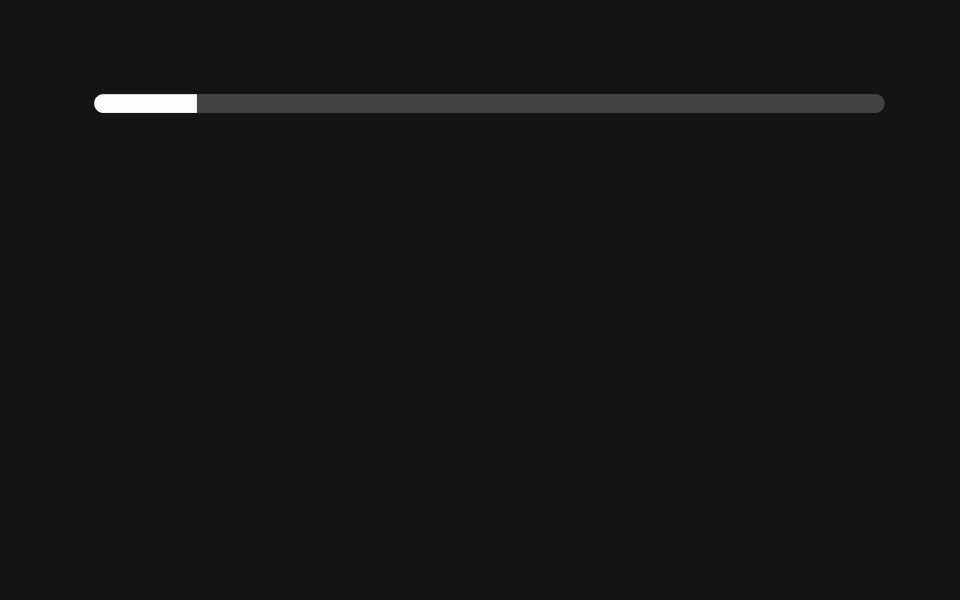 ProgressD2Studio UI · ReactDisplays an indicator showing the completion progress of a task.
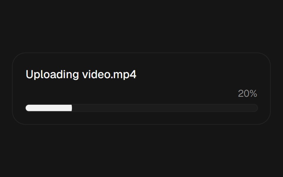 ProgressEaseUI · ReactProgress bar that fills with scale instead of width, plus an indeterminate state for unknown durations.
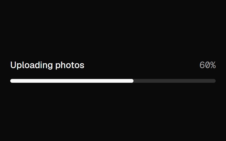 ProgressFibo · ReactShows how far a task has got, or that it's under way.
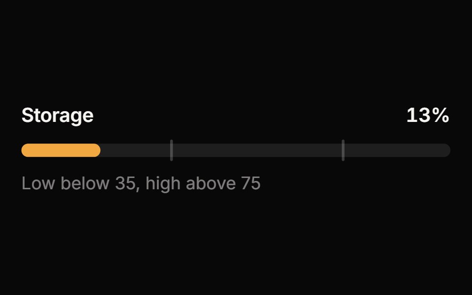 MeterReactFrame · ReactA meter for a value within a known range: bar, semicircle gauge or segmented variants with threshold zones, animated…
 Tracing BeamAceternity UI · React
 Progress Linearark-cn · ReactA shadcn-style progress linear component built with Ark UI primitives.
 Progress CircleChakra UI · ReactUsed to display a task's progress in a circular form.
 Progress CircleHeroUI · ReactA circular progress indicator that shows determinate or indeterminate progress.
 Progress CircleReact Spectrum · ReactProgressCircles show the progression of a system operation such as downloading, uploading, or processing, in a visual…
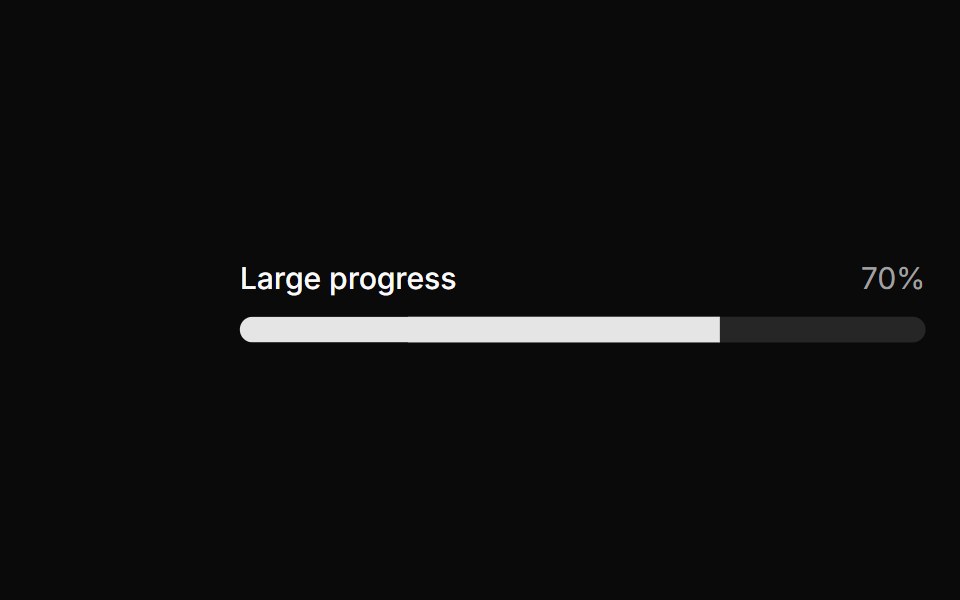 Large progress.ReUI · ReactLarge progress.
 Progress StepperAmicro Micro Transitions · ReactHorizontal step line (STEP 1 → STEP 2 → STEP 3) with animated fill bar.
 Dashboard Route ProgressLobe UI · React
 progress-circleIntent UI · Reactprogress-circle
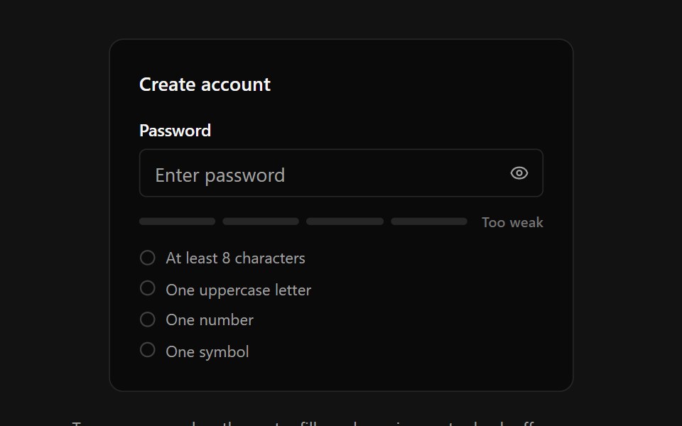 Password StrengthSpectrum UI · ReactA password input with an animated four-segment strength meter, crossfading strength label, requirements checklist with…
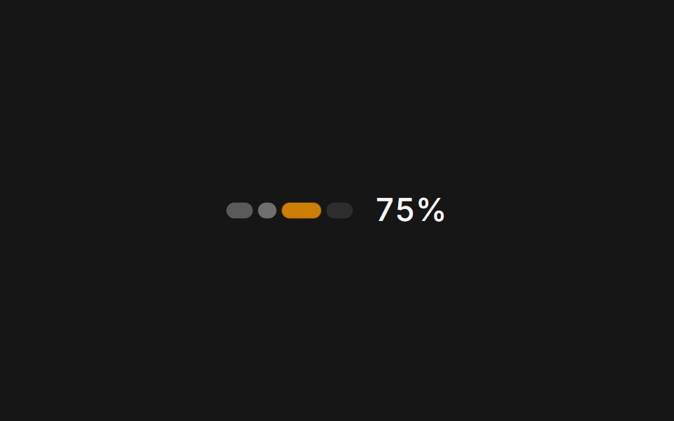 Web UsagePanel UI · React NativeA usage and credits panel for an AI app: credit used, renewal date and context compaction.
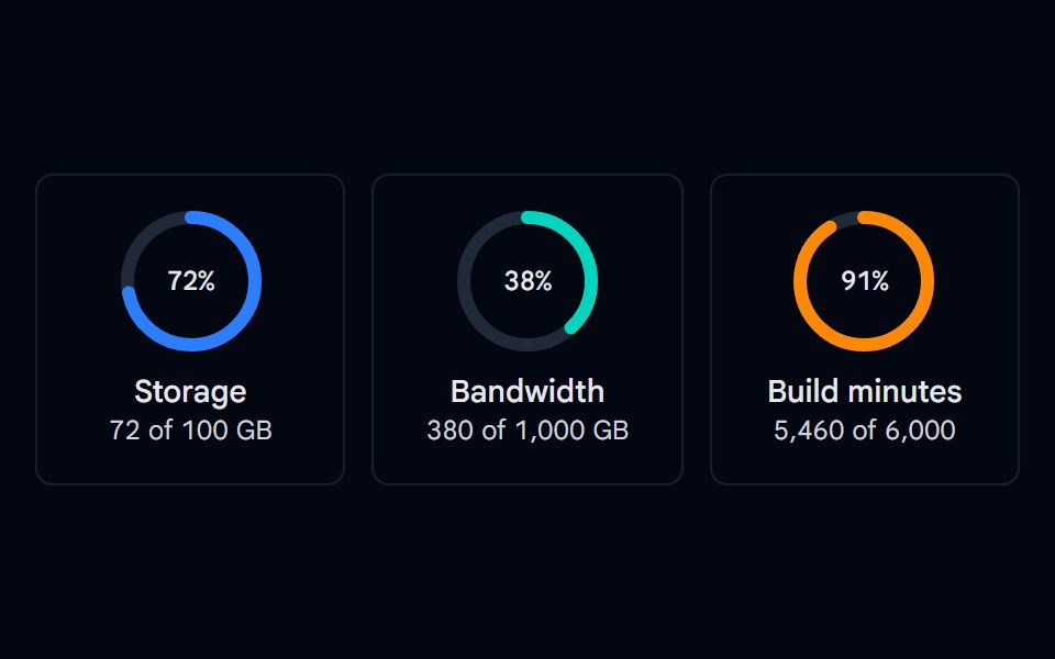 Progress 05 - Circular RingsShadcn Space · ReactSVG circular progress rings for storage, bandwidth, and build minutes with a centered percentage and usage details.
Libraries with progress components
Related categories
- React Progress Components
- Tailwind CSS Progress Components
- Animated Progress Components
- shadcn/ui Progress Components
- Feedback Components
- Badge Components
- Spinner Components
- Alert Components
- Chip Components
- Progress Bar Components
- Empty State Components
- Notification Components
- Status Indicator Components
- Skeleton Components
- Banner Components
- Typing Indicator Components
- Progress Circle Components
- Error State Components
- Success Animation Components
- Scroll Progress Components