Progress 05 - Circular Rings
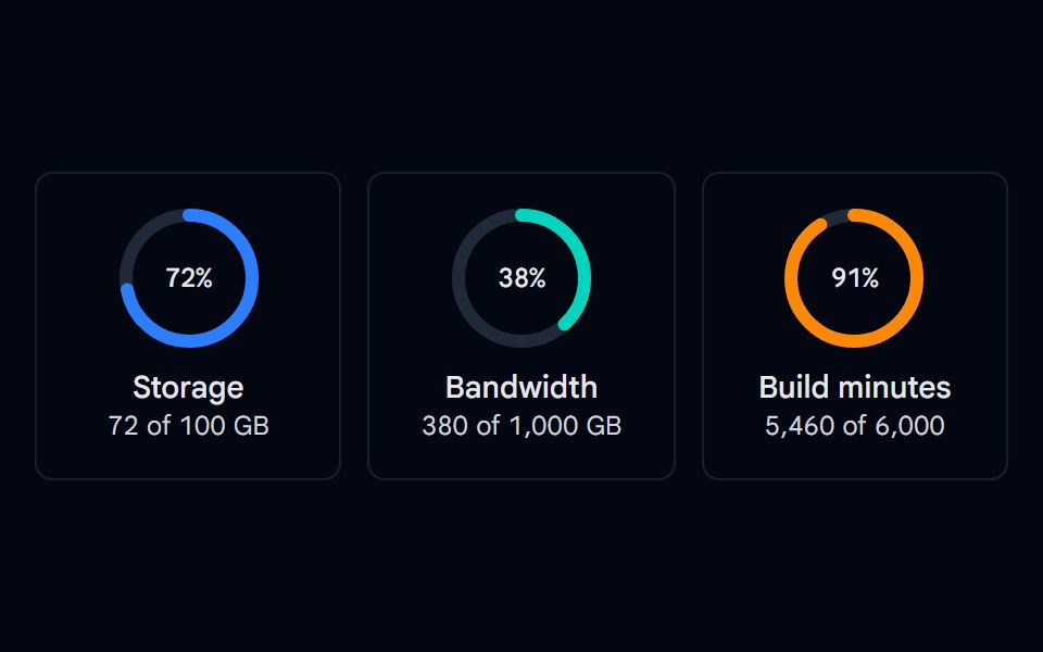
SVG circular progress rings for storage, bandwidth, and build minutes with a centered percentage and usage details.
- Library
- Shadcn Space
- Framework
- React
- Type
- component
- License
- MIT
- Files
src/components/shadcn-space/progress/progress-05.tsxsrc/lib/utils.tssrc/config.ts
- Source
- https://github.com/shadcnspace/shadcnspace
Categories
- Feedback Components
- React Feedback Components
- Tailwind CSS Feedback Components
- Animated Feedback Components
- Progress Components
- React Progress Components
- Tailwind CSS Progress Components
- Animated Progress Components
More from Shadcn Space
- Popover 05 - Download Progress
- Progress 04 - Shimmer Status Progress
- Progress 06 - Labeled Colors
- Progress 07 - Segmented Storage
- Progress 09 - Page Loading & Indeterminate
- Stepper 03 - Animated Progress Indicators
- About Us 01 - Impact Metrics
- Accordion-01 - Default
- Accordion-02 - Multi-level
- Accordion-03 - Numbered FAQ
- Accordion-04 - Card
- Accordion-05 - Media