 Dev Design Library
Tailwind CSS Feedback Components
Dev Design Library indexes 1,245 Tailwind CSS feedback components from 72 open-source UI libraries, with the most coming from Amicro Micro Transitions, ReUI, Watermelon UI, Shadcn Space and Origin UI. Each one links to its page with the source code, a live preview where available, the library license and the install command. Every library in this list styles its components with Tailwind CSS utility classes.
Showing 120 of 1,245, a mix from every library. Open a library to see all of its components.
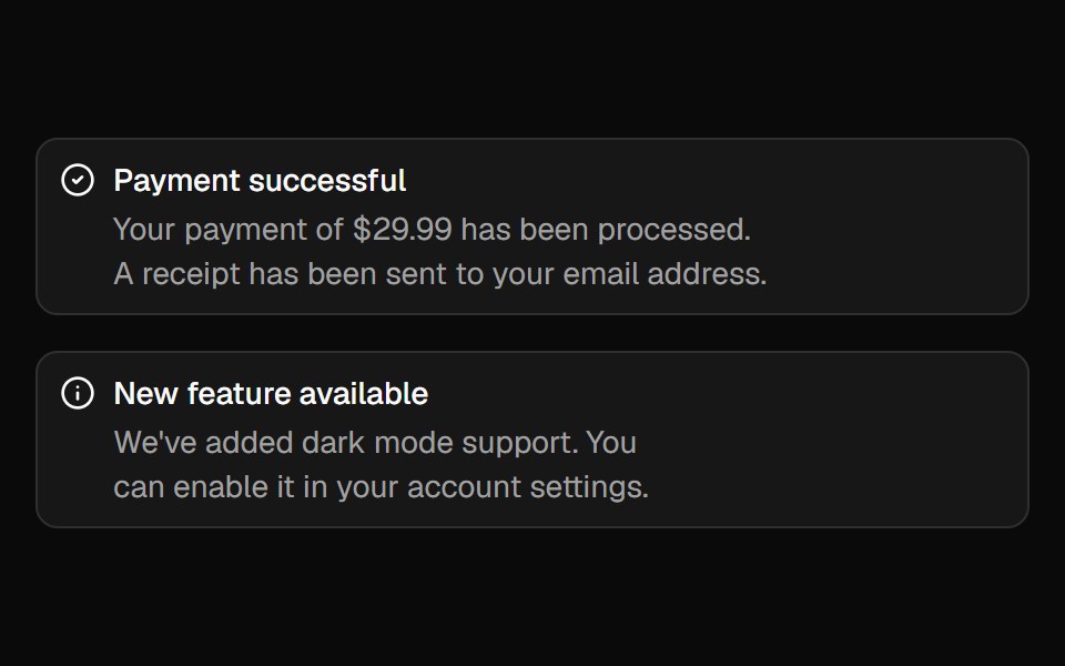 Alertshadcn/ui · ReactDisplays a callout for user attention.
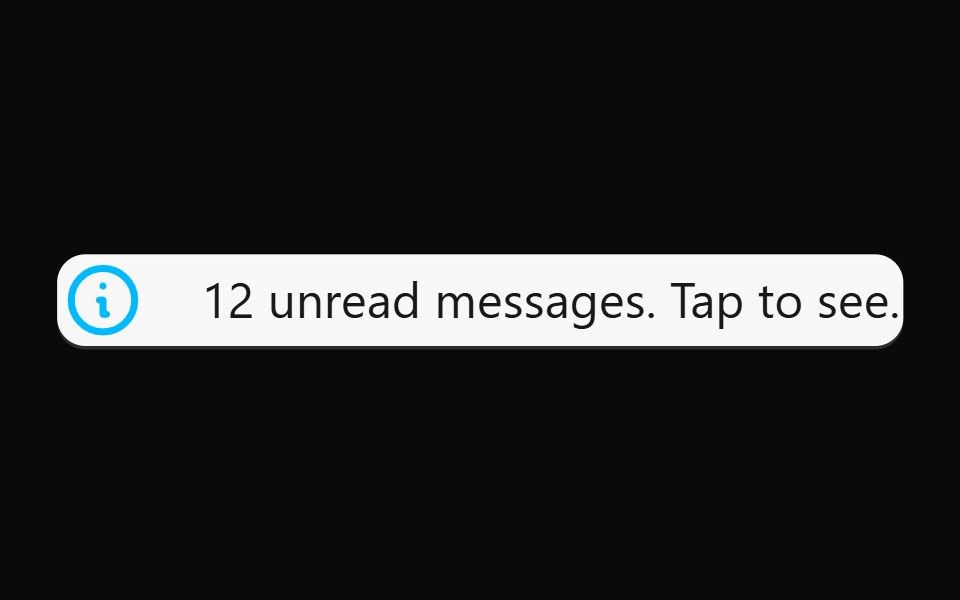 AlertdaisyUI · CSS (Tailwind)
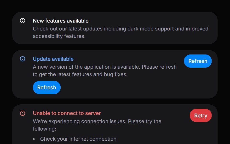 AlertHeroUI · ReactDisplays important messages and notifications to users with status indicators.
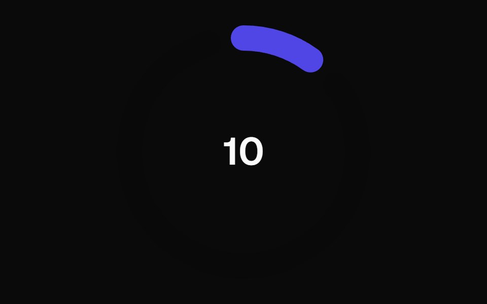 Animated Circular Progress BarMagic UI · ReactAnimated Circular Progress Bar is a component that displays a circular gauge with a percentage value.
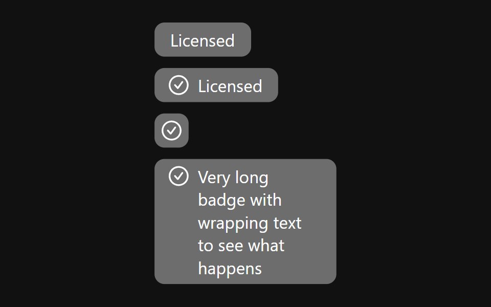 BadgeReact Spectrum · ReactBadges are used for showing a small amount of color-categorized metadata, ideal for getting a user's attention.
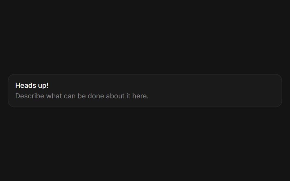 Alertcoss ui · ReactA callout for displaying important information.
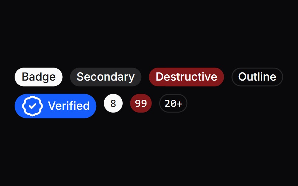 BadgeOrigin UI · ReactA badge or a component that looks like a badge.
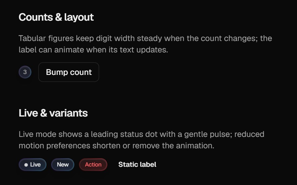 Halo BadgeCult UI · ReactBadge with optional layout animation, live status dot, and gradient rim aligned with Halo Button / Card
- Thinking OrbsLibraries.dev · ReactDotted thought-orb loading indicators for AI & agent UIs — nine tuned states, two sizes, auto dark/light
 BadgeTremor · React
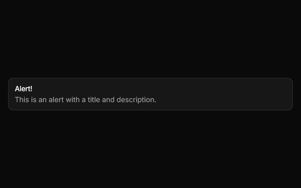 AlertReUI · ReactDisplays a callout for user attention, such as a success message, warning, or error.
 Accordion LoaderAmicro Micro Transitions · ReactAccordion Loader loading animation.
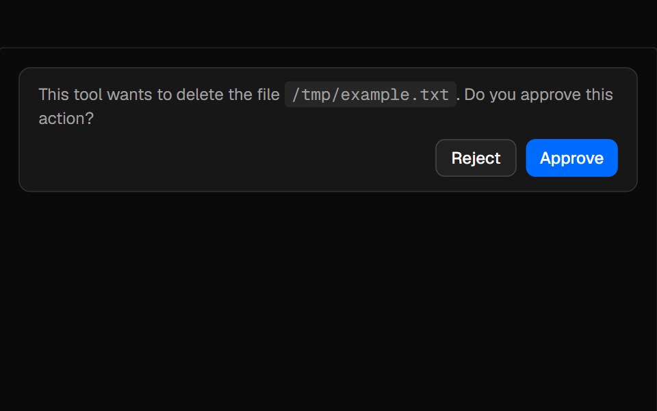 ConfirmationAI Elements · ReactAn alert-based component for managing tool execution approval workflows with request, accept, and reject states.
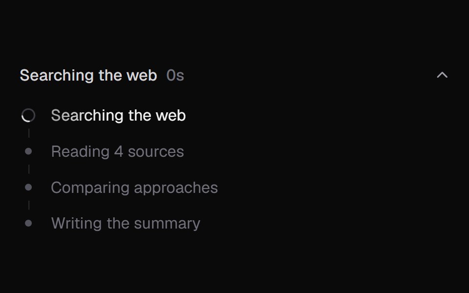 AI State LoadingKokonut UI · ReactAgent progress as a list of steps with a live log, elapsed time and a summary when done.
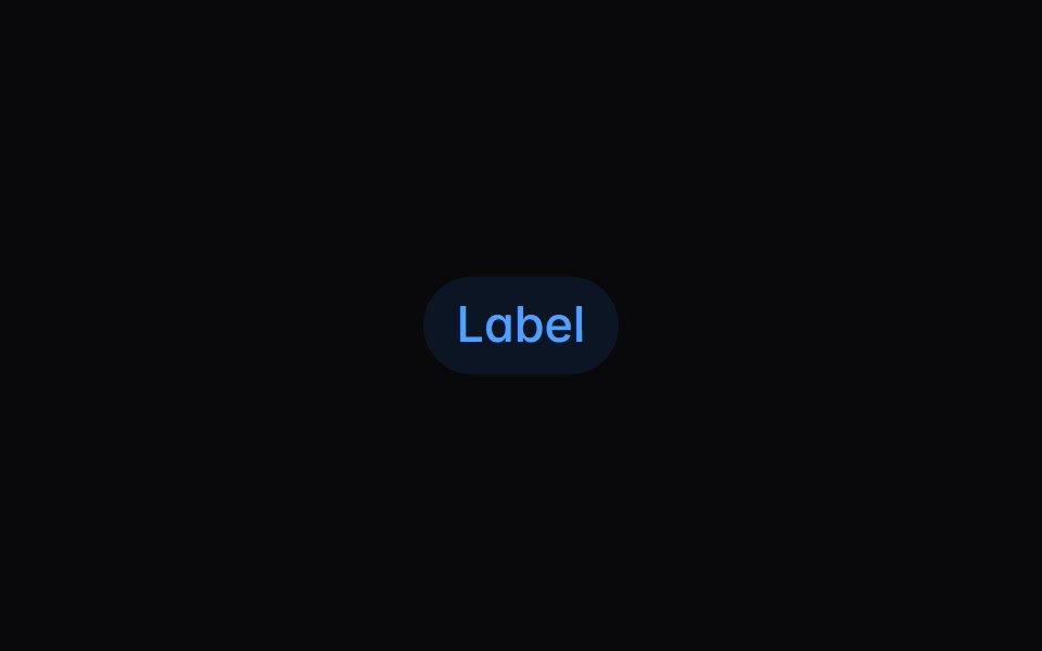 badgeIntent UI · Reactbadge
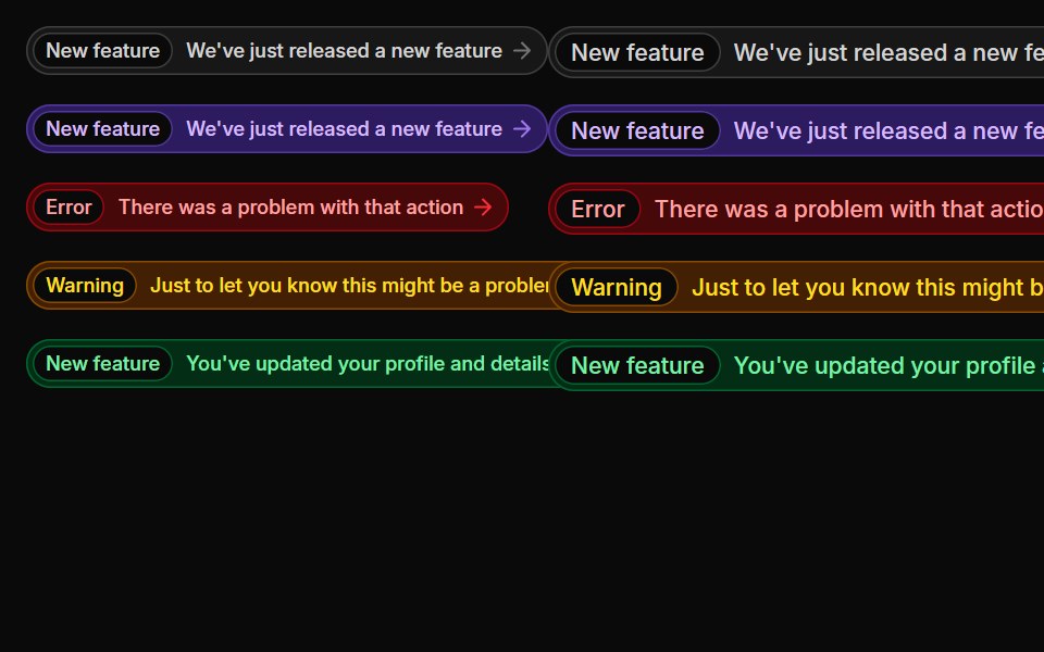 BadgesUntitled UI React · React
 Agent ActivitybeUI · ReactRenders progressive agent work as message content.
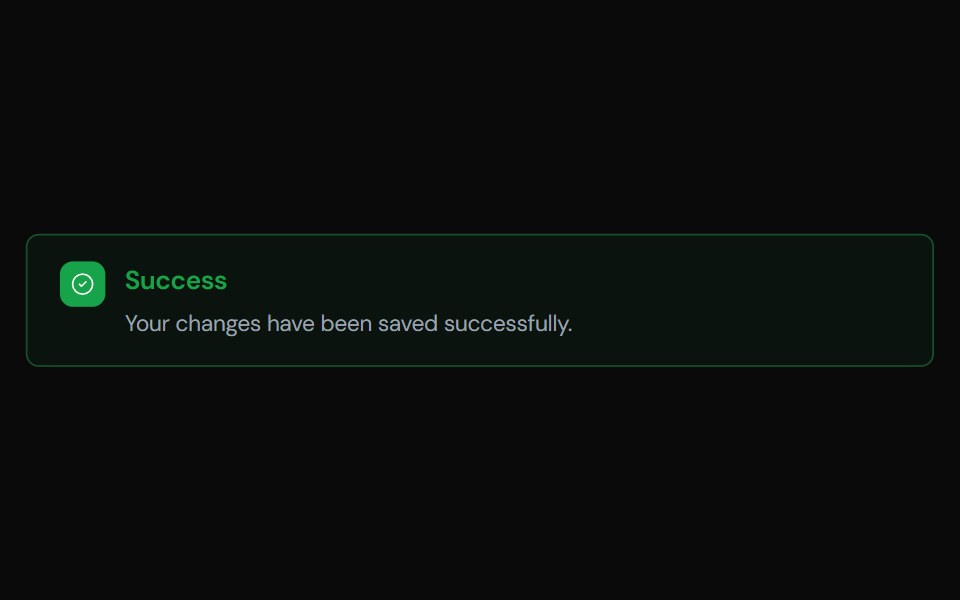 AlertTailGrids · ReactA component to display important messages to the user, with support for different variants.
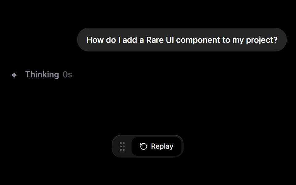 Inline AI StatusRare UI · ReactAn inline status that shows what an AI is doing, from thinking and researching to writing and done.
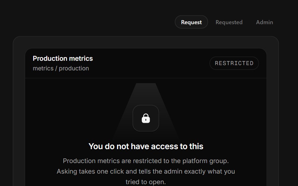 No AccessSpectrum UI · ReactA permission wall that names the owner and turns request into requested.
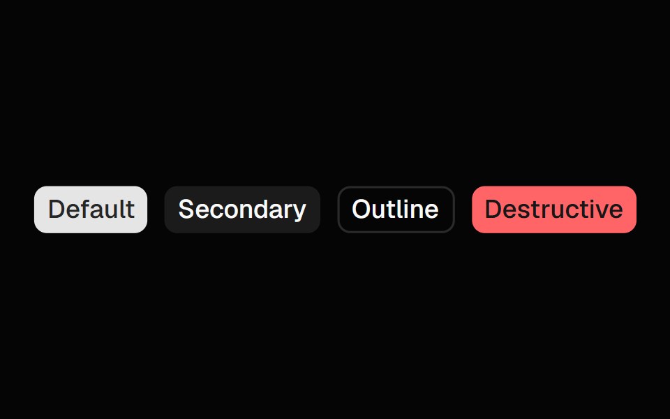 BadgeSpell UI · ReactA badge component with multiple color variants and sizes.
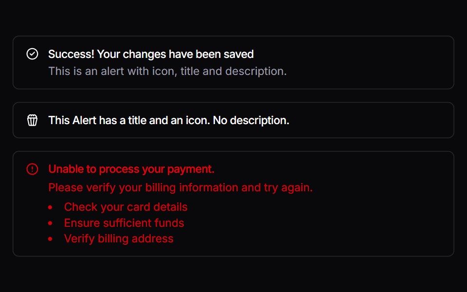 AlertVengeance UI · React
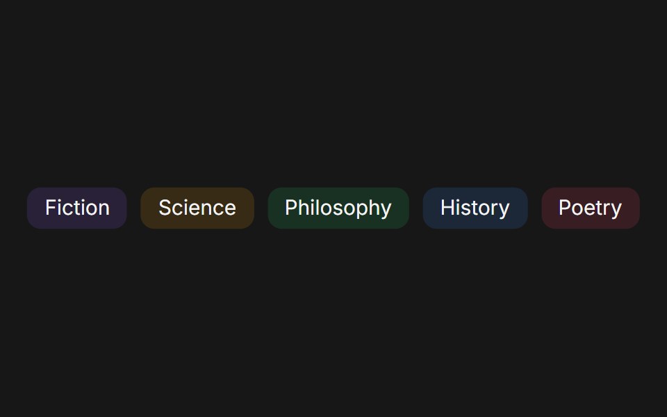 BadgeFluid Functionalism · ReactCompact label with solid, dot, and ghost variants, Tailwind color palette, and three sizes.
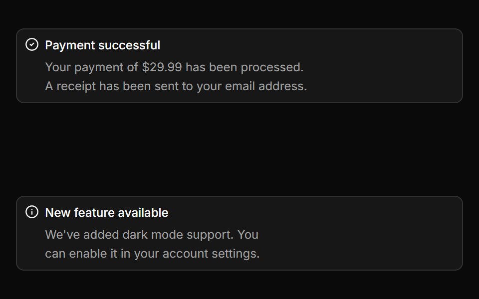 AlertToolcraft · React
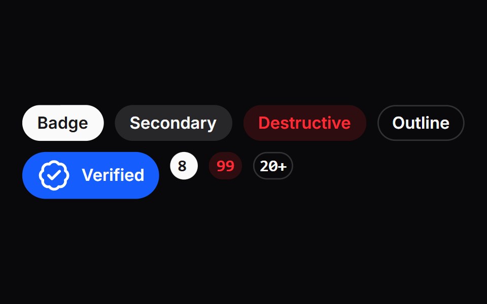 BadgeLaunch UI · React
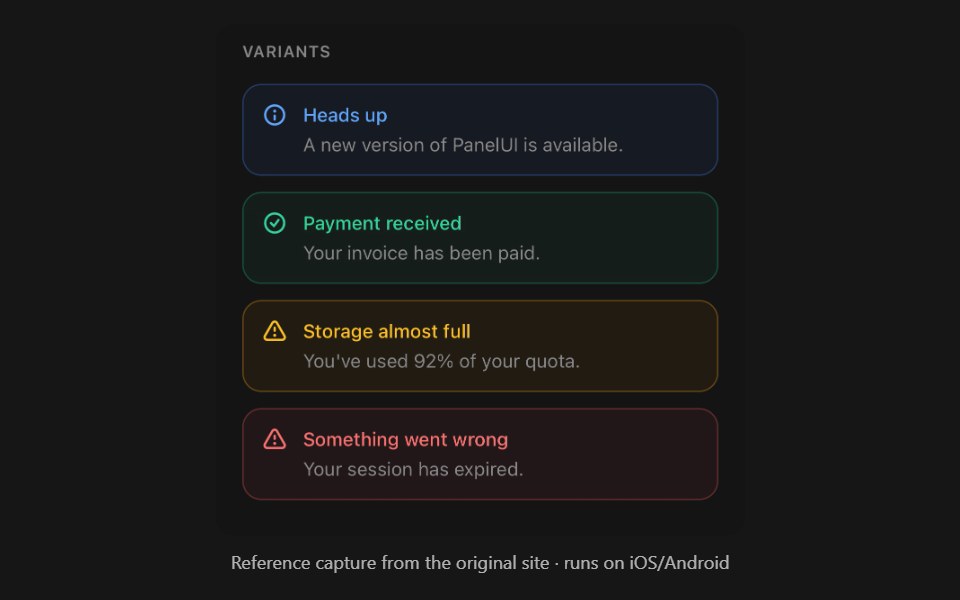 AlertPanel UI · React NativeStatus message with a built-in icon.
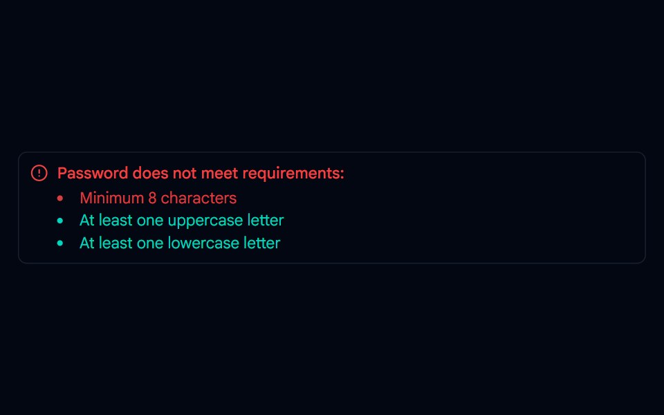 Alert-01 - Alert with Password DetailShadcn Space · ReactAlert component
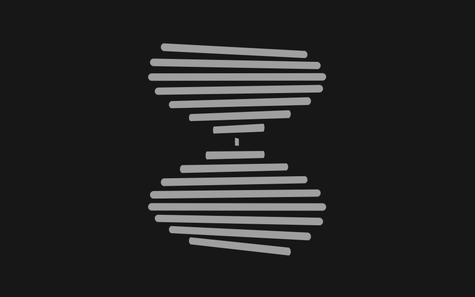 Helix SpinnerPixel Perfect · ReactA column of bars, each offset a few degrees on the Y axis, spinning together as a twisting 3D helix.
 Spin LoaderOpenSourceUI · ReactMinimal spinning loader built on a lucide icon — defaults to Loader, but pass any icon prop. Sizes: sm, md, lg.
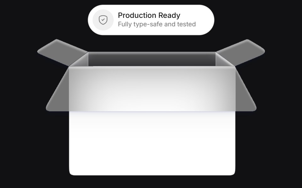 Bucketuselayouts · ReactAn interactive card component that simulates a bucket where chips are tossed and replaced with smooth physics-inspired…
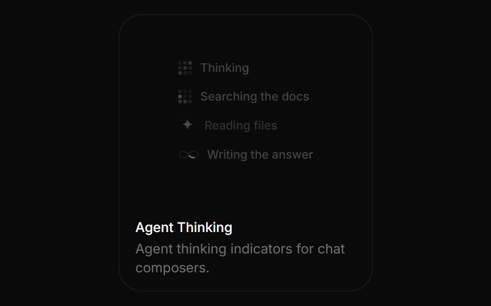 Agent ThinkingBoardUI · ReactAgent thinking indicators for chat composers.
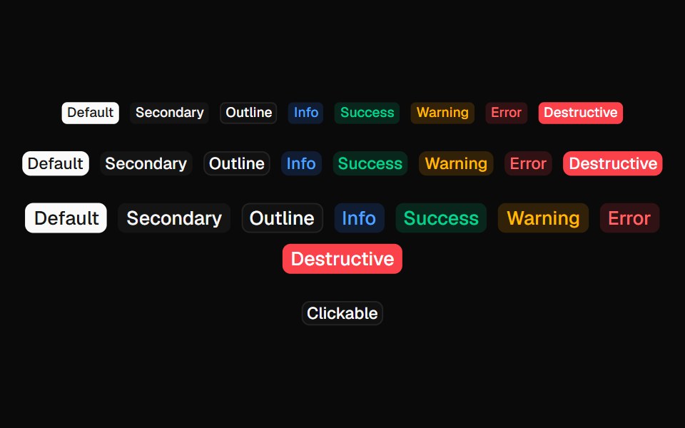 Coss BadgeComponentry · React
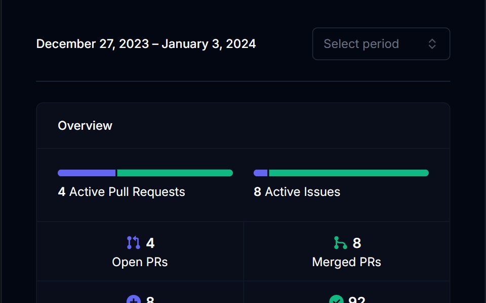 Category BarTremor Blocks · ReactSingle horizontal bar split into coloured segments, with threshold labels and an optional marker for the current value.
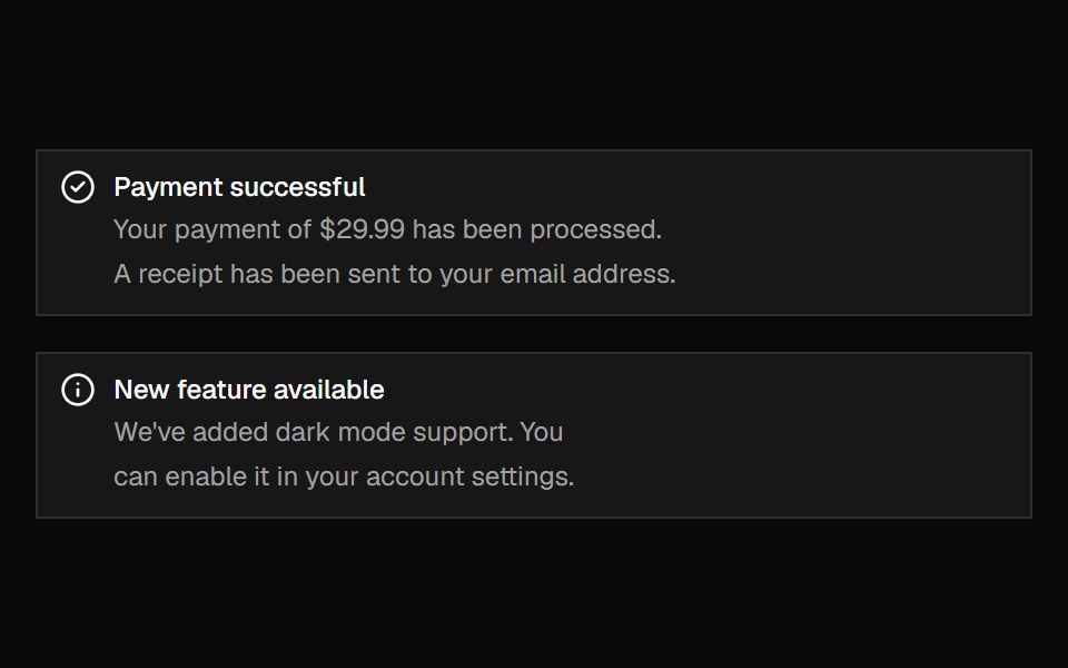 AlertShadcn Dashboard · React
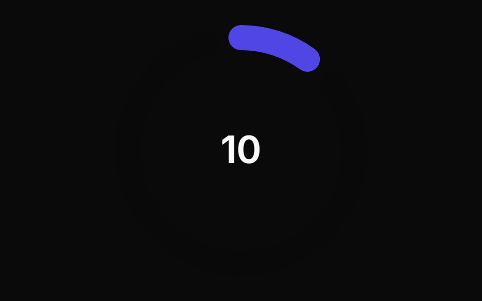 Animated Circular Progress BarAnimations (Svelte) · SvelteA circular progress bar component with animated transitions between primary and secondary colors.
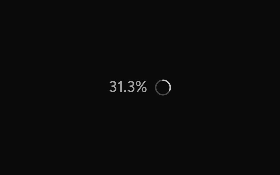 ContextAI Elements (Svelte) · SvelteA hover-card-based context window usage component with token, cost, and model usage breakdowns.
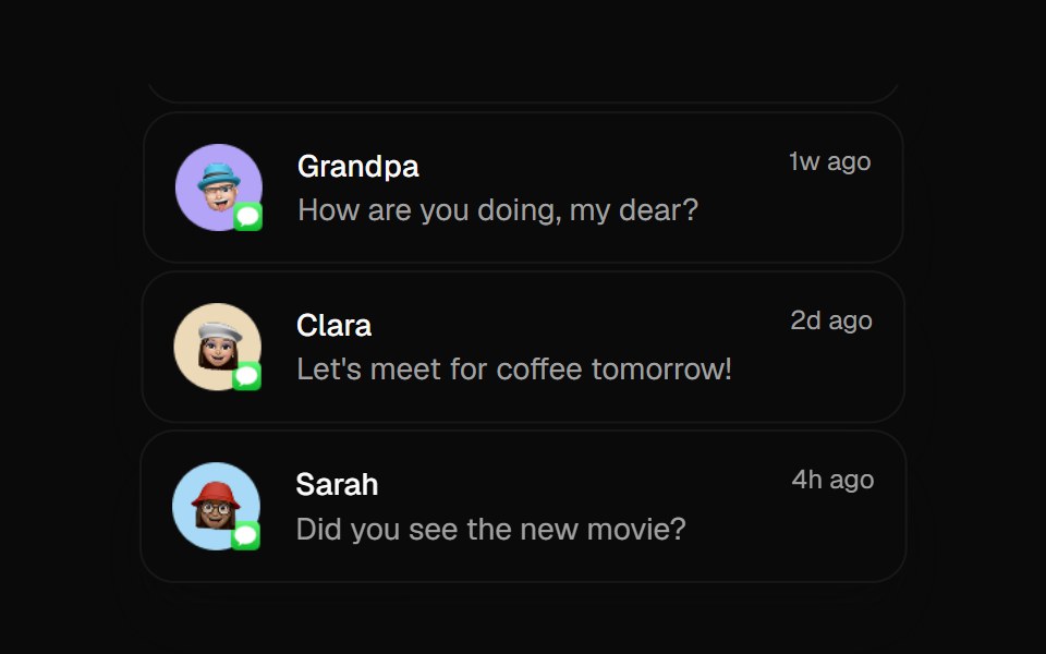 Animated ListBadtz UI · ReactA sophisticated animation component that creates dynamic column-based transitions with scaling effects. Perfect for…
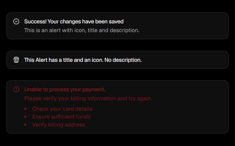 AlertObsidianUI · React
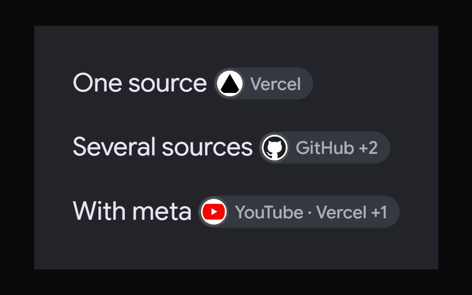 AI Overview CitationNotra · ReactA source chip built on shadcn Badge and HoverCard.
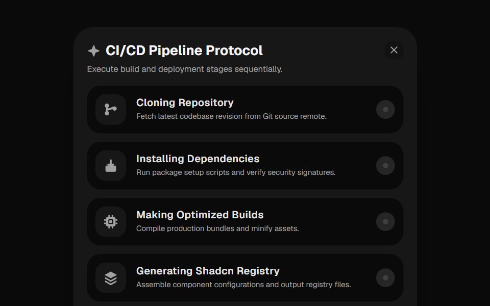 Deployment ChecklistGreatUI · React
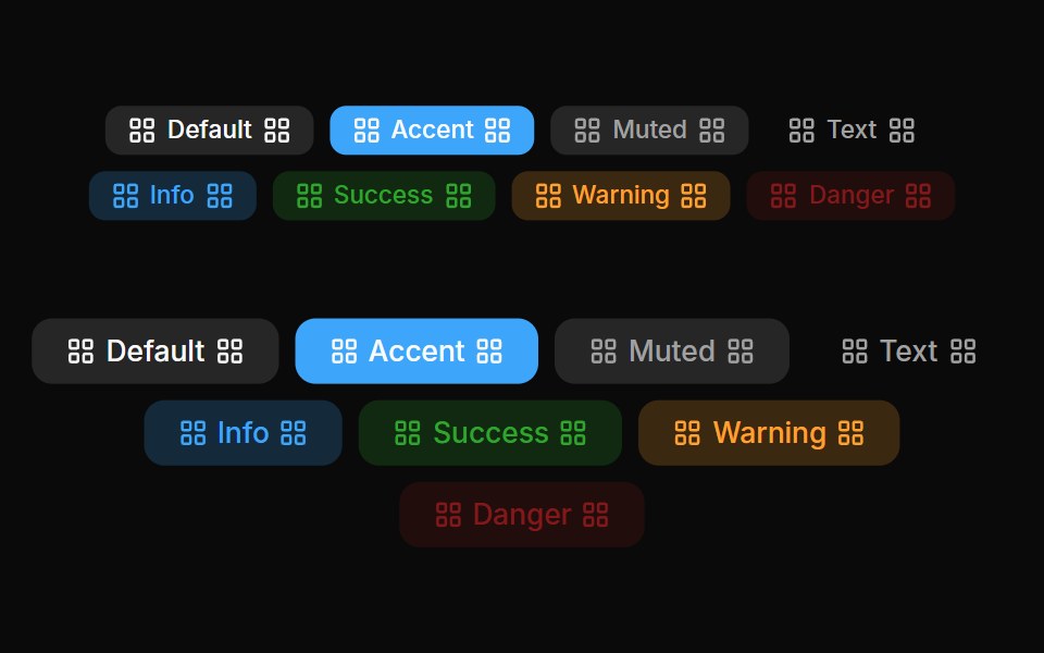 Badges 04Oxbow UI · AstroLeft and right badge
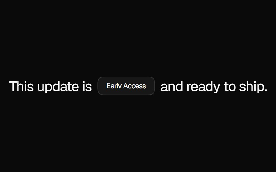 BadgeNexvyn UI · ReactA compact status label with solid, muted, and dot variants for tagging content inline.
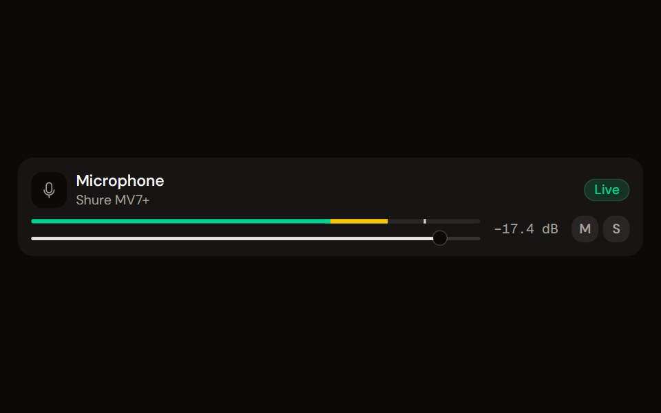 Channel Stripaudiocn · ReactOne channel of a mixer: header, status, meter, fader, value, controls and a notice, as a row or a console strip. The…
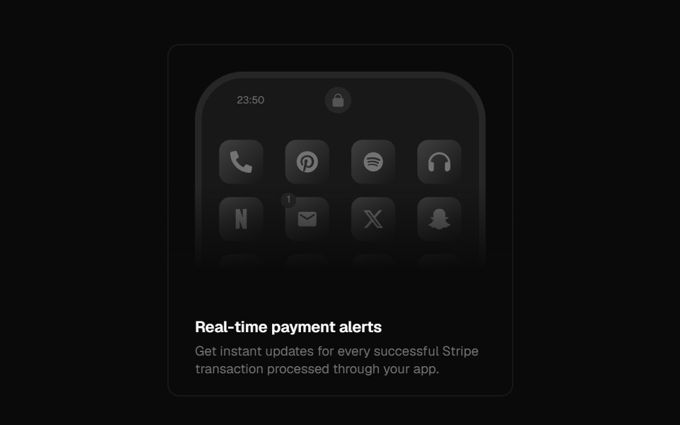 Notification CenterForge UI · ReactBeautifully animated mobile UI showcasing notifications with hover-triggered transitions and customizable content…
 badgeBaseLayer · ReactA badge is a small label that can be used to display information or status.
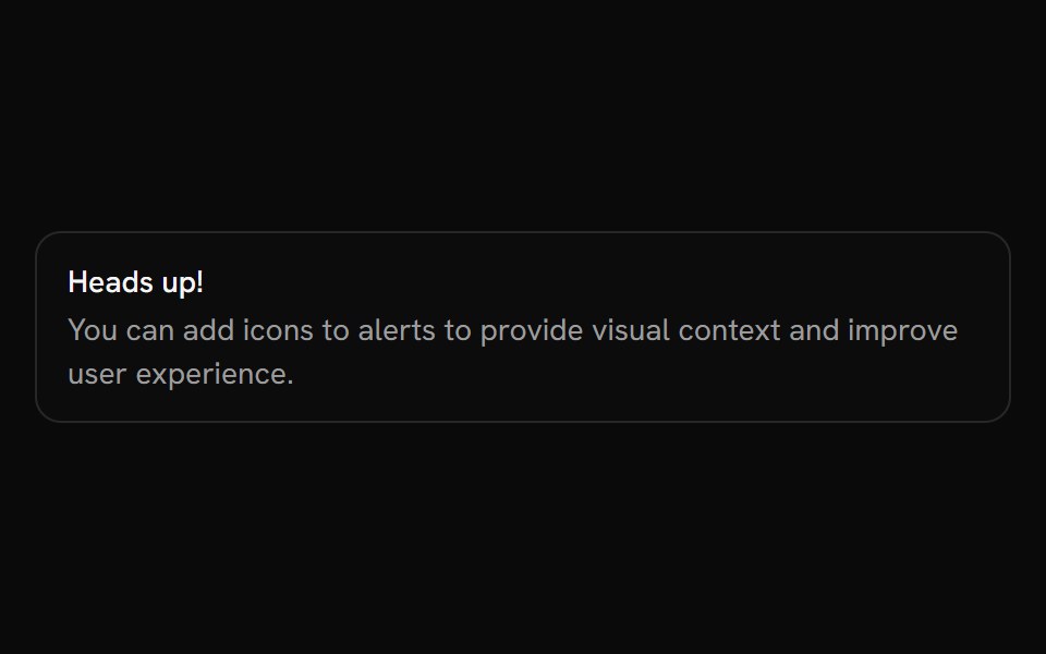 AlertShark UI · ReactDisplays an alert for user attention.
 SkeletonRewamp UI · ReactShared Skeleton primitive Pulsing block styled with brand tokens and subtle lilac shimmer sweep…
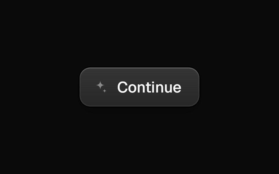 ConfettiButtonEvil Buttons · ReactA ringed dark button with a sparkle icon that fires a restrained confetti burst on click.
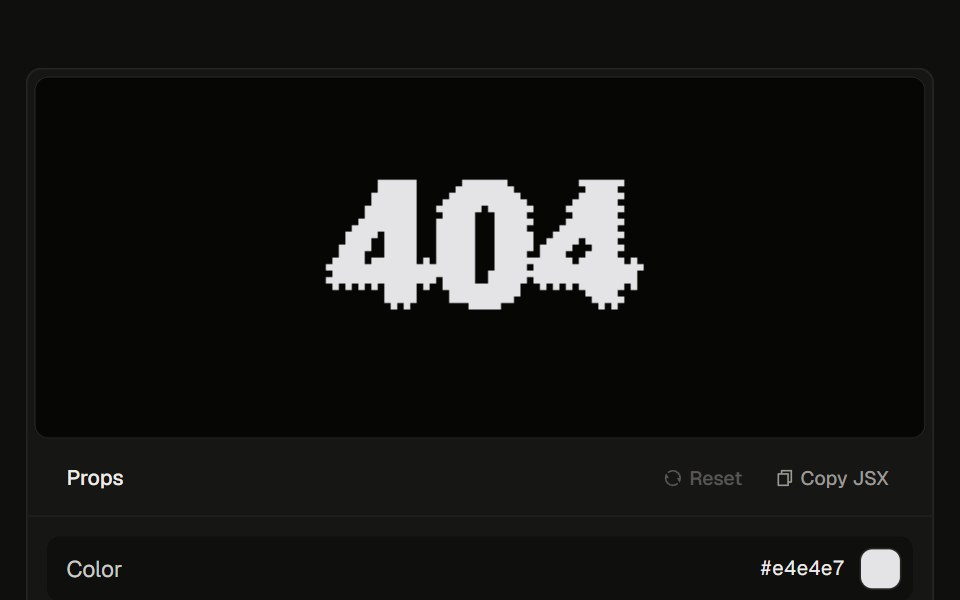 Dithered 40423rd.dev · ReactBayer-pixel 404 section: a fireball cursor scorches the glyph, burns it into embers and smoke, then reforms. Optional…
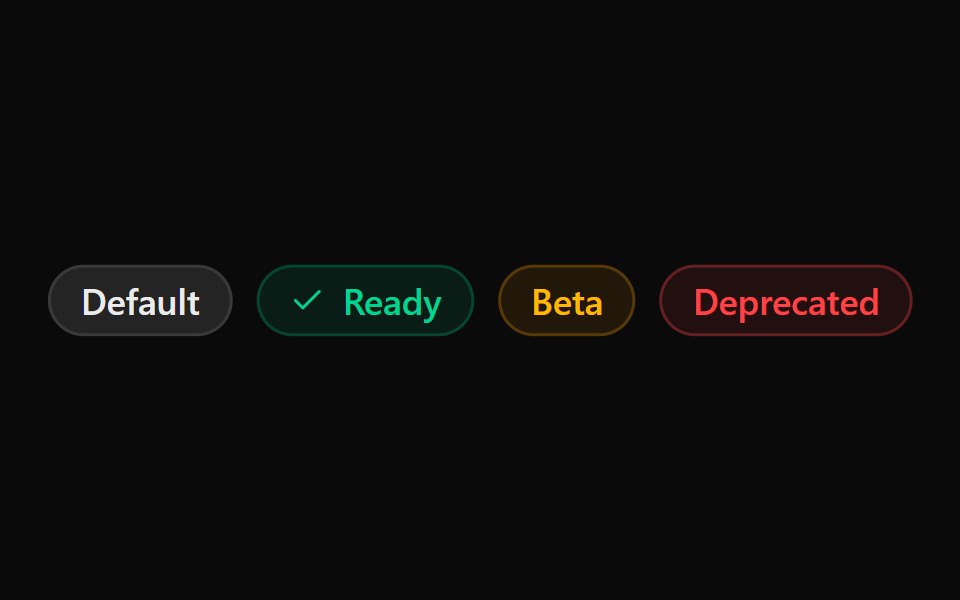 ChipSona UI · React
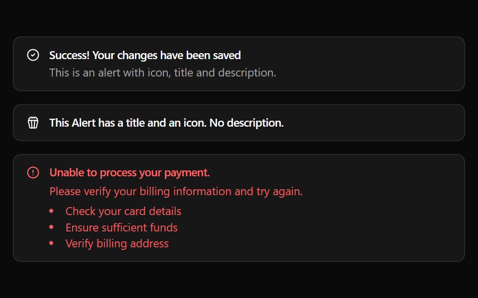 AlertWatermelon UI · React
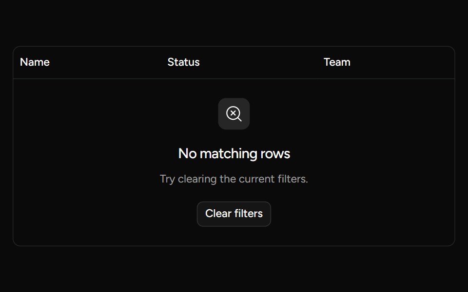 Data Table Emptysv-table · SvelteA table row for displaying a clear empty or filtered-results state.
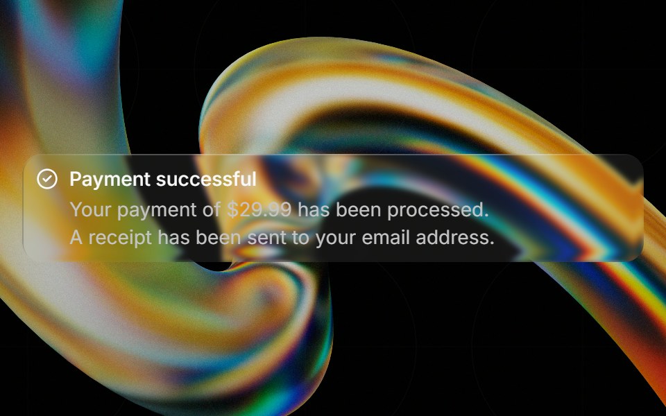 Glass Alertglasscn · ReactGlass Alert with five variants: clear, frosted, subtle, liquid, and liquid-refract
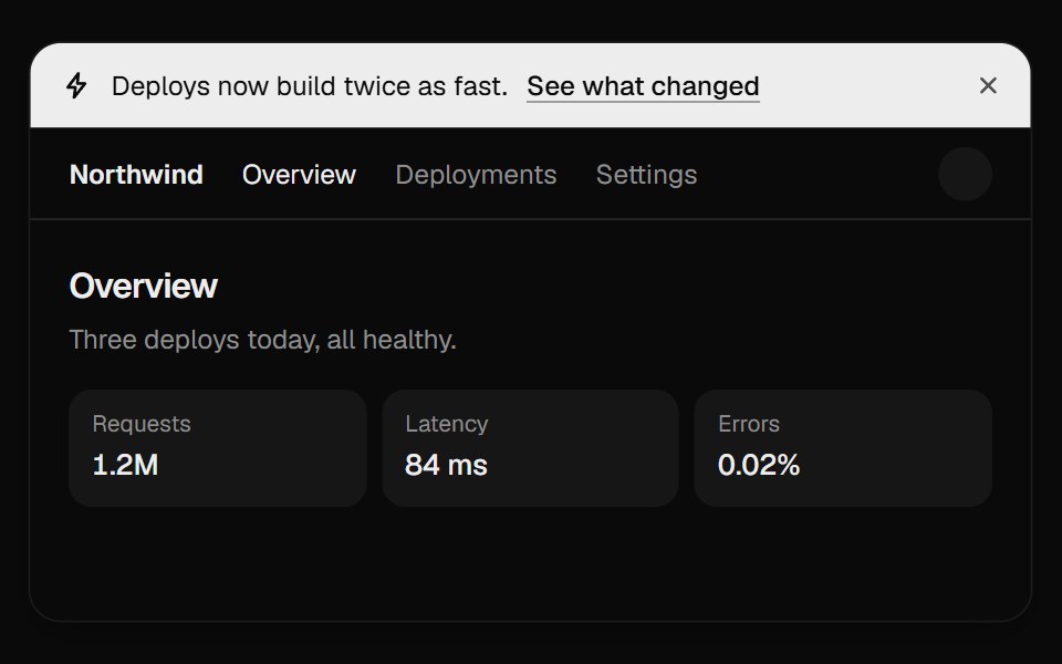 Announcement BannerUI Lab · ReactDismissing folds the bar away and the page slides up to fill the gap.
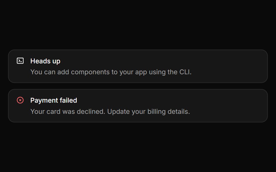 AlertHextaUI · ReactInline messages for status and feedback, with a neutral surface, a colored icon and a dismiss that collapses smoothly.
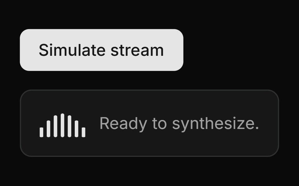 Streaming Speech PanelLocalMode · ReactA streaming-TTS status surface: active state (WaveformActivityBars + spinner, synthesizing/playing label…
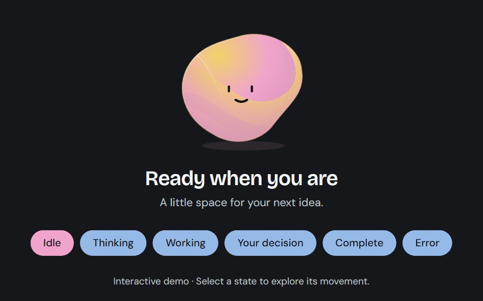 Agent stateCojeev UI · ReactA sculpted, living status field that changes contour and color as an agent thinks, works, asks for input, or finishes.
 Sliding Arrow LabelMicroKit · ReactA text label that gets a bright surface while an arrow slides in beside it.
 Loading skeletonFLX UI · ReactSkeleton placeholder while the avatar loads.
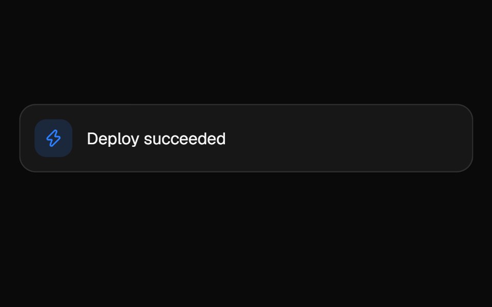 Animated ListVelora UI · ReactLooping feed that springs each item in, newest on top.
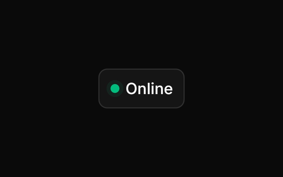 Animated Status Dotsv-particles · Svelte
 ChipMetal UI · React + SwiftUIA small pill with an optional leading LED or glyph and trailing actions: suggestion, glass, glass-action and tag.
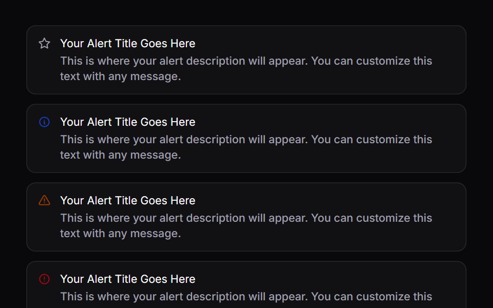 AlertSpaceUI · ReactDisplays a prominent message box for important notices, warnings, or success messages to keep users informed without…
 BellSora UI · ReactNotification bell that rattles from its hanger on trigger — a decaying rotation pivot.
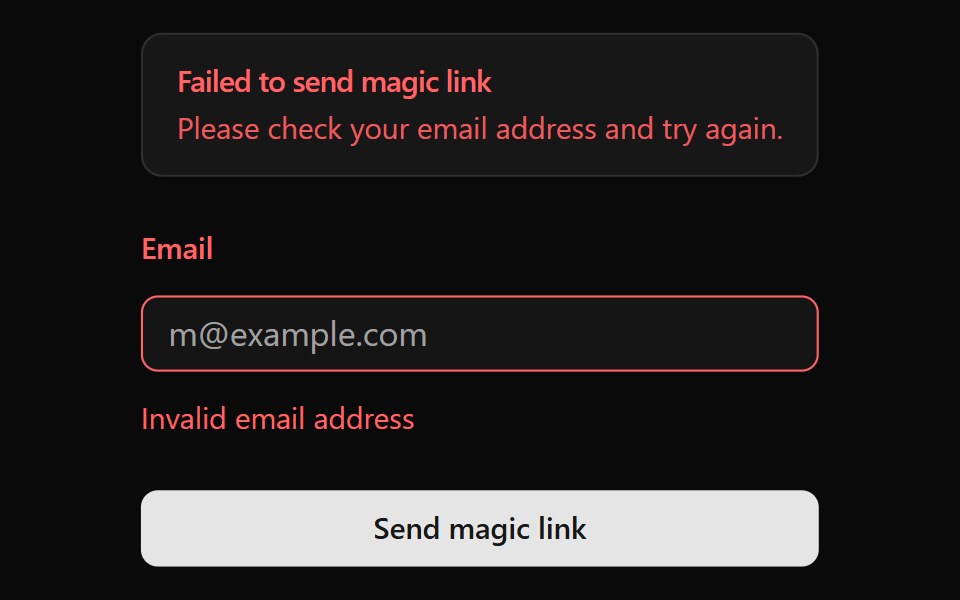 AlertOUI · ReactA shadcn Alert for a form displaying form action result.
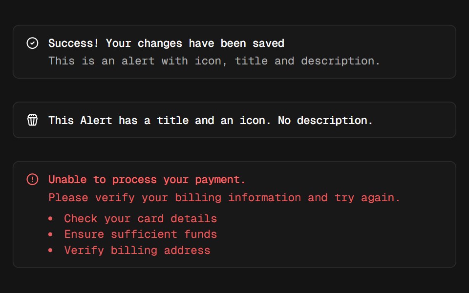 AlertD2Studio UI · ReactDisplays a callout for user attention.
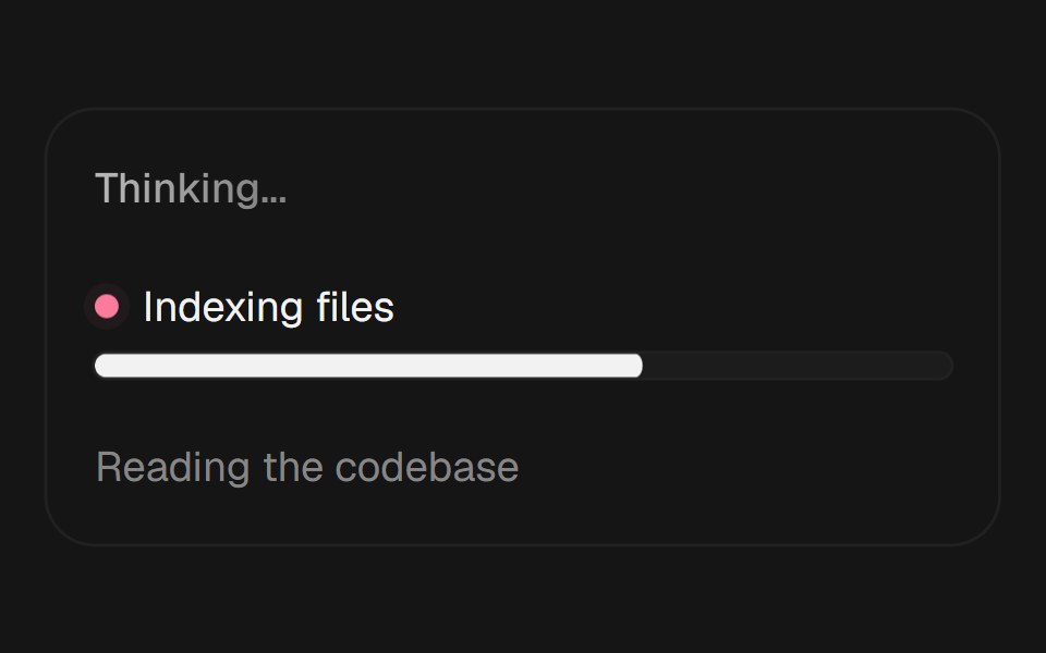 Agent Loading StatesEaseUI · ReactThree loading states for AI interfaces: shimmering status text, live agent progress, and cycling reasoning phrases.
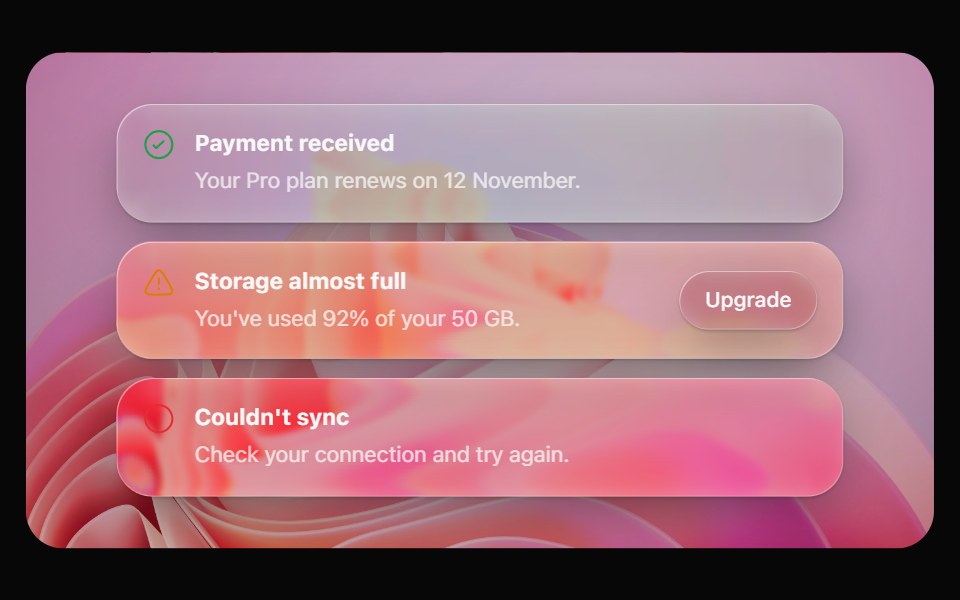 Glass AlertOpaline · ReactA callout on frosted glass, tinted by intent: info, success, warning or destructive.
 BadgeFibo · ReactA short label for status, category or count.
 AI AsistantReactFrame · ReactA dotted status light with two layouts, Mesh grid and Halo rings, across three animated states (Waiting, Listening…
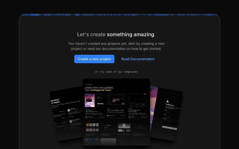 Image Generation LoaderAceternity UI · React
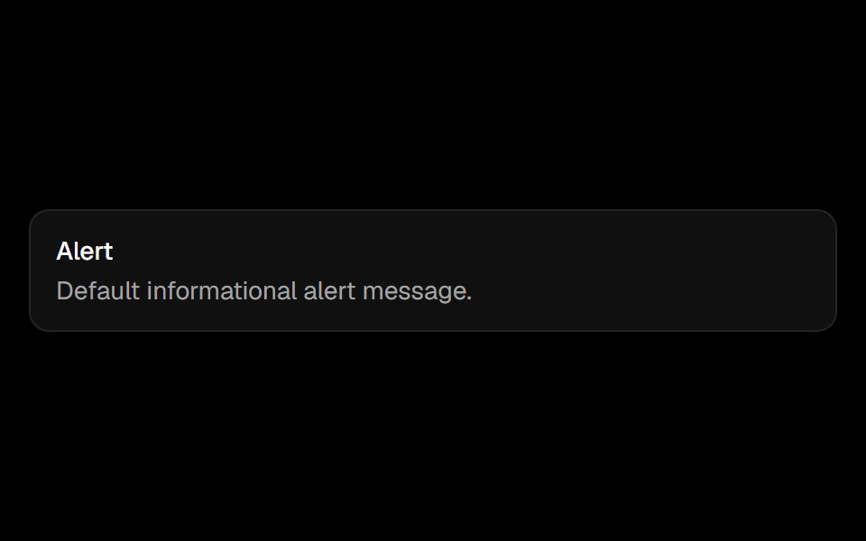 Alertark-cn · ReactA shadcn-style alert component built with Ark UI primitives.
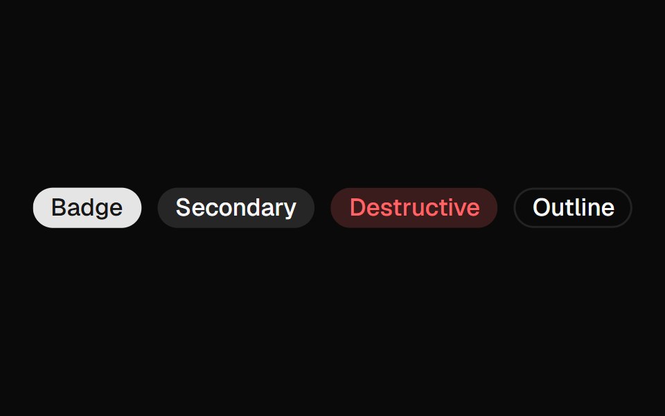 Badgeshadcn/ui · ReactDisplays a badge or a component that looks like a badge.
 BadgedaisyUI · CSS (Tailwind)
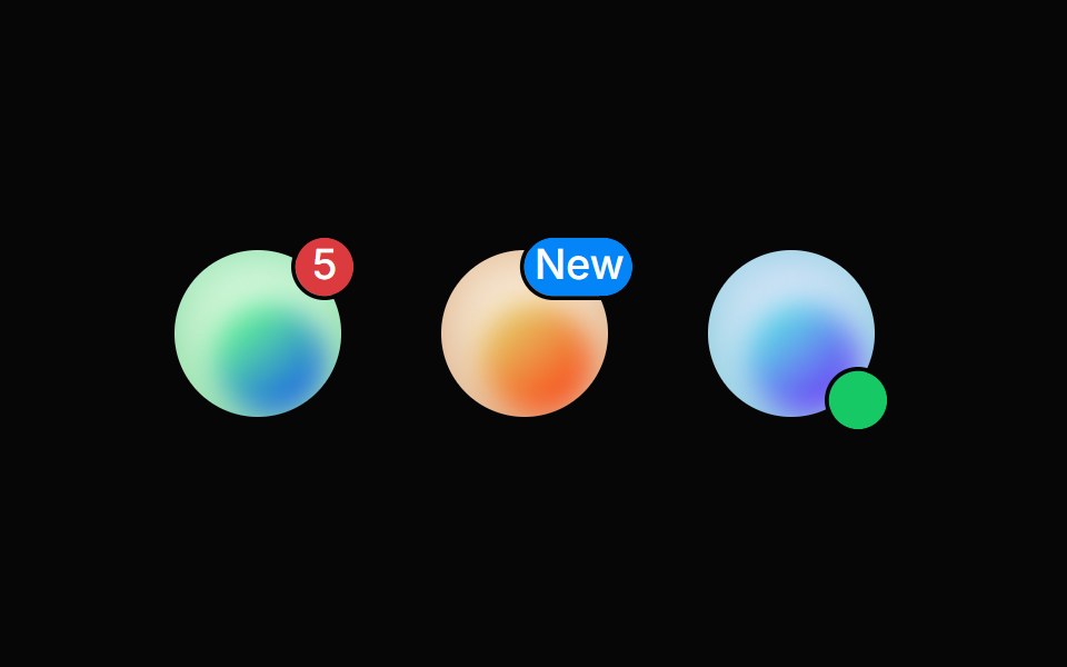 BadgeHeroUI · ReactDisplays a small indicator positioned relative to another element, commonly used for notification counts, status dots…
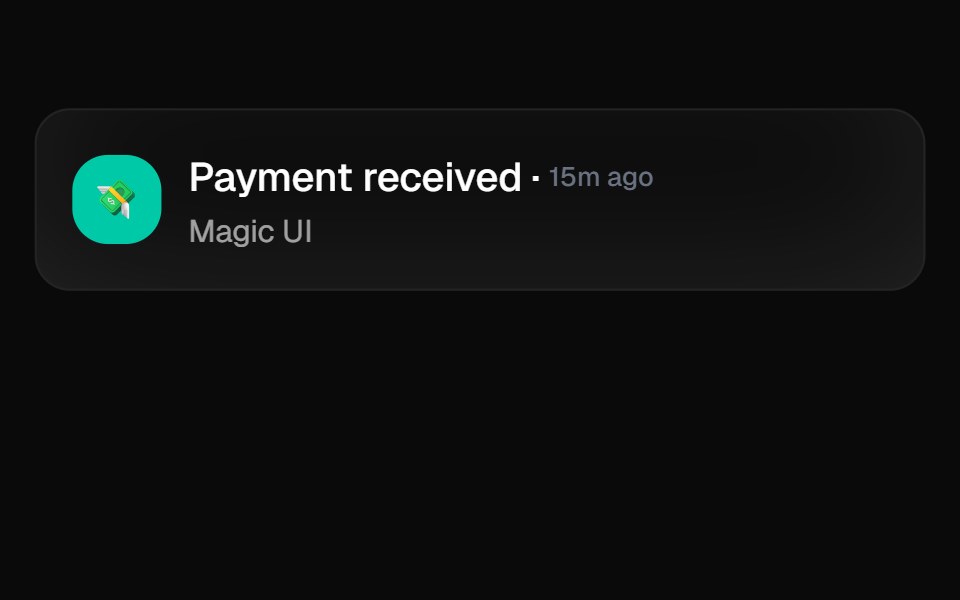 Animated ListMagic UI · ReactA list that animates each item in sequence with a delay. Used to showcase notifications or events on your landing page.
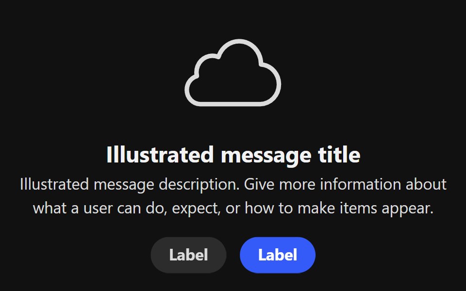 Illustrated MessageReact Spectrum · ReactAn IllustratedMessage displays an illustration and a message, usually for an empty state or an error page.
 Badgecoss ui · ReactA badge or a component that looks like a badge.
 ProgressOrigin UI · ReactDisplays the status of a task that takes a long time.
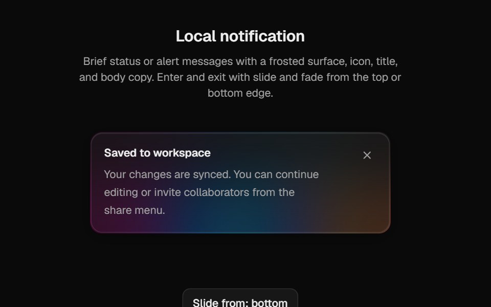 Halo NotificationCult UI · ReactPolished notification surface for local AnimatePresence use with rim variants and glyph stagger
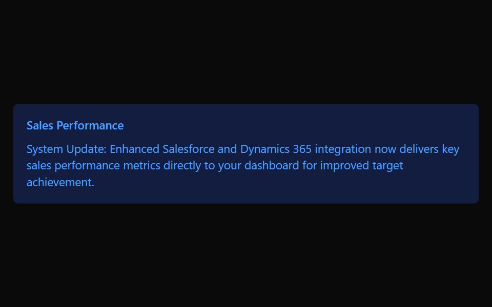 CalloutTremor · React
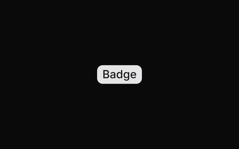 BadgeReUI · ReactBadges are used to highlight items, notify users, or display statuses.
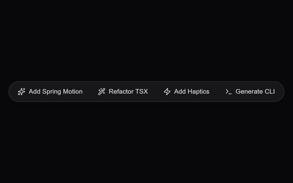 AI Floating Action PillAmicro Micro Transitions · ReactGlassmorphic floating quick-action pill dock for instant generative prompts and actions.
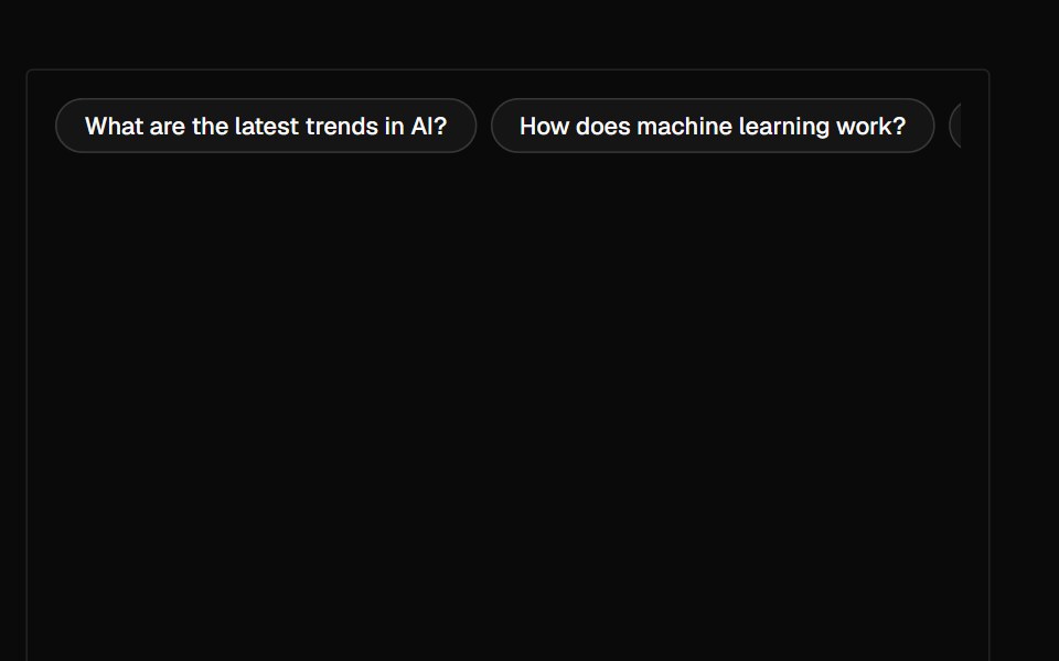 SuggestionAI Elements · ReactA suggestion component that displays a horizontal row of clickable suggestions for user interaction.
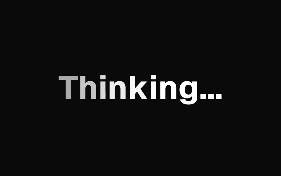 AI Text LoadingKokonut UI · ReactAI thinking text with a soft wave through the letters and words that swap letter by letter.
 loaderIntent UI · Reactloader
 Dot IconUntitled UI React · React
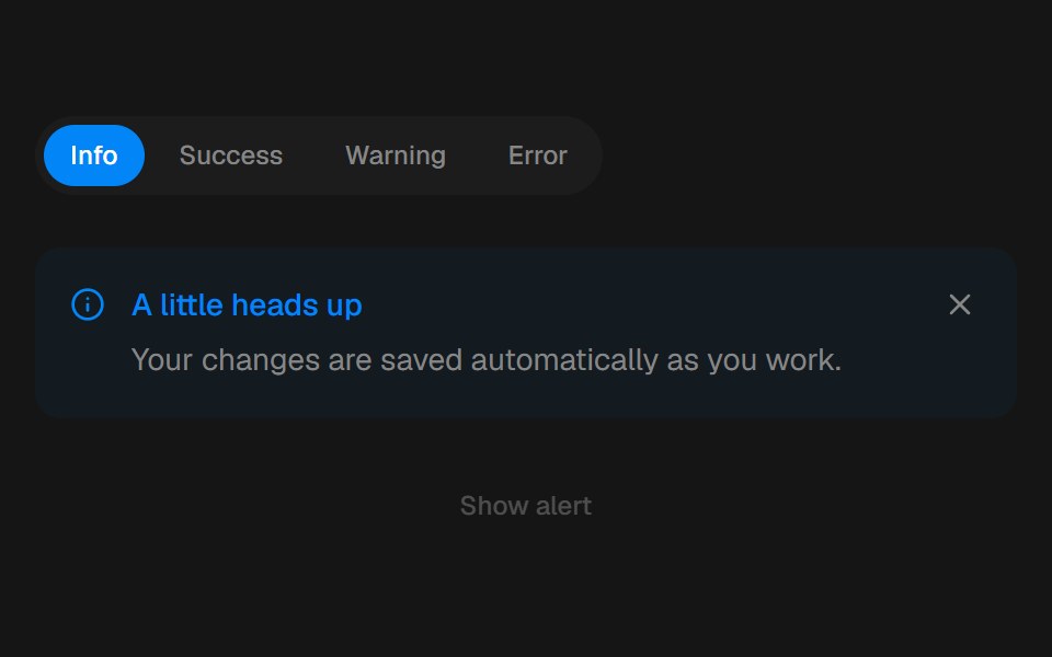 AlertbeUI · ReactFeedback that eases in and folds away.
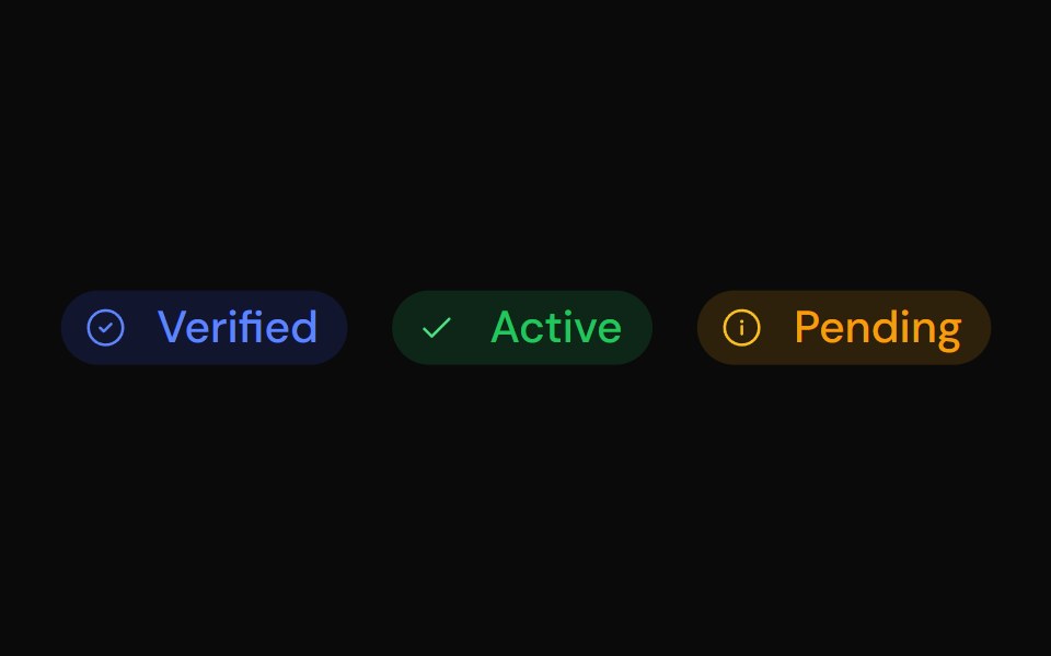 BadgeTailGrids · ReactBadge component with multiple colors, sizes, and support for prefix/suffix icons.
 Grid RevealRare UI · ReactA loading state for AI images that turns into the real picture when it arrives.
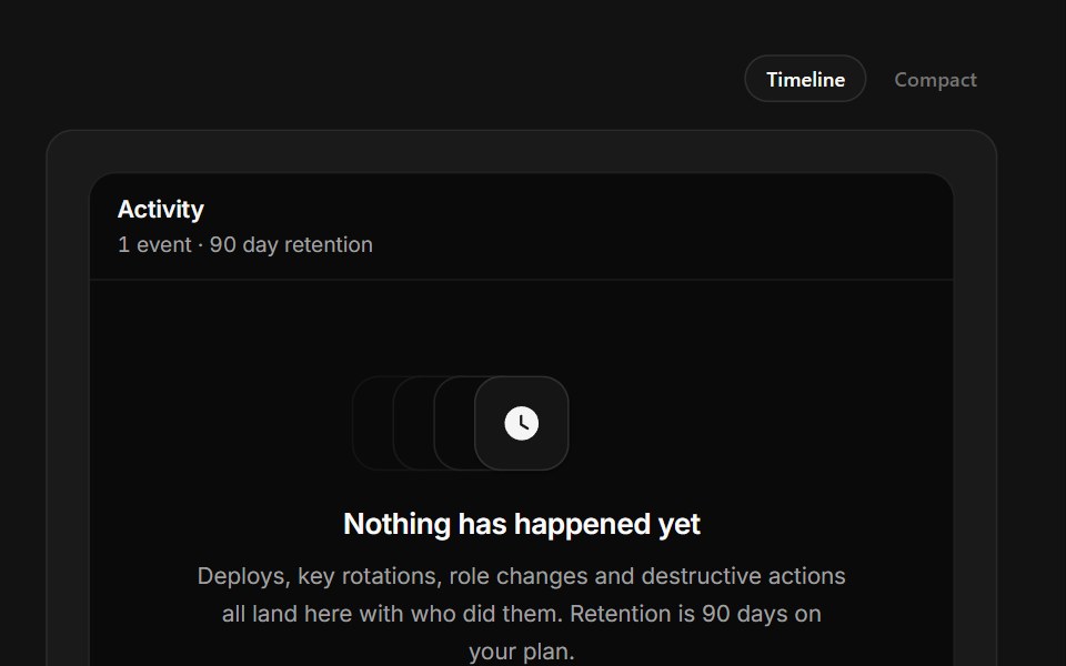 No Activity YetSpectrum UI · ReactAn audit timeline with a dashed rail above its one real event.
 Bars SpinnerSpell UI · ReactA loading spinner with rotating bars animation.
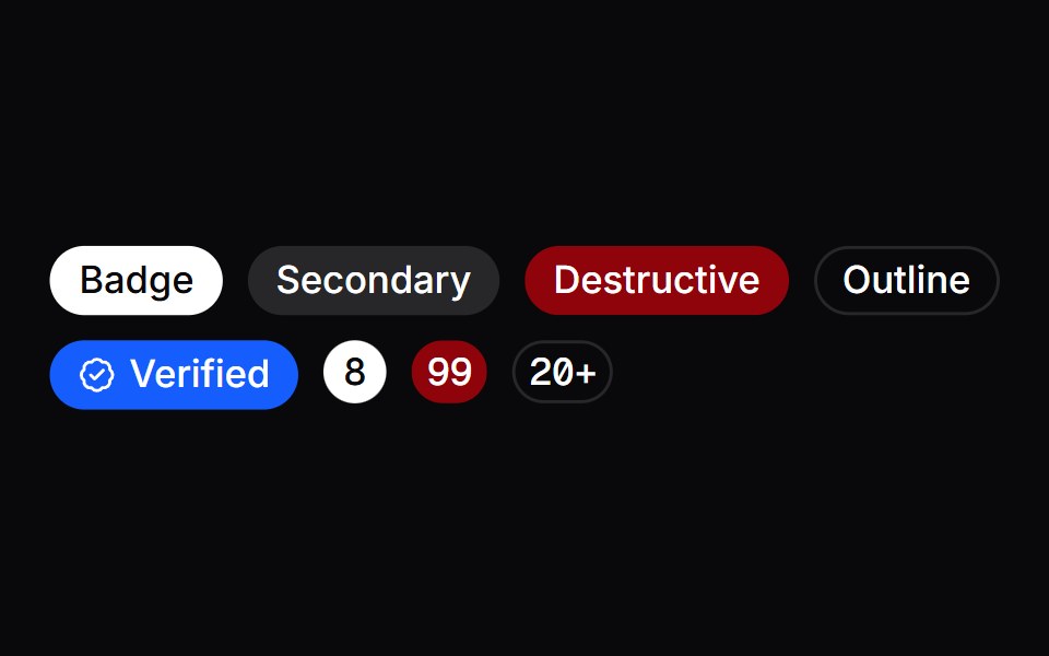 BadgeVengeance UI · React
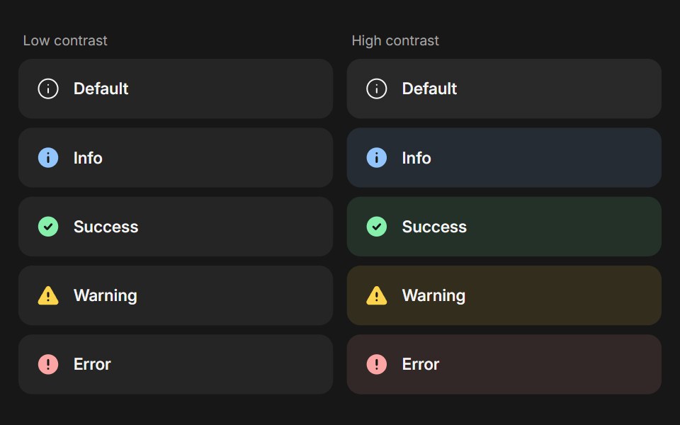 BannerFluid Functionalism · ReactStatus message built from parts (Banner, BannerTitle, BannerDescription, BannerActions, BannerAction): 5 statuses…
 Animated LoaderToolcraft · React
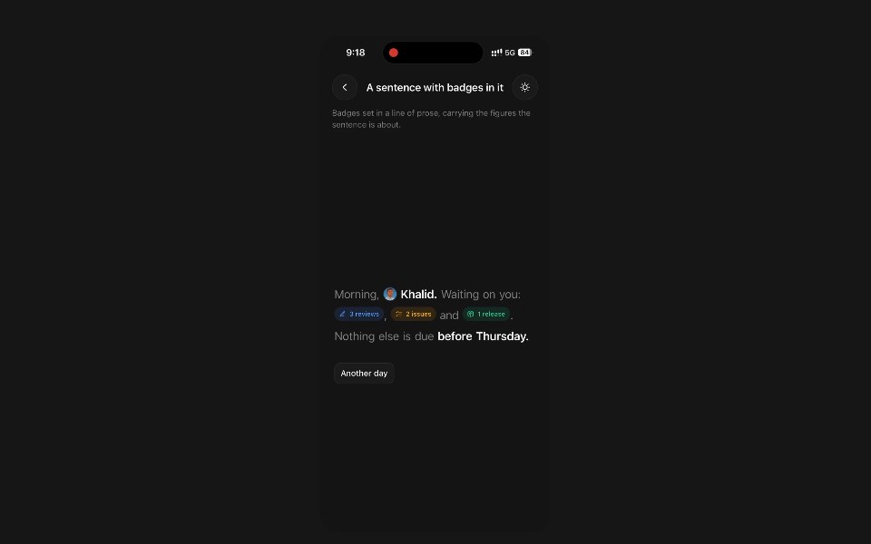 Animated BadgePanel UI · React NativeStatus pill whose icon and label roll over when the status changes.
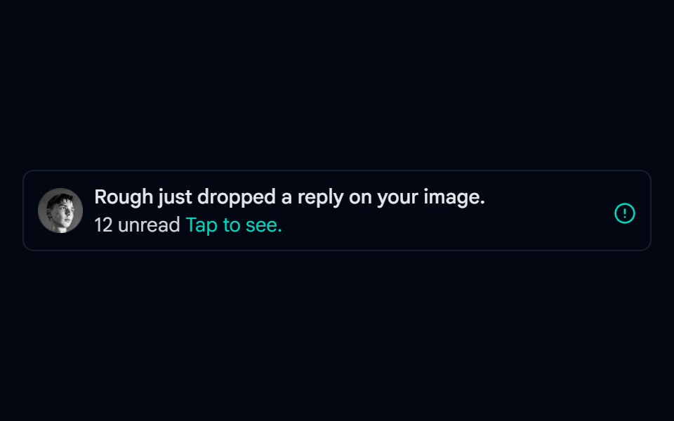 Alert-02 - Alert with User DetailShadcn Space · ReactAlert component
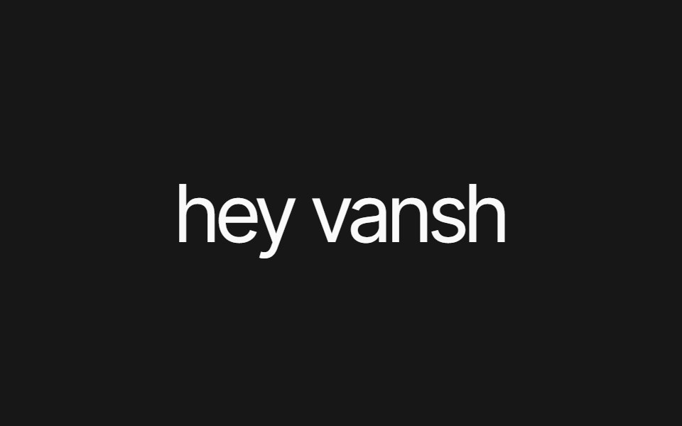 Text Inline Chip RevealPixel Perfect · ReactA headline whose words resolve from a hue-shifting glow into solid ink, around inline chips that sit in the text flow.
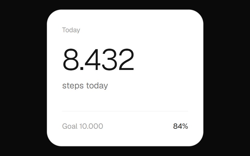 Step Count WidgetOpenSourceUI · ReactFitness widget showing the day's step count with a circular progress ring toward the goal.
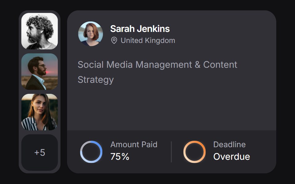 Client Carduselayouts · ReactA client CRM card with payment and deadline rings, plus a morphing avatar stack.
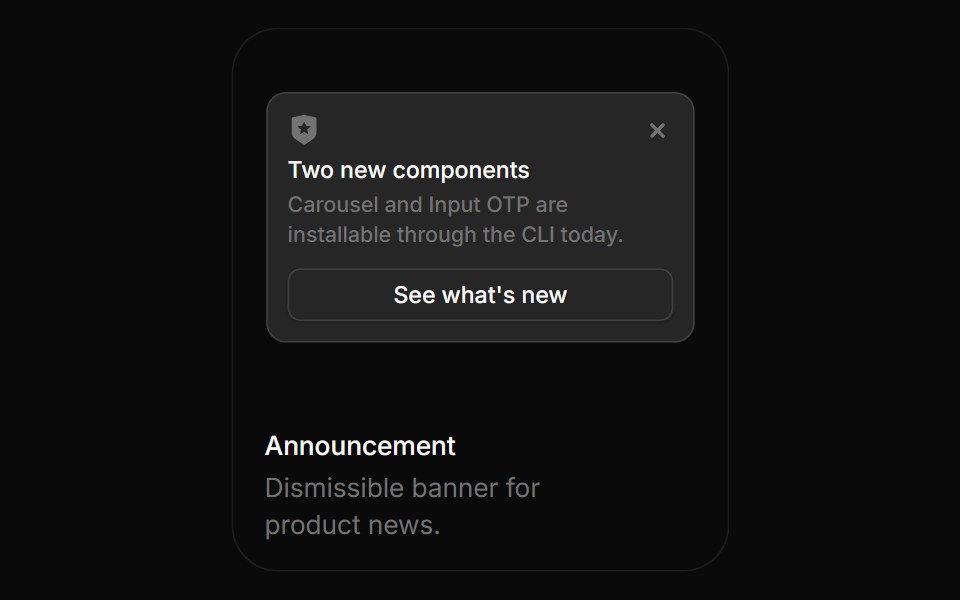 AnnouncementBoardUI · ReactDismissible banner for product news.
 SpinnerComponentry · React
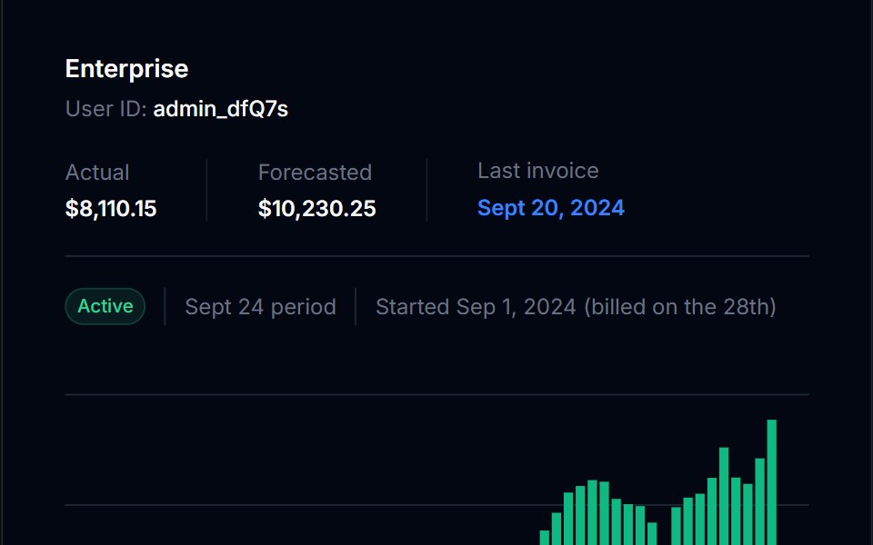 BadgeTremor Blocks · React
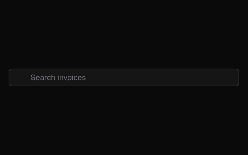 Animatedinput PlaceholderShadcn Dashboard · React
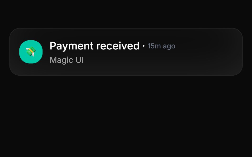 Animated ListAnimations (Svelte) · SvelteA component that animates list items with smooth layout transitions, revealing items one by one from top to bottom.
 LoaderAI Elements (Svelte) · SvelteA lightweight animated loader with a separate icon component.
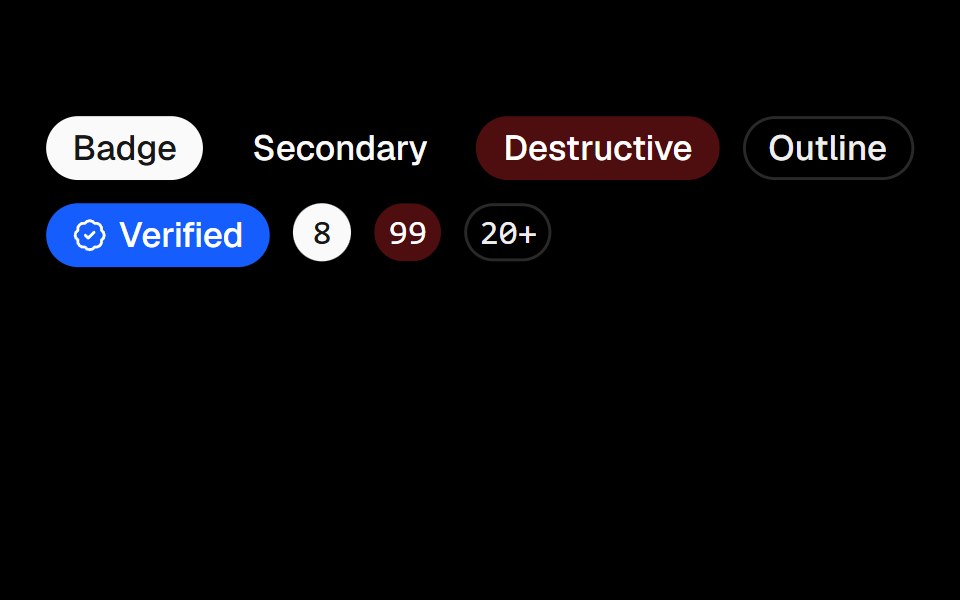 BadgeObsidianUI · React
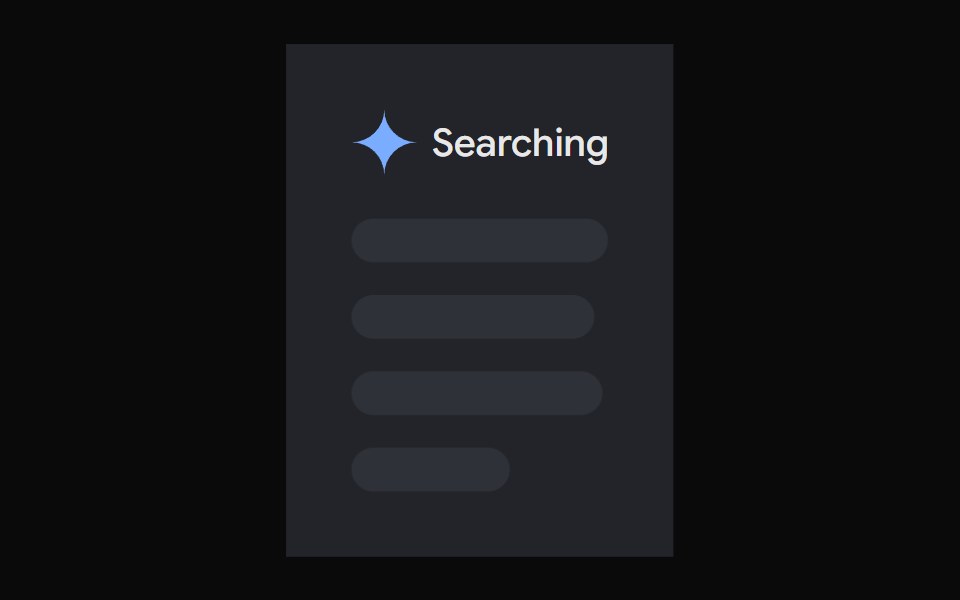 AI Overview SkeletonNotra · ReactA loading state built on shadcn Skeleton.
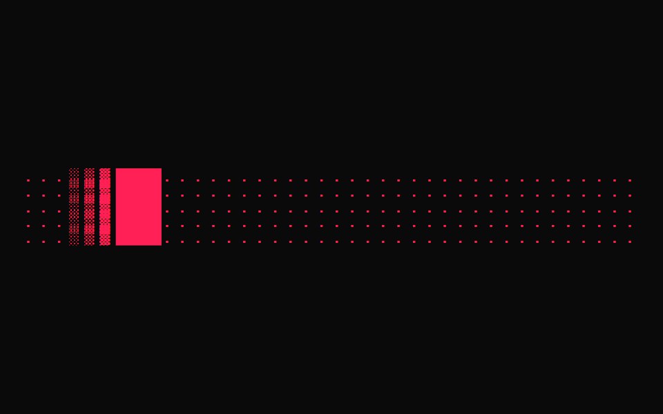 Terminal LoaderGreatUI · React
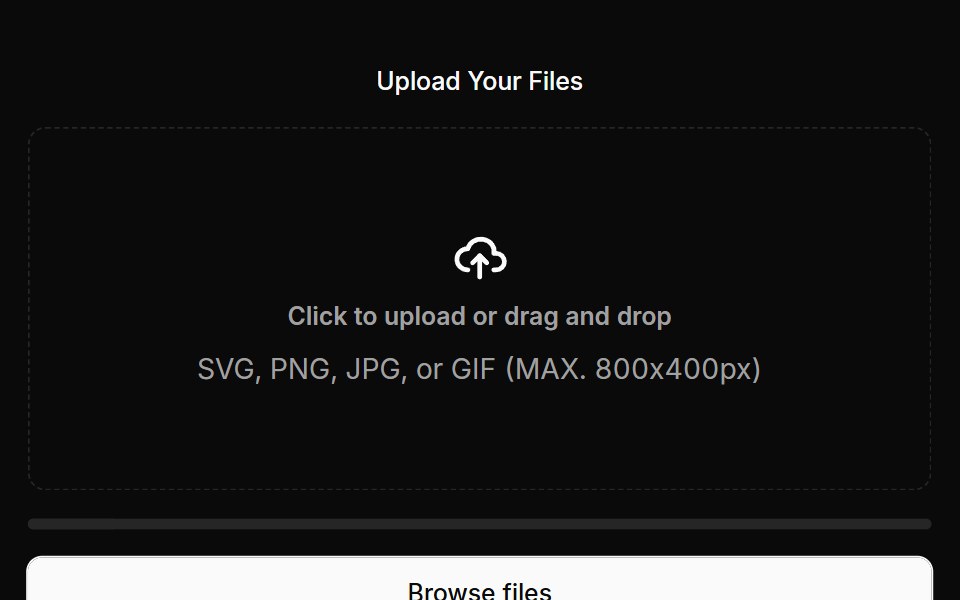 Empty States 02Oxbow UI · AstroEnhanced file upload empty state
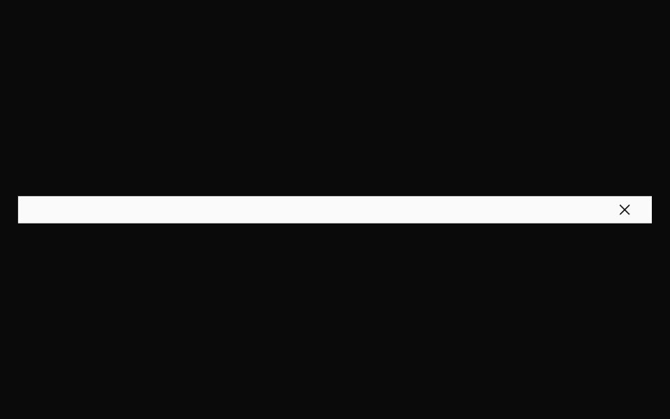 BannerNexvyn UI · ReactBanner primitives: a full-width dismissible strip, a link and a tag, shared by every banner block.
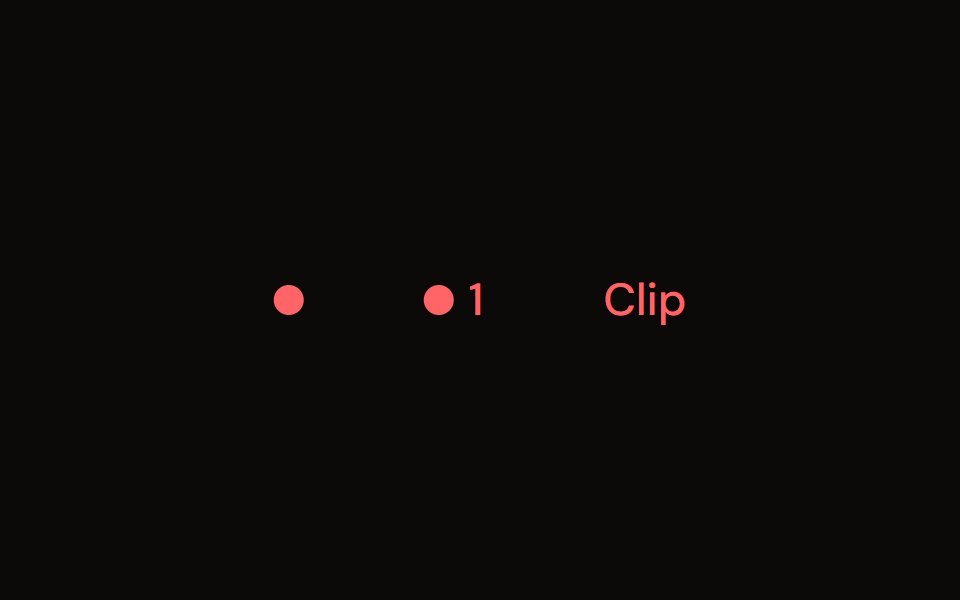 Clip Indicatoraudiocn · ReactA clip light that holds after the signal clips, with an optional count and click to reset.
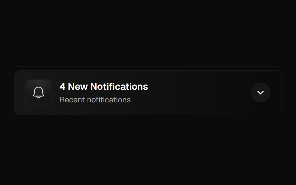 Notification PanelForge UI · ReactA collapsible notification panel displaying recent alerts with icons, timestamps, and smooth animated transitions.
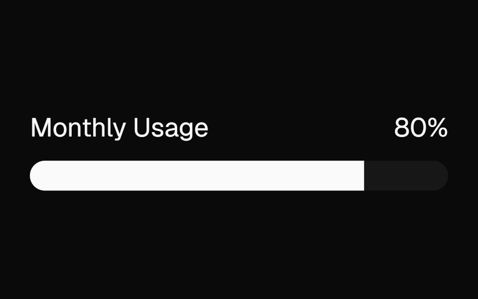 meterBaseLayer · ReactA meter represents a quantity within a known range, or a fractional value.
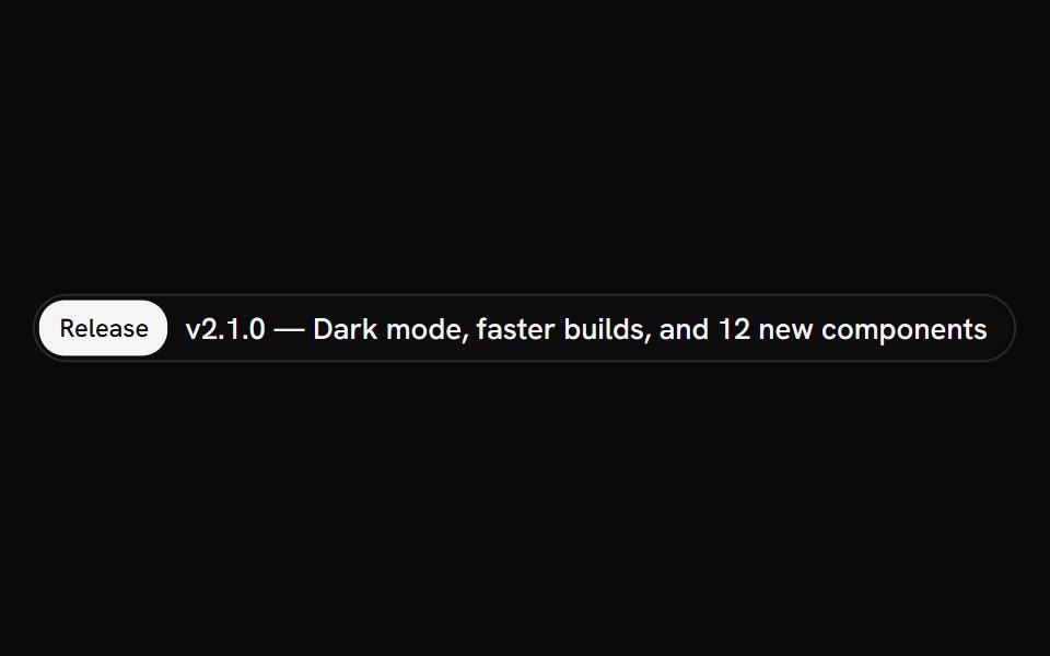 AnnouncementShark UI · ReactInline notice for short, prominent updates.
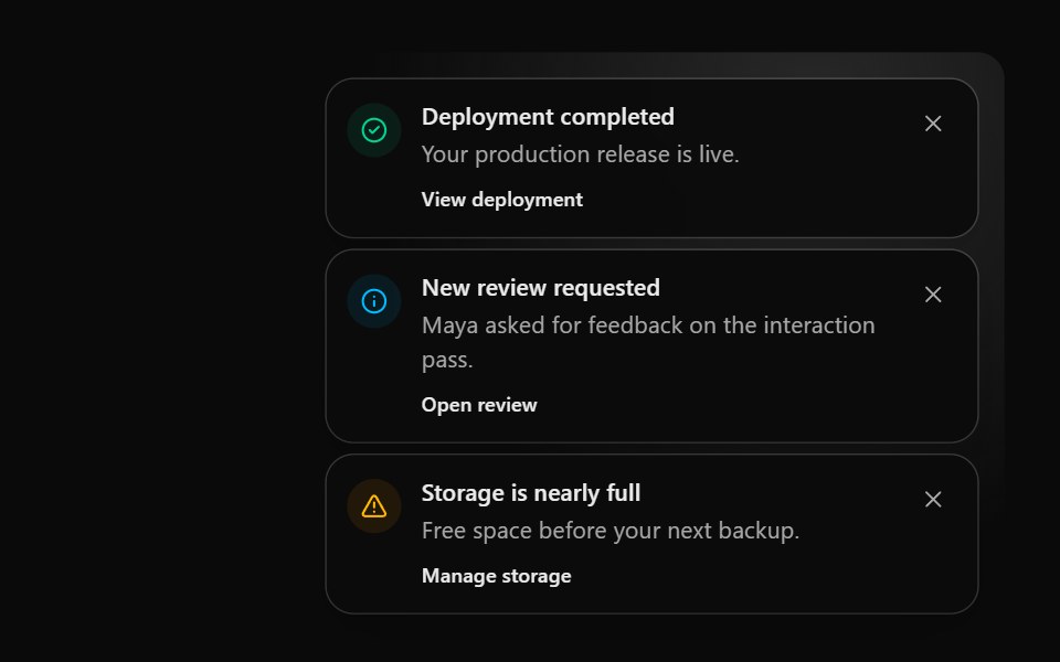 Notification StackSona UI · React
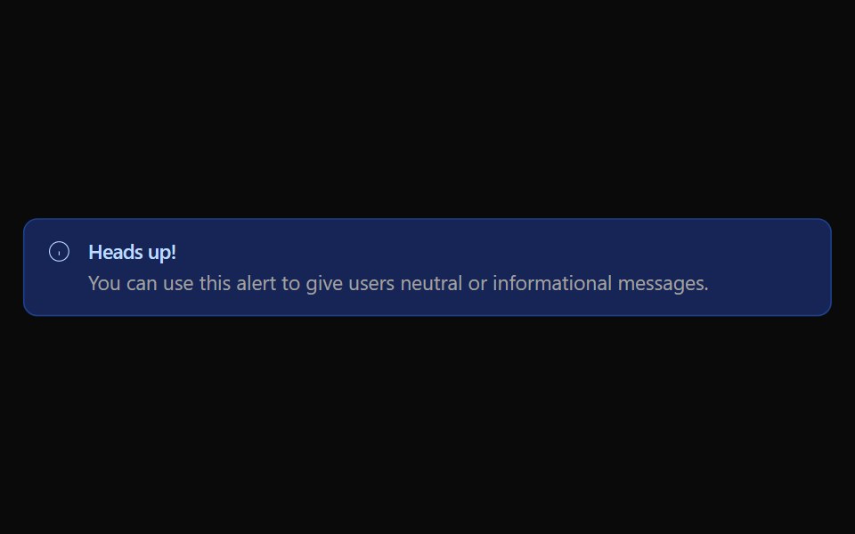 Alert 01Watermelon UI · React
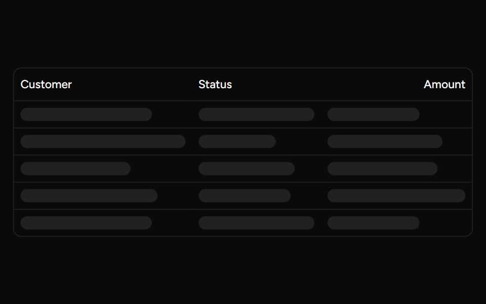 Data Table Loadingsv-table · SvelteSkeleton rows that preserve a table layout while its data is loading.
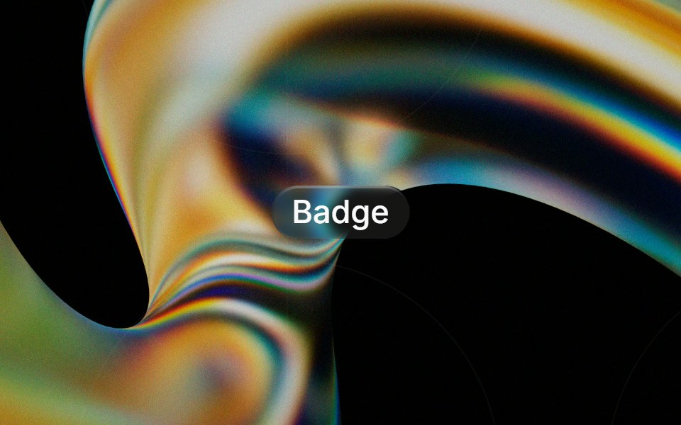 Glass Badgeglasscn · ReactGlass Badge with five variants: clear, frosted, subtle, liquid, and liquid-refract
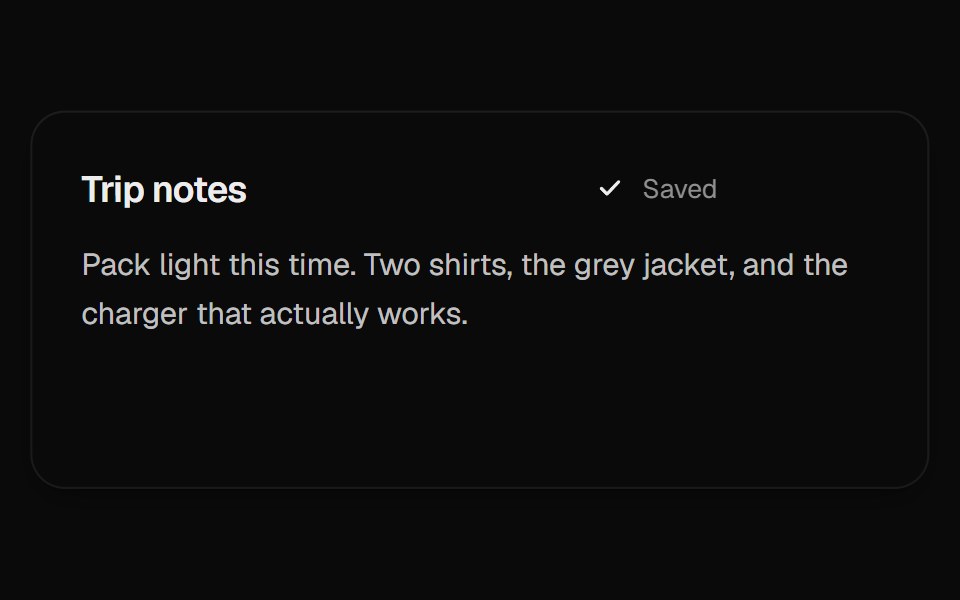 Autosave StatusUI Lab · ReactA dot for unsaved changes splits into three while saving, then gathers into a check.
Libraries with Tailwind CSS feedback components
Related categories
- Feedback Components
- React Feedback Components
- Svelte Feedback Components
- React Native Feedback Components
- Animated Feedback Components
- shadcn/ui Feedback Components
- Tailwind CSS Spinner Components
- Tailwind CSS Badge Components
- Tailwind CSS Progress Components
- Tailwind CSS Alert Components
- Tailwind CSS Chip Components
- Tailwind CSS Progress Bar Components
- Tailwind CSS Empty State Components
- Tailwind CSS Notification Components
- Tailwind CSS Banner Components
- Tailwind CSS Status Indicator Components
- Tailwind CSS Skeleton Components
- Tailwind CSS Typing Indicator Components
- Tailwind CSS Progress Circle Components
- Tailwind CSS Error State Components
- Tailwind CSS Scroll Progress Components
- Tailwind CSS Success Animation Components