 Dev Design Library
shadcn/ui Feedback Components
Dev Design Library indexes 286 shadcn/ui feedback components from 19 open-source UI libraries, with the most coming from Watermelon UI, Shadcn Space, FLX UI, sv-particles and Notra. Each one links to its page with the source code, a live preview where available, the library license and the install command. They follow the shadcn/ui conventions, so most install with the shadcn CLI and drop into a Tailwind project.
Showing 120 of 286, a mix from every library. Open a library to see all of its components.
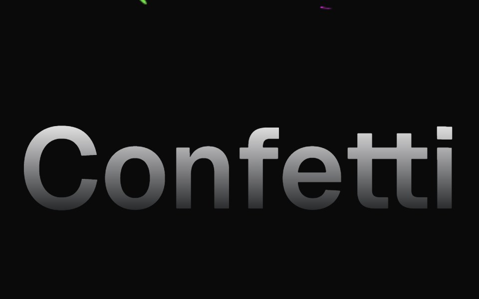 ConfettiMagic UI · ReactConfetti animations are best used to delight your users when something special happens
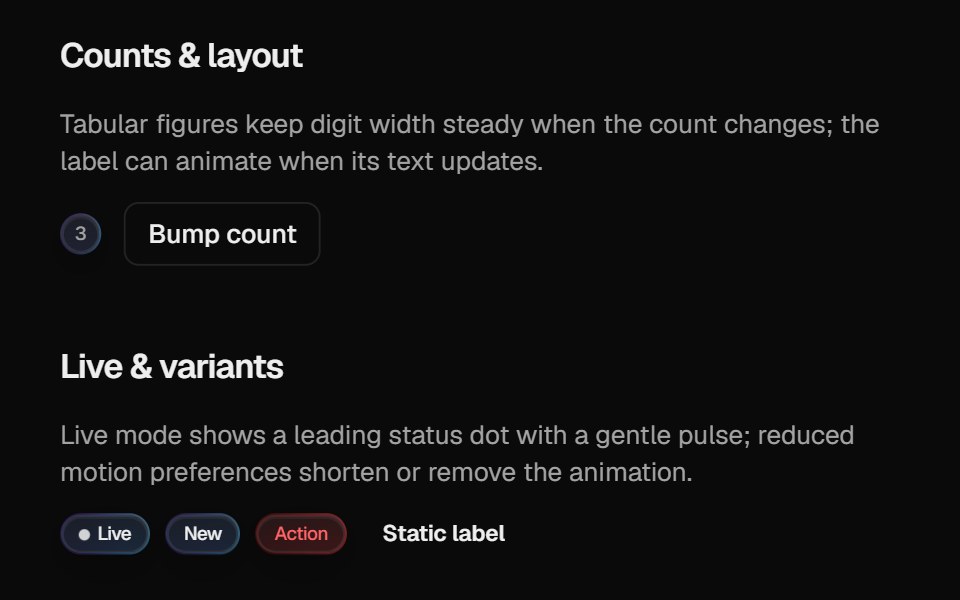 Halo BadgeCult UI · ReactBadge with optional layout animation, live status dot, and gradient rim aligned with Halo Button / Card
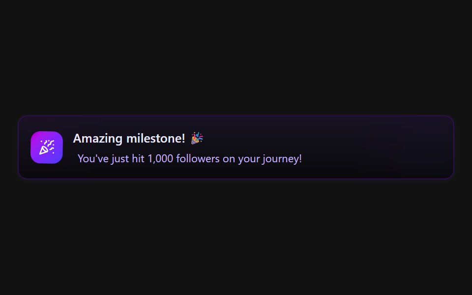 Alert demoSpectrum UI · Reactcomponent for the alert-demo
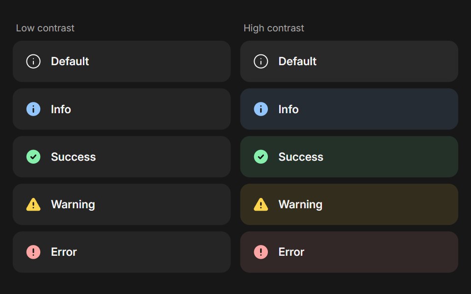 BannerFluid Functionalism · ReactStatus message built from parts (Banner, BannerTitle, BannerDescription, BannerActions, BannerAction): 5 statuses…
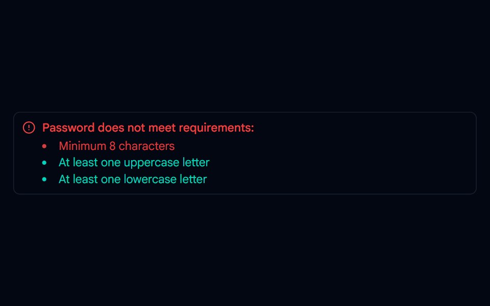 Alert-01 - Alert with Password DetailShadcn Space · ReactAlert component
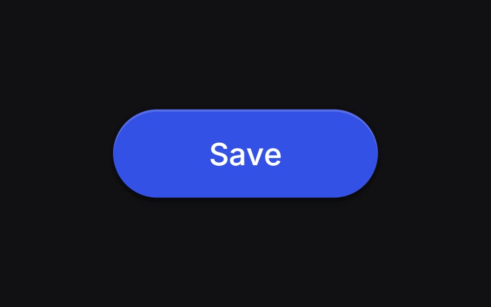 Save Buttonuselayouts · ReactA button with animated states for idle, loading, and success.
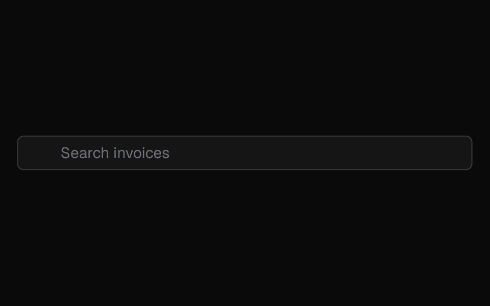 Animatedinput PlaceholderShadcn Dashboard · React
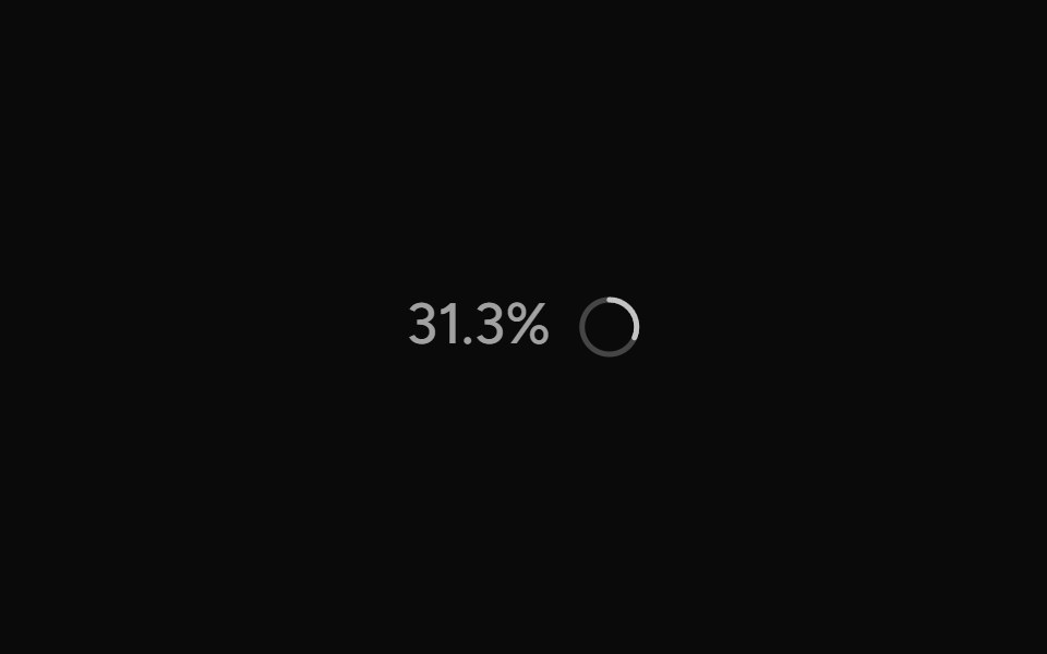 ContextAI Elements (Svelte) · SvelteA hover-card-based context window usage component with token, cost, and model usage breakdowns.
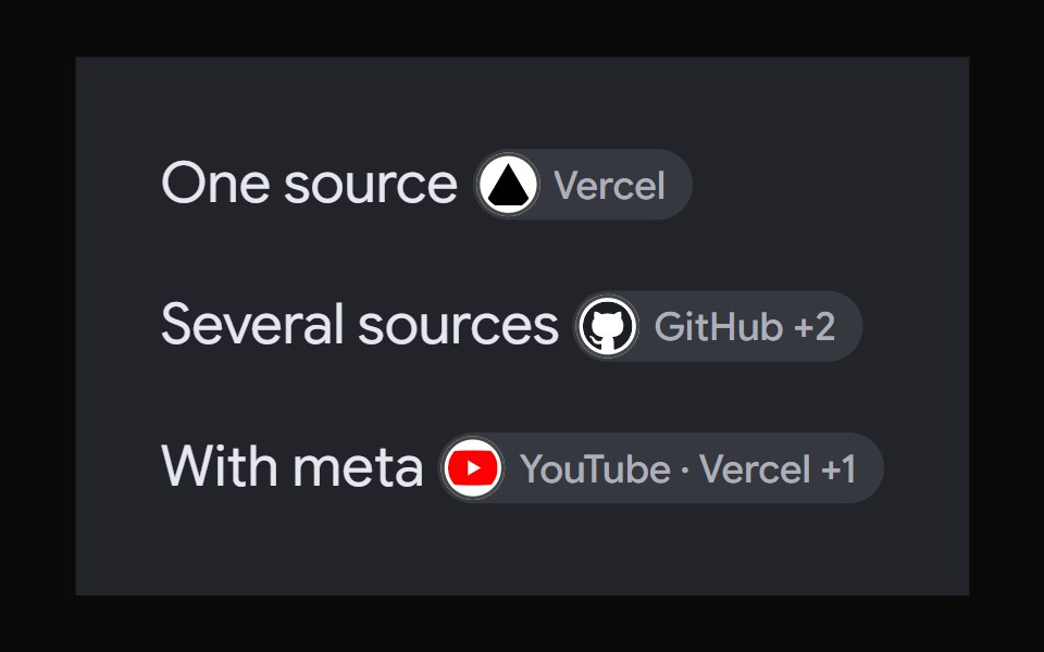 AI Overview CitationNotra · ReactA source chip built on shadcn Badge and HoverCard.
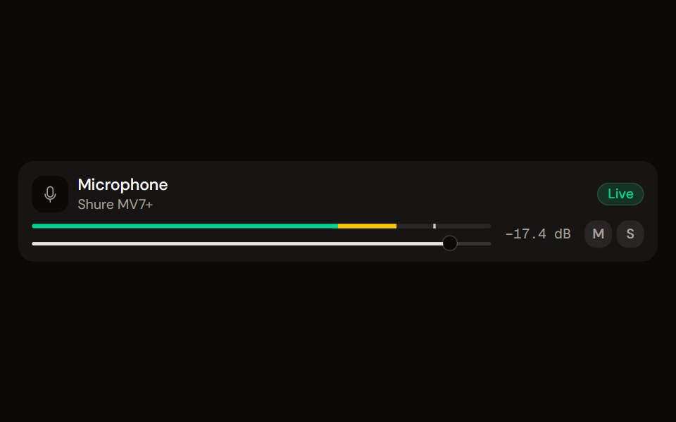 Channel Stripaudiocn · ReactOne channel of a mixer: header, status, meter, fader, value, controls and a notice, as a row or a console strip. The…
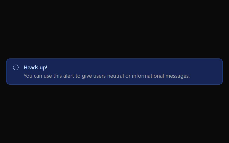 Alert 01Watermelon UI · React
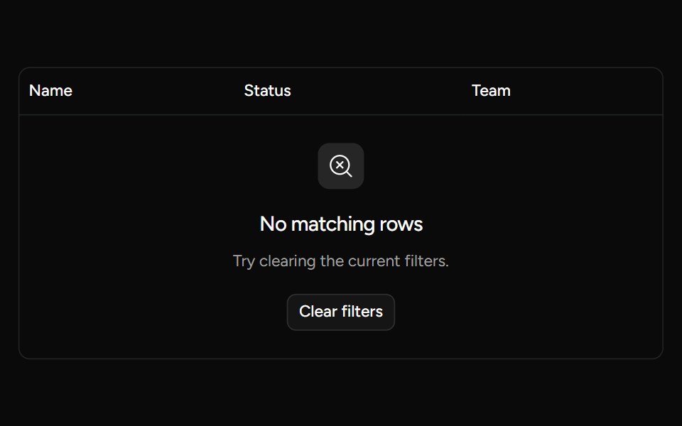 Data Table Emptysv-table · SvelteA table row for displaying a clear empty or filtered-results state.
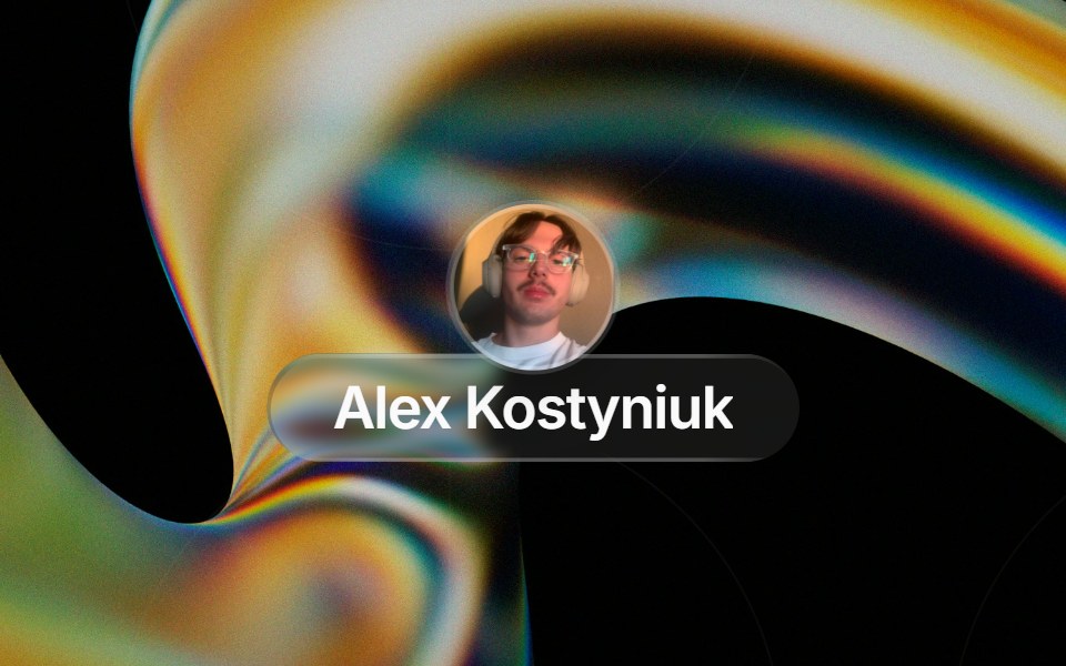 Glass Contact Pillglasscn · ReactLiquid-glass contact chip with an avatar (image or initials fallback) and name, for messaging apps
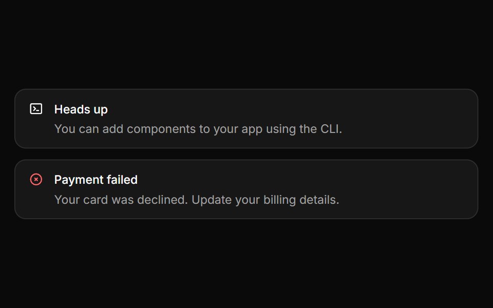 AlertHextaUI · ReactInline messages for status and feedback, with a neutral surface, a colored icon and a dismiss that collapses smoothly.
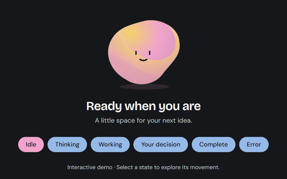 Agent stateCojeev UI · ReactA sculpted, living status field that changes contour and color as an agent thinks, works, asks for input, or finishes.
 Loading skeletonFLX UI · ReactSkeleton placeholder while the avatar loads.
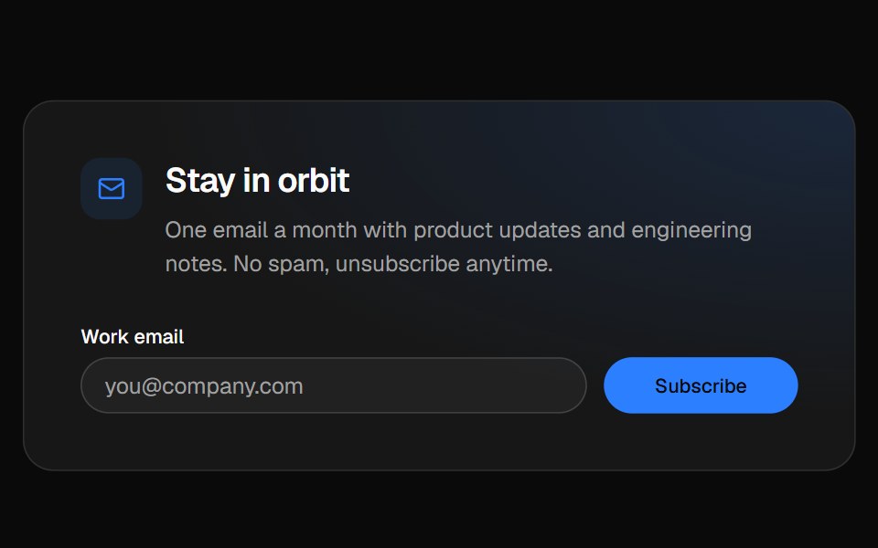 Newsletter footerVelora UI · ReactFooter with a newsletter sign-up row, link columns and a live “All systems normal” status badge.
 Animated Status Dotsv-particles · Svelte
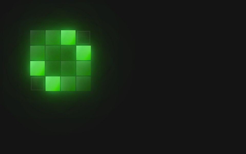 Spinner Billboard TilesD2Studio UI · ReactA 4×4 pixel-grid loading spinner: 5 frames at 180ms (900ms loop).
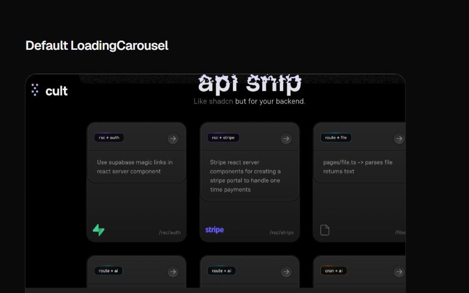 Loading CarouselCult UI · ReactLoading carousel component with smooth transitions and customizable content
 Alert 2Spectrum UI · Reactcomponent for the alert-2
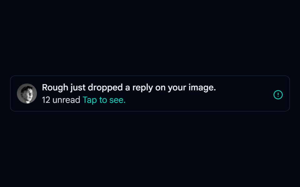 Alert-02 - Alert with User DetailShadcn Space · ReactAlert component
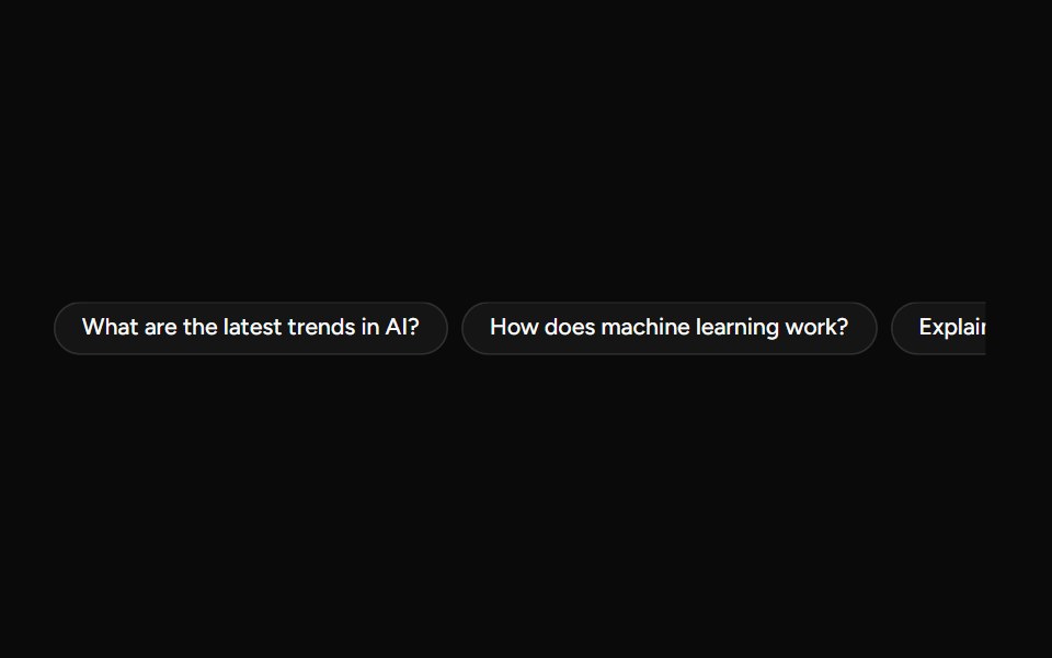 SuggestionAI Elements (Svelte) · SvelteA compact suggestion button set for displaying prompt ideas and quick actions.
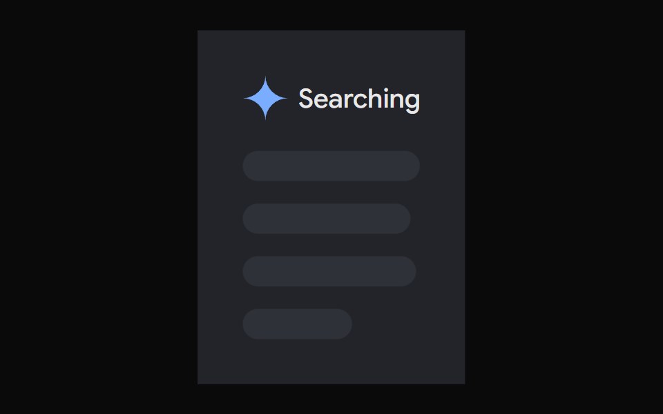 AI Overview SkeletonNotra · ReactA loading state built on shadcn Skeleton.
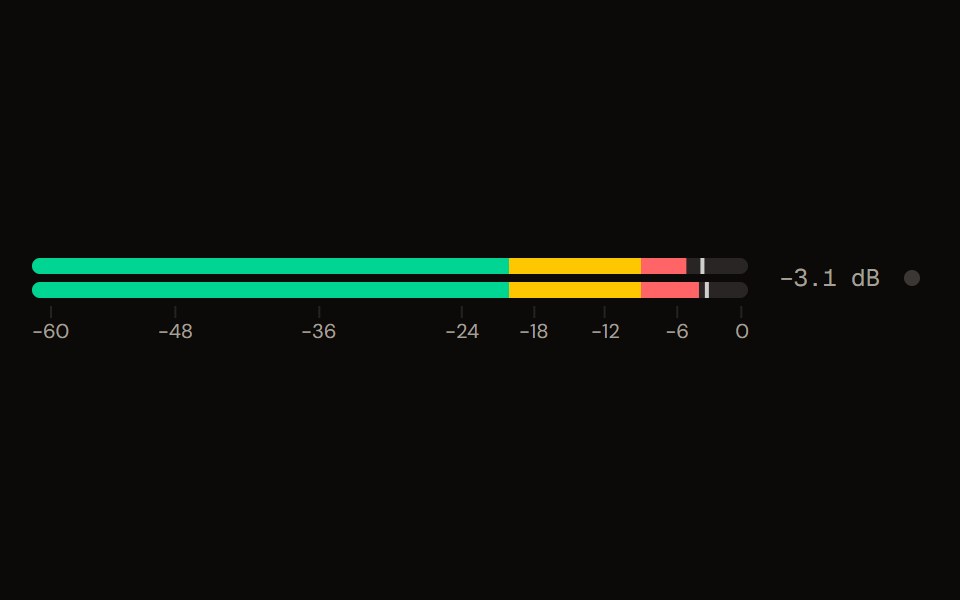 Level Meteraudiocn · ReactA peak and RMS level meter: mono or stereo, horizontal or vertical, solid, segmented or gradient, with zones, peak…
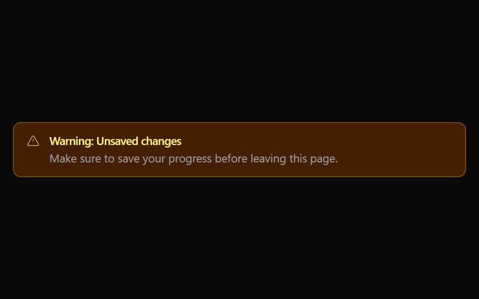 Alert 02Watermelon UI · React
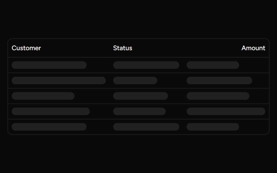 Data Table Loadingsv-table · SvelteSkeleton rows that preserve a table layout while its data is loading.
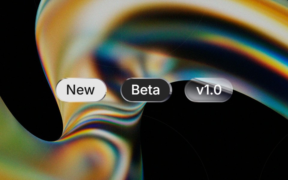 Liquid Badgeglasscn · ReactA liquid-glass badge wrapper that keeps the base badge fill and applies the effect to the border.
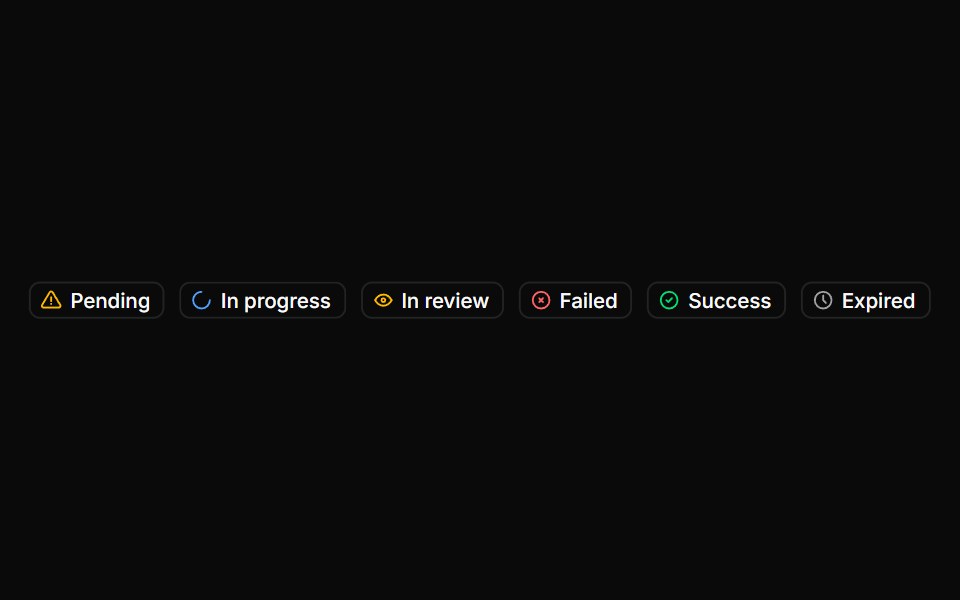 BadgeHextaUI · ReactStatus labels with colored dots, removable tags that slide closed and counts that roll to their new value.
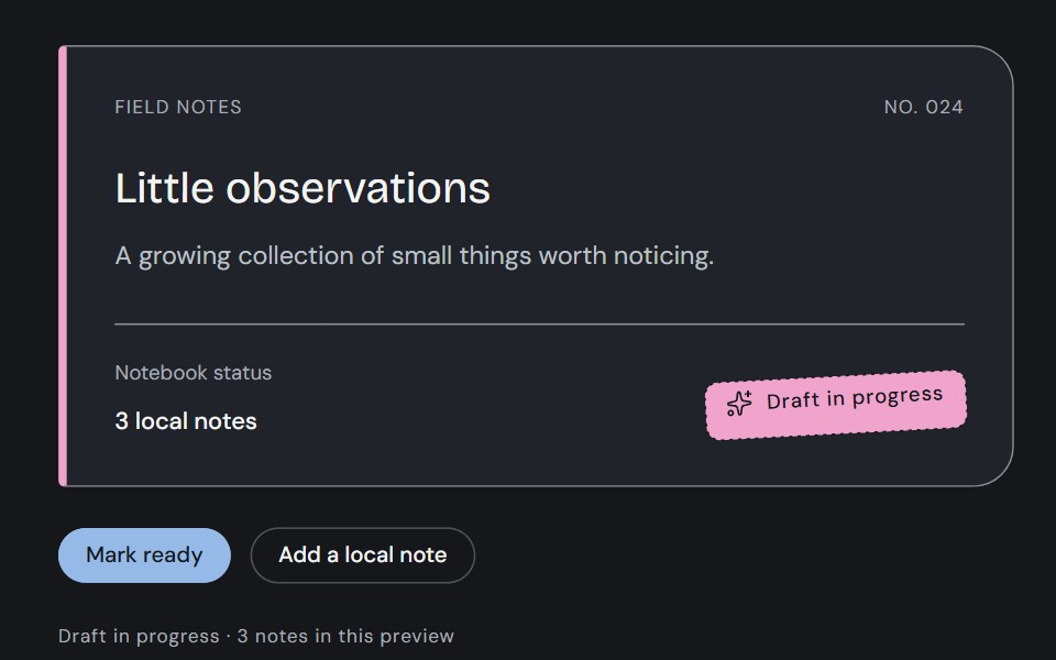 BadgeCojeev UI · ReactStamp a review state, attach a filing tag or count a collection. Three compact treatments with one clear meaning in…
 BasicFLX UI · ReactA single default badge.
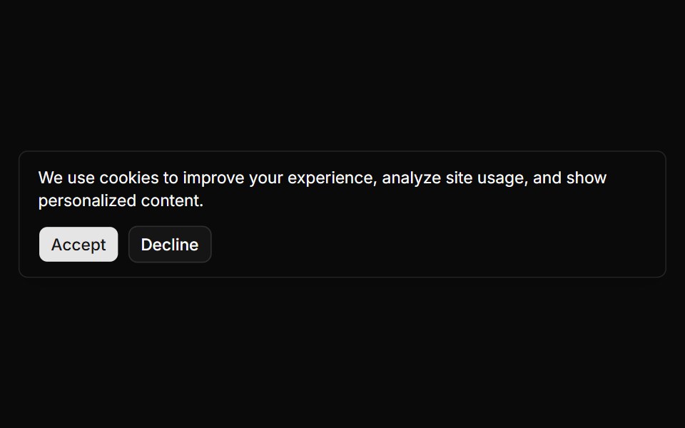 Banner 1sv-particles · Svelte
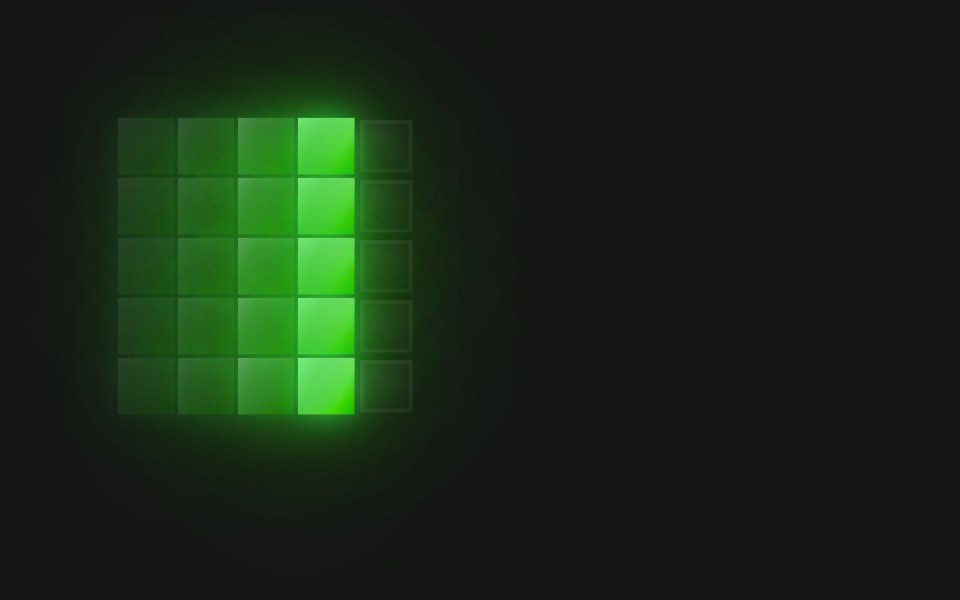 Spinner Col Wave 5D2Studio UI · ReactA 5×5 pixel-grid loading spinner: 8 frames at 120ms (960ms loop).
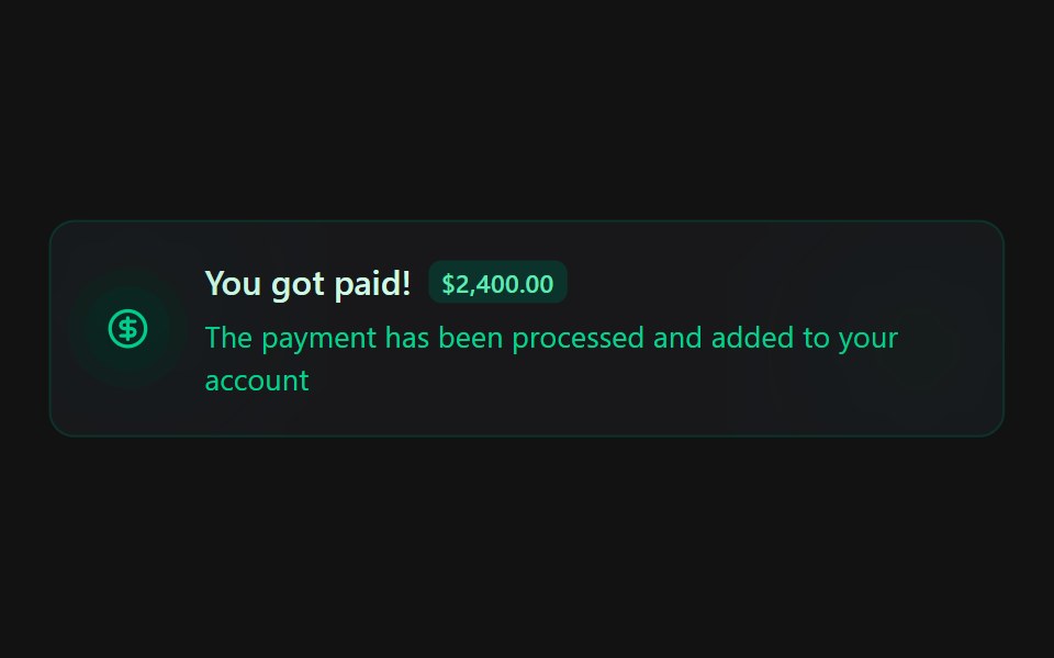 Alert 4Spectrum UI · Reactcomponent for the alert-4
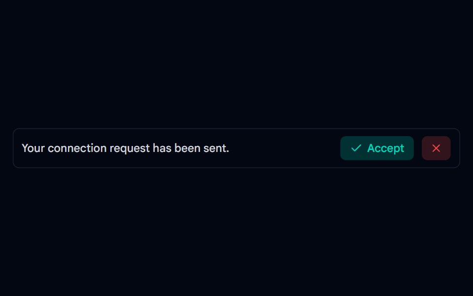 Alert-03 - Social AlertShadcn Space · ReactAlert component
 Chat MinimapNotra · ReactA rail of lines that maps a conversation, built on shadcn Button, Card, HoverCard and Tooltip.
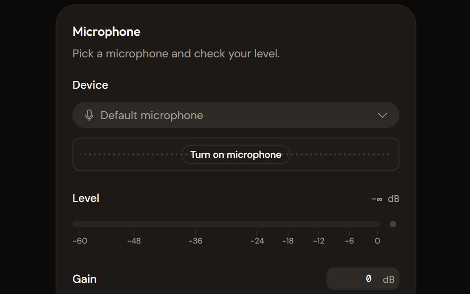 Microphone Setupaudiocn · ReactChoose and check a microphone: device select with a live preview, a level meter, gain, mute and a level check that…
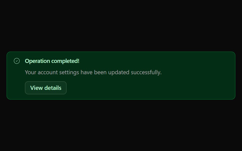 Alert 03Watermelon UI · React
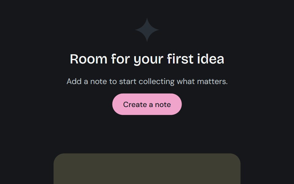 EmptyCojeev UI · ReactExplains an empty collection or unavailable result and creates space for a useful next step.
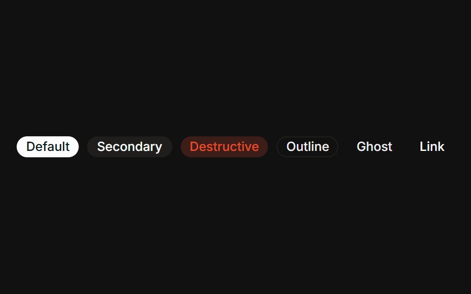 VariantsFLX UI · ReactAll six variants side-by-side: default, secondary, destructive, outline, ghost, link.
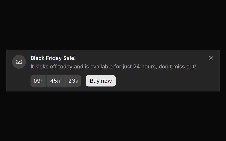 Banner 10sv-particles · Svelte
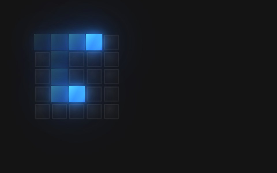 Spinner Dual Ring 5D2Studio UI · ReactA 5×5 pixel-grid loading spinner: 16 frames at 110ms (1760ms loop).
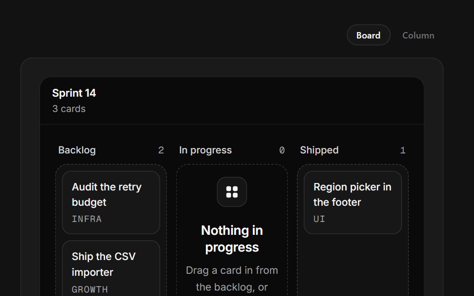 Empty Board ColumnSpectrum UI · ReactA kanban column that accepts real drags from its neighbours and composes cards inline.
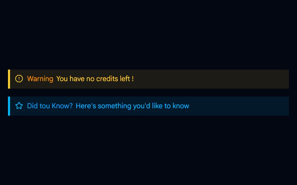 Alert-04 - Indicator Destructive AlertShadcn Space · ReactAlert component
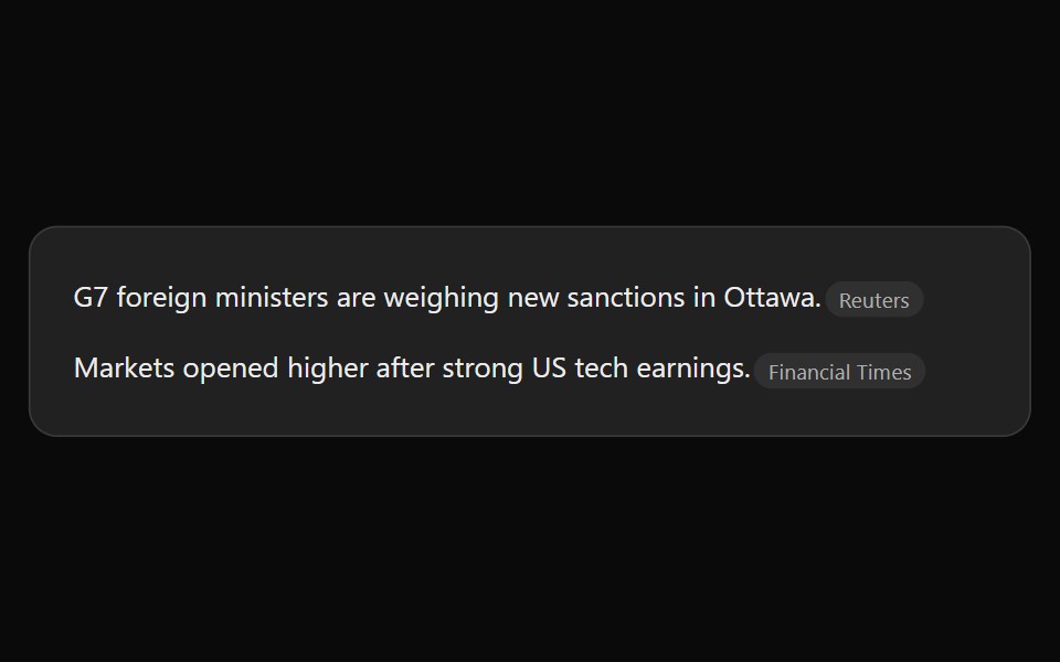 ChatGPT Source ChipNotra · ReactAn inline citation pill with a hover card.
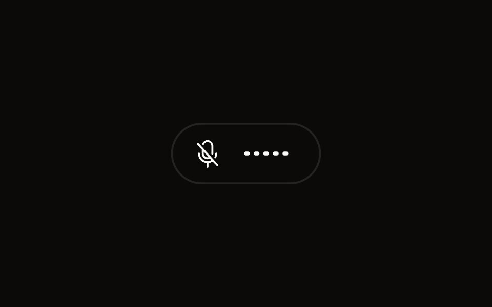 Quick Audio Popoveraudiocn · ReactCompact microphone and system audio controls behind one toolbar button that shows a live level.
 Alert 04Watermelon UI · React
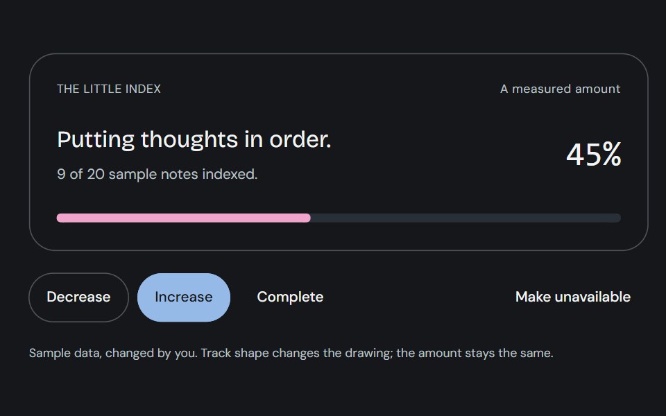 ProgressCojeev UI · ReactOne measured amount, explained as an inline task, a small report or connected milestones—with independent organic…
 With iconFLX UI · ReactLeading verified icon before the label.
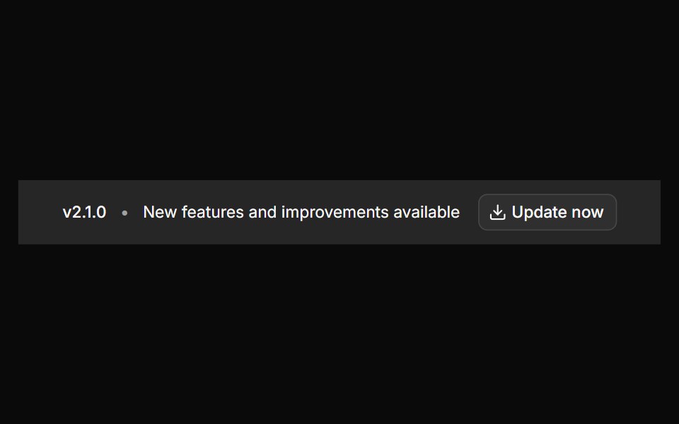 Banner 12sv-particles · Svelte
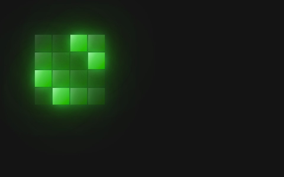 Spinner Rain 4D2Studio UI · ReactA 4×4 pixel-grid loading spinner: 4 frames at 180ms (720ms loop).
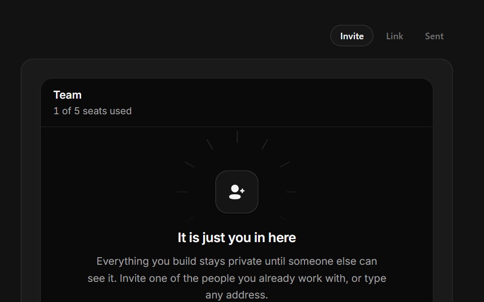 Invite TeammatesSpectrum UI · ReactA one-seat team with an avatar rail, live invite field and copyable join link.
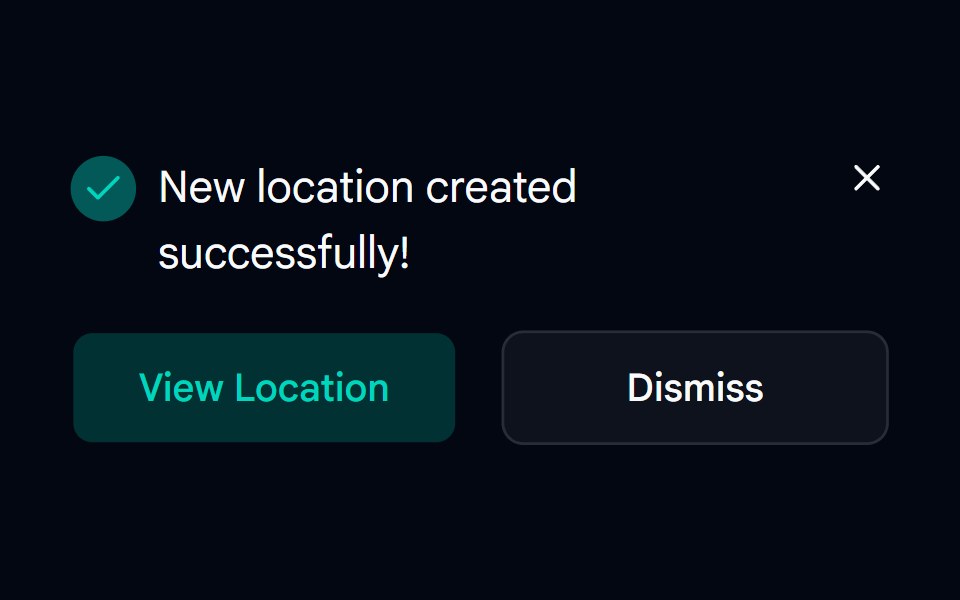 Alert-05 - Dark AlertShadcn Space · ReactAlert component
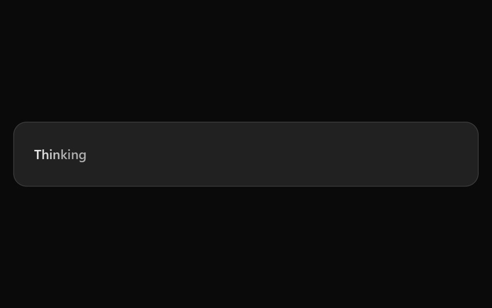 ChatGPT ThinkingNotra · ReactThe shimmering Thinking placeholder.
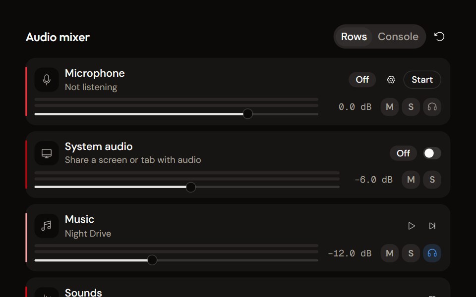 System Audio Mixeraudiocn · ReactThe complete mixer: microphone, system audio, music and sound pads with meters, faders, mute, solo, monitor and…
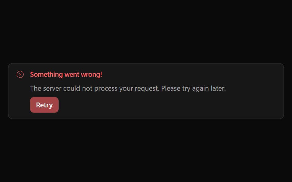 Alert 05Watermelon UI · React
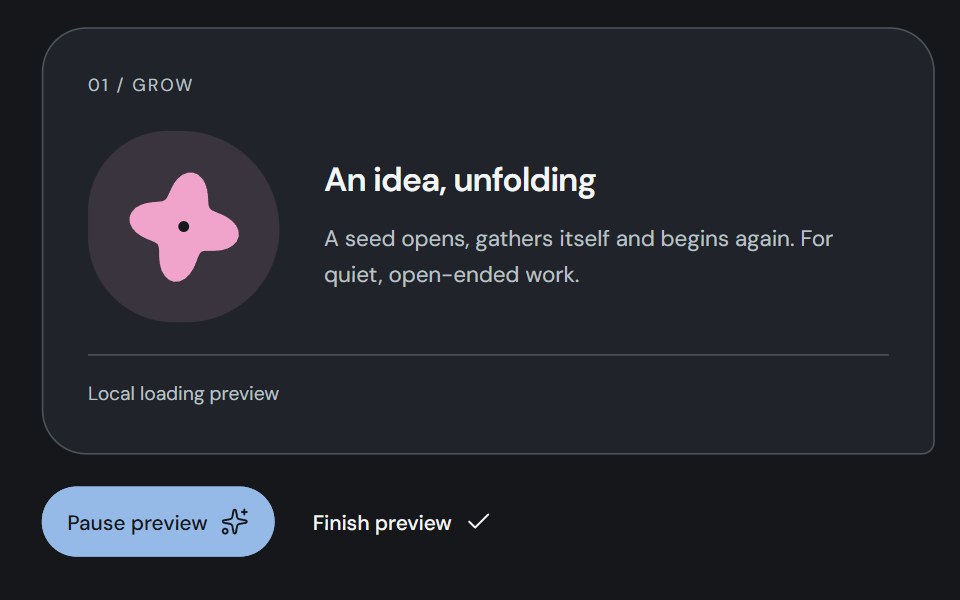 LoadingCojeev UI · ReactThree indeterminate signals: a morphing Bloom, gathering Orbit or handing-off Relay. The original small seed stays the…
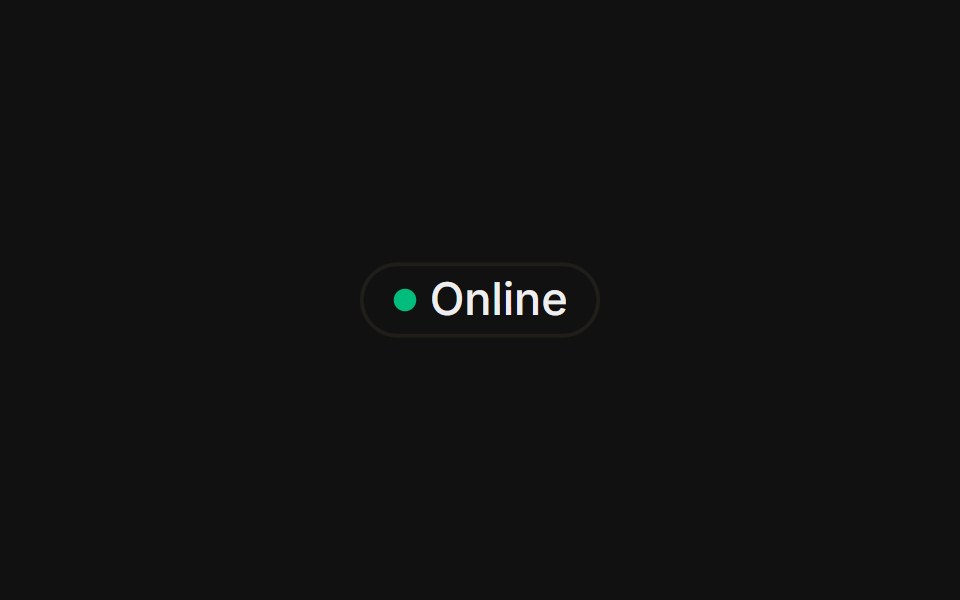 With status dotFLX UI · ReactA colored presence dot beside an outline label.
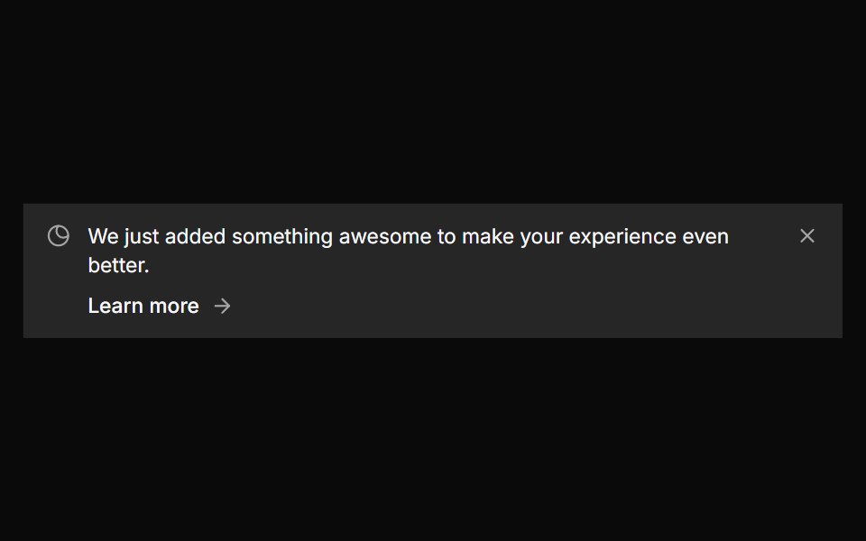 Banner 5sv-particles · Svelte
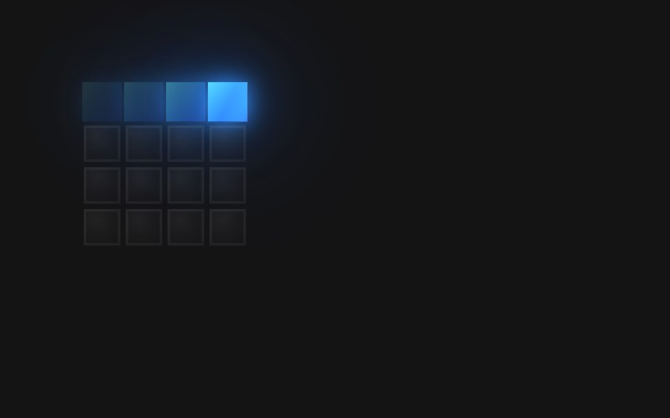 Spinner Ring 4 CwD2Studio UI · ReactA 4×4 pixel-grid loading spinner: 12 frames at 110ms (1320ms loop).
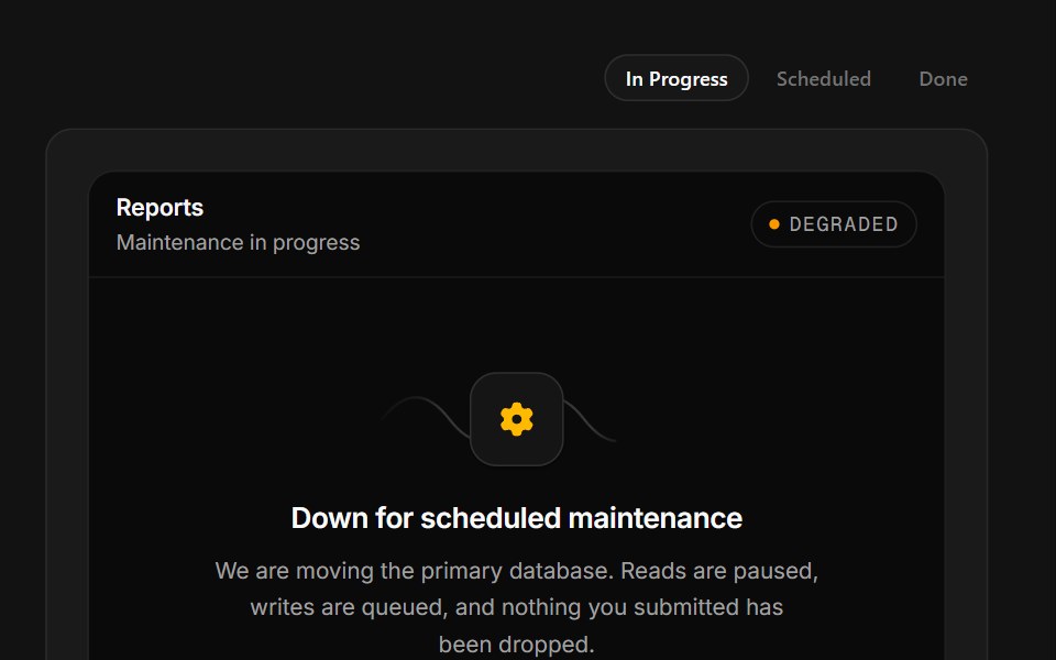 Scheduled MaintenanceSpectrum UI · ReactA maintenance window with a ticking ETA, a stage rail and a notify-me field.
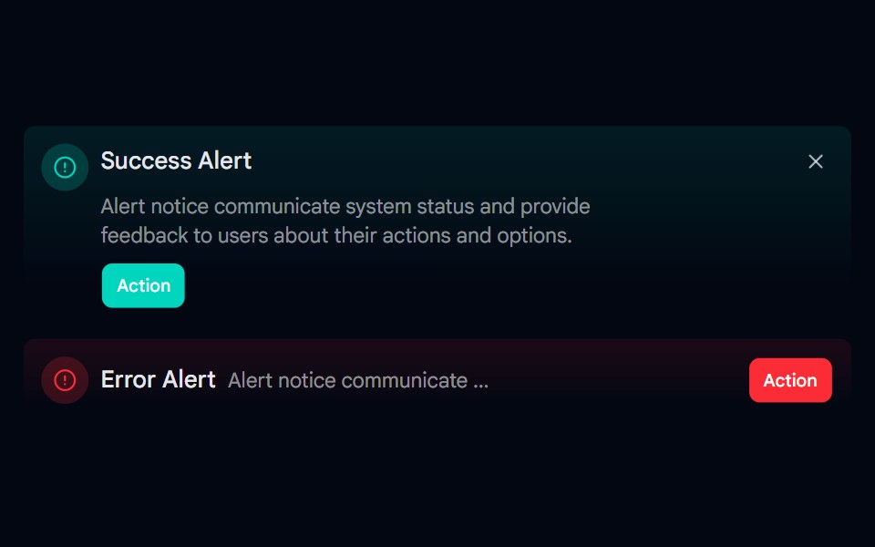 Alert-06 - Gradient AlertShadcn Space · ReactAlert component
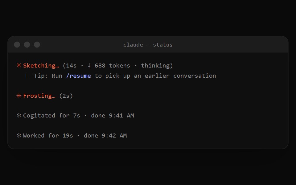 Claude Code StatusNotra · ReactThe orange spinner line while Claude works and the dim "✻ Worked for 19s" summary after a turn.
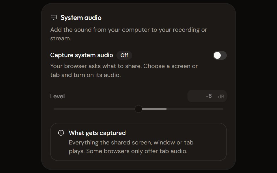 System Audio Settingsaudiocn · ReactTurn system audio capture on, set its level, watch its meter and explain what the browser will capture.
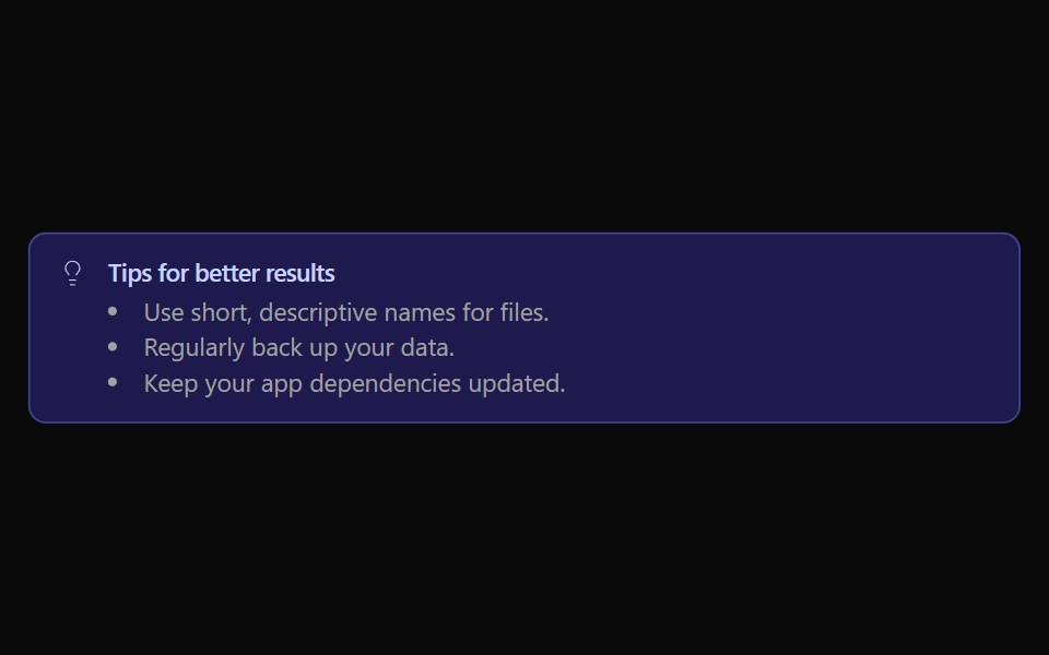 Alert 06Watermelon UI · React
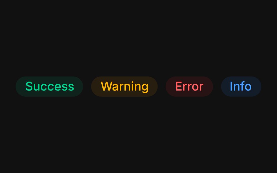 Status colorsFLX UI · ReactTinted success, warning, error, and info states.
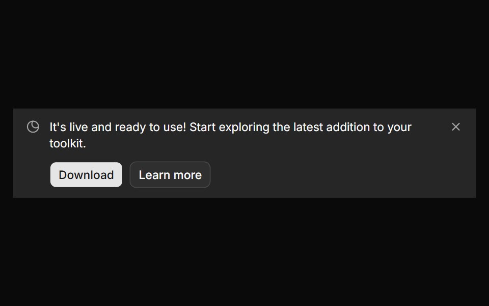 Banner 6sv-particles · Svelte
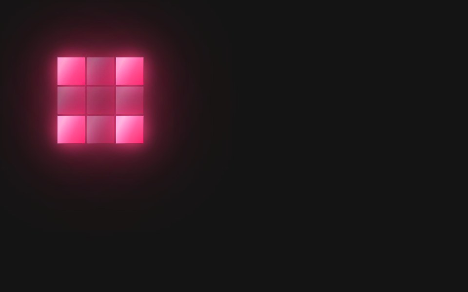 Spinner Ripple OutD2Studio UI · ReactA 3×3 pixel-grid loading spinner: 3 frames at 260ms (780ms loop).
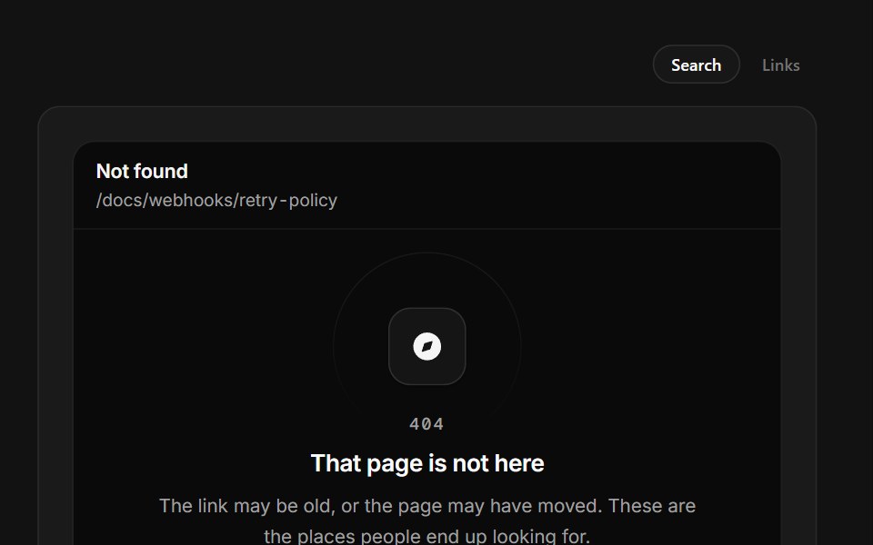 Page Not FoundSpectrum UI · ReactA 404 that prints the path it tried and filters real destinations as you type.
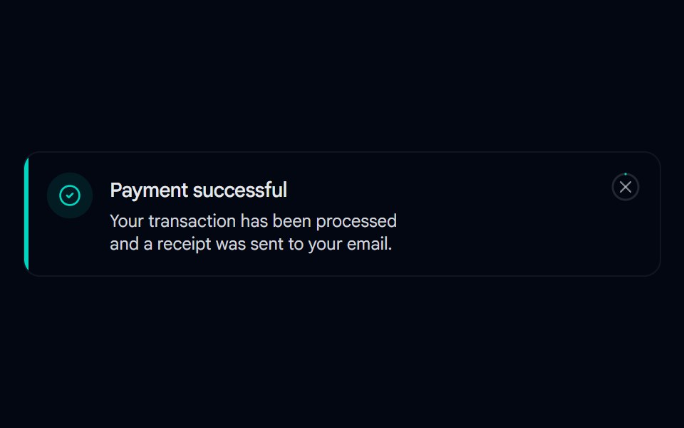 Alert 07 - With Hover-Fill DismissShadcn Space · ReactToast-style alert with a spring entrance, icon pop-in, and a close button whose ring fills in on hover, built with…
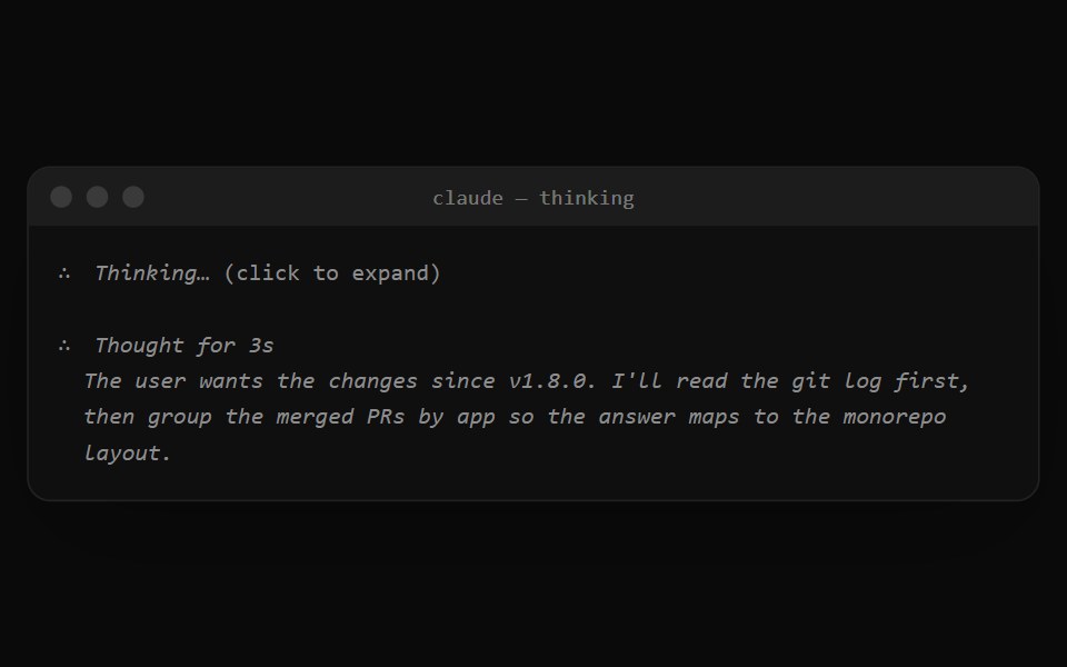 Claude Code ThinkingNotra · ReactThe dim "∴ Thinking…" line that expands to the thoughts.
 Alert 1Watermelon UI · React
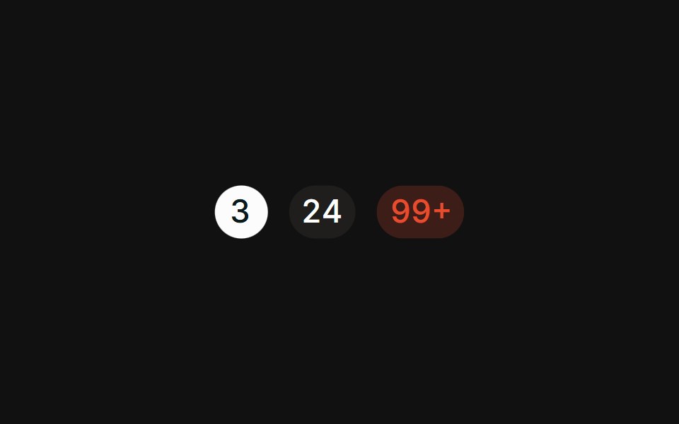 CountFLX UI · ReactPill-shaped numeric counts with tabular figures.
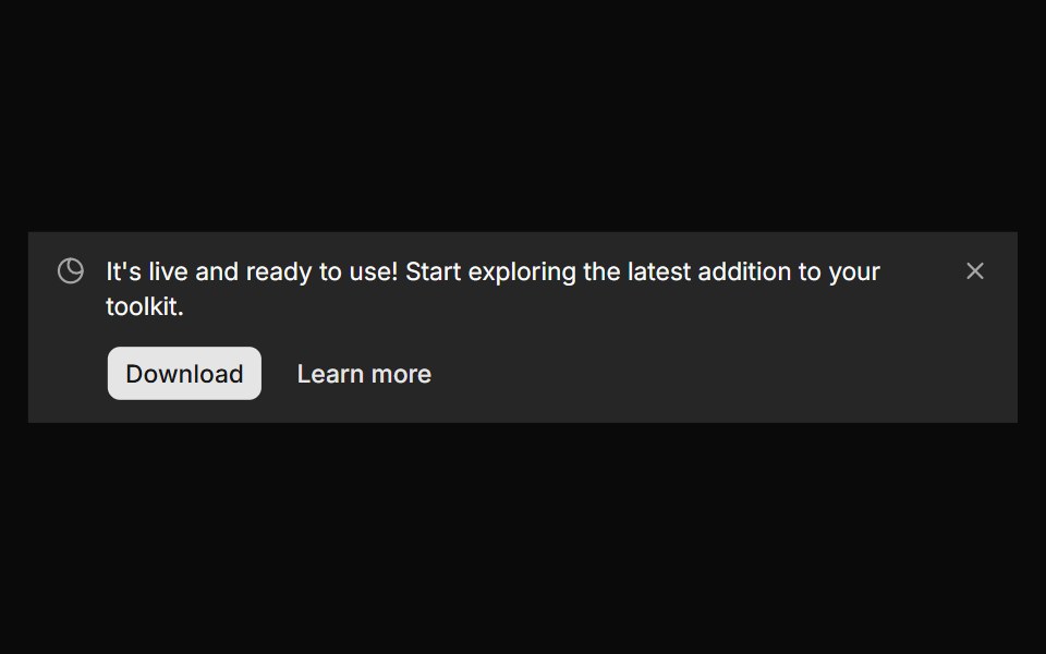 Banner 7sv-particles · Svelte
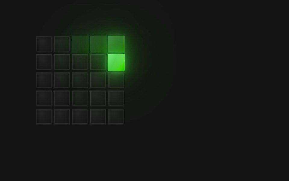 Spinner Spiral In 5D2Studio UI · ReactA 5×5 pixel-grid loading spinner: 25 frames at 75ms (1875ms loop).
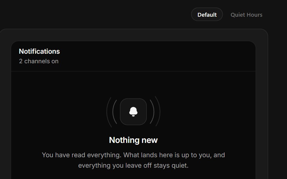 No NotificationsSpectrum UI · ReactAn empty notification tray with working channel switches and a quiet-hours state.
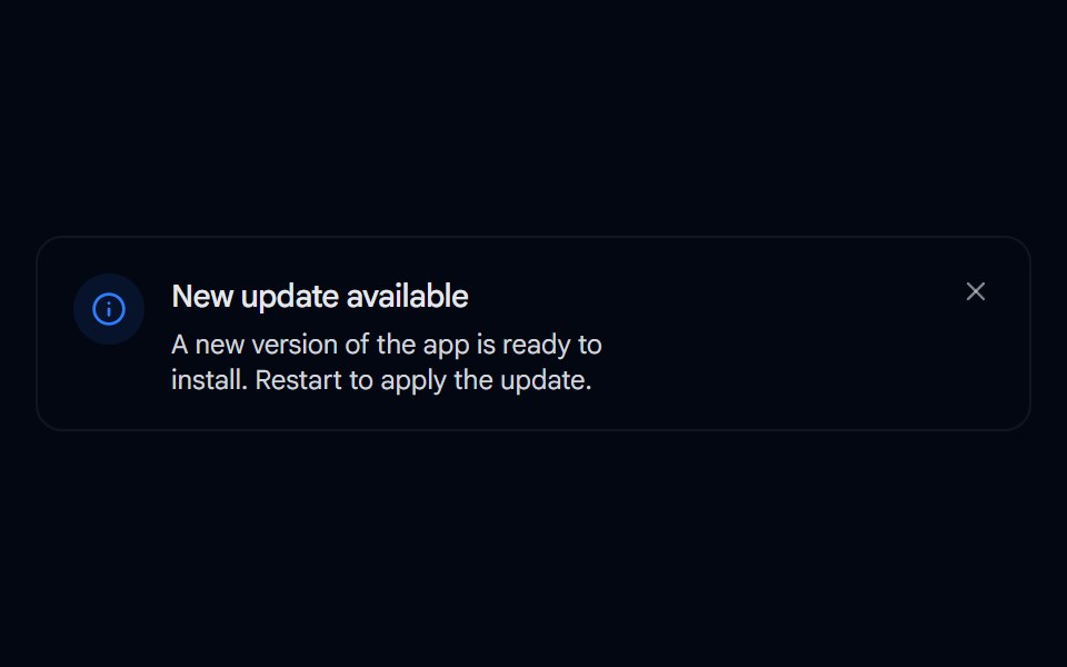 Alert 08 - Evaporate DismissShadcn Space · ReactAlert that dissolves away like evaporating water when dismissed, fading and blurring out with rising vapor wisps…
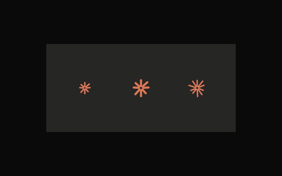 Claude SpinnerNotra · ReactClaude's animated starburst spinner.
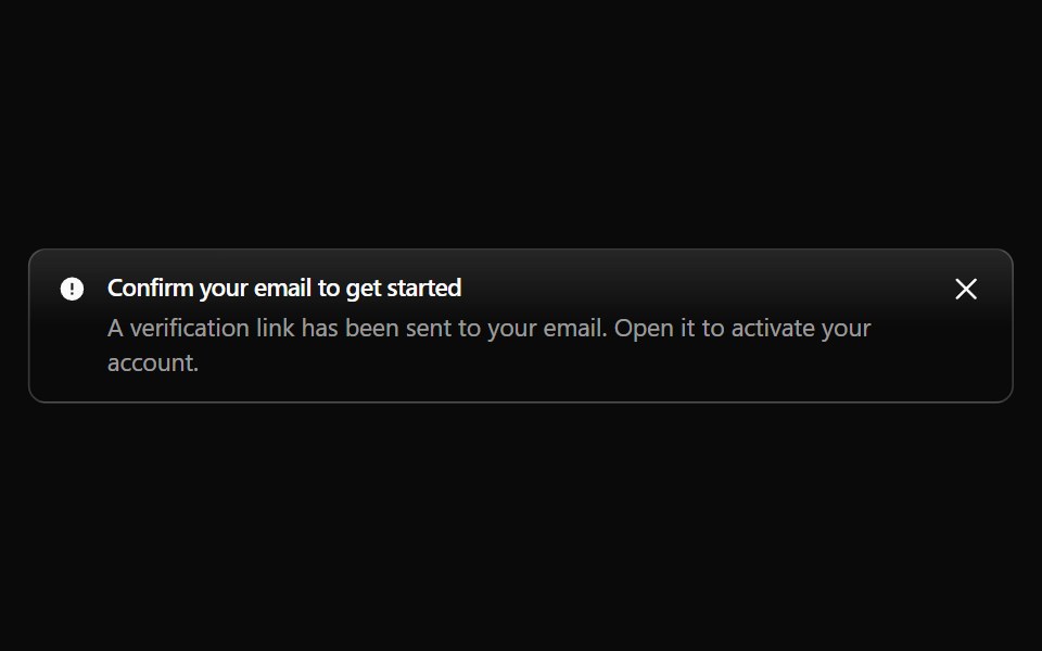 Alert 10Watermelon UI · React
 As linkFLX UI · Reactrender prop renders the badge as an anchor with a trailing icon.
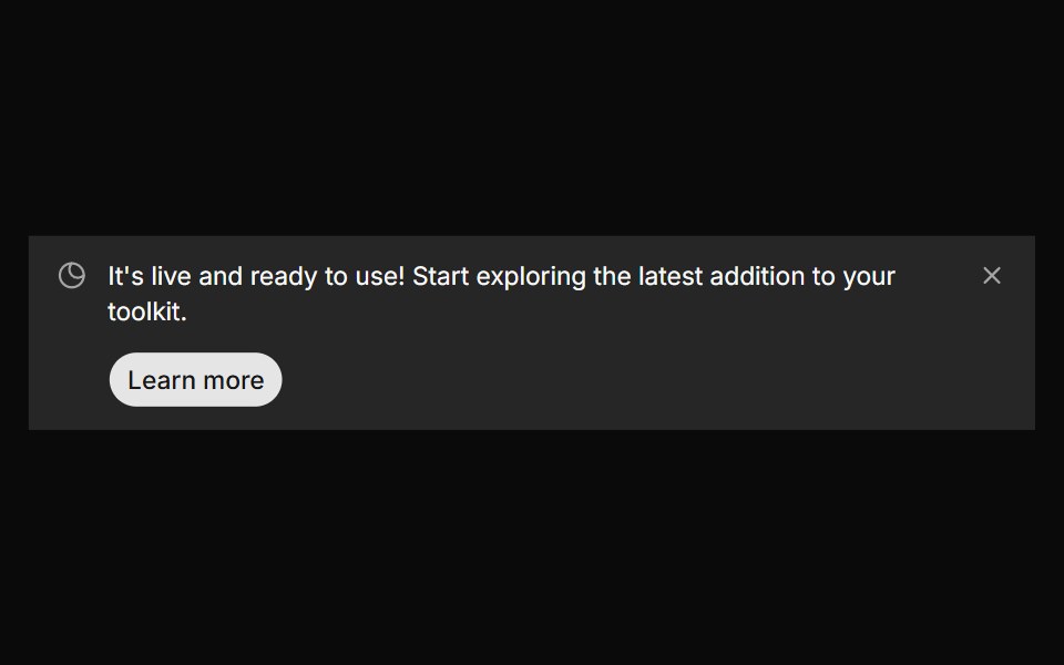 Banner 8sv-particles · Svelte
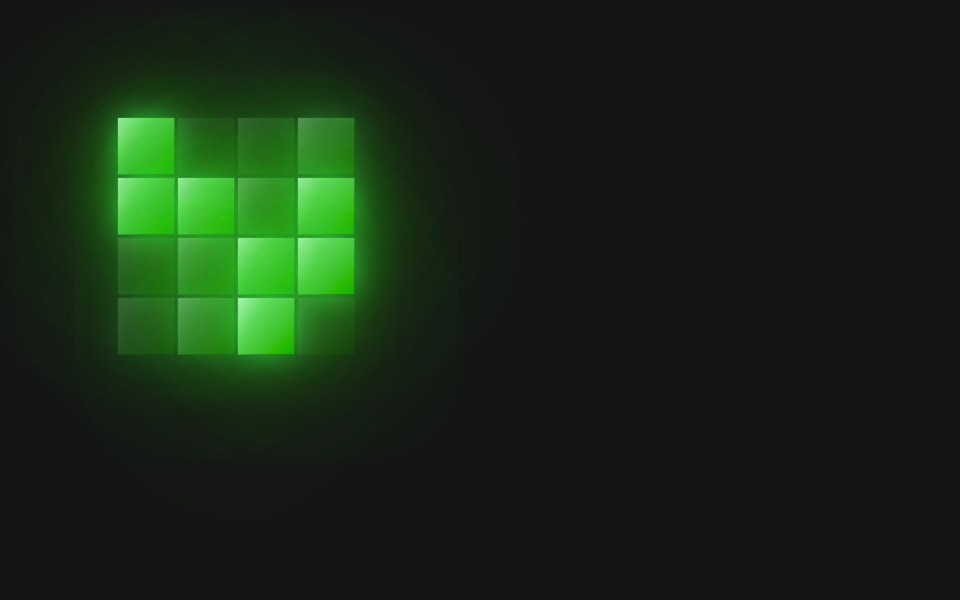 Spinner Swell RollD2Studio UI · ReactA 4×4 pixel-grid loading spinner: 4 frames at 160ms (640ms loop).
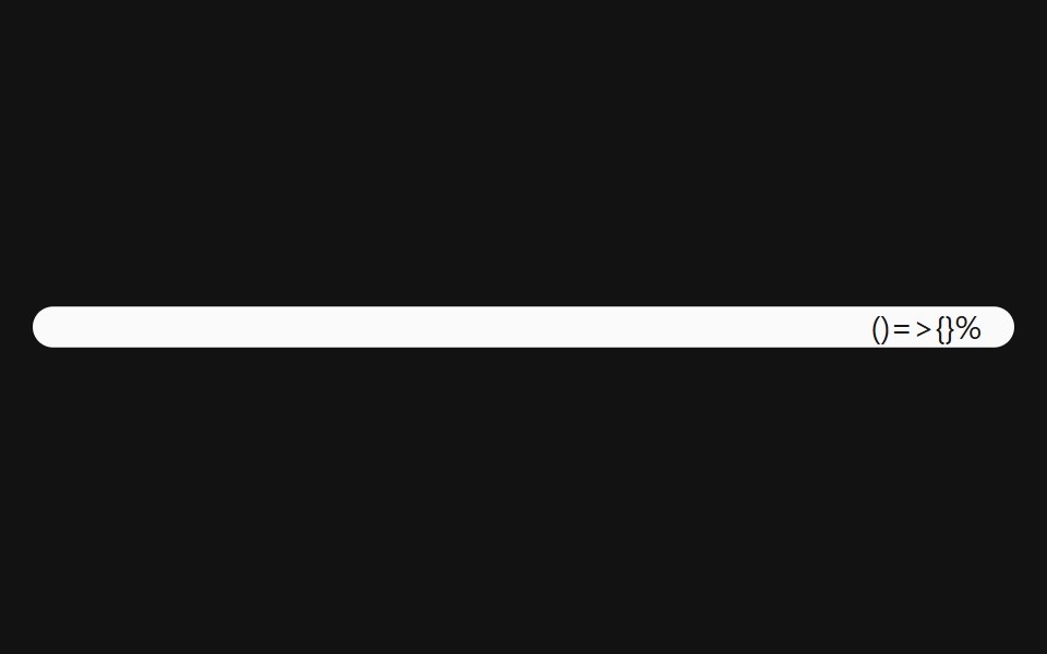 Progress With ValueSpectrum UI · Reactcomponent for the Progress With Value
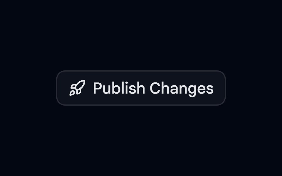 Alert 09 - Publish ConfirmationShadcn Space · ReactAlert dialog that slides up to confirm publishing, with a rocket icon, a change summary, and full width actions
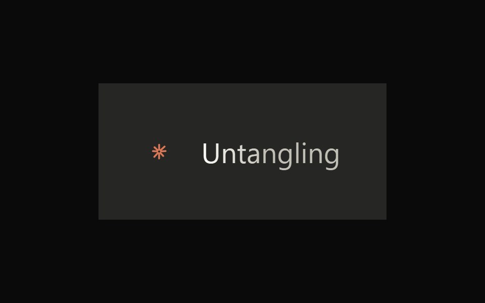 Claude ThinkingNotra · ReactThe animated spinner and rotating verb Claude shows before replying.
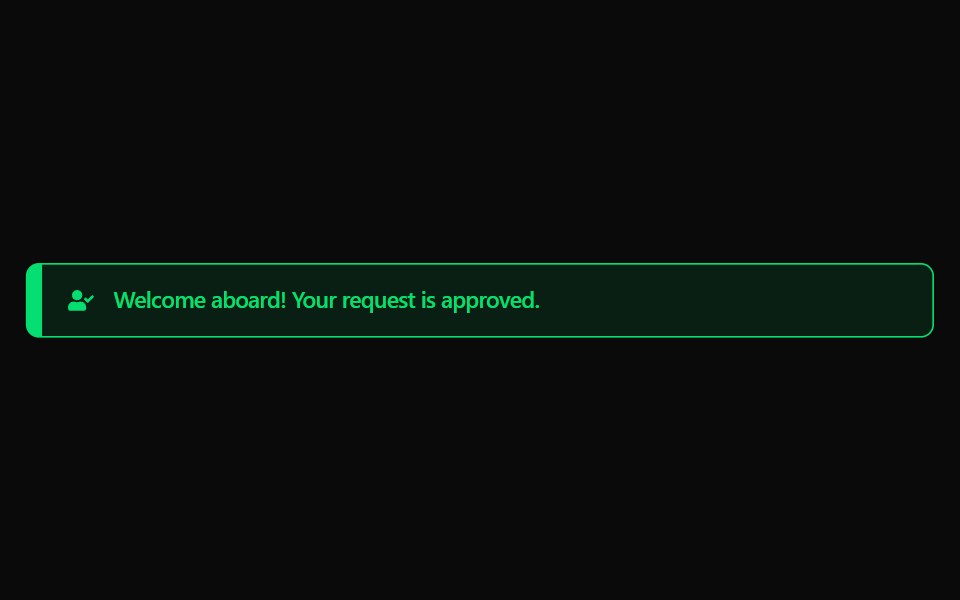 Alert 11Watermelon UI · React
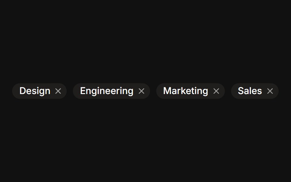 RemovableFLX UI · ReactDismissible tag chips with a trailing remove button.
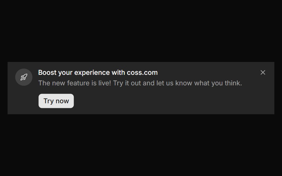 Banner 9sv-particles · Svelte
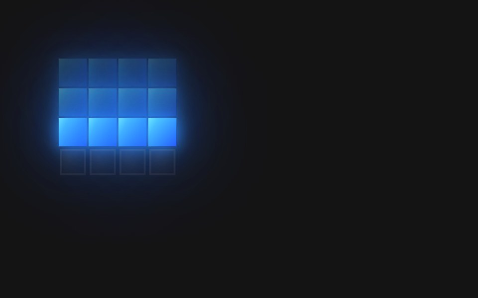 Spinner Tide RollD2Studio UI · ReactA 4×4 pixel-grid loading spinner: 6 frames at 180ms (1080ms loop).
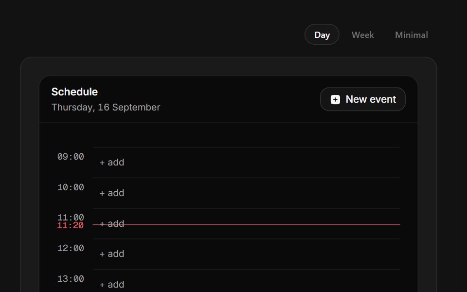 Nothing ScheduledSpectrum UI · ReactA day rail with a now marker where any hour opens an inline composer.
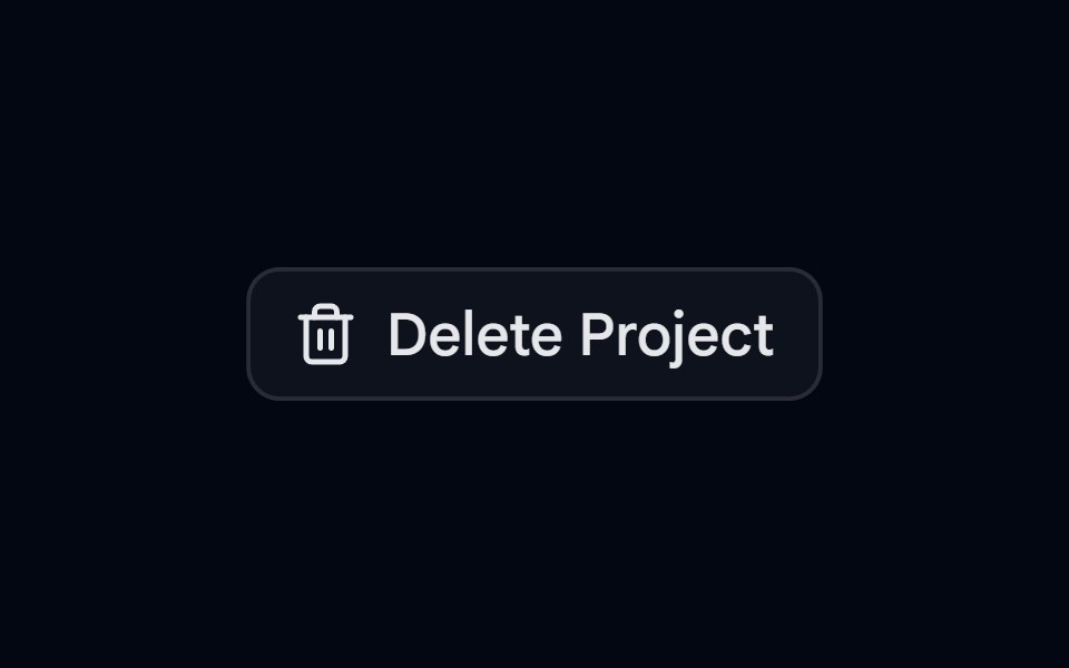 Alert 10 - Two Step DeleteShadcn Space · ReactDestructive alert dialog that lists what will be removed and needs a second click on delete to confirm
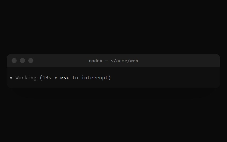 Codex WorkingNotra · ReactThe shimmering Working (13s • esc to interrupt) status line.
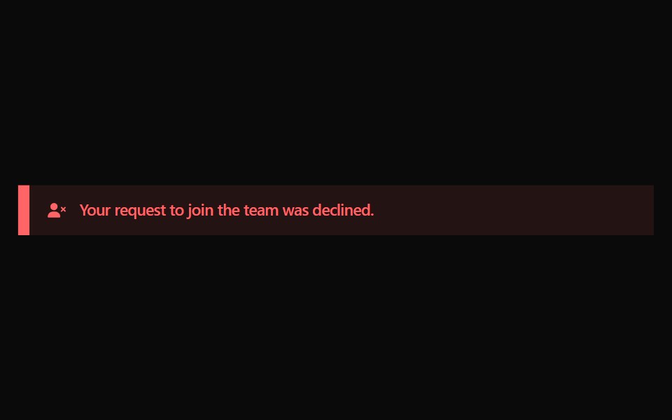 Alert 12Watermelon UI · React
 With avatarFLX UI · ReactAssignee chip with a leading avatar inside the badge.
 End Loading Spinnersv-particles · Svelte
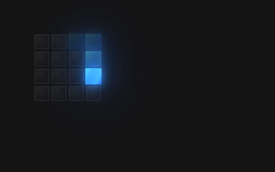 Spinner Vortex InD2Studio UI · ReactA 4×4 pixel-grid loading spinner: 16 frames at 90ms (1440ms loop).
 SkeletonSpectrum UI · Reactcomponent for the Skeleton
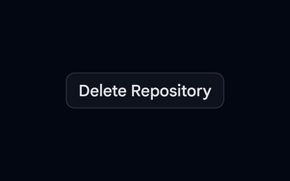 Alert 12 - Type to ConfirmShadcn Space · ReactDelete repository dialog with an impact callout that unlocks the delete action once the user types the repository name
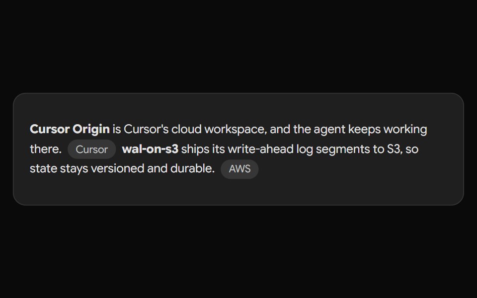 Gemini Source ChipNotra · ReactAn inline source pill with a hover card.
 Alert 13Watermelon UI · React
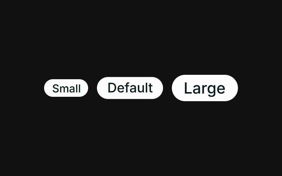 SizesFLX UI · ReactSmall, default, and large sizes via className.
 Loading Spinnersv-particles · Svelte
 Alert 13 - Async with SuccessShadcn Space · ReactArchive dialog that moves from confirm to a loading spinner to a success state, and cannot be closed while the action…
 Gemini SparkleNotra · ReactGemini's three-dot mark that bounces and folds into a triangle.
 Alert 14Watermelon UI · React
 Trend deltaFLX UI · ReactUp and down arrows with tinted gain / loss percentages.
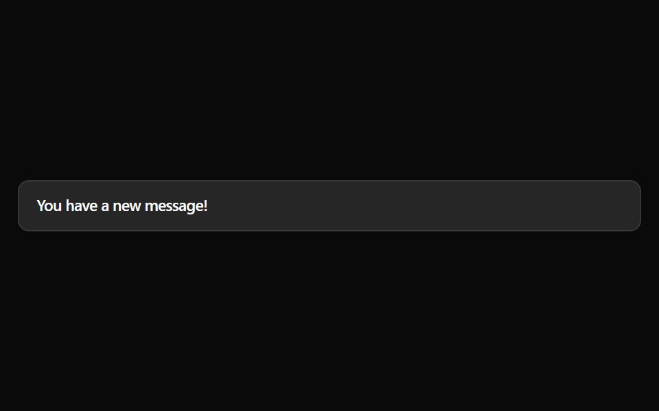
 Message Notificationsv-particles · Svelte
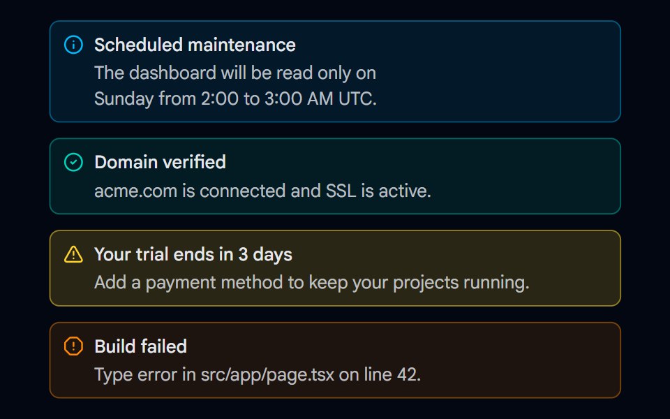 Alert 15 - Semantic VariantsShadcn Space · ReactInfo, success, warning, and error alerts with matching icons, tinted backgrounds, and borders that work in light and…
 Gemini ThinkingNotra · ReactThe animated Gemini sparkle with a shimmering status label.
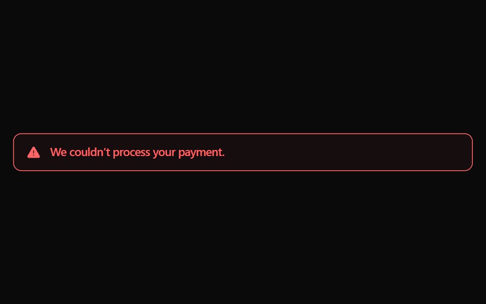 Alert 15Watermelon UI · React
 Icon onlyFLX UI · ReactRound icon-only badges across variants.
 Password Input With Strength Indicatorsv-particles · Svelte
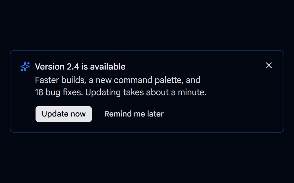 Alert 16 - Update AvailableShadcn Space · ReactDismissible update alert with Update now and Remind me later actions, a loading state while updating, and a way to…
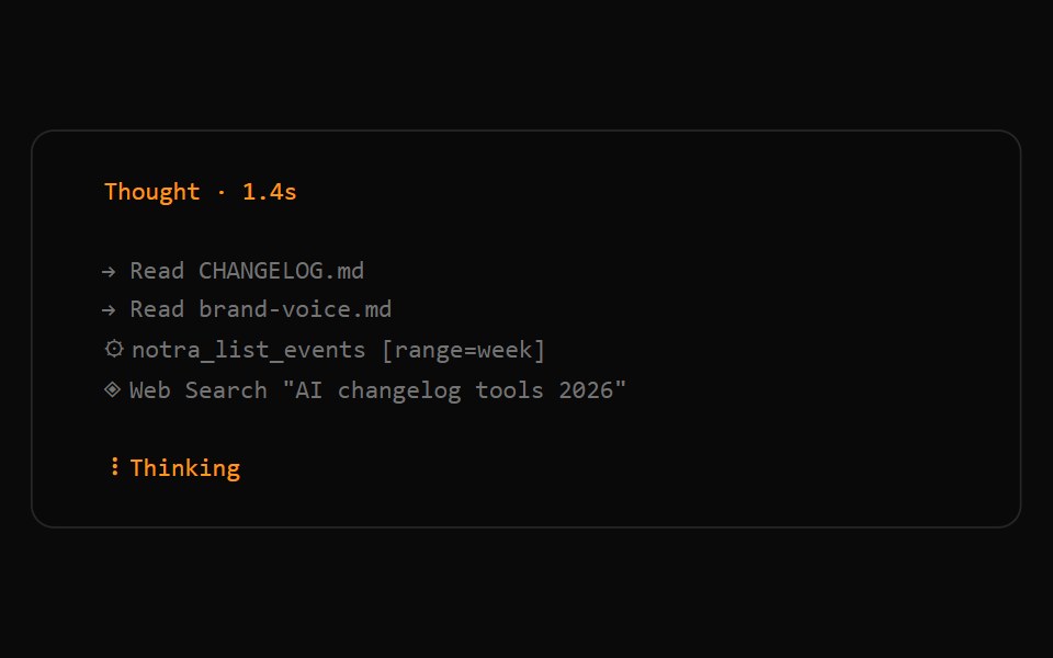 OpenCode ActivityNotra · ReactOrange thoughts with a live Thinking spinner, plus muted read, web search and tool lines.
 Alert 16Watermelon UI · React
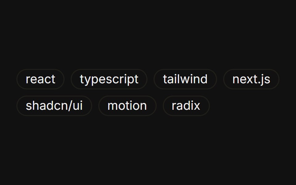 Tag listFLX UI · ReactA wrapping group of outline badges as tags.
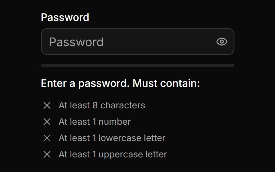 Password Input With Strength Inidicatorsv-particles · Svelte
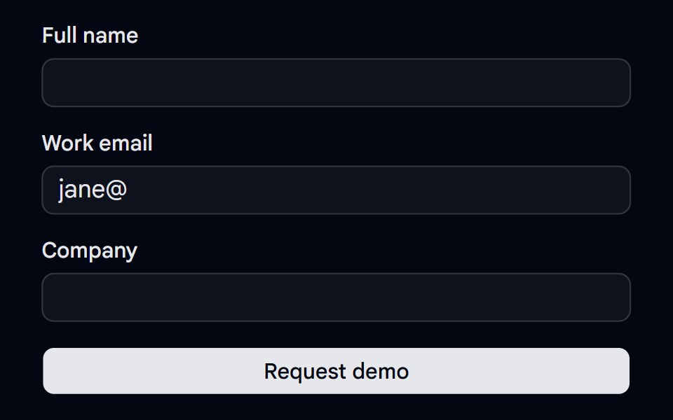 Alert 18 - Form Error SummaryShadcn Space · ReactForm error summary alert that lists every invalid field with links that focus it, receives focus on submit, and clears…
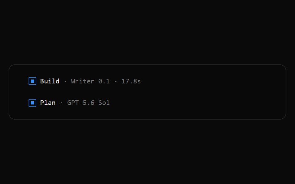 OpenCode Turn FooterNotra · ReactThe blue square, agent, model and duration line that closes an assistant turn.
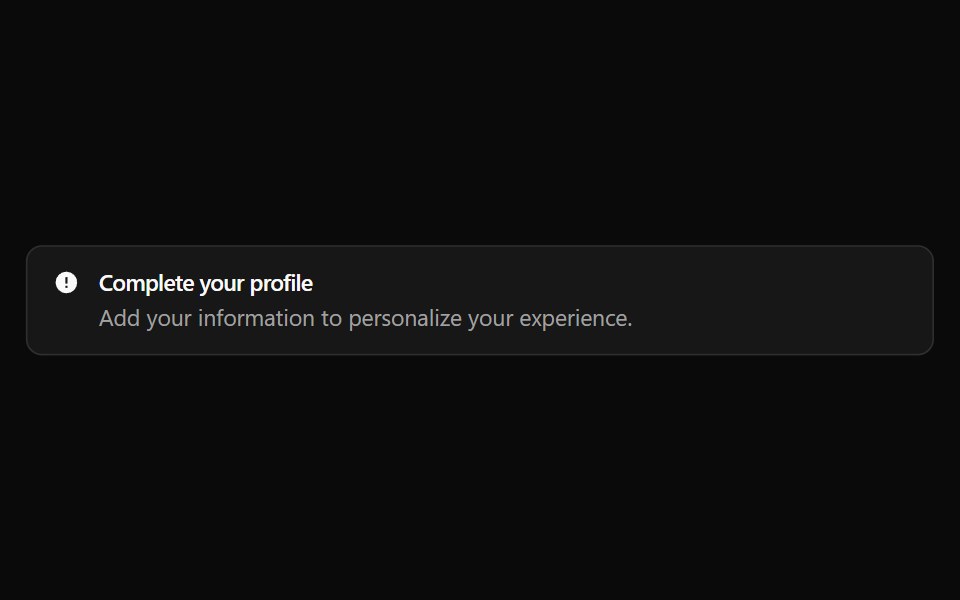 Alert 17Watermelon UI · React
Libraries with shadcn/ui feedback components
Related categories
- Feedback Components
- React Feedback Components
- Tailwind CSS Feedback Components
- Svelte Feedback Components
- React Native Feedback Components
- Animated Feedback Components
- shadcn/ui Badge Components
- shadcn/ui Alert Components
- shadcn/ui Banner Components
- shadcn/ui Chip Components
- shadcn/ui Spinner Components
- shadcn/ui Skeleton Components
- shadcn/ui Progress Components
- shadcn/ui Empty State Components
- shadcn/ui Notification Components
- shadcn/ui Status Indicator Components
- shadcn/ui Progress Bar Components
- shadcn/ui Error State Components
- shadcn/ui Typing Indicator Components