 Dev Design Library
shadcn/ui Skeleton Components
Dev Design Library indexes 20 shadcn/ui skeleton components from 6 open-source UI libraries, with the most coming from FLX UI, Spectrum UI, sv-table, Notra and Shadcn Space. Each one links to its page with the source code, a live preview where available, the library license and the install command. They follow the shadcn/ui conventions, so most install with the shadcn CLI and drop into a Tailwind project. Skeleton components belong to the Feedback group.
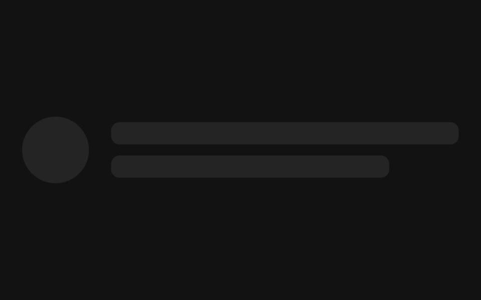 SkeletonSpectrum UI · Reactcomponent for the Skeleton
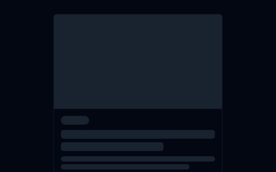 Skeleton 05 - Loading to ContentShadcn Space · ReactBlog card that shows a matching skeleton while loading, fades in the real content, and can be reloaded to replay the…
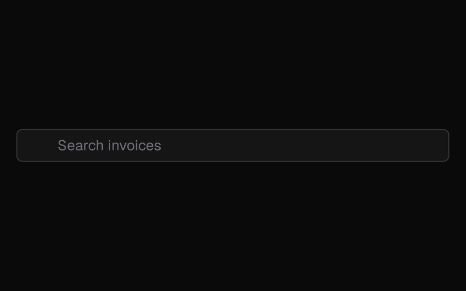 Animatedinput PlaceholderShadcn Dashboard · React
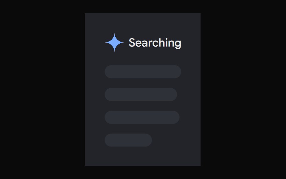 AI Overview SkeletonNotra · ReactA loading state built on shadcn Skeleton.
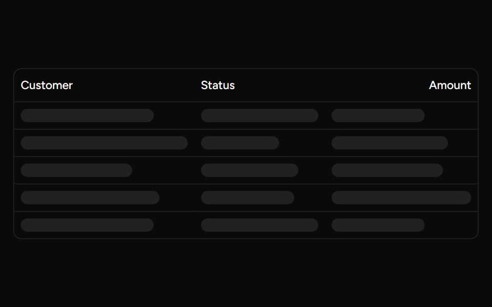 Data Table Loadingsv-table · SvelteSkeleton rows that preserve a table layout while its data is loading.
 Loading skeletonFLX UI · ReactSkeleton placeholder while the avatar loads.
 BasicFLX UI · ReactA stack of placeholder lines for a text block.
 Avatar with textFLX UI · ReactA circle beside two lines, mimicking a loading user row.
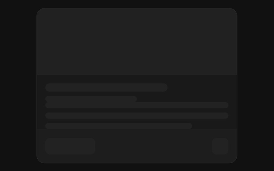 CardFLX UI · ReactMedia banner above a title, body lines, and a footer.
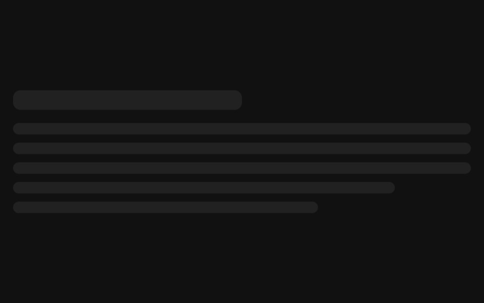 ParagraphFLX UI · ReactA heading followed by full-width body lines.
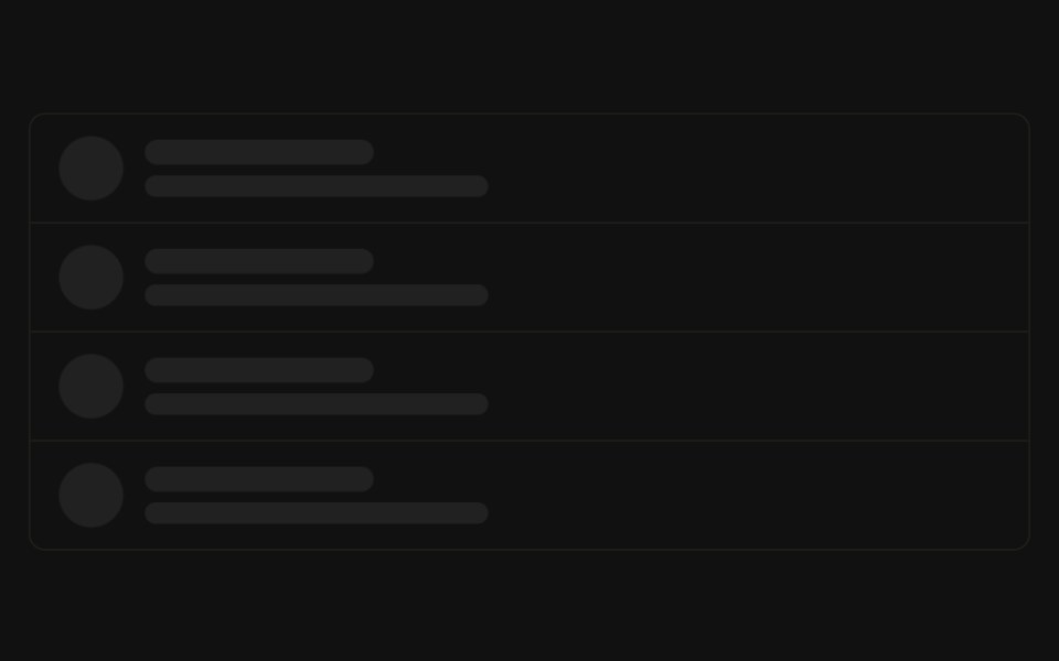 ListFLX UI · ReactRepeated rows, each with a circular avatar and two text lines.
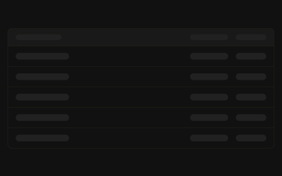 TableFLX UI · ReactA header row above several placeholder data rows.
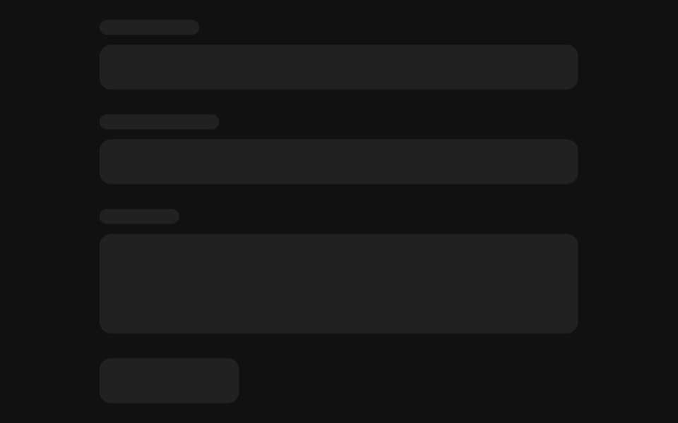 FormFLX UI · ReactLabelled fields above a submit button placeholder.
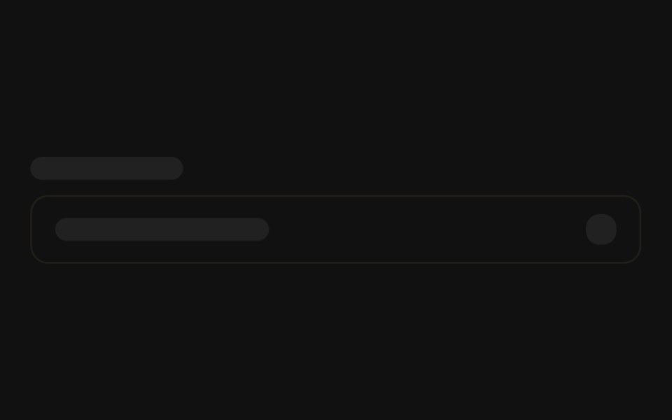 SelectFLX UI · ReactA field label above a trigger with a chevron block.
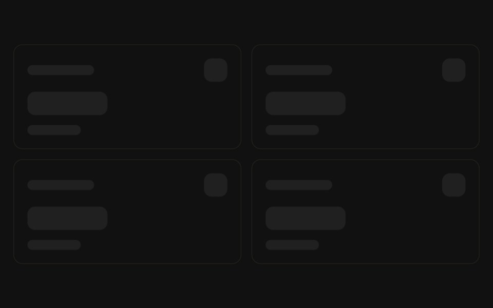 Stat cardsFLX UI · ReactA grid of KPI cards with label, value, and trend lines.
 Chat threadFLX UI · ReactAlternating inbound and outbound message bubbles.
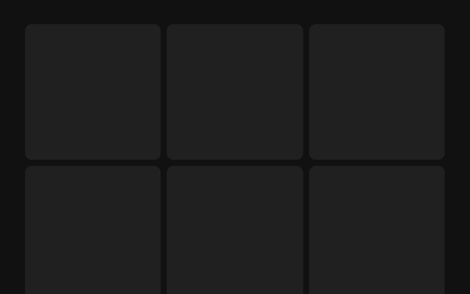 Gallery gridFLX UI · ReactA grid of square image tiles for a loading gallery.
 ArticleFLX UI · ReactA hero image, title, byline, and stacked body lines.
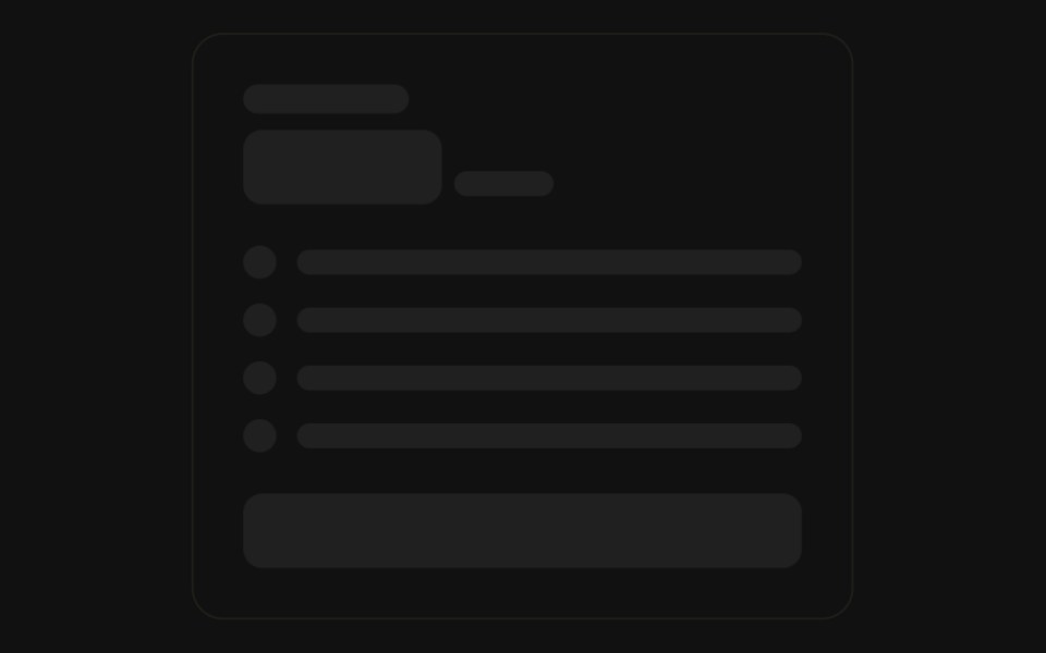 Pricing cardFLX UI · ReactA plan name, price, feature rows, and a CTA button.
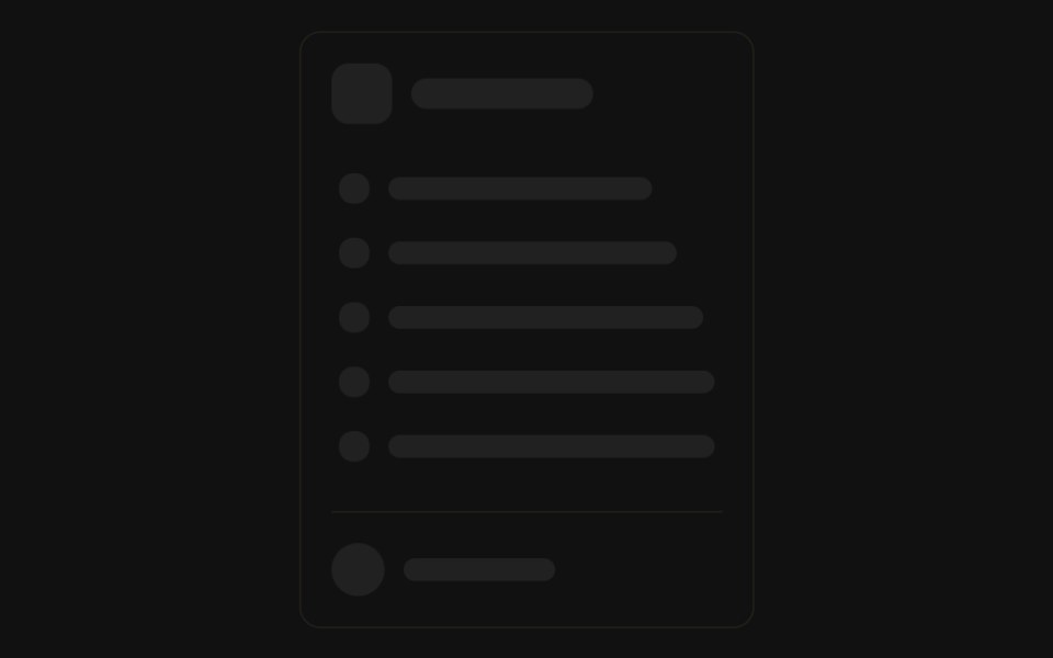 Sidebar navFLX UI · ReactA logo header above a list of icon-and-label nav rows, with a user profile row at the bottom.
Libraries with shadcn/ui skeleton components
Related categories
- Skeleton Components
- React Skeleton Components
- Tailwind CSS Skeleton Components
- Animated Skeleton Components
- shadcn/ui Feedback Components
- shadcn/ui Badge Components
- shadcn/ui Alert Components
- shadcn/ui Banner Components
- shadcn/ui Chip Components
- shadcn/ui Spinner Components
- shadcn/ui Progress Components
- shadcn/ui Empty State Components
- shadcn/ui Notification Components
- shadcn/ui Status Indicator Components
- shadcn/ui Progress Bar Components
- shadcn/ui Error State Components
- shadcn/ui Typing Indicator Components