 Dev Design Library
shadcn/ui Status Indicator Components
Dev Design Library indexes 14 shadcn/ui status indicator components from 7 open-source UI libraries, with the most coming from sv-particles, FLX UI, Notra, Shadcn Space and Watermelon UI. Each one links to its page with the source code, a live preview where available, the library license and the install command. They follow the shadcn/ui conventions, so most install with the shadcn CLI and drop into a Tailwind project. Status indicator components belong to the Feedback group.
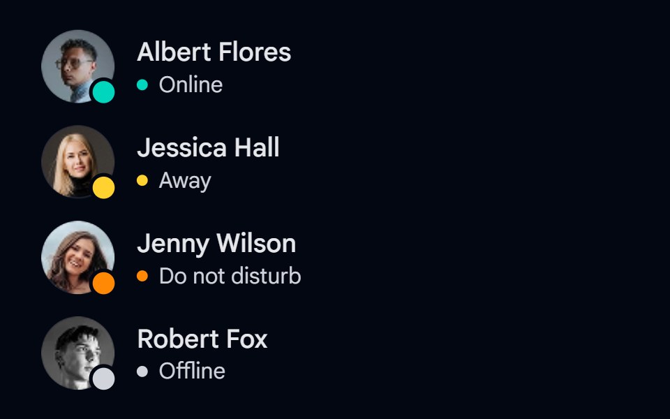 Avatar 09 - Status IndicatorsShadcn Space · ReactAvatars with online, away, do not disturb, and offline status badges, a grayscale offline photo, and status labels.
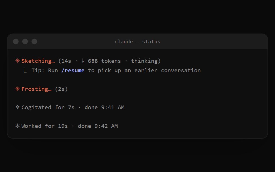 Claude Code StatusNotra · ReactThe orange spinner line while Claude works and the dim "✻ Worked for 19s" summary after a turn.
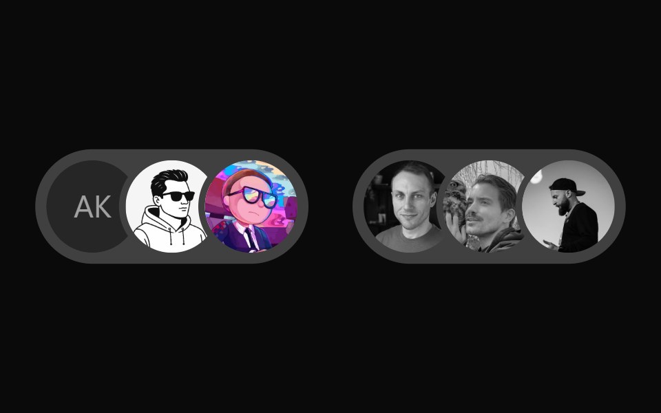 User Presence AvatarWatermelon UI · React
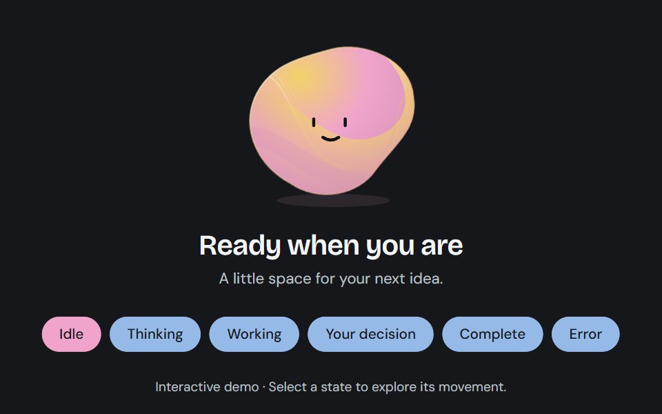 Agent stateCojeev UI · ReactA sculpted, living status field that changes contour and color as an agent thinks, works, asks for input, or finishes.
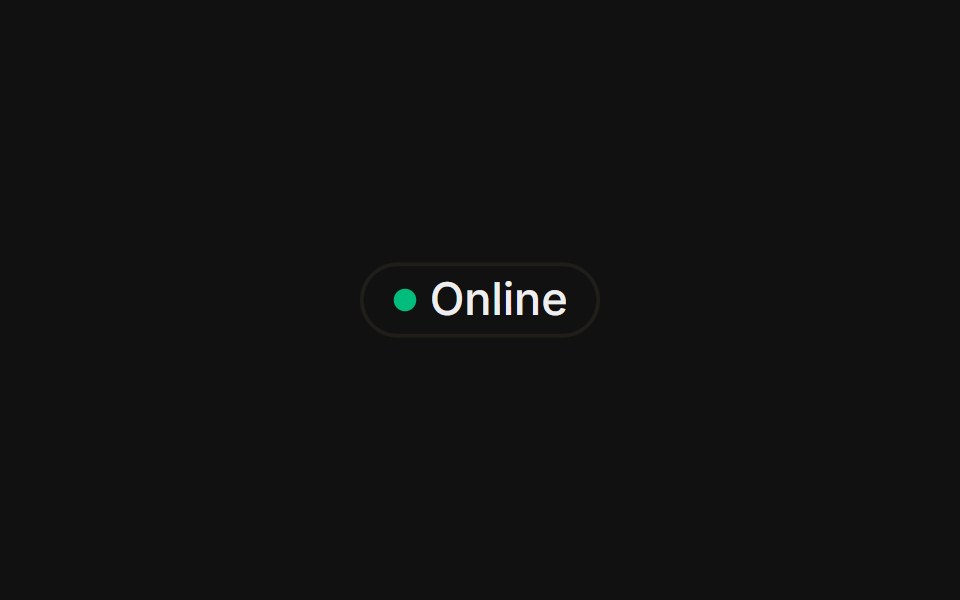 With status dotFLX UI · ReactA colored presence dot beside an outline label.
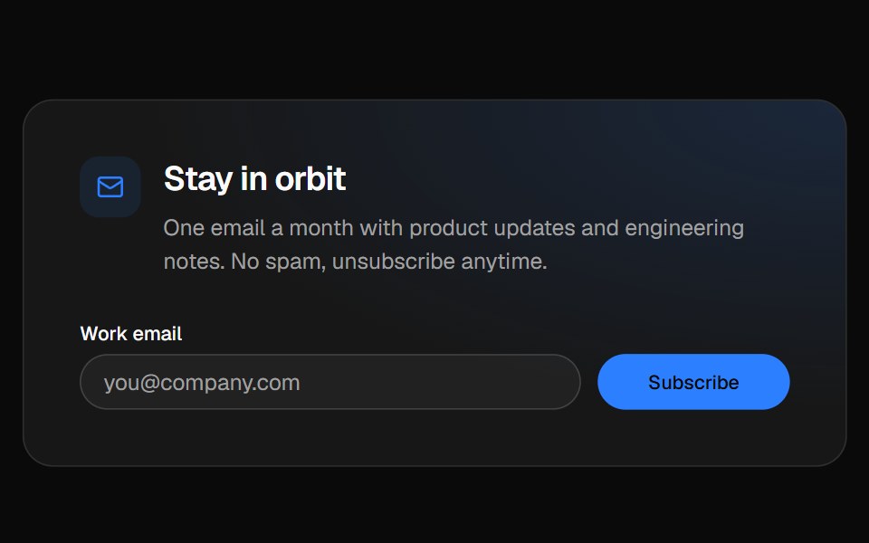 Newsletter footerVelora UI · ReactFooter with a newsletter sign-up row, link columns and a live “All systems normal” status badge.
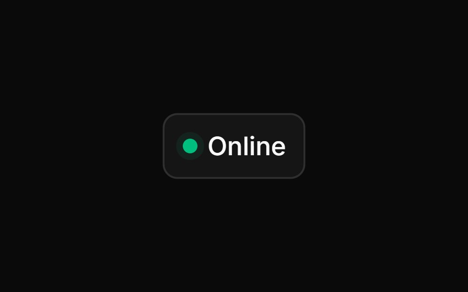 Animated Status Dotsv-particles · Svelte
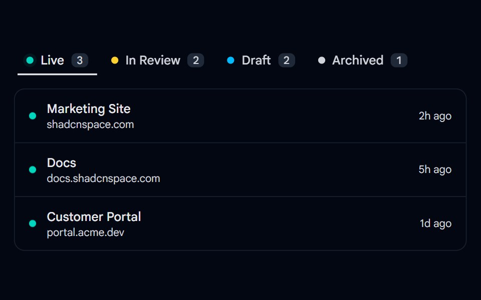 Tabs 14 - Status DotsShadcn Space · ReactUnderline tabs with colored status dots, counts, and a filtered project list per status.
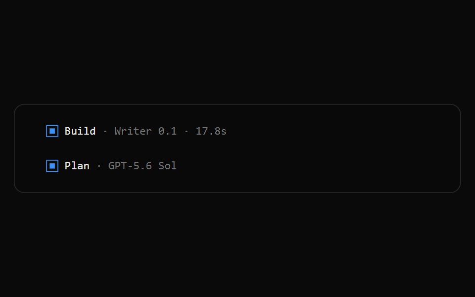 OpenCode Turn FooterNotra · ReactThe blue square, agent, model and duration line that closes an assistant turn.
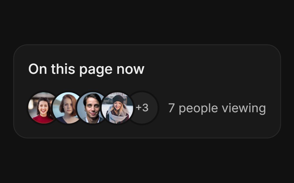 Avatar StackFLX UI · ReactAvatar Stack for Live Presence.
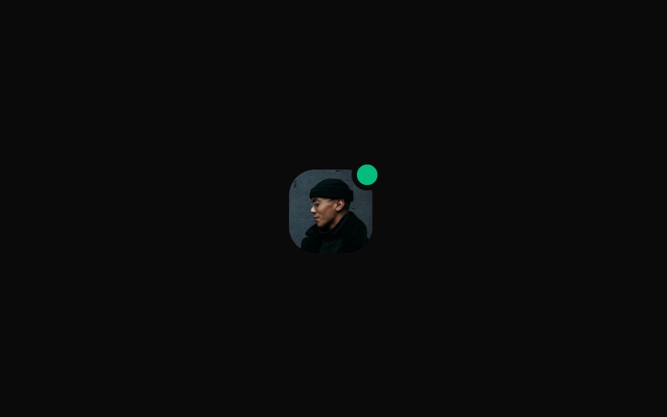 Rounded With Emerald Status Dotsv-particles · Svelte
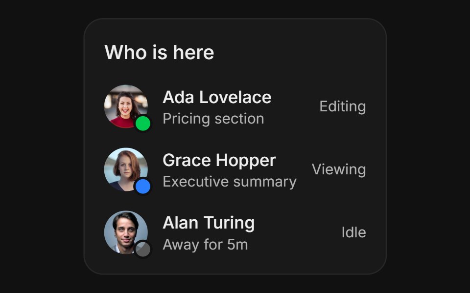 Activity StatusFLX UI · ReactActivity Status for Live Presence.
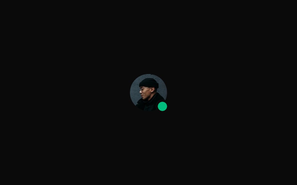 With Emerald Status Dotsv-particles · Svelte
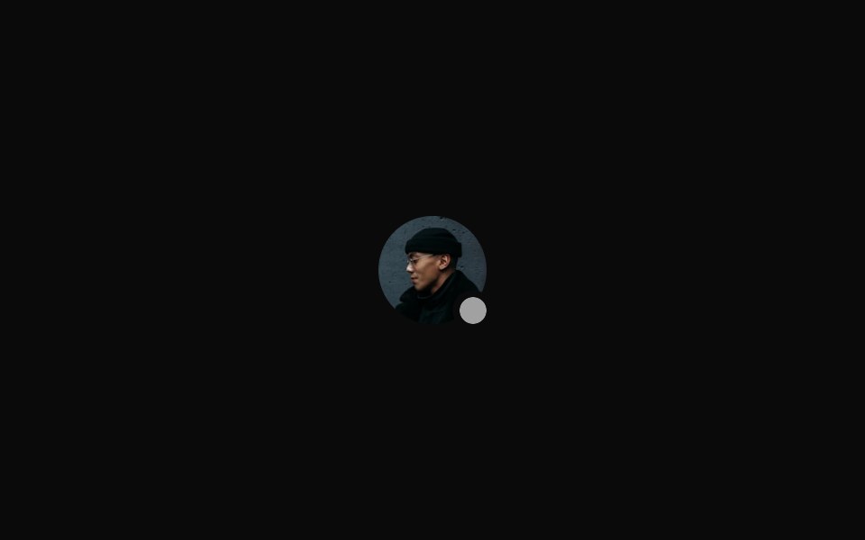 With Muted Status Dotsv-particles · Svelte
Libraries with shadcn/ui status indicator components
Related categories
- Status Indicator Components
- React Status Indicator Components
- Tailwind CSS Status Indicator Components
- Animated Status Indicator Components
- shadcn/ui Feedback Components
- shadcn/ui Badge Components
- shadcn/ui Alert Components
- shadcn/ui Banner Components
- shadcn/ui Chip Components
- shadcn/ui Spinner Components
- shadcn/ui Skeleton Components
- shadcn/ui Progress Components
- shadcn/ui Empty State Components
- shadcn/ui Notification Components
- shadcn/ui Progress Bar Components
- shadcn/ui Error State Components
- shadcn/ui Typing Indicator Components