 Dev Design Library
shadcn/ui Chip Components
Dev Design Library indexes 25 shadcn/ui chip components from 6 open-source UI libraries, with the most coming from FLX UI, Shadcn Space, Notra, AI Elements (Svelte) and glasscn. Each one links to its page with the source code, a live preview where available, the library license and the install command. They follow the shadcn/ui conventions, so most install with the shadcn CLI and drop into a Tailwind project. Chip components belong to the Feedback group.
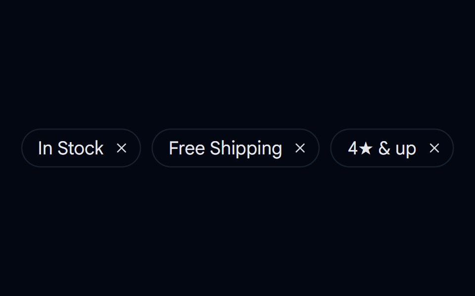 Badge 12 - Removable Filter ChipShadcn Space · ReactDismissible filter chip badge with hover/tap micro-interactions and animated removal
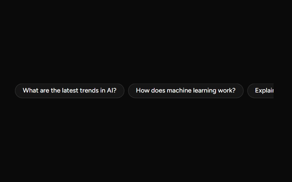 SuggestionAI Elements (Svelte) · SvelteA compact suggestion button set for displaying prompt ideas and quick actions.
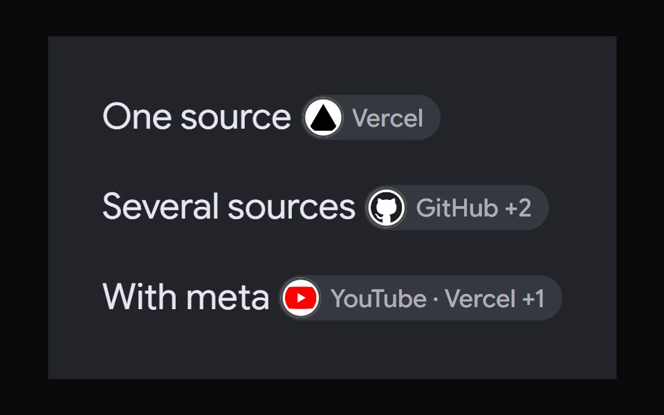 AI Overview CitationNotra · ReactA source chip built on shadcn Badge and HoverCard.
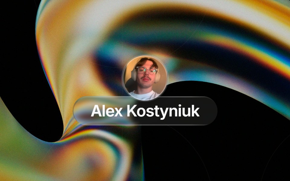 Glass Contact Pillglasscn · ReactLiquid-glass contact chip with an avatar (image or initials fallback) and name, for messaging apps
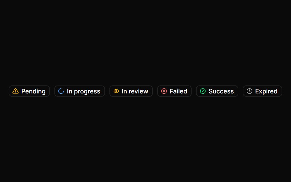 BadgeHextaUI · ReactStatus labels with colored dots, removable tags that slide closed and counts that roll to their new value.
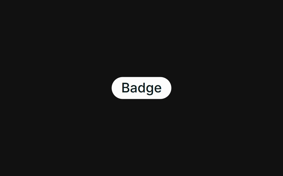 BasicFLX UI · ReactA single default badge.
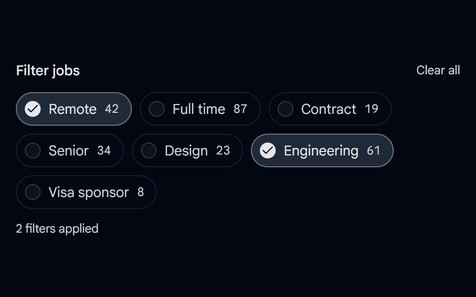 Checkbox 12 - Filter ChipsShadcn Space · ReactPill shaped checkbox chips for filtering with result counts, a checked style, and a clear all action.
 ChatGPT Source ChipNotra · ReactAn inline citation pill with a hover card.
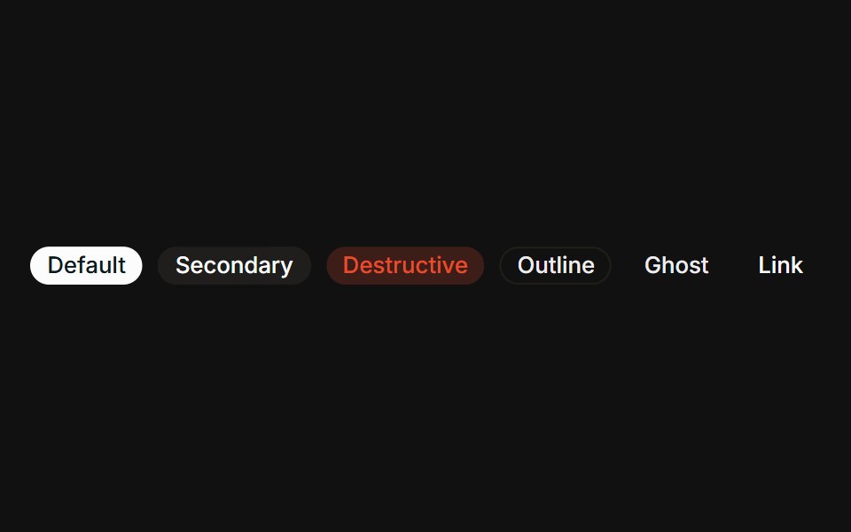 VariantsFLX UI · ReactAll six variants side-by-side: default, secondary, destructive, outline, ghost, link.
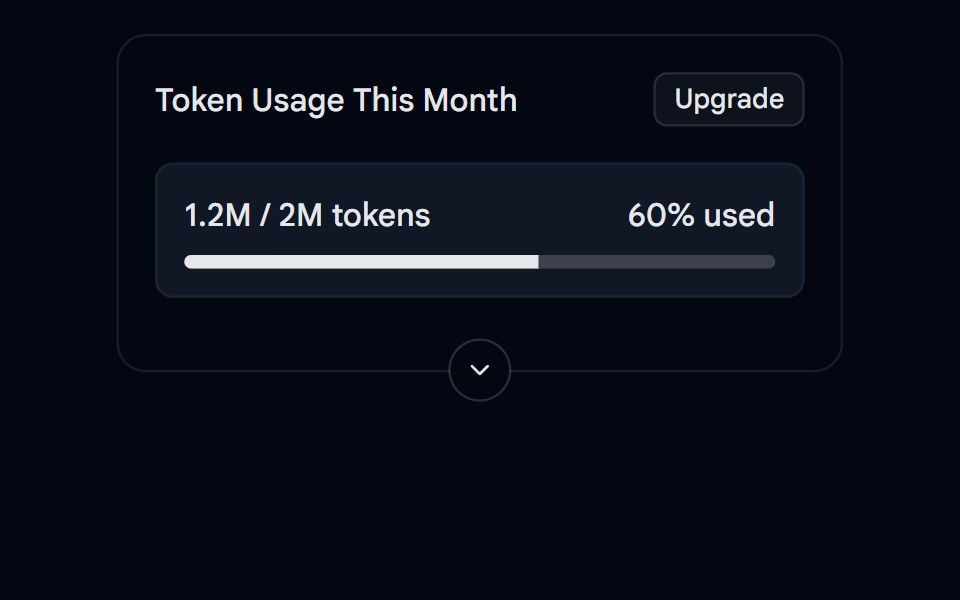 Collapsible 05 - Token UsageShadcn Space · ReactA collapsible usage card with a progress bar, summary and details.
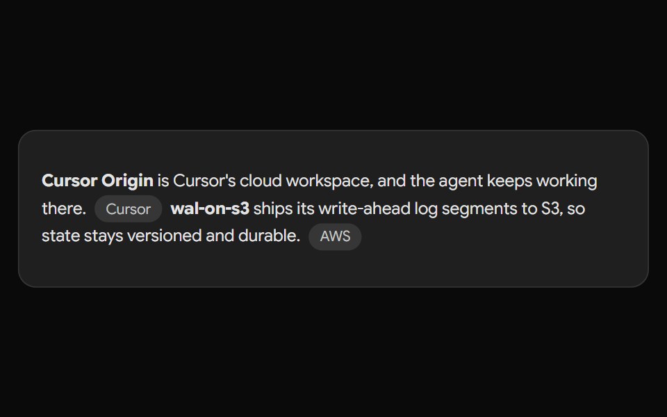 Gemini Source ChipNotra · ReactAn inline source pill with a hover card.
 With iconFLX UI · ReactLeading verified icon before the label.
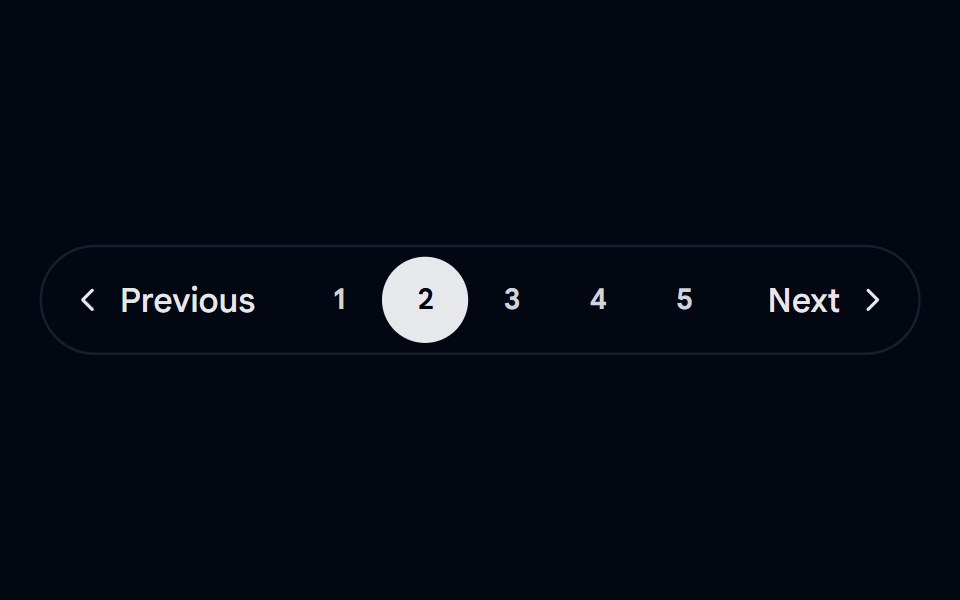 Pagination 01 - Floating PillShadcn Space · ReactA floating pill-style pagination with smooth morphing animations.
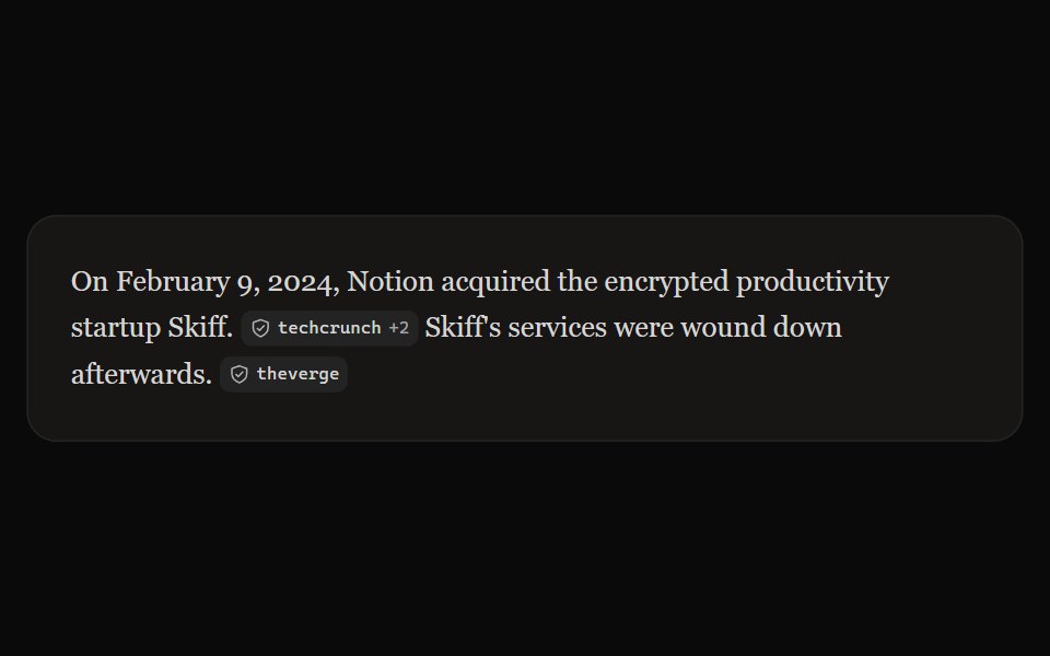 Perplexity CitationNotra · ReactAn inline source pill with favicon, label and +N count, built on shadcn Badge.
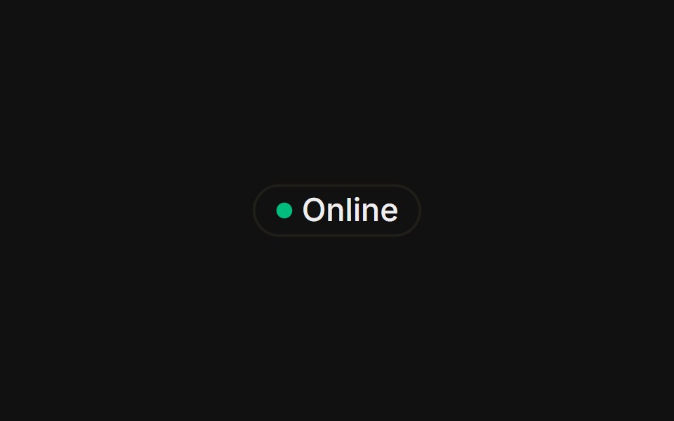 With status dotFLX UI · ReactA colored presence dot beside an outline label.
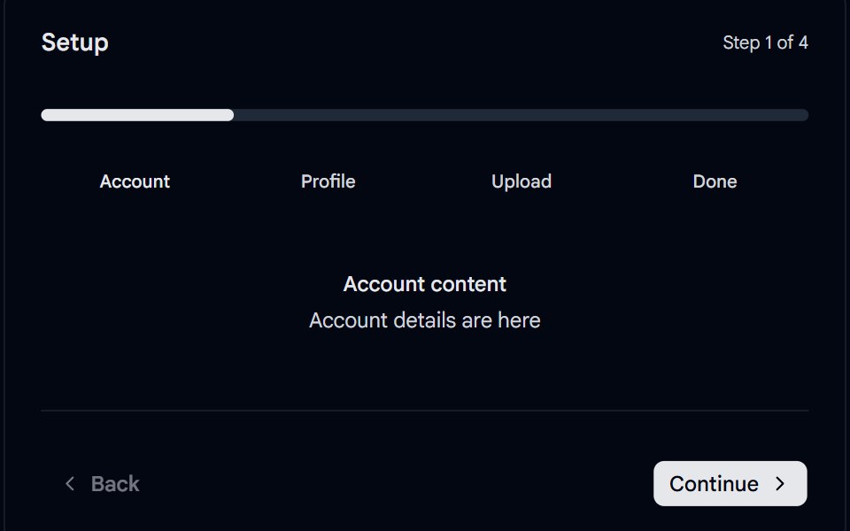 Stepper 04 - Segmented Progress PillShadcn Space · ReactMinimal segmented stepper with a spring-animated progress pill sliding across rounded segments, clickable step labels…
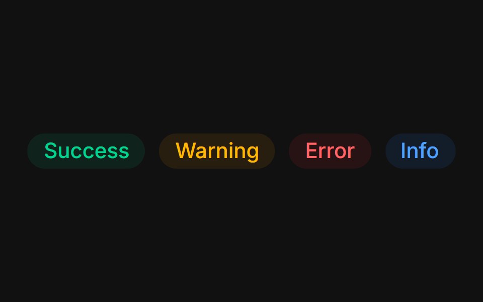 Status colorsFLX UI · ReactTinted success, warning, error, and info states.
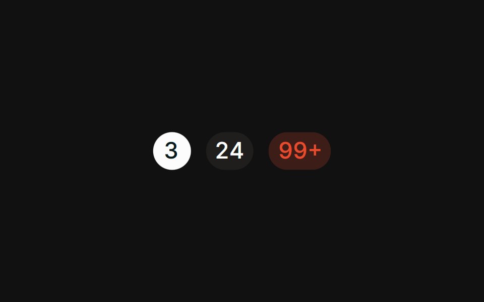 CountFLX UI · ReactPill-shaped numeric counts with tabular figures.
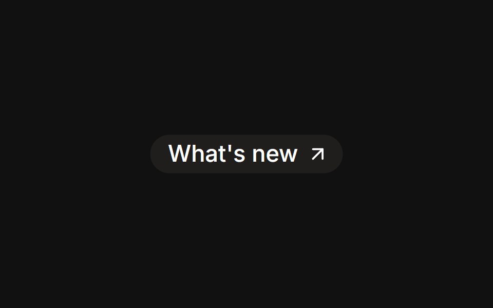 As linkFLX UI · Reactrender prop renders the badge as an anchor with a trailing icon.
 RemovableFLX UI · ReactDismissible tag chips with a trailing remove button.
 With avatarFLX UI · ReactAssignee chip with a leading avatar inside the badge.
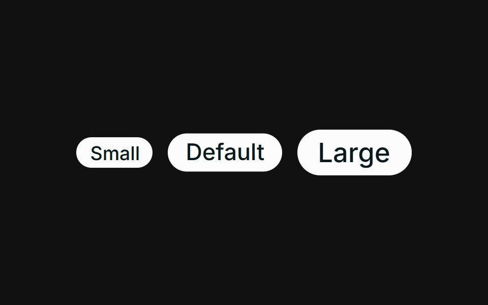 SizesFLX UI · ReactSmall, default, and large sizes via className.
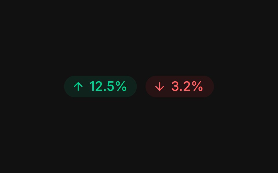 Trend deltaFLX UI · ReactUp and down arrows with tinted gain / loss percentages.
 Icon onlyFLX UI · ReactRound icon-only badges across variants.
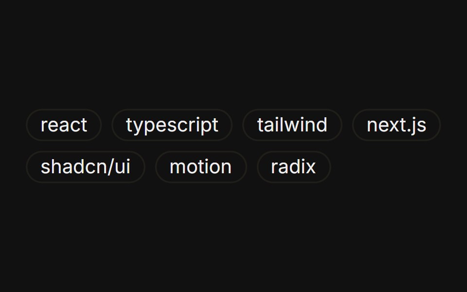 Tag listFLX UI · ReactA wrapping group of outline badges as tags.
Libraries with shadcn/ui chip components
Related categories
- Chip Components
- React Chip Components
- Tailwind CSS Chip Components
- Animated Chip Components
- shadcn/ui Feedback Components
- shadcn/ui Badge Components
- shadcn/ui Alert Components
- shadcn/ui Banner Components
- shadcn/ui Spinner Components
- shadcn/ui Skeleton Components
- shadcn/ui Progress Components
- shadcn/ui Empty State Components
- shadcn/ui Notification Components
- shadcn/ui Status Indicator Components
- shadcn/ui Progress Bar Components
- shadcn/ui Error State Components
- shadcn/ui Typing Indicator Components