 Dev Design Library
shadcn/ui Alert Components
Dev Design Library indexes 63 shadcn/ui alert components from 6 open-source UI libraries, with the most coming from Watermelon UI, Shadcn Space, FLX UI, Spectrum UI and Fluid Functionalism. Each one links to its page with the source code, a live preview where available, the library license and the install command. They follow the shadcn/ui conventions, so most install with the shadcn CLI and drop into a Tailwind project. Alert components belong to the Feedback group.
 Alert demoSpectrum UI · Reactcomponent for the alert-demo
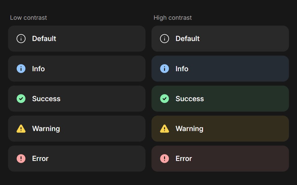 BannerFluid Functionalism · ReactStatus message built from parts (Banner, BannerTitle, BannerDescription, BannerActions, BannerAction): 5 statuses…
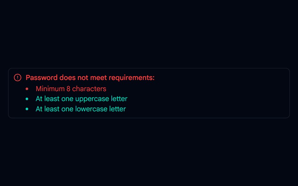 Alert-01 - Alert with Password DetailShadcn Space · ReactAlert component
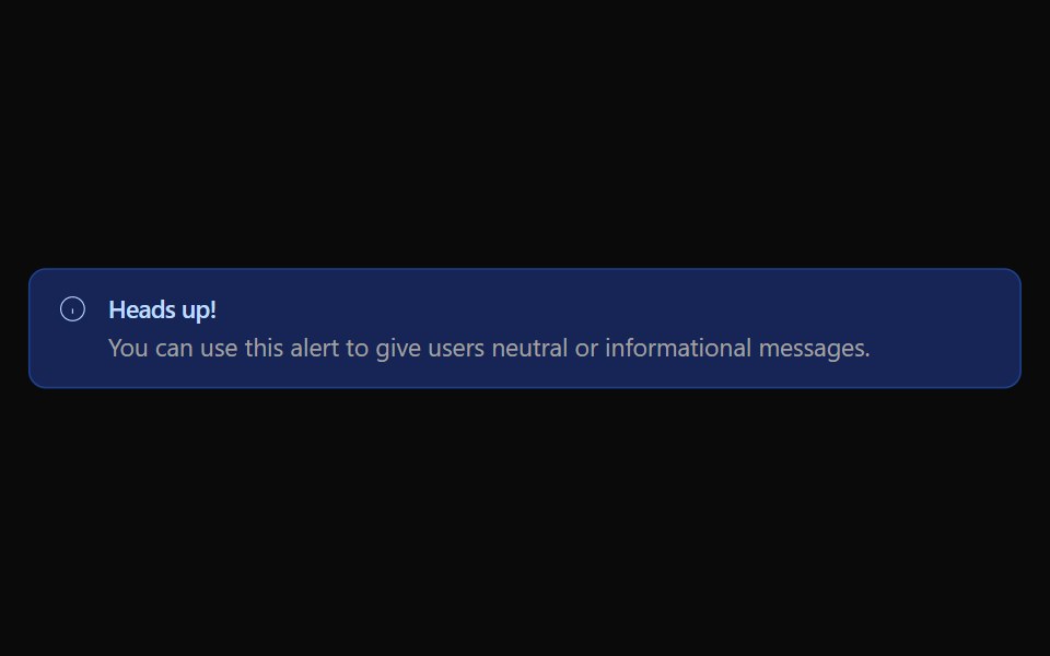 Alert 01Watermelon UI · React
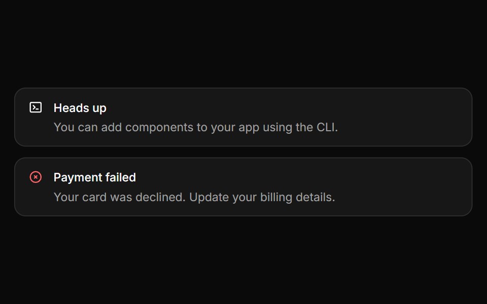 AlertHextaUI · ReactInline messages for status and feedback, with a neutral surface, a colored icon and a dismiss that collapses smoothly.
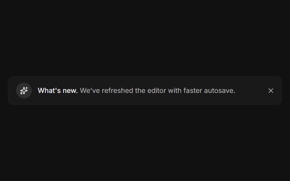 DismissibleFLX UI · ReactA close button hides the banner with a restore link.
 Alert 2Spectrum UI · Reactcomponent for the alert-2
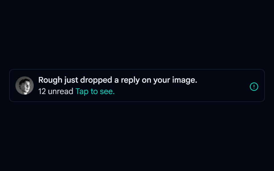 Alert-02 - Alert with User DetailShadcn Space · ReactAlert component
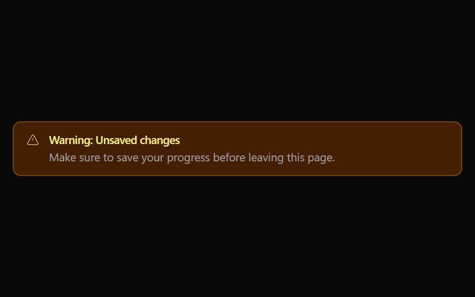 Alert 02Watermelon UI · React
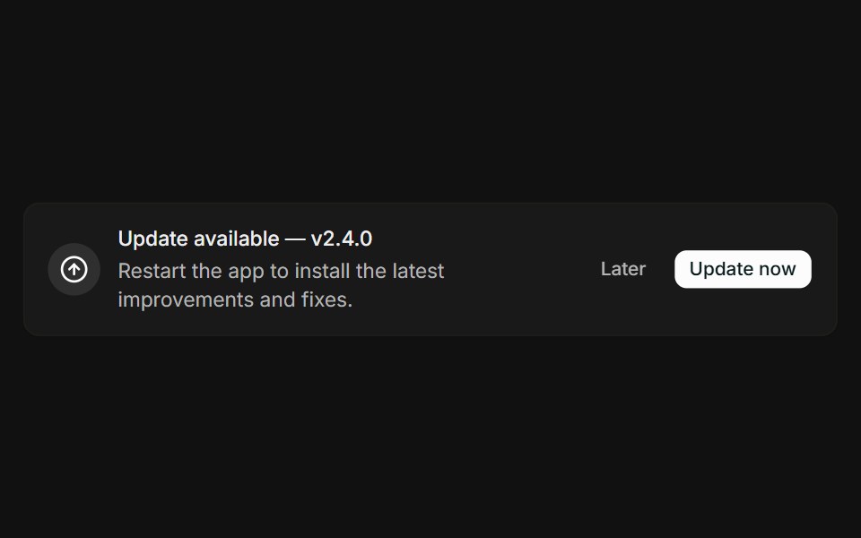 With actionsFLX UI · ReactMessage paired with Later and Update now buttons.
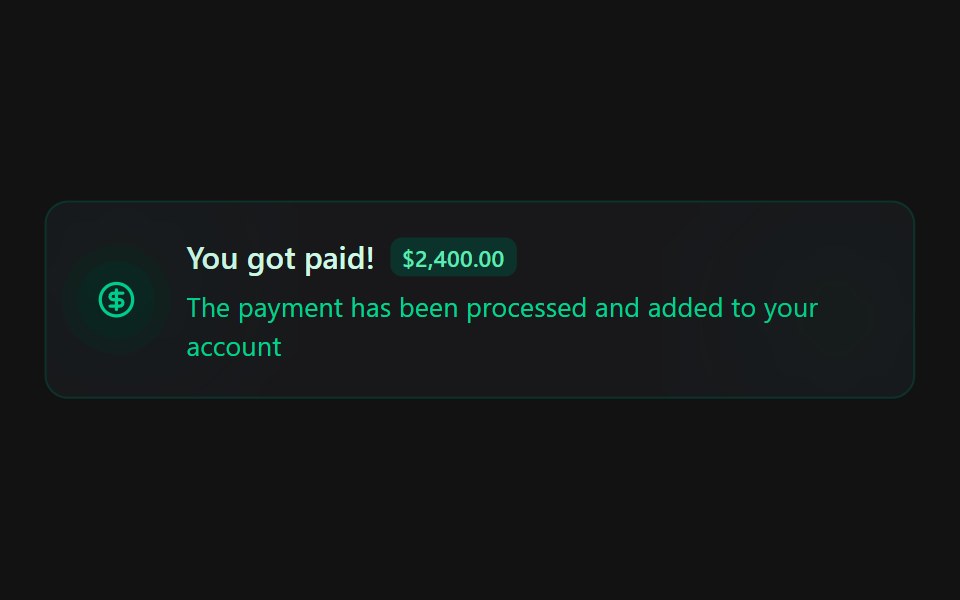 Alert 4Spectrum UI · Reactcomponent for the alert-4
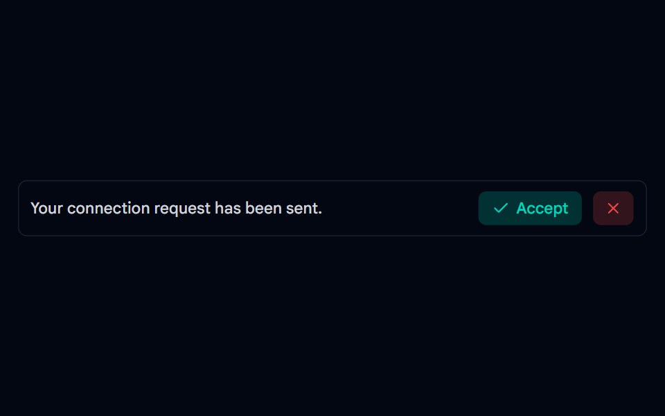 Alert-03 - Social AlertShadcn Space · ReactAlert component
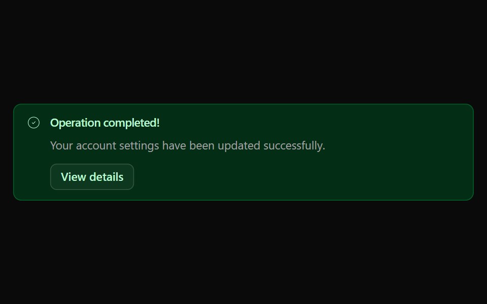 Alert 03Watermelon UI · React
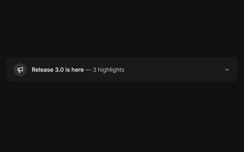 ExpandableFLX UI · ReactCollapsible release notes that reveal highlights.
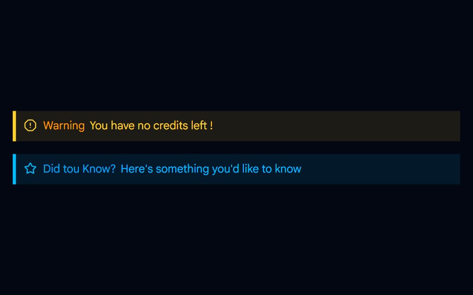 Alert-04 - Indicator Destructive AlertShadcn Space · ReactAlert component
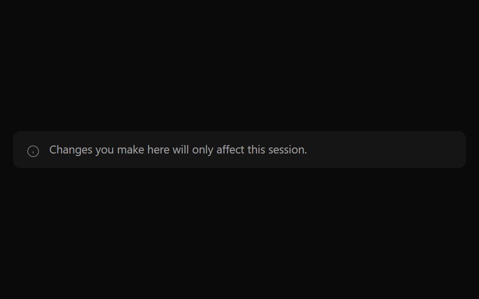 Alert 04Watermelon UI · React
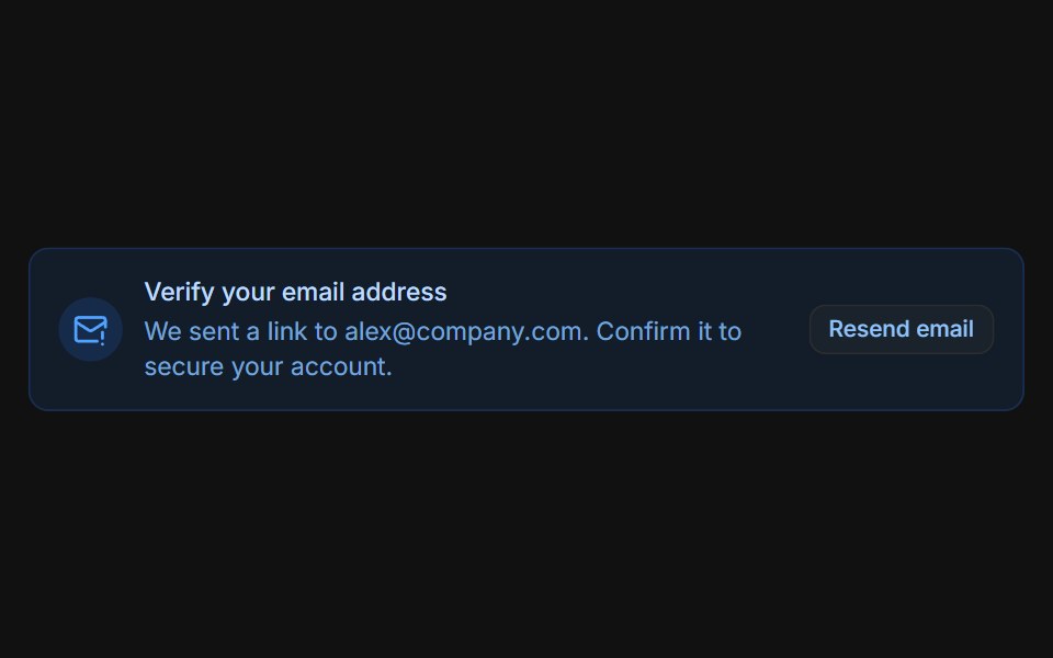 Email verificationFLX UI · ReactBlue prompt with a Resend email button that switches to a sent confirmation.
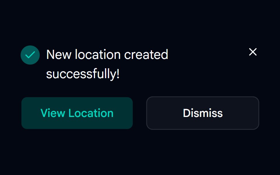 Alert-05 - Dark AlertShadcn Space · ReactAlert component
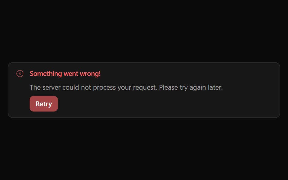 Alert 05Watermelon UI · React
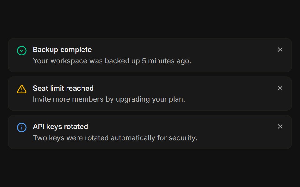 StackedFLX UI · ReactA list of dismissible notices, each removed on its own.
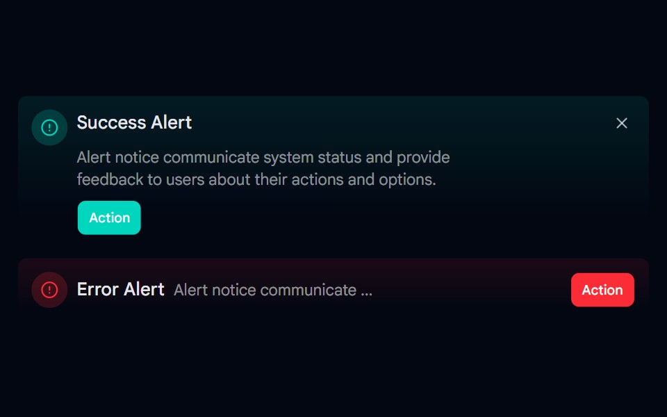 Alert-06 - Gradient AlertShadcn Space · ReactAlert component
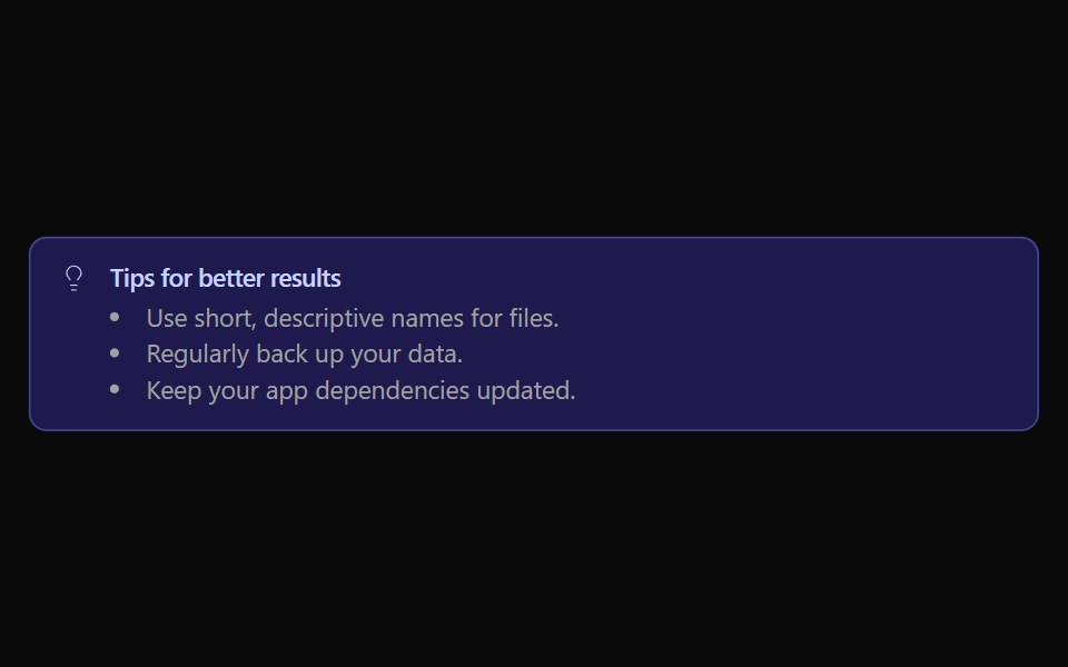 Alert 06Watermelon UI · React
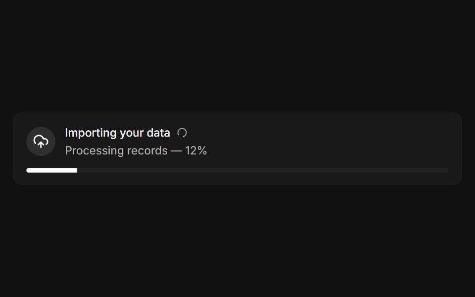 With progressFLX UI · ReactLive import banner with a spinner and a progress bar.
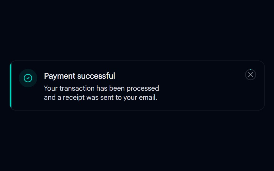 Alert 07 - With Hover-Fill DismissShadcn Space · ReactToast-style alert with a spring entrance, icon pop-in, and a close button whose ring fills in on hover, built with…
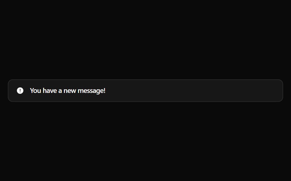 Alert 1Watermelon UI · React
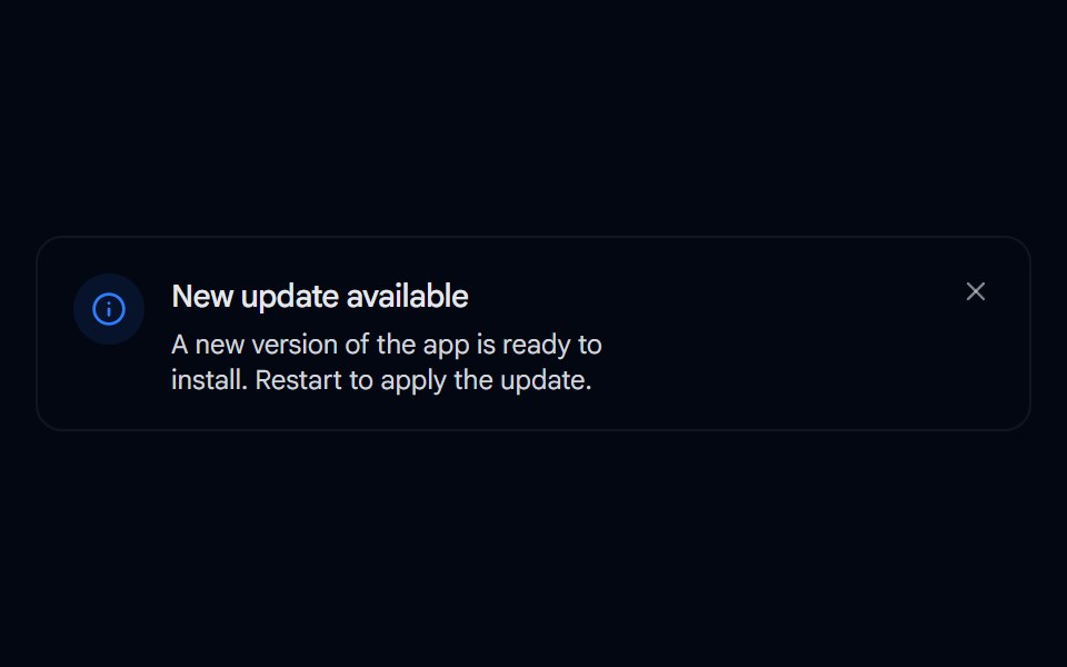 Alert 08 - Evaporate DismissShadcn Space · ReactAlert that dissolves away like evaporating water when dismissed, fading and blurring out with rising vapor wisps…
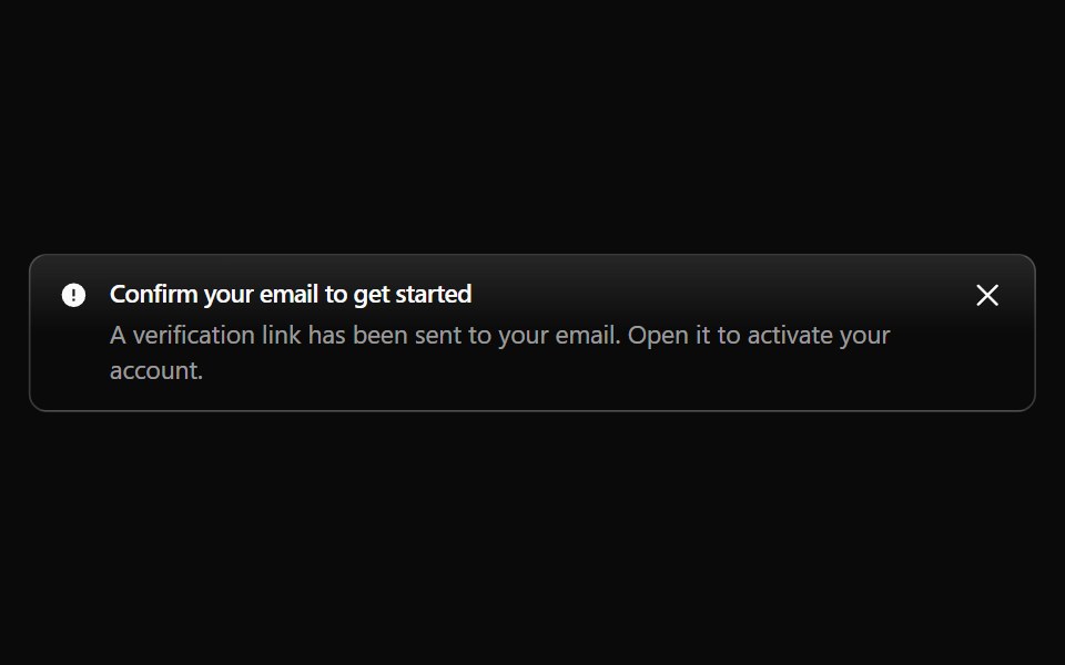 Alert 10Watermelon UI · React
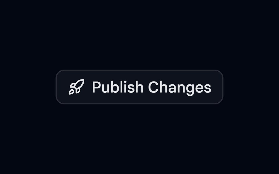 Alert 09 - Publish ConfirmationShadcn Space · ReactAlert dialog that slides up to confirm publishing, with a rocket icon, a change summary, and full width actions
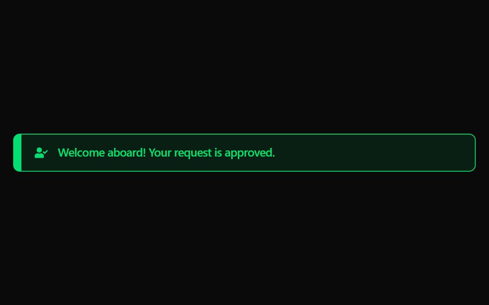 Alert 11Watermelon UI · React
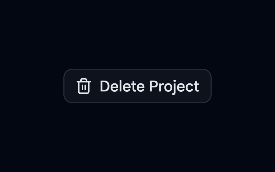 Alert 10 - Two Step DeleteShadcn Space · ReactDestructive alert dialog that lists what will be removed and needs a second click on delete to confirm
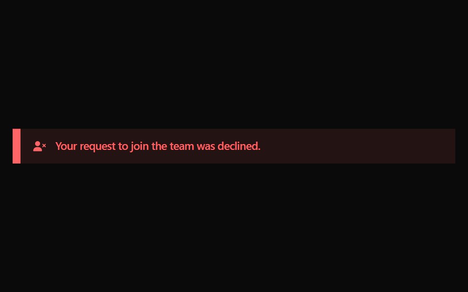 Alert 12Watermelon UI · React
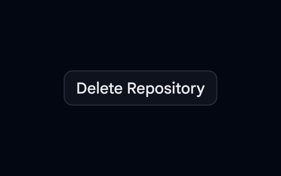 Alert 12 - Type to ConfirmShadcn Space · ReactDelete repository dialog with an impact callout that unlocks the delete action once the user types the repository name
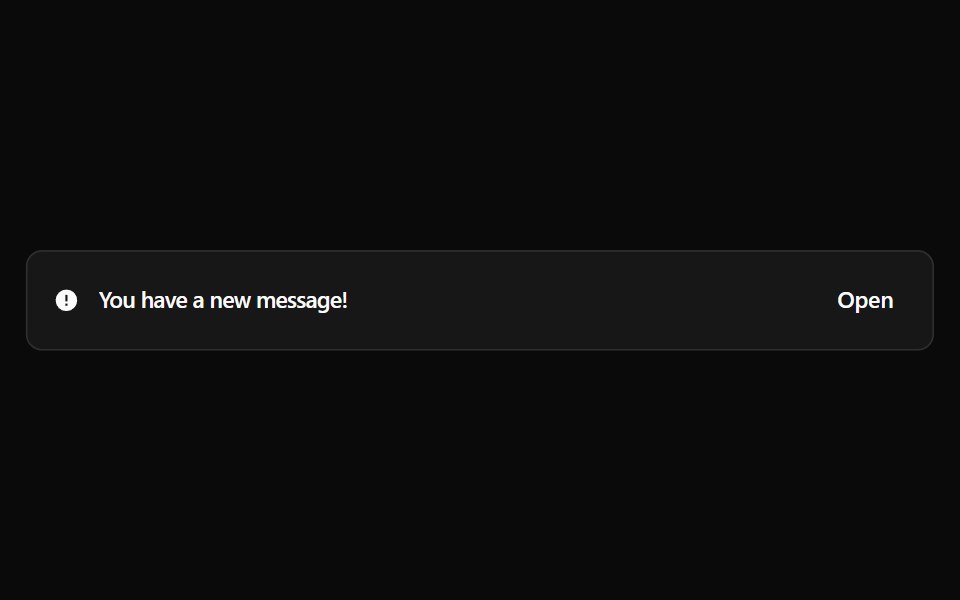 Alert 13Watermelon UI · React
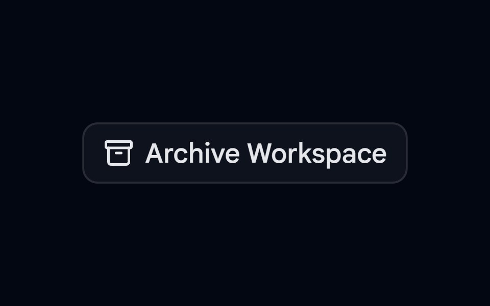 Alert 13 - Async with SuccessShadcn Space · ReactArchive dialog that moves from confirm to a loading spinner to a success state, and cannot be closed while the action…
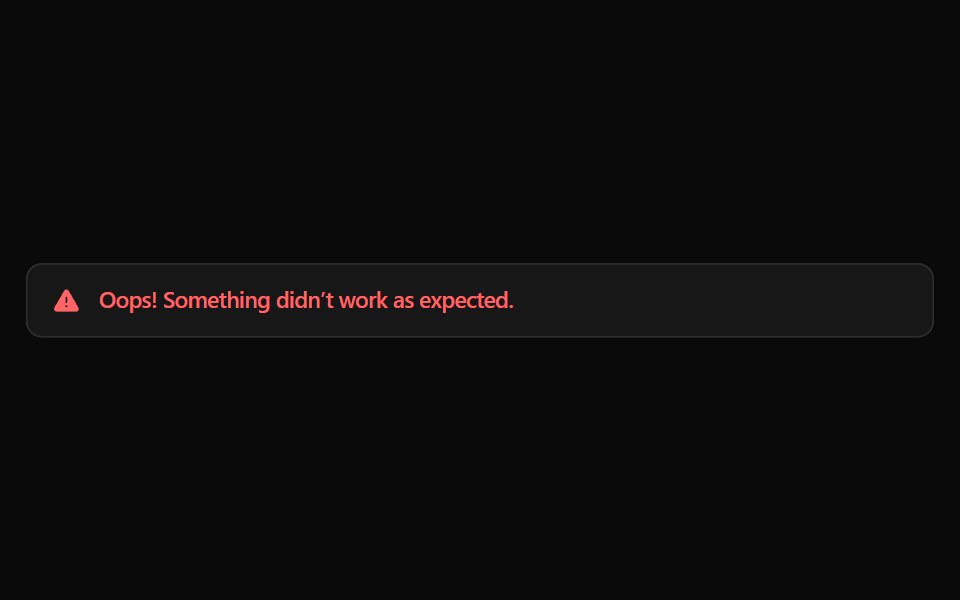 Alert 14Watermelon UI · React
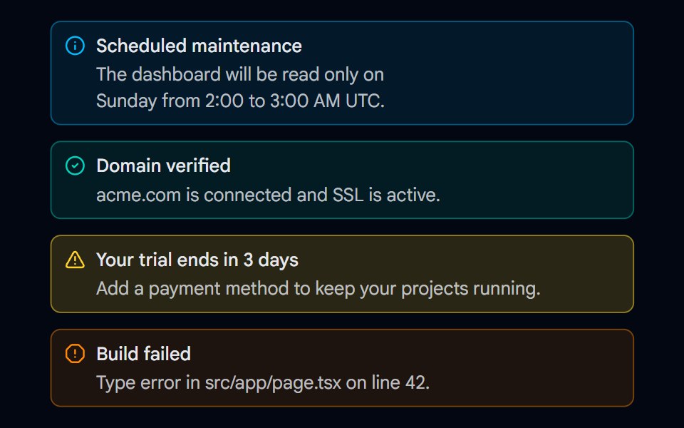 Alert 15 - Semantic VariantsShadcn Space · ReactInfo, success, warning, and error alerts with matching icons, tinted backgrounds, and borders that work in light and…
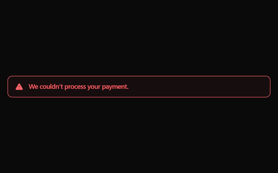 Alert 15Watermelon UI · React
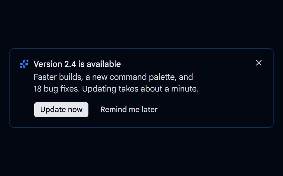 Alert 16 - Update AvailableShadcn Space · ReactDismissible update alert with Update now and Remind me later actions, a loading state while updating, and a way to…
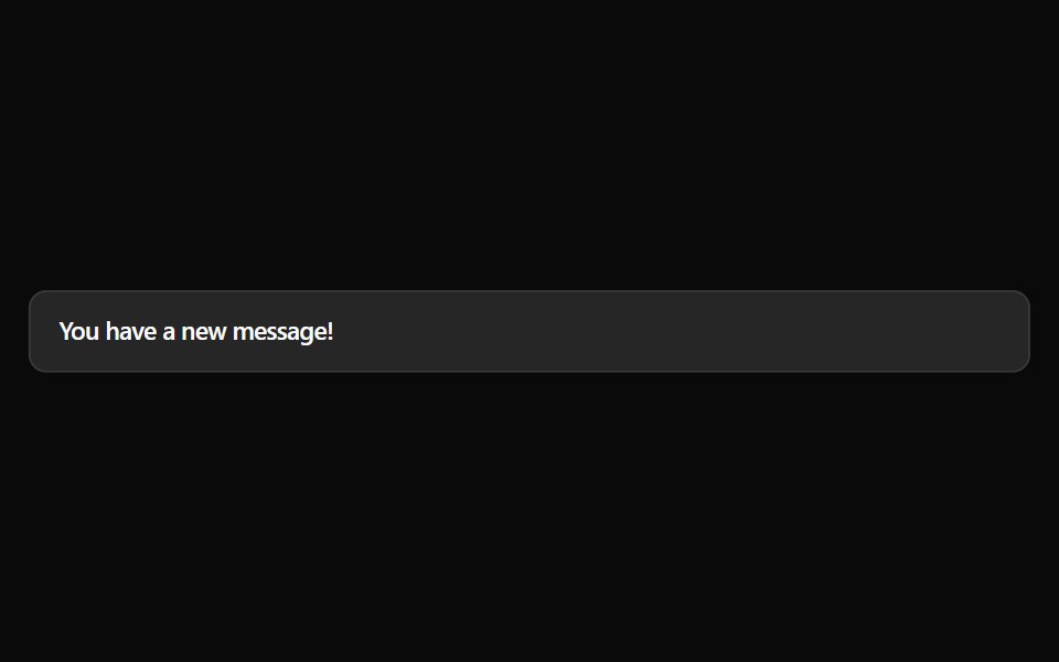 Alert 16Watermelon UI · React
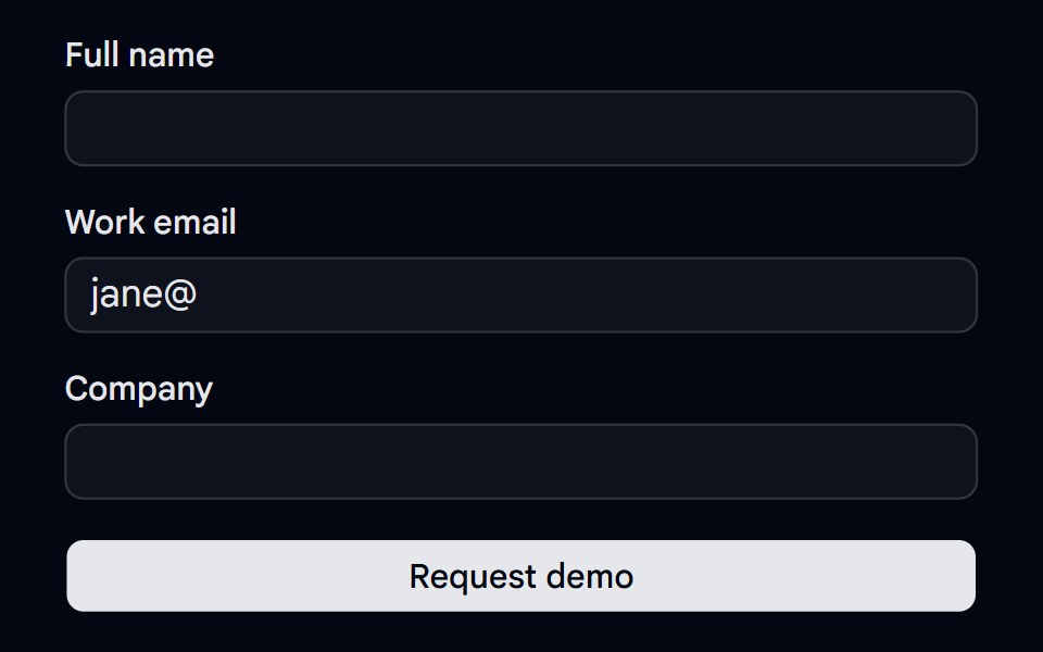 Alert 18 - Form Error SummaryShadcn Space · ReactForm error summary alert that lists every invalid field with links that focus it, receives focus on submit, and clears…
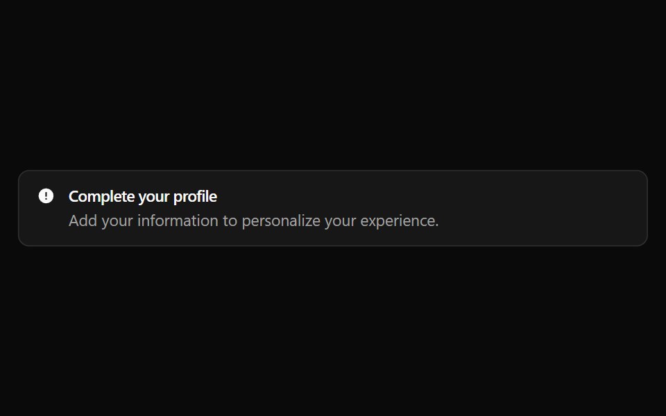 Alert 17Watermelon UI · React
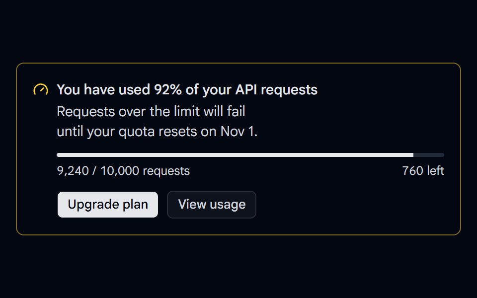 Alert 19 - Usage LimitShadcn Space · ReactUsage warning alert with a quota progress bar, used and remaining counts, a reset date, and Upgrade plan and View…
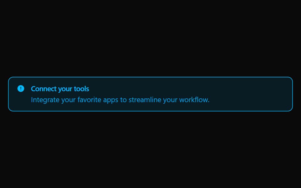 Alert 18Watermelon UI · React
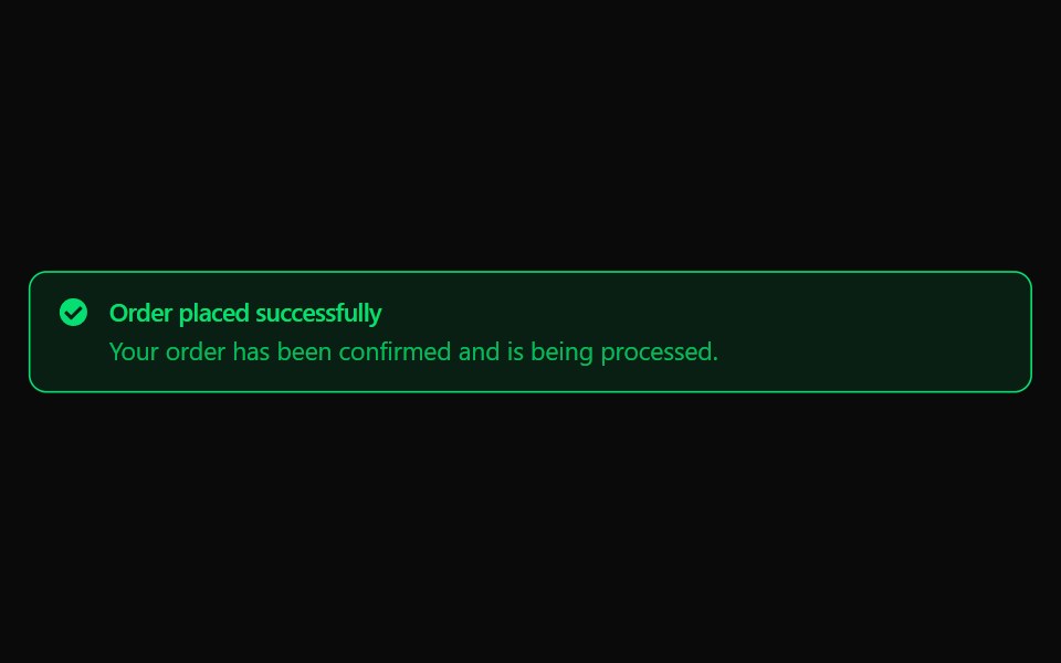 Alert 19Watermelon UI · React
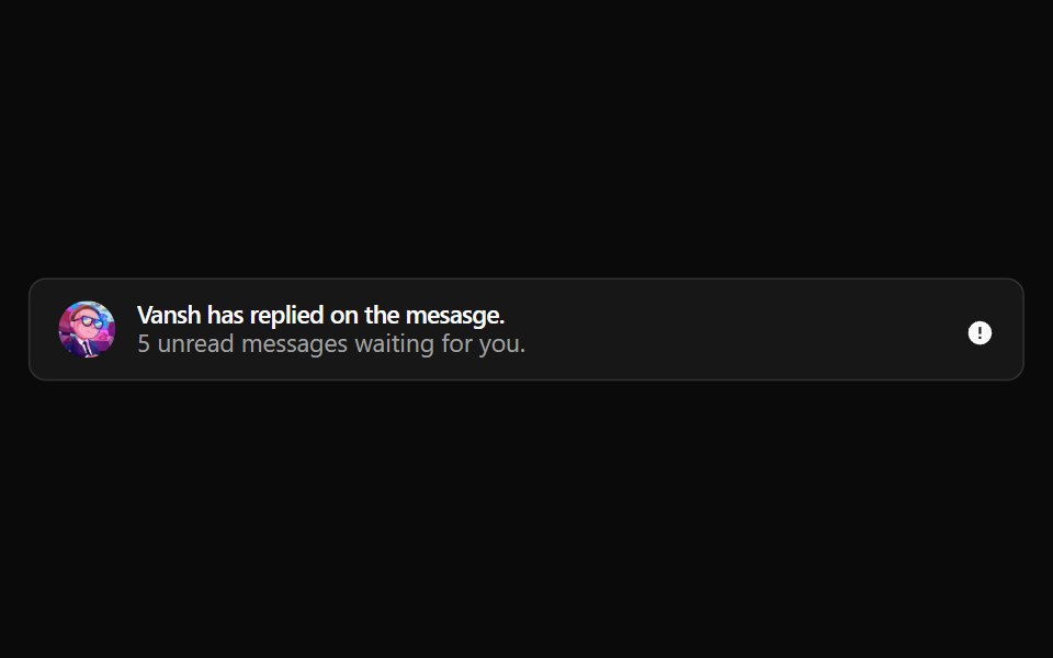 Alert 2Watermelon UI · React
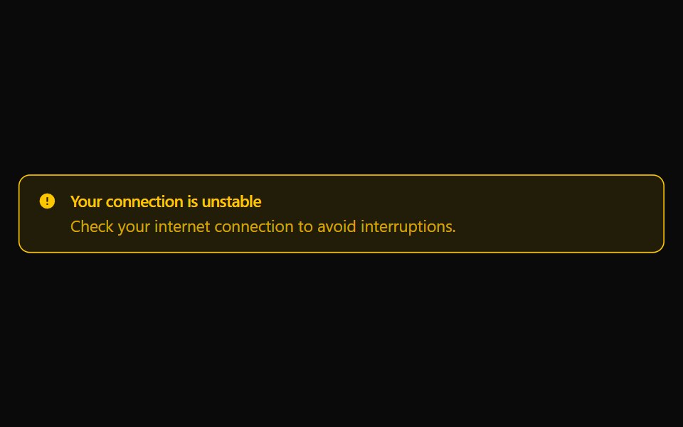 Alert 20Watermelon UI · React
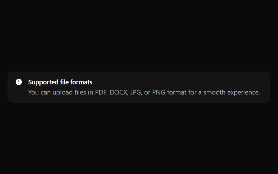 Alert 21Watermelon UI · React
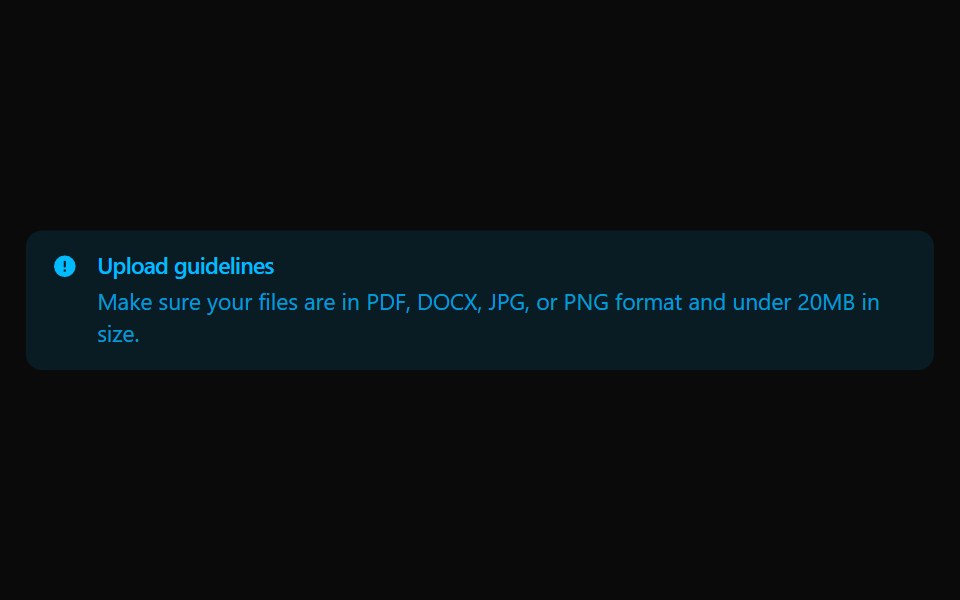 Alert 22Watermelon UI · React
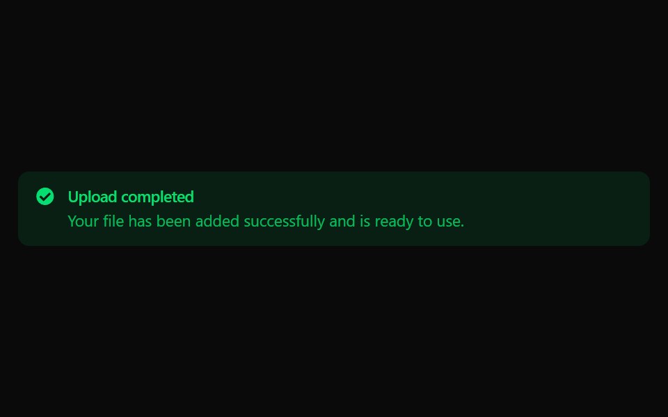 Alert 23Watermelon UI · React
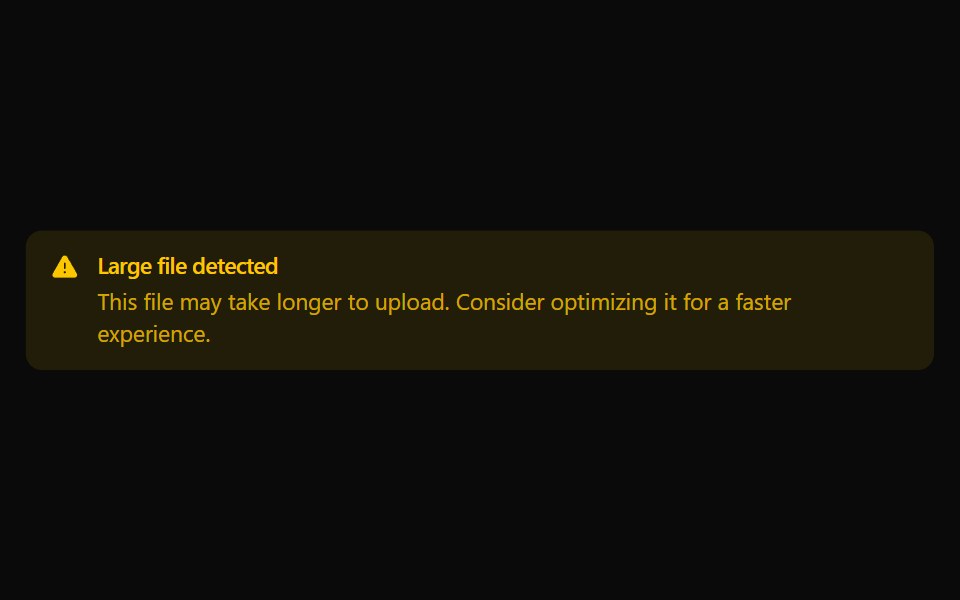 Alert 24Watermelon UI · React
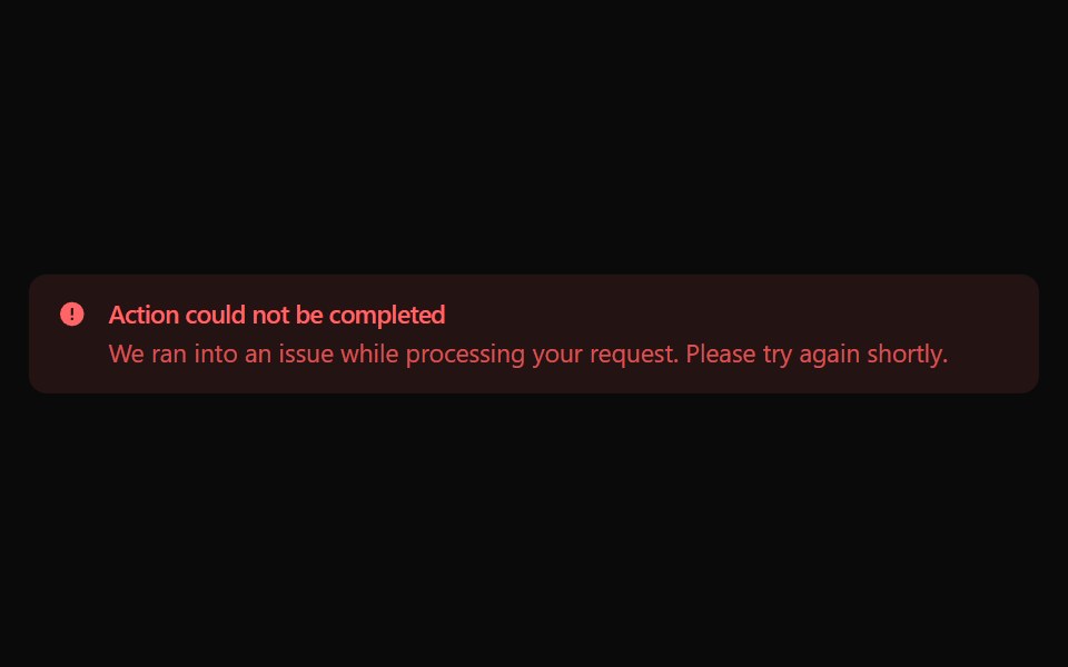 Alert 25Watermelon UI · React
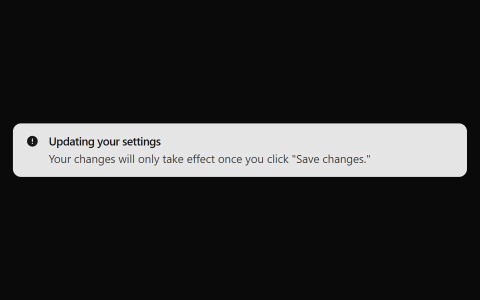 Alert 26Watermelon UI · React
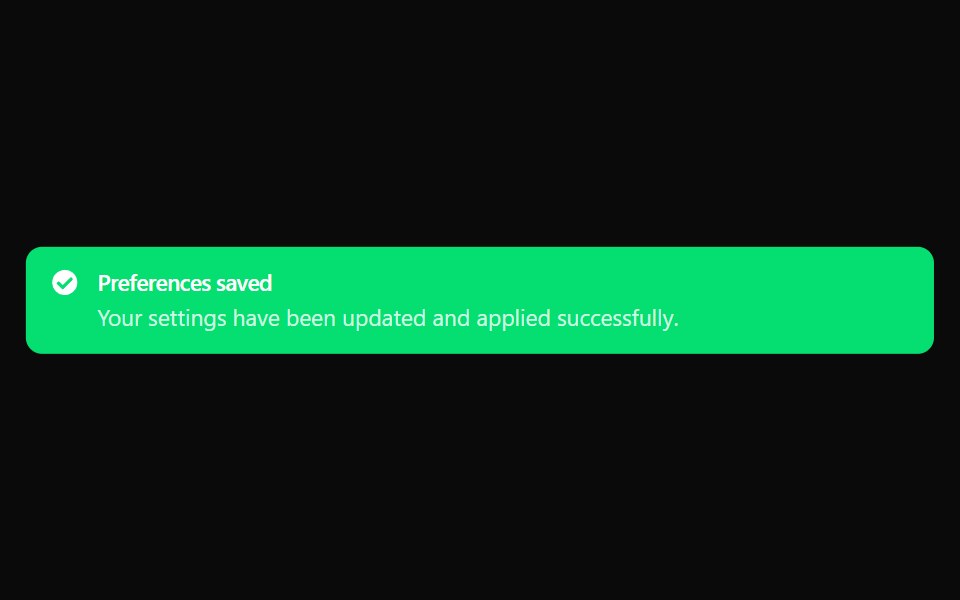 Alert 27Watermelon UI · React
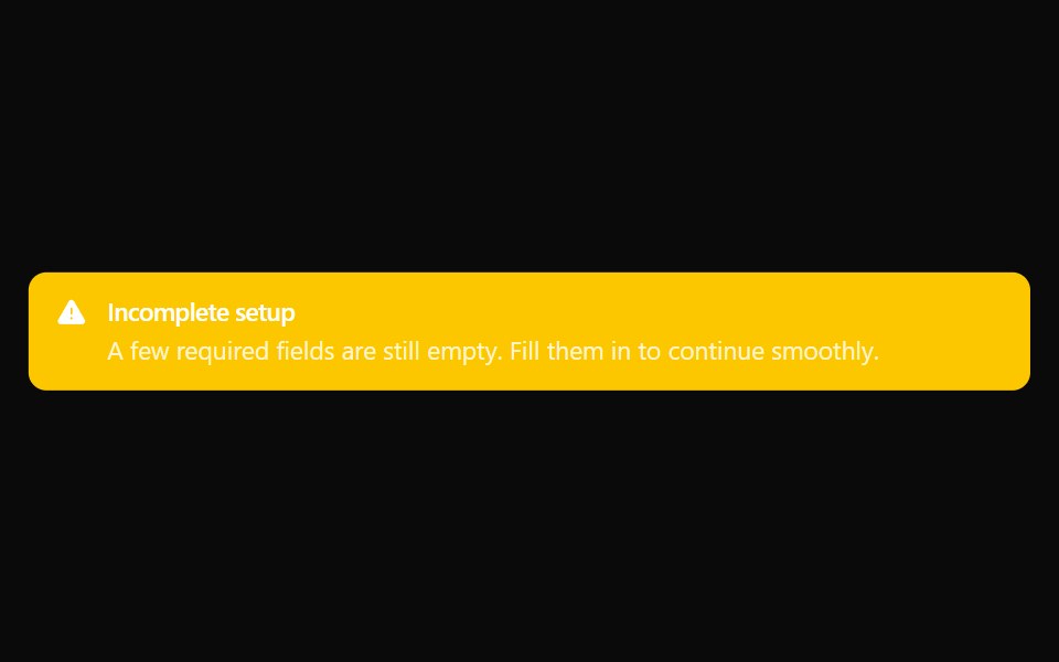 Alert 28Watermelon UI · React
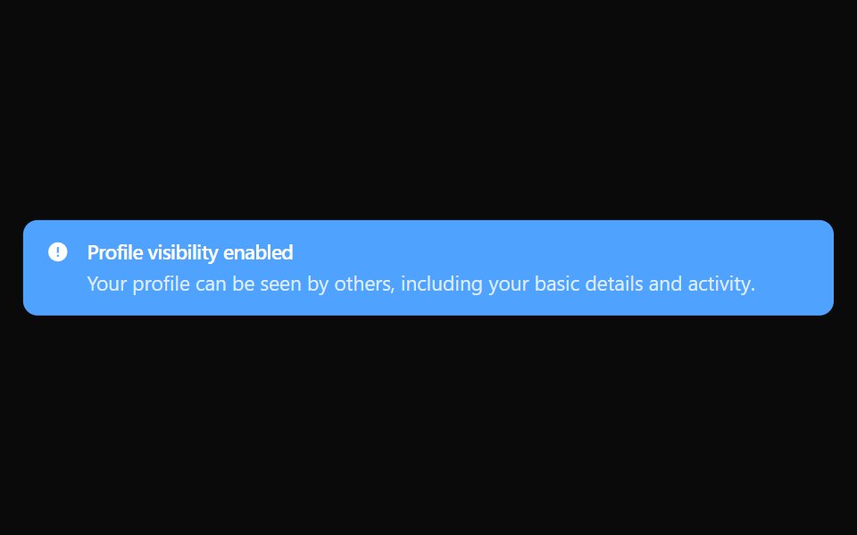 Alert 29Watermelon UI · React
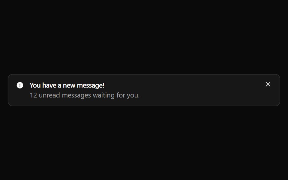 Alert 3Watermelon UI · React
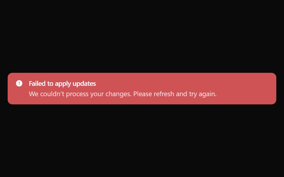 Alert 30Watermelon UI · React
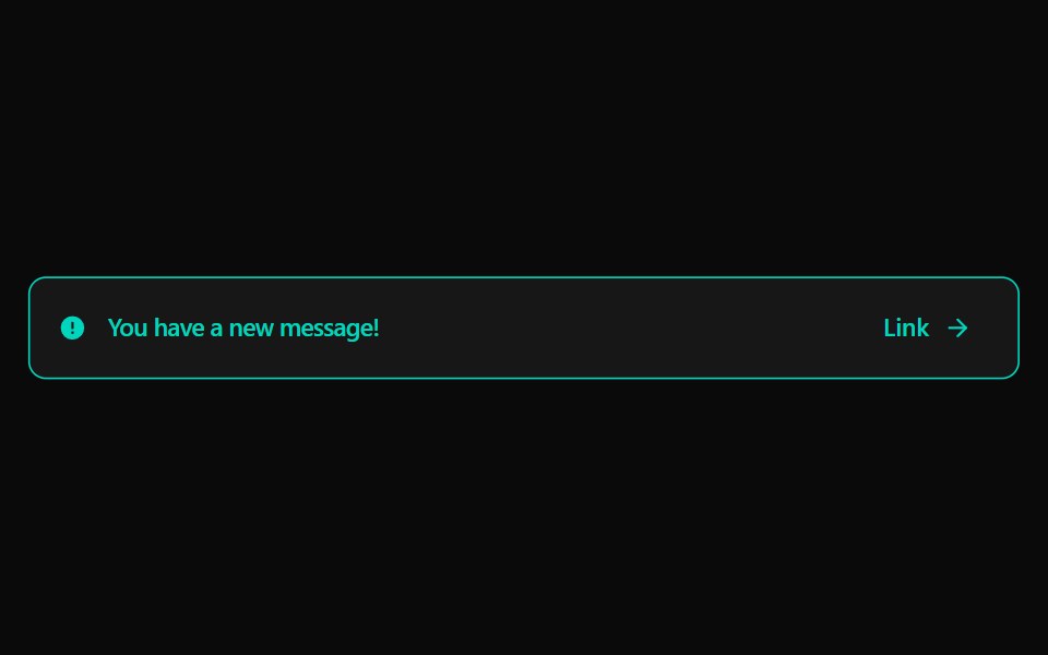 Alert 4Watermelon UI · React
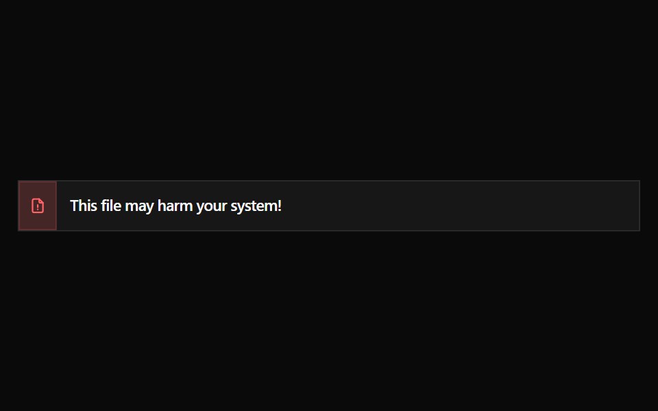 Alert 5Watermelon UI · React
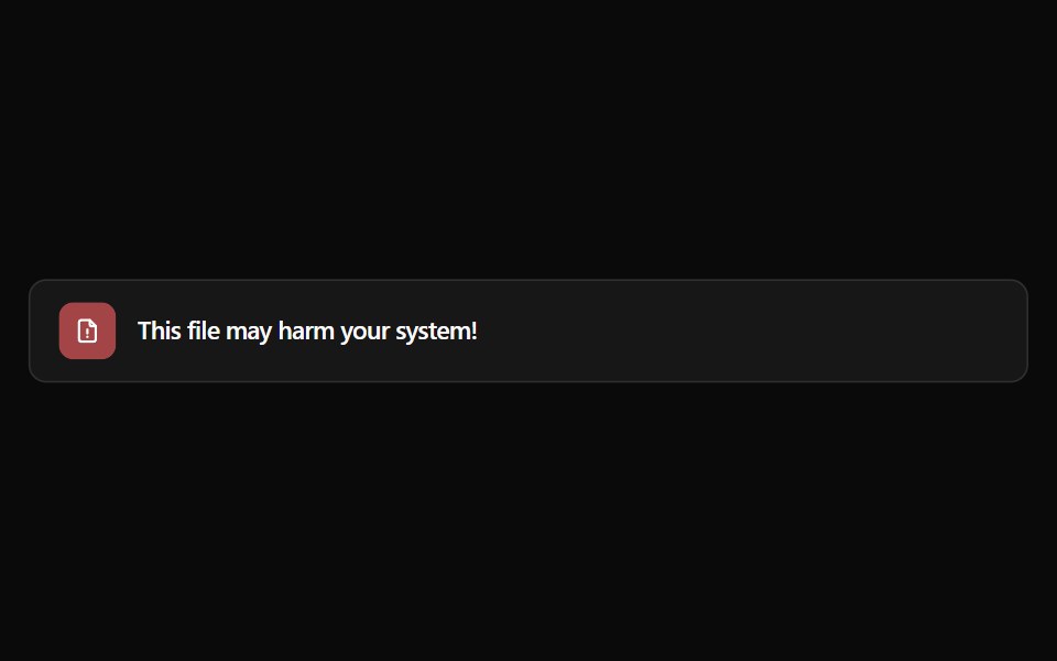 Alert 6Watermelon UI · React
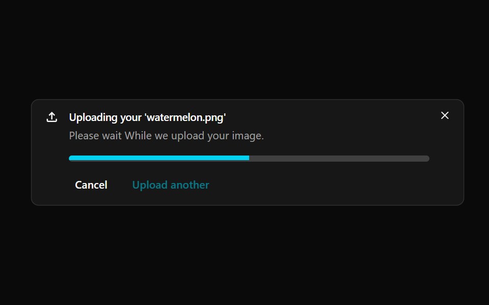 Alert 7Watermelon UI · React
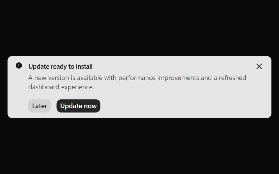 Alert 8Watermelon UI · React
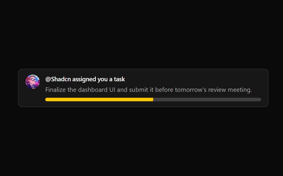 Alert 9Watermelon UI · React
Libraries with shadcn/ui alert components
Related categories
- Alert Components
- React Alert Components
- Tailwind CSS Alert Components
- Animated Alert Components
- shadcn/ui Feedback Components
- shadcn/ui Badge Components
- shadcn/ui Banner Components
- shadcn/ui Chip Components
- shadcn/ui Spinner Components
- shadcn/ui Skeleton Components
- shadcn/ui Progress Components
- shadcn/ui Empty State Components
- shadcn/ui Notification Components
- shadcn/ui Status Indicator Components
- shadcn/ui Progress Bar Components
- shadcn/ui Error State Components
- shadcn/ui Typing Indicator Components