 Dev Design Library
shadcn/ui Progress Bar Components
Dev Design Library indexes 12 shadcn/ui progress bar components from 6 open-source UI libraries, with the most coming from audiocn, sv-particles, Cult UI, Spectrum UI and Cojeev UI. Each one links to its page with the source code, a live preview where available, the library license and the install command. They follow the shadcn/ui conventions, so most install with the shadcn CLI and drop into a Tailwind project. Progress bar components belong to the Feedback group.
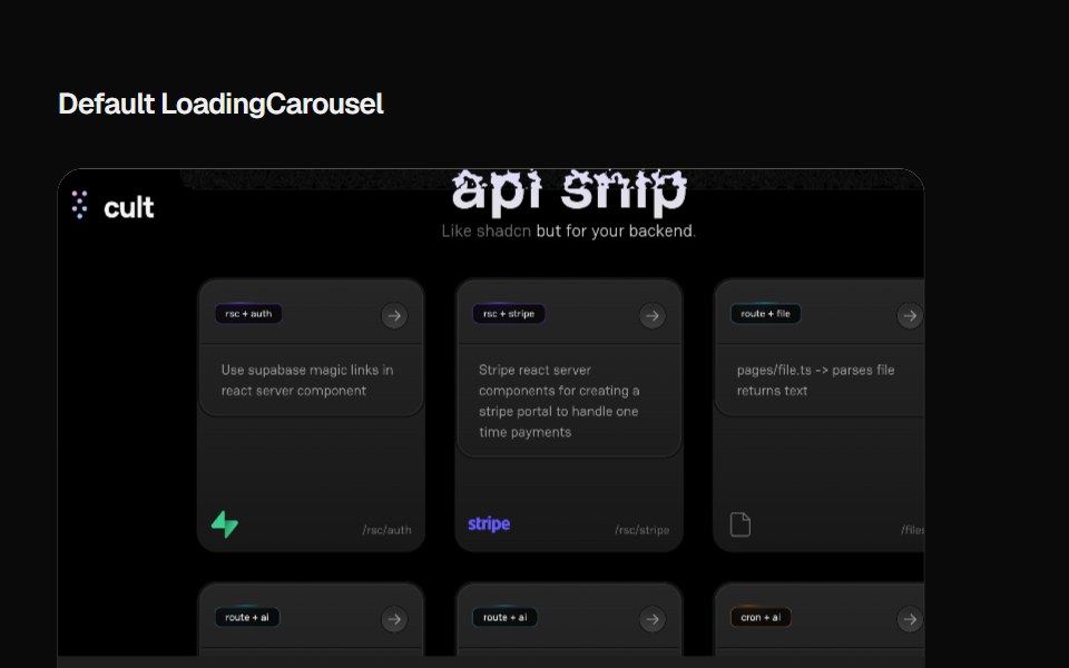 Loading CarouselCult UI · ReactLoading carousel component with smooth transitions and customizable content
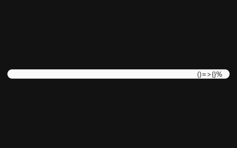 Progress With ValueSpectrum UI · Reactcomponent for the Progress With Value
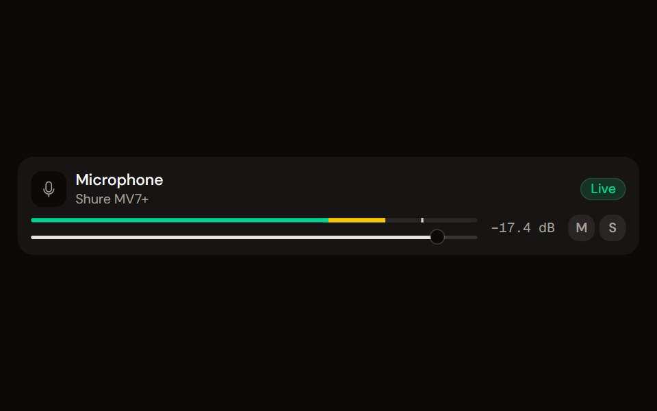 Channel Stripaudiocn · ReactOne channel of a mixer: header, status, meter, fader, value, controls and a notice, as a row or a console strip. The…
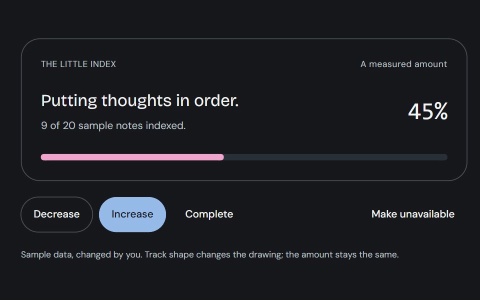 ProgressCojeev UI · ReactOne measured amount, explained as an inline task, a small report or connected milestones—with independent organic…
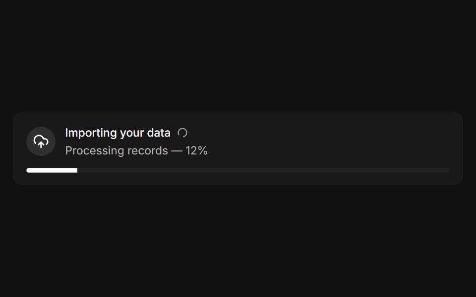 With progressFLX UI · ReactLive import banner with a spinner and a progress bar.
 Password Input With Strength Indicatorsv-particles · Svelte
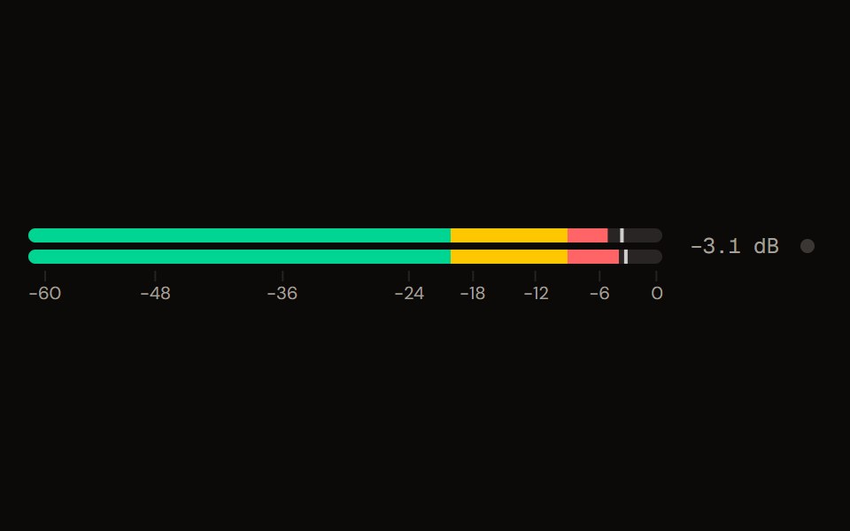 Level Meteraudiocn · ReactA peak and RMS level meter: mono or stereo, horizontal or vertical, solid, segmented or gradient, with zones, peak…
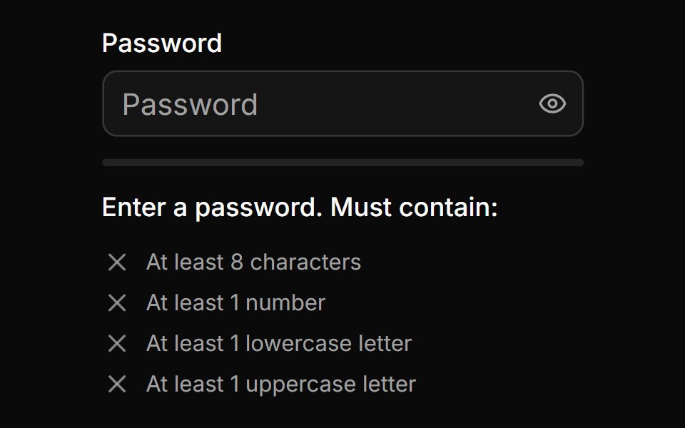 Password Input With Strength Inidicatorsv-particles · Svelte
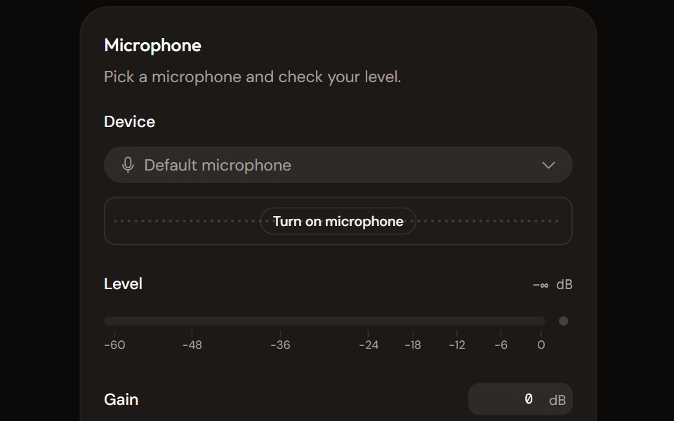 Microphone Setupaudiocn · ReactChoose and check a microphone: device select with a live preview, a level meter, gain, mute and a level check that…
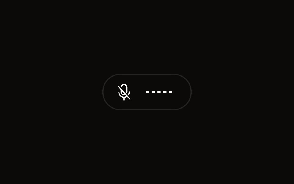 Quick Audio Popoveraudiocn · ReactCompact microphone and system audio controls behind one toolbar button that shows a live level.
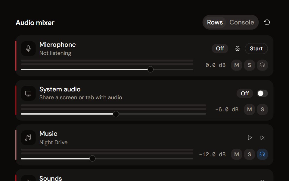 System Audio Mixeraudiocn · ReactThe complete mixer: microphone, system audio, music and sound pads with meters, faders, mute, solo, monitor and…
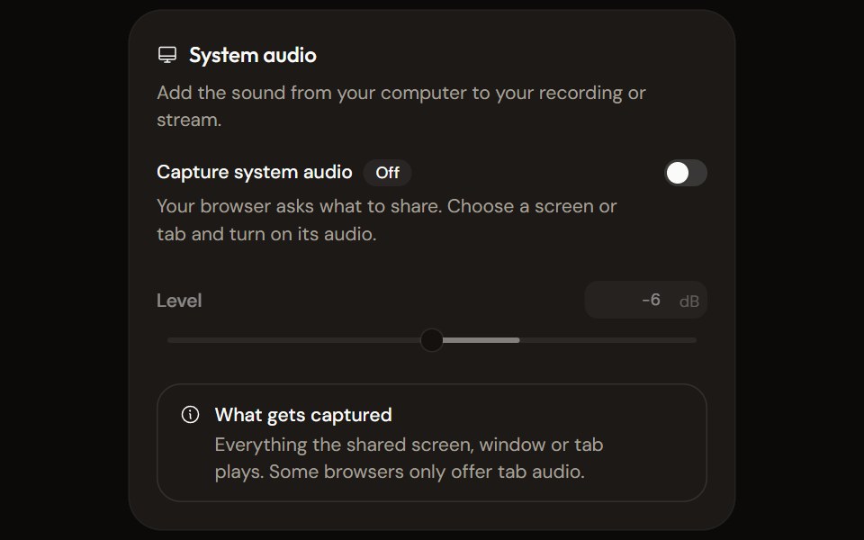 System Audio Settingsaudiocn · ReactTurn system audio capture on, set its level, watch its meter and explain what the browser will capture.
Libraries with shadcn/ui progress bar components
Related categories
- Progress Bar Components
- React Progress Bar Components
- Tailwind CSS Progress Bar Components
- Animated Progress Bar Components
- shadcn/ui Feedback Components
- shadcn/ui Badge Components
- shadcn/ui Alert Components
- shadcn/ui Banner Components
- shadcn/ui Chip Components
- shadcn/ui Spinner Components
- shadcn/ui Skeleton Components
- shadcn/ui Progress Components
- shadcn/ui Empty State Components
- shadcn/ui Notification Components
- shadcn/ui Status Indicator Components
- shadcn/ui Error State Components
- shadcn/ui Typing Indicator Components