 Dev Design Library
shadcn/ui Badge Components
Dev Design Library indexes 82 shadcn/ui badge components from 8 open-source UI libraries, with the most coming from Watermelon UI, Shadcn Space, FLX UI, sv-particles and Cult UI. Each one links to its page with the source code, a live preview where available, the library license and the install command. They follow the shadcn/ui conventions, so most install with the shadcn CLI and drop into a Tailwind project. Badge components belong to the Feedback group.
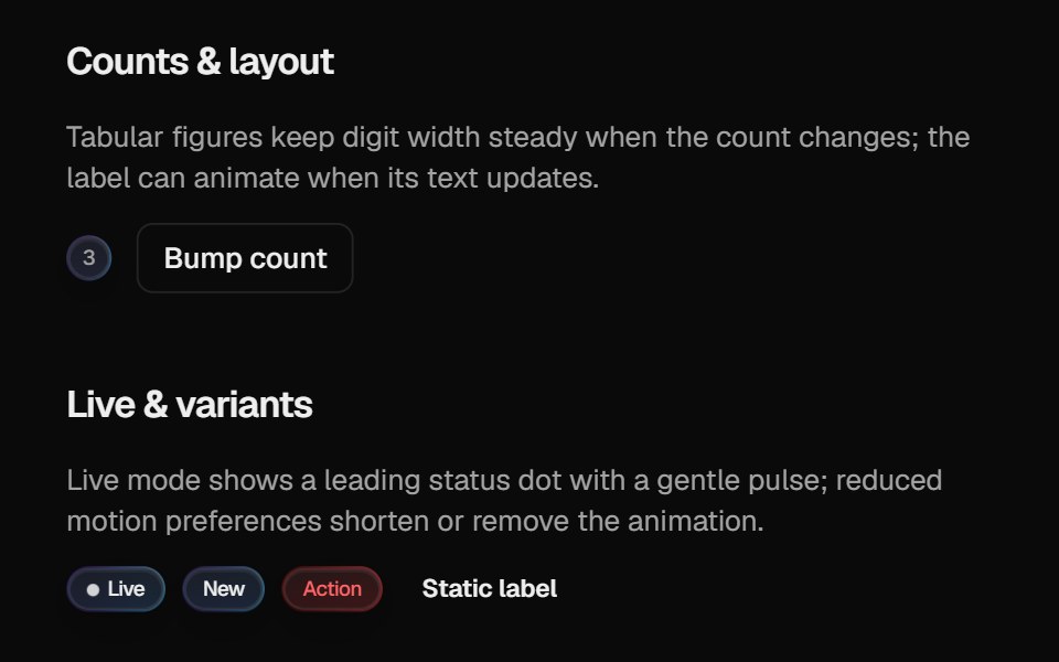 Halo BadgeCult UI · ReactBadge with optional layout animation, live status dot, and gradient rim aligned with Halo Button / Card
 Avatar-03 - BadgeShadcn Space · ReactBadge avatar component
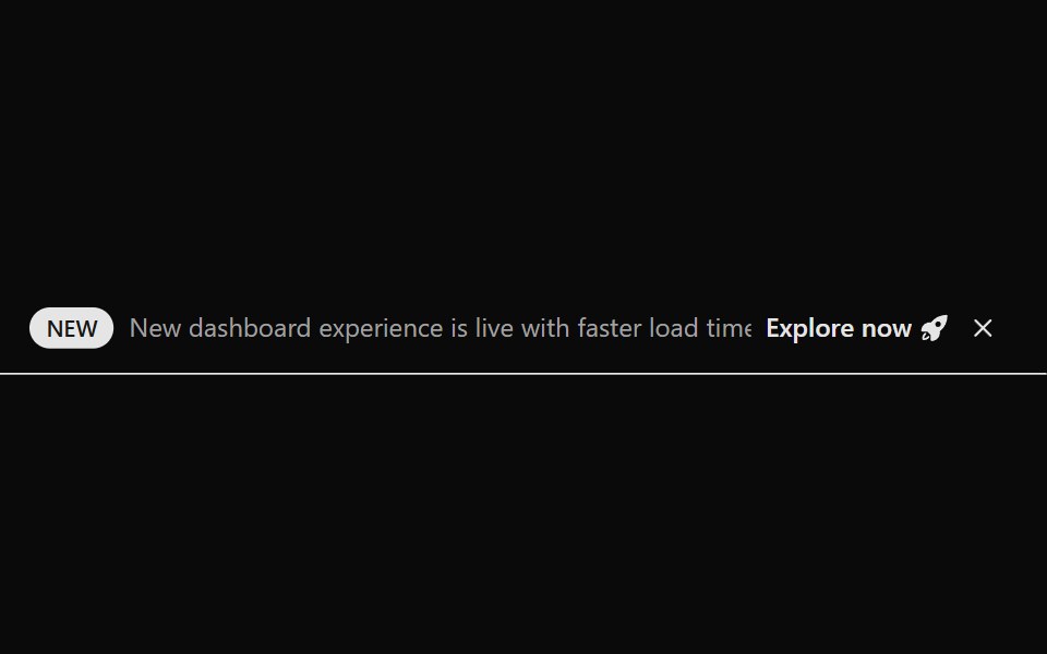 Announcement 1Watermelon UI · React
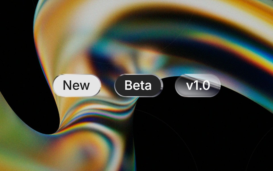 Liquid Badgeglasscn · ReactA liquid-glass badge wrapper that keeps the base badge fill and applies the effect to the border.
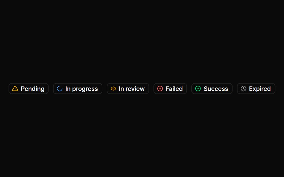 BadgeHextaUI · ReactStatus labels with colored dots, removable tags that slide closed and counts that roll to their new value.
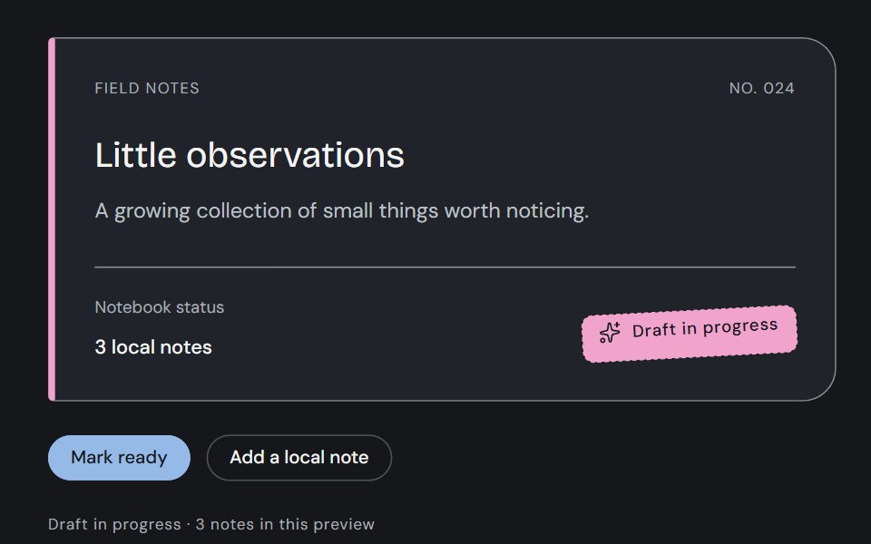 BadgeCojeev UI · ReactStamp a review state, attach a filing tag or count a collection. Three compact treatments with one clear meaning in…
 BasicFLX UI · ReactA single default badge.
 Message Notificationsv-particles · Svelte
 Badge-01 - DefaultShadcn Space · ReactBadge component
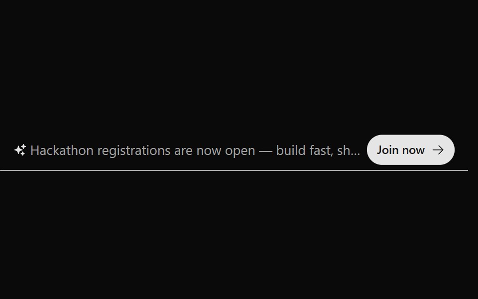 Announcement 2Watermelon UI · React
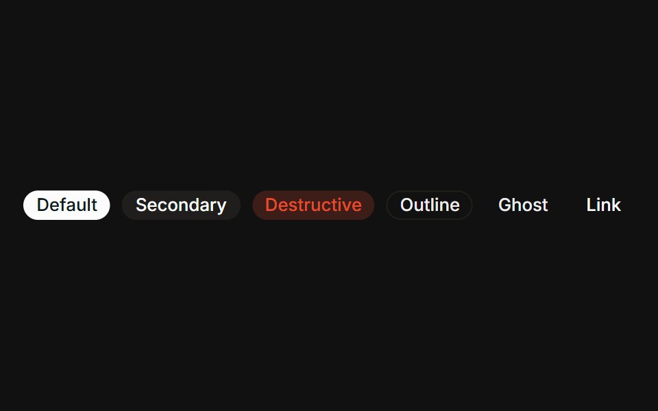 VariantsFLX UI · ReactAll six variants side-by-side: default, secondary, destructive, outline, ghost, link.
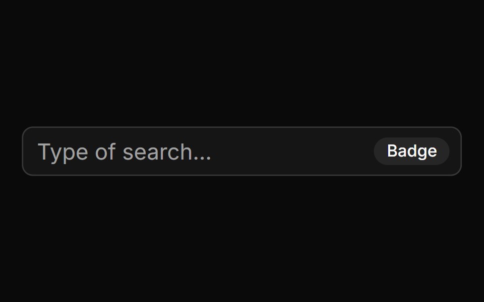 With Badgesv-particles · Svelte
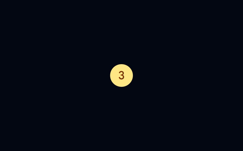 Badge-02 - CountShadcn Space · ReactBadge component
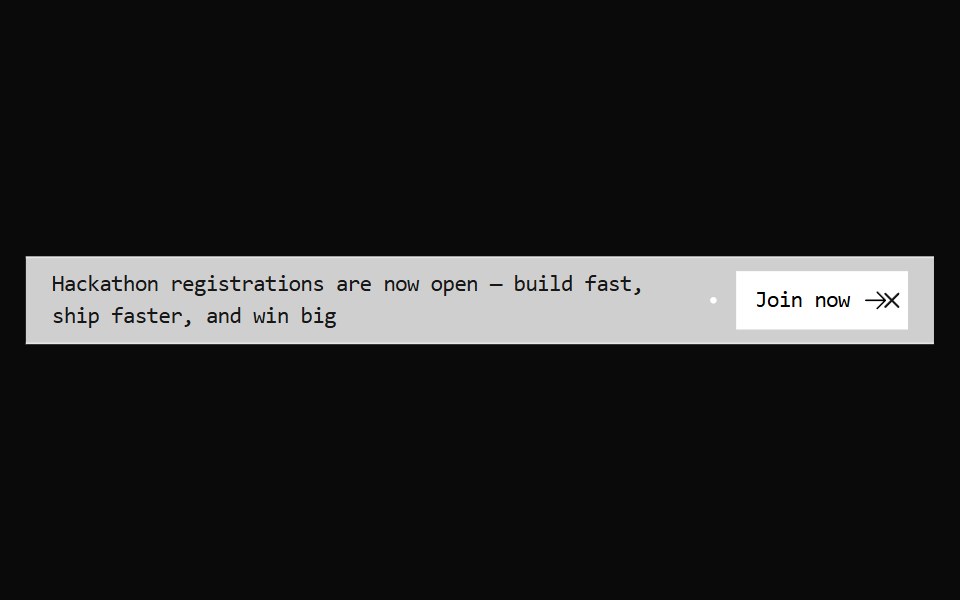 Announcement 3Watermelon UI · React
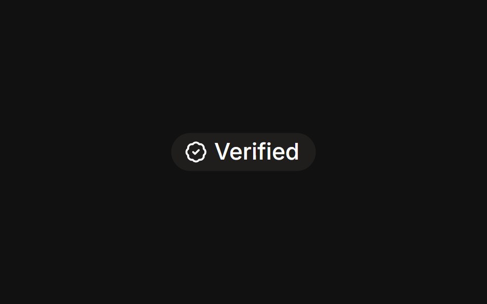 With iconFLX UI · ReactLeading verified icon before the label.
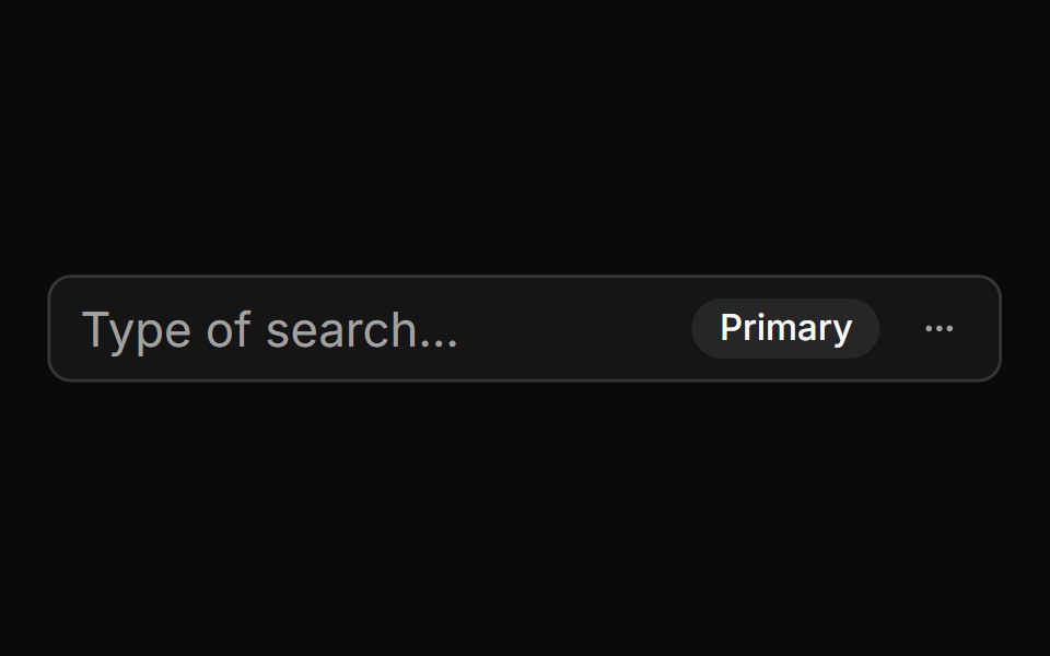 With Badge And Menusv-particles · Svelte
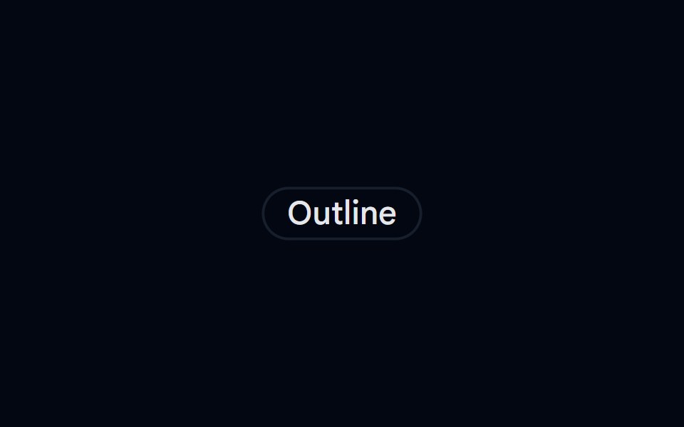 Badge-03 - OutlineShadcn Space · ReactBadge component
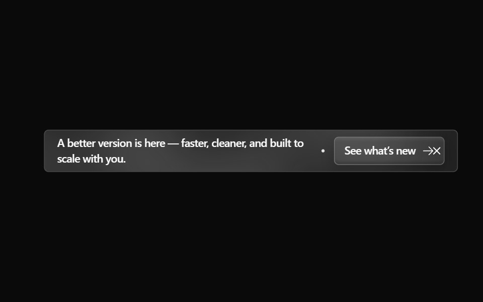 Announcement 4Watermelon UI · React
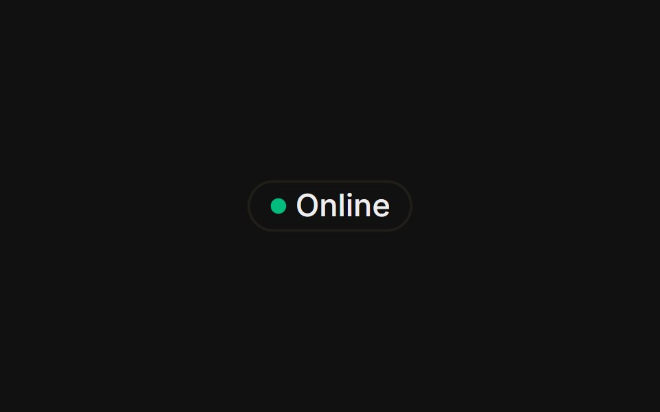 With status dotFLX UI · ReactA colored presence dot beside an outline label.
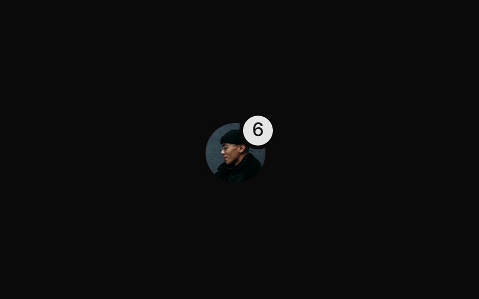 With Notification Badgesv-particles · Svelte
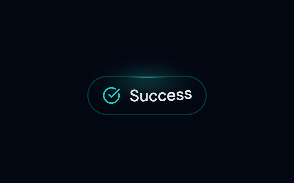 Badge-07 - SuccessShadcn Space · ReactAnimated success badge with top glow and letter-by-letter reveal
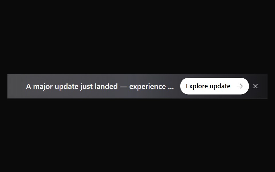 Announcement 5Watermelon UI · React
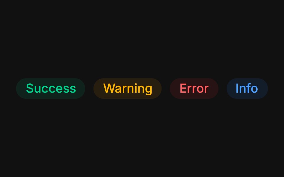 Status colorsFLX UI · ReactTinted success, warning, error, and info states.
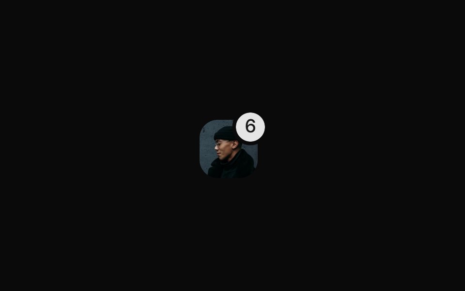 With Rounded Notification Badgesv-particles · Svelte
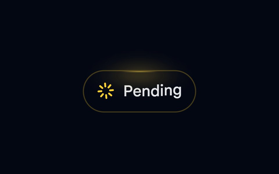 Badge-08 - PendingShadcn Space · ReactAnimated pending badge with spinning loader and top glow
 Announcement 6Watermelon UI · React
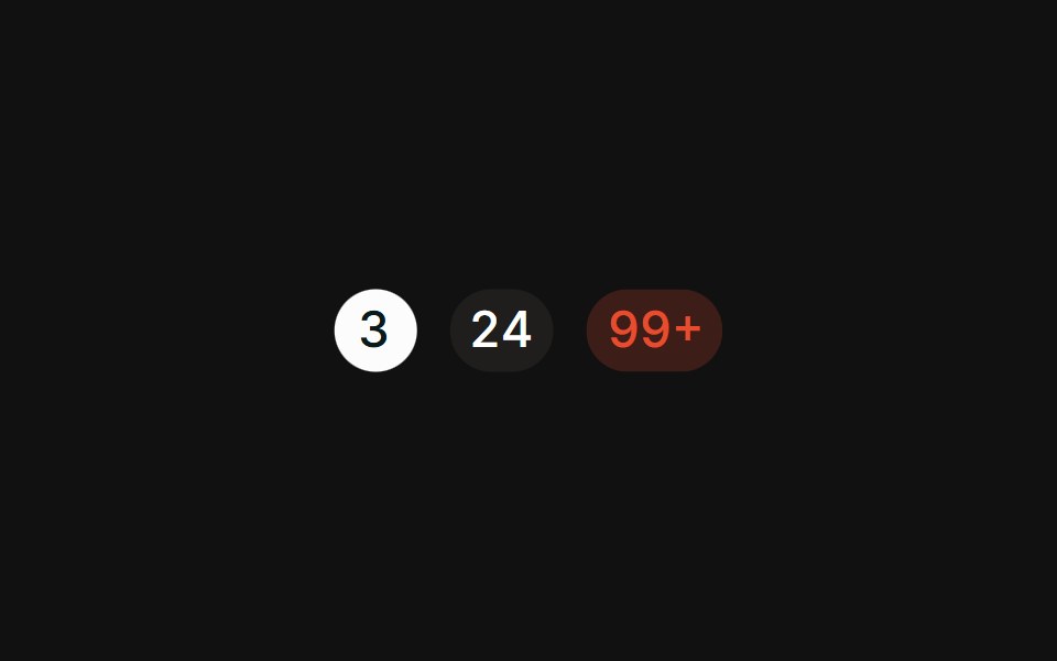 CountFLX UI · ReactPill-shaped numeric counts with tabular figures.
 With Verify Badgesv-particles · Svelte
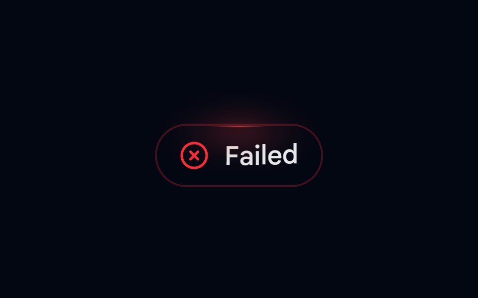 Badge-09 - FailedShadcn Space · ReactAnimated failed badge with top glow and letter-by-letter reveal
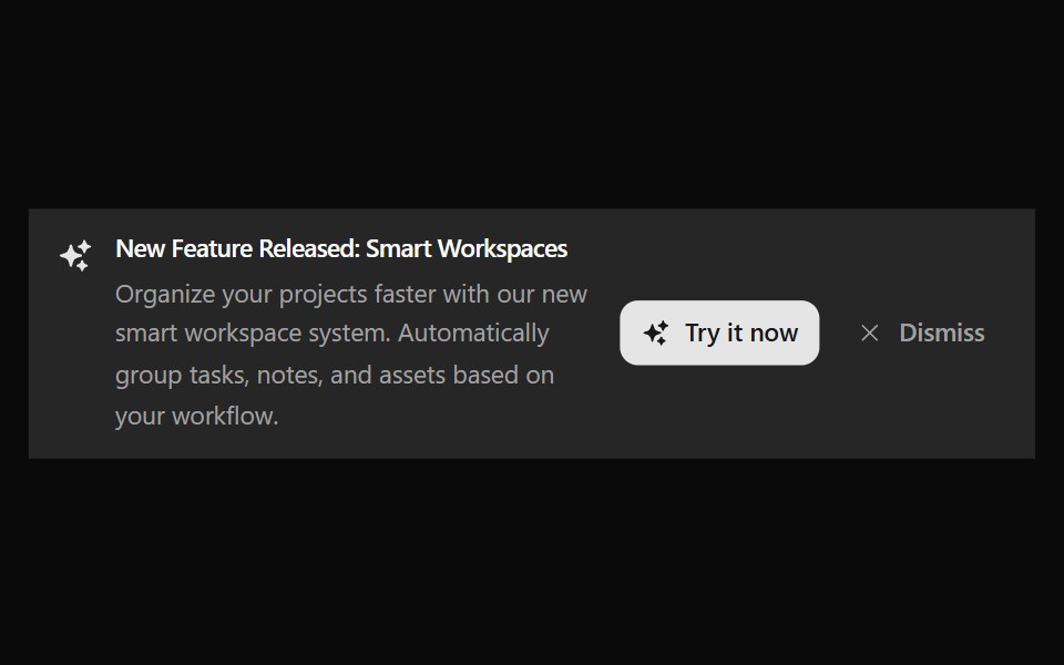 Announcement 7Watermelon UI · React
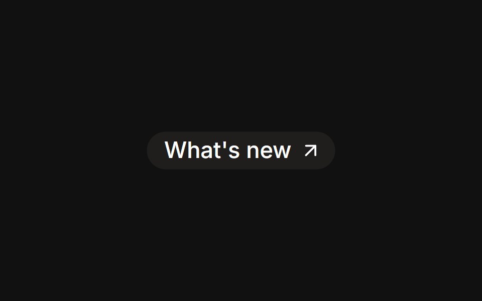 As linkFLX UI · Reactrender prop renders the badge as an anchor with a trailing icon.
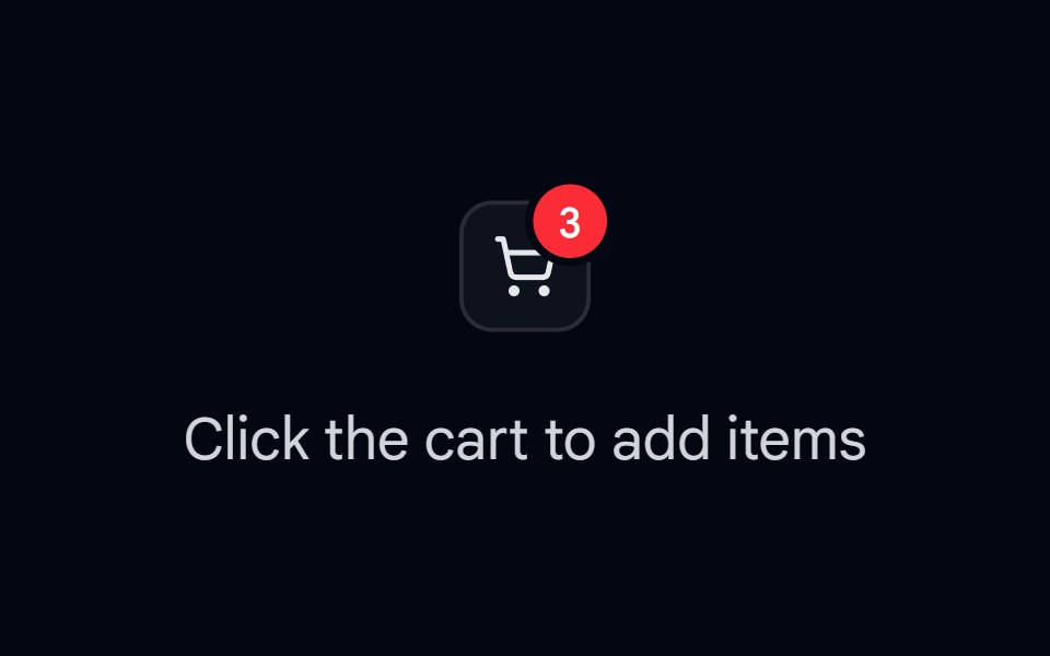 Badge 11 - Count PopShadcn Space · ReactNotification/cart count badge that springs and pops on every count change
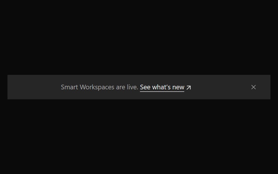 Announcement 8Watermelon UI · React
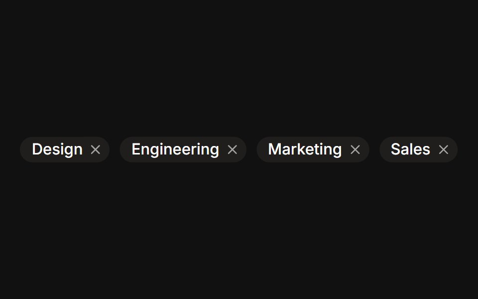 RemovableFLX UI · ReactDismissible tag chips with a trailing remove button.
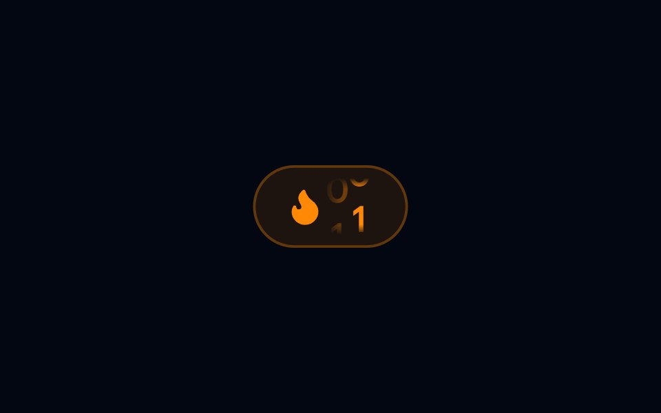 Badge 13 - Streak DisplayShadcn Space · ReactFlame streak badge with a flickering icon loop and an animated roll-in day count
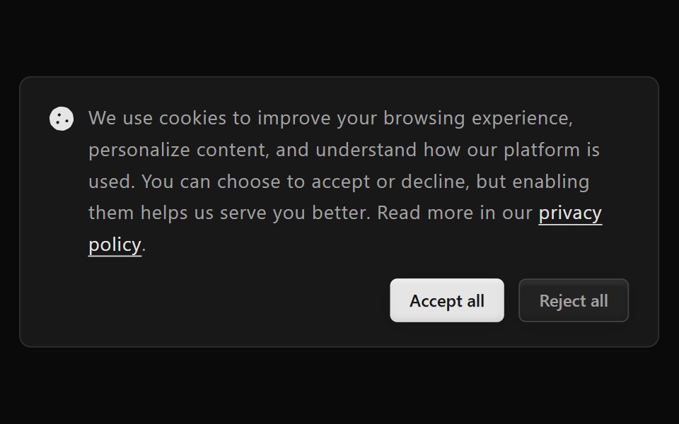 Announcement 9Watermelon UI · React
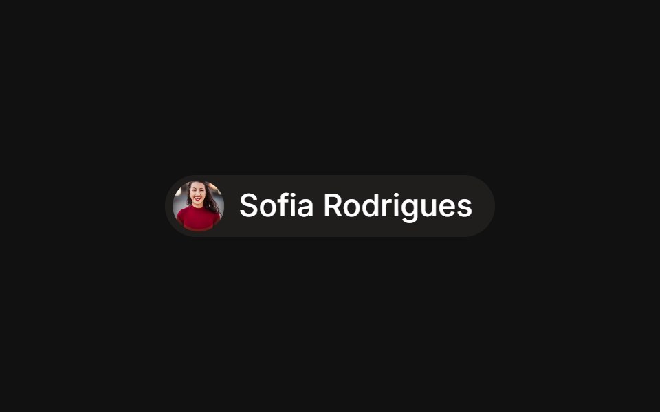 With avatarFLX UI · ReactAssignee chip with a leading avatar inside the badge.
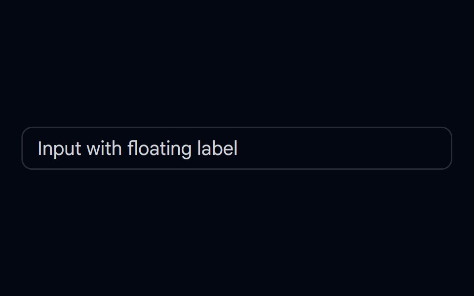 Input-09 - Input with floating labelShadcn Space · ReactInput component
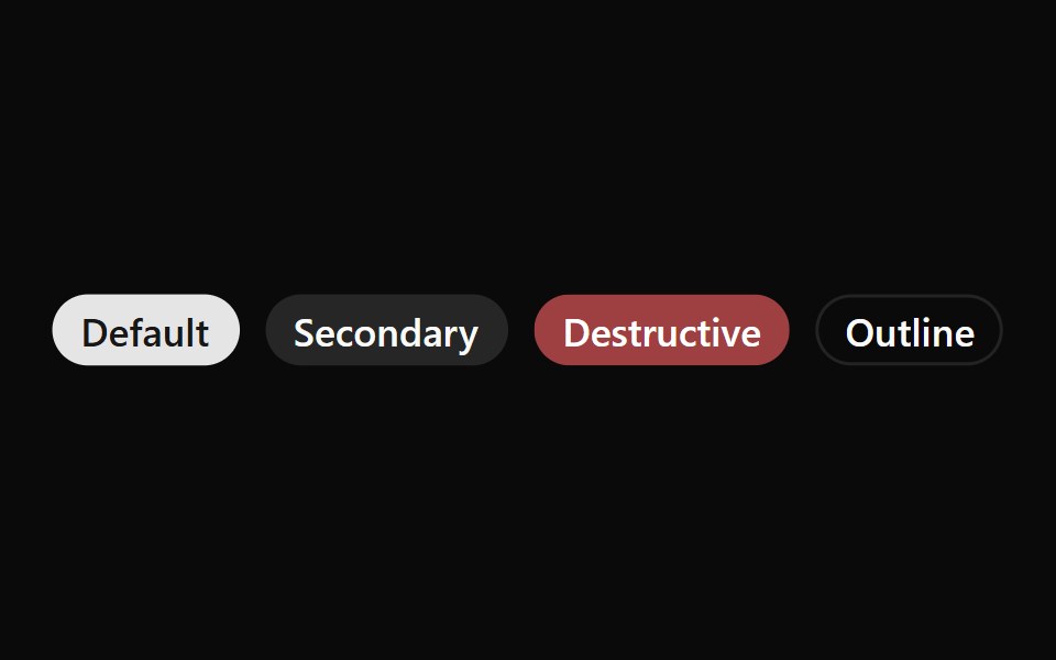 Badge 01Watermelon UI · React
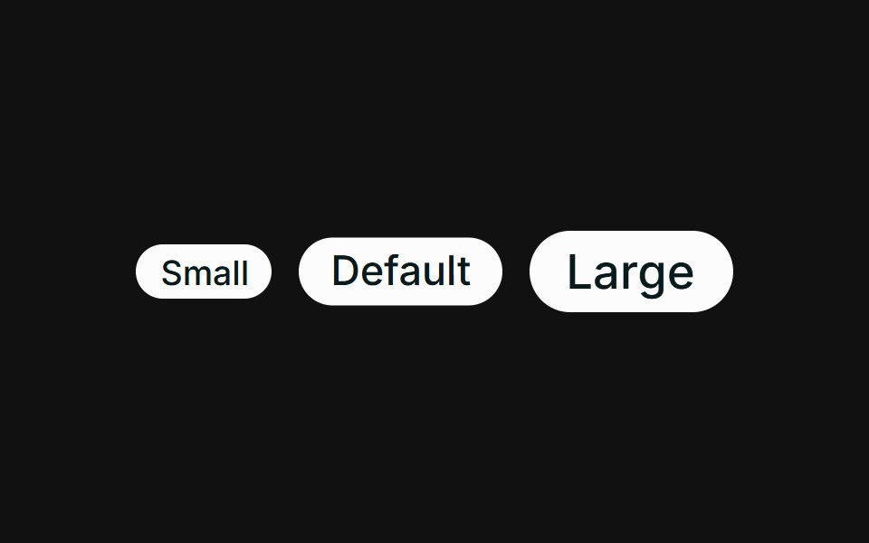 SizesFLX UI · ReactSmall, default, and large sizes via className.
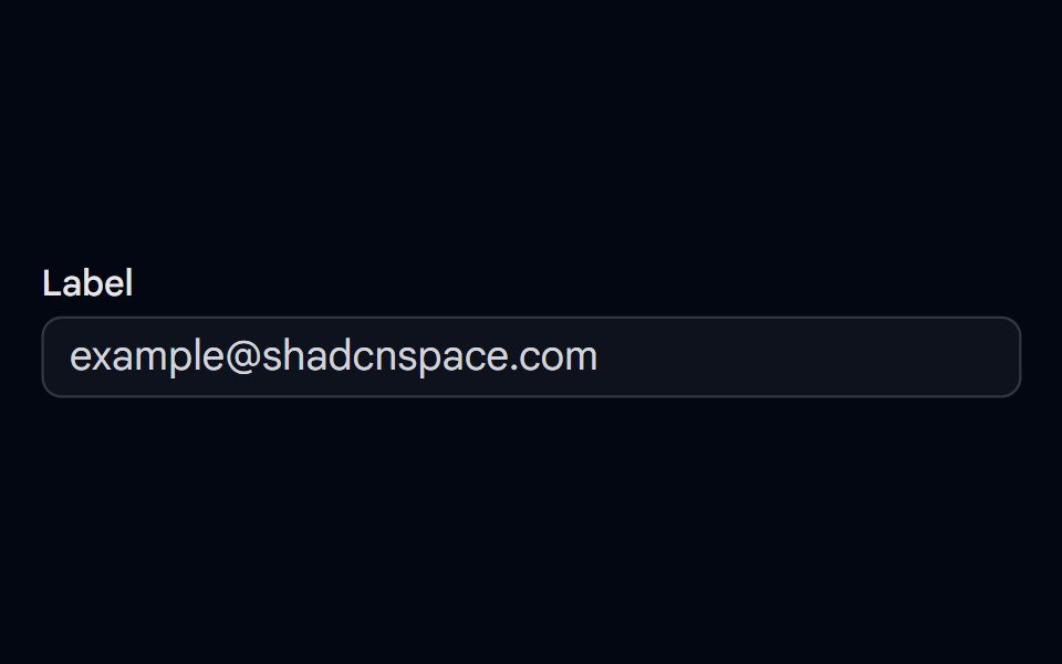 Input-17 - Input with labelShadcn Space · ReactInput component
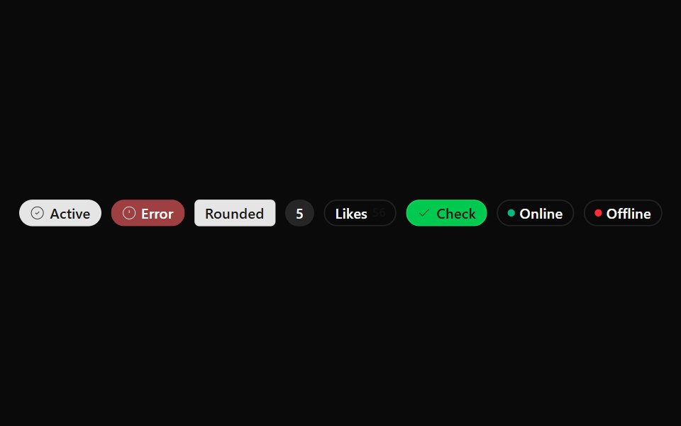 Badge 02Watermelon UI · React
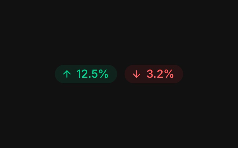 Trend deltaFLX UI · ReactUp and down arrows with tinted gain / loss percentages.
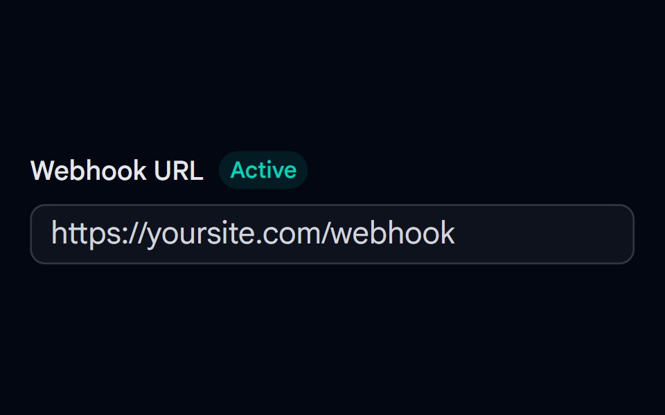 Label 03 - With BadgeShadcn Space · ReactLabel component with badge
 Badge 03Watermelon UI · React
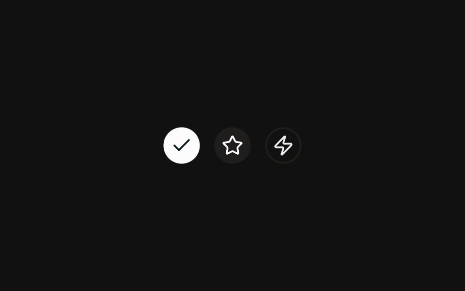 Icon onlyFLX UI · ReactRound icon-only badges across variants.
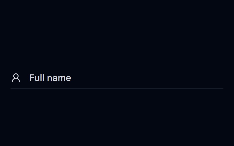 Label 06 - Floating LabelShadcn Space · ReactFloating label that transitions from inside the input to the top on focus or fill
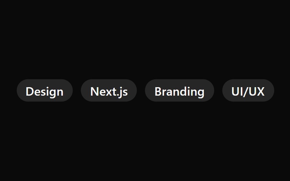 Badge 04Watermelon UI · React
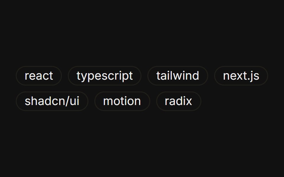 Tag listFLX UI · ReactA wrapping group of outline badges as tags.
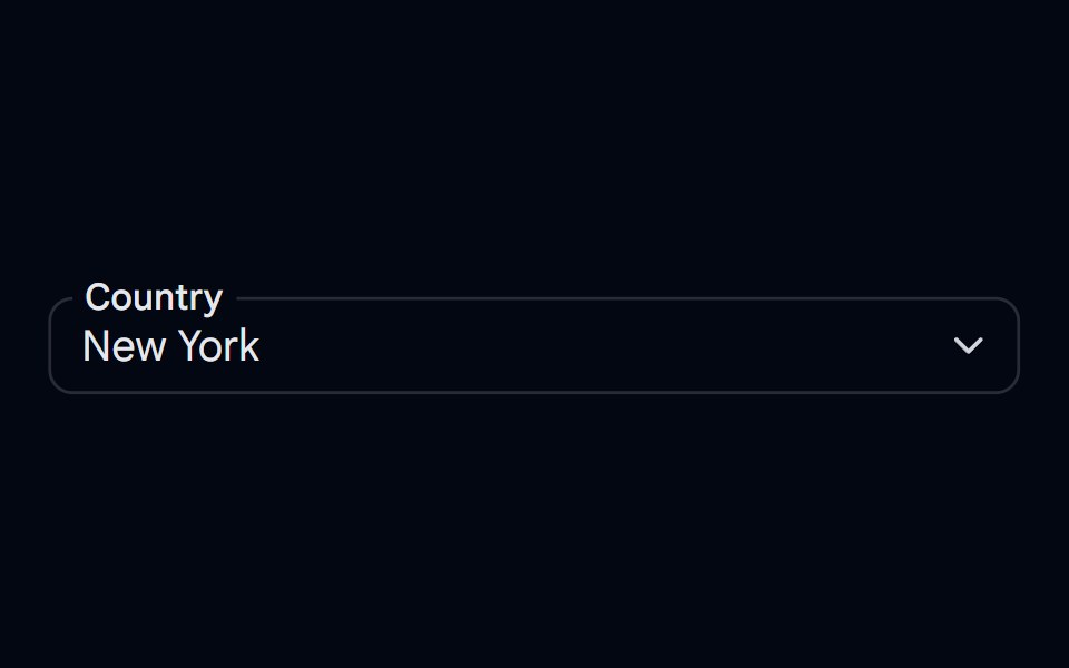 Select-05 - Select with overlapping labelShadcn Space · ReactSelect component
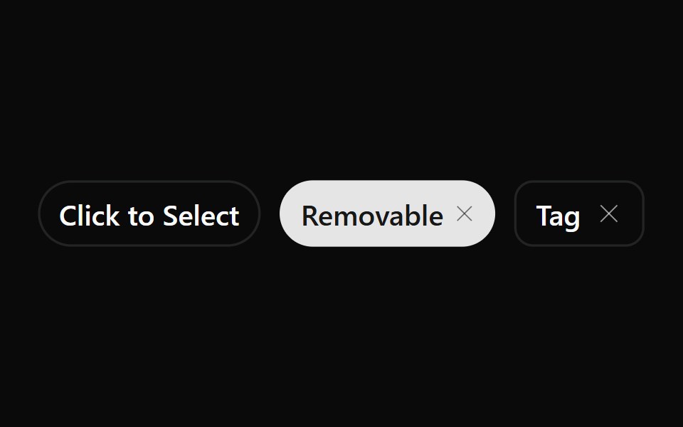 Badge 05Watermelon UI · React
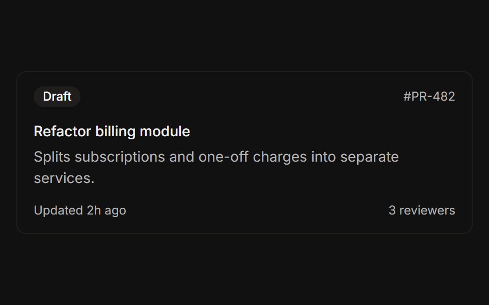 Header and footerFLX UI · ReactStatus badge above the title and a metadata row below the description.
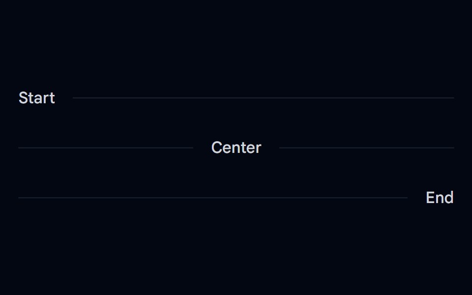 Separator 03 - Horizontal Label PlacementShadcn Space · ReactHorizontal separators with inline start, center, and end text labels
 Badge 1Watermelon UI · React
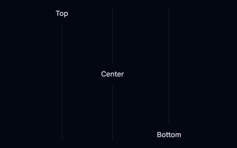 Separator 04 - Vertical Label PlacementShadcn Space · ReactVertical separators with top, center, and bottom text labels
 Badge 10Watermelon UI · React
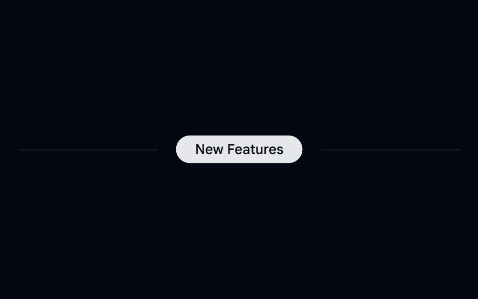 Separator 07 - With BadgeShadcn Space · ReactHorizontal separator with centered badge
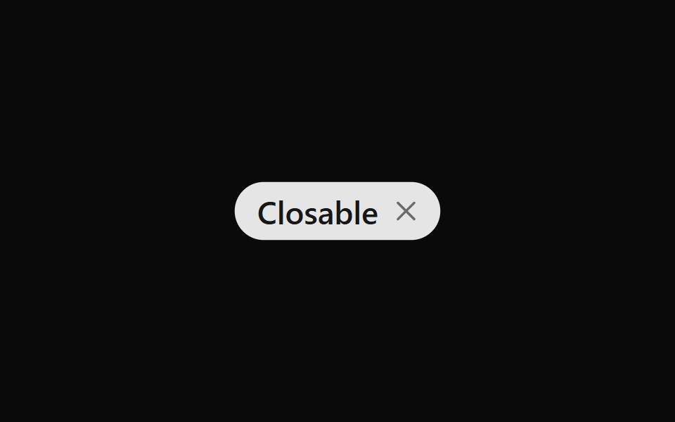 Badge 11Watermelon UI · React
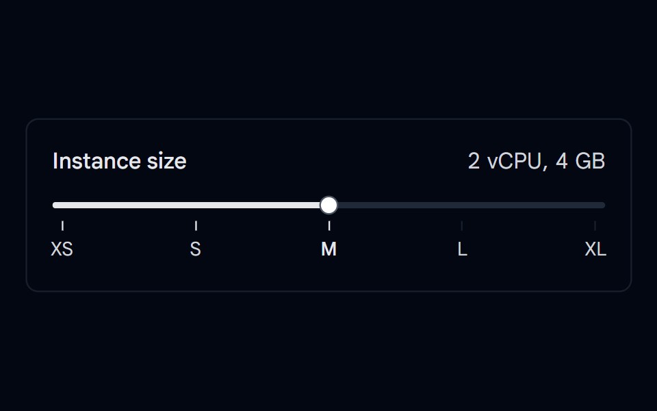 Slider 09 - Ticks & LabelsShadcn Space · ReactStepped instance size slider with tick marks and clickable XS to XL labels aligned to each step, showing CPU and…
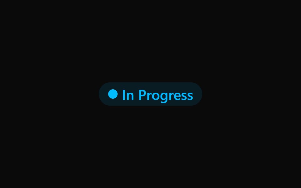 Badge 12Watermelon UI · React
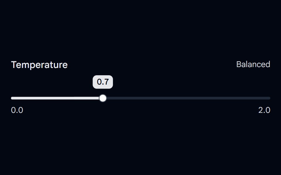 Slider 10 - Floating Value LabelShadcn Space · ReactDecimal slider with a value label that follows the thumb, grows while dragging, and a Precise / Balanced / Creative…
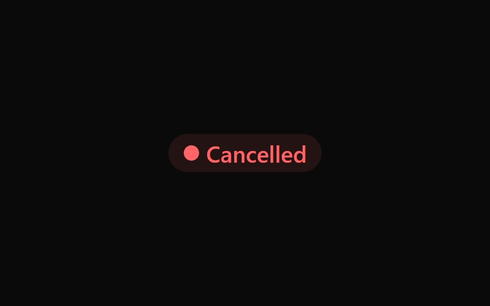 Badge 13Watermelon UI · React
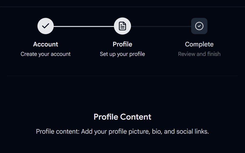 Stepper 01 - Custom Square BadgesShadcn Space · ReactResponsive stepper component with customizable indicators, checkmarks for completed steps, active and pending states…
 Badge 14Watermelon UI · React
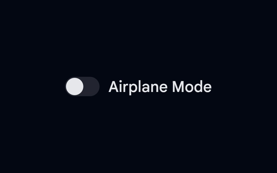 Switch-05 - With labelShadcn Space · ReactSwitch component
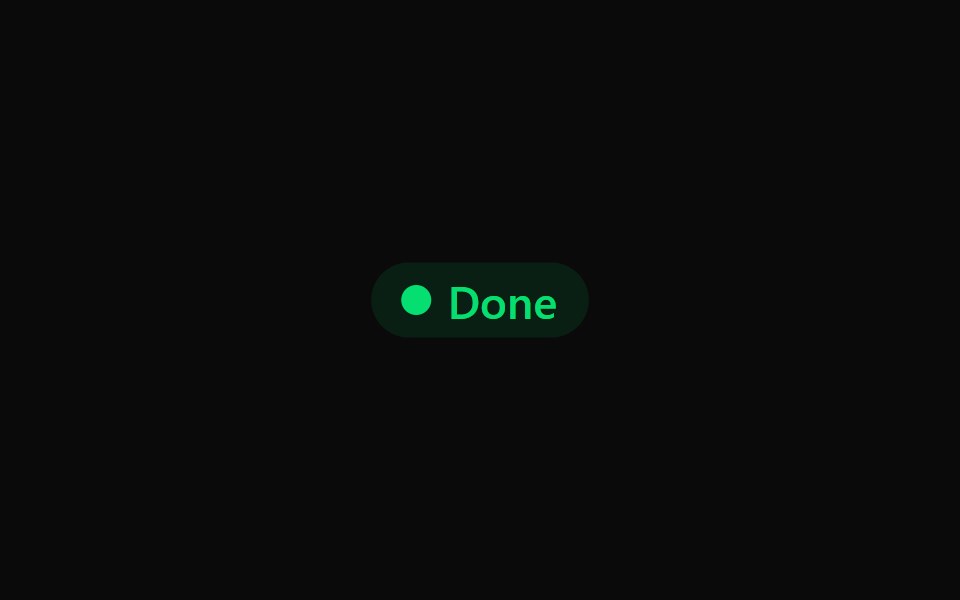 Badge 15Watermelon UI · React
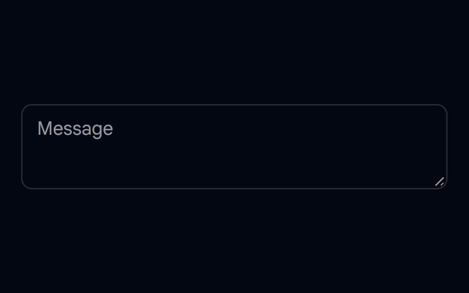 Textarea-07 - Textarea with floating labelShadcn Space · ReactTextarea component
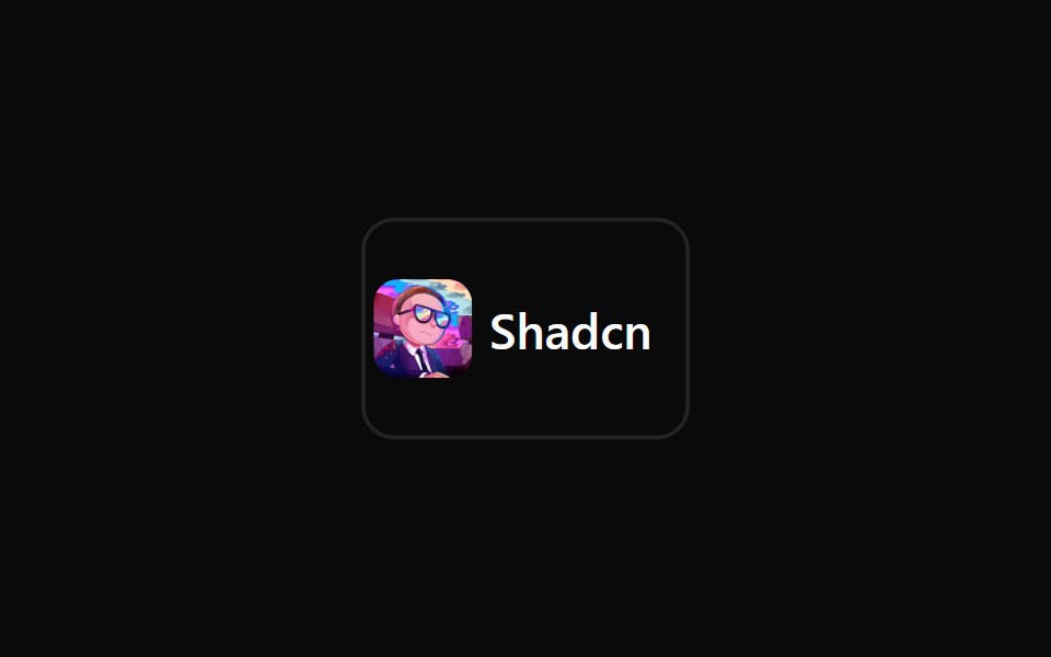 Badge 16Watermelon UI · React
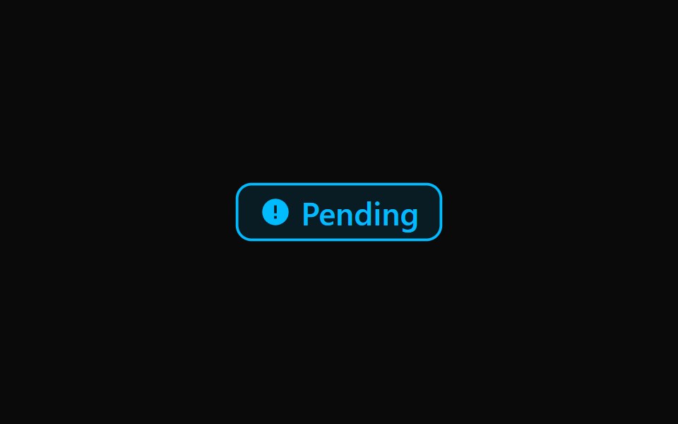 Badge 17Watermelon UI · React
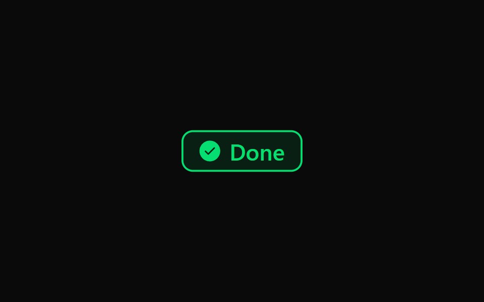 Badge 18Watermelon UI · React
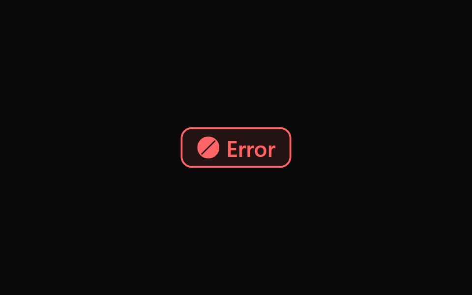 Badge 19Watermelon UI · React
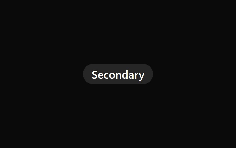 Badge 2Watermelon UI · React
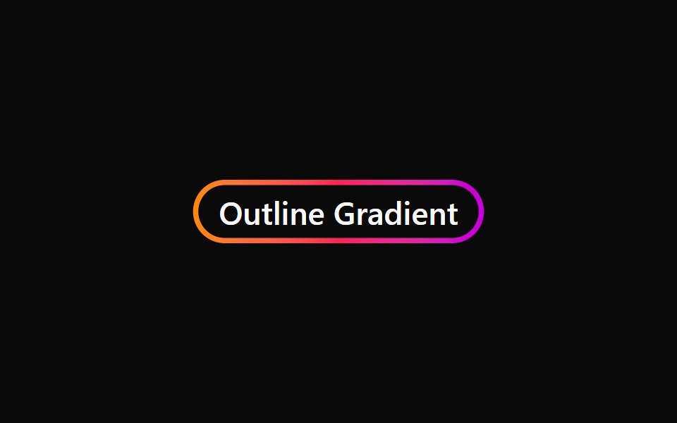 Badge 20Watermelon UI · React
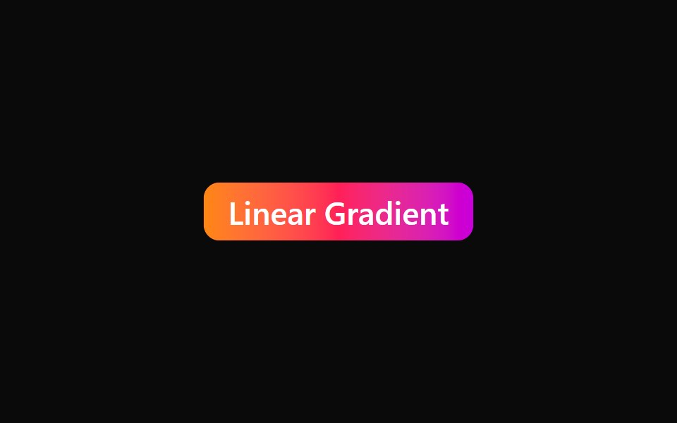 Badge 21Watermelon UI · React
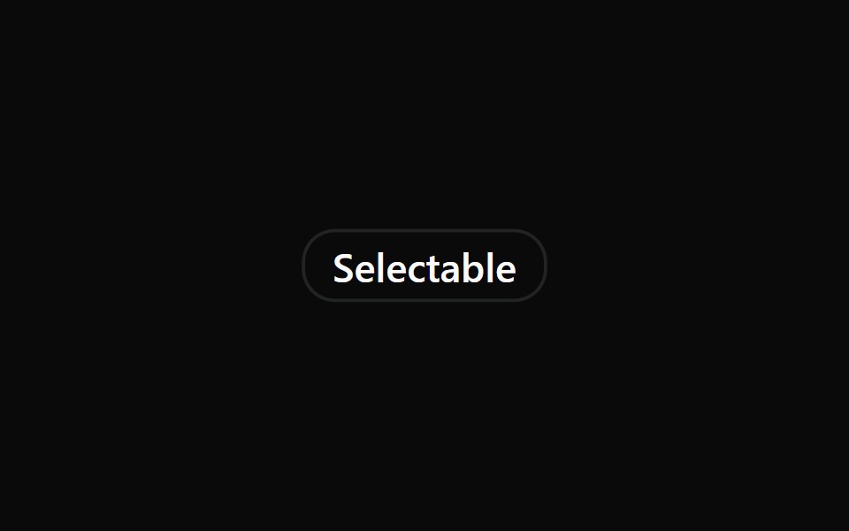 Badge 22Watermelon UI · React
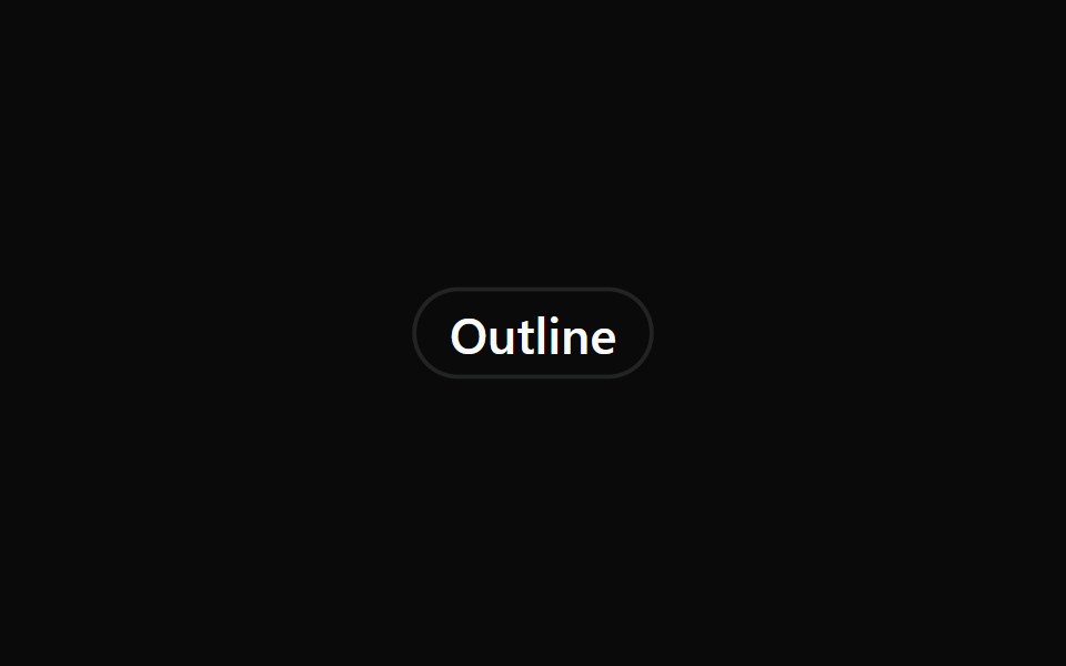 Badge 3Watermelon UI · React
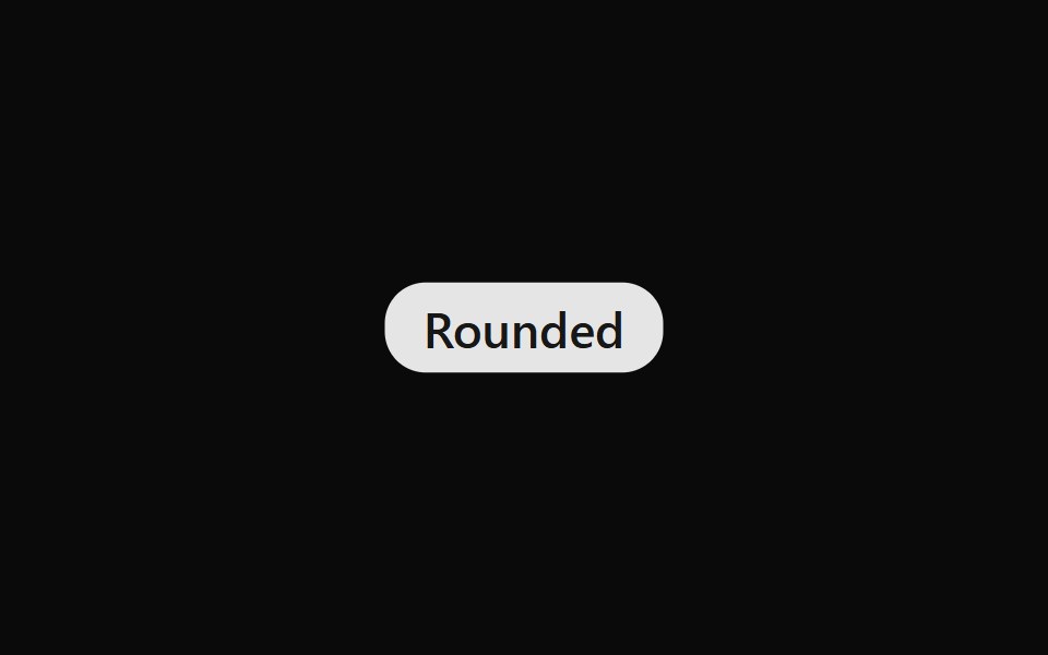 Badge 4Watermelon UI · React
 Badge 5Watermelon UI · React
 Badge 6Watermelon UI · React
 Badge 7Watermelon UI · React
 Badge 8Watermelon UI · React
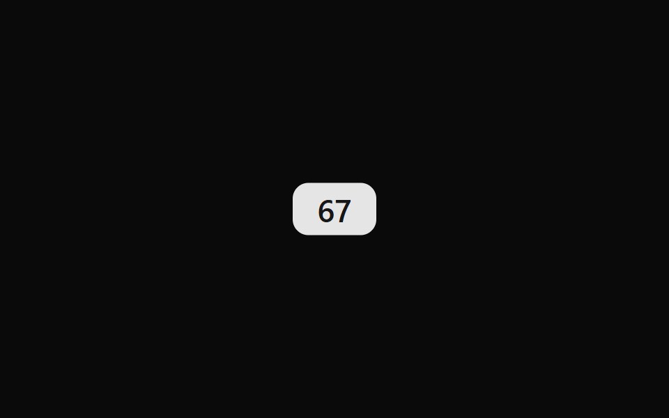 Badge 9Watermelon UI · React
Libraries with shadcn/ui badge components
Related categories
- Badge Components
- React Badge Components
- Tailwind CSS Badge Components
- Svelte Badge Components
- Animated Badge Components
- shadcn/ui Feedback Components
- shadcn/ui Alert Components
- shadcn/ui Banner Components
- shadcn/ui Chip Components
- shadcn/ui Spinner Components
- shadcn/ui Skeleton Components
- shadcn/ui Progress Components
- shadcn/ui Empty State Components
- shadcn/ui Notification Components
- shadcn/ui Status Indicator Components
- shadcn/ui Progress Bar Components
- shadcn/ui Error State Components
- shadcn/ui Typing Indicator Components