 Dev Design Library
Animated Alert Components
Dev Design Library indexes 17 Animated alert components from 10 open-source UI libraries, with the most coming from Shadcn Space, Spectrum UI, FLX UI, Kokonut UI and beUI. Each one links to its page with the source code, a live preview where available, the library license and the install command. These are the alert components tagged as animated: motion on hover, on scroll or on load, usually built with CSS transitions or Framer Motion. Alert components belong to the Feedback group.
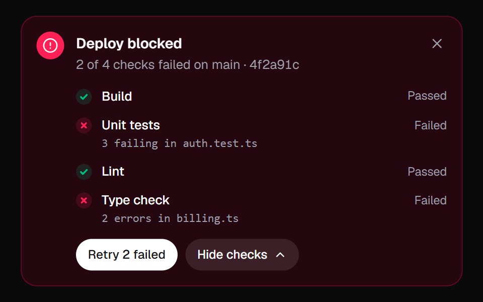 Inline AlertKokonut UI · React"An alert that does something about the problem: it lists the failed checks, re-runs them one by one, and turns from…
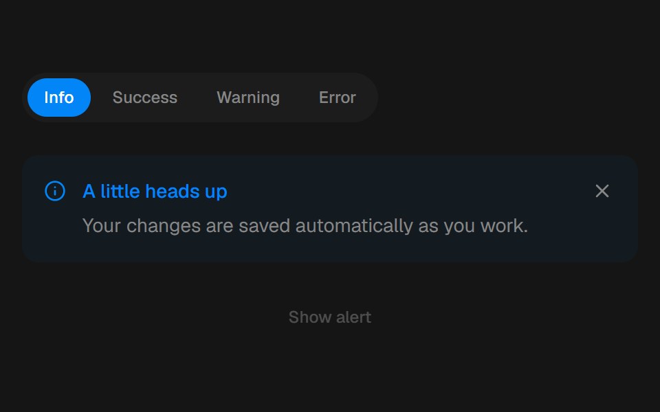 AlertbeUI · ReactFeedback that eases in and folds away.
 Alert demoSpectrum UI · Reactcomponent for the alert-demo
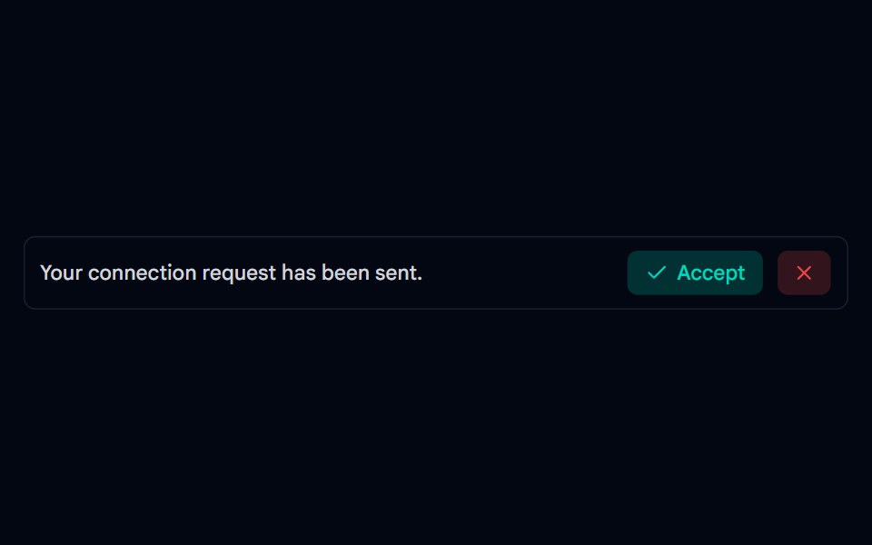 Alert-03 - Social AlertShadcn Space · ReactAlert component
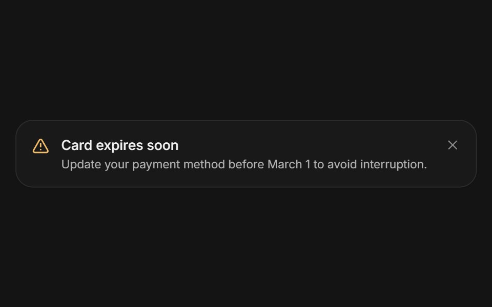 AlertArc Library · ReactA persistent message that helps people recover or continue.
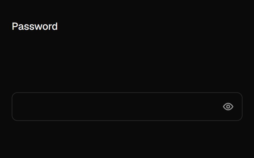 Caps Lock WarningUI Lab · ReactA small caps lock key with its light on slides into the field when caps is on.
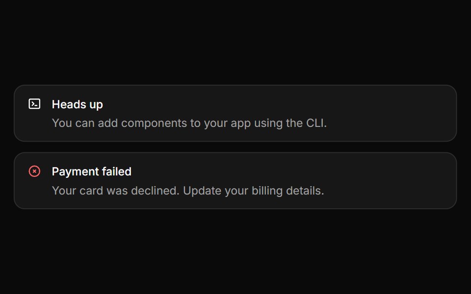 AlertHextaUI · ReactInline messages for status and feedback, with a neutral surface, a colored icon and a dismiss that collapses smoothly.
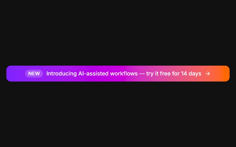 Announcement barFLX UI · ReactFull-width gradient promo with a New tag and arrow.
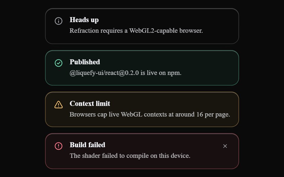 Liquid AlertLiquefy UI · ReactAlert message box in liquid glass style. Caixa de alerta em estilo vidro líquido.
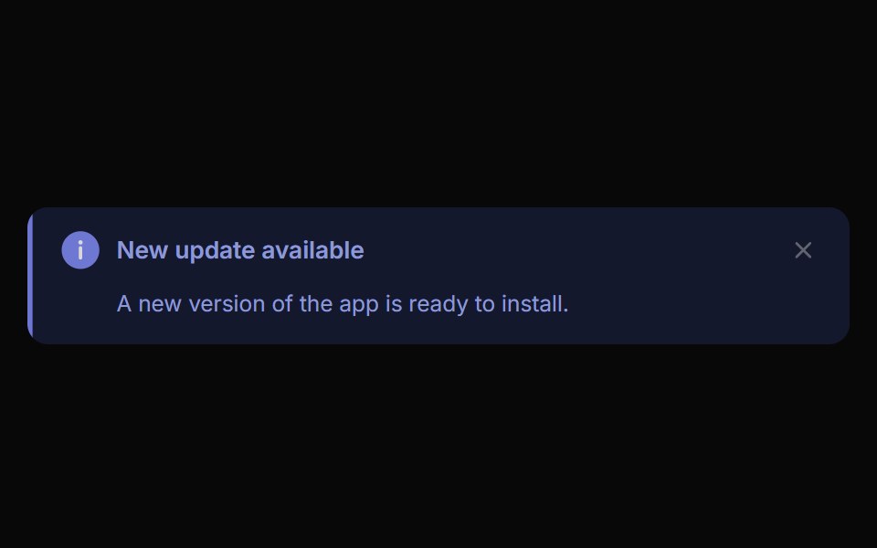 Alert ToastReactFrame · ReactA polished toast/alert notification, 5 tones, stacked or inline layout, icons, primary/secondary actions, dismiss and…
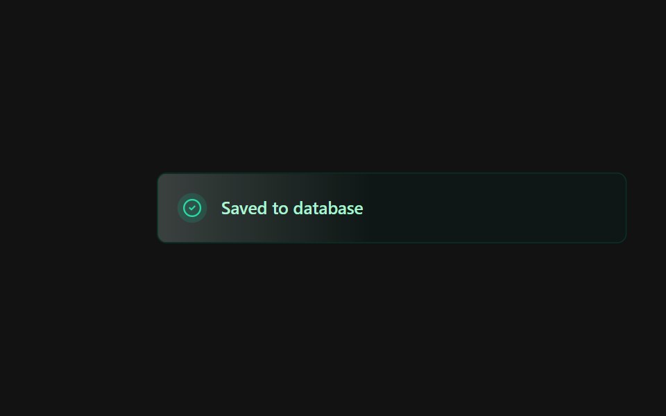 Alert 3Spectrum UI · Reactcomponent for the alert-3
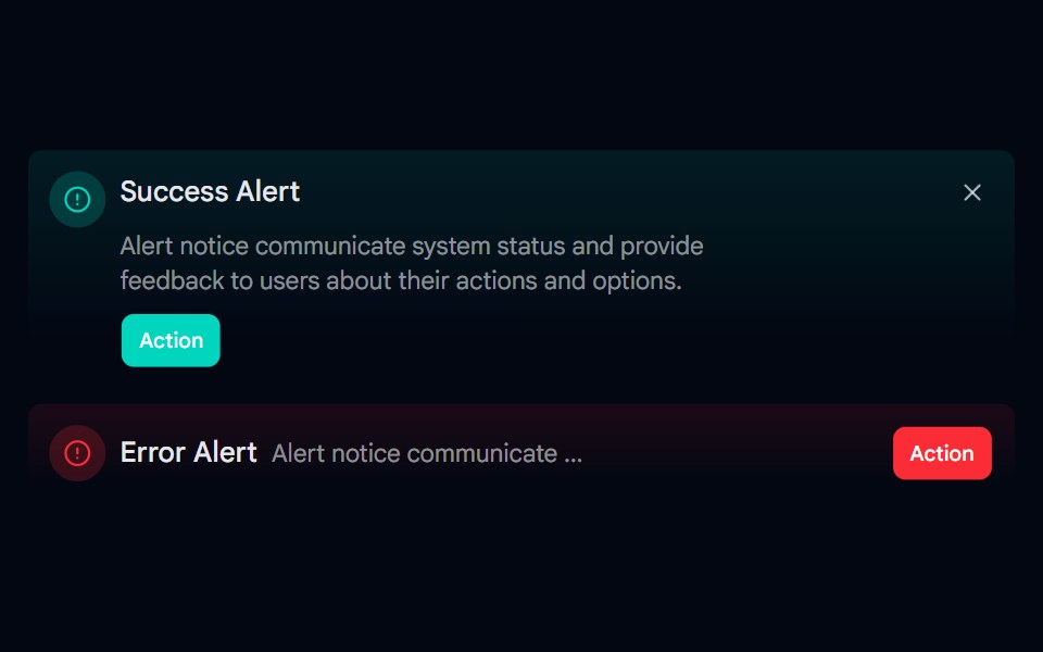 Alert-06 - Gradient AlertShadcn Space · ReactAlert component
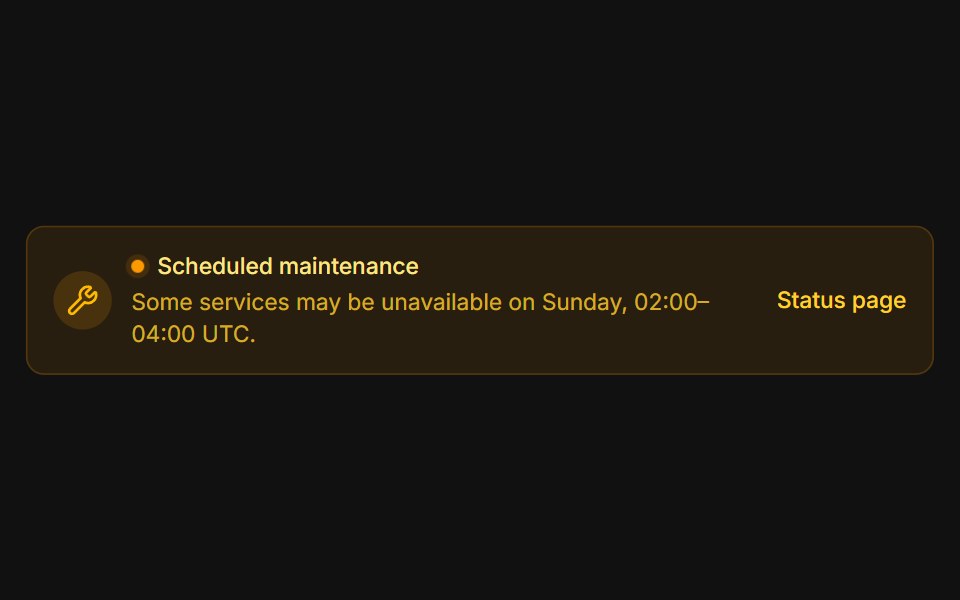 MaintenanceFLX UI · ReactAmber system notice with a pulsing status dot.
 Alert 4Spectrum UI · Reactcomponent for the alert-4
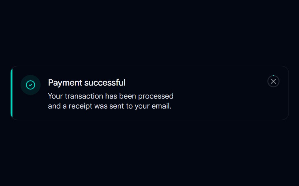 Alert 07 - With Hover-Fill DismissShadcn Space · ReactToast-style alert with a spring entrance, icon pop-in, and a close button whose ring fills in on hover, built with…
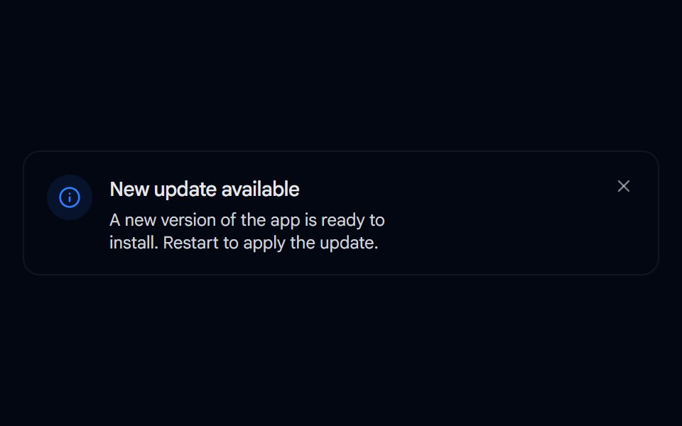 Alert 08 - Evaporate DismissShadcn Space · ReactAlert that dissolves away like evaporating water when dismissed, fading and blurring out with rising vapor wisps…
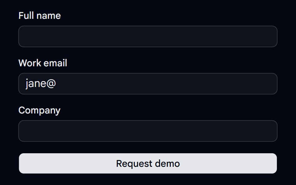 Alert 18 - Form Error SummaryShadcn Space · ReactForm error summary alert that lists every invalid field with links that focus it, receives focus on submit, and clears…
Libraries with Animated alert components
Related categories
- Alert Components
- React Alert Components
- Tailwind CSS Alert Components
- shadcn/ui Alert Components
- Animated Feedback Components
- Animated Spinner Components
- Animated Progress Components
- Animated Skeleton Components
- Animated Progress Bar Components
- Animated Status Indicator Components
- Animated Typing Indicator Components
- Animated Empty State Components
- Animated Badge Components
- Animated Chip Components
- Animated Notification Components
- Animated Progress Circle Components
- Animated Scroll Progress Components
- Animated Banner Components
- Animated Loading Screen Components
- Animated Error State Components