 Dev Design Library
Animated Loading Screen Components
Dev Design Library indexes 10 Animated loading screen components from 9 open-source UI libraries, with the most coming from Vengeance UI, Spectrum UI, React Bits, OpenSourceUI and Lobe UI. Each one links to its page with the source code, a live preview where available, the library license and the install command. These are the loading screen components tagged as animated: motion on hover, on scroll or on load, usually built with CSS transitions or Framer Motion. Loading screen components belong to the Feedback group.
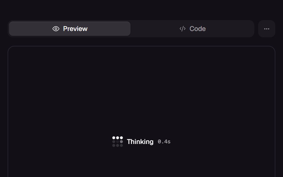 Lattice LoaderReact Bits · ReactSmall loading indicator: a 3x3 or 4x4 grid of cells lit in a looping pattern (orbit, snake, ripple, pulse) that…
 Brand Brand LoadingLobe UI · React
 Loading StateSpectrum UI · ReactA pixel-grid loader with a shimmering label and live elapsed timer.
 Kinetic Text LoaderVengeance UI · React
 Apple Hello LoaderOpenSourceUI · React
 Multi Step LoaderVelora UI · ReactFull-screen overlay that ticks through a list of steps, keeping the active one centred.
 Words PreloaderSpaceUI · ReactGreeting cycle preloader that exits with a curved SVG wipe. Replay from the demo.
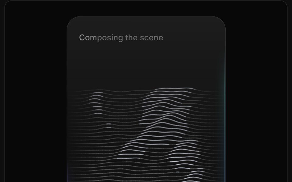 AI Image Loader 03ReactFrame · ReactAn AI image-generation loader, canvas-drawn rolling topographic lines grow in and a top-to-bottom sweep reveals the…
 Multi Step LoaderAceternity UI · React
 Reveal LoaderVengeance UI · React
Libraries with Animated loading screen components
Related categories
- Loading Screen Components
- Tailwind CSS Loading Screen Components
- Animated Feedback Components
- Animated Spinner Components
- Animated Progress Components
- Animated Skeleton Components
- Animated Progress Bar Components
- Animated Status Indicator Components
- Animated Typing Indicator Components
- Animated Empty State Components
- Animated Badge Components
- Animated Chip Components
- Animated Notification Components
- Animated Alert Components
- Animated Progress Circle Components
- Animated Scroll Progress Components
- Animated Banner Components
- Animated Error State Components