 Dev Design Library
Animated Progress Components
Dev Design Library indexes 78 Animated progress components from 31 open-source UI libraries, with the most coming from UI Lab, Kinetics, Amicro Micro Transitions, Spectrum UI and ReactFrame. Each one links to its page with the source code, a live preview where available, the library license and the install command. These are the progress components tagged as animated: motion on hover, on scroll or on load, usually built with CSS transitions or Framer Motion. Progress components belong to the Feedback group.
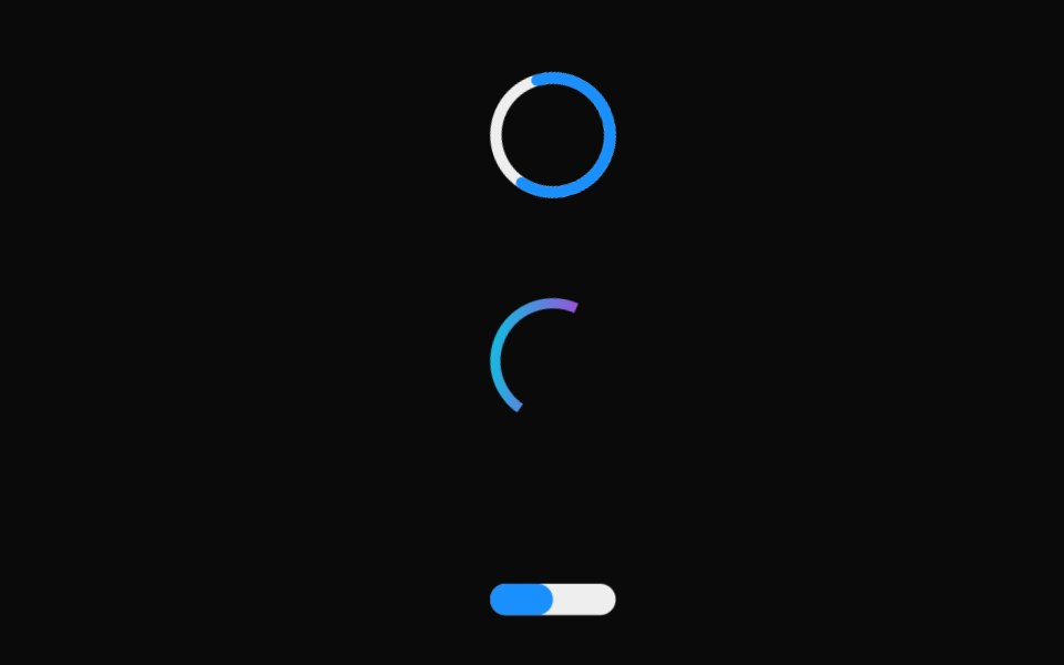 Linear ProgressMUI / Material UI · React
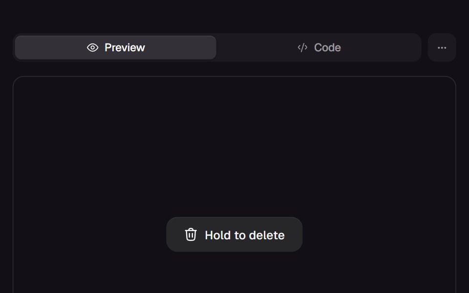 Hold ButtonReact Bits · ReactHold-to-confirm button whose liquid fill rises while pressed, snaps back on an early release and swaps its label…
 ProgressdaisyUI · CSS (Tailwind)
 Scroll ProgressMagic UI · ReactAnimated Scroll Progress for your pages
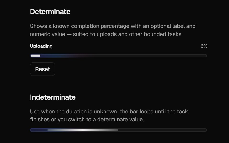 Halo ProgressCult UI · ReactProgress bar with spring-driven determinate fill and indeterminate gradient strip
 Progress CircleTremor · React
 App Icon LoadAmicro Micro Transitions · ReactApp Icon Load loading animation.
 Dashboard Route ProgressLobe UI · React
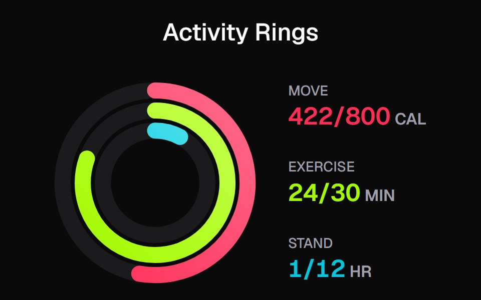 Apple Activity CardKokonut UI · ReactActivity rings that draw with a count-up, lap past 100% with a shadowed end cap and dim to focus, built with React and…
 Scroll ProgressbeUI · ReactReading-progress indicator — fixed bar or circular ring — driven by scroll position via useSmoothScroll, with spring…
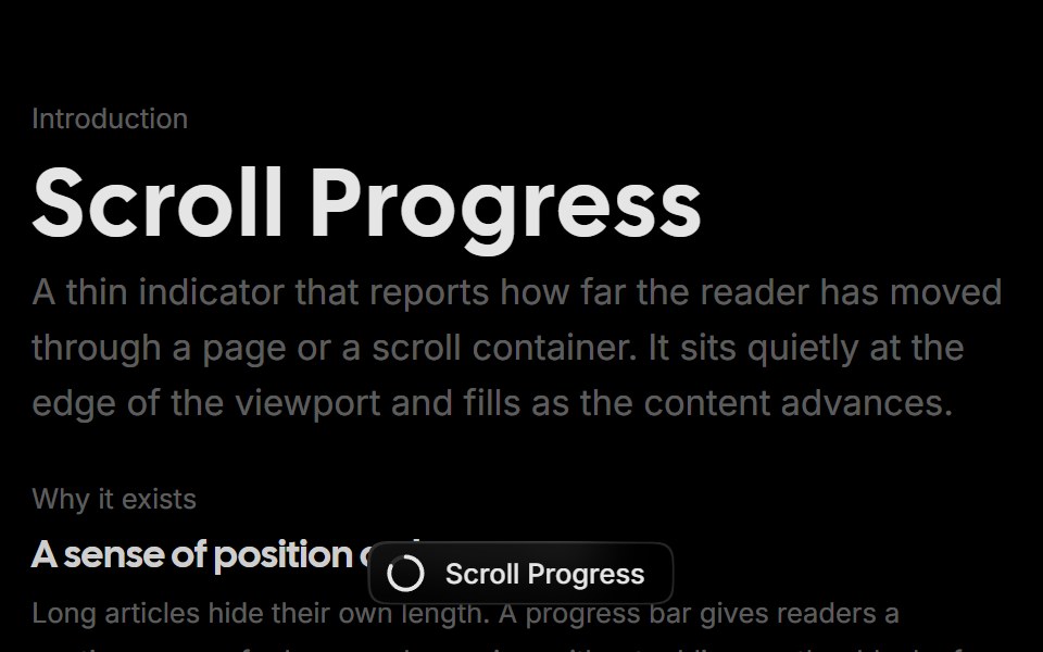 Scroll ProgressRare UI · ReactA scroll progress pill that tracks reading position and expands into a squircle menu of sections you can jump to.
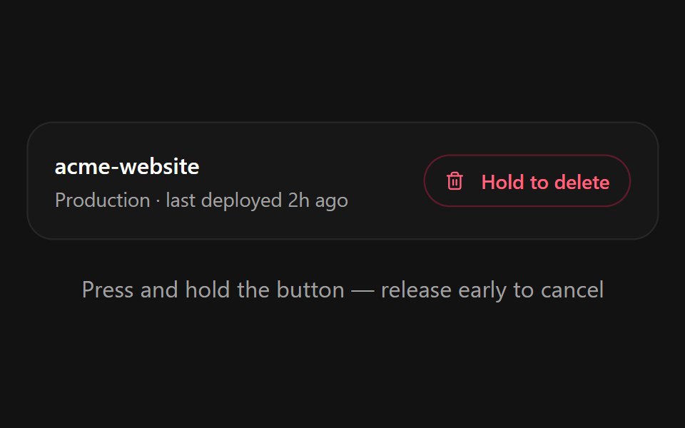 Hold to ConfirmSpectrum UI · ReactA press-and-hold confirmation button for destructive actions with a filling progress ring, spring-back on early…
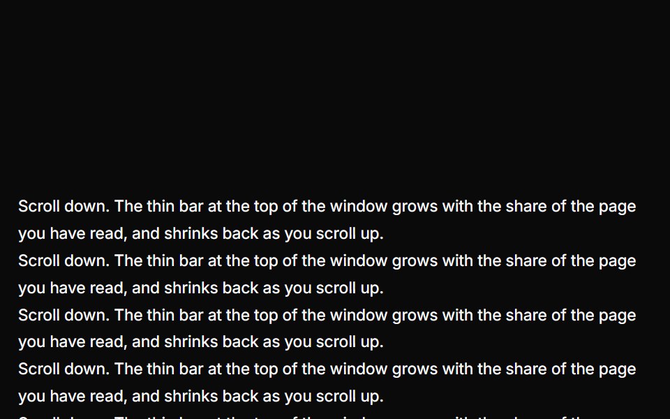 Reading ProgressUser Interface Wiki · React
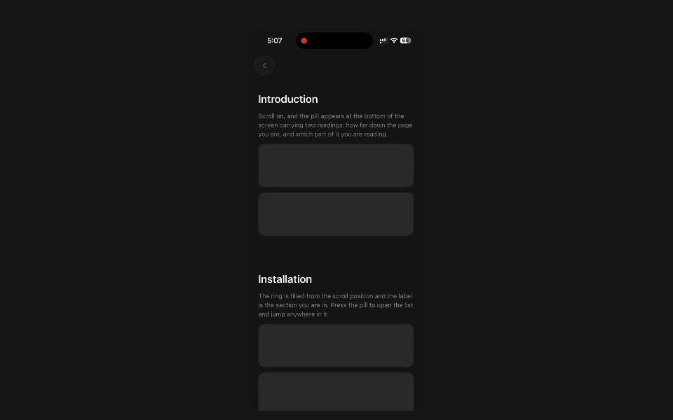 Section ProgressPanel UI · React NativeFloating pill with a scroll ring and the section being read.
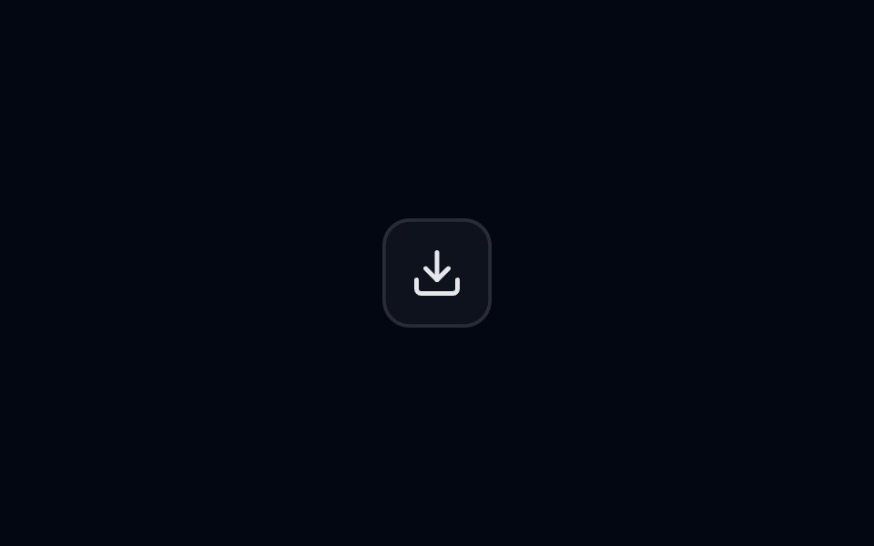 Popover 05 - Download ProgressShadcn Space · ReactDownload progress popover with pause/resume/cancel controls and background fill animation.
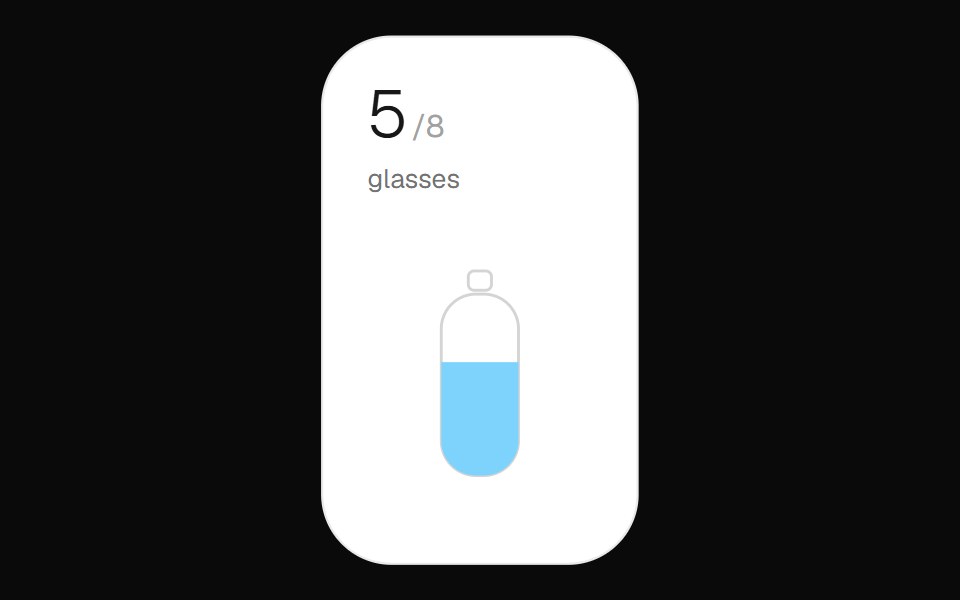 Hydration WidgetOpenSourceUI · React
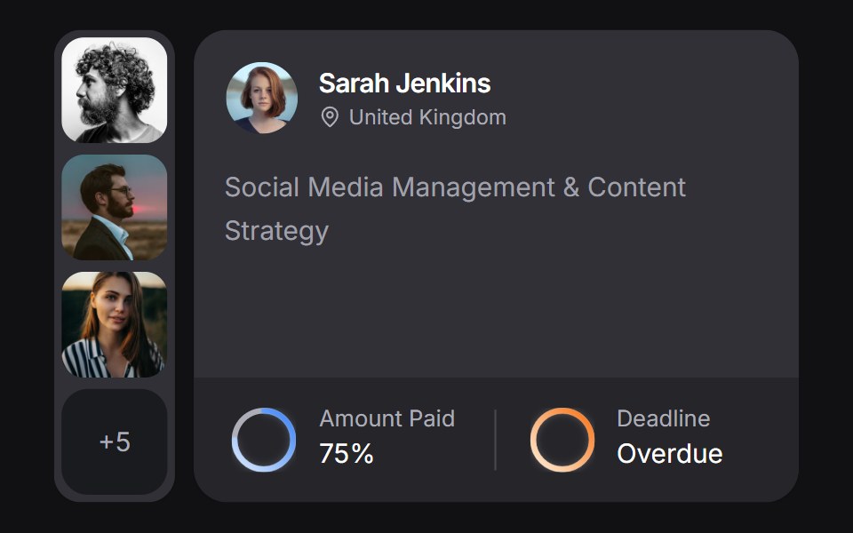 Client Carduselayouts · ReactA client CRM card with payment and deadline rings, plus a morphing avatar stack.
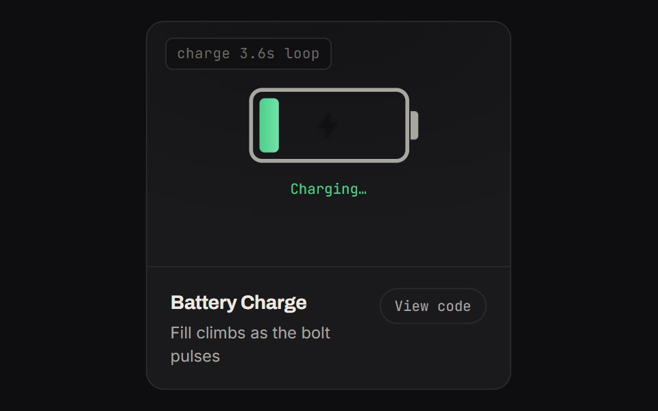 Battery ChargeKinetics · HTML/CSSFill climbs as the bolt pulses
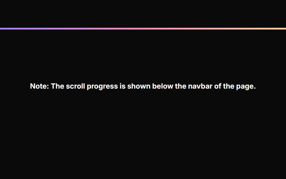 Scroll ProgressAnimations (Svelte) · SvelteA fixed progress bar component that indicates page scroll progress with a gradient color effect.
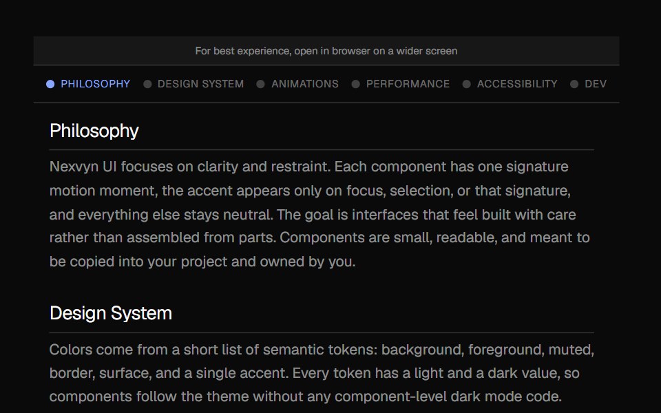 Scroll IndicatorNexvyn UI · ReactA vertical scroll progress indicator with tick marks, section labels, and a floating position readout.
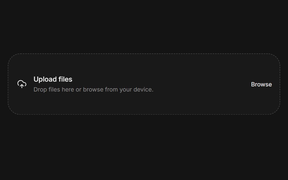 File uploadArc Library · ReactA complete file selection flow with constraints, progress, and error feedback.
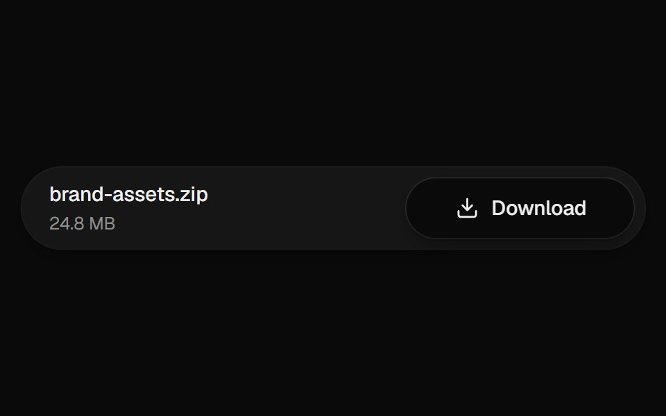 Download ButtonUI Lab · ReactThe arrow drops into the tray while the button fills with progress.
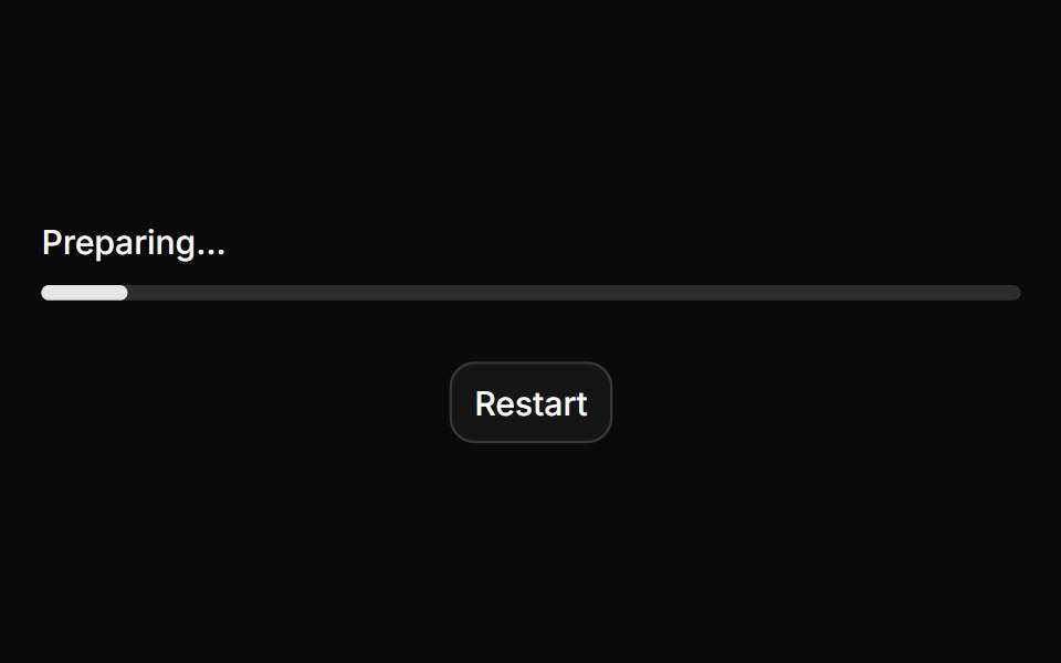 ProgressHextaUI · ReactA bar or ring that shows how far a task has come, eases between updates and slides while the total is unknown.
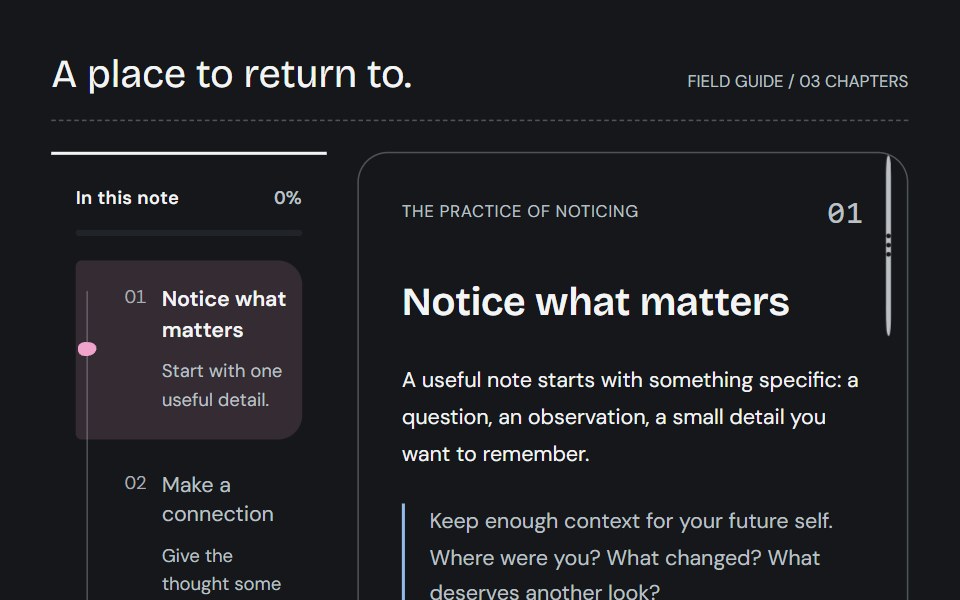 Reading trailCojeev UI · ReactKeep your place with a connected spine, an expandable bookmark or a descriptive chapter overview—all following actual…
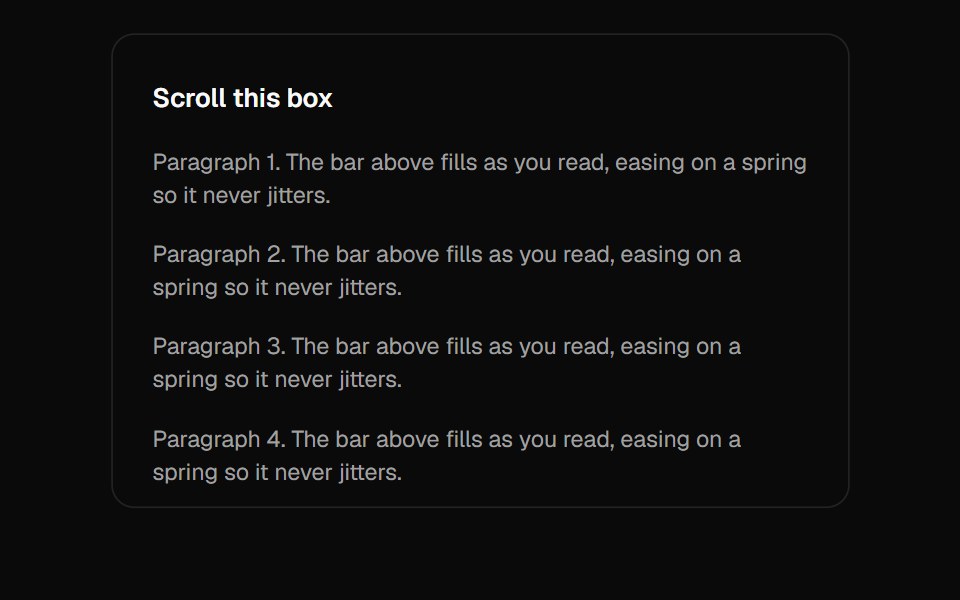 Scroll ProgressVelora UI · ReactGradient page-progress bar pinned to the top.
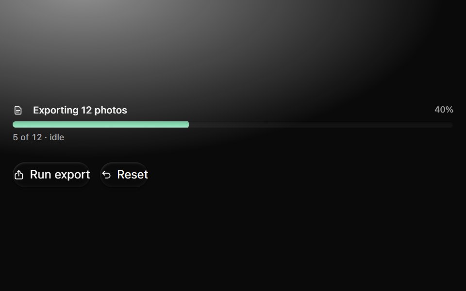 ProgressMetal UI · React + SwiftUITask amount and explicit idle, running, paused, failed, cancelled and complete states. Bars, slim bars, rings…
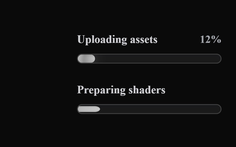 Liquid ProgressLiquefy UI · ReactProgress bar in liquid glass style. Barra de progresso em estilo vidro líquido.
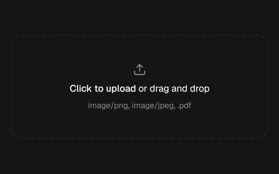 File UploadEaseUI · ReactDropzone that also opens the native file picker, with a list below it that pops each file in and collapses smoothly on…
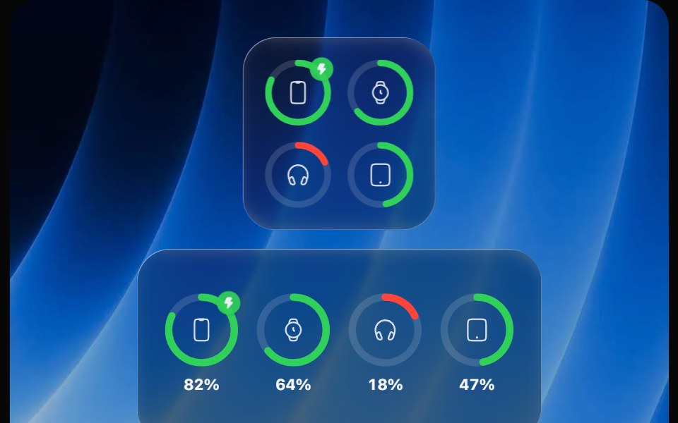 Battery WidgetOpaline · ReactBatteries widget with device rings that fill, turn red when low and show charging.
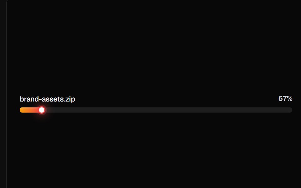 Linear Progress BarsReactFrame · ReactA card of linear progress rows, plain ratio bars, file-upload rows with icons/subtitles/shimmer, milestone ticks, and…
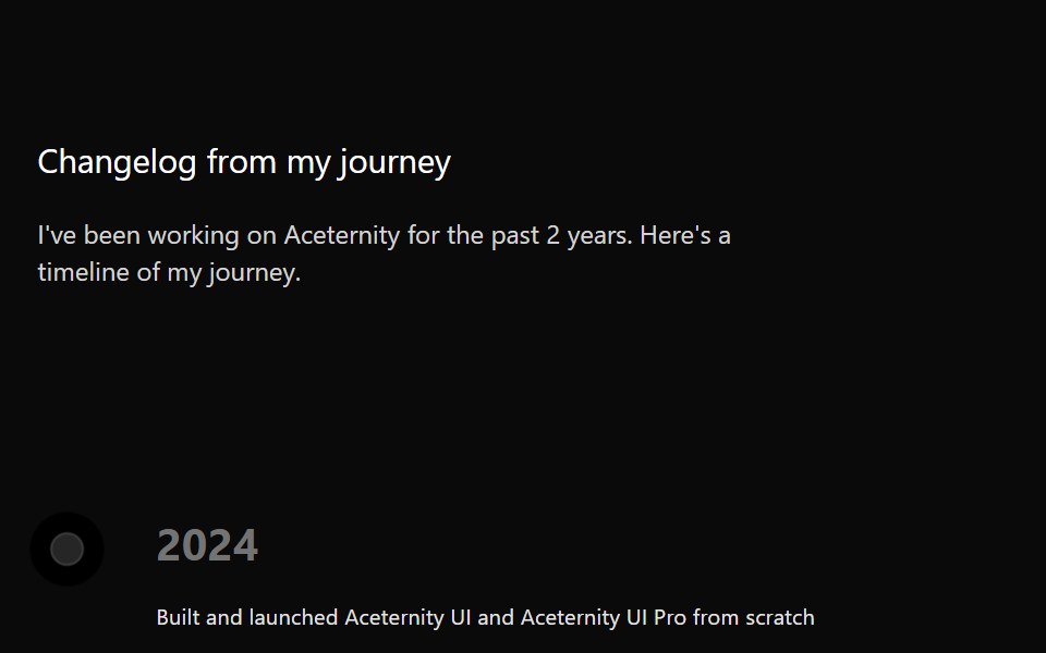 TimelineAceternity UI · React
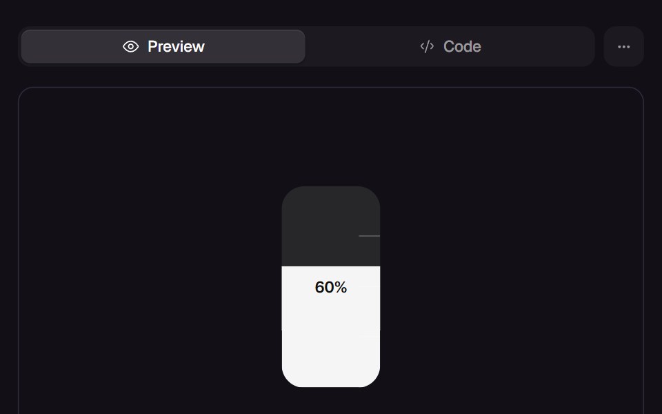 Slosh GaugeReact Bits · ReactTank gauge whose liquid chases the value with mass, tilts with its own speed and splashes against the top when it…
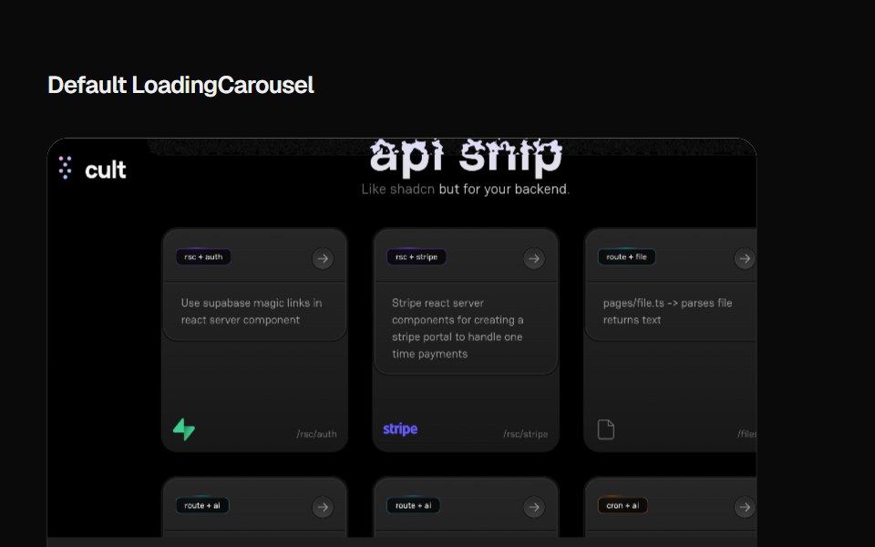 Loading CarouselCult UI · ReactLoading carousel component with smooth transitions and customizable content
 Progress IndicatorAmicro Micro Transitions · ReactHorizontal page scroll progress indicator bar.
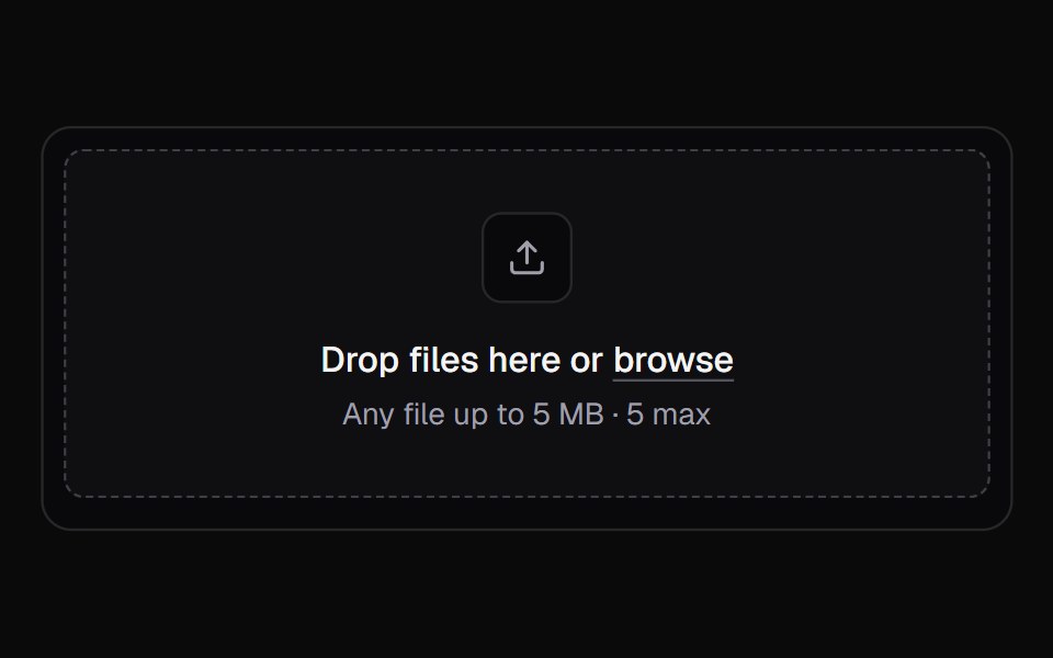 File UploadKokonut UI · ReactA multi-file upload queue with per-file progress, retry and cancel.
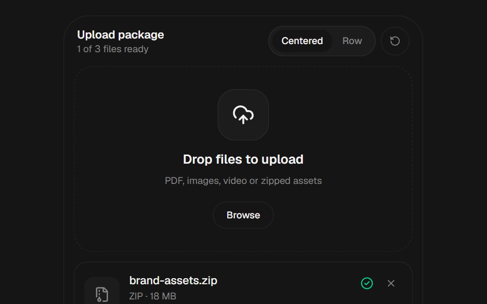 File UploadbeUI · React
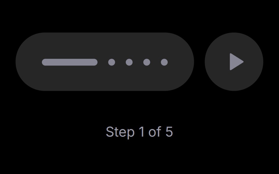 Step PlayerRare UI · ReactAn iOS-style stepped progress track with a play, pause and replay control. The active step stretches into a bar that…
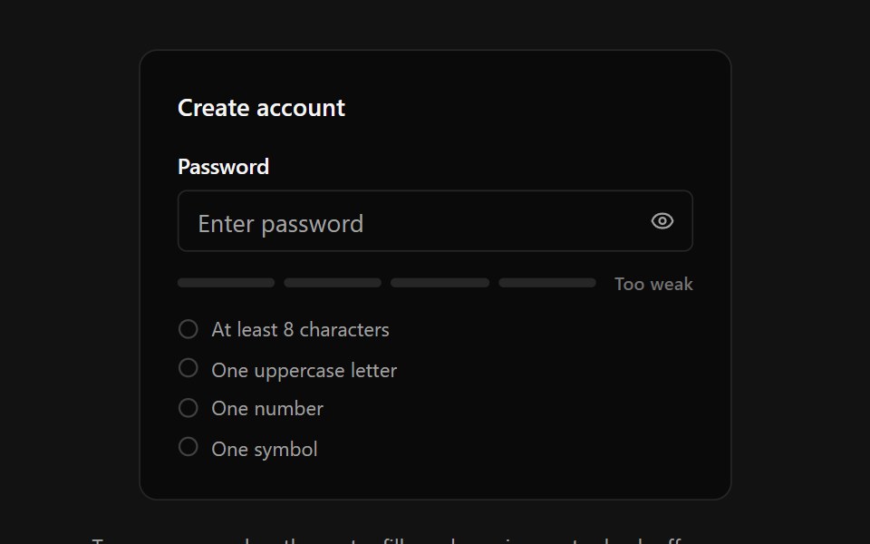 Password StrengthSpectrum UI · ReactA password input with an animated four-segment strength meter, crossfading strength label, requirements checklist with…
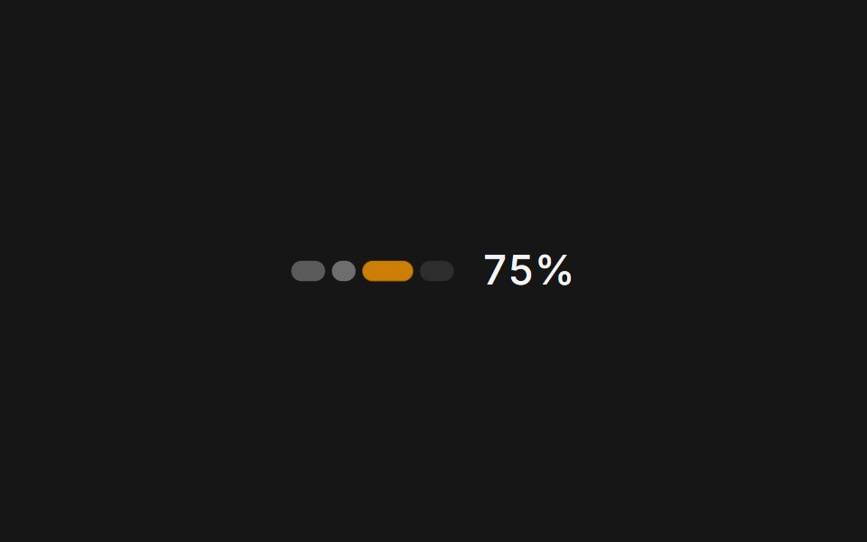 Web UsagePanel UI · React NativeA usage and credits panel for an AI app: credit used, renewal date and context compaction.
 Progress 04 - Shimmer Status ProgressShadcn Space · ReactAnimated progressbar with real-time text updates, smooth entrance and exit animations, and a polished UI.
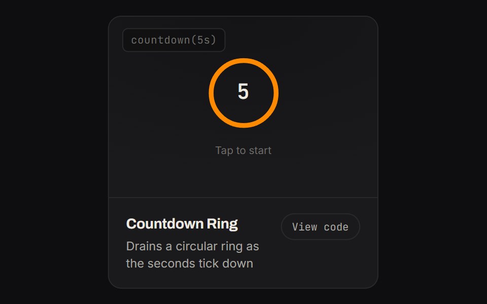 Countdown RingKinetics · HTML/CSSDrains a circular ring as the seconds tick down
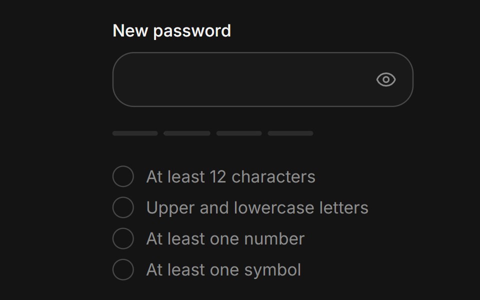 Password strengthArc Library · ReactShow how strong a new password is while it is typed.
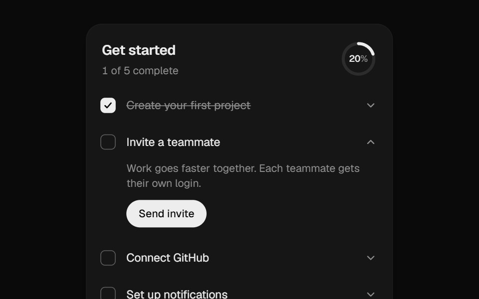 Onboarding ChecklistUI Lab · ReactA setup checklist that counts up as you go and celebrates the finish.
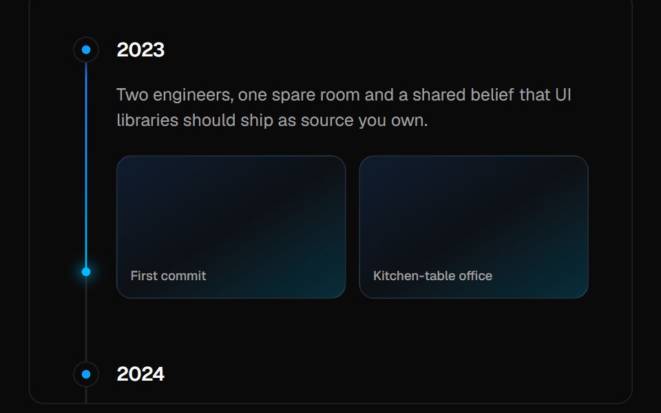 TimelineVelora UI · ReactVertical timeline with sticky labels and a gradient beam that fills as you scroll.
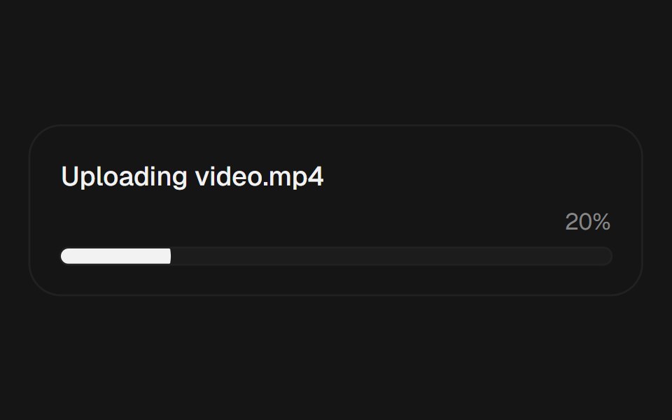 ProgressEaseUI · ReactProgress bar that fills with scale instead of width, plus an indeterminate state for unknown durations.
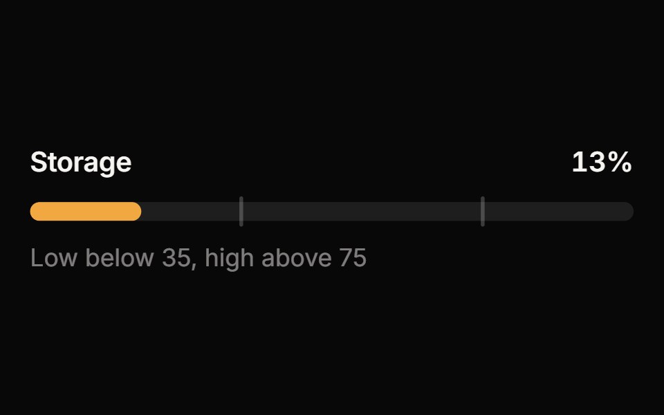 MeterReactFrame · ReactA meter for a value within a known range: bar, semicircle gauge or segmented variants with threshold zones, animated…
 Tracing BeamAceternity UI · React
 Progress StepperAmicro Micro Transitions · ReactHorizontal step line (STEP 1 → STEP 2 → STEP 3) with animated fill bar.
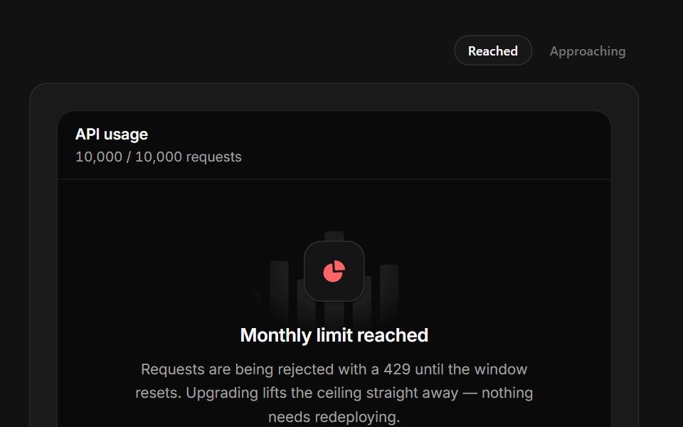 Limit ReachedSpectrum UI · ReactA quota wall with a full meter, seven days of history and a reset clock.
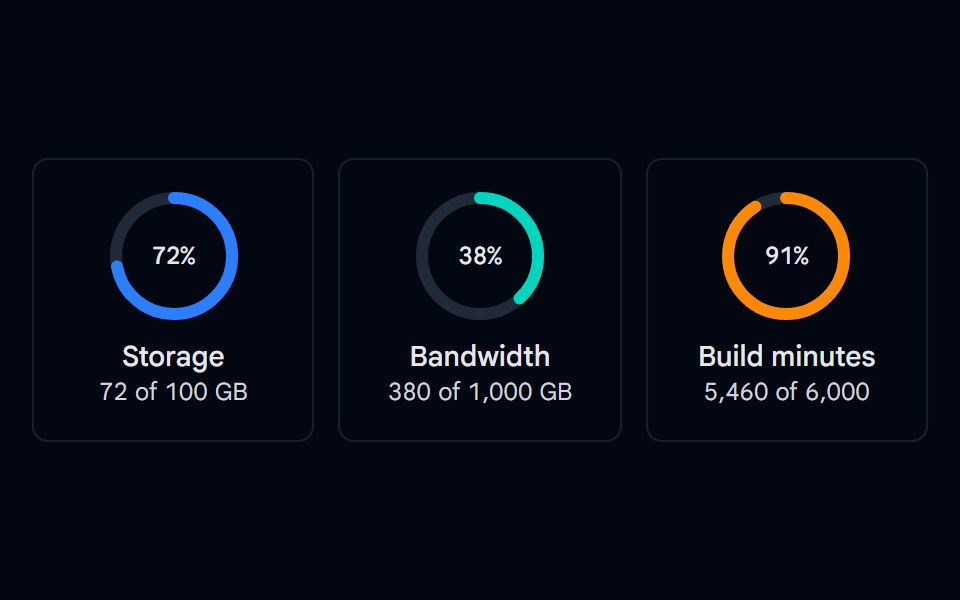 Progress 05 - Circular RingsShadcn Space · ReactSVG circular progress rings for storage, bandwidth, and build minutes with a centered percentage and usage details.
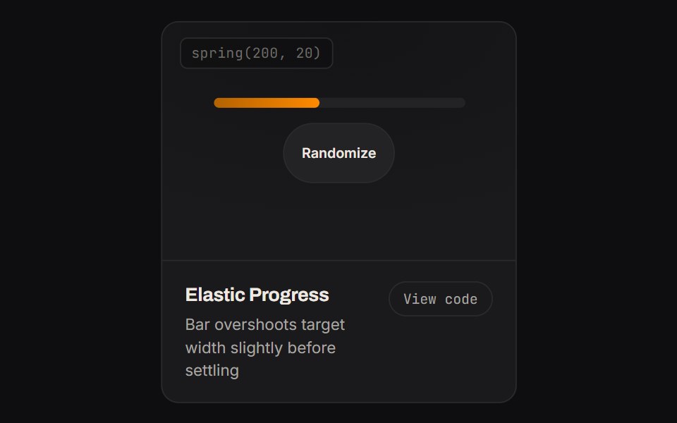 Elastic ProgressKinetics · HTML/CSSBar overshoots target width slightly before settling
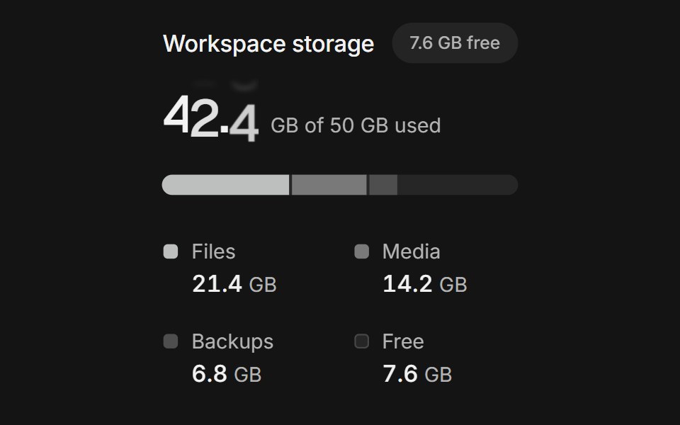 Usage meterArc Library · ReactShow what fills an allowance and how close it is to the limit.
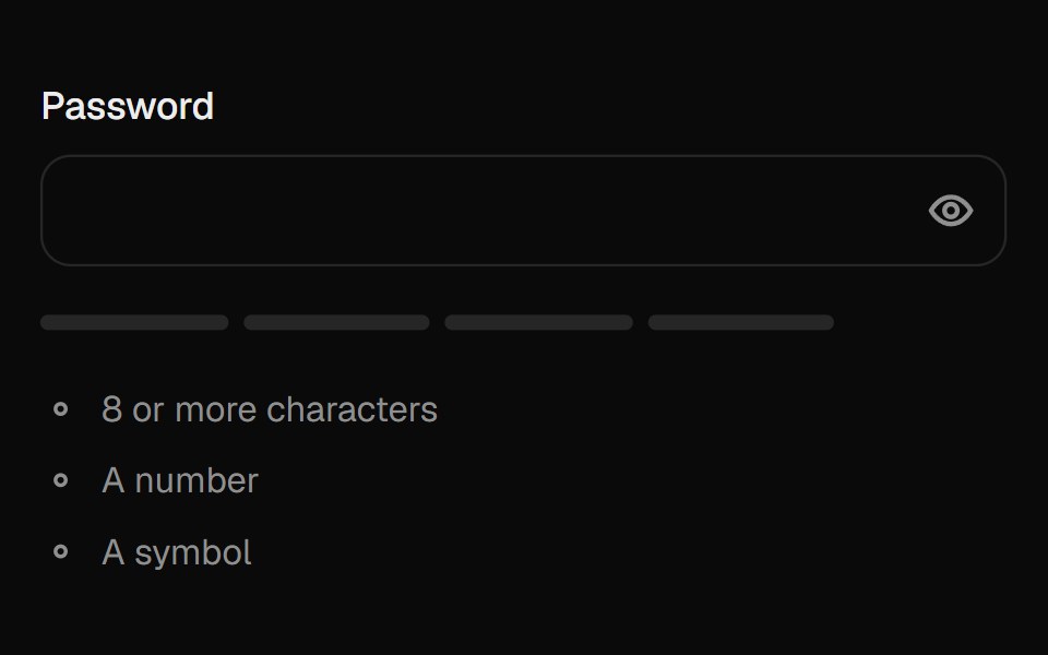 Password FieldUI Lab · ReactReveals the password with a wave of dots turning into letters; the meter fills as it gets stronger.
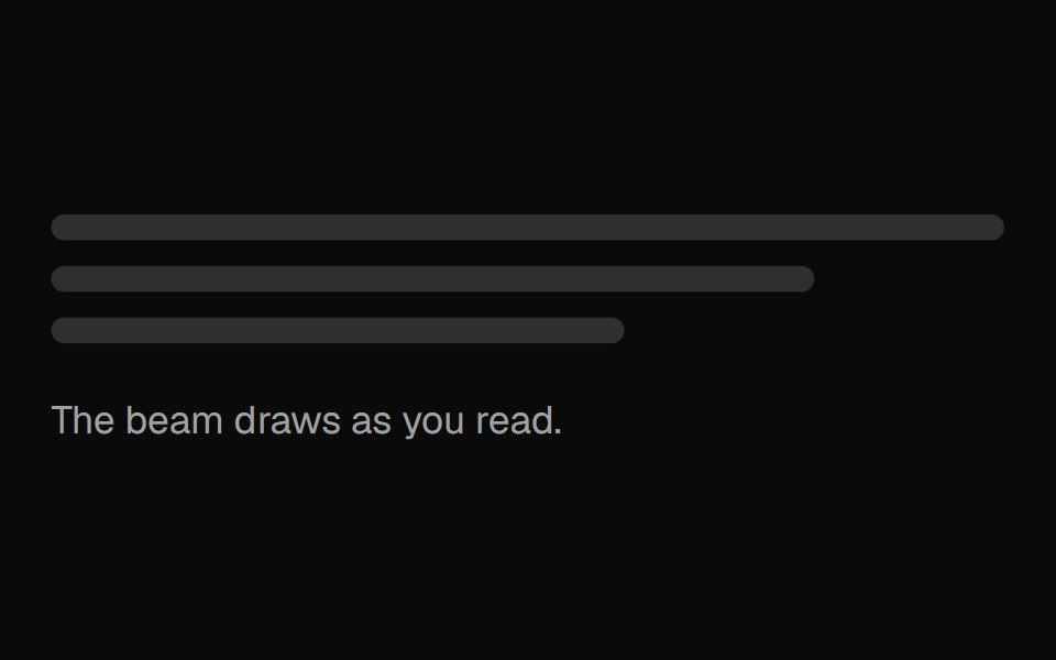 Tracing BeamVelora UI · ReactGradient line that draws itself down long-form content.
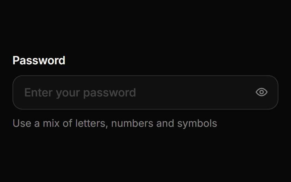 Password InputReactFrame · ReactA password field with an animated show/hide eye toggle, a four-segment strength meter, a live requirements checklist…
 Segmented Arc MeterAmicro Micro Transitions · ReactStepped 4-bar discrete vertical gauge with percentage readout.
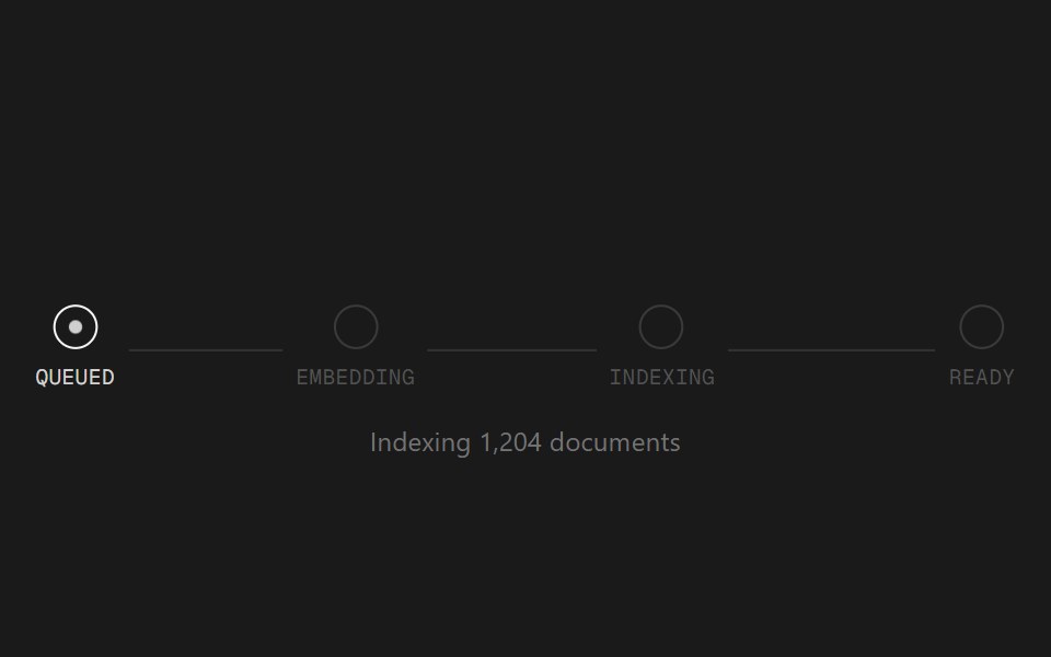 Status TrackerSpectrum UI · ReactA staged progress tracker for long-running AI jobs.
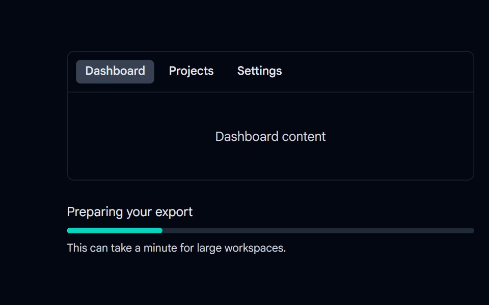 Progress 09 - Page Loading & IndeterminateShadcn Space · ReactTop page loading bar that trickles and finishes on navigation, plus an indeterminate progress bar for tasks with…
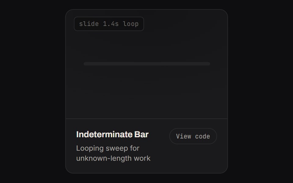 Indeterminate BarKinetics · HTML/CSSLooping sweep for unknown-length work
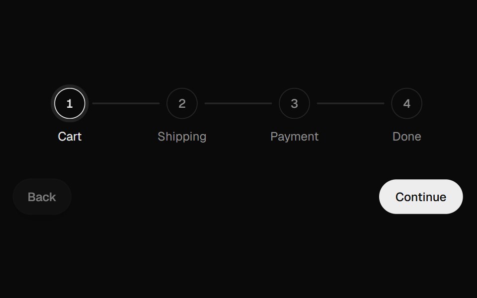 Progress StepperUI Lab · ReactFills the line toward the next step and unfills it in reverse.
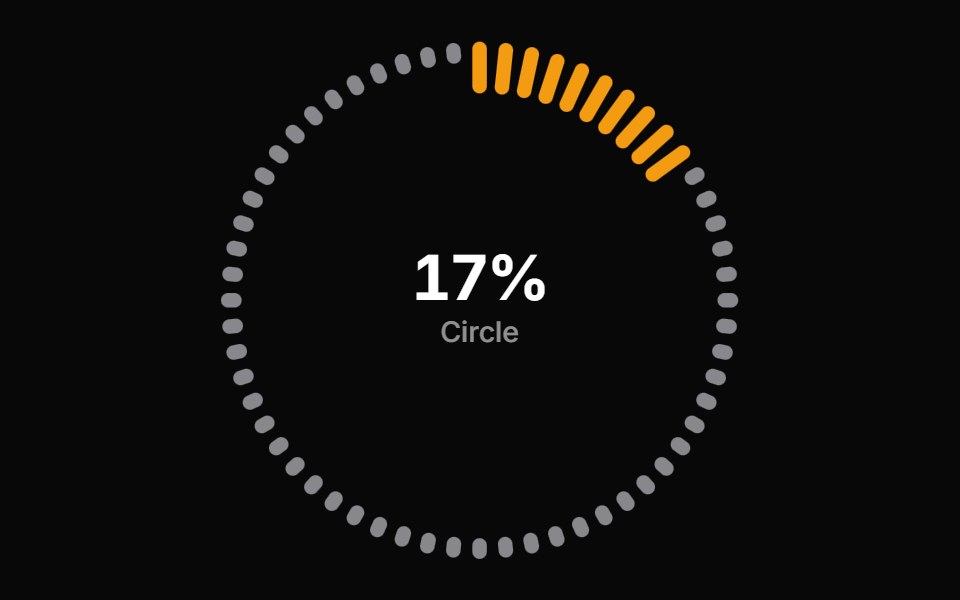 Progress Circle BarsReactFrame · ReactA circular progress indicator with ring, gauge, and dashes arc styles, scroll-triggered count-up animation, color…
 Segmented Step BarAmicro Micro Transitions · ReactBattery-style multi-segment discrete progress bar with stepped fill.
 Undo PillSpectrum UI · ReactAn inline undo pill with a draining countdown ring that pauses on hover and fires undo or expire callbacks
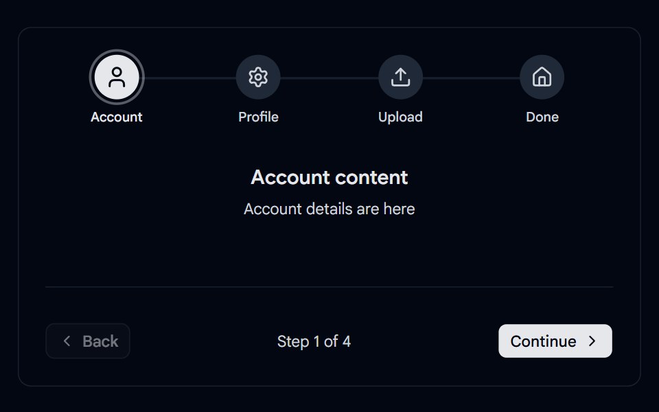 Stepper 03 - Animated Progress IndicatorsShadcn Space · ReactStepper with spring-based progress line, traveling dot, pulsing active badge, icon to checkmark morphing, and…
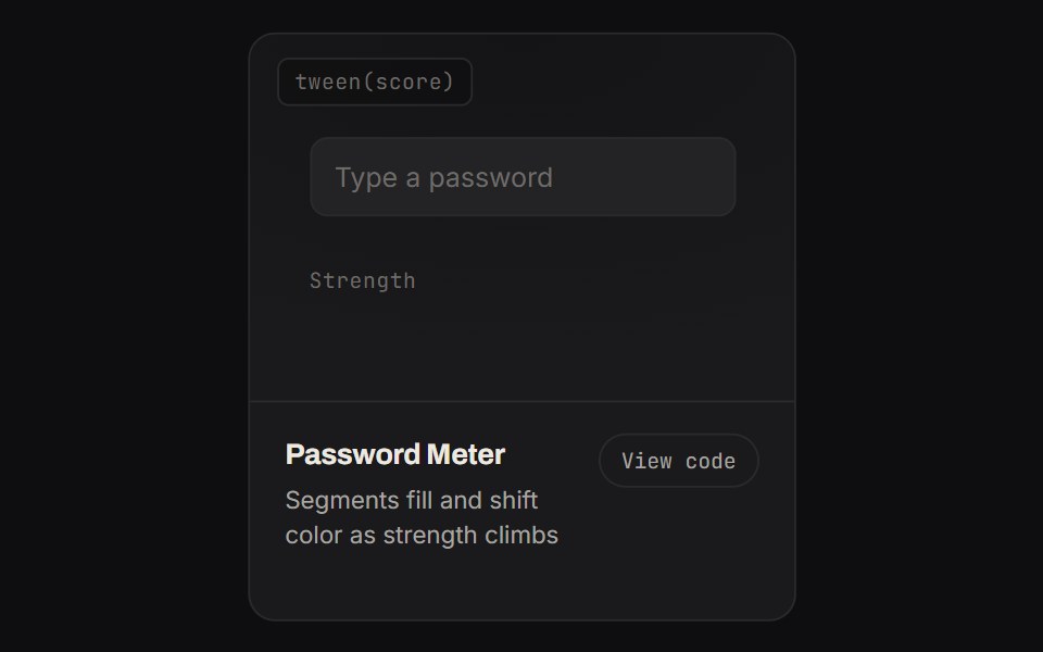 Password MeterKinetics · HTML/CSSSegments fill and shift color as strength climbs
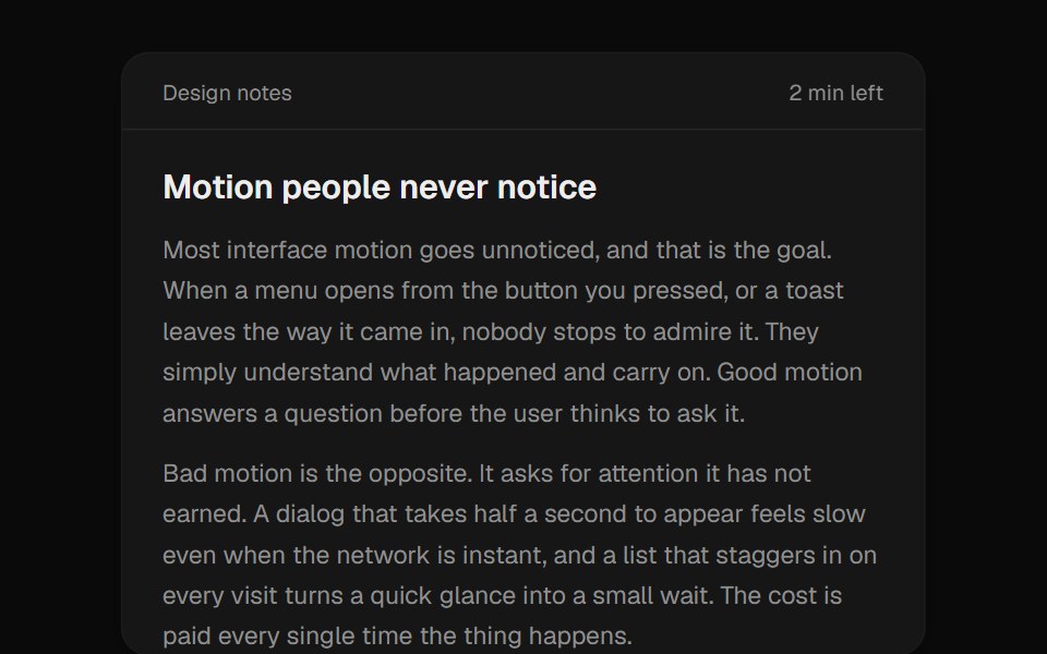 Reading ProgressUI Lab · ReactA progress bar fills as you read while the time left counts down.
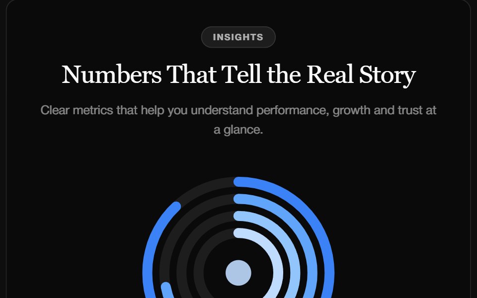 Stat FeatureReactFrame · ReactA metrics section with a concentric ring chart, a trend caption and count-up stats that enter with a blur, slide, fade…
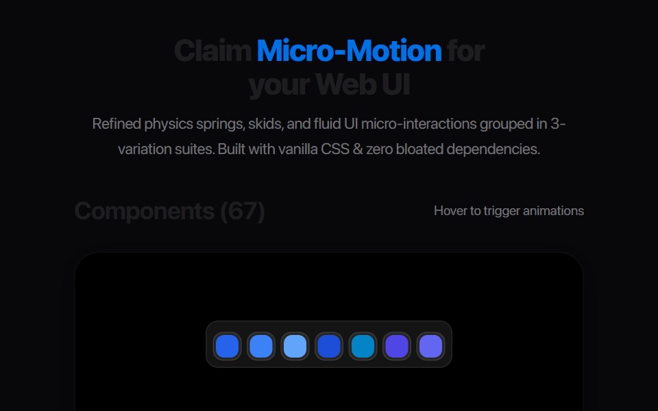 Segmented Stepper DotsAmicro Micro Transitions · ReactPill-morphing connected page dots with spring expansion indicator.
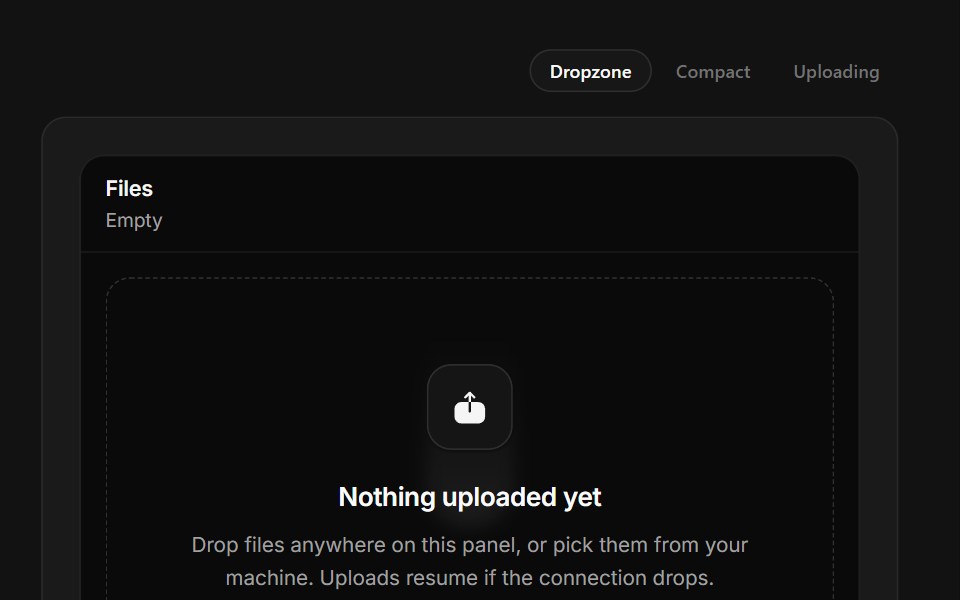 Drop FilesSpectrum UI · ReactA drop zone with real drag handling and per-file upload meters.
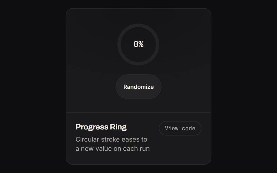 Progress RingKinetics · HTML/CSSCircular stroke eases to a new value on each run
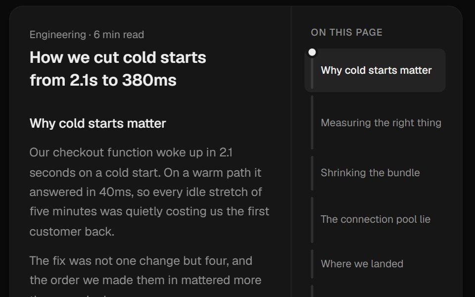 Scroll SpineUI Lab · ReactMaps the article as a spine of bands, each as long as its section, filling in as you read.
 Gear Tooth StepAmicro Micro Transitions · React
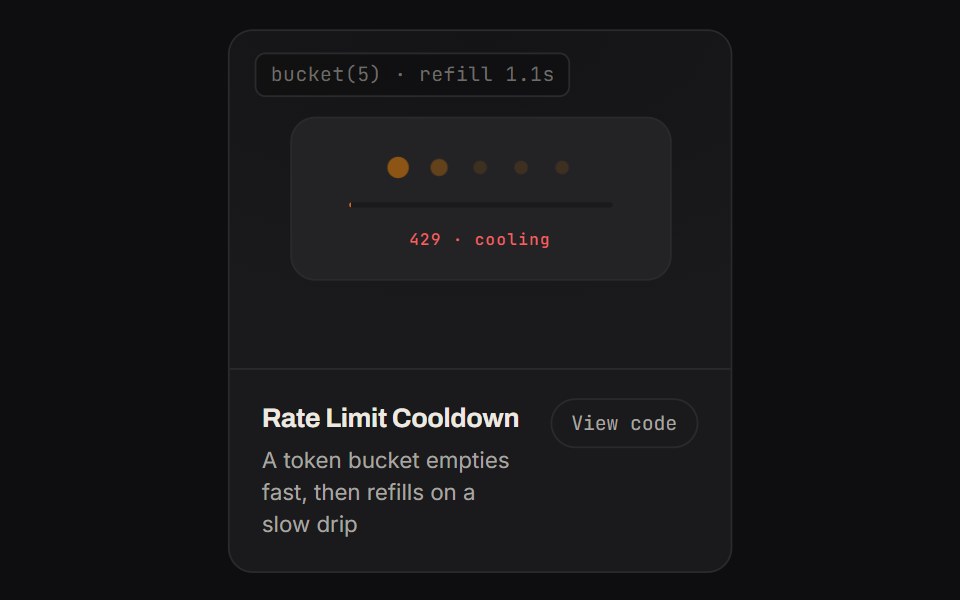 Rate Limit CooldownKinetics · HTML/CSSA token bucket empties fast, then refills on a slow drip
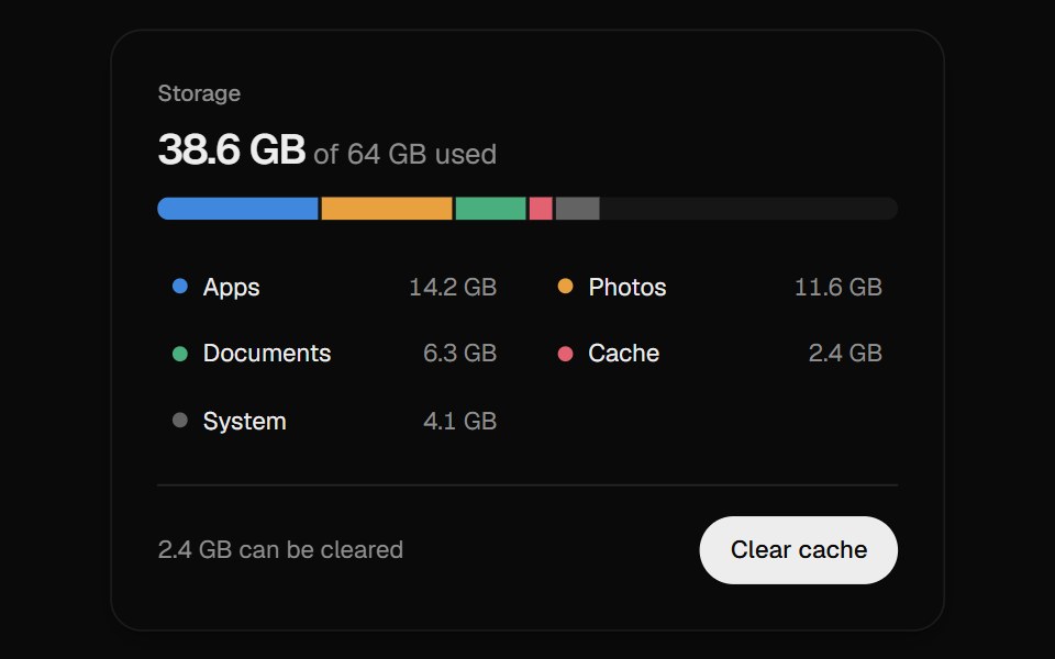 Storage MeterUI Lab · ReactPoint at any slice to read its size, then clear the cache and watch the total count down.
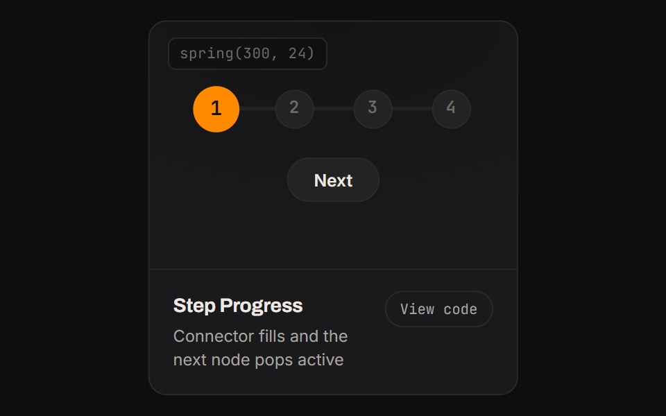 Step ProgressKinetics · HTML/CSSConnector fills and the next node pops active
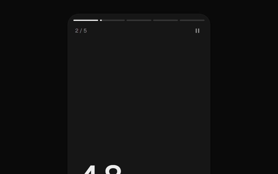 Story ProgressUI Lab · ReactTap through stories, hold to pause.
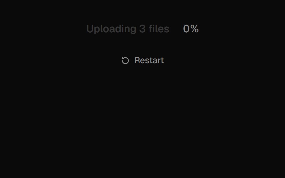 Text ProgressUI Lab · ReactFills the label itself with ink as the upload runs.
 Upload ButtonUI Lab · ReactShrinks into a progress ring, fills, then checks off.
Libraries with Animated progress components
Related categories
- Progress Components
- React Progress Components
- Tailwind CSS Progress Components
- shadcn/ui Progress Components
- Animated Feedback Components
- Animated Spinner Components
- Animated Skeleton Components
- Animated Progress Bar Components
- Animated Status Indicator Components
- Animated Typing Indicator Components
- Animated Empty State Components
- Animated Badge Components
- Animated Chip Components
- Animated Notification Components
- Animated Alert Components
- Animated Progress Circle Components
- Animated Scroll Progress Components
- Animated Banner Components
- Animated Loading Screen Components
- Animated Error State Components