 Dev Design Library
Tailwind CSS Status Indicator Components
Dev Design Library indexes 76 Tailwind CSS status indicator components from 25 open-source UI libraries, with the most coming from Tremor Blocks, LocalMode, Origin UI, ReUI and UI Lab. Each one links to its page with the source code, a live preview where available, the library license and the install command. Every library in this list styles its components with Tailwind CSS utility classes. Status indicator components belong to the Feedback group.
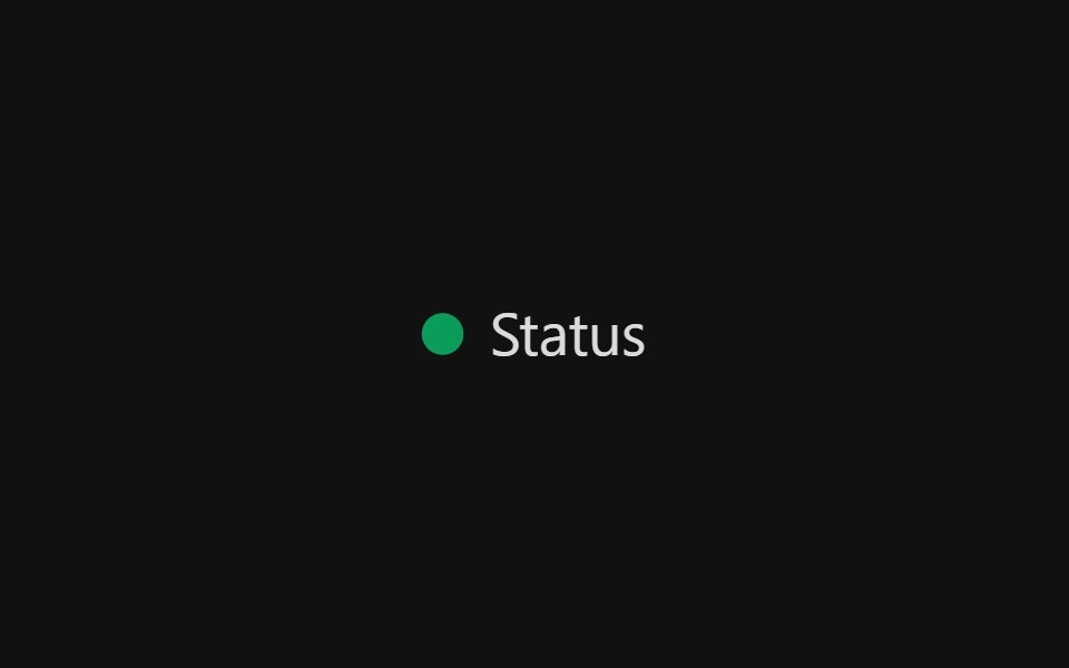 Status LightReact Spectrum · ReactStatus lights are used to color code categories and labels commonly found in data visualization. When status lights…
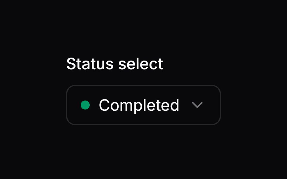 Comp 220Origin UI · React
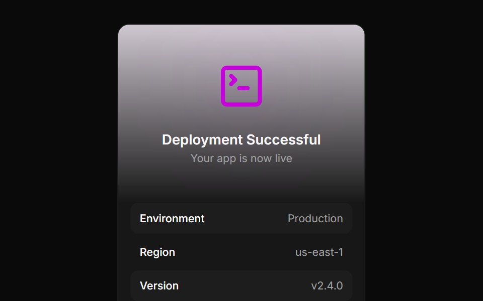 Deployment status summary cardReUI · ReactDeployment status summary card
 Uptime Dither Bar ChartAmicro Micro Transitions · ReactContinuous uptime bar chart with dithered matrix animation.
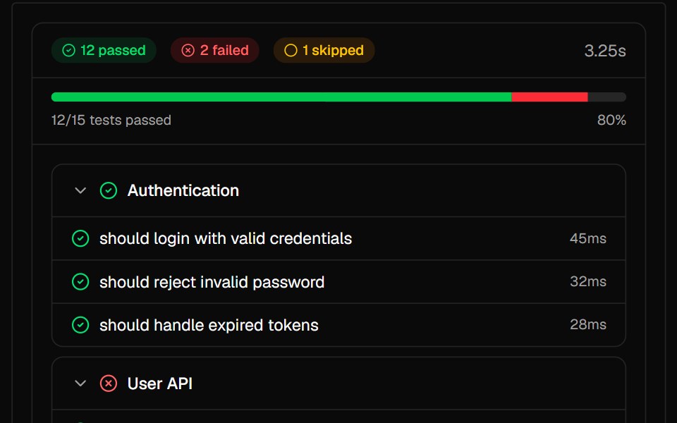 Test ResultsAI Elements · ReactDisplay test suite results with pass/fail/skip status and error details.
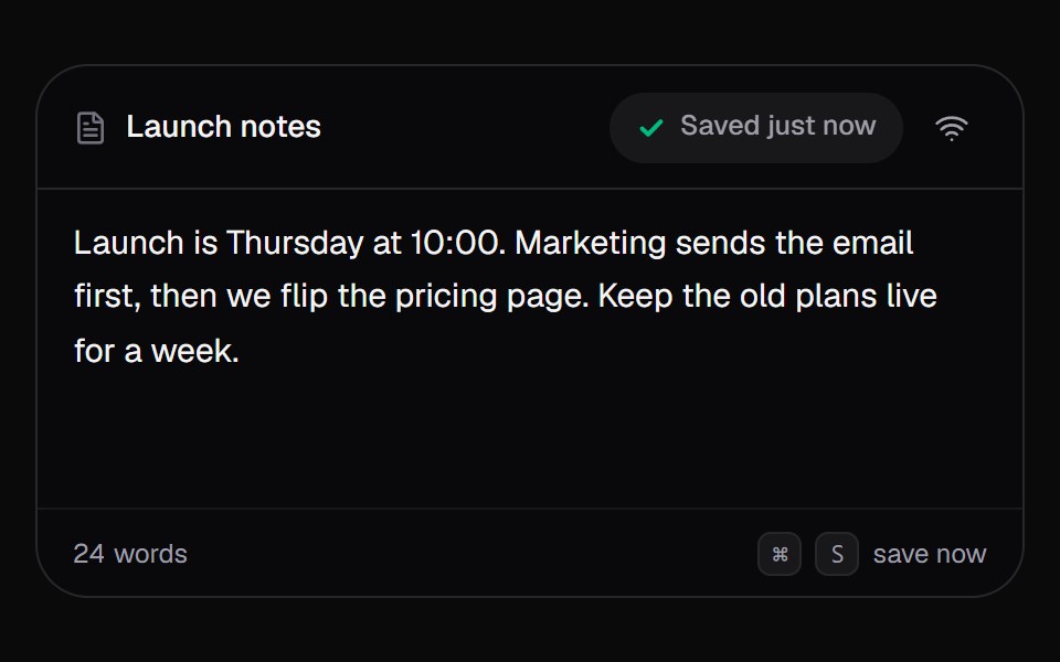 Save StatusKokonut UI · React"An autosave pill for editors that says Editing, Saving or Saved, counts changes while offline, and syncs them when…
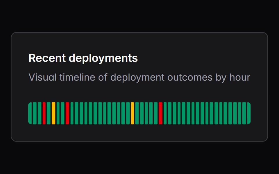 trackerIntent UI · Reacttracker
 Dot IconUntitled UI React · React
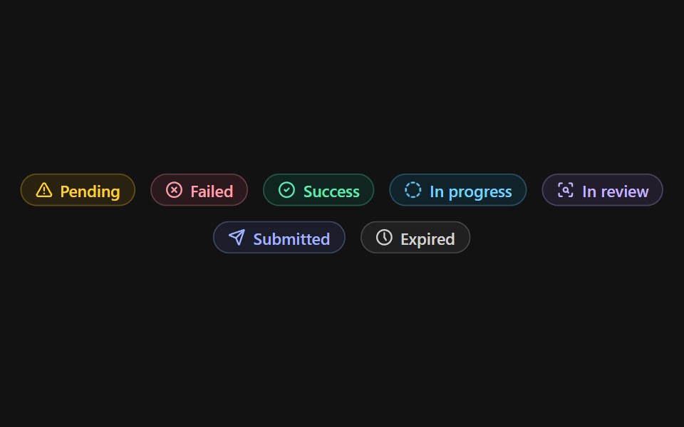 Status BadgeSpectrum UI · Reactcomponent for the Status Badge
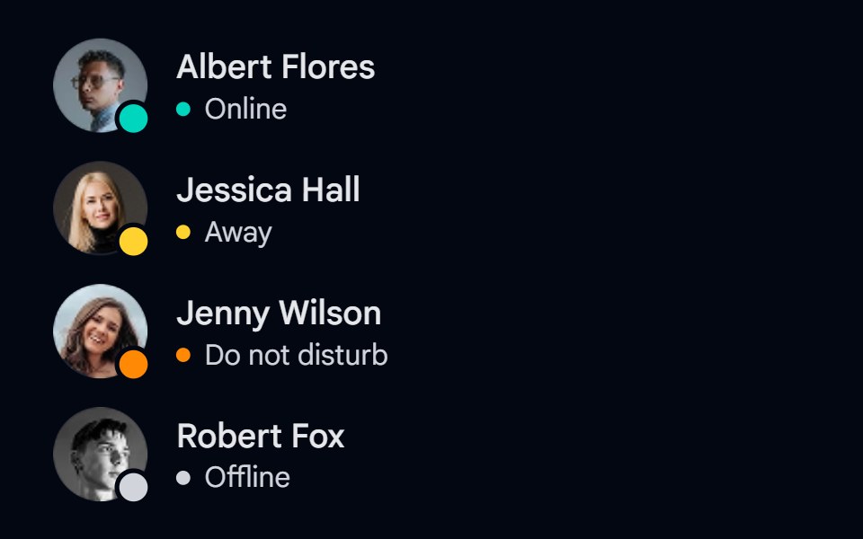 Avatar 09 - Status IndicatorsShadcn Space · ReactAvatars with online, away, do not disturb, and offline status badges, a grayscale offline photo, and status labels.
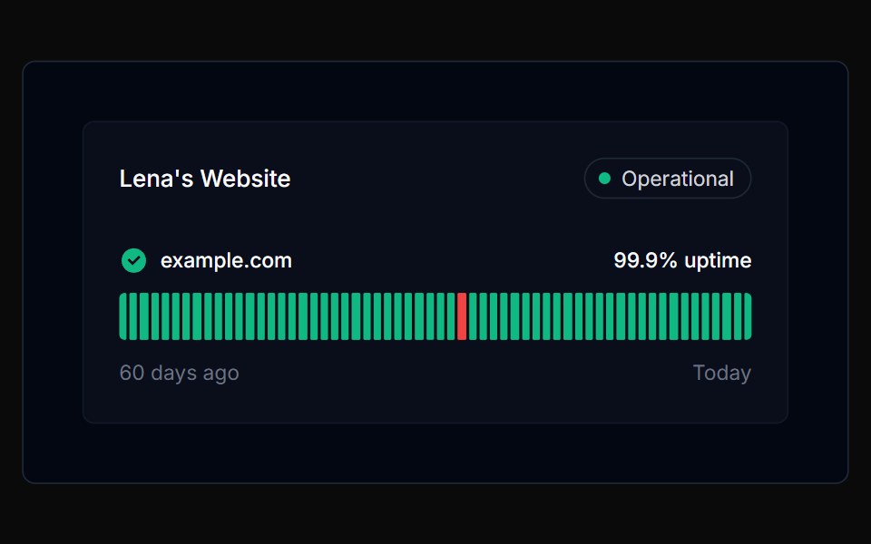 TrackerTremor Blocks · React
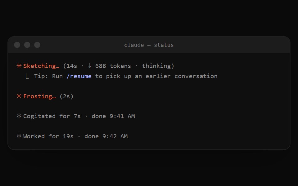 Claude Code StatusNotra · ReactThe orange spinner line while Claude works and the dim "✻ Worked for 19s" summary after a turn.
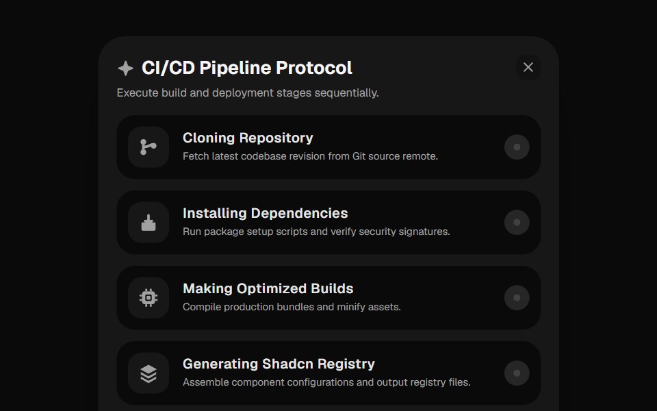 Deployment ChecklistGreatUI · React
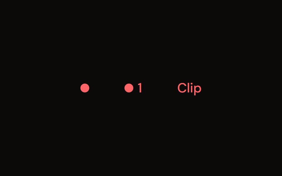 Clip Indicatoraudiocn · ReactA clip light that holds after the signal clips, with an optional count and click to reset.
 Status IndicatorWatermelon UI · React
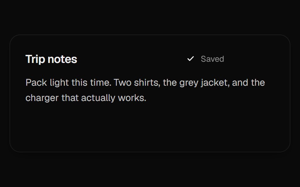 Autosave StatusUI Lab · ReactA dot for unsaved changes splits into three while saving, then gathers into a check.
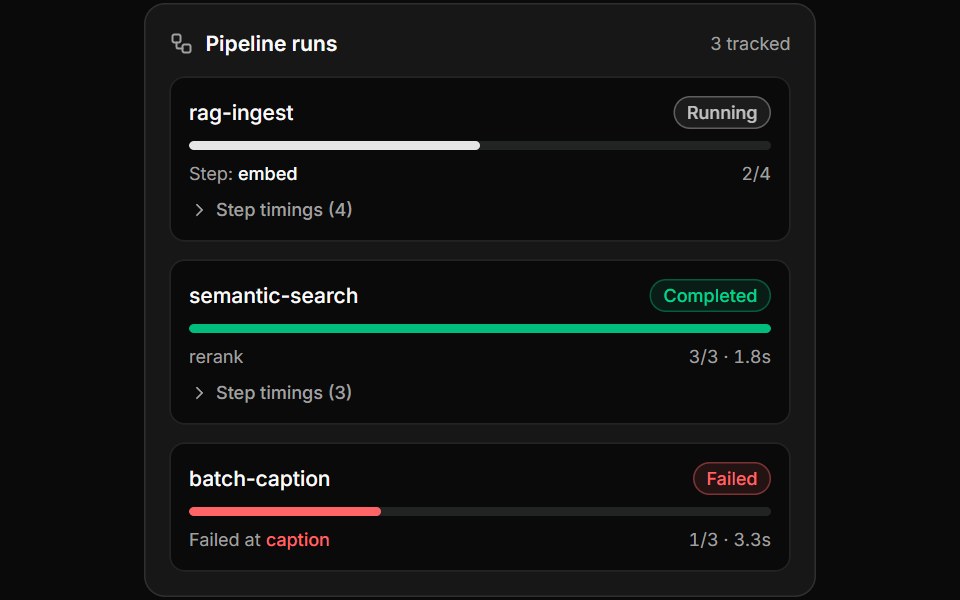 Pipeline Run InspectorLocalMode · ReactPer-run pipeline observability cards: status badge (running pulses on primary, completed emerald, failed destructive)…
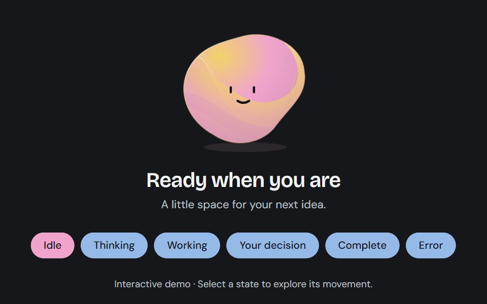 Agent stateCojeev UI · ReactA sculpted, living status field that changes contour and color as an agent thinks, works, asks for input, or finishes.
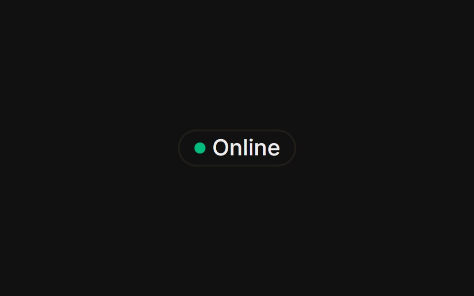 With status dotFLX UI · ReactA colored presence dot beside an outline label.
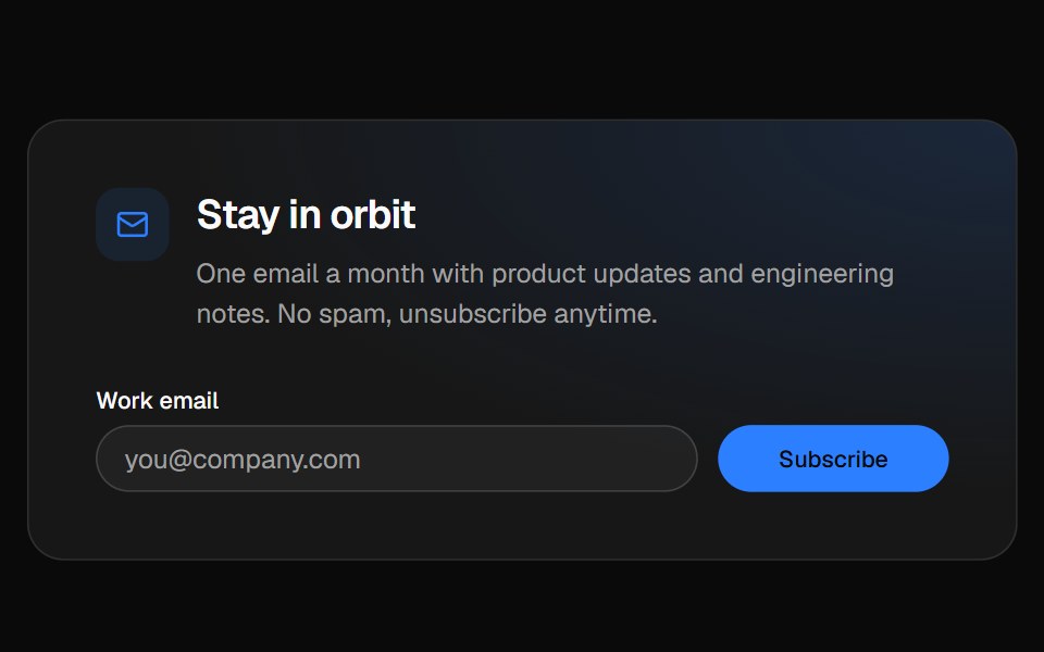 Newsletter footerVelora UI · ReactFooter with a newsletter sign-up row, link columns and a live “All systems normal” status badge.
 Animated Status Dotsv-particles · Svelte
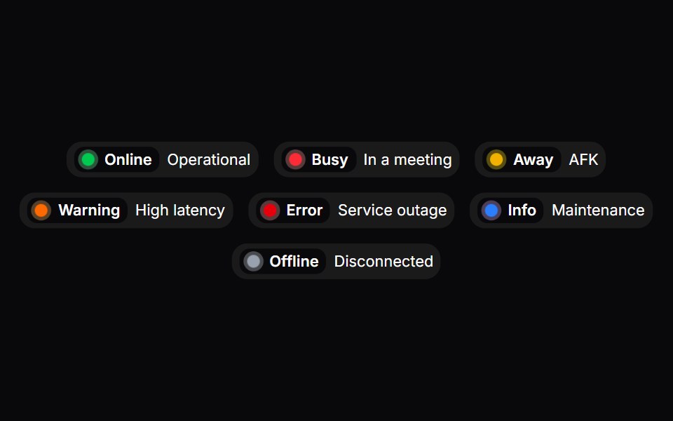 Status BadgeSpaceUI · ReactDisplays a real-time status indicator with a pulsing dot and color coding to show whether a service or user is online…
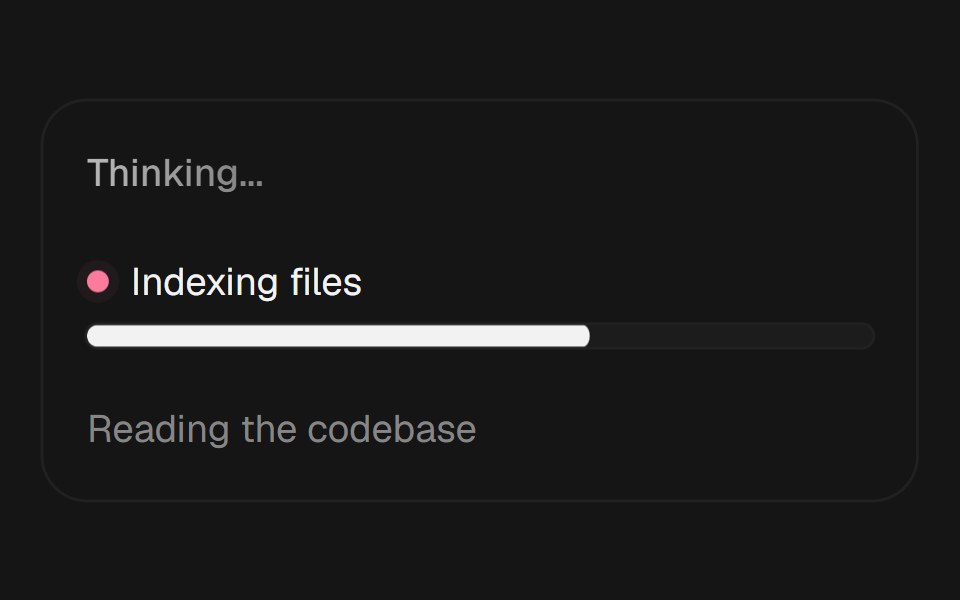 Agent Loading StatesEaseUI · ReactThree loading states for AI interfaces: shimmering status text, live agent progress, and cycling reasoning phrases.
 Status DotFibo · ReactA small mark for whether someone is present, away or offline, told apart by shape.
 AI AsistantReactFrame · ReactA dotted status light with two layouts, Mesh grid and Halo rings, across three animated states (Waiting, Listening…
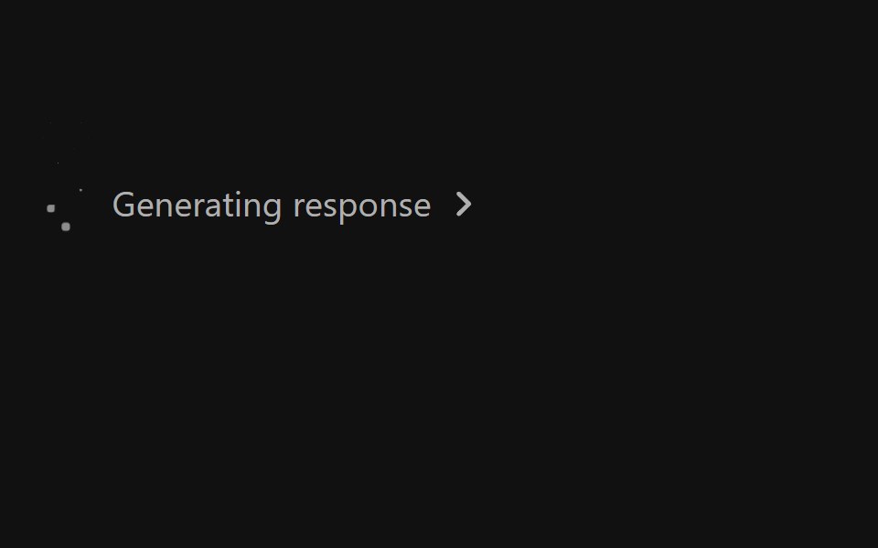 Ai Response StatusReact Spectrum · React
 Comp 394Origin UI · React
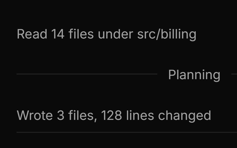 Default, separator, and border markersReUI · ReactDefault, separator, and border markers
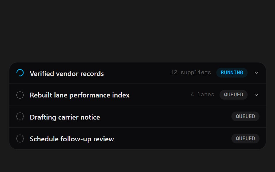 Task RowsSpectrum UI · ReactLive agent task rows with status badges and expandable notes.
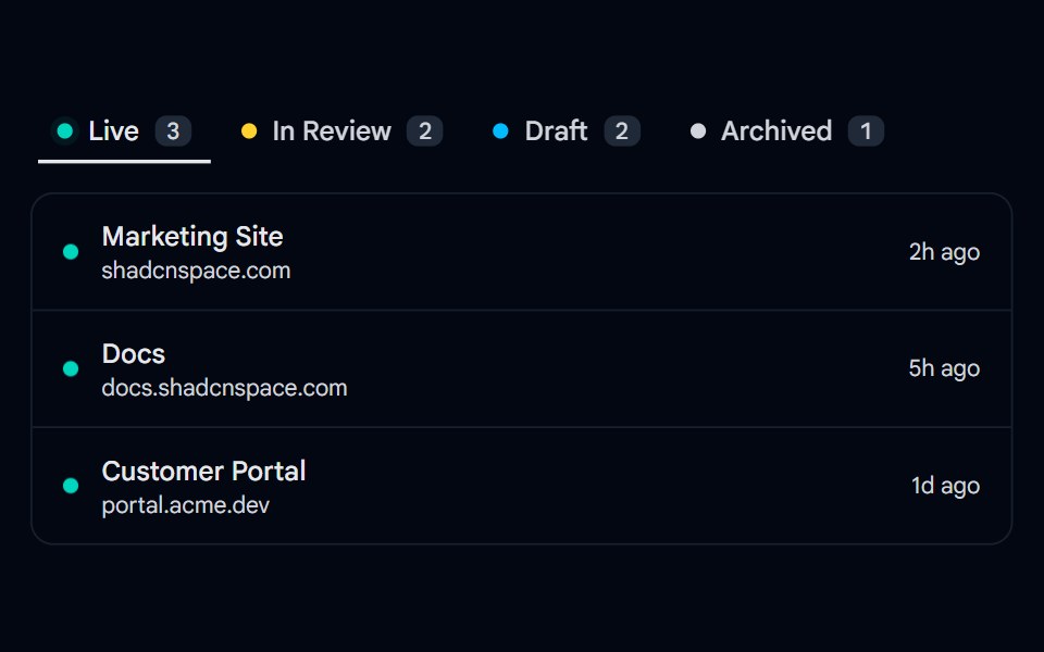 Tabs 14 - Status DotsShadcn Space · ReactUnderline tabs with colored status dots, counts, and a filtered project list per status.
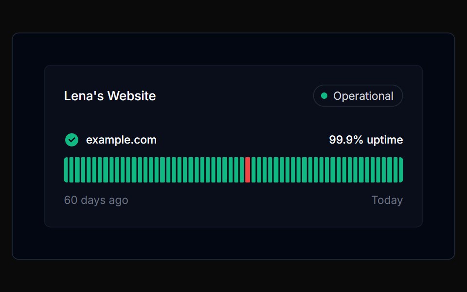 Tracker 01Tremor Blocks · React
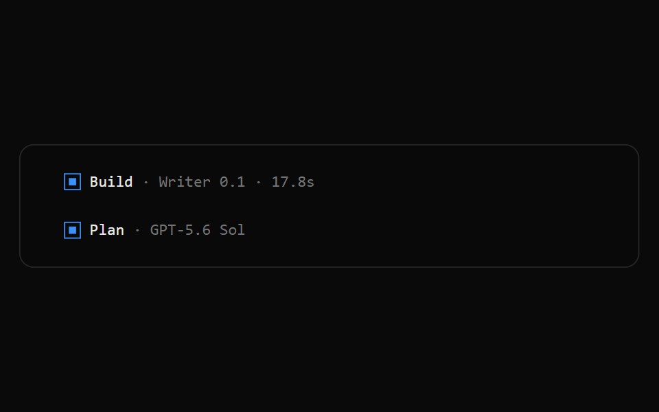 OpenCode Turn FooterNotra · ReactThe blue square, agent, model and duration line that closes an assistant turn.
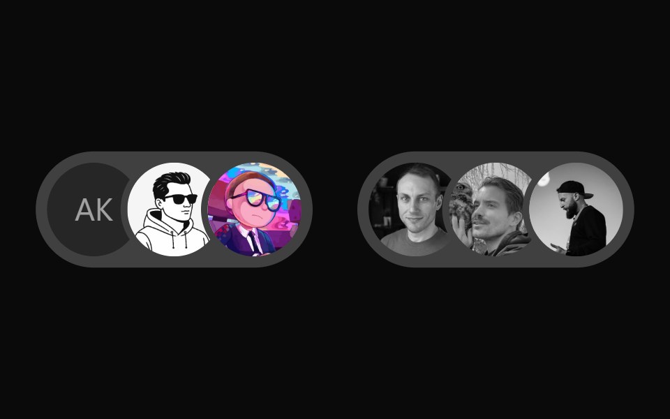 User Presence AvatarWatermelon UI · React
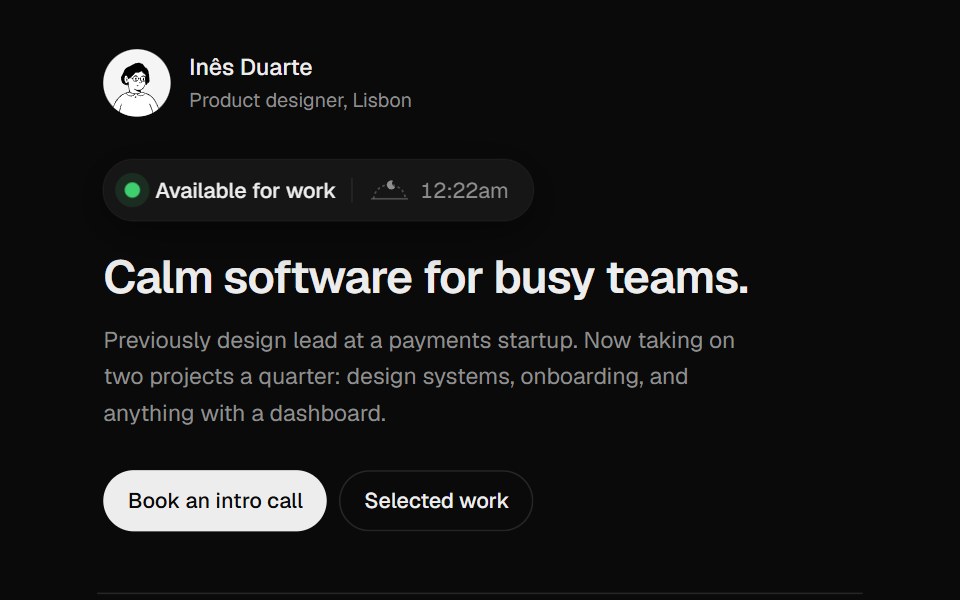 Availability BadgeUI Lab · ReactShows when the owner is working, and when that overlaps with your day.
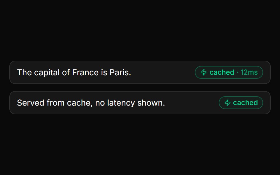 Cache BadgeLocalMode · ReactAnnotates a result as served from the semantic cache, optionally with the hit latency (e.g. "cached · 12ms"). Drive…
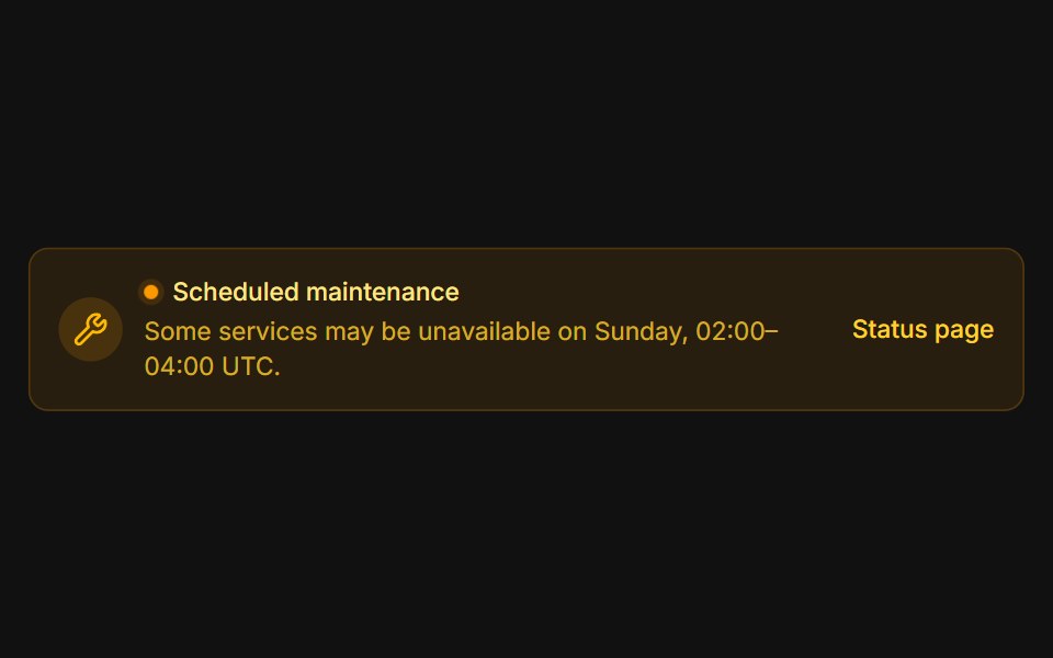 MaintenanceFLX UI · ReactAmber system notice with a pulsing status dot.
 Rounded With Emerald Status Dotsv-particles · Svelte
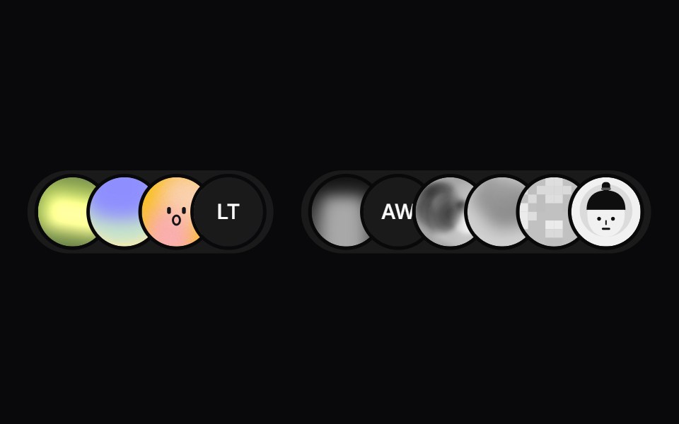 User Presence AvatarSpaceUI · ReactA compact avatar group for showing online and offline users, with smooth animated transitions when presence changes.
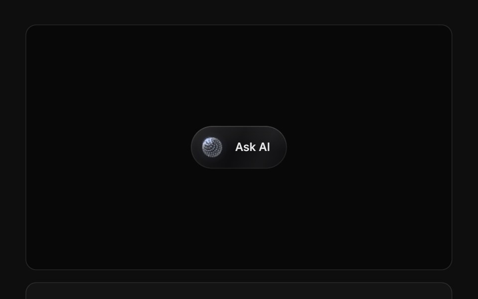 AI Dynamic Island 01ReactFrame · ReactA Dynamic Island-style AI status pill that morphs between idle, listening, thinking, working (with an unfolding step…
 Comp 395Origin UI · React
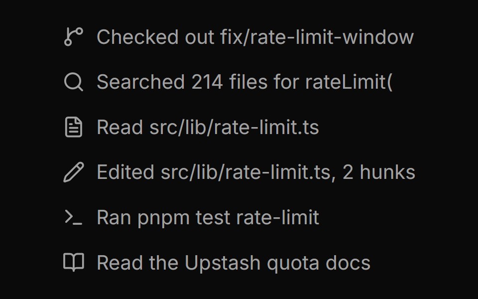 Tool call log with icon markersReUI · ReactTool call log with icon markers
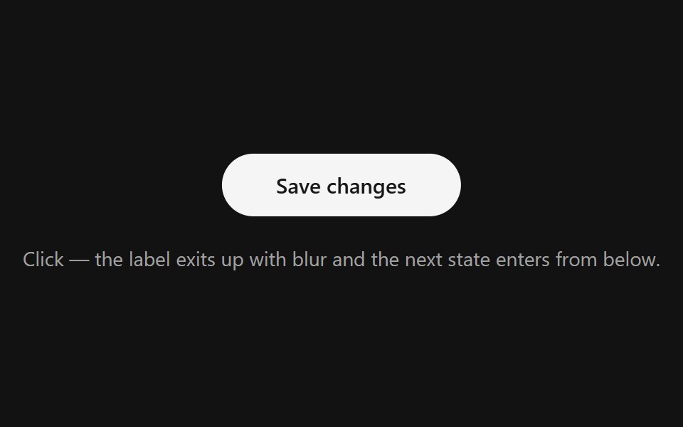 Text StatesSpectrum UI · ReactA status label that swaps its text in place, exiting up with blur and entering from below.
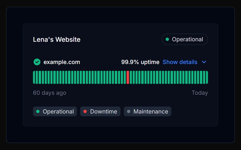 Tracker 02Tremor Blocks · React
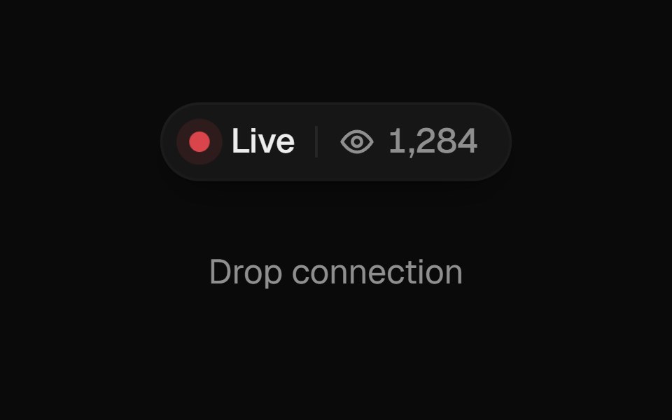 Live IndicatorUI Lab · ReactBreathes while live, lets the viewer count drift, and blinks hollow while reconnecting.
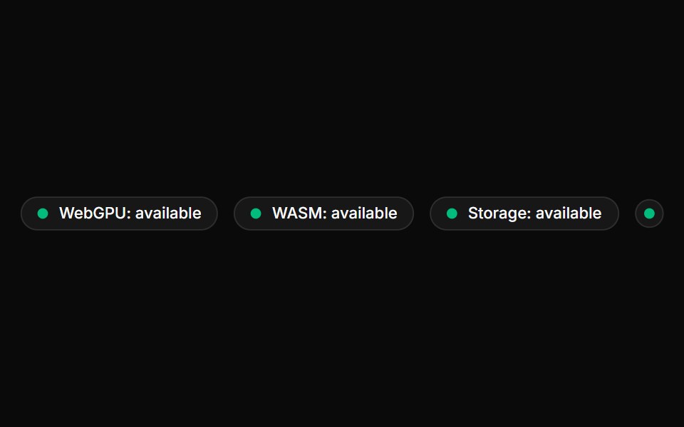 Device BadgeLocalMode · ReactA local-first capability badge. Detects WebGPU / WASM / IndexedDB support via a bundled useCapabilities() hook…
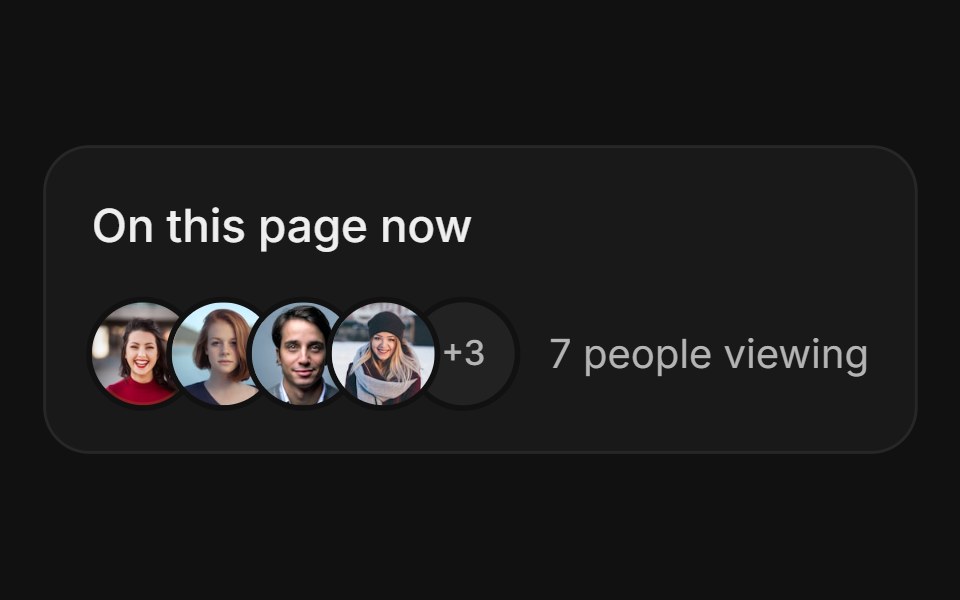 Avatar StackFLX UI · ReactAvatar Stack for Live Presence.
 With Emerald Status Dotsv-particles · Svelte
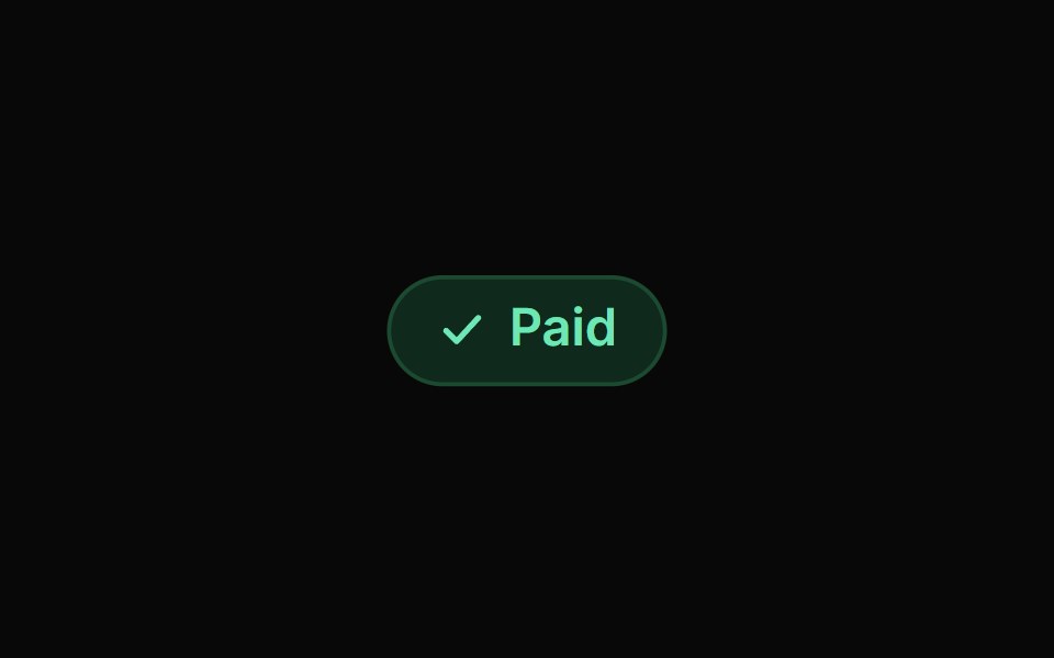 Badges KitReactFrame · ReactA status badge with 8 tone presets, light/dark variants, 3 sizes, 6 icon styles (check, cross, minus, dot, spinner…
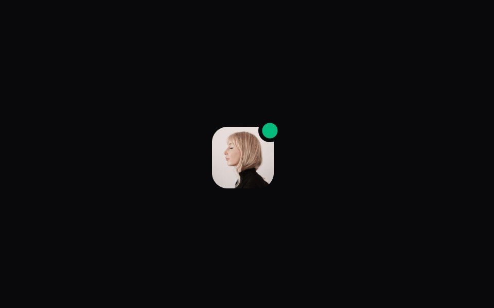 Comp 396Origin UI · React
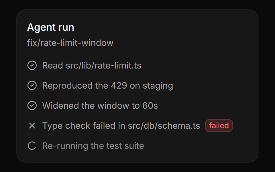 Run status markers with a live stepReUI · ReactRun status markers with a live step
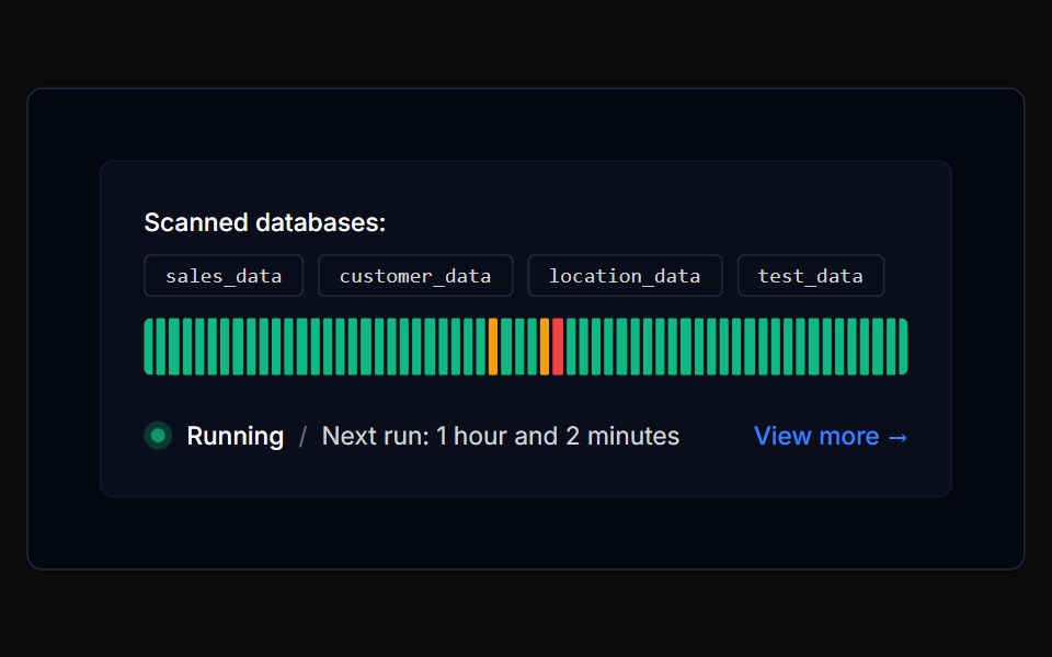 Tracker 03Tremor Blocks · React
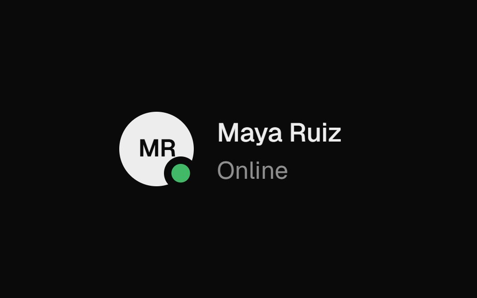 Status PickerUI Lab · ReactPick a status and the badge on your avatar turns into its shape: a dot, a moon, a stop sign or a ring.
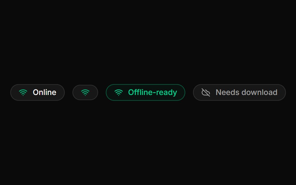 Network BadgeLocalMode · ReactA reactive online/offline indicator (NetworkBadge) sourced from useNetworkStatus, plus an OfflineReady badge that…
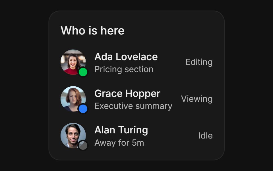 Activity StatusFLX UI · ReactActivity Status for Live Presence.
 With Muted Status Dotsv-particles · Svelte
 Business HoursReactFrame · ReactA premium opening-hours card, live open/closed status with a pulsing dot, a day-by-day schedule, and a Get Directions…
 Comp 419Origin UI · React
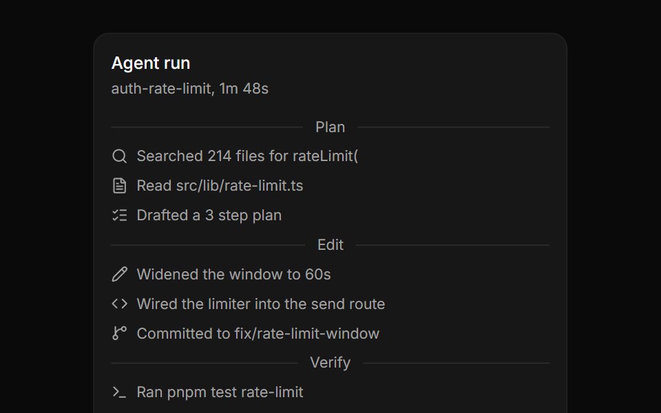 Agent run log grouped by phase separatorsReUI · ReactAgent run log grouped by phase separators
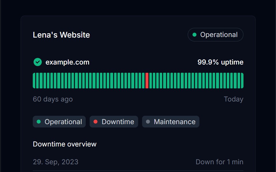 Tracker 04Tremor Blocks · React
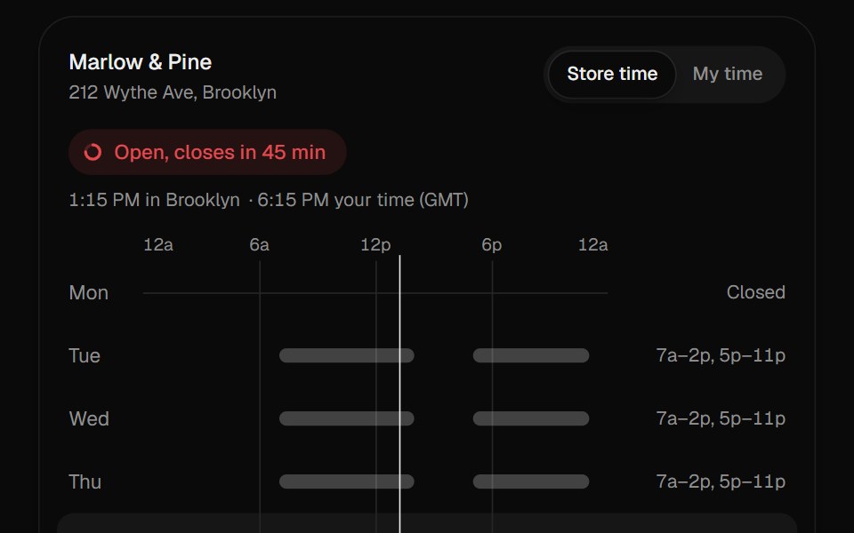 Store HoursUI Lab · ReactDraws the week's hours on a 24-hour scale and can redraw them in your own time zone.
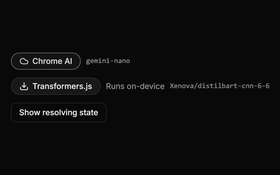 Provider BadgeLocalMode · ReactDisplays the RESOLVED provider identity - composing ProviderFallbackBadge for the tier and name - alongside the model…
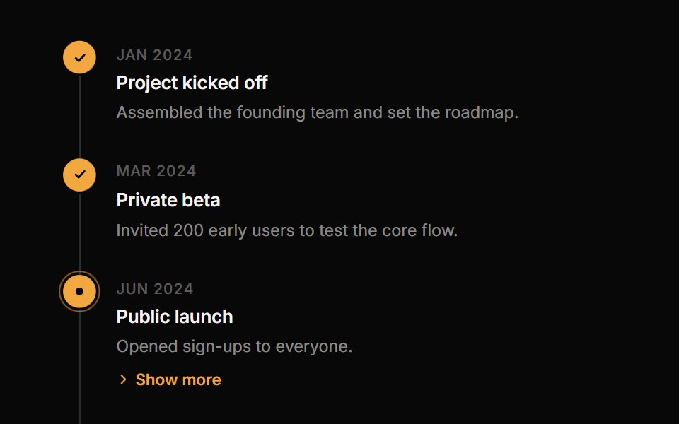 TimelineReactFrame · ReactA vertical timeline with status markers (done, active, pending, error), a connecting line, an alternating layout…
 Comp 420Origin UI · React
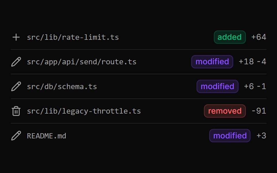 Changed files summary with border markersReUI · ReactChanged files summary with border markers
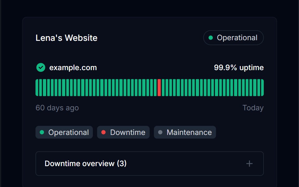 Tracker 05Tremor Blocks · React
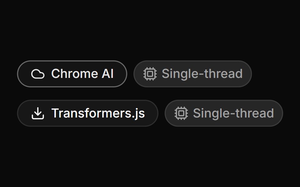 Provider Fallback BadgeLocalMode · ReactSurfaces the active AI backend tier — a zero-download built-in (Chrome AI) vs a model-download provider…
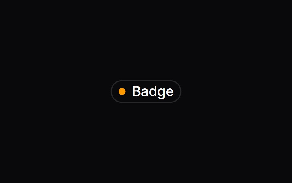 Comp 421Origin UI · React
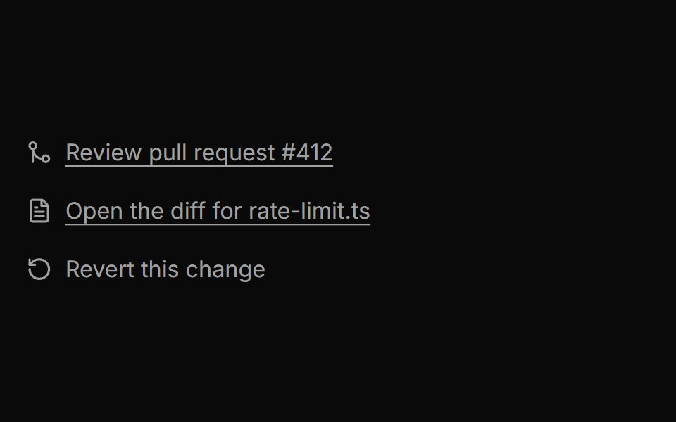 Markers as links and as an action buttonReUI · ReactMarkers as links and as an action button
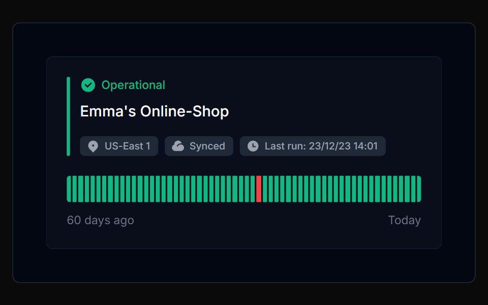 Tracker 06Tremor Blocks · React
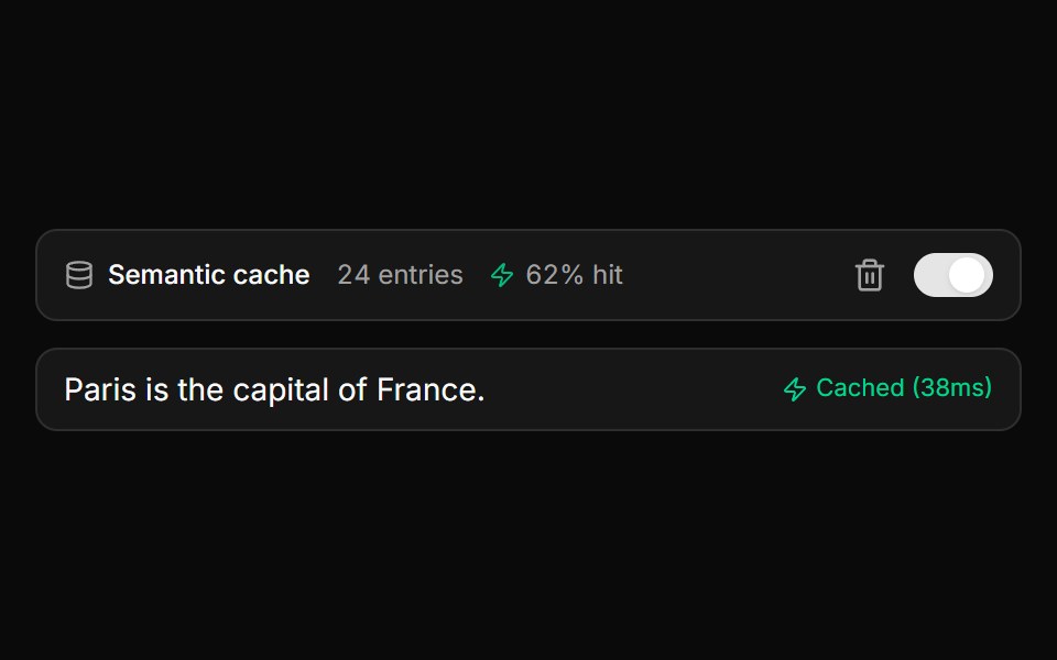 Semantic Cache Status BarLocalMode · ReactA compact toolbar row for useSemanticCache complementing CacheBadge: entry count, hit-rate percentage, an icon-only…
 Comp 422Origin UI · React
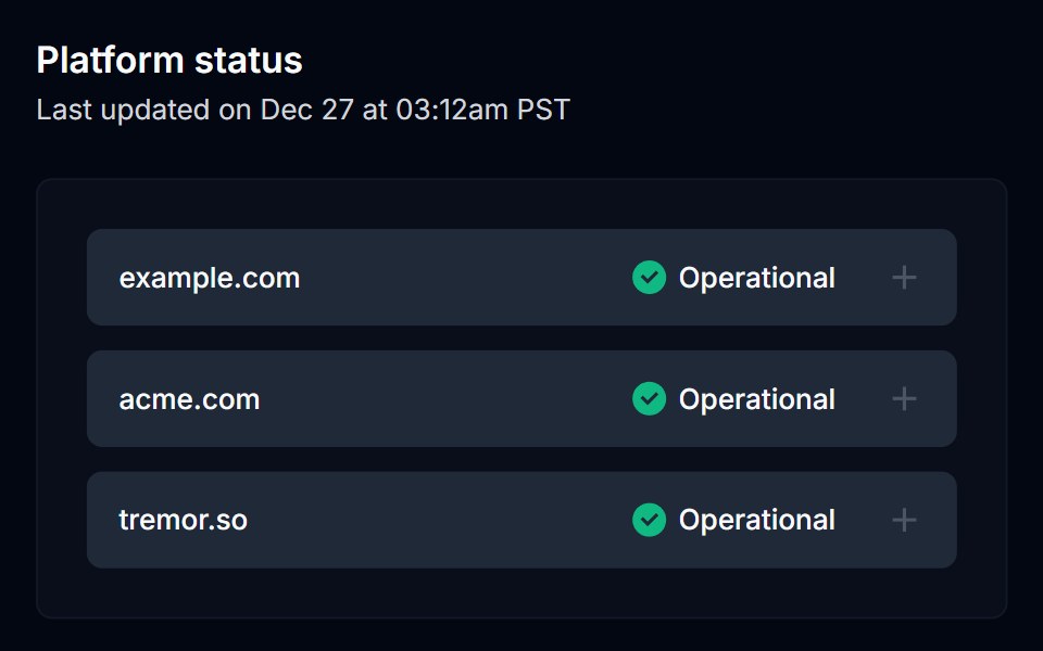 Tracker 07Tremor Blocks · React
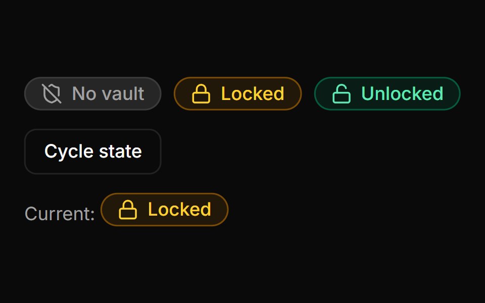 Lock Status BadgeLocalMode · ReactA compact session-lock indicator accepting a status of locked, unlocked, or no-vault, with distinct iconography per…
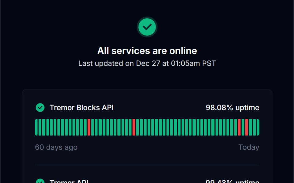 Tracker 08Tremor Blocks · React
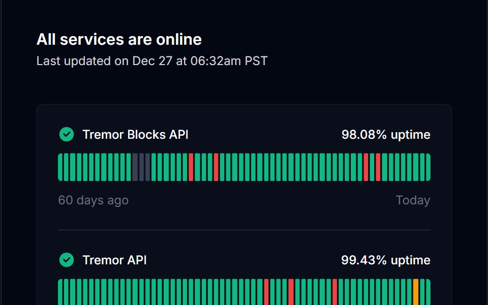 Tracker 09Tremor Blocks · React
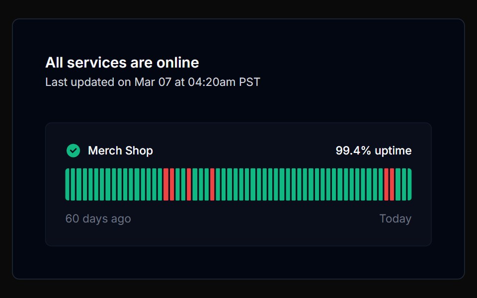 Tracker 10Tremor Blocks · React
Libraries with Tailwind CSS status indicator components
Related categories
- Status Indicator Components
- React Status Indicator Components
- Animated Status Indicator Components
- shadcn/ui Status Indicator Components
- Tailwind CSS Feedback Components
- Tailwind CSS Spinner Components
- Tailwind CSS Badge Components
- Tailwind CSS Progress Components
- Tailwind CSS Alert Components
- Tailwind CSS Chip Components
- Tailwind CSS Progress Bar Components
- Tailwind CSS Empty State Components
- Tailwind CSS Notification Components
- Tailwind CSS Banner Components
- Tailwind CSS Skeleton Components
- Tailwind CSS Typing Indicator Components
- Tailwind CSS Progress Circle Components
- Tailwind CSS Error State Components
- Tailwind CSS Scroll Progress Components
- Tailwind CSS Success Animation Components