 Dev Design Library
Tailwind CSS Banner Components
Dev Design Library indexes 80 Tailwind CSS banner components from 22 open-source UI libraries, with the most coming from sv-particles, Origin UI, FLX UI, Watermelon UI and Nexvyn UI. Each one links to its page with the source code, a live preview where available, the library license and the install command. Every library in this list styles its components with Tailwind CSS utility classes. Banner components belong to the Feedback group.
 Comp 301Origin UI · React
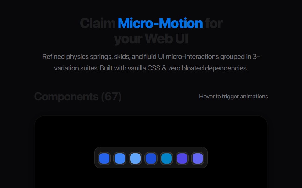 Ribbon Banner SlideAmicro Micro Transitions · ReactHorizontal chevron badge sliding and unfolding from center.
 noteIntent UI · Reactnote
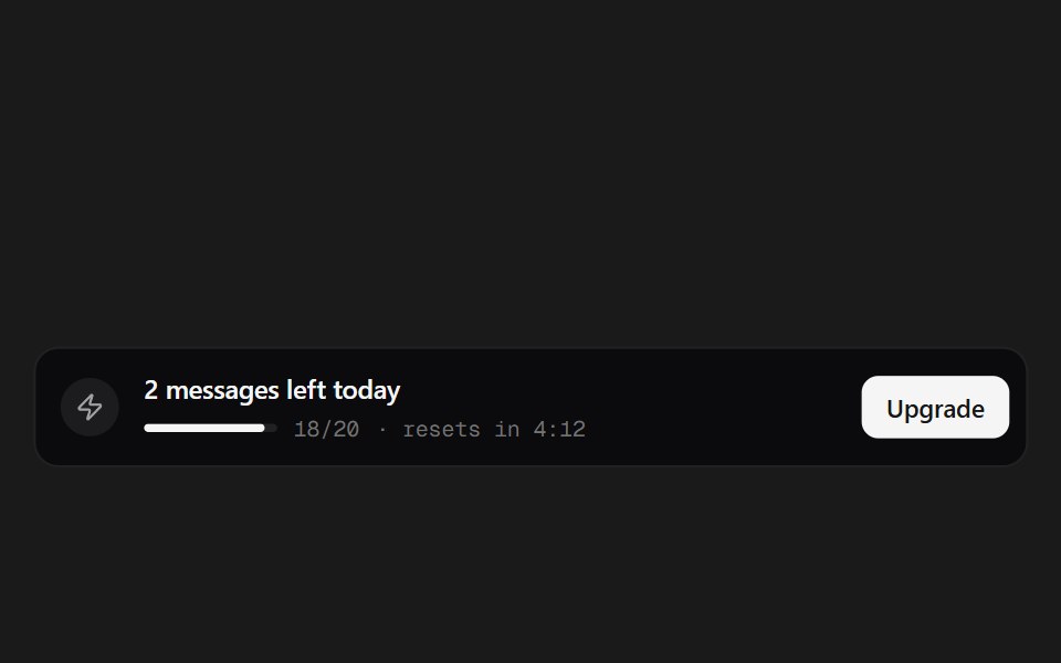 Quota BannerSpectrum UI · ReactA message-quota banner with a live reset countdown.
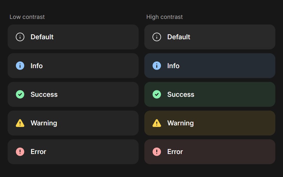 BannerFluid Functionalism · ReactStatus message built from parts (Banner, BannerTitle, BannerDescription, BannerActions, BannerAction): 5 statuses…
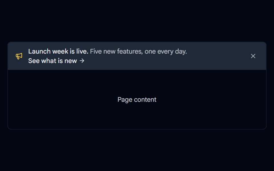 Alert 17 - Announcement BannerShadcn Space · ReactFull width announcement bar for the top of a page with an icon, a call to action link, and a dismiss button.
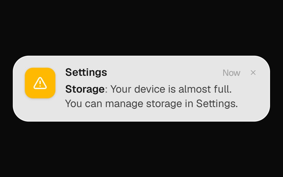 System Alert BannerOpenSourceUI · React
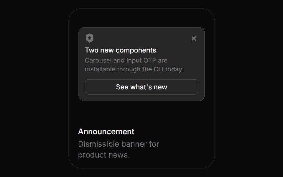 AnnouncementBoardUI · ReactDismissible banner for product news.
 Banner 01Tremor Blocks · React
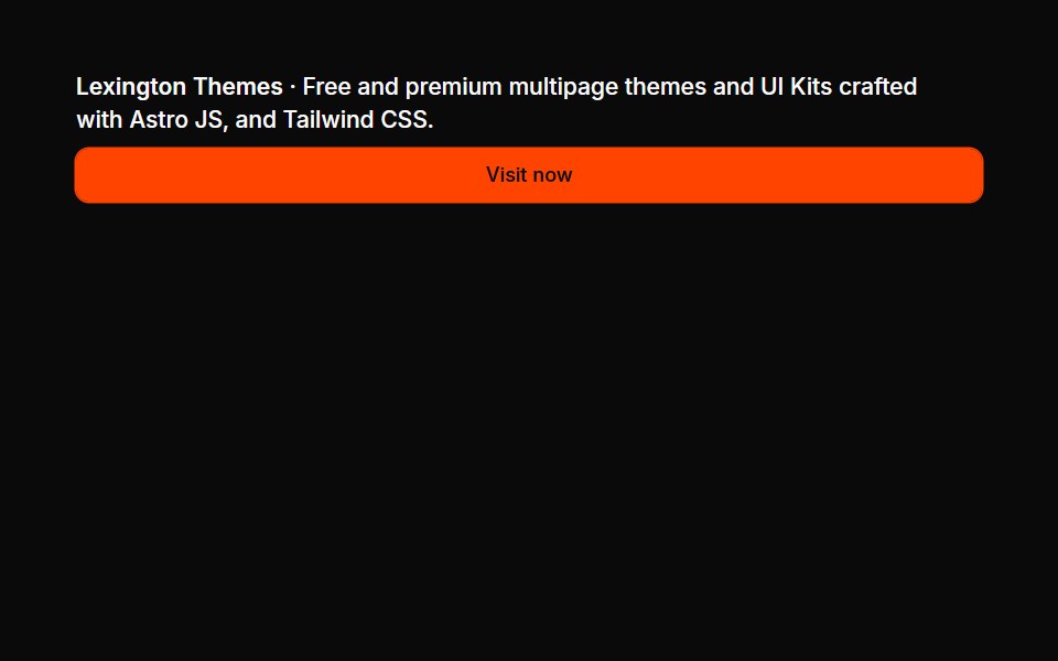 Banners 01Oxbow UI · Astro
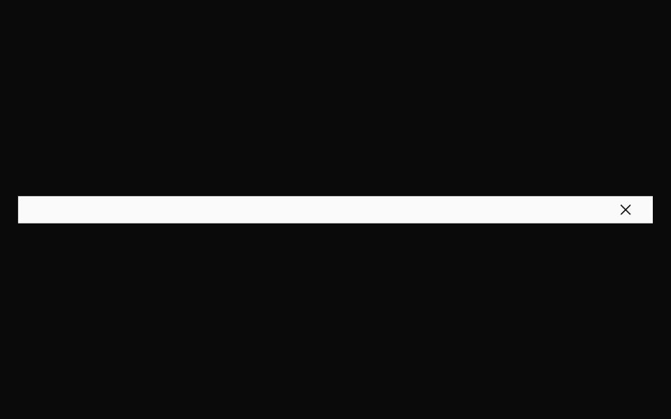 BannerNexvyn UI · ReactBanner primitives: a full-width dismissible strip, a link and a tag, shared by every banner block.
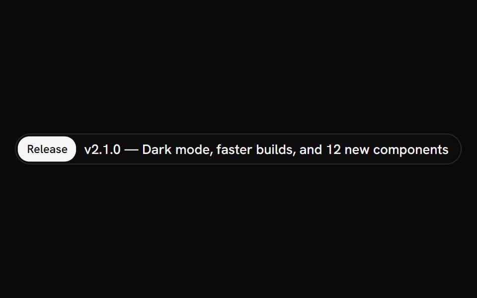 AnnouncementShark UI · ReactInline notice for short, prominent updates.
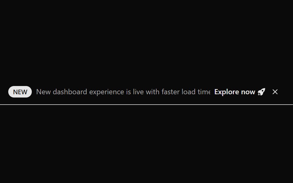 Announcement 1Watermelon UI · React
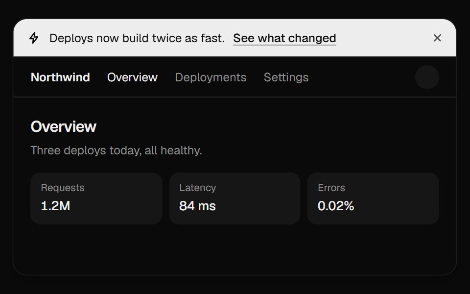 Announcement BannerUI Lab · ReactDismissing folds the bar away and the page slides up to fill the gap.
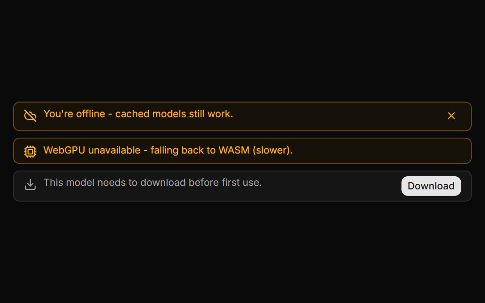 System Notice BannerLocalMode · ReactAn in-conversation info/warning banner (not a message bubble) for local-first state changes: offline/online, model…
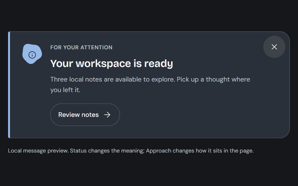 AlertCojeev UI · ReactAn authored note, attached-action banner or folded dispatch that makes the message and its next step clear.
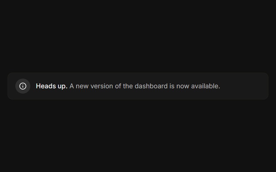 BasicFLX UI · ReactIcon, message, and a subtle bordered surface.
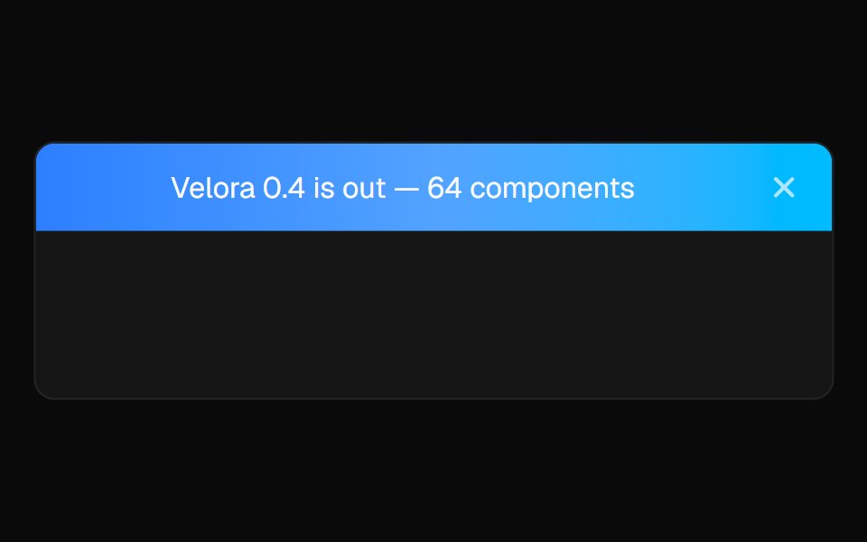 Sticky BannerVelora UI · ReactDismissible announcement bar pinned above the header.
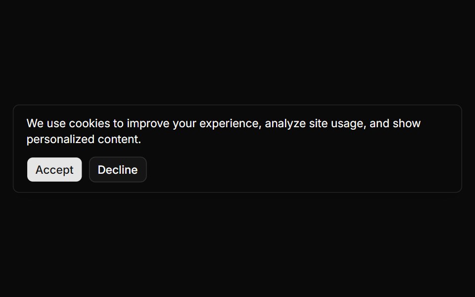 Banner 1sv-particles · Svelte
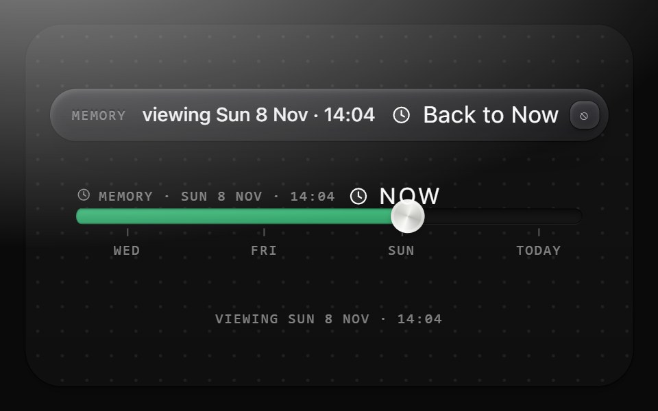 Past bannerMetal UI · React + SwiftUIThe only chrome that changes while the canvas is scrubbed into the past: Surface(graphite-plain) with the MEMORY…
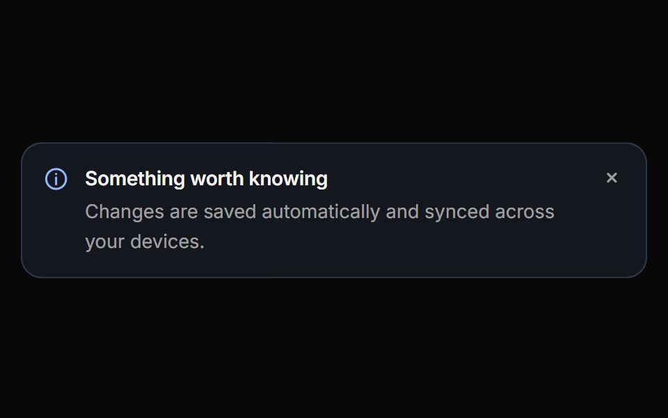 CalloutReactFrame · ReactAn inline message block with info, success, warning, danger and neutral variants, three appearances, self-drawing…
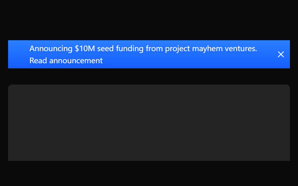 Sticky BannerAceternity UI · React
 Comp 302Origin UI · React
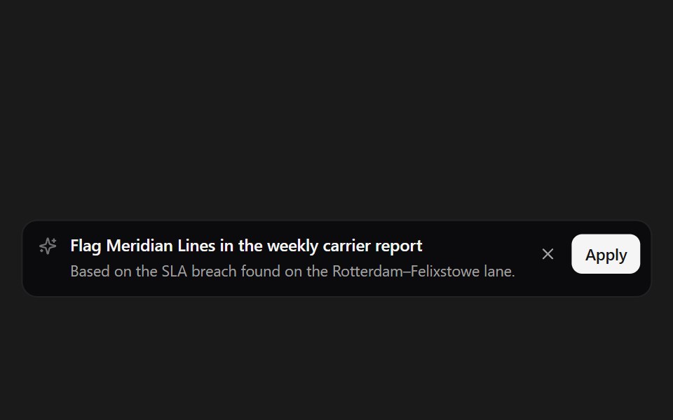 Suggestion BannerSpectrum UI · ReactAn inline AI suggestion with apply and dismiss.
 CTA 01 - Gradient Call-to-Action BannerShadcn Space · ReactA minimal full width CTA section with soft gradient background, persuasive headline, and primary action button…
 Banner 02Tremor Blocks · React
 Banners 02Oxbow UI · Astro
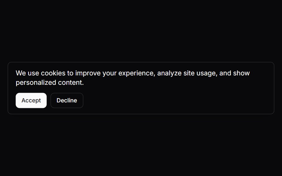
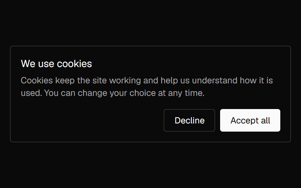 Banner CookieNexvyn UI · ReactA cookie consent card with accept and decline actions that lifts in once and lifts away on a choice.
 Announcement 2Watermelon UI · React
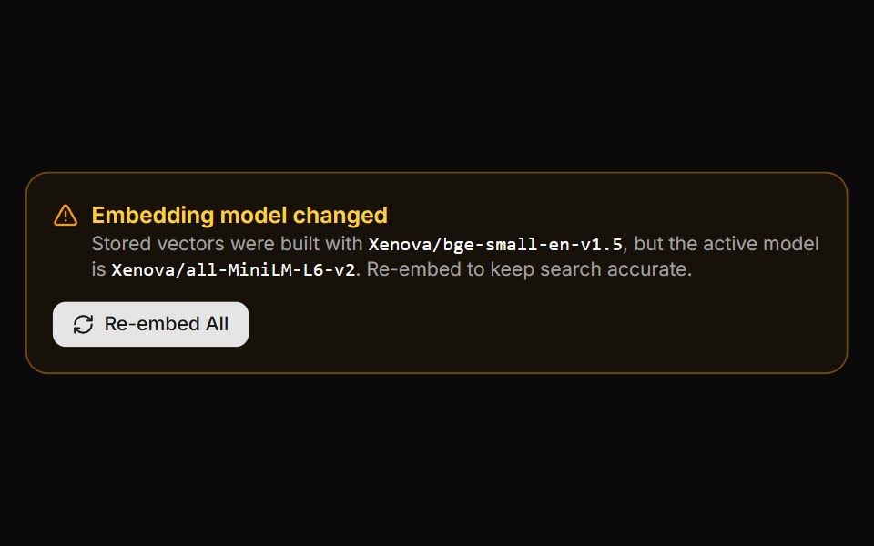 Embedding Drift BannerLocalMode · ReactA warning panel shown when the active embedding model is incompatible with vectors already stored (model changed or…
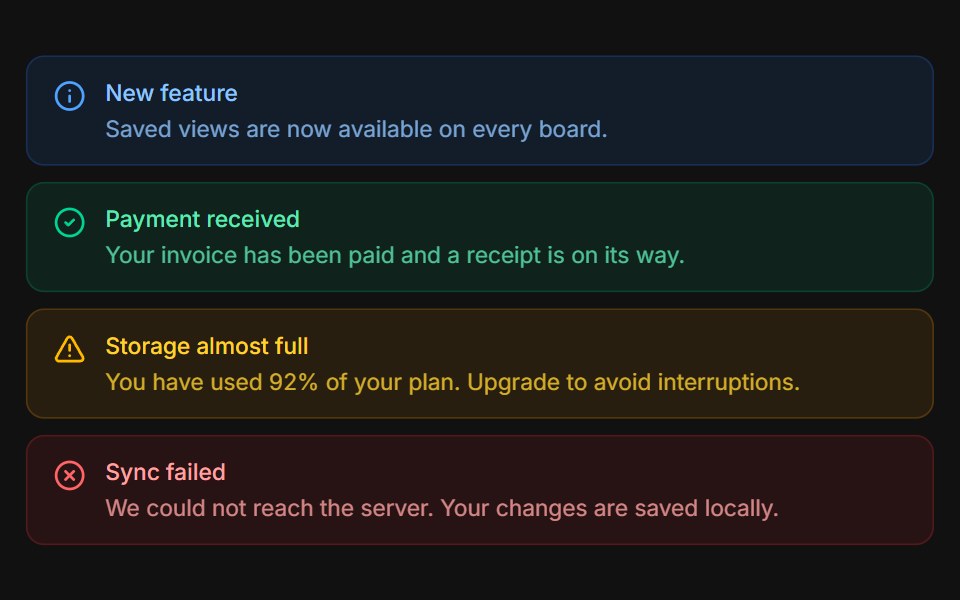 VariantsFLX UI · ReactInfo, success, warning, and error tones stacked.
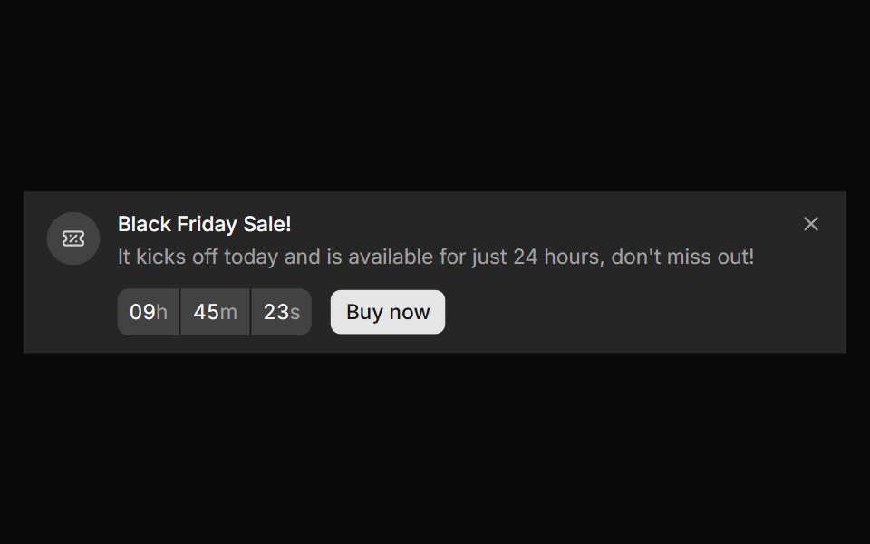 Banner 10sv-particles · Svelte
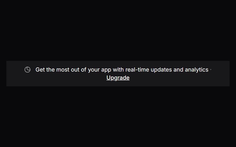 Comp 303Origin UI · React
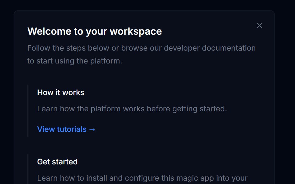 Banner 03Tremor Blocks · React
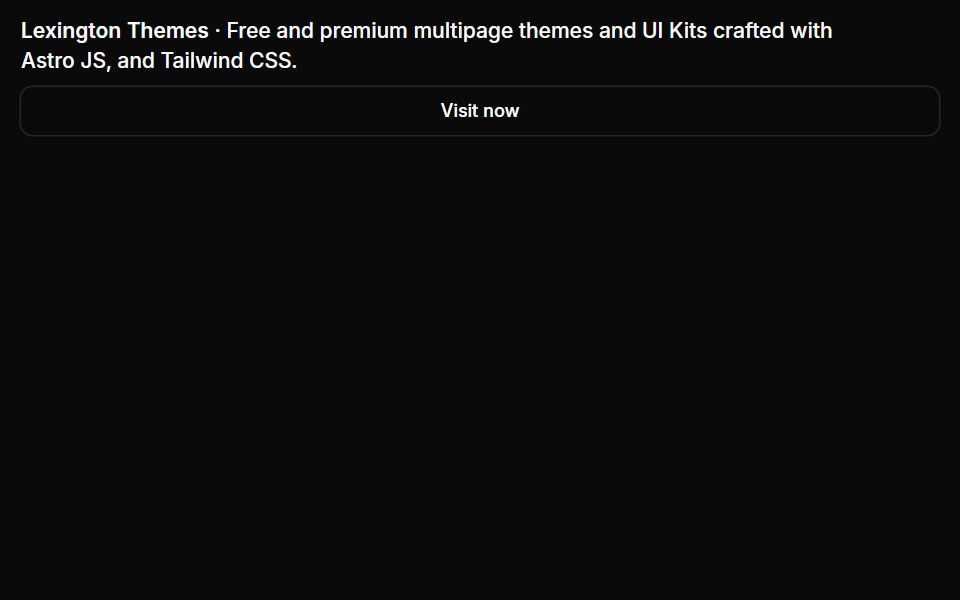 Banners 03Oxbow UI · Astro
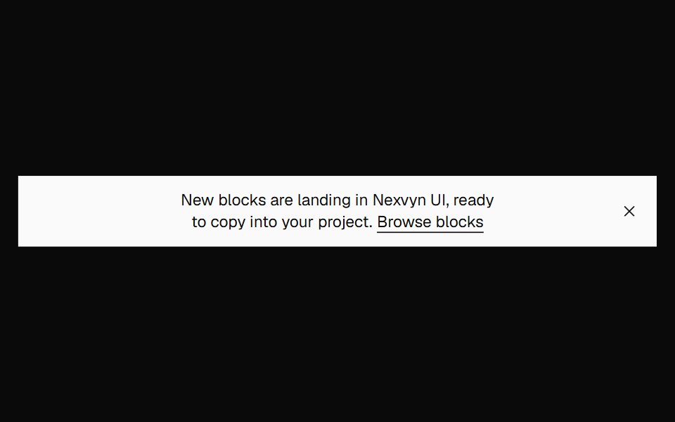 Banner FilledNexvyn UI · ReactA filled announcement banner on the inverted foreground surface.
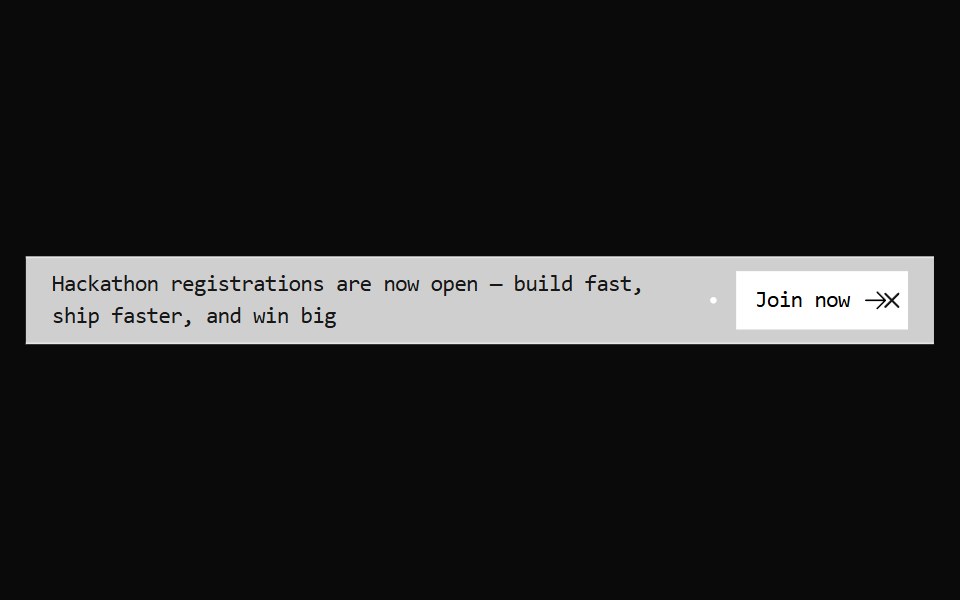 Announcement 3Watermelon UI · React
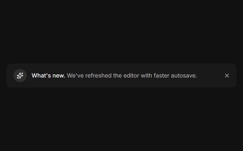 DismissibleFLX UI · ReactA close button hides the banner with a restore link.
 Banner 11sv-particles · Svelte
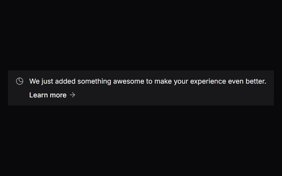 Comp 304Origin UI · React
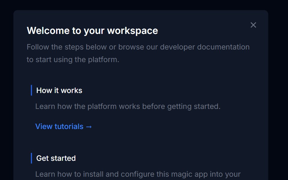 Banner 04Tremor Blocks · React
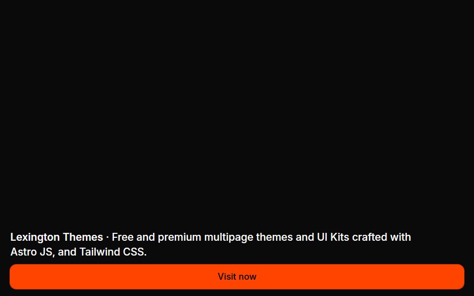 Banners 04Oxbow UI · Astro
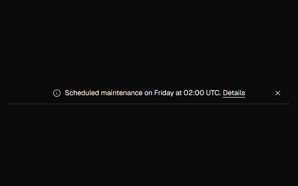 Banner NoticeNexvyn UI · ReactInfo and error status banners with icons and the right live-region roles.
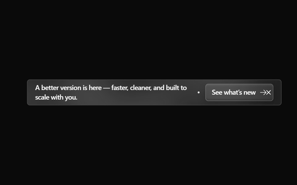 Announcement 4Watermelon UI · React
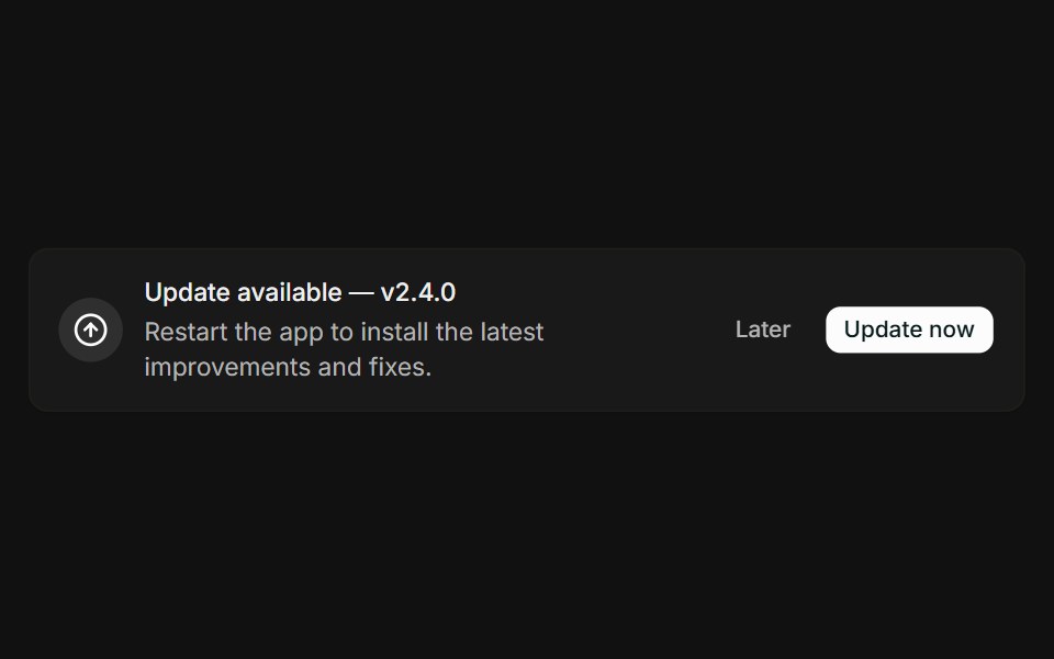 With actionsFLX UI · ReactMessage paired with Later and Update now buttons.
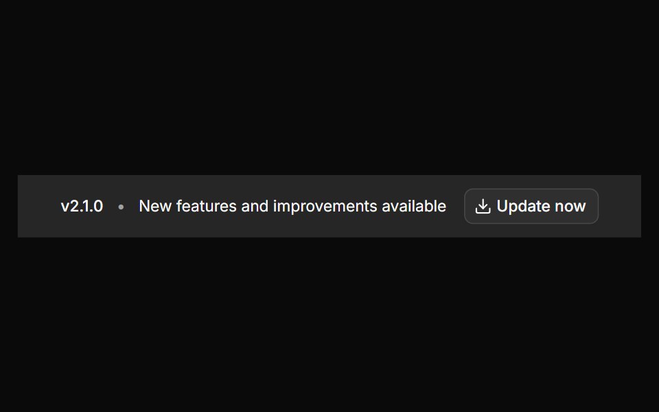 Banner 12sv-particles · Svelte
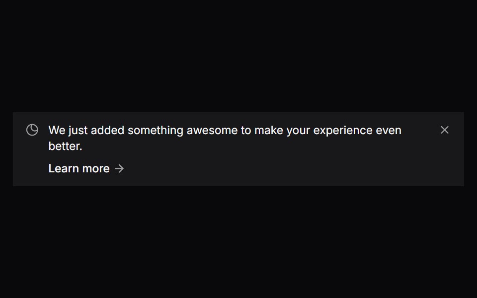 Comp 305Origin UI · React
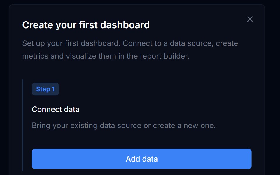 Banner 05Tremor Blocks · React
 Banners 05Oxbow UI · Astro
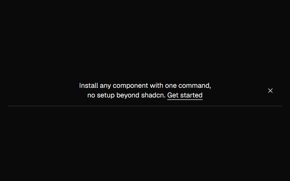 Banner OutlineNexvyn UI · ReactA quiet outline announcement banner with a hairline bottom border.
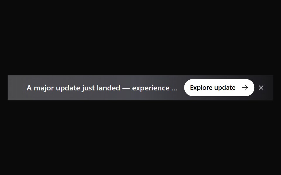 Announcement 5Watermelon UI · React
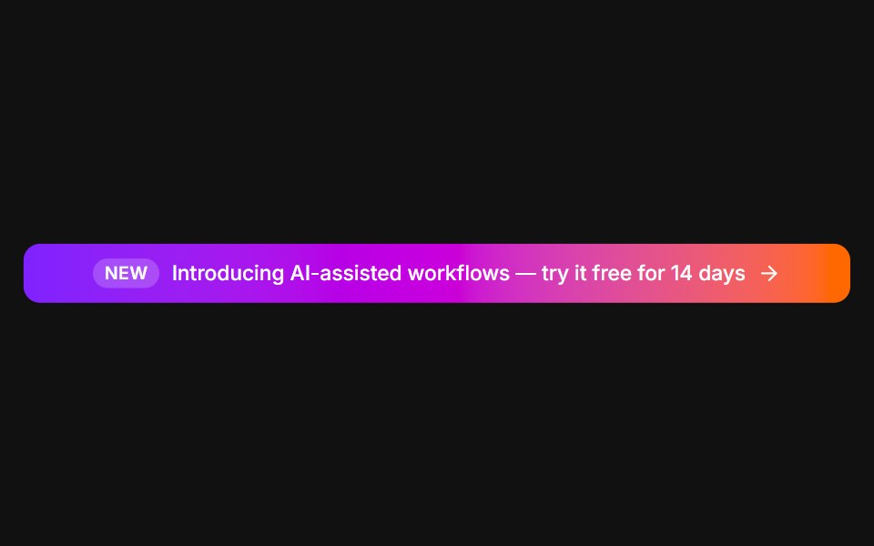 Announcement barFLX UI · ReactFull-width gradient promo with a New tag and arrow.
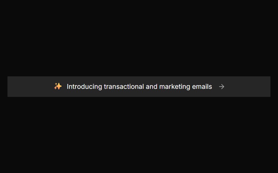 Banner 2sv-particles · Svelte
 Comp 306Origin UI · React
 Banners 06Oxbow UI · Astro
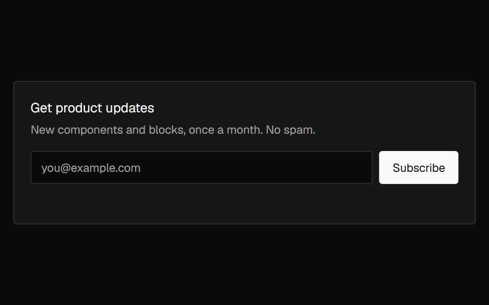 Banner SubscribeNexvyn UI · ReactAn email signup banner with inline validation that crossfades into a confirmation on success.
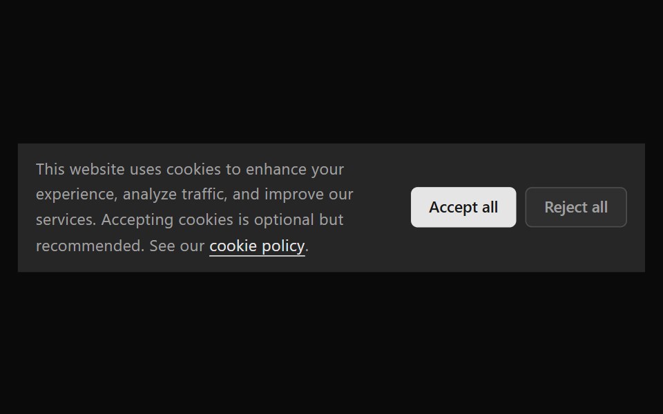 Announcement 6Watermelon UI · React
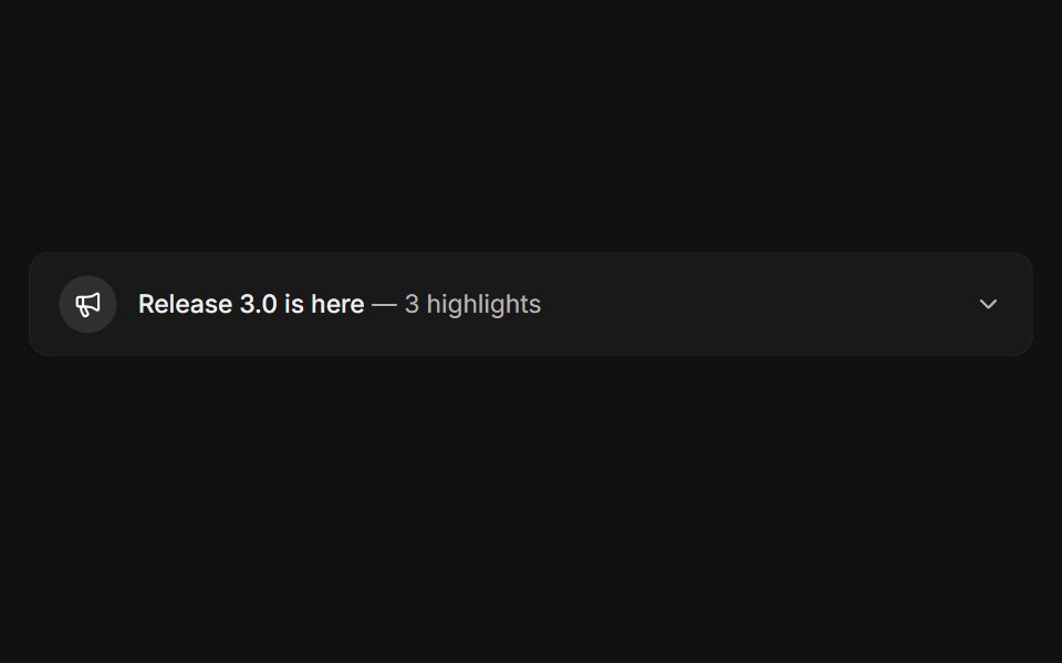 ExpandableFLX UI · ReactCollapsible release notes that reveal highlights.
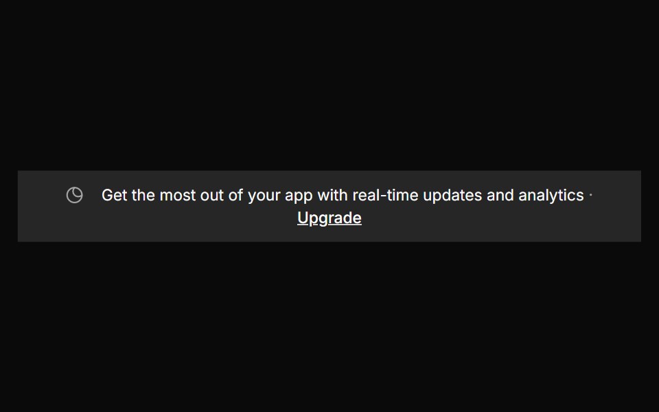 Banner 3sv-particles · Svelte
 Comp 307Origin UI · React
 Banners 07Oxbow UI · Astro
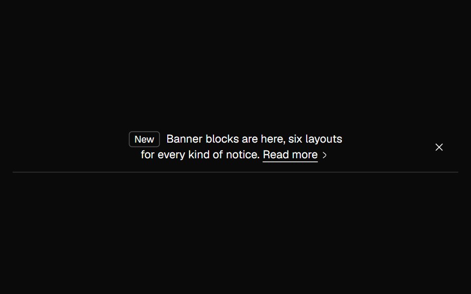 Banner TaggedNexvyn UI · ReactAn outline banner led by a small tag, with an arrow link.
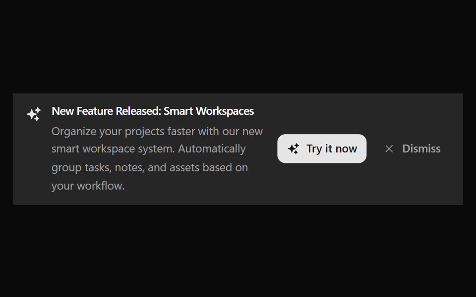 Announcement 7Watermelon UI · React
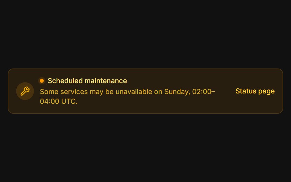 MaintenanceFLX UI · ReactAmber system notice with a pulsing status dot.
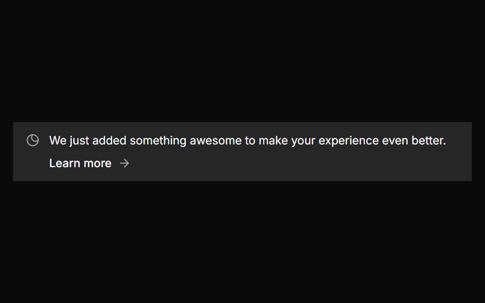 Banner 4sv-particles · Svelte
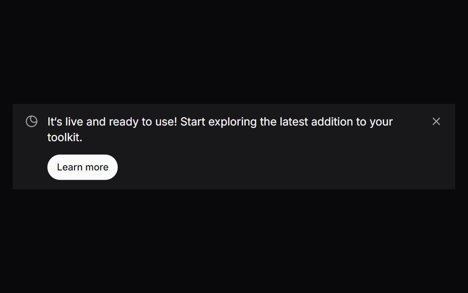 Comp 308Origin UI · React
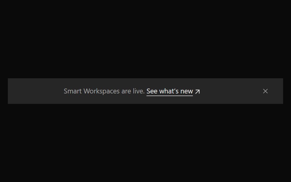 Announcement 8Watermelon UI · React
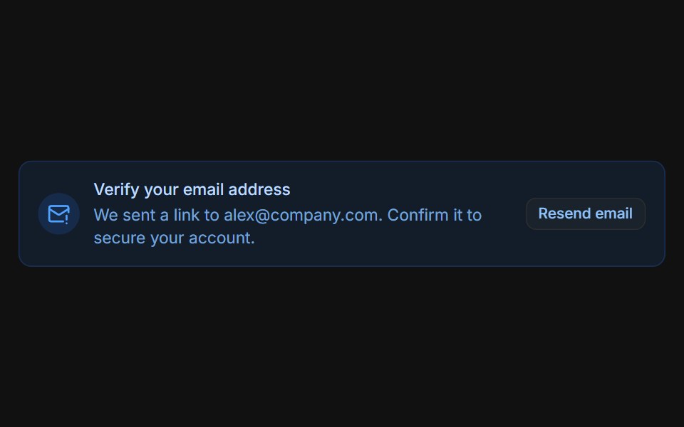 Email verificationFLX UI · ReactBlue prompt with a Resend email button that switches to a sent confirmation.
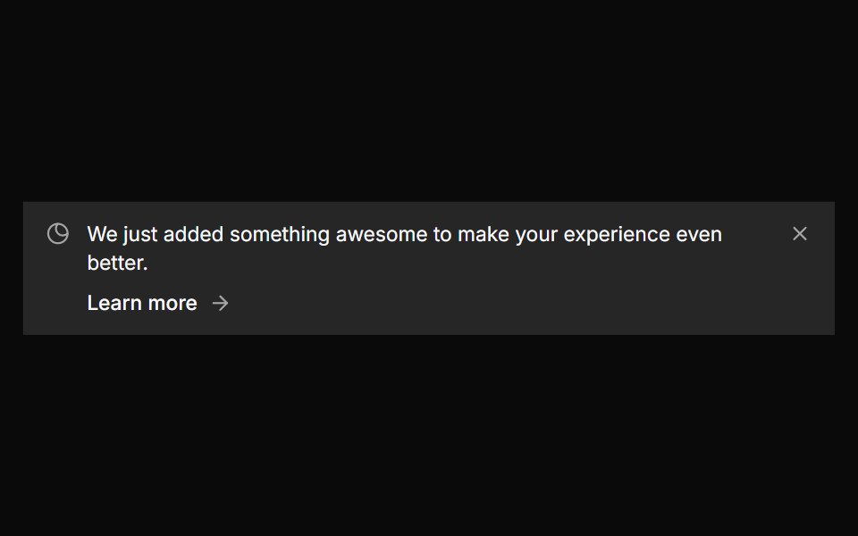 Banner 5sv-particles · Svelte
 Comp 309Origin UI · React
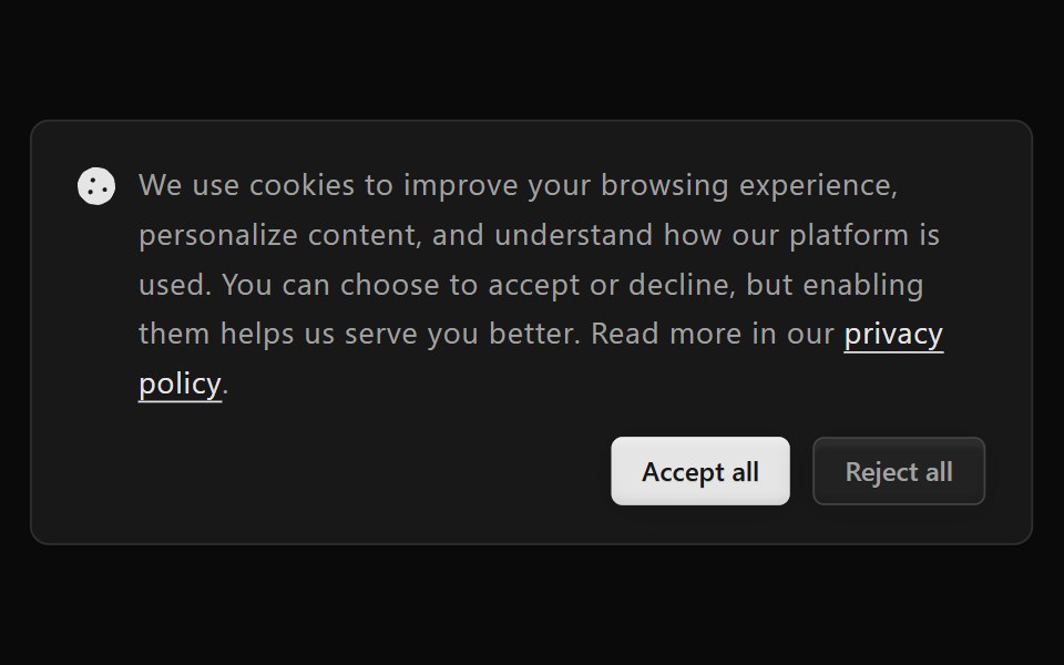 Announcement 9Watermelon UI · React
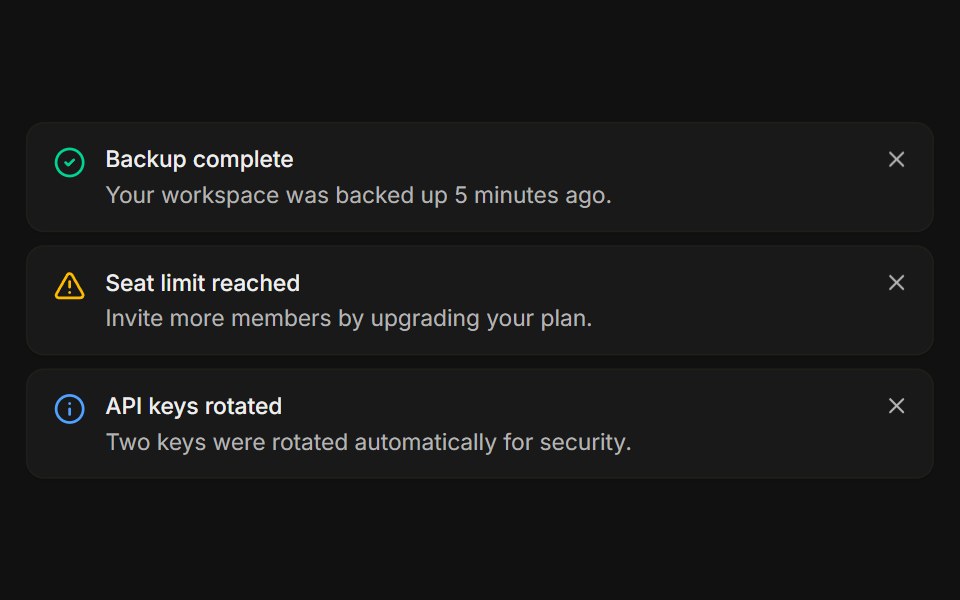 StackedFLX UI · ReactA list of dismissible notices, each removed on its own.
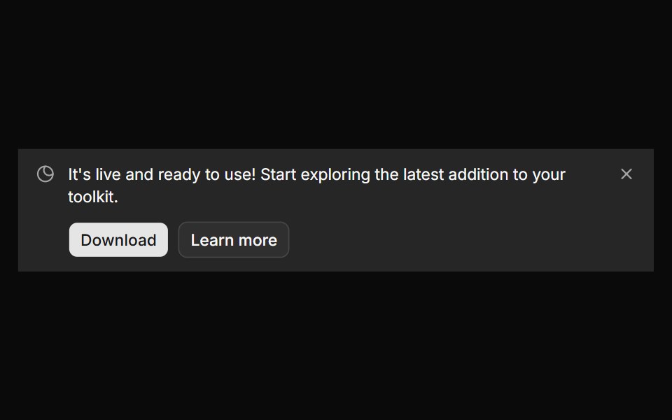 Banner 6sv-particles · Svelte
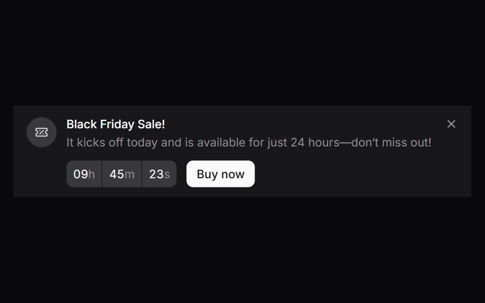 Comp 310Origin UI · React
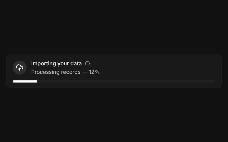 With progressFLX UI · ReactLive import banner with a spinner and a progress bar.
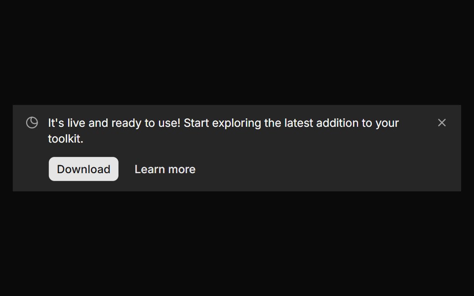 Banner 7sv-particles · Svelte
 Comp 311Origin UI · React
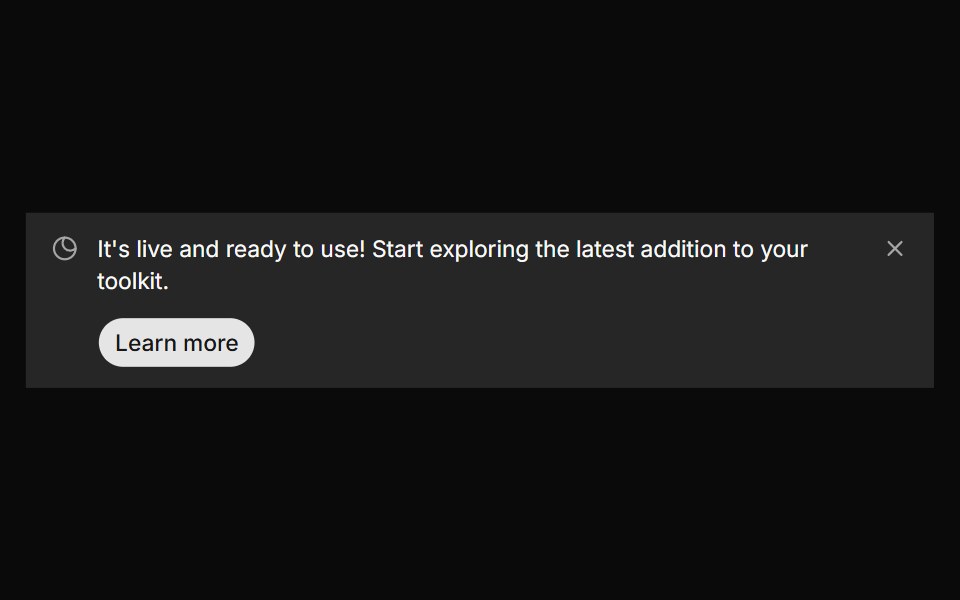 Banner 8sv-particles · Svelte
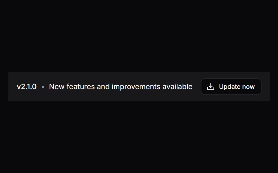 Comp 312Origin UI · React
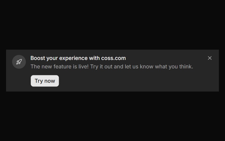 Banner 9sv-particles · Svelte
Libraries with Tailwind CSS banner components
Related categories
- Banner Components
- React Banner Components
- Animated Banner Components
- shadcn/ui Banner Components
- Tailwind CSS Feedback Components
- Tailwind CSS Spinner Components
- Tailwind CSS Badge Components
- Tailwind CSS Progress Components
- Tailwind CSS Alert Components
- Tailwind CSS Chip Components
- Tailwind CSS Progress Bar Components
- Tailwind CSS Empty State Components
- Tailwind CSS Notification Components
- Tailwind CSS Status Indicator Components
- Tailwind CSS Skeleton Components
- Tailwind CSS Typing Indicator Components
- Tailwind CSS Progress Circle Components
- Tailwind CSS Error State Components
- Tailwind CSS Scroll Progress Components
- Tailwind CSS Success Animation Components