 Dev Design Library
Banner Components
Dev Design Library indexes 86 banner components from 26 open-source UI libraries, with the most coming from sv-particles, Origin UI, FLX UI, Watermelon UI and Nexvyn UI. Each one links to its page with the source code, a live preview where available, the library license and the install command. Banner components belong to the Feedback group.
 Comp 301Origin UI · React
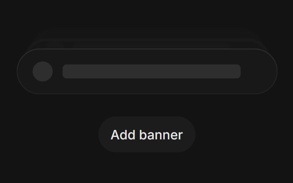 Banner Stackingtransitions.dev · HTML/CSS
 Ribbon Banner SlideAmicro Micro Transitions · ReactHorizontal chevron badge sliding and unfolding from center.
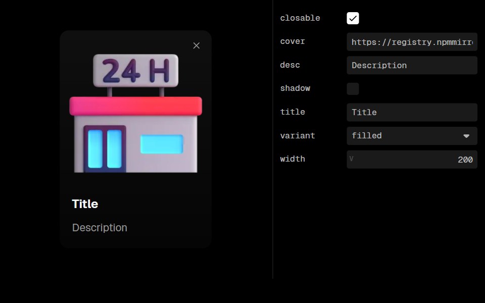 Guide CardLobe UI · ReactGuideCard is a component used to display visual guides, introductory content, or instructional information with an…
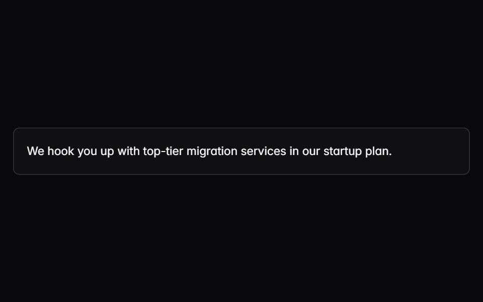 noteIntent UI · Reactnote
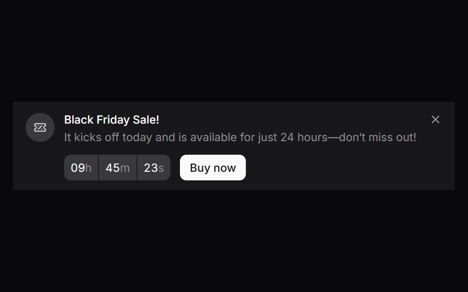
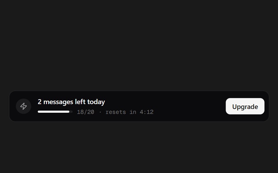 Quota BannerSpectrum UI · ReactA message-quota banner with a live reset countdown.
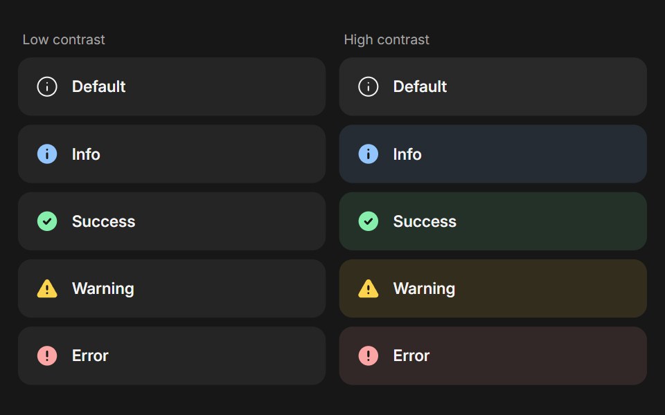 BannerFluid Functionalism · ReactStatus message built from parts (Banner, BannerTitle, BannerDescription, BannerActions, BannerAction): 5 statuses…
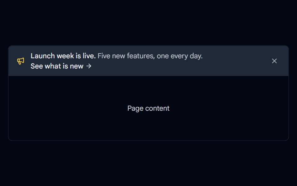 Alert 17 - Announcement BannerShadcn Space · ReactFull width announcement bar for the top of a page with an icon, a call to action link, and a dismiss button.
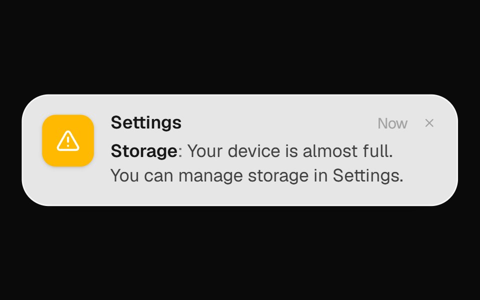 System Alert BannerOpenSourceUI · React
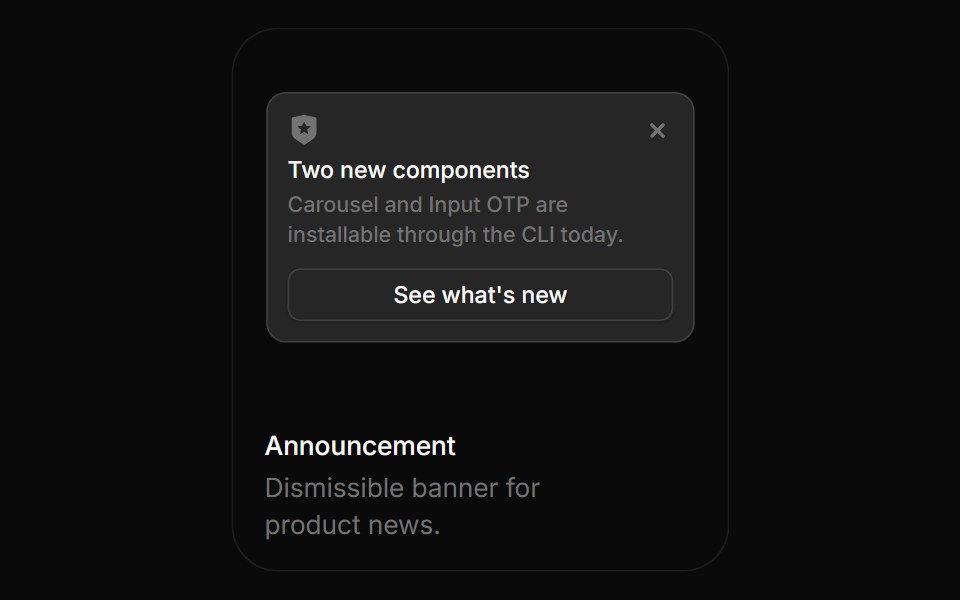 AnnouncementBoardUI · ReactDismissible banner for product news.
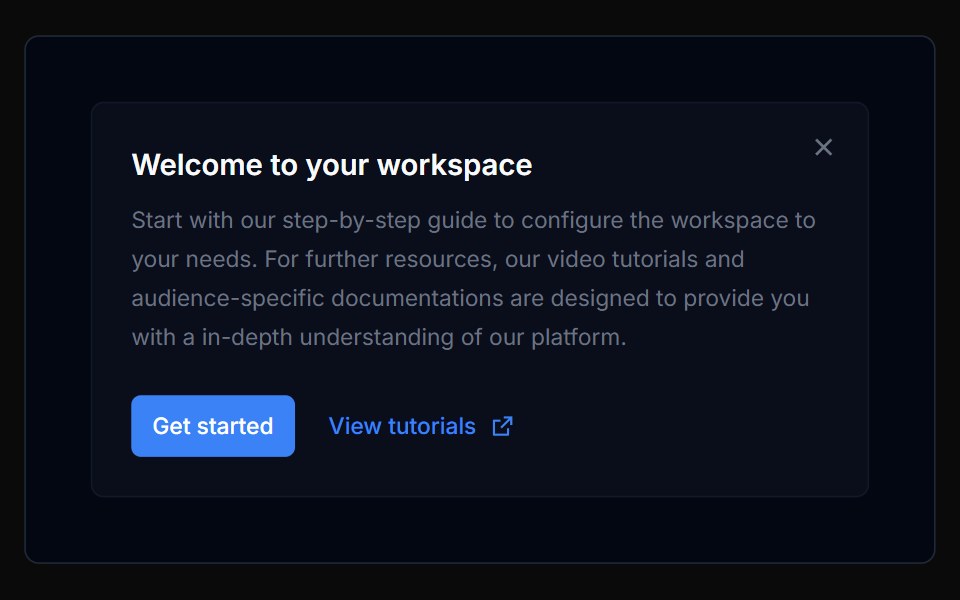 Banner 01Tremor Blocks · React
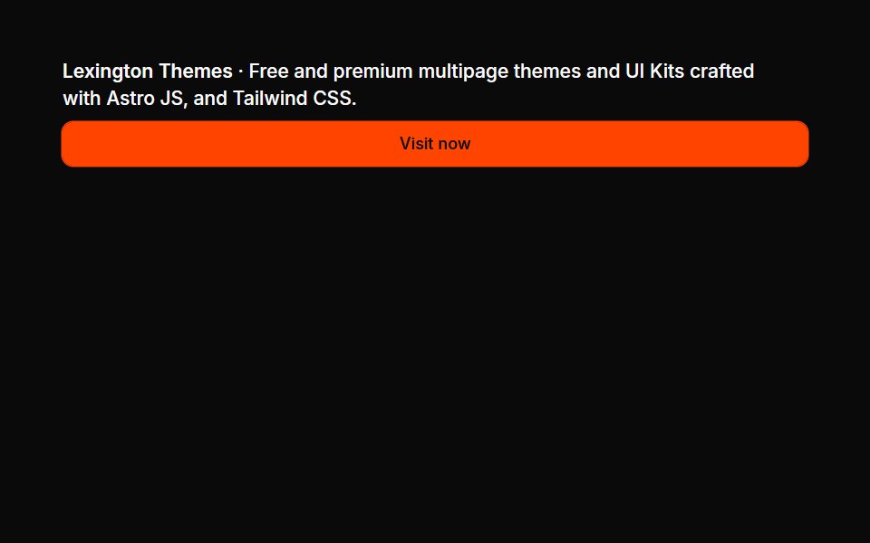 Banners 01Oxbow UI · Astro
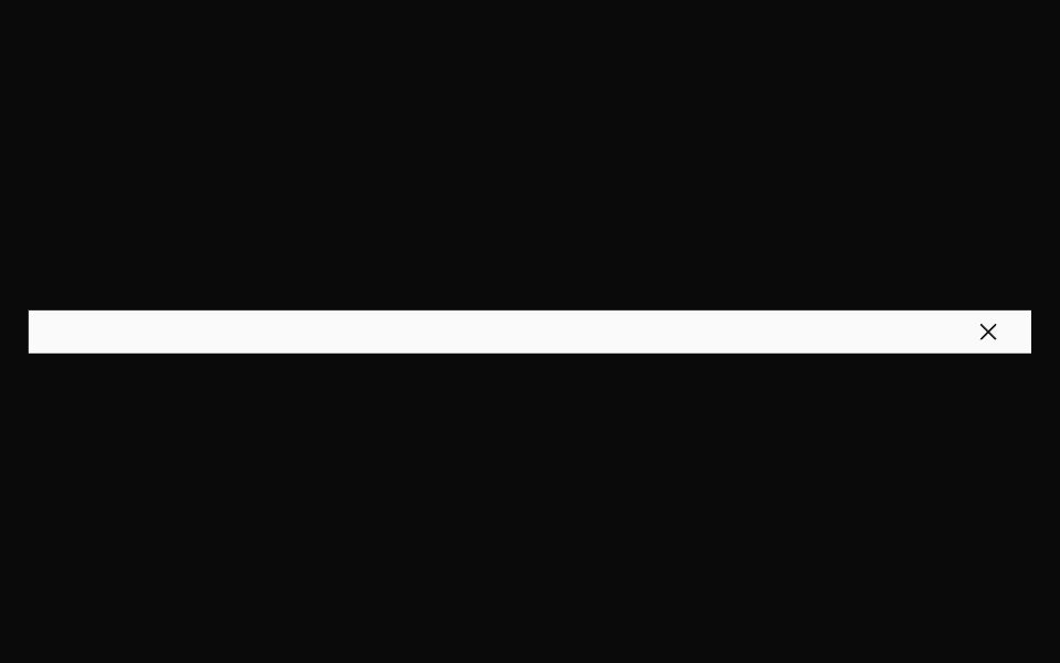 BannerNexvyn UI · ReactBanner primitives: a full-width dismissible strip, a link and a tag, shared by every banner block.
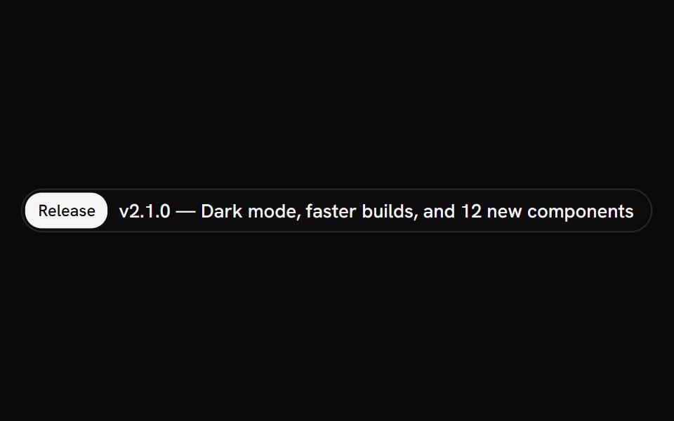 AnnouncementShark UI · ReactInline notice for short, prominent updates.
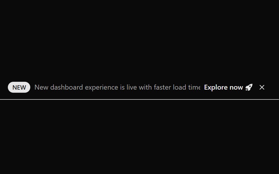 Announcement 1Watermelon UI · React
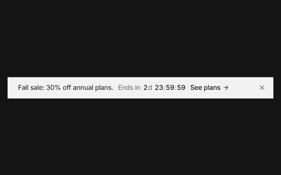 Announcement barArc Library · ReactA top banner that rotates messages, counts down, and collapses smoothly when dismissed.
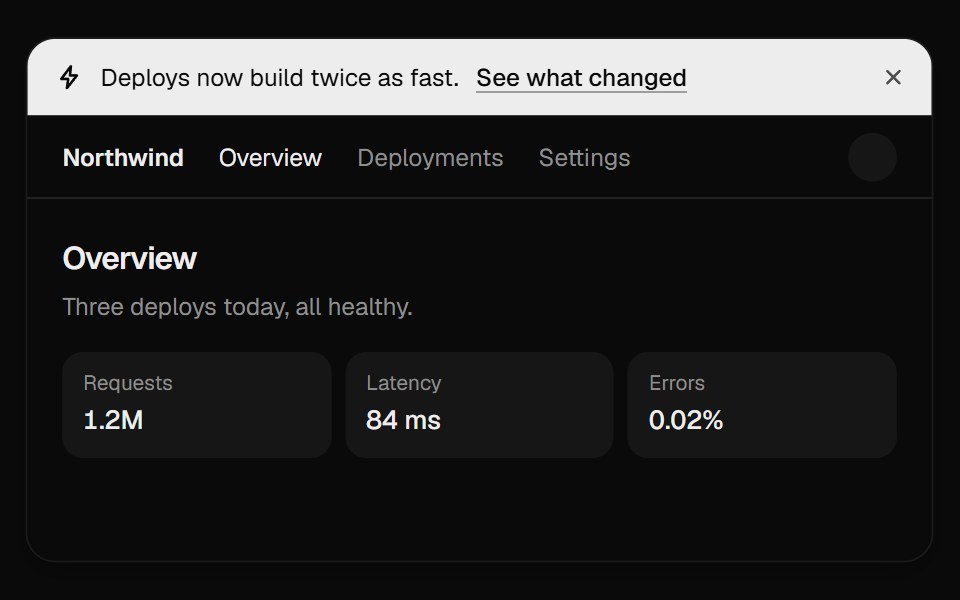 Announcement BannerUI Lab · ReactDismissing folds the bar away and the page slides up to fill the gap.
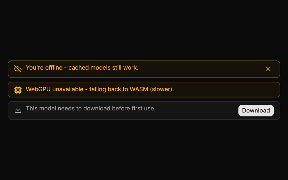 System Notice BannerLocalMode · ReactAn in-conversation info/warning banner (not a message bubble) for local-first state changes: offline/online, model…
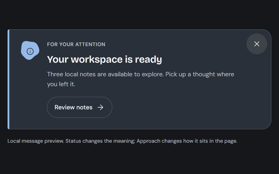 AlertCojeev UI · ReactAn authored note, attached-action banner or folded dispatch that makes the message and its next step clear.
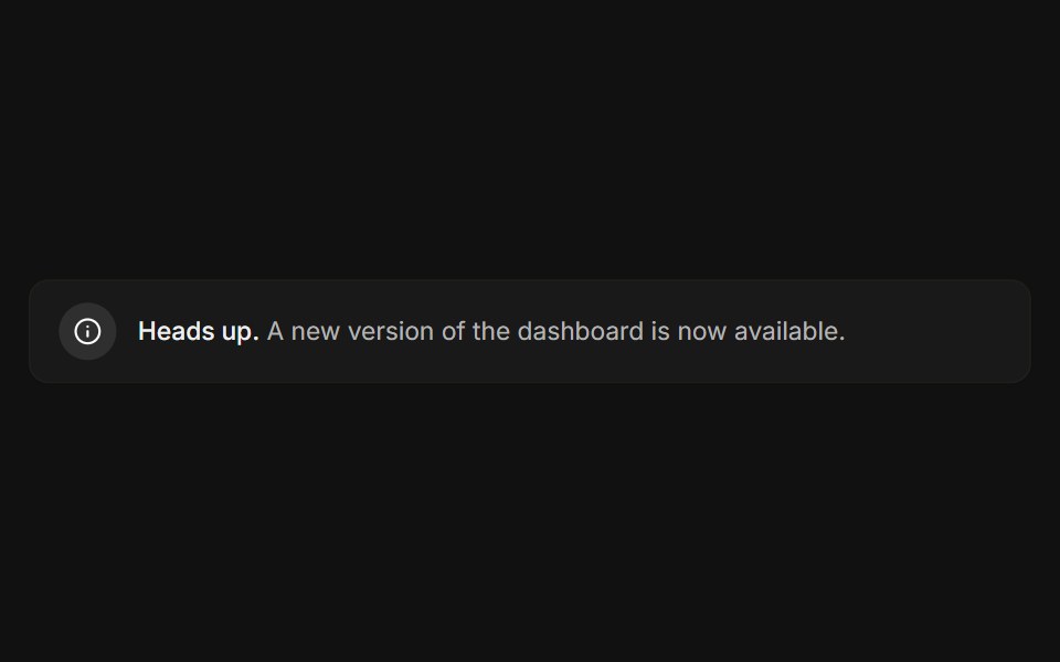 BasicFLX UI · ReactIcon, message, and a subtle bordered surface.
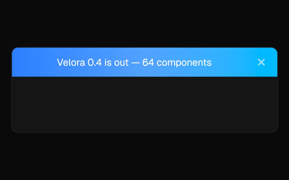 Sticky BannerVelora UI · ReactDismissible announcement bar pinned above the header.
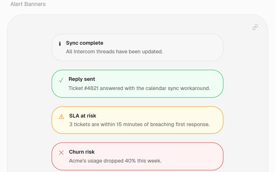 Alert BannerHalaska UI · React
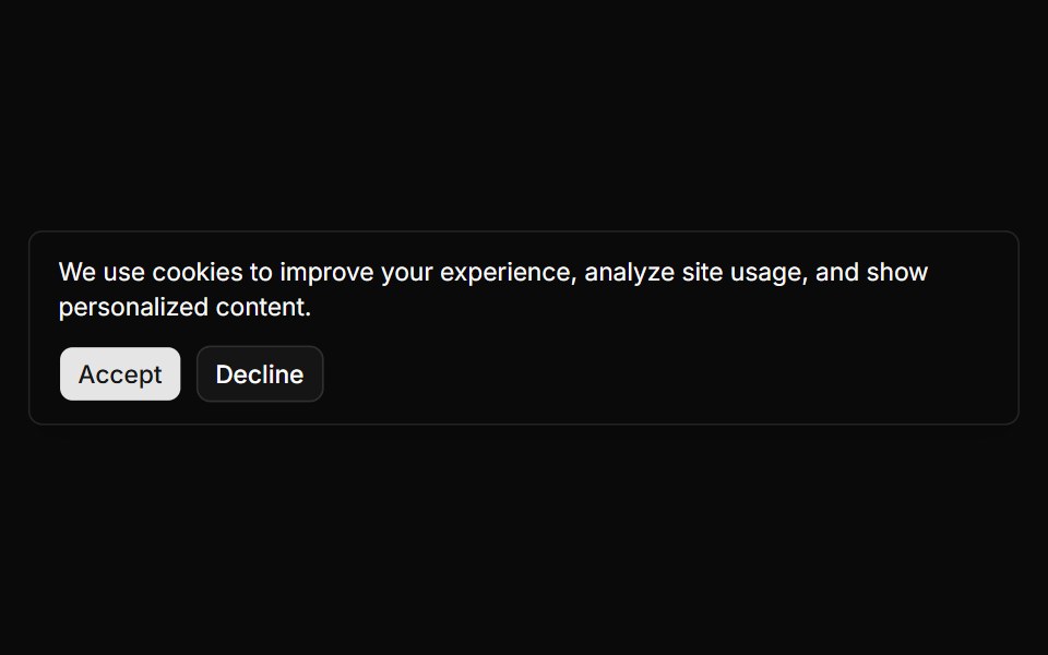 Banner 1sv-particles · Svelte
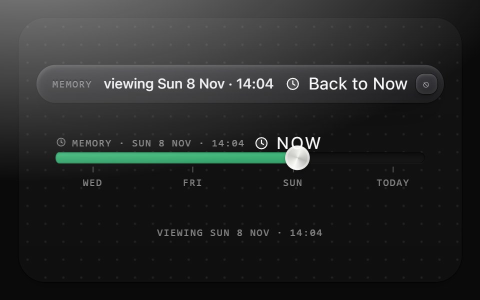 Past bannerMetal UI · React + SwiftUIThe only chrome that changes while the canvas is scrubbed into the past: Surface(graphite-plain) with the MEMORY…
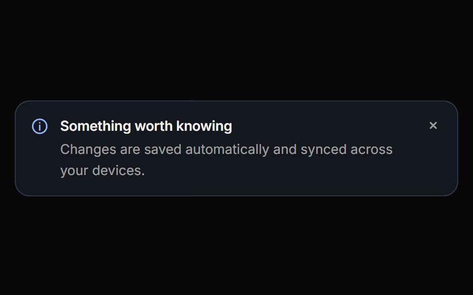 CalloutReactFrame · ReactAn inline message block with info, success, warning, danger and neutral variants, three appearances, self-drawing…
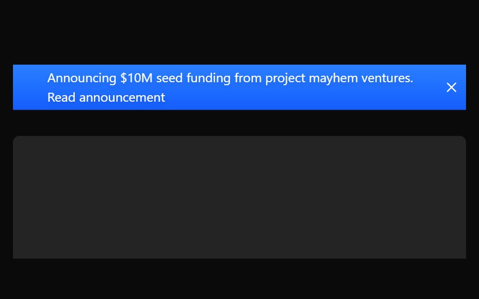 Sticky BannerAceternity UI · React
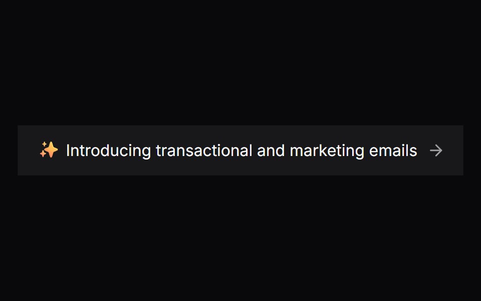 Comp 302Origin UI · React
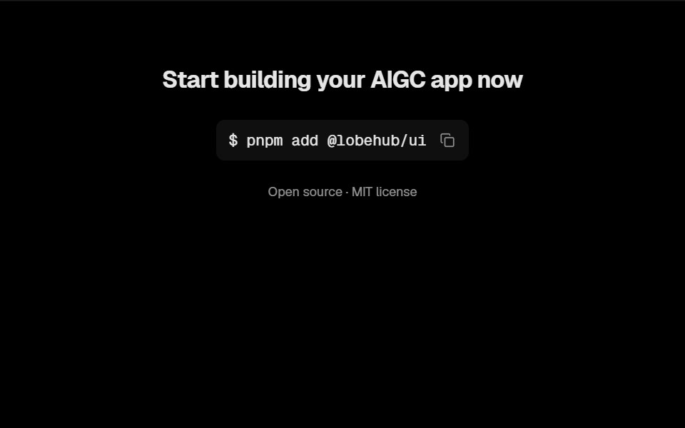 Awesome Install BannerLobe UI · React
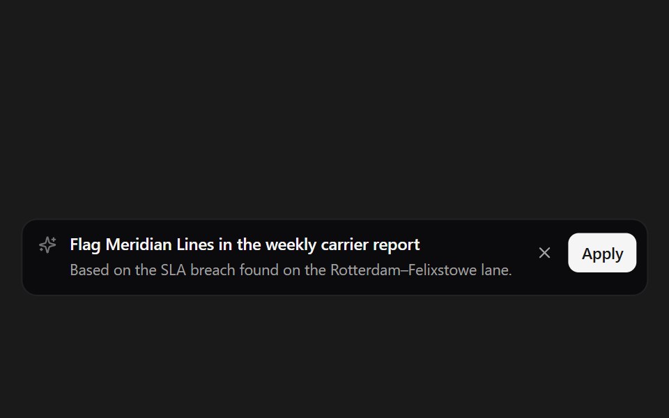 Suggestion BannerSpectrum UI · ReactAn inline AI suggestion with apply and dismiss.
 CTA 01 - Gradient Call-to-Action BannerShadcn Space · ReactA minimal full width CTA section with soft gradient background, persuasive headline, and primary action button…
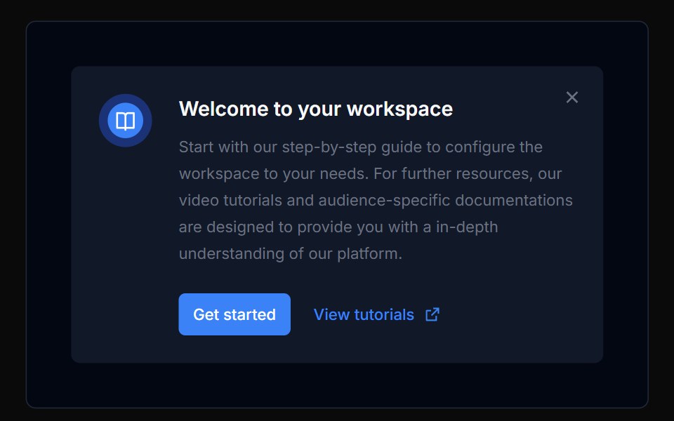 Banner 02Tremor Blocks · React
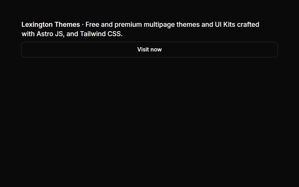 Banners 02Oxbow UI · Astro
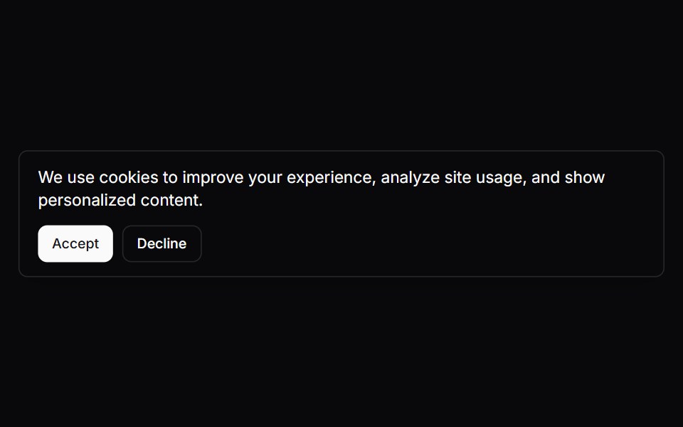
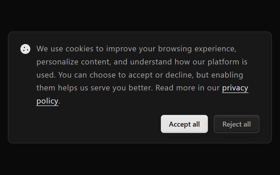
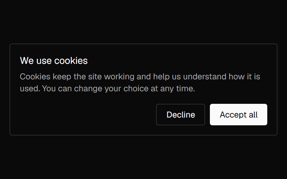 Banner CookieNexvyn UI · ReactA cookie consent card with accept and decline actions that lifts in once and lifts away on a choice.
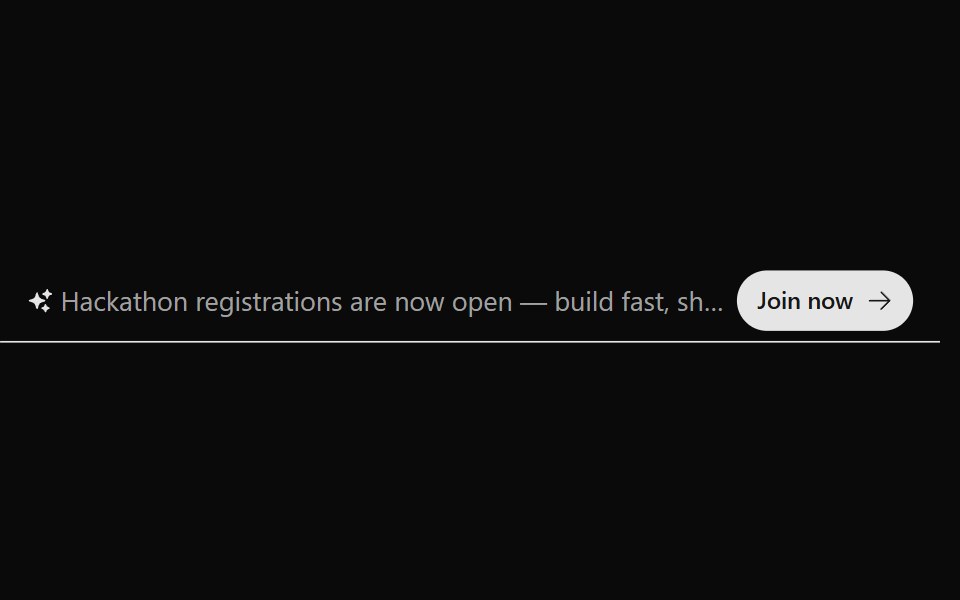 Announcement 2Watermelon UI · React
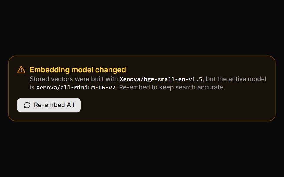 Embedding Drift BannerLocalMode · ReactA warning panel shown when the active embedding model is incompatible with vectors already stored (model changed or…
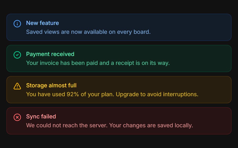 VariantsFLX UI · ReactInfo, success, warning, and error tones stacked.
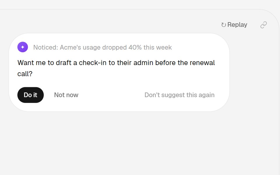 Nudge PatternHalaska UI · React
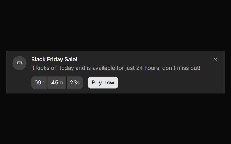 Banner 10sv-particles · Svelte
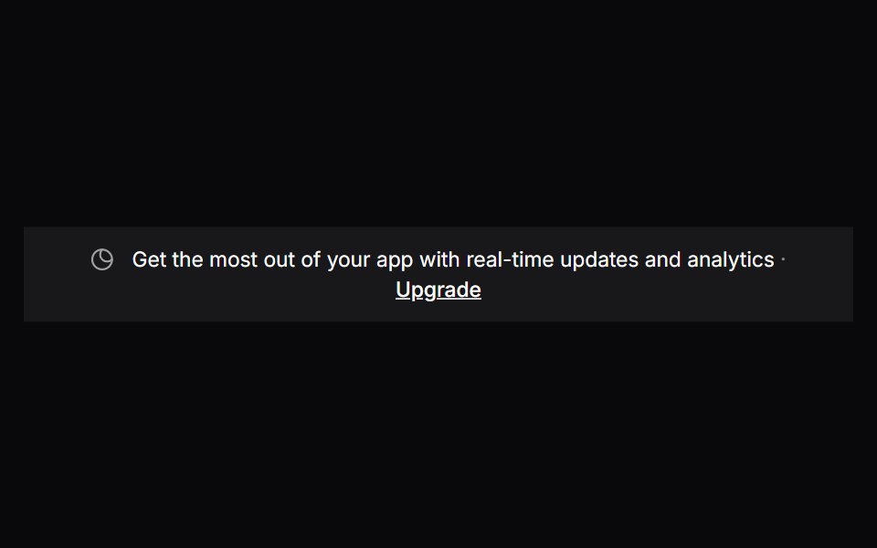 Comp 303Origin UI · React
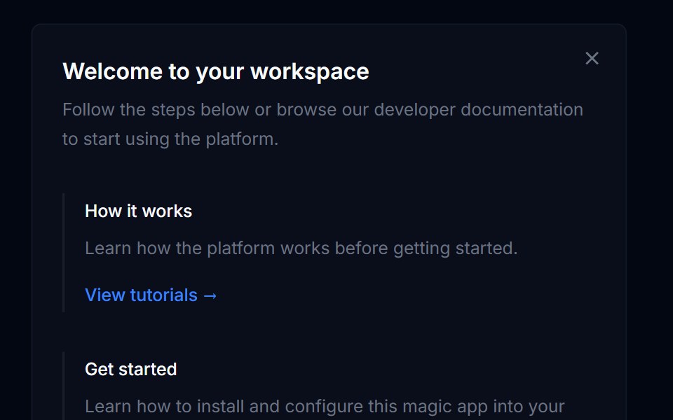 Banner 03Tremor Blocks · React
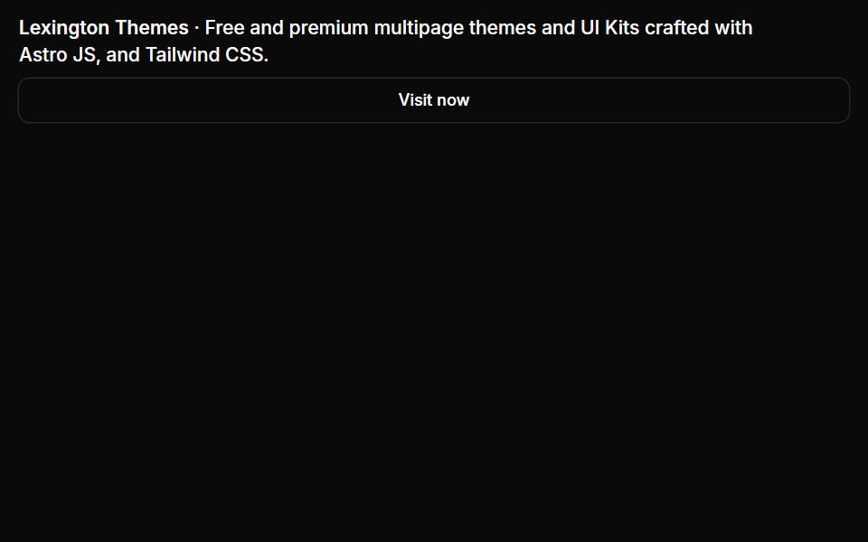 Banners 03Oxbow UI · Astro
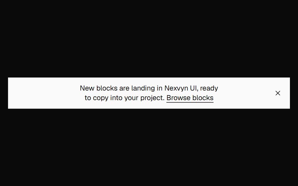 Banner FilledNexvyn UI · ReactA filled announcement banner on the inverted foreground surface.
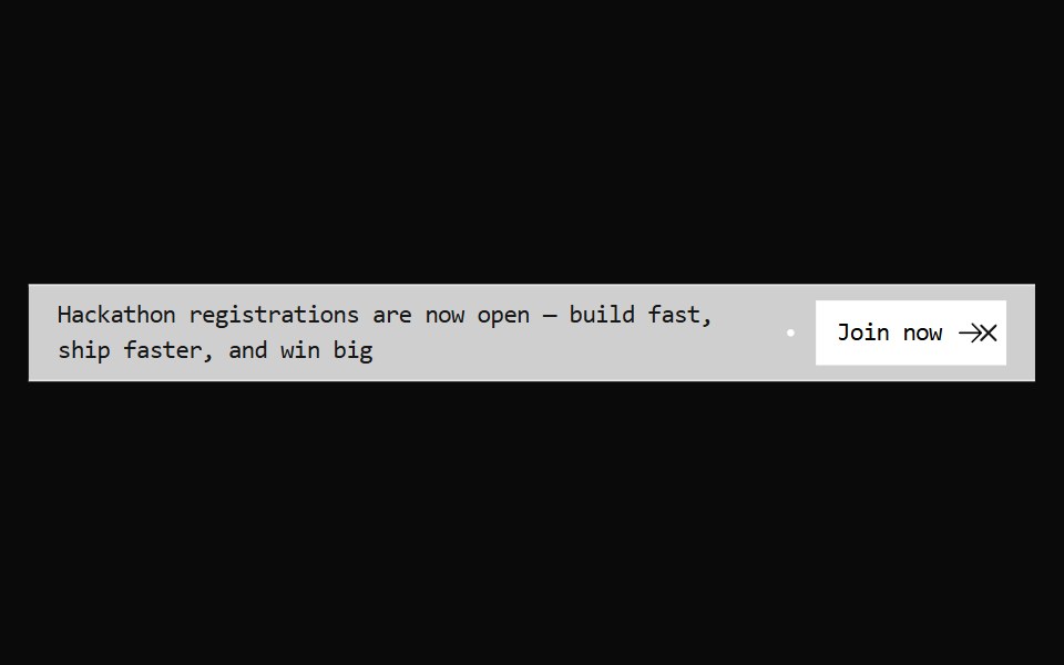 Announcement 3Watermelon UI · React
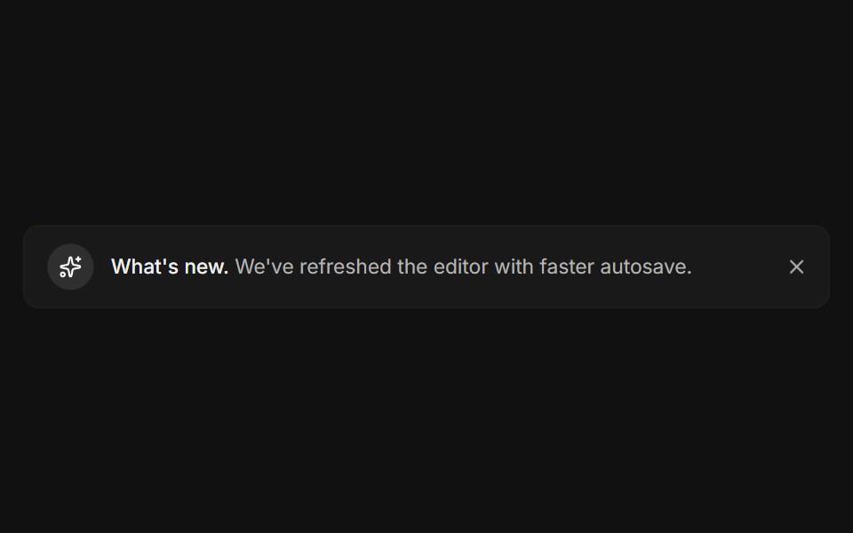 DismissibleFLX UI · ReactA close button hides the banner with a restore link.
 Banner 11sv-particles · Svelte
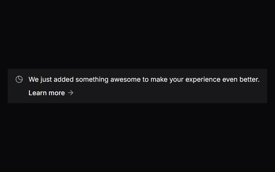 Comp 304Origin UI · React
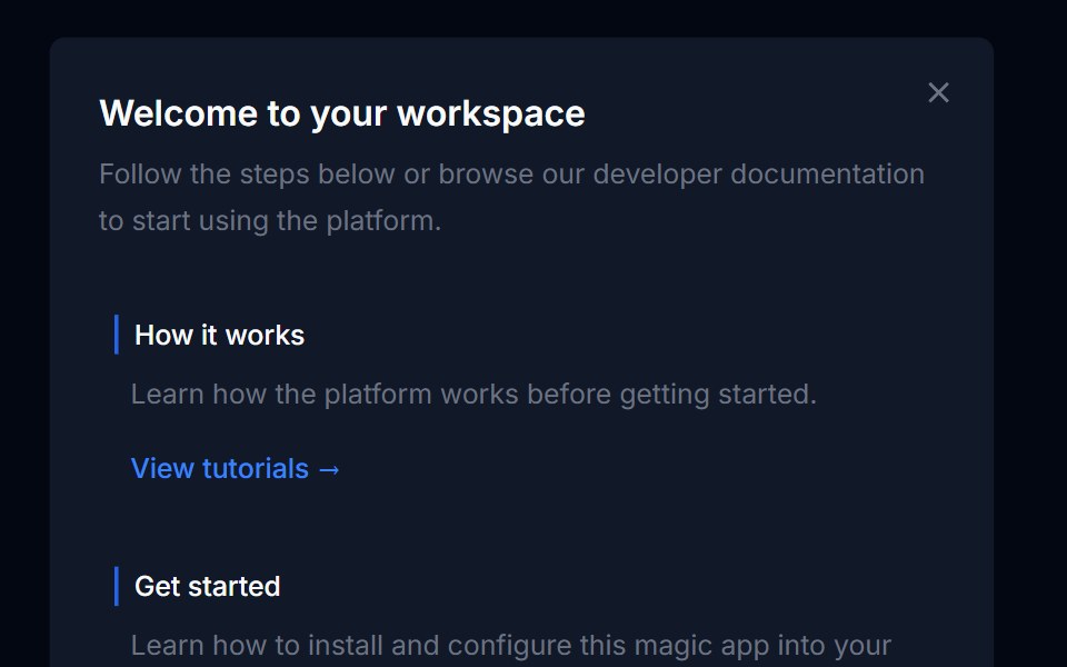 Banner 04Tremor Blocks · React
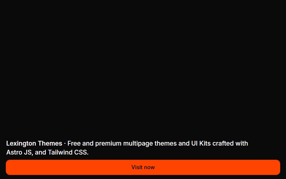 Banners 04Oxbow UI · Astro
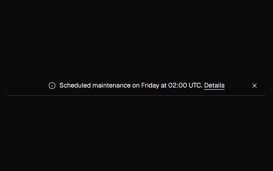 Banner NoticeNexvyn UI · ReactInfo and error status banners with icons and the right live-region roles.
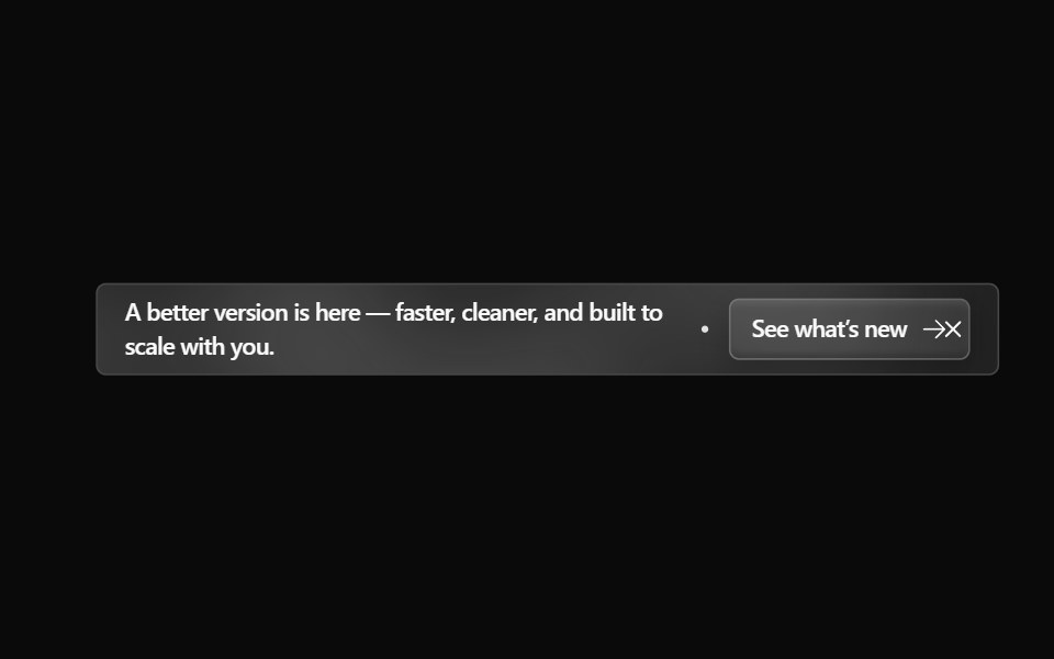 Announcement 4Watermelon UI · React
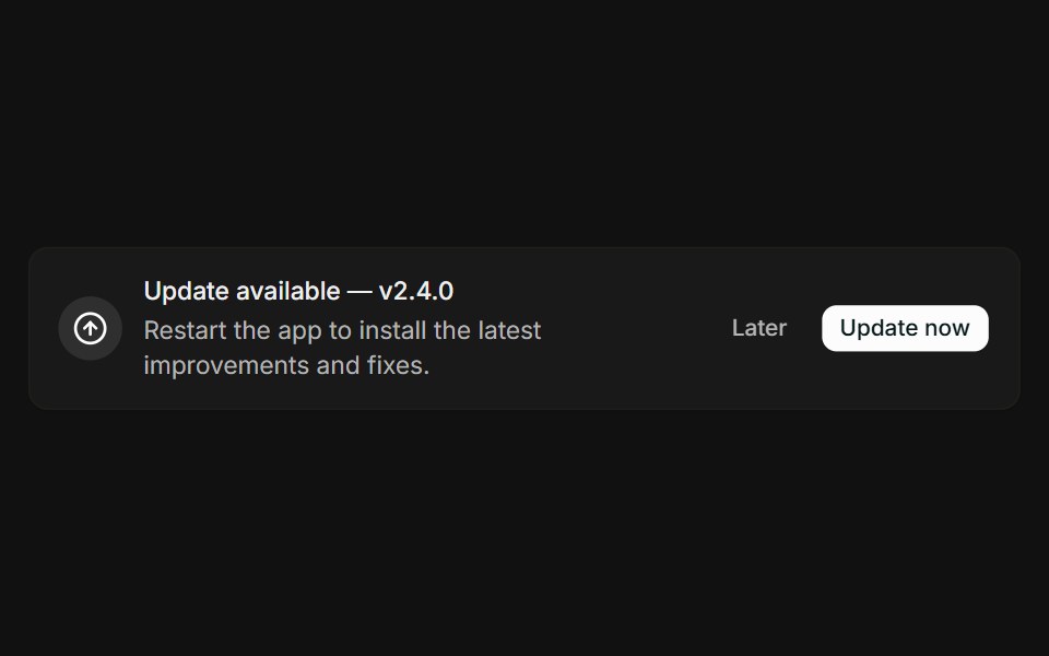 With actionsFLX UI · ReactMessage paired with Later and Update now buttons.
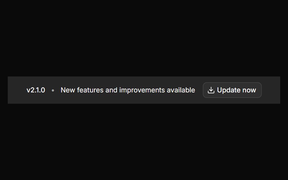 Banner 12sv-particles · Svelte
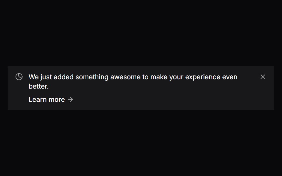 Comp 305Origin UI · React
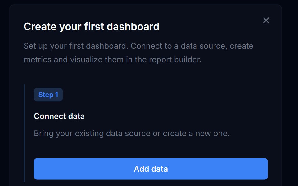 Banner 05Tremor Blocks · React
 Banners 05Oxbow UI · Astro
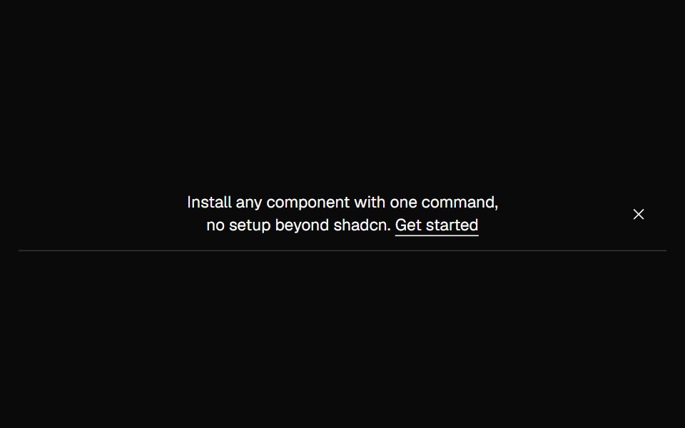 Banner OutlineNexvyn UI · ReactA quiet outline announcement banner with a hairline bottom border.
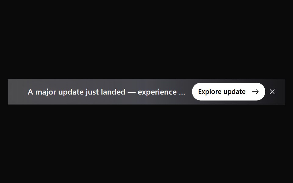 Announcement 5Watermelon UI · React
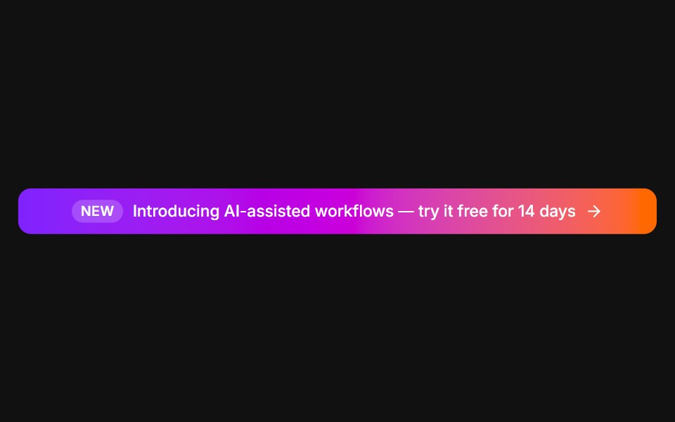 Announcement barFLX UI · ReactFull-width gradient promo with a New tag and arrow.
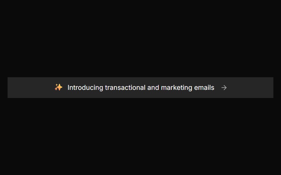 Banner 2sv-particles · Svelte
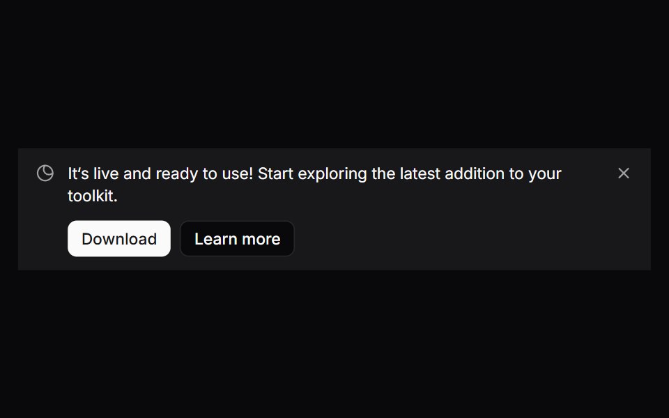 Comp 306Origin UI · React
 Banners 06Oxbow UI · Astro
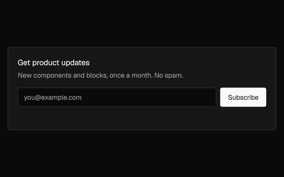 Banner SubscribeNexvyn UI · ReactAn email signup banner with inline validation that crossfades into a confirmation on success.
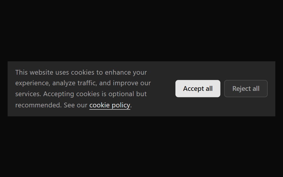 Announcement 6Watermelon UI · React
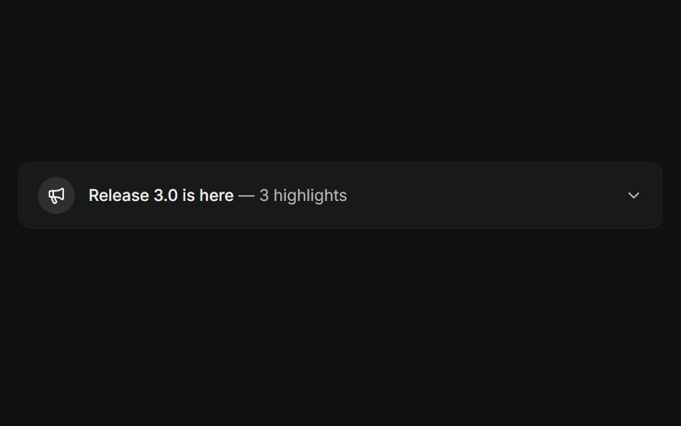 ExpandableFLX UI · ReactCollapsible release notes that reveal highlights.
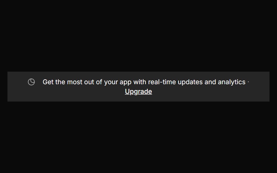 Banner 3sv-particles · Svelte
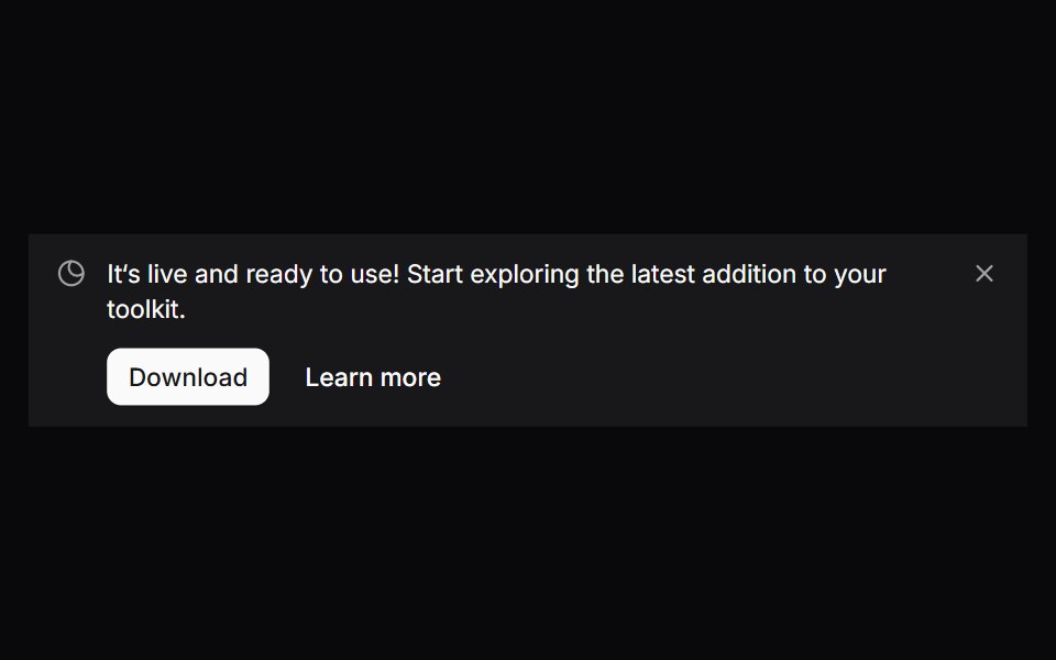 Comp 307Origin UI · React
 Banners 07Oxbow UI · Astro
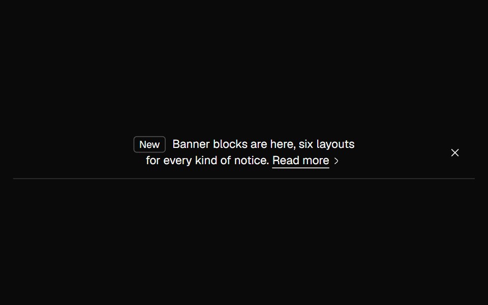 Banner TaggedNexvyn UI · ReactAn outline banner led by a small tag, with an arrow link.
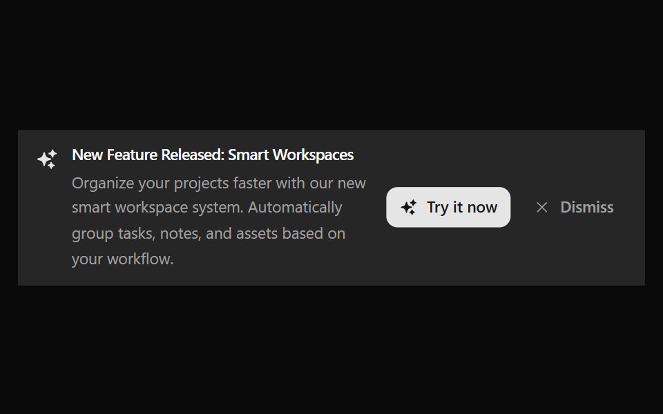 Announcement 7Watermelon UI · React
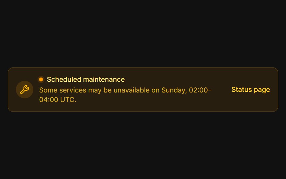 MaintenanceFLX UI · ReactAmber system notice with a pulsing status dot.
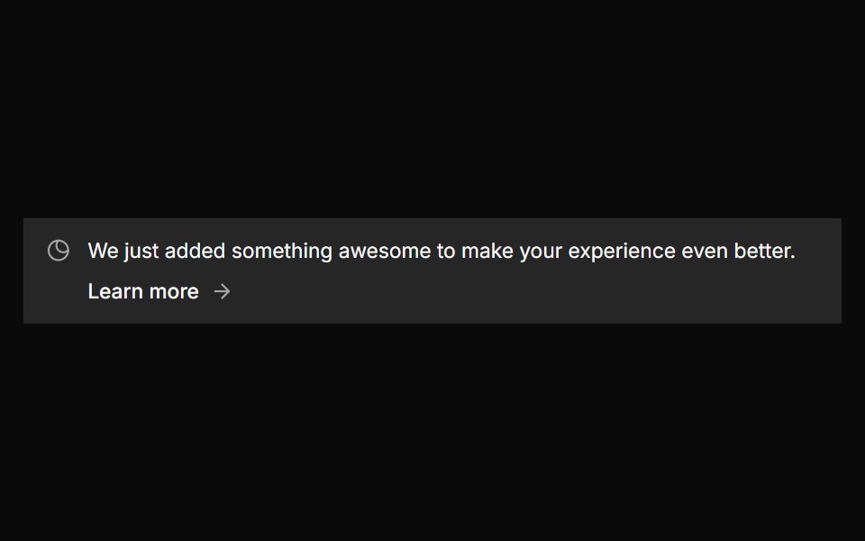 Banner 4sv-particles · Svelte
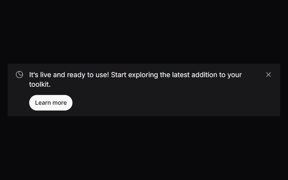 Comp 308Origin UI · React
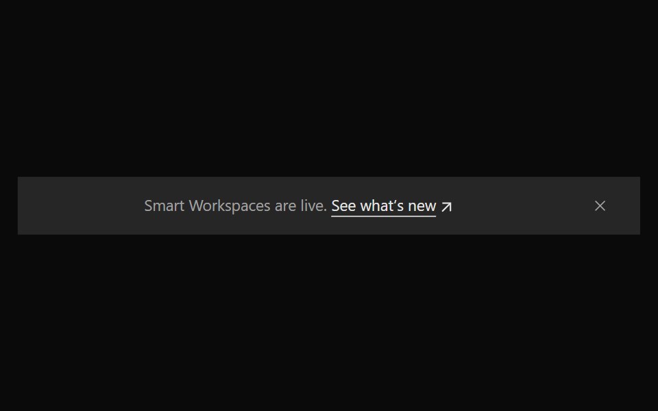 Announcement 8Watermelon UI · React
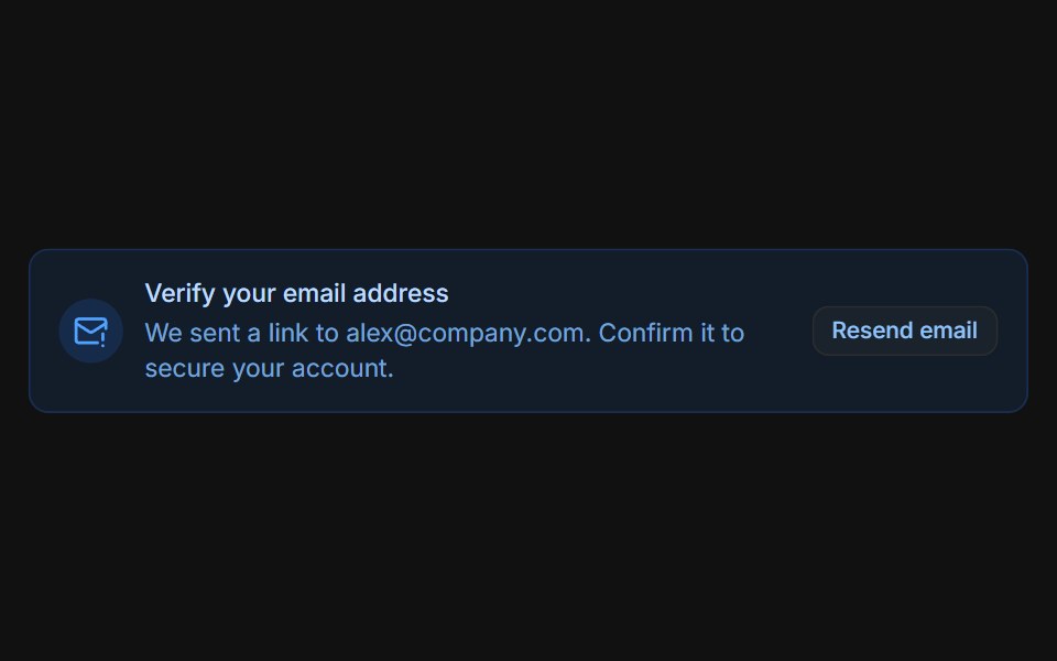 Email verificationFLX UI · ReactBlue prompt with a Resend email button that switches to a sent confirmation.
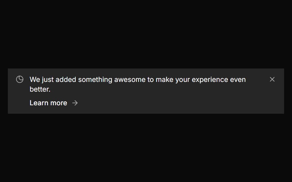 Banner 5sv-particles · Svelte
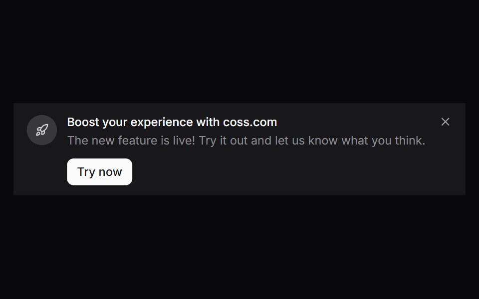 Comp 309Origin UI · React
 Announcement 9Watermelon UI · React
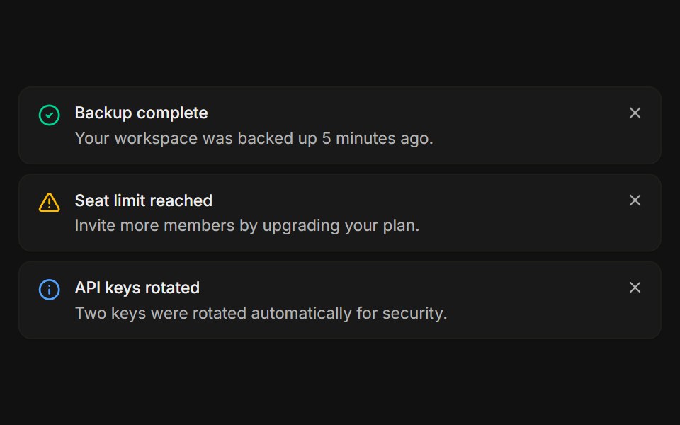 StackedFLX UI · ReactA list of dismissible notices, each removed on its own.
 Banner 6sv-particles · Svelte
 Comp 310Origin UI · React
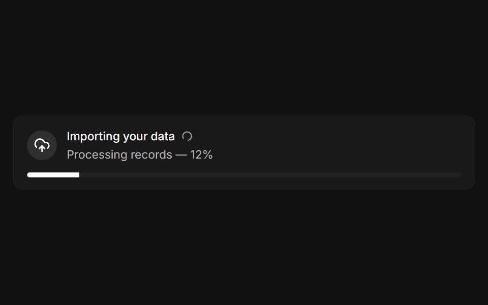 With progressFLX UI · ReactLive import banner with a spinner and a progress bar.
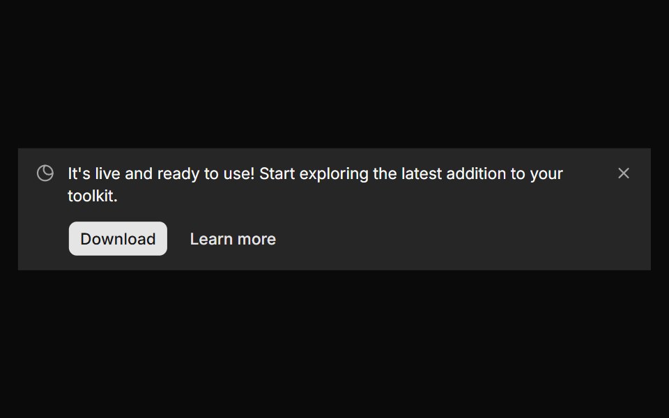 Banner 7sv-particles · Svelte
 Comp 311Origin UI · React
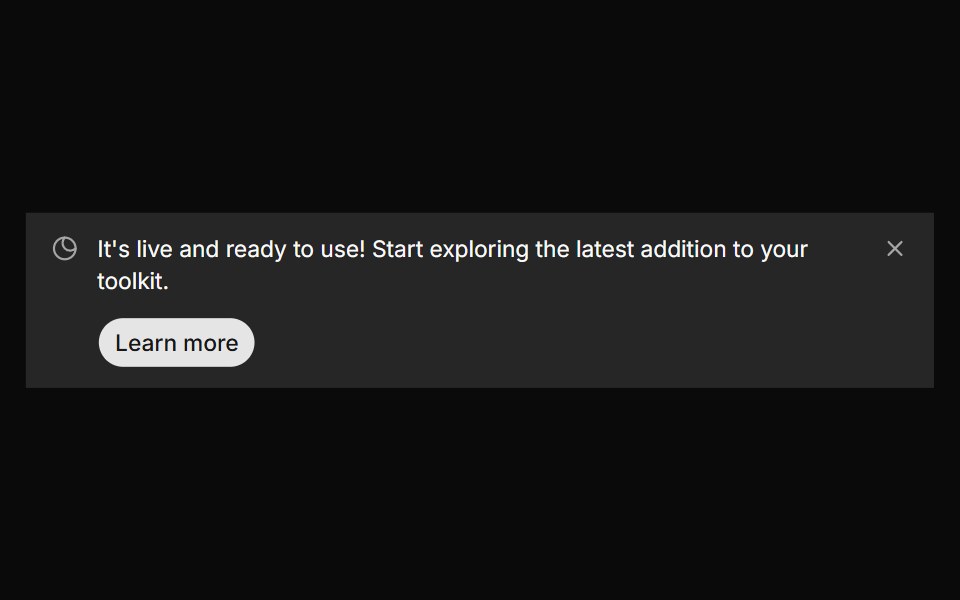 Banner 8sv-particles · Svelte
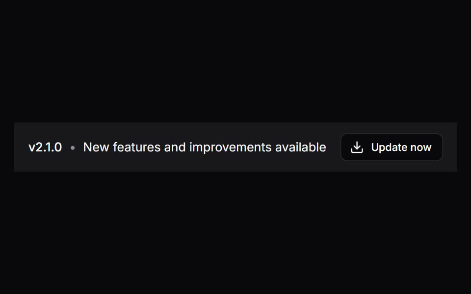 Comp 312Origin UI · React
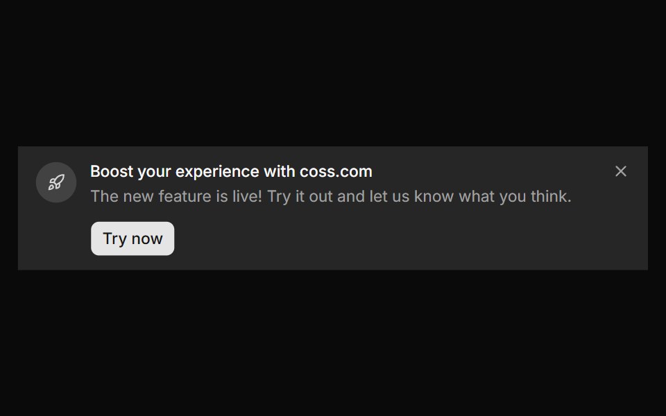 Banner 9sv-particles · Svelte
Libraries with banner components
Related categories
- React Banner Components
- Tailwind CSS Banner Components
- Animated Banner Components
- shadcn/ui Banner Components
- Feedback Components
- Badge Components
- Spinner Components
- Progress Components
- Alert Components
- Chip Components
- Progress Bar Components
- Empty State Components
- Notification Components
- Status Indicator Components
- Skeleton Components
- Typing Indicator Components
- Progress Circle Components
- Error State Components
- Success Animation Components
- Scroll Progress Components