Guide Card
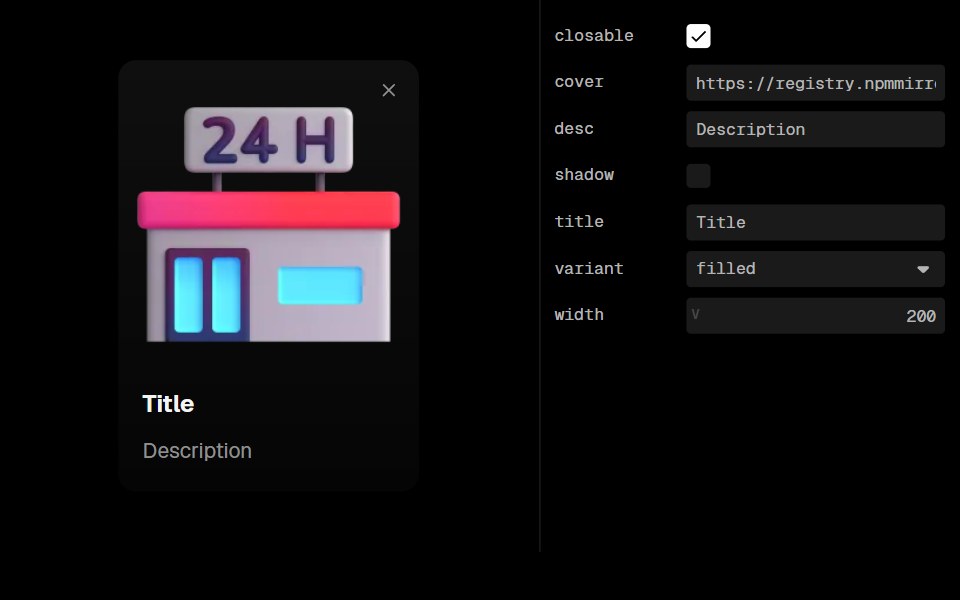
GuideCard is a component used to display visual guides, introductory content, or instructional information with an optional cover image, title, and description. It supports various visual styles, closable functionality, and customization options.
- Library
- Lobe UI
- Framework
- React
- Type
- component
- License
- MIT
- Install
pnpm add @lobehub/ui- Files
src/GuideCard/GuideCard.tsxsrc/GuideCard/index.tsxsrc/GuideCard/stable.tssrc/GuideCard/style.tssrc/GuideCard/type.tssrc/ActionIcon/index.tssrc/Flex/index.tssrc/types/index.ts
- Source
- https://github.com/lobehub/lobe-ui
Categories
- Banner Components
- React Banner Components
- Card Components
- React Card Components
- Data Display Components
- React Data Display Components
- Feedback Components
- React Feedback Components