 Dev Design Library
Card Components
Dev Design Library indexes 924 card components from 88 open-source UI libraries, with the most coming from Watermelon UI, OpenSourceUI, Tremor Blocks, FLX UI and Oxbow UI. Each one links to its page with the source code, a live preview where available, the library license and the install command. Card components belong to the Data display group.
Showing 120 of 924, a mix from every library. Open a library to see all of its components.
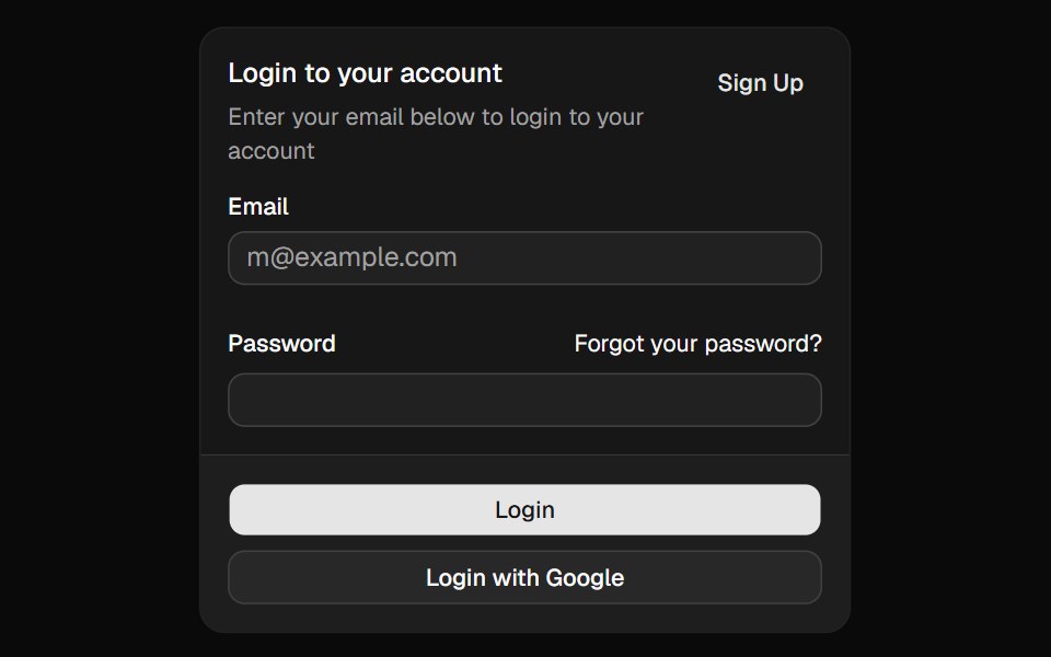 Cardshadcn/ui · ReactDisplays a card with header, content, and footer.
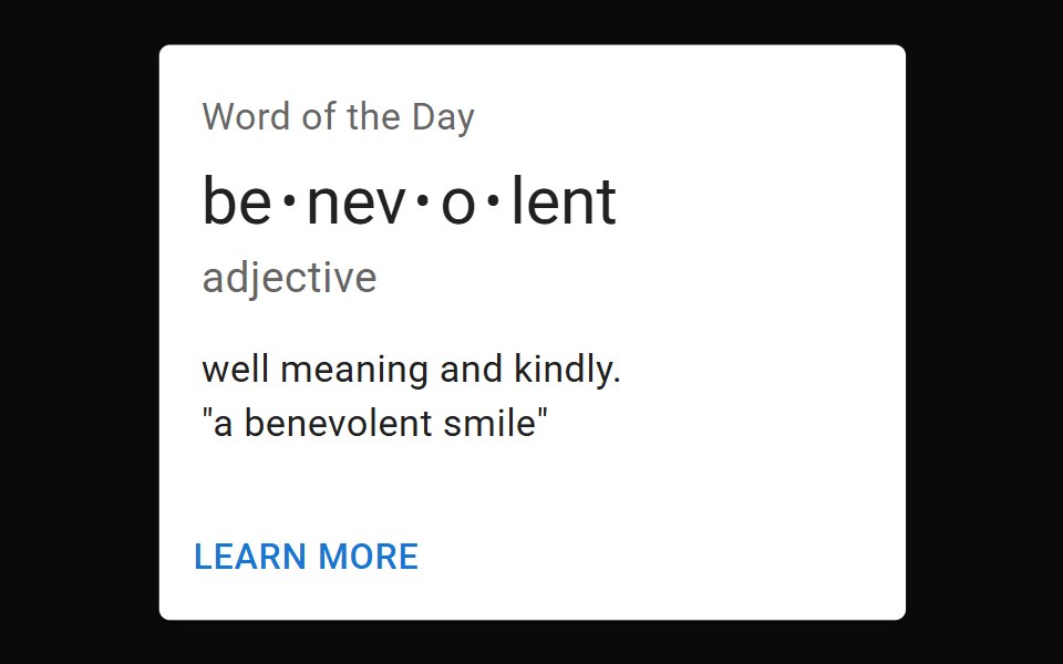 CardMUI / Material UI · React
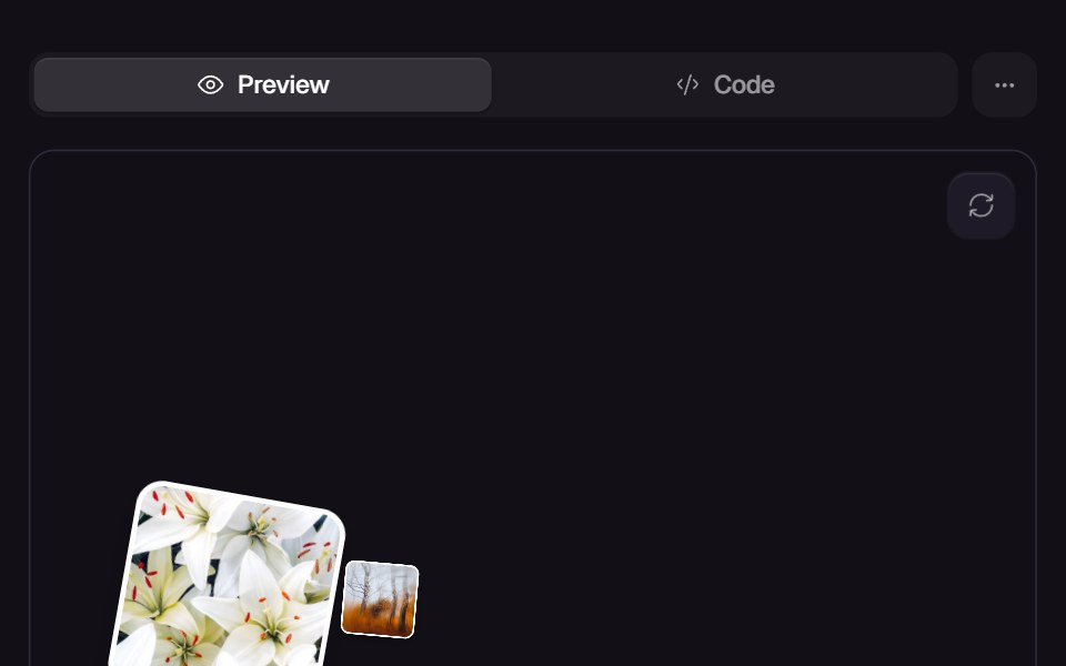 Bounce CardsReact Bits · ReactCards bounce that bounce in on mount.
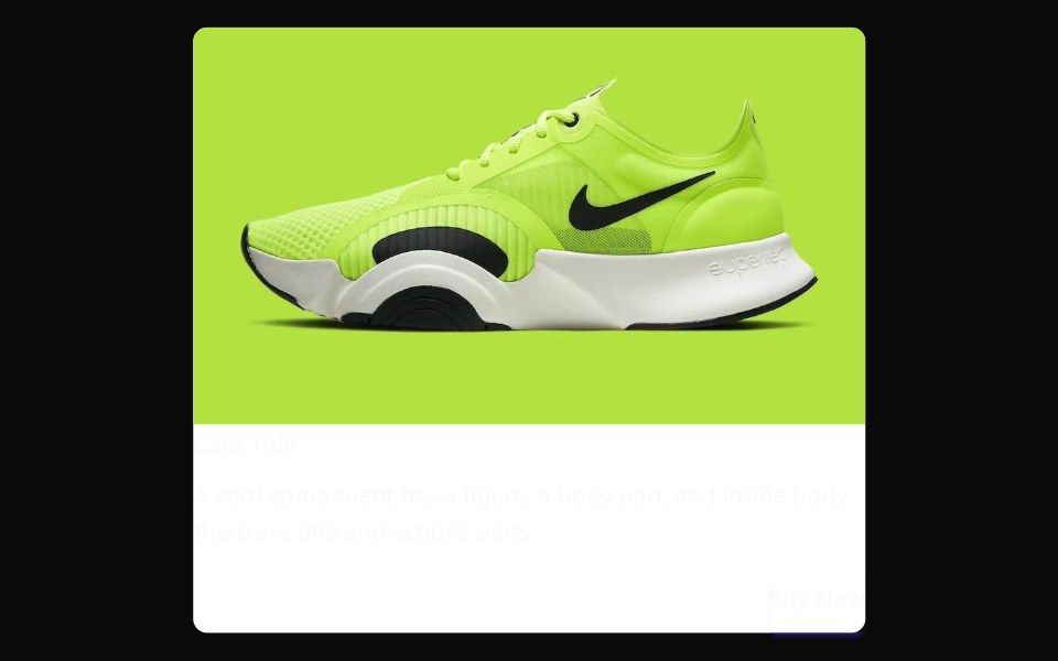 CarddaisyUI · CSS (Tailwind)
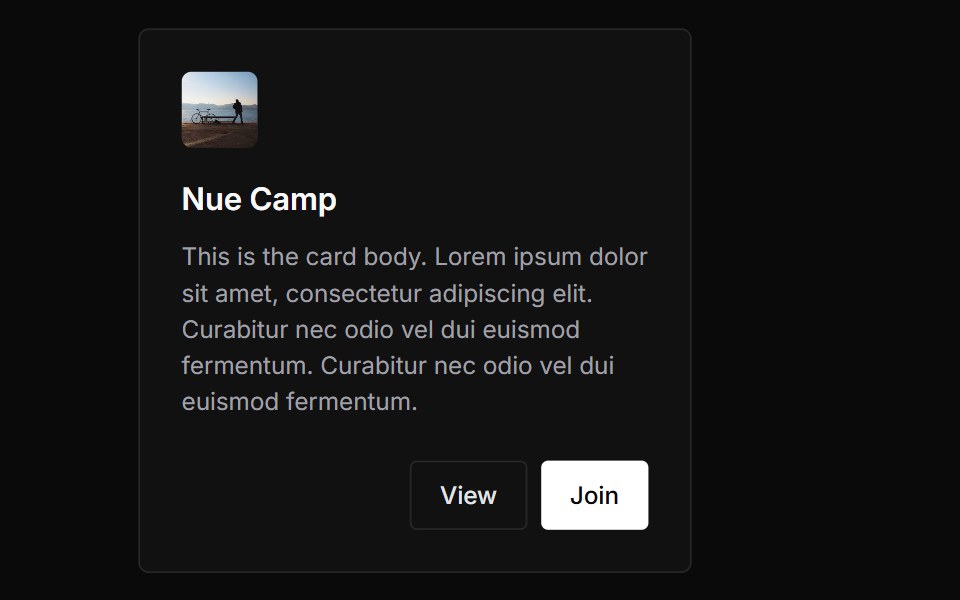 CardChakra UI · ReactUsed to display content related to a single subject.
 CardHeroUI · ReactDisplays a card container with flexible layout sections for structured content.
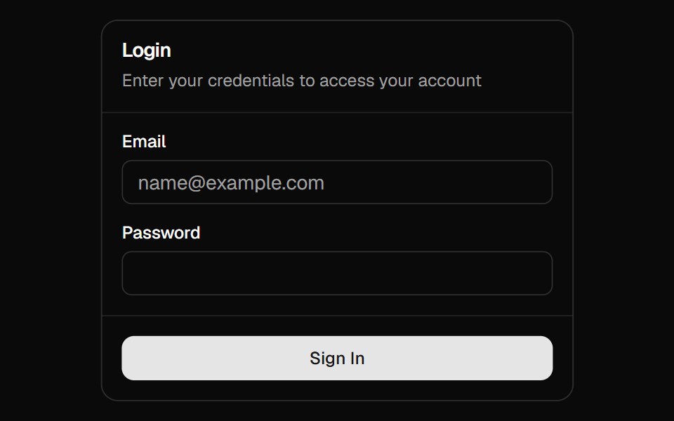 Magic CardMagic UI · ReactA spotlight effect that follows your mouse cursor and highlights borders on hover.
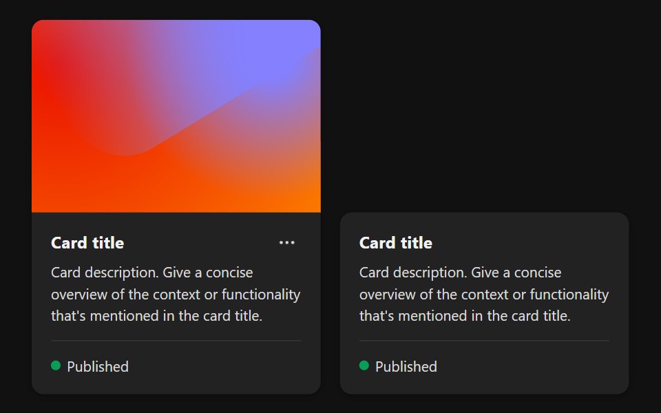 CardReact Spectrum · ReactA Card summarizes an object that a user can select or navigate to.
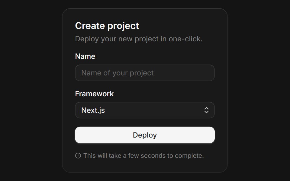 Cardcoss ui · ReactA content container for grouping related information.
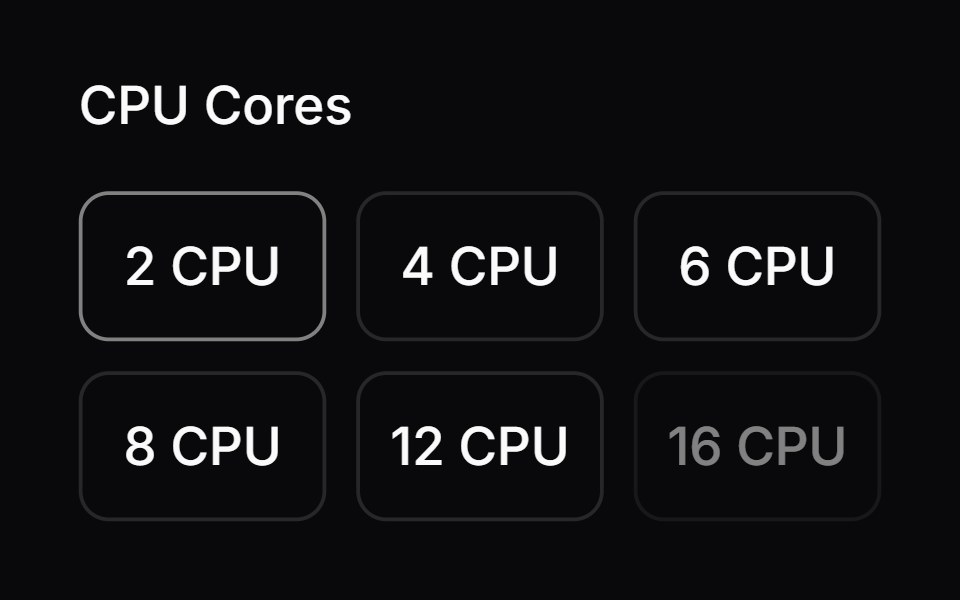 Comp 164Origin UI · React
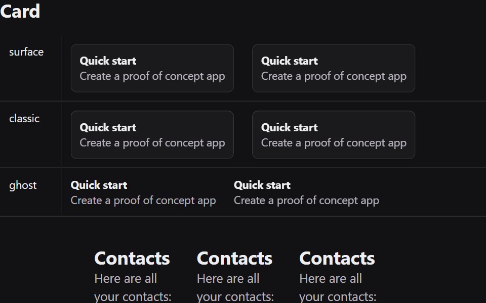 CardRadix Themes · React
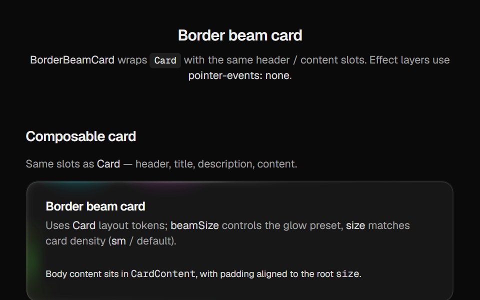 Border Beam CardCult UI · Reactborder-beam around compound Card API with balanced title and description
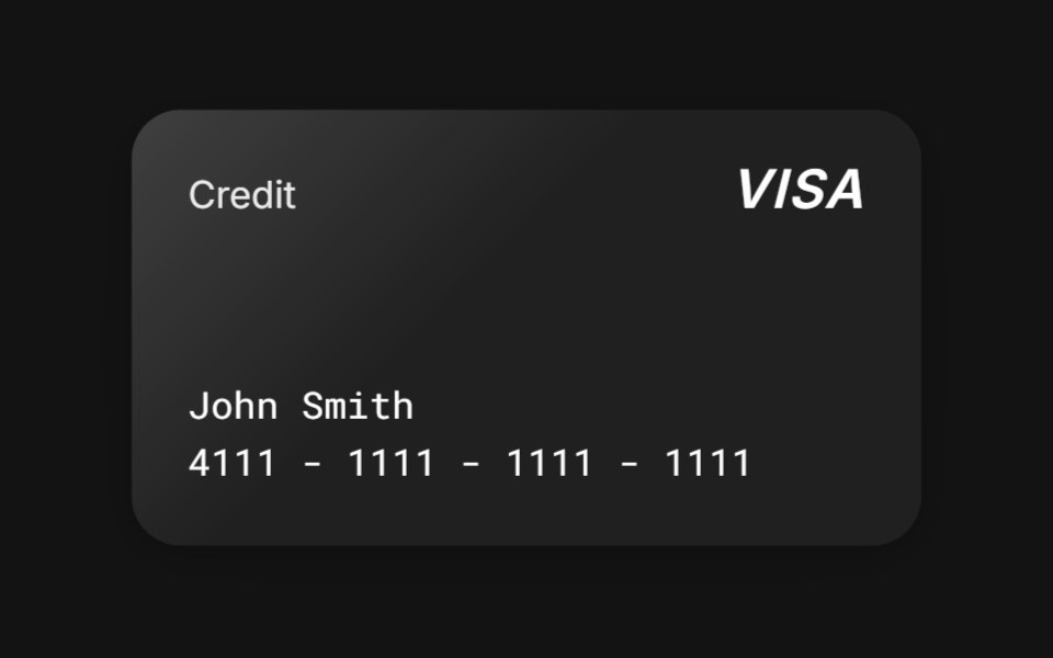 3D Tilttransitions.dev · HTML/CSS
 CardTremor · React
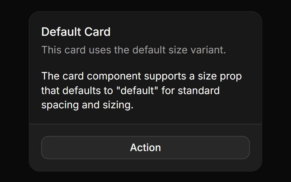 Basic cardReUI · ReactBasic card
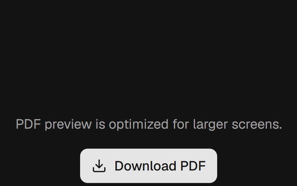 Cardpdfcn · ReactCard PDF component (forme)
 Card Cascade StaggerAmicro Micro Transitions · ReactStack of cards that cascade into place one after another.
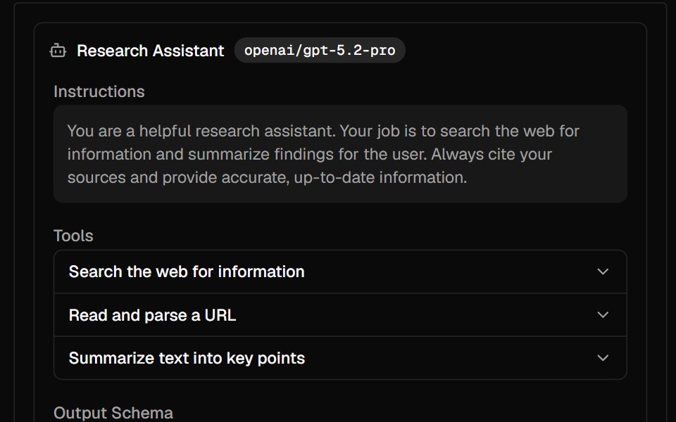 AgentAI Elements · ReactA composable component for displaying AI agent configuration with model, instructions, tools, and output schema.
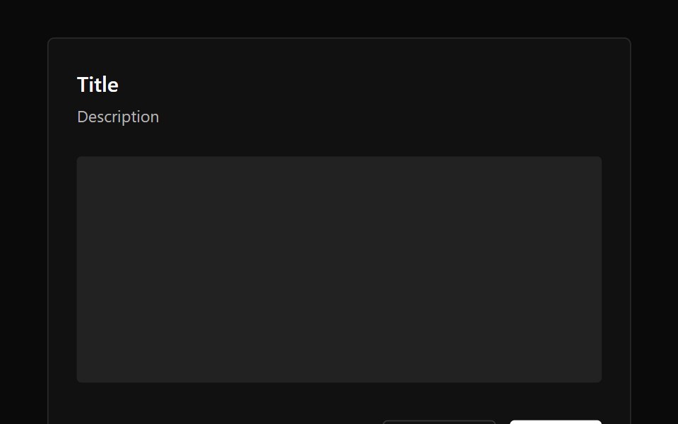 CardPark UI · ReactA container component for grouping related content and actions.
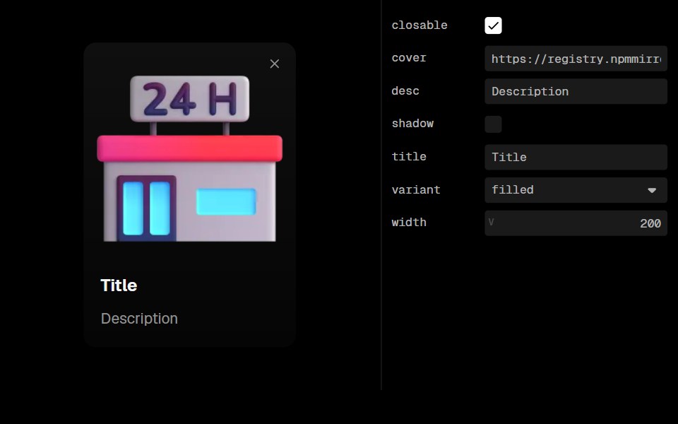 Guide CardLobe UI · ReactGuideCard is a component used to display visual guides, introductory content, or instructional information with an…
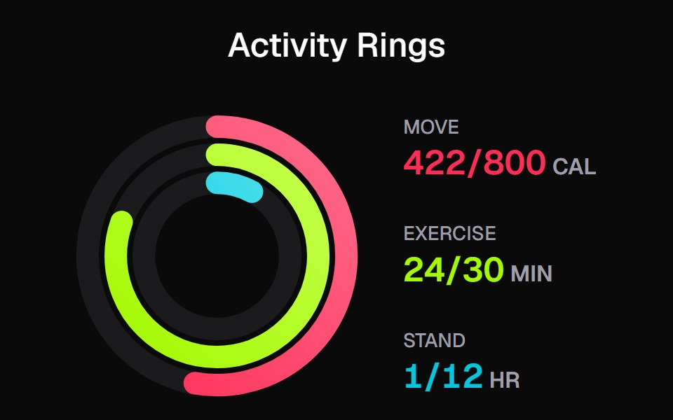 Apple Activity CardKokonut UI · ReactActivity rings that draw with a count-up, lap past 100% with a shadowed end cap and dim to focus, built with React and…
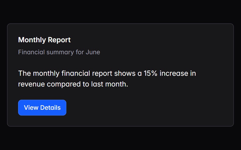 cardIntent UI · Reactcard
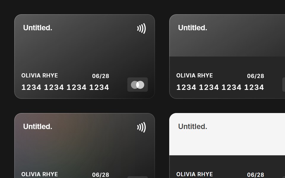 Credit CardUntitled UI React · React
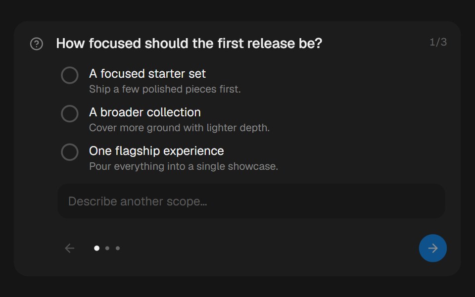 Approval CardbeUI · ReactCollects structured human input during a paused run.
 CardTailGrids · ReactA card component with ultimate flexibility and customization.
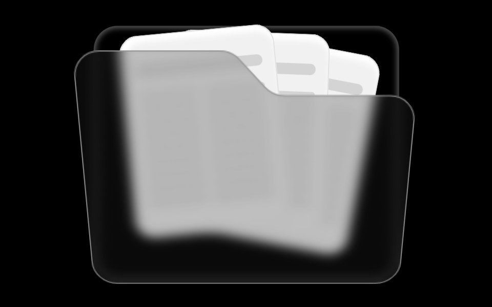 Folder ComponentRare UI · ReactAn animated folder whose cards fan out on hover and lift open on click, with a 3D-tilted flap. Supports color and size…
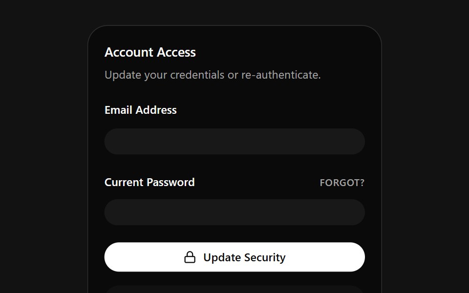 Account Access CardSpectrum UI · ReactA credentials card that auto-fills email and password on a loop, with a danger zone.
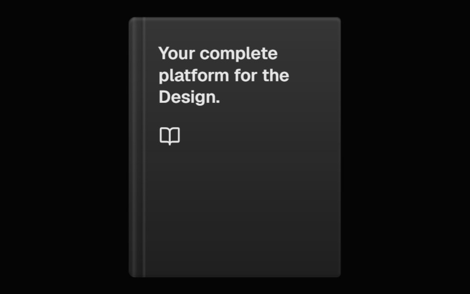 Perspective BookSpell UI · ReactA 3D book component with hover animation and customizable appearance.
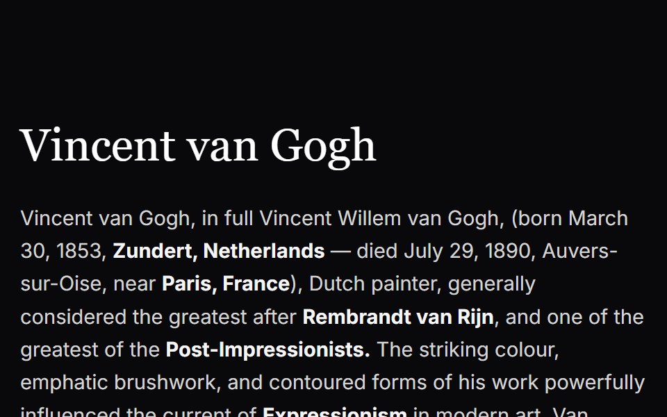 Cursor CardVengeance UI · ReactInline text link with cursor tracking preview card
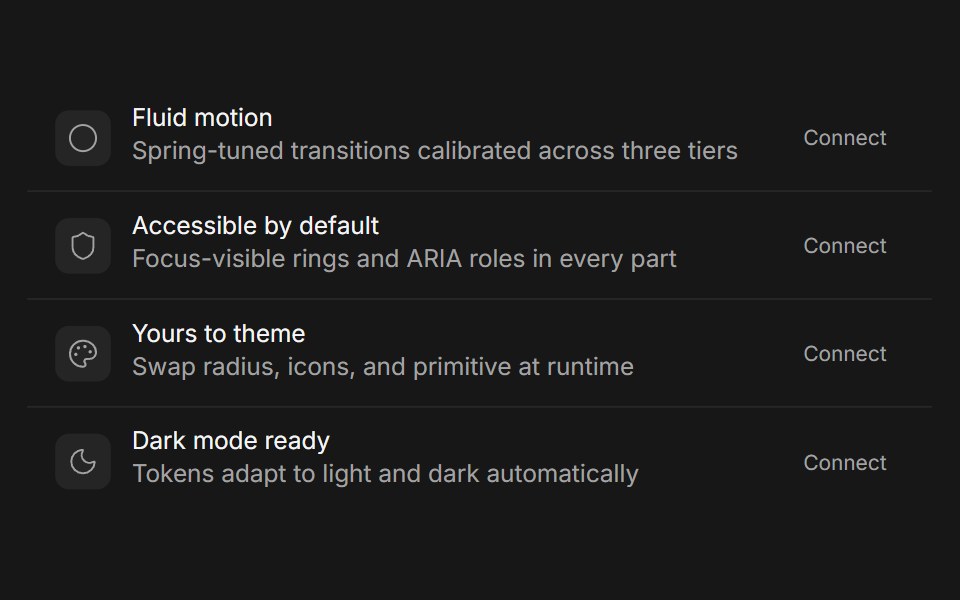 CardFluid Functionalism · Reactshadcn's compositional card (Card, CardHeader, CardTitle, CardDescription, CardAction, CardContent, CardFooter) with…
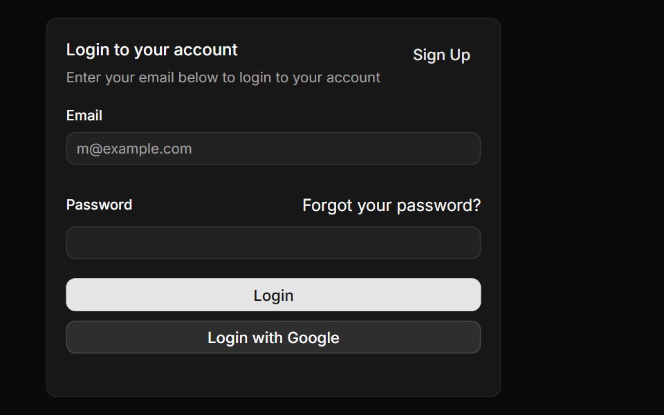 CardToolcraft · React
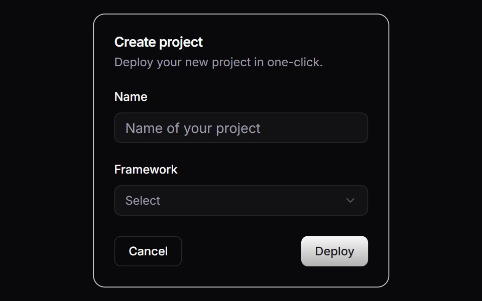 CardLaunch UI · React
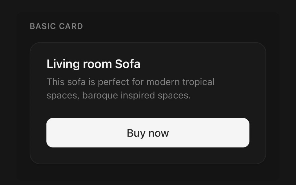 CardPanel UI · React NativeContent surface with header, body and footer.
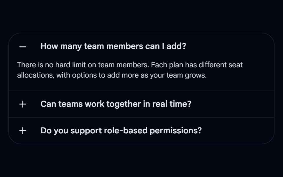 Accordion-04 - CardShadcn Space · ReactAccordion wrapped in a rounded card with left-aligned +/- icons and border dividers
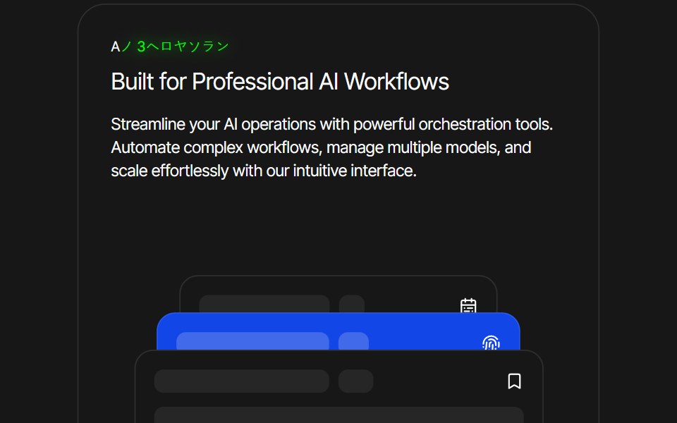 Card AnimationPixel Perfect · ReactFramer Motion card animation.
 Linked In Post CardOpenSourceUI · ReactCard that reproduces a LinkedIn post: author, text, image and reaction bar.
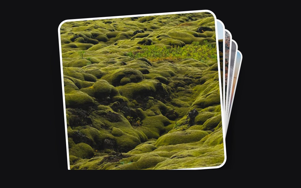 Accessible Actionuselayouts · ReactInteractive draggable card stack with 3D tilt, swipe-to-back gestures, click interactions, random rotation, and smooth…
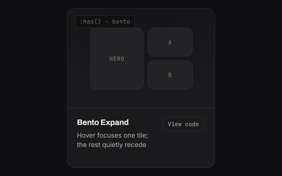 Bento ExpandKinetics · HTML/CSSHover focuses one tile; the rest quietly recede
 CardPrebuiltUI · React
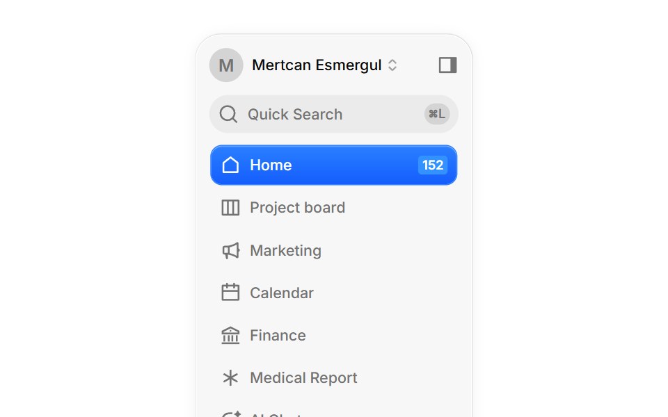 DashboardBoardUI · React
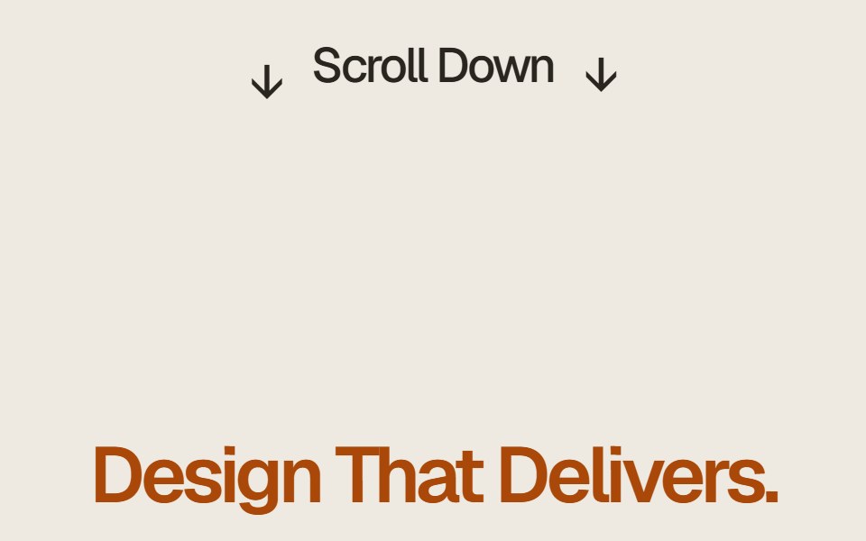 Case Study Flip StackComponentry · ReactEditorial case study cards that fold upward on scroll to reveal the next story.
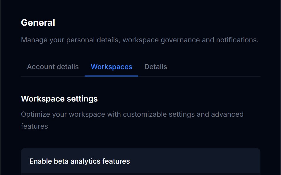 CardTremor Blocks · React
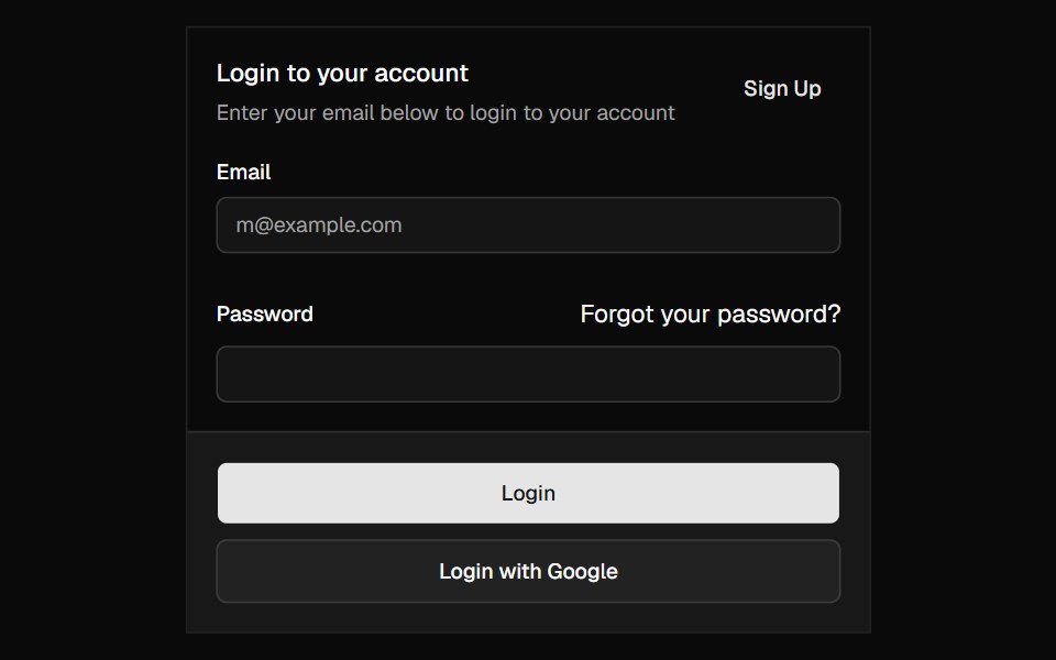 CardShadcn Dashboard · React
 Card Decoratorcnblocks · SvelteDecorative card component with visual effects
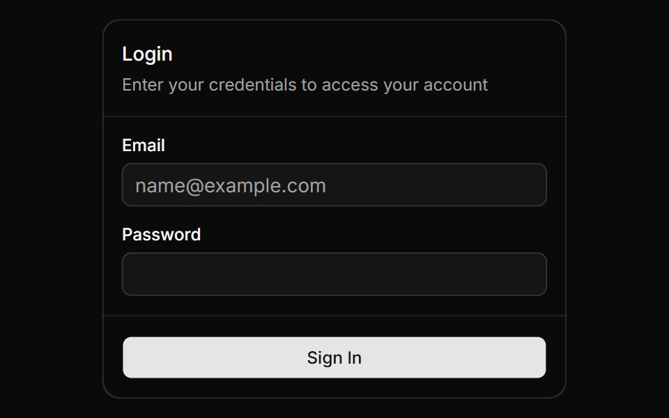 Magic CardAnimations (Svelte) · SvelteA spotlight effect that follows your mouse cursor and highlights borders on hover.
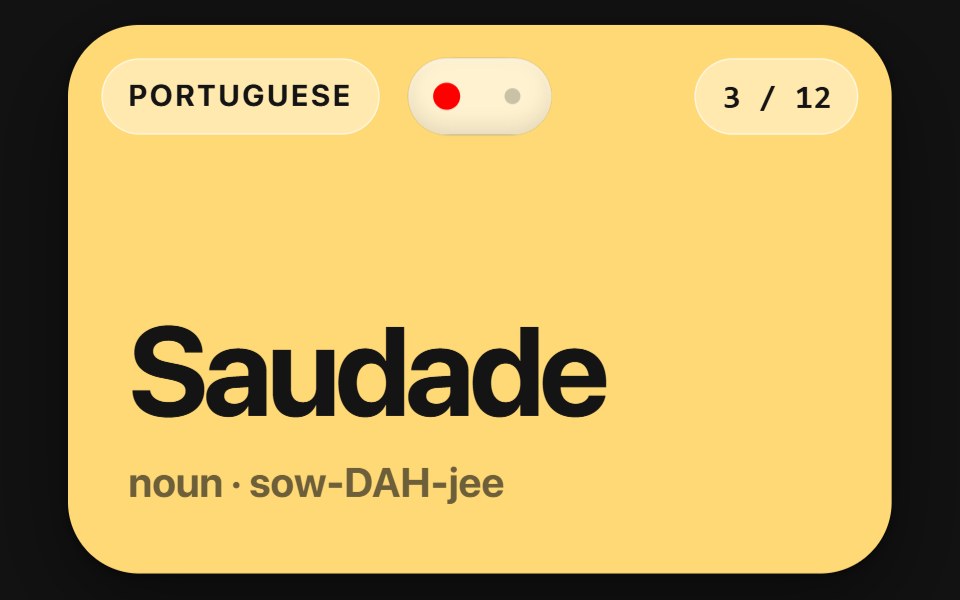 Flip CardSwiftPieces · SwiftUIA two-sided card you flip by tap or drag, scrubbing the turn and carrying the flick into the landing, with a lift and…
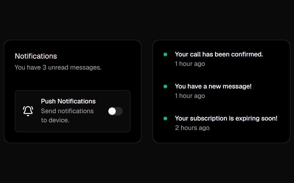 Cursor CardsBadtz UI · ReactInteractive cards with animated gradient borders that respond to cursor movement and proximity. Inspired by Cursor's…
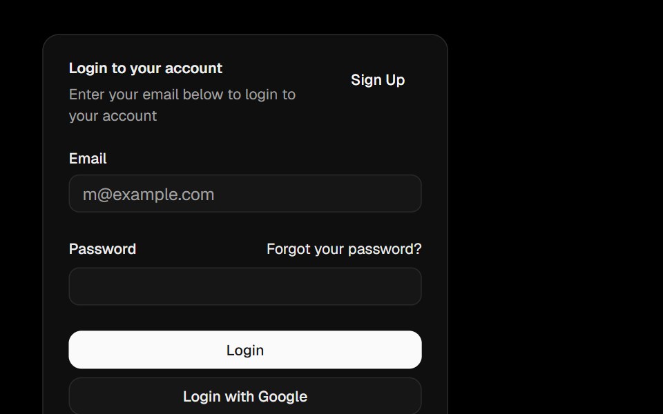 CardObsidianUI · React
 CardGreatUI · React
 Category Previews 01Oxbow UI · AstroSimple card with overlayed text
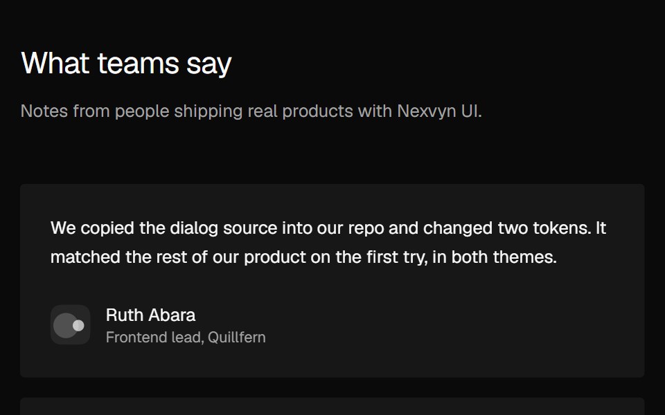 Social Proof Testimonial gridNexvyn UI · ReactTestimonial cards in two or three columns, with a Show more toggle on mobile.
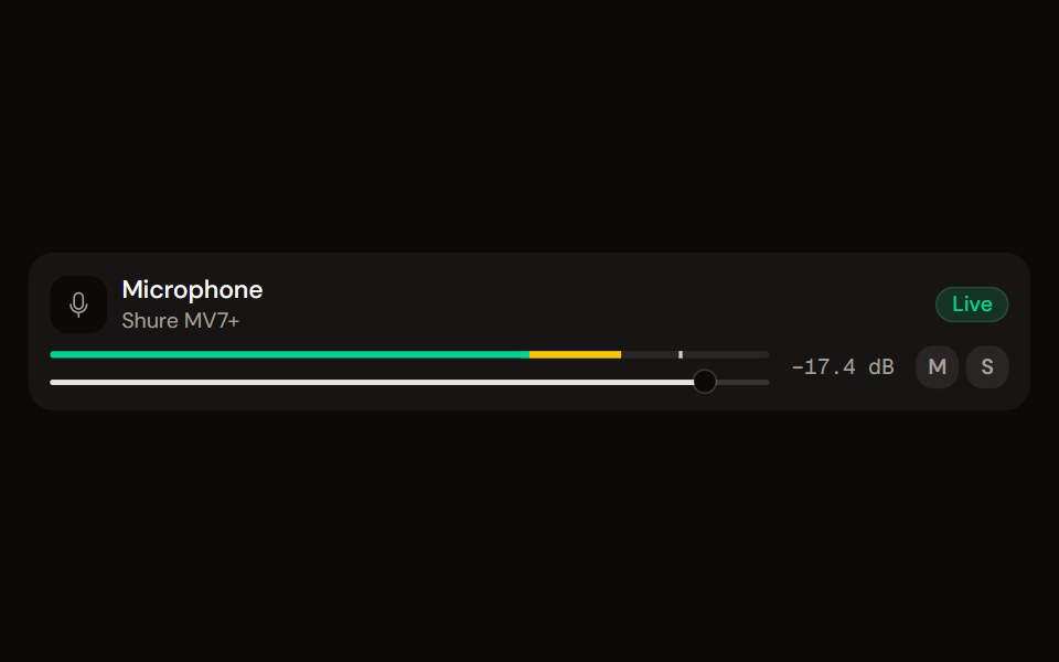 Channel Stripaudiocn · ReactOne channel of a mixer: header, status, meter, fader, value, controls and a notice, as a row or a console strip. The…
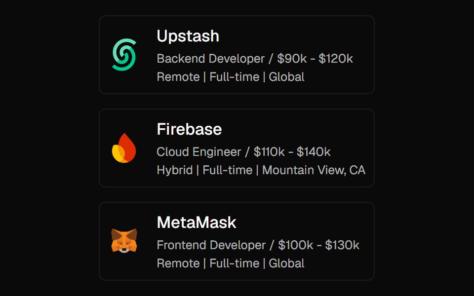 Expandable CardForge UI · ReactInteractive UI component to expand cards with smooth animations and detailed content using layout transitions.
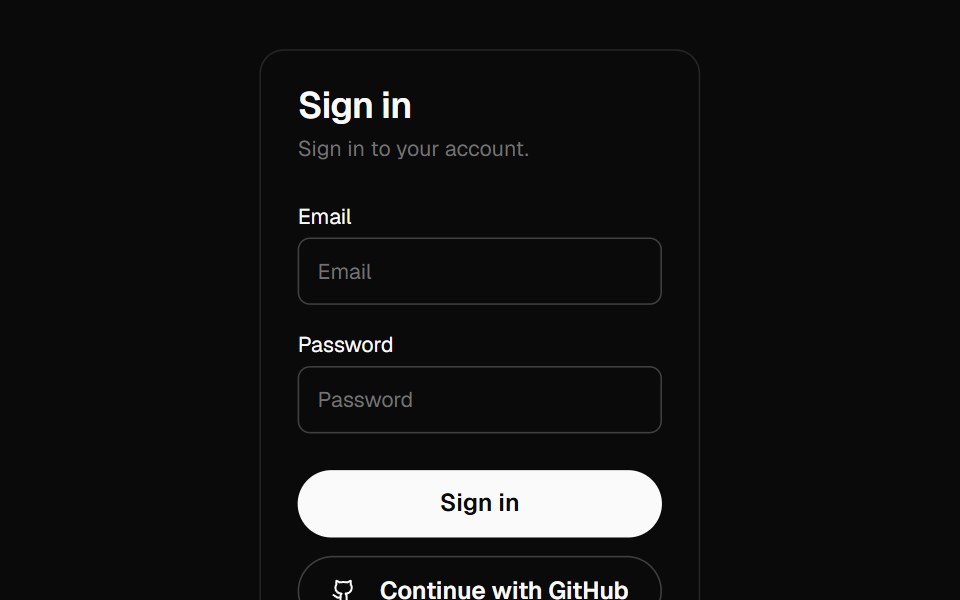 cardBaseLayer · ReactDisplays a card with header, content, and footer.
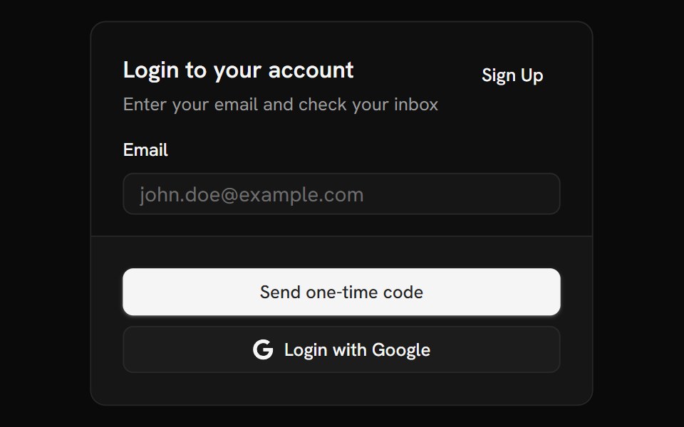 CardShark UI · ReactDisplays content about a single subject.
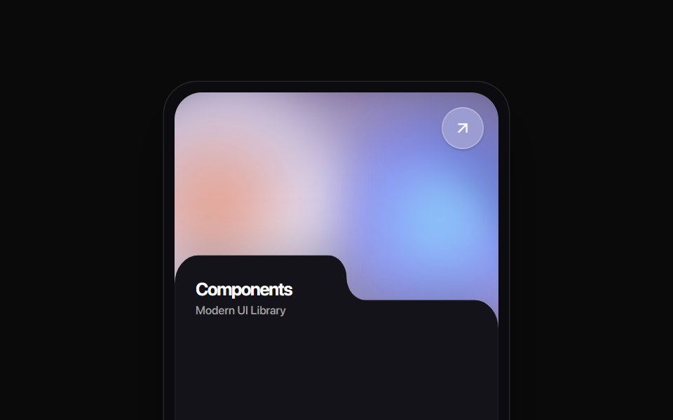 Folder Tab CardRewamp UI · ReactA modern tactile UI card featuring an ethereal animated mesh aurora gradient header, circular diagonal glass arrow…
 MoviePassButtonEvil Buttons · ReactA cinema ticket button that tears along its perforation on click, hinging open or snapping apart.
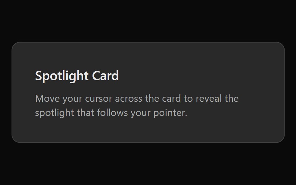 Spotlight CardSona UI · ReactA card with a radial spotlight glow that follows the cursor.
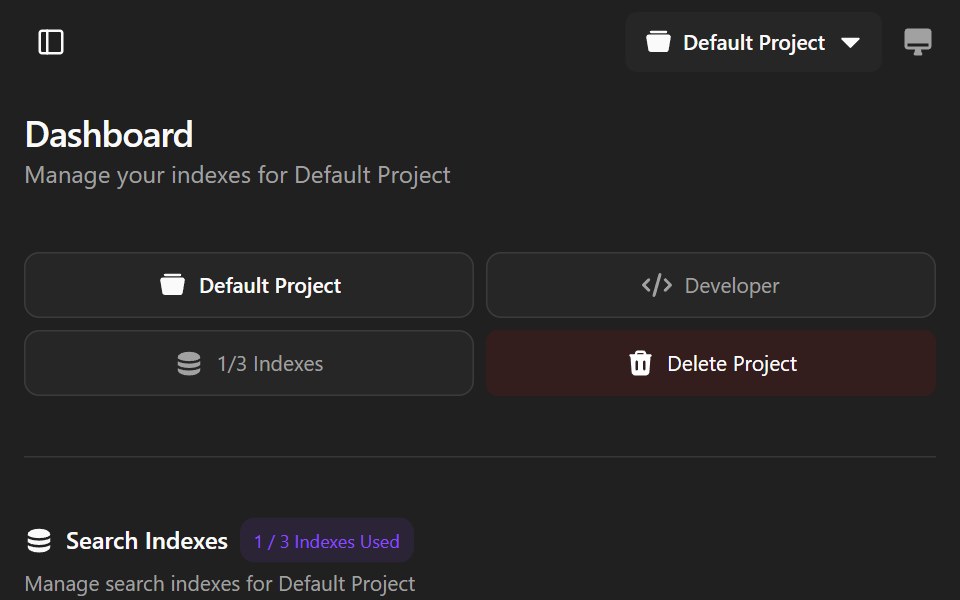 Agndex DashboardWatermelon UI · ReactA developer portal for managing search indexes, API credentials, billing, and project settings with light and dark…
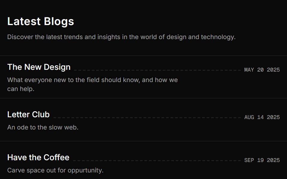 Blog Onesv-efferd · SvelteA vertical editorial list with full-width dividers and compact summaries.
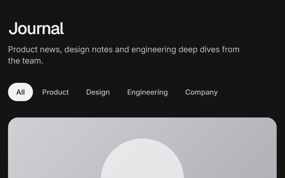 Blog gridArc Library · ReactA blog index with a featured post, category filter, post cards, pagination and an in-place reader.
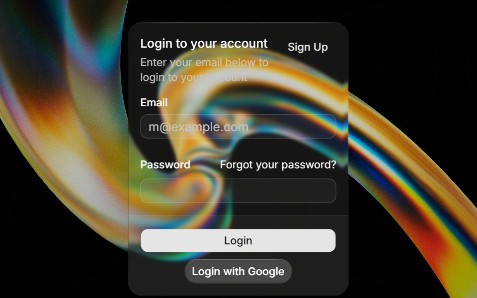 Glass Cardglasscn · ReactGlass Card with five variants: clear, frosted, subtle, liquid, and liquid-refract
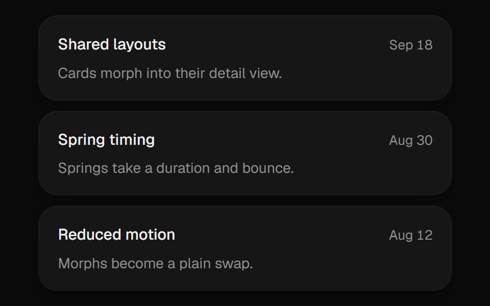 Expanding CardUI Lab · ReactGrows from its slot into a detail view and folds back when you are done.
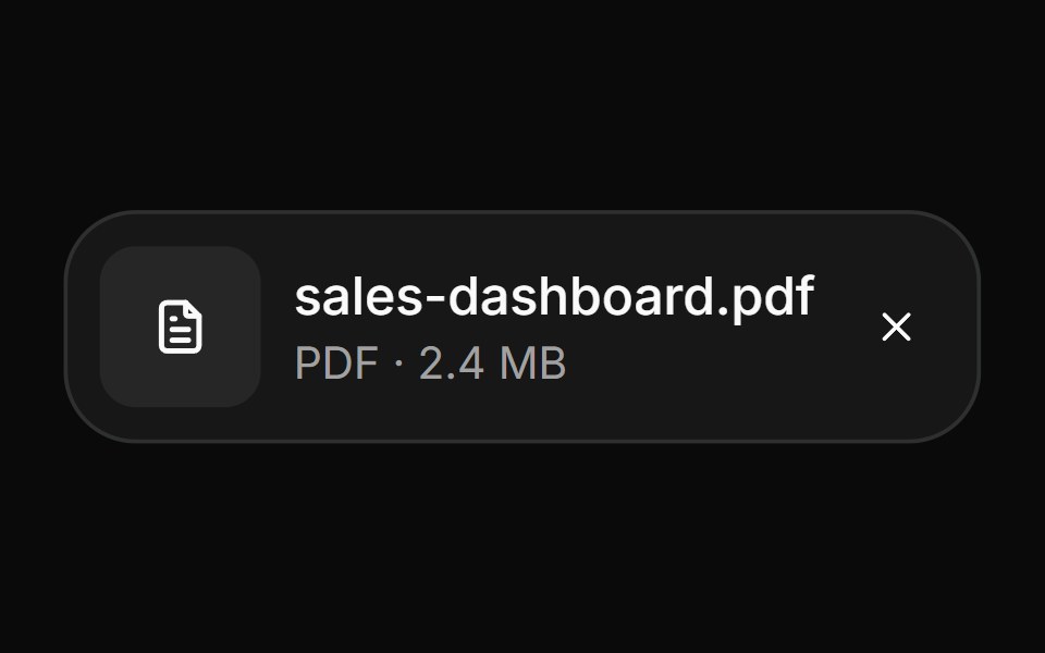 AttachmentHextaUI · ReactFile and image cards for uploads, with progress, states, actions, a full-card trigger and names that keep their…
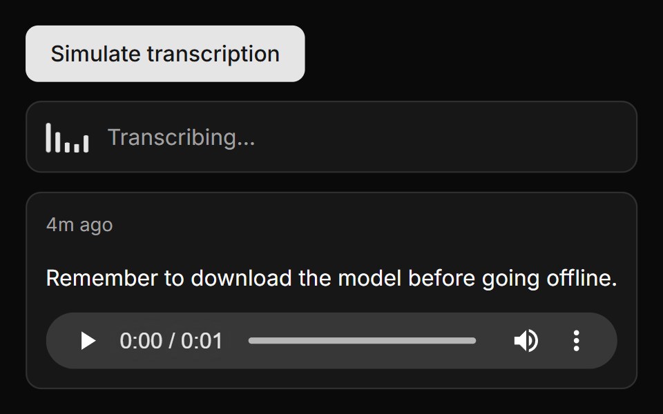 Transcribed Note CardLocalMode · ReactA transcription list item pairing transcript text with inline <audio> playback — relative timestamp (hover ->…
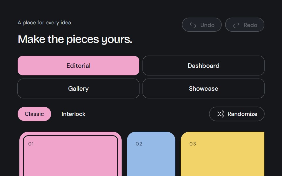 Bento GridCojeev UI · ReactA complete canvas of rounded cards or organically interlocking pieces. Compose a layout, then install just the…
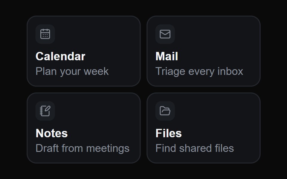 Hover Glide CardsMicroKit · ReactOne highlight glides from card to card under the pointer, seen only through the cards themselves, so it drains out of…
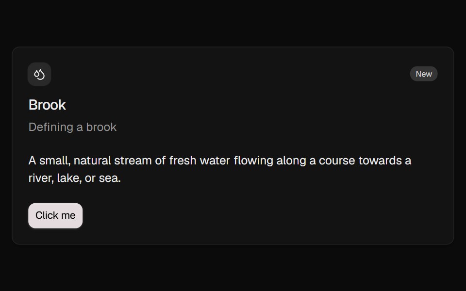 CardROI UI · ReactA container component for displaying content.
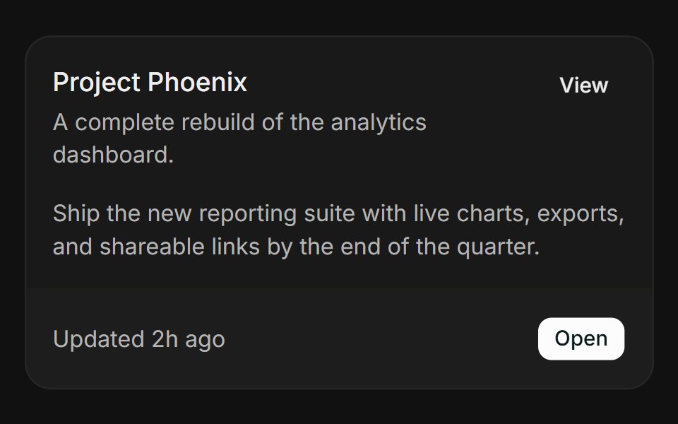 BasicFLX UI · ReactHeader, action, content, and a bordered footer.
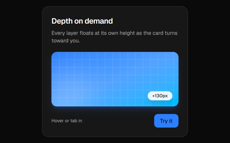 3D CardVelora UI · ReactPerspective card that turns toward the pointer while its layers lift to different depths.
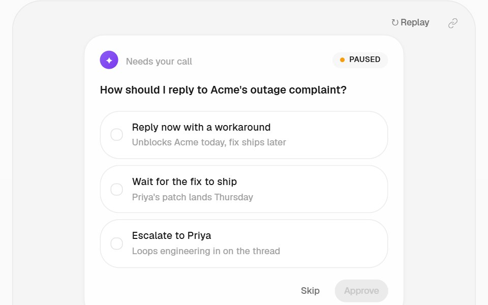 Approval Card PatternHalaska UI · React
 Card Style Buttonsv-particles · Svelte
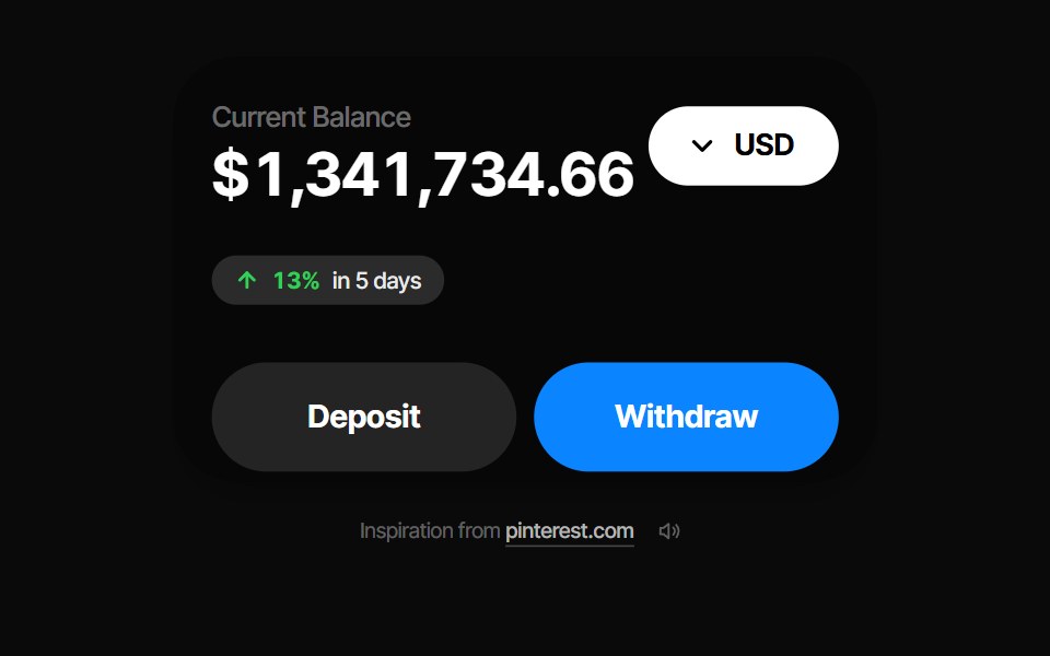 Balance CardPin UI · React
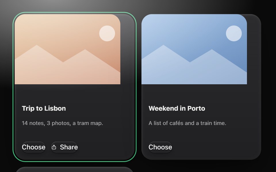 CardMetal UI · React + SwiftUIA person's thing on a raised plate: media, title, a line, actions. A card with a link lifts one grid step on the…
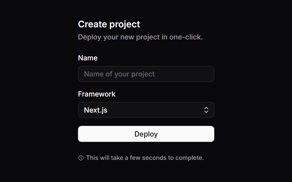 CardSpaceUI · ReactGroups related information, images, and action buttons into a bordered container, creating clear visual sections on…
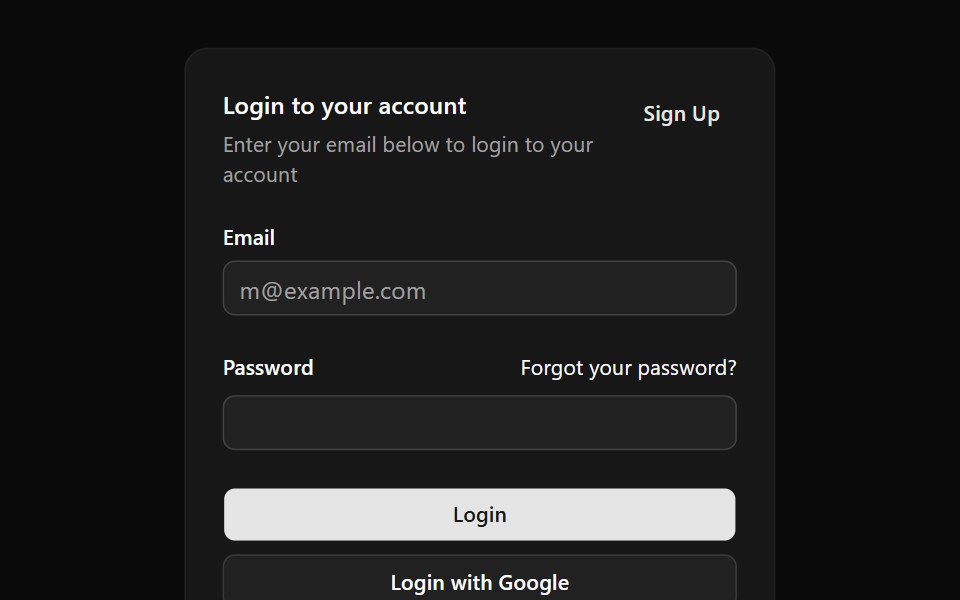 Aria CardReScript shadcn · ReScript
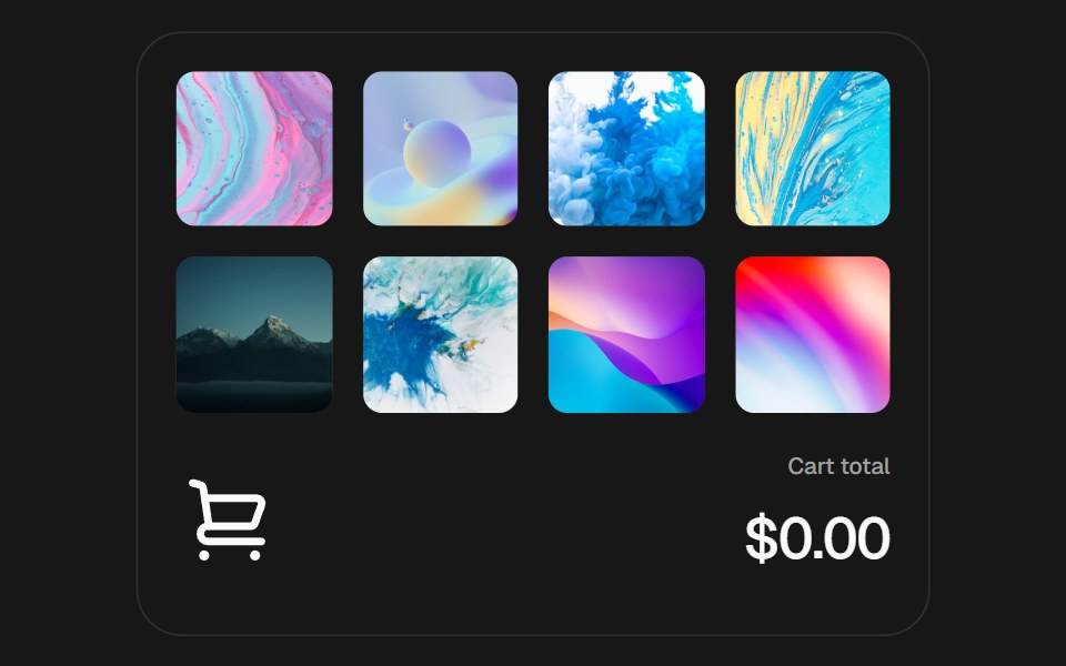 Add to CartSkecher UI · ReactAn interactive product grid with curved add-to-cart flights, a responsive cart stack, and an animated currency total.
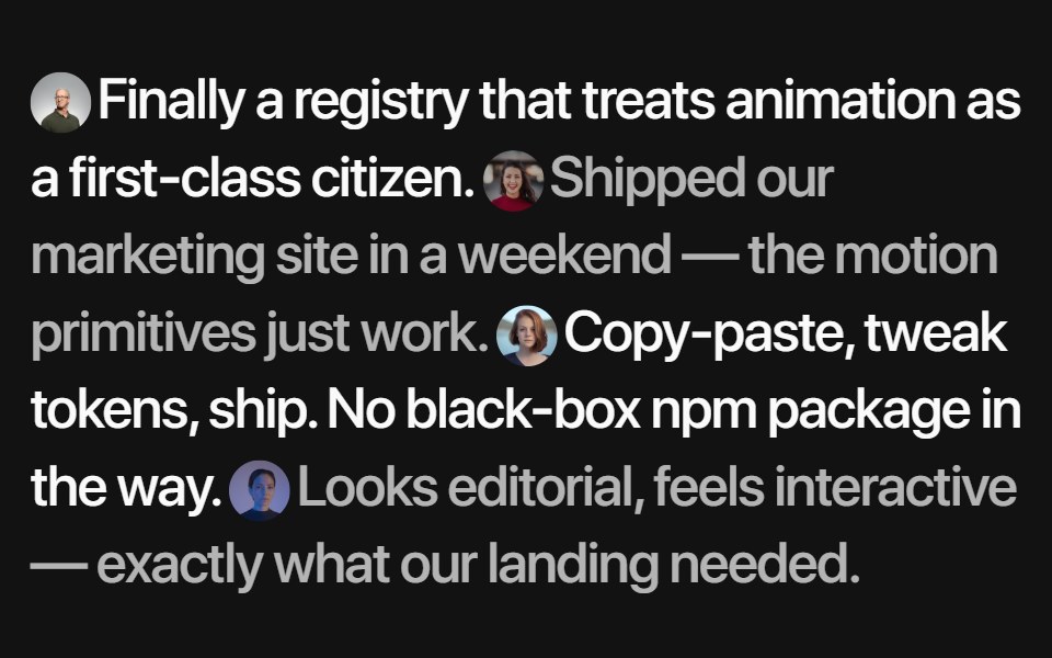 Inline TestimonialsSora UI · ReactA flowing quote stream where each avatar reveals its author on hover, with Motion fading and blurring the rest.
 Crypto SwitchZAYX · React NativeA crypto swap card: pick the coin you pay and the one you receive, flip them with a spring, and send.
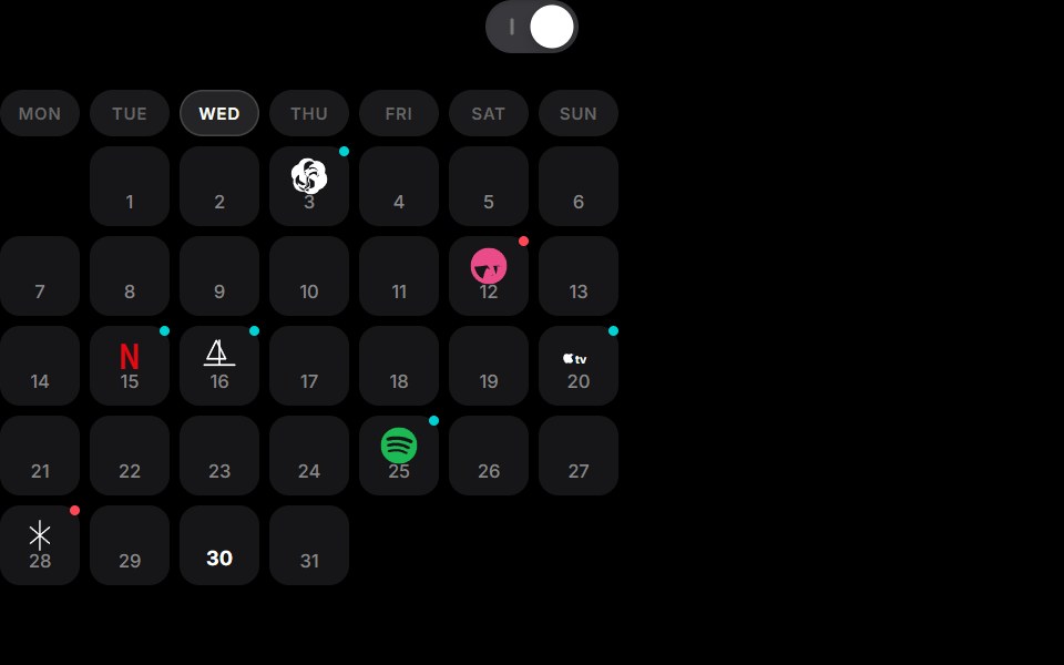 Cell To Card Calendar ExpansionCue Foundations · React
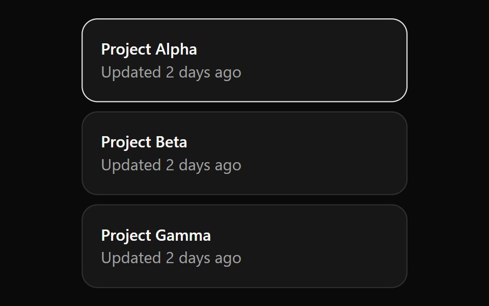 CardOUI · ReactCardGridListItem for shadcn Card.
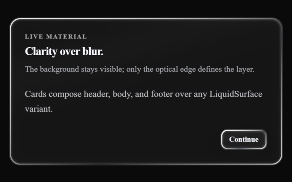 Glass CardLiquefy UI · React
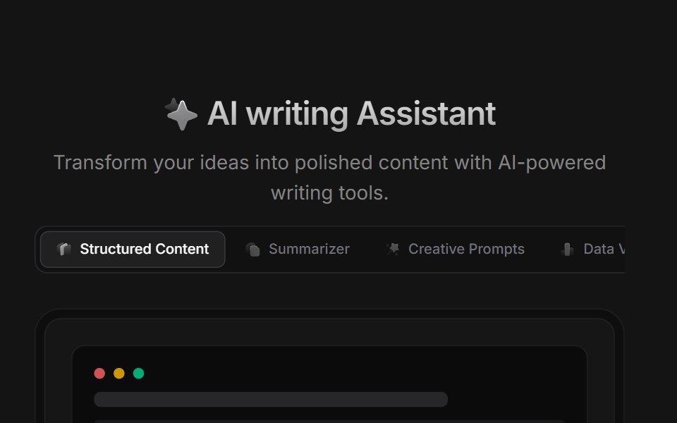 AI BlockD2Studio UI · ReactAI prompt template grid with creative prompts, summarizer, story, poetry and study presets.
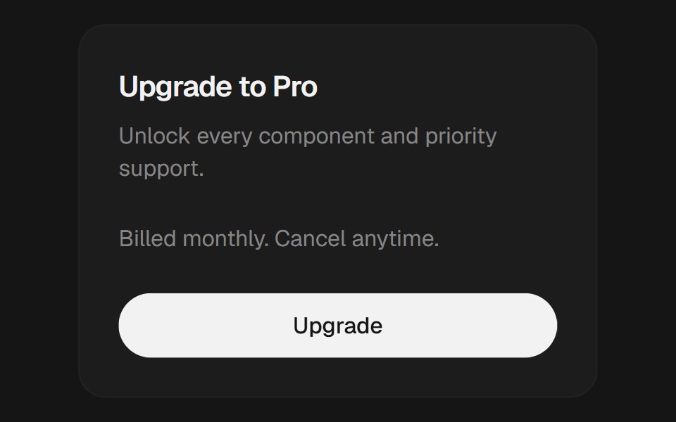 CardEaseUI · ReactBordered surface with header, content, and footer parts for grouping related content.
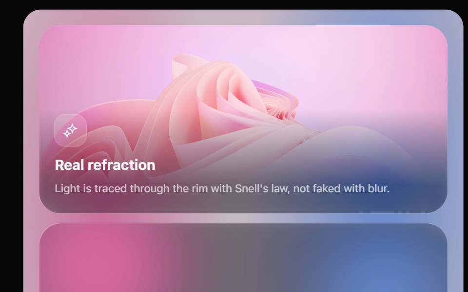 Glass Bento GridOpaline · ReactFeature tiles on glass in a bento layout, with a pointer light and a call to action that slides in.
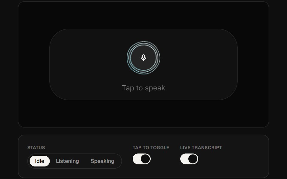 AI Voice 05ReactFrame · ReactA portrait voice-assistant card with a canvas audio-reactive curve visualizer, a mic button that grows on tap…
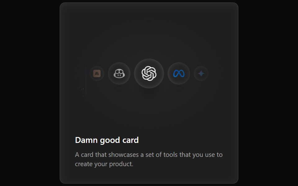 Cards Demo 3Aceternity UI · ReactFeature Block Animated Card
 Cardark-cn · ReactA flexible container for grouping related content and actions.
 Card Action AreaMUI / Material UI · React
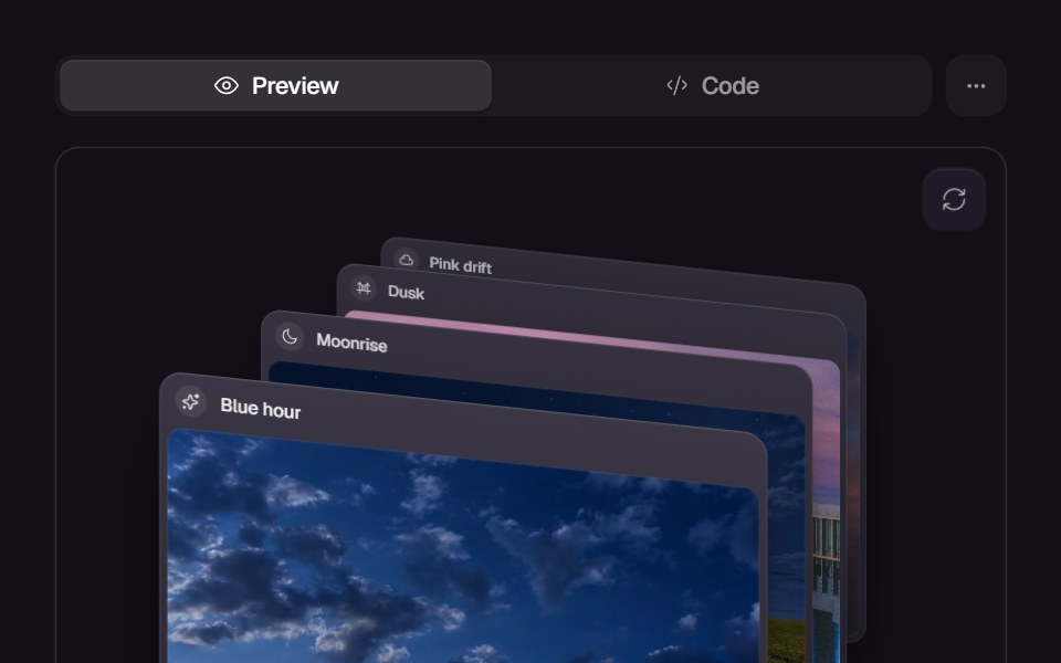 Card SwapReact Bits · ReactCards animate position swapping with smooth layout transitions.
 Checkbox CardChakra UI · ReactUsed to select or deselect options displayed within cards.
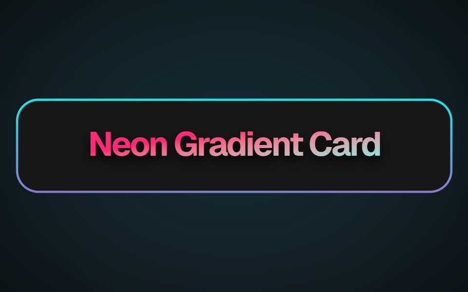 Neon Gradient CardMagic UI · ReactA beautiful neon card effect
 Select Box GroupReact Spectrum · ReactSelectBoxGroup allows users to select one or more options from a list.
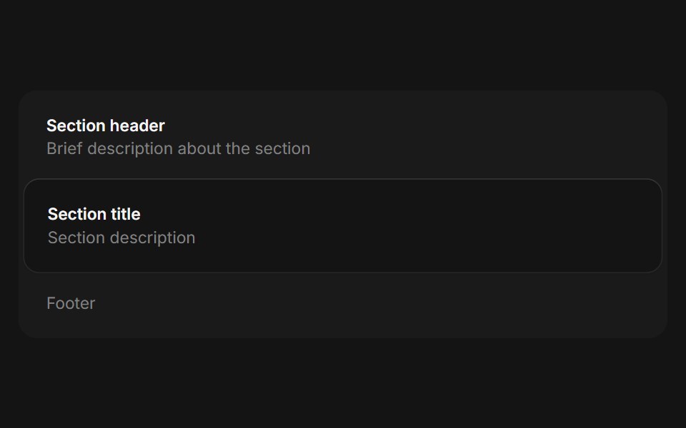 Framecoss ui · ReactA framed container for grouping related information.
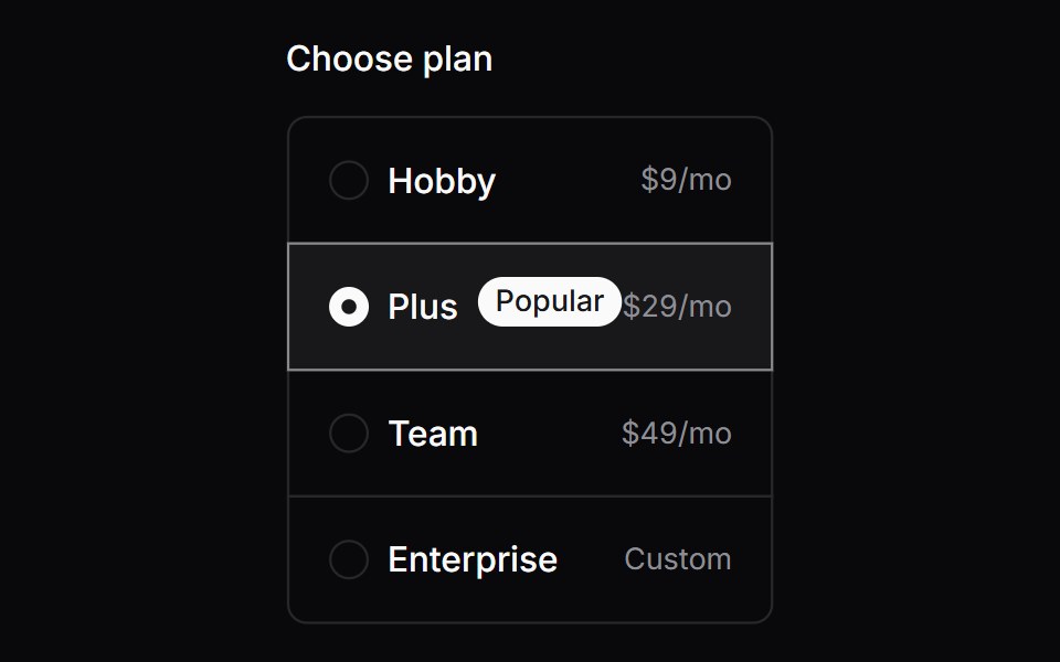 Comp 166Origin UI · React
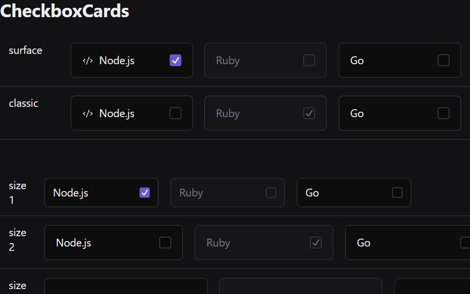 Checkbox CardsRadix Themes · React
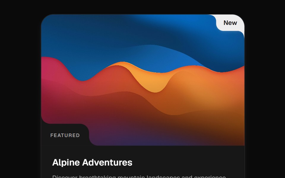 Cutout CardCult UI · ReactImage card with cutout corners, hover motion, inset labels, pins, and reveal actions
 Card Resizetransitions.dev · HTML/CSS
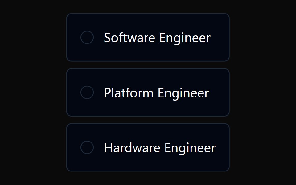 Radio Card GroupTremor · React
 Full card with image and shadow fade effectReUI · ReactFull card with image and shadow fade effect
 Cardpdfcn · ReactCard PDF component (takumi)
 Card Preview TileAmicro Micro Transitions · ReactCatalog preview for a card spread / carousel. Hover state lives here so hovering one tile re-renders only that tile…
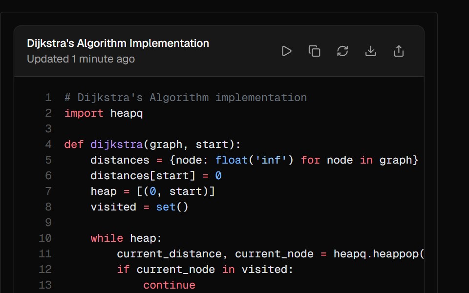 ArtifactAI Elements · ReactA container component for displaying generated content like code, documents, or other outputs with built-in actions.
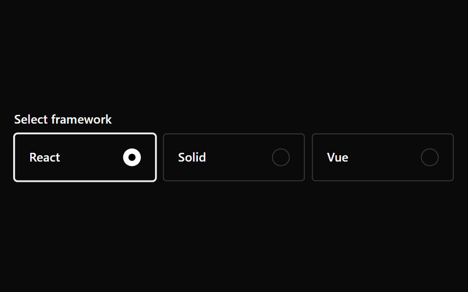 Radio Card GroupPark UI · ReactA form input component for selecting one option from a set of cards.
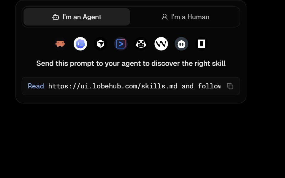 Awesome Agent Skill CardLobe UI · React
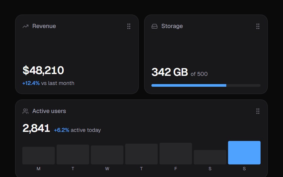 Widget GridKokonut UI · ReactDashboard widgets you lift, drag and resize on a 6-column grid, with spring physics and full keyboard support.
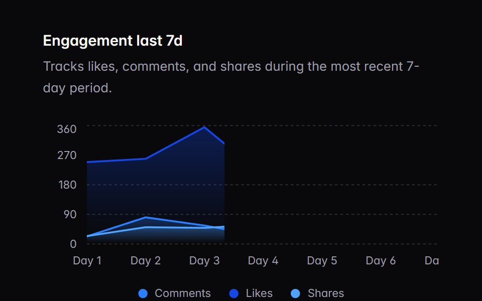 chart-01Intent UI · Reactchart-01
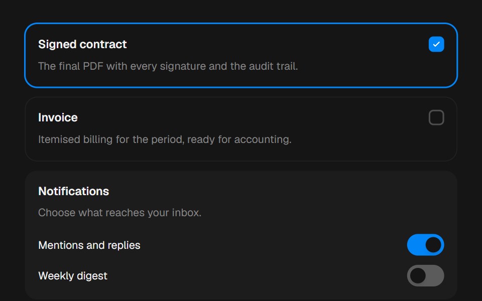 CardbeUI · ReactComposable surfaces, selectable with press feedback.
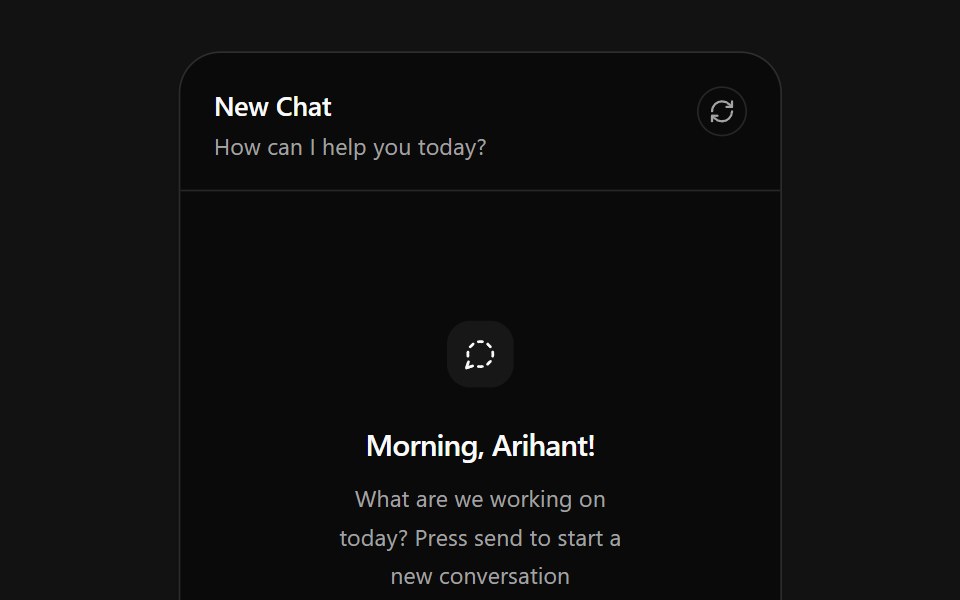 AI Chat CardSpectrum UI · ReactAn AI chat card that types prompts into its composer, with send, attach and reset actions.
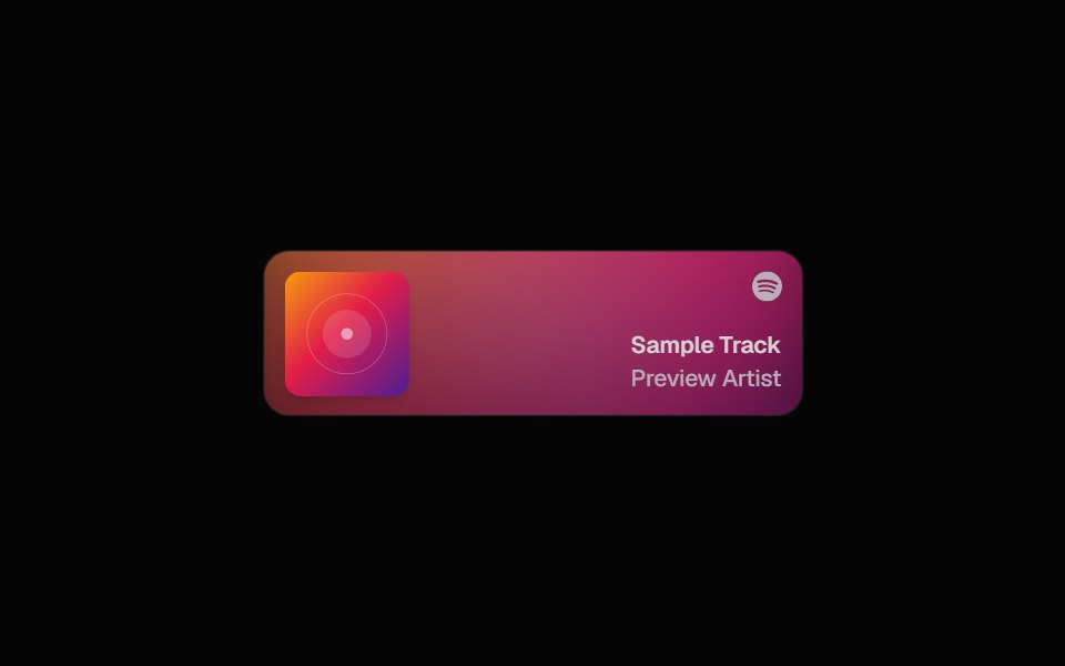 Spotify CardSpell UI · ReactDisplay Spotify tracks with album art and blurred background.
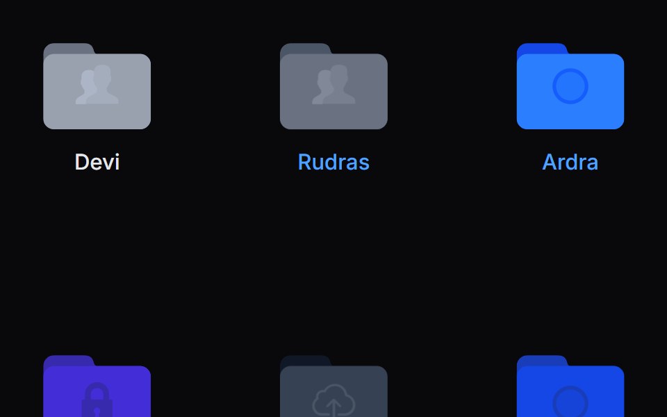 Folder PreviewVengeance UI · ReactFolder stack visual preview
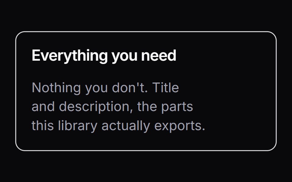 ItemLaunch UI · React
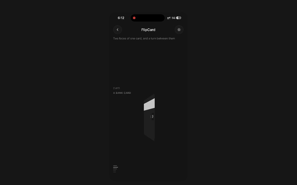 Flip CardPanel UI · React NativeTwo faces of one card, and a turn between them.
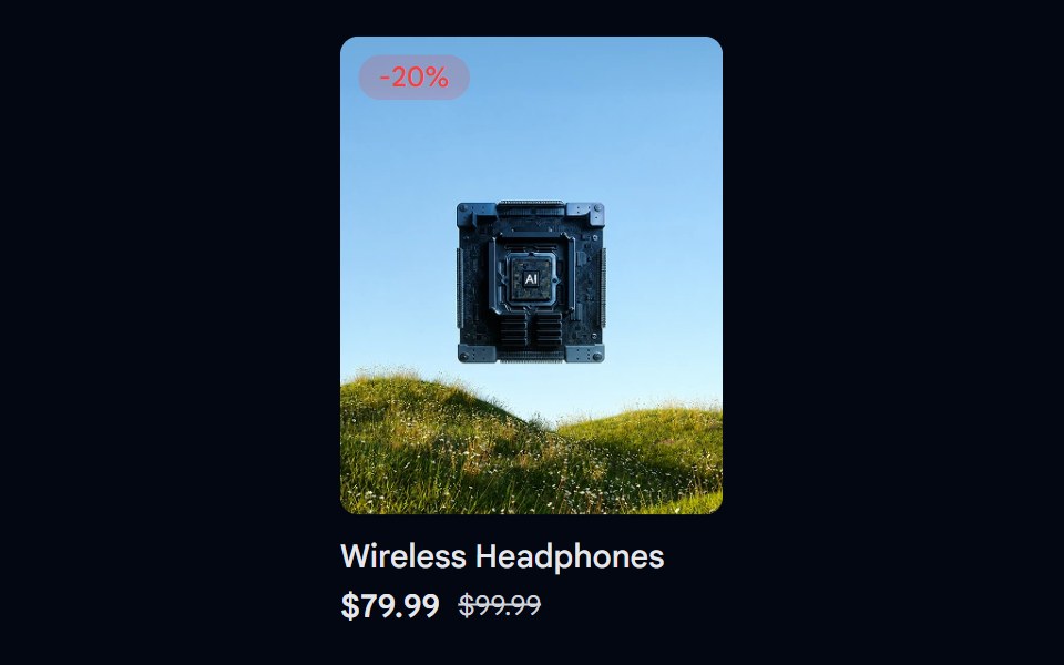 Aspect Ratio 06 - Product CardShadcn Space · ReactA product card using a 4:5 aspect ratio image with a discount badge and pricing details.
 Card ScanPixel Perfect · ReactHover it and it turns holographic: thin-film foil that shifts as you move, light rippling out from the cursor, and a…
 Linked In Profile CardOpenSourceUI · ReactCard that reproduces a LinkedIn profile: cover, avatar, name, headline and connect button.
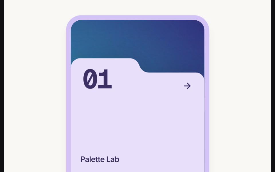 Card Folderuselayouts · ReactThis component creates an animated folder-style card with a background image, floating 3D object, hover effects, and…
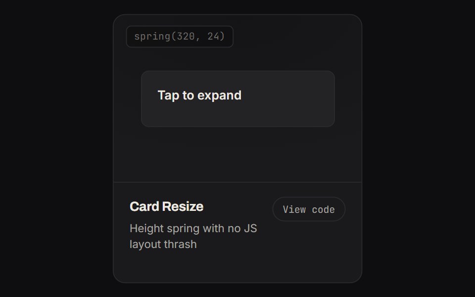 Card ResizeKinetics · HTML/CSSHeight spring with no JS layout thrash
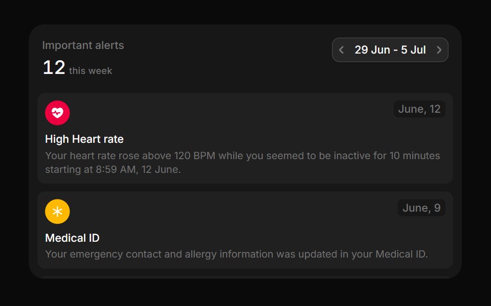 MedicalBoardUI · React
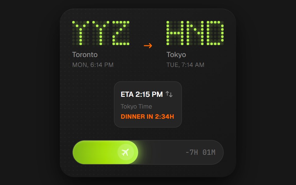 Flight Status CardComponentry · ReactA detailed card showing flight information with animations.
Libraries with card components
Related categories
- React Card Components
- Tailwind CSS Card Components
- Svelte Card Components
- React Native Card Components
- Animated Card Components
- shadcn/ui Card Components
- Data Display Components
- Chart Components
- Table Components
- Avatar Components
- List Components
- Stat Components
- Calendar Components
- Accordion Components
- Data Table Components
- Carousel Components
- Collapsible Components
- Avatar Group Components
- Stat Card Components
- Bar Chart Components
- Tree View Components
- Card Stack Components