 Dev Design Library
Svelte Card Components
Dev Design Library indexes 30 Svelte card components from 4 open-source UI libraries, with the most coming from cnblocks, sv-efferd, Animations (Svelte) and sv-particles. Each one links to its page with the source code, a live preview where available, the library license and the install command. Every library in this list targets Svelte. Card components belong to the Data display group.
 Card Decoratorcnblocks · SvelteDecorative card component with visual effects
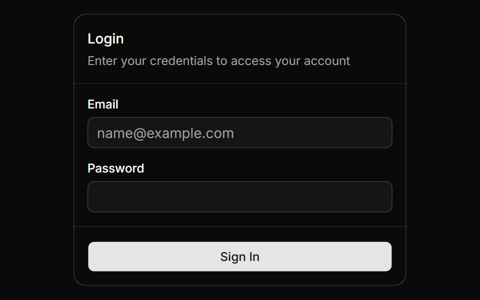 Magic CardAnimations (Svelte) · SvelteA spotlight effect that follows your mouse cursor and highlights borders on hover.
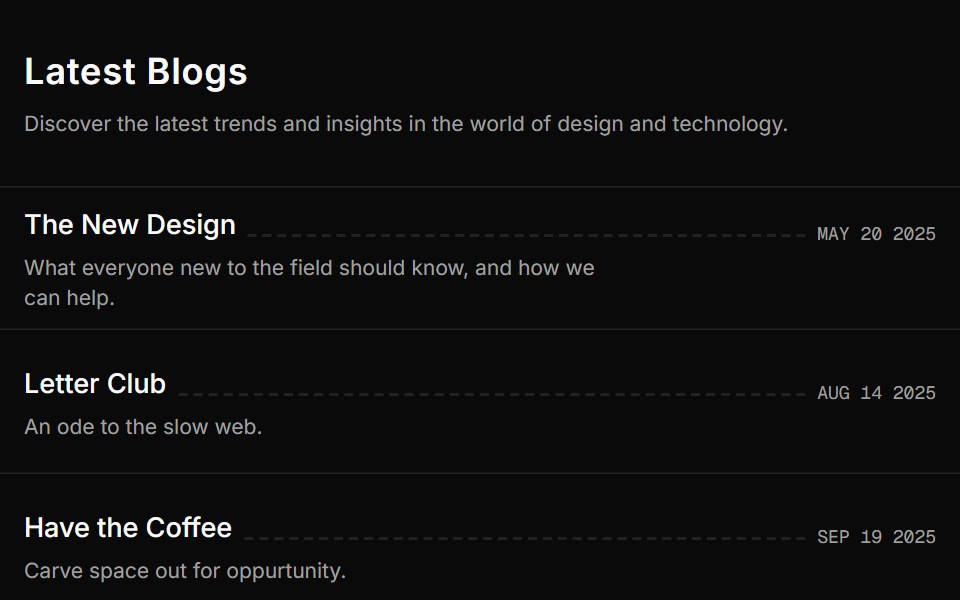 Blog Onesv-efferd · SvelteA vertical editorial list with full-width dividers and compact summaries.
 Card Style Buttonsv-particles · Svelte
 Feature Cardcnblocks · SvelteReusable feature card with icon and text
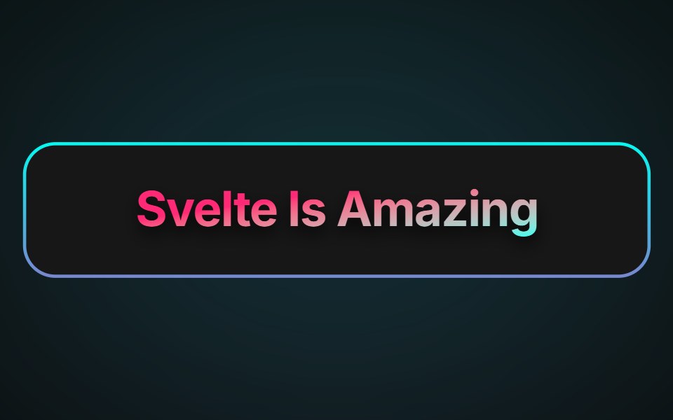 Neon Gradient CardAnimations (Svelte) · SvelteA card component with animated neon gradient borders and customizable colors, border size, and radius.
 Blog Threesv-efferd · SvelteA card-based blog grid with media thumbnails and richer reading metadata.
 Integration Cardscnblocks · SvelteCollection of integration card variants for logos
 Warp BackgroundAnimations (Svelte) · SvelteA 3D perspective grid background with animated light beams that create a warping effect.
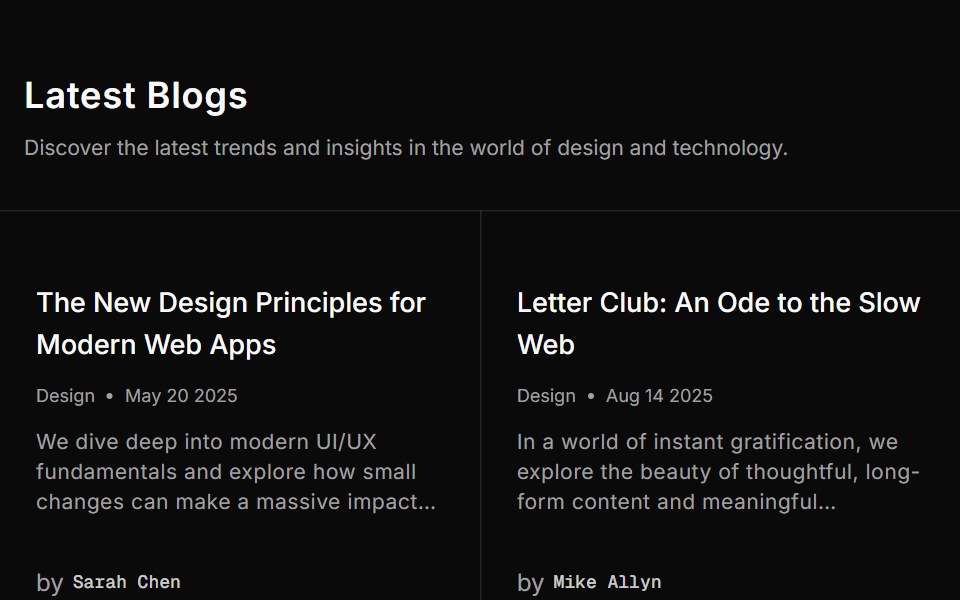 Blog Twosv-efferd · SvelteA structured blog grid with metadata rows and filler cells for balance.
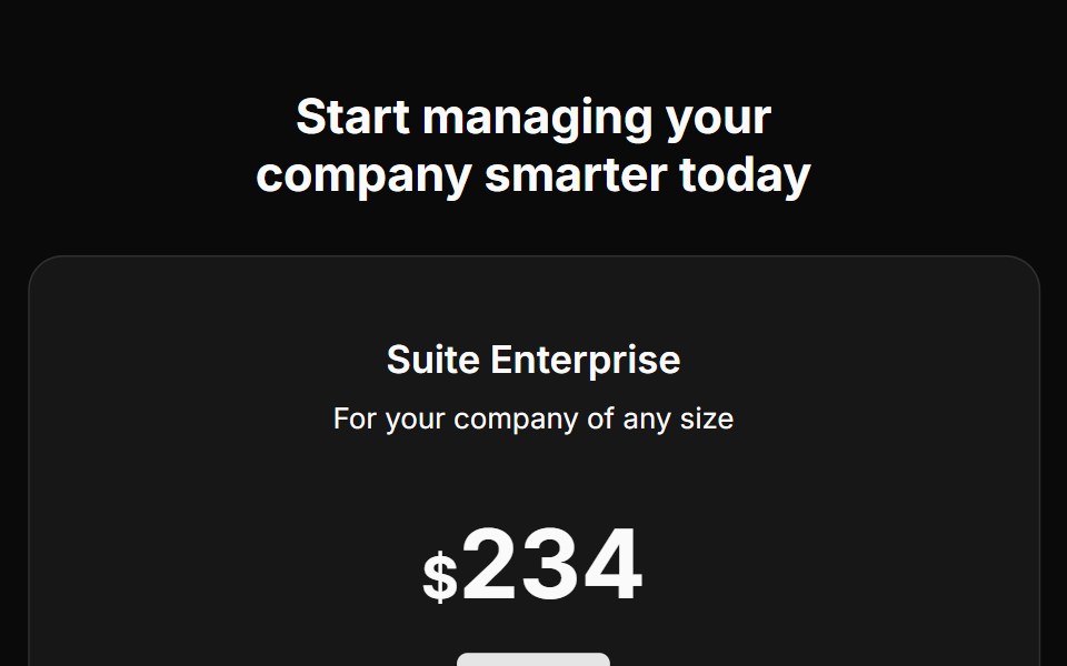 Pricing Fivecnblocks · SveltePricing table with feature comparison
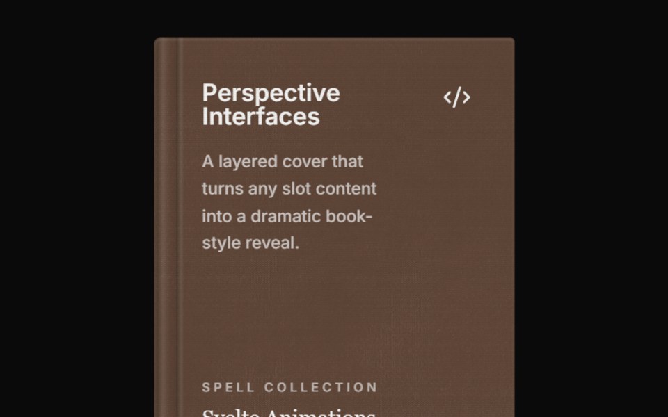 Spell Perspective BookAnimations (Svelte) · Svelte
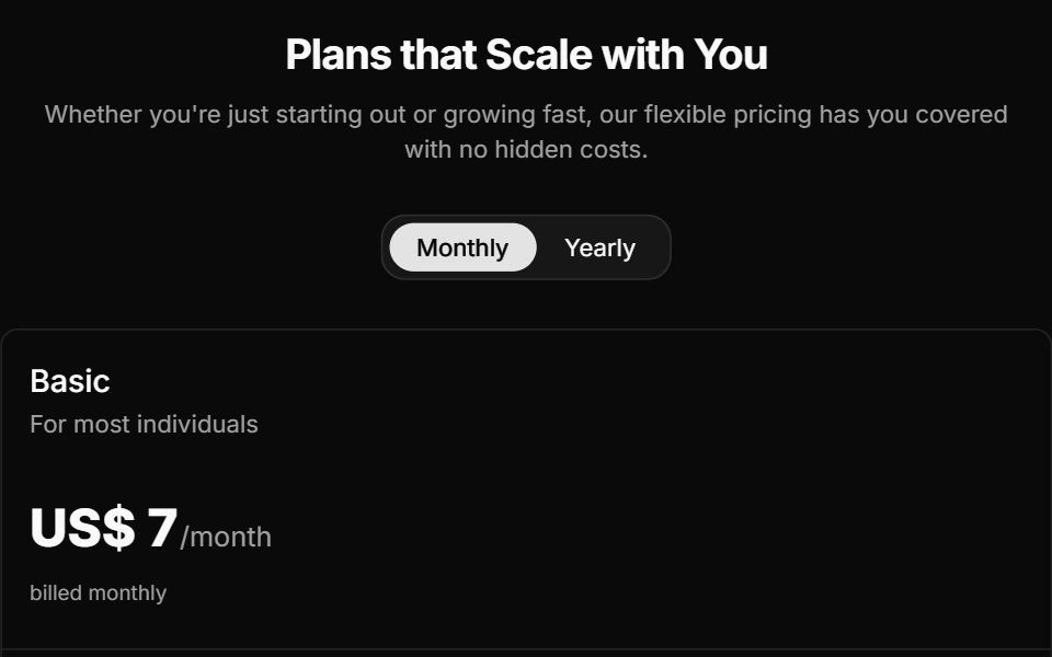 Pricing Foursv-efferd · SvelteAn animated pricing table with monthly-yearly toggles, live number transitions, and motion badges.
 Pricing Fourcnblocks · SvelteFour-tier pricing with toggle switch
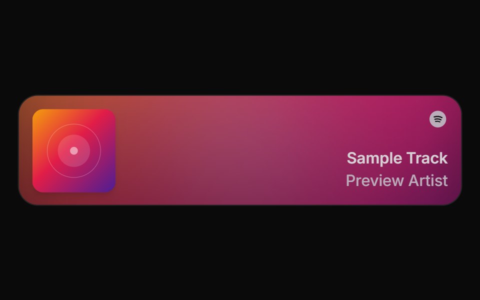 Spell Spotify CardAnimations (Svelte) · Svelte
 Pricing Onesv-efferd · SvelteA two-plan comparison with corner accents, compact savings callouts, and a stronger featured tier.
 Pricing Onecnblocks · SvelteSimple three-tier pricing cards
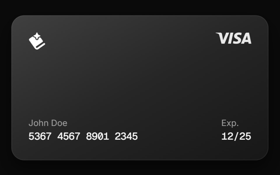 Spell Tilt CardAnimations (Svelte) · Svelte
 Pricing Threesv-efferd · SvelteA reusable three-tier pricing layout with icon-led cards and a highlighted middle plan.
 Pricing Threecnblocks · SveltePricing with highlighted popular plan
 Pricing Twosv-efferd · SvelteA bordered editorial pricing grid with divider rails, concise plan summaries, and feature checklists.
 Pricing Twocnblocks · SvelteTwo-column pricing with monthly/yearly toggle
 Team Onecnblocks · SvelteTeam grid with member photos and roles
 Team Twocnblocks · SvelteTeam section with social links
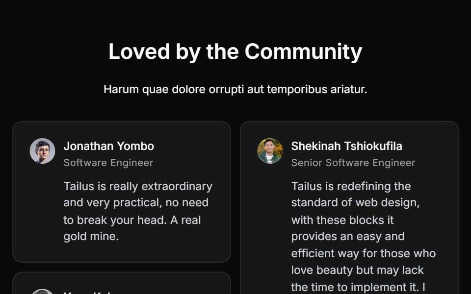 Testimonial Fivecnblocks · SvelteTestimonial carousel with navigation
 Testimonial Fourcnblocks · SvelteFour-column testimonial grid
 Testimonial Onecnblocks · SvelteSimple centered testimonial quote
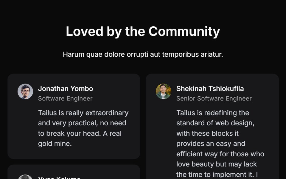 Testimonial Sixcnblocks · SvelteTestimonial with video embed
 Testimonial Threecnblocks · SvelteThree-column testimonial cards
 Testimonial Twocnblocks · SvelteTwo-column testimonial with photos
Libraries with Svelte card components
Related categories
- Card Components
- React Card Components
- Tailwind CSS Card Components
- React Native Card Components
- Animated Card Components
- shadcn/ui Card Components
- Svelte Data Display Components
- Svelte Table Components
- Svelte Data Table Components
- Svelte Avatar Components
- Svelte Accordion Components
- Svelte Stat Components
- Svelte Filter Bar Components