 Dev Design Library
Tailwind CSS Card Components
Dev Design Library indexes 833 Tailwind CSS card components from 70 open-source UI libraries, with the most coming from Watermelon UI, OpenSourceUI, Tremor Blocks, FLX UI and Oxbow UI. Each one links to its page with the source code, a live preview where available, the library license and the install command. Every library in this list styles its components with Tailwind CSS utility classes. Card components belong to the Data display group.
Showing 120 of 833, a mix from every library. Open a library to see all of its components.
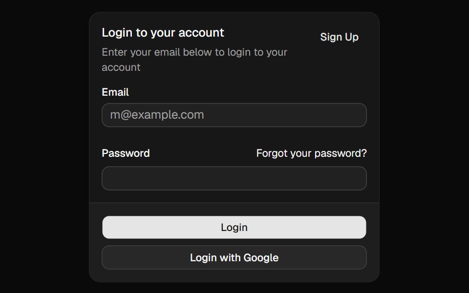 Cardshadcn/ui · ReactDisplays a card with header, content, and footer.
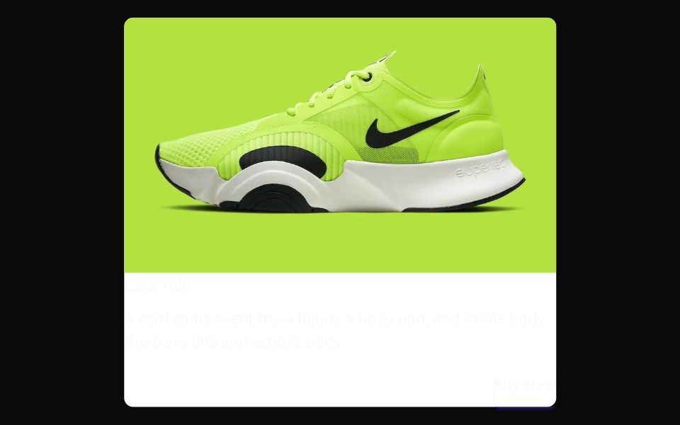 CarddaisyUI · CSS (Tailwind)
 CardHeroUI · ReactDisplays a card container with flexible layout sections for structured content.
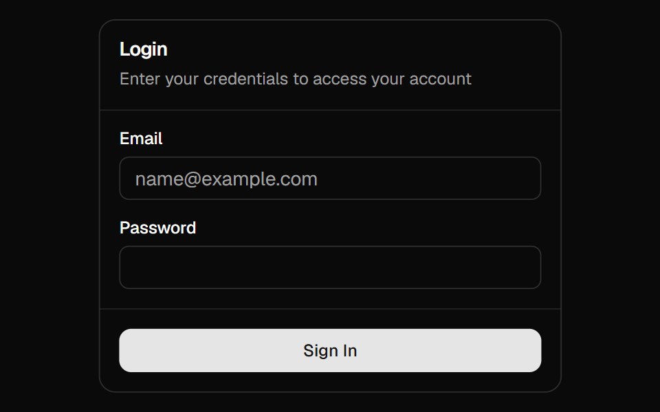 Magic CardMagic UI · ReactA spotlight effect that follows your mouse cursor and highlights borders on hover.
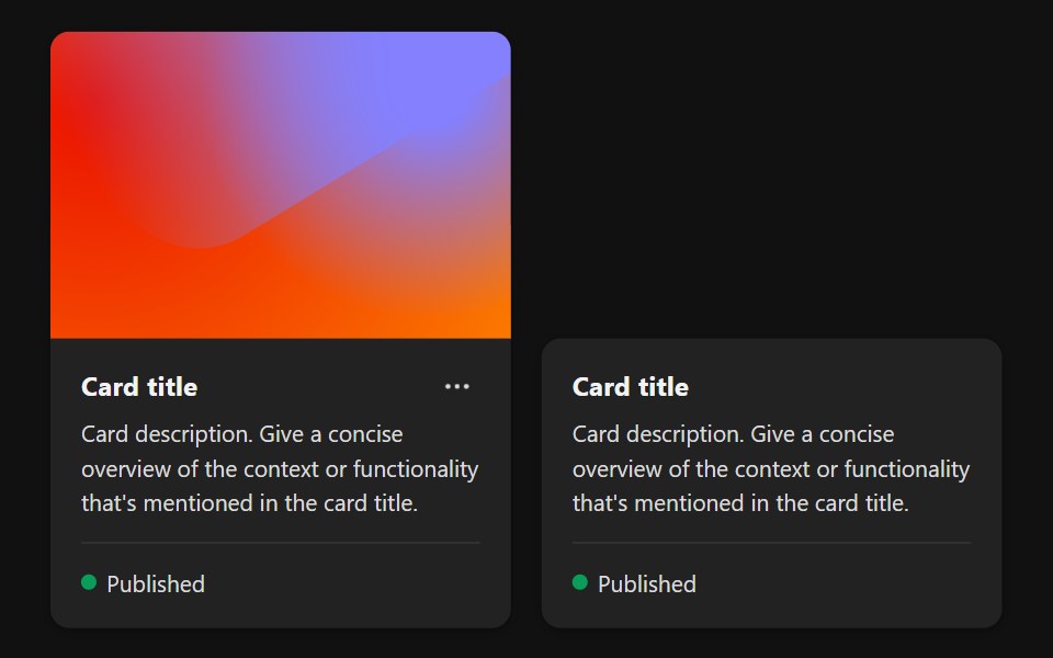 CardReact Spectrum · ReactA Card summarizes an object that a user can select or navigate to.
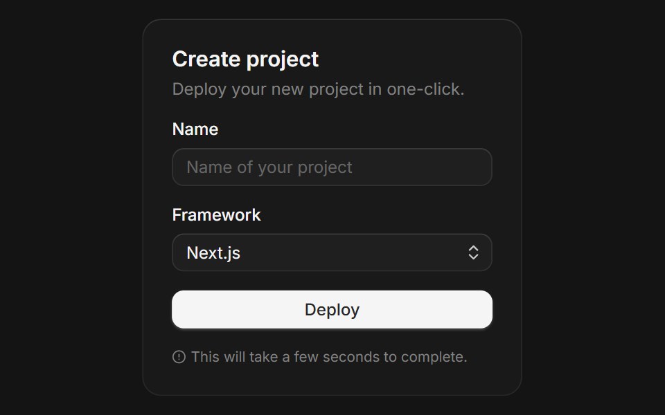 Cardcoss ui · ReactA content container for grouping related information.
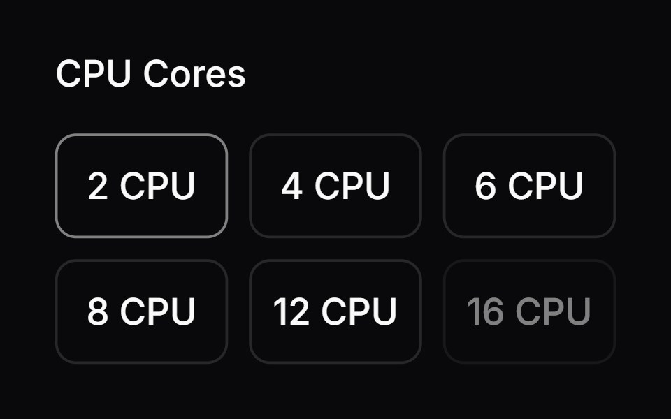 Comp 164Origin UI · React
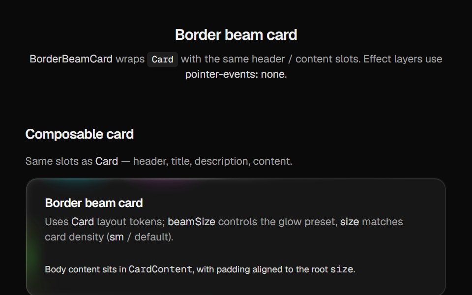 Border Beam CardCult UI · Reactborder-beam around compound Card API with balanced title and description
 CardTremor · React
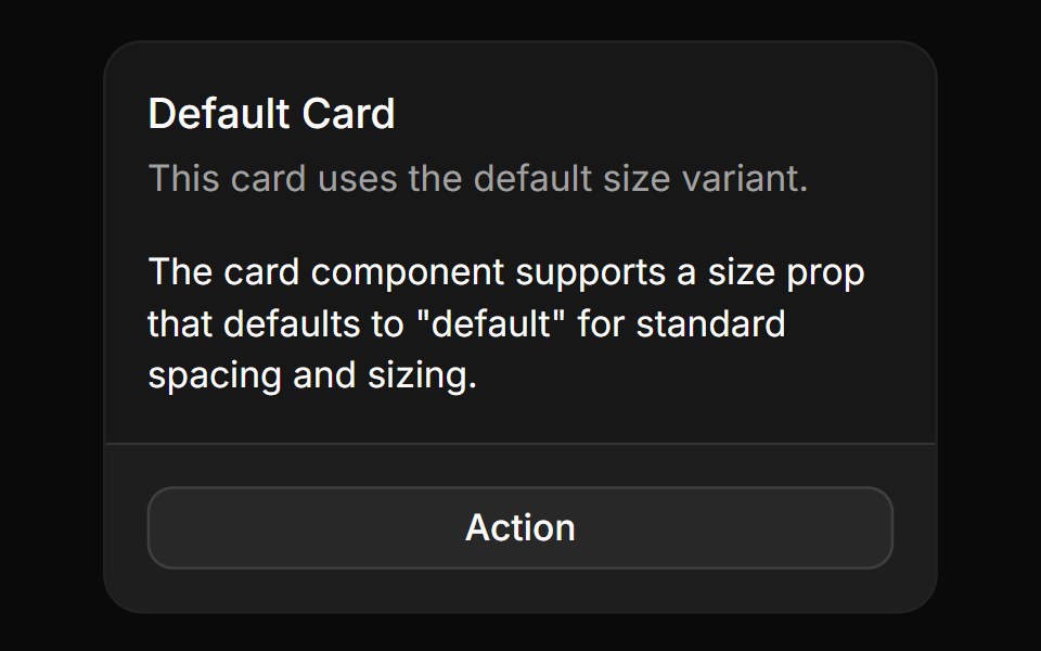 Basic cardReUI · ReactBasic card
 Card Cascade StaggerAmicro Micro Transitions · ReactStack of cards that cascade into place one after another.
 AgentAI Elements · ReactA composable component for displaying AI agent configuration with model, instructions, tools, and output schema.
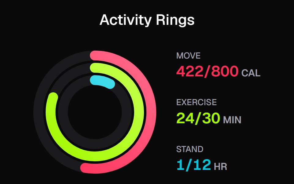 Apple Activity CardKokonut UI · ReactActivity rings that draw with a count-up, lap past 100% with a shadowed end cap and dim to focus, built with React and…
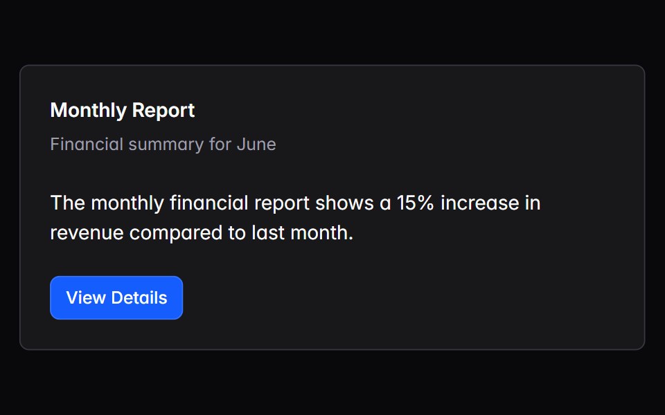 cardIntent UI · Reactcard
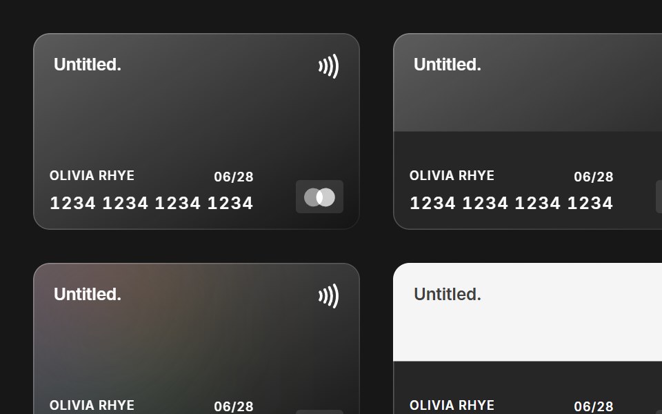 Credit CardUntitled UI React · React
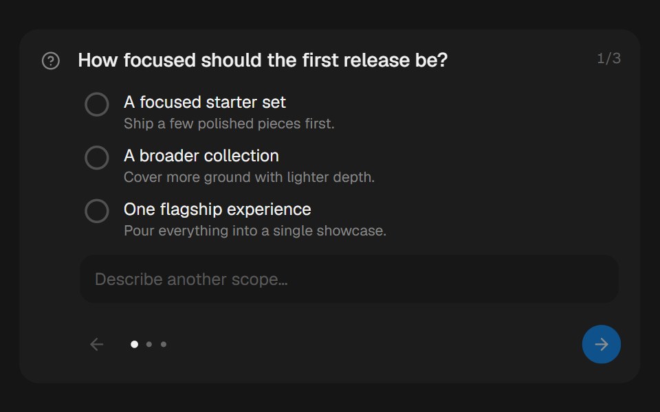 Approval CardbeUI · ReactCollects structured human input during a paused run.
 CardTailGrids · ReactA card component with ultimate flexibility and customization.
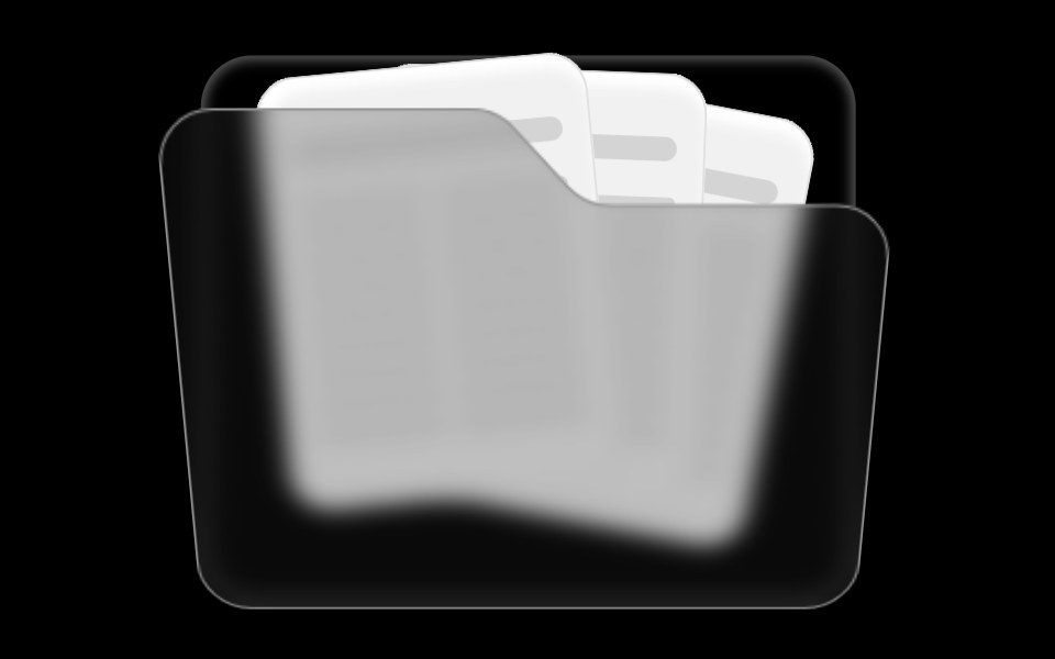 Folder ComponentRare UI · ReactAn animated folder whose cards fan out on hover and lift open on click, with a 3D-tilted flap. Supports color and size…
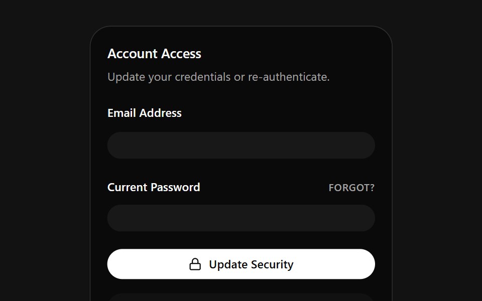 Account Access CardSpectrum UI · ReactA credentials card that auto-fills email and password on a loop, with a danger zone.
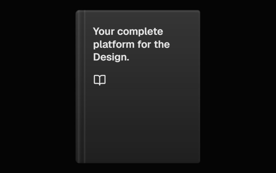 Perspective BookSpell UI · ReactA 3D book component with hover animation and customizable appearance.
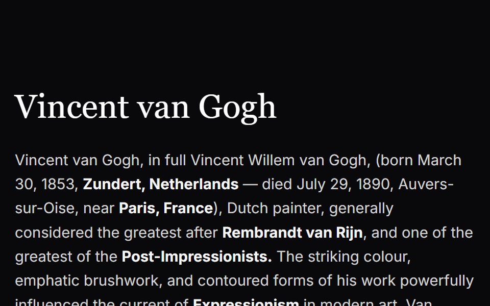 Cursor CardVengeance UI · ReactInline text link with cursor tracking preview card
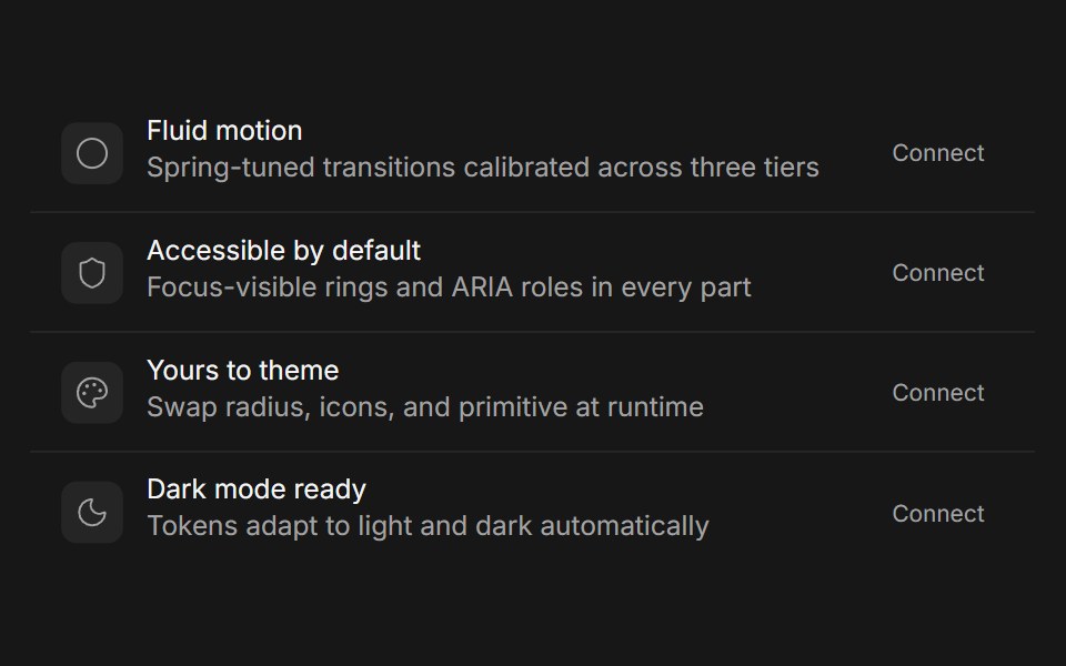 CardFluid Functionalism · Reactshadcn's compositional card (Card, CardHeader, CardTitle, CardDescription, CardAction, CardContent, CardFooter) with…
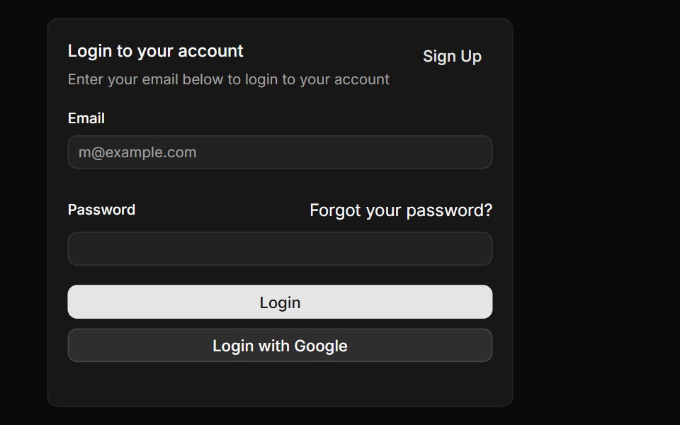 CardToolcraft · React
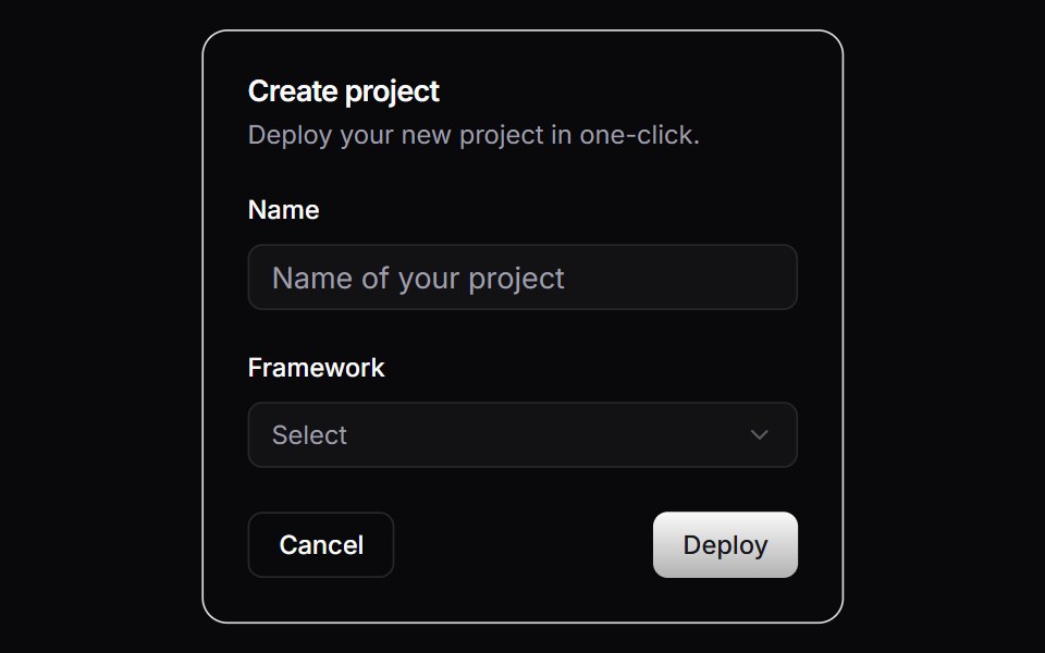 CardLaunch UI · React
 CardPanel UI · React NativeContent surface with header, body and footer.
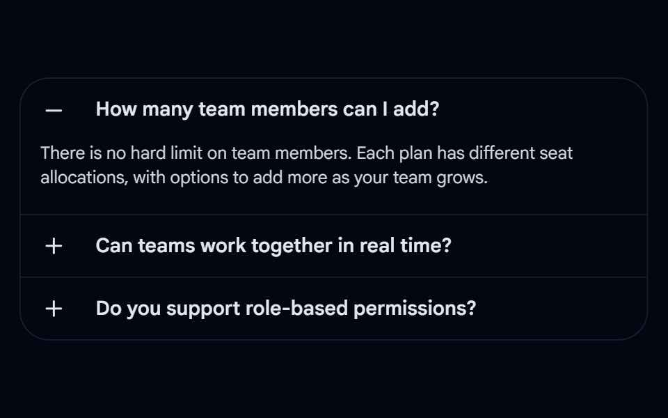 Accordion-04 - CardShadcn Space · ReactAccordion wrapped in a rounded card with left-aligned +/- icons and border dividers
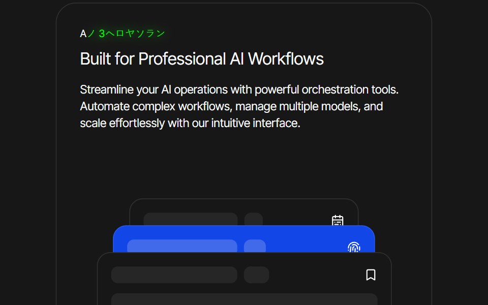 Card AnimationPixel Perfect · ReactFramer Motion card animation.
 Linked In Post CardOpenSourceUI · ReactCard that reproduces a LinkedIn post: author, text, image and reaction bar.
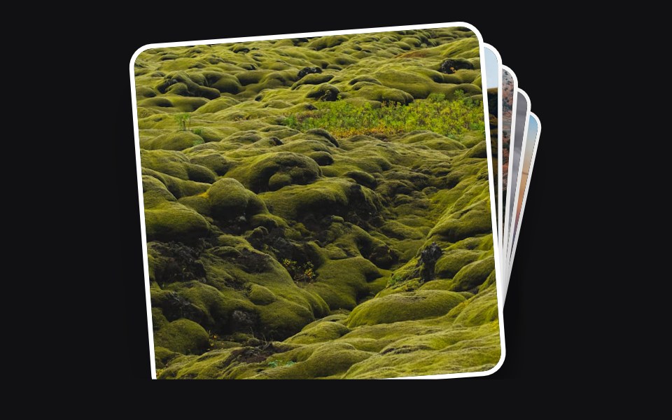 Accessible Actionuselayouts · ReactInteractive draggable card stack with 3D tilt, swipe-to-back gestures, click interactions, random rotation, and smooth…
 CardPrebuiltUI · React
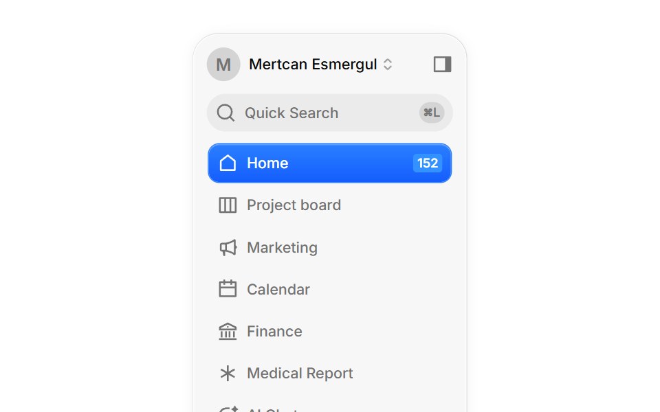 DashboardBoardUI · React
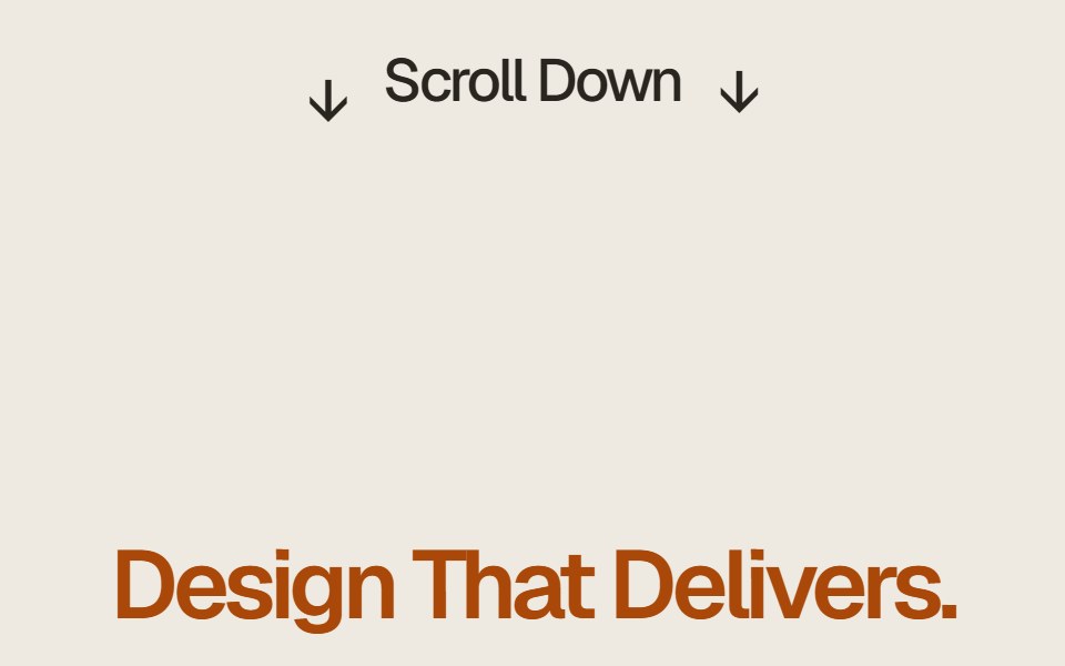 Case Study Flip StackComponentry · ReactEditorial case study cards that fold upward on scroll to reveal the next story.
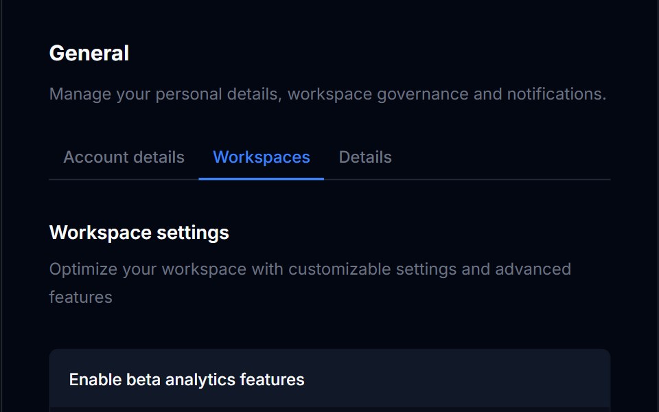 CardTremor Blocks · React
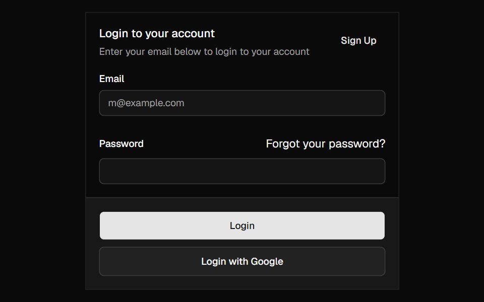 CardShadcn Dashboard · React
 Card Decoratorcnblocks · SvelteDecorative card component with visual effects
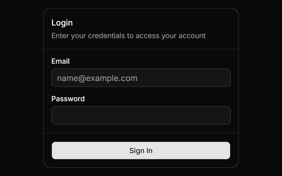 Magic CardAnimations (Svelte) · SvelteA spotlight effect that follows your mouse cursor and highlights borders on hover.
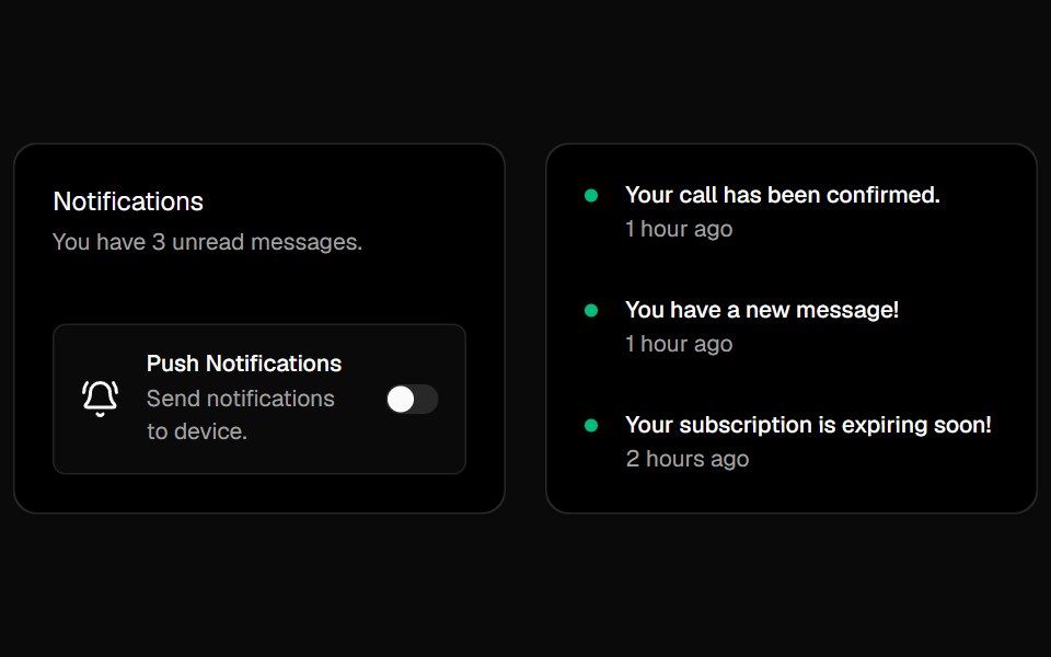 Cursor CardsBadtz UI · ReactInteractive cards with animated gradient borders that respond to cursor movement and proximity. Inspired by Cursor's…
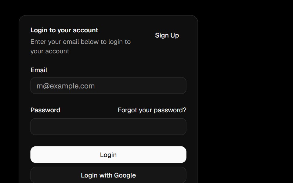 CardObsidianUI · React
 CardGreatUI · React
 Category Previews 01Oxbow UI · AstroSimple card with overlayed text
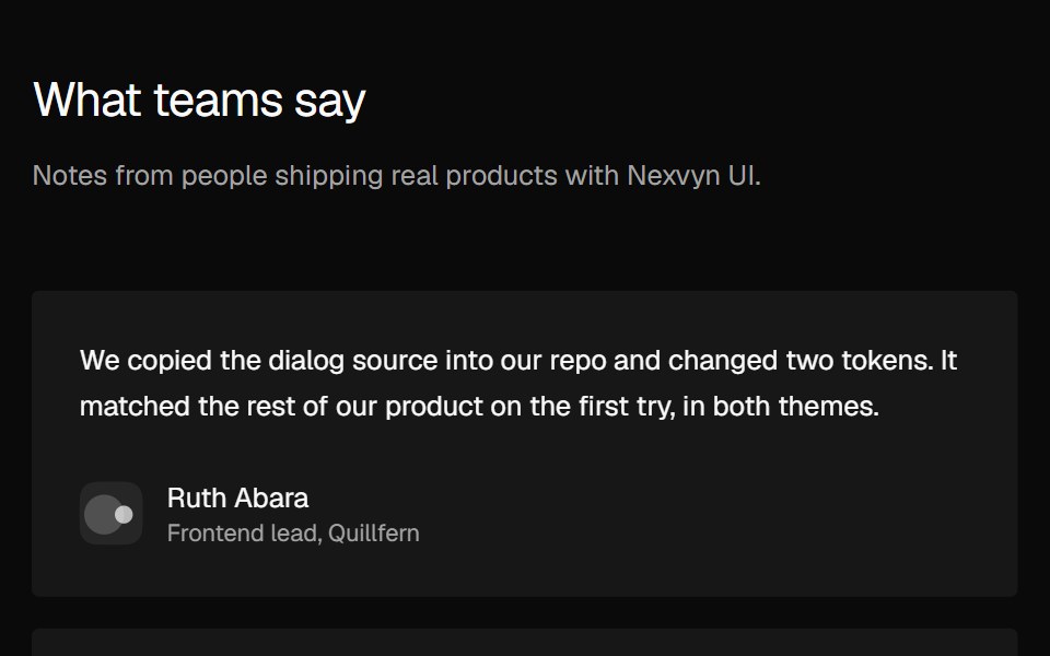 Social Proof Testimonial gridNexvyn UI · ReactTestimonial cards in two or three columns, with a Show more toggle on mobile.
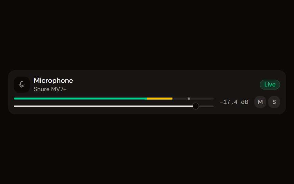 Channel Stripaudiocn · ReactOne channel of a mixer: header, status, meter, fader, value, controls and a notice, as a row or a console strip. The…
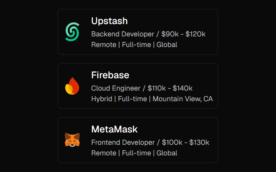 Expandable CardForge UI · ReactInteractive UI component to expand cards with smooth animations and detailed content using layout transitions.
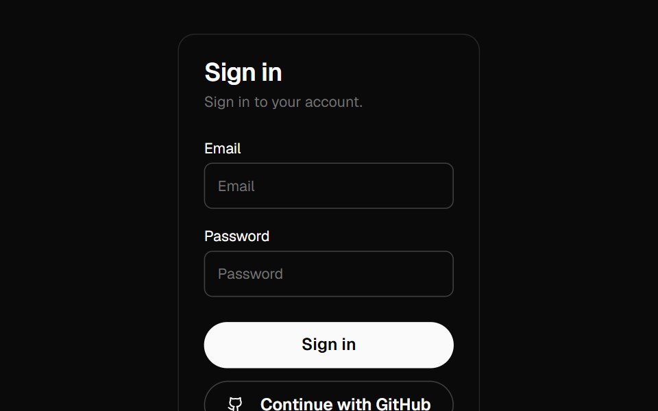 cardBaseLayer · ReactDisplays a card with header, content, and footer.
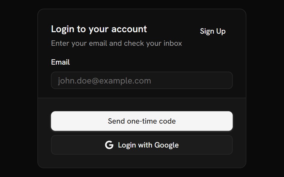 CardShark UI · ReactDisplays content about a single subject.
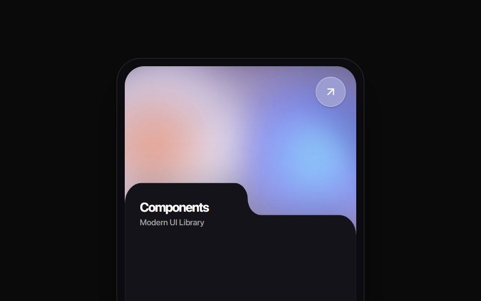 Folder Tab CardRewamp UI · ReactA modern tactile UI card featuring an ethereal animated mesh aurora gradient header, circular diagonal glass arrow…
 MoviePassButtonEvil Buttons · ReactA cinema ticket button that tears along its perforation on click, hinging open or snapping apart.
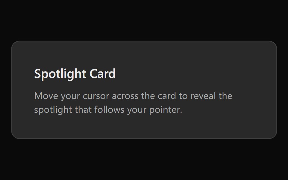 Spotlight CardSona UI · ReactA card with a radial spotlight glow that follows the cursor.
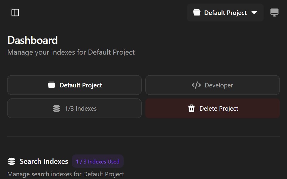 Agndex DashboardWatermelon UI · ReactA developer portal for managing search indexes, API credentials, billing, and project settings with light and dark…
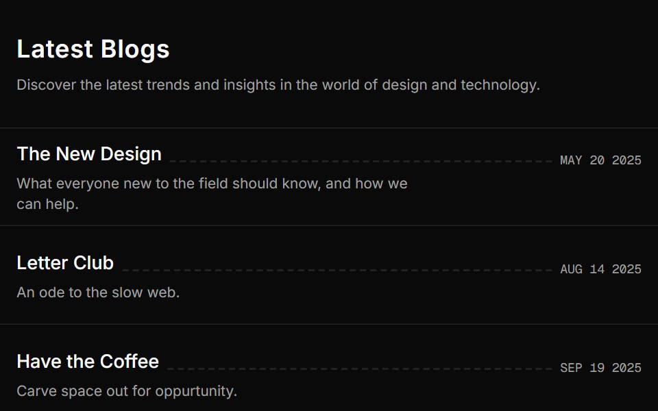 Blog Onesv-efferd · SvelteA vertical editorial list with full-width dividers and compact summaries.
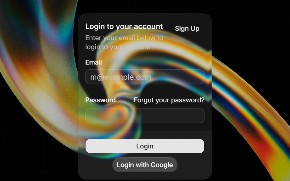 Glass Cardglasscn · ReactGlass Card with five variants: clear, frosted, subtle, liquid, and liquid-refract
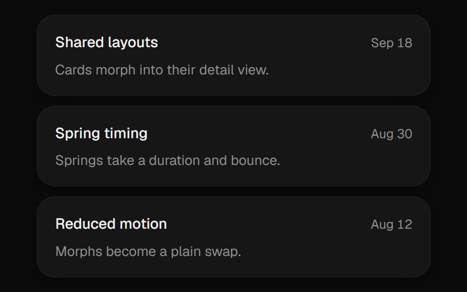 Expanding CardUI Lab · ReactGrows from its slot into a detail view and folds back when you are done.
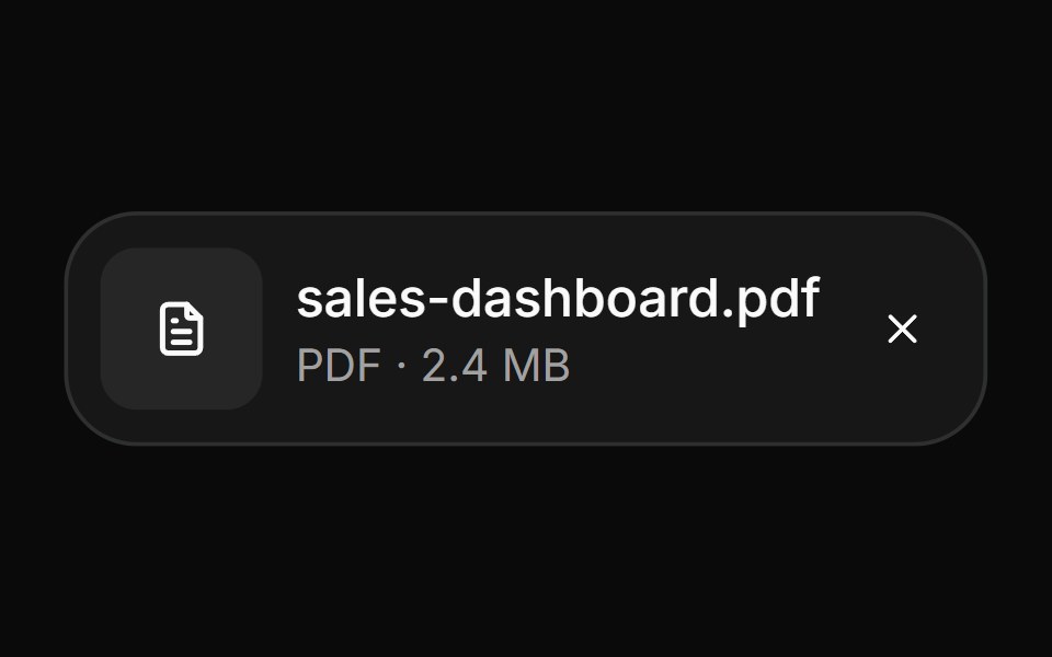 AttachmentHextaUI · ReactFile and image cards for uploads, with progress, states, actions, a full-card trigger and names that keep their…
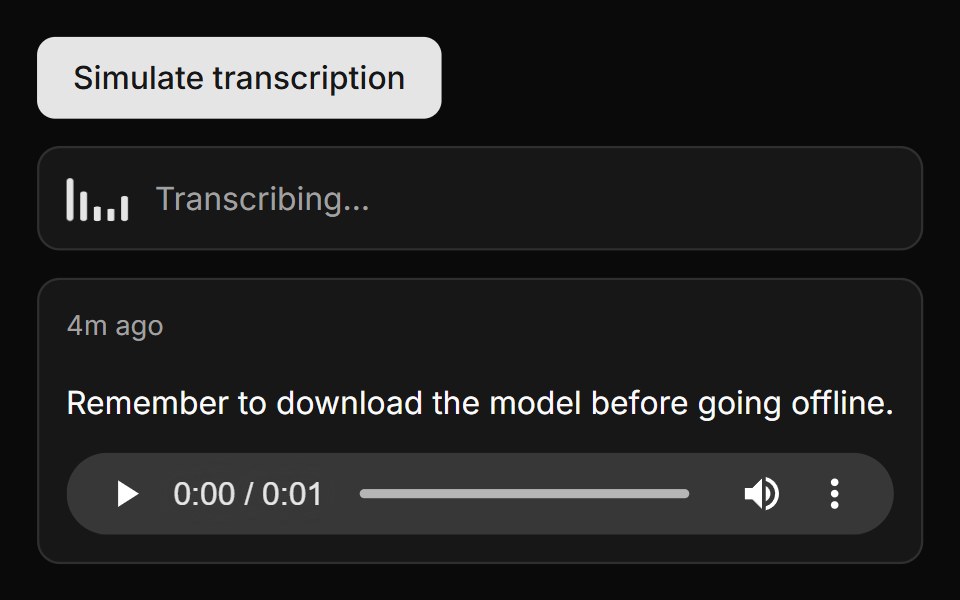 Transcribed Note CardLocalMode · ReactA transcription list item pairing transcript text with inline <audio> playback — relative timestamp (hover ->…
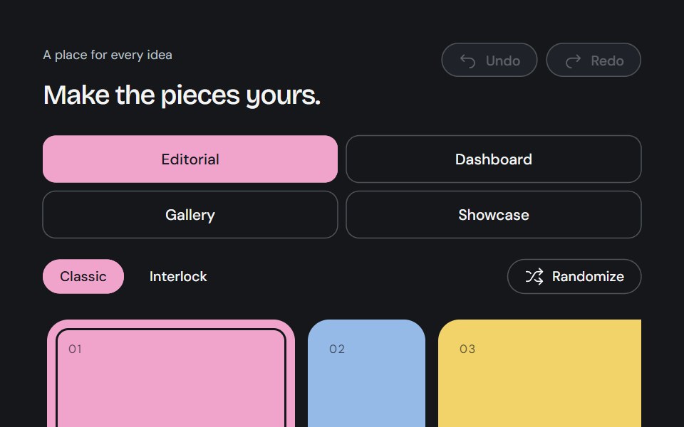 Bento GridCojeev UI · ReactA complete canvas of rounded cards or organically interlocking pieces. Compose a layout, then install just the…
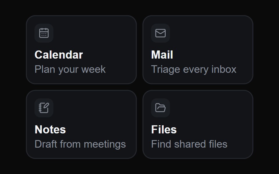 Hover Glide CardsMicroKit · ReactOne highlight glides from card to card under the pointer, seen only through the cards themselves, so it drains out of…
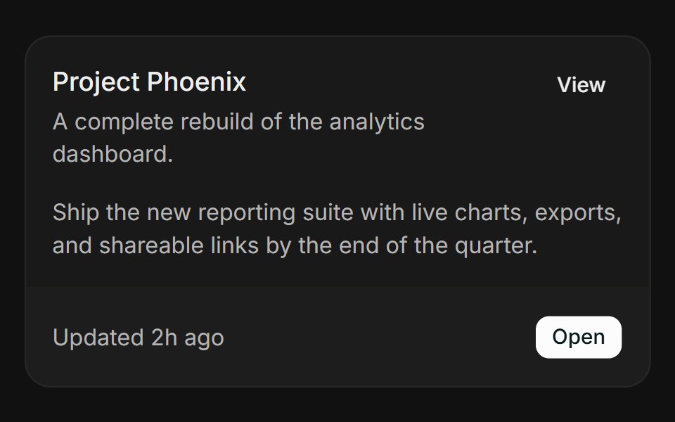 BasicFLX UI · ReactHeader, action, content, and a bordered footer.
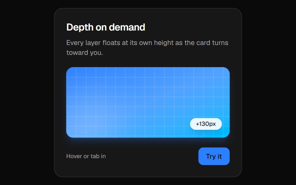 3D CardVelora UI · ReactPerspective card that turns toward the pointer while its layers lift to different depths.
 Card Style Buttonsv-particles · Svelte
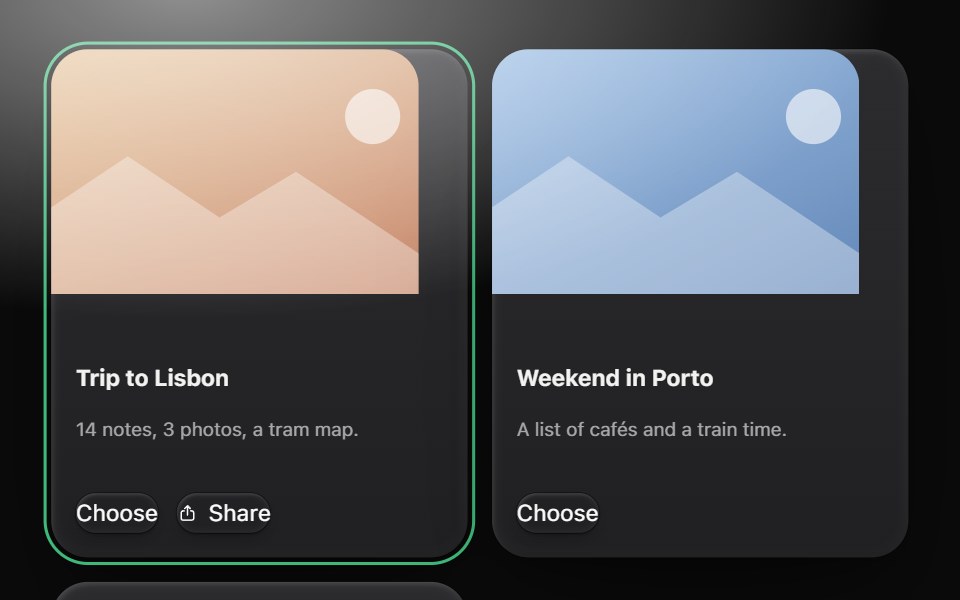 CardMetal UI · React + SwiftUIA person's thing on a raised plate: media, title, a line, actions. A card with a link lifts one grid step on the…
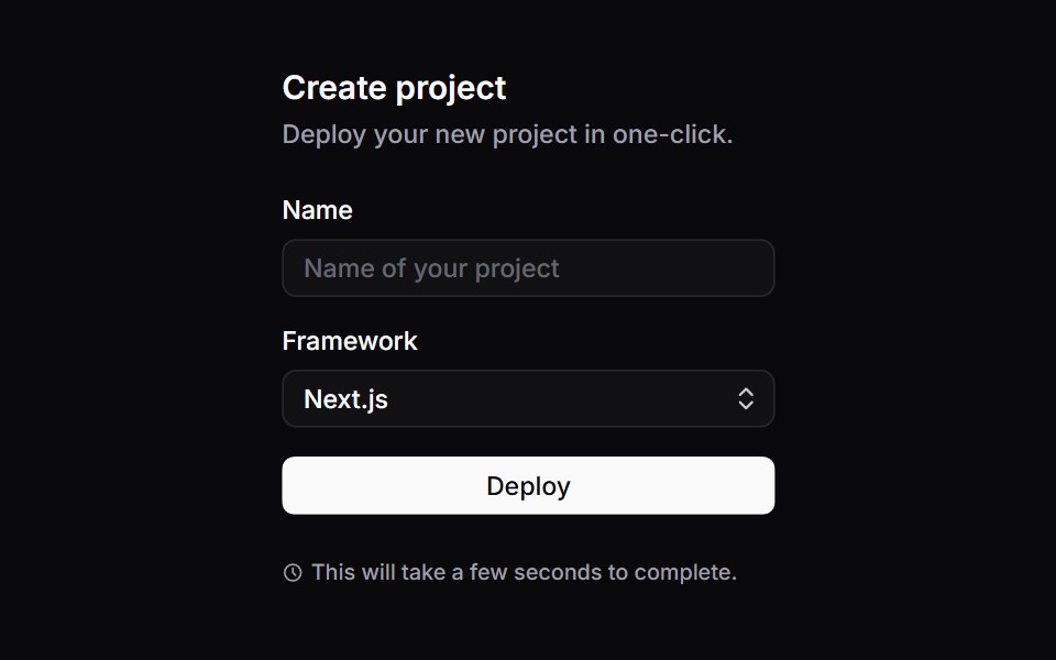 CardSpaceUI · ReactGroups related information, images, and action buttons into a bordered container, creating clear visual sections on…
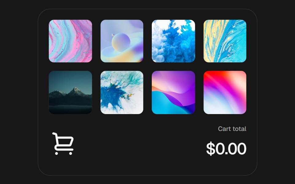 Add to CartSkecher UI · ReactAn interactive product grid with curved add-to-cart flights, a responsive cart stack, and an animated currency total.
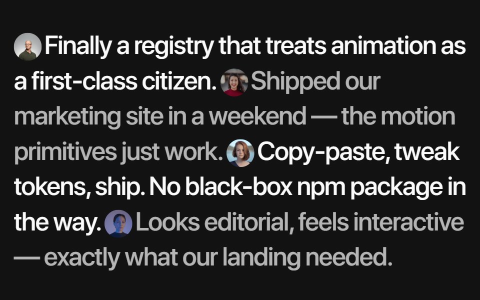 Inline TestimonialsSora UI · ReactA flowing quote stream where each avatar reveals its author on hover, with Motion fading and blurring the rest.
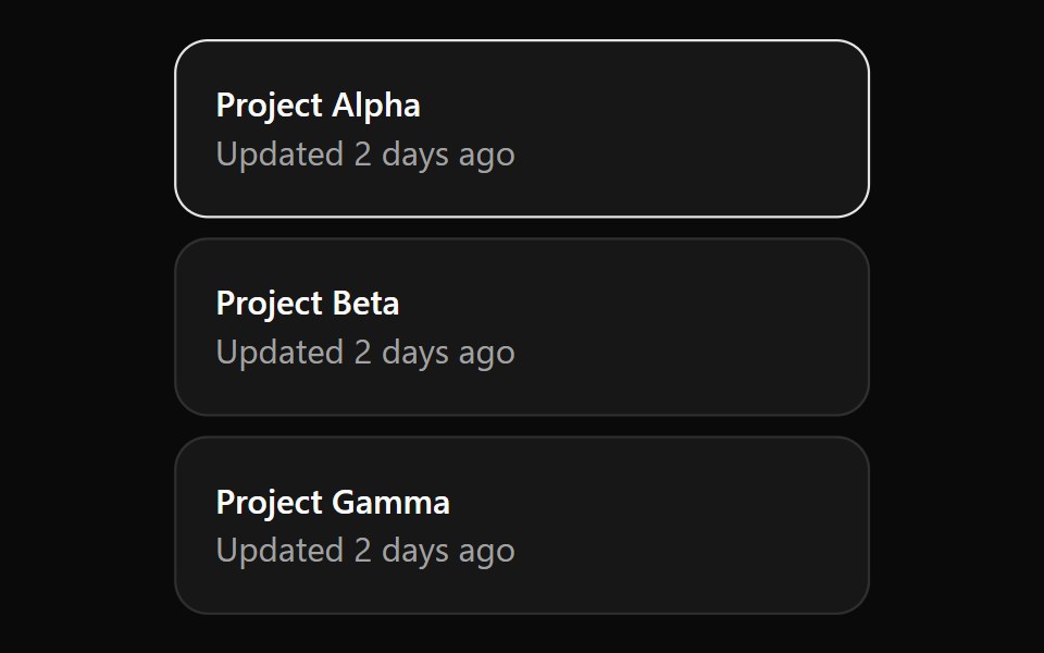 CardOUI · ReactCardGridListItem for shadcn Card.
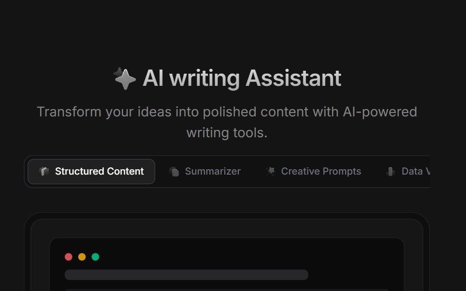 AI BlockD2Studio UI · ReactAI prompt template grid with creative prompts, summarizer, story, poetry and study presets.
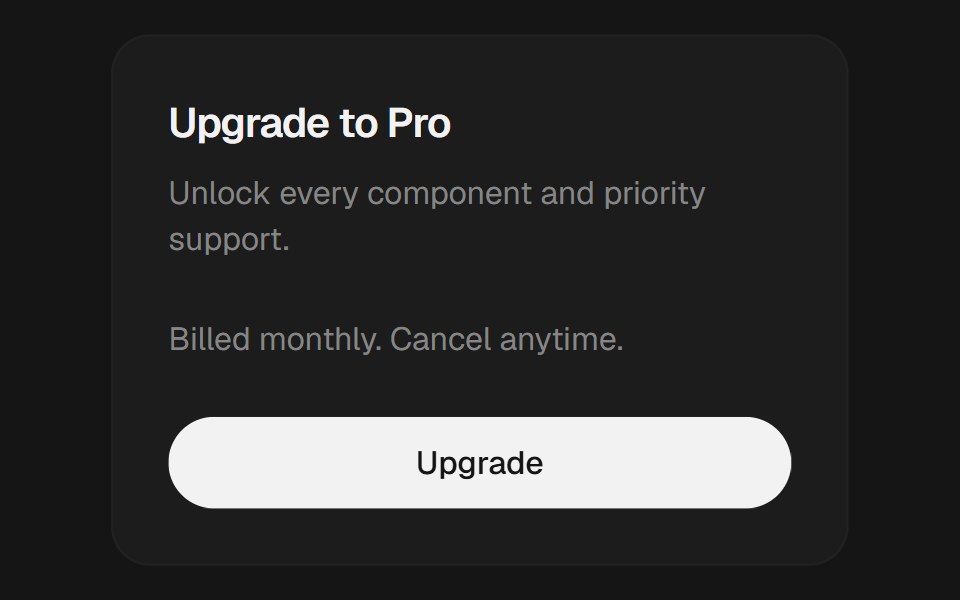 CardEaseUI · ReactBordered surface with header, content, and footer parts for grouping related content.
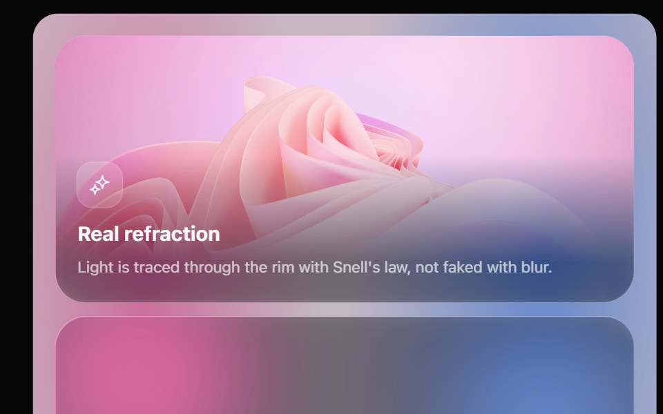 Glass Bento GridOpaline · ReactFeature tiles on glass in a bento layout, with a pointer light and a call to action that slides in.
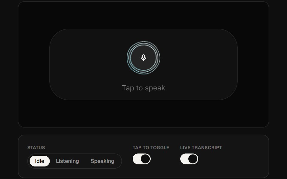 AI Voice 05ReactFrame · ReactA portrait voice-assistant card with a canvas audio-reactive curve visualizer, a mic button that grows on tap…
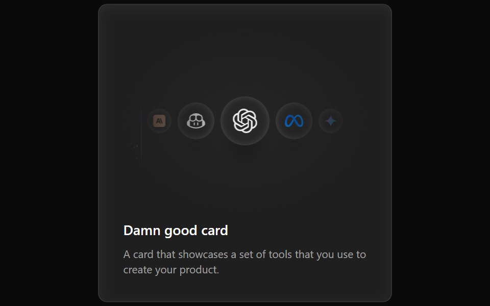 Cards Demo 3Aceternity UI · ReactFeature Block Animated Card
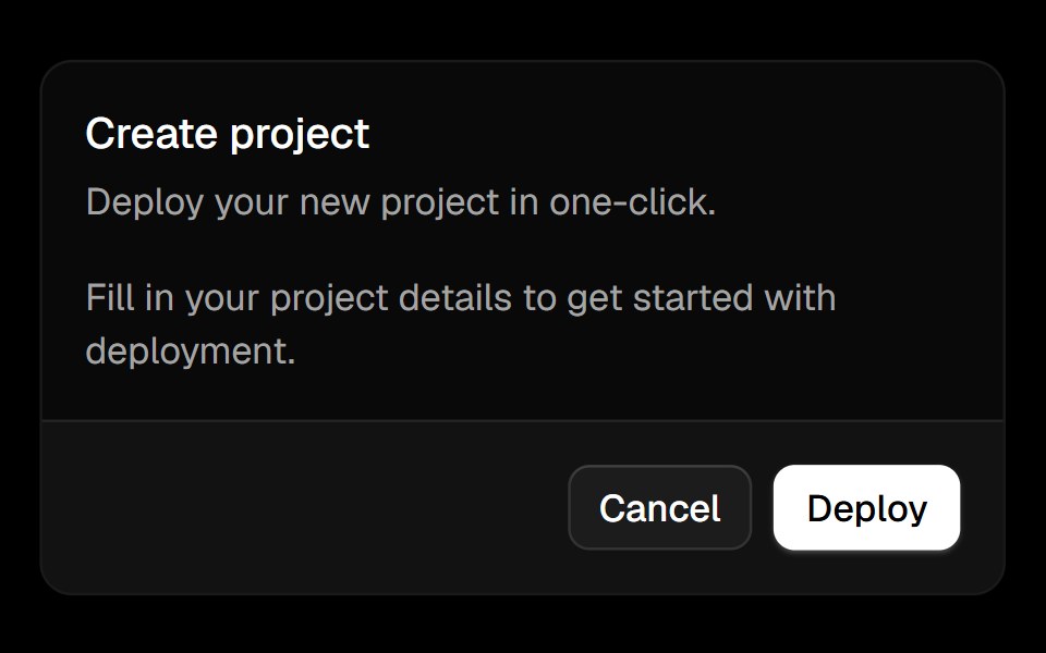 Cardark-cn · ReactA flexible container for grouping related content and actions.
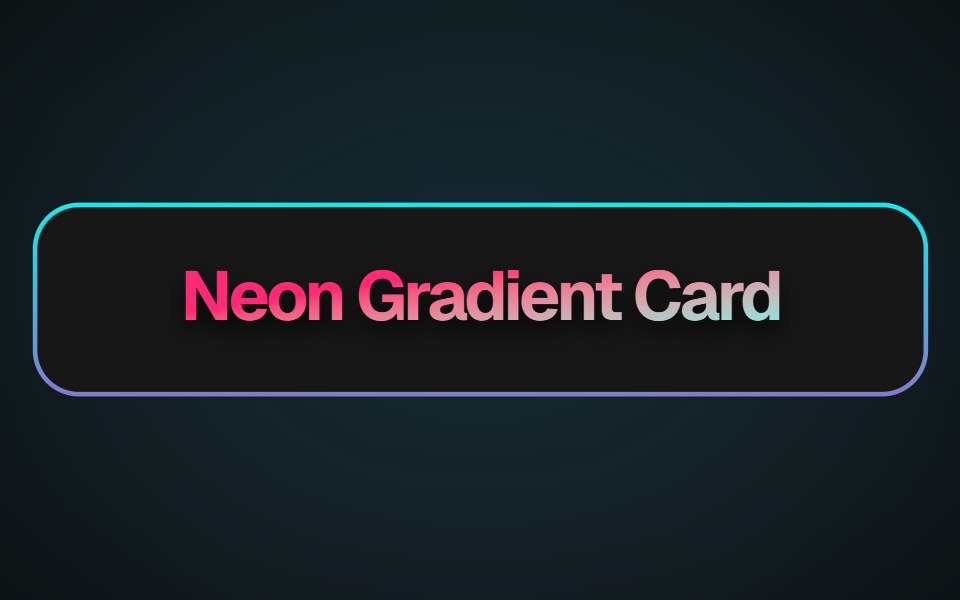 Neon Gradient CardMagic UI · ReactA beautiful neon card effect
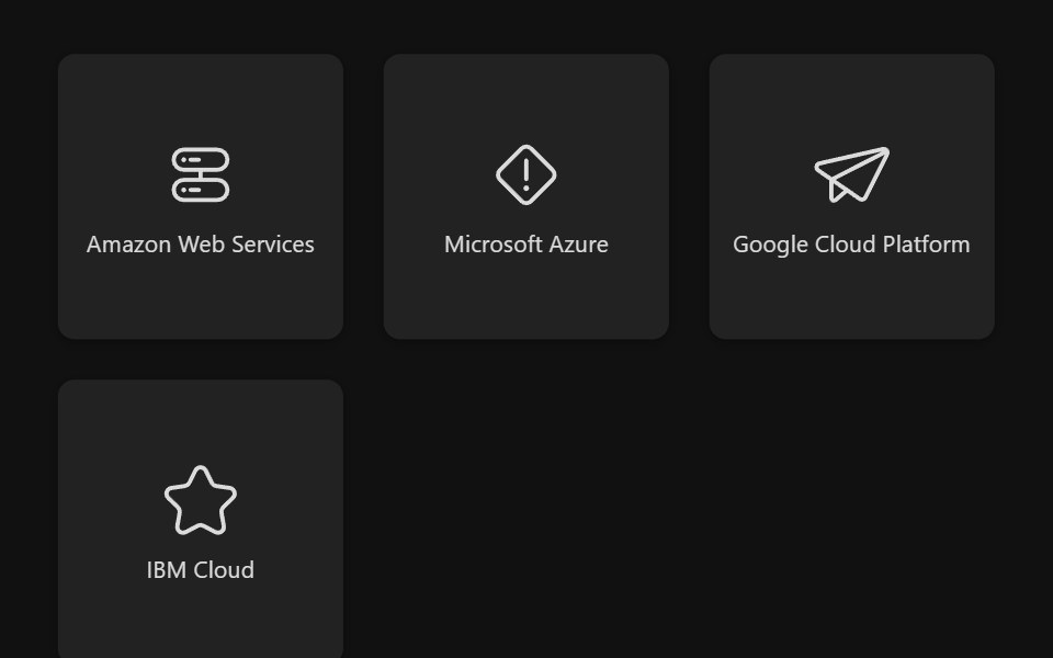 Select Box GroupReact Spectrum · ReactSelectBoxGroup allows users to select one or more options from a list.
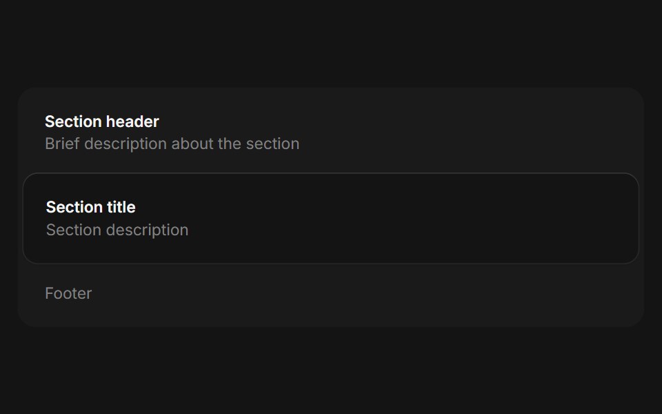 Framecoss ui · ReactA framed container for grouping related information.
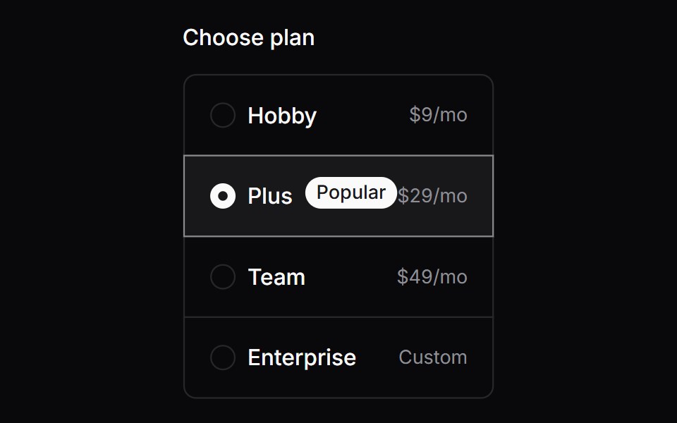 Comp 166Origin UI · React
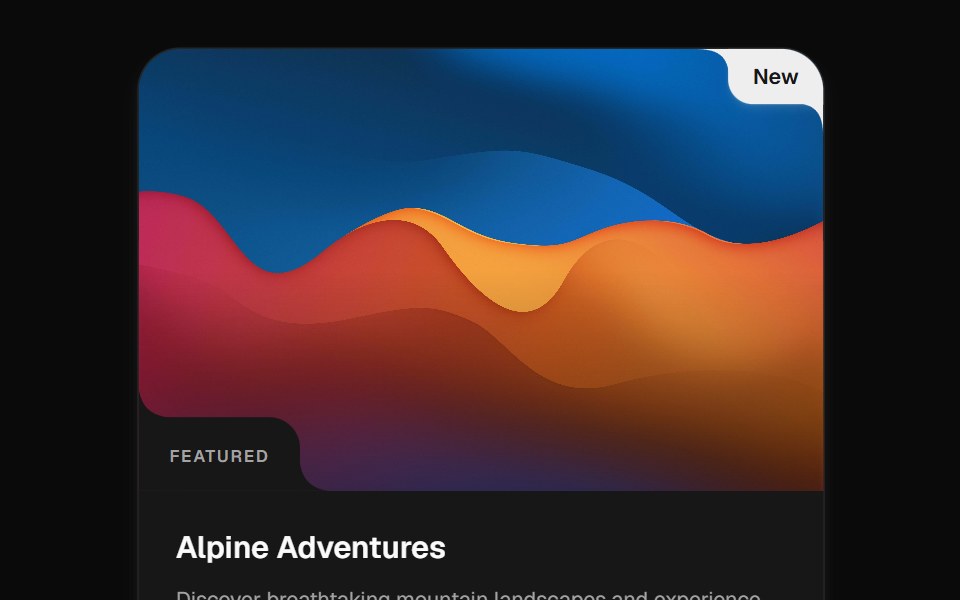 Cutout CardCult UI · ReactImage card with cutout corners, hover motion, inset labels, pins, and reveal actions
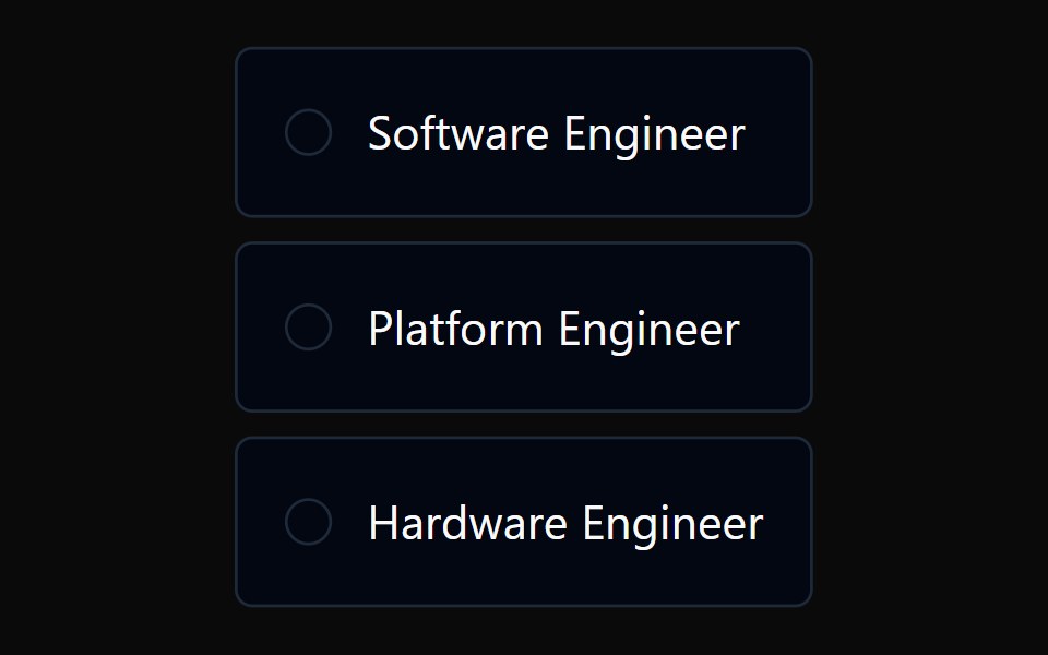 Radio Card GroupTremor · React
 Full card with image and shadow fade effectReUI · ReactFull card with image and shadow fade effect
 Card Preview TileAmicro Micro Transitions · ReactCatalog preview for a card spread / carousel. Hover state lives here so hovering one tile re-renders only that tile…
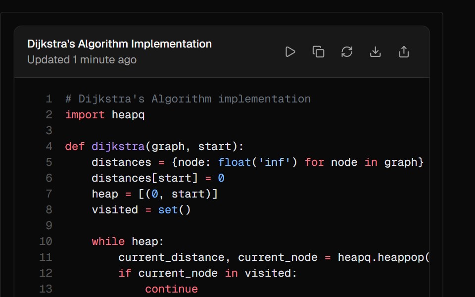 ArtifactAI Elements · ReactA container component for displaying generated content like code, documents, or other outputs with built-in actions.
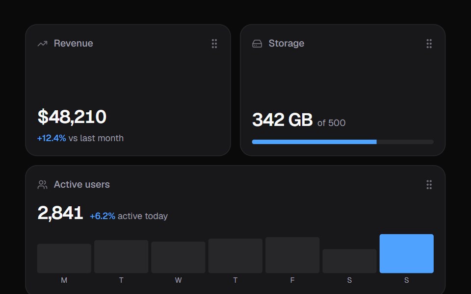 Widget GridKokonut UI · ReactDashboard widgets you lift, drag and resize on a 6-column grid, with spring physics and full keyboard support.
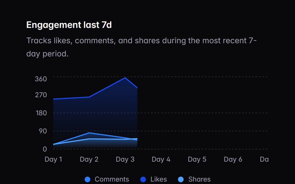 chart-01Intent UI · Reactchart-01
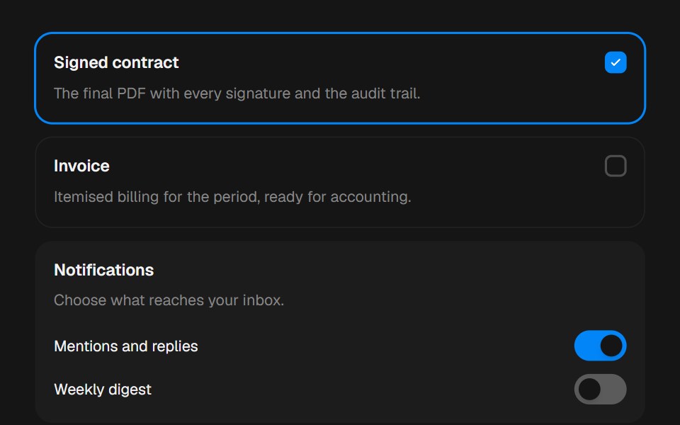 CardbeUI · ReactComposable surfaces, selectable with press feedback.
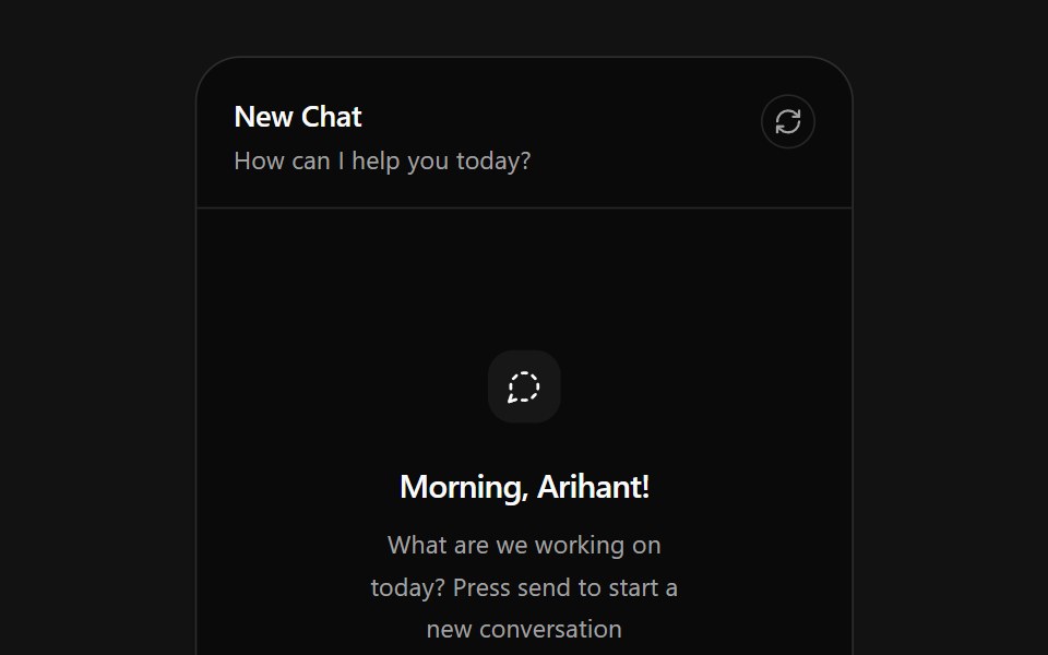 AI Chat CardSpectrum UI · ReactAn AI chat card that types prompts into its composer, with send, attach and reset actions.
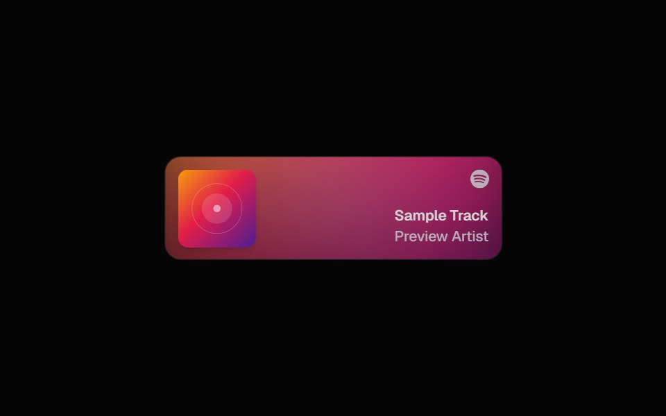 Spotify CardSpell UI · ReactDisplay Spotify tracks with album art and blurred background.
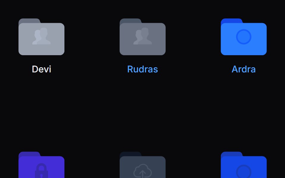 Folder PreviewVengeance UI · ReactFolder stack visual preview
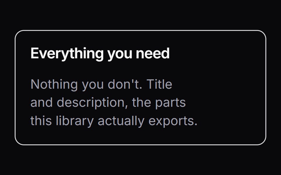 ItemLaunch UI · React
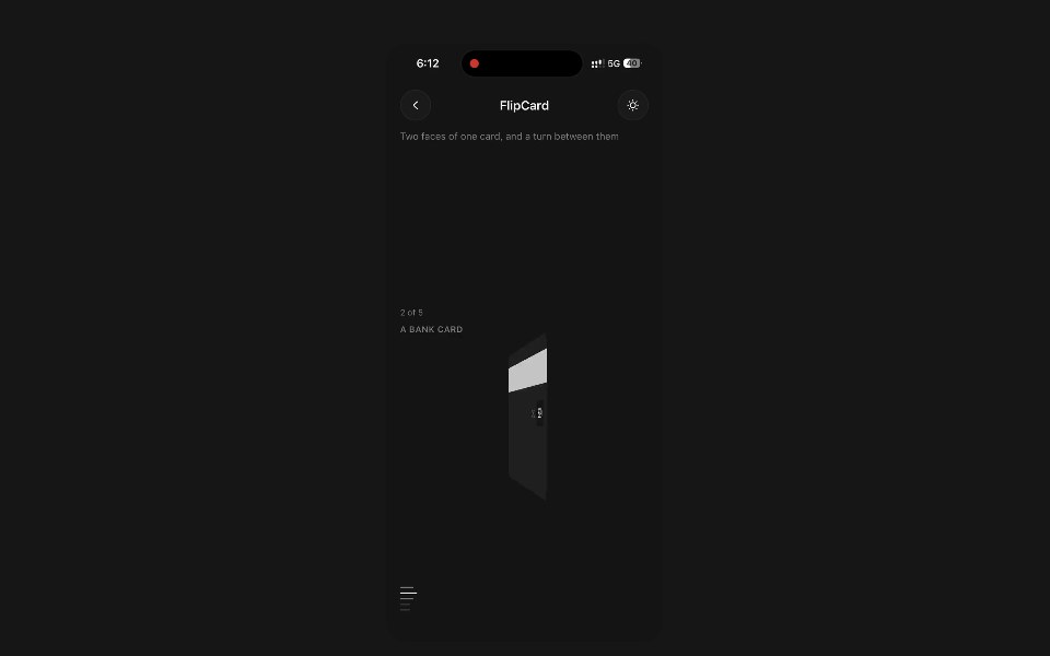 Flip CardPanel UI · React NativeTwo faces of one card, and a turn between them.
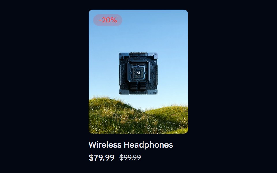 Aspect Ratio 06 - Product CardShadcn Space · ReactA product card using a 4:5 aspect ratio image with a discount badge and pricing details.
 Card ScanPixel Perfect · ReactHover it and it turns holographic: thin-film foil that shifts as you move, light rippling out from the cursor, and a…
 Linked In Profile CardOpenSourceUI · ReactCard that reproduces a LinkedIn profile: cover, avatar, name, headline and connect button.
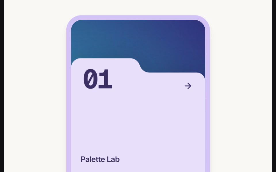 Card Folderuselayouts · ReactThis component creates an animated folder-style card with a background image, floating 3D object, hover effects, and…
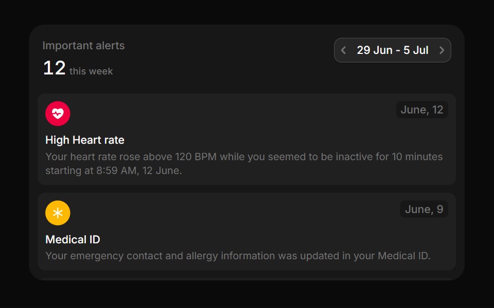 MedicalBoardUI · React
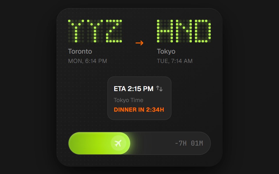 Flight Status CardComponentry · ReactA detailed card showing flight information with animations.
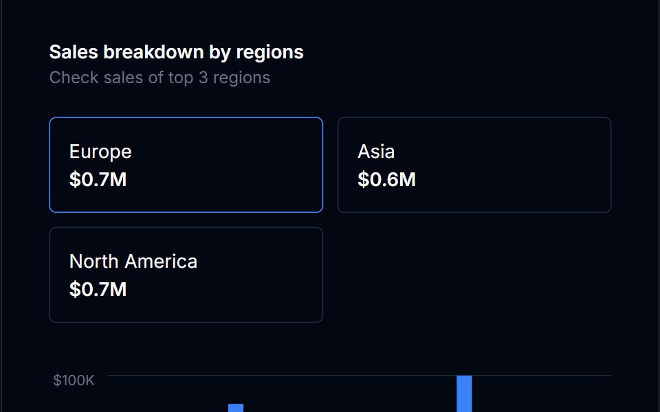 Radio Card GroupTremor Blocks · React
 Hover CardShadcn Dashboard · React
 Feature Cardcnblocks · SvelteReusable feature card with icon and text
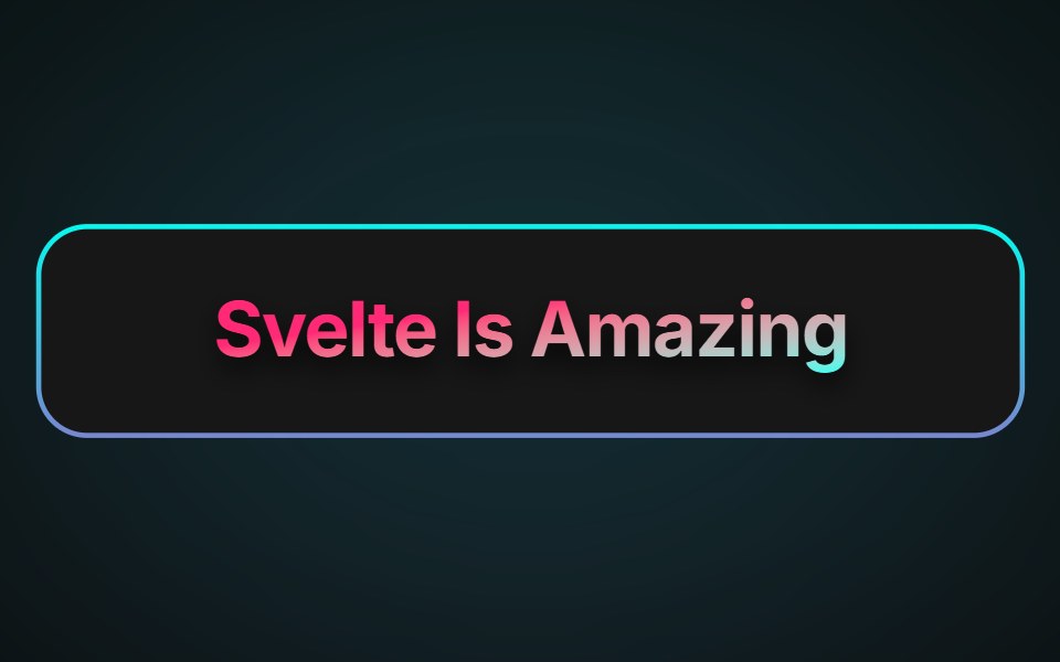 Neon Gradient CardAnimations (Svelte) · SvelteA card component with animated neon gradient borders and customizable colors, border size, and radius.
 Expandable CardBadtz UI · ReactA versatile and engaging UI component that allows users to explore content in a more immersive way.
 Facebook CardGreatUI · React
 Category Previews 02Oxbow UI · AstroCategory cards in bento style
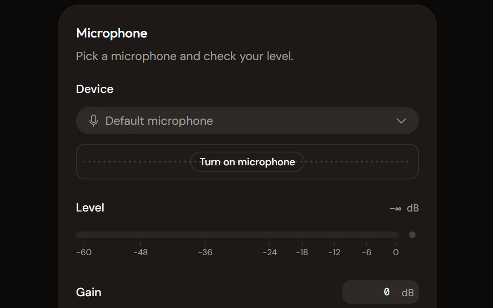 Microphone Setupaudiocn · ReactChoose and check a microphone: device select with a live preview, a level meter, gain, mute and a level check that…
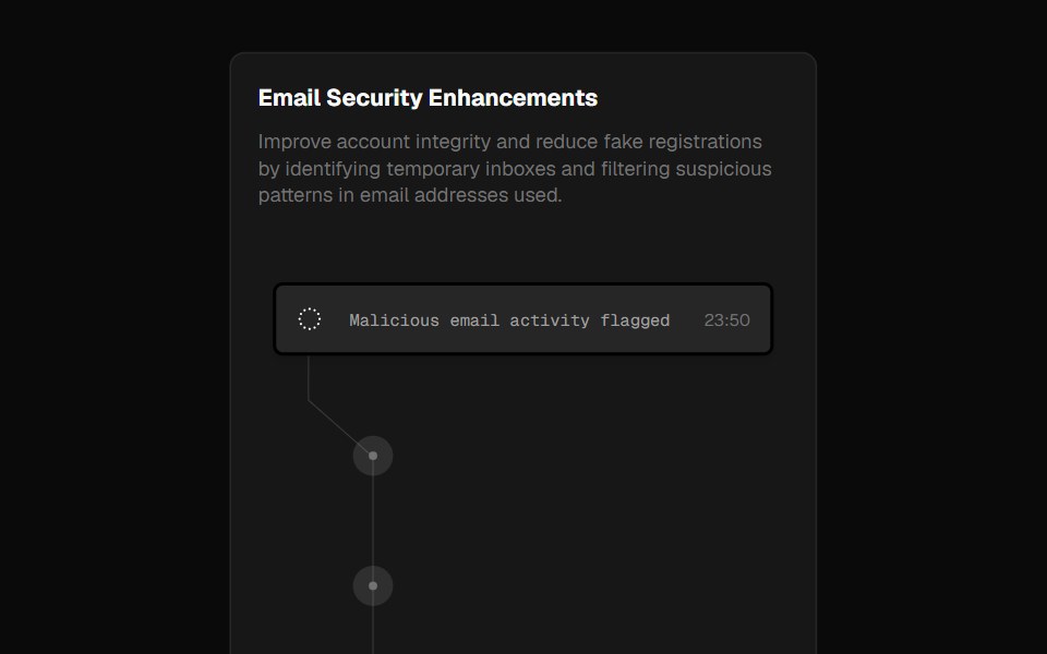 Fraud CardForge UI · ReactA security alert card inspired by Clerk's landing page, showcasing blocked emails with smooth hover animations.
 Template BlogShark UI · React
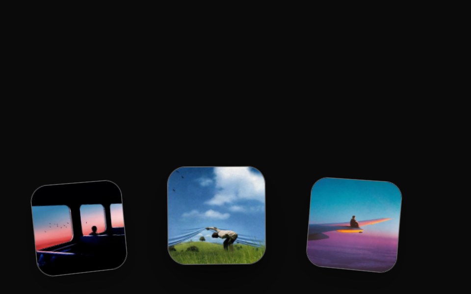 Orbital Card ArchRewamp UI · ReactExact recreation of Recording 2026-09-15 154820.mp4: Cards gliding along a panoramic 3D curved horizon cylinder…
 Cursor Hover CardSona UI · React
 Astrix DashboardWatermelon UI · ReactA trade compliance workspace with AI classification metrics, a live pipeline, HS code stream review, and light and…
 Blog Threesv-efferd · SvelteA card-based blog grid with media thumbnails and richer reading metadata.
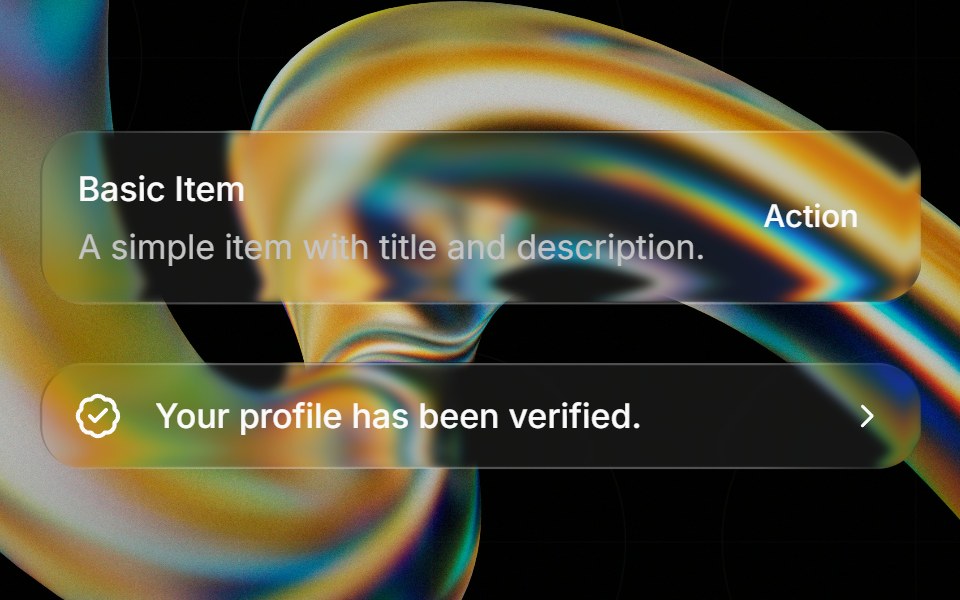 Glass Itemglasscn · ReactGlass Item with five variants: clear, frosted, subtle, liquid, and liquid-refract
 Flip CardUI Lab · ReactTurns over in 3D to show what is on the back.
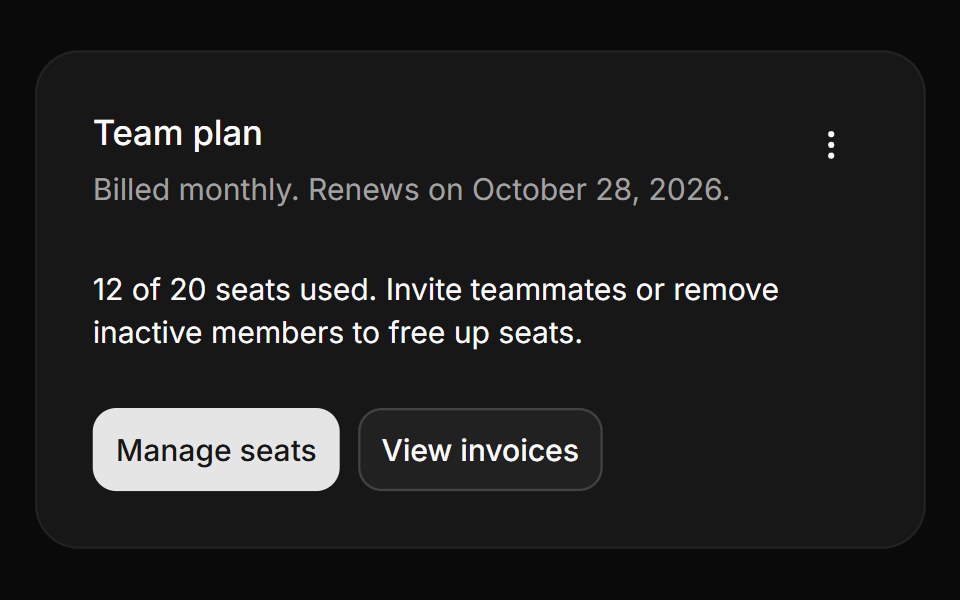 CardHextaUI · ReactA surface for grouping content, with three variants, edge-to-edge media, concentric radii and whole-card links.
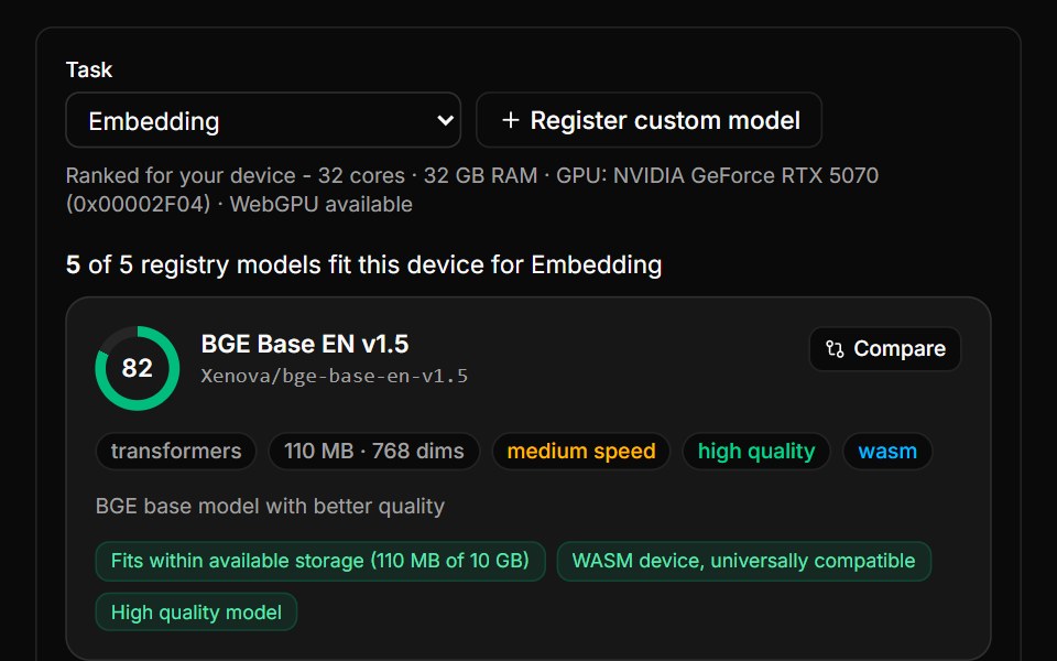 Model Advisor BlockLocalMode · ReactRanked on-device model recommendations that compute their OWN device context via useCapabilities and rank…
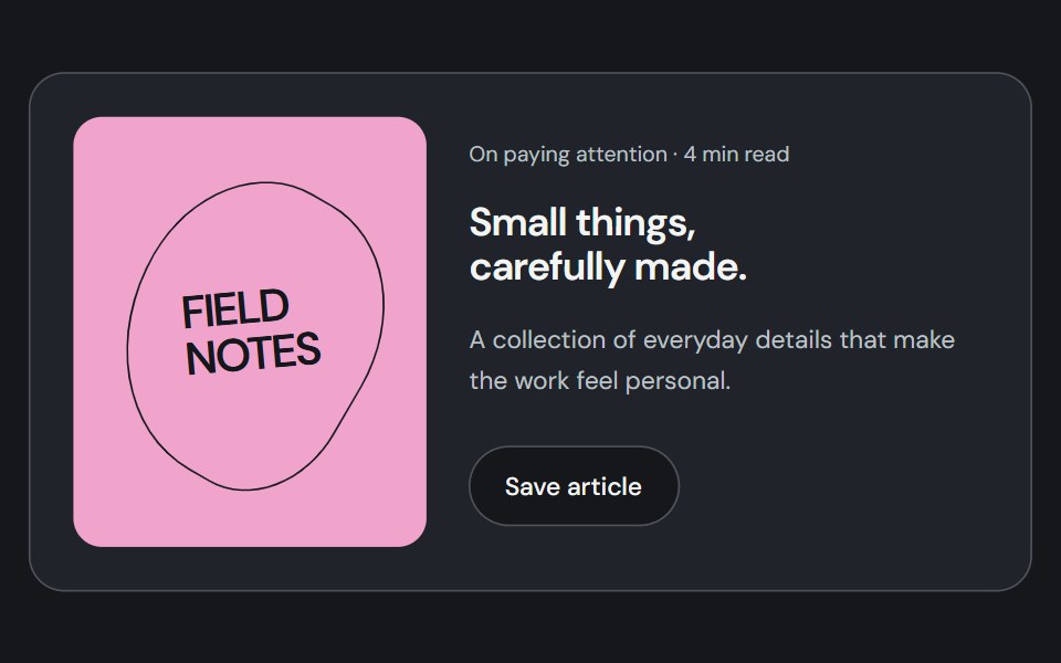 CardCojeev UI · ReactGroups related content, metadata, and actions into a distinct surface.
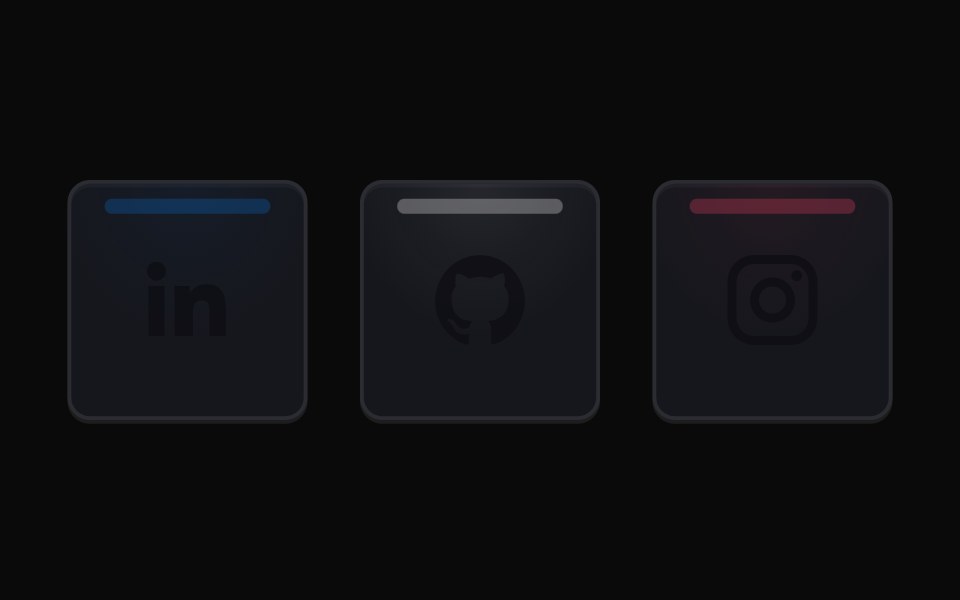 Social Highlight CardsMicroKit · ReactSocial cards with a luminous top rail, a soft brand-colored wash, and matching icons on hover.
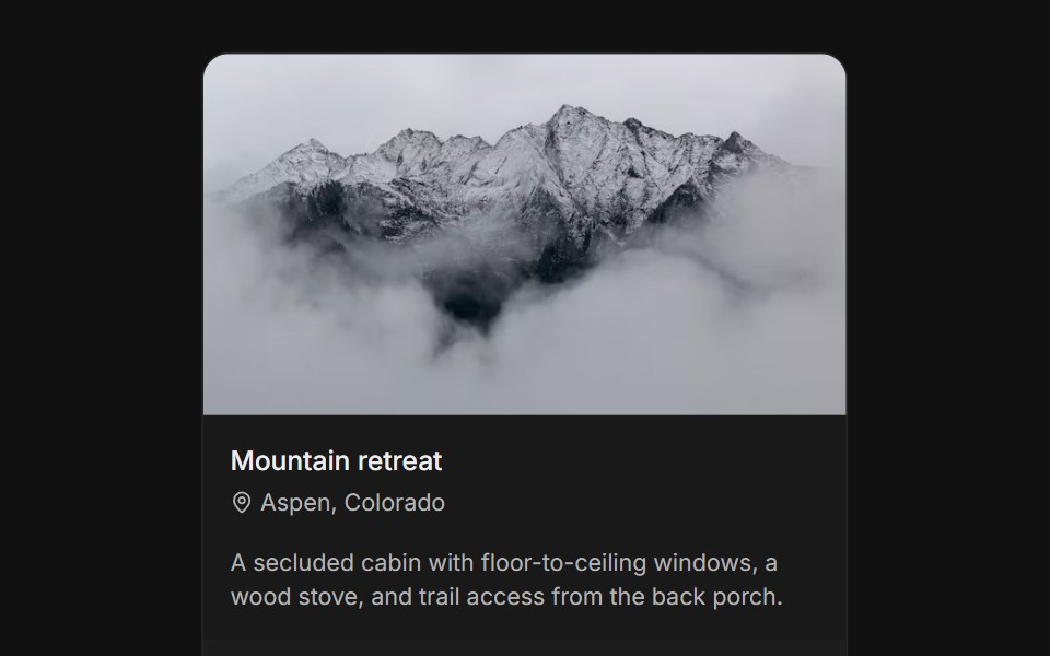 With imageFLX UI · ReactTop media banner above title, body, and a CTA footer.
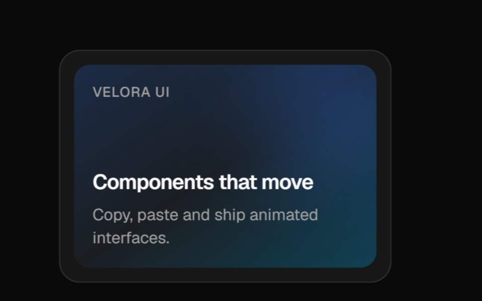 3D PinVelora UI · ReactCard that tilts back as a glowing pin rises with a label chip and rippling rings.
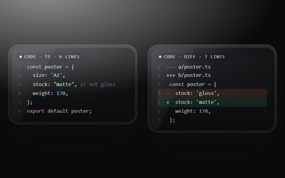 Code cardMetal UI · React + SwiftUICode as a glass object: numbered, tinted lines (at most 18) on a dark screen under a CODE · LANG · N LINES tag.
 Card InfoSpaceUI · ReactResponsive feature and philosophy cards with gradient icons, clean typography, and layered container aesthetics.
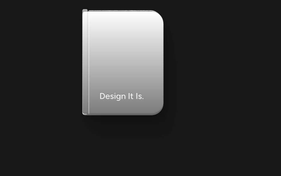 Animated BookSkecher UI · ReactA reusable 3D book preview that opens on hover or focus and supports controlled state, keyboard input, and reduced…
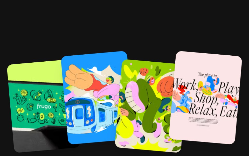 Magnetic CardsSora UI · ReactA fanned stack of cards that fling away from the cursor on release, with GSAP InertiaPlugin easing each one back to…
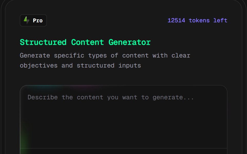 AI Content Creator CardD2Studio UI · ReactPro version content creation card
Libraries with Tailwind CSS card components
Related categories
- Card Components
- React Card Components
- Svelte Card Components
- React Native Card Components
- Animated Card Components
- shadcn/ui Card Components
- Tailwind CSS Data Display Components
- Tailwind CSS Chart Components
- Tailwind CSS Table Components
- Tailwind CSS Avatar Components
- Tailwind CSS Stat Components
- Tailwind CSS List Components
- Tailwind CSS Calendar Components
- Tailwind CSS Accordion Components
- Tailwind CSS Data Table Components
- Tailwind CSS Carousel Components
- Tailwind CSS Collapsible Components
- Tailwind CSS Avatar Group Components
- Tailwind CSS Stat Card Components
- Tailwind CSS Bar Chart Components
- Tailwind CSS Tree View Components
- Tailwind CSS Card Stack Components