 Dev Design Library
Tailwind CSS Collapsible Components
Dev Design Library indexes 116 Tailwind CSS collapsible components from 38 open-source UI libraries, with the most coming from ReUI, Watermelon UI, AI Elements, Origin UI and Notra. Each one links to its page with the source code, a live preview where available, the library license and the install command. Every library in this list styles its components with Tailwind CSS utility classes. Collapsible components belong to the Data display group.
 Collapsibleshadcn/ui · ReactAn interactive component which expands/collapses a panel.
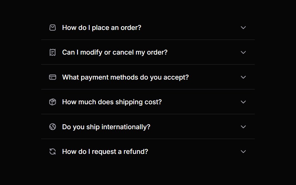 AccordionHeroUI · ReactA collapsible content panel for organizing information in a compact space
 DisclosureReact Spectrum · ReactA collapsible section of content composed of a heading that expands and collapses a panel.
 Accordioncoss ui · ReactA set of collapsible panels with headings and content.
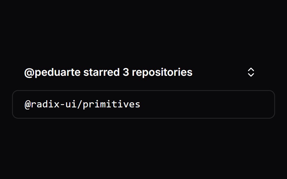 CollapsibleOrigin UI · ReactA collapsible panel controlled by a button trigger.
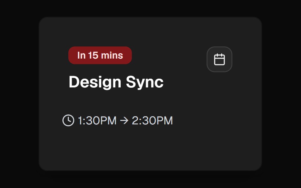 ExpandableCult UI · ReactExpandable component system with smooth animations and customizable presets
 Basic collapsibleReUI · ReactBasic collapsible
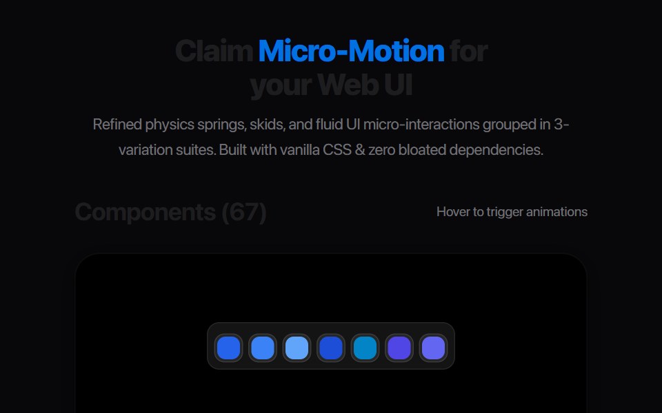 Plus Minus ToggleAmicro Micro Transitions · ReactDual square toggle buttons with solid color fills and spring micro-bounce.
 Chain Of ThoughtAI Elements · ReactA collapsible component that visualizes AI reasoning steps with support for search results, images, and step-by-step…
 disclosure-groupIntent UI · Reactdisclosure-group
 Agent DisclosurebeUI · ReactShared transform-only reveal for collapsible agent content.
 AccordionTailGrids · ReactFully accessible accordion component with multiple style variants
 Reasoning TraceSpectrum UI · ReactAn expandable chain-of-thought trace with a live thinking timer.
 AccordionVengeance UI · React
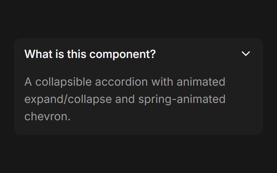 AccordionFluid Functionalism · ReactCollapsible accordion with animated height transitions, spring-animated chevron, and fluid hover in grouped mode…
 AccordionToolcraft · React
 AccordionLaunch UI · React
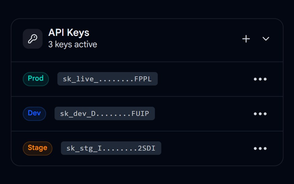 Collapsible 03 - API Keys ManagerShadcn Space · ReactA collapsible API keys panel with copy-to-clipboard, delete actions, and a dropdown context menu per key.
 CollapsibleShadcn Dashboard · React
 Chain Of ThoughtAI Elements (Svelte) · SvelteA collapsible component that visualizes AI reasoning steps with support for search results, images, and step-by-step…
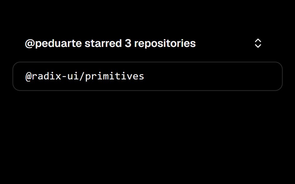 CollapsibleObsidianUI · React
 AI OverviewNotra · ReactThe AI Overview root, built on shadcn Collapsible and Button, with a collapsible Show more.
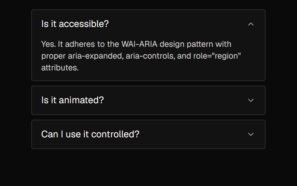 AccordionNexvyn UI · ReactA vertically stacked set of interactive headings that each reveal a section of content, with a grid-rows unfold…
 accordionBaseLayer · ReactAn accordion allows users to toggle the display of sections of content. Each accordion consists of a header with a…
 CollapsibleShark UI · ReactCollapsible content in a vertical stack.
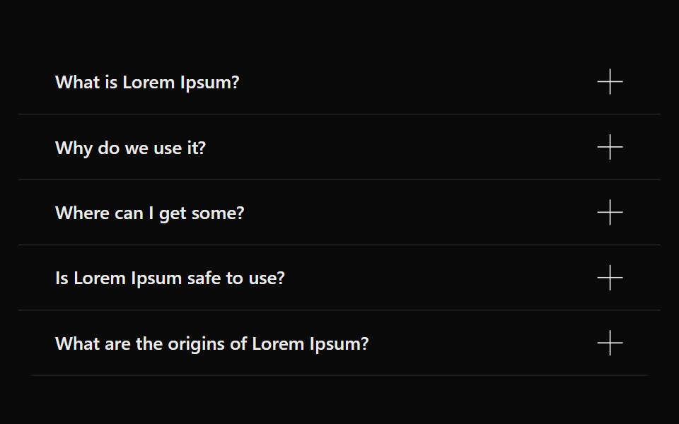 AccordionSona UI · ReactAn accessible Base UI accordion with controlled and uncontrolled state, four visual variants, interruptible disclosure…
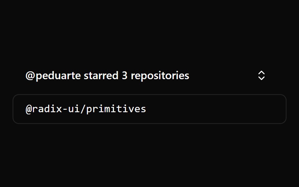 CollapsibleWatermelon UI · React
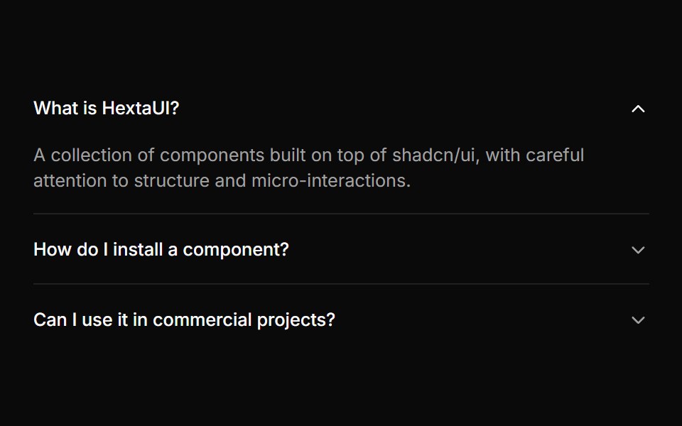 AccordionHextaUI · ReactStacked headings that each reveal a panel, with height motion you can reverse mid-way and panels that stay searchable…
 Agent Step TimelineLocalMode · ReactA vertical timeline of ReAct agent steps: collapsible per-step cards (color-coded tool badge, args, observation…
 CollapsibleCojeev UI · ReactShows or hides one optional section without leaving the surrounding layout.
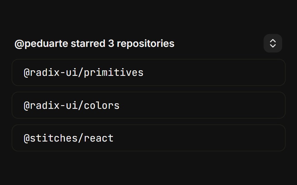 BasicFLX UI · ReactCanonical starred-repos toggle with a chevron trigger.
 Expandable CardVelora UI · ReactExpands into a centred panel with shared-layout transitions.
 CollapsibleSpaceUI · ReactHides extra content behind a simple toggle button, allowing users to expand and read details only when they need them.
 DisclosureOUI · ReactReact aria components Disclosure with shadcn characteristics.
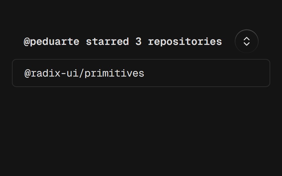 CollapsibleD2Studio UI · ReactAn interactive component which expands and collapses a panel.
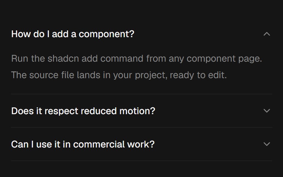 AccordionEaseUI · ReactExpanding sections that grow to their natural height with no measuring, with arrow key navigation and closed panels…
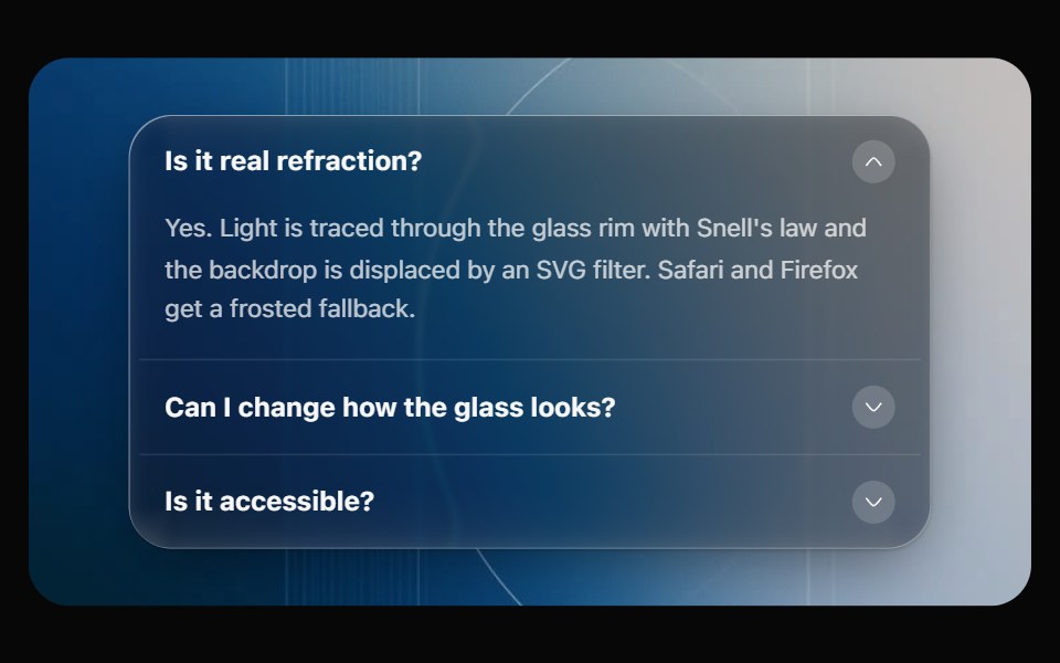 Glass AccordionOpaline · ReactCollapsible sections on one glass panel, or as separate glass cards that grow open.
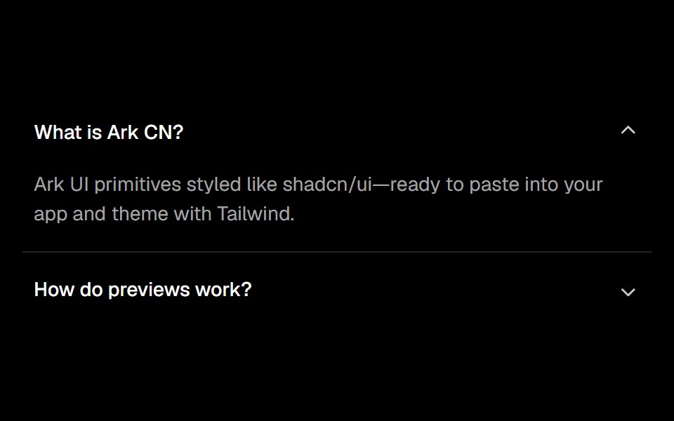 Accordionark-cn · ReactA shadcn-style accordion component built with Ark UI primitives.
 DisclosureHeroUI · ReactA disclosure is a collapsible section with a header containing a heading and a trigger button, and a panel that wraps…
 Tailwind DisclosureReact Spectrum · React
 Collapsiblecoss ui · ReactA collapsible panel controlled by a button trigger.
 Comp 123Origin UI · React
 Expandable ScreenCult UI · ReactA full-screen expandable component with morphing animations using shared layout IDs for smooth transitions
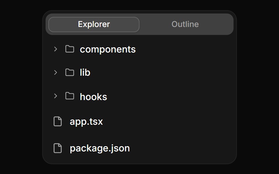 Tree view with file actionsReUI · ReactTree view with file actions
 CommitAI Elements · ReactDisplay commit information with hash, message, author, and file changes.
 show-moreIntent UI · Reactshow-more
 CollapsiblebeUI · ReactExpandable content with a smooth reveal.
 CollapsibleTailGrids · ReactA high-performance context menu component that appears when triggered by a right-click or long-press.
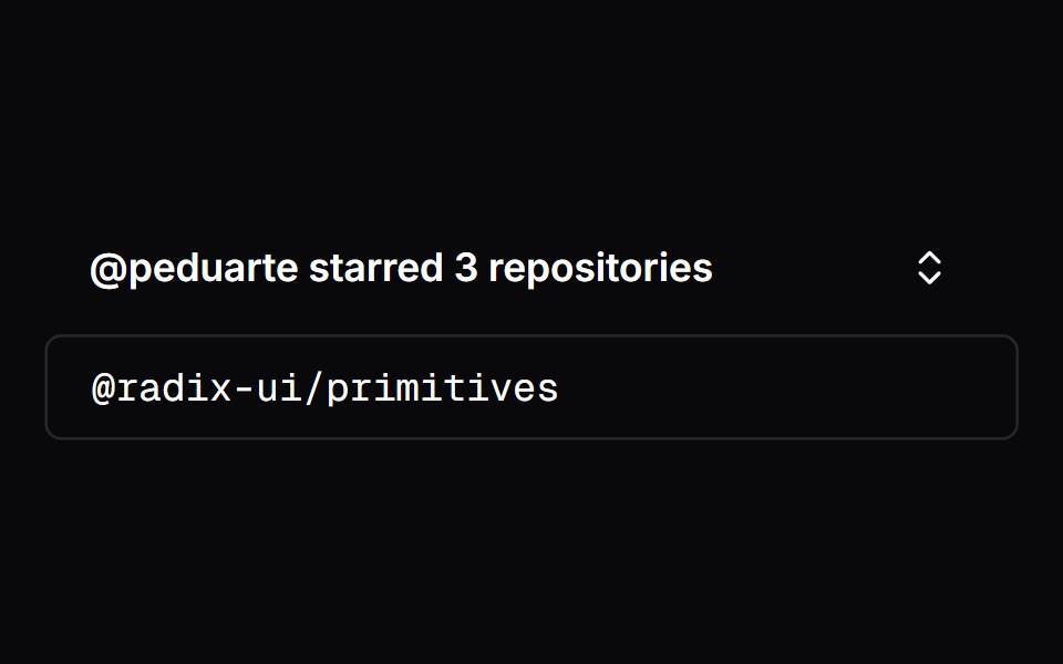 CollapsibleVengeance UI · React
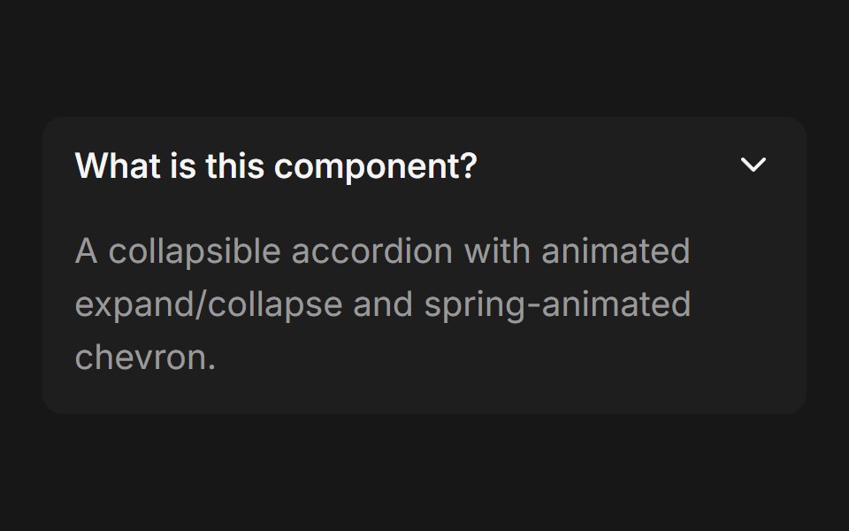 Accordion (Base UI)Fluid Functionalism · ReactCollapsible accordion with animated height transitions, spring-animated chevron, and fluid hover in grouped mode. Base…
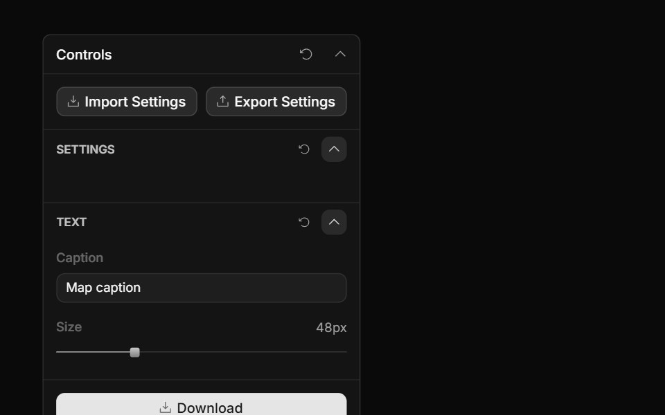 Control Section TitleToolcraft · React
 Collapsible 05 - Token UsageShadcn Space · ReactA collapsible usage card with a progress bar, summary and details.
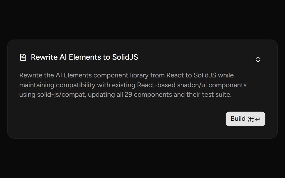 PlanAI Elements (Svelte) · SvelteA plan card component with collapsible content and streaming-aware description shimmer.
 ChatGPT ReasoningNotra · ReactThe collapsible "Worked for Ns" trace, built on shadcn Collapsible.
 Sidebar CollapsibleNexvyn UI · ReactA sidebar that folds down to its icons, with recent pages and the account at the bottom.
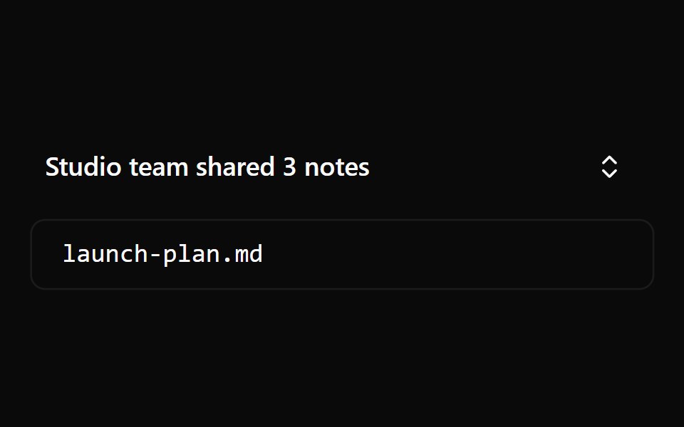 Collapsible 1Watermelon UI · React
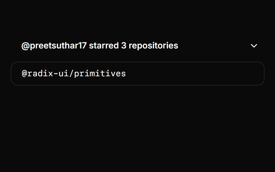 CollapsibleHextaUI · ReactA panel that shows and hides with height motion you can reverse mid-way, without jumping the layout.
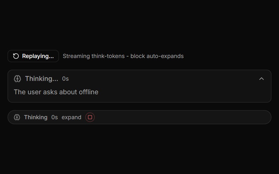 ReasoningLocalMode · ReactThe model's own thinking tokens (DeepSeek-R1 style) in a collapsible region: auto-expands while streaming with an…
 FAQ listFLX UI · ReactStacked question rows; each answer expands with an animated chevron.
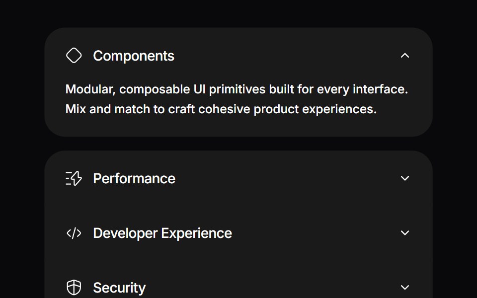 Detachable AccordionSpaceUI · ReactAn interactive accordion with spring motion where the expanded item physically detaches with animated gaps and rounded…
 Reasoning DisclosureEaseUI · React
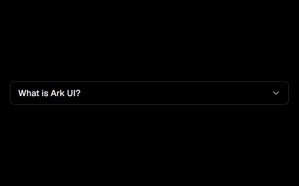 Collapsibleark-cn · ReactA shadcn-style collapsible component built with Ark UI primitives.
 Disclosure GroupHeroUI · ReactContainer that manages multiple Disclosure items with coordinated expanded states
 Vanilla DisclosureReact Spectrum · React
 Comp 142Origin UI · React
 Intro DisclosureCult UI · ReactIntro disclosure component with expandable content and smooth animations
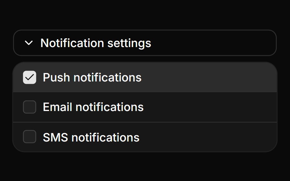 Collapsible with checkbox settingsReUI · ReactCollapsible with checkbox settings
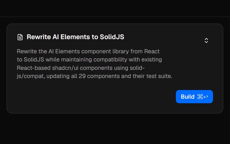 PlanAI Elements · ReactA collapsible plan component for displaying AI-generated execution plans with streaming support and shimmer animations.
 Tool ResultbeUI · ReactPresents the evidence produced by an active task.
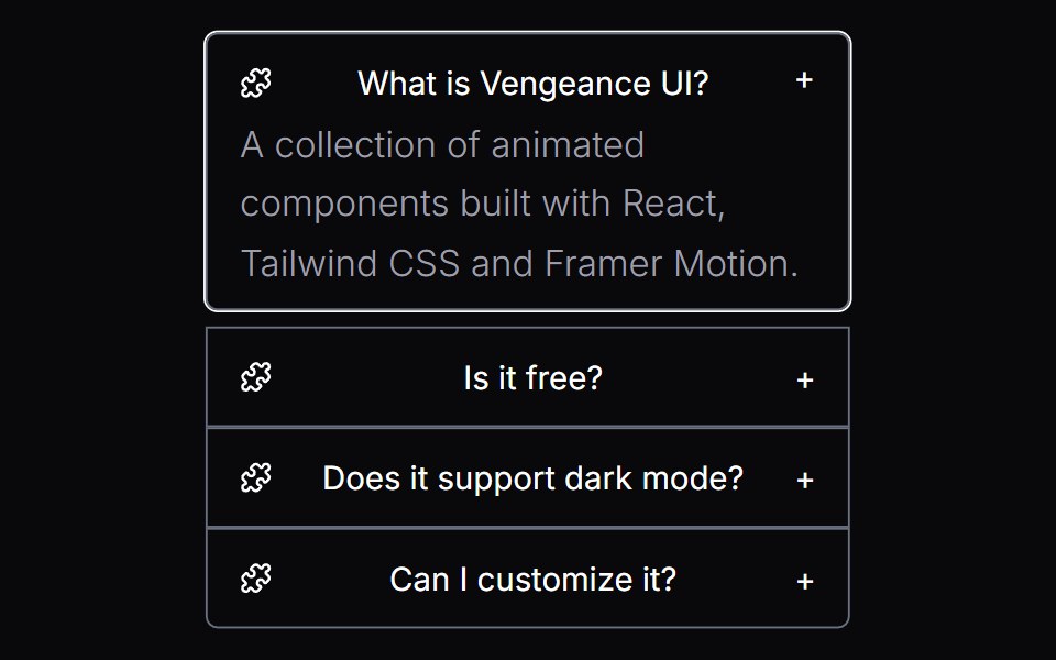 Morphing DisclosureVengeance UI · React
 Thinking StepsFluid Functionalism · ReactCollapsible AI reasoning steps with animated expand/collapse, per-step icons, sources, and nested details. Radix flavor.
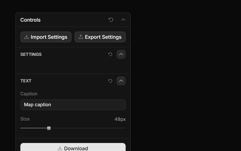 Panel SectionToolcraft · React
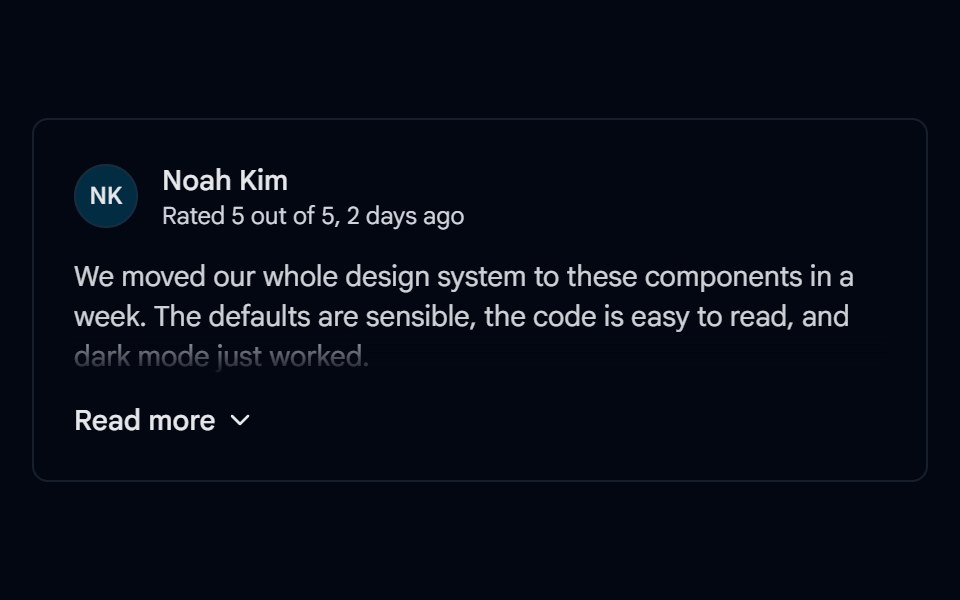 Collapsible 06 - Read MoreShadcn Space · ReactReview card that shows the first paragraph with a fade and expands the full text with a Read more / Show less toggle.
 ReasoningAI Elements (Svelte) · SvelteA collapsible reasoning block that tracks streaming duration and renders a markdown response.
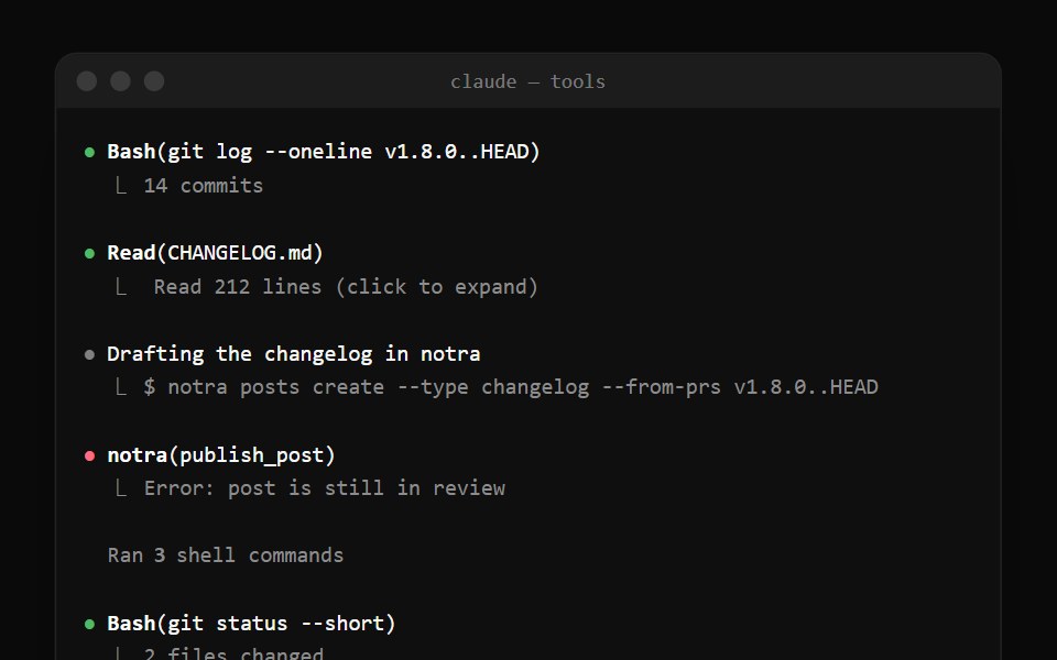 Claude Code Tool CallNotra · ReactTool calls with a status bullet and a ⎿ result line, plus the collapsed "Ran 3 shell commands" summary.
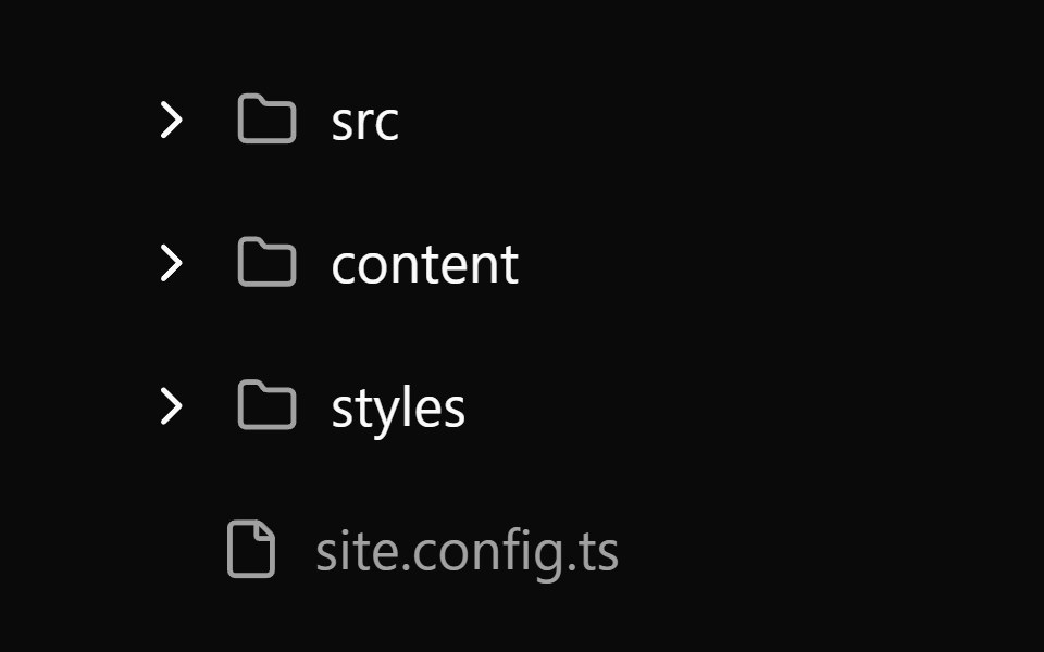 Collapsible 2Watermelon UI · React
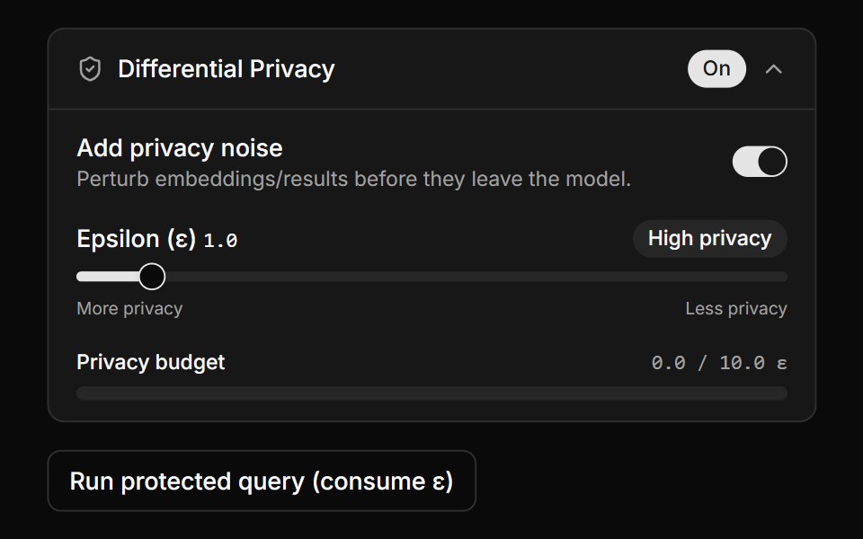 Differential Privacy ControlsLocalMode · ReactA collapsible DP settings panel (enable toggle, epsilon slider with derived High/Balanced/Low label, privacy-budget…
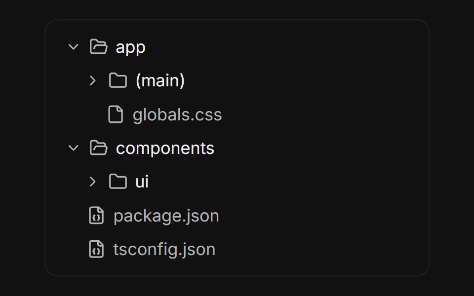 File treeFLX UI · ReactNested folders built from collapsible rows, with folder icons that swap on open.
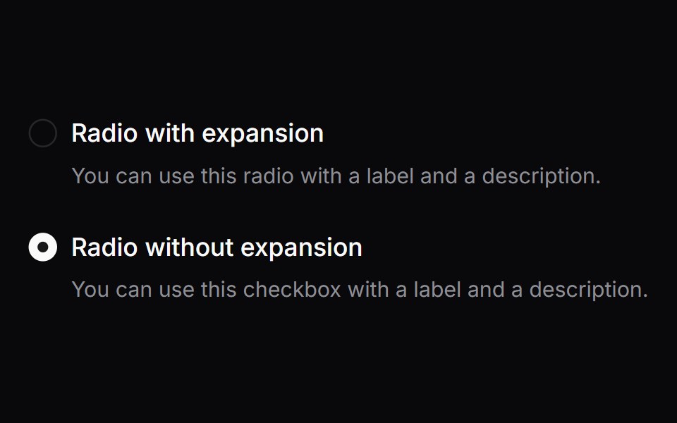 Comp 156Origin UI · React
 Wizard ExpandableCult UI · ReactExpandable multi-step wizard with optional forward validation, scrollable step rail, and Motion height transitions
 Collapsible animated cardReUI · ReactCollapsible animated card
 ReasoningAI Elements · ReactA collapsible component that displays AI reasoning content, automatically opening during streaming and closing when…
 Thinking StepsFluid Functionalism · ReactCollapsible AI reasoning steps with animated expand/collapse, per-step icons, sources, and nested details. Base UI…
 Collapsible 08 - Advanced OptionsShadcn Space · ReactWebhook form that hides a signing secret, retry count, and batching switch inside an animated Advanced options section.
 SourcesAI Elements (Svelte) · SvelteA collapsible sources list for rendering cited links and source groups.
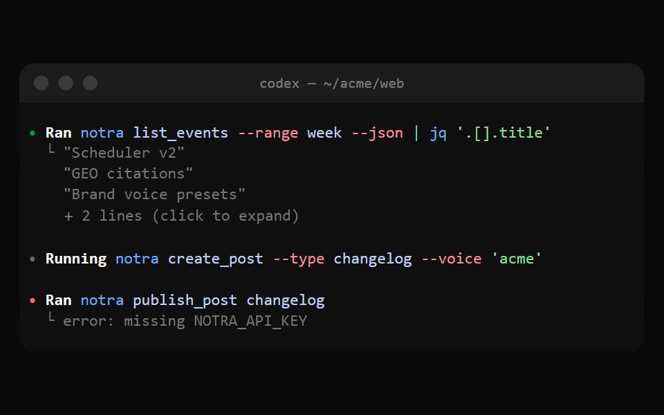 Codex ExecNotra · ReactA Ran cell with shell syntax colors and output folded behind + N lines.
 Collapsible 3Watermelon UI · React
 Read moreFLX UI · ReactTruncated paragraph reveals the rest; trigger label swaps to Show less.
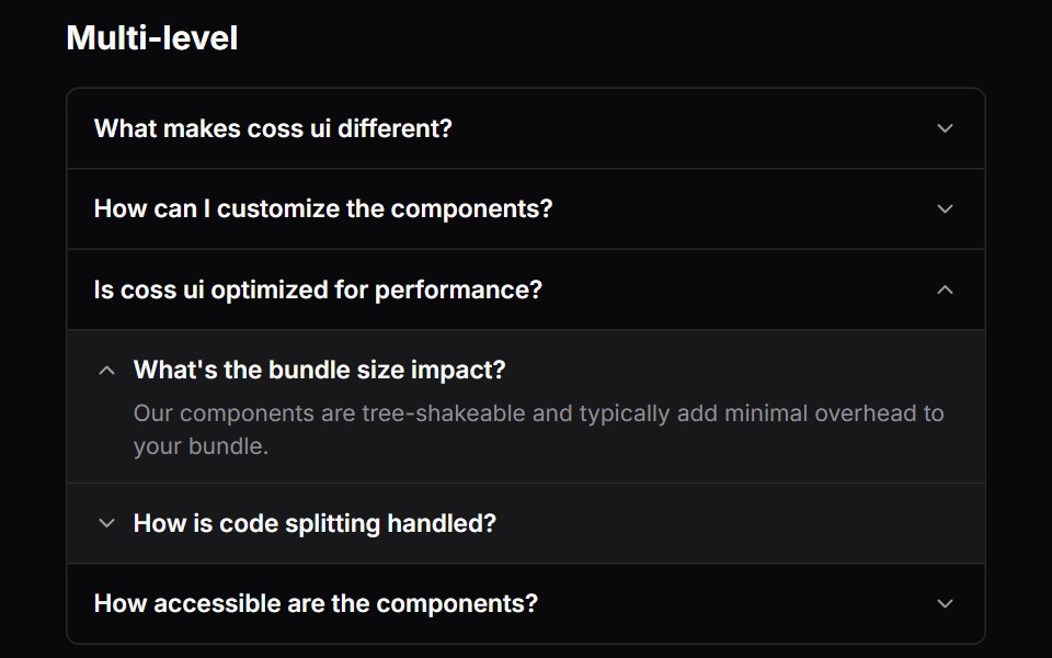 Comp 352Origin UI · React
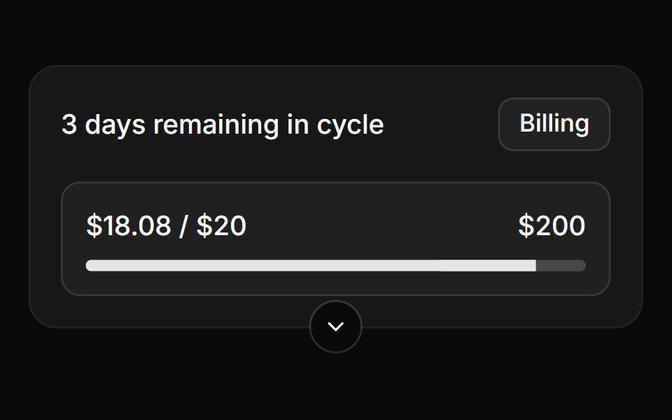 Collapsible card with bottom triggerReUI · ReactCollapsible card with bottom trigger
 SourcesAI Elements · ReactA component that allows a user to view the sources or citations used to generate a response.
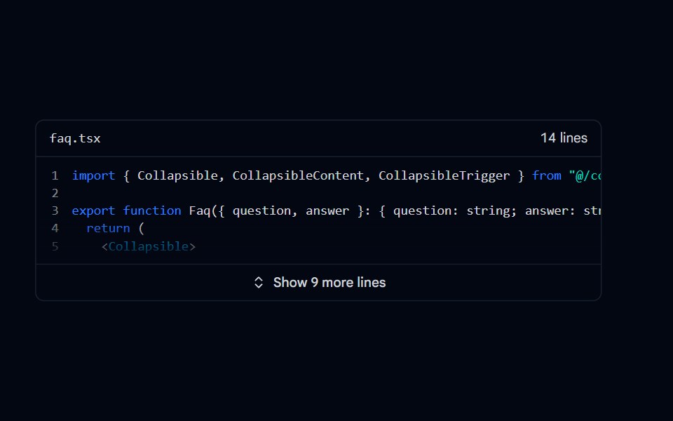 Collapsible 09 - Expandable CodeShadcn Space · ReactCode snippet that shows the first lines with line numbers and a fade, and expands to the full file with a Show more…
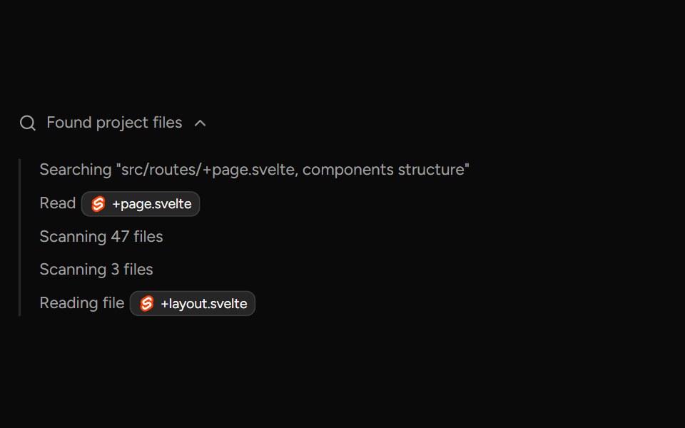 TaskAI Elements (Svelte) · SvelteA collapsible task panel for tracking task state and nested task items.
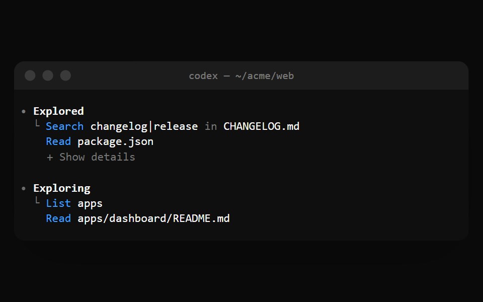 Codex ExploredNotra · ReactGrouped Read, Search and List calls with a + Show details fold.
 Collapsible 4Watermelon UI · React
 Sidebar nav groupFLX UI · ReactCollapsible navigation sections with sub-items and a rotating chevron.
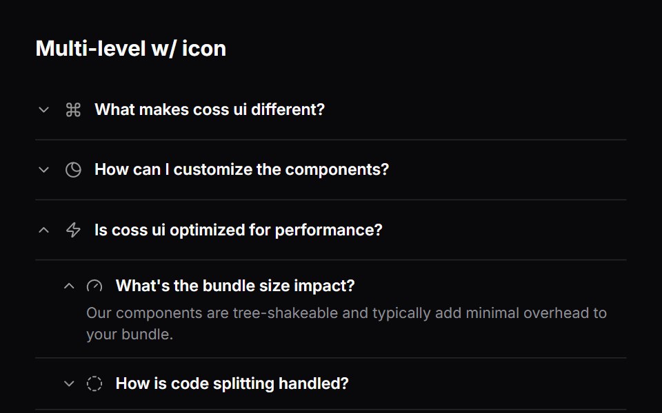 Comp 353Origin UI · React
 Collapsible form fieldsReUI · ReactCollapsible form fields
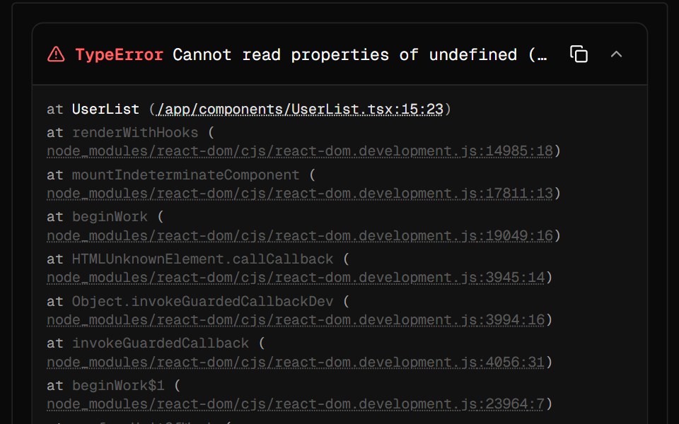 Stack TraceAI Elements · ReactDisplays formatted JavaScript/Node.js error stack traces with syntax highlighting and collapsible frames.
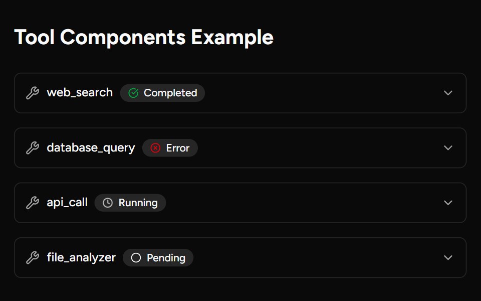 ToolAI Elements (Svelte) · SvelteA collapsible tool call block with parameter and result rendering.
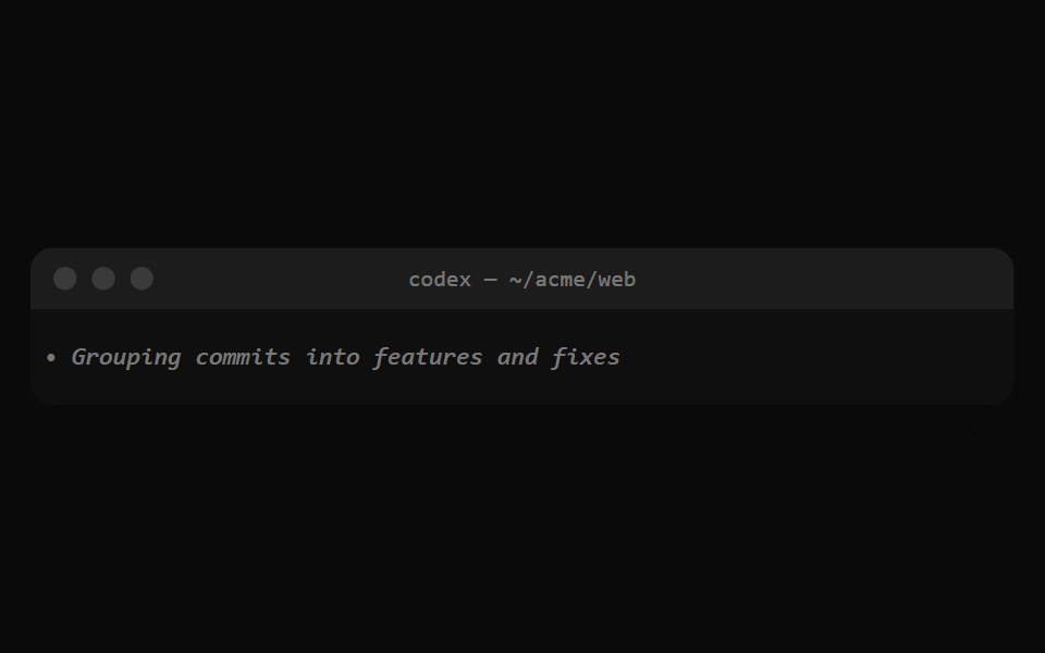 Codex ReasoningNotra · ReactThe dim italic summary Codex shows while it reasons.
 Collapsible 5Watermelon UI · React
 Advanced optionsFLX UI · ReactForm reveals extra fields behind an Advanced options toggle.
 Comp 482Origin UI · React
 Collapsible frameReUI · ReactCollapsible frame
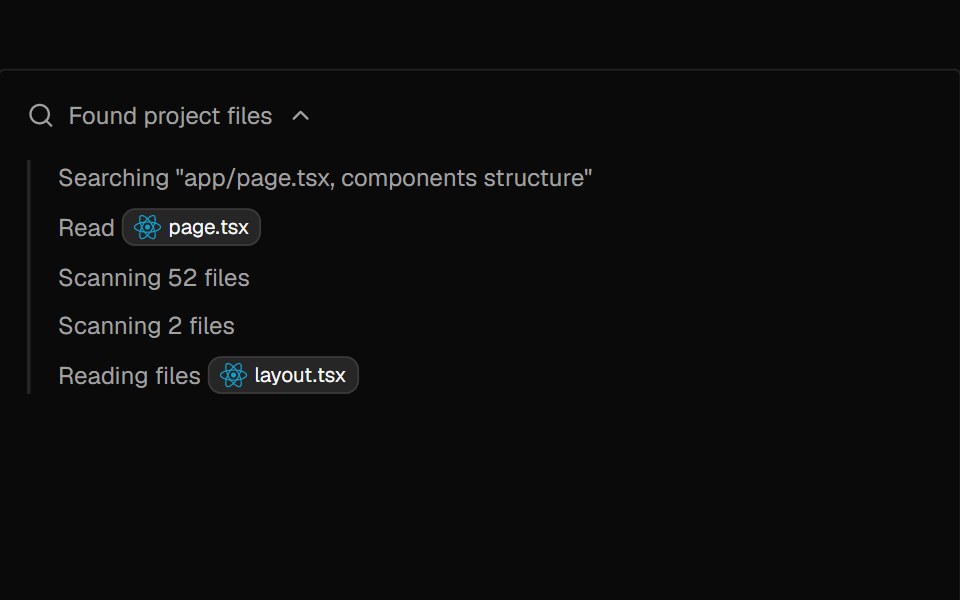 TaskAI Elements · ReactA collapsible task list component for displaying AI workflow progress, with status indicators and optional descriptions.
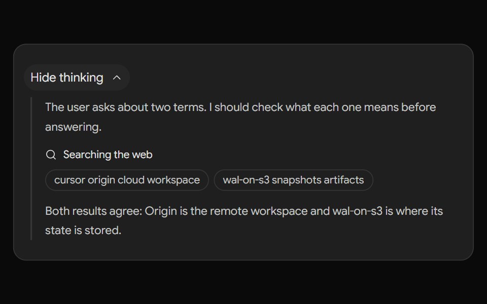 Gemini ThoughtsNotra · ReactThe "Show thinking" step with thoughts and searches.
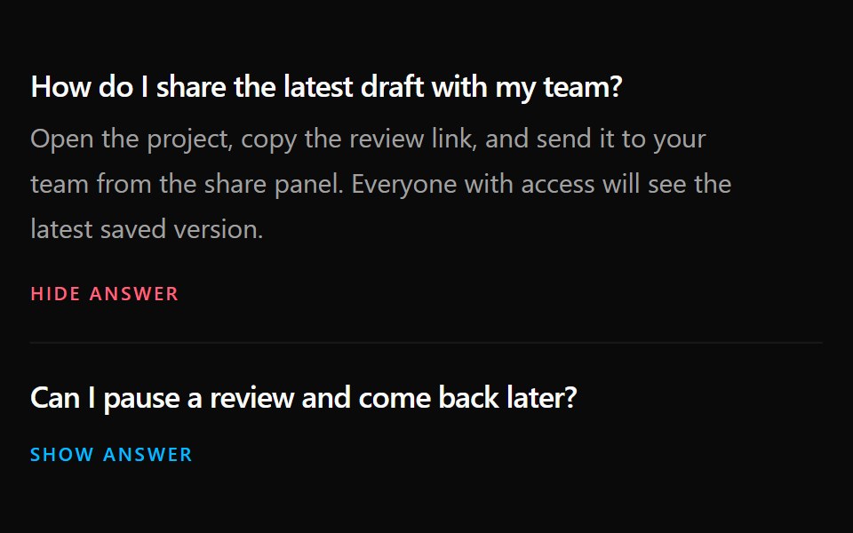 Collapsible 6Watermelon UI · React
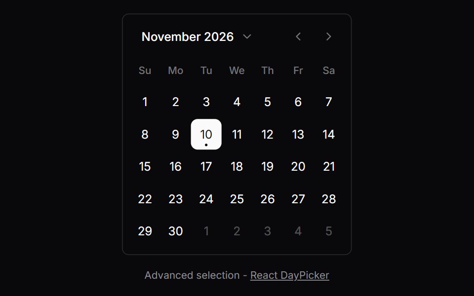 Comp 504Origin UI · React
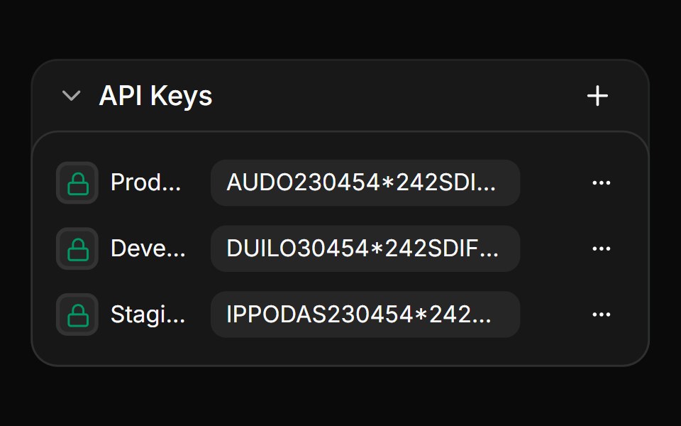 Nested collapsible list with actionsReUI · ReactNested collapsible list with actions
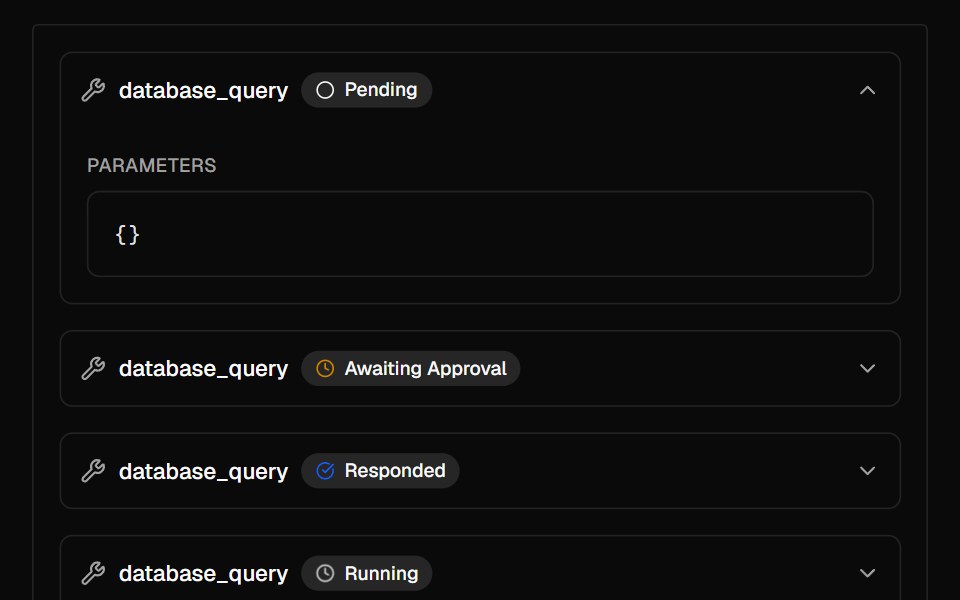 ToolAI Elements · ReactA collapsible component for displaying tool invocation details in AI chatbot interfaces.
 Collapsible 7Watermelon UI · React
 Collapsible User profileReUI · ReactCollapsible User profile
 Collapsible 8Watermelon UI · React
 Multi-level collapsible menuReUI · ReactMulti-level collapsible menu
 Collapsible 9Watermelon UI · React
Libraries with Tailwind CSS collapsible components
Related categories
- Collapsible Components
- React Collapsible Components
- Animated Collapsible Components
- shadcn/ui Collapsible Components
- Tailwind CSS Data Display Components
- Tailwind CSS Card Components
- Tailwind CSS Chart Components
- Tailwind CSS Table Components
- Tailwind CSS Avatar Components
- Tailwind CSS Stat Components
- Tailwind CSS List Components
- Tailwind CSS Calendar Components
- Tailwind CSS Accordion Components
- Tailwind CSS Data Table Components
- Tailwind CSS Carousel Components
- Tailwind CSS Avatar Group Components
- Tailwind CSS Stat Card Components
- Tailwind CSS Bar Chart Components
- Tailwind CSS Tree View Components
- Tailwind CSS Card Stack Components