 Dev Design Library
shadcn/ui Collapsible Components
Dev Design Library indexes 39 shadcn/ui collapsible components from 9 open-source UI libraries, with the most coming from Watermelon UI, Notra, AI Elements (Svelte), FLX UI and Shadcn Space. Each one links to its page with the source code, a live preview where available, the library license and the install command. They follow the shadcn/ui conventions, so most install with the shadcn CLI and drop into a Tailwind project. Collapsible components belong to the Data display group.
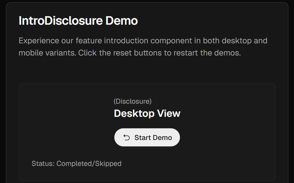 Intro DisclosureCult UI · ReactIntro disclosure component with expandable content and smooth animations
 show-moreIntent UI · Reactshow-more
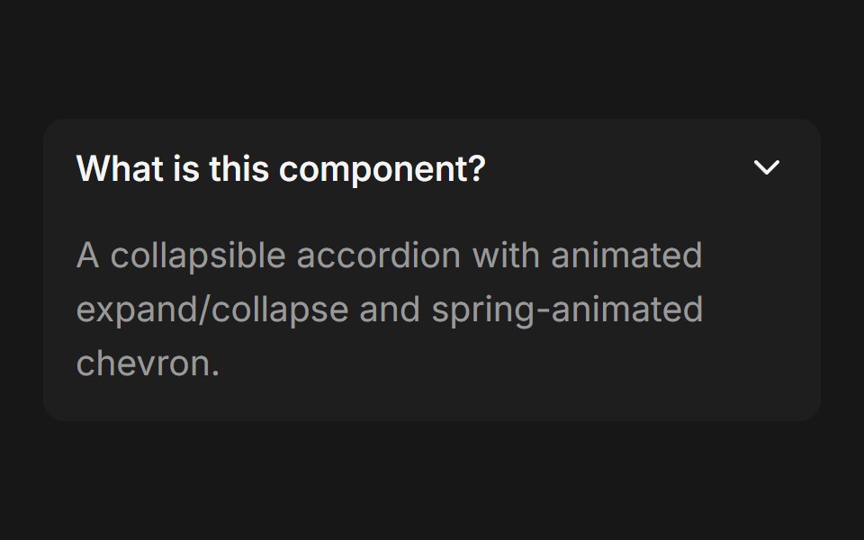 AccordionFluid Functionalism · ReactCollapsible accordion with animated height transitions, spring-animated chevron, and fluid hover in grouped mode…
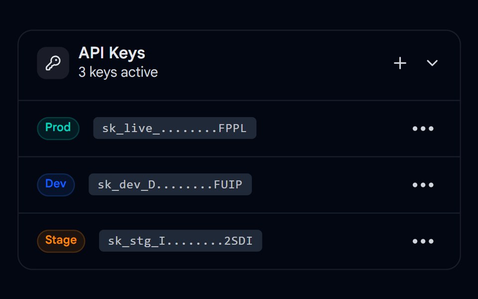 Collapsible 03 - API Keys ManagerShadcn Space · ReactA collapsible API keys panel with copy-to-clipboard, delete actions, and a dropdown context menu per key.
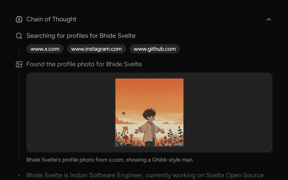 Chain Of ThoughtAI Elements (Svelte) · SvelteA collapsible component that visualizes AI reasoning steps with support for search results, images, and step-by-step…
 AI OverviewNotra · ReactThe AI Overview root, built on shadcn Collapsible and Button, with a collapsible Show more.
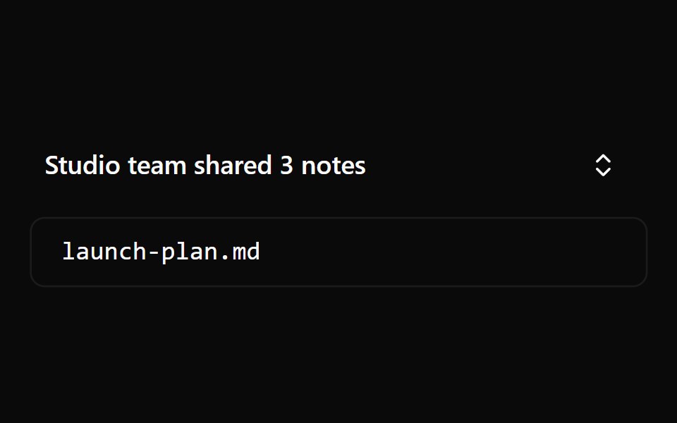 Collapsible 1Watermelon UI · React
 CollapsibleCojeev UI · ReactShows or hides one optional section without leaving the surrounding layout.
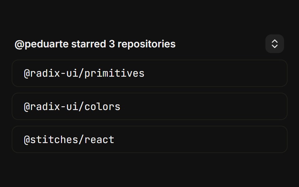 BasicFLX UI · ReactCanonical starred-repos toggle with a chevron trigger.
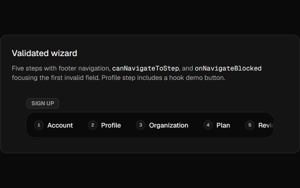 Wizard ExpandableCult UI · ReactExpandable multi-step wizard with optional forward validation, scrollable step rail, and Motion height transitions
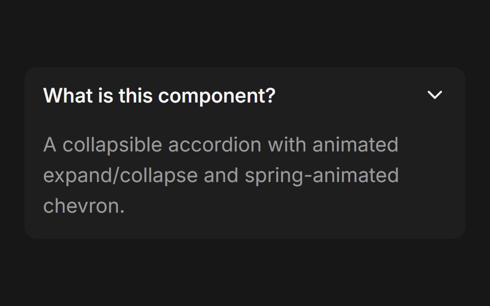 Accordion (Base UI)Fluid Functionalism · ReactCollapsible accordion with animated height transitions, spring-animated chevron, and fluid hover in grouped mode. Base…
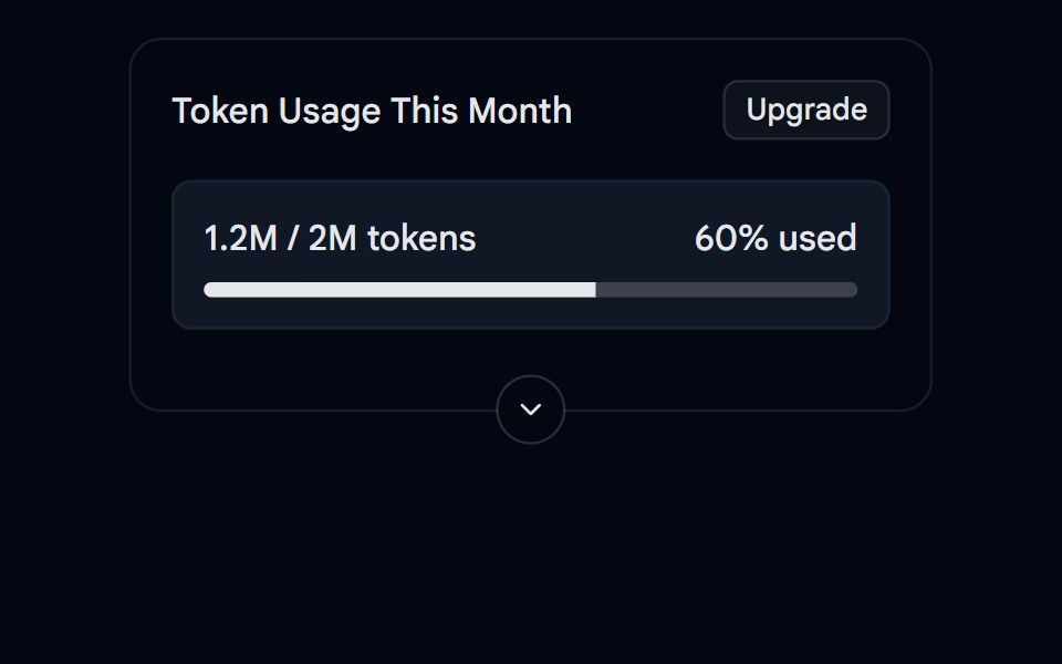 Collapsible 05 - Token UsageShadcn Space · ReactA collapsible usage card with a progress bar, summary and details.
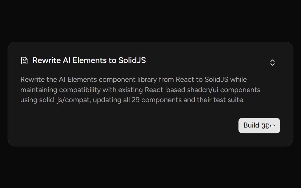 PlanAI Elements (Svelte) · SvelteA plan card component with collapsible content and streaming-aware description shimmer.
 ChatGPT ReasoningNotra · ReactThe collapsible "Worked for Ns" trace, built on shadcn Collapsible.
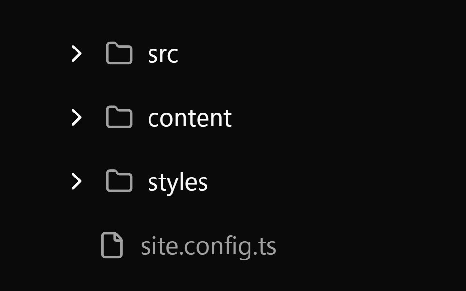 Collapsible 2Watermelon UI · React
 FAQ listFLX UI · ReactStacked question rows; each answer expands with an animated chevron.
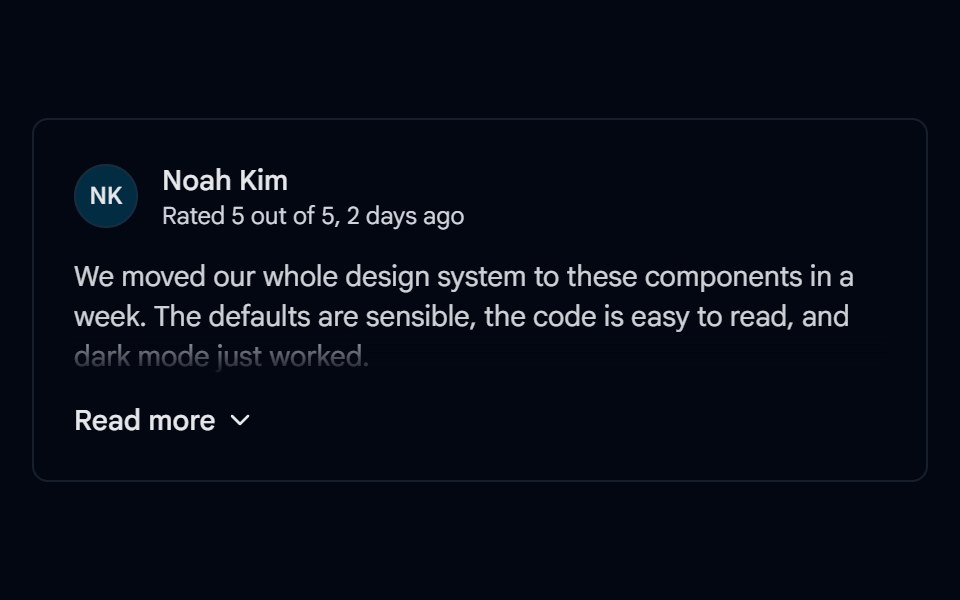 Collapsible 06 - Read MoreShadcn Space · ReactReview card that shows the first paragraph with a fade and expands the full text with a Read more / Show less toggle.
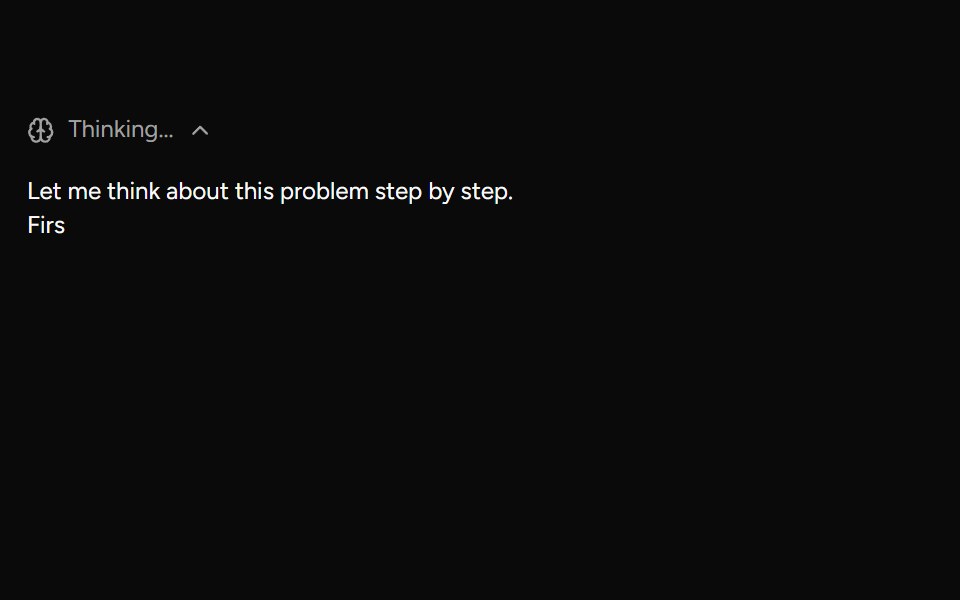 ReasoningAI Elements (Svelte) · SvelteA collapsible reasoning block that tracks streaming duration and renders a markdown response.
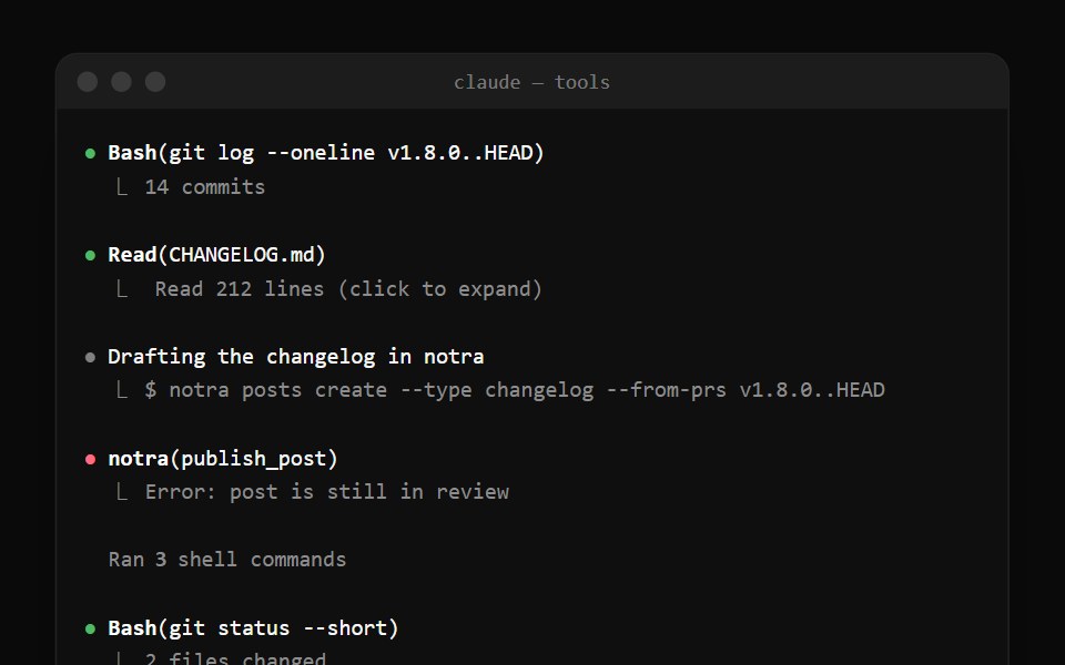 Claude Code Tool CallNotra · ReactTool calls with a status bullet and a ⎿ result line, plus the collapsed "Ran 3 shell commands" summary.
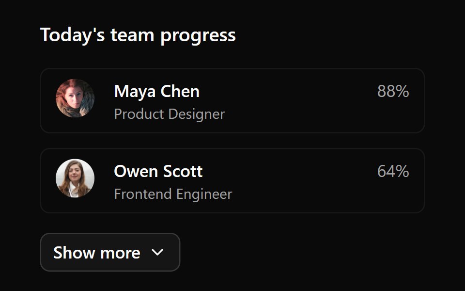 Collapsible 3Watermelon UI · React
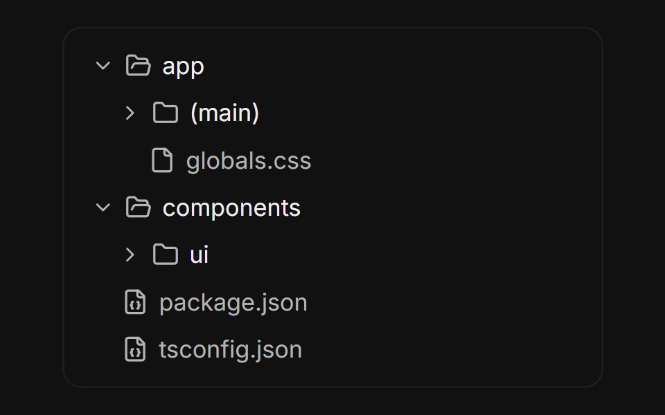 File treeFLX UI · ReactNested folders built from collapsible rows, with folder icons that swap on open.
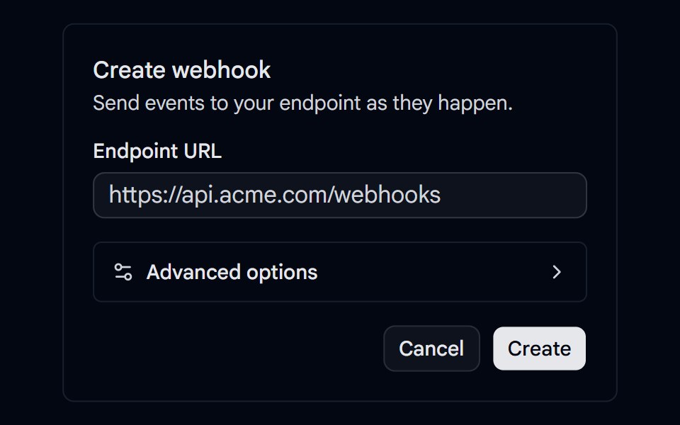 Collapsible 08 - Advanced OptionsShadcn Space · ReactWebhook form that hides a signing secret, retry count, and batching switch inside an animated Advanced options section.
 SourcesAI Elements (Svelte) · SvelteA collapsible sources list for rendering cited links and source groups.
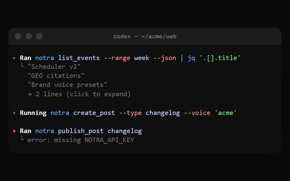 Codex ExecNotra · ReactA Ran cell with shell syntax colors and output folded behind + N lines.
 Collapsible 4Watermelon UI · React
 Read moreFLX UI · ReactTruncated paragraph reveals the rest; trigger label swaps to Show less.
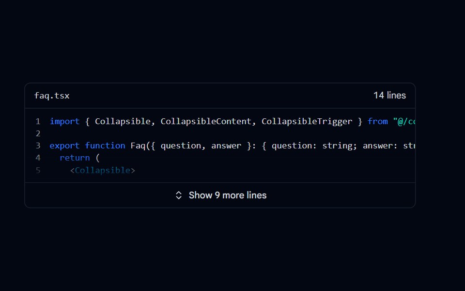 Collapsible 09 - Expandable CodeShadcn Space · ReactCode snippet that shows the first lines with line numbers and a fade, and expands to the full file with a Show more…
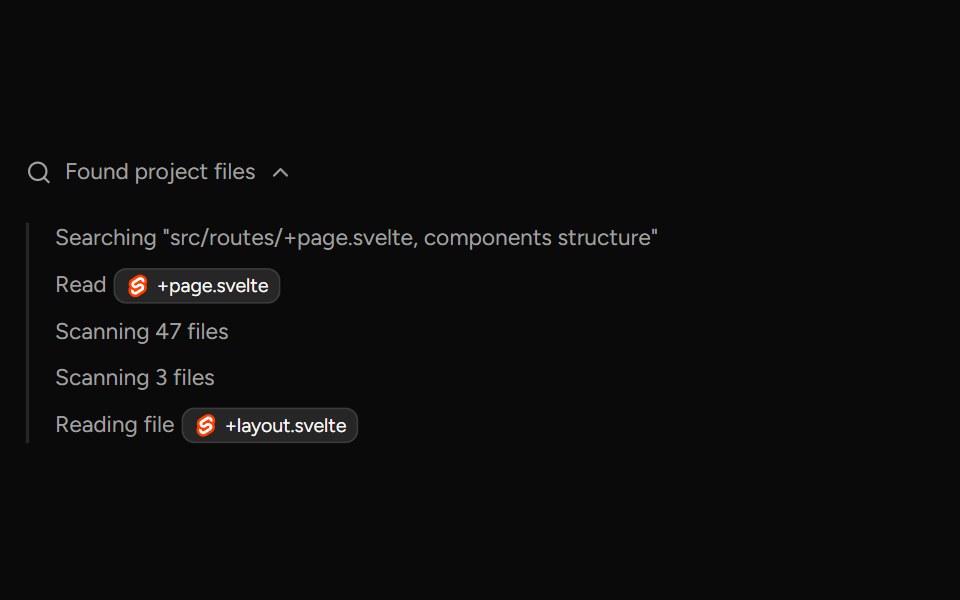 TaskAI Elements (Svelte) · SvelteA collapsible task panel for tracking task state and nested task items.
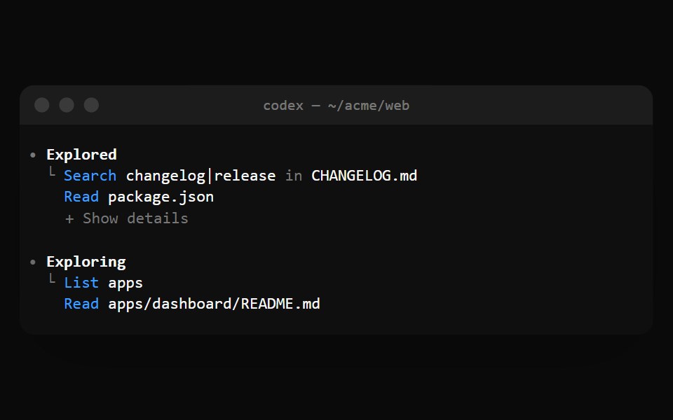 Codex ExploredNotra · ReactGrouped Read, Search and List calls with a + Show details fold.
 Collapsible 5Watermelon UI · React
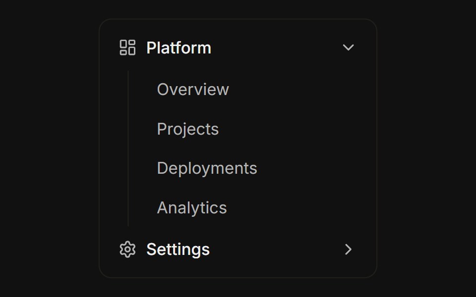 Sidebar nav groupFLX UI · ReactCollapsible navigation sections with sub-items and a rotating chevron.
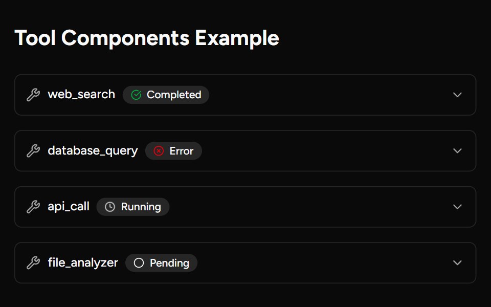 ToolAI Elements (Svelte) · SvelteA collapsible tool call block with parameter and result rendering.
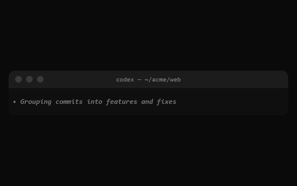 Codex ReasoningNotra · ReactThe dim italic summary Codex shows while it reasons.
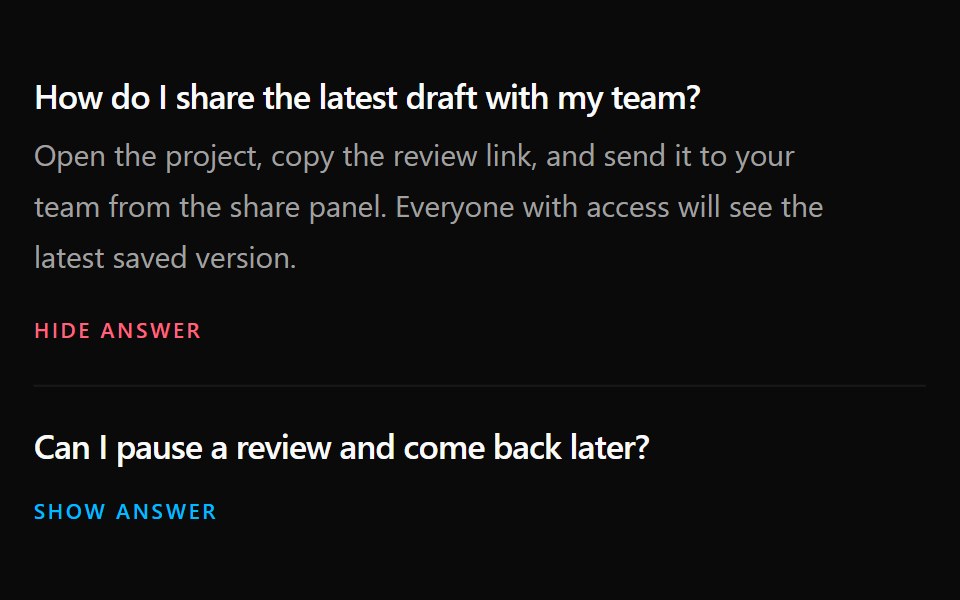 Collapsible 6Watermelon UI · React
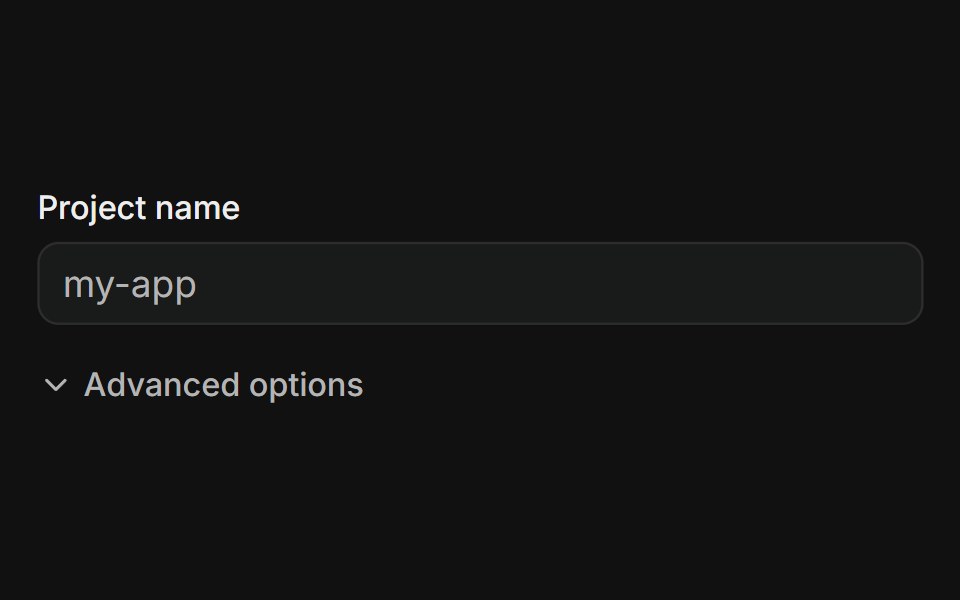 Advanced optionsFLX UI · ReactForm reveals extra fields behind an Advanced options toggle.
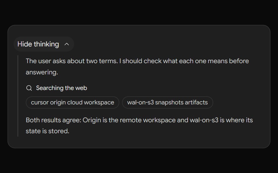 Gemini ThoughtsNotra · ReactThe "Show thinking" step with thoughts and searches.
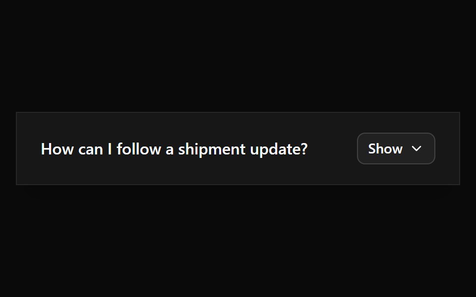 Collapsible 7Watermelon UI · React
 Collapsible 8Watermelon UI · React
 Collapsible 9Watermelon UI · React
Libraries with shadcn/ui collapsible components
Related categories
- Collapsible Components
- React Collapsible Components
- Tailwind CSS Collapsible Components
- Animated Collapsible Components
- shadcn/ui Data Display Components
- shadcn/ui Card Components
- shadcn/ui Table Components
- shadcn/ui Avatar Components
- shadcn/ui Data Table Components
- shadcn/ui Accordion Components
- shadcn/ui Stat Components
- shadcn/ui List Components
- shadcn/ui Chart Components
- shadcn/ui Calendar Components
- shadcn/ui Stat Card Components
- shadcn/ui Avatar Group Components
- shadcn/ui Tree View Components
- shadcn/ui Carousel Components
- shadcn/ui Testimonial Components
- shadcn/ui Filter Bar Components