 Dev Design Library
shadcn/ui Data Display Components
Dev Design Library indexes 608 shadcn/ui data display components from 28 open-source UI libraries, with the most coming from Watermelon UI, FLX UI, Shadcn Space, sv-particles and Spectrum UI. Each one links to its page with the source code, a live preview where available, the library license and the install command. They follow the shadcn/ui conventions, so most install with the shadcn CLI and drop into a Tailwind project.
Showing 120 of 608, a mix from every library. Open a library to see all of its components.
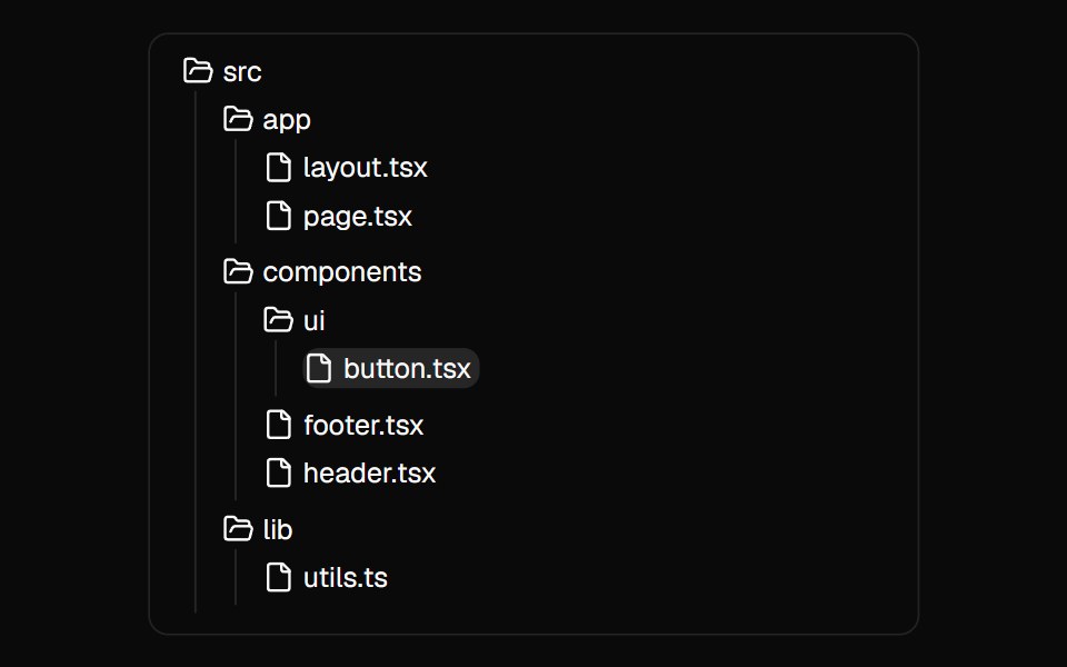 File TreeMagic UI · ReactA component used to showcase the folder and file structure of a directory.
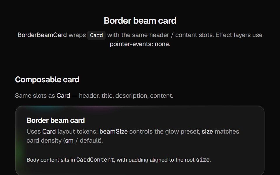 Border Beam CardCult UI · Reactborder-beam around compound Card API with balanced title and description
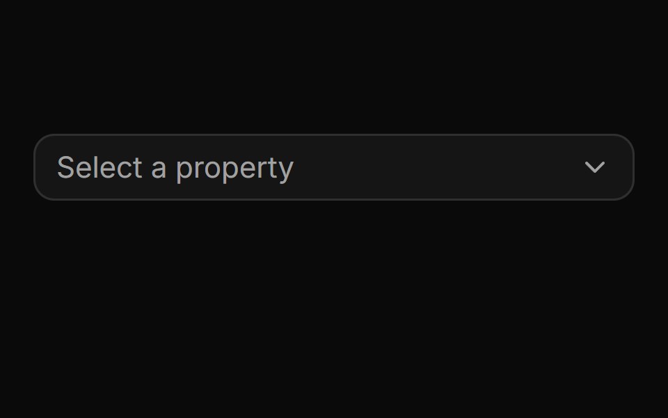 Pinned footer with a side-anchored import flyout.ReUI · ReactPinned footer with a side-anchored import flyout.
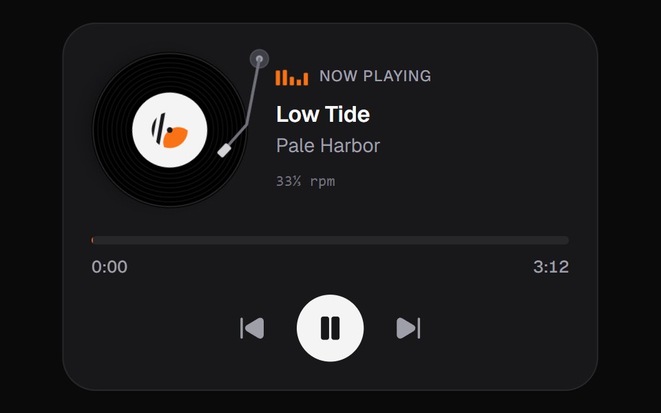 Now PlayingKokonut UI · ReactMusic card with a spinning disc you can grab and turn to scrub, built with React and Tailwind CSS.
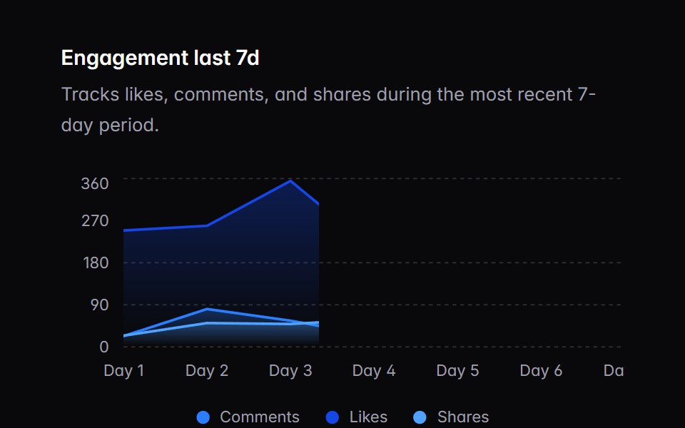 chart-01Intent UI · Reactchart-01
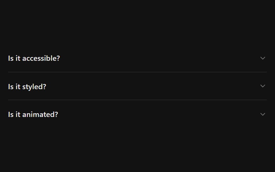 AccordionSpectrum UI · Reactcomponent for the Accordion
 Books ShowcaseVengeance UI · React
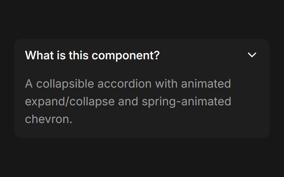 AccordionFluid Functionalism · ReactCollapsible accordion with animated height transitions, spring-animated chevron, and fluid hover in grouped mode…
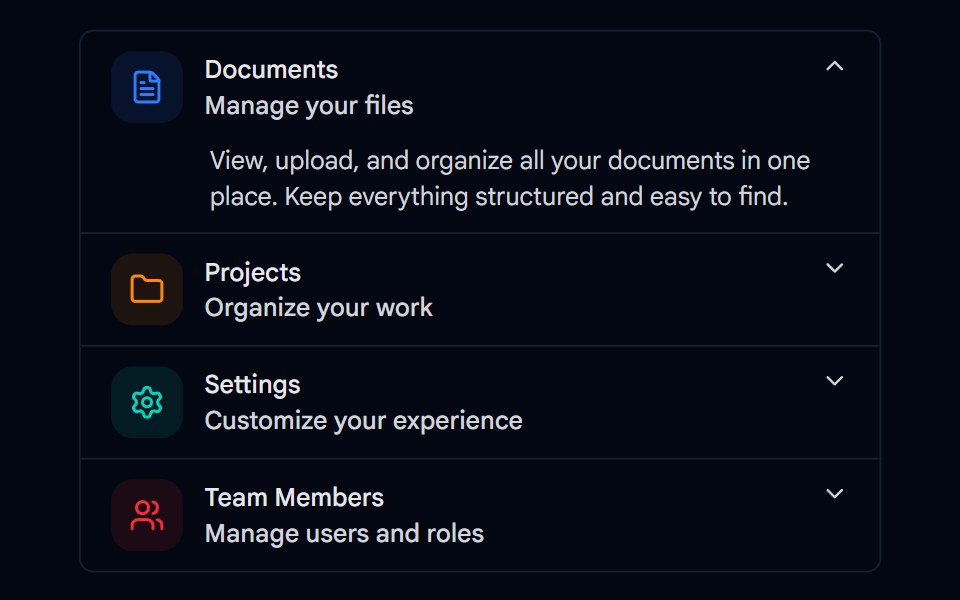 Accordion-01 - DefaultShadcn Space · ReactDefault accordion component
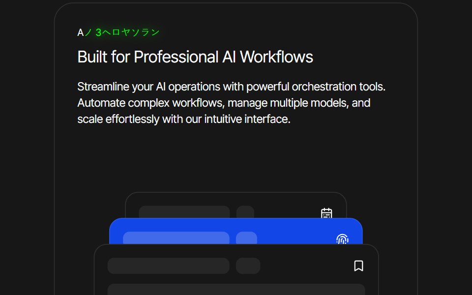 Card AnimationPixel Perfect · ReactFramer Motion card animation.
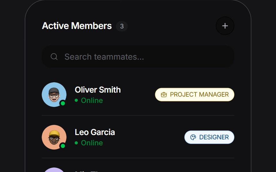 Stacked Listuselayouts · ReactAn expandable list widget with a stacked layout and smooth morphing transitions.
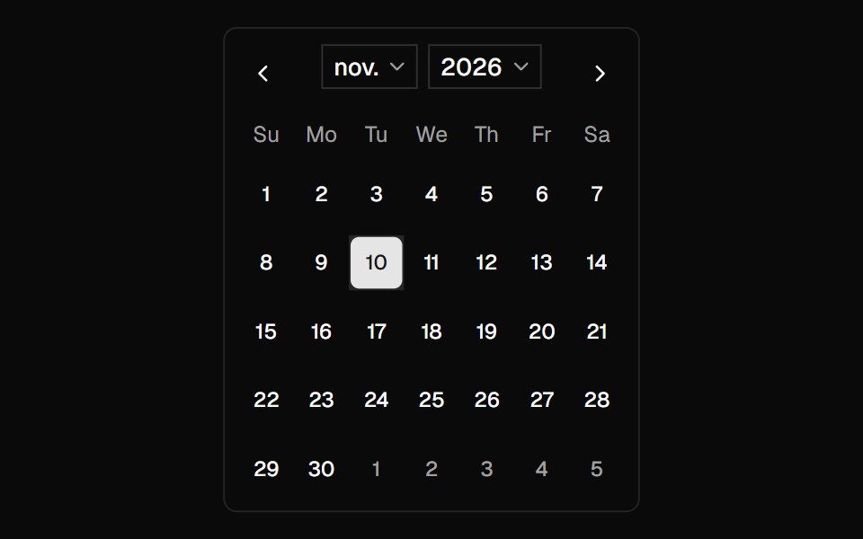 CalendarShadcn Dashboard · React
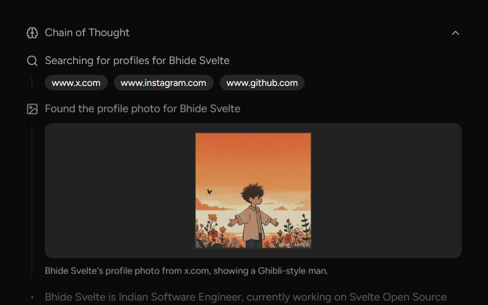 Chain Of ThoughtAI Elements (Svelte) · SvelteA collapsible component that visualizes AI reasoning steps with support for search results, images, and step-by-step…
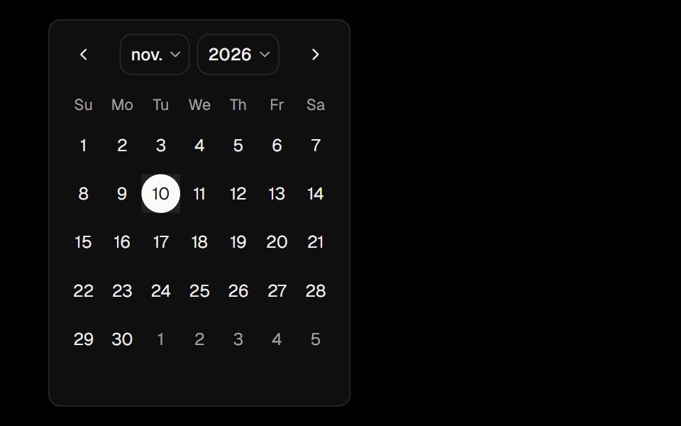 CalendarObsidianUI · React
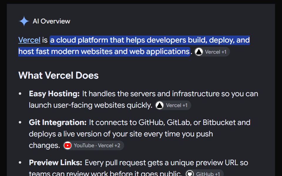 AI OverviewNotra · ReactThe AI Overview root, built on shadcn Collapsible and Button, with a collapsible Show more.
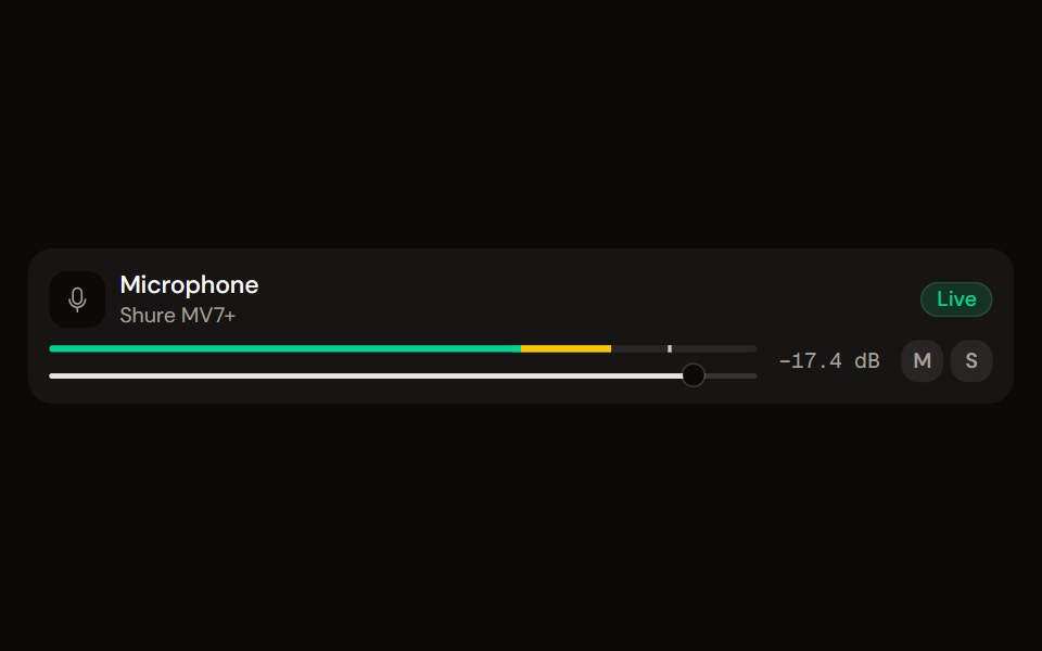 Channel Stripaudiocn · ReactOne channel of a mixer: header, status, meter, fader, value, controls and a notice, as a row or a console strip. The…
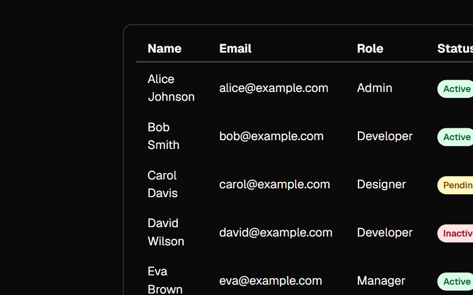 tableBaseLayer · ReactA table displays data in rows and columns and enables a user to navigate its contents via directional navigation keys…
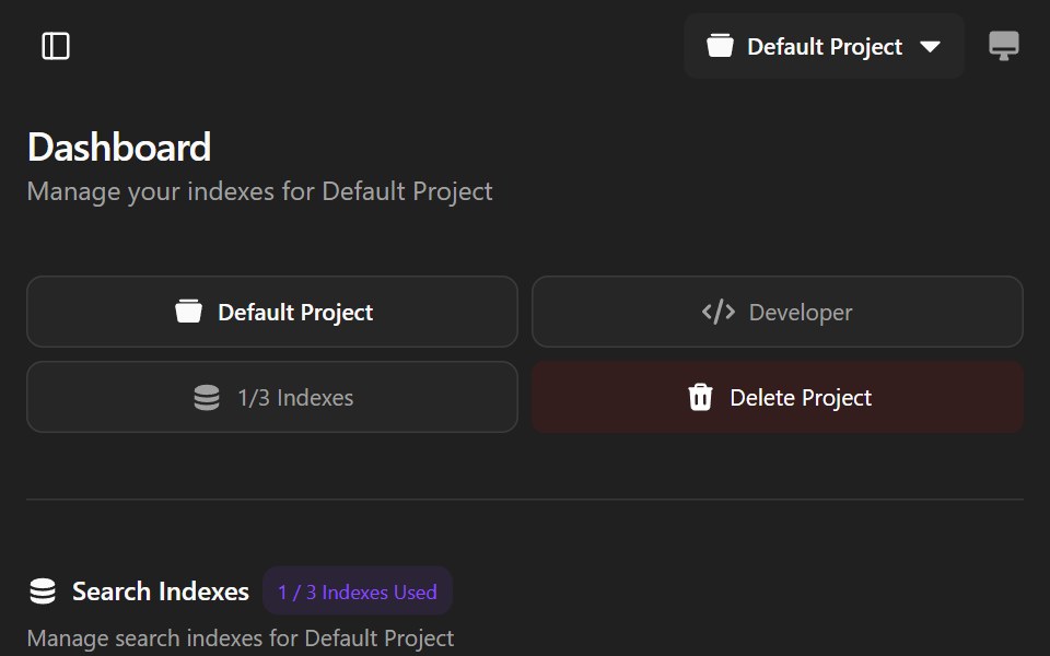 Agndex DashboardWatermelon UI · ReactA developer portal for managing search indexes, API credentials, billing, and project settings with light and dark…
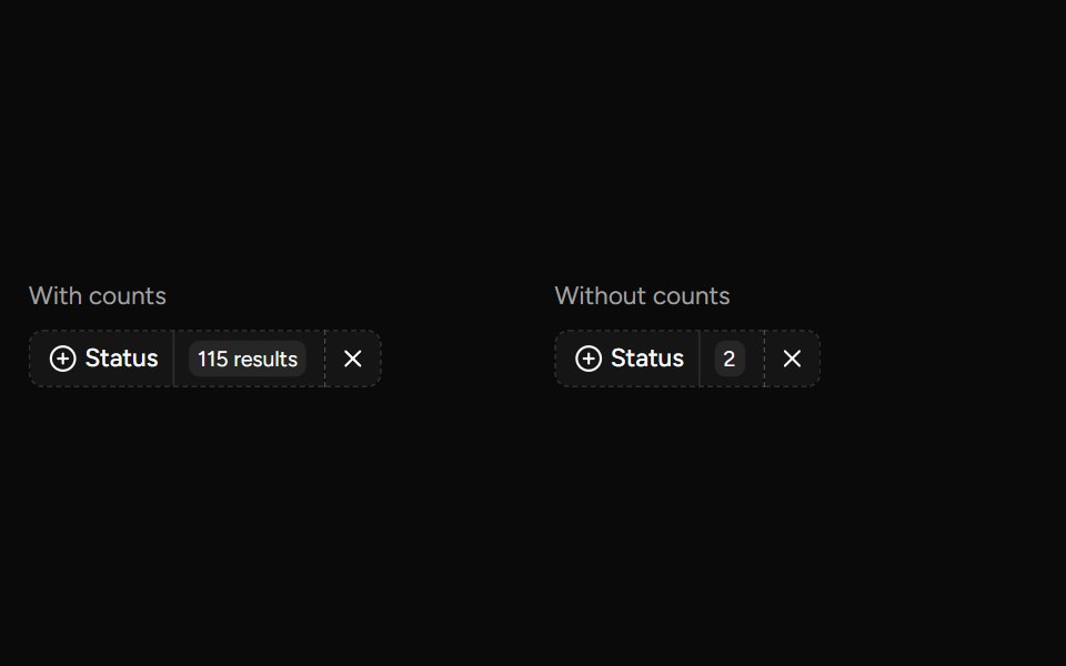 Data Table Faceted Filtersv-table · SvelteA searchable multi-select filter with live counts for categorical table columns.
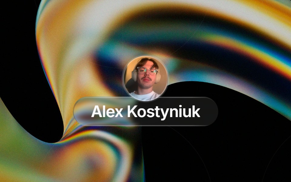 Glass Contact Pillglasscn · ReactLiquid-glass contact chip with an avatar (image or initials fallback) and name, for messaging apps
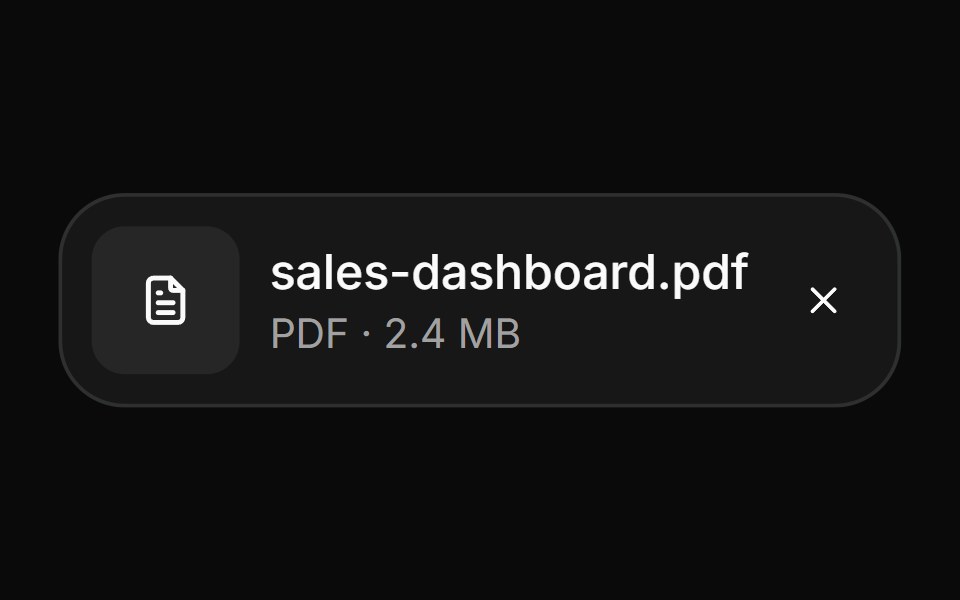 AttachmentHextaUI · ReactFile and image cards for uploads, with progress, states, actions, a full-card trigger and names that keep their…
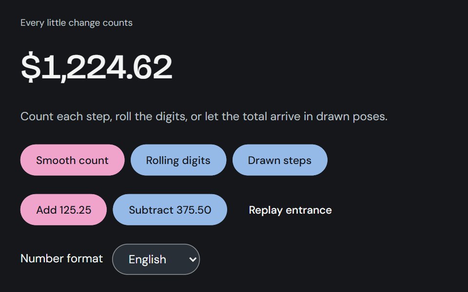 Animated numberCojeev UI · ReactA smooth, interruptible number transition for totals, metrics and small moments of progress.
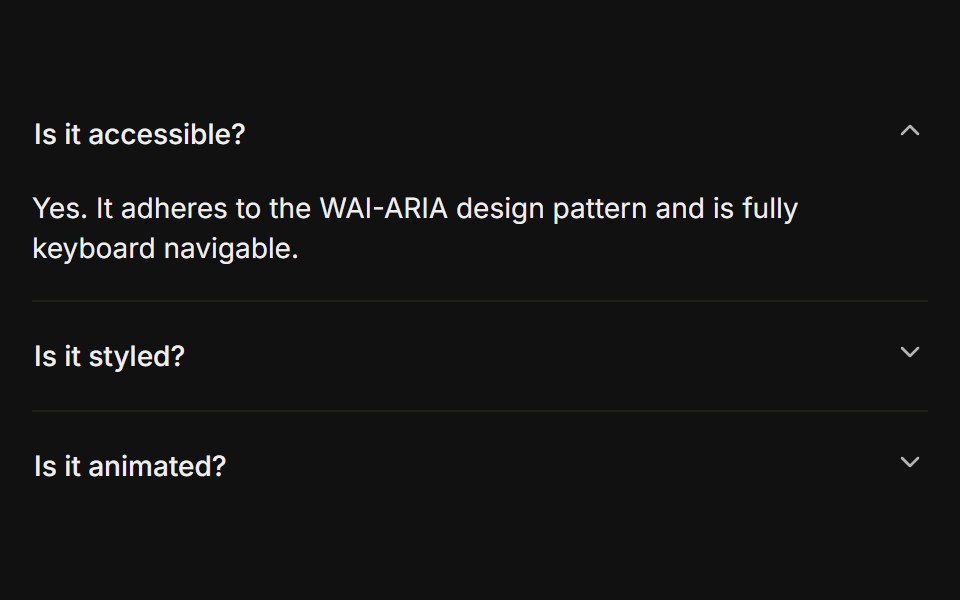 BasicFLX UI · ReactOnly one section open at a time, type="single" collapsible. The default behavior.
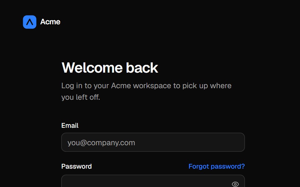 Split login pageVelora UI · ReactLogin form with password reveal, remember-me and social sign-in beside an aurora testimonial panel.
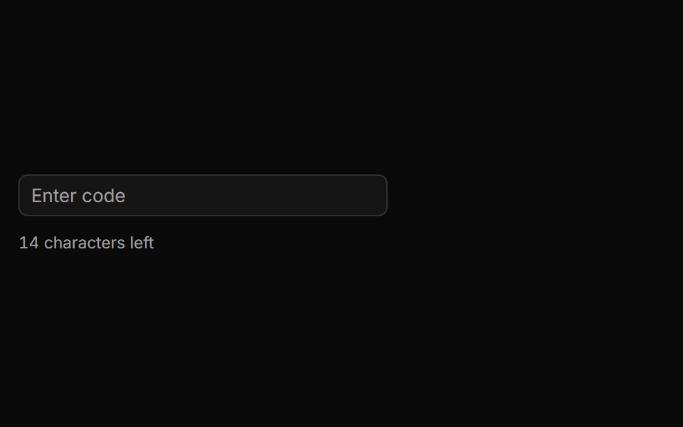 Characters Remaining Countsv-particles · SvelteText input that shows how many characters are still left before the limit.
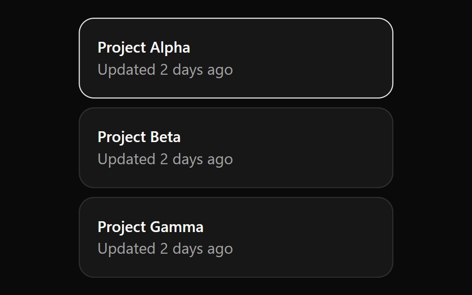 CardOUI · ReactCardGridListItem for shadcn Card.
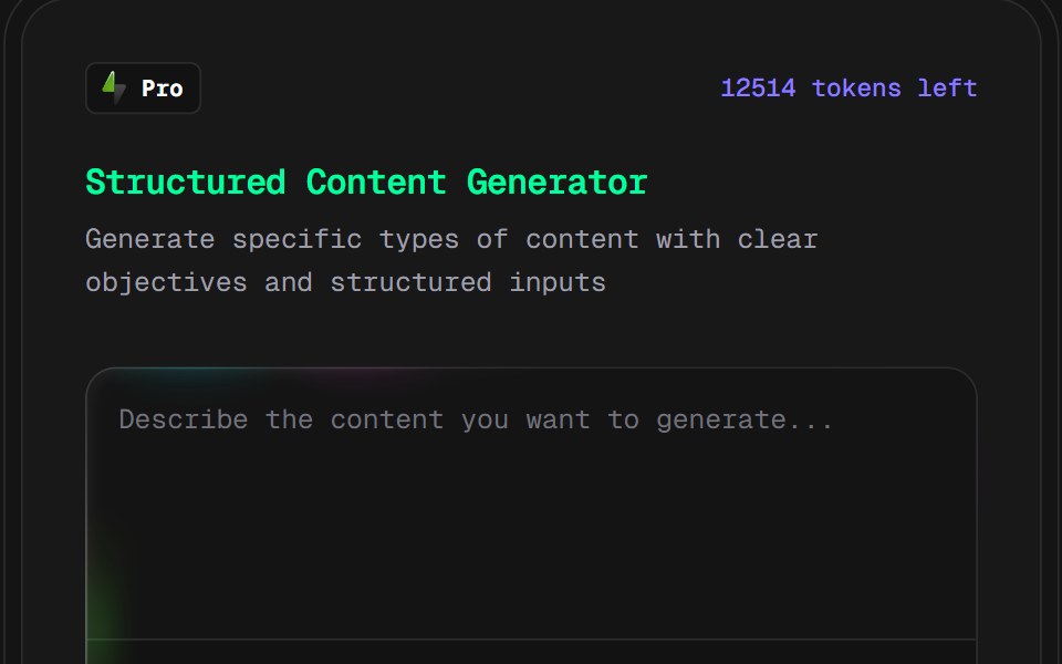 AI Content Creator CardD2Studio UI · ReactPro version content creation card
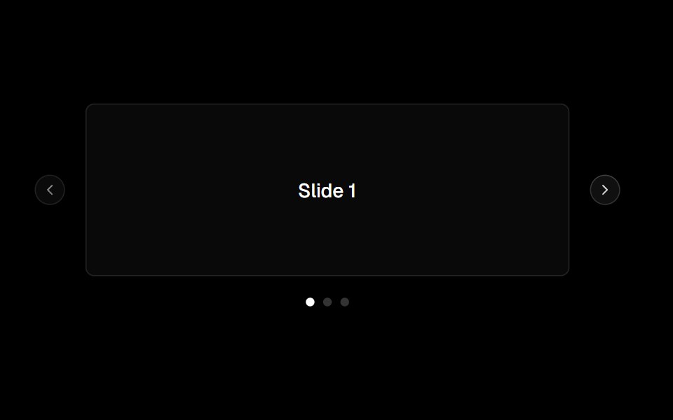 Carouselark-cn · ReactA shadcn-style carousel component built with Ark UI primitives.
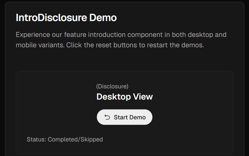 Intro DisclosureCult UI · ReactIntro disclosure component with expandable content and smooth animations
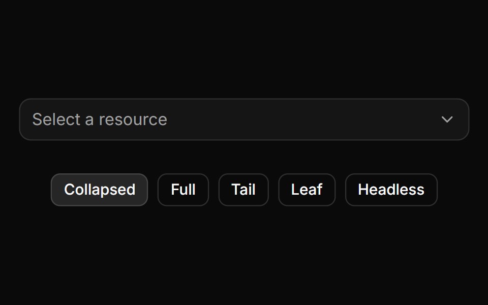 Trigger path formatting and collapsing.ReUI · ReactTrigger path formatting and collapsing.
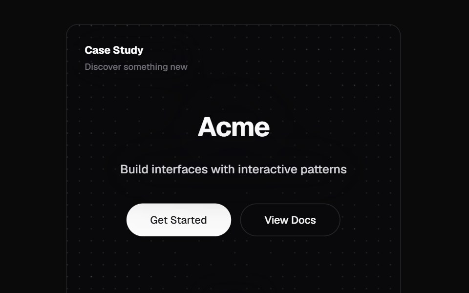 Mouse Effect CardKokonut UI · ReactInteractive card with an animated dot pattern that repels away from the cursor, powered by React, Tailwind CSS and…
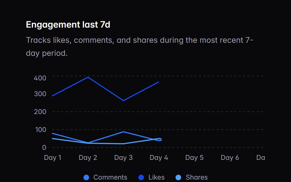 chart-02Intent UI · Reactchart-02
 Animated TestimonialsSpectrum UI · Reactcomponent for the Animated Testimonials
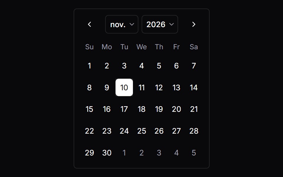 CalendarVengeance UI · React
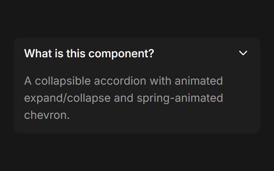 Accordion (Base UI)Fluid Functionalism · ReactCollapsible accordion with animated height transitions, spring-animated chevron, and fluid hover in grouped mode. Base…
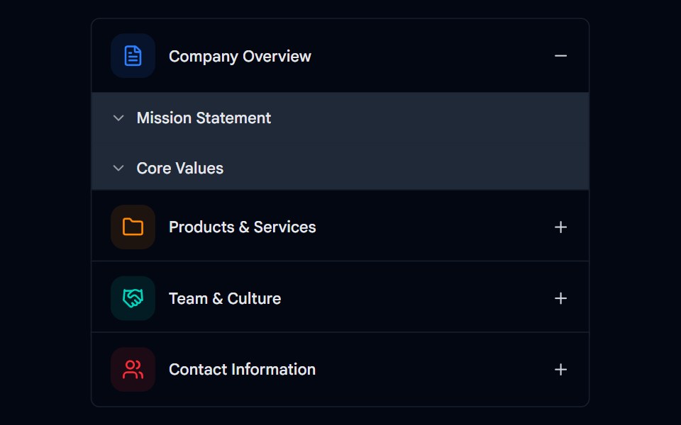 Accordion-02 - Multi-levelShadcn Space · ReactMulti-level accordion component
 CarouselShadcn Dashboard · React
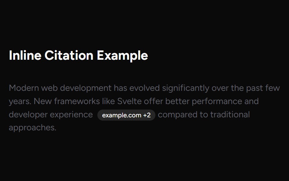 Inline CitationAI Elements (Svelte) · SvelteAn inline citation system with hover cards and carousel views for source-backed AI content.
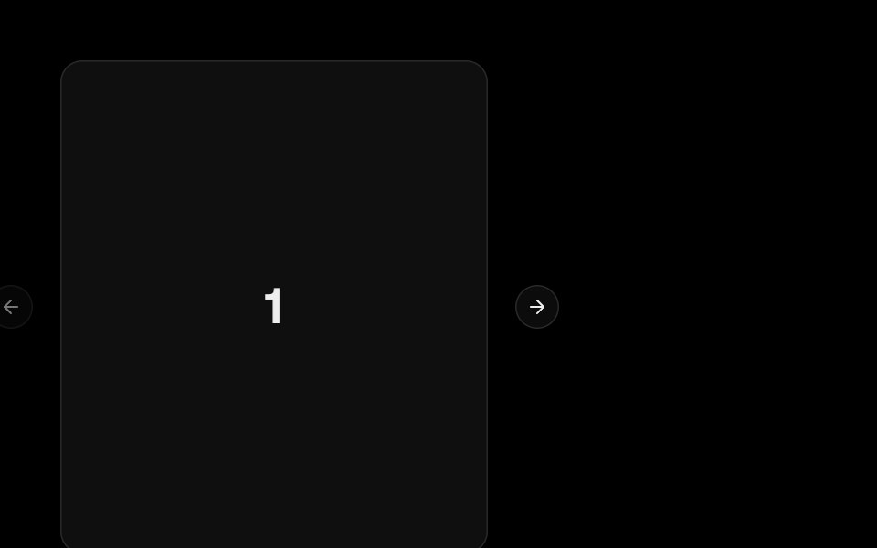 CarouselObsidianUI · React
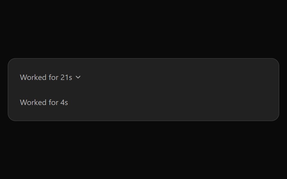 ChatGPT ReasoningNotra · ReactThe collapsible "Worked for Ns" trace, built on shadcn Collapsible.
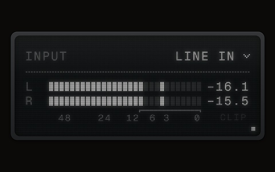 LCD Meteraudiocn · ReactA recorder-style level meter on an LCD Display's screen: block segments in the display's ink that light whole, a held…
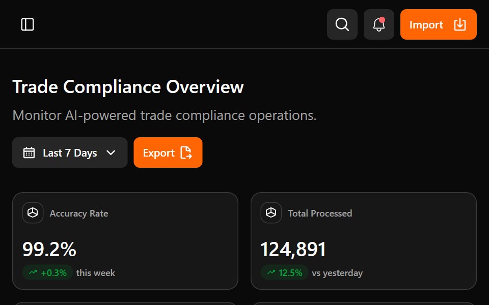 Astrix DashboardWatermelon UI · ReactA trade compliance workspace with AI classification metrics, a live pipeline, HS code stream review, and light and…
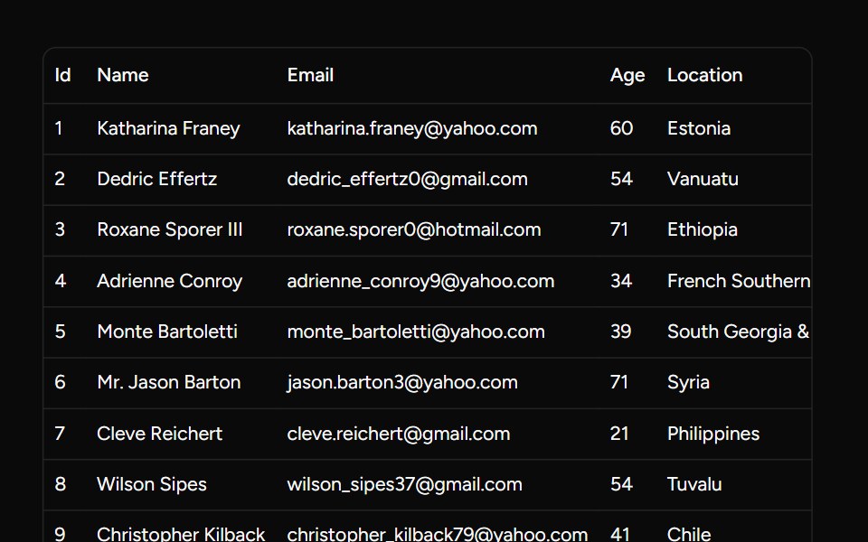 Basic Data Tablesv-table · Svelte
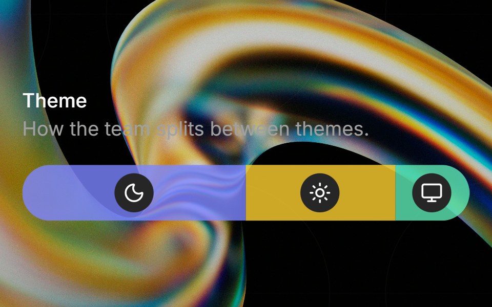 Preferenceglasscn · ReactA weighted preference bar with icon badges, hover tinting, and tooltip descriptions.
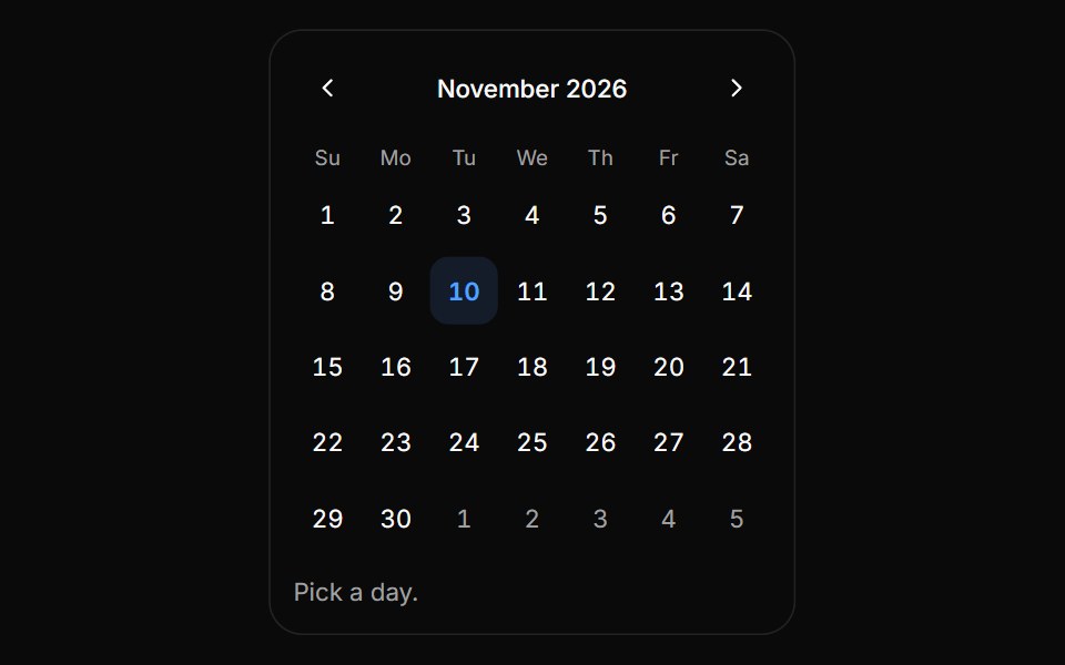 CalendarHextaUI · ReactA date grid for single, range and multiple selection, with sliding months, range previews and touch-sized days.
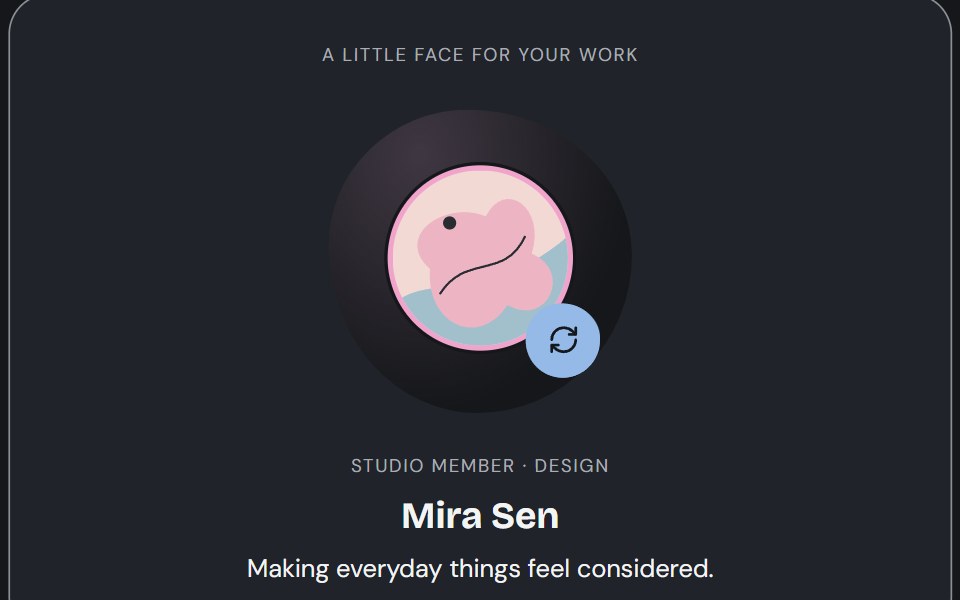 AvatarCojeev UI · ReactPortraits, identity rows and participant groups that keep the person recognizable—with artwork, initials and…
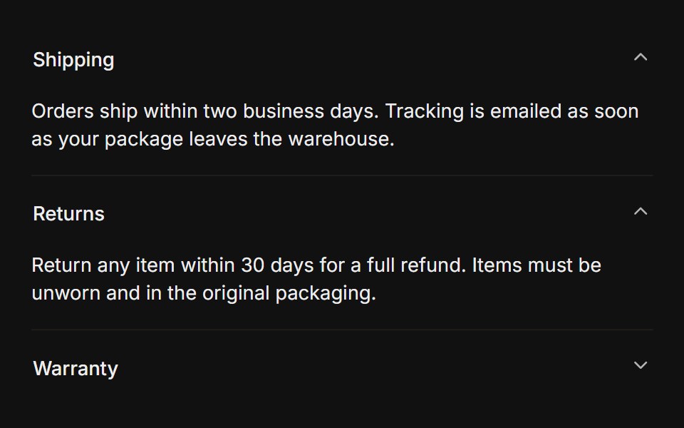 MultipleFLX UI · Reacttype="multiple" keeps several sections open at once.
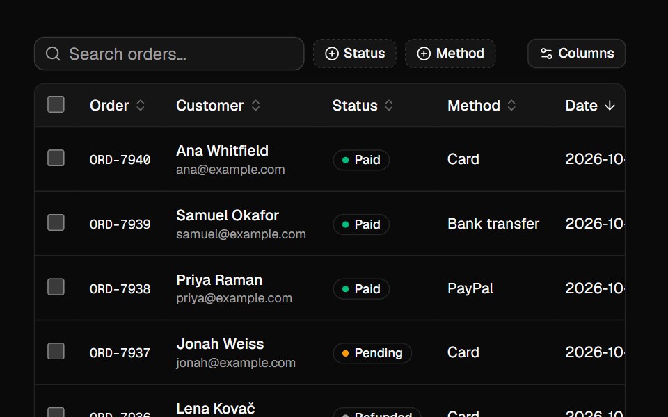 Data GridVelora UI · ReactSortable, searchable, filterable table with selection, column toggles and pagination, built on TanStack Table.
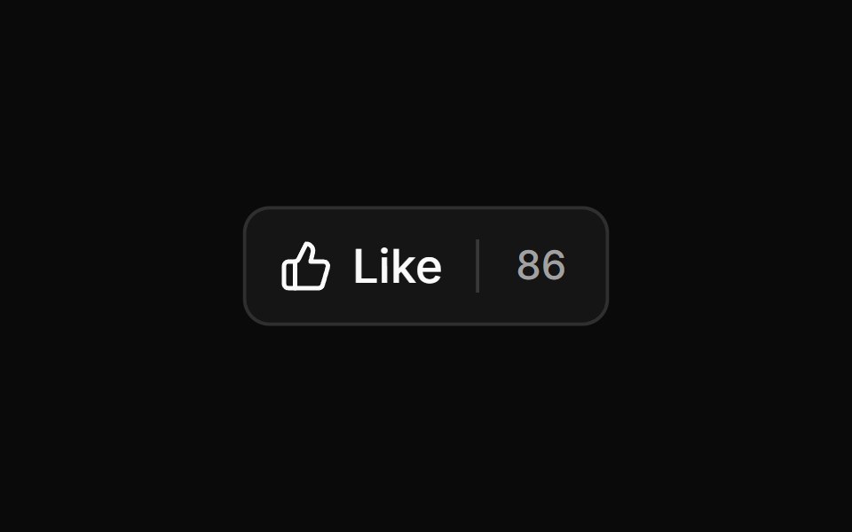 Outline Like With Countsv-particles · SvelteOutlined like button with a heart and the number of likes next to it.
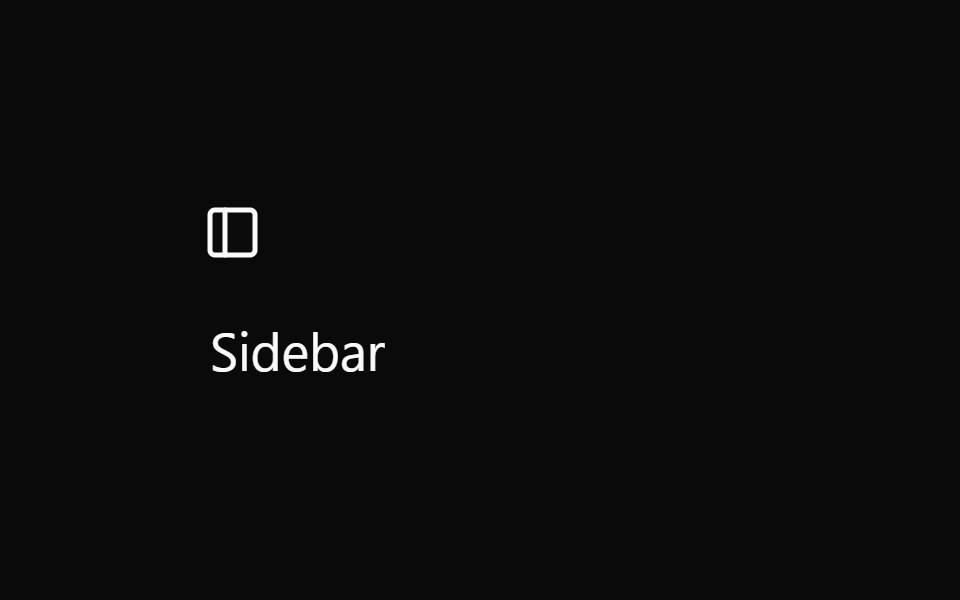 SidebarOUI · ReactSidebar Trigger, Sidebar Tree, and Sidebar Button for shadcn Sidebar.
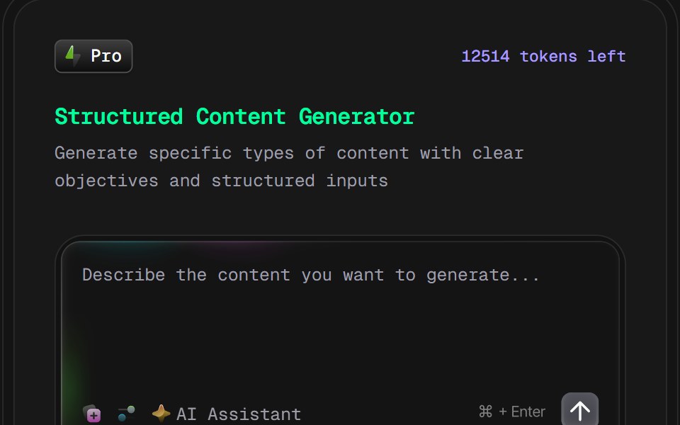 AI Content Creator Card v2D2Studio UI · ReactGlassmorphic AI content generator card with content type and tone pickers and a prompt field.
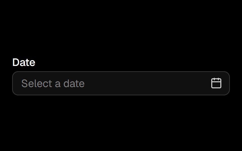 Date Pickerark-cn · ReactA shadcn-style date picker component built with Ark UI primitives.
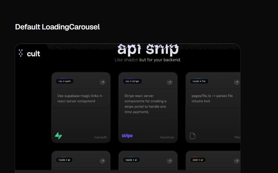 Loading CarouselCult UI · ReactLoading carousel component with smooth transitions and customizable content
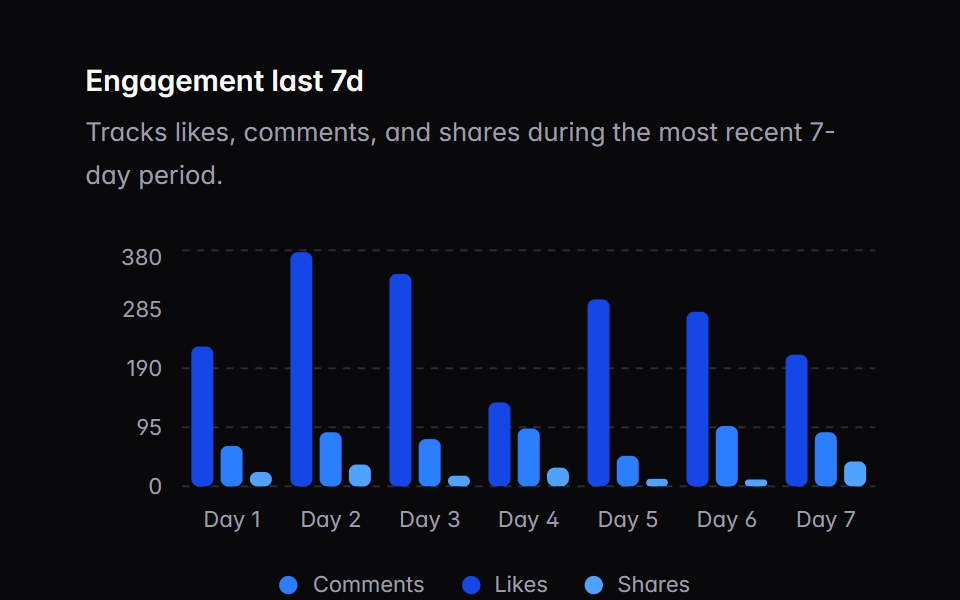 chart-03Intent UI · Reactchart-03
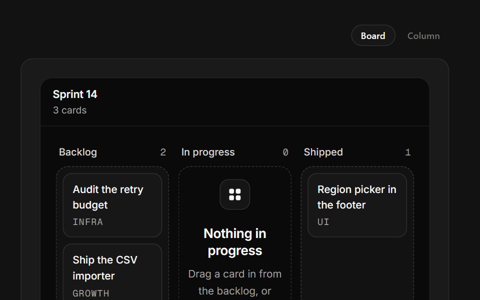 Empty Board ColumnSpectrum UI · ReactA kanban column that accepts real drags from its neighbours and composes cards inline.
 CarouselVengeance UI · React
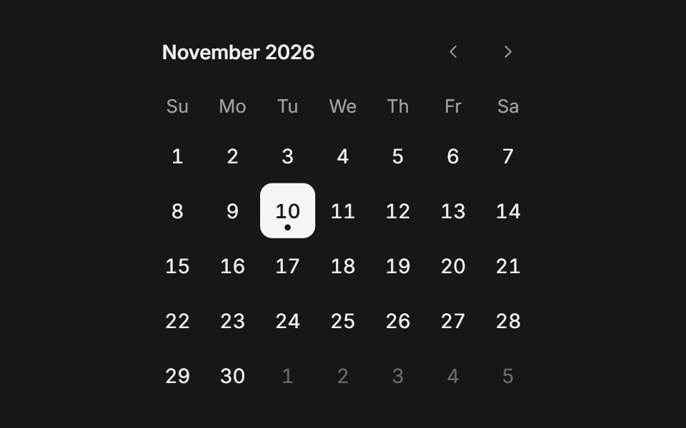 CalendarFluid Functionalism · ReactMonth grid on DayPicker v10 for a single day or a range: one fluid hover highlight across one or two months that…
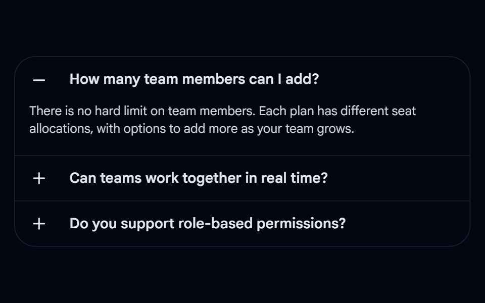 Accordion-04 - CardShadcn Space · ReactAccordion wrapped in a rounded card with left-aligned +/- icons and border dividers
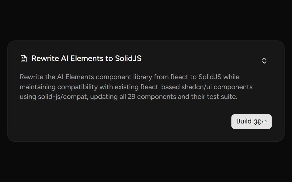 PlanAI Elements (Svelte) · SvelteA plan card component with collapsible content and streaming-aware description shimmer.
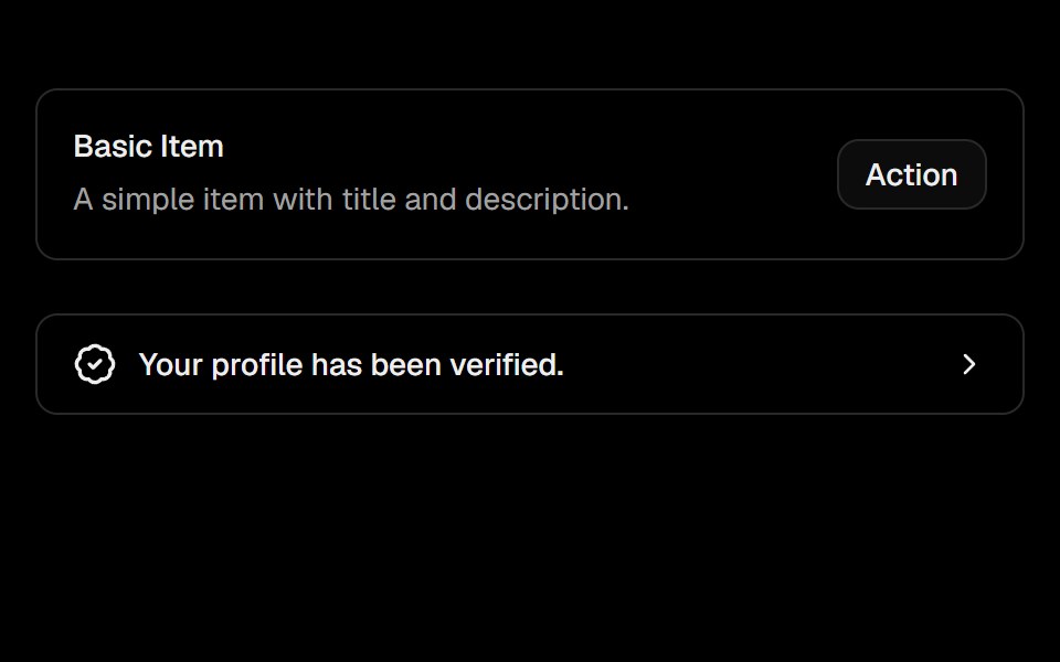 ItemObsidianUI · React
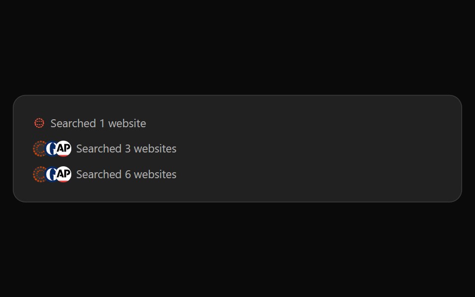 ChatGPT SearchNotra · ReactThe "Searched N websites" line, built on shadcn Button.
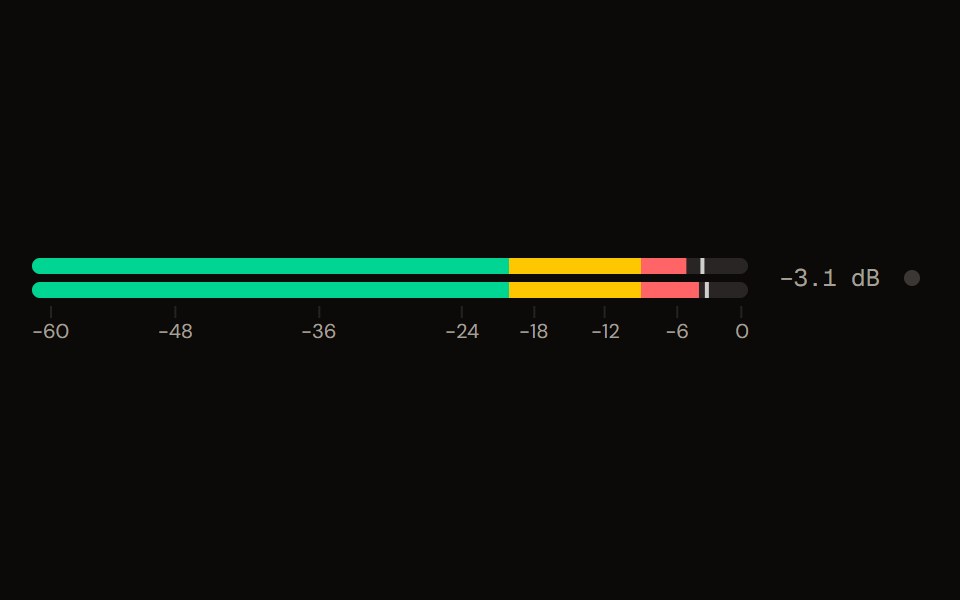 Level Meteraudiocn · ReactA peak and RMS level meter: mono or stereo, horizontal or vertical, solid, segmented or gradient, with zones, peak…
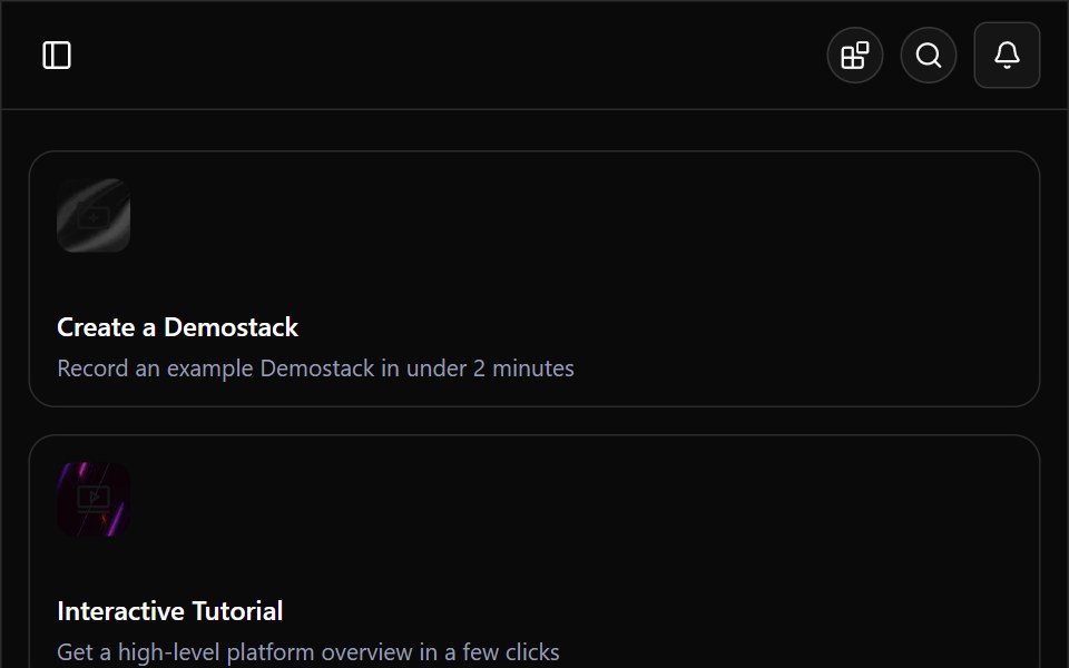 Demostack DashboardWatermelon UI · ReactA responsive product-demo workspace with organization switching, resource discovery, team filtering, and light and…
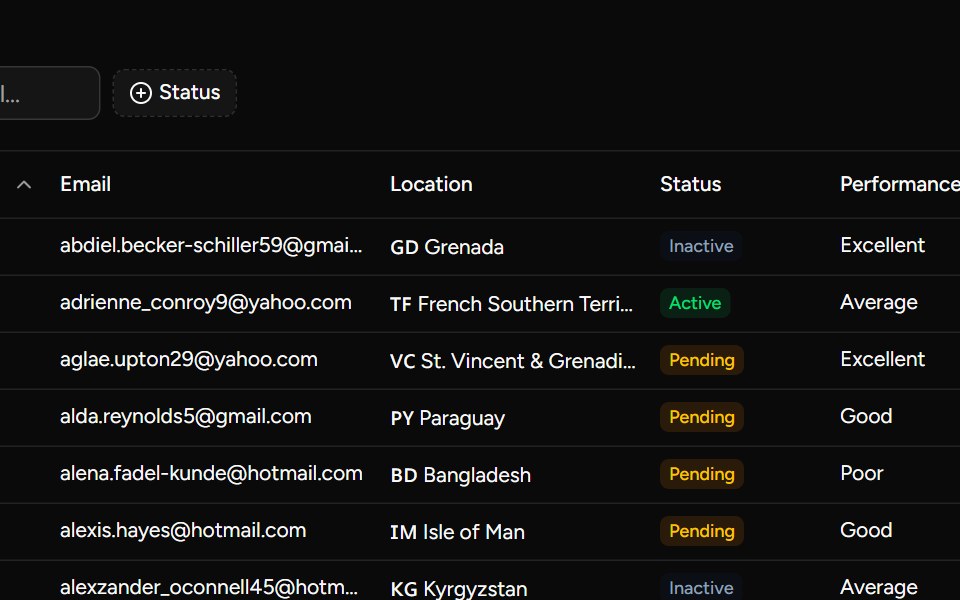 Complex Examplesv-table · Svelte
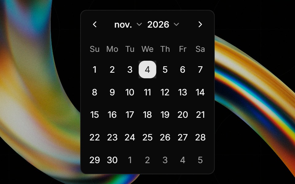 Calendarglasscn · React
 CarouselHextaUI · ReactNative scroll-snap slides with momentum on touch, mouse dragging, arrow keys, dots, thumbnails and an autoplay that…
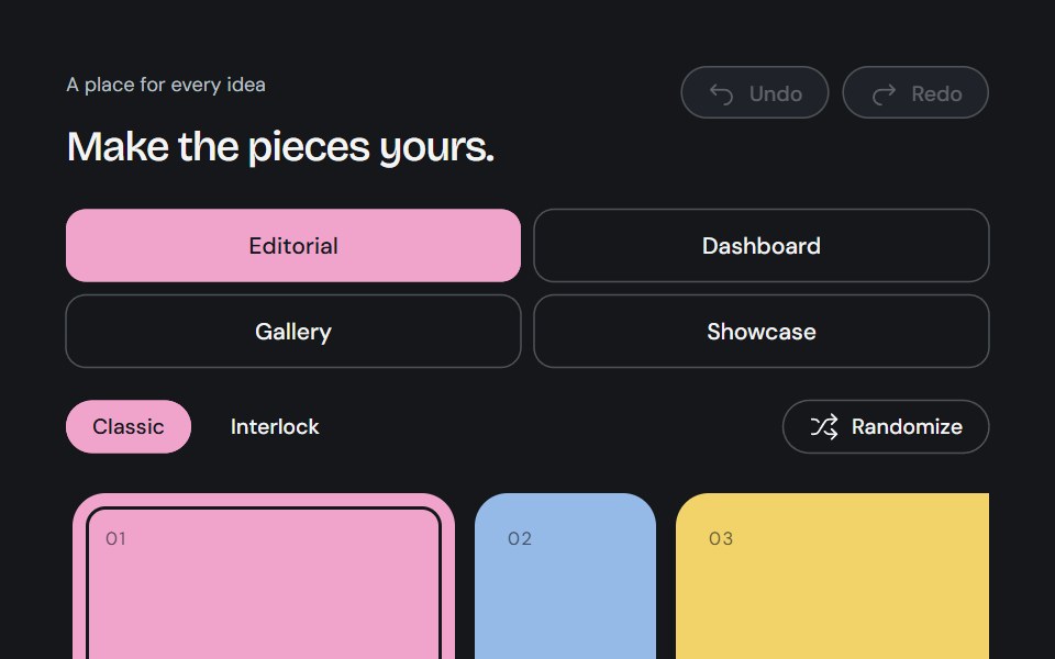 Bento GridCojeev UI · ReactA complete canvas of rounded cards or organically interlocking pieces. Compose a layout, then install just the…
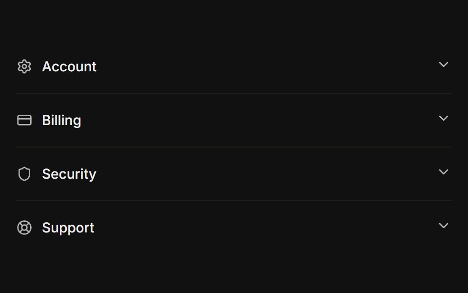 With iconsFLX UI · ReactLeading icon beside each trigger label.
 Centered FAQ accordionVelora UI · ReactCentered heading over an accordion of eight questions, closed by a contact row.
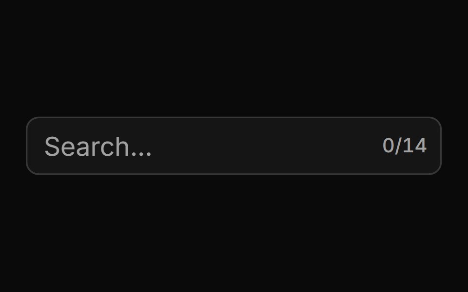 With Character Countsv-particles · SvelteForm field that shows the number of characters typed out of the maximum.
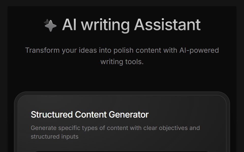 AI Writing AssistantD2Studio UI · ReactAI writing assistant panel with assistant, blog and pro modes and a prompt field.
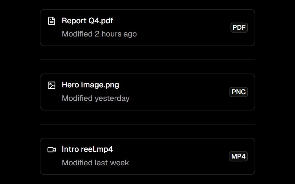 Itemark-cn · ReactComposable list item with media, content, title, description, and action slots.
 OnboardingCult UI · ReactComposable multi-step onboarding primitives: Onboarding root with step navigation, FeatureCarousel, ChoiceGroup radio…
 show-moreIntent UI · Reactshow-more
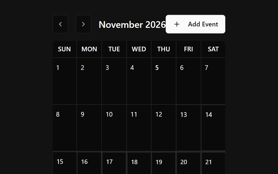 Event CalendarSpectrum UI · Reactcomponent for the Event Calendar
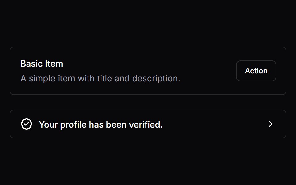 ItemVengeance UI · React
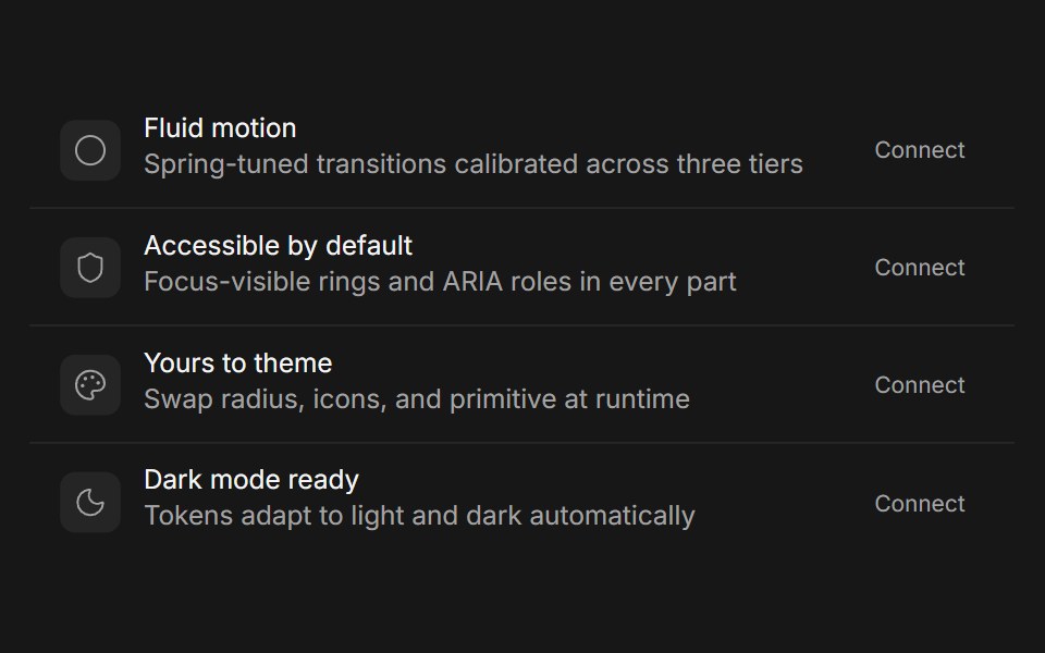 CardFluid Functionalism · Reactshadcn's compositional card (Card, CardHeader, CardTitle, CardDescription, CardAction, CardContent, CardFooter) with…
 Accordion-06 - Filled TriggerShadcn Space · ReactAccordion with a filled accent background on the trigger header
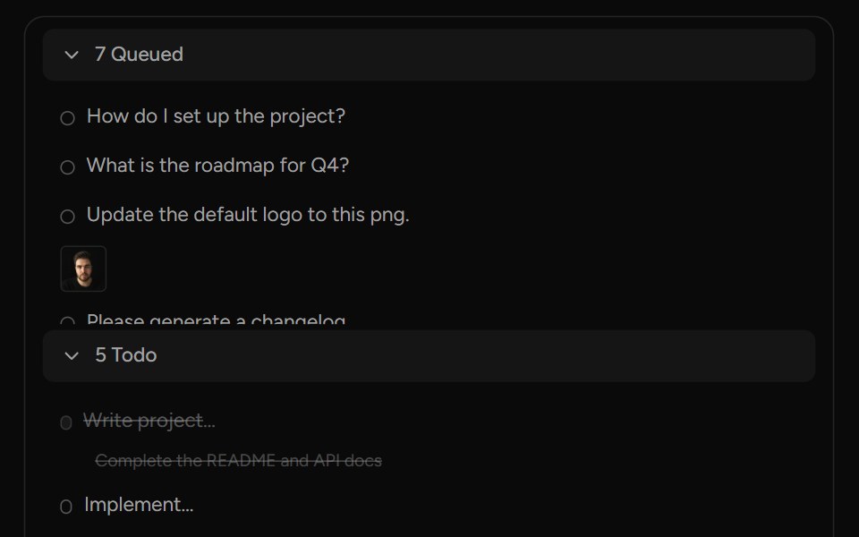 QueueAI Elements (Svelte) · SvelteA structured queue view with sections, items, attachments, and action controls.
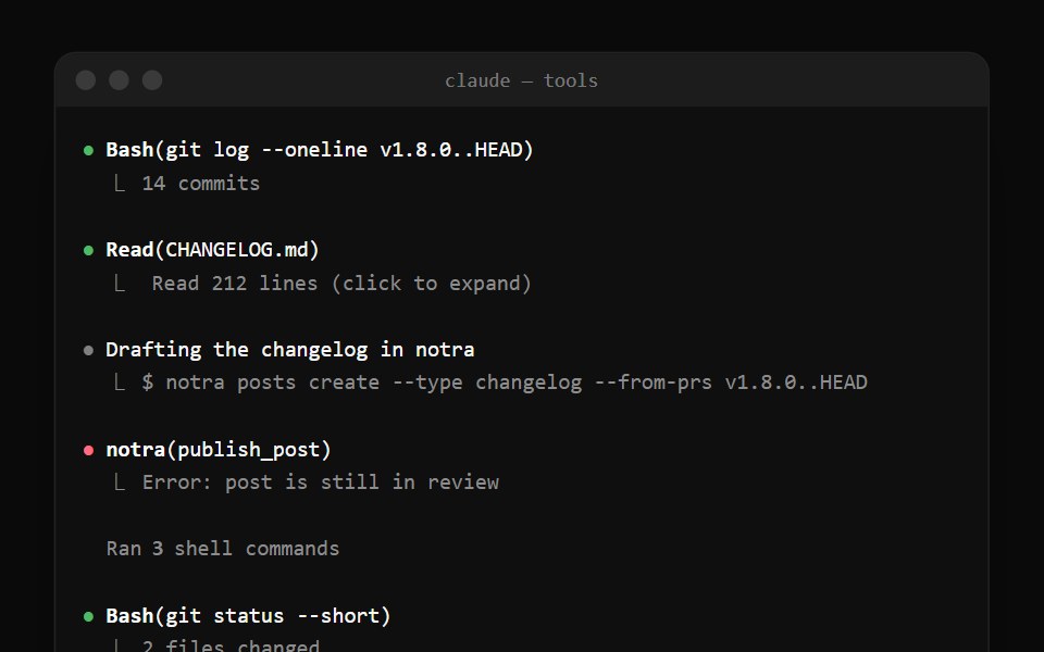 Claude Code Tool CallNotra · ReactTool calls with a status bullet and a ⎿ result line, plus the collapsed "Ran 3 shell commands" summary.
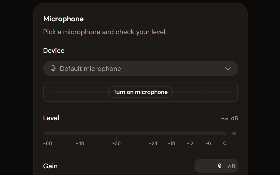 Microphone Setupaudiocn · ReactChoose and check a microphone: device select with a live preview, a level meter, gain, mute and a level check that…
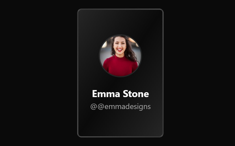 Flip CardWatermelon UI · ReactCard that flips over in 3D to show its back face.
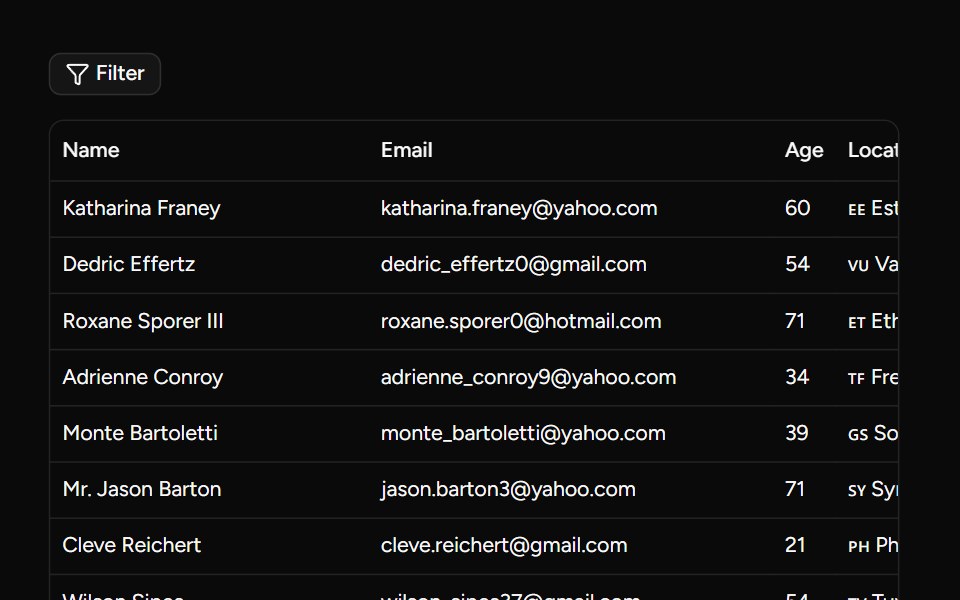 Custom Filters Examplesv-table · Svelte
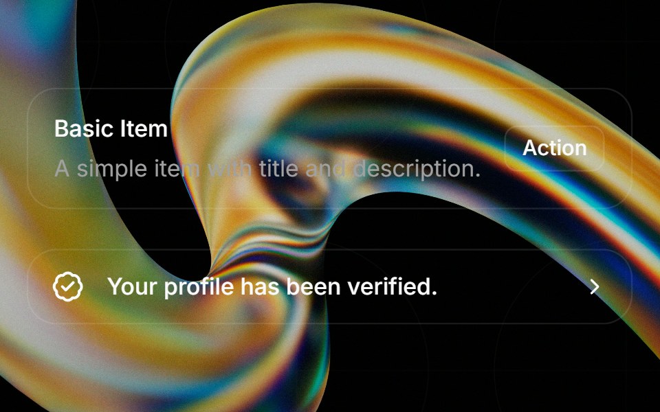 Itemglasscn · React
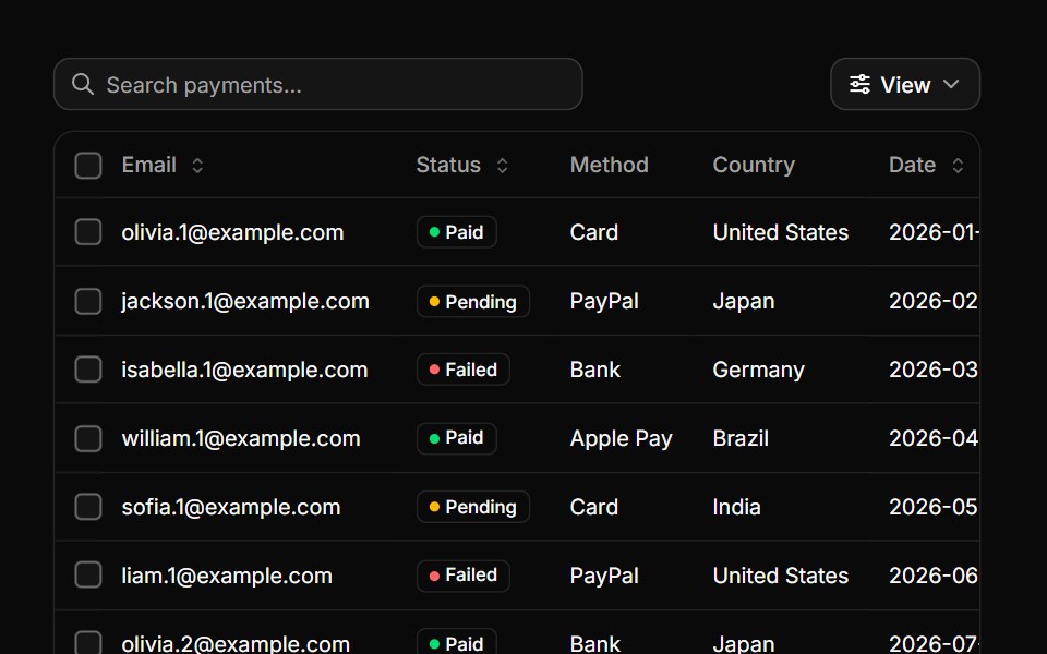 Data tableHextaUI · ReactA table for real data, with sorting, search, row selection, pinned columns, a sticky header and pagination.
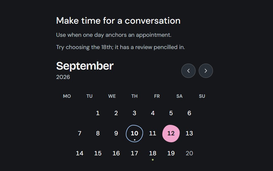 CalendarCojeev UI · ReactChoose one appointment day, a continuous date range, or separate days in an accessible month grid.
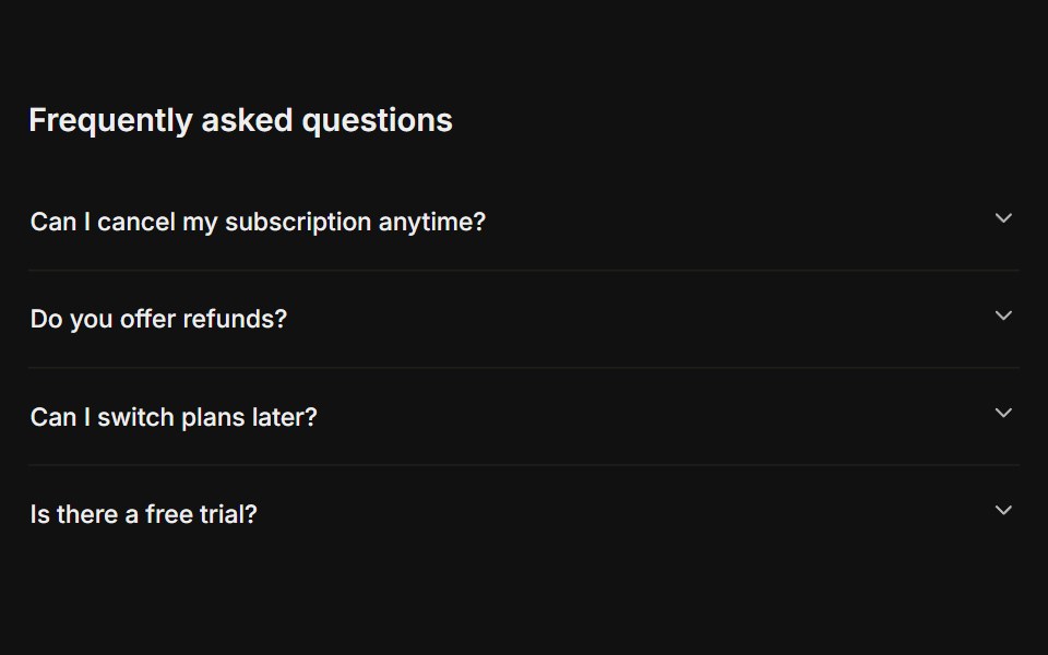 FAQFLX UI · ReactA titled question-and-answer list.
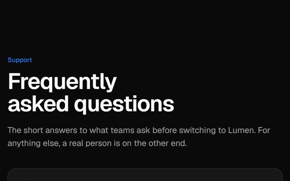 Two-column FAQVelora UI · ReactSticky intro and contact card on the left, an accordion of questions on the right.
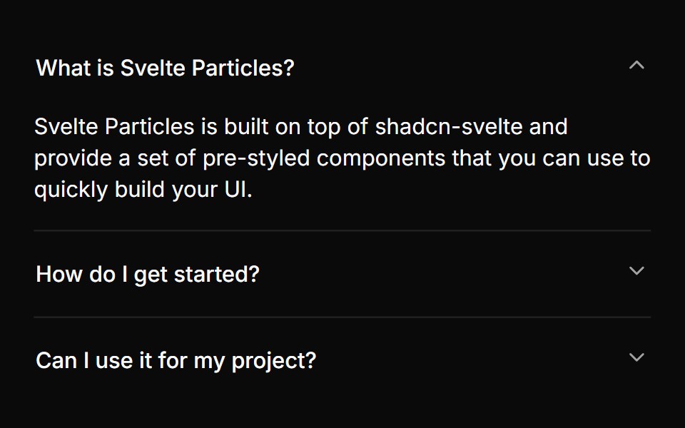 Basicsv-particles · Svelte
 Bento 01D2Studio UI · ReactBento grid for an education program platform with admin overview, faculty view and a program form.
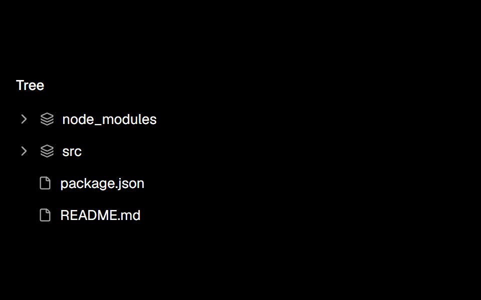 Tree Viewark-cn · ReactA shadcn-style tree view component built with Ark UI primitives.
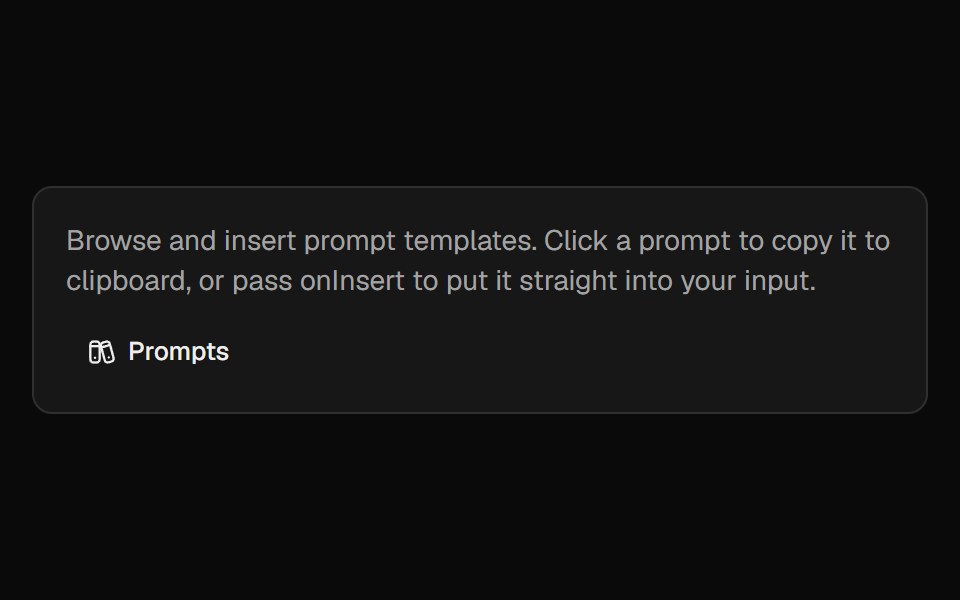 Prompt LibraryCult UI · ReactBrowse, insert, and manage prompt templates with categories and custom prompts
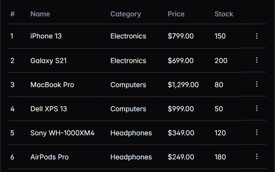 tableIntent UI · Reacttable
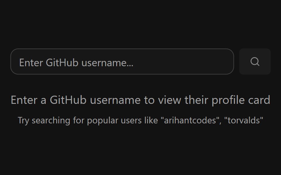 GitHub Profile CardSpectrum UI · ReactA GitHub profile card with account stats, a contribution graph, and social links.
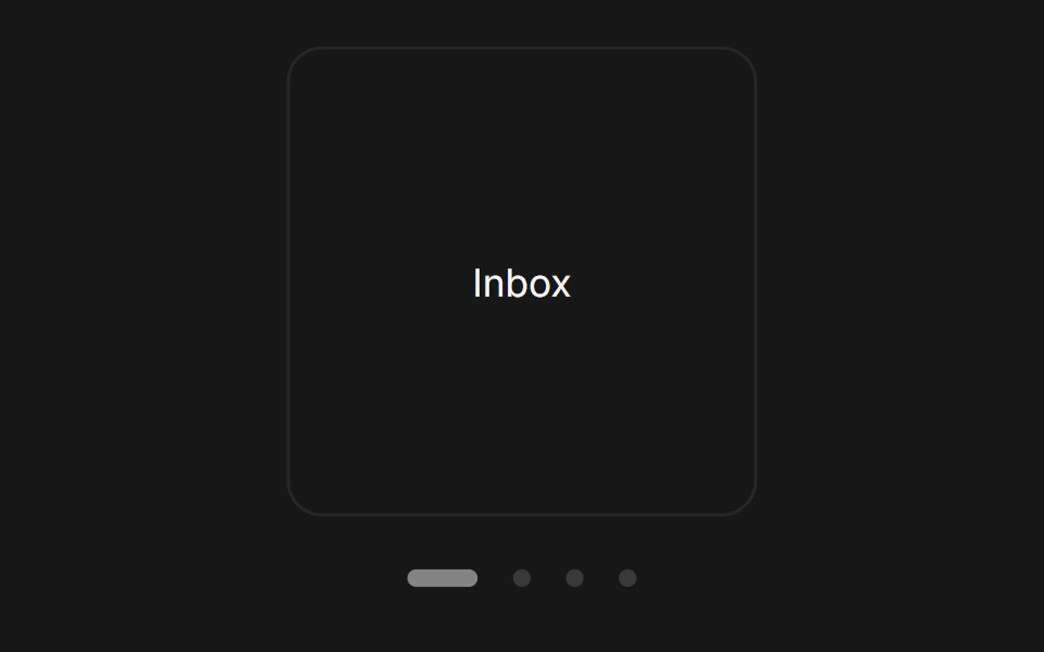 Carousel DotsFluid Functionalism · ReactCarousel dots, static or on autoplay: fluid-hover click areas, and a current pill that fills over each slide's duration.
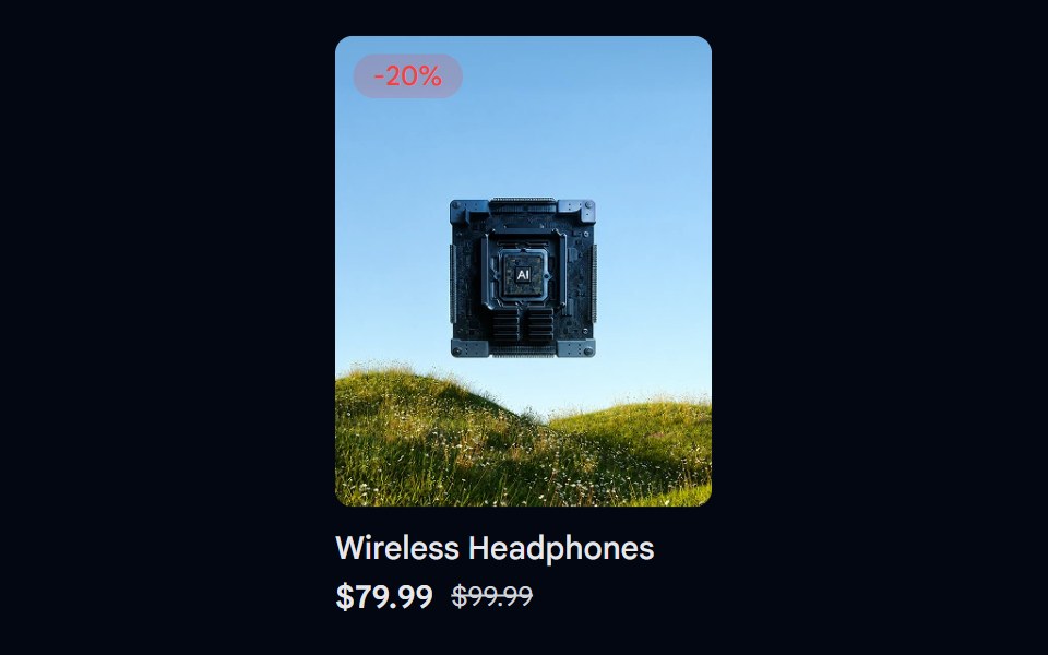 Aspect Ratio 06 - Product CardShadcn Space · ReactA product card using a 4:5 aspect ratio image with a discount badge and pricing details.
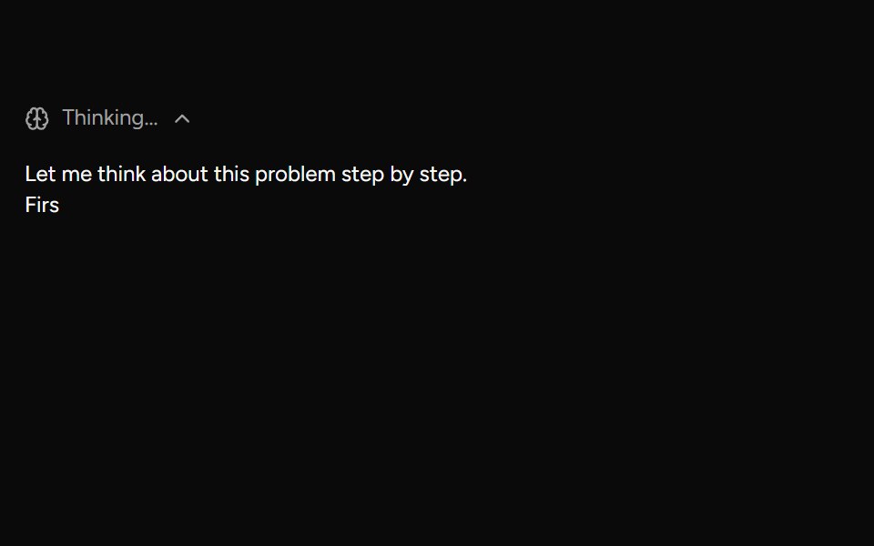 ReasoningAI Elements (Svelte) · SvelteA collapsible reasoning block that tracks streaming duration and renders a markdown response.
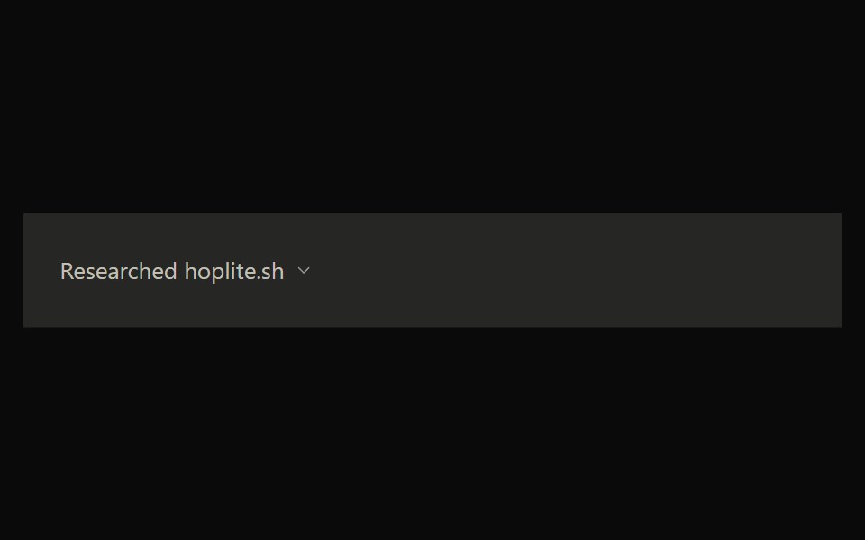 Claude SearchNotra · ReactClaude's web search timeline with queries, result cards and status steps.
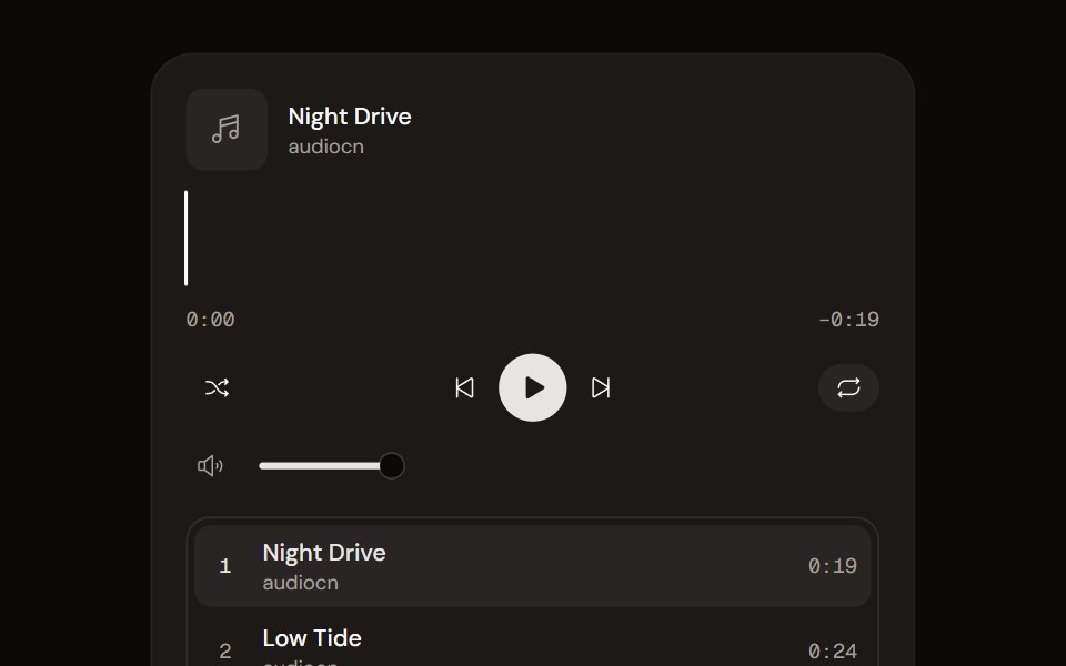 Music Playeraudiocn · ReactA playlist player with a waveform seek bar, shuffle, repeat, volume and optional ducking under the microphone.
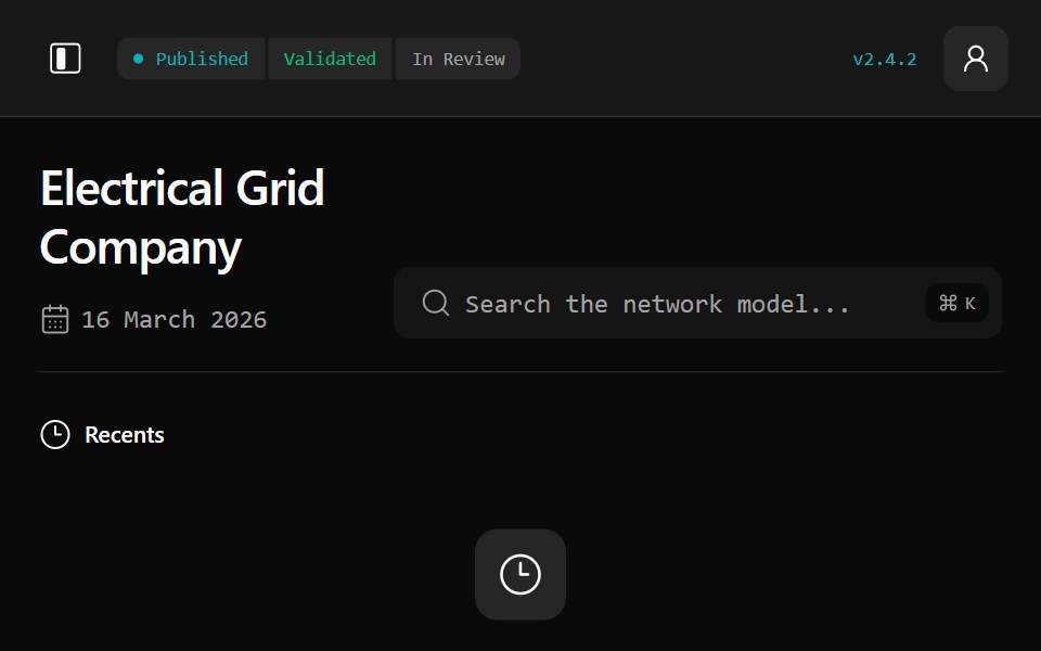 Gridline DashboardWatermelon UI · ReactA responsive electrical-grid workspace for network modelling, asset flexibility, planning, operations, and stakeholder…
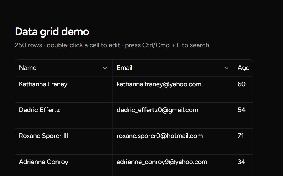 Data Gridsv-table · Svelte
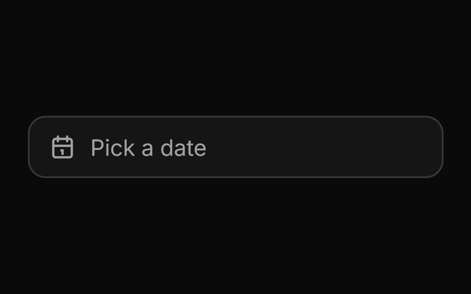 Date pickerHextaUI · ReactA button that opens a calendar in a popover, or a bottom sheet on phones, for single dates and ranges.
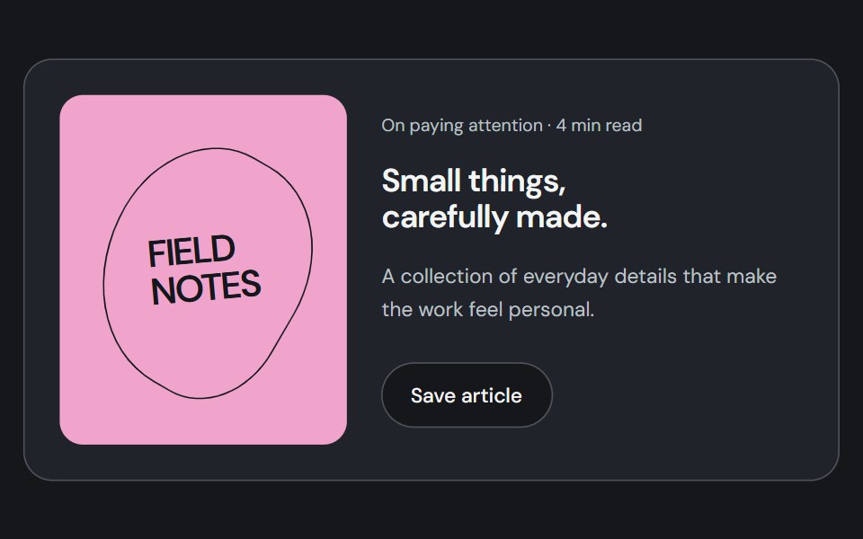 CardCojeev UI · ReactGroups related content, metadata, and actions into a distinct surface.
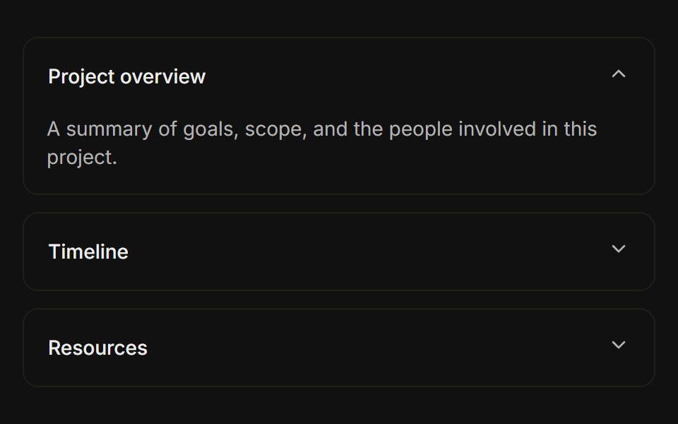 Separated cardsFLX UI · ReactEach item is a bordered card with spacing between them.
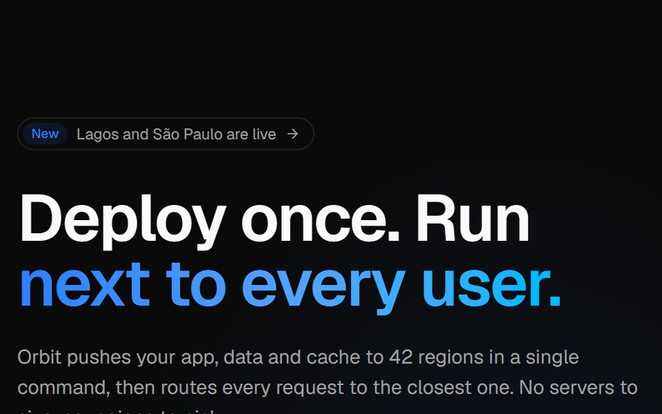 Globe split heroVelora UI · ReactSplit hero with copy, CTAs and live stats beside an interactive dotted globe with arcs.
 Basic Avatarsv-particles · Svelte
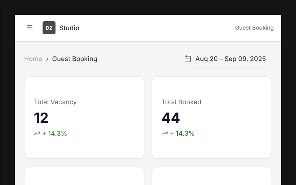 Dashboard 01D2Studio UI · ReactHotel booking dashboard with guest and vacancy stats, booking search and a check-in and check-out table.
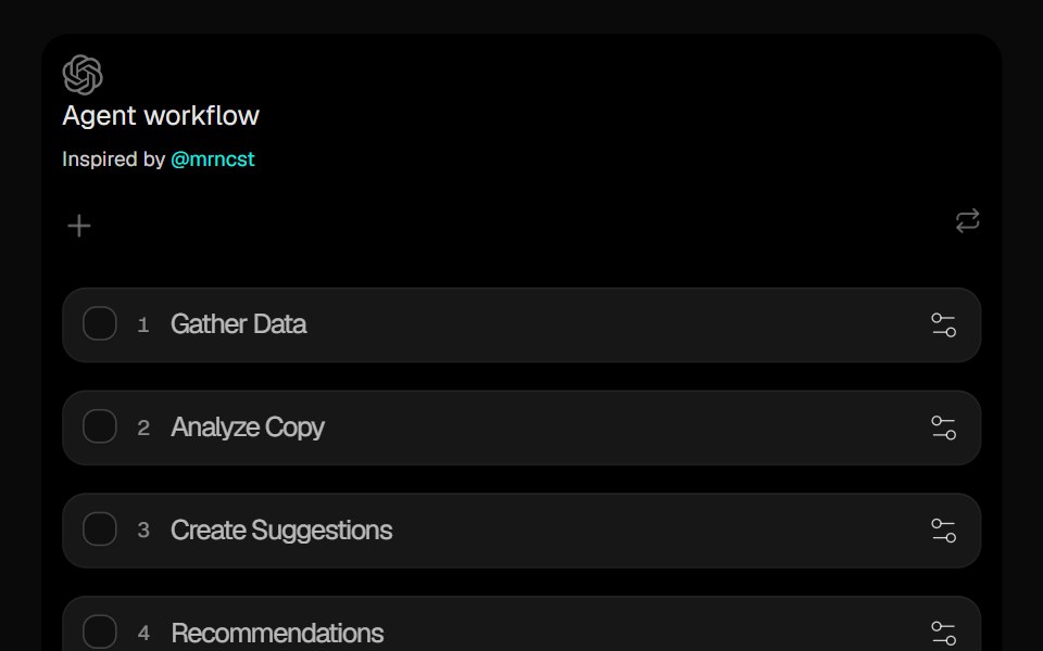 Sortable ListCult UI · ReactDrag-and-drop sortable list component with smooth animations and reordering
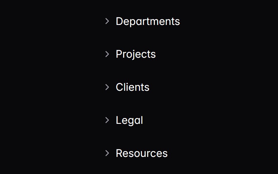 treeIntent UI · Reacttree
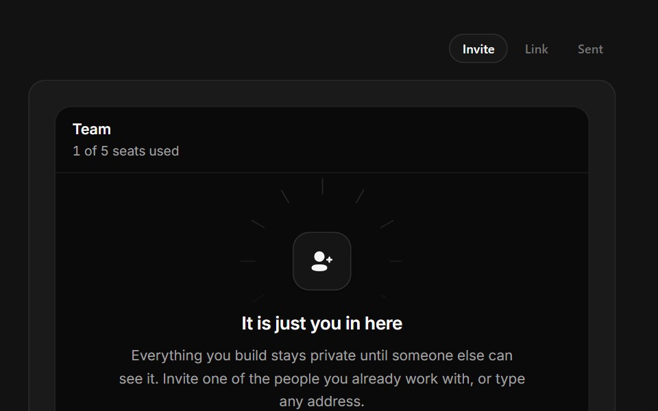 Invite TeammatesSpectrum UI · ReactA one-seat team with an avatar rail, live invite field and copyable join link.
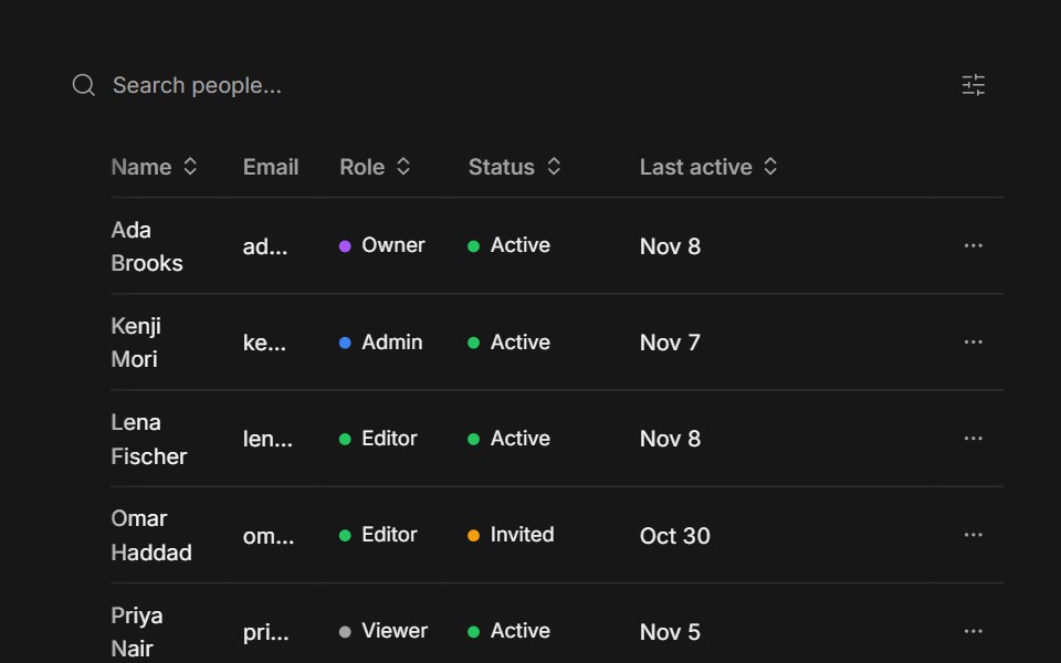 Data TableFluid Functionalism · ReactTanStack Table drawn with the library's Table: the fluid hover row highlight plus resizable, draggable columns…
 Avatar-01 - DefaultShadcn Space · ReactDefault avatar component
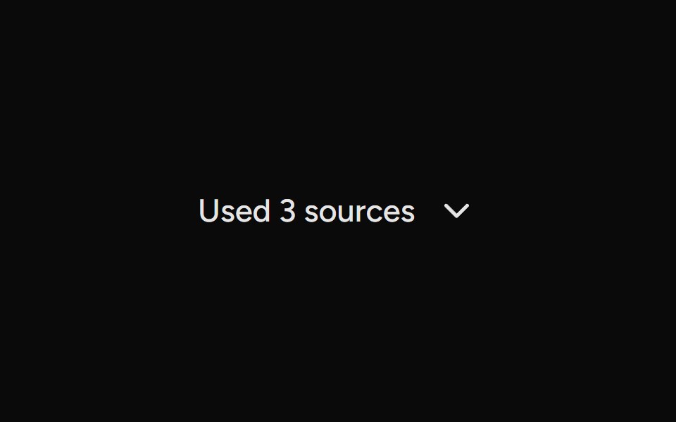 SourcesAI Elements (Svelte) · SvelteA collapsible sources list for rendering cited links and source groups.
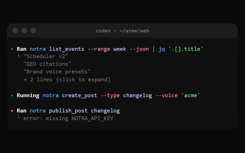 Codex ExecNotra · ReactA Ran cell with shell syntax colors and output folded behind + N lines.
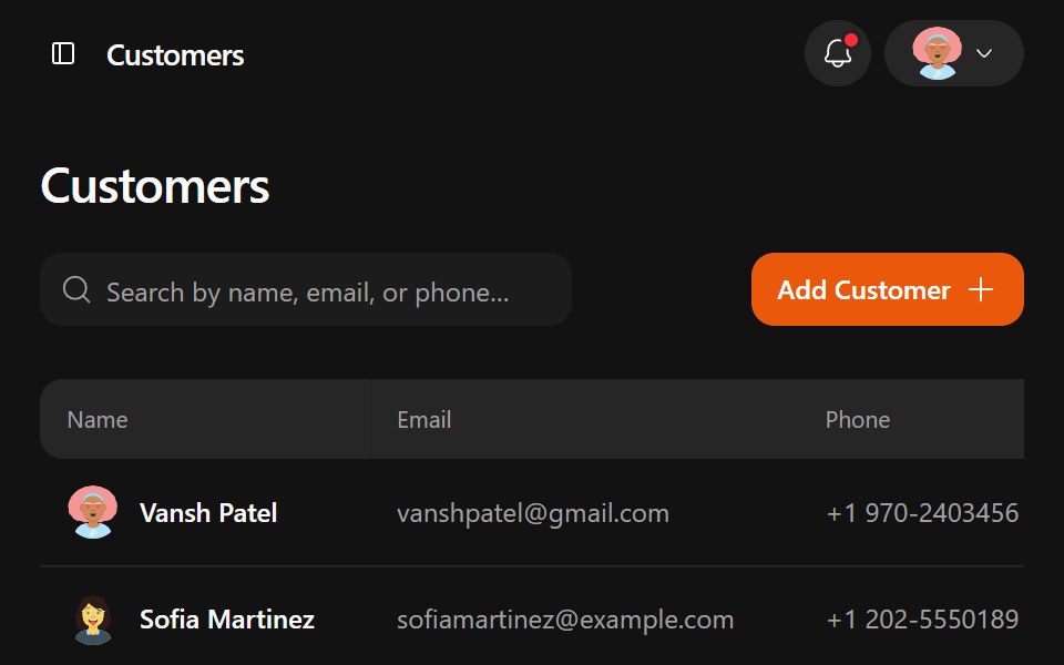 Jobtracker DashboardWatermelon UI · ReactA responsive job management workspace with customer records, job pipelines, estimates, drag-and-drop line items, and…
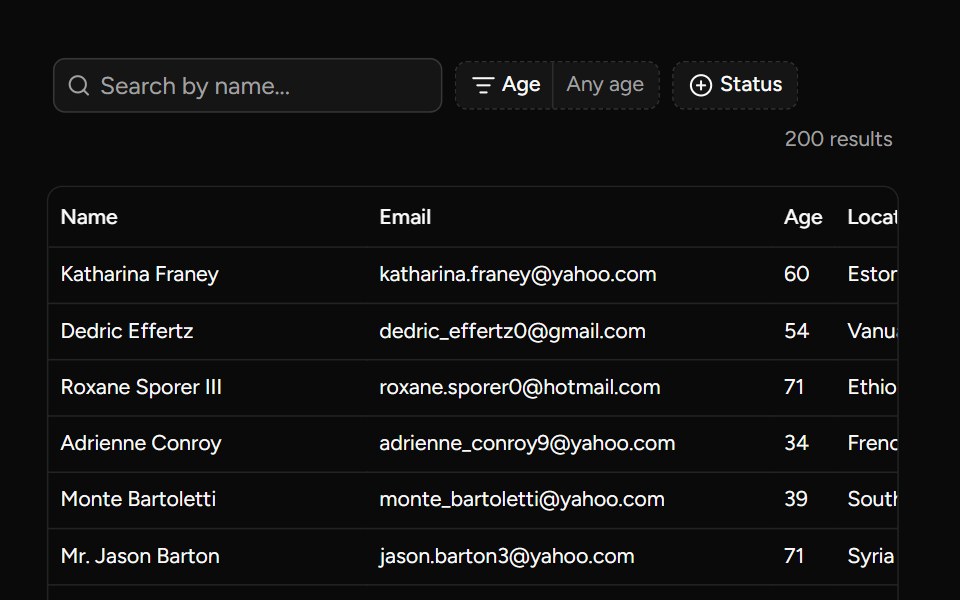 Data Table Filters Examplesv-table · Svelte
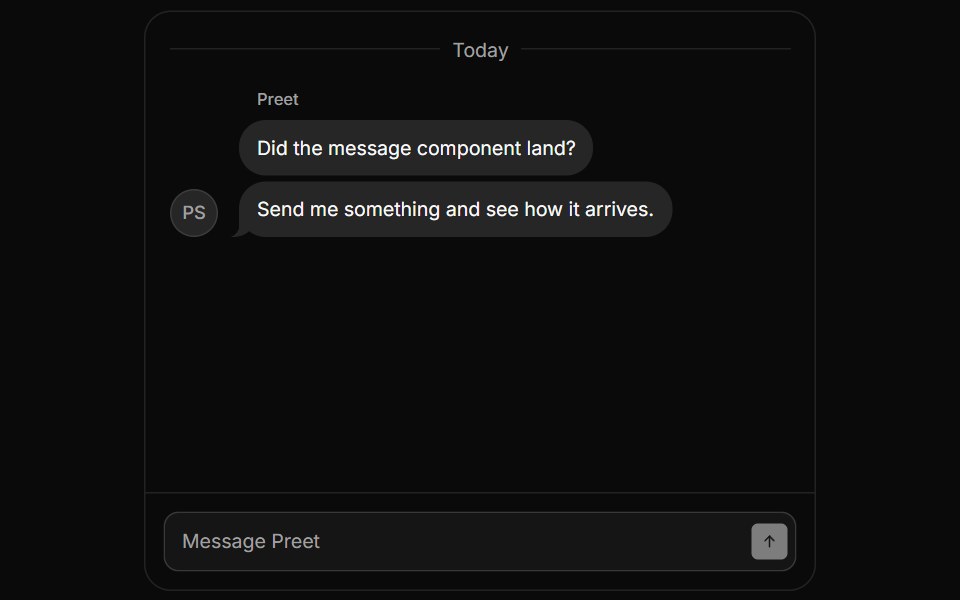 MessageHextaUI · ReactA chat message row with an avatar, name, bubbles and status, where new messages rise in from the sender's side.
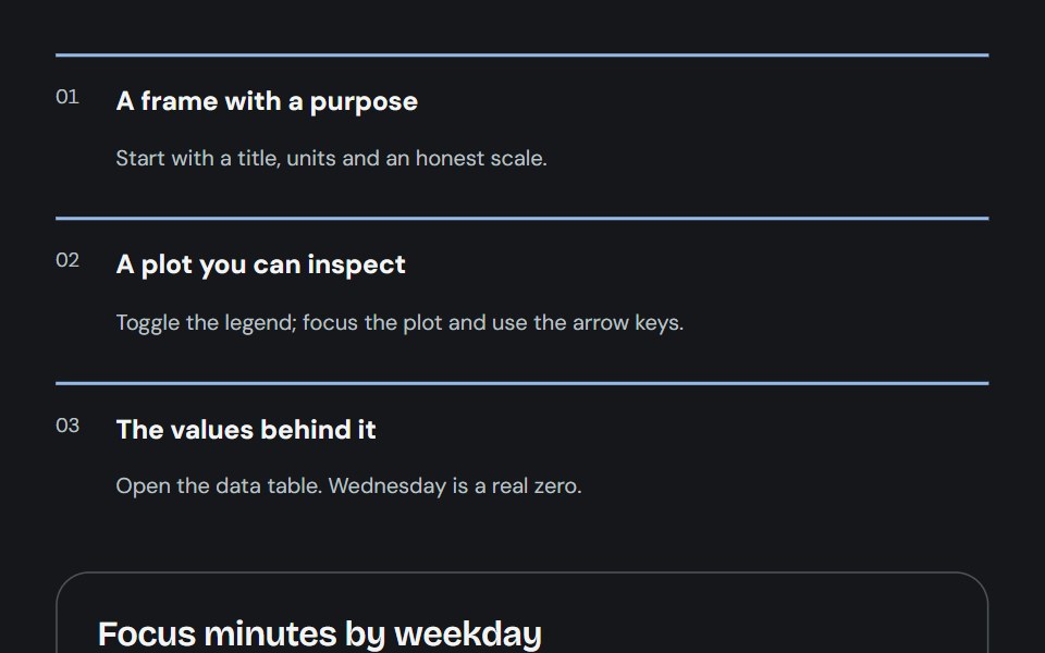 ChartCojeev UI · ReactCompose an understandable chart from a frame, labelled series, inspectable plot and accessible values.
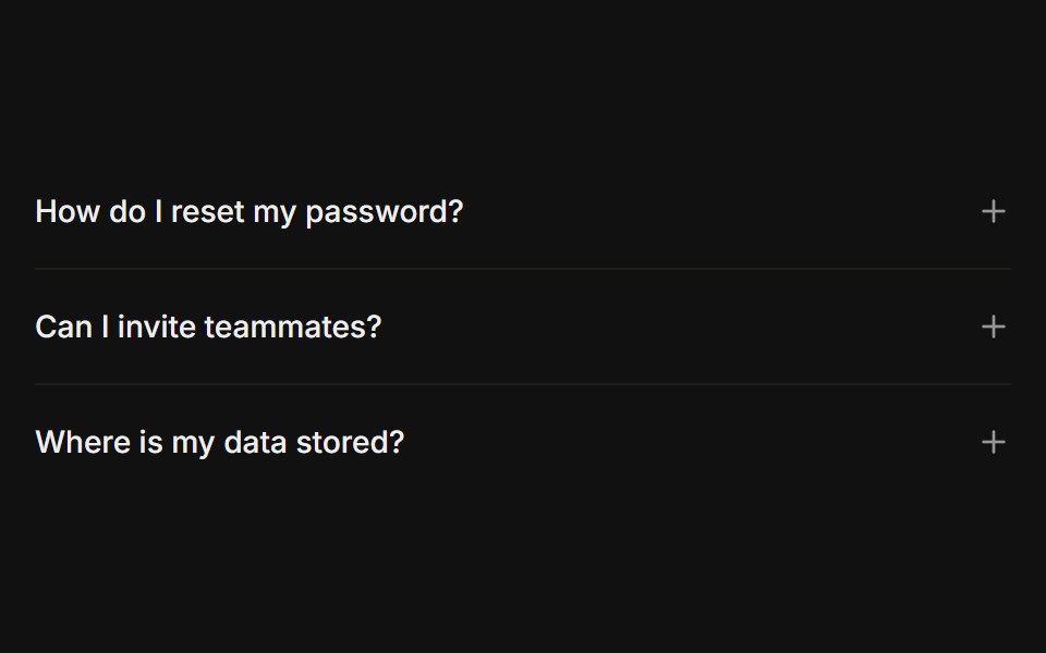 Plus / minus iconFLX UI · ReactPlus icon on each trigger that turns into a minus when open, instead of a chevron.
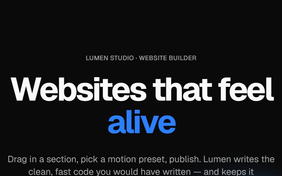 Wavy heroVelora UI · ReactBold centered hero over flowing waves, with a rotating headline word and avatar social proof.
Libraries with shadcn/ui data display components
Related categories
- Data Display Components
- React Data Display Components
- Tailwind CSS Data Display Components
- Svelte Data Display Components
- React Native Data Display Components
- Animated Data Display Components
- shadcn/ui Card Components
- shadcn/ui Table Components
- shadcn/ui Avatar Components
- shadcn/ui Data Table Components
- shadcn/ui Accordion Components
- shadcn/ui Stat Components
- shadcn/ui List Components
- shadcn/ui Chart Components
- shadcn/ui Calendar Components
- shadcn/ui Collapsible Components
- shadcn/ui Stat Card Components
- shadcn/ui Avatar Group Components
- shadcn/ui Tree View Components
- shadcn/ui Carousel Components
- shadcn/ui Testimonial Components
- shadcn/ui Filter Bar Components