 Dev Design Library
shadcn/ui Accordion Components
Dev Design Library indexes 54 shadcn/ui accordion components from 7 open-source UI libraries, with the most coming from Watermelon UI, FLX UI, sv-particles, Spectrum UI and Shadcn Space. Each one links to its page with the source code, a live preview where available, the library license and the install command. They follow the shadcn/ui conventions, so most install with the shadcn CLI and drop into a Tailwind project. Accordion components belong to the Data display group.
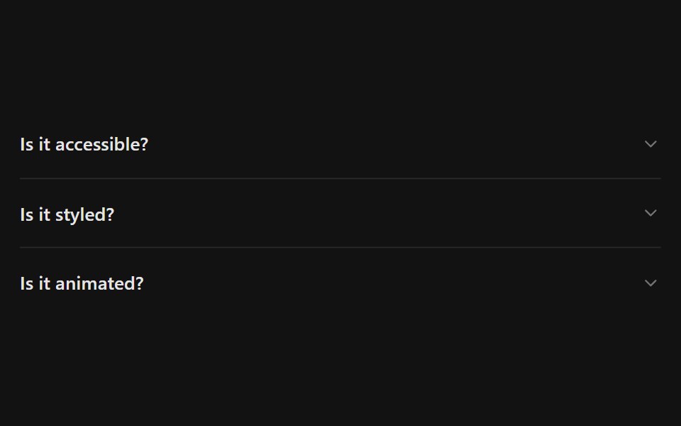 AccordionSpectrum UI · Reactcomponent for the Accordion
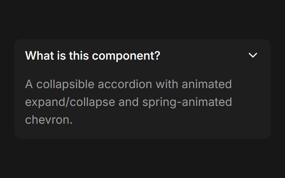 AccordionFluid Functionalism · ReactCollapsible accordion with animated height transitions, spring-animated chevron, and fluid hover in grouped mode…
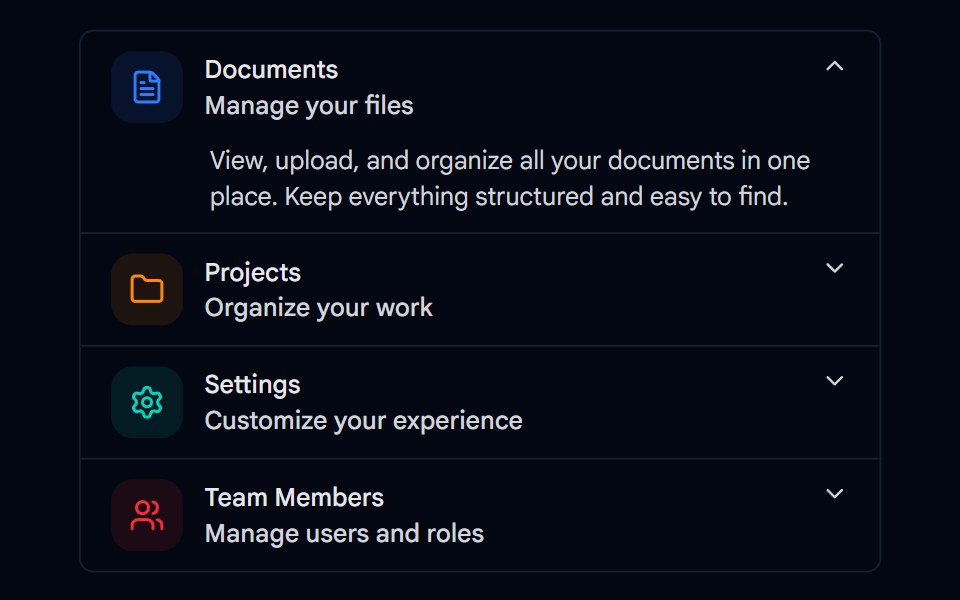 Accordion-01 - DefaultShadcn Space · ReactDefault accordion component
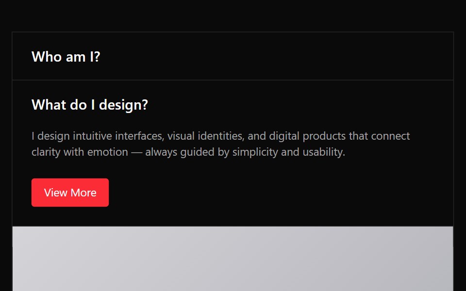 Accordion 03Watermelon UI · React
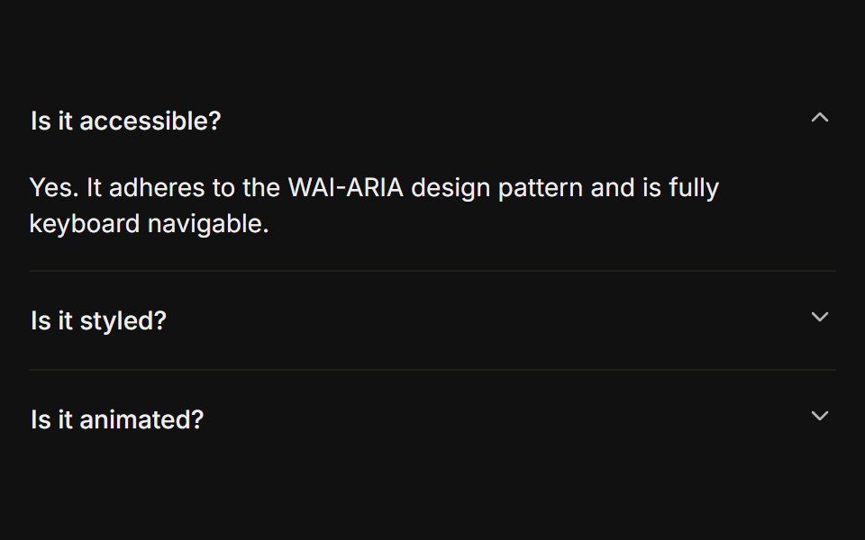 BasicFLX UI · ReactOnly one section open at a time, type="single" collapsible. The default behavior.
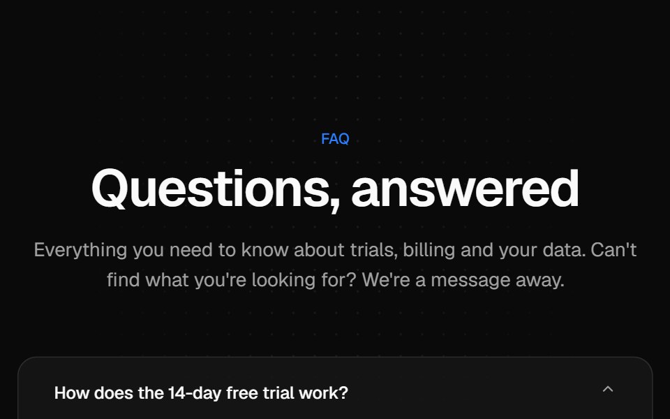 Centered FAQ accordionVelora UI · ReactCentered heading over an accordion of eight questions, closed by a contact row.
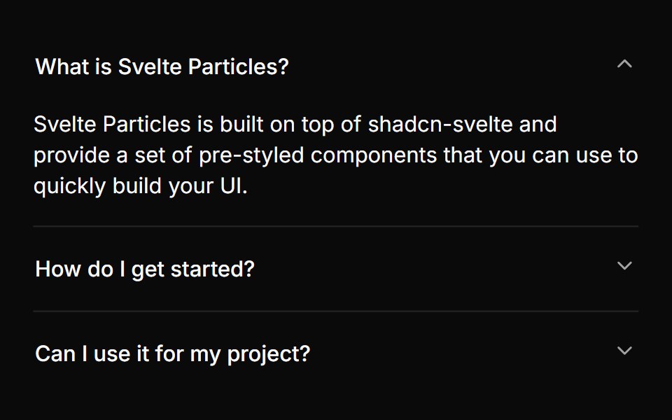 Basicsv-particles · Svelte
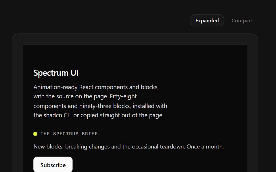 Mega Sitemap FooterSpectrum UI · ReactA five-column sitemap with region and language selectors and mobile accordions.
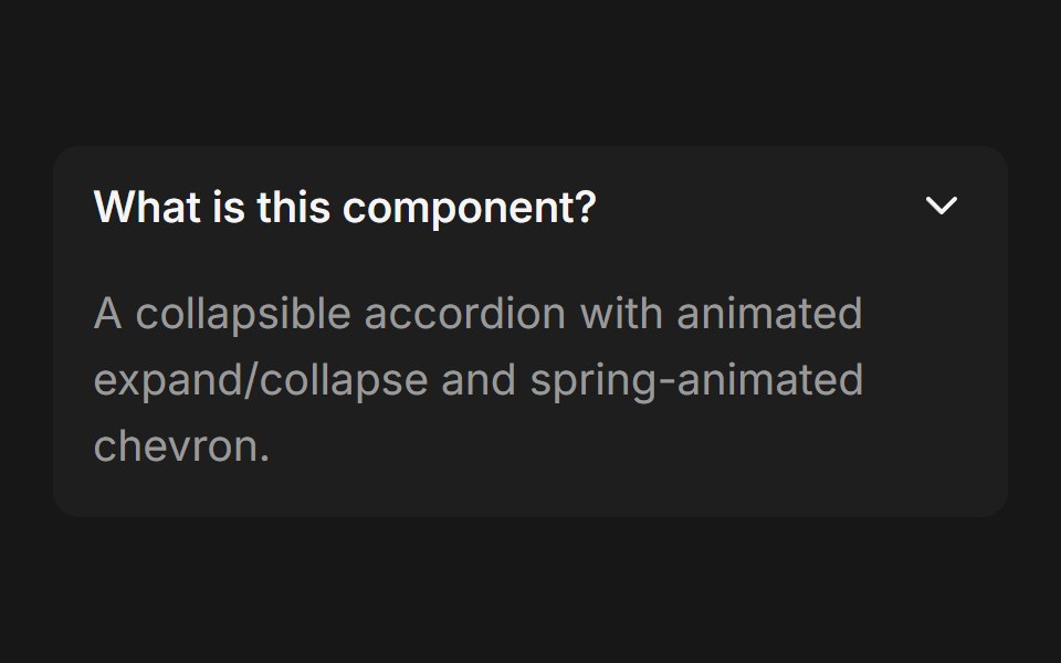 Accordion (Base UI)Fluid Functionalism · ReactCollapsible accordion with animated height transitions, spring-animated chevron, and fluid hover in grouped mode. Base…
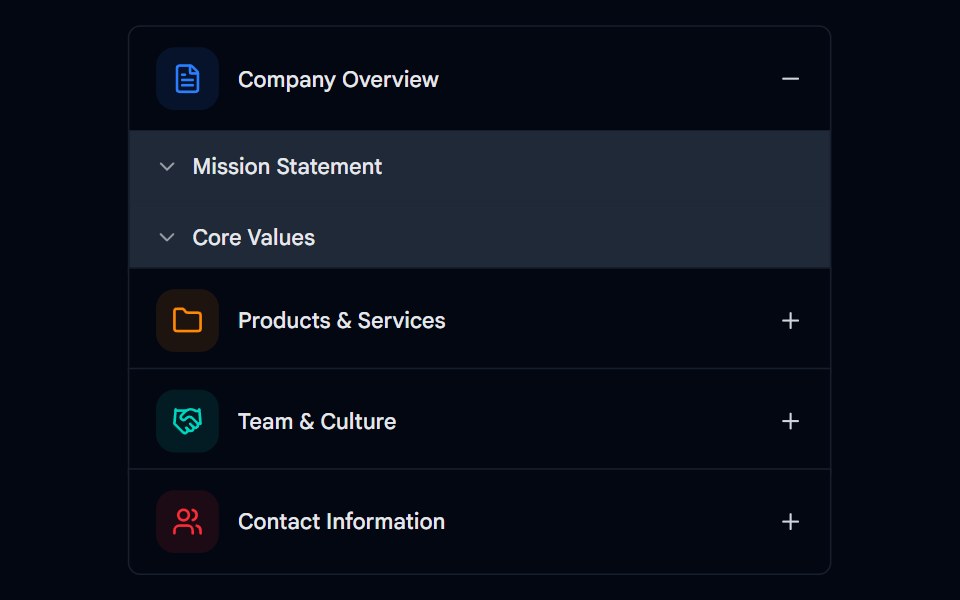 Accordion-02 - Multi-levelShadcn Space · ReactMulti-level accordion component
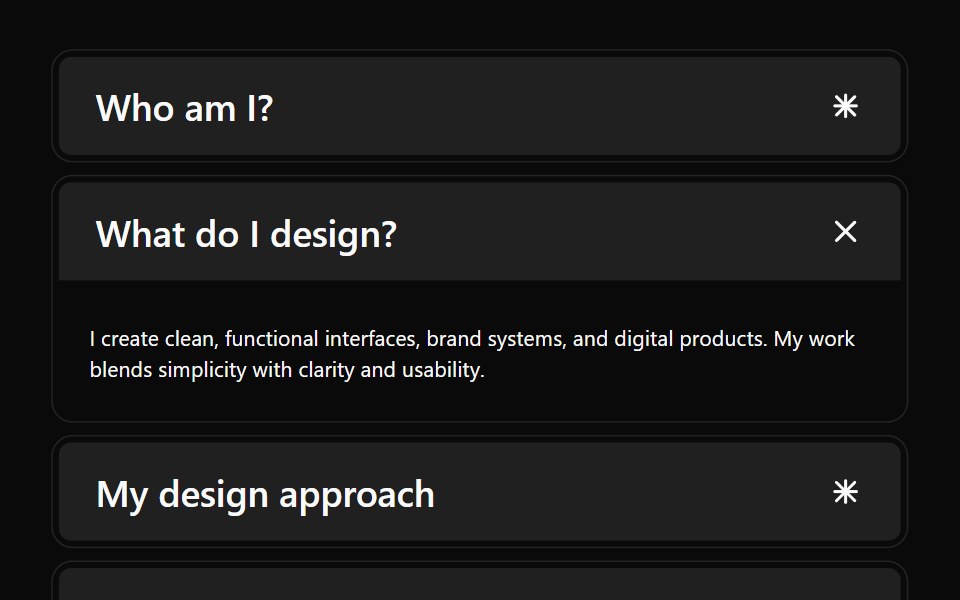 Accordion 04Watermelon UI · React
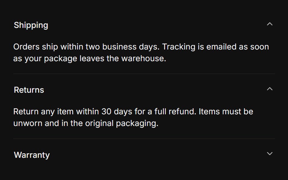 MultipleFLX UI · Reacttype="multiple" keeps several sections open at once.
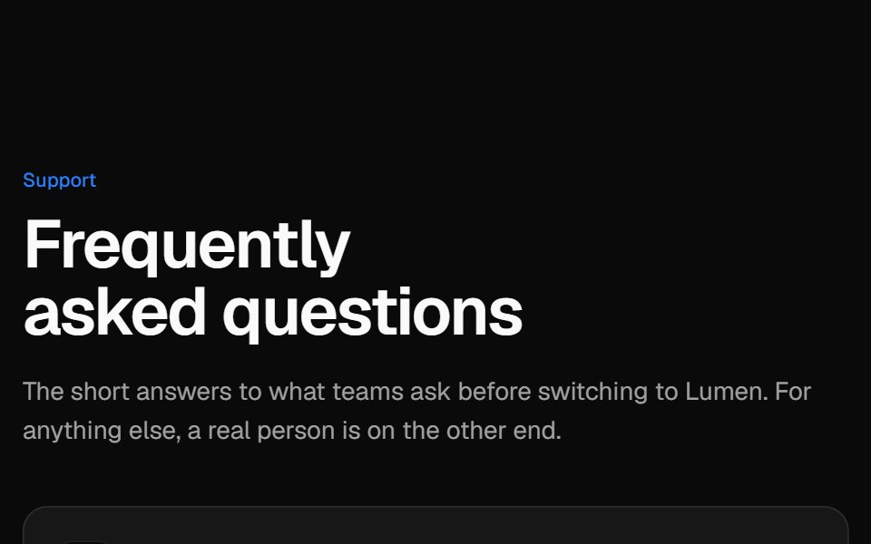 Two-column FAQVelora UI · ReactSticky intro and contact card on the left, an accordion of questions on the right.
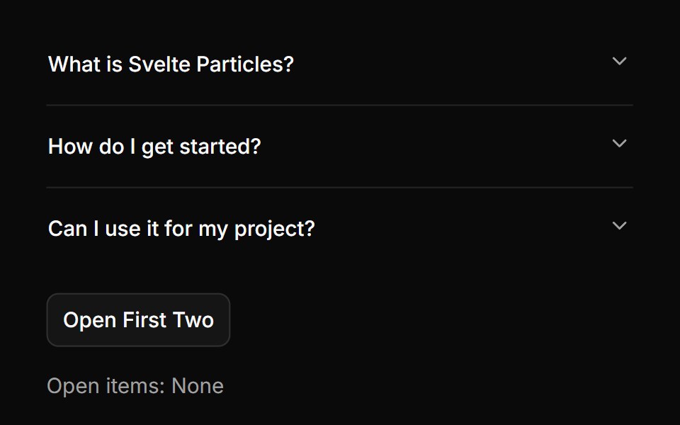 Controlledsv-particles · Svelte
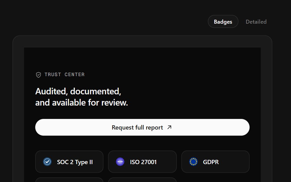 Trust Center FooterSpectrum UI · ReactCompliance marks that expand to scope, over a logo row and link columns.
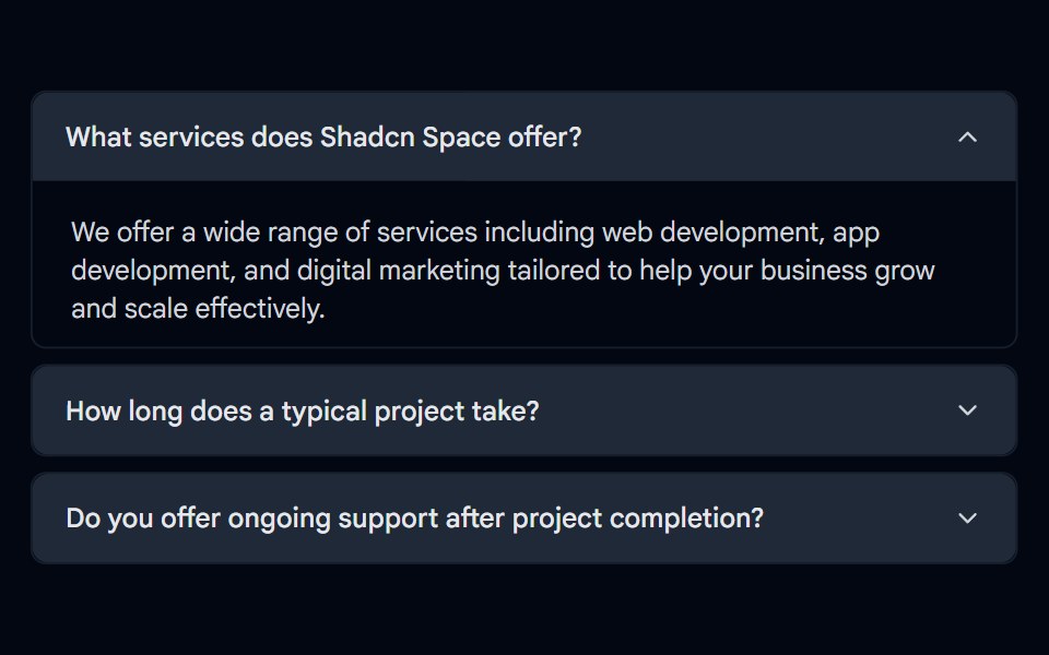 Accordion-06 - Filled TriggerShadcn Space · ReactAccordion with a filled accent background on the trigger header
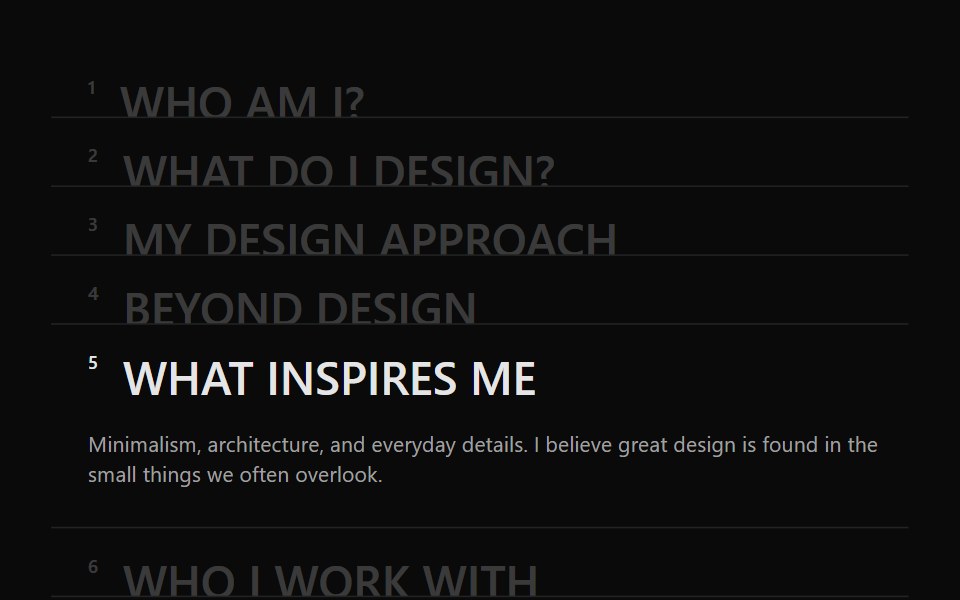 Accordion 05Watermelon UI · React
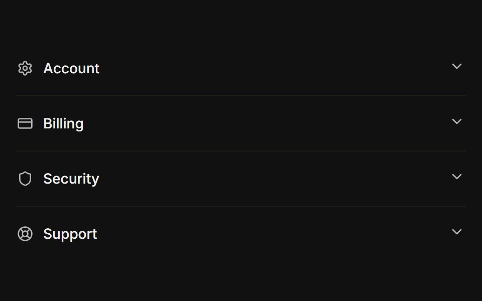 With iconsFLX UI · ReactLeading icon beside each trigger label.
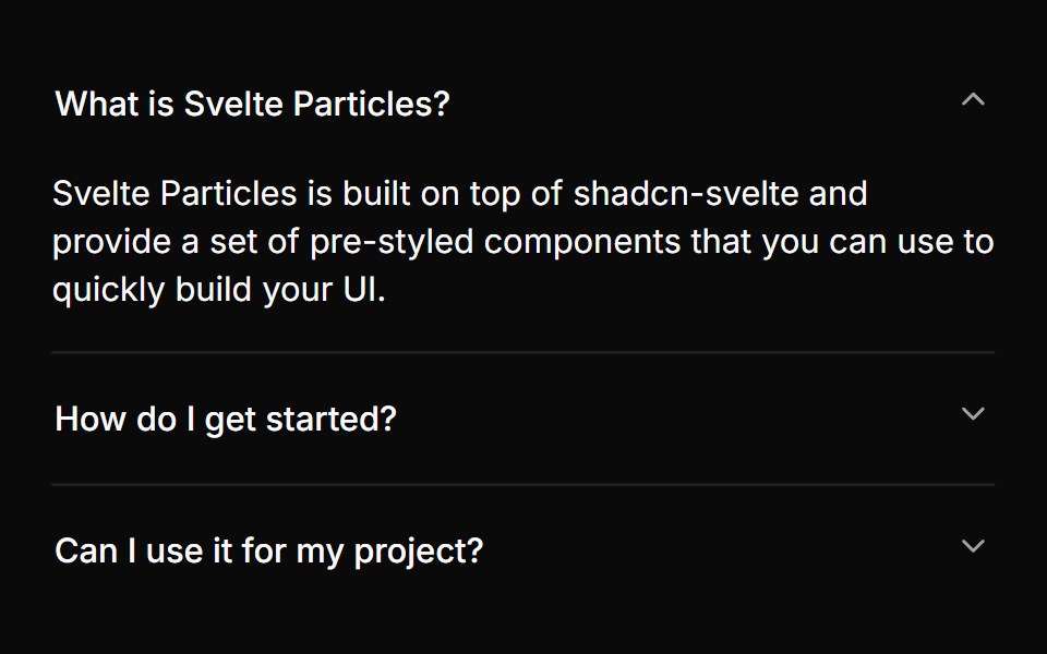 Multiple Panelssv-particles · Svelte
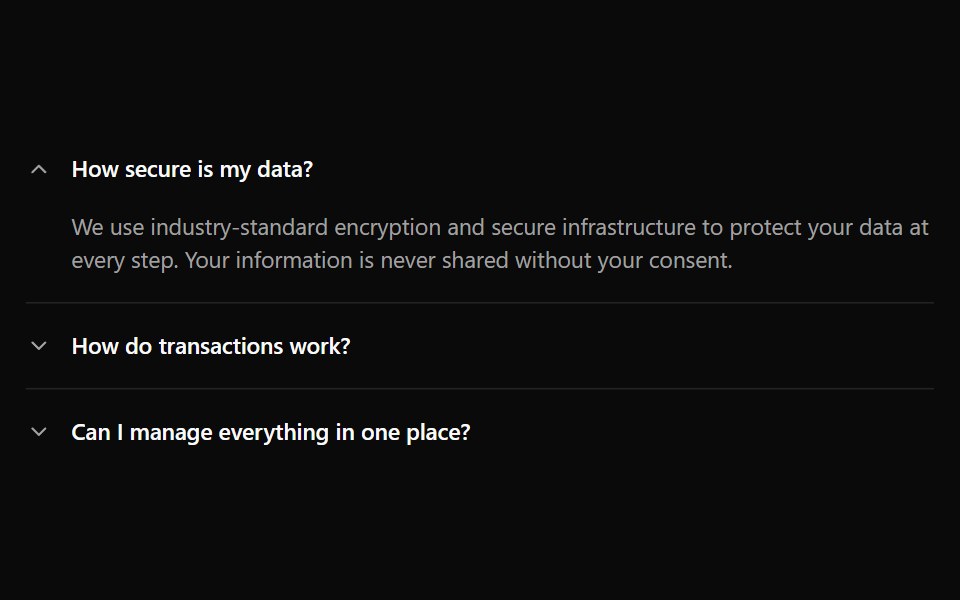 Accordion 1Watermelon UI · React
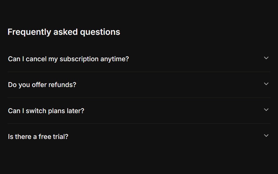 FAQFLX UI · ReactA titled question-and-answer list.
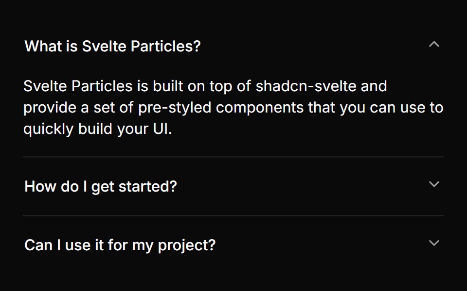 With One Panelsv-particles · Svelte
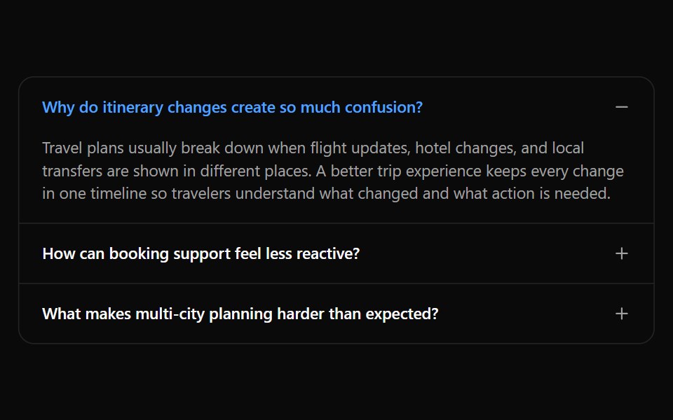 Accordion 10Watermelon UI · React
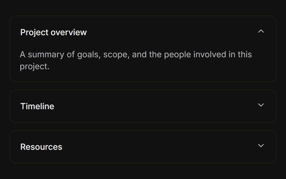 Separated cardsFLX UI · ReactEach item is a bordered card with spacing between them.
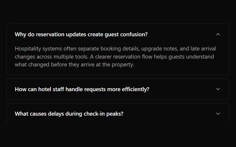 Accordion 11Watermelon UI · React
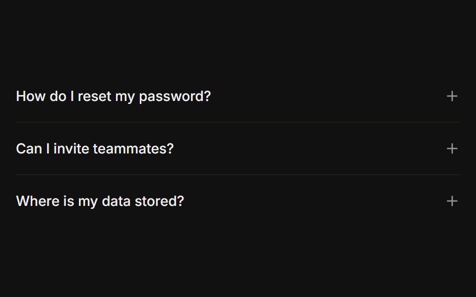 Plus / minus iconFLX UI · ReactPlus icon on each trigger that turns into a minus when open, instead of a chevron.
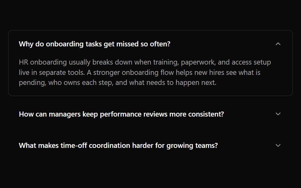 Accordion 12Watermelon UI · React
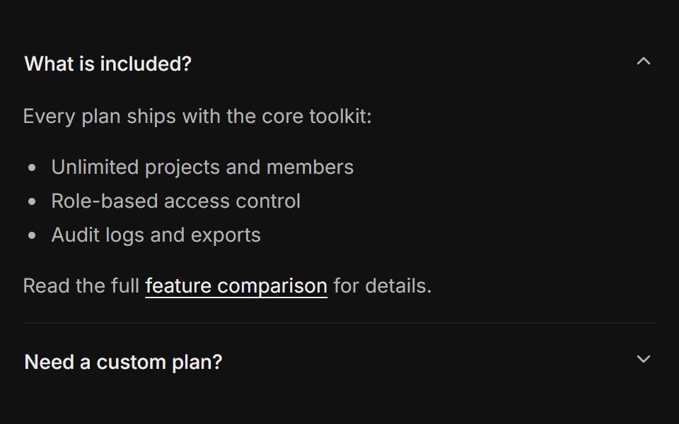 Rich contentFLX UI · ReactLists, links, and a button inside the panel body.
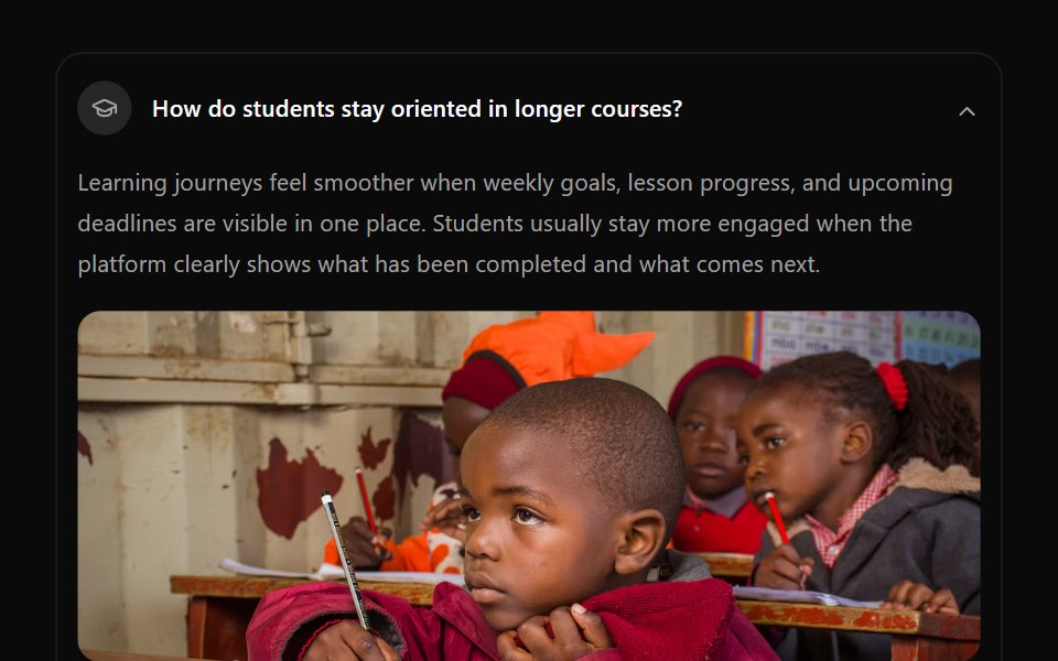 Accordion 13Watermelon UI · React
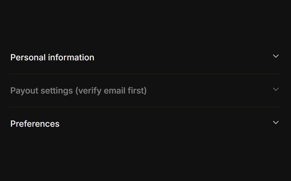 Disabled itemFLX UI · ReactOne trigger disabled while the others stay interactive.
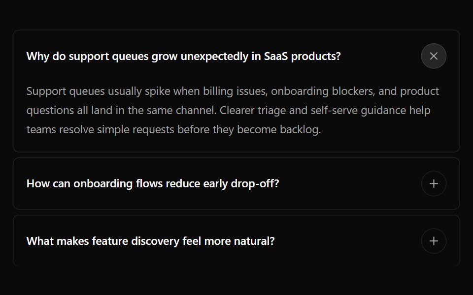 Accordion 14Watermelon UI · React
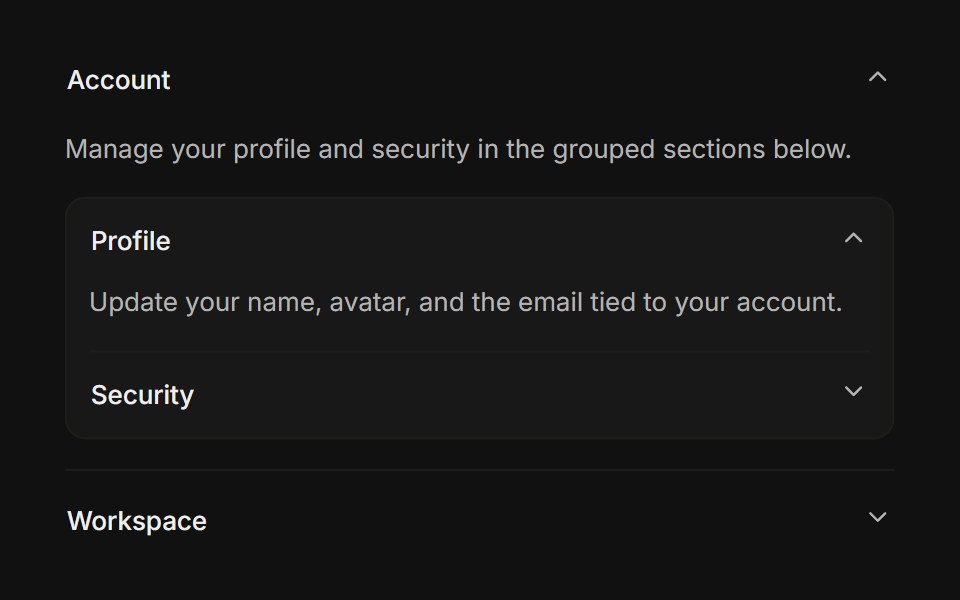 NestedFLX UI · ReactAn accordion rendered inside another panel body.
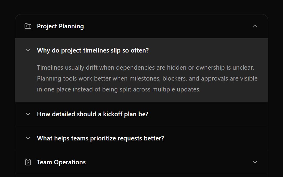 Accordion 15Watermelon UI · React
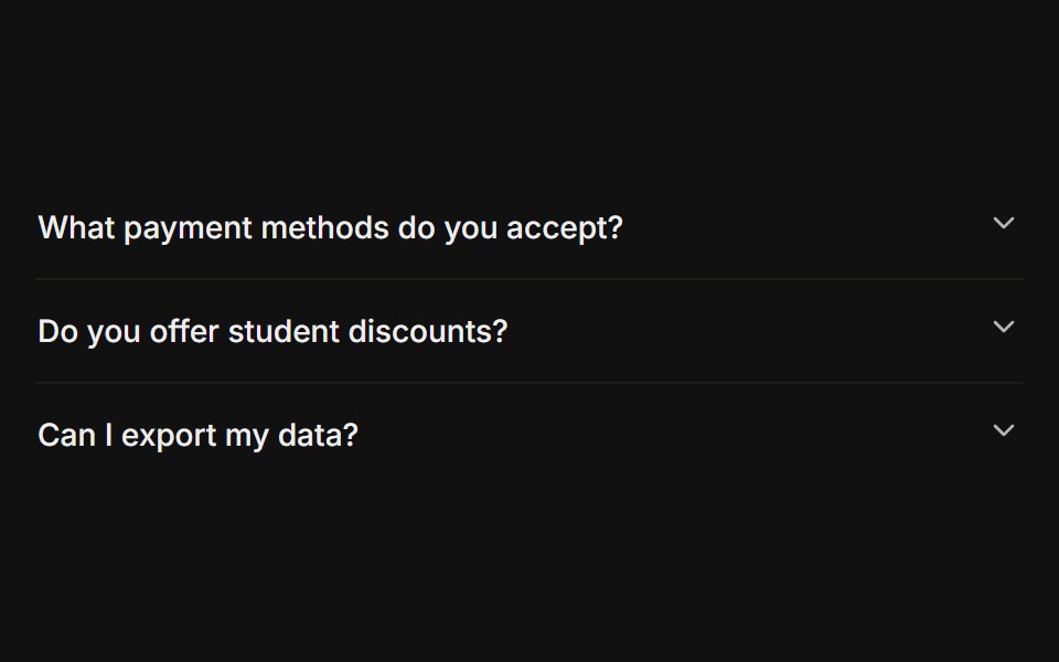 GhostFLX UI · ReactBorderless minimal rows with an active color on open.
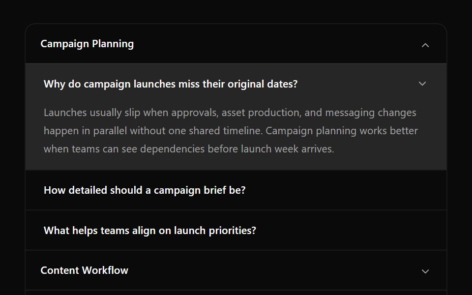 Accordion 16Watermelon UI · React
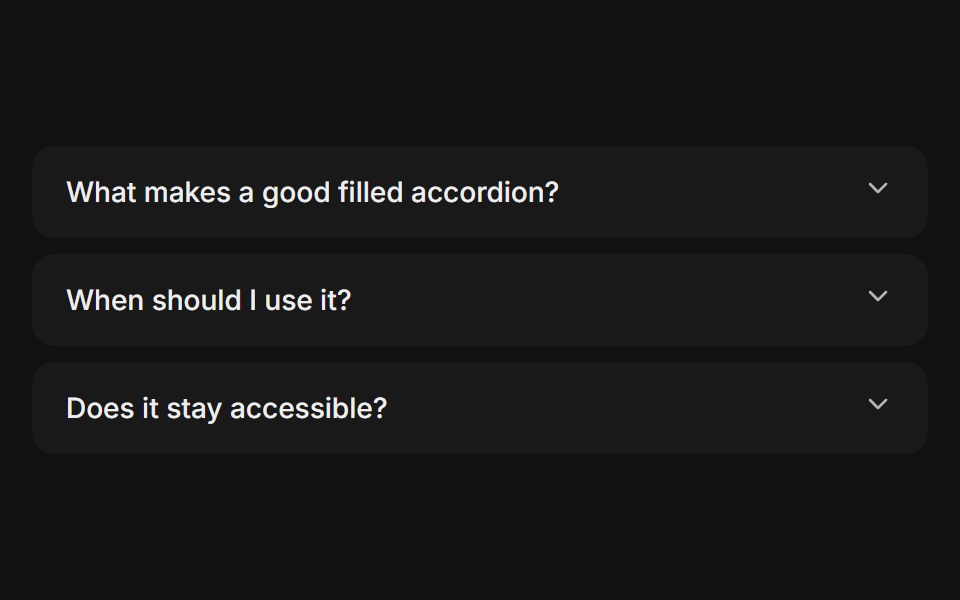 Filled triggerFLX UI · ReactEach trigger sits on a muted, rounded background.
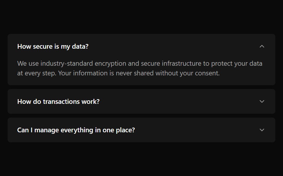 Accordion 2Watermelon UI · React
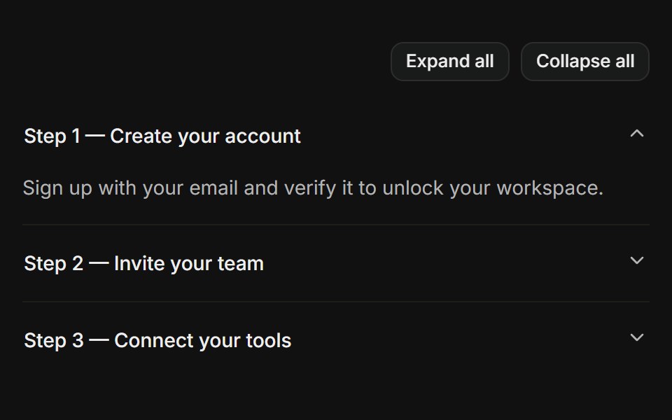 Expand allFLX UI · ReactControlled value with expand-all / collapse-all buttons.
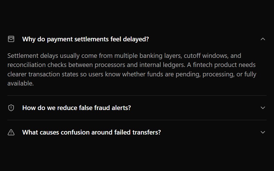 Accordion 3Watermelon UI · React
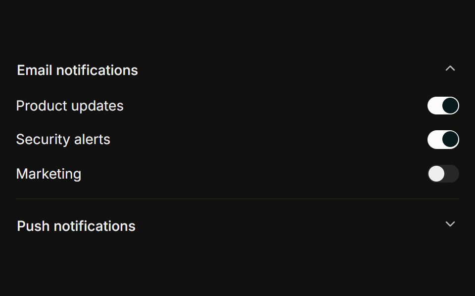 Settings sectionsFLX UI · ReactGrouped switch rows revealed inside each panel.
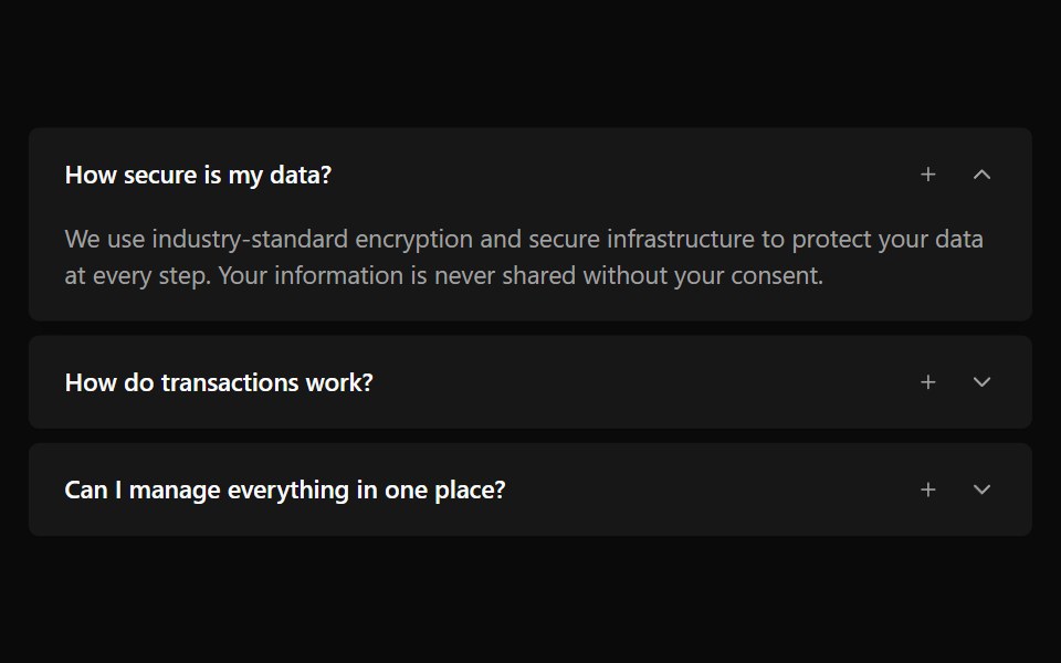 Accordion 4Watermelon UI · React
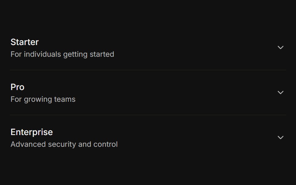 With subtitleFLX UI · ReactTwo-line trigger pairing a title with helper text.
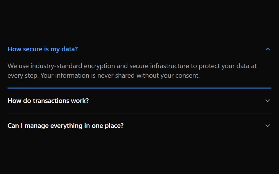 Accordion 5Watermelon UI · React
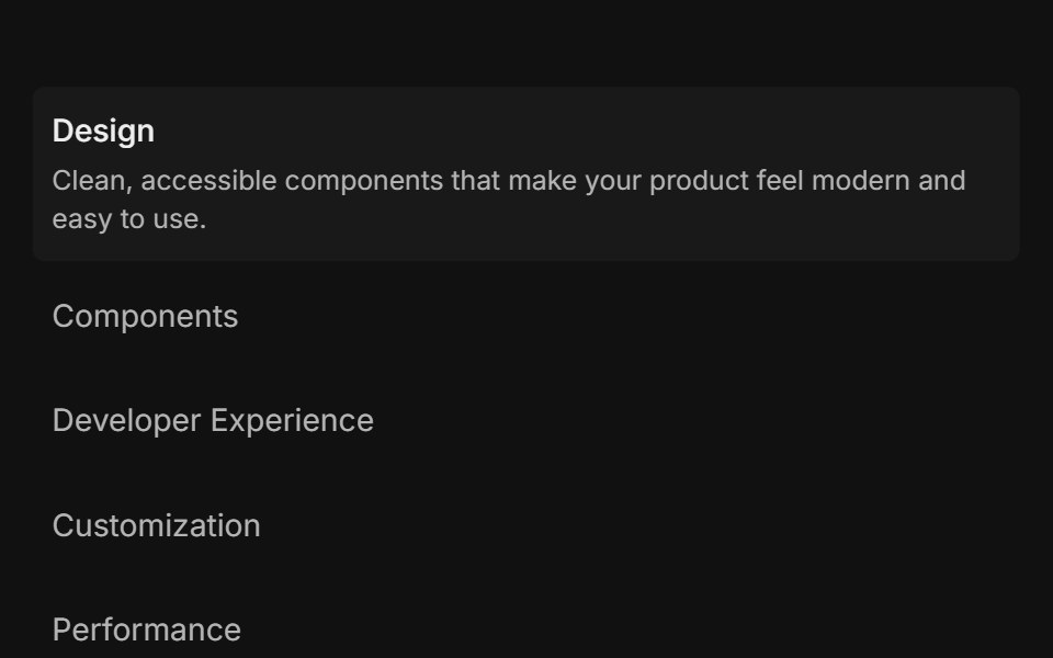 Feature 01FLX UI · ReactList of items: select one to reveal its description and media.
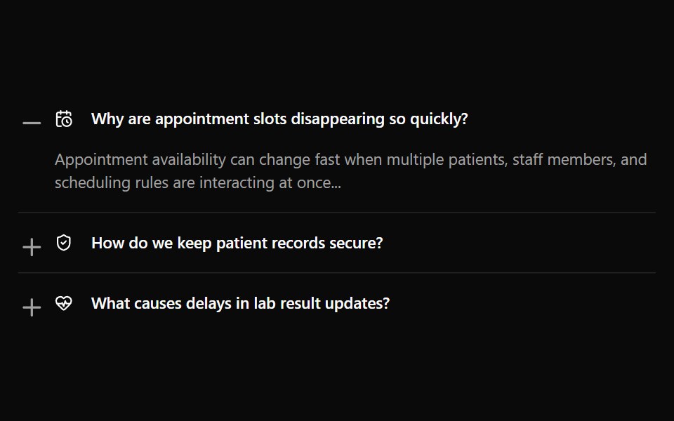 Accordion 6Watermelon UI · React
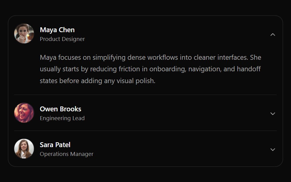 Accordion 7Watermelon UI · React
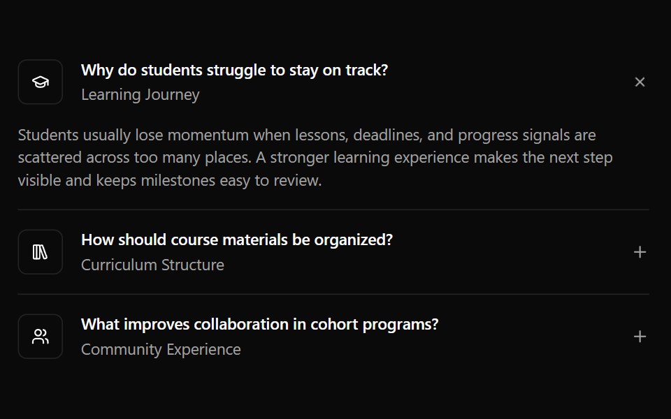 Accordion 8Watermelon UI · React
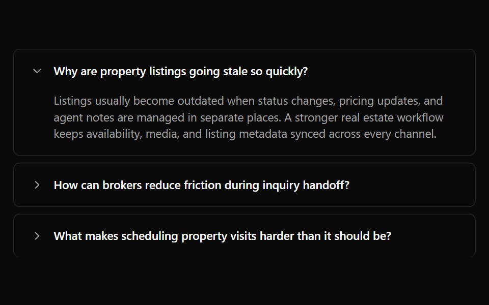 Accordion 9Watermelon UI · React
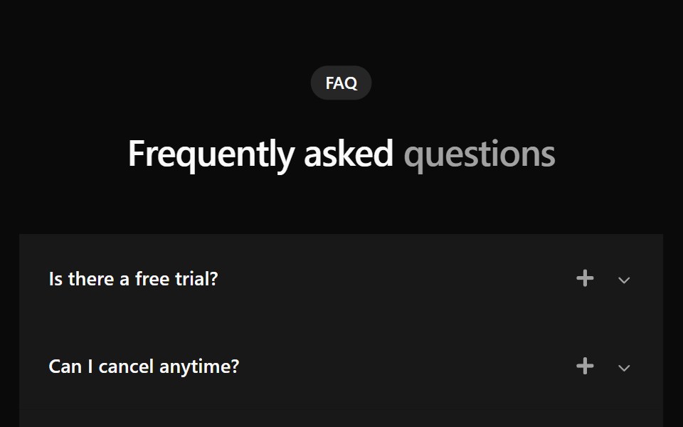 Faq 1Watermelon UI · React
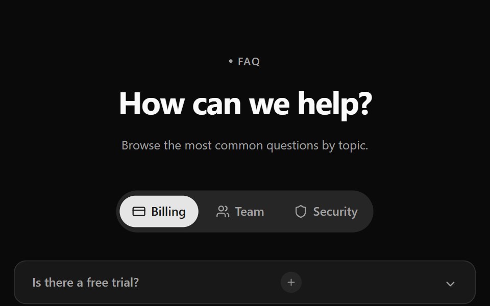 Faq 2Watermelon UI · React
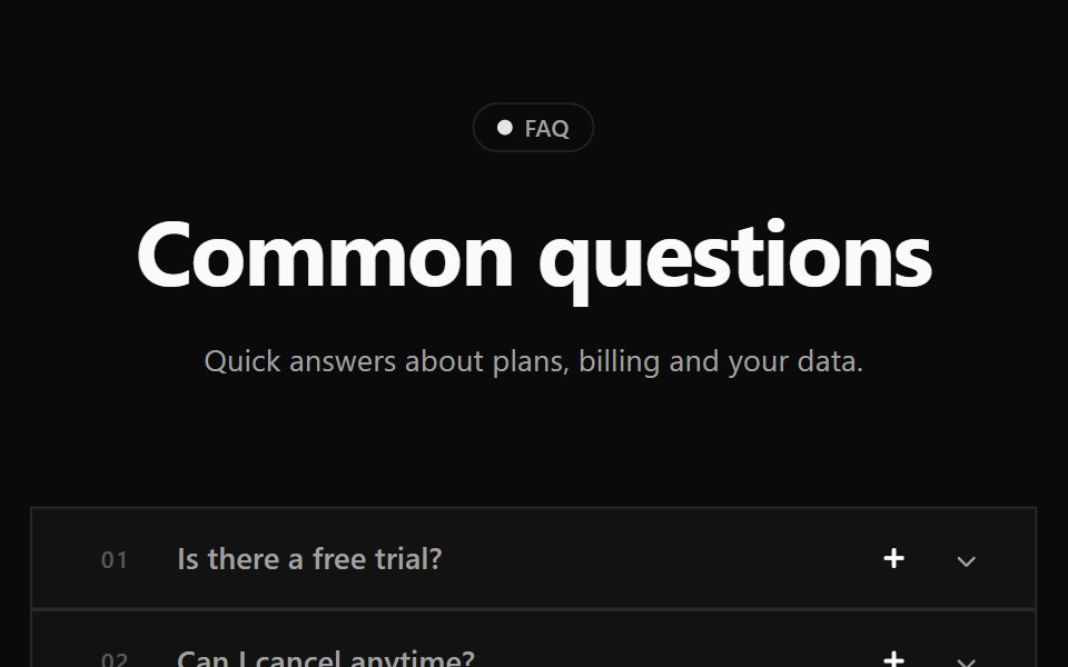 Faq 3Watermelon UI · React
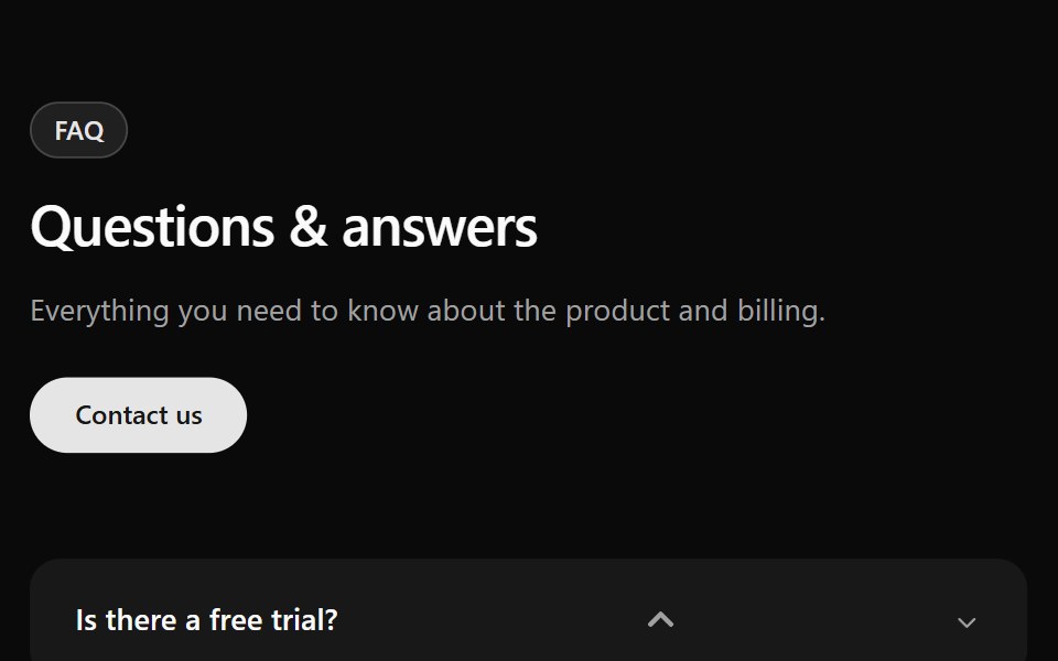 Faq 4Watermelon UI · React
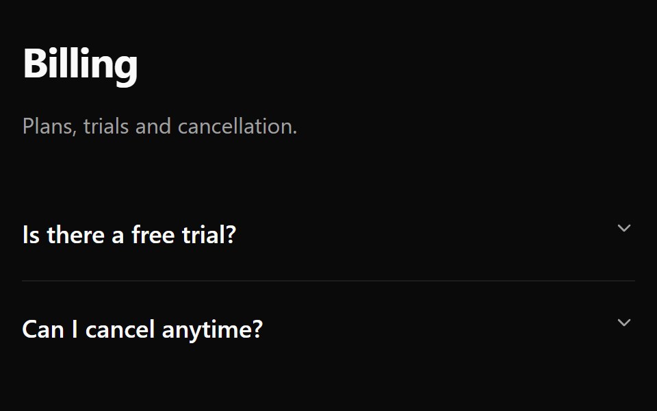 Faq 5Watermelon UI · React
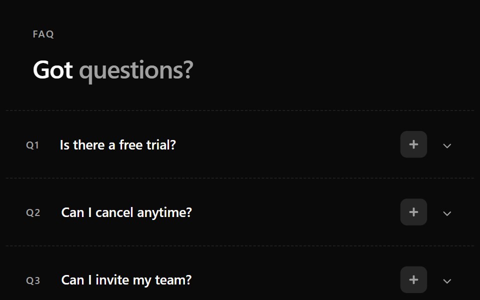 Faq 6Watermelon UI · React
Libraries with shadcn/ui accordion components
Related categories
- Accordion Components
- React Accordion Components
- Tailwind CSS Accordion Components
- Svelte Accordion Components
- Animated Accordion Components
- shadcn/ui Data Display Components
- shadcn/ui Card Components
- shadcn/ui Table Components
- shadcn/ui Avatar Components
- shadcn/ui Data Table Components
- shadcn/ui Stat Components
- shadcn/ui List Components
- shadcn/ui Chart Components
- shadcn/ui Calendar Components
- shadcn/ui Collapsible Components
- shadcn/ui Stat Card Components
- shadcn/ui Avatar Group Components
- shadcn/ui Tree View Components
- shadcn/ui Carousel Components
- shadcn/ui Testimonial Components
- shadcn/ui Filter Bar Components