 Dev Design Library
React Accordion Components
Dev Design Library indexes 155 React accordion components from 54 open-source UI libraries, with the most coming from Watermelon UI, Origin UI, FLX UI, ReUI and Spectrum UI. Each one links to its page with the source code, a live preview where available, the library license and the install command. Every library in this list targets React. Accordion components belong to the Data display group.
Showing 120 of 155, a mix from every library. Open a library to see all of its components.
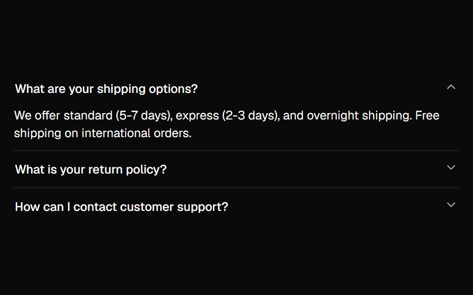 Accordionshadcn/ui · ReactA vertically stacked set of interactive headings that each reveal a section of content.
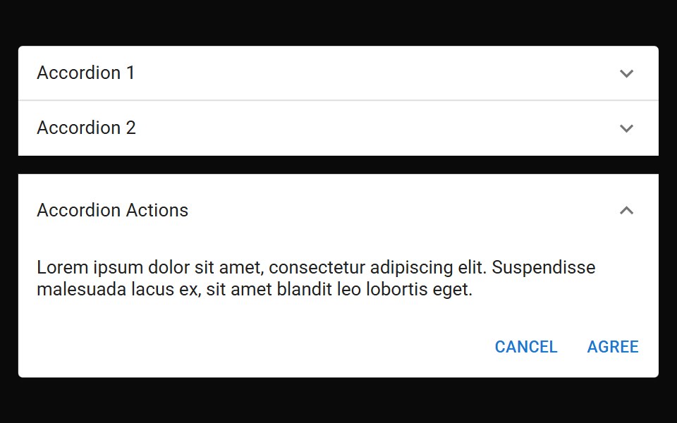 AccordionMUI / Material UI · React
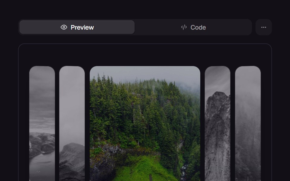 Accordion GalleryReact Bits · ReactPanels expand on hover or focus, revealing parallax imagery and captions.
 AccordionChakra UI · ReactUsed to show and hide sections of related content on a page
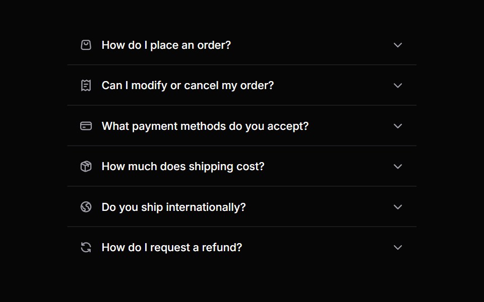 AccordionHeroUI · ReactA collapsible content panel for organizing information in a compact space
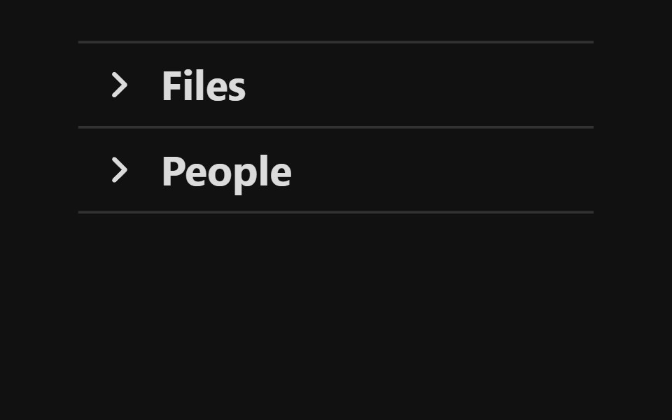 AccordionReact Spectrum · ReactA group of disclosures that can be expanded and collapsed.
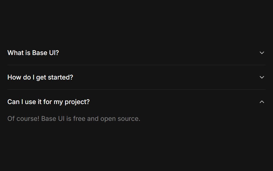 Accordioncoss ui · ReactA set of collapsible panels with headings and content.
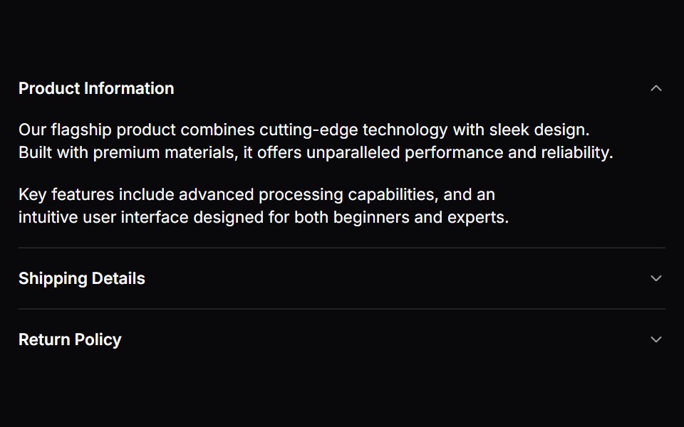 AccordionOrigin UI · ReactA set of collapsible panels with headings and content.
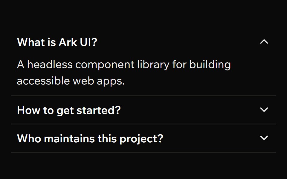 AccordionArk UI · ReactA collapsible component for displaying content in a vertical stack.
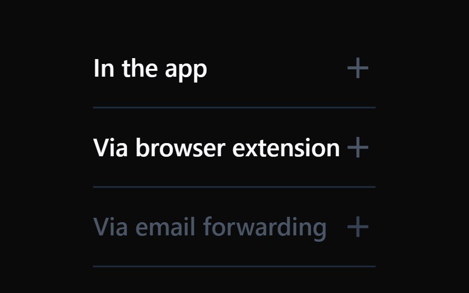 AccordionTremor · React
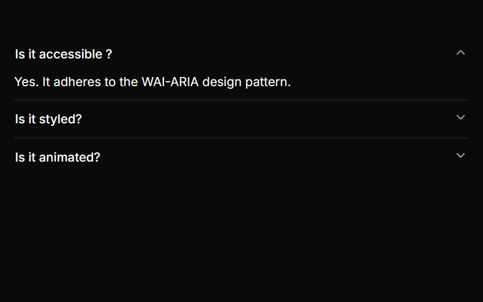 A basic single-expand accordionReUI · ReactA basic single-expand accordion
 Accordion LoaderAmicro Micro Transitions · ReactAccordion Loader loading animation.
 AccordionPark UI · ReactA disclosure component with collapsible sections for organizing content.
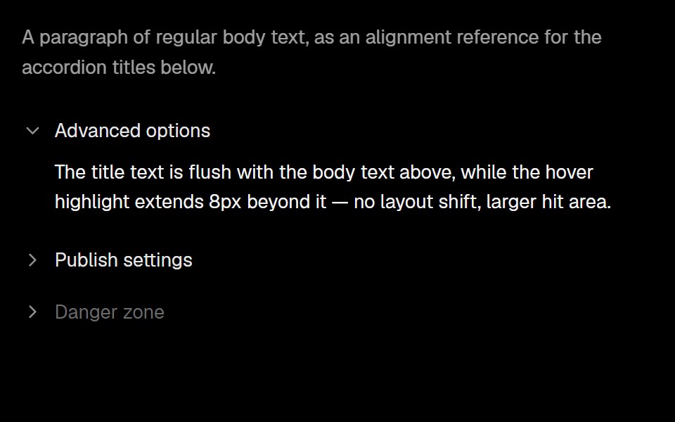 AccordionLobe UI · ReactA vertically stacked set of interactive headings whose items reveal titled content with controlled or uncontrolled…
 disclosure-groupIntent UI · Reactdisclosure-group
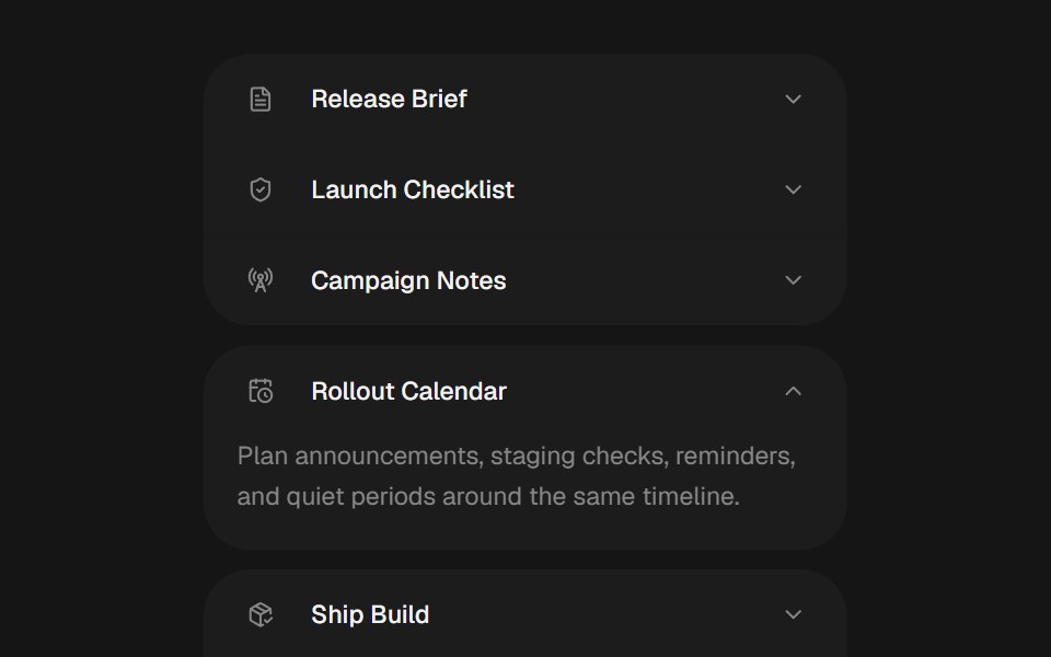 Bouncy AccordionbeUI · ReactSingle-open accordion with weighted spring layout, icon rows and reduced-motion-safe content reveals.
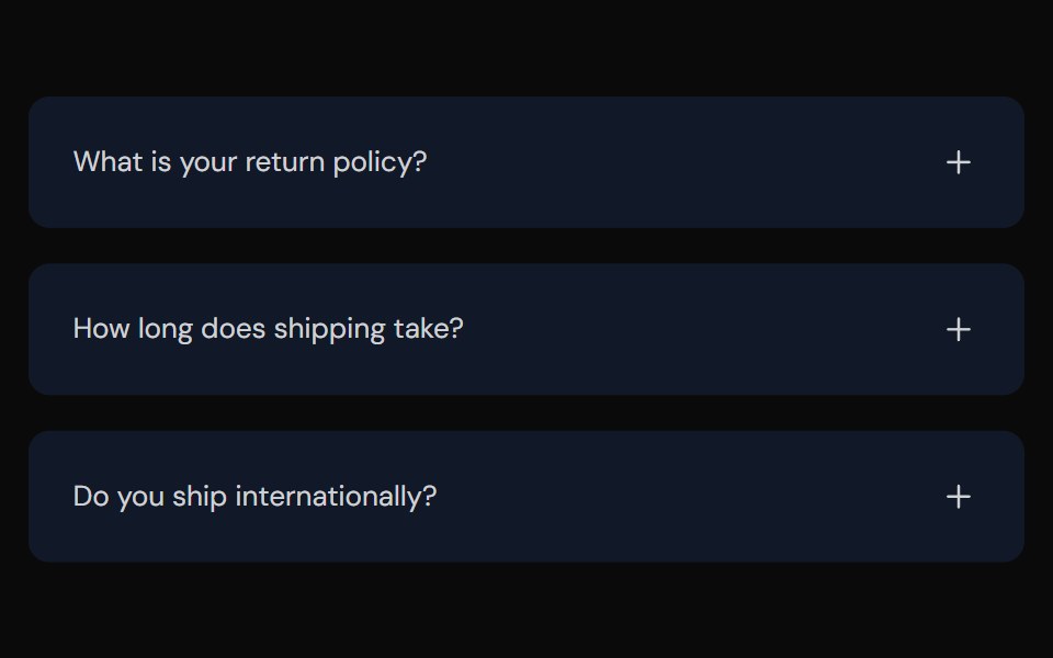 AccordionTailGrids · ReactFully accessible accordion component with multiple style variants
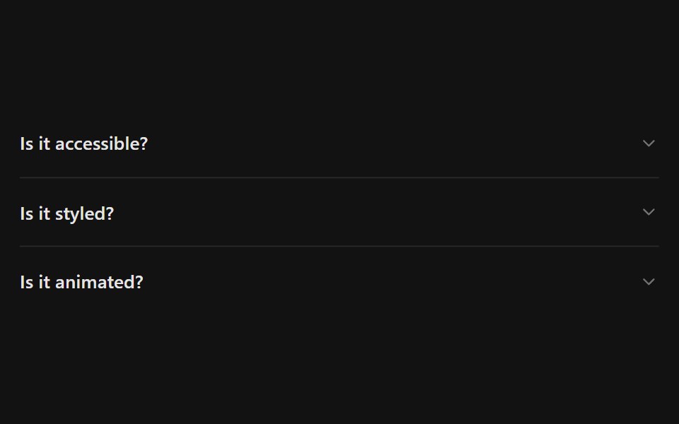 AccordionSpectrum UI · Reactcomponent for the Accordion
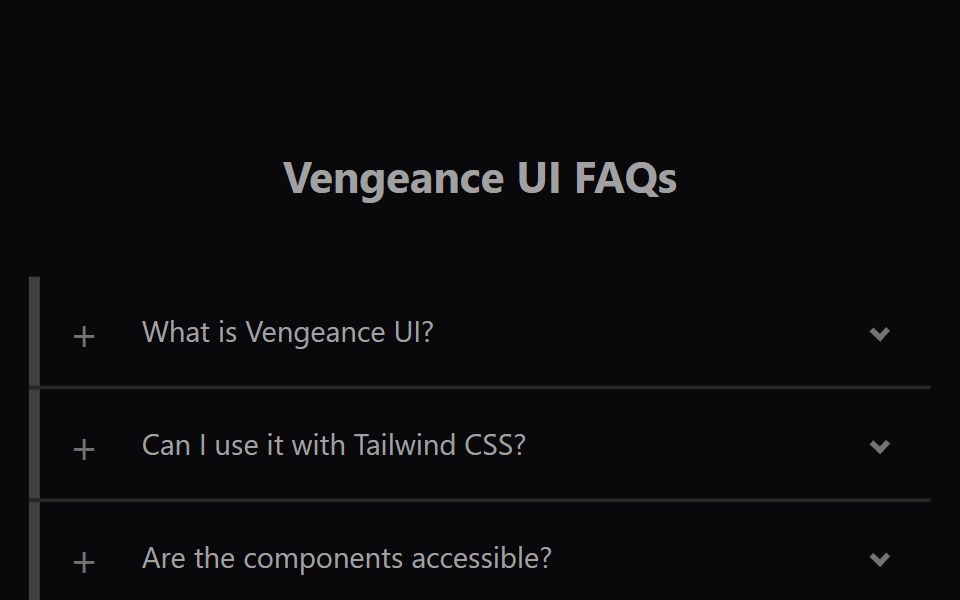 Faq AccordionVengeance UI · ReactAnimated expanding FAQ list
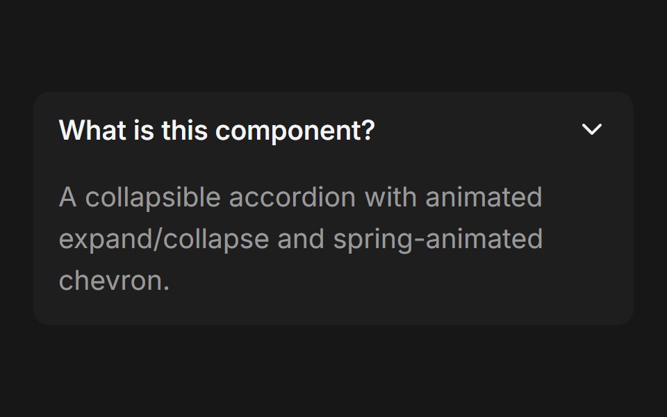 AccordionFluid Functionalism · ReactCollapsible accordion with animated height transitions, spring-animated chevron, and fluid hover in grouped mode…
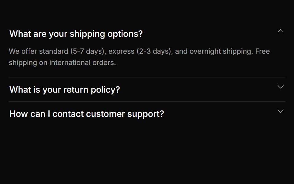 AccordionToolcraft · React
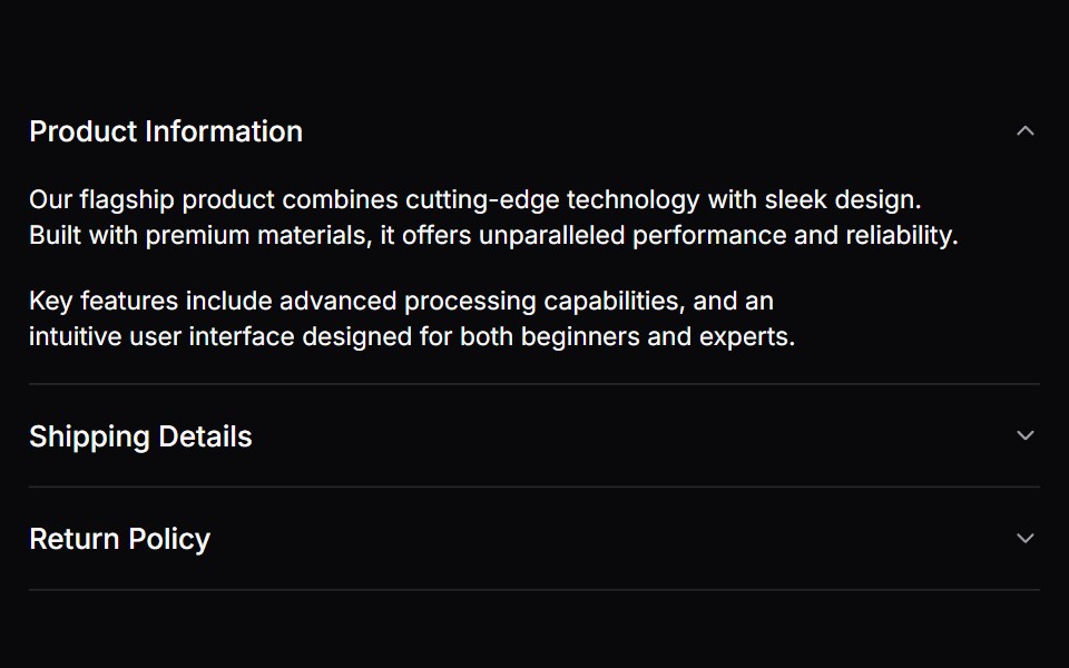 AccordionLaunch UI · React
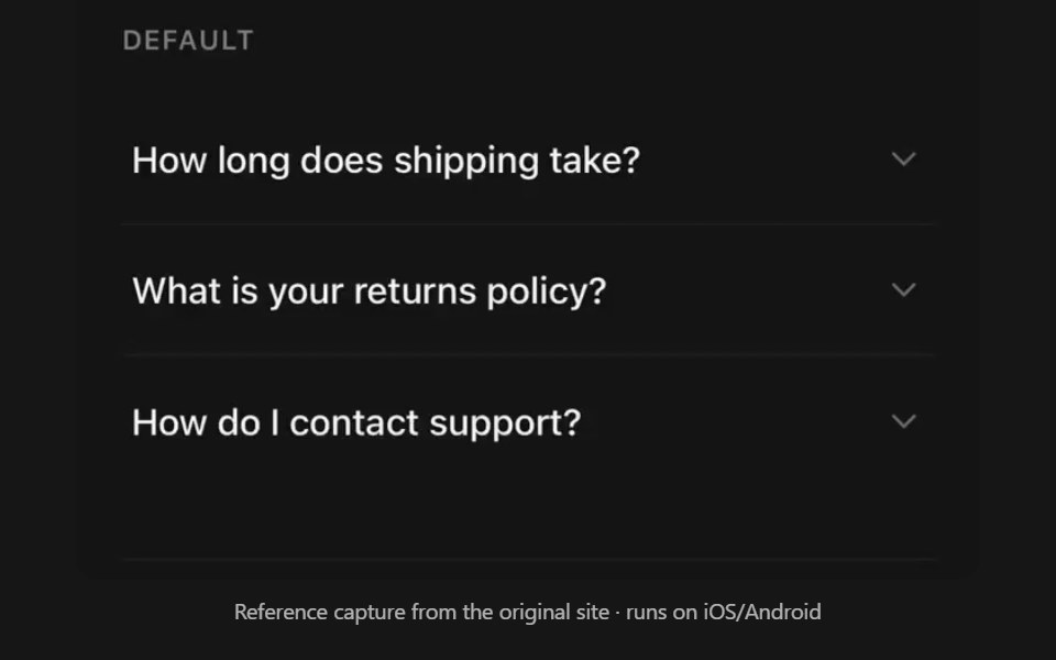 AccordionPanel UI · React NativeCollapsible sections with single or multiple selection.
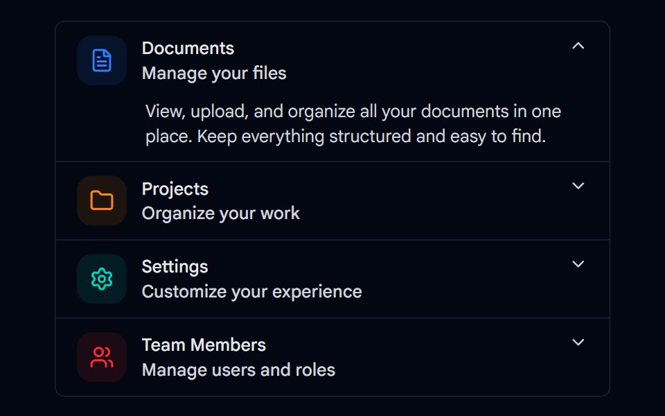 Accordion-01 - DefaultShadcn Space · ReactDefault accordion component
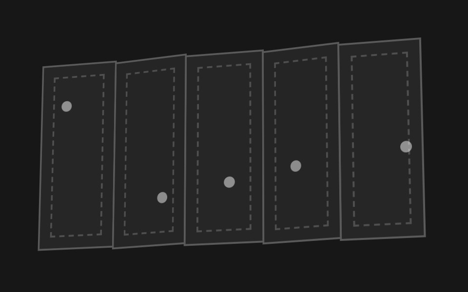 Accordion FoldPixel Perfect · ReactA paper map of hinged panels that folds itself up like an accordion and flattens back out.
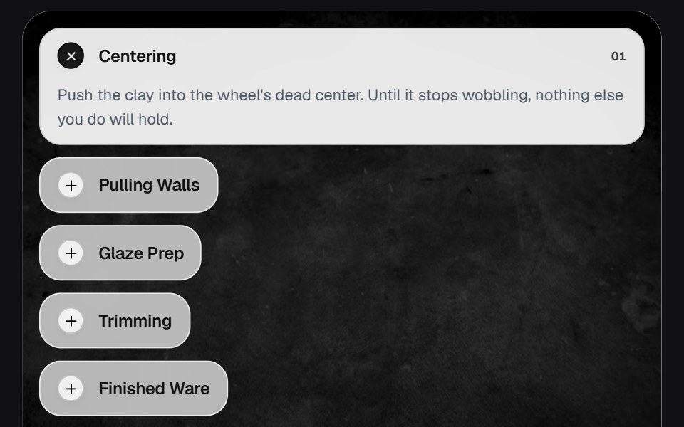 AccordionOSuselayouts · ReactInteractive accordion showcase with animated content, image transitions, hover effects, keyboard navigation, autoplay…
 AccordionTremor Blocks · React
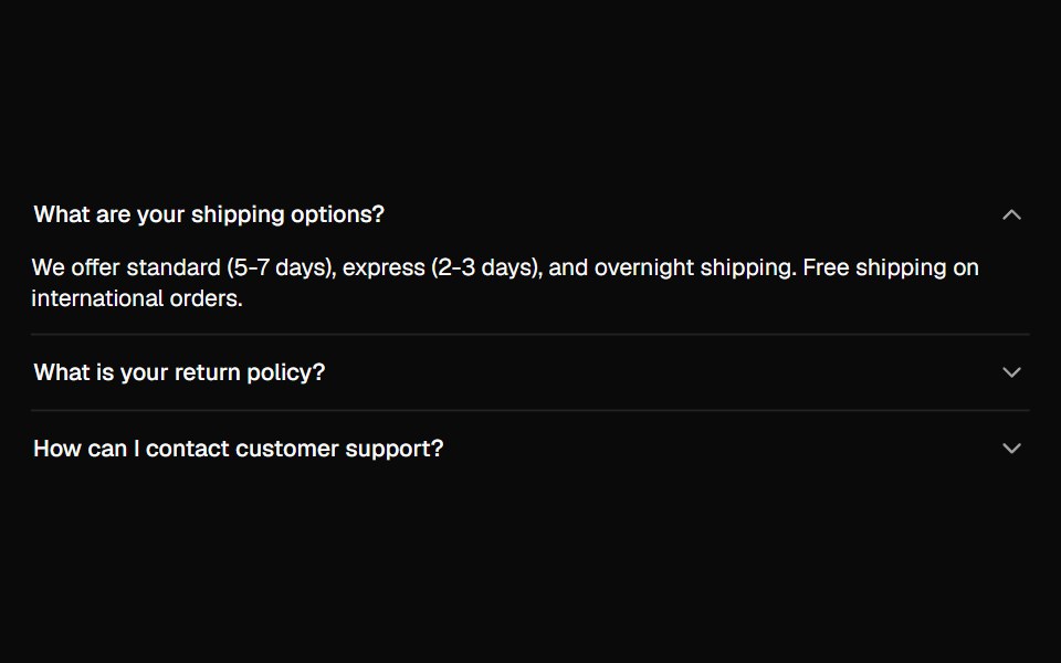 AccordionShadcn Dashboard · React
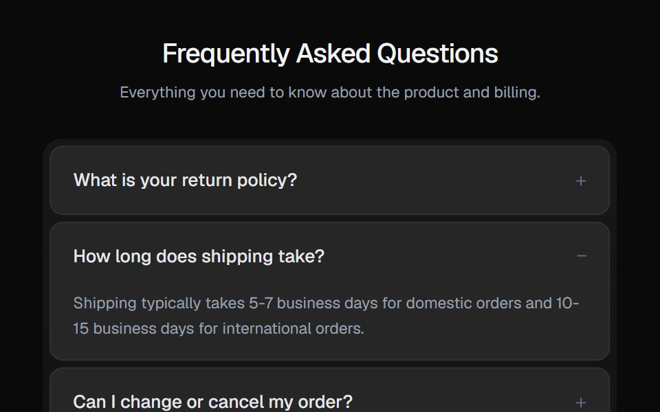 AccordionGreatUI · React
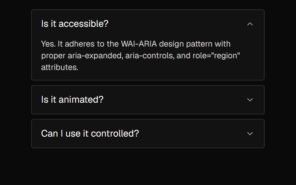 AccordionNexvyn UI · ReactA vertically stacked set of interactive headings that each reveal a section of content, with a grid-rows unfold…
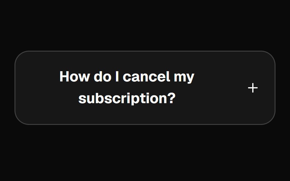 accordionBaseLayer · ReactAn accordion allows users to toggle the display of sections of content. Each accordion consists of a header with a…
 AccordionShark UI · ReactA collapsible for displaying content.
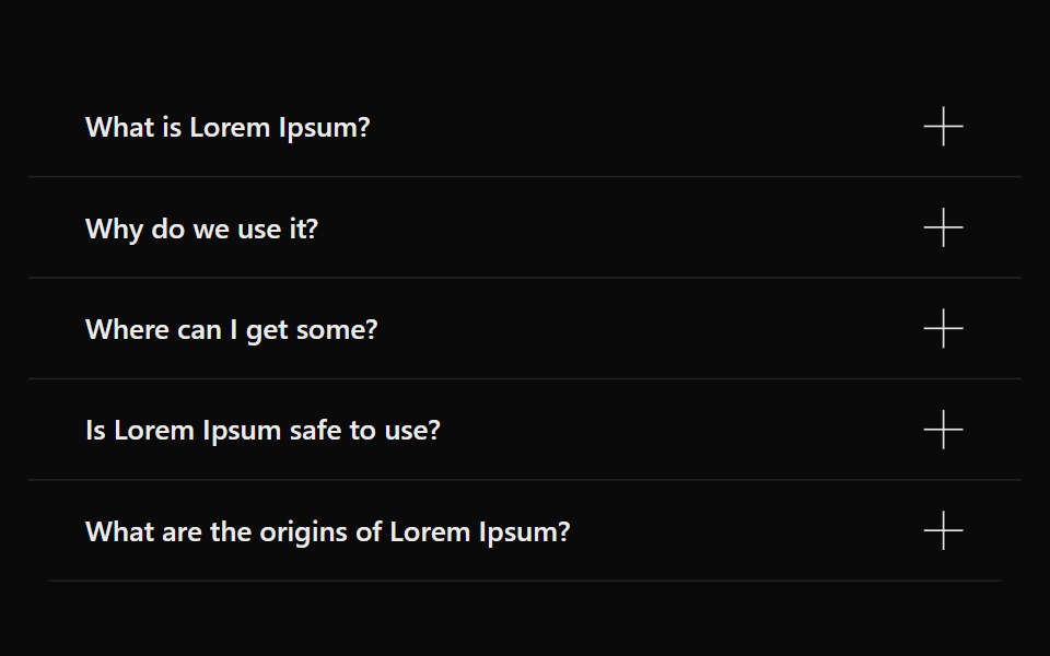 AccordionSona UI · ReactAn accessible Base UI accordion with controlled and uncontrolled state, four visual variants, interruptible disclosure…
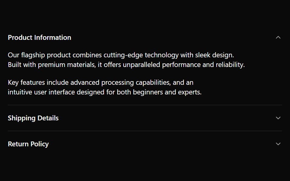 AccordionWatermelon UI · React
 AccordionArc Library · ReactProgressively reveal supporting information in place.
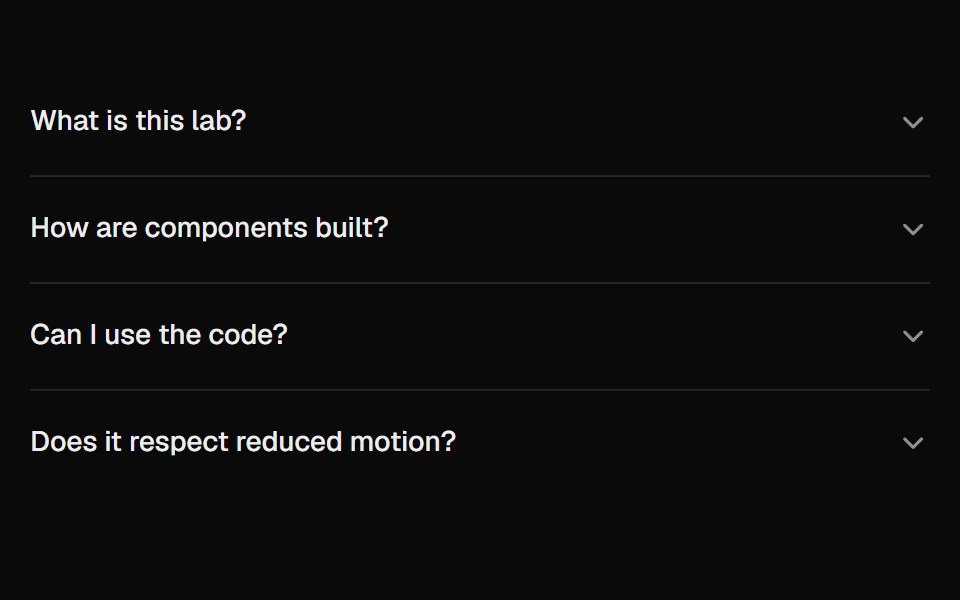 AccordionUI Lab · ReactAnswers unfold from under their question like a folded flap, and the row you clicked never moves.
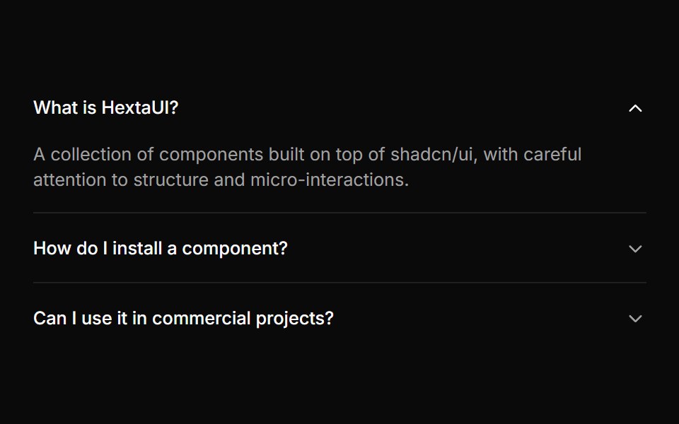 AccordionHextaUI · ReactStacked headings that each reveal a panel, with height motion you can reverse mid-way and panels that stay searchable…
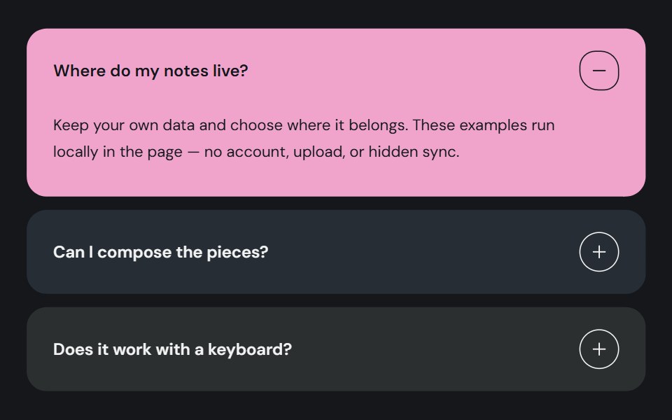 AccordionCojeev UI · ReactOrganizes related sections into expandable panels so readers can open the details they need.
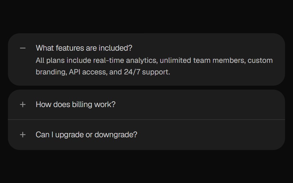 AccordionROI UI · ReactA collapsible content component.
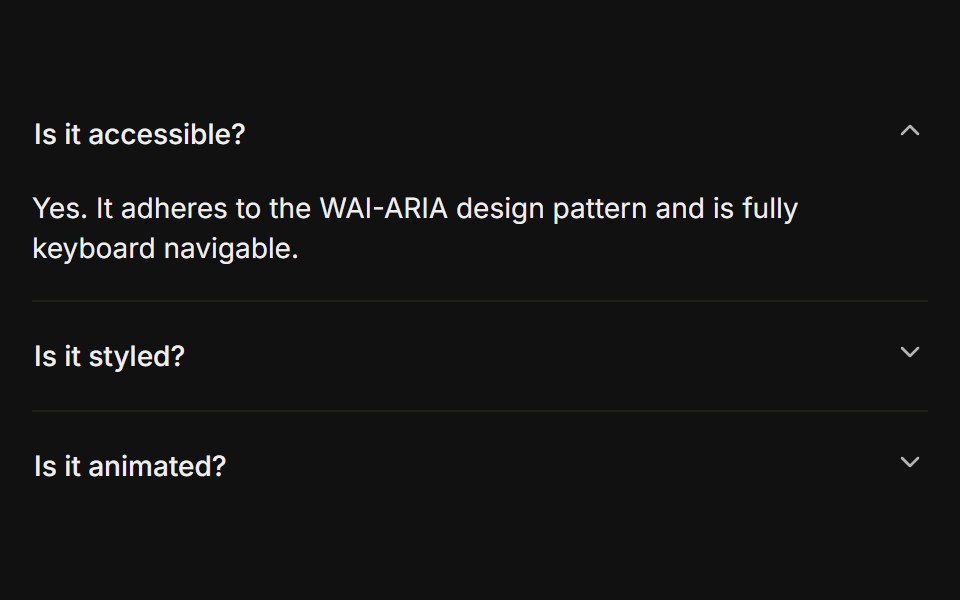 BasicFLX UI · ReactOnly one section open at a time, type="single" collapsible. The default behavior.
 Centered FAQ accordionVelora UI · ReactCentered heading over an accordion of eight questions, closed by a contact row.
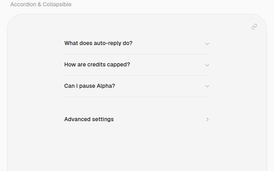 AccordionHalaska UI · React
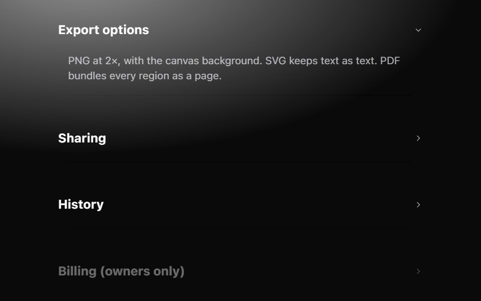 AccordionMetal UI · React + SwiftUISections that open in place: row headers with a chevron; the panel grows to its content on the settle spring while the…
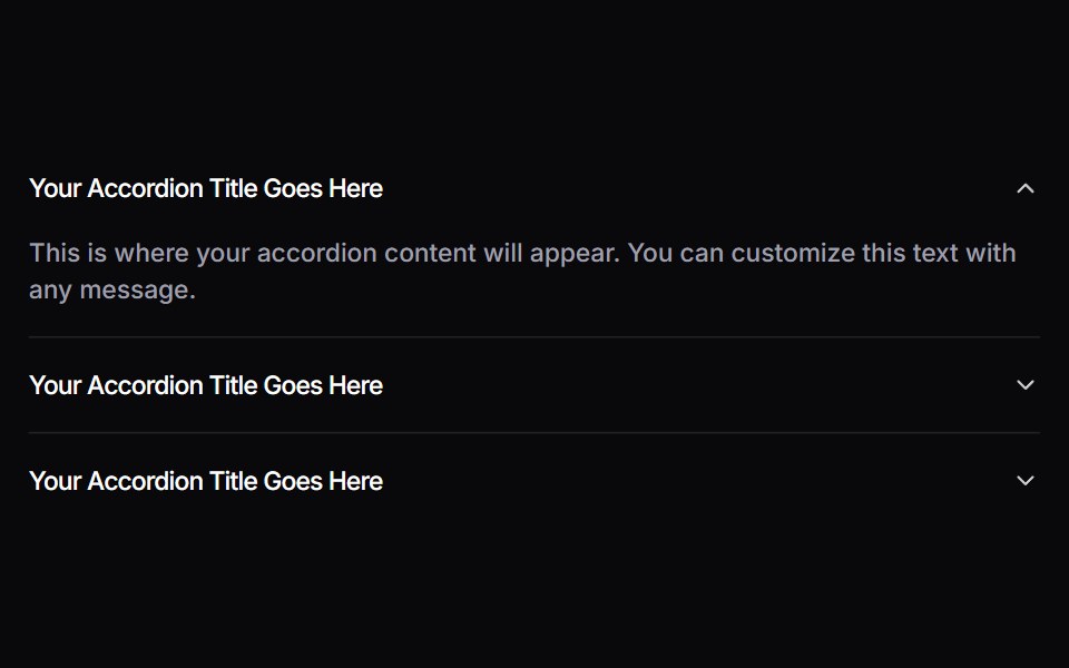 AccordionSpaceUI · ReactAllows you to display content in collapsible panels, making it easy for users to explore details on demand while…
 Aria AccordionReScript shadcn · ReScript
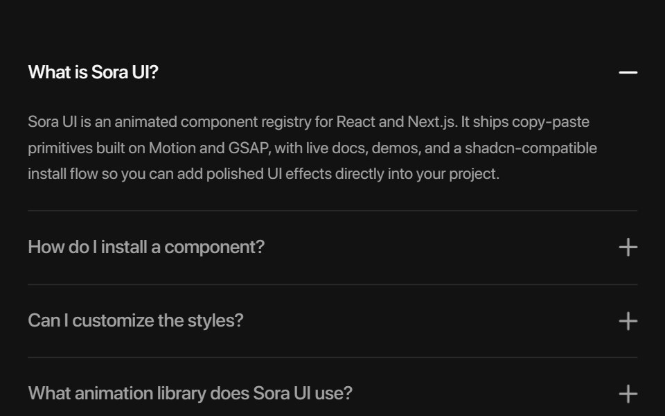 AccordionSora UI · ReactAn animated FAQ accordion with expandable panels, powered by Motion.
 Collapsing Cards AccordionCue Foundations · React
 DisclosureOUI · ReactReact aria components Disclosure with shadcn characteristics.
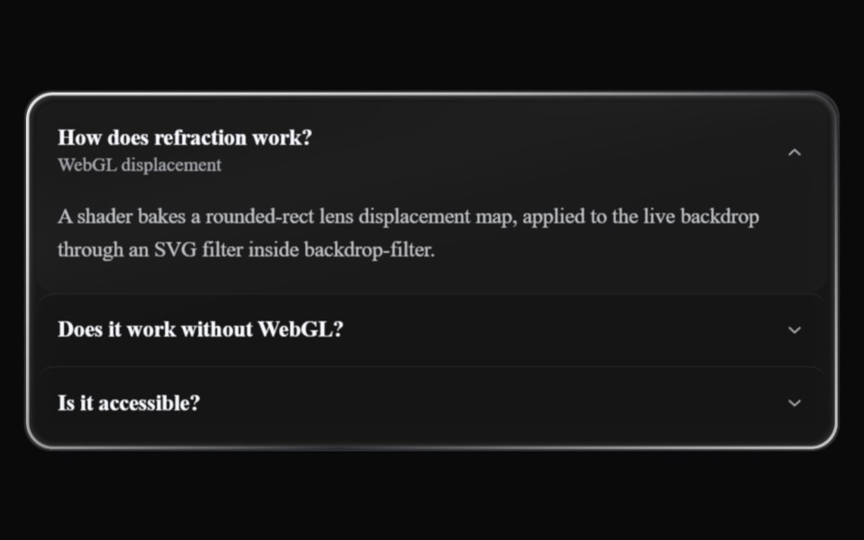 Liquid AccordionLiquefy UI · ReactAccordion in liquid glass style: translucent panels that refract the background.
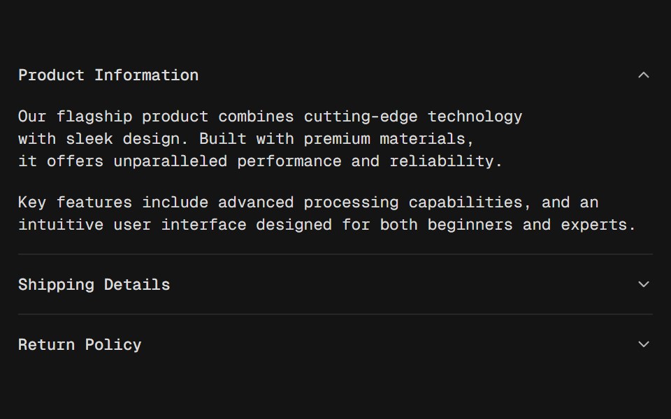 AccordionD2Studio UI · ReactA vertically stacked set of interactive headings that each reveal a section of content.
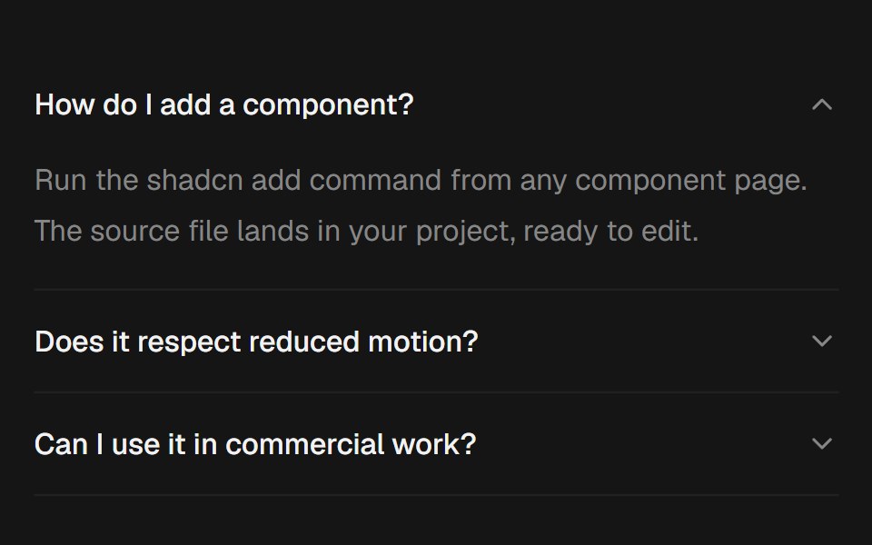 AccordionEaseUI · ReactExpanding sections that grow to their natural height with no measuring, with arrow key navigation and closed panels…
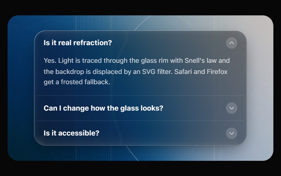 Glass AccordionOpaline · ReactCollapsible sections on one glass panel, or as separate glass cards that grow open.
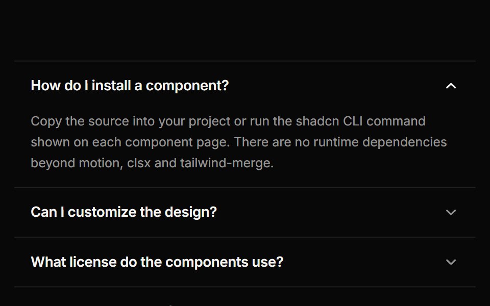 AccordionReactFrame · ReactAn accessible accordion with single or multiple open panels, default, card and filled variants, chevron or plus…
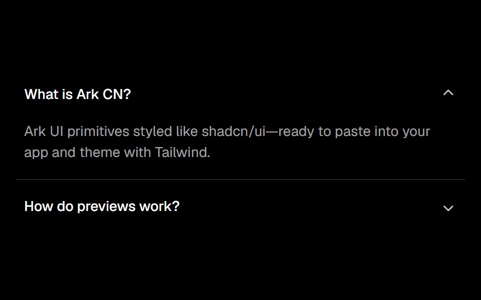 Accordionark-cn · ReactA shadcn-style accordion component built with Ark UI primitives.
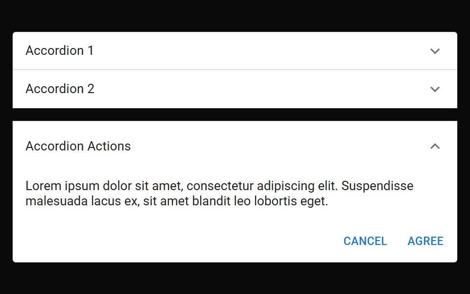 Accordion DetailsMUI / Material UI · React
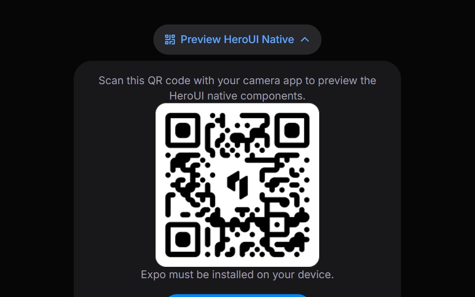 DisclosureHeroUI · ReactA disclosure is a collapsible section with a header containing a heading and a trigger button, and a panel that wraps…
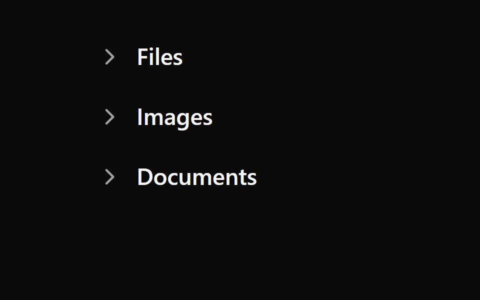 Tailwind Disclosure GroupReact Spectrum · React
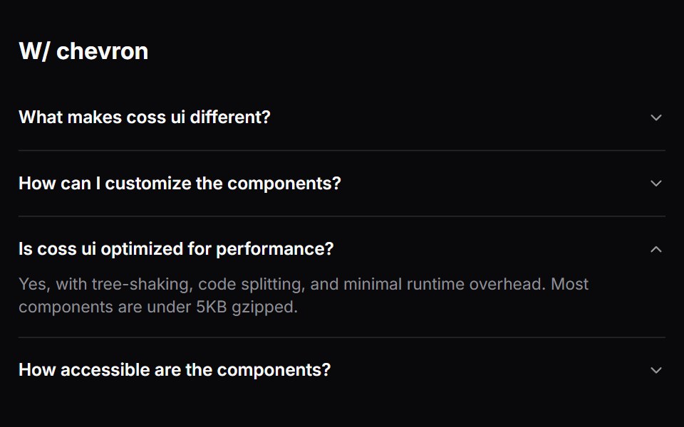 Comp 334Origin UI · React
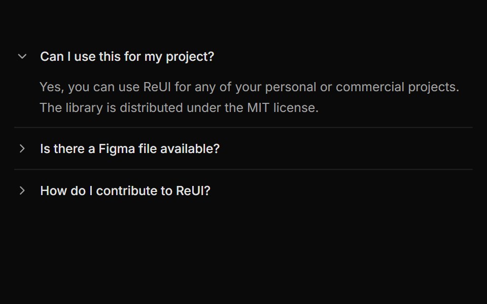 Accordion with rotating arrow indicatorReUI · ReactAccordion with rotating arrow indicator
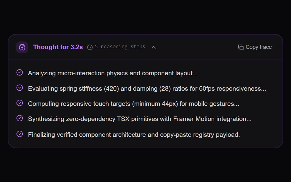 AI Reasoning Trace AccordionAmicro Micro Transitions · ReactCollapsible chain-of-thought reasoning trace with active thought timer, pulsating brain wave, and sequential step…
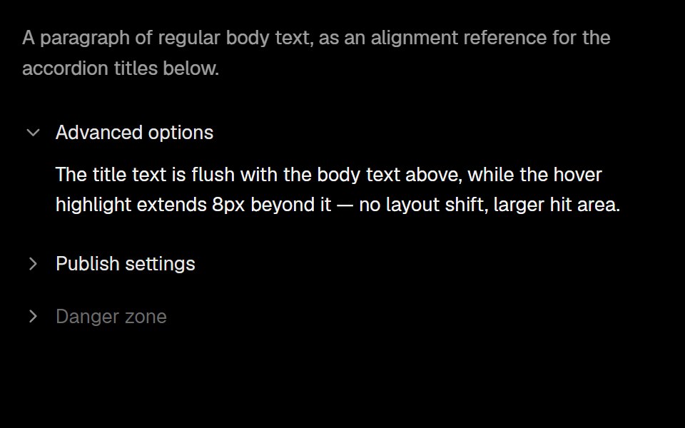 Base Ui AccordionLobe UI · React
 FAQ Tabs CardSpectrum UI · ReactA tabbed FAQ card with animated accordion answers and a support footer.
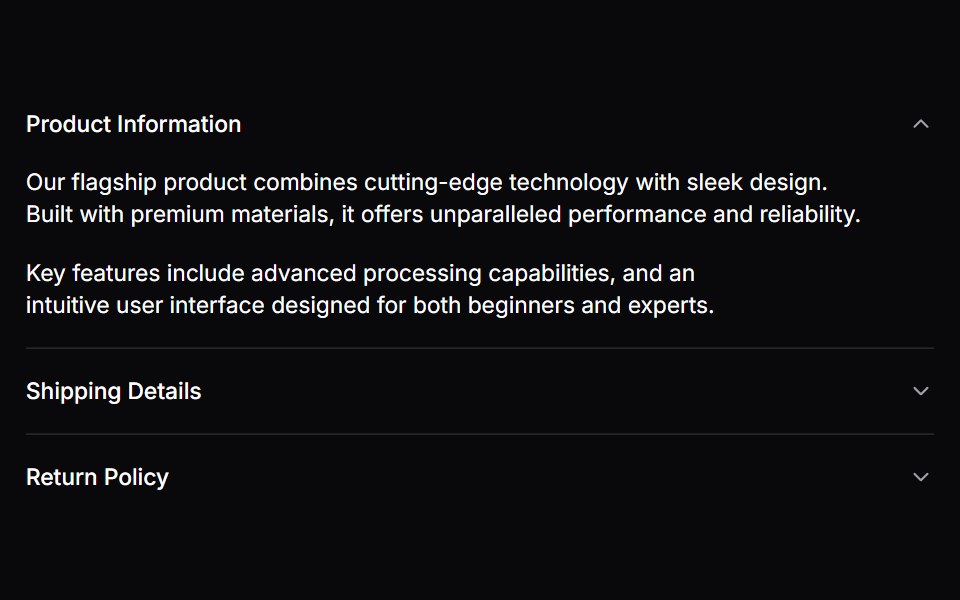 AccordionVengeance UI · React
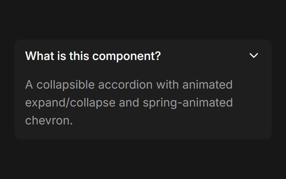 Accordion (Base UI)Fluid Functionalism · ReactCollapsible accordion with animated height transitions, spring-animated chevron, and fluid hover in grouped mode. Base…
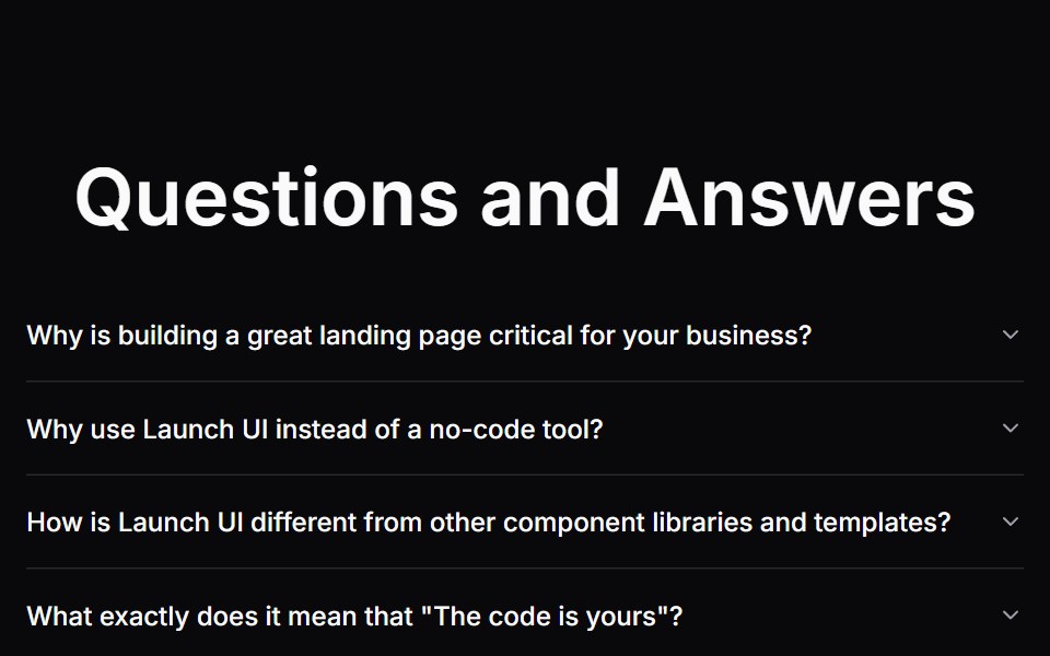 Faq SectionLaunch UI · React
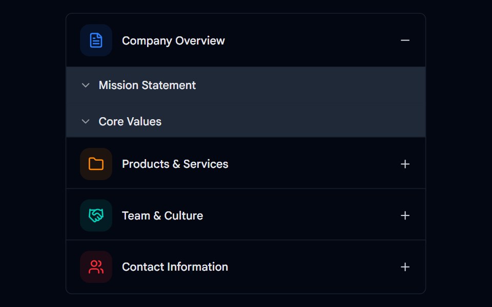 Accordion-02 - Multi-levelShadcn Space · ReactMulti-level accordion component
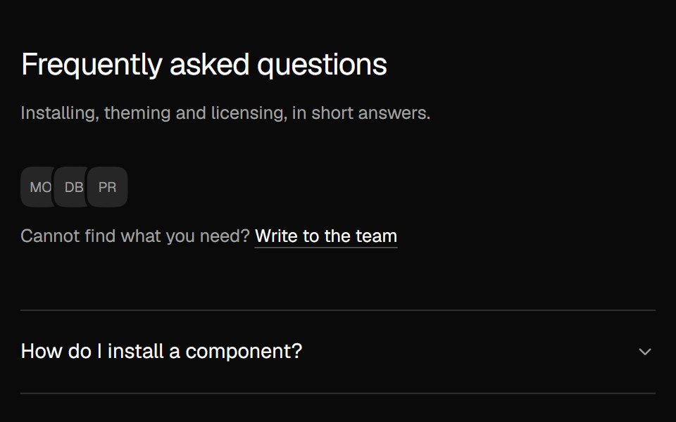 FAQ AccordionNexvyn UI · ReactA two column FAQ accordion with a contact line.
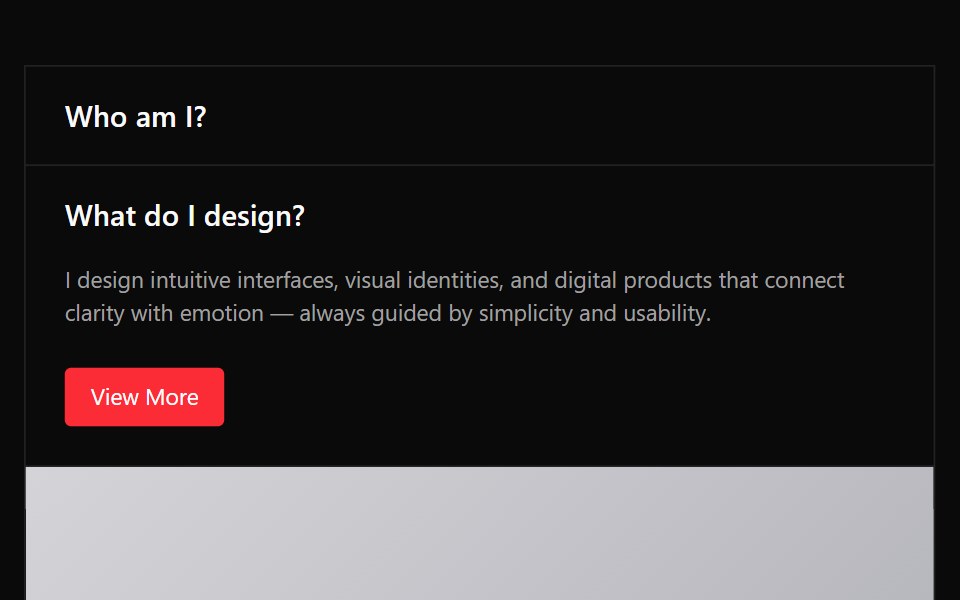 Accordion 03Watermelon UI · React
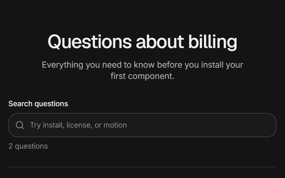 FAQ sectionArc Library · ReactFAQs as an accordion, a topic rail, or a searchable list that highlights matches.
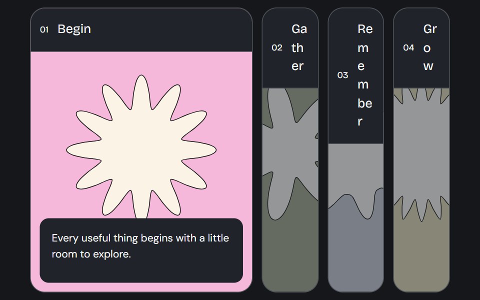 Accordion GalleryCojeev UI · ReactA selected image panel opens to reveal its label, story and action.
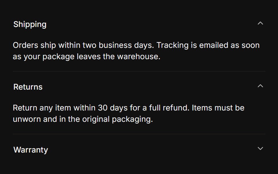 MultipleFLX UI · Reacttype="multiple" keeps several sections open at once.
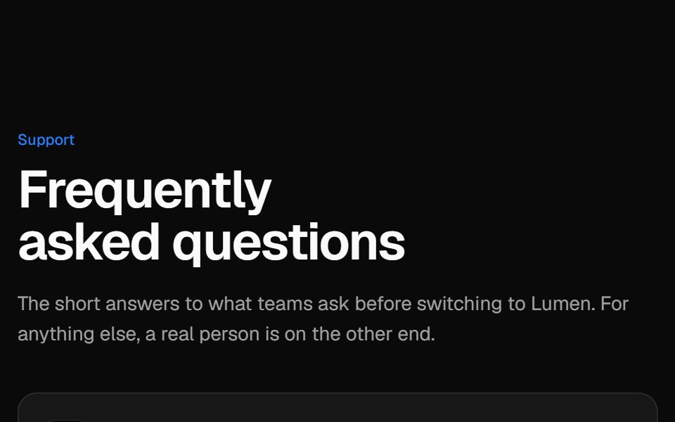 Two-column FAQVelora UI · ReactSticky intro and contact card on the left, an accordion of questions on the right.
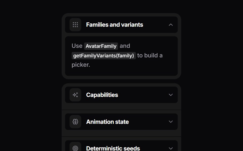 Bouncy AccordionSpaceUI · ReactSpring accordion that splits rounded rows when a panel opens.
 Base AccordionReScript shadcn · ReScript
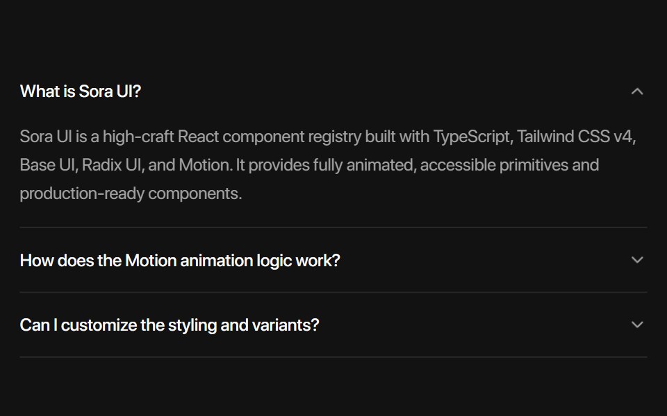 Base AccordionSora UI · ReactAn animated accordion component built on Base UI with spring physics, height collapse mask gradient, blur transitions…
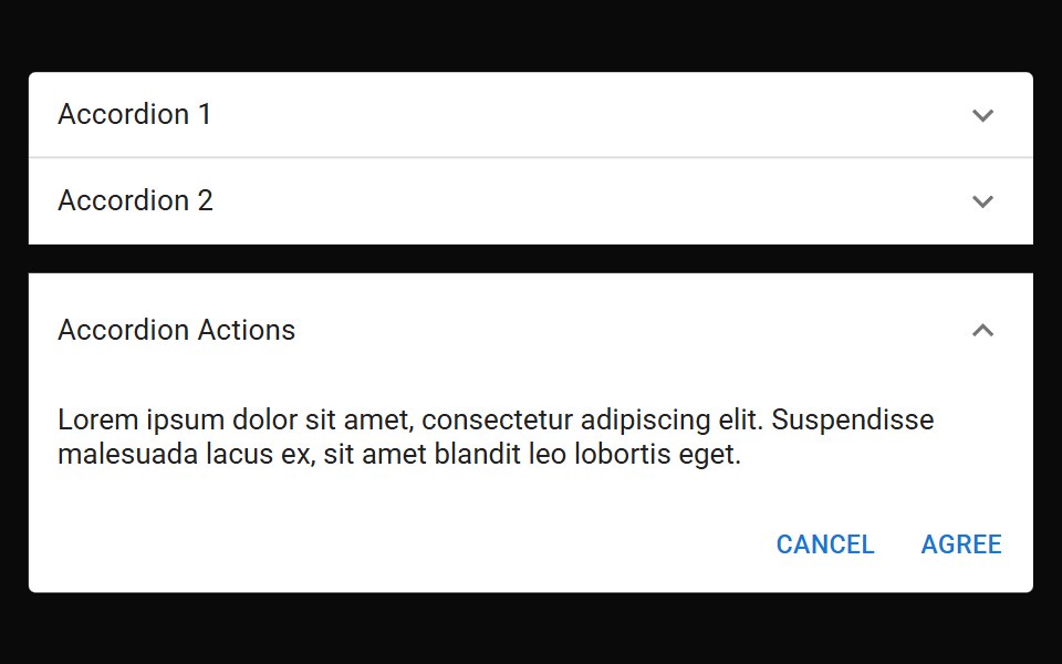 Accordion SummaryMUI / Material UI · React
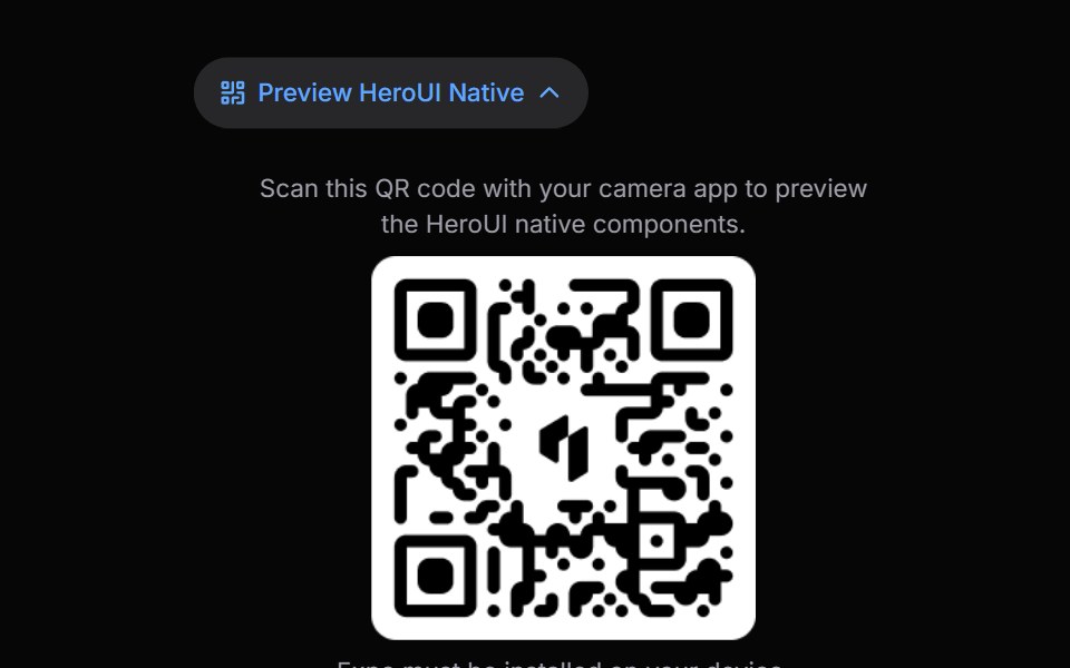 Disclosure GroupHeroUI · ReactContainer that manages multiple Disclosure items with coordinated expanded states
 Vanilla Disclosure GroupReact Spectrum · React
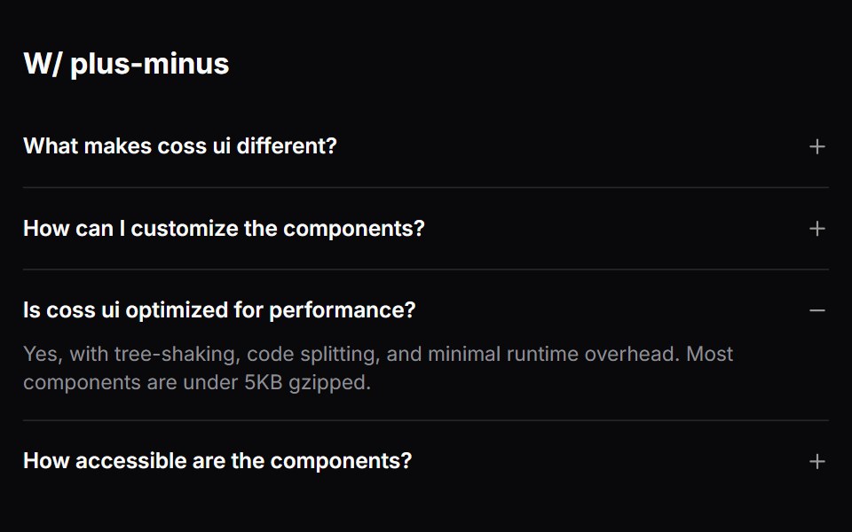 Comp 335Origin UI · React
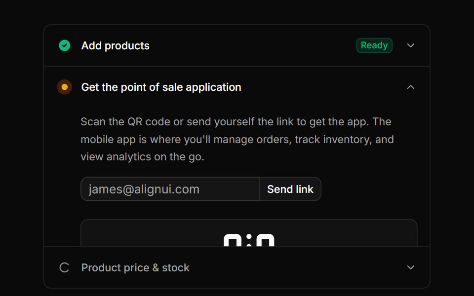 Accordion pattern for onboarding or setup steps with icons, badges, and QR codesReUI · ReactAccordion pattern for onboarding or setup steps with icons, badges, and QR codes
 Square AccordionAmicro Micro Transitions · ReactSquare Accordion loading animation.
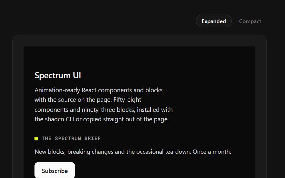 Mega Sitemap FooterSpectrum UI · ReactA five-column sitemap with region and language selectors and mobile accordions.
 Accordion-06 - Filled TriggerShadcn Space · ReactAccordion with a filled accent background on the trigger header
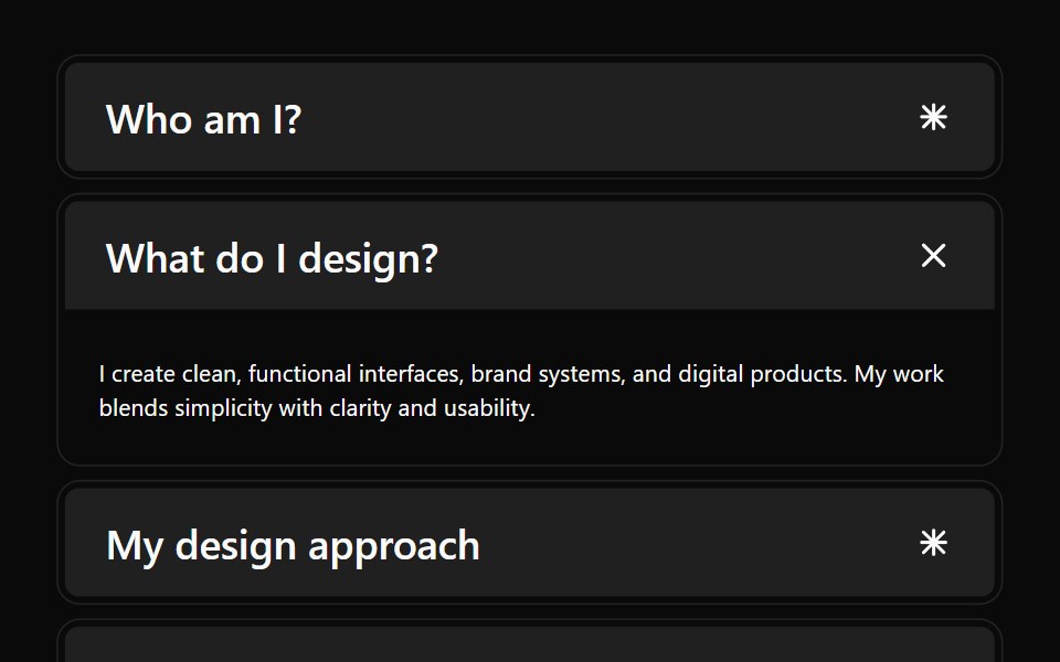 Accordion 04Watermelon UI · React
 With iconsFLX UI · ReactLeading icon beside each trigger label.
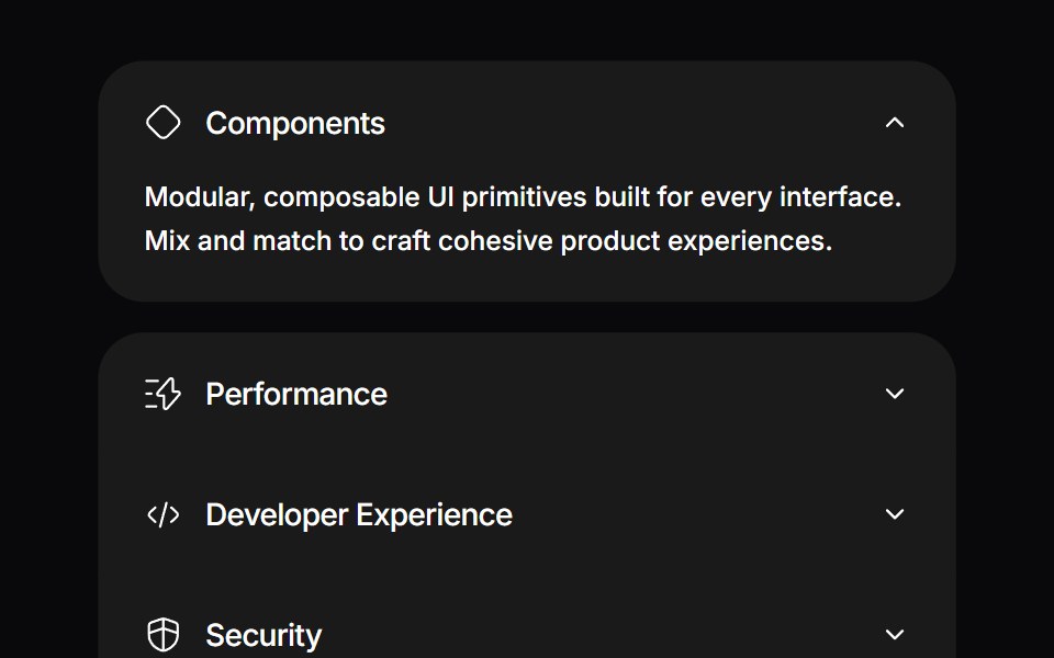 Detachable AccordionSpaceUI · ReactAn interactive accordion with spring motion where the expanded item physically detaches with animated gaps and rounded…
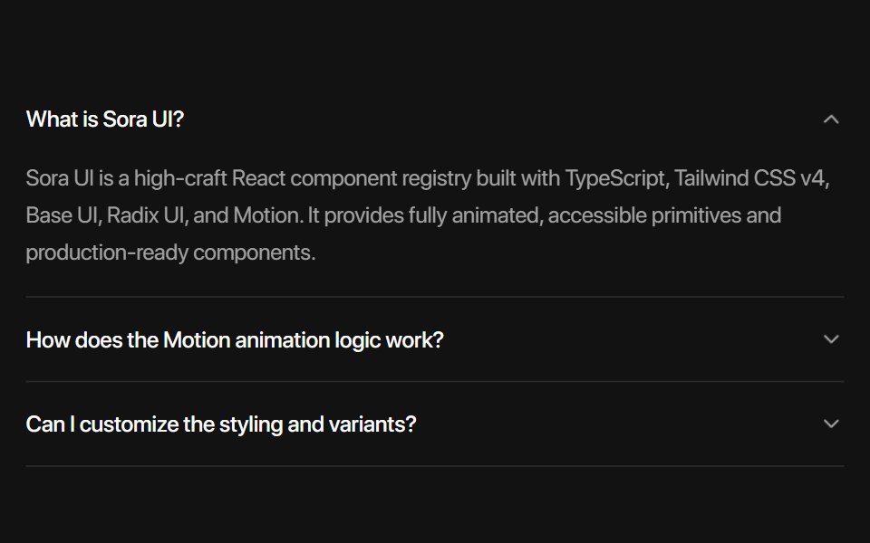 Radix AccordionSora UI · ReactAn animated accordion component built on Radix UI with spring physics, height collapse mask gradient, blur…
 Comp 336Origin UI · React
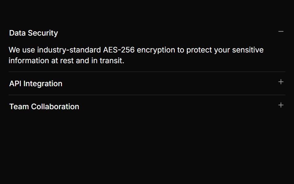 Accordion with plus/minus indicatorsReUI · ReactAccordion with plus/minus indicators
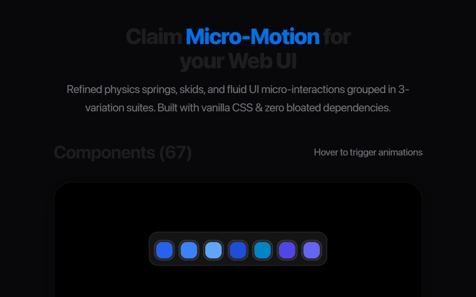 Accordion BlindAmicro Micro Transitions · React
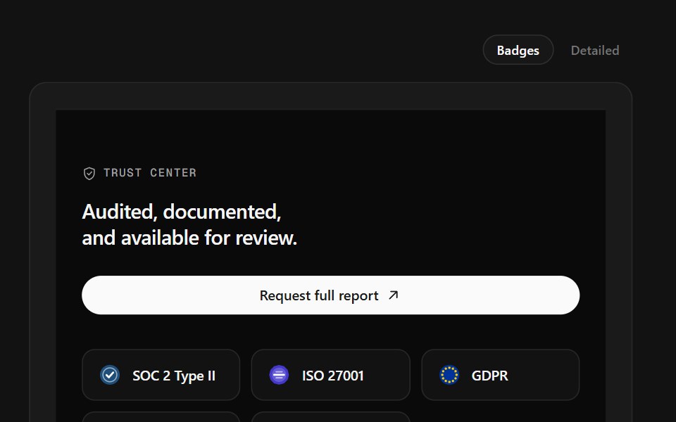 Trust Center FooterSpectrum UI · ReactCompliance marks that expand to scope, over a logo row and link columns.
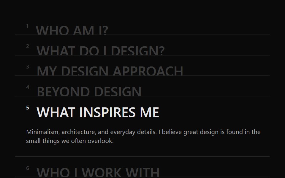 Accordion 05Watermelon UI · React
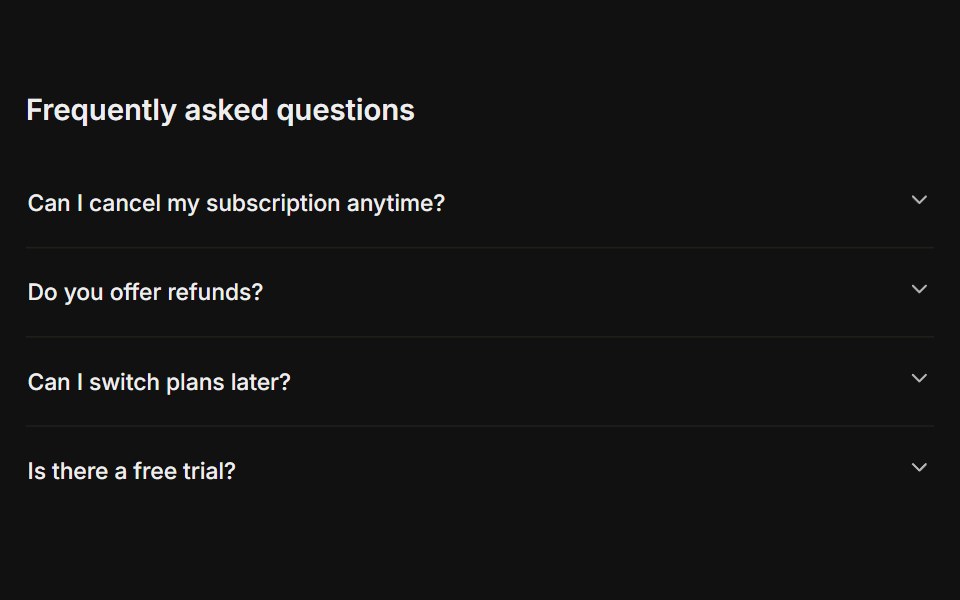 FAQFLX UI · ReactA titled question-and-answer list.
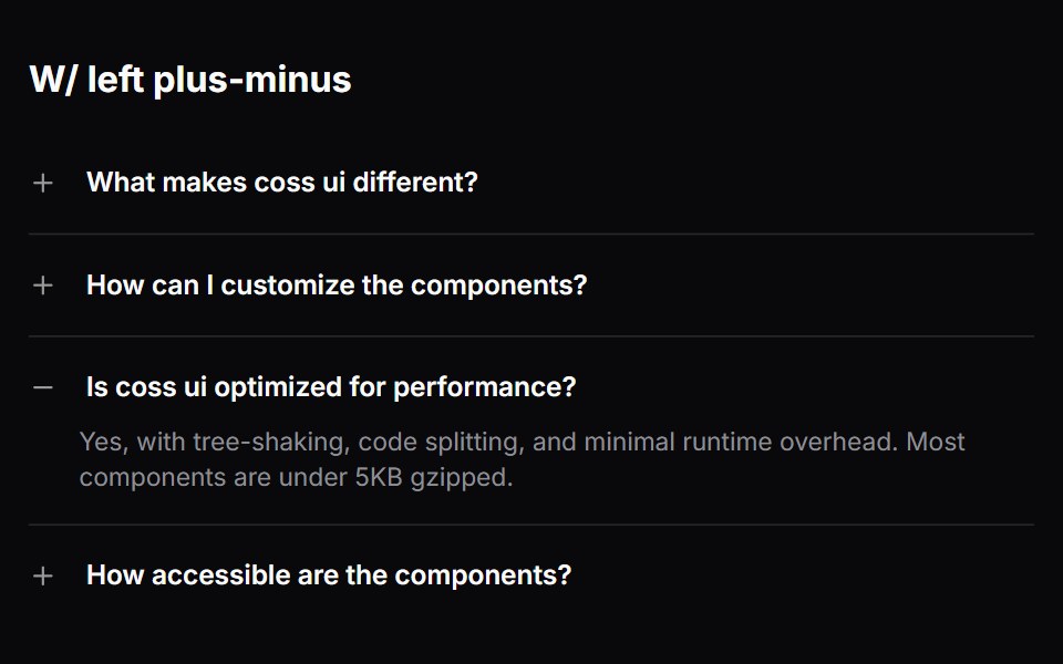 Comp 337Origin UI · React
 Accordion with borders and rounded cornersReUI · ReactAccordion with borders and rounded corners
 Accordion 1Watermelon UI · React
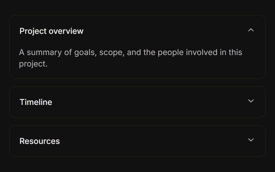 Separated cardsFLX UI · ReactEach item is a bordered card with spacing between them.
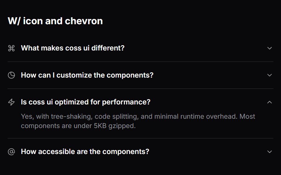 Comp 338Origin UI · React
 Accordion embedded within a CardReUI · ReactAccordion embedded within a Card
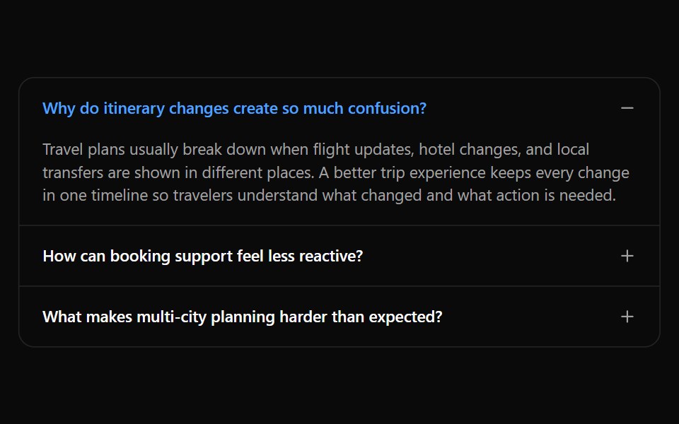 Accordion 10Watermelon UI · React
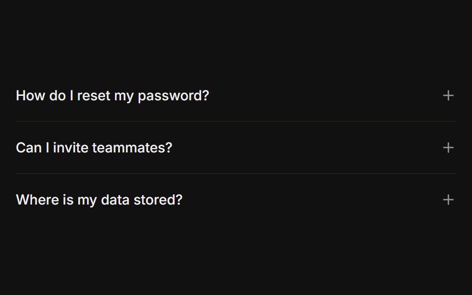 Plus / minus iconFLX UI · ReactPlus icon on each trigger that turns into a minus when open, instead of a chevron.
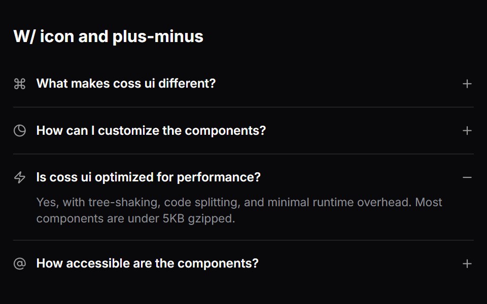 Comp 339Origin UI · React
 Accordion with disabled items and highlighted stateReUI · ReactAccordion with disabled items and highlighted state
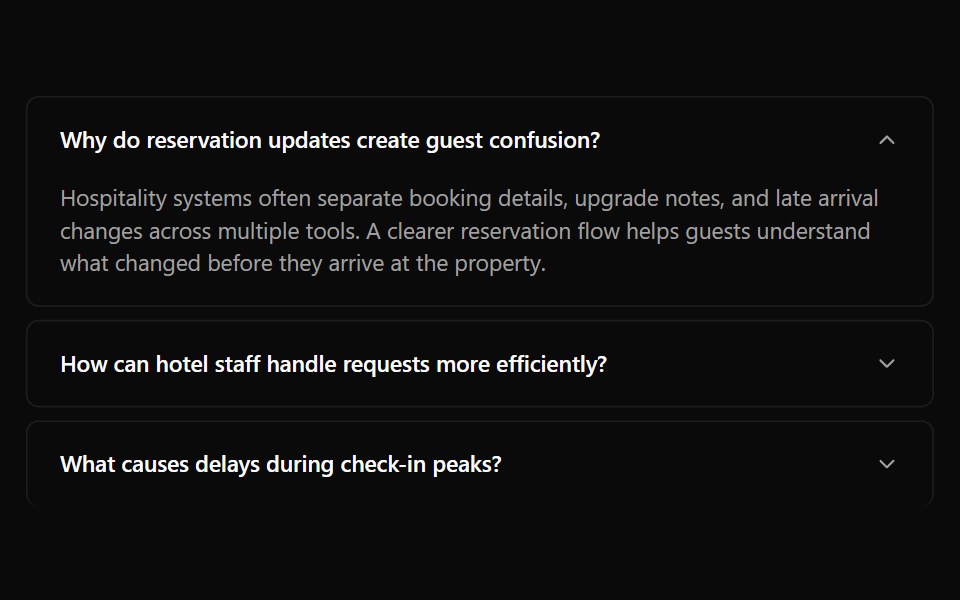 Accordion 11Watermelon UI · React
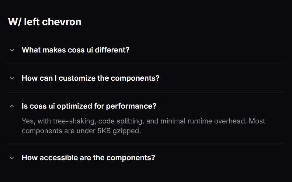
 Left chevronFLX UI · ReactRotating chevron placed before the label instead of after it.
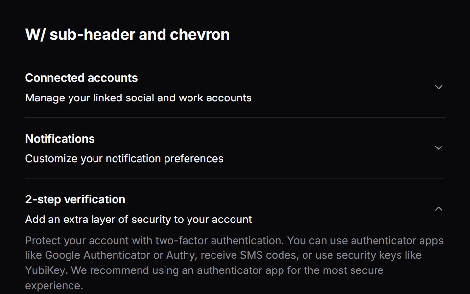 Comp 340Origin UI · React
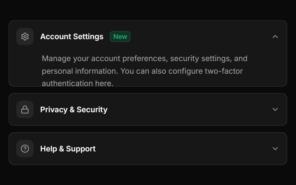 Advanced accordion with custom icons and badgesReUI · ReactAdvanced accordion with custom icons and badges
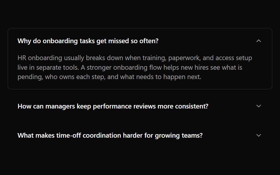 Accordion 12Watermelon UI · React
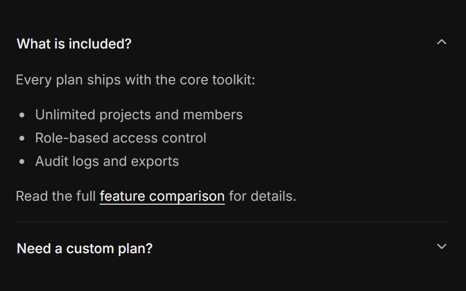 Rich contentFLX UI · ReactLists, links, and a button inside the panel body.
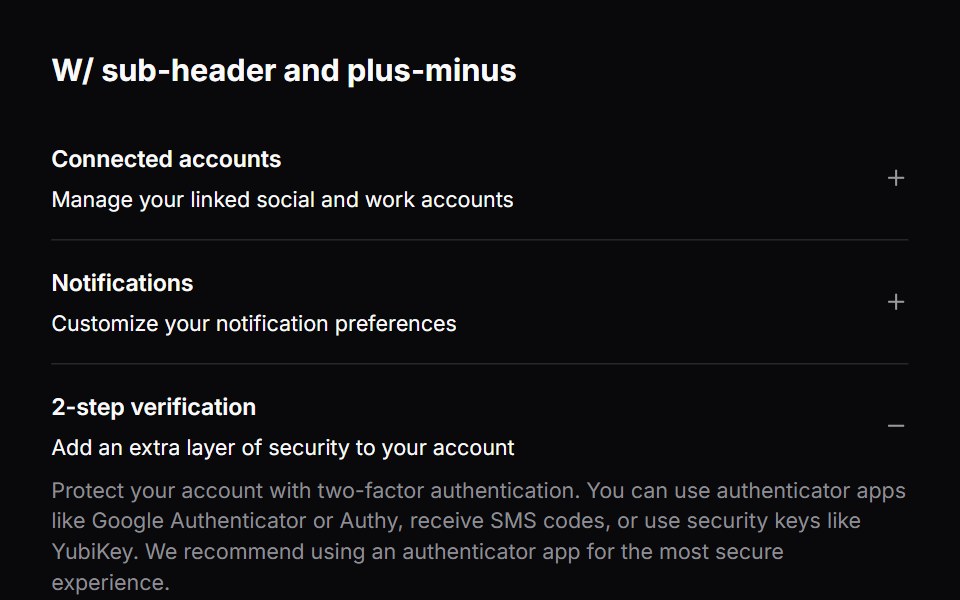 Comp 341Origin UI · React
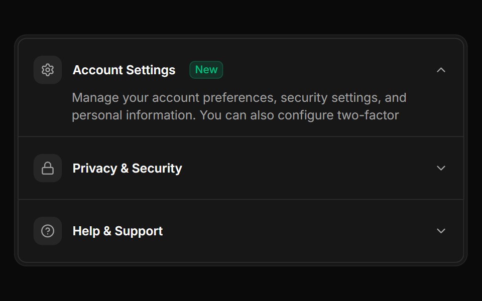 Accordion items integrated within Frame and FramePanelReUI · ReactAccordion items integrated within Frame and FramePanel
 Accordion 13Watermelon UI · React
 Disabled itemFLX UI · ReactOne trigger disabled while the others stay interactive.
 Comp 342Origin UI · React
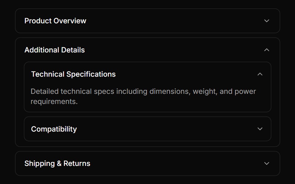 Nested accordion example with bordered itemsReUI · ReactNested accordion example with bordered items
 Accordion 14Watermelon UI · React
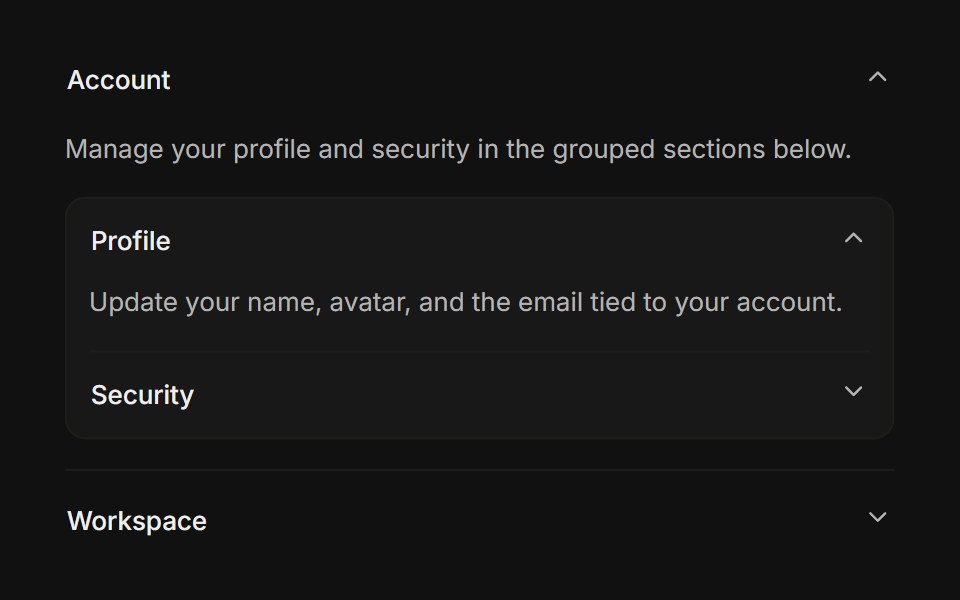 NestedFLX UI · ReactAn accordion rendered inside another panel body.
 Comp 343Origin UI · React
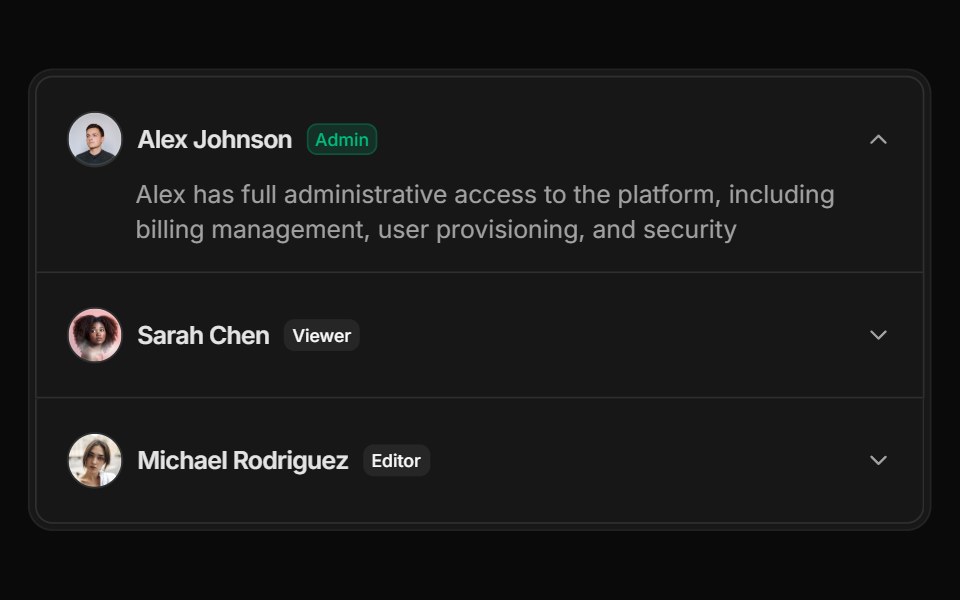 User list accordion with avatars and role indicatorsReUI · ReactUser list accordion with avatars and role indicators
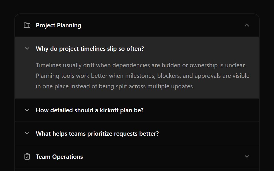 Accordion 15Watermelon UI · React
Libraries with React accordion components
Related categories
- Accordion Components
- Tailwind CSS Accordion Components
- Svelte Accordion Components
- Animated Accordion Components
- shadcn/ui Accordion Components
- React Data Display Components
- React Card Components
- React Chart Components
- React Table Components
- React Avatar Components
- React List Components
- React Stat Components
- React Calendar Components
- React Carousel Components
- React Collapsible Components
- React Data Table Components
- React Avatar Group Components
- React Tree View Components
- React Card Stack Components
- React Line Chart Components
- React Counter Components