 Dev Design Library
Tailwind CSS Accordion Components
Dev Design Library indexes 158 Tailwind CSS accordion components from 47 open-source UI libraries, with the most coming from Watermelon UI, Origin UI, FLX UI, ReUI and Oxbow UI. Each one links to its page with the source code, a live preview where available, the library license and the install command. Every library in this list styles its components with Tailwind CSS utility classes. Accordion components belong to the Data display group.
Showing 120 of 158, a mix from every library. Open a library to see all of its components.
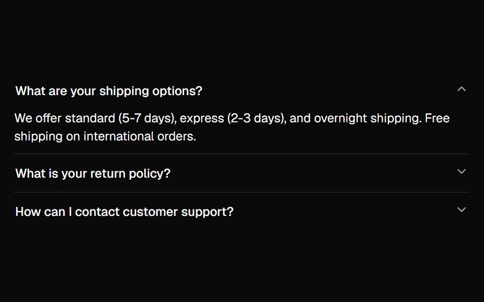 Accordionshadcn/ui · ReactA vertically stacked set of interactive headings that each reveal a section of content.
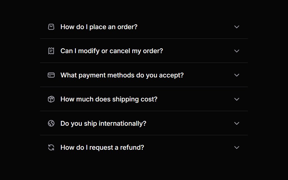 AccordionHeroUI · ReactA collapsible content panel for organizing information in a compact space
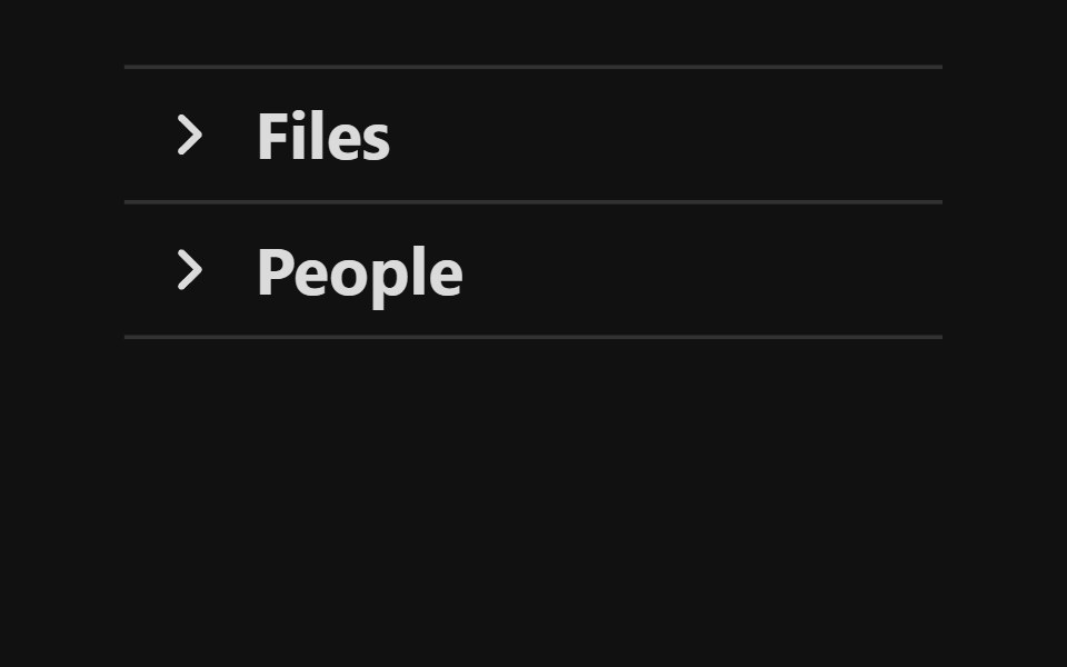 AccordionReact Spectrum · ReactA group of disclosures that can be expanded and collapsed.
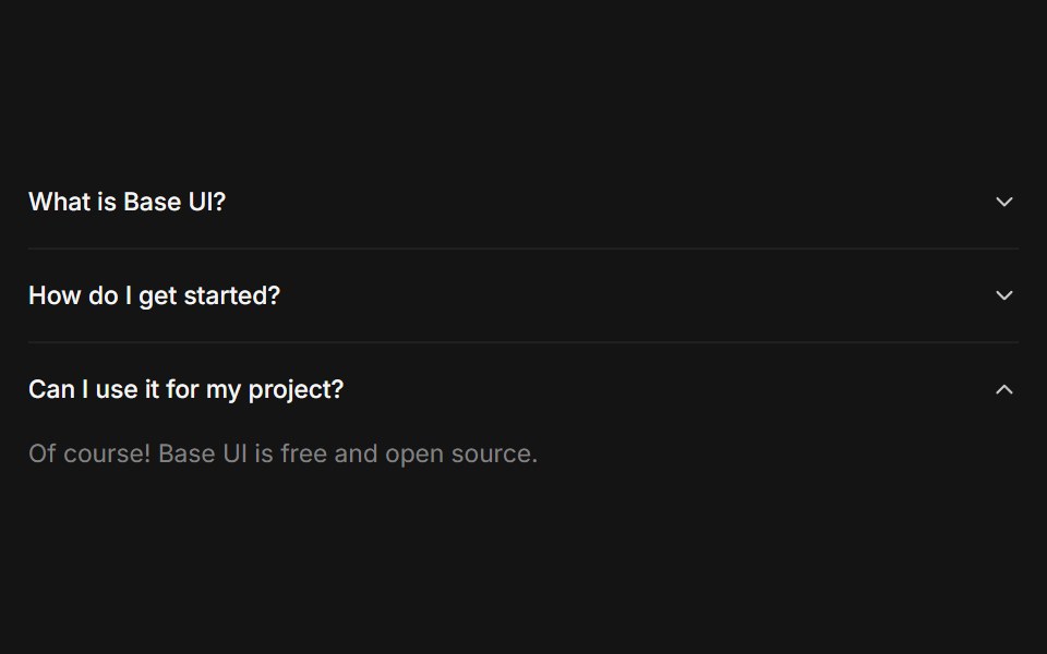 Accordioncoss ui · ReactA set of collapsible panels with headings and content.
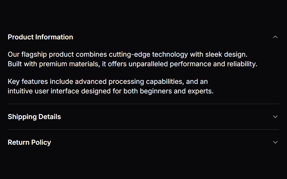 AccordionOrigin UI · ReactA set of collapsible panels with headings and content.
 AccordionPreline UI · JavaScript (HTML + Tailwind)
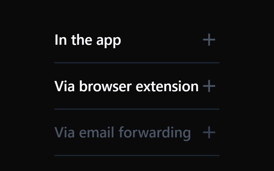 AccordionTremor · React
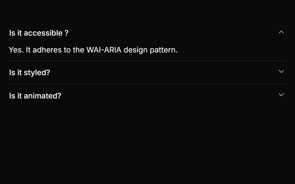 A basic single-expand accordionReUI · ReactA basic single-expand accordion
 Accordion LoaderAmicro Micro Transitions · ReactAccordion Loader loading animation.
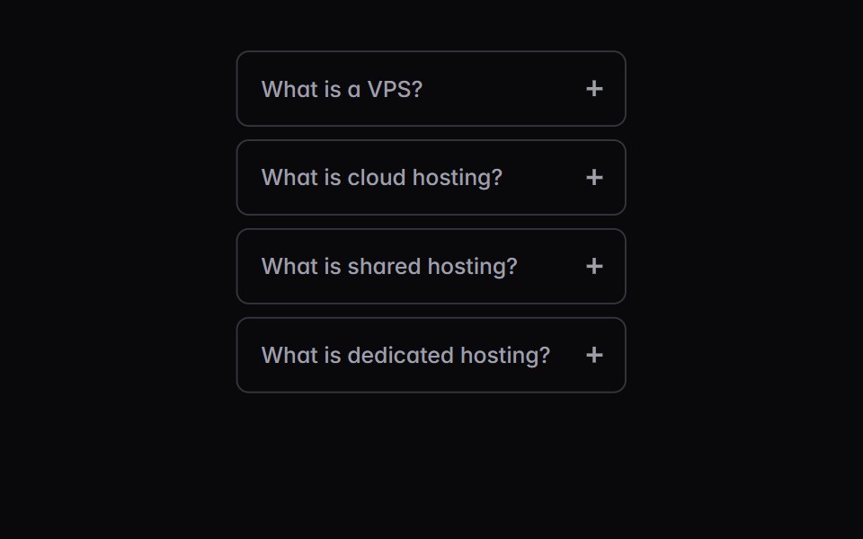 disclosure-groupIntent UI · Reactdisclosure-group
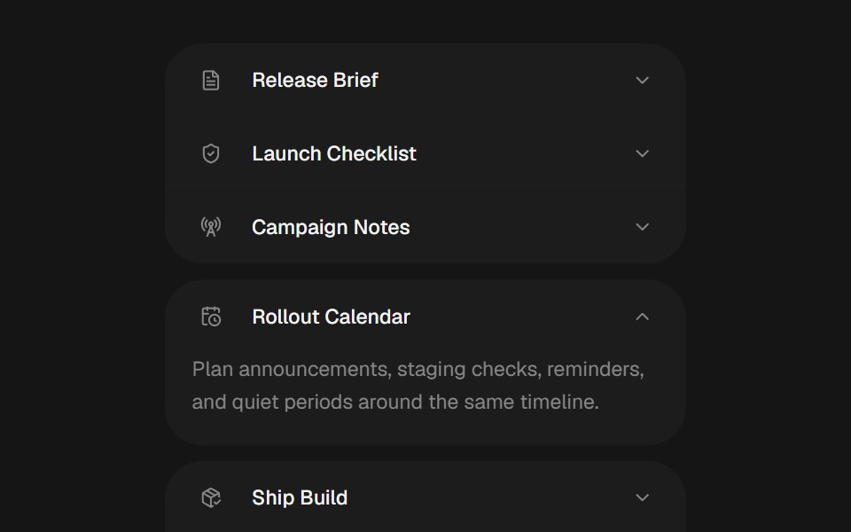 Bouncy AccordionbeUI · ReactSingle-open accordion with weighted spring layout, icon rows and reduced-motion-safe content reveals.
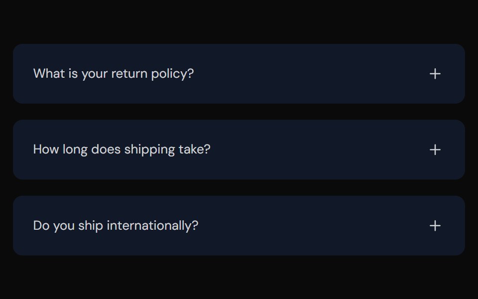 AccordionTailGrids · ReactFully accessible accordion component with multiple style variants
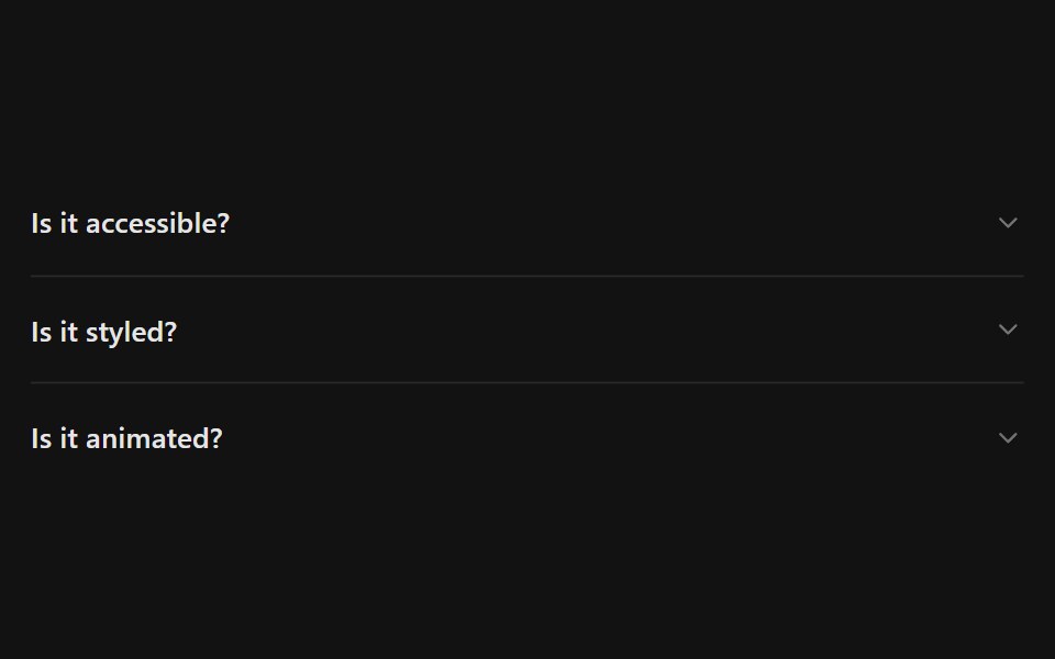 AccordionSpectrum UI · Reactcomponent for the Accordion
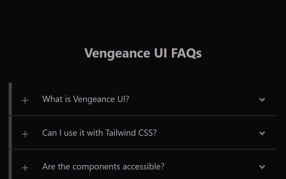 Faq AccordionVengeance UI · ReactAnimated expanding FAQ list
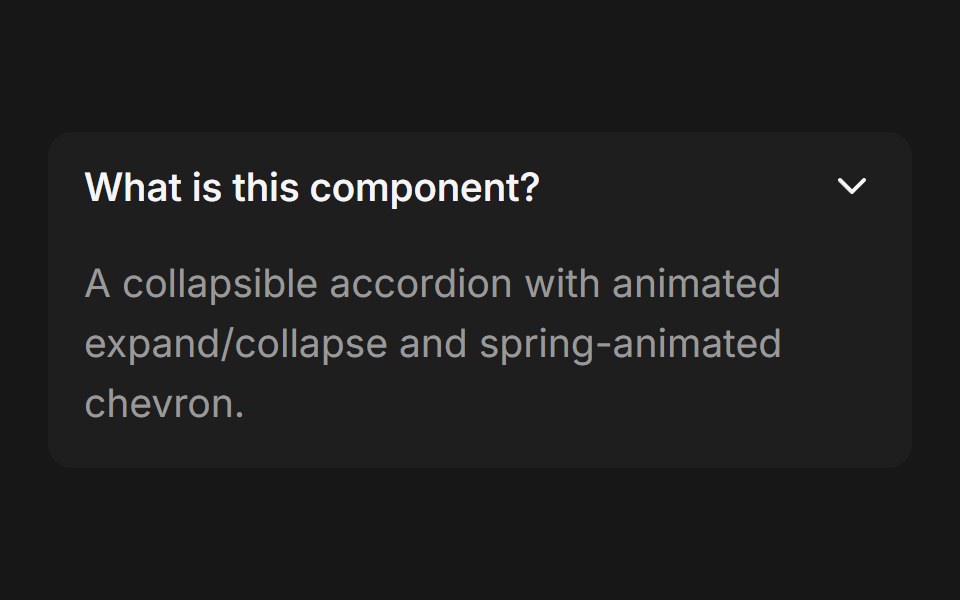 AccordionFluid Functionalism · ReactCollapsible accordion with animated height transitions, spring-animated chevron, and fluid hover in grouped mode…
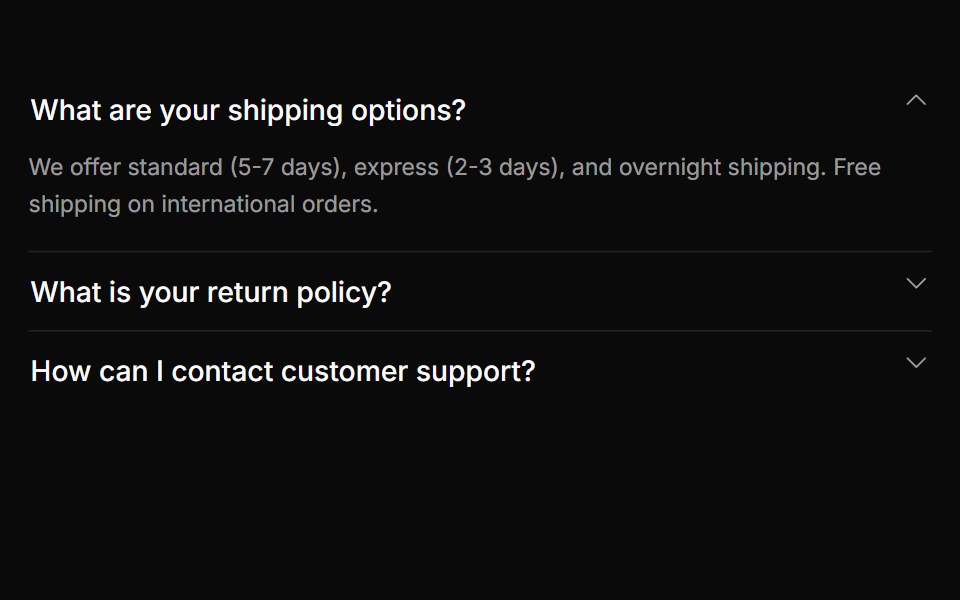 AccordionToolcraft · React
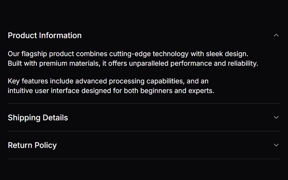 AccordionLaunch UI · React
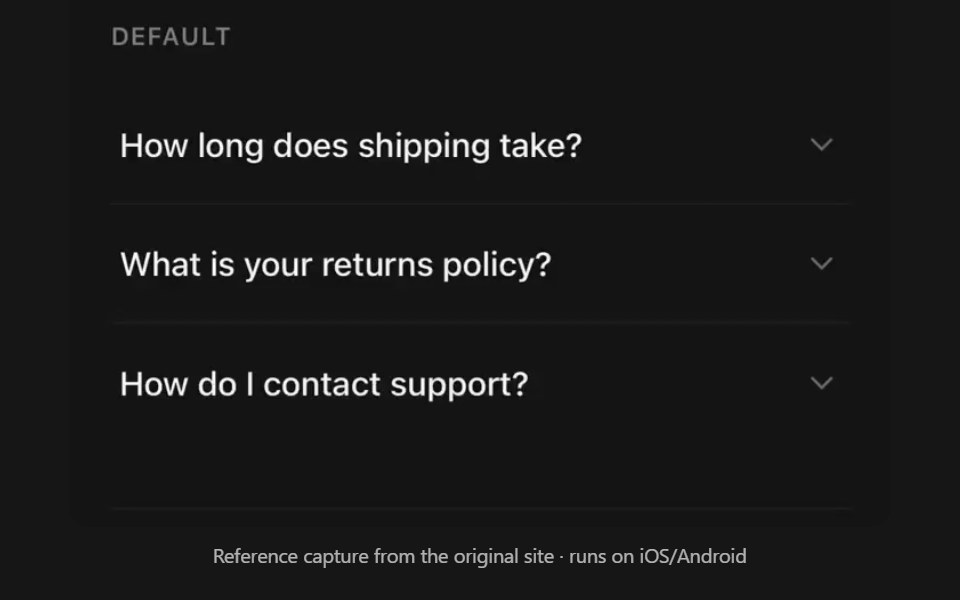 AccordionPanel UI · React NativeCollapsible sections with single or multiple selection.
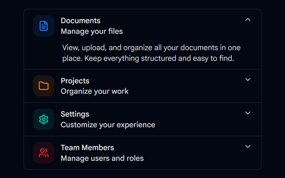 Accordion-01 - DefaultShadcn Space · ReactDefault accordion component
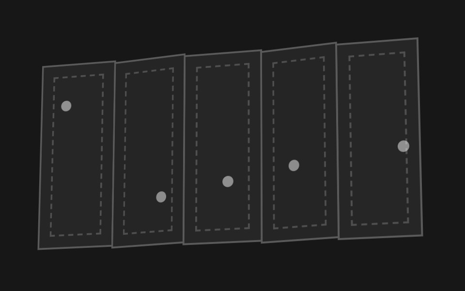 Accordion FoldPixel Perfect · ReactA paper map of hinged panels that folds itself up like an accordion and flattens back out.
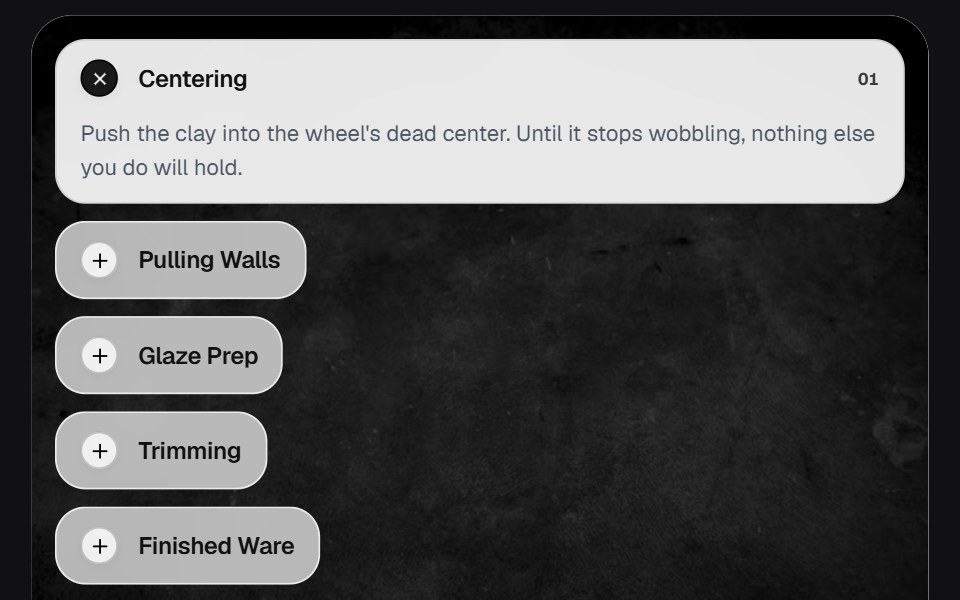 AccordionOSuselayouts · ReactInteractive accordion showcase with animated content, image transitions, hover effects, keyboard navigation, autoplay…
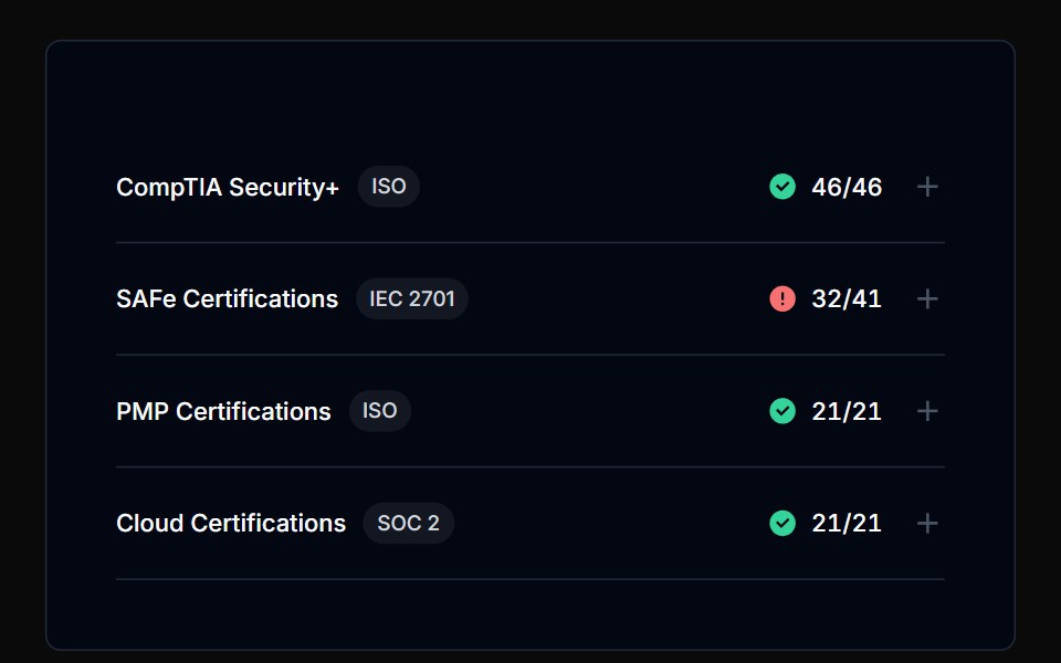 AccordionTremor Blocks · React
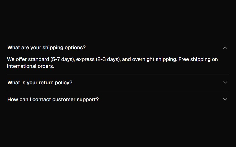 AccordionShadcn Dashboard · React
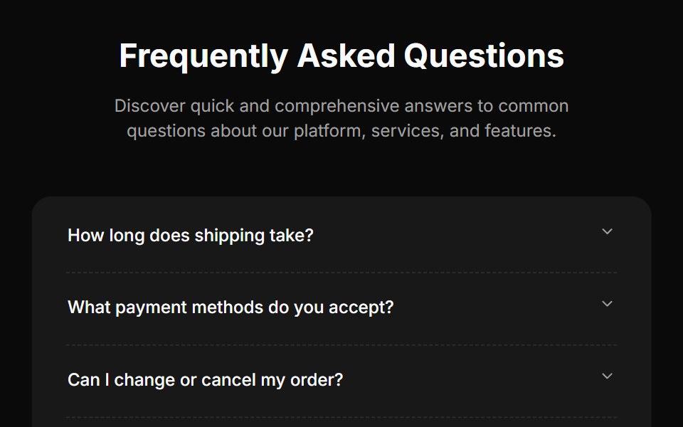 Faq Fourcnblocks · SvelteFAQ section with search and categories
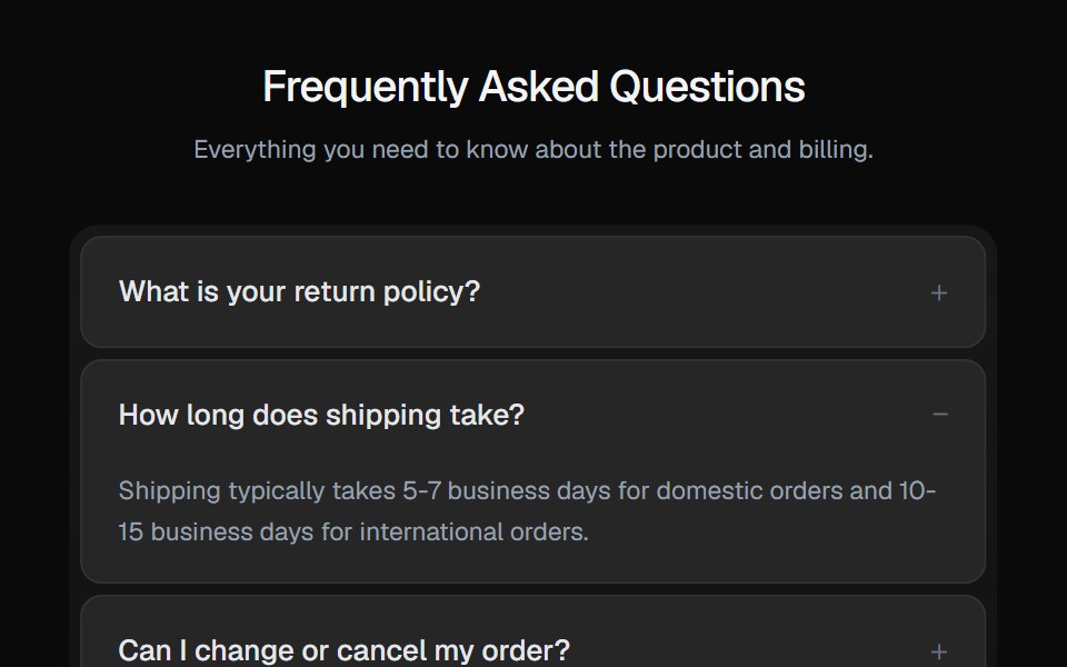 AccordionGreatUI · React
 Faq 01Oxbow UI · Astro
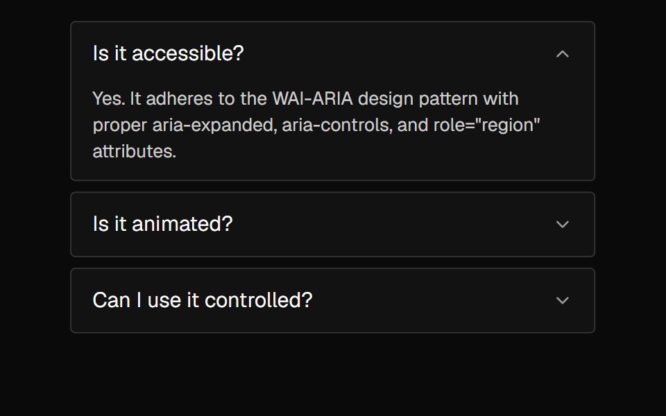 AccordionNexvyn UI · ReactA vertically stacked set of interactive headings that each reveal a section of content, with a grid-rows unfold…
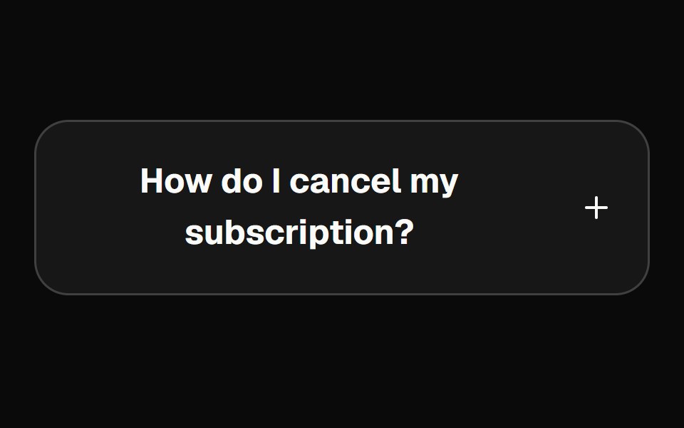 accordionBaseLayer · ReactAn accordion allows users to toggle the display of sections of content. Each accordion consists of a header with a…
 AccordionShark UI · ReactA collapsible for displaying content.
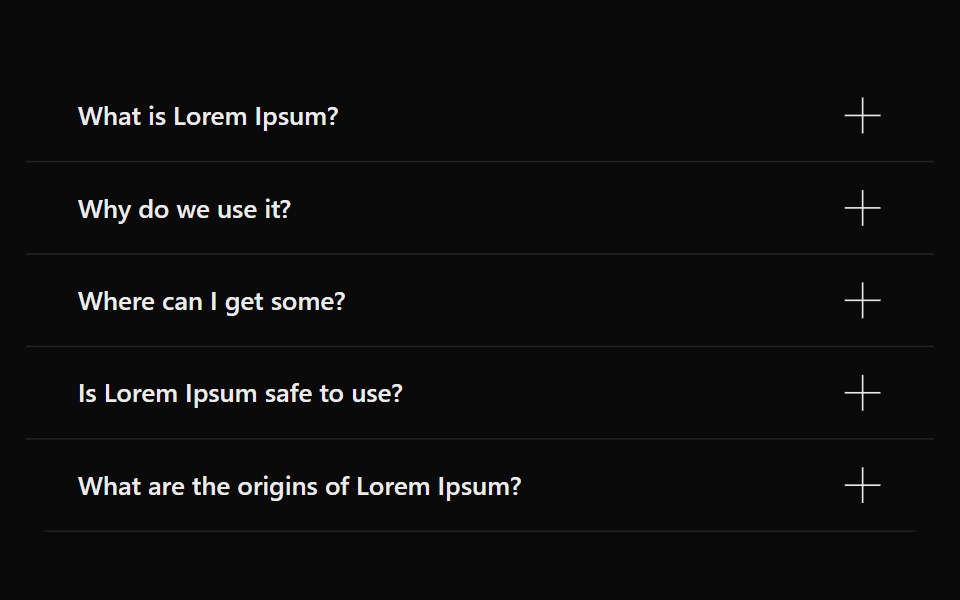 AccordionSona UI · ReactAn accessible Base UI accordion with controlled and uncontrolled state, four visual variants, interruptible disclosure…
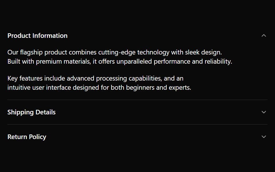 AccordionWatermelon UI · React
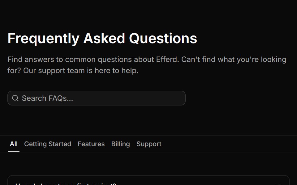 FAQ Fivesv-efferd · SvelteA searchable FAQ page with category filters, empty state handling, and structured dividers.
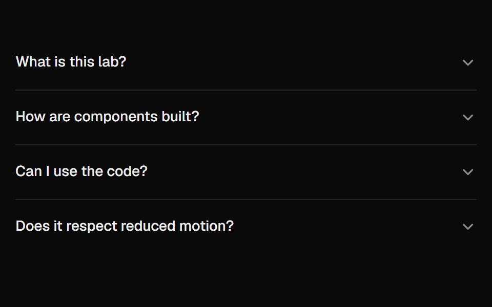 AccordionUI Lab · ReactAnswers unfold from under their question like a folded flap, and the row you clicked never moves.
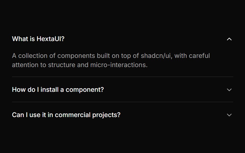 AccordionHextaUI · ReactStacked headings that each reveal a panel, with height motion you can reverse mid-way and panels that stay searchable…
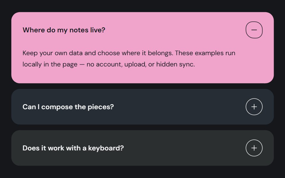 AccordionCojeev UI · ReactOrganizes related sections into expandable panels so readers can open the details they need.
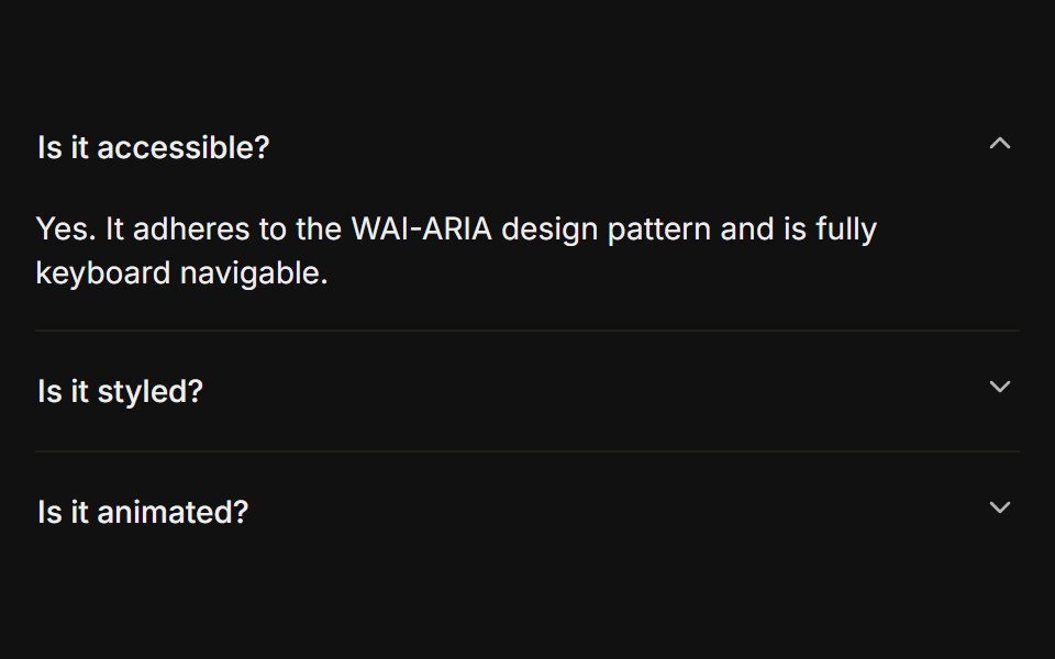 BasicFLX UI · ReactOnly one section open at a time, type="single" collapsible. The default behavior.
 Centered FAQ accordionVelora UI · ReactCentered heading over an accordion of eight questions, closed by a contact row.
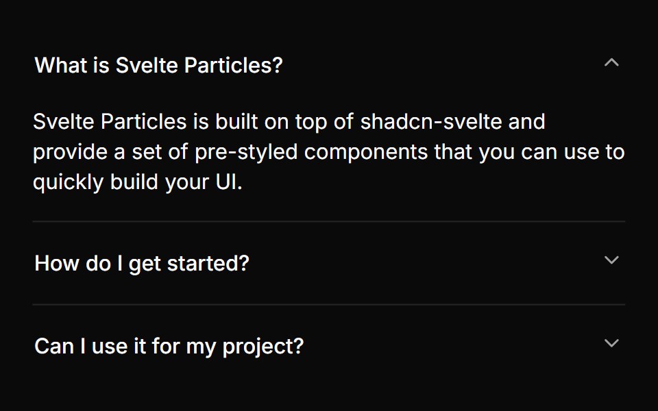 Basicsv-particles · Svelte
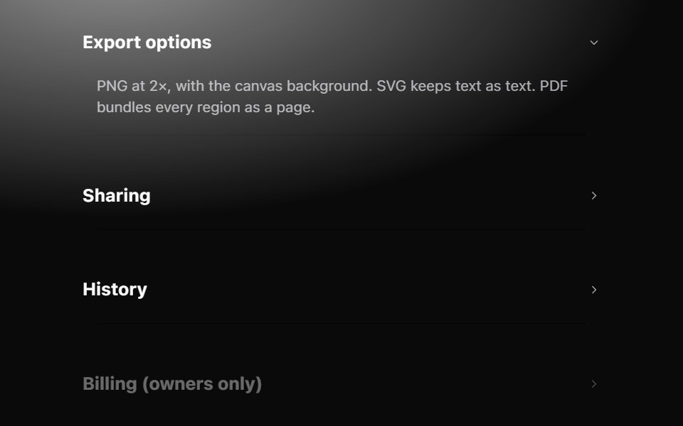 AccordionMetal UI · React + SwiftUISections that open in place: row headers with a chevron; the panel grows to its content on the settle spring while the…
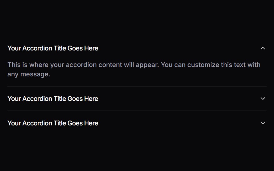 AccordionSpaceUI · ReactAllows you to display content in collapsible panels, making it easy for users to explore details on demand while…
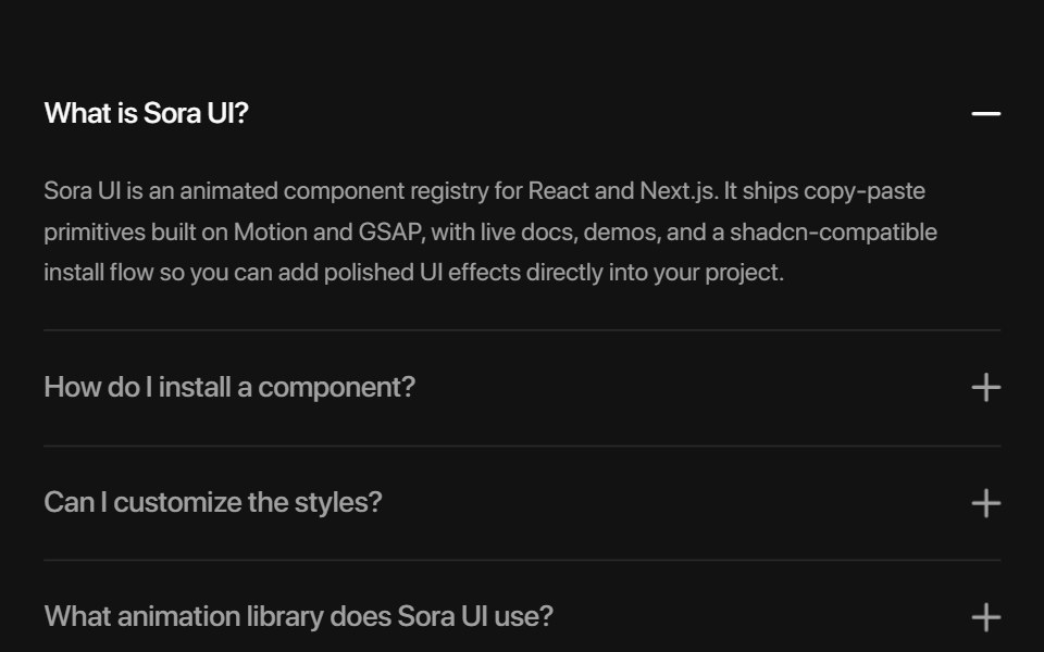 AccordionSora UI · ReactAn animated FAQ accordion with expandable panels, powered by Motion.
 DisclosureOUI · ReactReact aria components Disclosure with shadcn characteristics.
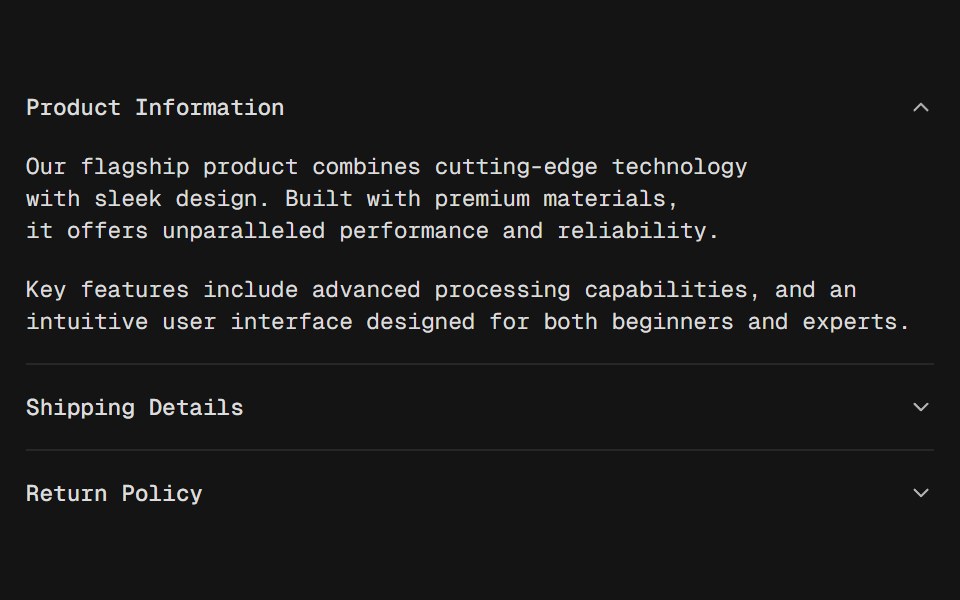 AccordionD2Studio UI · ReactA vertically stacked set of interactive headings that each reveal a section of content.
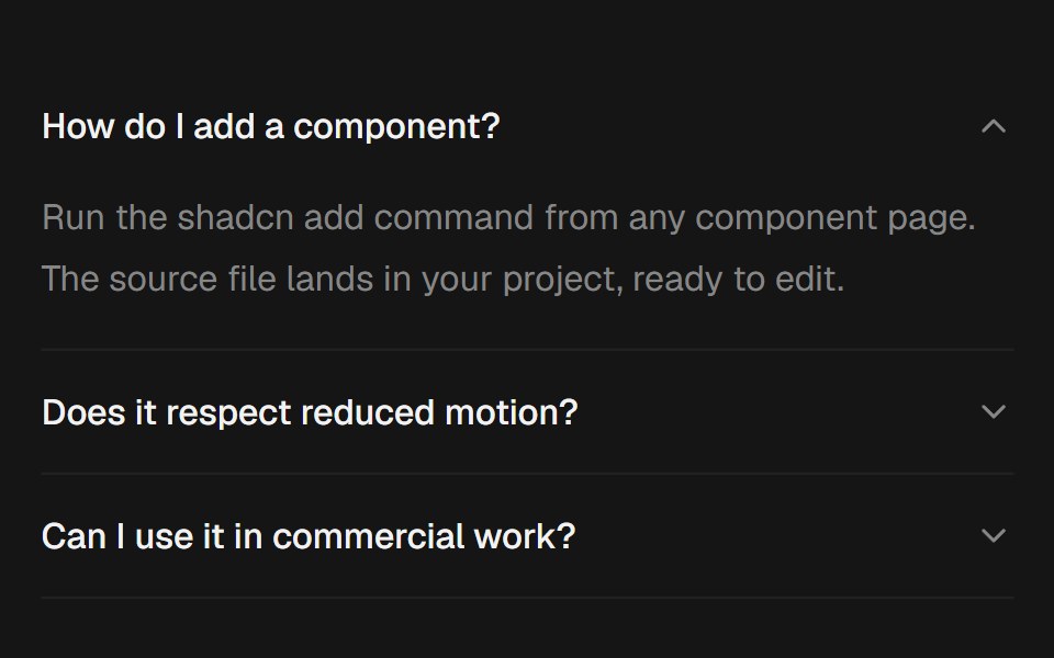 AccordionEaseUI · ReactExpanding sections that grow to their natural height with no measuring, with arrow key navigation and closed panels…
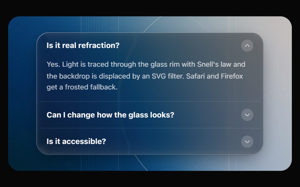 Glass AccordionOpaline · ReactCollapsible sections on one glass panel, or as separate glass cards that grow open.
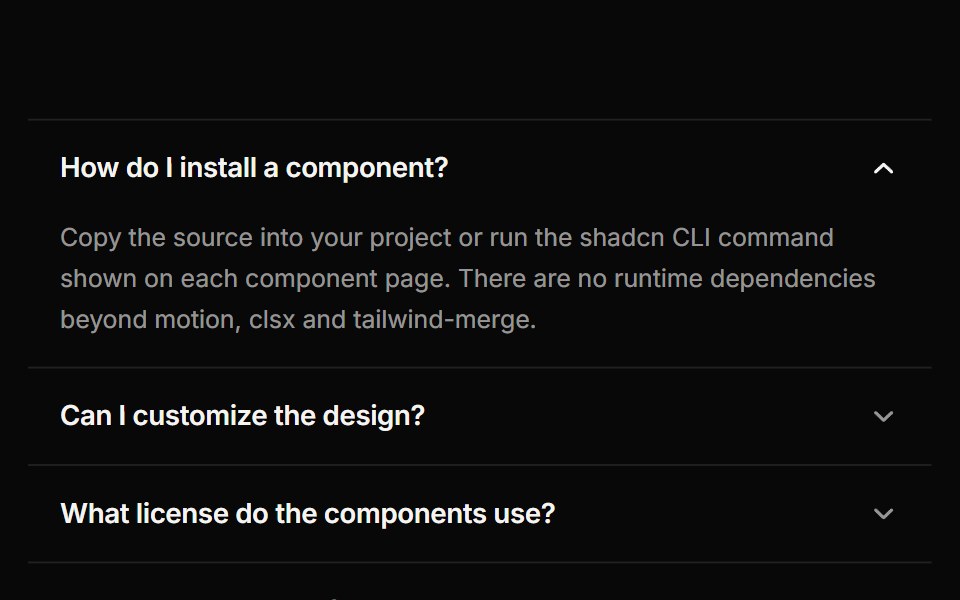 AccordionReactFrame · ReactAn accessible accordion with single or multiple open panels, default, card and filled variants, chevron or plus…
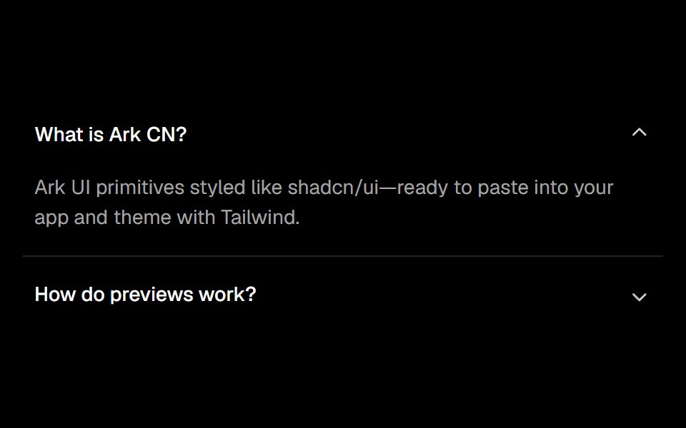 Accordionark-cn · ReactA shadcn-style accordion component built with Ark UI primitives.
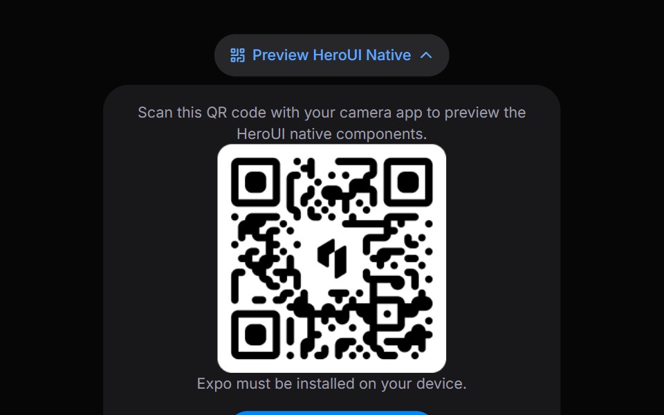 DisclosureHeroUI · ReactA disclosure is a collapsible section with a header containing a heading and a trigger button, and a panel that wraps…
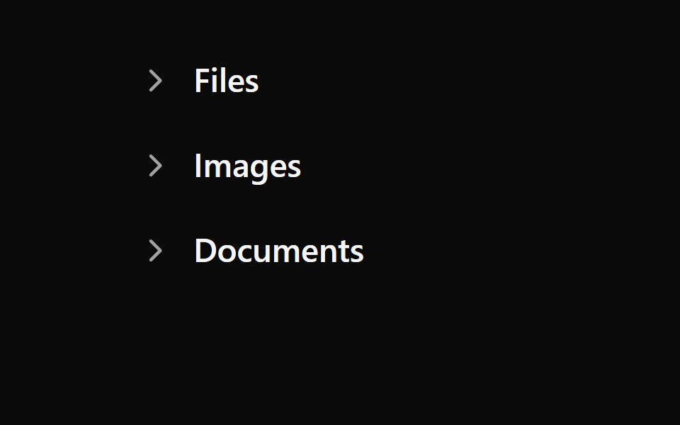 Tailwind Disclosure GroupReact Spectrum · React
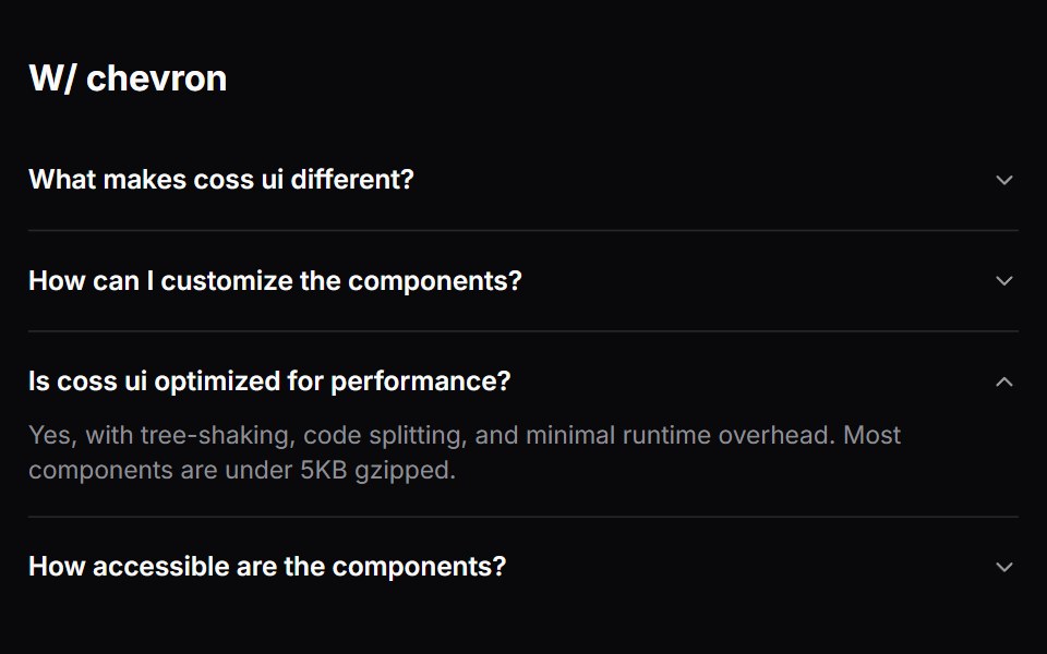 Comp 334Origin UI · React
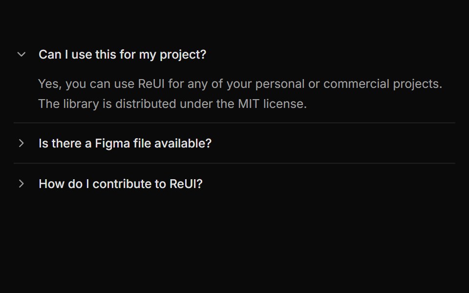 Accordion with rotating arrow indicatorReUI · ReactAccordion with rotating arrow indicator
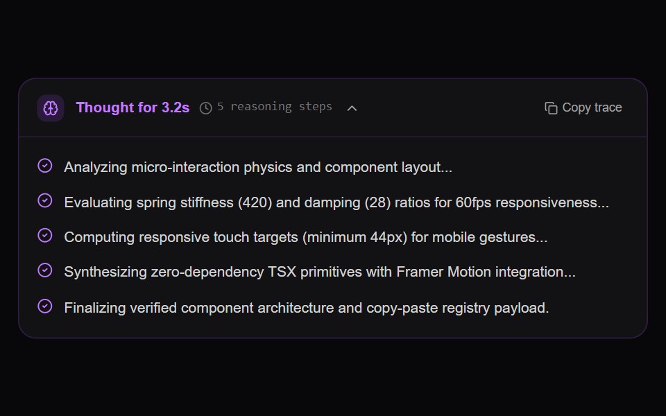 AI Reasoning Trace AccordionAmicro Micro Transitions · ReactCollapsible chain-of-thought reasoning trace with active thought timer, pulsating brain wave, and sequential step…
 FAQ Tabs CardSpectrum UI · ReactA tabbed FAQ card with animated accordion answers and a support footer.
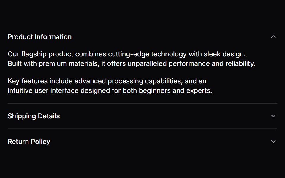 AccordionVengeance UI · React
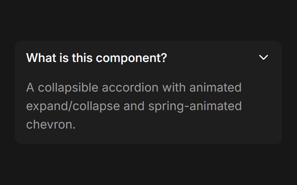 Accordion (Base UI)Fluid Functionalism · ReactCollapsible accordion with animated height transitions, spring-animated chevron, and fluid hover in grouped mode. Base…
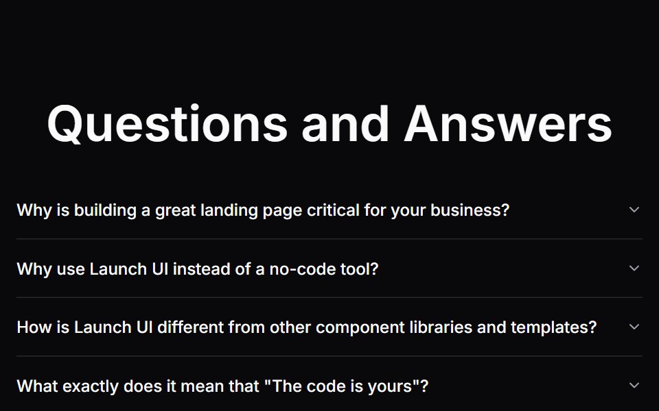 Faq SectionLaunch UI · React
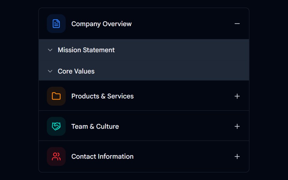 Accordion-02 - Multi-levelShadcn Space · ReactMulti-level accordion component
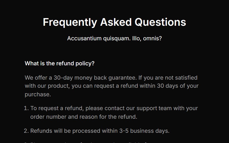 Faq Onecnblocks · SvelteSimple accordion-style FAQ block
 Faq 02Oxbow UI · Astro
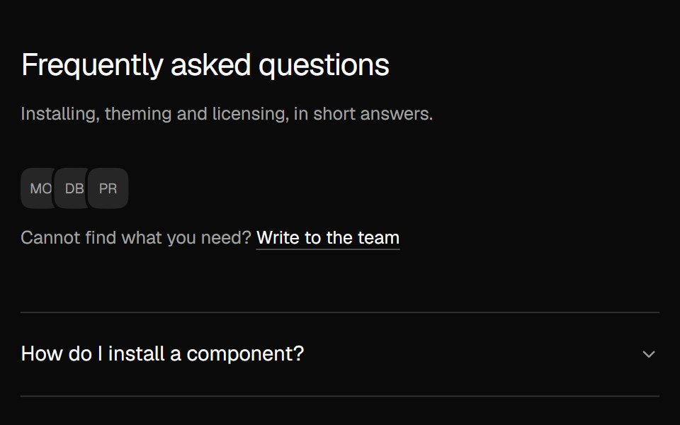 FAQ AccordionNexvyn UI · ReactA two column FAQ accordion with a contact line.
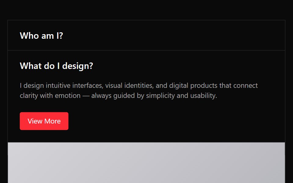 Accordion 03Watermelon UI · React
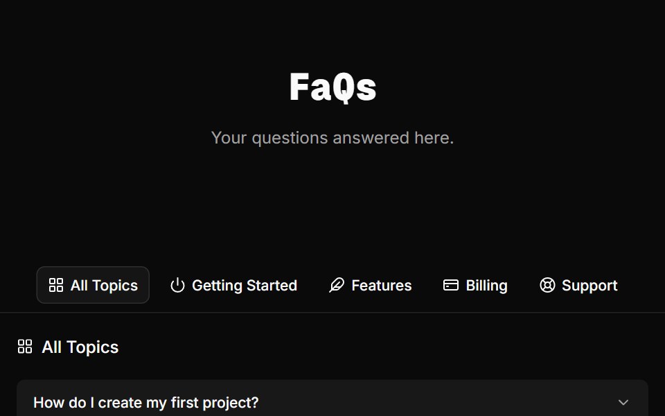 FAQ Foursv-efferd · SvelteA categorized FAQ explorer with topic switching and softly framed accordion rows.
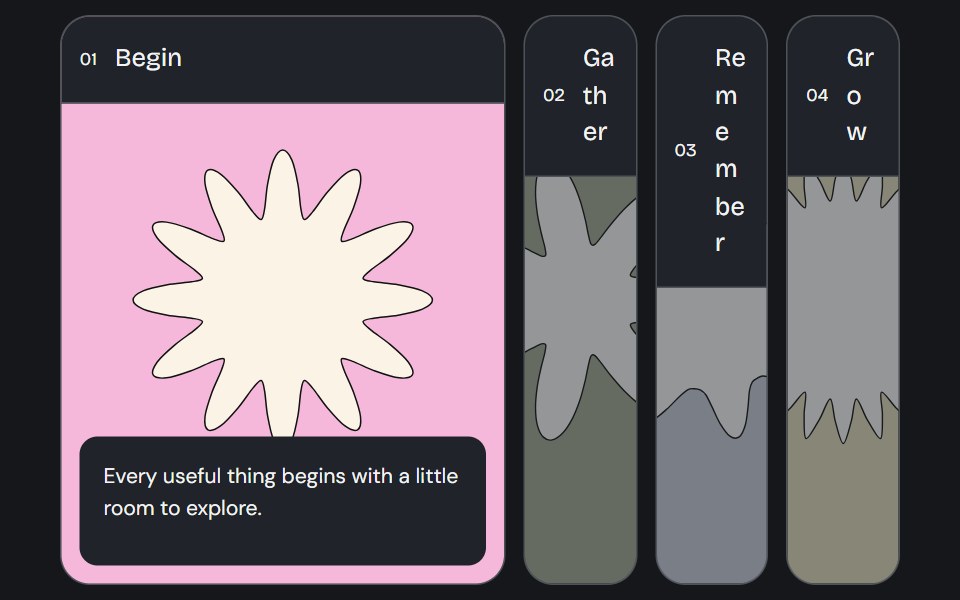 Accordion GalleryCojeev UI · ReactA selected image panel opens to reveal its label, story and action.
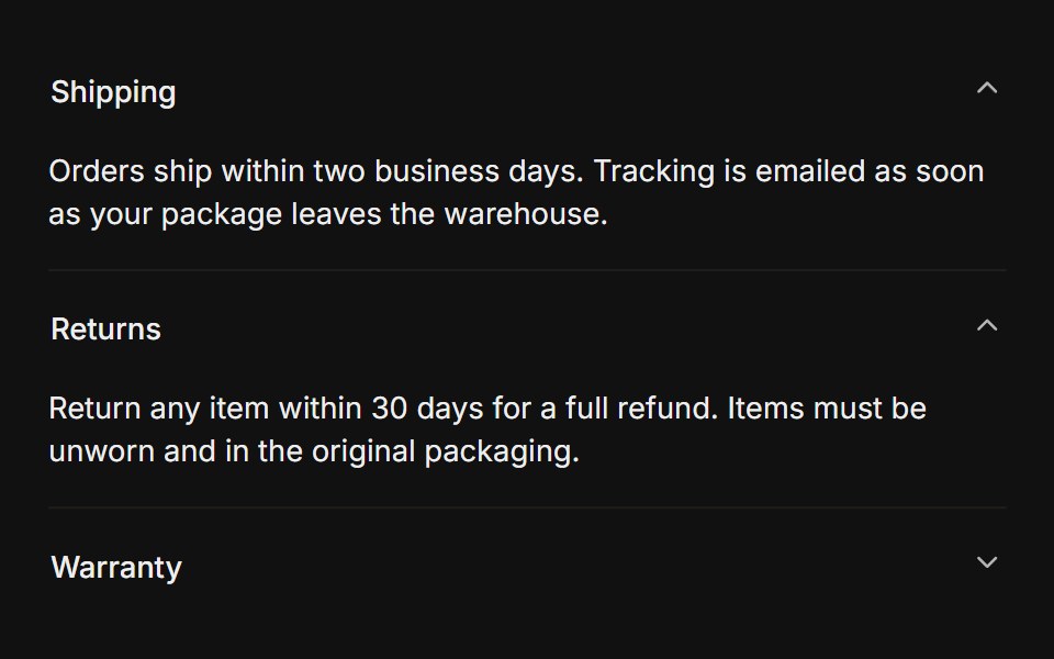 MultipleFLX UI · Reacttype="multiple" keeps several sections open at once.
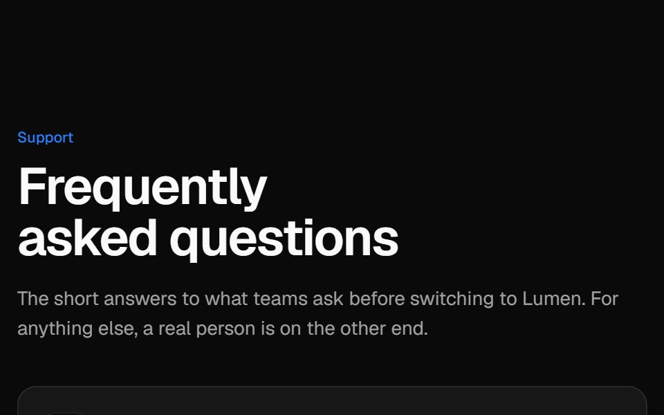 Two-column FAQVelora UI · ReactSticky intro and contact card on the left, an accordion of questions on the right.
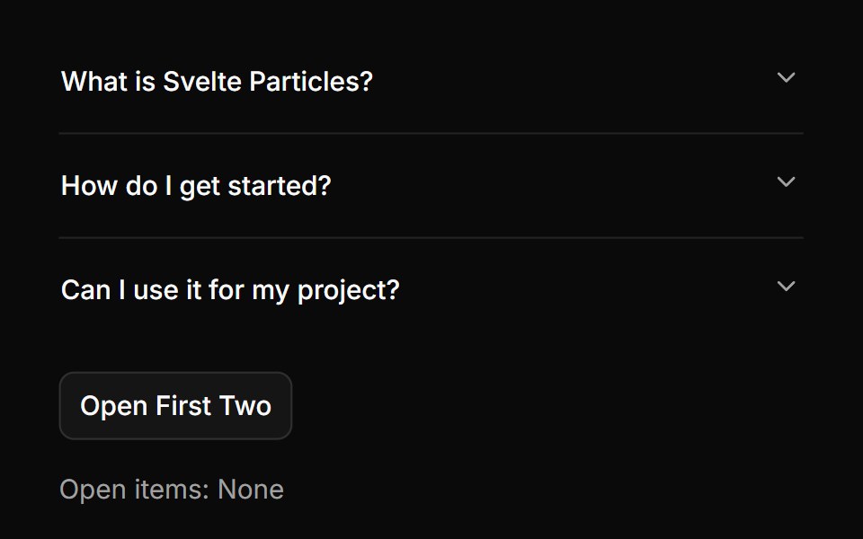 Controlledsv-particles · Svelte
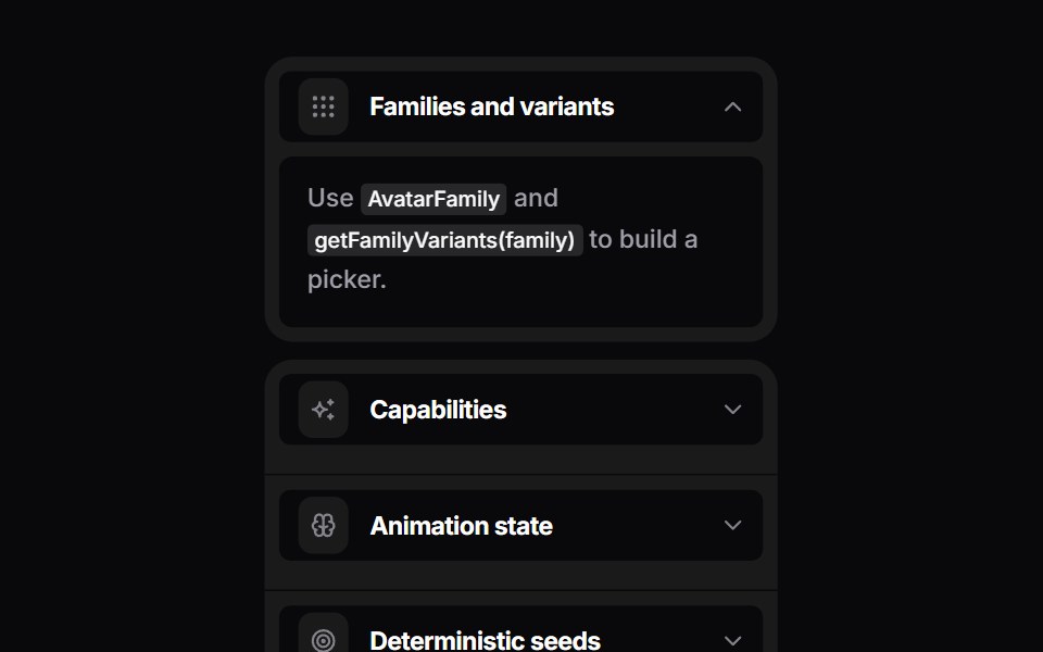 Bouncy AccordionSpaceUI · ReactSpring accordion that splits rounded rows when a panel opens.
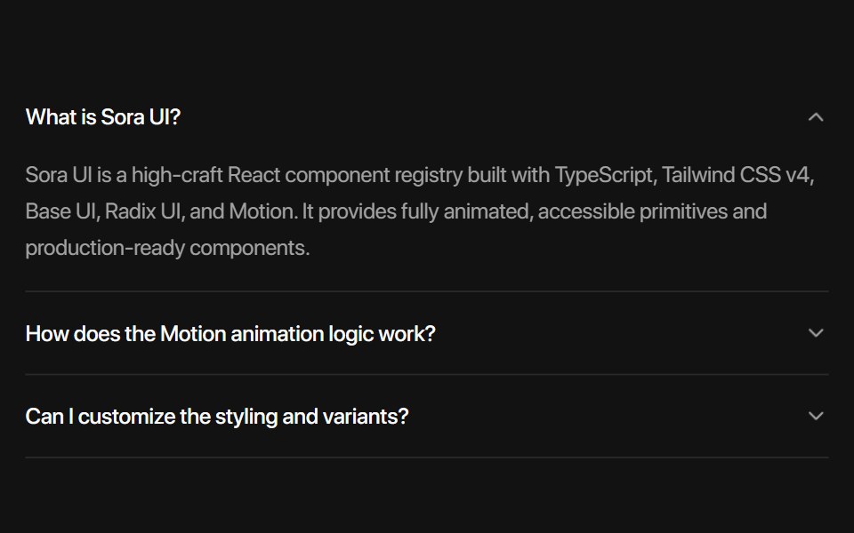 Base AccordionSora UI · ReactAn animated accordion component built on Base UI with spring physics, height collapse mask gradient, blur transitions…
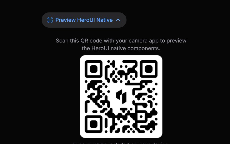 Disclosure GroupHeroUI · ReactContainer that manages multiple Disclosure items with coordinated expanded states
 Vanilla Disclosure GroupReact Spectrum · React
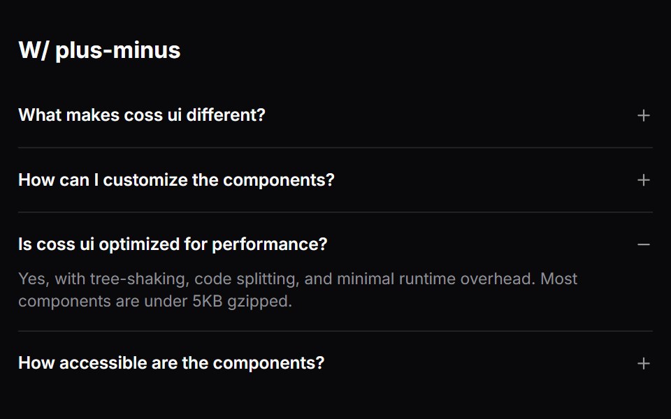 Comp 335Origin UI · React
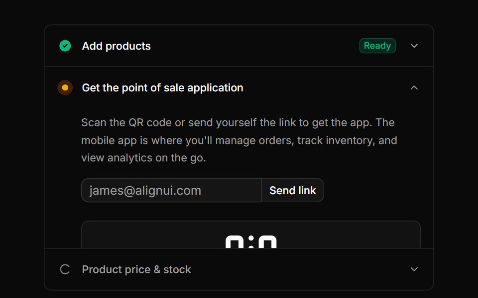 Accordion pattern for onboarding or setup steps with icons, badges, and QR codesReUI · ReactAccordion pattern for onboarding or setup steps with icons, badges, and QR codes
 Square AccordionAmicro Micro Transitions · ReactSquare Accordion loading animation.
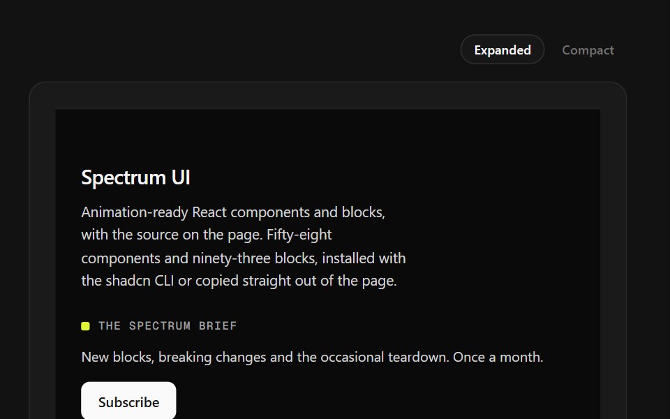 Mega Sitemap FooterSpectrum UI · ReactA five-column sitemap with region and language selectors and mobile accordions.
 Accordion-06 - Filled TriggerShadcn Space · ReactAccordion with a filled accent background on the trigger header
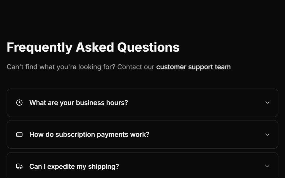 Faq Threecnblocks · SvelteFAQ with two-column layout
 Faq 03Oxbow UI · Astro
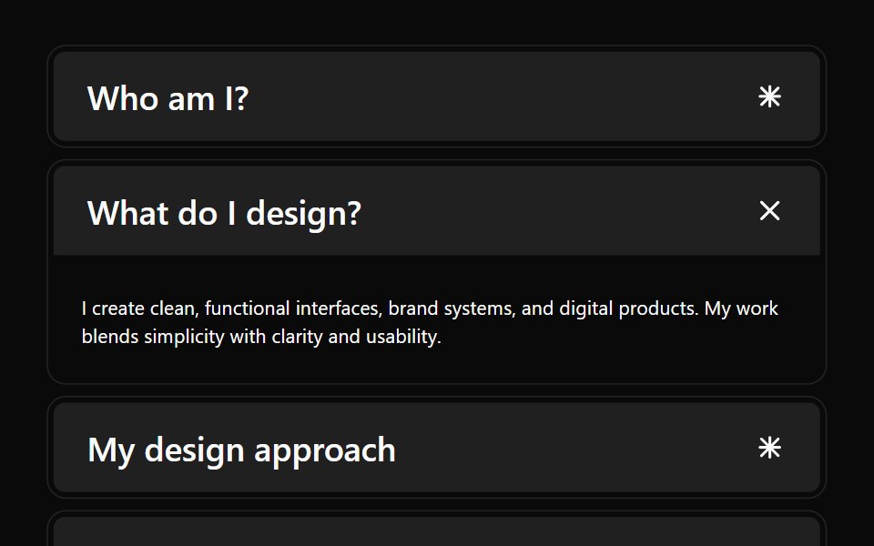 Accordion 04Watermelon UI · React
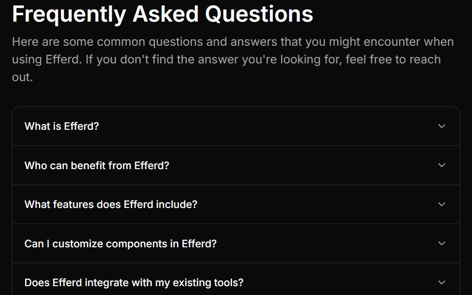 FAQ Onesv-efferd · SvelteA compact FAQ stack with a centered heading and a classic single-column accordion.
 With iconsFLX UI · ReactLeading icon beside each trigger label.
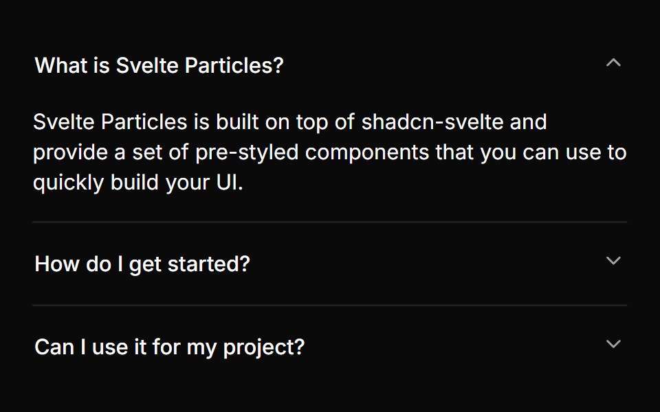 Multiple Panelssv-particles · Svelte
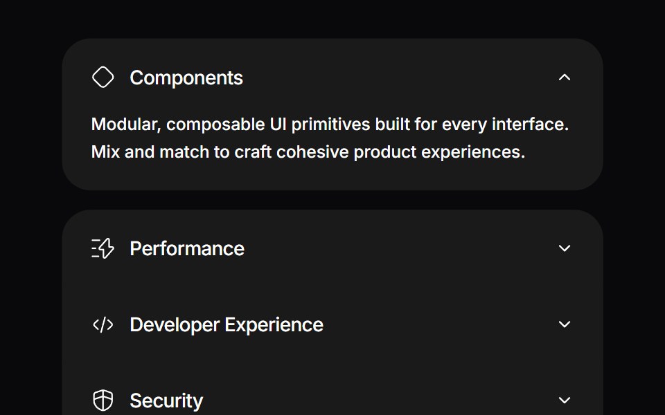 Detachable AccordionSpaceUI · ReactAn interactive accordion with spring motion where the expanded item physically detaches with animated gaps and rounded…
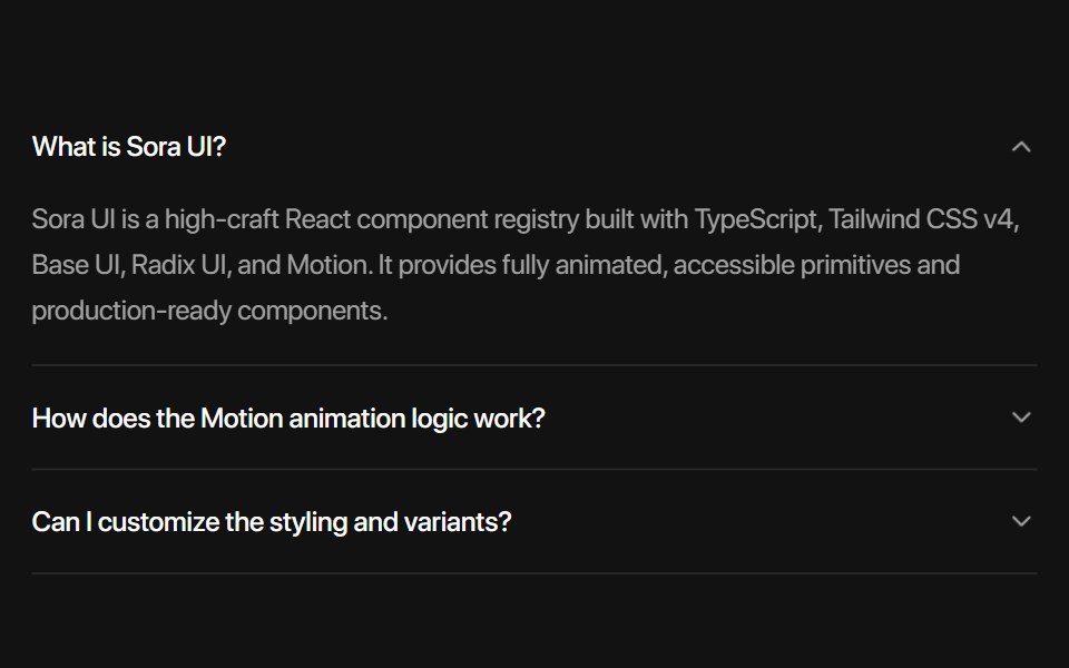 Radix AccordionSora UI · ReactAn animated accordion component built on Radix UI with spring physics, height collapse mask gradient, blur…
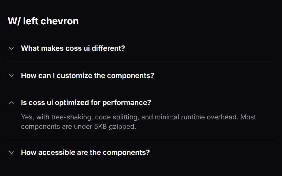 Comp 336Origin UI · React
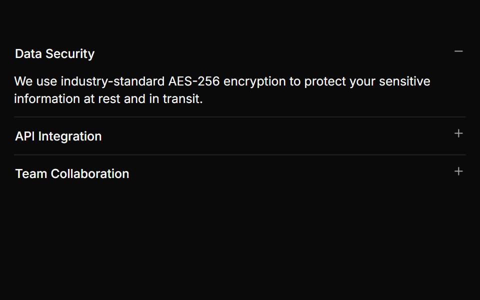 Accordion with plus/minus indicatorsReUI · ReactAccordion with plus/minus indicators
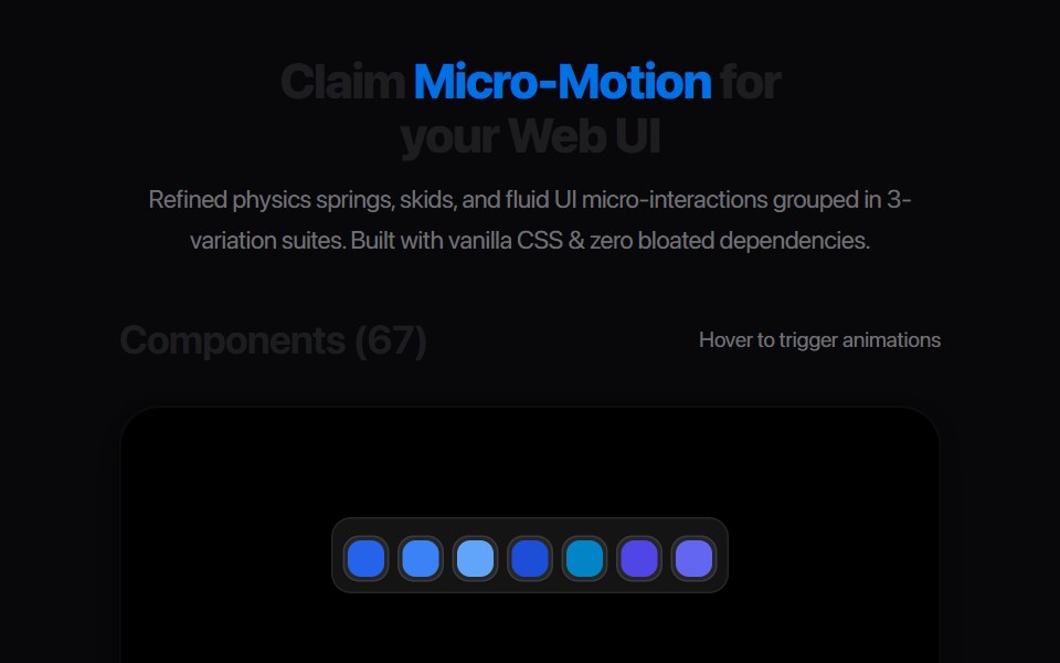 Accordion BlindAmicro Micro Transitions · React
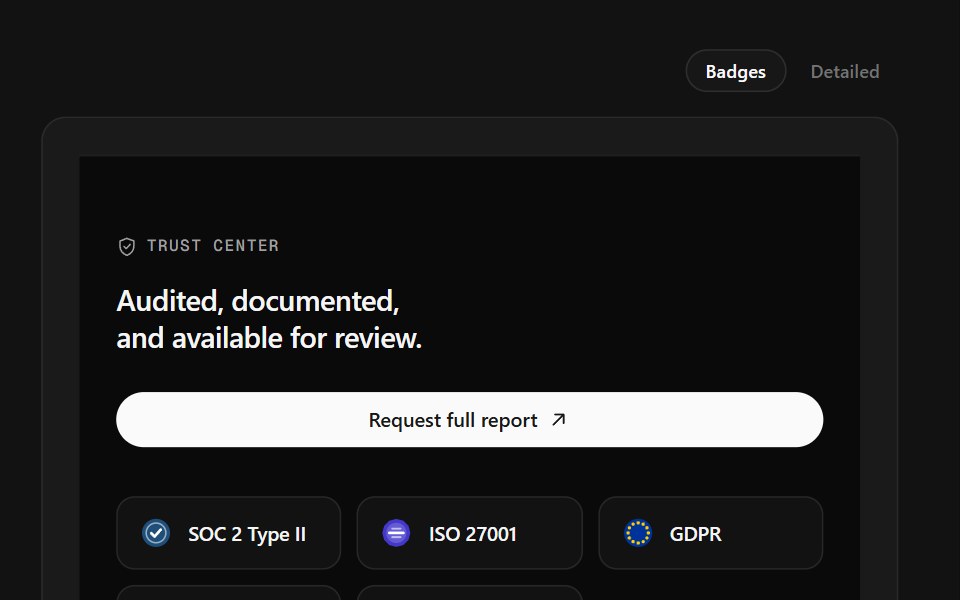 Trust Center FooterSpectrum UI · ReactCompliance marks that expand to scope, over a logo row and link columns.
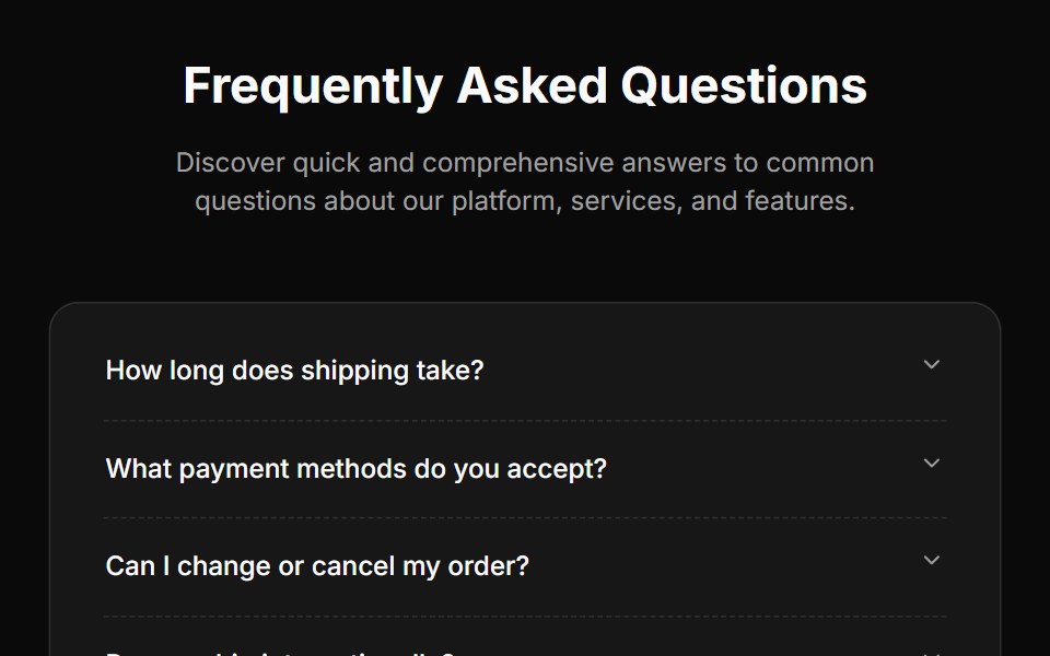 Faq Twocnblocks · SvelteFAQ section with expandable items
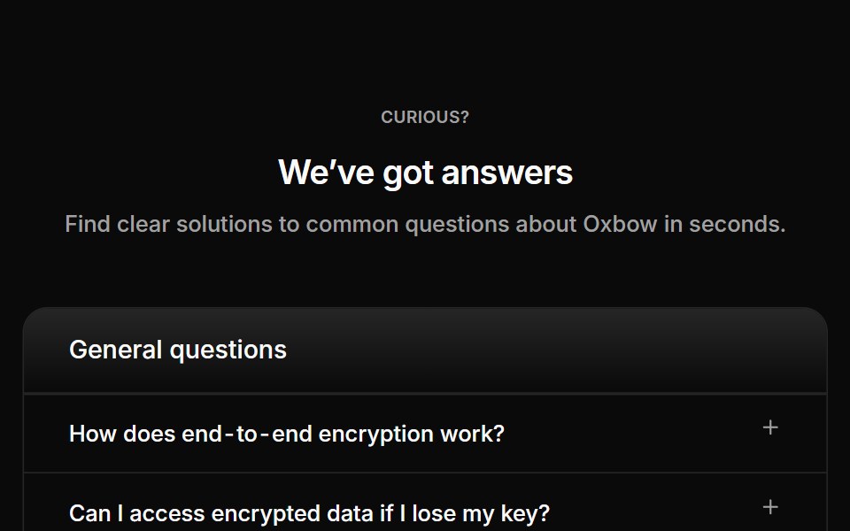 Faq 04Oxbow UI · Astro
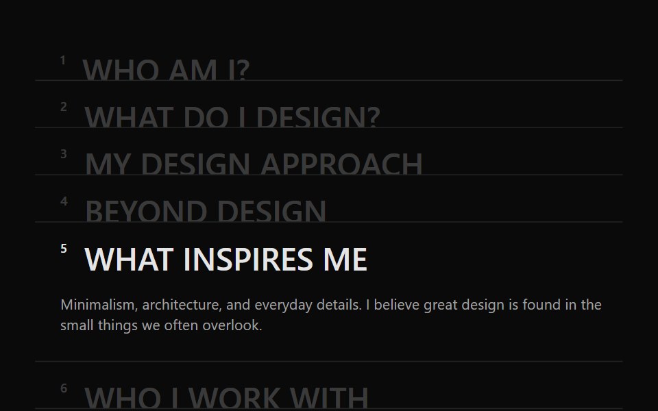 Accordion 05Watermelon UI · React
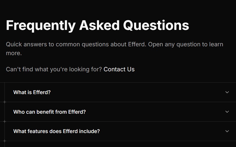 FAQ Threesv-efferd · SvelteA guided editorial FAQ with divider rails and decorative timeline markers.
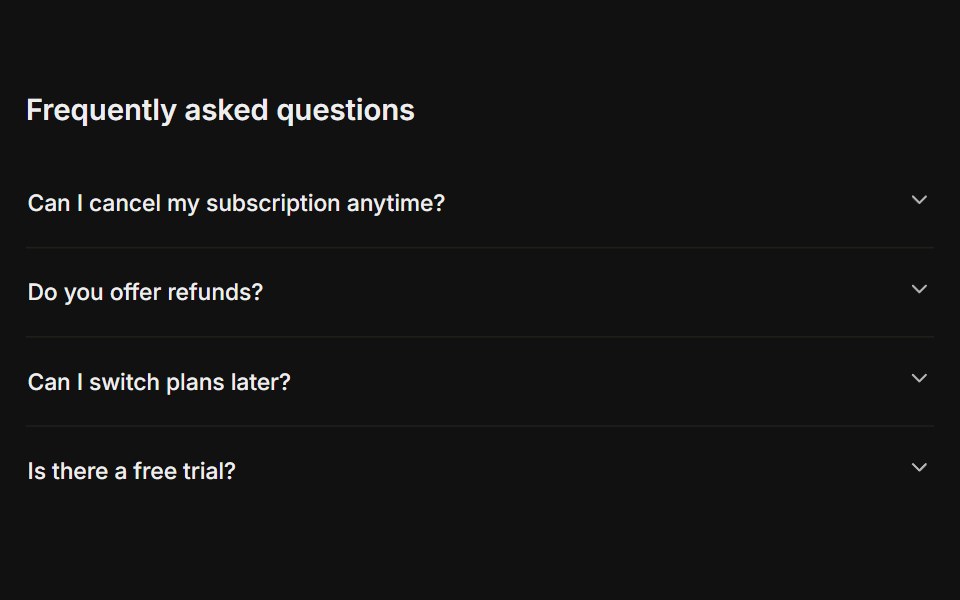 FAQFLX UI · ReactA titled question-and-answer list.
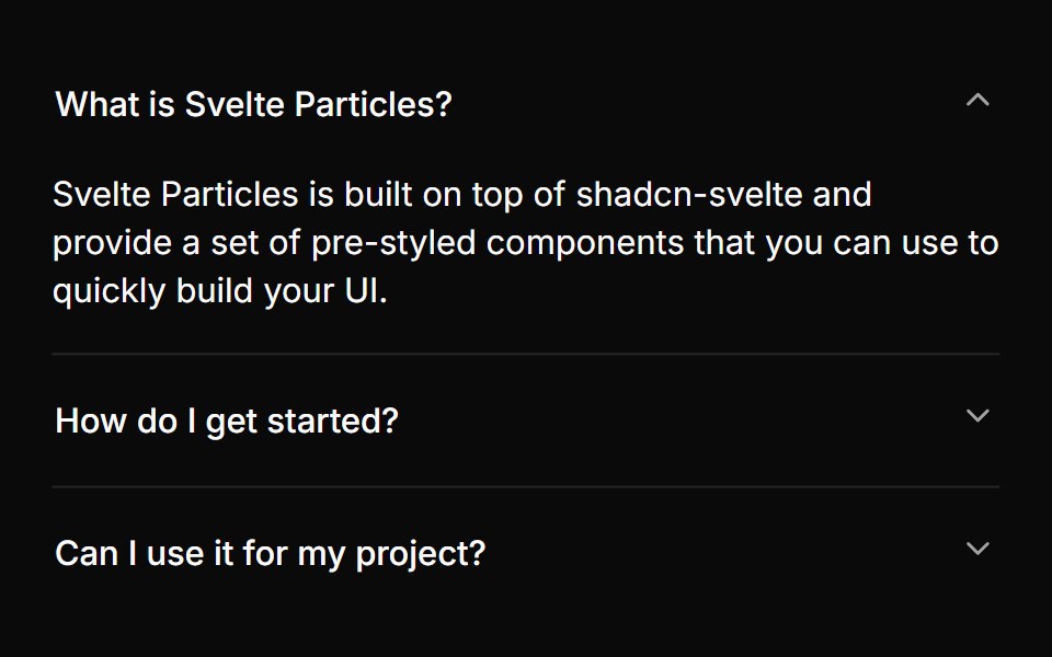 With One Panelsv-particles · Svelte
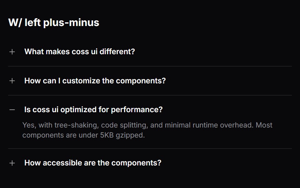 Comp 337Origin UI · React
 Accordion with borders and rounded cornersReUI · ReactAccordion with borders and rounded corners
 Faq 05Oxbow UI · Astro
 Accordion 1Watermelon UI · React
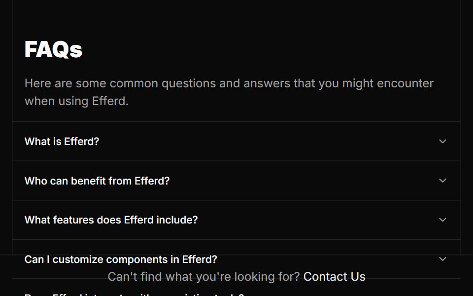 FAQ Twosv-efferd · SvelteA split FAQ layout with a fixed intro column and full-height answer rail.
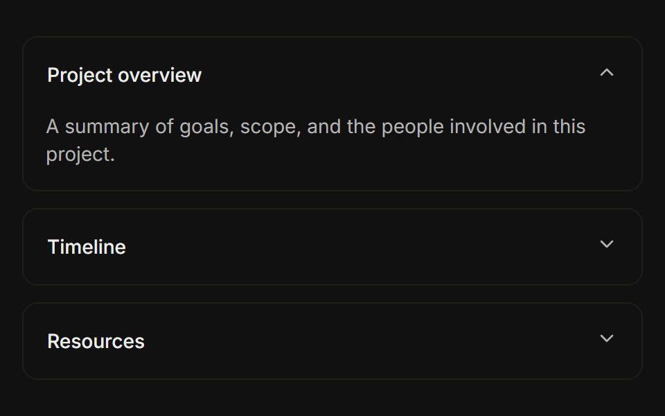 Separated cardsFLX UI · ReactEach item is a bordered card with spacing between them.
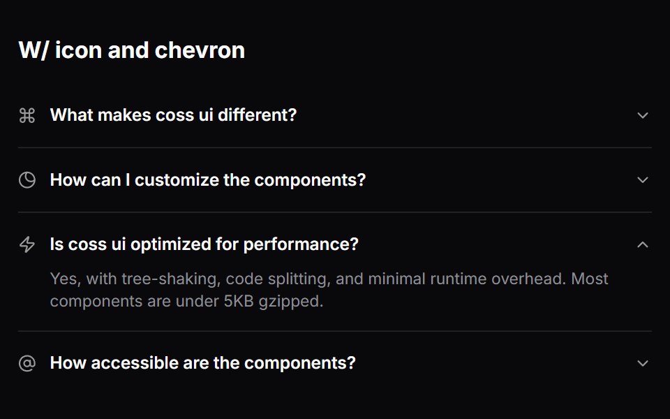 Comp 338Origin UI · React
 Accordion embedded within a CardReUI · ReactAccordion embedded within a Card
 Faq 06Oxbow UI · Astro
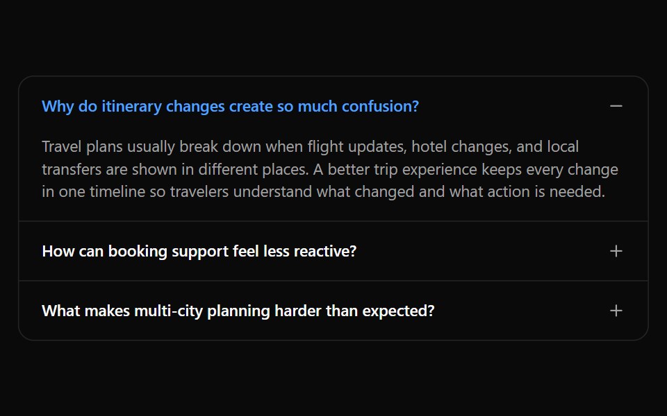 Accordion 10Watermelon UI · React
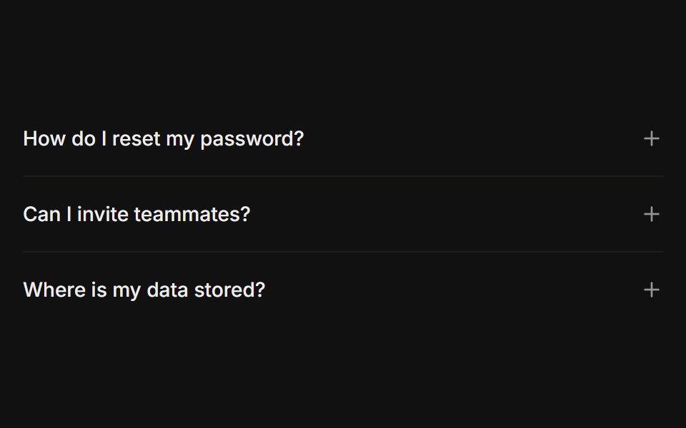 Plus / minus iconFLX UI · ReactPlus icon on each trigger that turns into a minus when open, instead of a chevron.
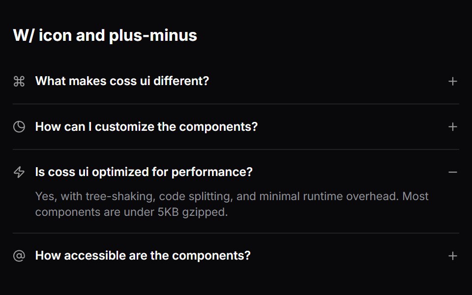 Comp 339Origin UI · React
 Accordion with disabled items and highlighted stateReUI · ReactAccordion with disabled items and highlighted state
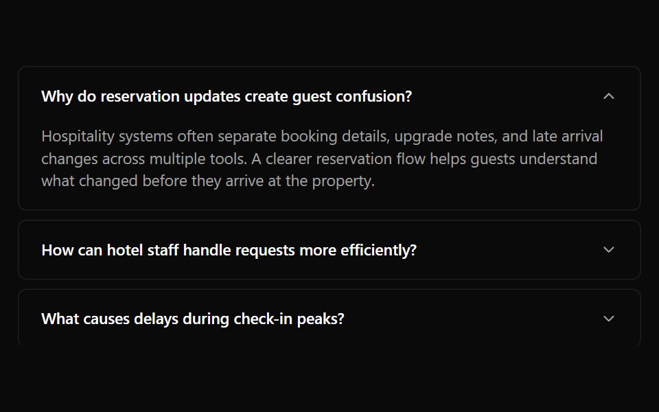 Accordion 11Watermelon UI · React
 Left chevronFLX UI · ReactRotating chevron placed before the label instead of after it.
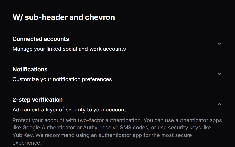 Comp 340Origin UI · React
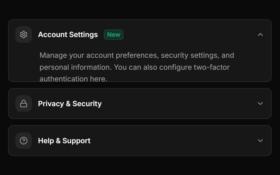 Advanced accordion with custom icons and badgesReUI · ReactAdvanced accordion with custom icons and badges
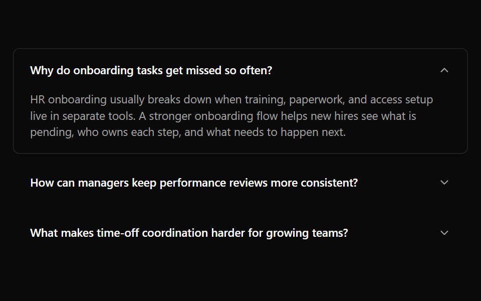 Accordion 12Watermelon UI · React
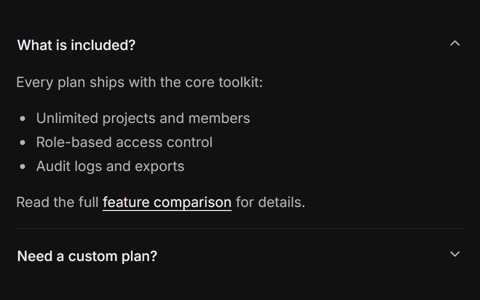 Rich contentFLX UI · ReactLists, links, and a button inside the panel body.
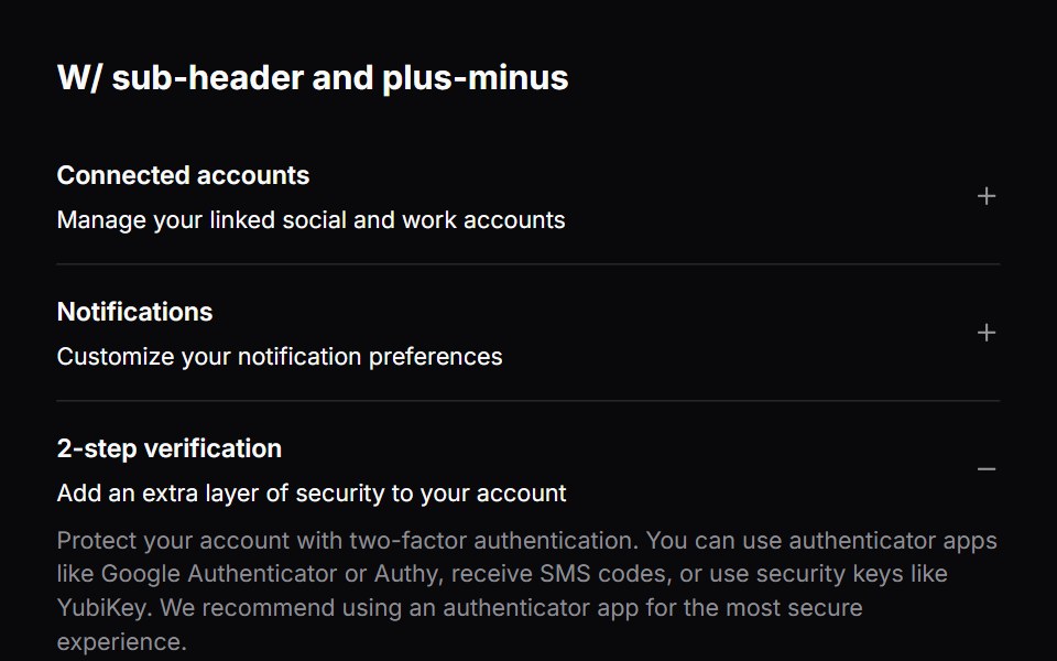 Comp 341Origin UI · React
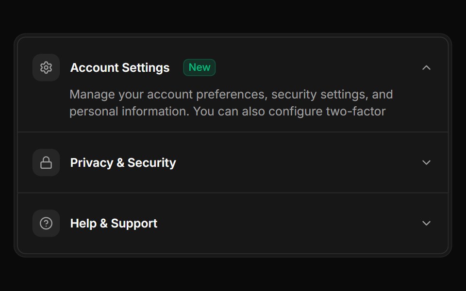 Accordion items integrated within Frame and FramePanelReUI · ReactAccordion items integrated within Frame and FramePanel
 Accordion 13Watermelon UI · React
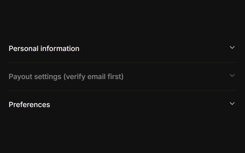 Disabled itemFLX UI · ReactOne trigger disabled while the others stay interactive.
 Comp 342Origin UI · React
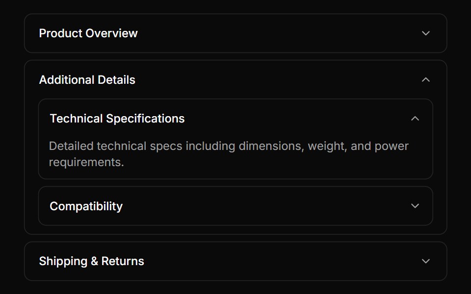 Nested accordion example with bordered itemsReUI · ReactNested accordion example with bordered items
 Accordion 14Watermelon UI · React
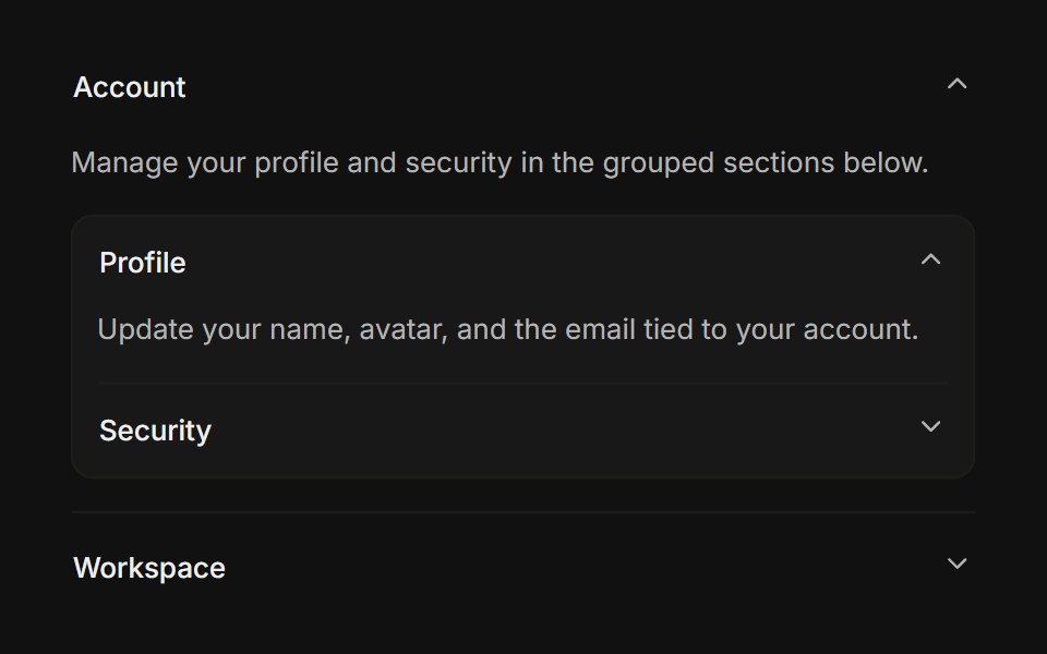 NestedFLX UI · ReactAn accordion rendered inside another panel body.
Libraries with Tailwind CSS accordion components
Related categories
- Accordion Components
- React Accordion Components
- Svelte Accordion Components
- Animated Accordion Components
- shadcn/ui Accordion Components
- Tailwind CSS Data Display Components
- Tailwind CSS Card Components
- Tailwind CSS Chart Components
- Tailwind CSS Table Components
- Tailwind CSS Avatar Components
- Tailwind CSS Stat Components
- Tailwind CSS List Components
- Tailwind CSS Calendar Components
- Tailwind CSS Data Table Components
- Tailwind CSS Carousel Components
- Tailwind CSS Collapsible Components
- Tailwind CSS Avatar Group Components
- Tailwind CSS Stat Card Components
- Tailwind CSS Bar Chart Components
- Tailwind CSS Tree View Components
- Tailwind CSS Card Stack Components