 Dev Design Library
Tailwind CSS Tree View Components
Dev Design Library indexes 92 Tailwind CSS tree view components from 27 open-source UI libraries, with the most coming from ReUI, Origin UI, Shadcn Space, React Spectrum and beUI. Each one links to its page with the source code, a live preview where available, the library license and the install command. Every library in this list styles its components with Tailwind CSS utility classes. Tree view components belong to the Data display group.
 Sidebar 11shadcn/ui · ReactA sidebar with a collapsible file tree.
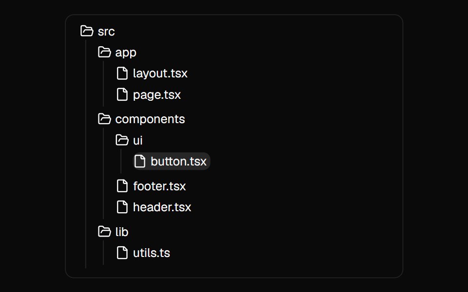 File TreeMagic UI · ReactA component used to showcase the folder and file structure of a directory.
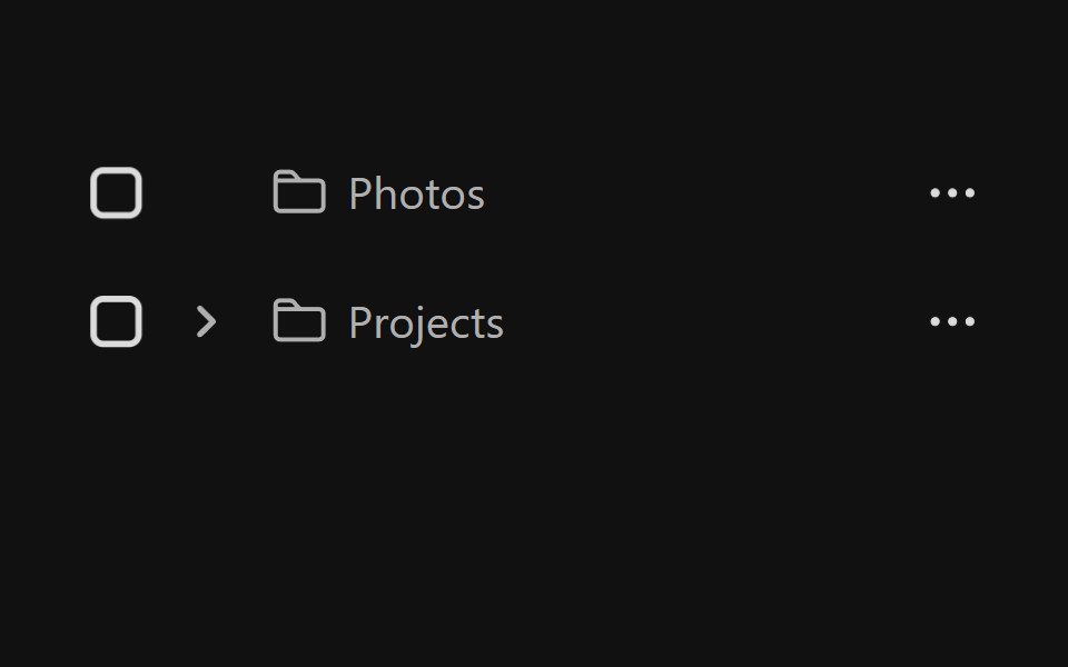 Tree ViewReact Spectrum · ReactA tree view provides users with a way to navigate nested hierarchical information.
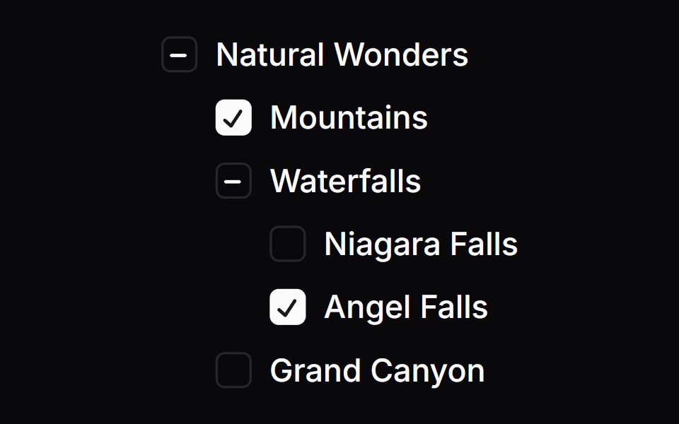 Checkbox TreeOrigin UI · React
 Tree ViewPreline UI · JavaScript (HTML + Tailwind)
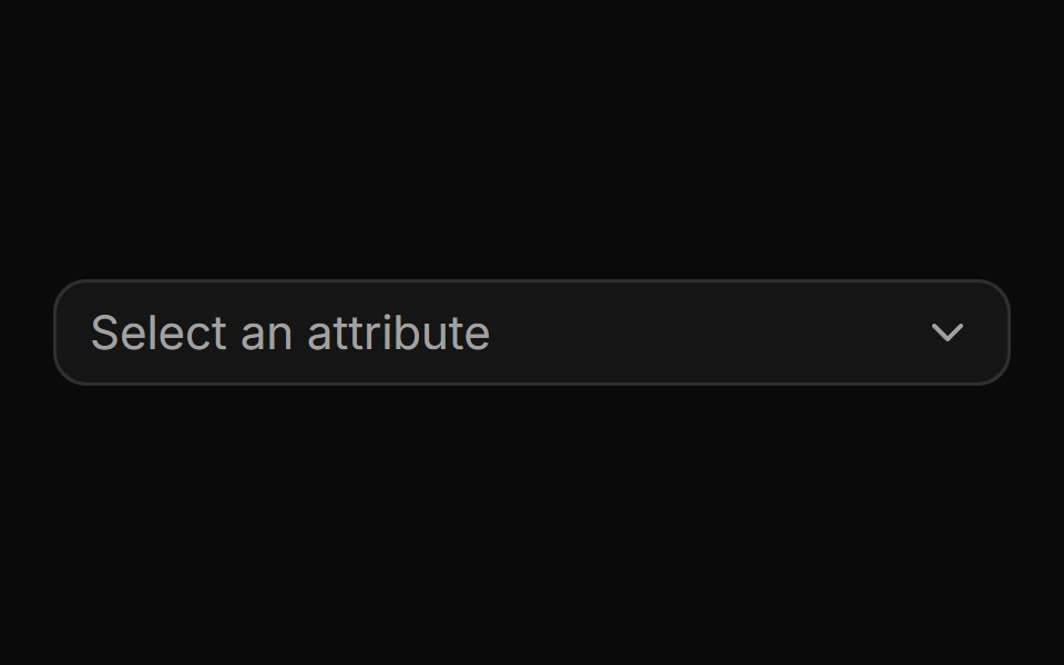 Nested attribute picker with drill-down navigation.ReUI · ReactNested attribute picker with drill-down navigation.
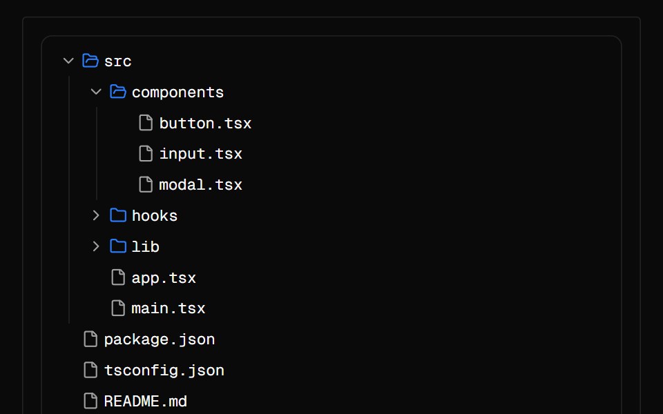 File TreeAI Elements · ReactDisplay hierarchical file and folder structure with expand/collapse functionality.
 treeIntent UI · Reacttree
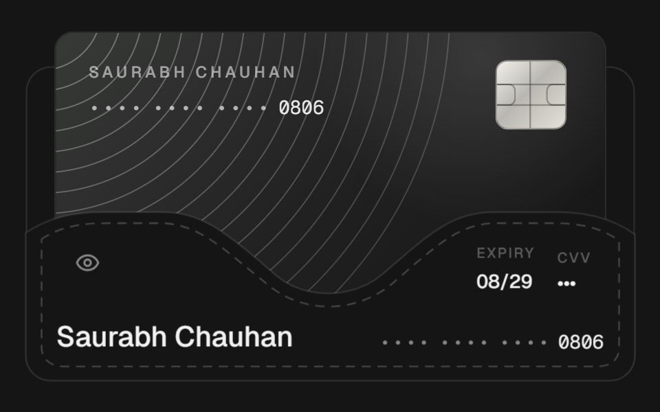 Card FolderbeUI · ReactA landscape card tucked into a stitched purse pocket that lifts forward as the purse compresses into its bottom seam…
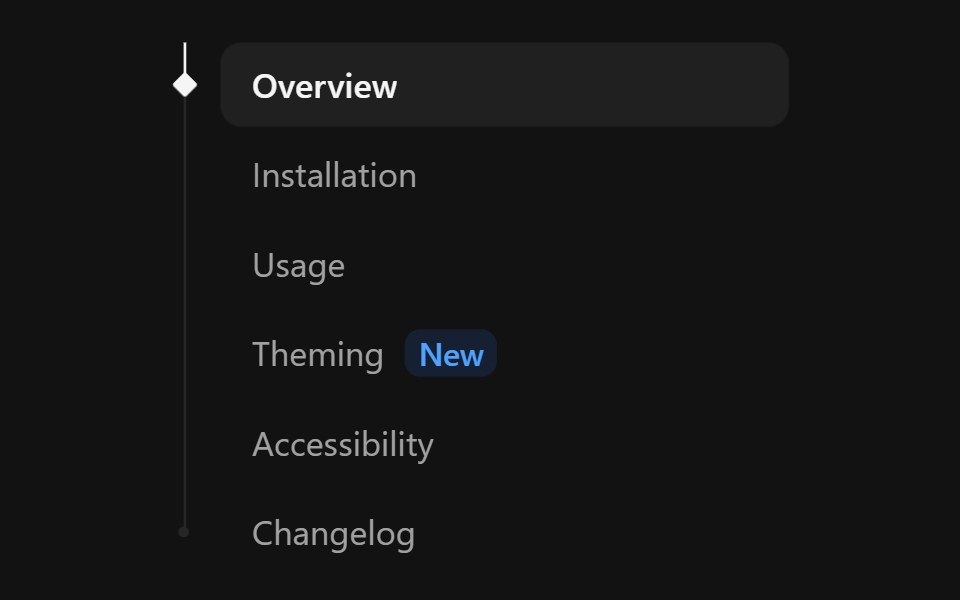 Tree NavSpectrum UI · ReactA nav list with a tree rail and a spring marker that follows hover and settles on the active link.
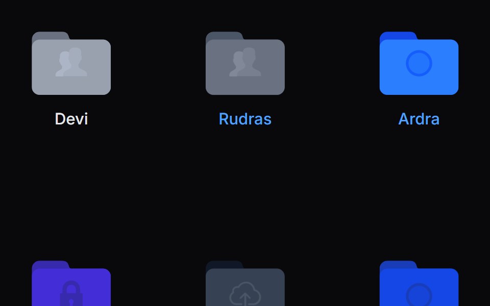 Folder PreviewVengeance UI · ReactFolder stack visual preview
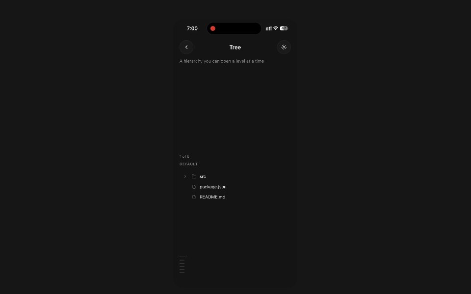 TreePanel UI · React NativeA hierarchy you can open a level at a time.
 Checkbox-09 - Checkbox with treeShadcn Space · ReactCheckbox component
 Folder Interactionuselayouts · ReactA folder management system with drag-and-drop-like feel.
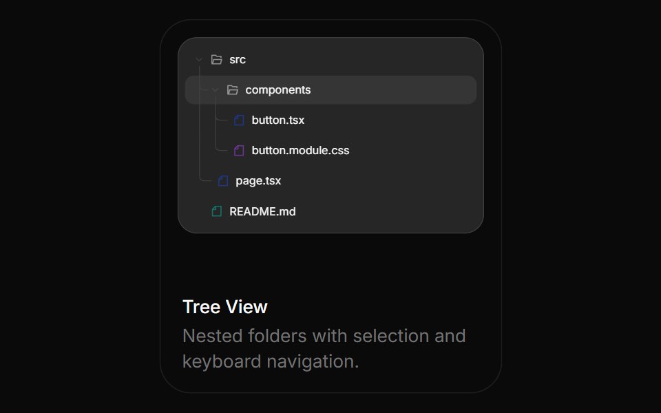 Tree ViewBoardUI · React
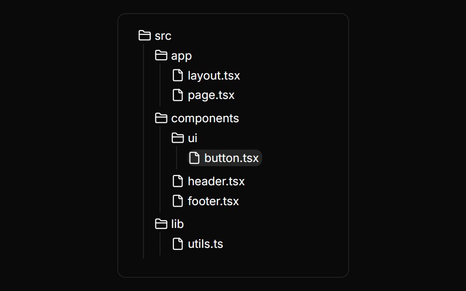 File TreeAnimations (Svelte) · SvelteAn interactive file tree component with expandable folders, selectable files, and smooth animations.
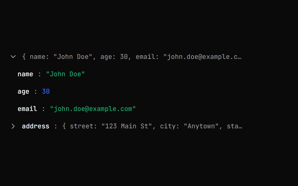 Json Tree ViewShark UI · ReactDisplay JSON data in an interactive, expandable tree.
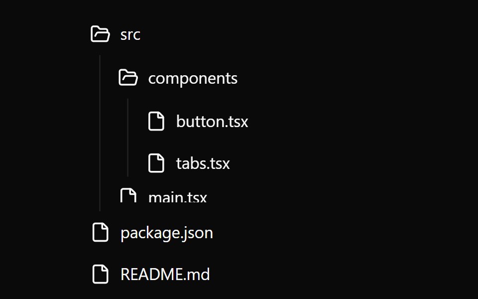 FilesWatermelon UI · React
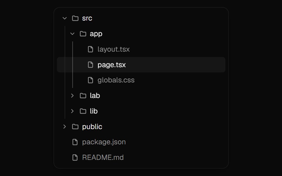 Tree ViewUI Lab · ReactFolders unfold in place while the selection glides to the file you pick.
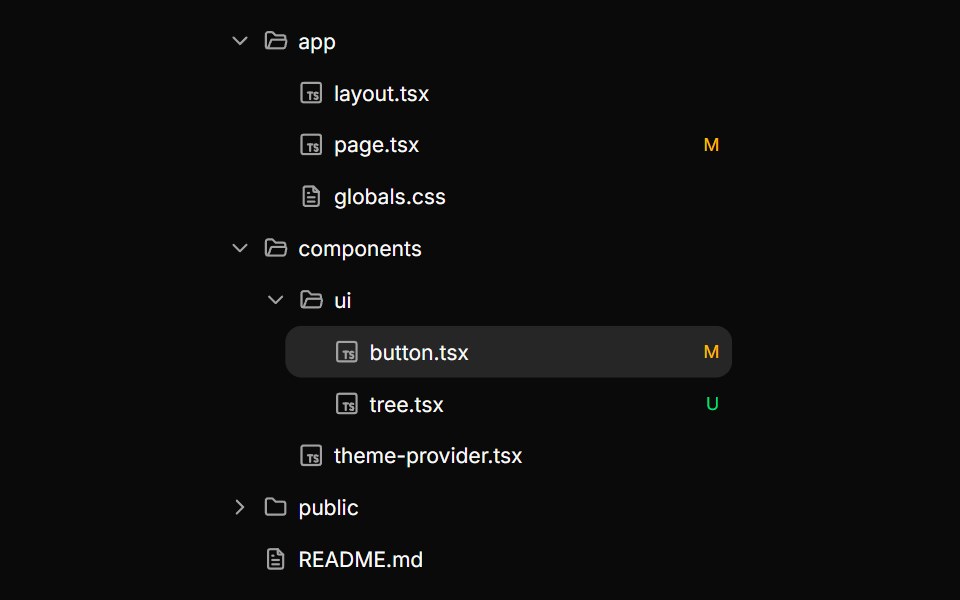 TreeHextaUI · ReactNested, expandable rows for files and hierarchies, with indent guides, connector lines, cascading checkboxes…
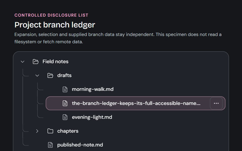 TreeCojeev UI · ReactA controlled branch ledger for supplied hierarchical data, with separate disclosure, selection and trailing actions.
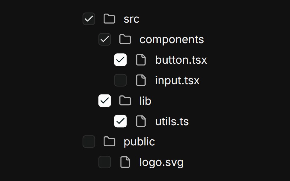 Nested treeFLX UI · ReactMulti-level file tree; parents derive checked / indeterminate from children.
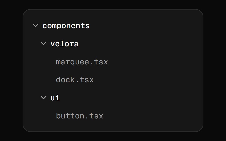 File TreeVelora UI · ReactCollapsible tree for documenting project structure.
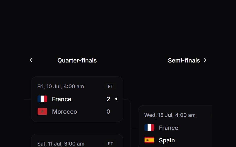 Tournament BracketSpaceUI · ReactAnimated knockout bracket with round navigation, live and finished matches, and elbow connectors.
 SidebarOUI · ReactSidebar Trigger, Sidebar Tree, and Sidebar Button for shadcn Sidebar.
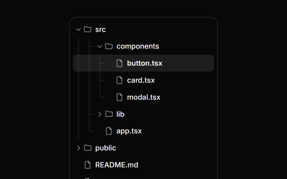 Tree ViewReactFrame · ReactA hierarchical tree with expand/collapse, tri-state checkboxes for multi-select, single-row selection, guide lines and…
 Tree Viewark-cn · ReactA shadcn-style tree view component built with Ark UI primitives.
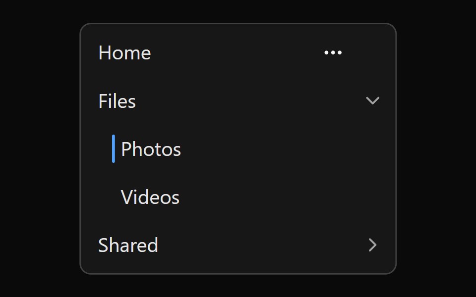 Tailwind Navigation TreeReact Spectrum · React
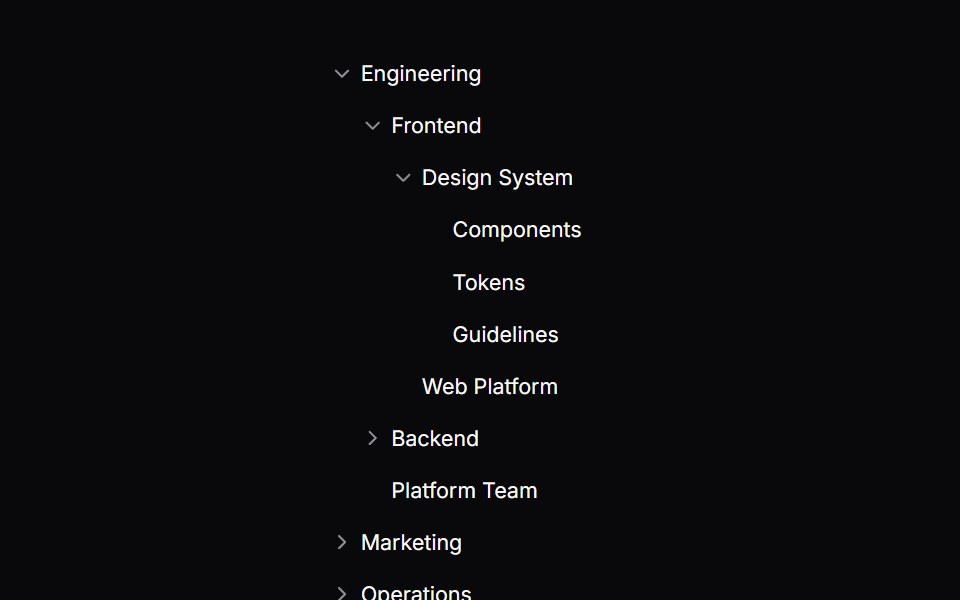 Comp 565Origin UI · React
 Translated labels across a country picker.ReUI · ReactA German country picker where every string the primitive renders comes from labels, including the live-region…
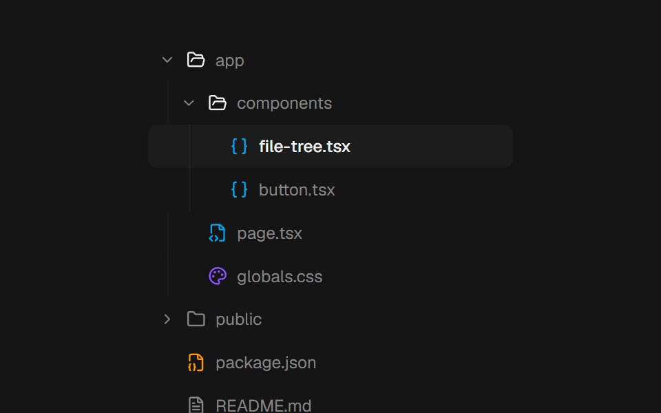 File TreebeUI · ReactComposable file and folder primitives with springing branches, a gliding selection, and complete keyboard navigation.
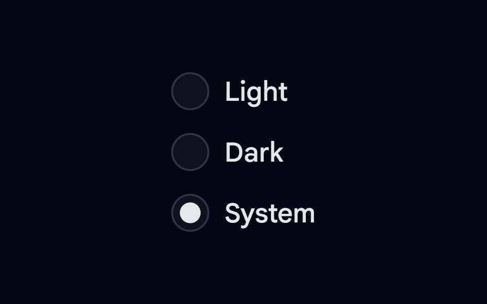 Radio Group-01 - Radio Group with treeShadcn Space · ReactRadio Group component
 Tree ViewShark UI · ReactHierarchical data in a tree structure.
 Tree MenuWatermelon UI · React
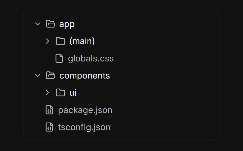 File treeFLX UI · ReactNested folders built from collapsible rows, with folder icons that swap on open.
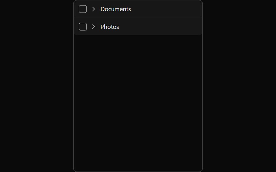 Tailwind TreeReact Spectrum · React
 Comp 566Origin UI · React
 Two-line rows with descriptions and a disabled option.ReUI · ReactTwo-line rows with descriptions and a disabled option.
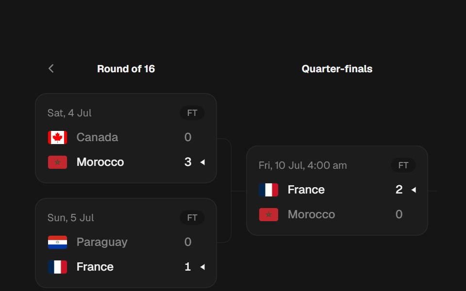 Knockout BracketbeUI · ReactPages one round at a time. The leftmost round stacks at a fixed rhythm, each later round centers between its two…
 Radio Group-02 - Radio Group with treeShadcn Space · ReactRadio Group component
 Tree Menu BaseWatermelon UI · React
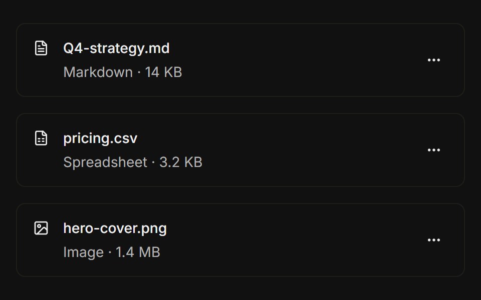 File listFLX UI · ReactFile icon, name, size metadata, and a trailing overflow menu with actions per row.
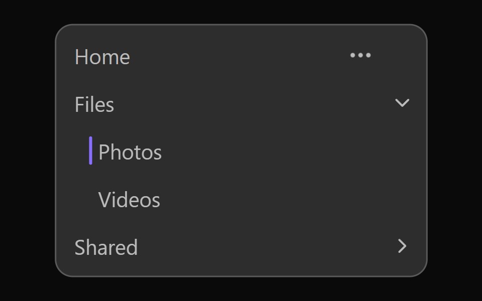 Vanilla Navigation TreeReact Spectrum · React
 Comp 567Origin UI · React
 Form field that submits like a native input.ReUI · ReactForm field that submits like a native input.
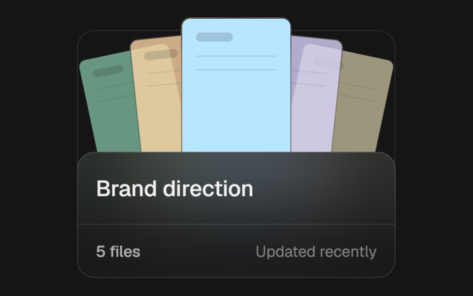 Project FolderbeUI · ReactAn interactive project folder that opens its file fan on hover or focus, expands into a focus-managed overlay, then…
 Radio Group-03 - Radio Group with treeShadcn Space · ReactRadio Group component
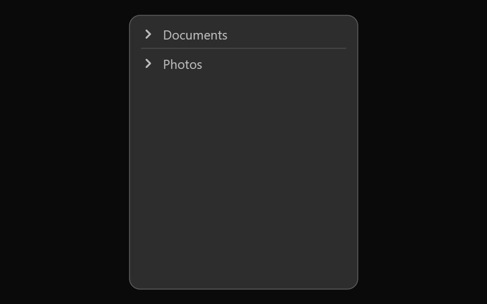 Vanilla TreeReact Spectrum · React
 Comp 568Origin UI · React
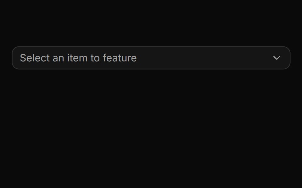 Columns mode with independently scrolling panels.ReUI · ReactA media library in Miller columns where all three panes overflow and each scrolls on its own.
 Radio Group-04 - Radio Group with treeShadcn Space · ReactRadio Group component
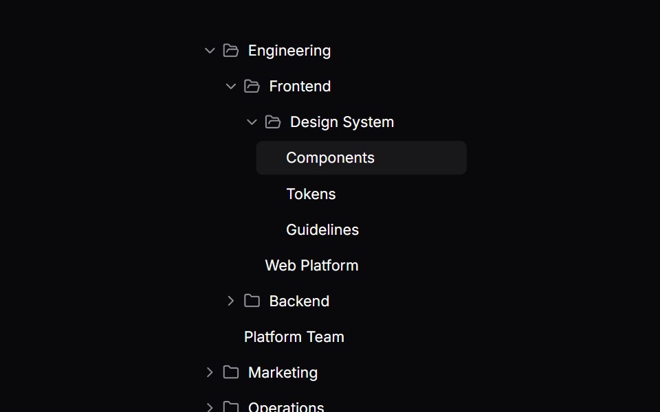 Comp 569Origin UI · React
 Tree mode with inline expand and multi-select scopes.ReUI · ReactTree mode with inline expand and multi-select scopes.
 Radio Group-05 - Radio Group with treeShadcn Space · ReactRadio Group component
 Comp 570Origin UI · React
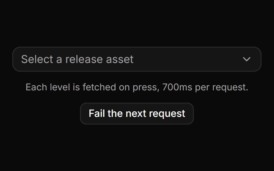 Async drill-down that loads before it navigates.ReUI · ReactAsync drill-down that loads before it navigates.
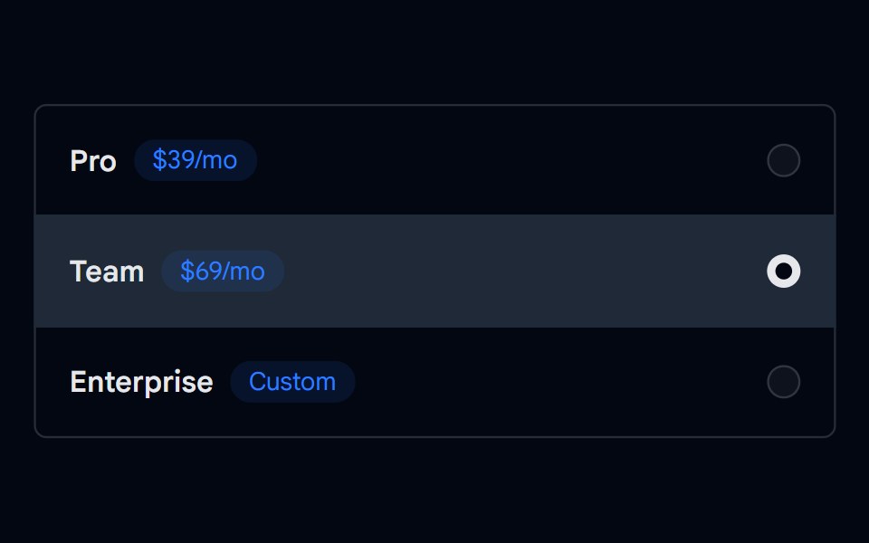 Radio Group-06 - Radio Group with treeShadcn Space · ReactRadio Group component
 Comp 571Origin UI · React
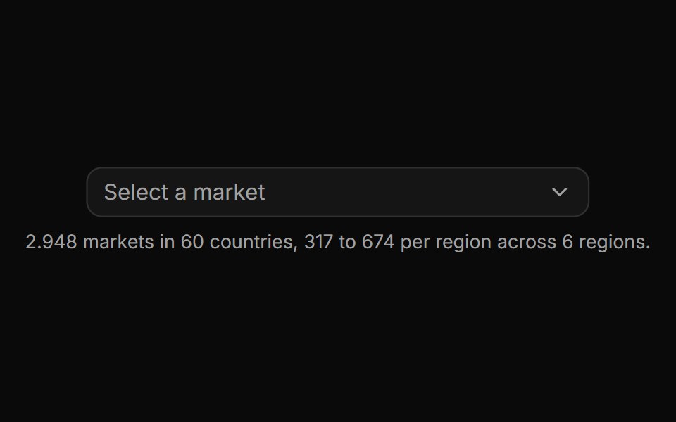 Virtualized level with thousands of rows.ReUI · ReactSix unevenly sized regions of country markets, windowed so only the visible rows ever mount.
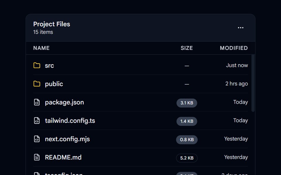 Scroll Area 01 - Custom File ExplorerShadcn Space · ReactA scrollable file explorer list with custom icons, badges, and smooth scroll area performance.
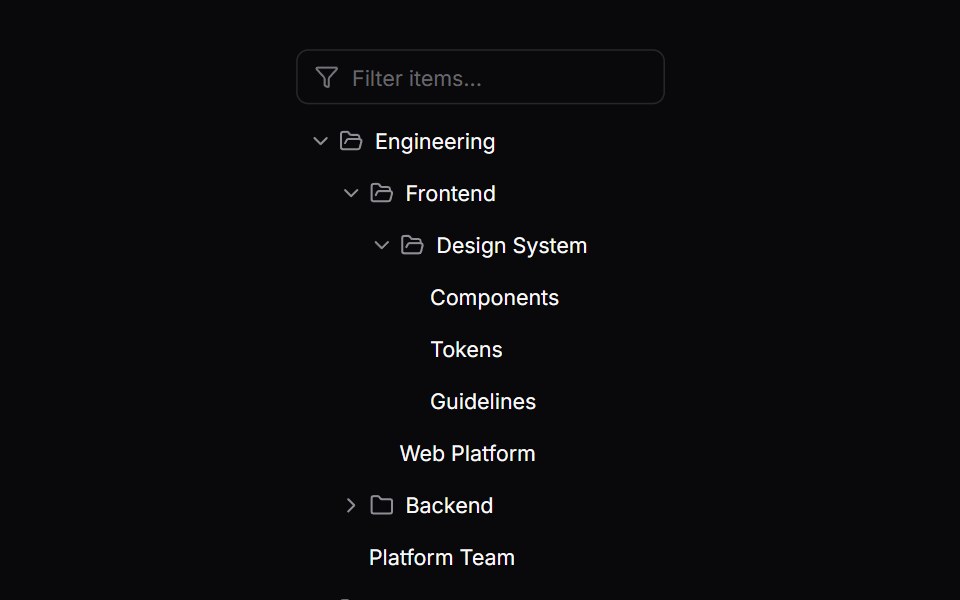 Comp 572Origin UI · React
 Consumer-rendered removable chips with path-aware labels.ReUI · ReactChips rendered outside the primitive from useCascaderSelection, each carrying its full path so repeated column names…
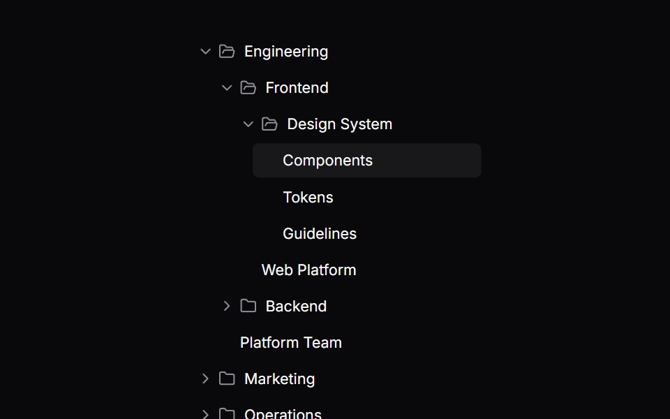 Comp 573Origin UI · React
 Cascading tree multi-select inside a popover.ReUI · ReactA cascading tree with indeterminate branches in a popover, bounded by the positioner's available height.
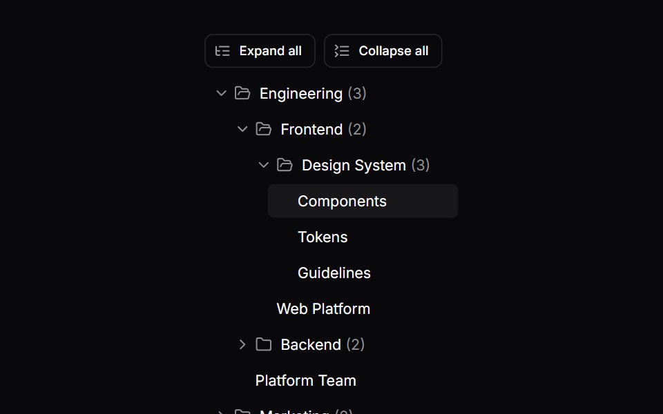 Comp 574Origin UI · React
 Status and priority colour dots via renderLabel.ReUI · ReactStatus and priority colour dots via renderLabel.
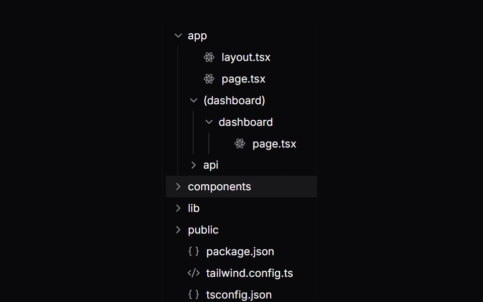 Comp 575Origin UI · React
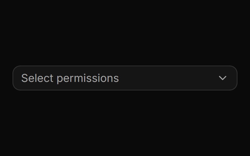 Multi-select permissions with checkboxes and a selection cap.ReUI · ReactMulti-select permissions with checkboxes and a selection cap.
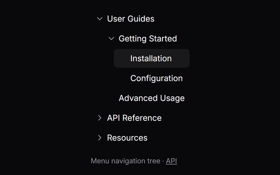 Comp 576Origin UI · React
 Expense accounts with a colour inherited down each branch.ReUI · ReactExpense accounts with a colour inherited down each branch.
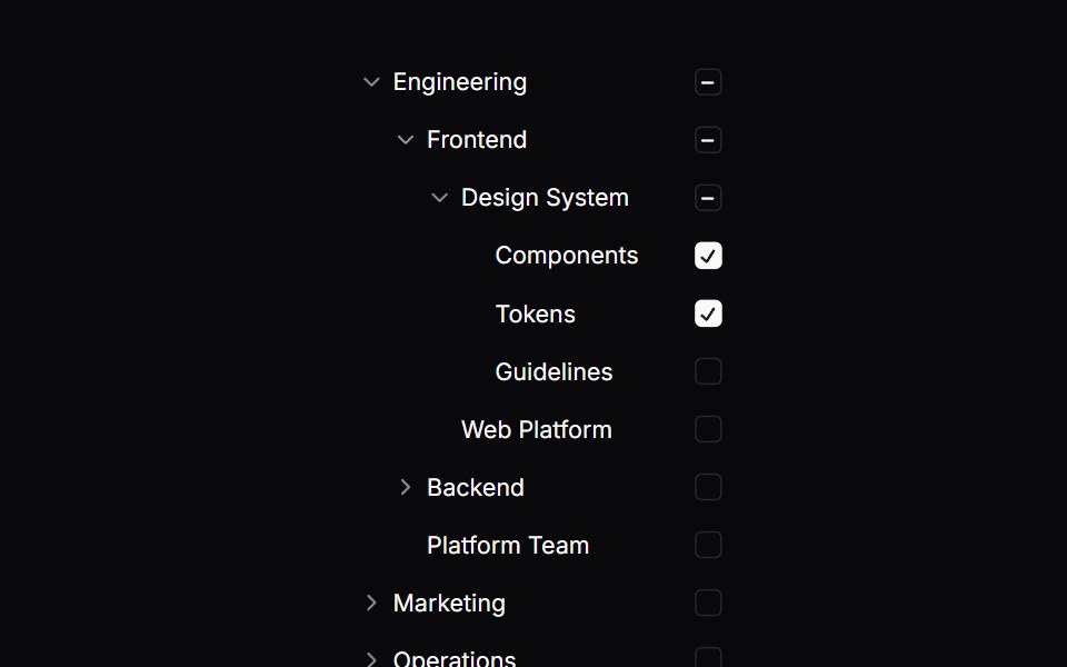 Comp 597Origin UI · React
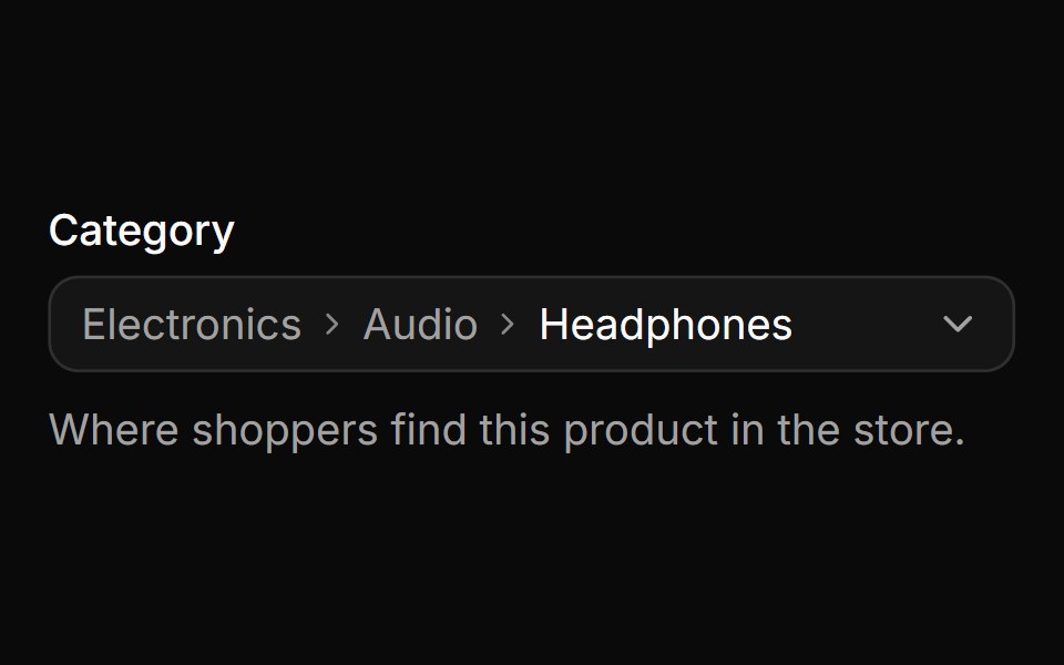 Global search across the whole tree from a nested level.ReUI · ReactA product category field that reopens on its current level, where typing still searches the whole catalog and each hit…
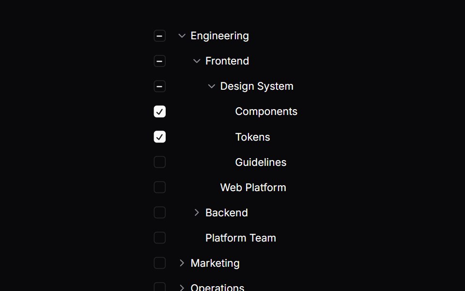 Comp 598Origin UI · React
 Deep search across every level with path-annotated results.ReUI · ReactDeep search across every level with path-annotated results.
 Comp 599Origin UI · React
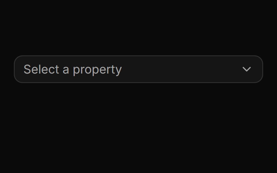 Pinned footer with a side-anchored import flyout.ReUI · ReactPinned footer with a side-anchored import flyout.
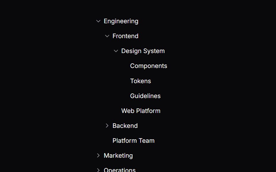 TreeOrigin UI · React
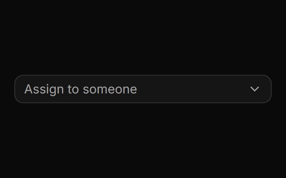 Custom rows with avatars and role badges.ReUI · ReactCustom rows pairing avatars with outline role badges that color-code seniority.
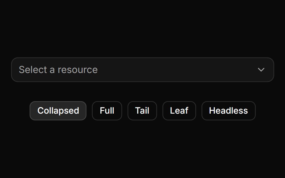 Trigger path formatting and collapsing.ReUI · ReactTrigger path formatting and collapsing.
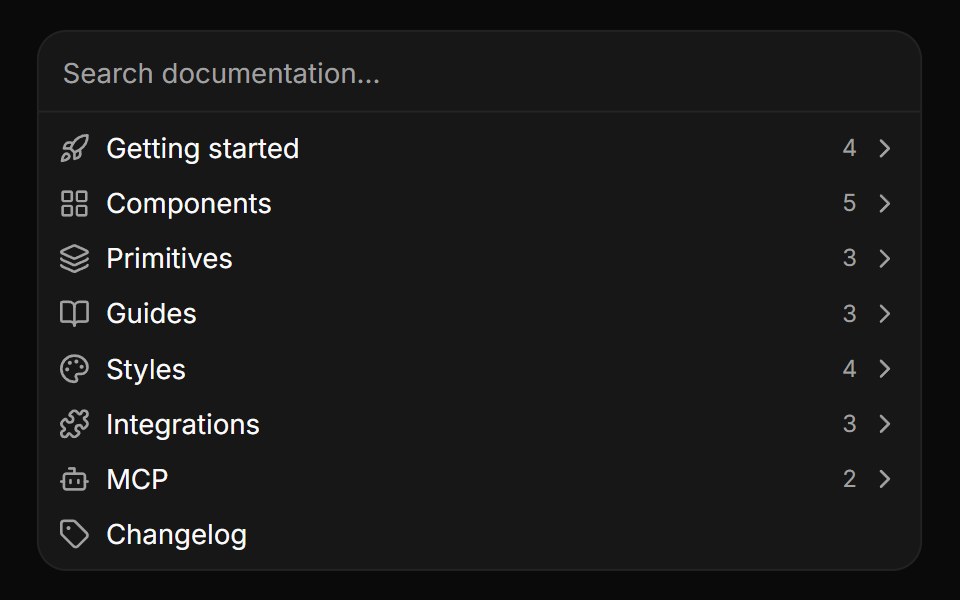 Embedded panel without a popover.ReUI · ReactEmbedded panel without a popover.
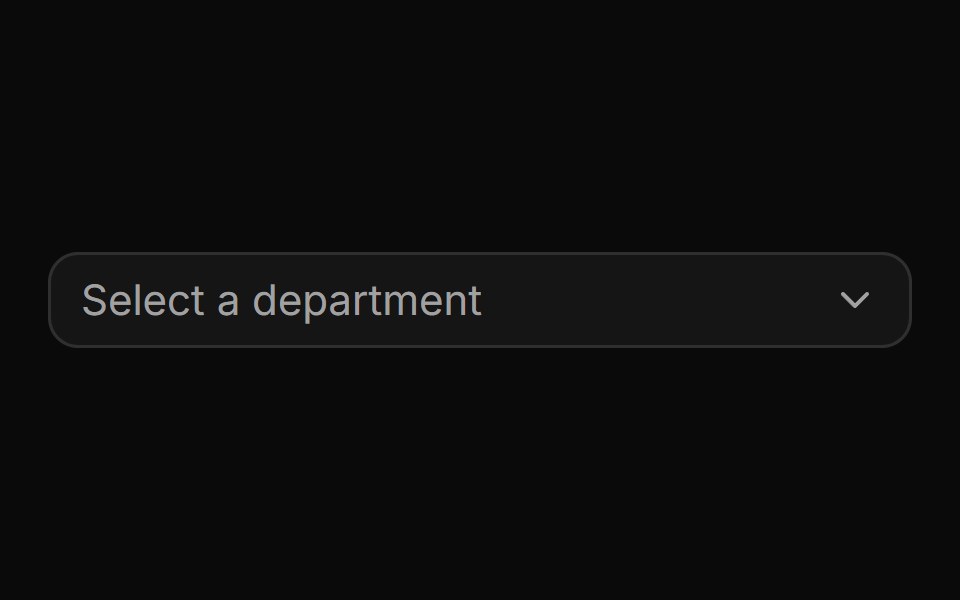 Flat adjacency data with a parent pointer.ReUI · ReactFlat adjacency data with a parent pointer.
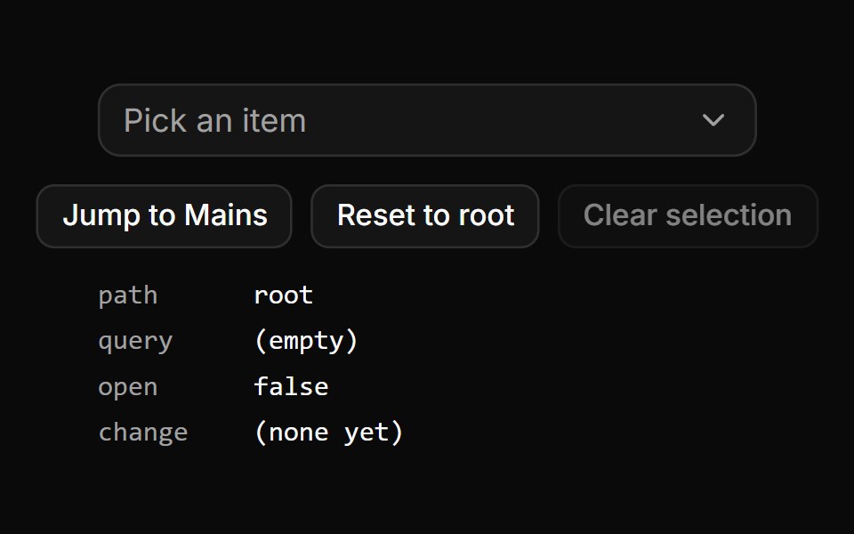 Controlled path, value, query and open state.ReUI · ReactExternal buttons jump the panel to a level, reset it to the root and clear the selection, with all four controlled…
 Data grid with tree rowsReUI · ReactData grid with tree rows
 Basic tree.ReUI · ReactBasic tree.
 Tree with indented lines.ReUI · ReactTree with indented lines.
 Tree with custom indent.ReUI · ReactTree with custom indent.
 Tree with custom indent.ReUI · ReactTree with custom indent.
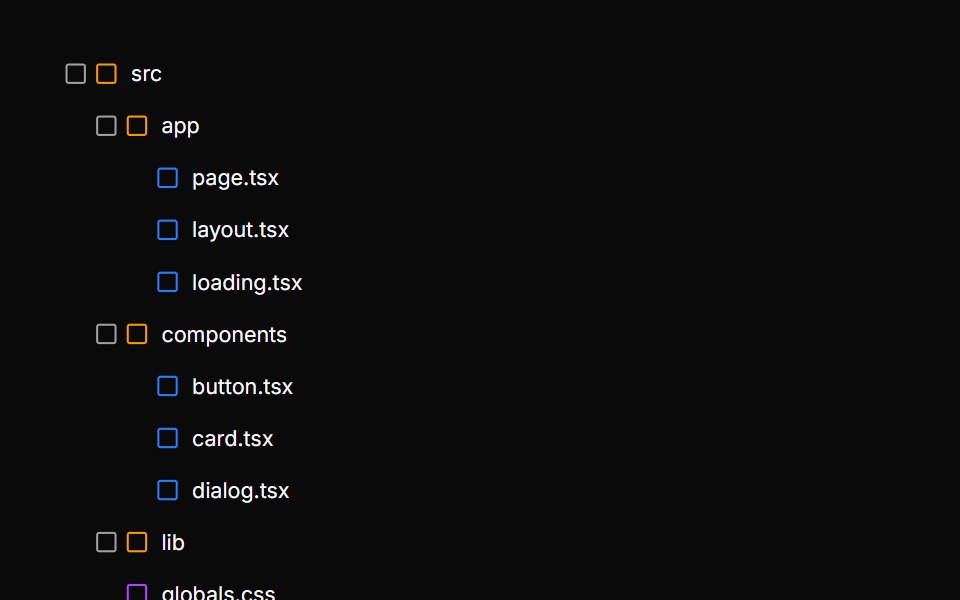 File explorer tree with type iconsReUI · ReactFile explorer tree with type icons
 Organization chart tree with avatarsReUI · ReactOrganization chart tree with avatars
 Permissions tree with checkboxesReUI · ReactPermissions tree with checkboxes
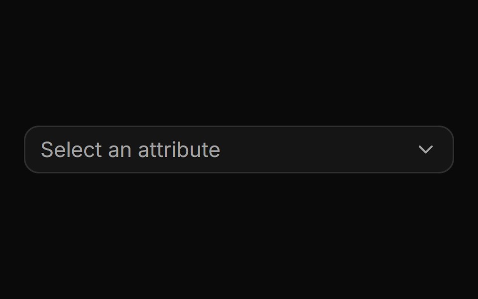 CascaderReUI · ReactA nested multi-level combobox with drill-down navigation, breadcrumbs, search and custom rows.
 TreeReUI · ReactA customizable tree component for React.
Libraries with Tailwind CSS tree view components
Related categories
- Tree View Components
- React Tree View Components
- Animated Tree View Components
- shadcn/ui Tree View Components
- Tailwind CSS Data Display Components
- Tailwind CSS Card Components
- Tailwind CSS Chart Components
- Tailwind CSS Table Components
- Tailwind CSS Avatar Components
- Tailwind CSS Stat Components
- Tailwind CSS List Components
- Tailwind CSS Calendar Components
- Tailwind CSS Accordion Components
- Tailwind CSS Data Table Components
- Tailwind CSS Carousel Components
- Tailwind CSS Collapsible Components
- Tailwind CSS Avatar Group Components
- Tailwind CSS Stat Card Components
- Tailwind CSS Bar Chart Components
- Tailwind CSS Card Stack Components