 Dev Design Library
Tailwind CSS Avatar Group Components
Dev Design Library indexes 112 Tailwind CSS avatar group components from 28 open-source UI libraries, with the most coming from ReUI, FLX UI, Oxbow UI, SpaceUI and Vengeance UI. Each one links to its page with the source code, a live preview where available, the library license and the install command. Every library in this list styles its components with Tailwind CSS utility classes. Avatar group components belong to the Data display group.
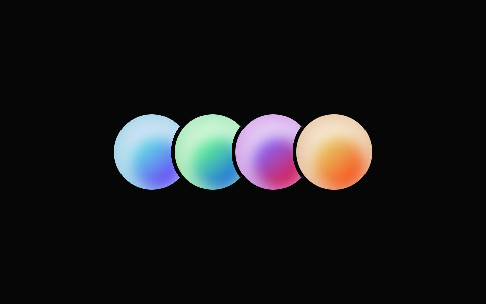 Avatar GroupHeroUI · ReactDisplay a stacked or grid group of avatars with overflow counting
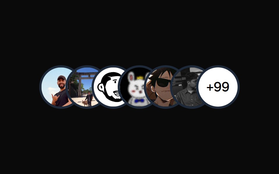 Avatar CirclesMagic UI · ReactOverlapping circles of avatars.
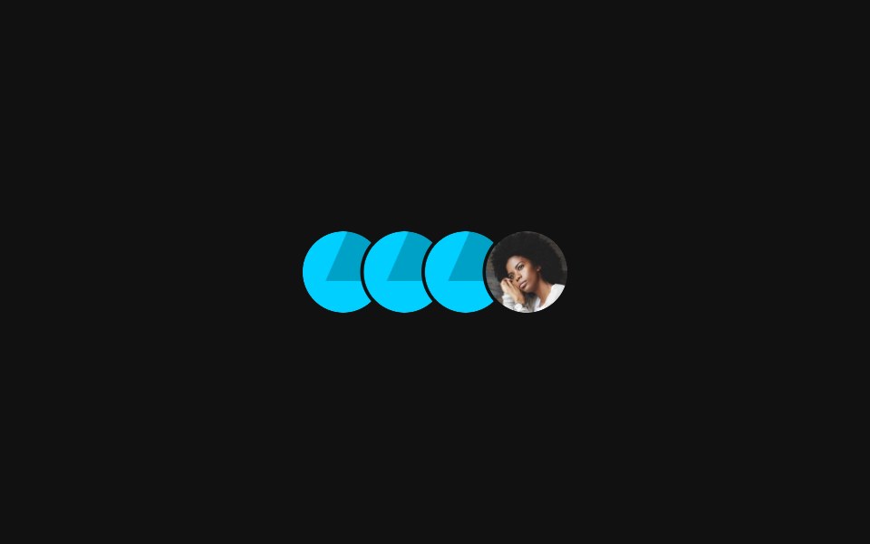 Avatar GroupReact Spectrum · ReactAn avatar group is a grouping of avatars that are related to each other.
 Basic avatarReUI · ReactBasic avatar
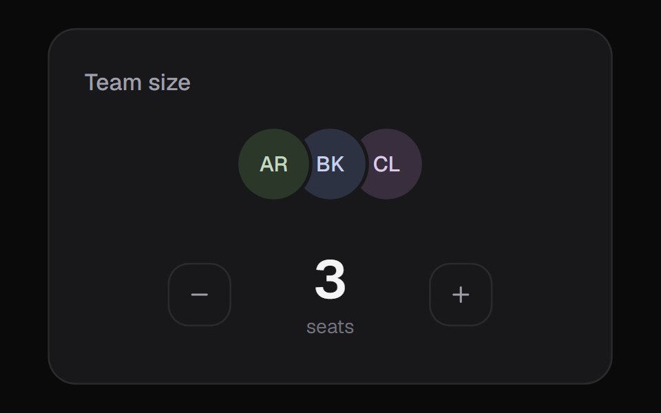 Team SelectorKokonut UI · ReactSeat picker with a scrubbable number, generated avatars and an optional rolling price line.
 AvatarUntitled UI React · React
 Avatar GroupbeUI · ReactOverlapping avatars that fan apart on hover, lift with a name tooltip, and expand from a +N count to show everyone.
 Avatar StackSpectrum UI · ReactAn overlapping avatar stack that fans apart on hover, springs name tooltips over each face and expands hidden members…
 Animated TooltipVengeance UI · ReactBouncy SVG-shaped tooltips with spring animations
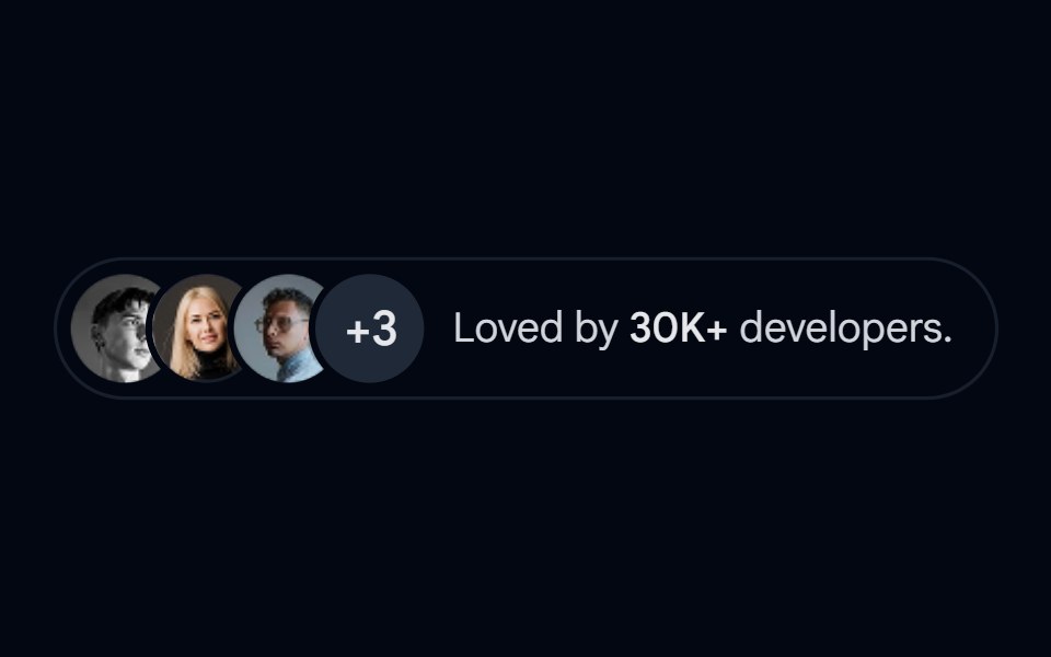 Avatar-08 - Avatar stackShadcn Space · ReactStacked avatar group with overflow count and popularity indicator
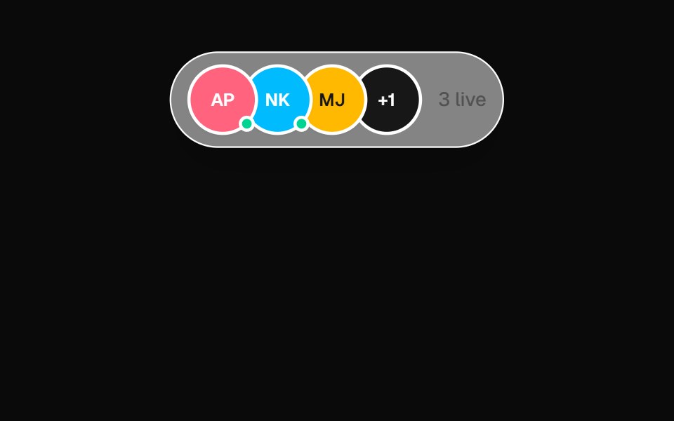 Presence DockOpenSourceUI · React
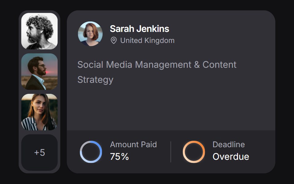 Client Carduselayouts · ReactA client CRM card with payment and deadline rings, plus a morphing avatar stack.
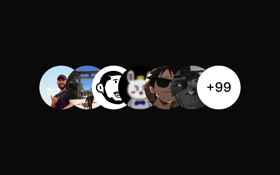 Avatar CirclesAnimations (Svelte) · SvelteA component that displays overlapping avatar circles with optional count indicator for showing team members or…
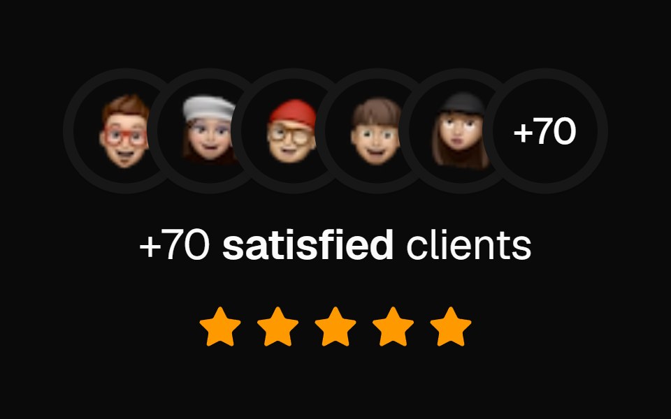 Social Proof AvatarsBadtz UI · ReactA component that displays user avatars with optional extra count and star ratings, ideal for showcasing social proof.
 Avatar StackGreatUI · React
 Avatars 08Oxbow UI · AstroAvatar Group (Dynamic +N)
 Avatar ShowcaseSona UI · ReactA recording-friendly avatar strip with count-aware pacing, deterministic sampling, staggered lanes, and reduced-motion…
 Avatar GroupWatermelon UI · React
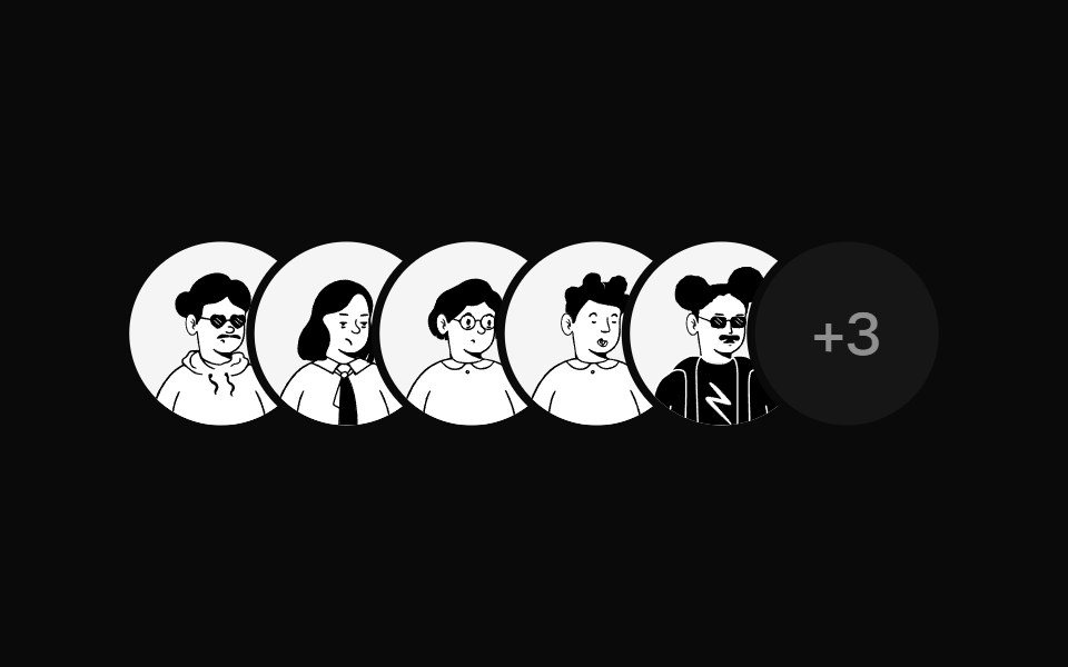 Avatar StackUI Lab · ReactFans open when you reach for it, with a name above each face.
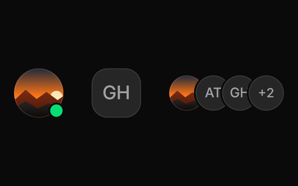 AvatarHextaUI · ReactUser photos with an initials fallback, status badges and stacked groups that collapse into a count.
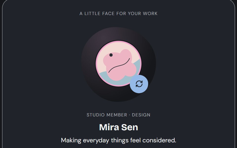 AvatarCojeev UI · ReactPortraits, identity rows and participant groups that keep the person recognizable—with artwork, initials and…
 BasicFLX UI · ReactImage avatar with an initials fallback.
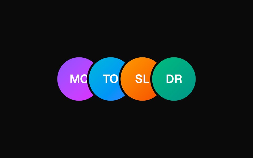 Animated TooltipVelora UI · ReactAvatar row with springy name tooltips on hover.
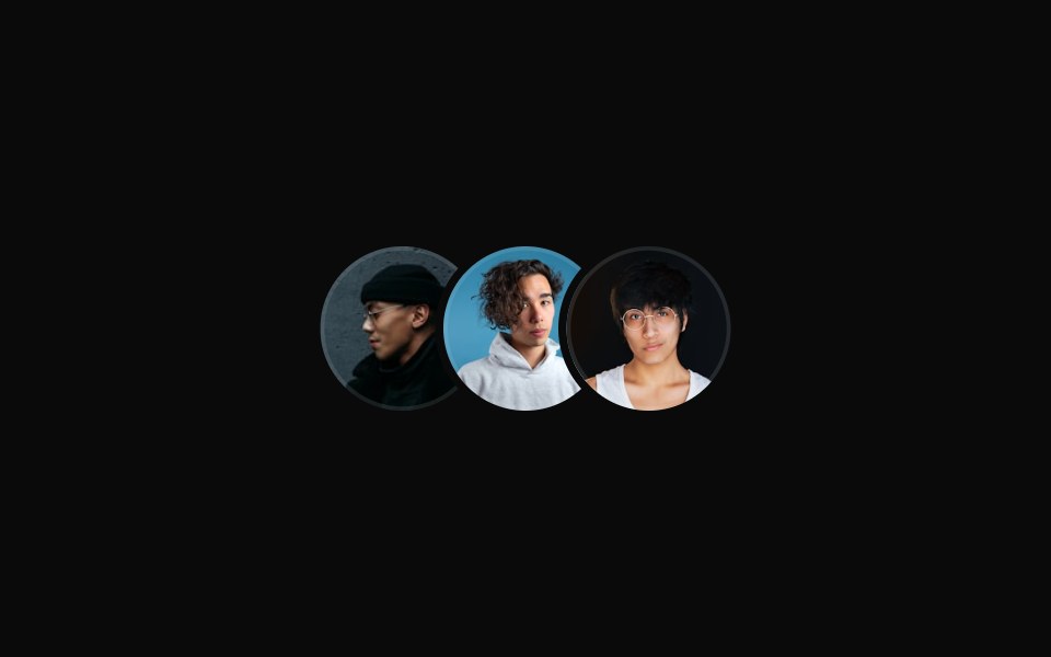 Large Overlapping Avatar Groupsv-particles · Svelte
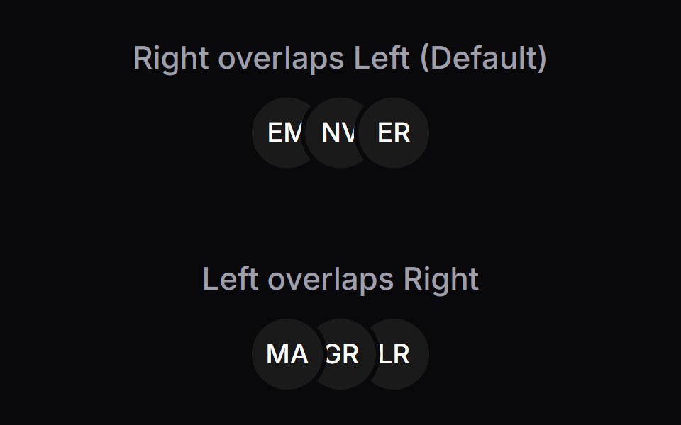 Avatar GroupSpaceUI · ReactA component for rendering a group of avatars, supporting different stacking directions and action buttons.
 Hero 01D2Studio UI · ReactStartup mentorship landing hero with a headline, call to action and mentor avatar group.
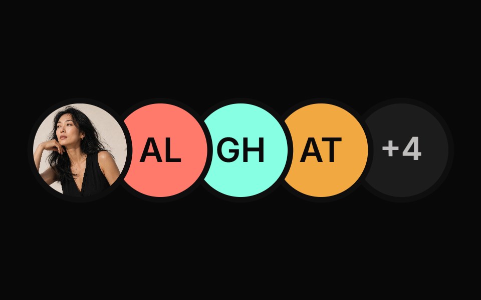 Avatar GroupReactFrame · ReactA stacked group of avatars with photo or initials, an overflow +N bubble, hover lift with name tooltips, a…
 Animated TooltipAceternity UI · React
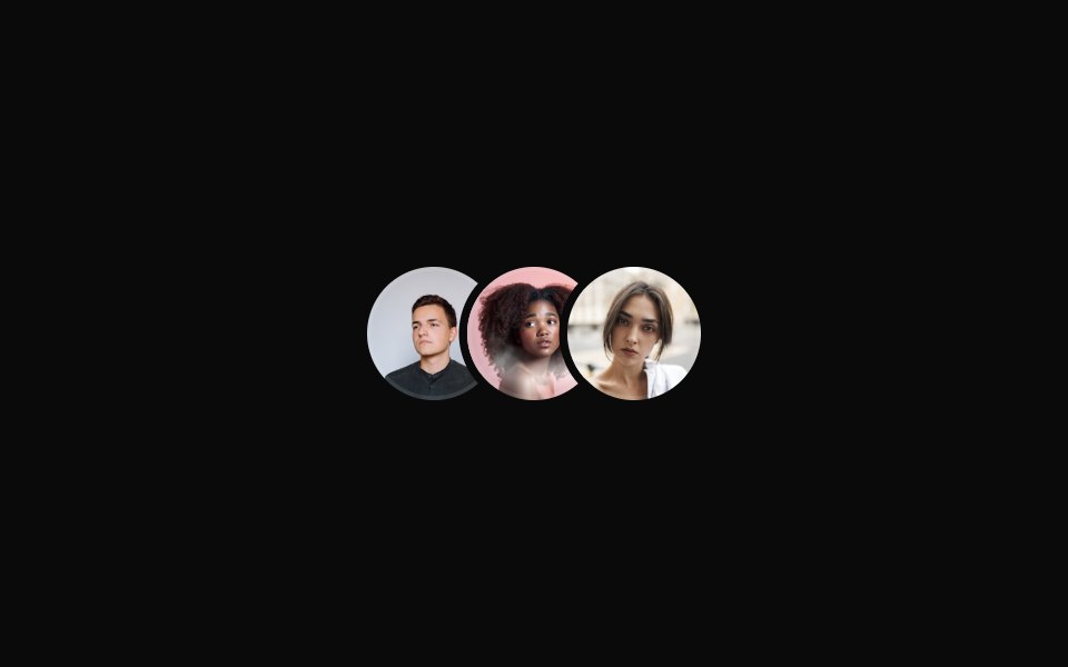 Basic avatar groupReUI · ReactBasic avatar group
 Invite TeammatesSpectrum UI · ReactA one-seat team with an avatar rail, live invite field and copyable join link.
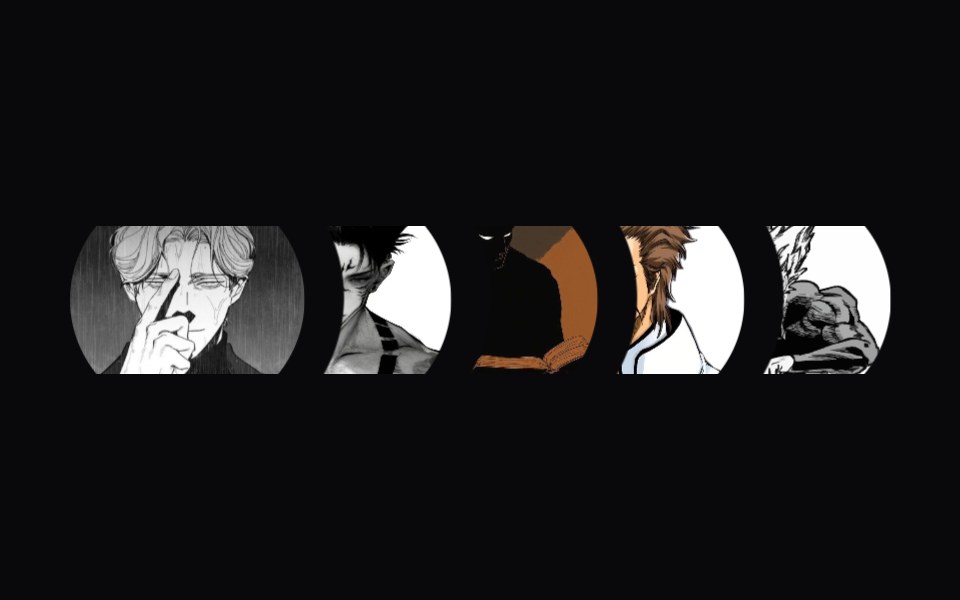 Masked AvatarsVengeance UI · ReactStacked masked avatar list
 Avatars 10Oxbow UI · AstroAvatar with Badge Count
 Assignment ClusterSona UI · React
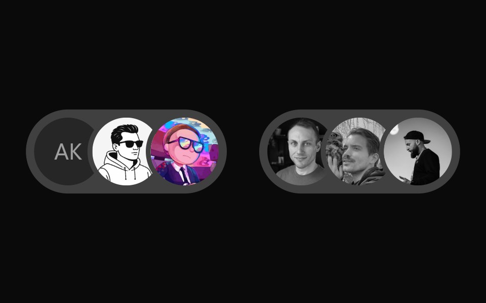 User Presence AvatarWatermelon UI · React
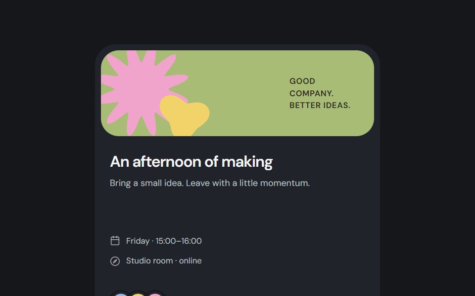 Invite cardCojeev UI · ReactAn event invitation with participant avatars and a reversible local RSVP, composed from Cojeev primitives.
 Fallback initialsFLX UI · ReactMissing image falls back to initials.
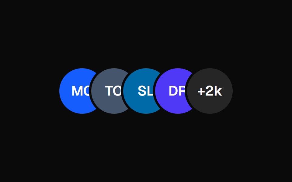 Avatar CirclesVelora UI · ReactStacked initials avatars with a +N badge — zero images.
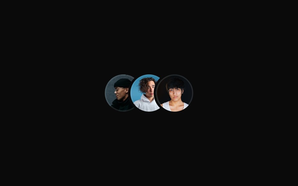 Overlapping Avatar Groupsv-particles · Svelte
 Icon StackSpaceUI · ReactDisplays an overlapping cluster of icons or avatars that expands smoothly when hovered to reveal every individual item.
 Hero Section 01D2Studio UI · ReactPremium landing page hero with a serif accent headline, badge and mentor avatar group.
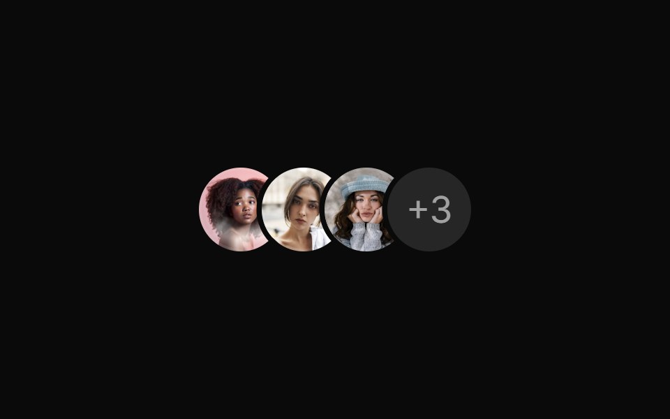 Avatar group with numerical countReUI · ReactAvatar group with numerical count
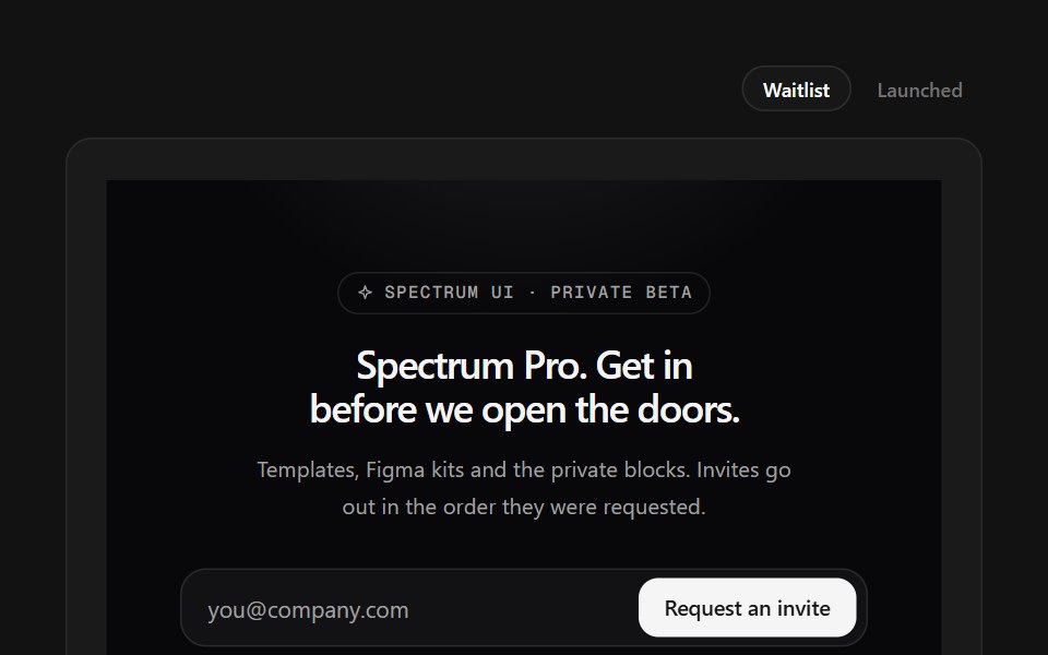 Waitlist FooterSpectrum UI · ReactWaitlist capture with an avatar stack and a live position counter.
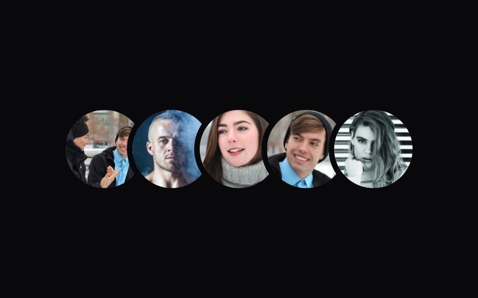 Shared Tooltip AvatarsVengeance UI · ReactAvatar stack with a sliding shared tooltip
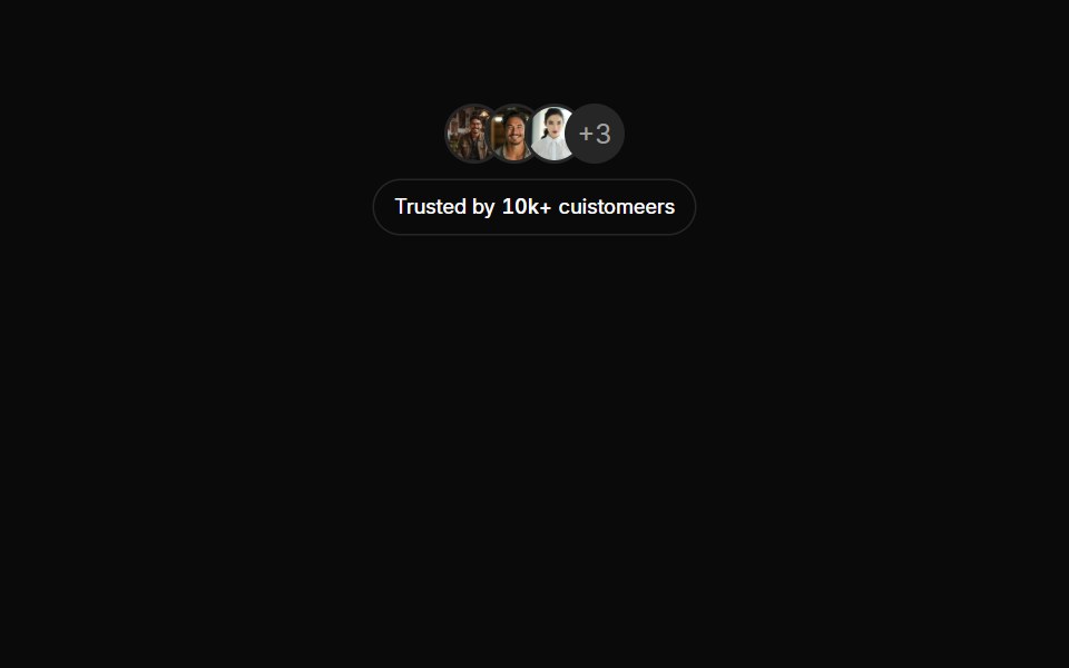 Avatars 12Oxbow UI · AstroTrusted By + Avatars
 Prototype Avatar ShowcaseSona UI · React
 Icon fallbackFLX UI · ReactGeneric user icon when there is no image or name.
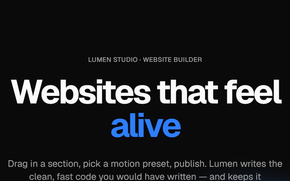 Wavy heroVelora UI · ReactBold centered hero over flowing waves, with a rotating headline word and avatar social proof.
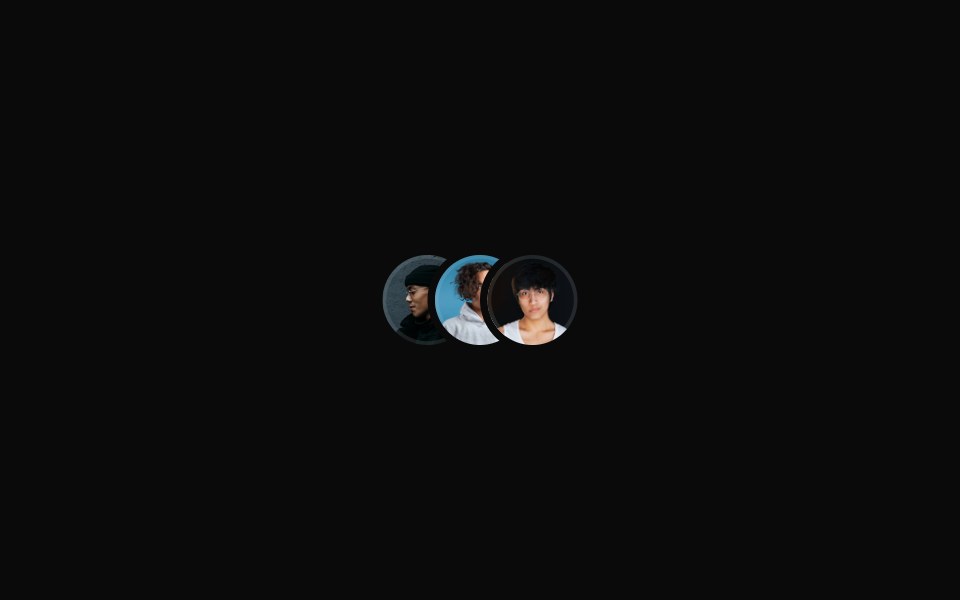 Small Overlapping Avatar Groupsv-particles · Svelte
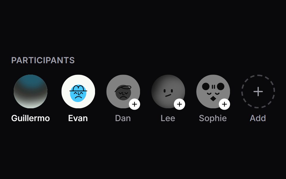 Member SelectorSpaceUI · ReactAn interactive participant and member avatar selector with dynamic row layout, animated selection badges, quick-add…
 Hero Section 02D2Studio UI · ReactModern landing page hero section with badge, headline and avatar social proof.
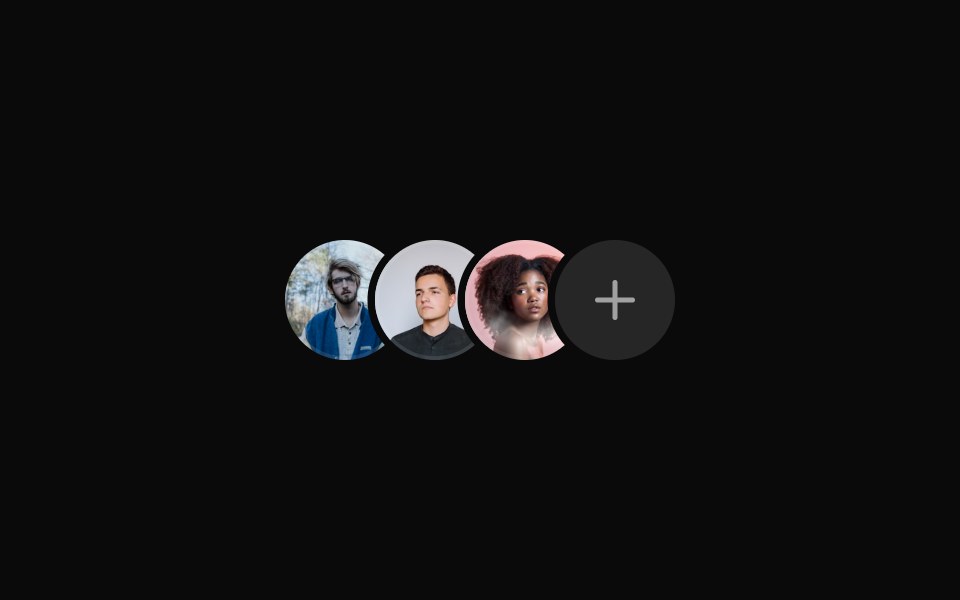 Avatar group with an icon countReUI · ReactAvatar group with an icon count
 Stacked LogosVengeance UI · React
 Avatars 01Oxbow UI · Astro
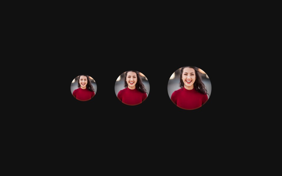 SizesFLX UI · ReactSmall, default, and large sizes side-by-side.
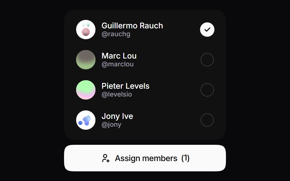 Team Roster SelectorSpaceUI · React
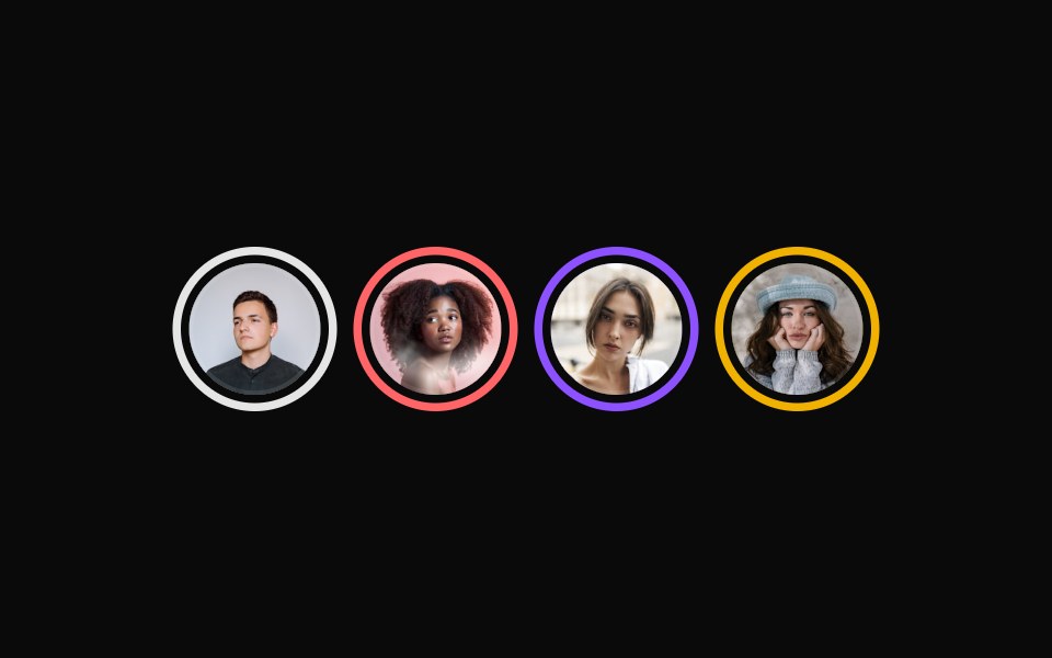 Avatar with a distinct border ringReUI · ReactAvatar with a distinct border ring
 Avatars 02Oxbow UI · Astro
 Colored fallbackFLX UI · ReactTinted initials fallbacks using semantic tokens.
 Avatar with light background color fallbackReUI · ReactAvatar with light background color fallback
 Avatars 03Oxbow UI · Astro
 Status badgeFLX UI · ReactPresence dot in the corner showing online, away, or offline.
 Avatar with a solid background color fallbackReUI · ReactAvatar with a solid background color fallback
 Avatars 04Oxbow UI · Astro
 Badge with iconFLX UI · ReactVerified check icon inside the AvatarBadge.
 Avatar with user details and badgeReUI · ReactAvatar with user details and badge
 Avatars 05Oxbow UI · Astro
 With nameFLX UI · ReactAvatar beside a name and email, forming a user row.
 Avatar with grayscale image filterReUI · ReactAvatar with grayscale image filter
 Avatars 06Oxbow UI · Astro
 GroupFLX UI · ReactOverlapping AvatarGroup stack of members.
 Avatar group with online status on oneReUI · ReactAvatar group with online status on one
 Avatars 07Oxbow UI · Astro
 Group with countFLX UI · ReactOverlapping group with a +N count for the remaining members.
 Avatar inside small outline buttonReUI · ReactAvatar inside small outline button
 Avatars 09Oxbow UI · Astro
 Group with tooltipFLX UI · ReactHover each avatar in the group to reveal its name.
 Avatar with fallbackReUI · ReactAvatar with fallback
 Avatars 11Oxbow UI · Astro
 Loading skeletonFLX UI · ReactSkeleton placeholder while the avatar loads.
 Avatar social proof with text labelReUI · ReactAvatar social proof with text label
 Icon on topFLX UI · ReactIcon badge pinned to the top-right corner.
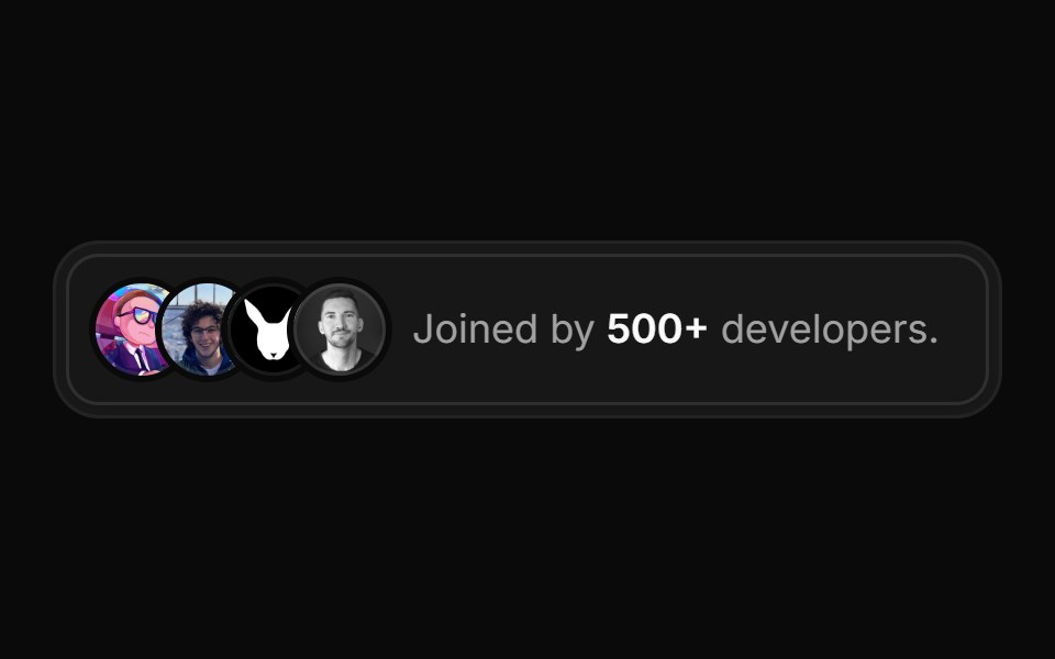 Compact social proof with initialsReUI · ReactCompact social proof with initials
 Invite teamFLX UI · ReactIcon header plus email field.
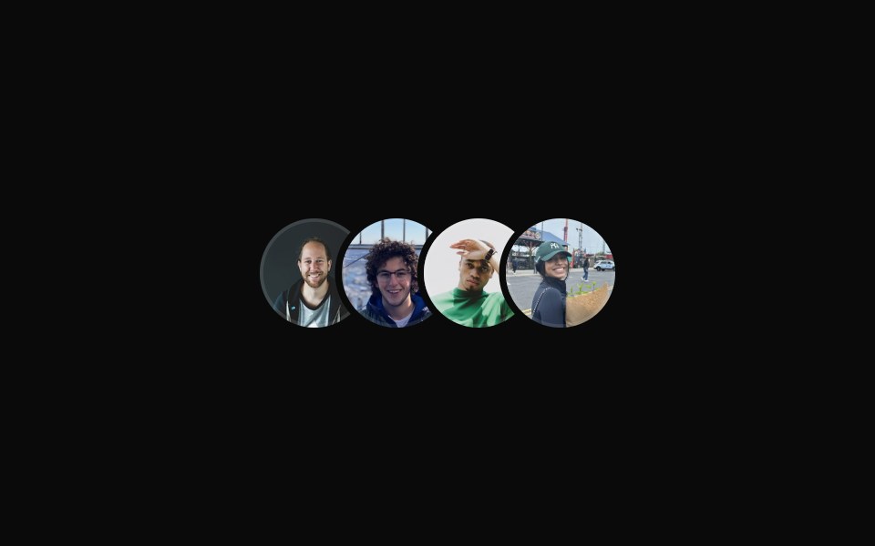 Avatar group with hover tooltips and lift effectReUI · ReactAvatar group with hover tooltips and lift effect
 Hero 08FLX UI · ReactA split hero with a bold headline, avatar social proof, and two image cards with invertible overlay text and CTAs.
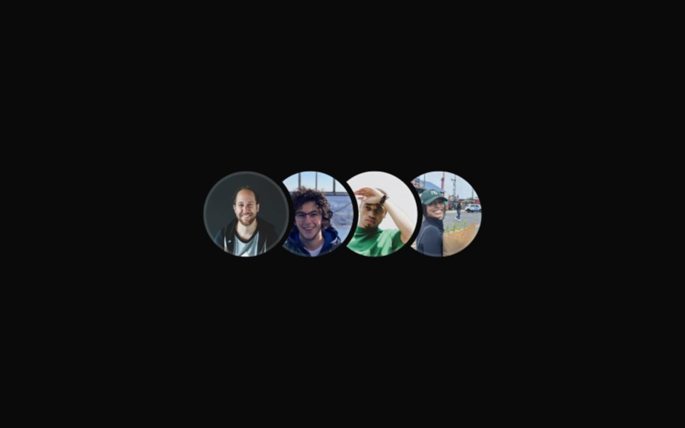 Avatar group with hover effectReUI · ReactAvatar group with hover effect
 Hero 10FLX UI · ReactA centered hero with a highlighted headline, dual CTAs, social proof, and a fanned collage of three overlapping images.
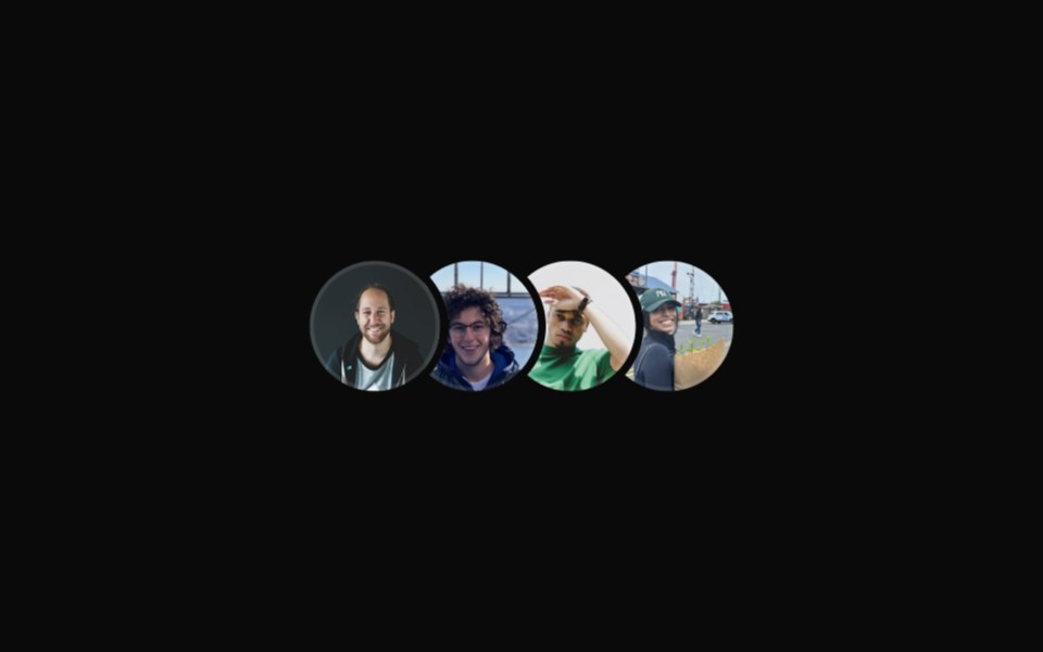 Avatar group with hover effect and tooltipsReUI · ReactAvatar group with hover effect and tooltips
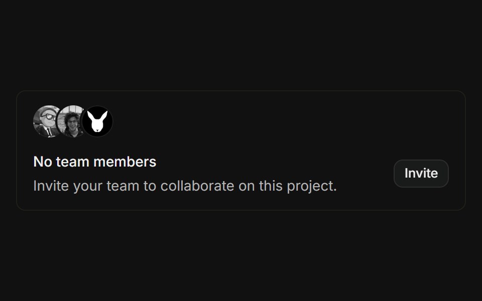 Empty teamFLX UI · ReactOverlapping avatar stack above an empty-state message with an invite button.
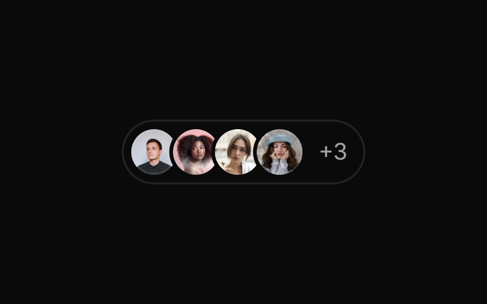 Avatar group with numerical countReUI · ReactAvatar group with numerical count
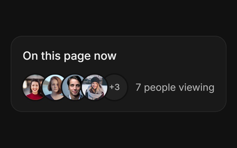 Avatar StackFLX UI · ReactAvatar Stack for Live Presence.
 Pilled small outline button with avatarReUI · ReactPilled small outline button with avatar
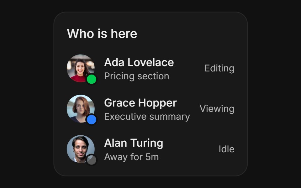 Activity StatusFLX UI · ReactActivity Status for Live Presence.
 Pilled small button with avatarReUI · ReactPilled small button with avatar
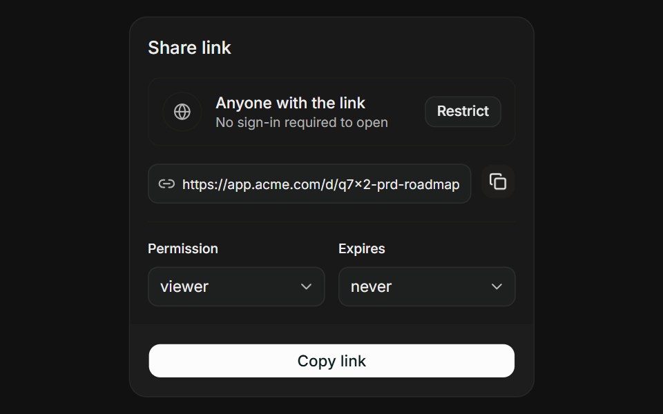 Link with ScopeFLX UI · ReactLink with Scope for Share Access.
 Avatar inside an empty state exampleReUI · ReactAvatar inside an empty state example
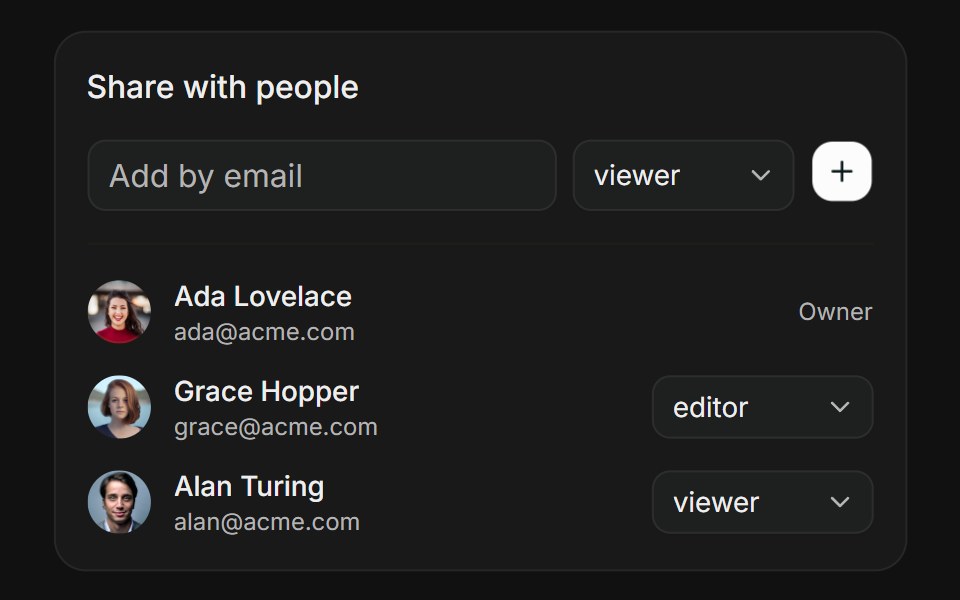 People PickerFLX UI · ReactPeople Picker for Share Access.
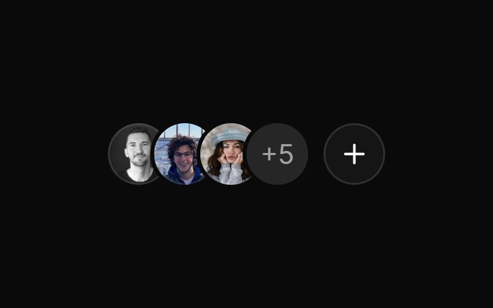 Avatar group with icon count and buttonReUI · ReactAvatar group with icon count and button
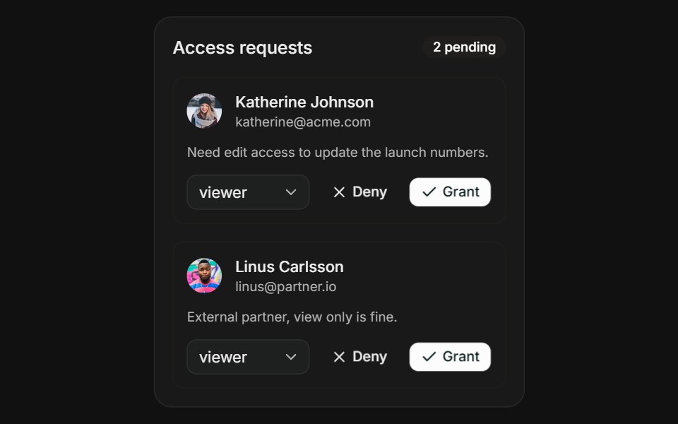 Request AccessFLX UI · ReactRequest Access for Share Access.
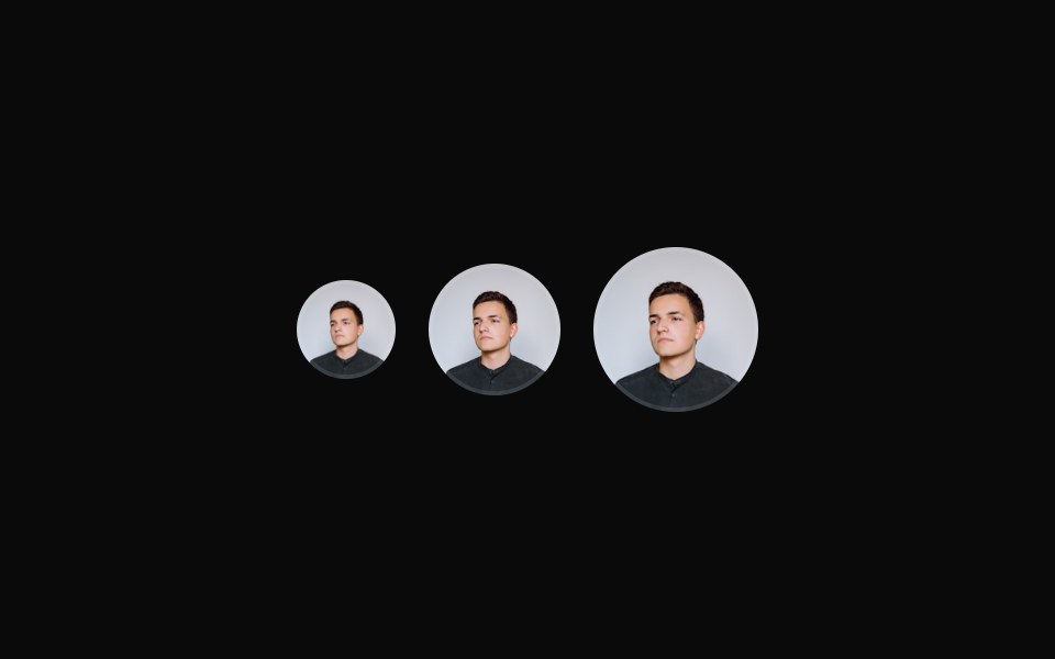 Avatars with different sizesReUI · ReactAvatars with different sizes
 Avatar with loading state demonstrationReUI · ReactAvatar with loading state demonstration
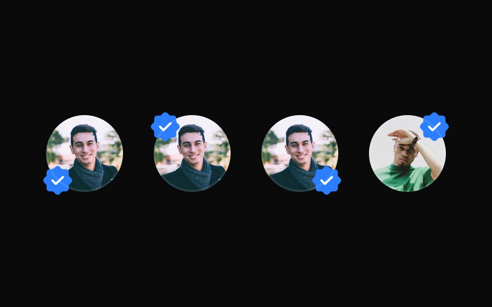 Avatar with custom badgeReUI · ReactAvatar with custom badge
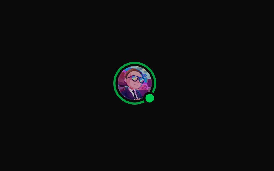 Avatar with ring animationReUI · ReactAvatar with ring animation
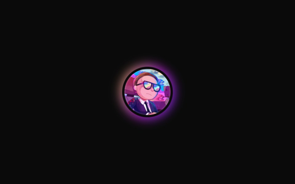 Avatar with gradient animated ringReUI · ReactAvatar with gradient animated ring
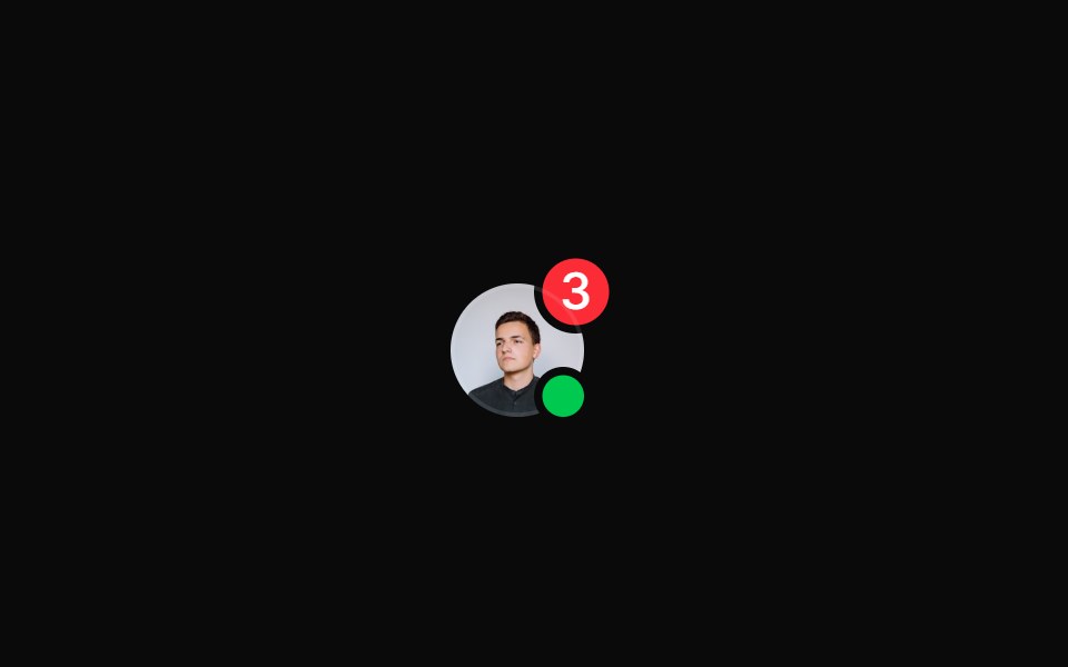 Avatar with multiple badgesReUI · ReactAvatar with multiple badges
 Compact avatar dropdown menuReUI · ReactCompact avatar dropdown menu
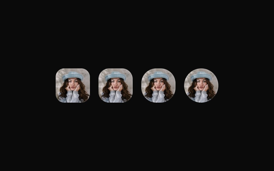 Avatars with different border radiusesReUI · ReactAvatars with different border radiuses
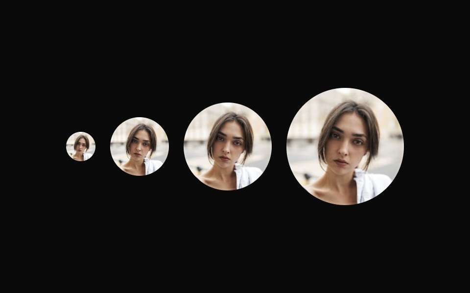 Avatars with custom sizesReUI · ReactAvatars with custom sizes
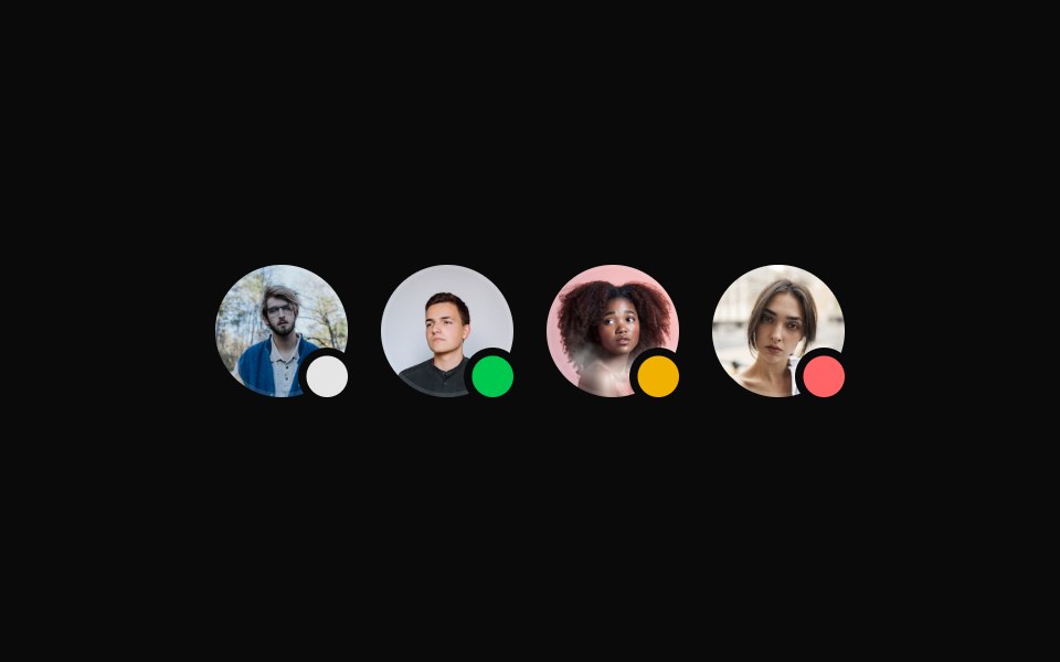 Avatar with an online status badgeReUI · ReactAvatar with an online status badge
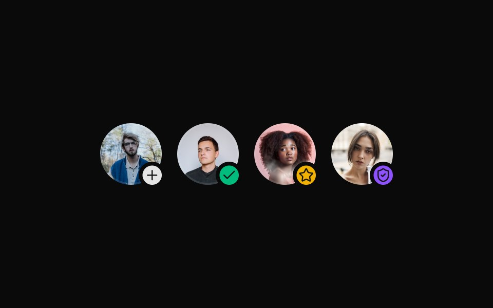 Avatar with badge iconReUI · ReactAvatar with badge icon
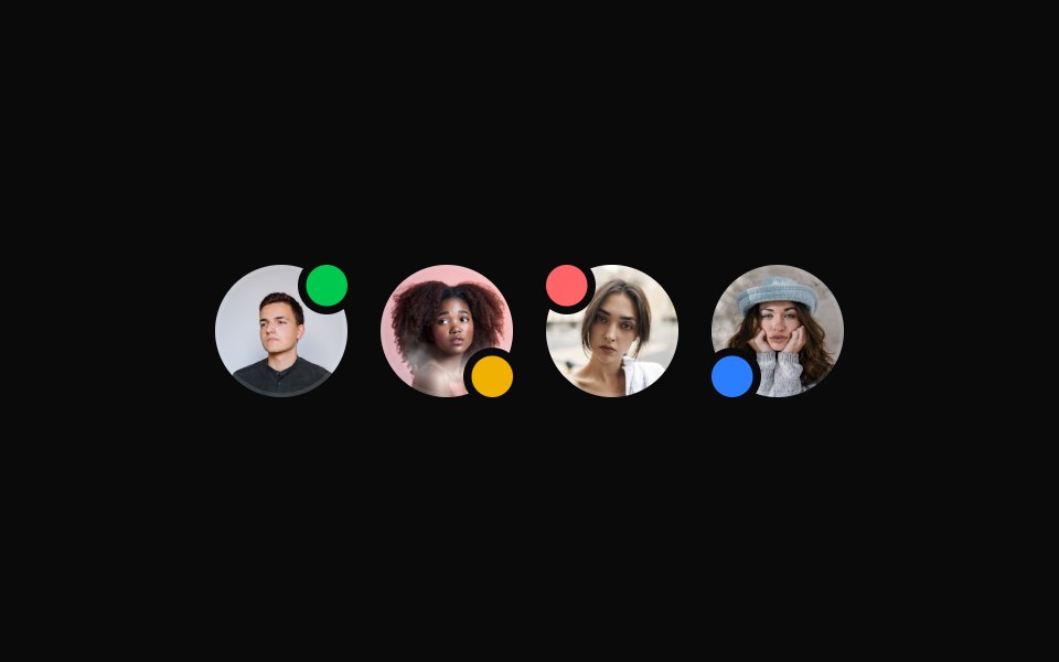 Avatar with different badge positionsReUI · ReactAvatar with different badge positions
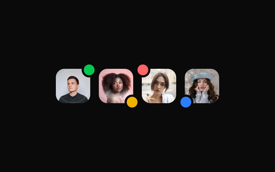 Avatar with different badge positionsReUI · ReactAvatar with different badge positions
Libraries with Tailwind CSS avatar group components
Related categories
- Avatar Group Components
- React Avatar Group Components
- Animated Avatar Group Components
- shadcn/ui Avatar Group Components
- Tailwind CSS Data Display Components
- Tailwind CSS Card Components
- Tailwind CSS Chart Components
- Tailwind CSS Table Components
- Tailwind CSS Avatar Components
- Tailwind CSS Stat Components
- Tailwind CSS List Components
- Tailwind CSS Calendar Components
- Tailwind CSS Accordion Components
- Tailwind CSS Data Table Components
- Tailwind CSS Carousel Components
- Tailwind CSS Collapsible Components
- Tailwind CSS Stat Card Components
- Tailwind CSS Bar Chart Components
- Tailwind CSS Tree View Components
- Tailwind CSS Card Stack Components