 Dev Design Library
Tailwind CSS Data Display Components
Dev Design Library indexes 2,905 Tailwind CSS data display components from 78 open-source UI libraries, with the most coming from ReUI, Watermelon UI, Tremor Blocks, Origin UI and FLX UI. Each one links to its page with the source code, a live preview where available, the library license and the install command. Every library in this list styles its components with Tailwind CSS utility classes.
Showing 120 of 2,905, a mix from every library. Open a library to see all of its components.
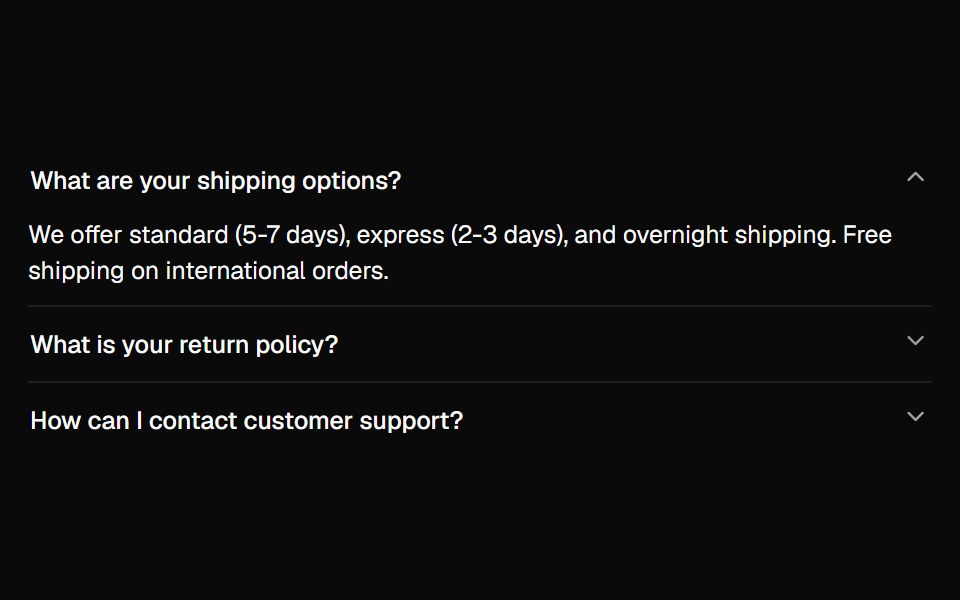 Accordionshadcn/ui · ReactA vertically stacked set of interactive headings that each reveal a section of content.
 AvatardaisyUI · CSS (Tailwind)
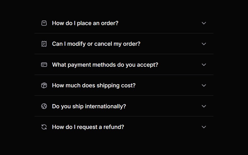 AccordionHeroUI · ReactA collapsible content panel for organizing information in a compact space
 Animated ListMagic UI · ReactA list that animates each item in sequence with a delay. Used to showcase notifications or events on your landing page.
 AccordionReact Spectrum · ReactA group of disclosures that can be expanded and collapsed.
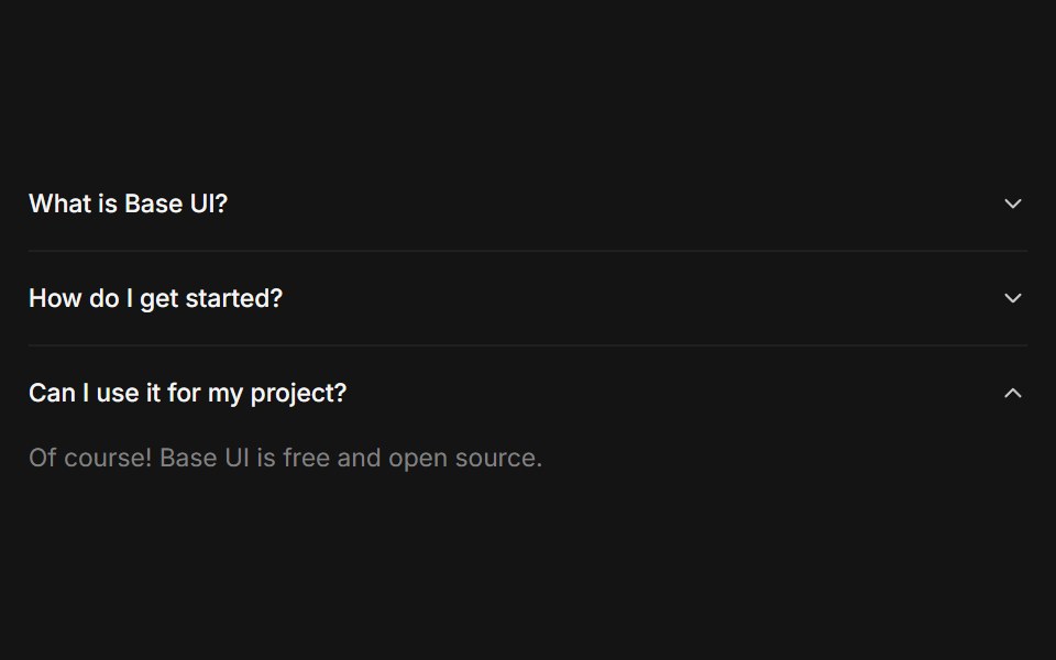 Accordioncoss ui · ReactA set of collapsible panels with headings and content.
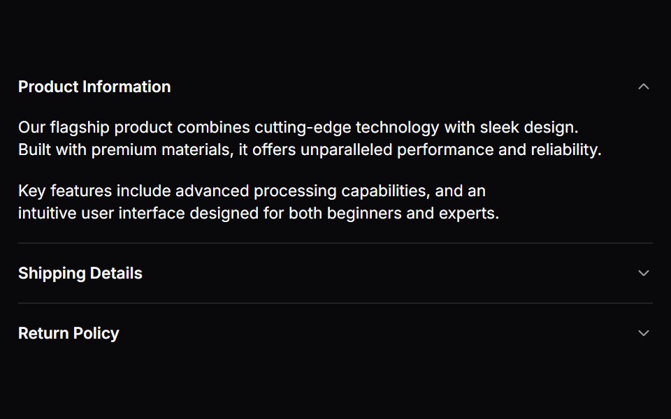 AccordionOrigin UI · ReactA set of collapsible panels with headings and content.
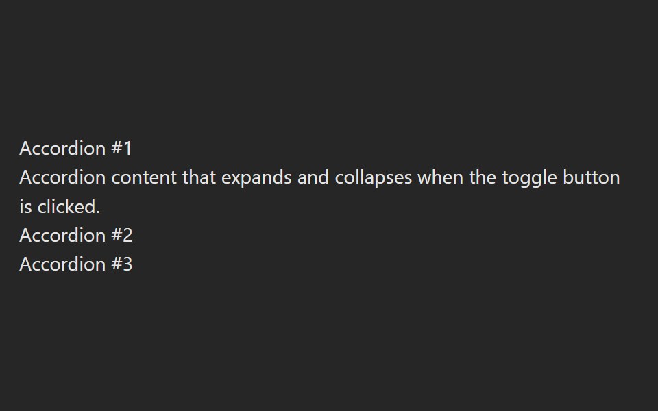 AccordionPreline UI · JavaScript (HTML + Tailwind)
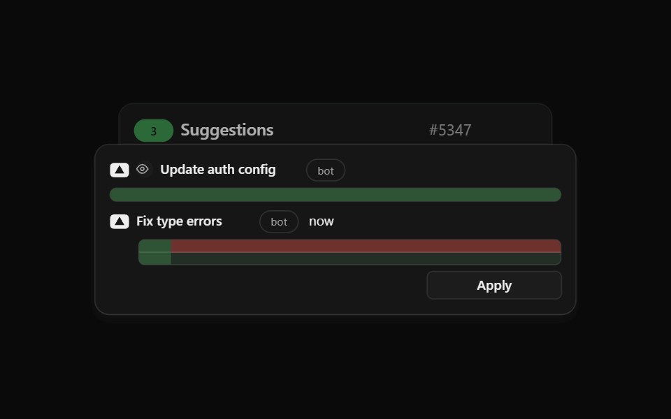 Agent Suggest Card StackCult UI · ReactStack of suggestion cards for AI agent responses
- Bot AvatarsLibraries.dev · ReactAnimated bot avatars for React — eighteen glossy 3D shapes with living faces that turn, hop and flip, three states…
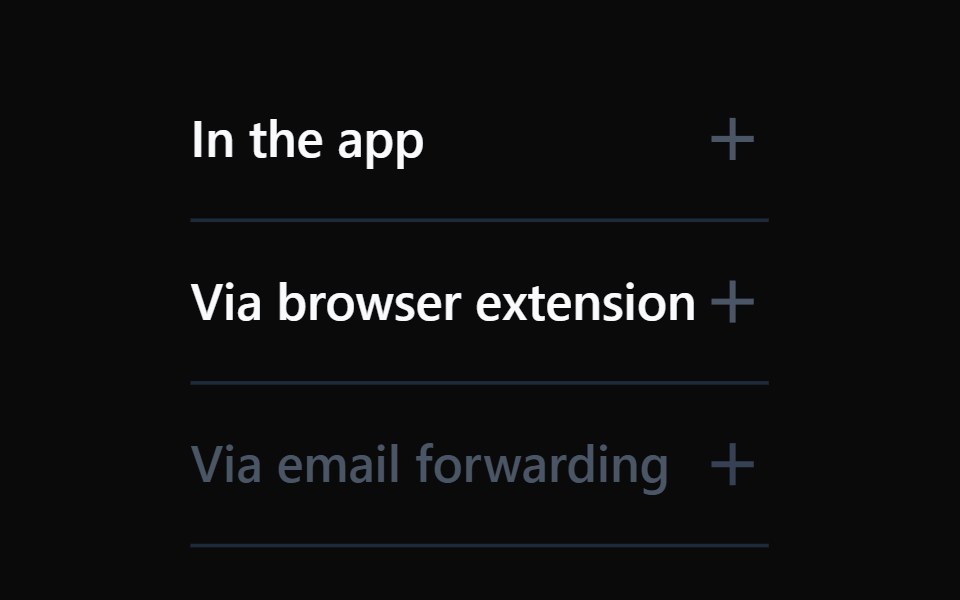 AccordionTremor · React
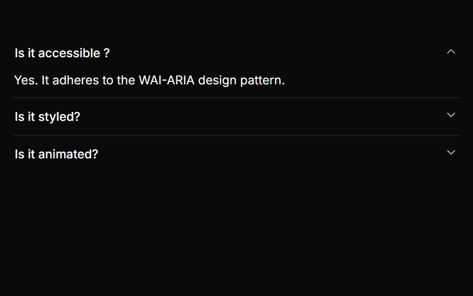 A basic single-expand accordionReUI · ReactA basic single-expand accordion
 Card Cascade StaggerAmicro Micro Transitions · ReactStack of cards that cascade into place one after another.
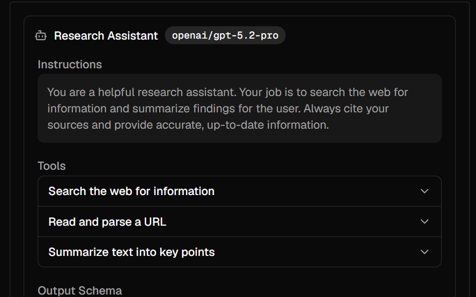 AgentAI Elements · ReactA composable component for displaying AI agent configuration with model, instructions, tools, and output schema.
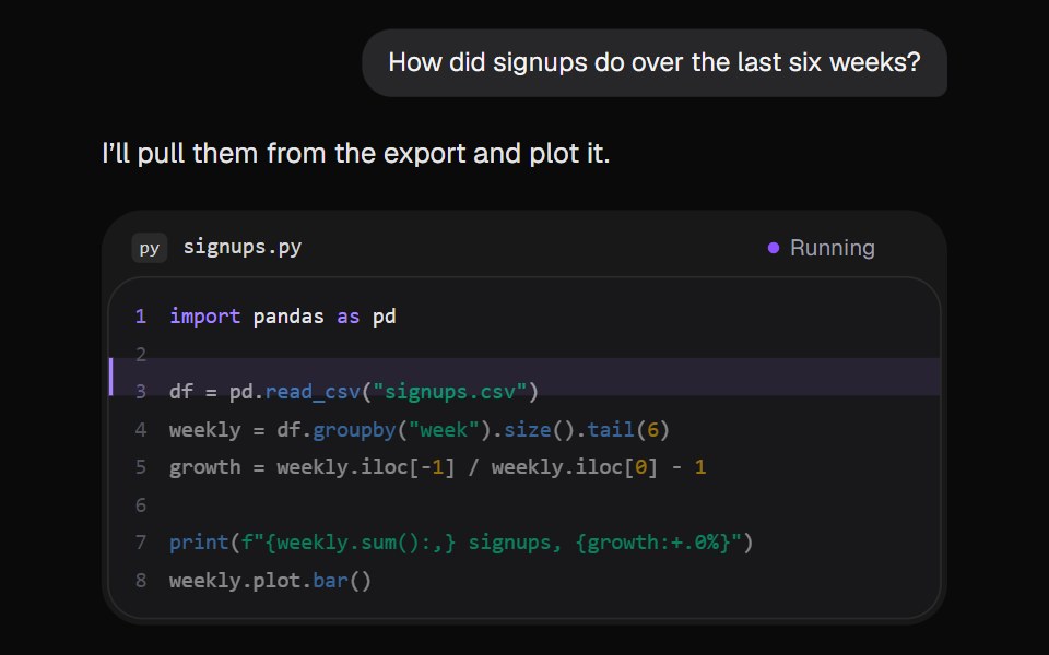 AI Code RunKokonut UI · ReactThe assistant runs a short Python script in the reply. A marker steps down the lines, the output prints, and the chart…
 Horizontal BarsCursify · React
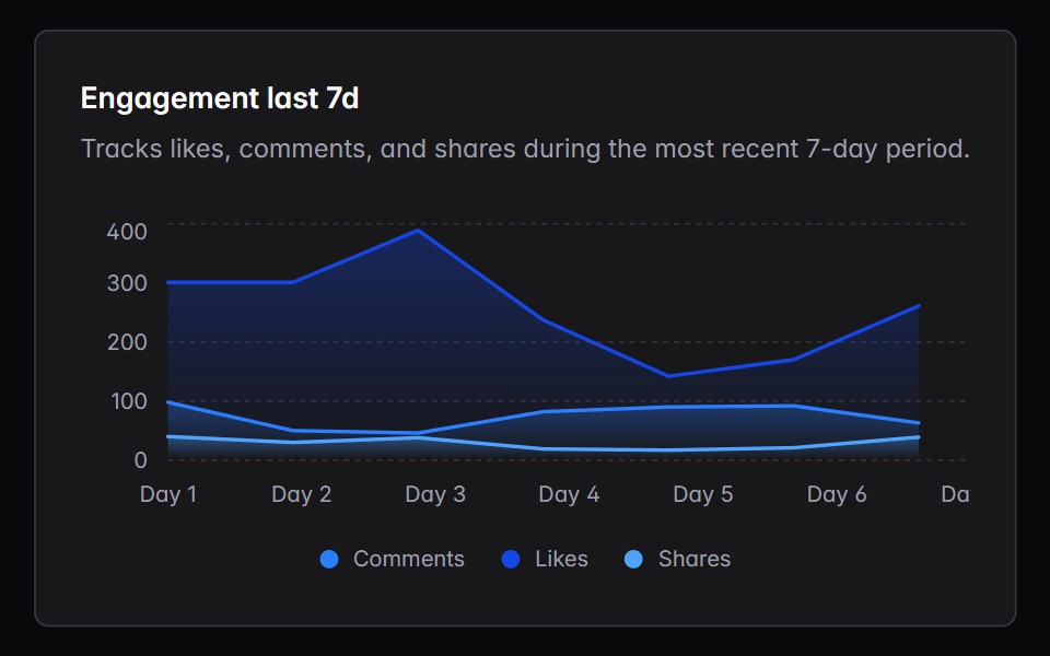 area-chartIntent UI · Reactarea-chart
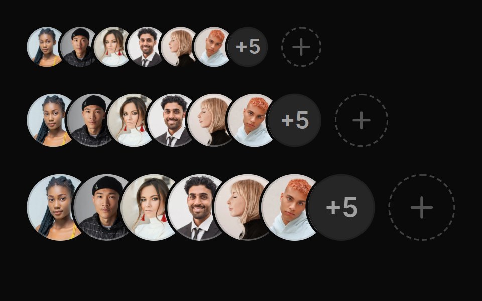 AvatarUntitled UI React · React
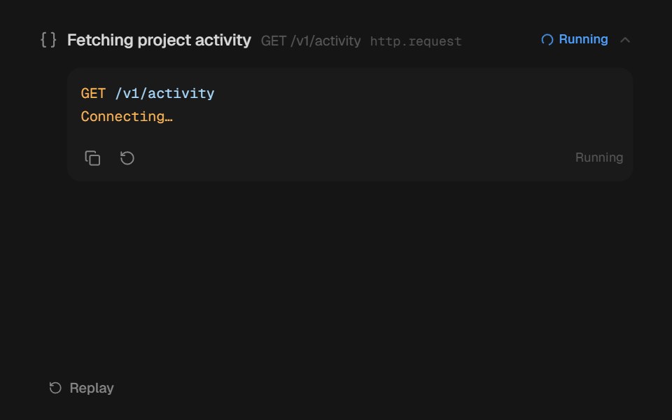 Agent DisclosurebeUI · ReactShared transform-only reveal for collapsible agent content.
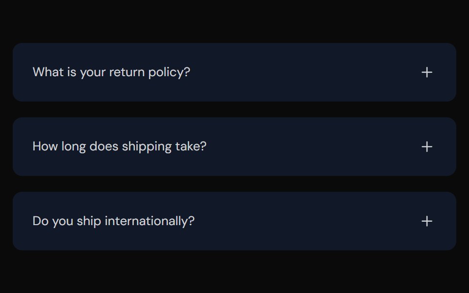 AccordionTailGrids · ReactFully accessible accordion component with multiple style variants
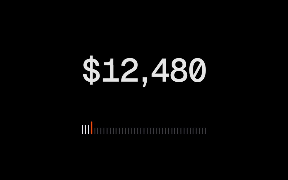 Animated CounterRare UI · ReactA number that counts to its new value on a wheel of digits, like an odometer.
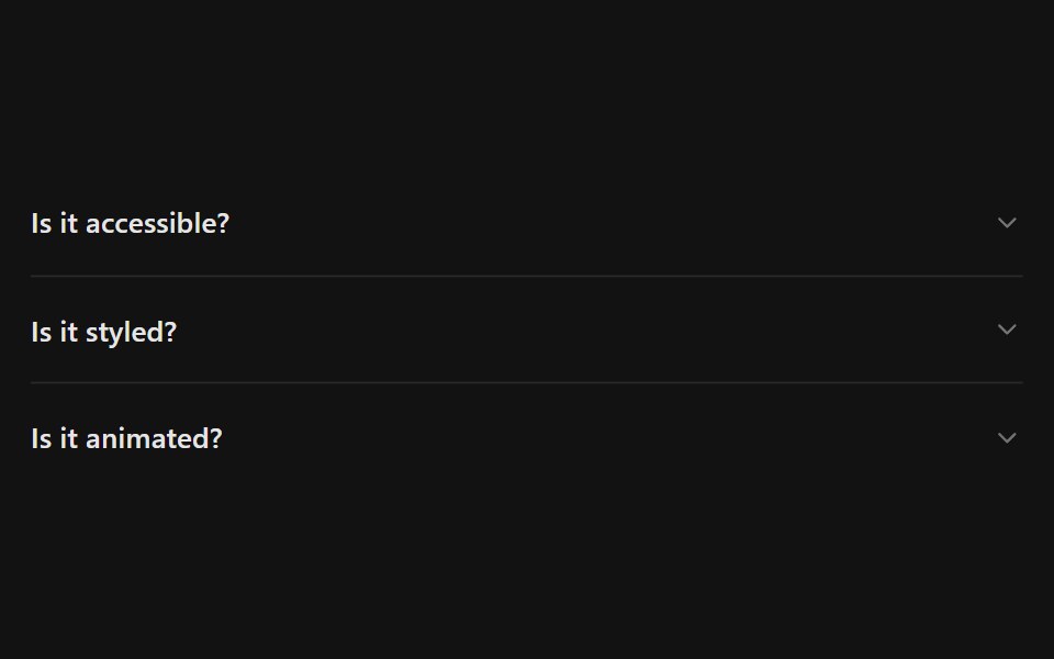 AccordionSpectrum UI · Reactcomponent for the Accordion
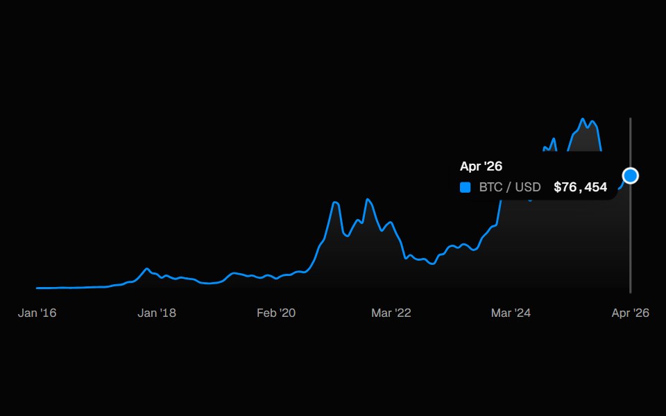 ChartSpell UI · ReactInteractive line chart with a cursor-tracked tooltip card, snap-to-point hover, and built-in X-axis labels.
 Animated TooltipVengeance UI · ReactBouncy SVG-shaped tooltips with spring animations
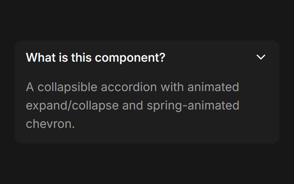 AccordionFluid Functionalism · ReactCollapsible accordion with animated height transitions, spring-animated chevron, and fluid hover in grouped mode…
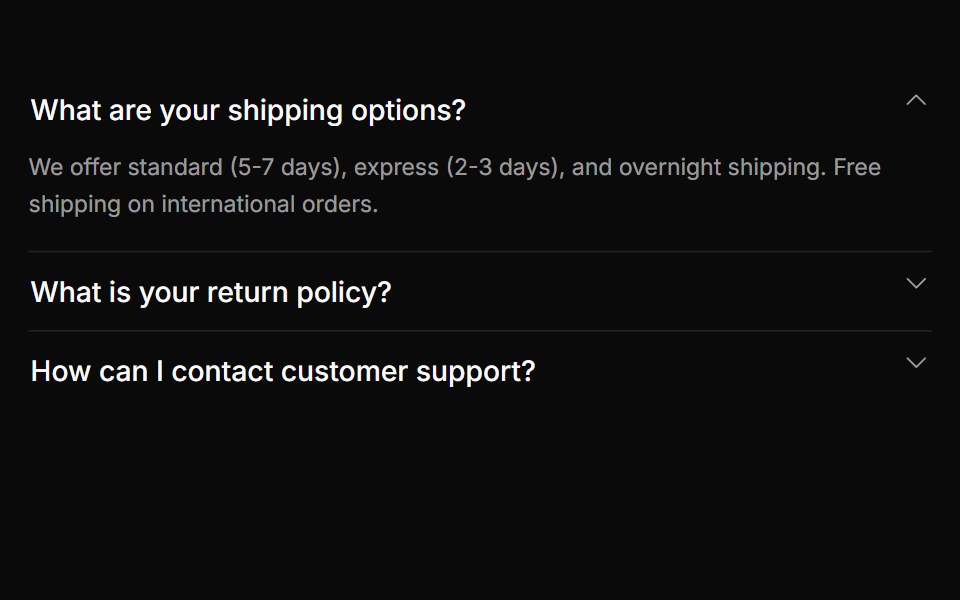 AccordionToolcraft · React
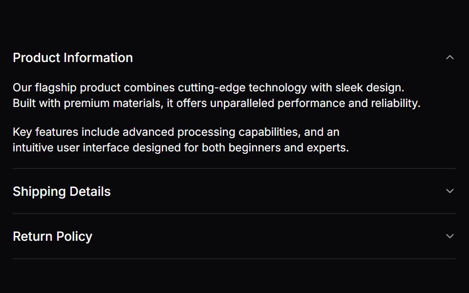 AccordionLaunch UI · React
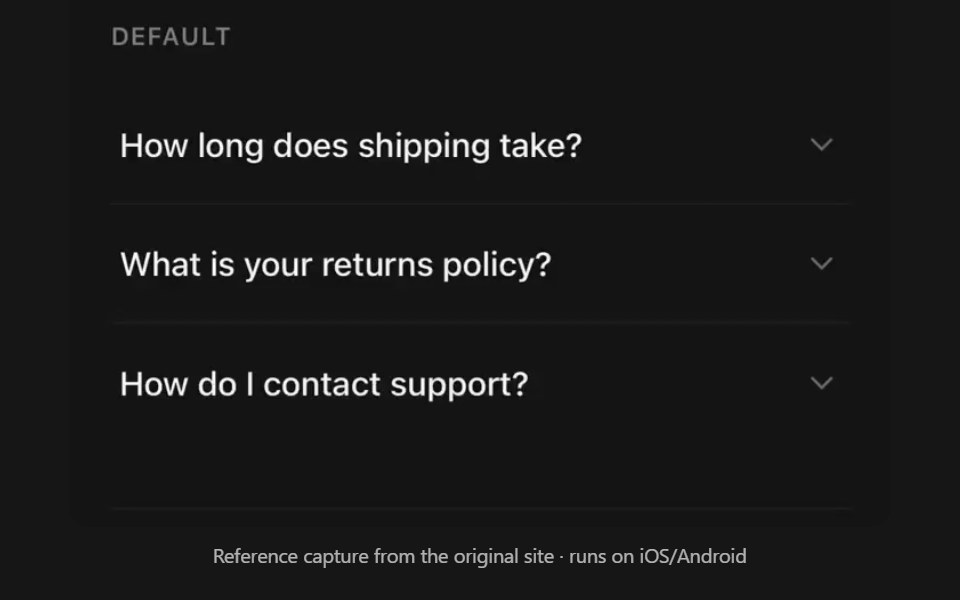 AccordionPanel UI · React NativeCollapsible sections with single or multiple selection.
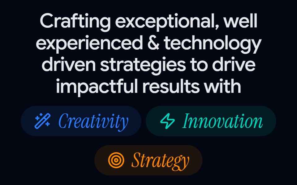 About Us 01 - Impact MetricsShadcn Space · ReactA bold about us section combining value pillars, headline messaging, and performance counters, perfect for agencies or…
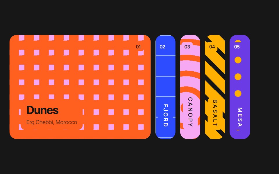 Accordion CarouselPixel Perfect · ReactAn accordion of vertical image panels — the active panel springs wide to reveal its photo and caption while the rest…
 Linked In Post CardOpenSourceUI · ReactCard that reproduces a LinkedIn post: author, text, image and reaction bar.
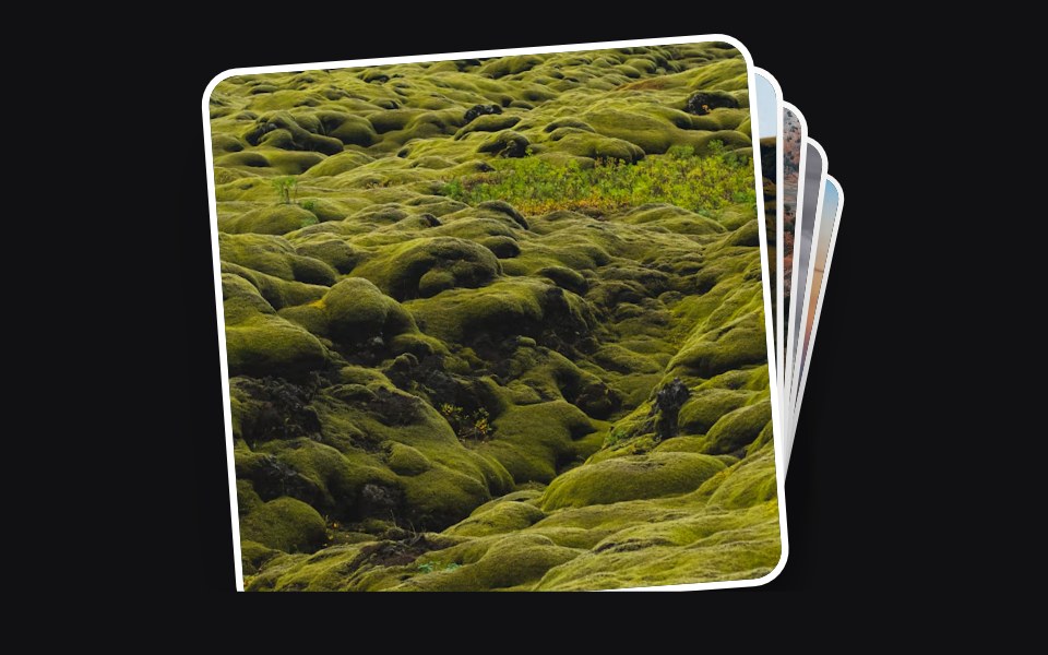 Accessible Actionuselayouts · ReactInteractive draggable card stack with 3D tilt, swipe-to-back gestures, click interactions, random rotation, and smooth…
 CardPrebuiltUI · React
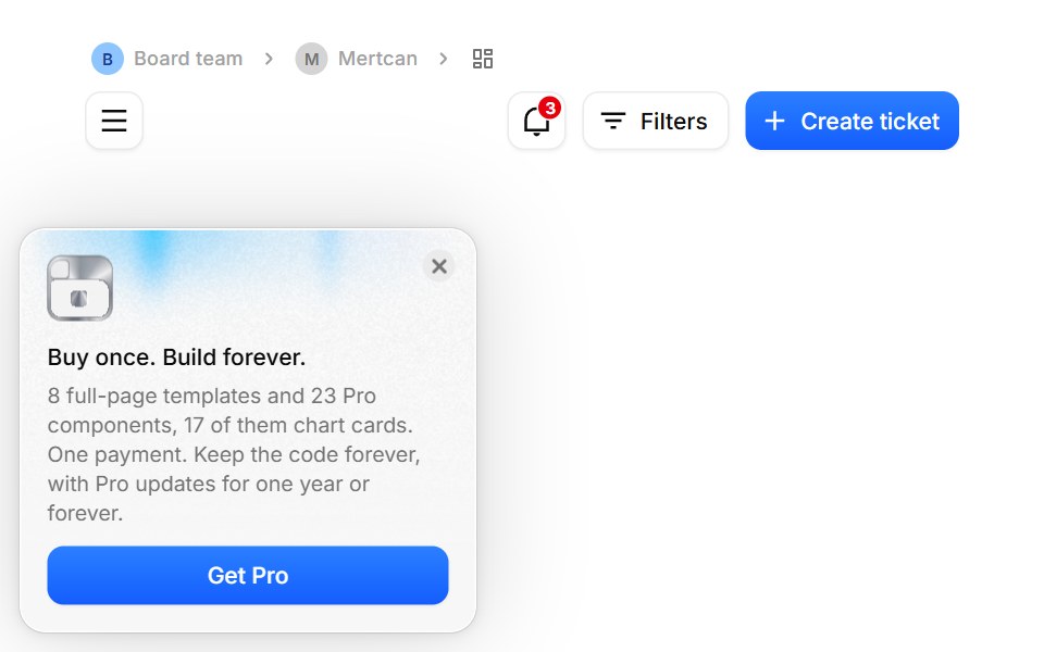 App ShellBoardUI · ReactThe page standard every BoardUI template follows, free or Pro: content sits directly on the page background inside a…
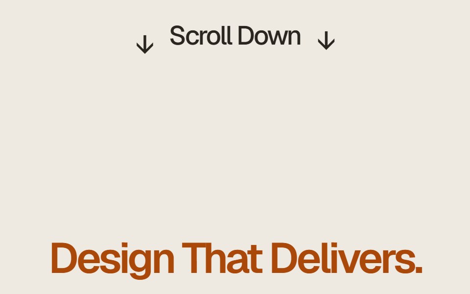 Case Study Flip StackComponentry · ReactEditorial case study cards that fold upward on scroll to reveal the next story.
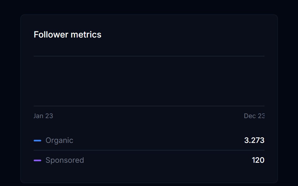 Area ChartTremor Blocks · ReactThe base area chart component (Recharts): any number of series, legend, tooltip, axes, stacked or percent mode…
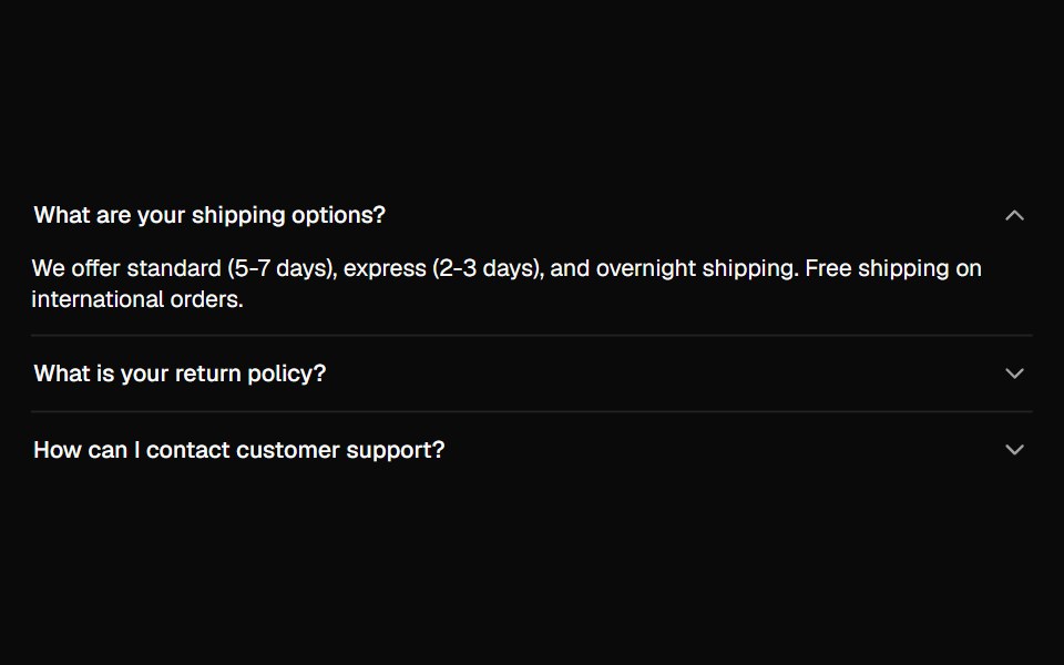 AccordionShadcn Dashboard · React
 Card Decoratorcnblocks · SvelteDecorative card component with visual effects
 Animated ListAnimations (Svelte) · SvelteA component that animates list items with smooth layout transitions, revealing items one by one from top to bottom.
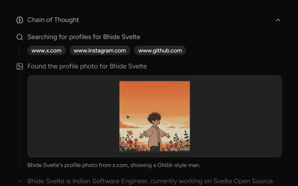 Chain Of ThoughtAI Elements (Svelte) · SvelteA collapsible component that visualizes AI reasoning steps with support for search results, images, and step-by-step…
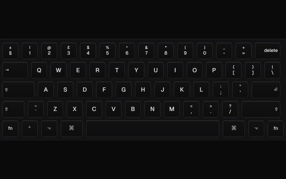 Animated KeyboardBadtz UI · ReactDisplays an animated keyboard with keycaps that can be customized with different colors and variants.
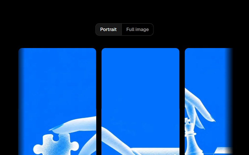 Parallax SliderObsidianUI · ReactA full-width image slider where each slide moves with a parallax offset, driven by drag, arrows or keys.
 AI OverviewNotra · ReactThe AI Overview root, built on shadcn Collapsible and Button, with a collapsible Show more.
 Fluid Dock CarouselGreatUI · ReactA carousel driven by a fluid dock of thumbnails, with swipe, arrows and keyboard navigation.
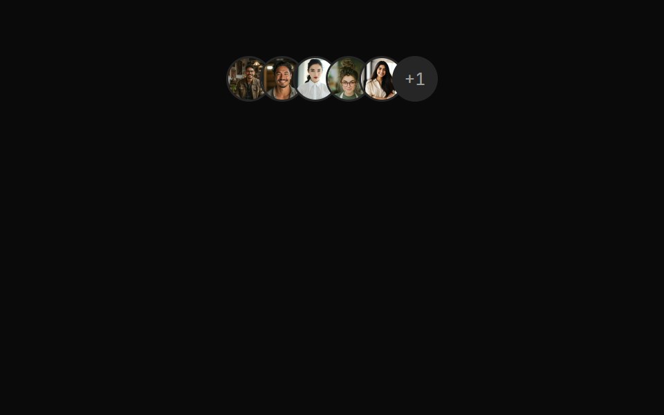 Avatars 08Oxbow UI · AstroAvatar Group (Dynamic +N)
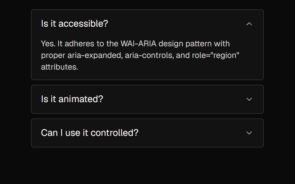 AccordionNexvyn UI · ReactA vertically stacked set of interactive headings that each reveal a section of content, with a grid-rows unfold…
 Bar Visualizeraudiocn · ReactA row of bars driven by frequency bands, with idle, loading and mirrored modes. Bars paint without re-rendering React.
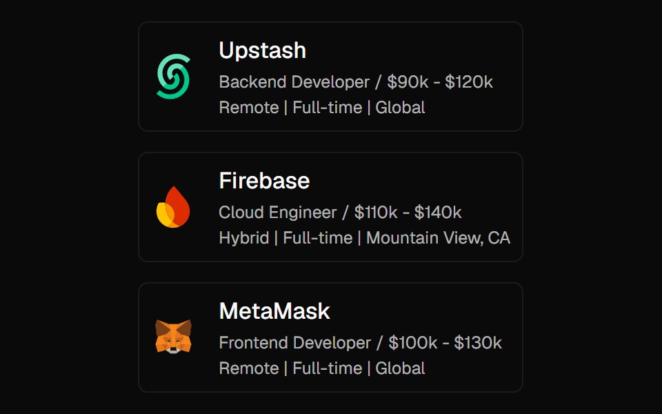 Expandable CardForge UI · ReactInteractive UI component to expand cards with smooth animations and detailed content using layout transitions.
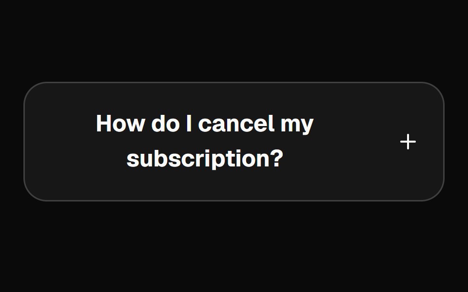 accordionBaseLayer · ReactAn accordion allows users to toggle the display of sections of content. Each accordion consists of a header with a…
 AccordionShark UI · ReactA collapsible for displaying content.
 Diagonal Card StackRewamp UI · ReactExact recreation of the diagonal cascading card stream & stacked deck collapse animation.
 CommandButtonEvil Buttons · ReactA button with a global keyboard shortcut, shown as keycaps that sink as you hold each key.
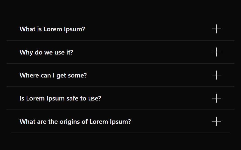 AccordionSona UI · ReactAn accessible Base UI accordion with controlled and uncontrolled state, four visual variants, interruptible disclosure…
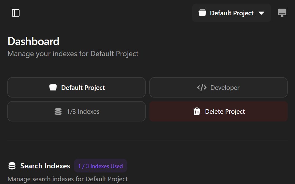 Agndex DashboardWatermelon UI · ReactA developer portal for managing search indexes, API credentials, billing, and project settings with light and dark…
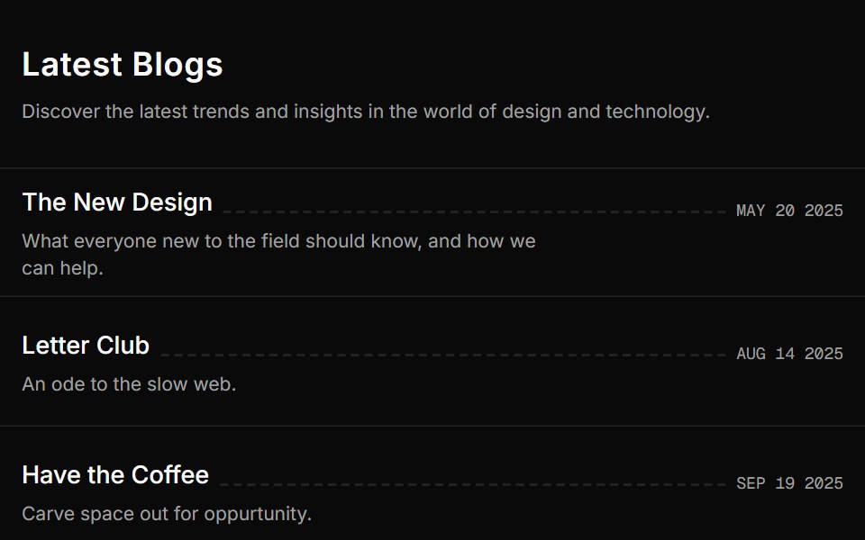 Blog Onesv-efferd · SvelteA vertical editorial list with full-width dividers and compact summaries.
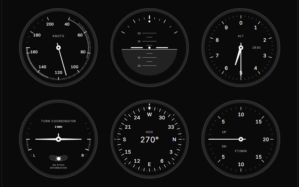 GaugeGauge UI · ReactComposable SVG gauge primitives: track, arc, zones, ticks, tick fills, labels, needle, hub, dot, tooltip and value…
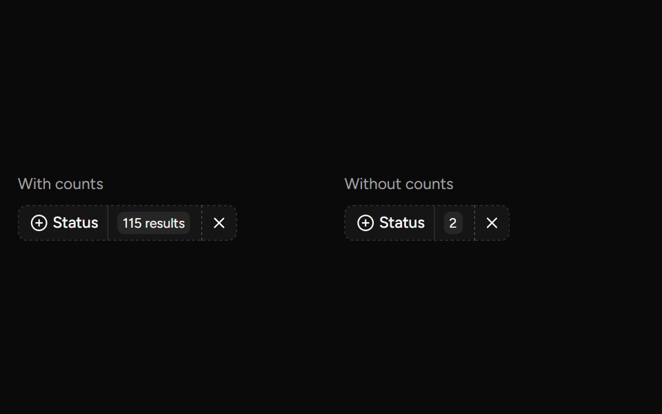 Data Table Faceted Filtersv-table · SvelteA searchable multi-select filter with live counts for categorical table columns.
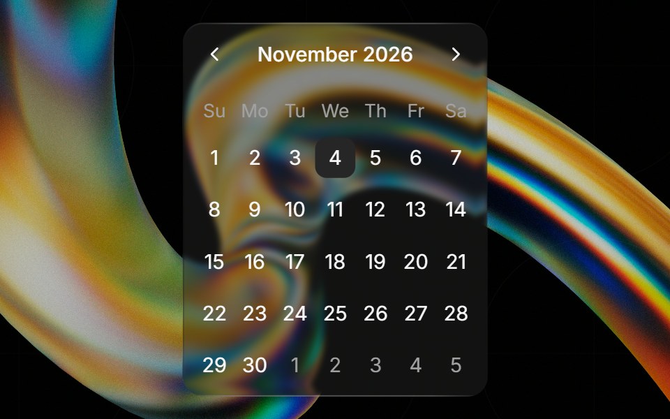 Glass Calendarglasscn · ReactGlass Calendar with five variants: clear, frosted, subtle, liquid, and liquid-refract
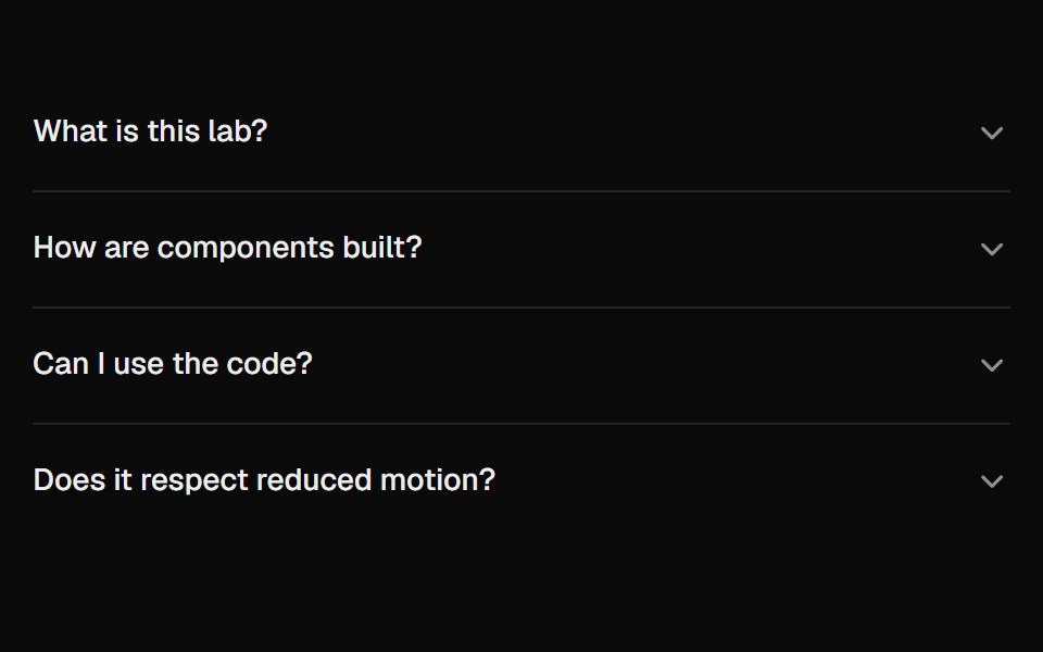 AccordionUI Lab · ReactAnswers unfold from under their question like a folded flap, and the row you clicked never moves.
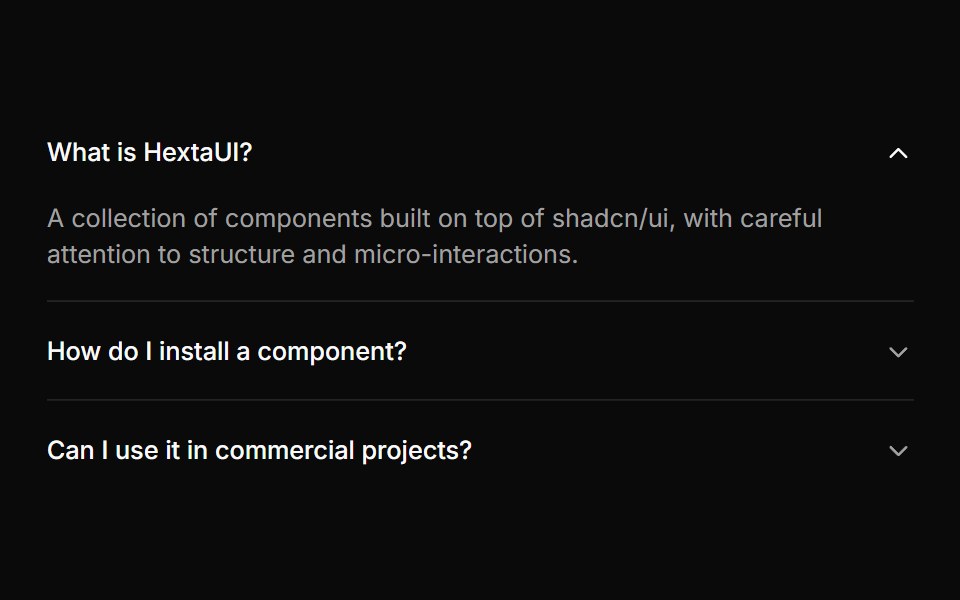 AccordionHextaUI · ReactStacked headings that each reveal a panel, with height motion you can reverse mid-way and panels that stay searchable…
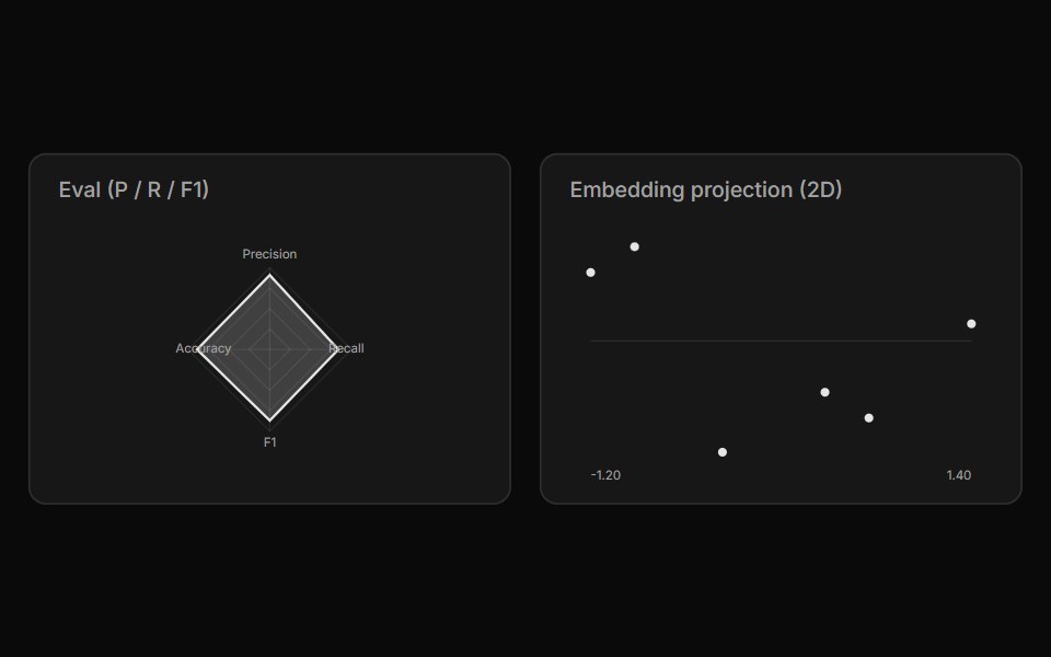 Chart ArtifactLocalMode · ReactA dependency-free inline-SVG chart (line / bar / area / scatter / radar / gauge) for local metrics — eval curves…
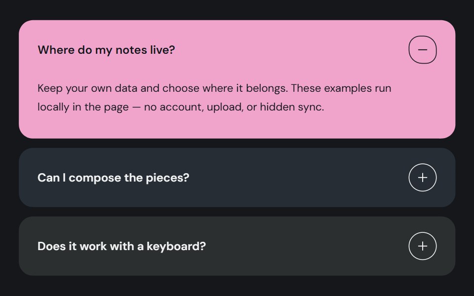 AccordionCojeev UI · ReactOrganizes related sections into expandable panels so readers can open the details they need.
 Count Up NumberMicroKit · ReactA stat that counts up from zero the first time it scrolls into view, easing out so the last digits settle slowly; it…
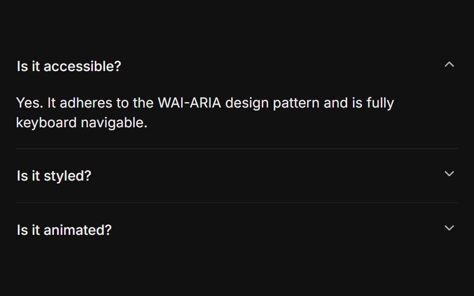 BasicFLX UI · ReactOnly one section open at a time, type="single" collapsible. The default behavior.
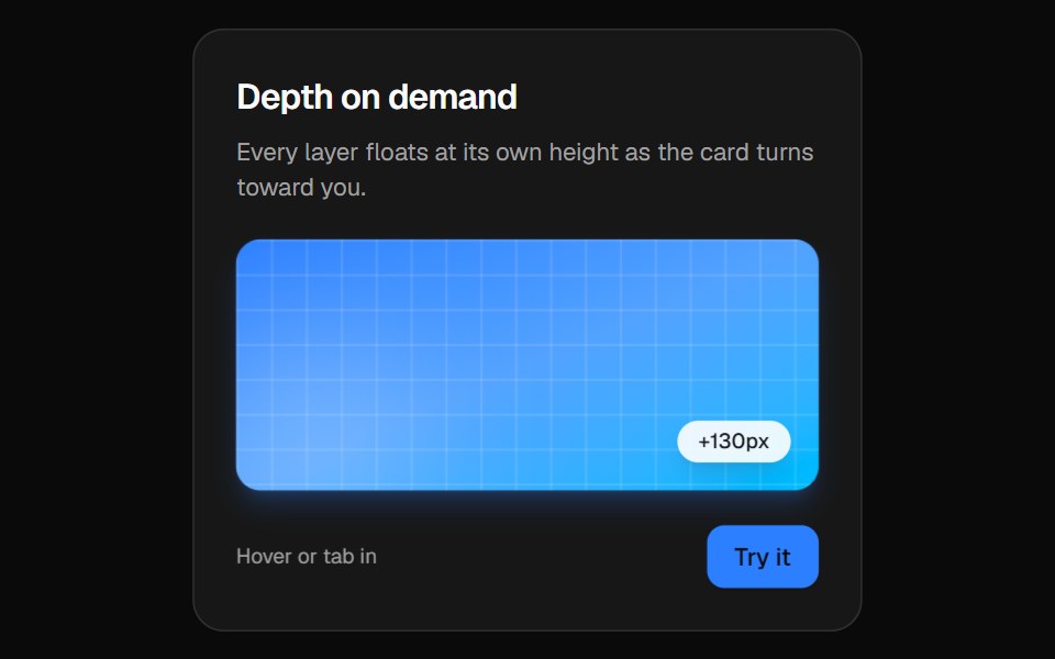 3D CardVelora UI · ReactPerspective card that turns toward the pointer while its layers lift to different depths.
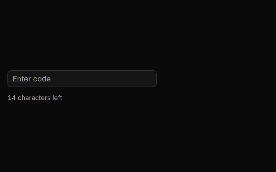 Characters Remaining Countsv-particles · SvelteText input that shows how many characters are still left before the limit.
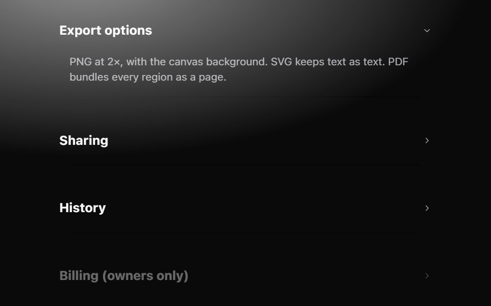 AccordionMetal UI · React + SwiftUISections that open in place: row headers with a chevron; the panel grows to its content on the settle spring while the…
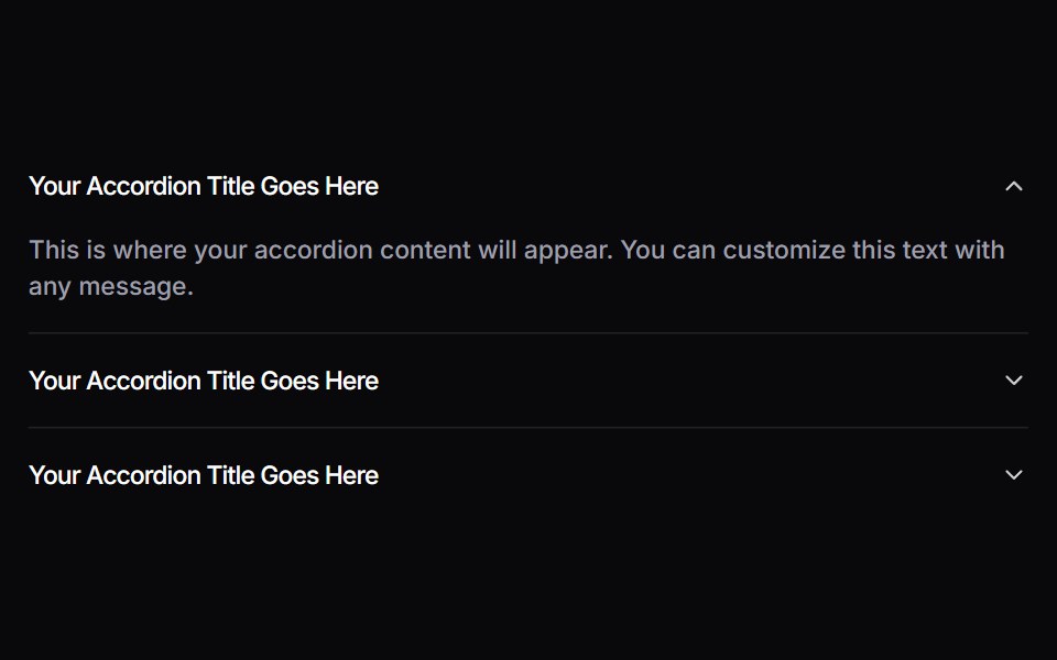 AccordionSpaceUI · ReactAllows you to display content in collapsible panels, making it easy for users to explore details on demand while…
 3D Wheel CarouselSkecher UI · ReactA reusable, drag-controlled 3D card carousel with auto-rotation, keyboard navigation, blur depth, and reduced-motion…
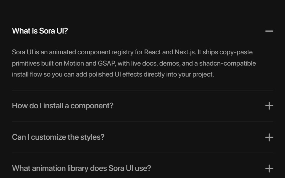 AccordionSora UI · ReactAn animated FAQ accordion with expandable panels, powered by Motion.
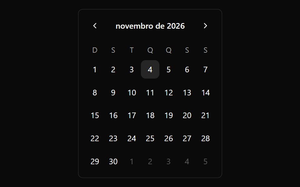 CalendarOUI · ReactReact aria components Calendar with shadcn characteristics.
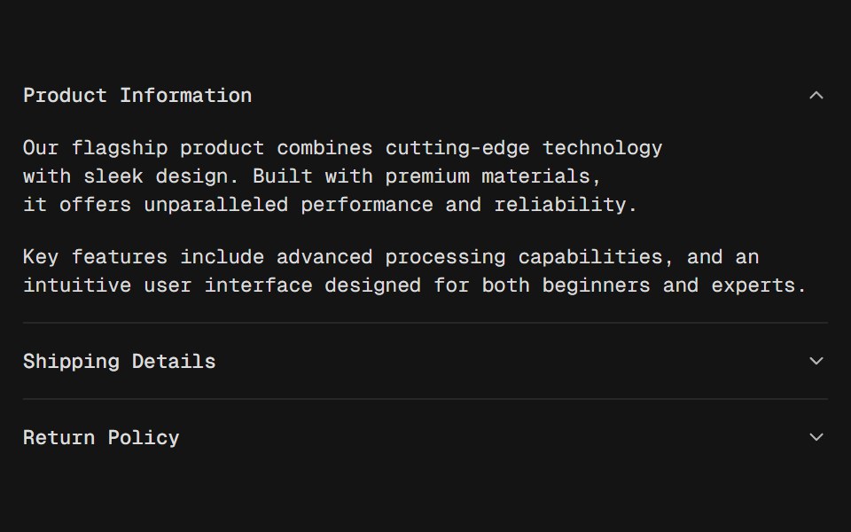 AccordionD2Studio UI · ReactA vertically stacked set of interactive headings that each reveal a section of content.
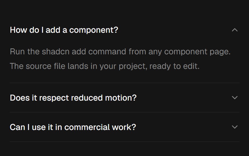 AccordionEaseUI · ReactExpanding sections that grow to their natural height with no measuring, with arrow key navigation and closed panels…
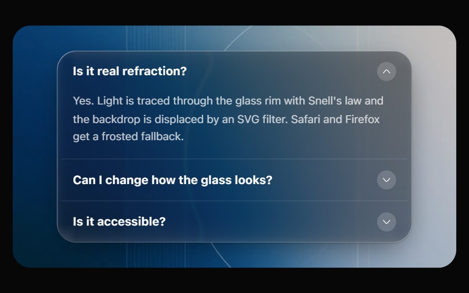 Glass AccordionOpaline · ReactCollapsible sections on one glass panel, or as separate glass cards that grow open.
 AvatarFibo · ReactA person's photo, or their initials when there's no photo.
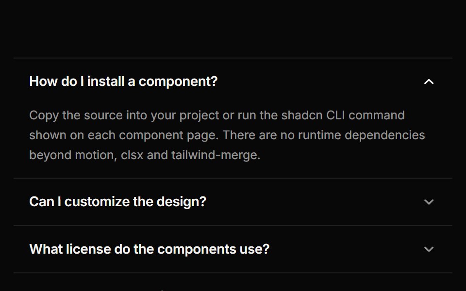 AccordionReactFrame · ReactAn accessible accordion with single or multiple open panels, default, card and filled variants, chevron or plus…
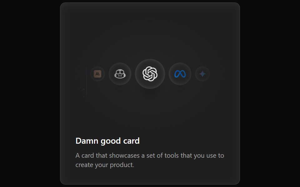 Cards Demo 3Aceternity UI · ReactFeature Block Animated Card
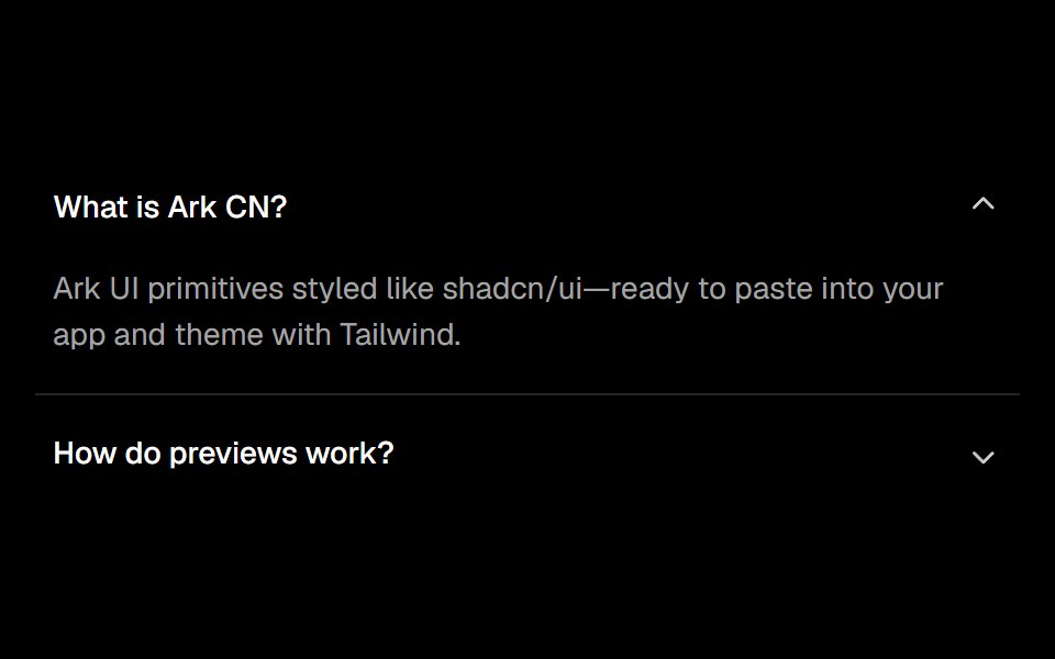 Accordionark-cn · ReactA shadcn-style accordion component built with Ark UI primitives.
 Avatarshadcn/ui · ReactAn image element with a fallback for representing the user.
 CalendardaisyUI · CSS (Tailwind)
 AvatarHeroUI · ReactDisplays a user avatar with support for images, text initials, or fallback icons.
 Avatar CirclesMagic UI · ReactOverlapping circles of avatars.
 AvatarReact Spectrum · ReactAn avatar is a thumbnail representation of an entity, such as a user or an organization.
 Avatarcoss ui · ReactAn image element with a fallback for representing the user.
 AvatarOrigin UI · ReactAn image element with a fallback for representing the user.
 CarouselPreline UI · JavaScript (HTML + Tailwind)
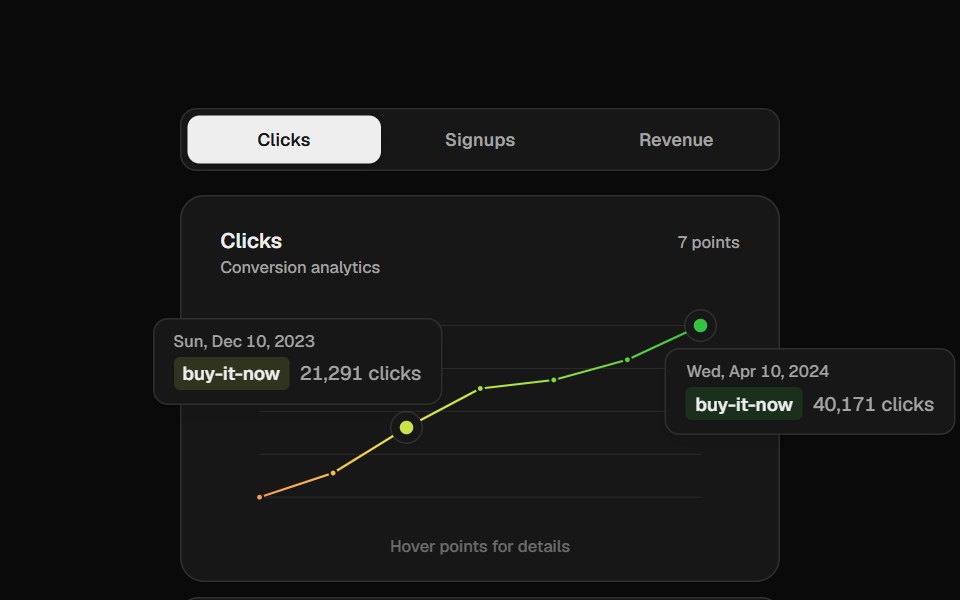 Analytics ChartCult UI · ReactVercel-style gradient line chart with floating tooltip cards
 Area ChartTremor · React
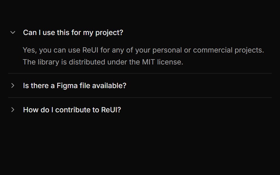 Accordion with rotating arrow indicatorReUI · ReactAccordion with rotating arrow indicator
 Card Preview TileAmicro Micro Transitions · ReactCatalog preview for a card spread / carousel. Hover state lives here so hovering one tile re-renders only that tile…
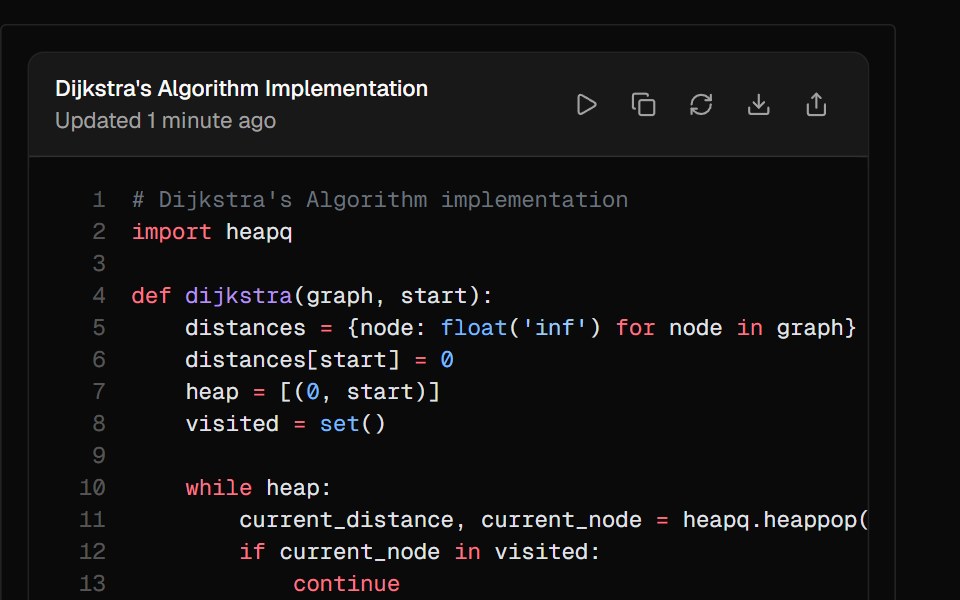 ArtifactAI Elements · ReactA container component for displaying generated content like code, documents, or other outputs with built-in actions.
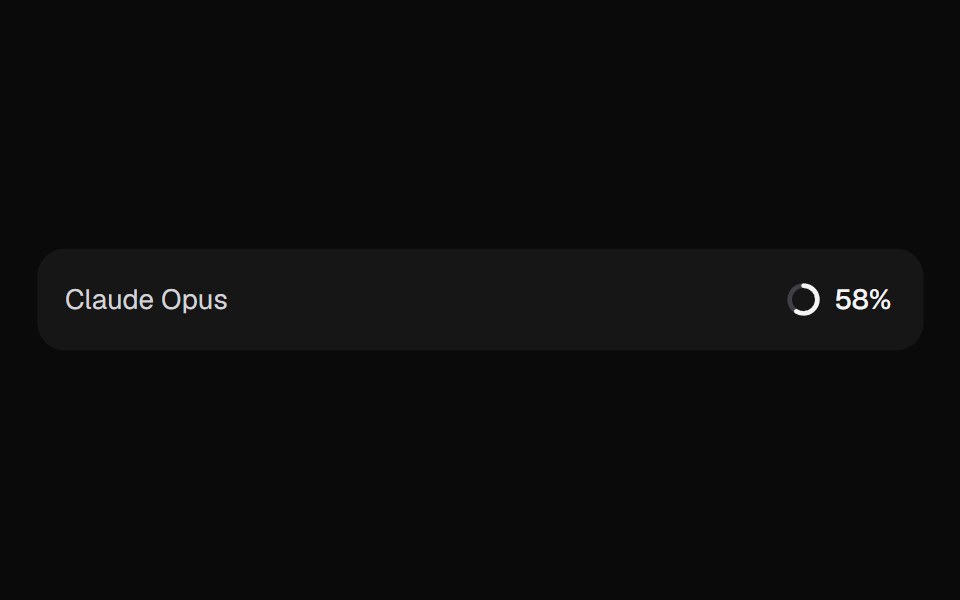 AI Context MeterKokonut UI · ReactHow full the context window is, as a ring in the prompt footer that opens a breakdown by source and compacts when it…
 Verticle BarsCursify · React
 avatarIntent UI · Reactavatar
 CarouselUntitled UI React · React
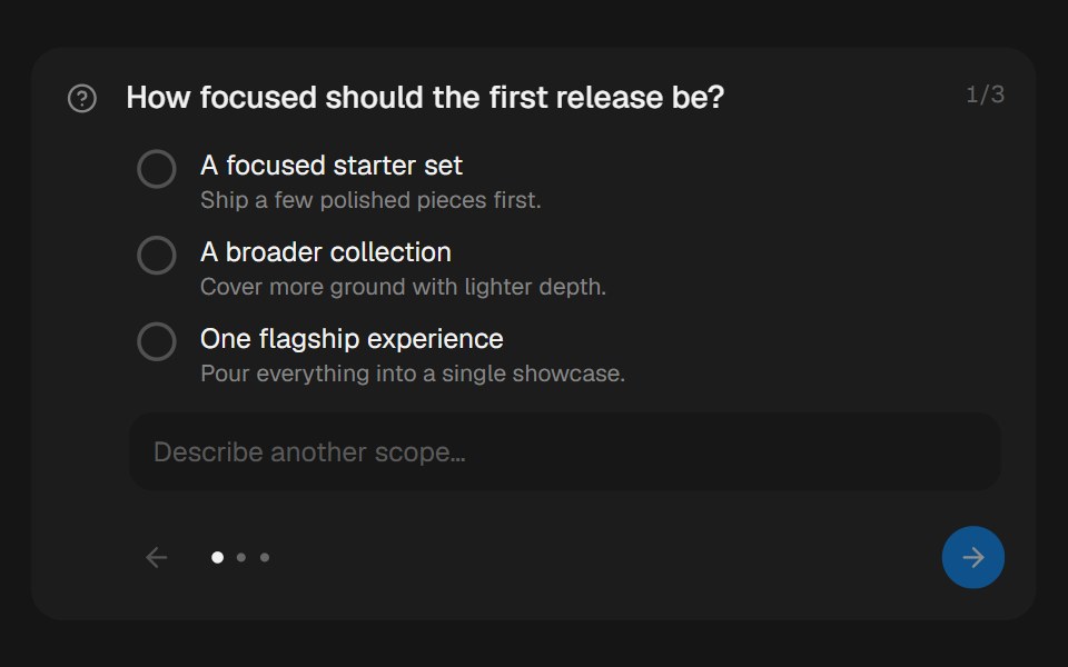 Approval CardbeUI · ReactCollects structured human input during a paused run.
 AvatarTailGrids · ReactAn image element with a fallback for representing a user.
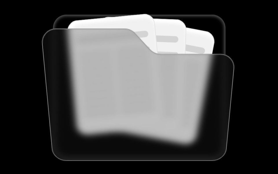 Folder ComponentRare UI · ReactAn animated folder whose cards fan out on hover and lift open on click, with a 3D-tilted flap. Supports color and size…
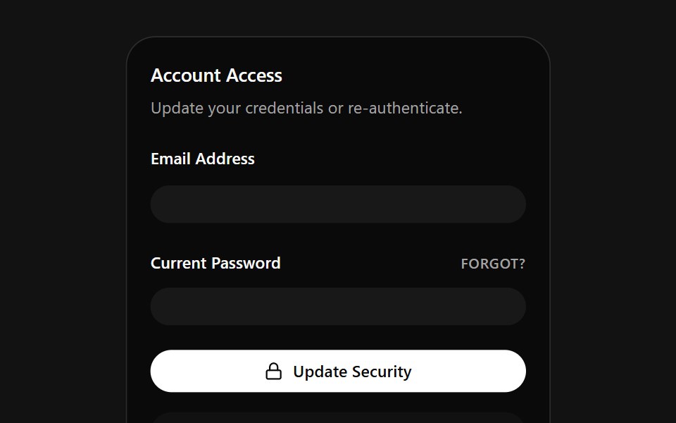 Account Access CardSpectrum UI · ReactA credentials card that auto-fills email and password on a loop, with a danger zone.
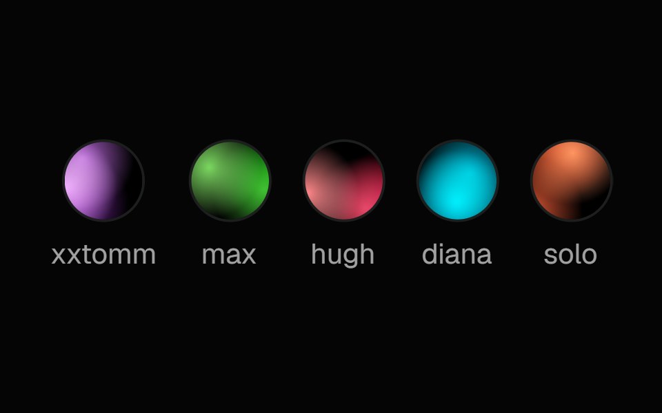 Fallback AvatarSpell UI · ReactA unique gradient avatar generated from a name string.
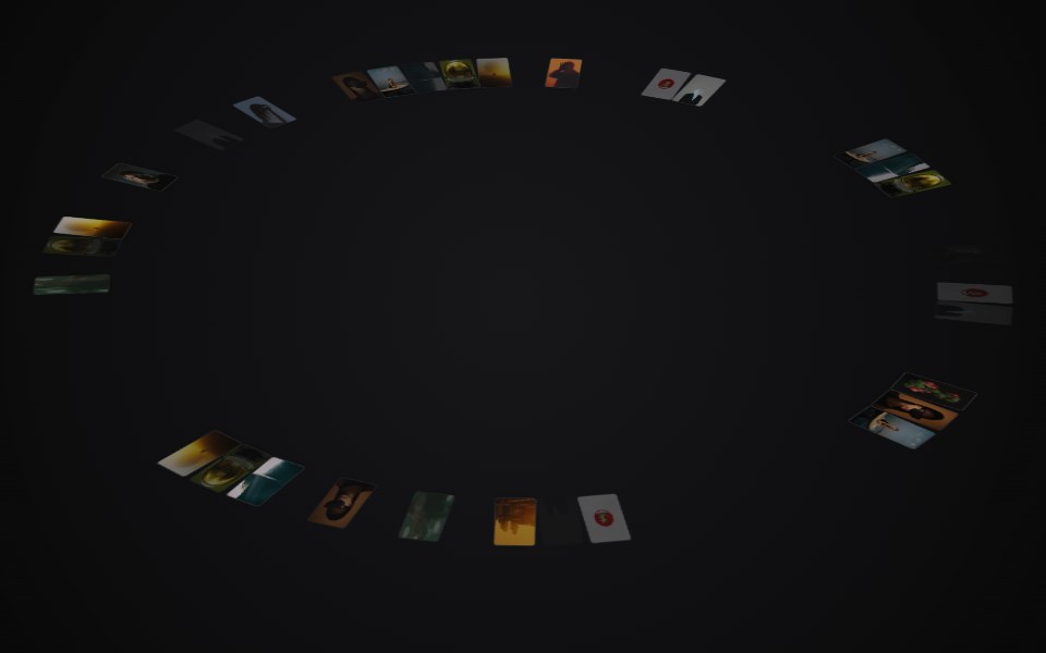 Circular GalleryVengeance UI · ReactRelaxing 3D ring of images with drag-spin, parallax tilt, and center preview
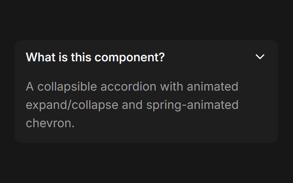 Accordion (Base UI)Fluid Functionalism · ReactCollapsible accordion with animated height transitions, spring-animated chevron, and fluid hover in grouped mode. Base…
 AvatarToolcraft · React
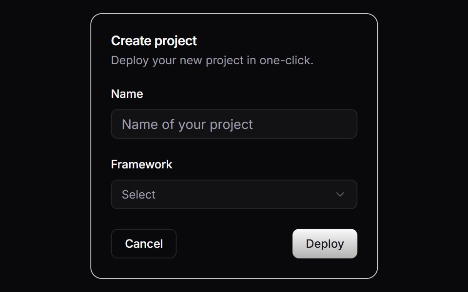 CardLaunch UI · React
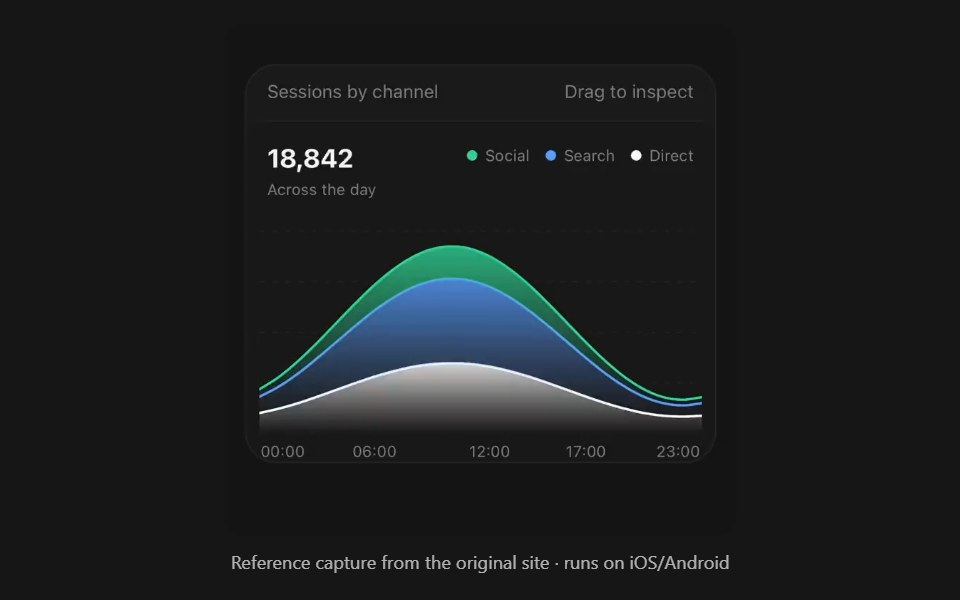 Area ChartPanel UI · React NativeFilled bands over time, stacked or overlaid.
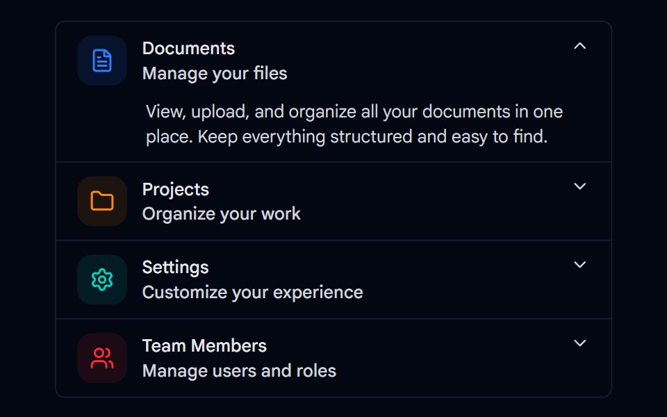 Accordion-01 - DefaultShadcn Space · ReactDefault accordion component
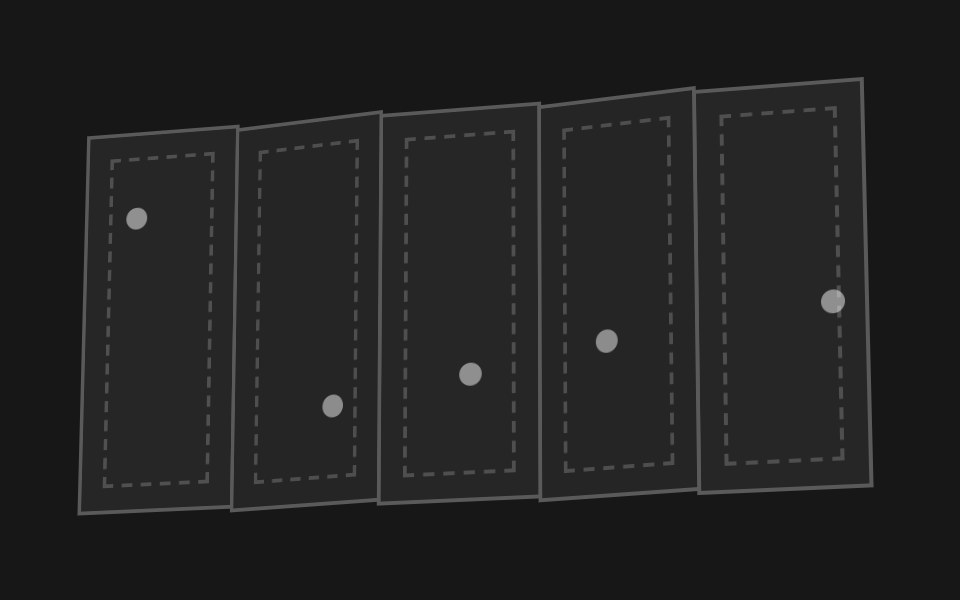 Accordion FoldPixel Perfect · ReactA paper map of hinged panels that folds itself up like an accordion and flattens back out.
 Linked In Profile CardOpenSourceUI · ReactCard that reproduces a LinkedIn profile: cover, avatar, name, headline and connect button.
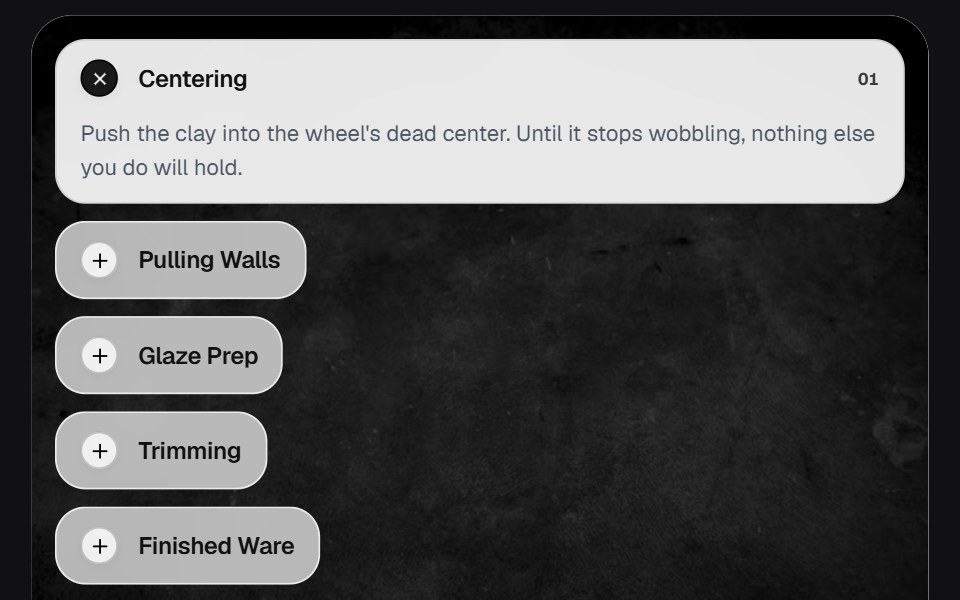 AccordionOSuselayouts · ReactInteractive accordion showcase with animated content, image transitions, hover effects, keyboard navigation, autoplay…
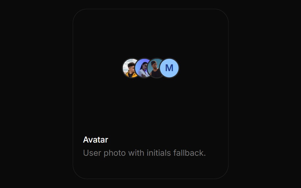 AvatarBoardUI · ReactUser photo with initials fallback.
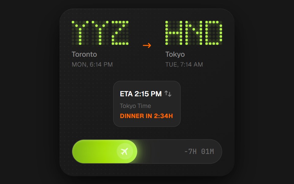 Flight Status CardComponentry · ReactA detailed card showing flight information with animations.
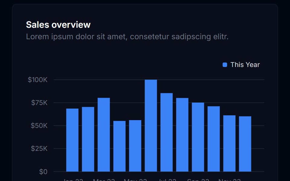 Bar ChartTremor Blocks · ReactThe base bar chart component (Recharts): vertical or horizontal bars, grouped or stacked, legend and tooltip…
 AvatarShadcn Dashboard · React
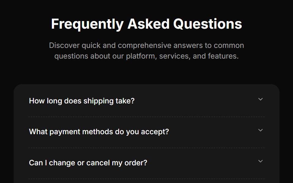 Faq Fourcnblocks · SvelteFAQ section with search and categories
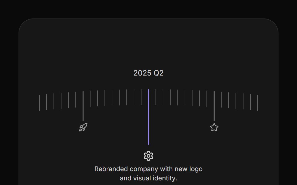 Arc TimelineAnimations (Svelte) · SvelteA curved timeline that rotates through milestone steps with clickable markers, icons, and configurable spacing.
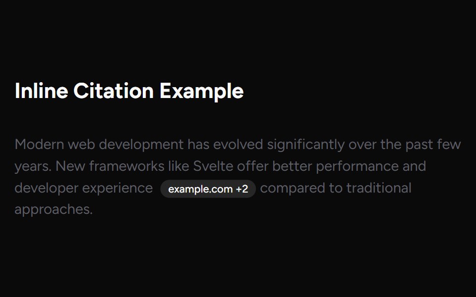 Inline CitationAI Elements (Svelte) · SvelteAn inline citation system with hover cards and carousel views for source-backed AI content.
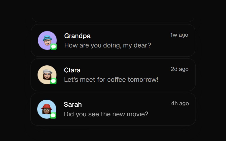 Animated ListBadtz UI · ReactA sophisticated animation component that creates dynamic column-based transitions with scaling effects. Perfect for…
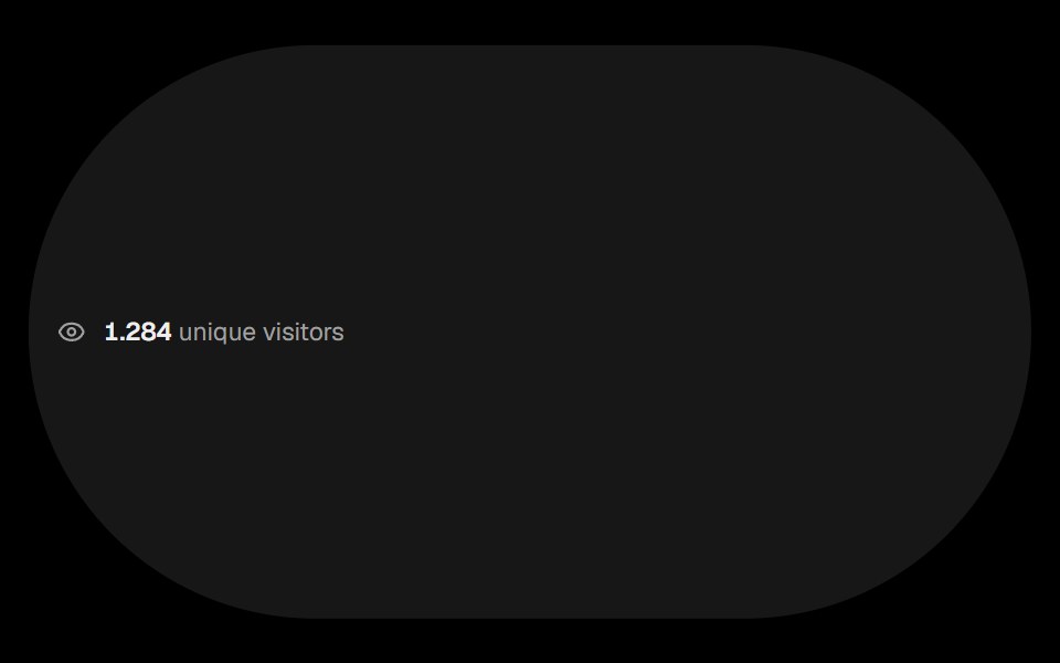 Visitor CountObsidianUI · ReactCounter that shows the number of visitors with animated digits.
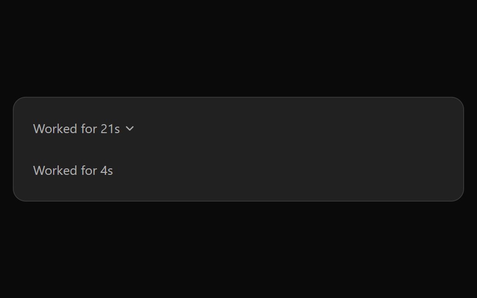 ChatGPT ReasoningNotra · ReactThe collapsible "Worked for Ns" trace, built on shadcn Collapsible.
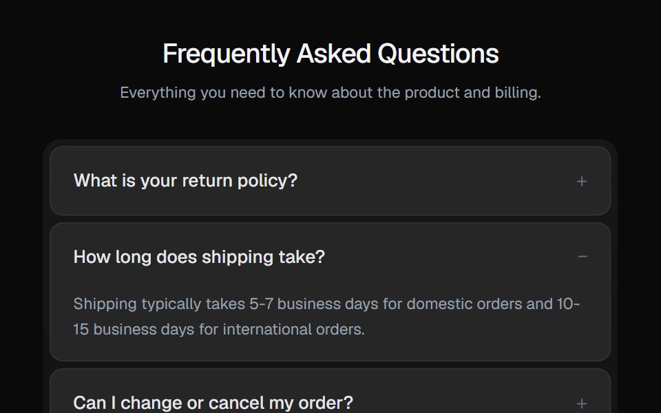 AccordionGreatUI · React
Libraries with Tailwind CSS data display components
Related categories
- Data Display Components
- React Data Display Components
- Svelte Data Display Components
- React Native Data Display Components
- Animated Data Display Components
- shadcn/ui Data Display Components
- Tailwind CSS Card Components
- Tailwind CSS Chart Components
- Tailwind CSS Table Components
- Tailwind CSS Avatar Components
- Tailwind CSS Stat Components
- Tailwind CSS List Components
- Tailwind CSS Calendar Components
- Tailwind CSS Accordion Components
- Tailwind CSS Data Table Components
- Tailwind CSS Carousel Components
- Tailwind CSS Collapsible Components
- Tailwind CSS Avatar Group Components
- Tailwind CSS Stat Card Components
- Tailwind CSS Bar Chart Components
- Tailwind CSS Tree View Components
- Tailwind CSS Card Stack Components