 Dev Design Library
Animated Data Display Components
Dev Design Library indexes 995 Animated data display components from 69 open-source UI libraries, with the most coming from Watermelon UI, Spectrum UI, Amicro Micro Transitions, Panel UI and UI Lab. Each one links to its page with the source code, a live preview where available, the library license and the install command. These are the data display components tagged as animated: motion on hover, on scroll or on load, usually built with CSS transitions or Framer Motion.
Showing 120 of 995, a mix from every library. Open a library to see all of its components.
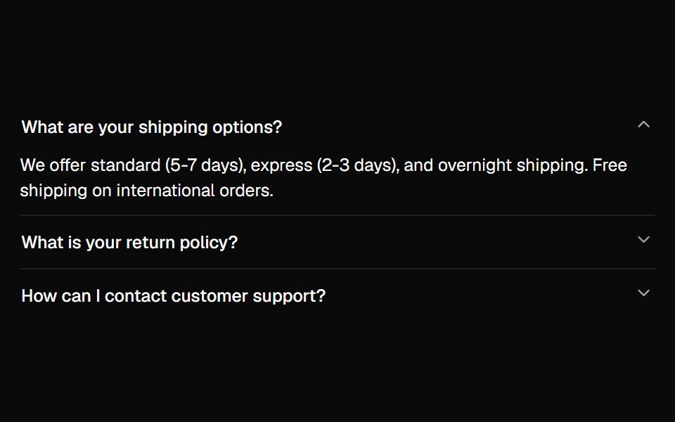 Accordionshadcn/ui · ReactA vertically stacked set of interactive headings that each reveal a section of content.
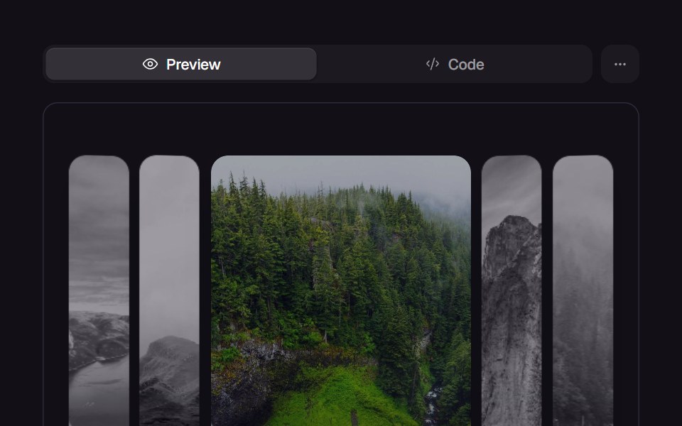 Accordion GalleryReact Bits · ReactPanels expand on hover or focus, revealing parallax imagery and captions.
 AccordionChakra UI · ReactUsed to show and hide sections of related content on a page
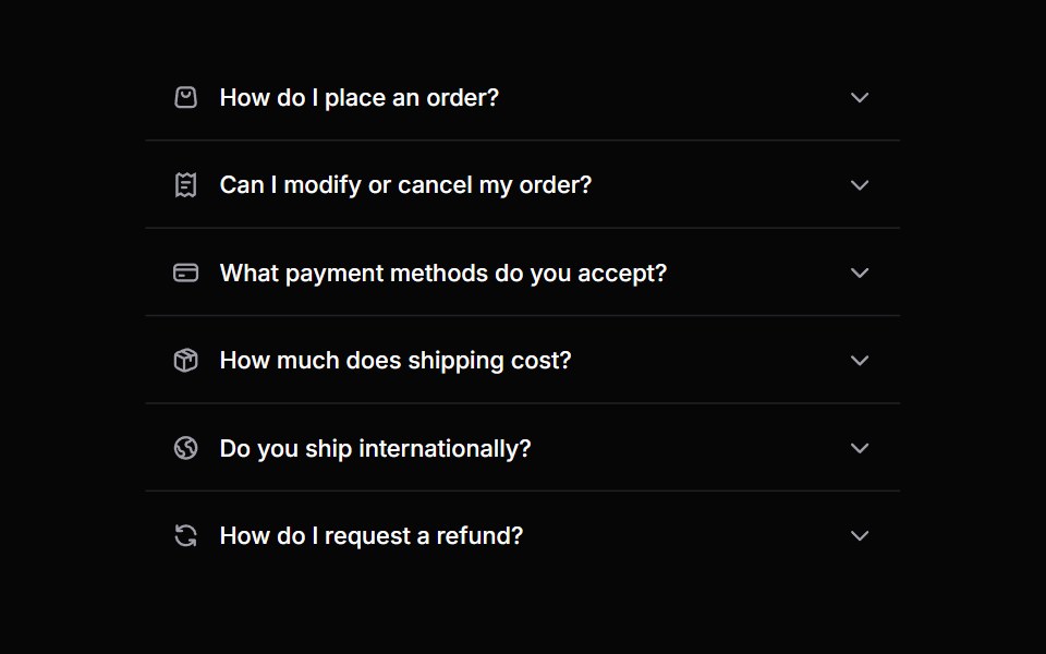 AccordionHeroUI · ReactA collapsible content panel for organizing information in a compact space
 Animated ListMagic UI · ReactA list that animates each item in sequence with a delay. Used to showcase notifications or events on your landing page.
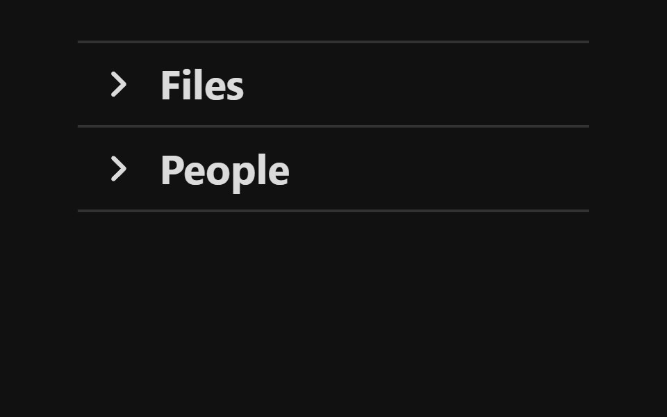 AccordionReact Spectrum · ReactA group of disclosures that can be expanded and collapsed.
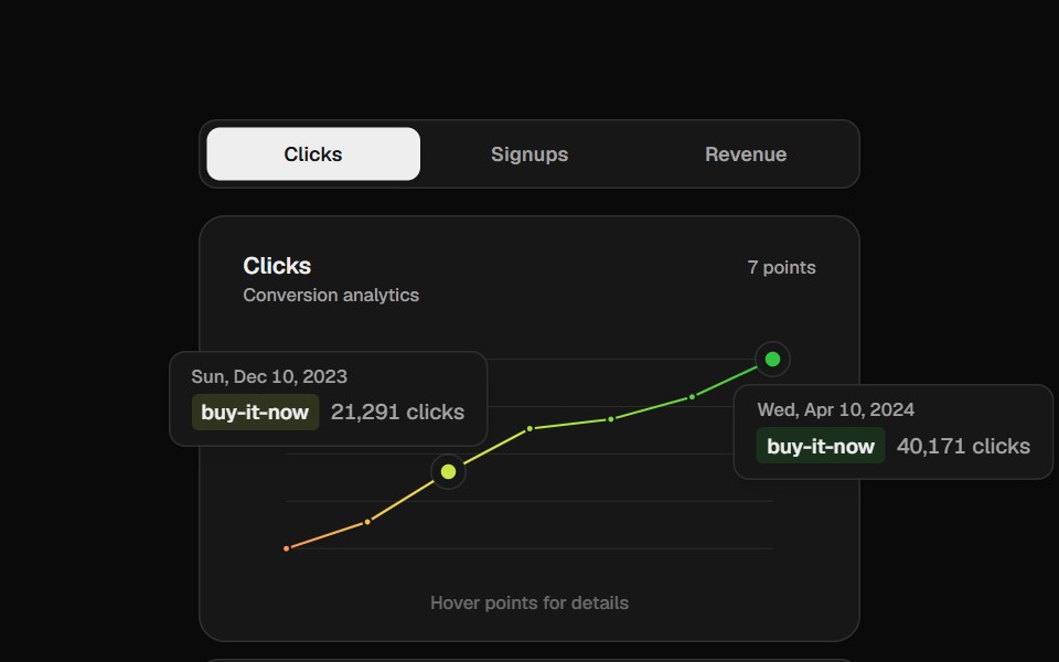 Analytics ChartCult UI · ReactVercel-style gradient line chart with floating tooltip cards
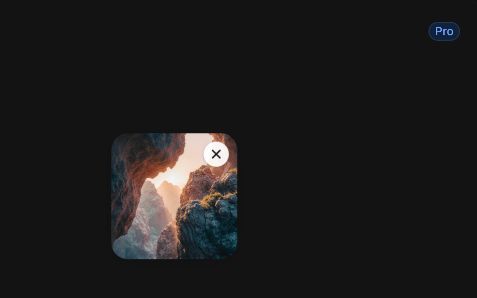 Delete With Smoky Dissolvetransitions.dev · HTML/CSSList item that dissolves into smoke when deleted.
- Bot AvatarsLibraries.dev · ReactAnimated bot avatars for React — eighteen glossy 3D shapes with living faces that turn, hop and flip, three states…
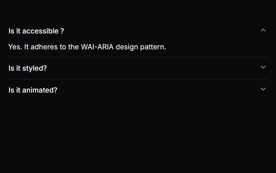 A basic single-expand accordionReUI · ReactA basic single-expand accordion
 Card Cascade StaggerAmicro Micro Transitions · ReactStack of cards that cascade into place one after another.
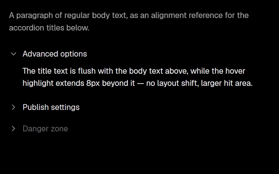 AccordionLobe UI · ReactA vertically stacked set of interactive headings whose items reveal titled content with controlled or uncontrolled…
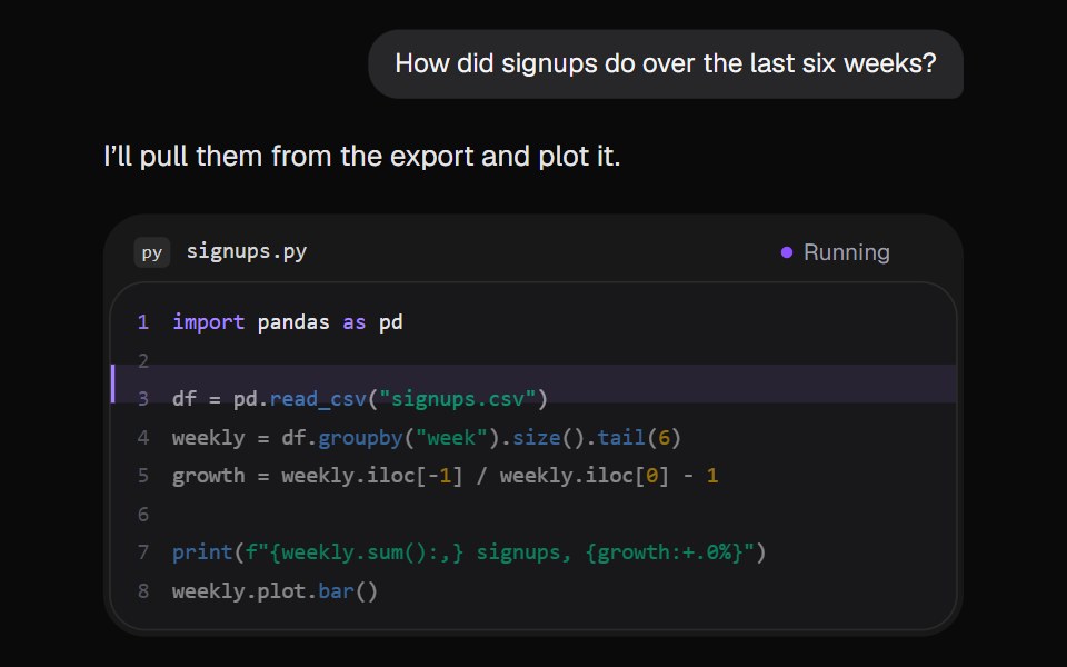 AI Code RunKokonut UI · ReactThe assistant runs a short Python script in the reply. A marker steps down the lines, the output prints, and the chart…
 Horizontal BarsCursify · React
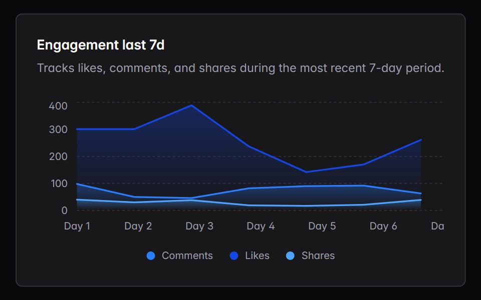 area-chartIntent UI · Reactarea-chart
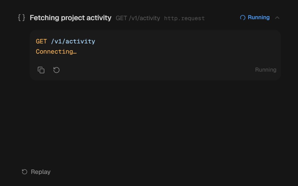 Agent DisclosurebeUI · ReactShared transform-only reveal for collapsible agent content.
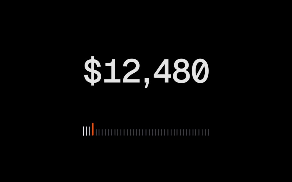 Animated CounterRare UI · ReactA number that counts to its new value on a wheel of digits, like an odometer.
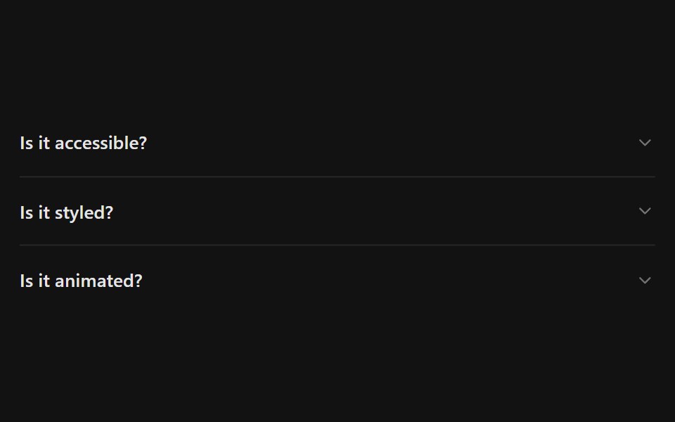 AccordionSpectrum UI · Reactcomponent for the Accordion
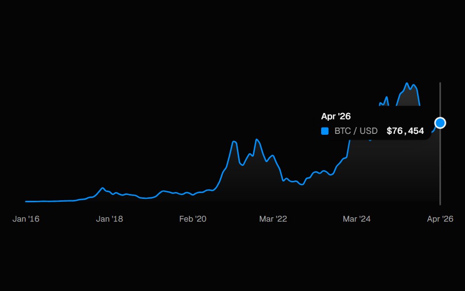 ChartSpell UI · ReactInteractive line chart with a cursor-tracked tooltip card, snap-to-point hover, and built-in X-axis labels.
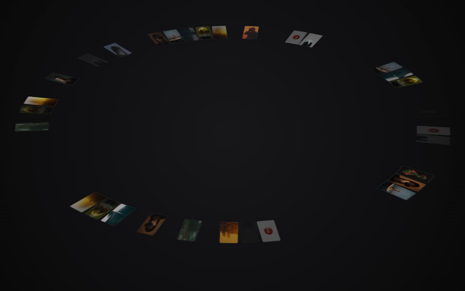 Circular GalleryVengeance UI · ReactRelaxing 3D ring of images with drag-spin, parallax tilt, and center preview
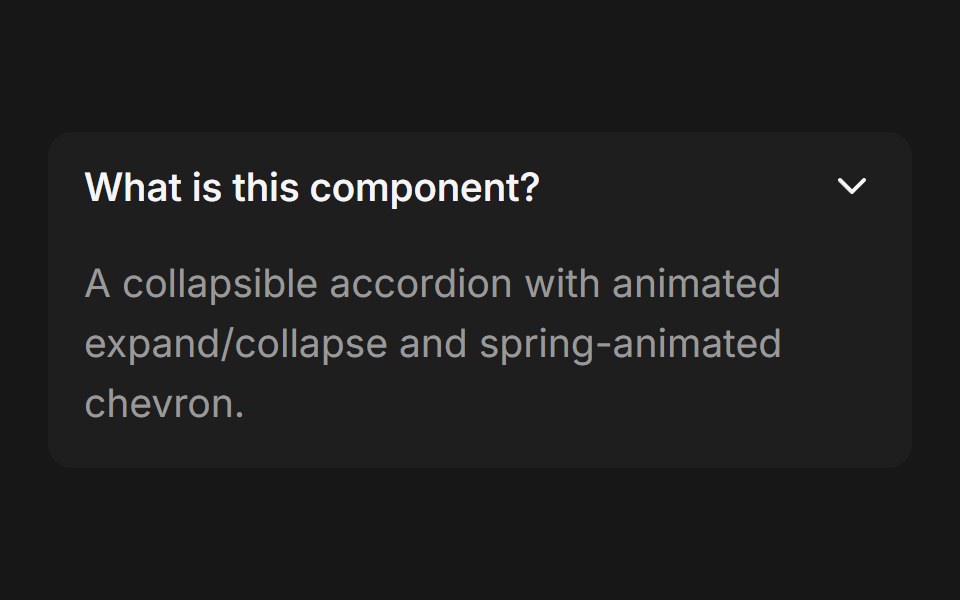 AccordionFluid Functionalism · ReactCollapsible accordion with animated height transitions, spring-animated chevron, and fluid hover in grouped mode…
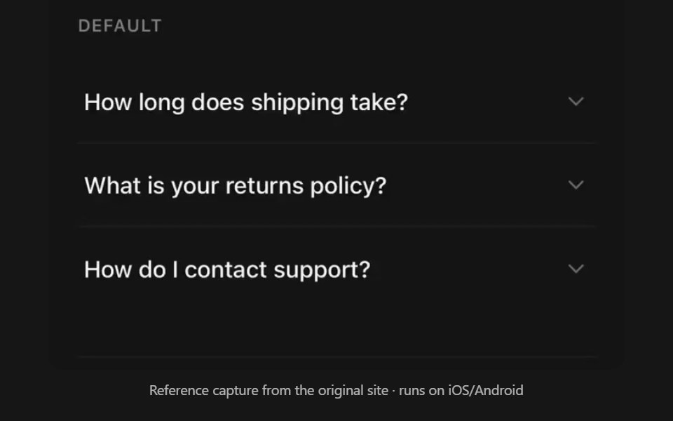 AccordionPanel UI · React NativeCollapsible sections with single or multiple selection.
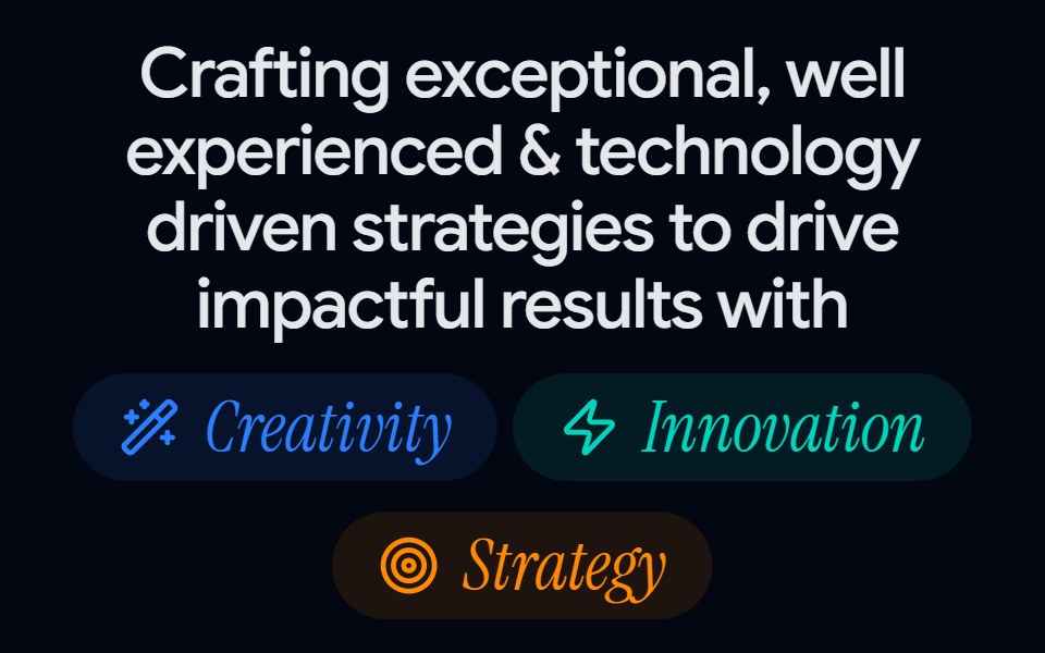 About Us 01 - Impact MetricsShadcn Space · ReactA bold about us section combining value pillars, headline messaging, and performance counters, perfect for agencies or…
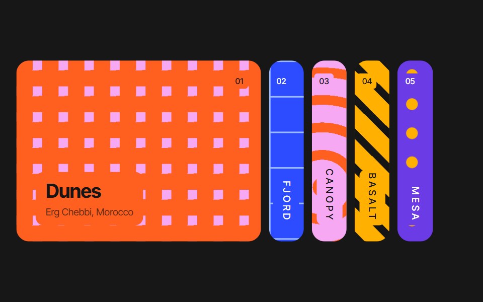 Accordion CarouselPixel Perfect · ReactAn accordion of vertical image panels — the active panel springs wide to reveal its photo and caption while the rest…
 Blob ProfileOpenSourceUI · React
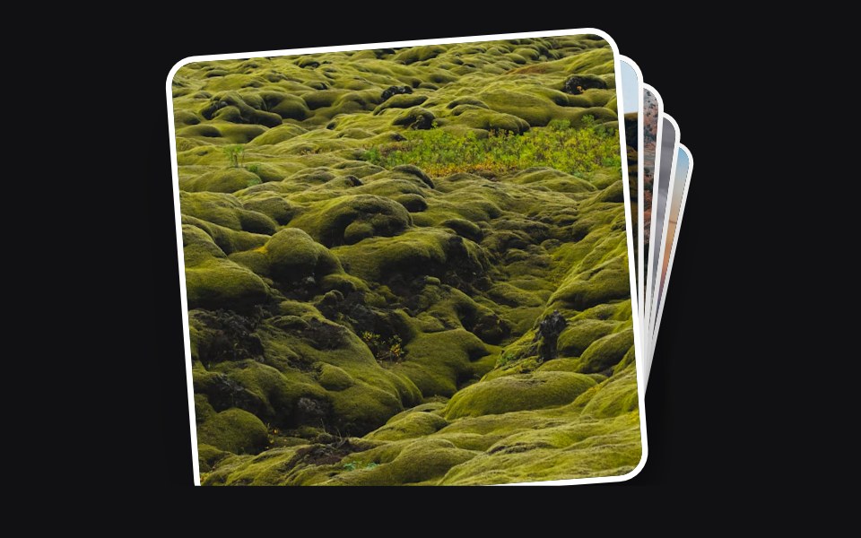 Accessible Actionuselayouts · ReactInteractive draggable card stack with 3D tilt, swipe-to-back gestures, click interactions, random rotation, and smooth…
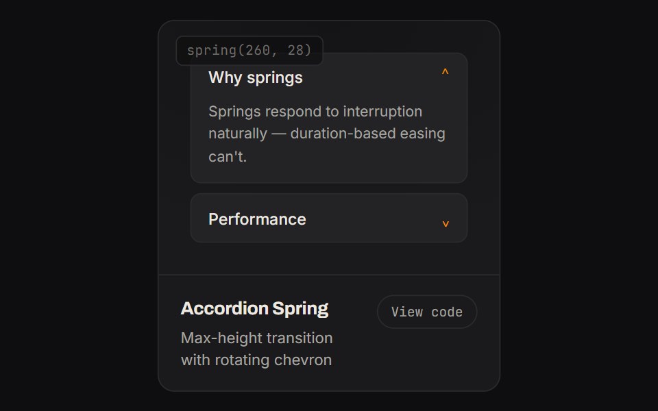 Accordion SpringKinetics · HTML/CSSMax-height transition with rotating chevron
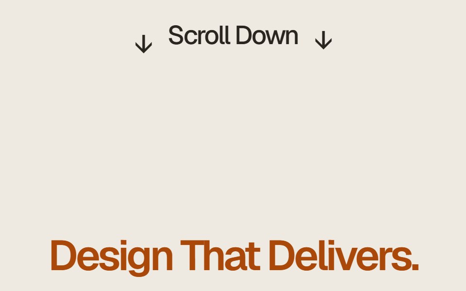 Case Study Flip StackComponentry · ReactEditorial case study cards that fold upward on scroll to reveal the next story.
- Animated TableShadcn Dashboard · React
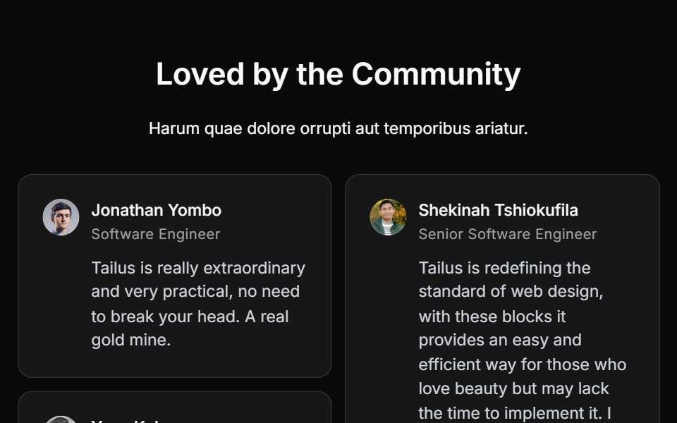 Testimonial Fivecnblocks · SvelteTestimonial carousel with navigation
 Animated ListAnimations (Svelte) · SvelteA component that animates list items with smooth layout transitions, revealing items one by one from top to bottom.
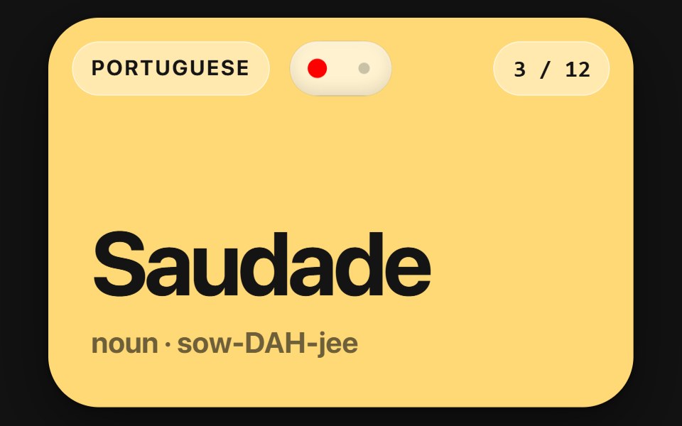 Flip CardSwiftPieces · SwiftUIA two-sided card you flip by tap or drag, scrubbing the turn and carrying the flick into the landing, with a lift and…
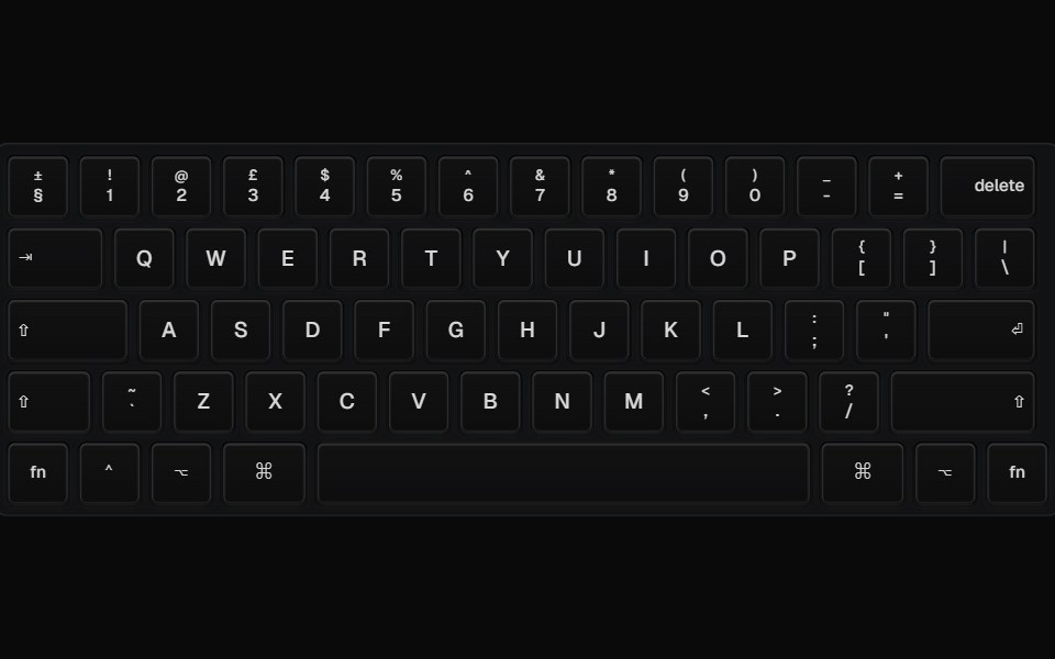 Animated KeyboardBadtz UI · ReactDisplays an animated keyboard with keycaps that can be customized with different colors and variants.
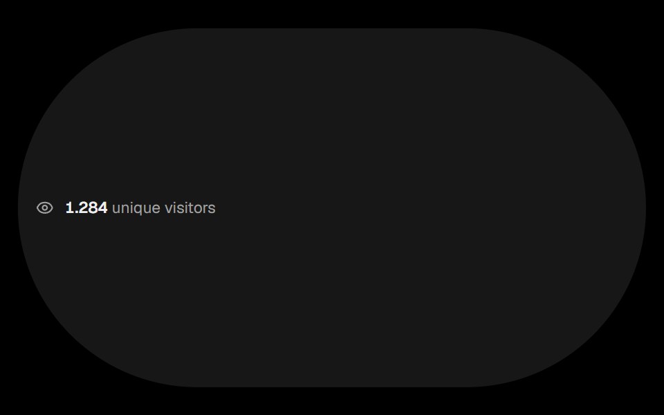 Visitor CountObsidianUI · ReactCounter that shows the number of visitors with animated digits.
 Fluid Dock CarouselGreatUI · ReactA carousel driven by a fluid dock of thumbnails, with swipe, arrows and keyboard navigation.
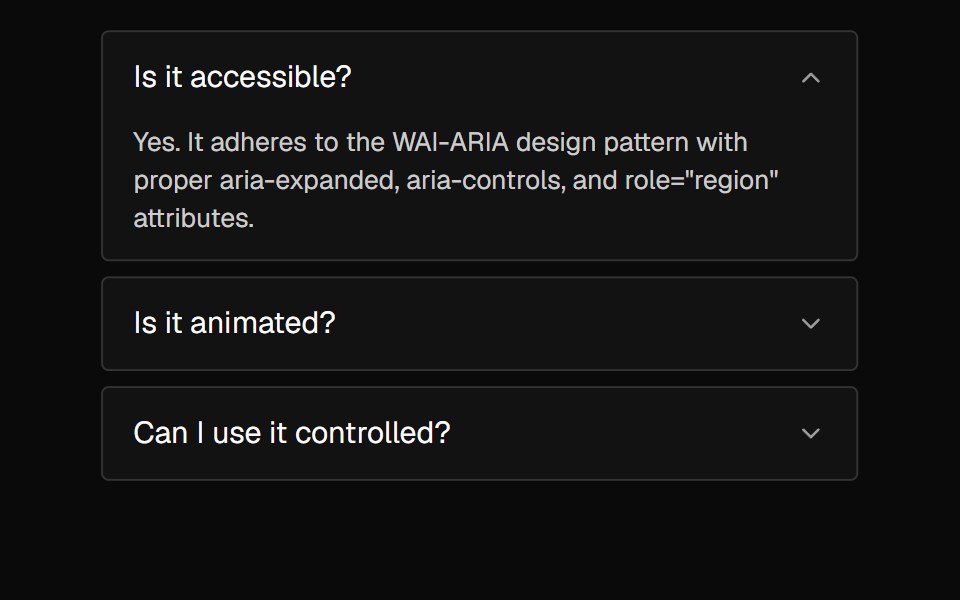 AccordionNexvyn UI · ReactA vertically stacked set of interactive headings that each reveal a section of content, with a grid-rows unfold…
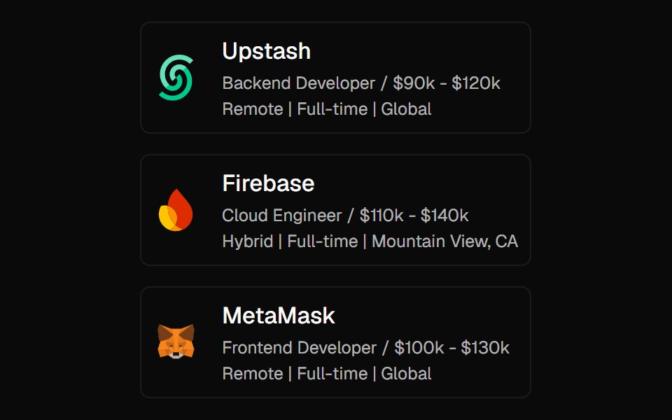 Expandable CardForge UI · ReactInteractive UI component to expand cards with smooth animations and detailed content using layout transitions.
 AccordionShark UI · ReactA collapsible for displaying content.
 Diagonal Card StackRewamp UI · ReactExact recreation of the diagonal cascading card stream & stacked deck collapse animation.
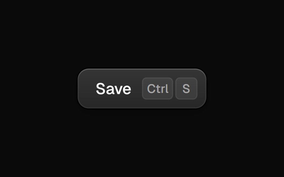 CommandButtonEvil Buttons · ReactA button with a global keyboard shortcut, shown as keycaps that sink as you hold each key.
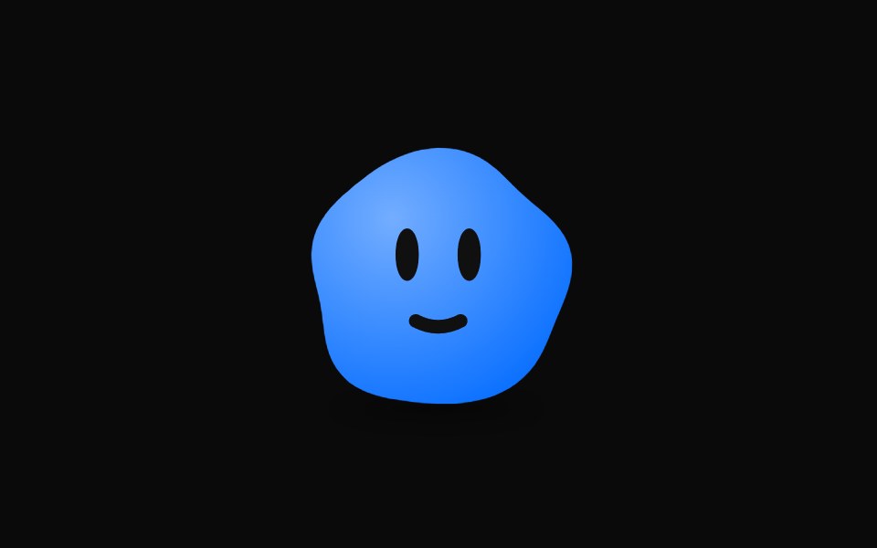 Ai Bot AvatarAI CSS · ReactAn animated AI bot avatar that follows the cursor with its eyes, blinks and reacts to attention.
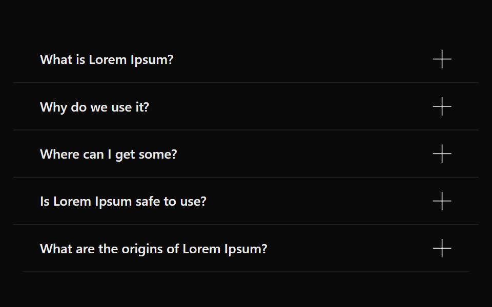 AccordionSona UI · ReactAn accessible Base UI accordion with controlled and uncontrolled state, four visual variants, interruptible disclosure…
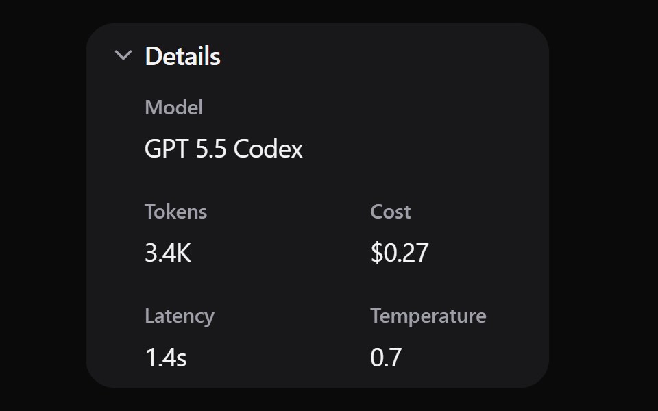 Expand DetailsWatermelon UI · ReactCard that expands to show more details when clicked.
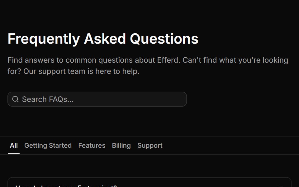 FAQ Fivesv-efferd · SvelteA searchable FAQ page with category filters, empty state handling, and structured dividers.
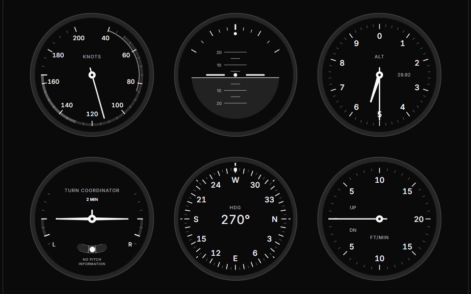 GaugeGauge UI · ReactComposable SVG gauge primitives: track, arc, zones, ticks, tick fills, labels, needle, hub, dot, tooltip and value…
 AccordionArc Library · ReactProgressively reveal supporting information in place.
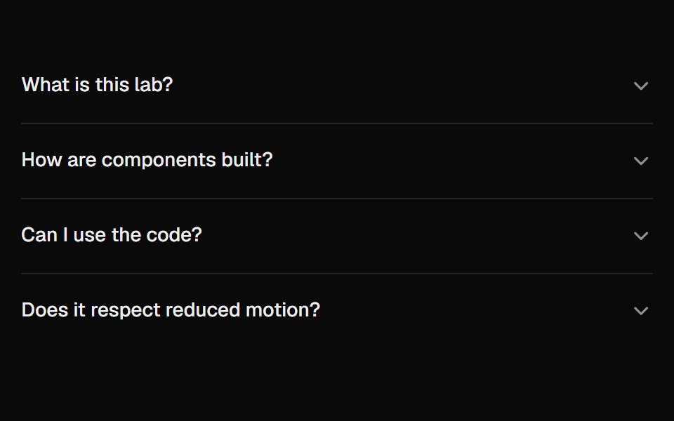 AccordionUI Lab · ReactAnswers unfold from under their question like a folded flap, and the row you clicked never moves.
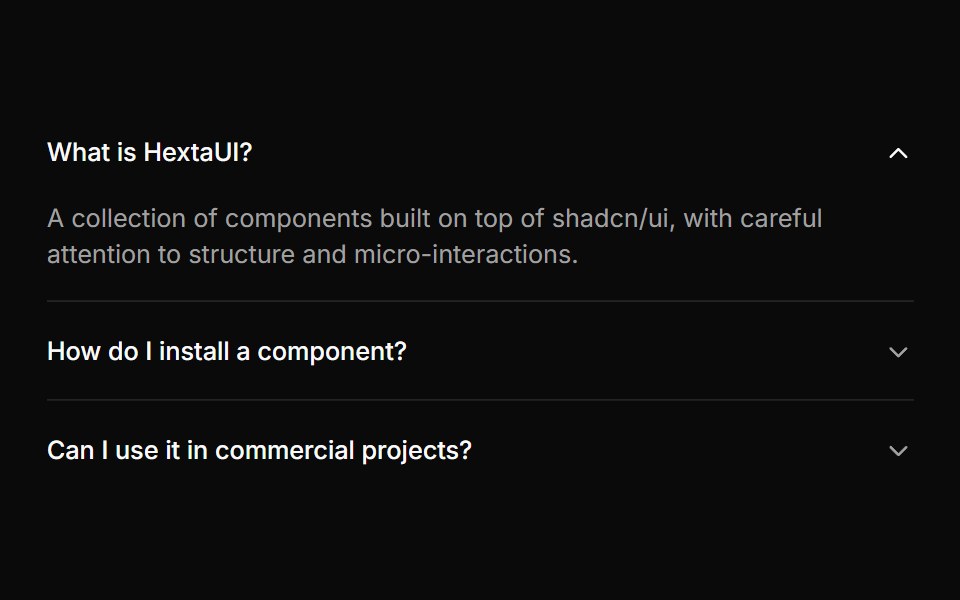 AccordionHextaUI · ReactStacked headings that each reveal a panel, with height motion you can reverse mid-way and panels that stay searchable…
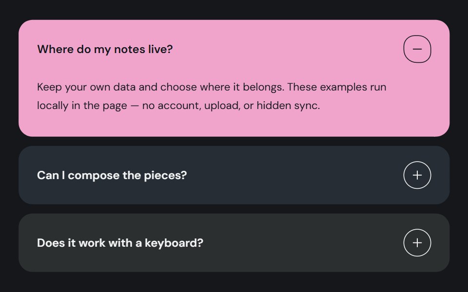 AccordionCojeev UI · ReactOrganizes related sections into expandable panels so readers can open the details they need.
 Count Up NumberMicroKit · ReactA stat that counts up from zero the first time it scrolls into view, easing out so the last digits settle slowly; it…
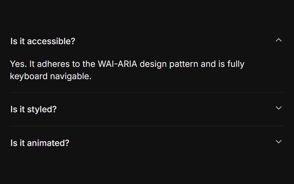 BasicFLX UI · ReactOnly one section open at a time, type="single" collapsible. The default behavior.
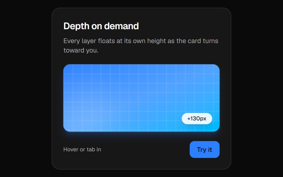 3D CardVelora UI · ReactPerspective card that turns toward the pointer while its layers lift to different depths.
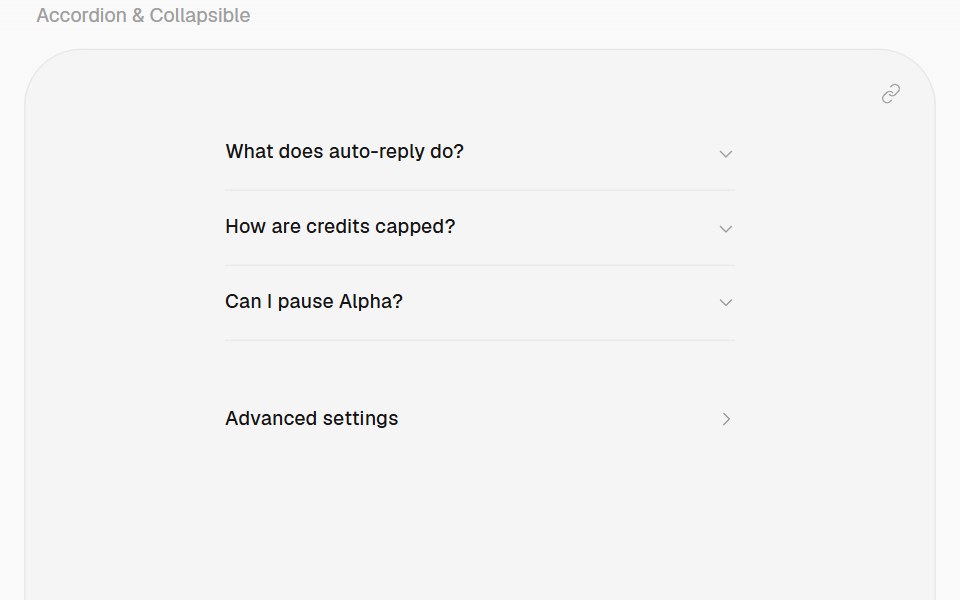 AccordionHalaska UI · React
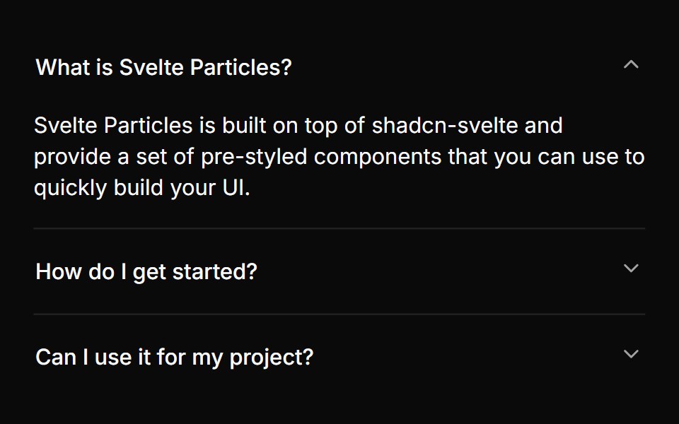 Basicsv-particles · Svelte
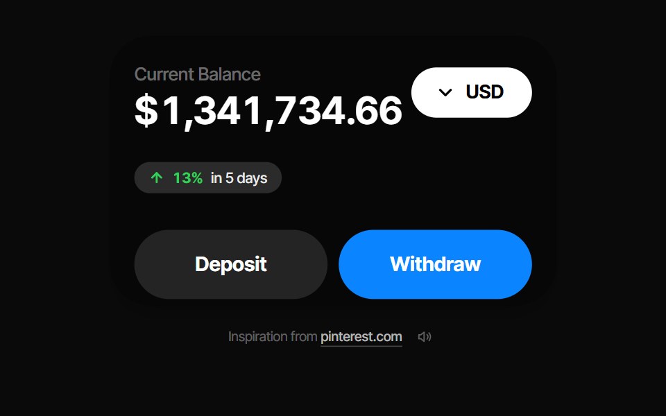 Balance CardPin UI · React
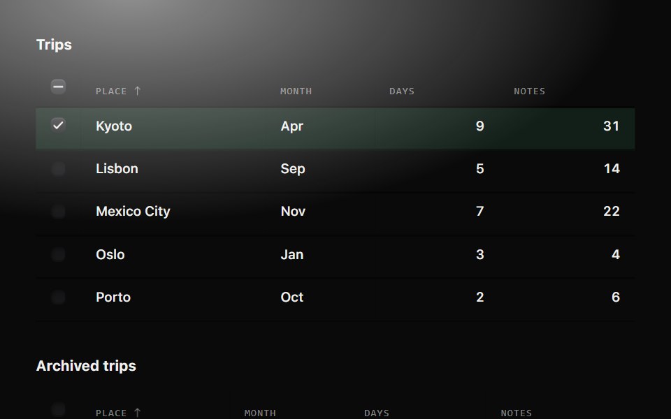 TableMetal UI · React + SwiftUIRows of things, read across and compared down: engraved labels and hairlines; sorting turns the column's arrow and…
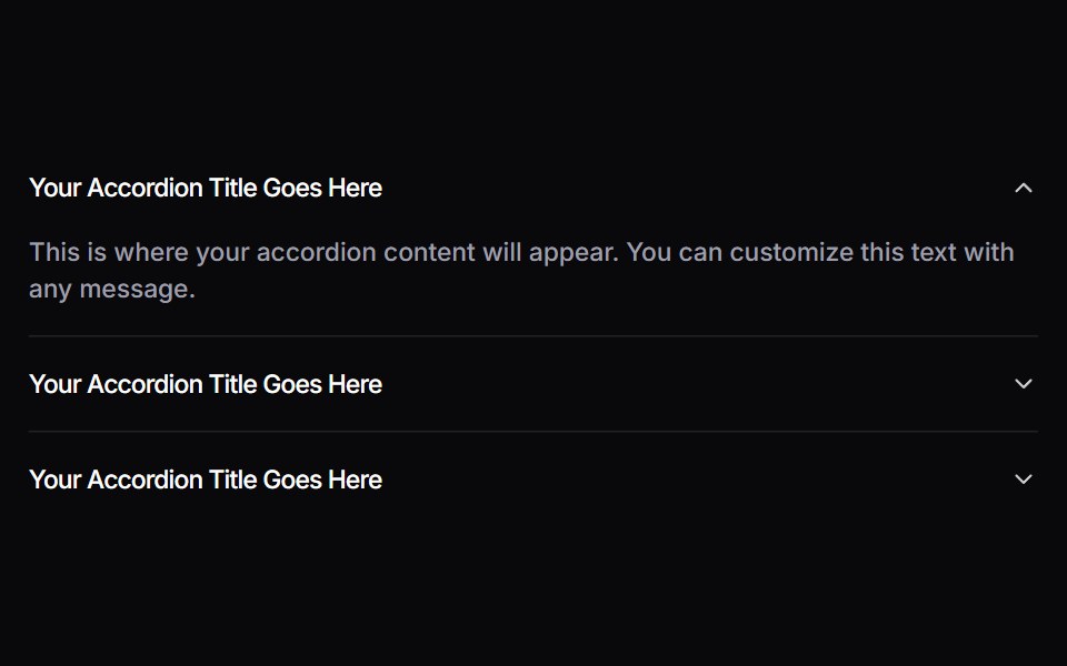 AccordionSpaceUI · ReactAllows you to display content in collapsible panels, making it easy for users to explore details on demand while…
 Aria CarouselReScript shadcn · ReScript
 3D Wheel CarouselSkecher UI · ReactA reusable, drag-controlled 3D card carousel with auto-rotation, keyboard navigation, blur depth, and reduced-motion…
 AccordionSora UI · ReactAn animated FAQ accordion with expandable panels, powered by Motion.
 Crypto SwitchZAYX · React NativeA crypto swap card: pick the coin you pay and the one you receive, flip them with a spring, and send.
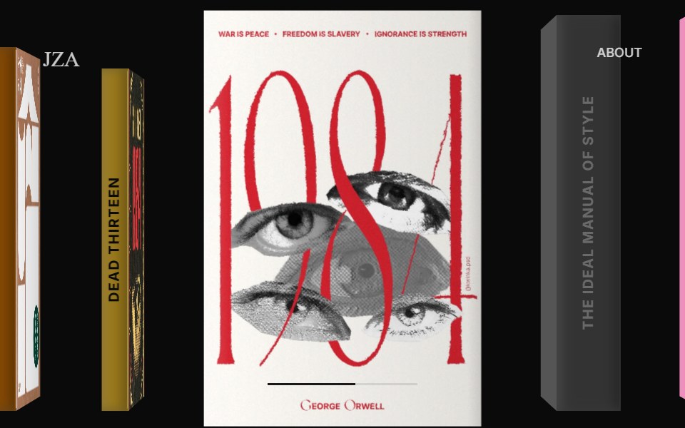 3D Book Carousel Reading ModeCue Foundations · React
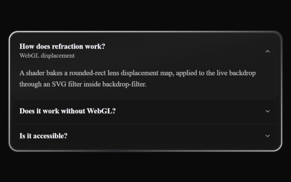 Liquid AccordionLiquefy UI · ReactAccordion in liquid glass style: translucent panels that refract the background.
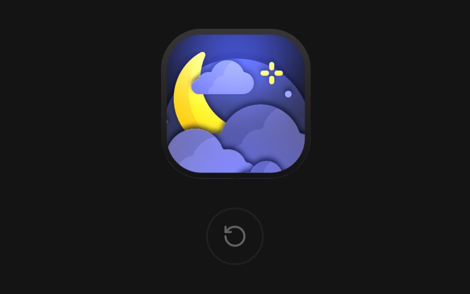 Moon TileD2Studio UI · ReactA night tile: a crescent moon rises over a bank of clouds, then the clouds sway in parallax while a sparkle twinkles…
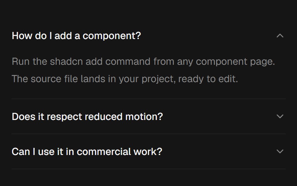 AccordionEaseUI · ReactExpanding sections that grow to their natural height with no measuring, with arrow key navigation and closed panels…
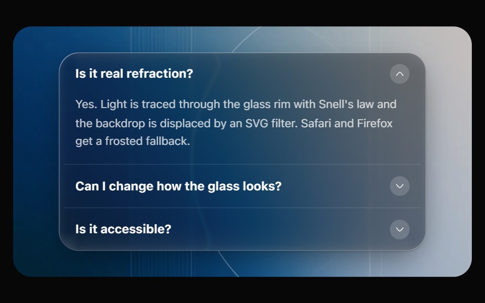 Glass AccordionOpaline · ReactCollapsible sections on one glass panel, or as separate glass cards that grow open.
 CountFibo · ReactA number at a glance: capped at 99+, shortened to 1.2K or signed as +4, read out in full.
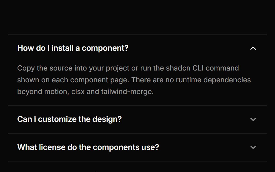 AccordionReactFrame · ReactAn accessible accordion with single or multiple open panels, default, card and filled variants, chevron or plus…
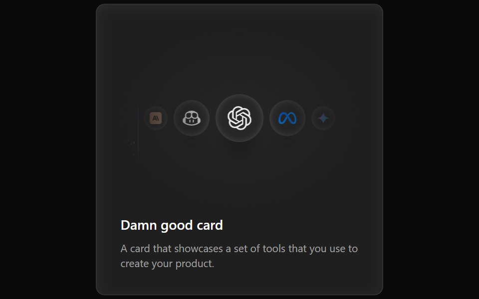 Cards Demo 3Aceternity UI · ReactFeature Block Animated Card
 Carouselshadcn/ui · ReactA carousel with motion and swipe built using Embla.
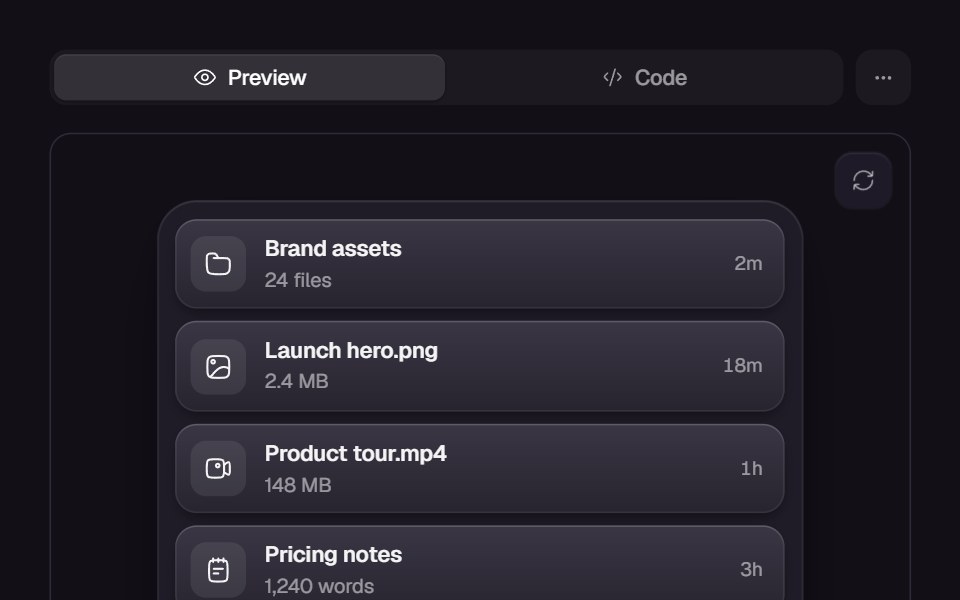 Animated ListReact Bits · ReactList items enter with staggered motion variants for polished reveals.
 CarouselChakra UI · ReactUsed to cycle through a series of visual content within a container.
 DisclosureHeroUI · ReactA disclosure is a collapsible section with a header containing a heading and a trigger button, and a panel that wraps…
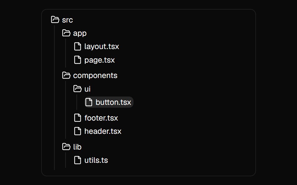 File TreeMagic UI · ReactA component used to showcase the folder and file structure of a directory.
 DisclosureReact Spectrum · ReactA collapsible section of content composed of a heading that expands and collapses a panel.
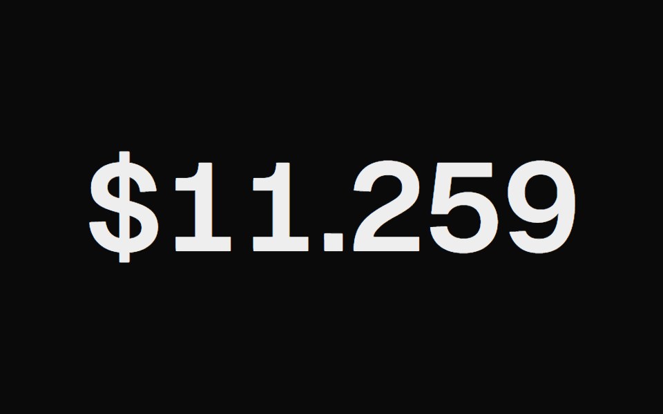 Animated NumberCult UI · ReactNumber component with smooth counting animations and customizable formatting
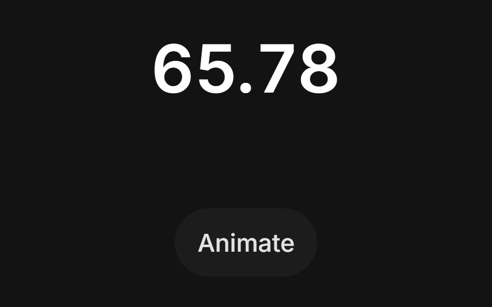 Number Pop Intransitions.dev · HTML/CSSNumber whose digits pop in with a small scale bounce when the value changes.
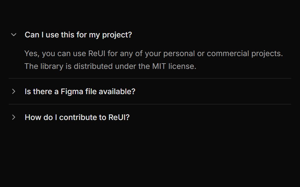 Accordion with rotating arrow indicatorReUI · ReactAccordion with rotating arrow indicator
 Accordion LoaderAmicro Micro Transitions · ReactAccordion Loader loading animation.
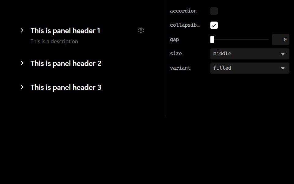 CollapseLobe UI · ReactAn expandable content container that extends Ant Design Collapse with additional styling, icons, and header…
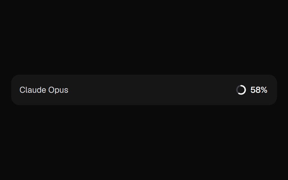 AI Context MeterKokonut UI · ReactHow full the context window is, as a ring in the prompt footer that opens a breakdown by source and compacts when it…
 Verticle BarsCursify · React
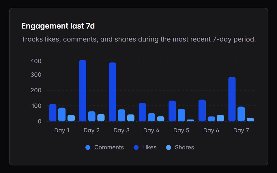 bar-chartIntent UI · Reactbar-chart
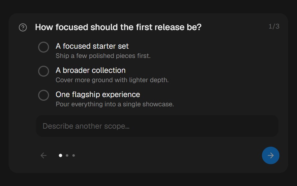 Approval CardbeUI · ReactCollects structured human input during a paused run.
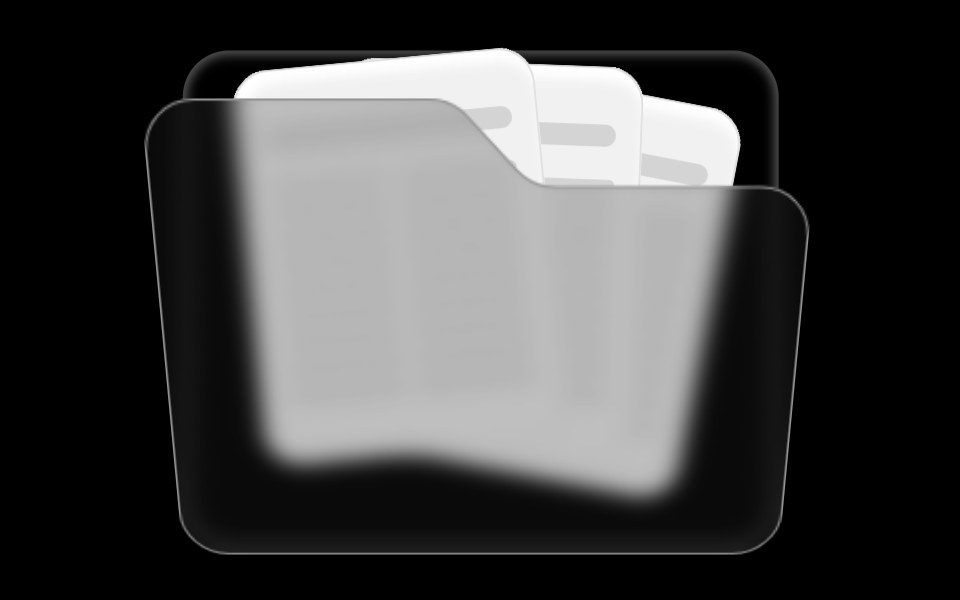 Folder ComponentRare UI · ReactAn animated folder whose cards fan out on hover and lift open on click, with a 3D-tilted flap. Supports color and size…
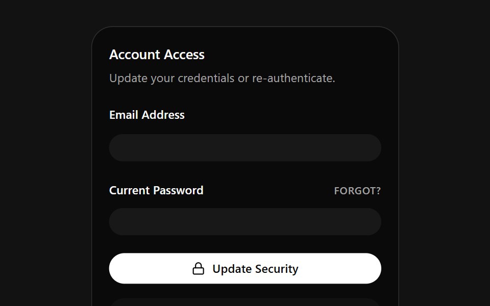 Account Access CardSpectrum UI · ReactA credentials card that auto-fills email and password on a loop, with a danger zone.
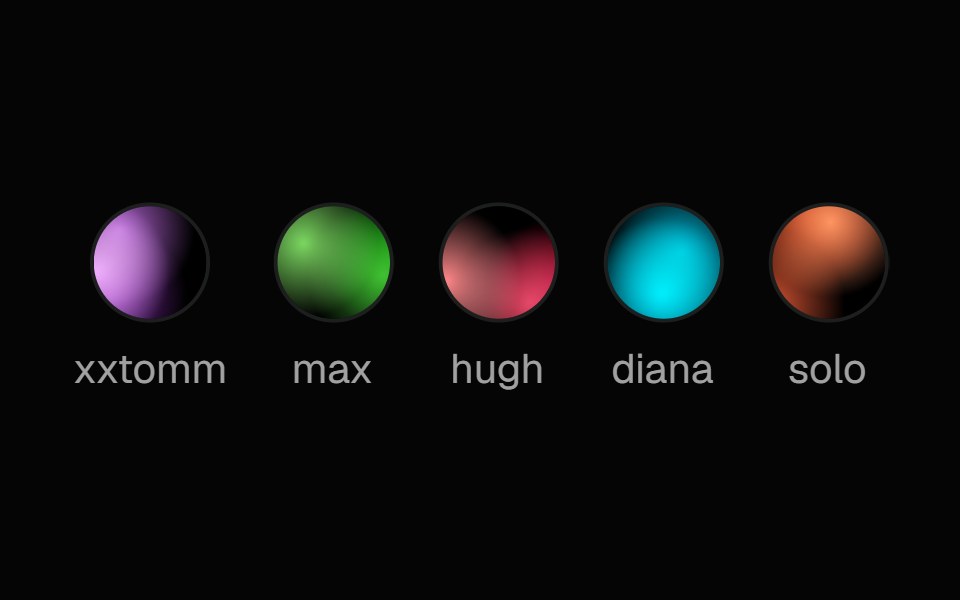 Fallback AvatarSpell UI · ReactA unique gradient avatar generated from a name string.
 Cursor CardVengeance UI · ReactInline text link with cursor tracking preview card
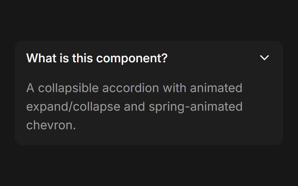 Accordion (Base UI)Fluid Functionalism · ReactCollapsible accordion with animated height transitions, spring-animated chevron, and fluid hover in grouped mode. Base…
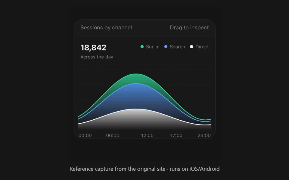 Area ChartPanel UI · React NativeFilled bands over time, stacked or overlaid.
 Animated List 01 - DefaultShadcn Space · ReactAnimated List component
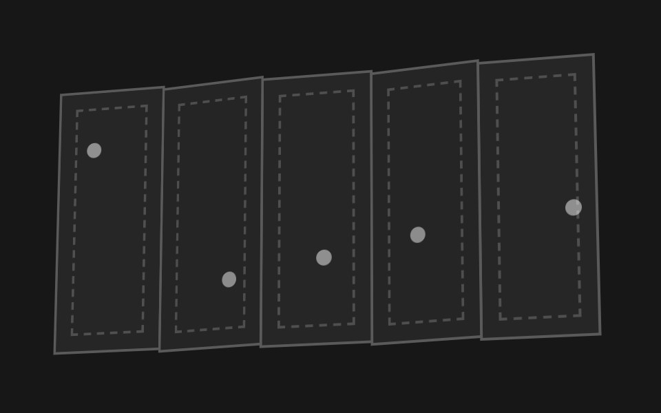 Accordion FoldPixel Perfect · ReactA paper map of hinged panels that folds itself up like an accordion and flattens back out.
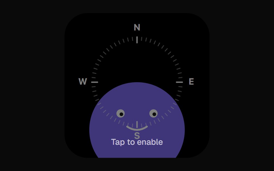 Compass WidgetOpenSourceUI · React
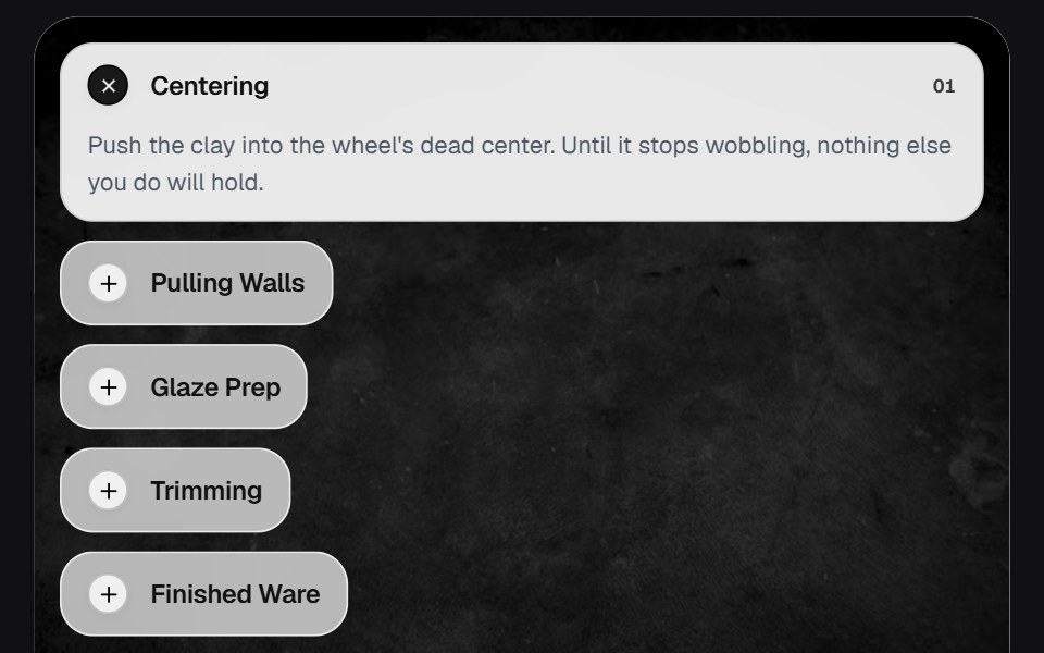 AccordionOSuselayouts · ReactInteractive accordion showcase with animated content, image transitions, hover effects, keyboard navigation, autoplay…
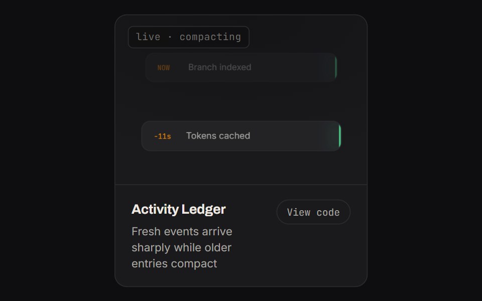 Activity LedgerKinetics · HTML/CSSFresh events arrive sharply while older entries compact
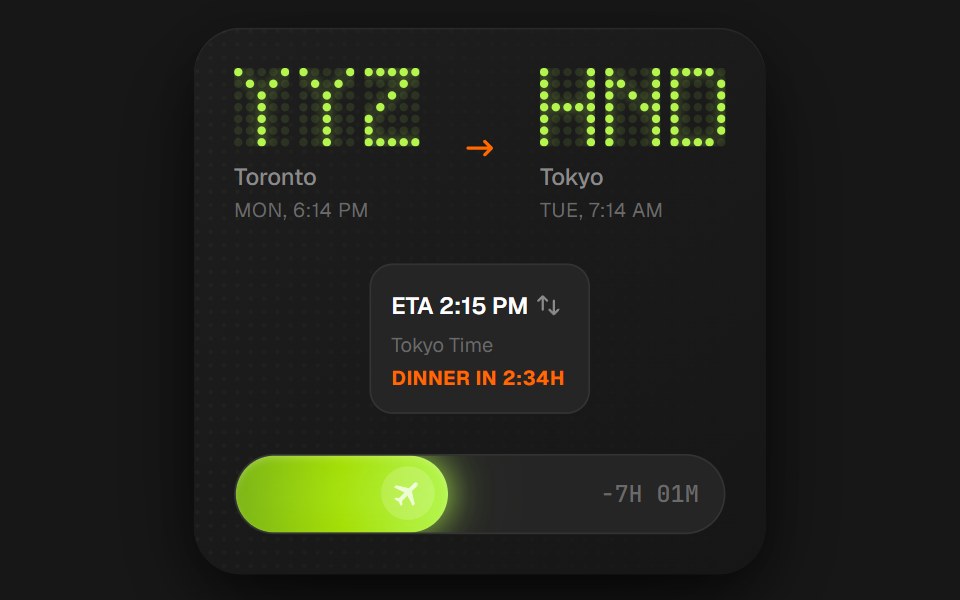 Flight Status CardComponentry · ReactA detailed card showing flight information with animations.
- List AnimationShadcn Dashboard · React
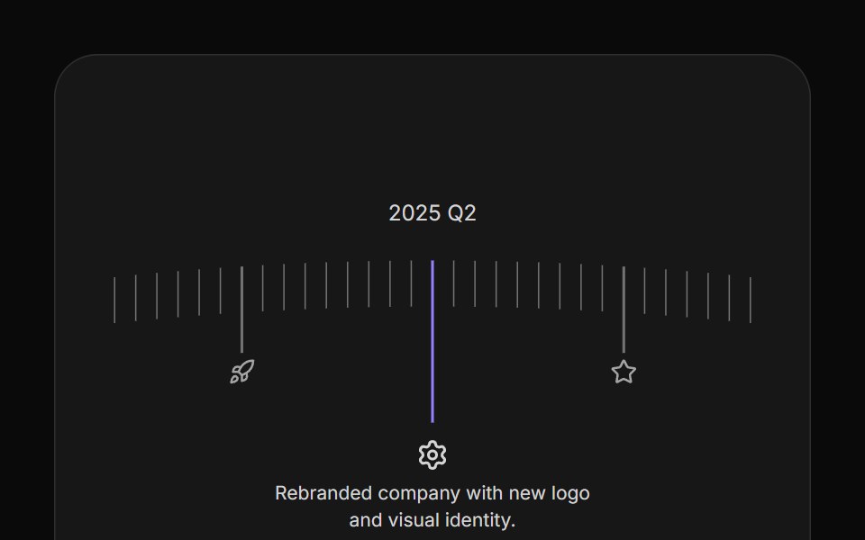 Arc TimelineAnimations (Svelte) · SvelteA curved timeline that rotates through milestone steps with clickable markers, icons, and configurable spacing.
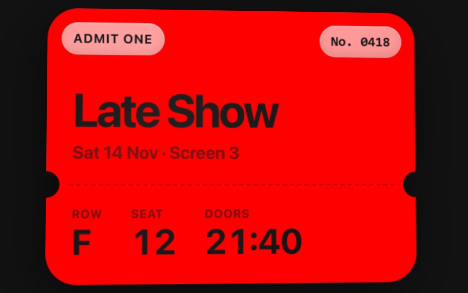 Motion CardSwiftPieces · SwiftUIA solid colour card that tilts with the device, catching a fixed light across its face and its glass chips, and…
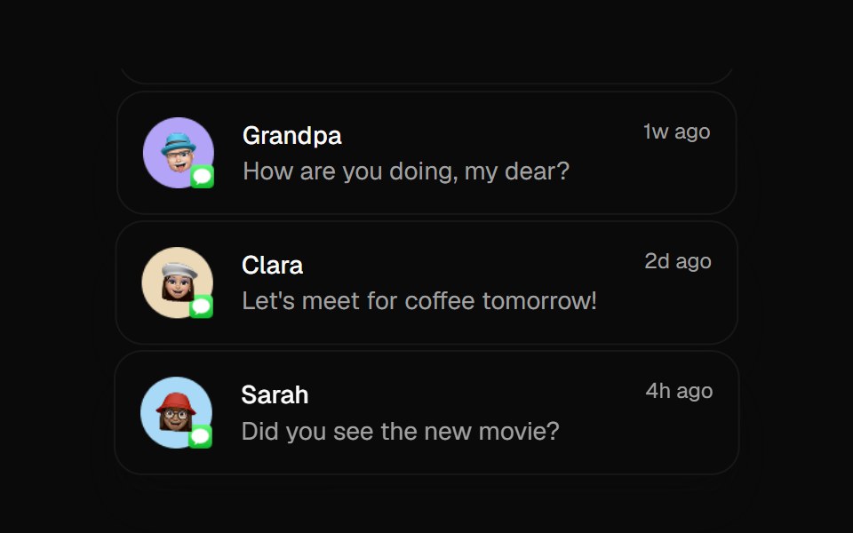 Animated ListBadtz UI · ReactA sophisticated animation component that creates dynamic column-based transitions with scaling effects. Perfect for…
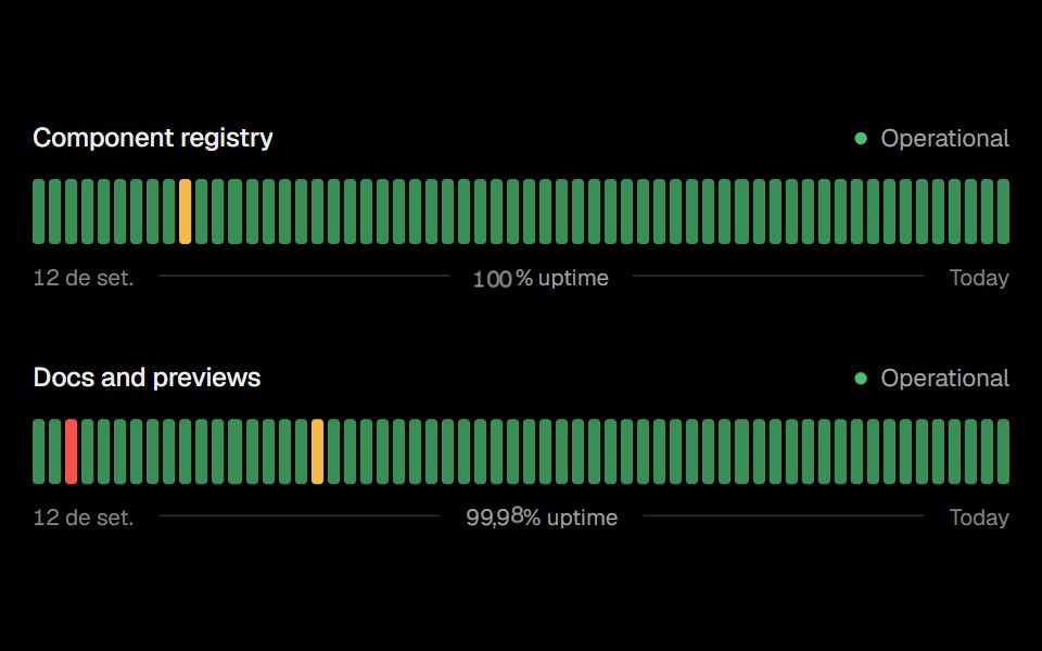 Status BarsObsidianUI · React
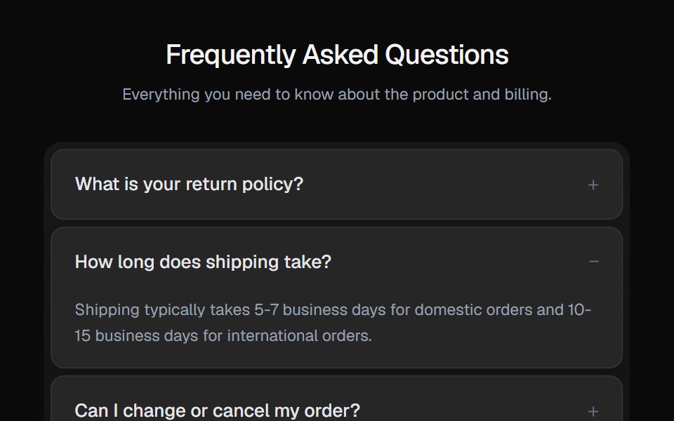 AccordionGreatUI · React
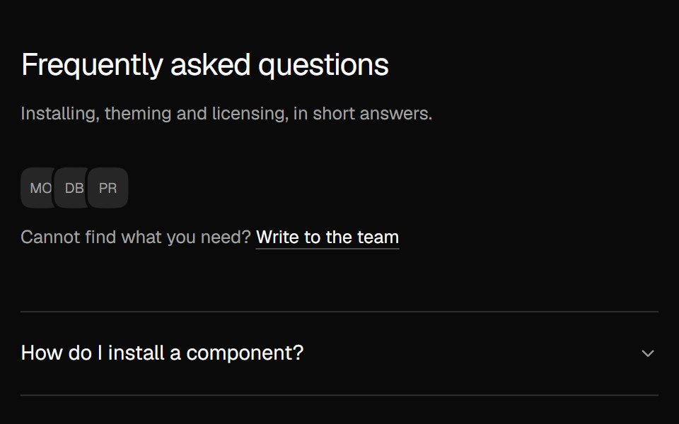 FAQ AccordionNexvyn UI · ReactA two column FAQ accordion with a contact line.
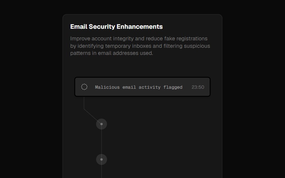 Fraud CardForge UI · ReactA security alert card inspired by Clerk's landing page, showcasing blocked emails with smooth hover animations.
 CarouselShark UI · ReactLets users cycle through a series of items.
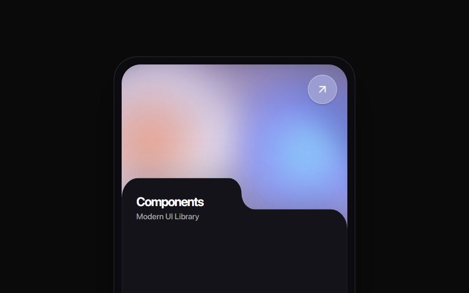 Folder Tab CardRewamp UI · ReactA modern tactile UI card featuring an ethereal animated mesh aurora gradient header, circular diagonal glass arrow…
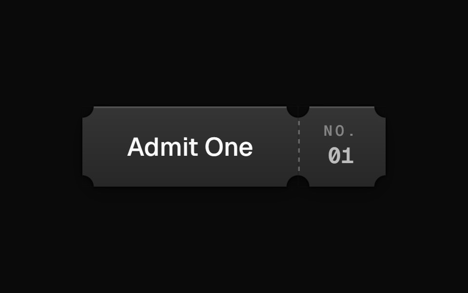 MoviePassButtonEvil Buttons · ReactA cinema ticket button that tears along its perforation on click, hinging open or snapping apart.
 Thinking ReasoningAI CSS · React
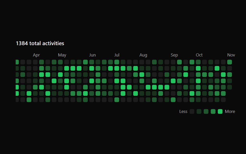 Activity GraphSona UI · ReactA keyboard-accessible calendar heatmap with normalized intensity levels and an interruptible shared focus surface.
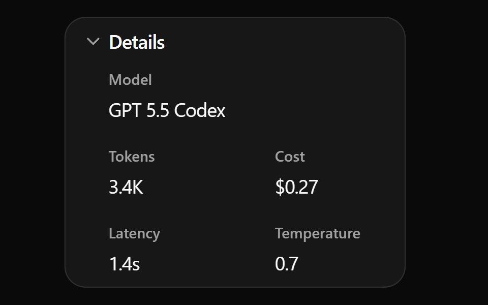 Expand Details BaseWatermelon UI · ReactCard that expands to show more details when clicked.
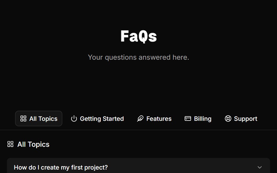 FAQ Foursv-efferd · SvelteA categorized FAQ explorer with topic switching and softly framed accordion rows.
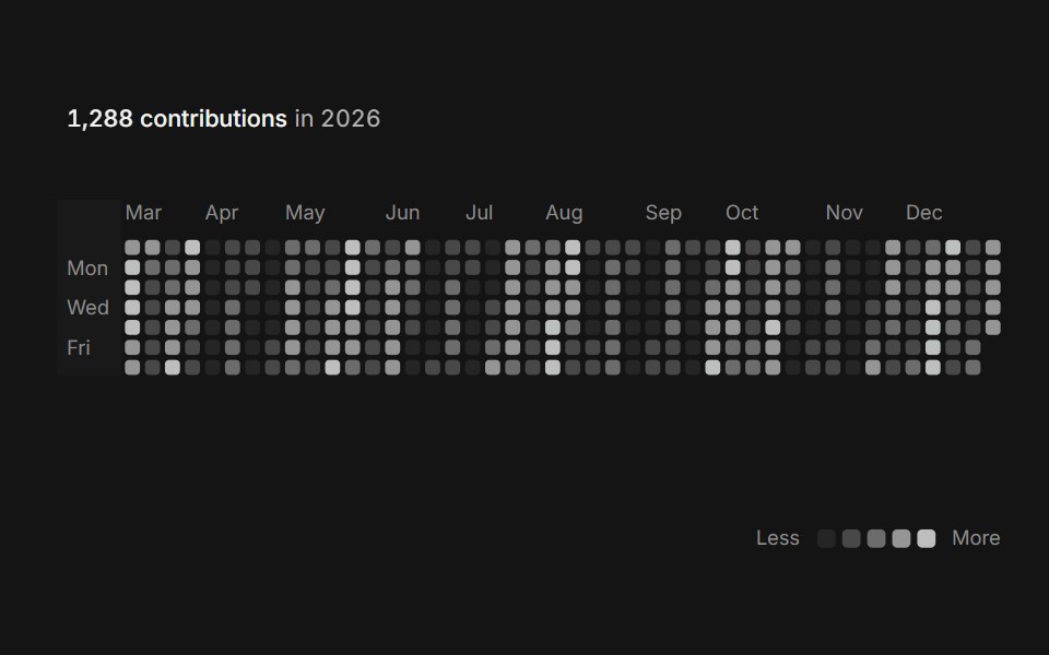 Activity heatmapArc Library · ReactSee a year of activity at a glance, one square per day.
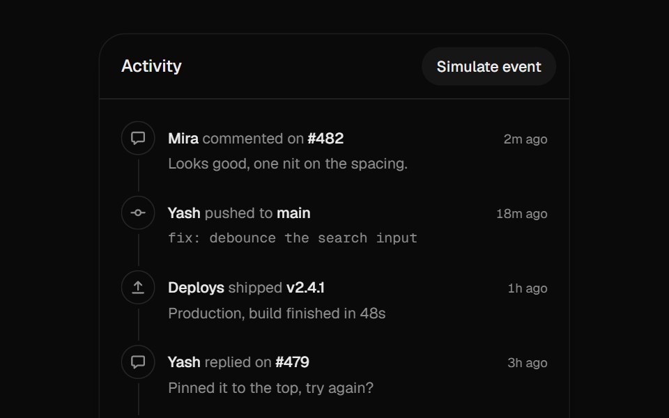 Activity TimelineUI Lab · ReactNew events slide in at the top as the line grows to meet them.
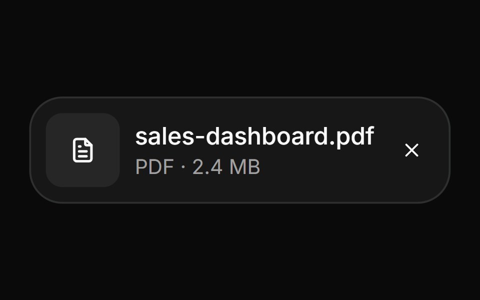 AttachmentHextaUI · ReactFile and image cards for uploads, with progress, states, actions, a full-card trigger and names that keep their…
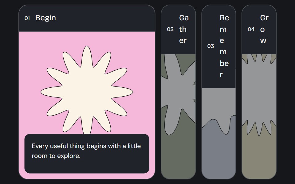 Accordion GalleryCojeev UI · ReactA selected image panel opens to reveal its label, story and action.
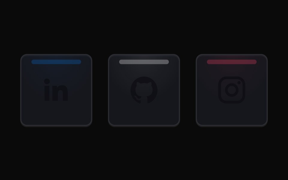 Social Highlight CardsMicroKit · ReactSocial cards with a luminous top rail, a soft brand-colored wash, and matching icons on hover.
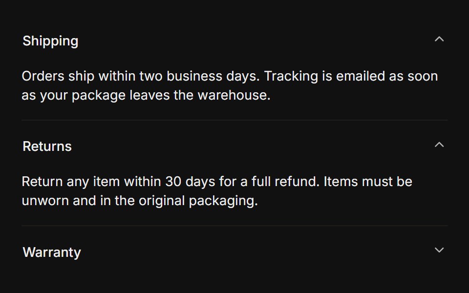 MultipleFLX UI · Reacttype="multiple" keeps several sections open at once.
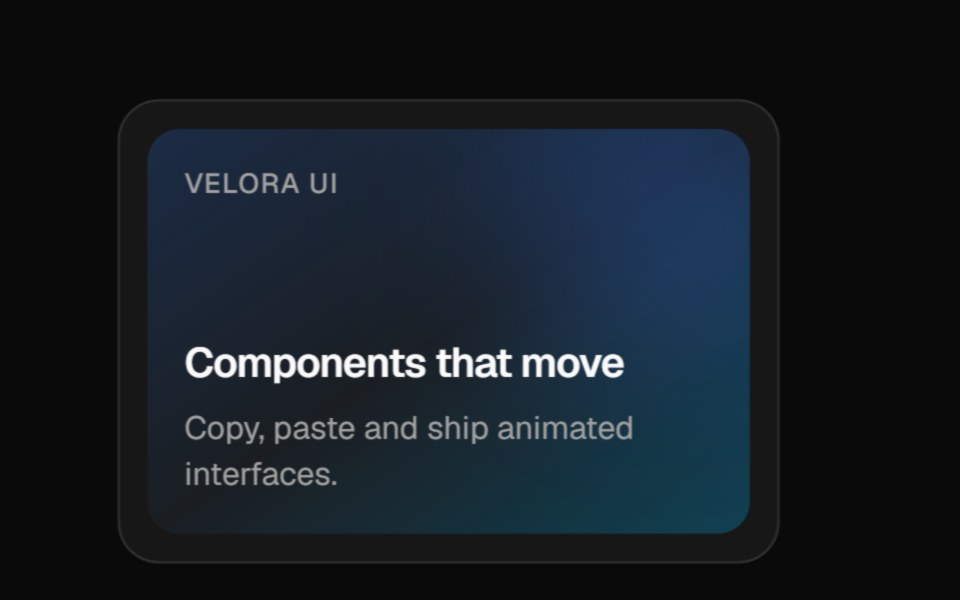 3D PinVelora UI · ReactCard that tilts back as a glowing pin rises with a label chip and rippling rings.
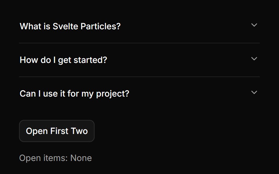 Controlledsv-particles · Svelte
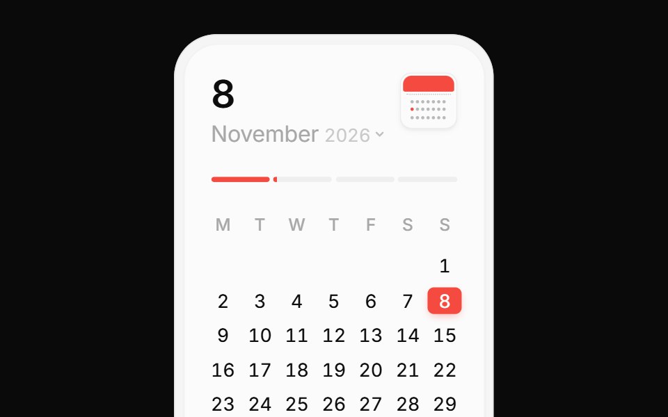 Calendar CardPin UI · React
Libraries with Animated data display components
Related categories
- Data Display Components
- React Data Display Components
- Tailwind CSS Data Display Components
- Svelte Data Display Components
- React Native Data Display Components
- shadcn/ui Data Display Components
- Animated Card Components
- Animated Chart Components
- Animated Carousel Components
- Animated Accordion Components
- Animated Stat Components
- Animated Collapsible Components
- Animated Card Stack Components
- Animated Counter Components
- Animated List Components
- Animated Avatar Components
- Animated Table Components
- Animated Tree View Components
- Animated Avatar Group Components
- Animated Line Chart Components
- Animated Timeline Components
- Animated Testimonial Components