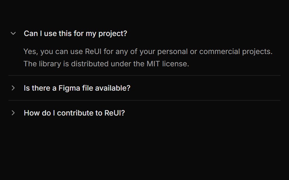
Accordion with rotating arrow indicator
Accordion with rotating arrow indicator.
- Library
- ReUI
- Framework
- React
- Type
- block
- License
- MIT
- Install
npx shadcn@latest add @reui/c-accordion-10- Files
registry-reui/bases/radix/components/accordion/c-accordion-10.tsxregistry/bases/radix/ui/accordion.tsxapp/(create)/components/icon-placeholder.tsxlib/icon-library-store.tsregistry/icons/icon-lucide.tsxregistry/icons/icon-tabler.tsxregistry/icons/icon-hugeicons.tsxregistry/icons/icon-phosphor.tsx
- Source
- https://github.com/keenthemes/reui
Categories
- Accordion Components
- React Accordion Components
- Tailwind CSS Accordion Components
- Animated Accordion Components
- Data Display Components
- React Data Display Components
- Tailwind CSS Data Display Components
- Animated Data Display Components
More from ReUI
- A basic single-expand accordion
- Accordion pattern for onboarding or setup steps with icons, badges, and QR codes
- Accordion with plus/minus indicators
- Accordion with borders and rounded corners
- Accordion embedded within a Card
- Accordion with disabled items and highlighted state
- Advanced accordion with custom icons and badges
- Accordion items integrated within Frame and FramePanel
- Nested accordion example with bordered items
- User list accordion with avatars and role indicators
- Alert
- Autocomplete