 Dev Design Library
Animated Collapsible Components
Dev Design Library indexes 67 Animated collapsible components from 26 open-source UI libraries, with the most coming from ReUI, Watermelon UI, FLX UI, Cult UI and Fluid Functionalism. Each one links to its page with the source code, a live preview where available, the library license and the install command. These are the collapsible components tagged as animated: motion on hover, on scroll or on load, usually built with CSS transitions or Framer Motion. Collapsible components belong to the Data display group.
 CollapsibleChakra UI · ReactUsed to expand and collapse additional content.
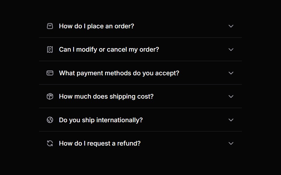 AccordionHeroUI · ReactA collapsible content panel for organizing information in a compact space
 DisclosureReact Spectrum · ReactA collapsible section of content composed of a heading that expands and collapses a panel.
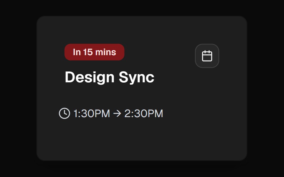 ExpandableCult UI · ReactExpandable component system with smooth animations and customizable presets
 Accordiontransitions.dev · HTML/CSS
 Basic collapsibleReUI · ReactBasic collapsible
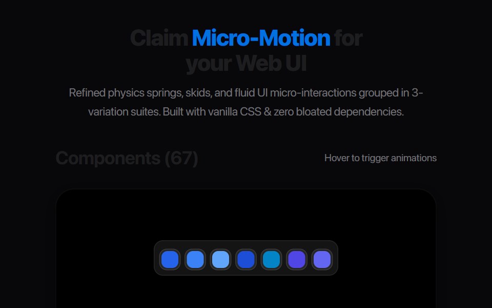 Plus Minus ToggleAmicro Micro Transitions · ReactDual square toggle buttons with solid color fills and spring micro-bounce.
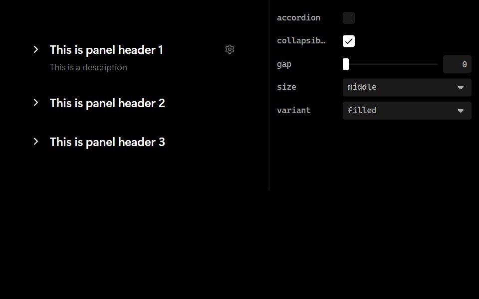 CollapseLobe UI · ReactAn expandable content container that extends Ant Design Collapse with additional styling, icons, and header…
 disclosure-groupIntent UI · Reactdisclosure-group
 Agent DisclosurebeUI · ReactShared transform-only reveal for collapsible agent content.
 Reasoning TraceSpectrum UI · ReactAn expandable chain-of-thought trace with a live thinking timer.
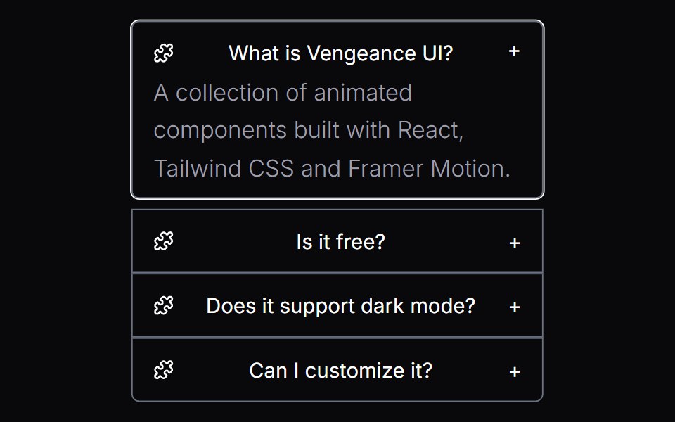 Morphing DisclosureVengeance UI · React
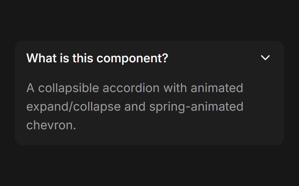 AccordionFluid Functionalism · ReactCollapsible accordion with animated height transitions, spring-animated chevron, and fluid hover in grouped mode…
 Collapsible 05 - Token UsageShadcn Space · ReactA collapsible usage card with a progress bar, summary and details.
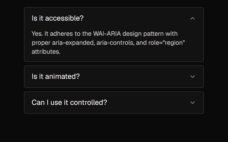 AccordionNexvyn UI · ReactA vertically stacked set of interactive headings that each reveal a section of content, with a grid-rows unfold…
 Thinking ReasoningAI CSS · React
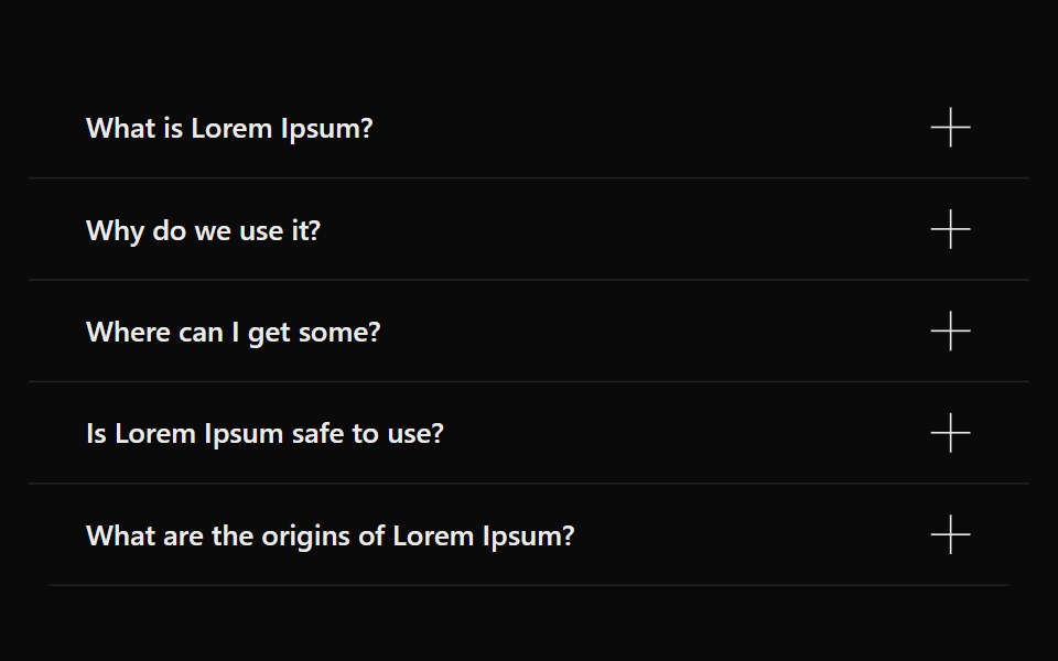 AccordionSona UI · ReactAn accessible Base UI accordion with controlled and uncontrolled state, four visual variants, interruptible disclosure…
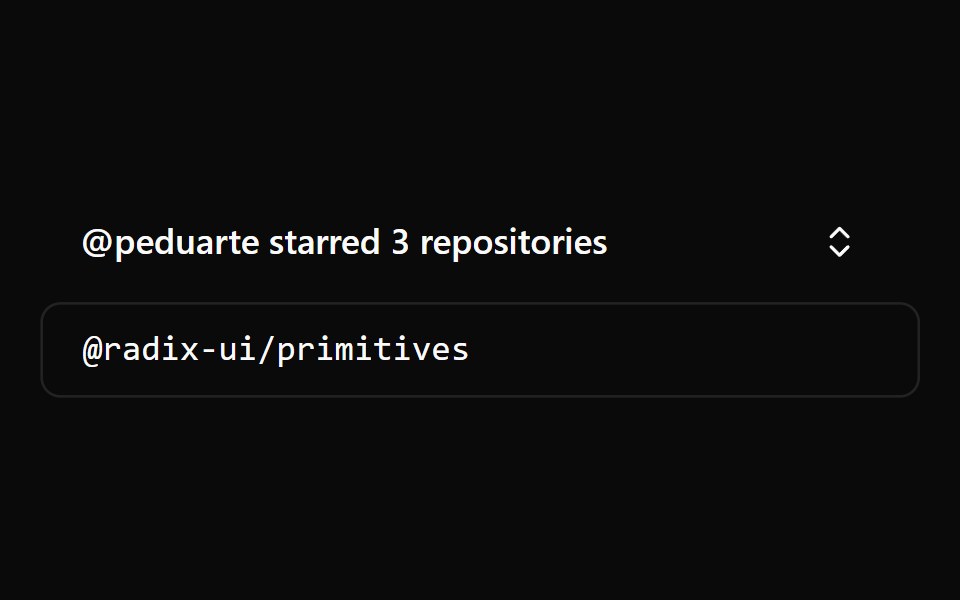 CollapsibleWatermelon UI · React
 Expandable cardArc Library · ReactGive a dense card more room when requested.
 AccordionHextaUI · ReactStacked headings that each reveal a panel, with height motion you can reverse mid-way and panels that stay searchable…
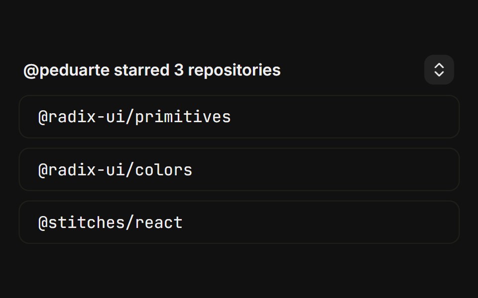 BasicFLX UI · ReactCanonical starred-repos toggle with a chevron trigger.
 Expandable CardVelora UI · ReactExpands into a centred panel with shared-layout transitions.
 Detachable AccordionSpaceUI · ReactAn interactive accordion with spring motion where the expanded item physically detaches with animated gaps and rounded…
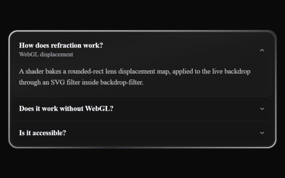 Liquid AccordionLiquefy UI · ReactAccordion in liquid glass style: translucent panels that refract the background.
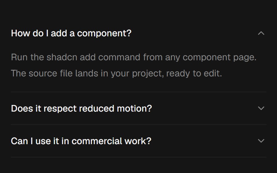 AccordionEaseUI · ReactExpanding sections that grow to their natural height with no measuring, with arrow key navigation and closed panels…
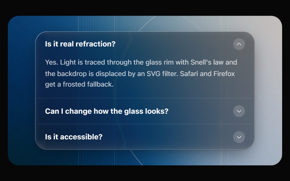 Glass AccordionOpaline · ReactCollapsible sections on one glass panel, or as separate glass cards that grow open.
 DisclosureHeroUI · ReactA disclosure is a collapsible section with a header containing a heading and a trigger button, and a panel that wraps…
 Tailwind DisclosureReact Spectrum · React
 Expandable ScreenCult UI · ReactA full-screen expandable component with morphing animations using shared layout IDs for smooth transitions
 Panel Revealtransitions.dev · HTML/CSS
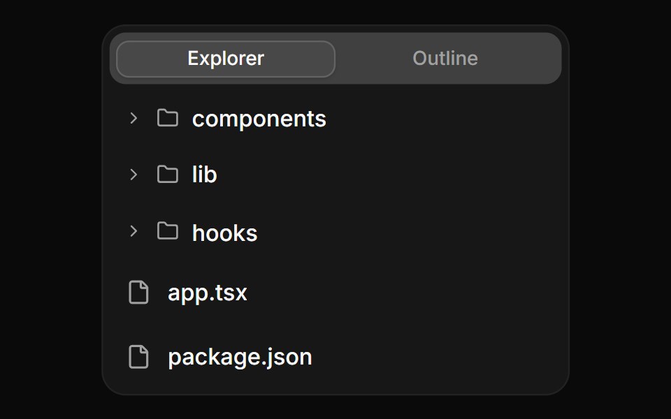 Tree view with file actionsReUI · ReactTree view with file actions
 Base Ui CollapsibleLobe UI · React
 show-moreIntent UI · Reactshow-more
 CollapsiblebeUI · ReactExpandable content with a smooth reveal.
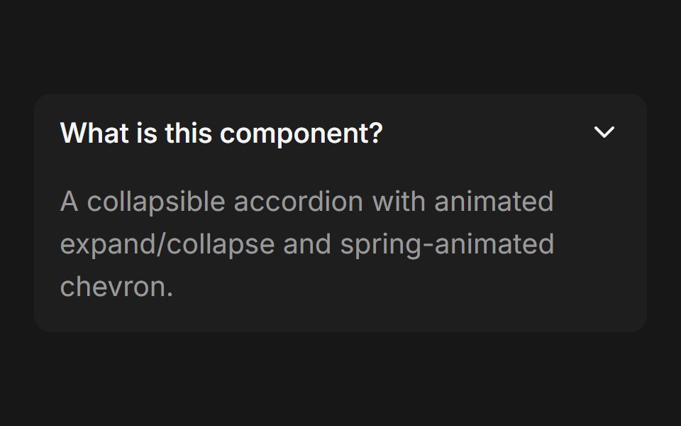 Accordion (Base UI)Fluid Functionalism · ReactCollapsible accordion with animated height transitions, spring-animated chevron, and fluid hover in grouped mode. Base…
 Sidebar CollapsibleNexvyn UI · ReactA sidebar that folds down to its icons, with recent pages and the account at the bottom.
 Collapsible 1Watermelon UI · React
 CollapsibleHextaUI · ReactA panel that shows and hides with height motion you can reverse mid-way, without jumping the layout.
 FAQ listFLX UI · ReactStacked question rows; each answer expands with an animated chevron.
 Reasoning DisclosureEaseUI · React
 Disclosure GroupHeroUI · ReactContainer that manages multiple Disclosure items with coordinated expanded states
 Vanilla DisclosureReact Spectrum · React
 Intro DisclosureCult UI · ReactIntro disclosure component with expandable content and smooth animations
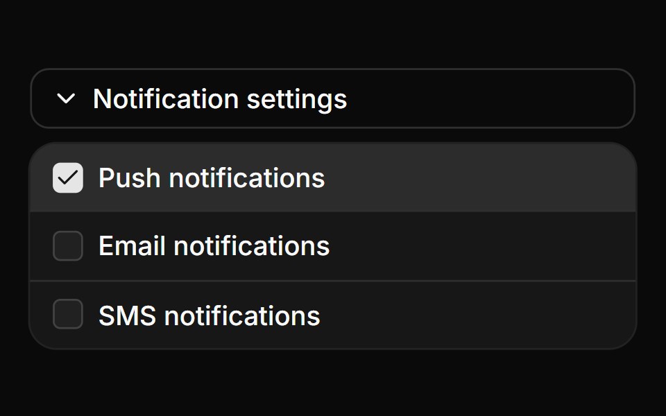 Collapsible with checkbox settingsReUI · ReactCollapsible with checkbox settings
 Tool ResultbeUI · ReactPresents the evidence produced by an active task.
 Thinking StepsFluid Functionalism · ReactCollapsible AI reasoning steps with animated expand/collapse, per-step icons, sources, and nested details. Radix flavor.
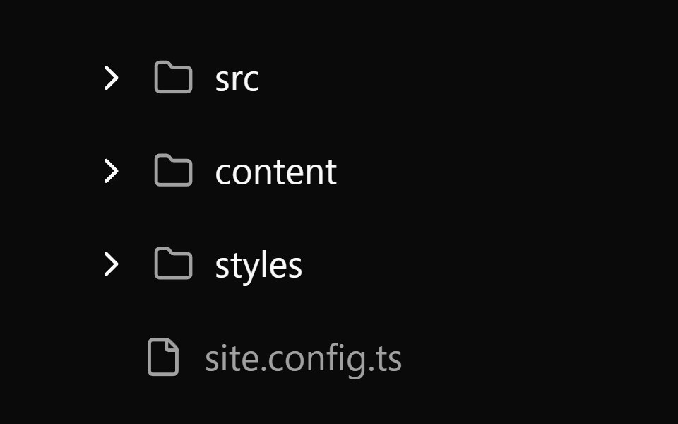 Collapsible 2Watermelon UI · React
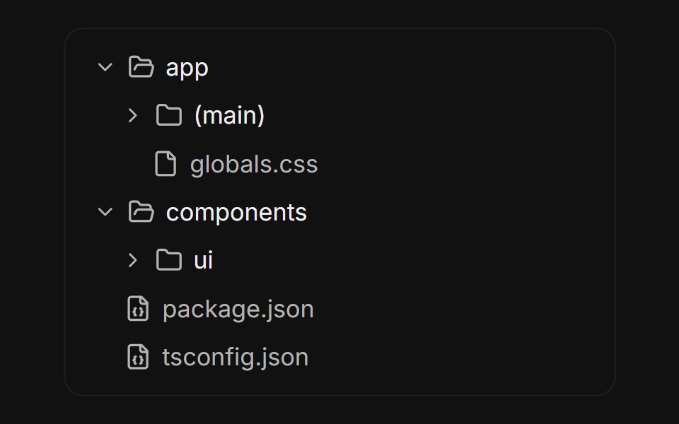 File treeFLX UI · ReactNested folders built from collapsible rows, with folder icons that swap on open.
 Wizard ExpandableCult UI · ReactExpandable multi-step wizard with optional forward validation, scrollable step rail, and Motion height transitions
 Collapsible animated cardReUI · ReactCollapsible animated card
 Thinking StepsFluid Functionalism · ReactCollapsible AI reasoning steps with animated expand/collapse, per-step icons, sources, and nested details. Base UI…
 Collapsible 3Watermelon UI · React
 Read moreFLX UI · ReactTruncated paragraph reveals the rest; trigger label swaps to Show less.
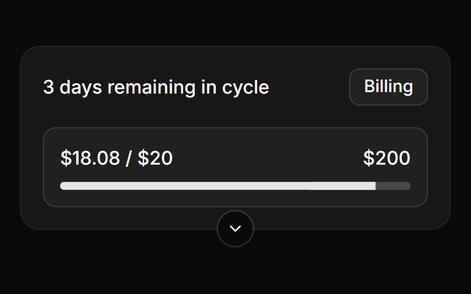 Collapsible card with bottom triggerReUI · ReactCollapsible card with bottom trigger
 Collapsible 4Watermelon UI · React
 Sidebar nav groupFLX UI · ReactCollapsible navigation sections with sub-items and a rotating chevron.
 Collapsible form fieldsReUI · ReactCollapsible form fields
 Collapsible 5Watermelon UI · React
 Advanced optionsFLX UI · ReactForm reveals extra fields behind an Advanced options toggle.
 Collapsible frameReUI · ReactCollapsible frame
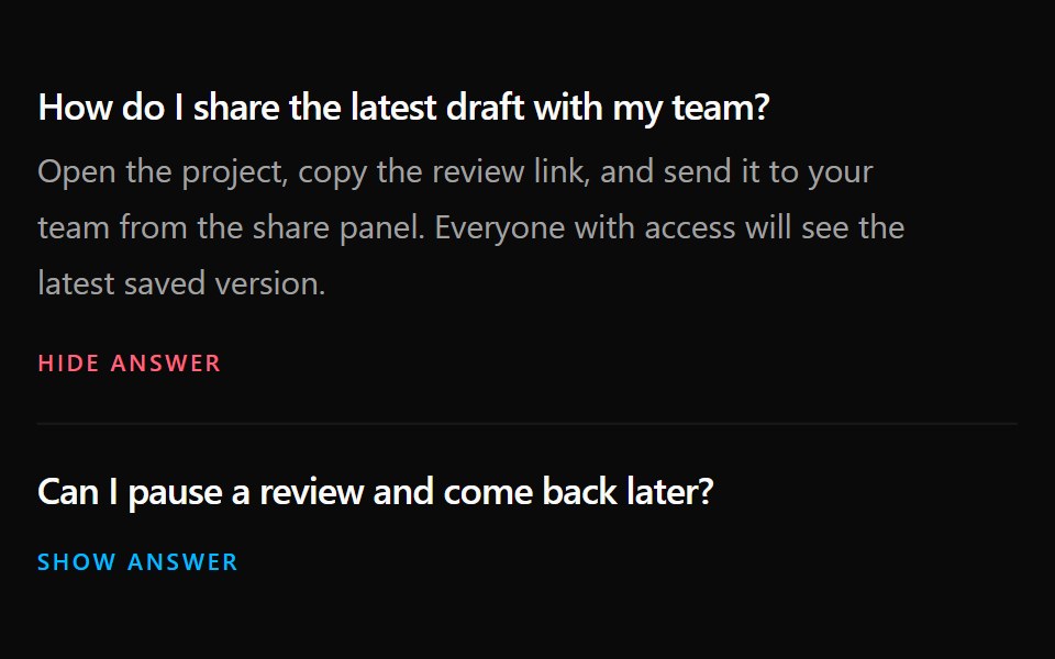 Collapsible 6Watermelon UI · React
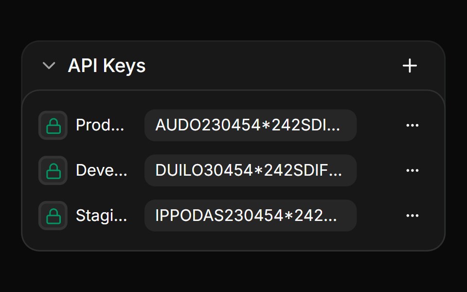 Nested collapsible list with actionsReUI · ReactNested collapsible list with actions
 Collapsible 7Watermelon UI · React
 Collapsible User profileReUI · ReactCollapsible User profile
 Collapsible 8Watermelon UI · React
 Multi-level collapsible menuReUI · ReactMulti-level collapsible menu
 Collapsible 9Watermelon UI · React
Libraries with Animated collapsible components
Related categories
- Collapsible Components
- React Collapsible Components
- Tailwind CSS Collapsible Components
- shadcn/ui Collapsible Components
- Animated Data Display Components
- Animated Card Components
- Animated Chart Components
- Animated Carousel Components
- Animated Accordion Components
- Animated Stat Components
- Animated Card Stack Components
- Animated Counter Components
- Animated List Components
- Animated Avatar Components
- Animated Table Components
- Animated Tree View Components
- Animated Avatar Group Components
- Animated Line Chart Components
- Animated Timeline Components
- Animated Testimonial Components