 Dev Design Library
Animated Card Components
Dev Design Library indexes 297 Animated card components from 50 open-source UI libraries, with the most coming from React Bits, Spectrum UI, Amicro Micro Transitions, Velora UI and ReactFrame. Each one links to its page with the source code, a live preview where available, the library license and the install command. These are the card components tagged as animated: motion on hover, on scroll or on load, usually built with CSS transitions or Framer Motion. Card components belong to the Data display group.
Showing 120 of 297, a mix from every library. Open a library to see all of its components.
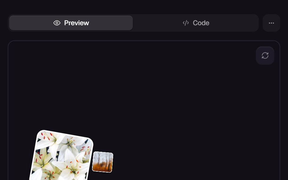 Bounce CardsReact Bits · ReactCards bounce that bounce in on mount.
 Magic CardMagic UI · ReactA spotlight effect that follows your mouse cursor and highlights borders on hover.
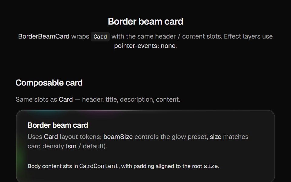 Border Beam CardCult UI · Reactborder-beam around compound Card API with balanced title and description
 3D Tilttransitions.dev · HTML/CSS
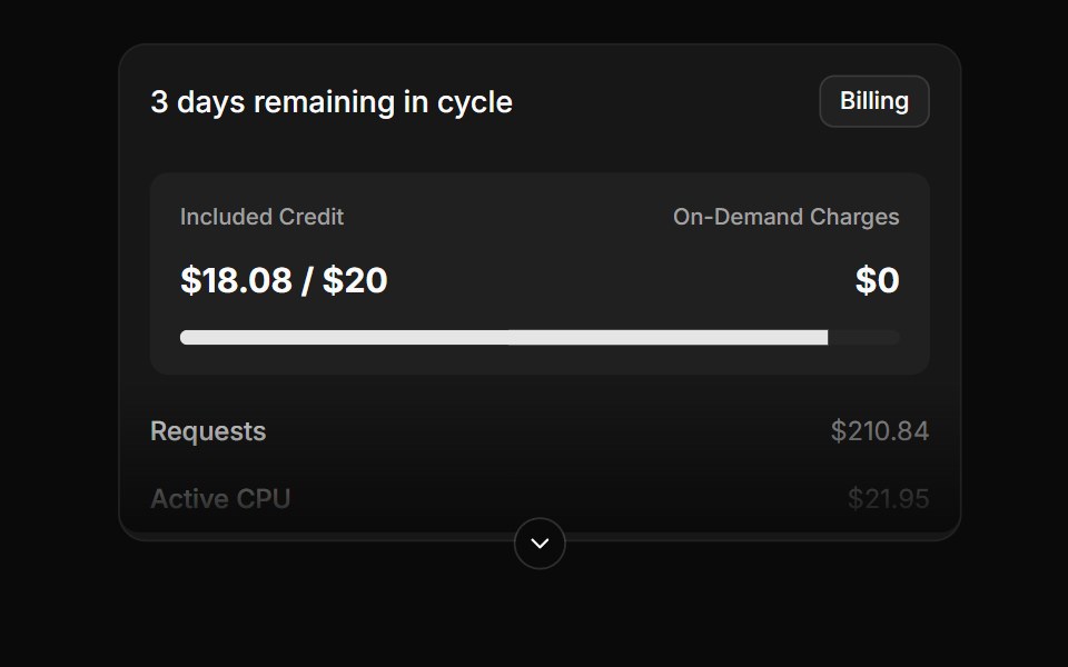 Expandable billing usage cardReUI · ReactExpandable billing usage card
 Card Cascade StaggerAmicro Micro Transitions · ReactStack of cards that cascade into place one after another.
 Awesome Spotlight CardLobe UI · React
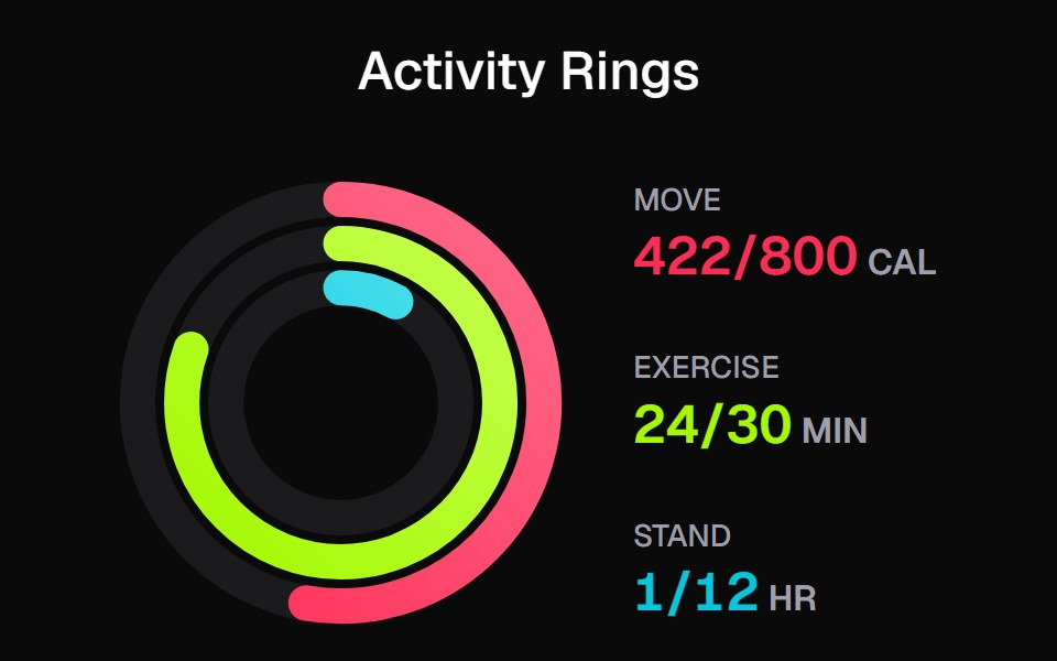 Apple Activity CardKokonut UI · ReactActivity rings that draw with a count-up, lap past 100% with a shadowed end cap and dim to focus, built with React and…
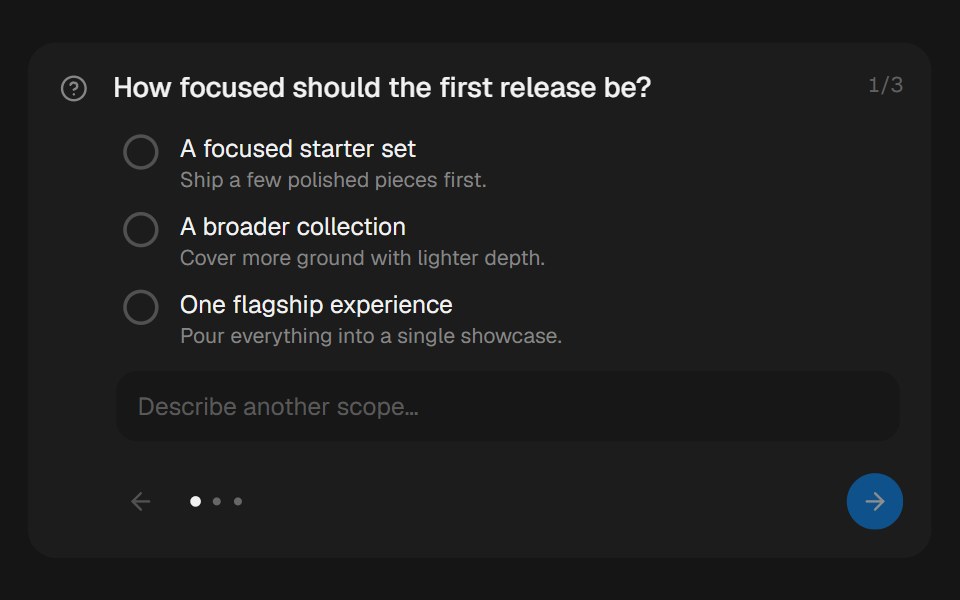 Approval CardbeUI · ReactCollects structured human input during a paused run.
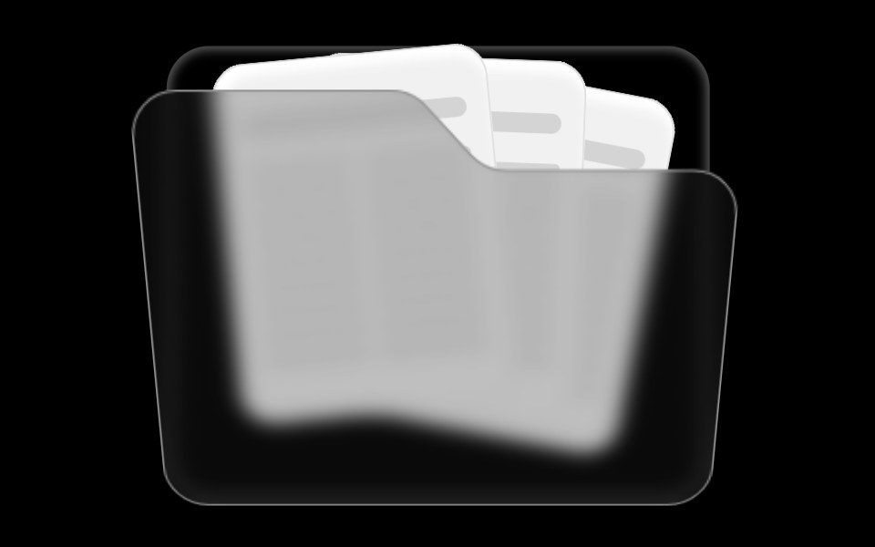 Folder ComponentRare UI · ReactAn animated folder whose cards fan out on hover and lift open on click, with a 3D-tilted flap. Supports color and size…
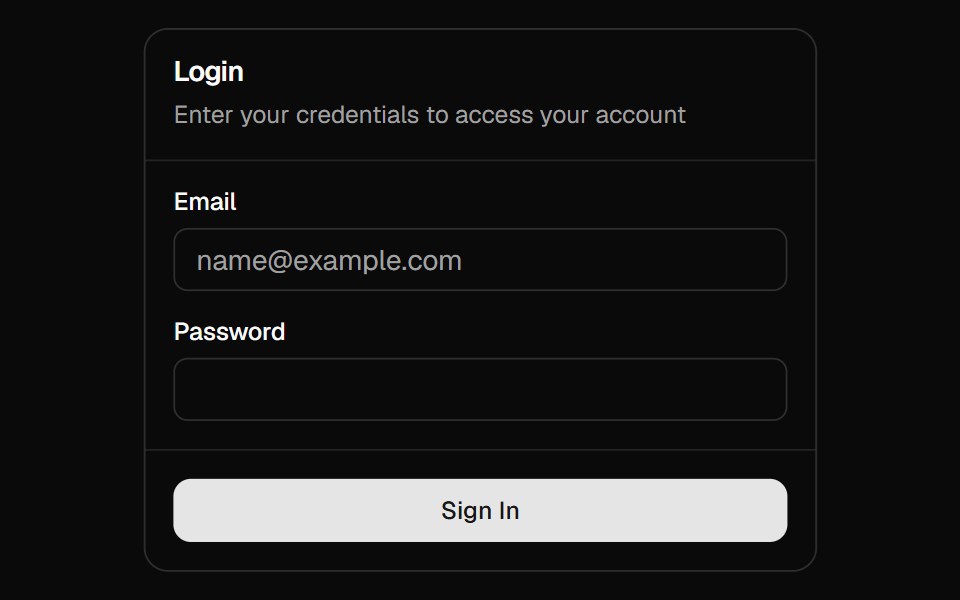
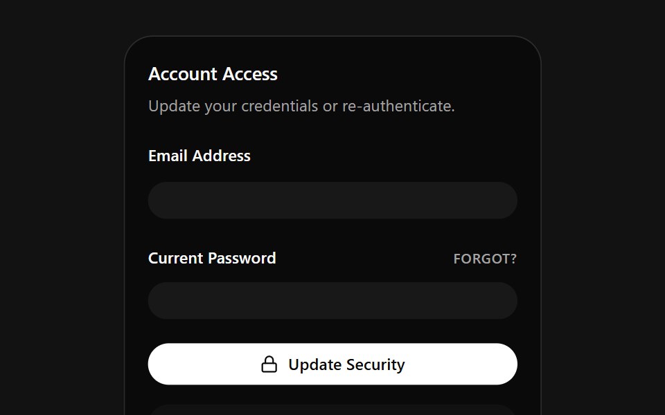 Account Access CardSpectrum UI · ReactA credentials card that auto-fills email and password on a loop, with a danger zone.
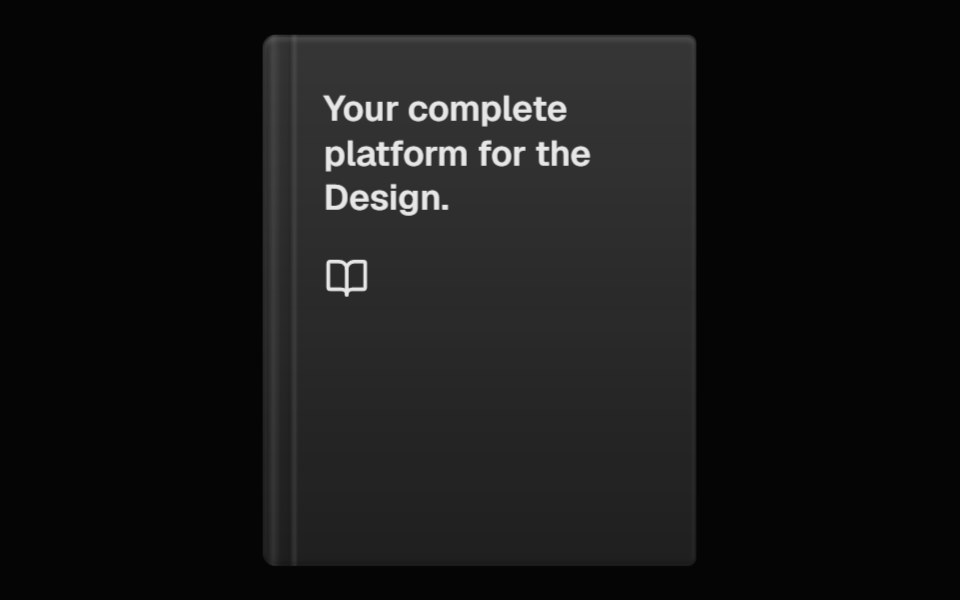 Perspective BookSpell UI · ReactA 3D book component with hover animation and customizable appearance.
 Cursor CardVengeance UI · ReactInline text link with cursor tracking preview card
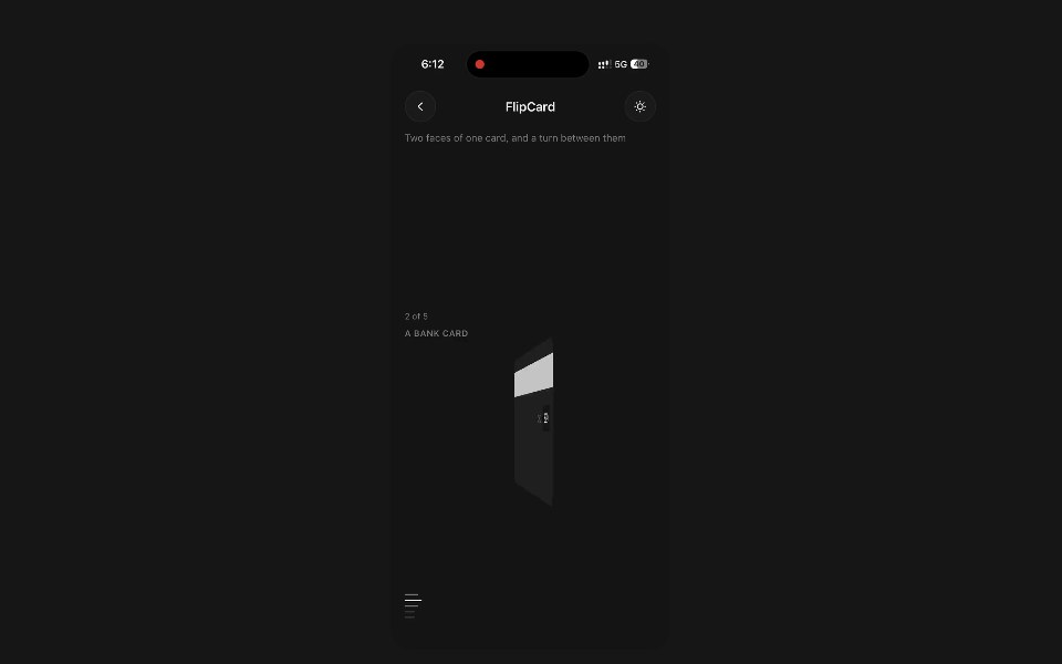 Flip CardPanel UI · React NativeTwo faces of one card, and a turn between them.
 Card-01 - ArticlePreviewCardShadcn Space · ReactCard component
 Card AnimationPixel Perfect · ReactFramer Motion card animation.
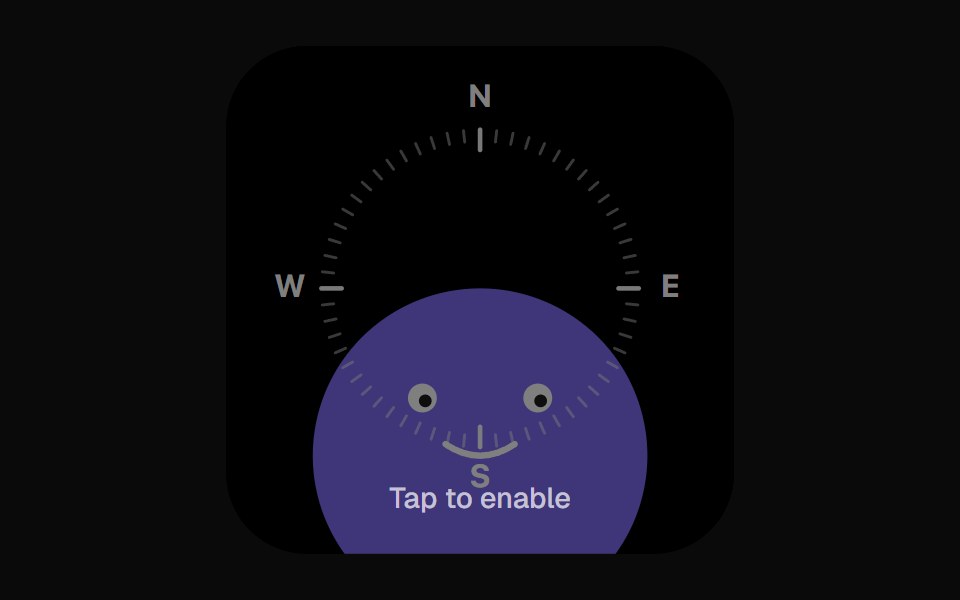 Compass WidgetOpenSourceUI · React
 Accessible Actionuselayouts · ReactInteractive draggable card stack with 3D tilt, swipe-to-back gestures, click interactions, random rotation, and smooth…
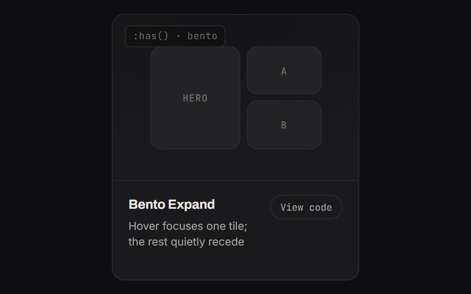 Bento ExpandKinetics · HTML/CSSHover focuses one tile; the rest quietly recede
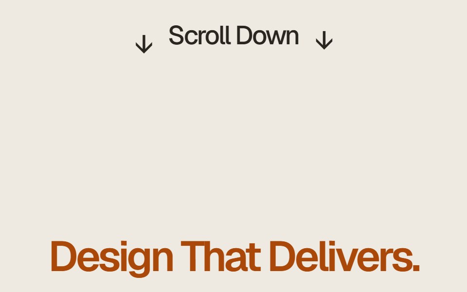 Case Study Flip StackComponentry · ReactEditorial case study cards that fold upward on scroll to reveal the next story.
 Testimonial Fivecnblocks · SvelteTestimonial carousel with navigation
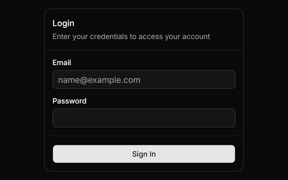 Magic CardAnimations (Svelte) · SvelteA spotlight effect that follows your mouse cursor and highlights borders on hover.
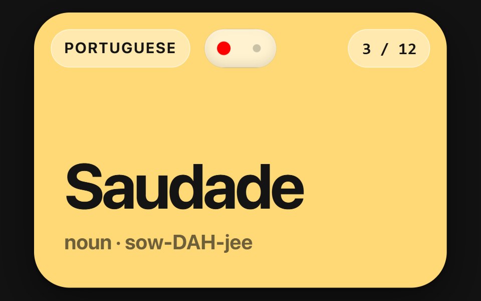 Flip CardSwiftPieces · SwiftUIA two-sided card you flip by tap or drag, scrubbing the turn and carrying the flick into the landing, with a lift and…
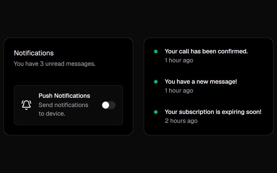 Cursor CardsBadtz UI · ReactInteractive cards with animated gradient borders that respond to cursor movement and proximity. Inspired by Cursor's…
 CardGreatUI · React
 Expandable CardForge UI · ReactInteractive UI component to expand cards with smooth animations and detailed content using layout transitions.
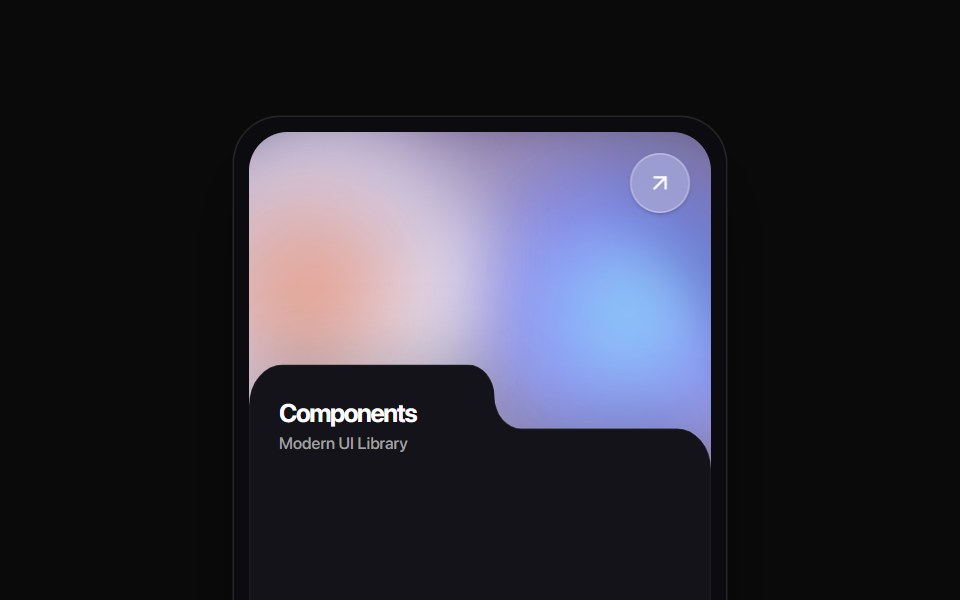 Folder Tab CardRewamp UI · ReactA modern tactile UI card featuring an ethereal animated mesh aurora gradient header, circular diagonal glass arrow…
 MoviePassButtonEvil Buttons · ReactA cinema ticket button that tears along its perforation on click, hinging open or snapping apart.
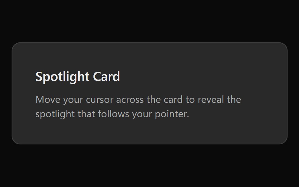 Spotlight CardSona UI · ReactA card with a radial spotlight glow that follows the cursor.
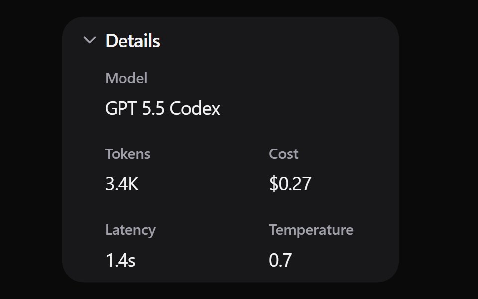 Expand DetailsWatermelon UI · ReactCard that expands to show more details when clicked.
 Pricing Foursv-efferd · SvelteAn animated pricing table with monthly-yearly toggles, live number transitions, and motion badges.
 Blog gridArc Library · ReactA blog index with a featured post, category filter, post cards, pagination and an in-place reader.
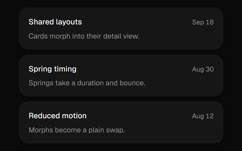 Expanding CardUI Lab · ReactGrows from its slot into a detail view and folds back when you are done.
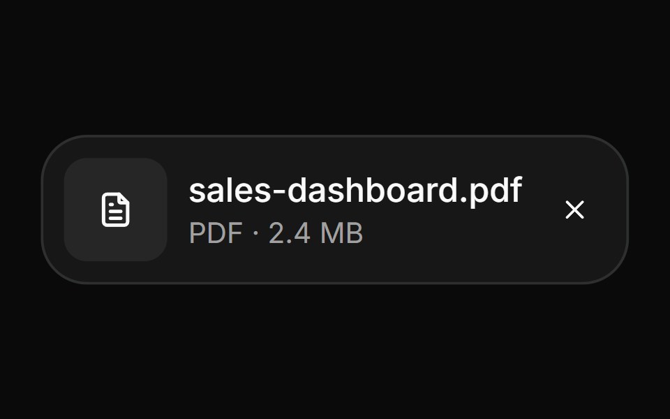 AttachmentHextaUI · ReactFile and image cards for uploads, with progress, states, actions, a full-card trigger and names that keep their…
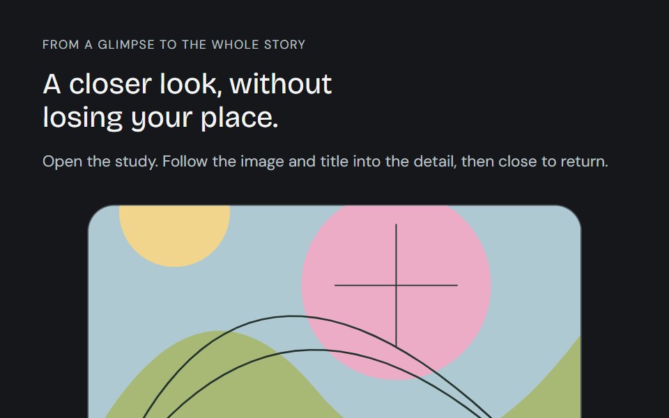 Linear ModalCojeev UI · ReactFollow a card, image and title into a full detail, then back. Card, Centered and browsable Gallery preserve the…
 Social Highlight CardsMicroKit · ReactSocial cards with a luminous top rail, a soft brand-colored wash, and matching icons on hover.
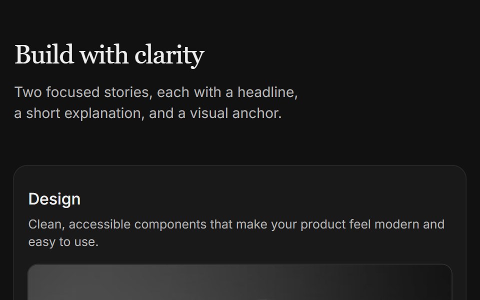 Content 04FLX UI · ReactTwo-column card grid with a serif section header and copy above each image.
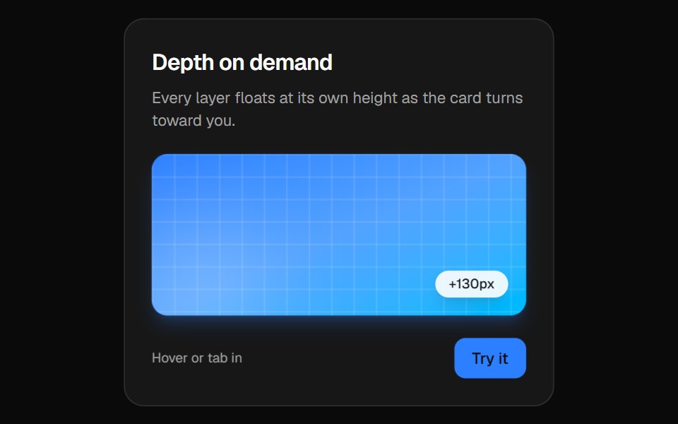 3D CardVelora UI · ReactPerspective card that turns toward the pointer while its layers lift to different depths.
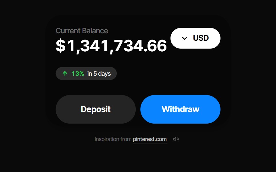 Balance CardPin UI · React
 Card InfoSpaceUI · ReactResponsive feature and philosophy cards with gradient icons, clean typography, and layered container aesthetics.
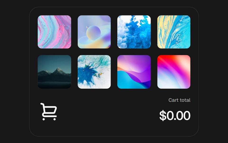 Add to CartSkecher UI · ReactAn interactive product grid with curved add-to-cart flights, a responsive cart stack, and an animated currency total.
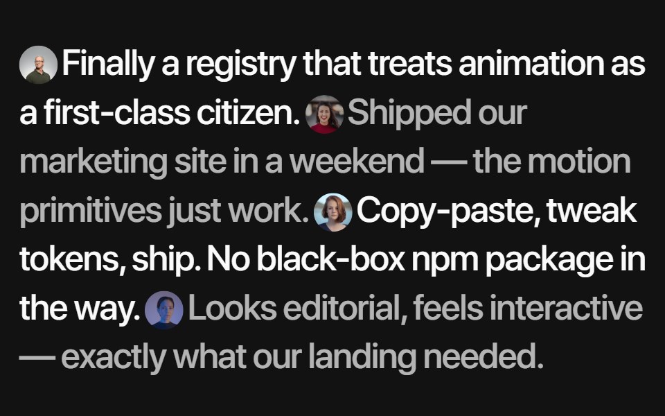 Inline TestimonialsSora UI · ReactA flowing quote stream where each avatar reveals its author on hover, with Motion fading and blurring the rest.
 Crypto SwitchZAYX · React NativeA crypto swap card: pick the coin you pay and the one you receive, flip them with a spring, and send.
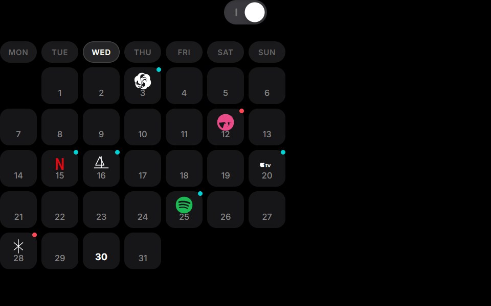 Cell To Card Calendar ExpansionCue Foundations · React
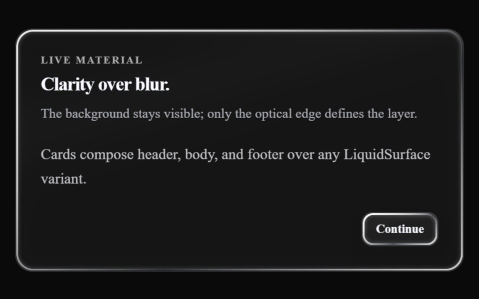 Glass CardLiquefy UI · React
 Moon TileD2Studio UI · ReactA night tile: a crescent moon rises over a bank of clouds, then the clouds sway in parallax while a sparkle twinkles…
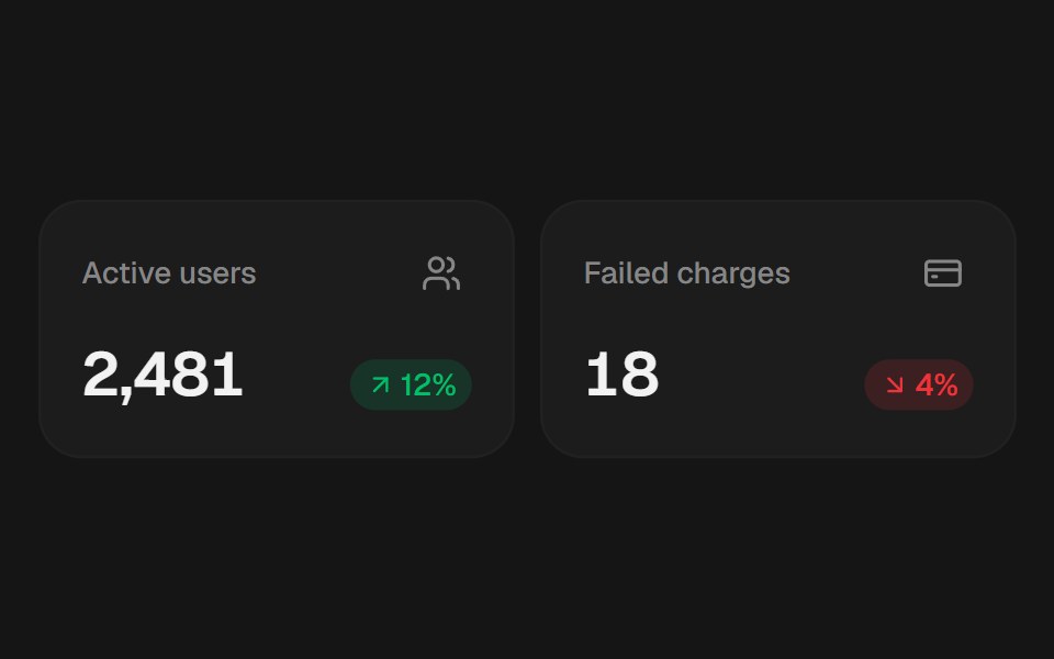 Insight CardEaseUI · ReactA stat tile: a label, a headline value, and an optional trend pill. Pass a Number Ticker as the value to have it roll…
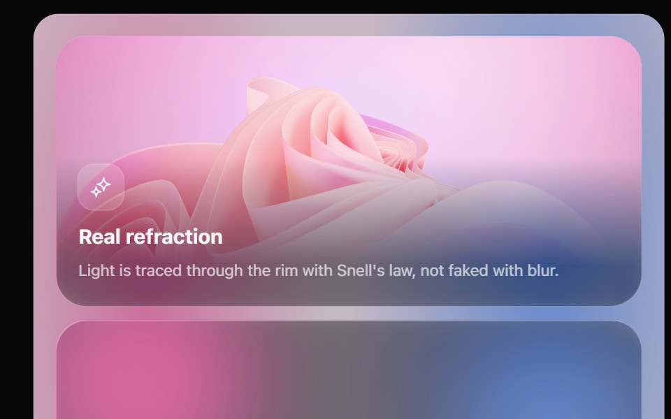 Glass Bento GridOpaline · ReactFeature tiles on glass in a bento layout, with a pointer light and a call to action that slides in.
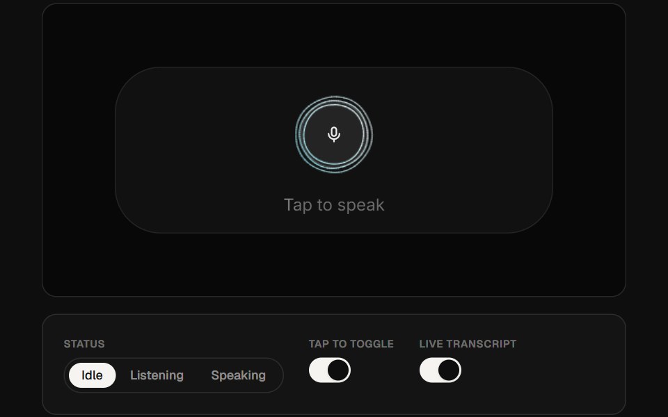 AI Voice 05ReactFrame · ReactA portrait voice-assistant card with a canvas audio-reactive curve visualizer, a mic button that grows on tap…
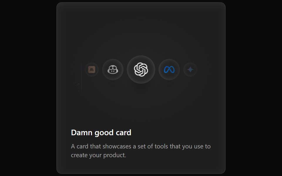 Cards Demo 3Aceternity UI · ReactFeature Block Animated Card
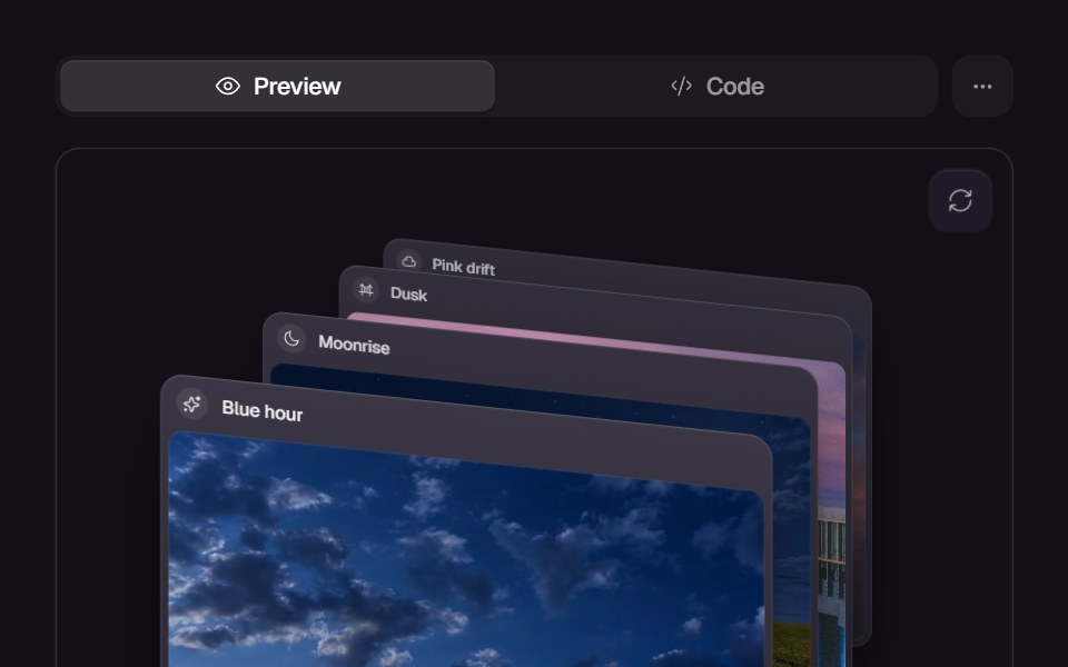 Card SwapReact Bits · ReactCards animate position swapping with smooth layout transitions.
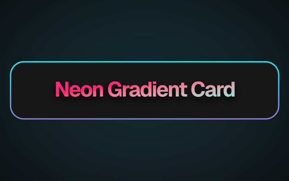 Neon Gradient CardMagic UI · ReactA beautiful neon card effect
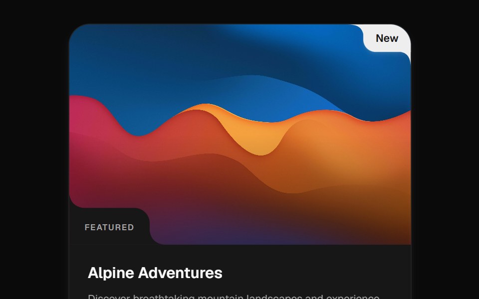 Cutout CardCult UI · ReactImage card with cutout corners, hover motion, inset labels, pins, and reveal actions
 Card Resizetransitions.dev · HTML/CSS
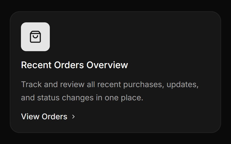 Card with icon, title and linkReUI · ReactCard with icon, title and link
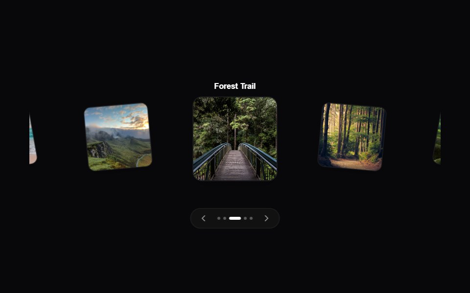 Interactive 3D CarouselAmicro Micro Transitions · ReactAn interactive arc-based 3D motion carousel featuring smooth dot indicators and dynamic prev/next controls.
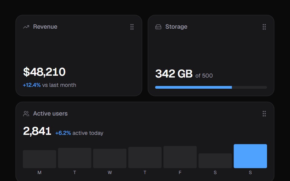 Widget GridKokonut UI · ReactDashboard widgets you lift, drag and resize on a 6-column grid, with spring physics and full keyboard support.
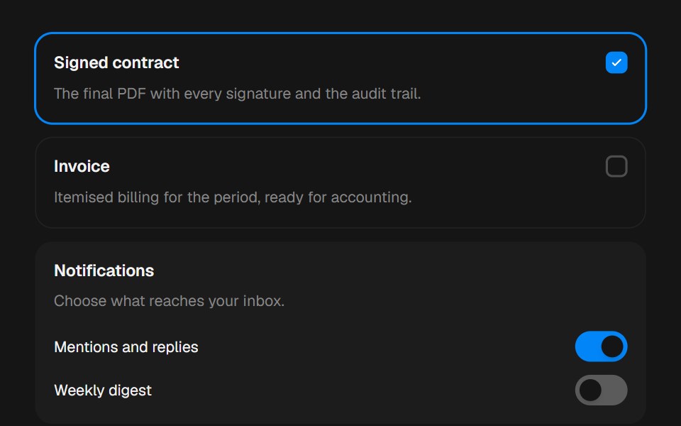 CardbeUI · ReactComposable surfaces, selectable with press feedback.
 AI Chat CardSpectrum UI · ReactAn AI chat card that types prompts into its composer, with send, attach and reset actions.
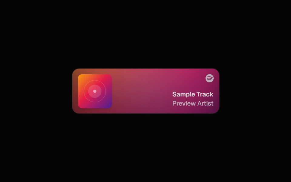 Spotify CardSpell UI · ReactDisplay Spotify tracks with album art and blurred background.
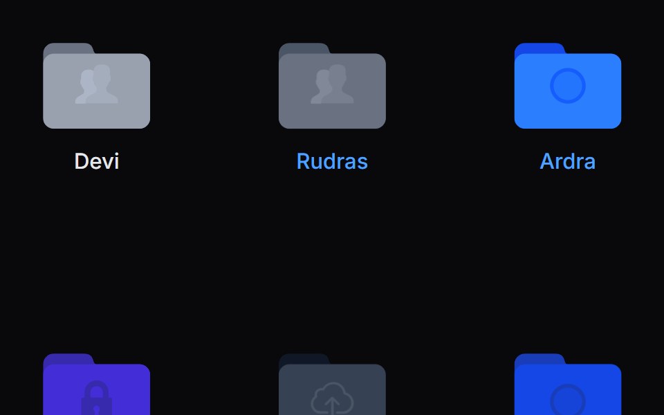 Folder PreviewVengeance UI · ReactFolder stack visual preview
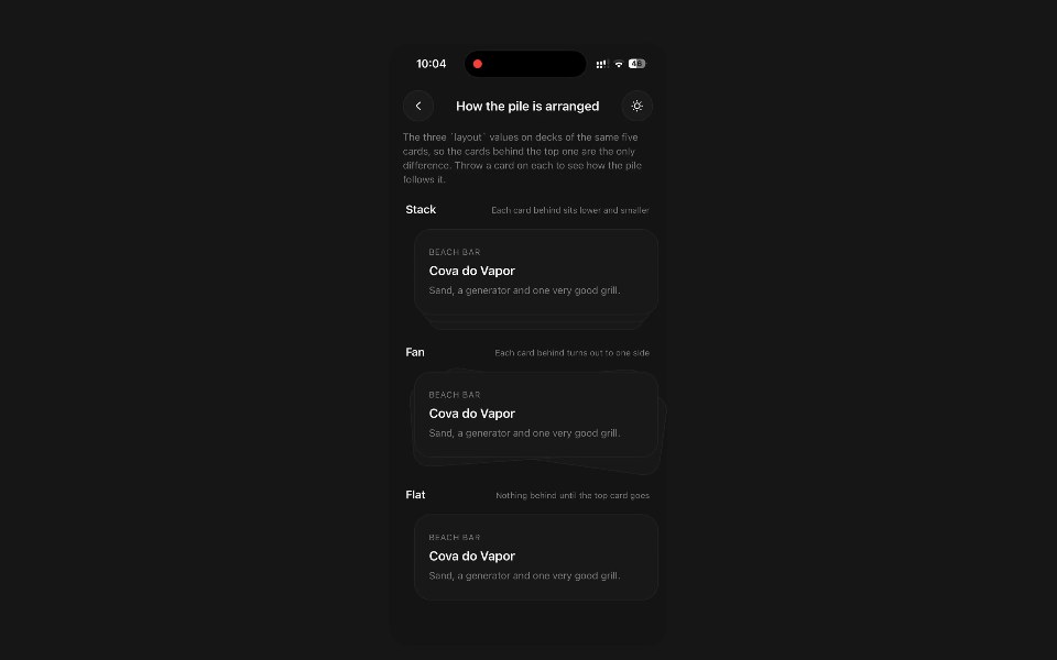 Stack CardPanel UI · React NativeA pile of cards, taken one at a time by throwing the top one off.
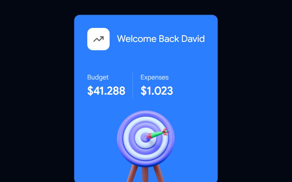 Card-04 - Welcome CardShadcn Space · ReactCard component
 Card ScanPixel Perfect · ReactHover it and it turns holographic: thin-film foil that shifts as you move, light rippling out from the cursor, and a…
 Event Countdown CardOpenSourceUI · React
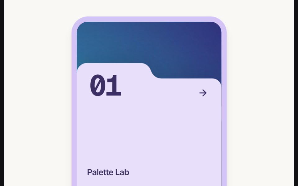 Card Folderuselayouts · ReactThis component creates an animated folder-style card with a background image, floating 3D object, hover effects, and…
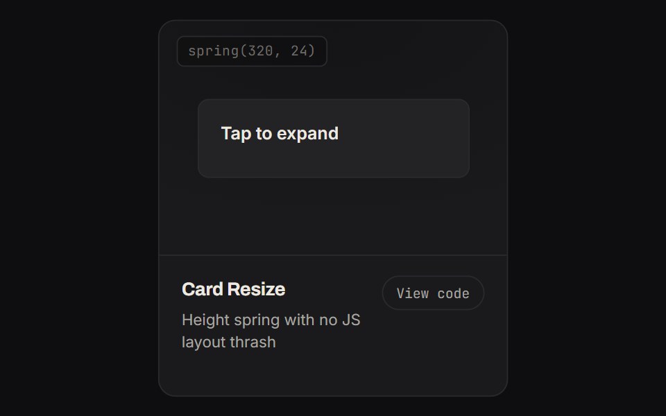 Card ResizeKinetics · HTML/CSSHeight spring with no JS layout thrash
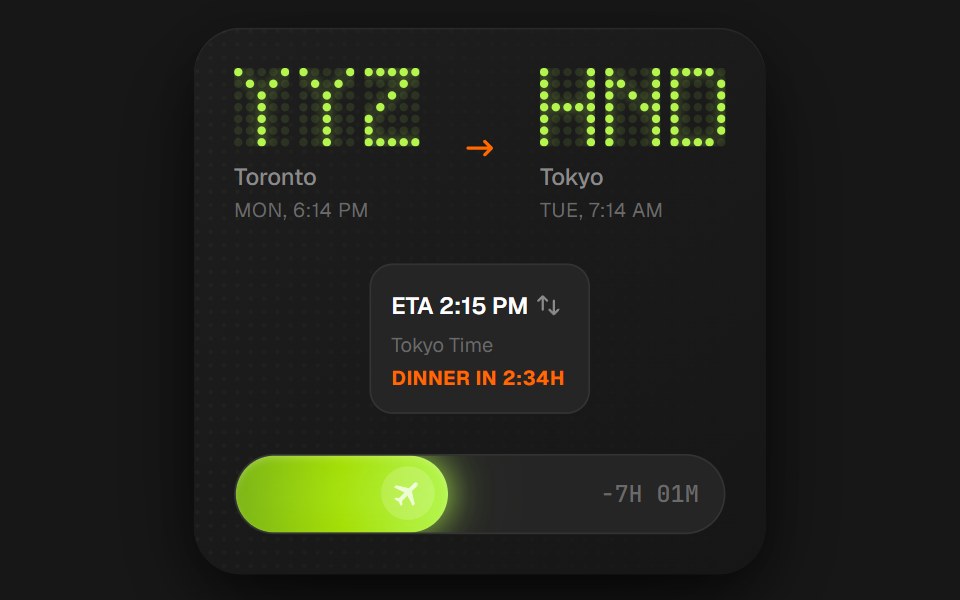 Flight Status CardComponentry · ReactA detailed card showing flight information with animations.
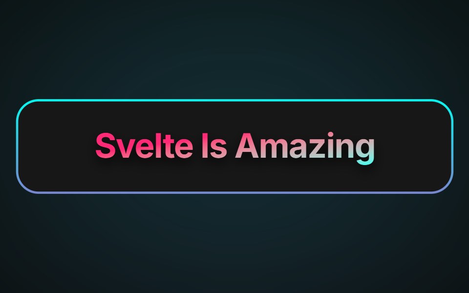 Neon Gradient CardAnimations (Svelte) · SvelteA card component with animated neon gradient borders and customizable colors, border size, and radius.
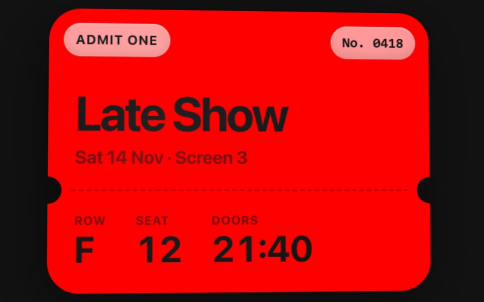 Motion CardSwiftPieces · SwiftUIA solid colour card that tilts with the device, catching a fixed light across its face and its glass chips, and…
 Expandable CardBadtz UI · ReactA versatile and engaging UI component that allows users to explore content in a more immersive way.
 Facebook CardGreatUI · React
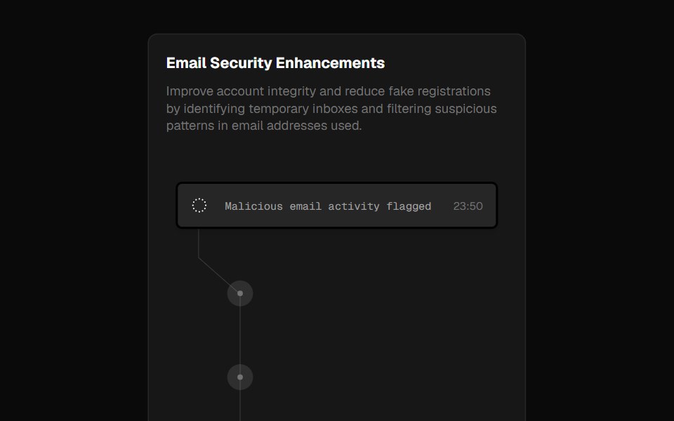 Fraud CardForge UI · ReactA security alert card inspired by Clerk's landing page, showcasing blocked emails with smooth hover animations.
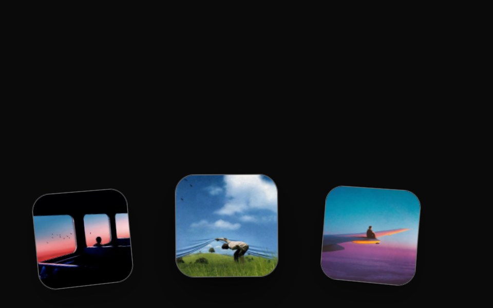 Orbital Card ArchRewamp UI · ReactExact recreation of Recording 2026-09-15 154820.mp4: Cards gliding along a panoramic 3D curved horizon cylinder…
 Cursor Hover CardSona UI · React
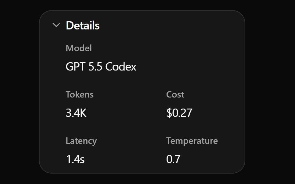 Expand Details BaseWatermelon UI · ReactCard that expands to show more details when clicked.
 CardArc Library · ReactA contained group of related content and actions.
 Flip CardUI Lab · ReactTurns over in 3D to show what is on the back.
 Content 05FLX UI · ReactA focus grid with items that can be focused and dimmed.
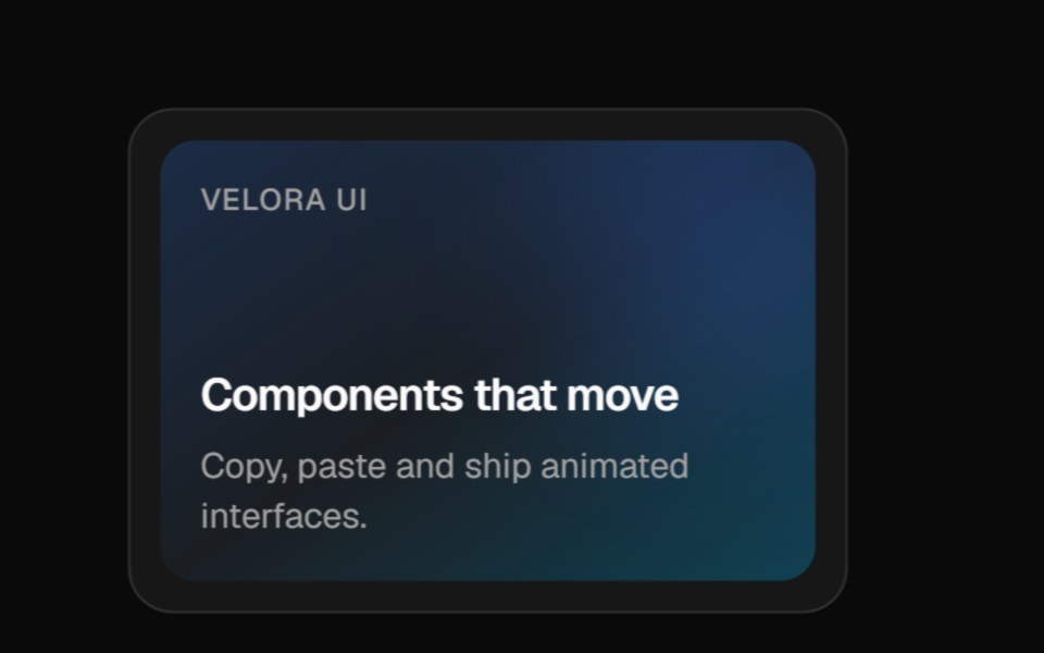 3D PinVelora UI · ReactCard that tilts back as a glowing pin rises with a label chip and rippling rings.
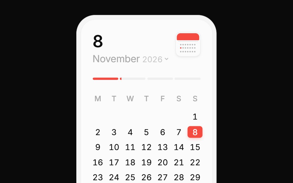 Calendar CardPin UI · React
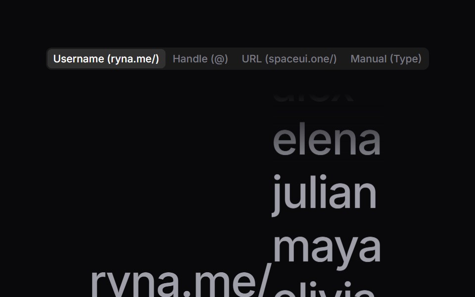 Handle ReelSpaceUI · ReactKinetic tumbler reel that spins a vertical reel of names past a prefix, highlighting the centered handle as it…
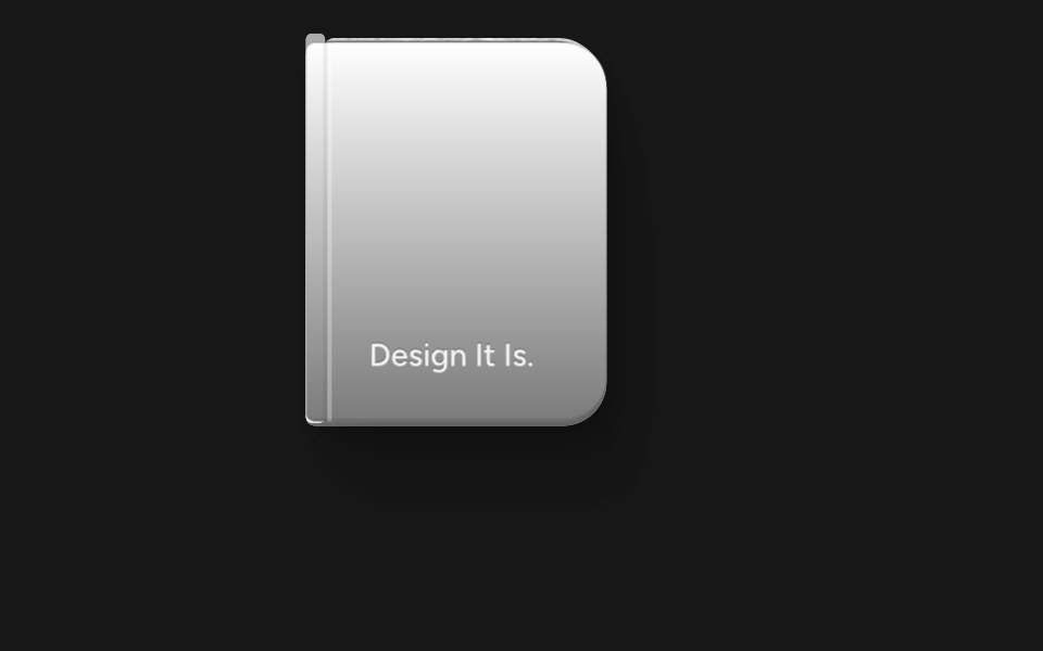 Animated BookSkecher UI · ReactA reusable 3D book preview that opens on hover or focus and supports controlled state, keyboard input, and reduced…
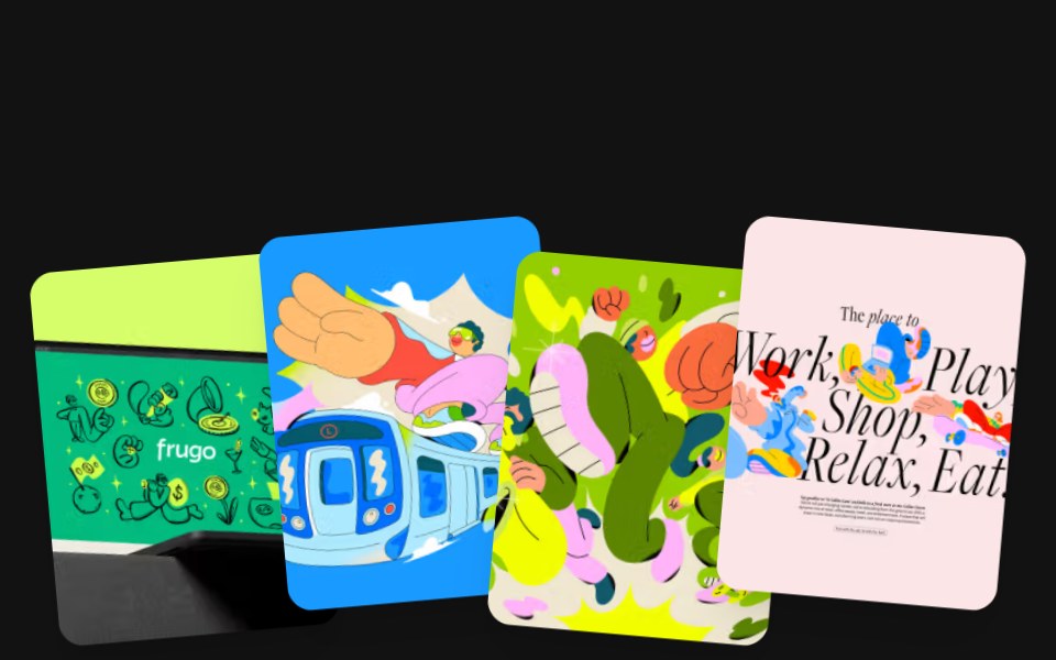 Magnetic CardsSora UI · ReactA fanned stack of cards that fling away from the cursor on release, with GSAP InertiaPlugin easing each one back to…
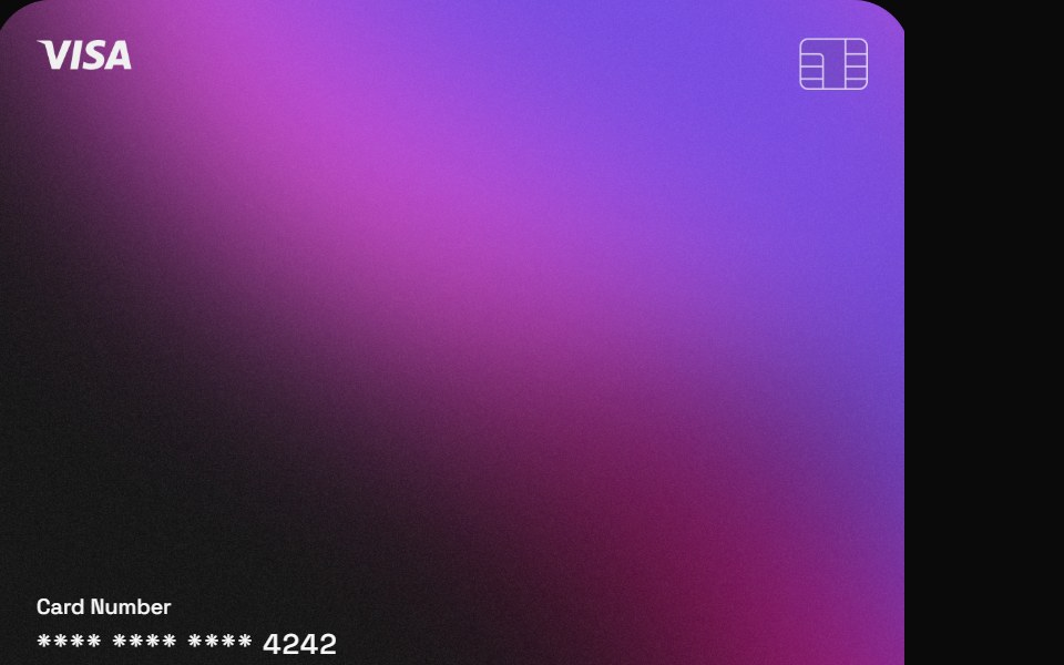 Card InsightZAYX · React Native
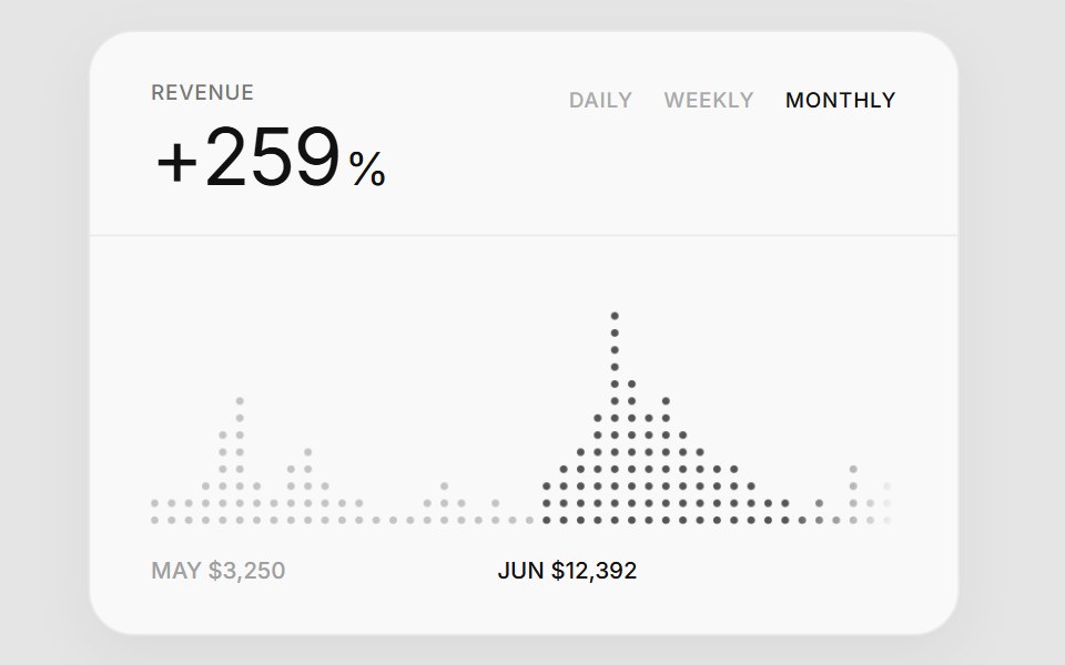 Dot Graph CardCue Foundations · React
 Moon WindowD2Studio UI · ReactA night window: a pale moon rises from behind dark hills in a round pane of stars, then the hills roll like a swell…
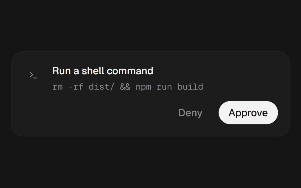 Tool ApprovalEaseUI · ReactA card for an agent action waiting on approval, with Approve and Deny that collapse into a single status pill once…
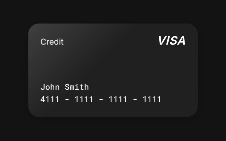
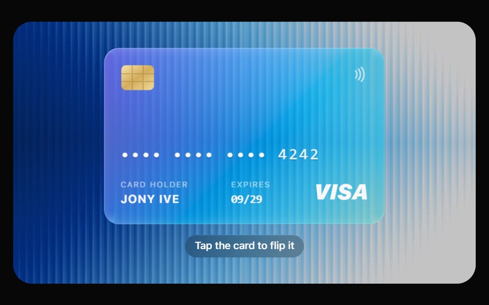 Glass Credit CardOpaline · ReactA glass payment card that tilts to the pointer, flips to its back and detects the brand.
 Business HoursReactFrame · ReactA premium opening-hours card, live open/closed status with a pulsing dot, a day-by-day schedule, and a Get Directions…
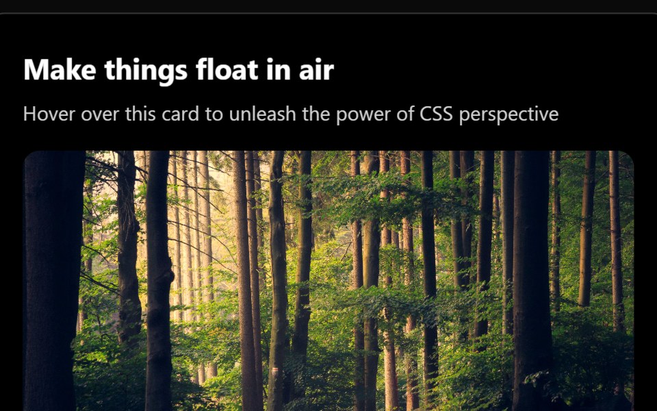 3d CardAceternity UI · React
 CarouselReact Bits · ReactResponsive carousel with touch gestures, looping and transitions.
 Warp BackgroundMagic UI · ReactA card with a time warping background effect.
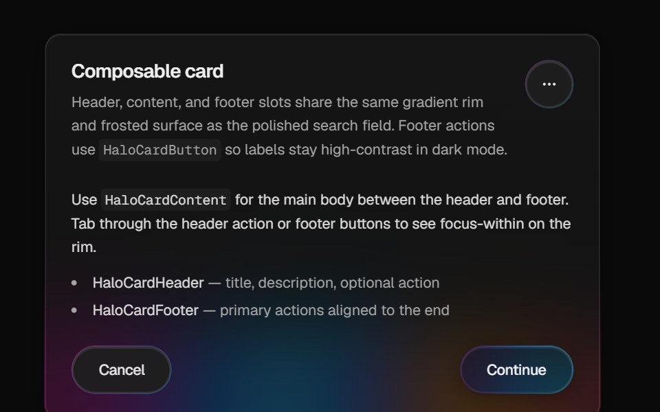 Halo CardCult UI · ReactComposable card with animated gradient rim, frosted fill, layered shadow, and Base UI button actions
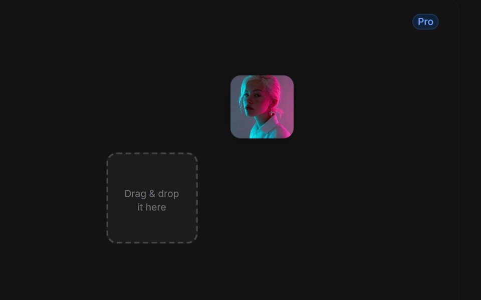 Drag Drop With Physicstransitions.dev · HTML/CSS
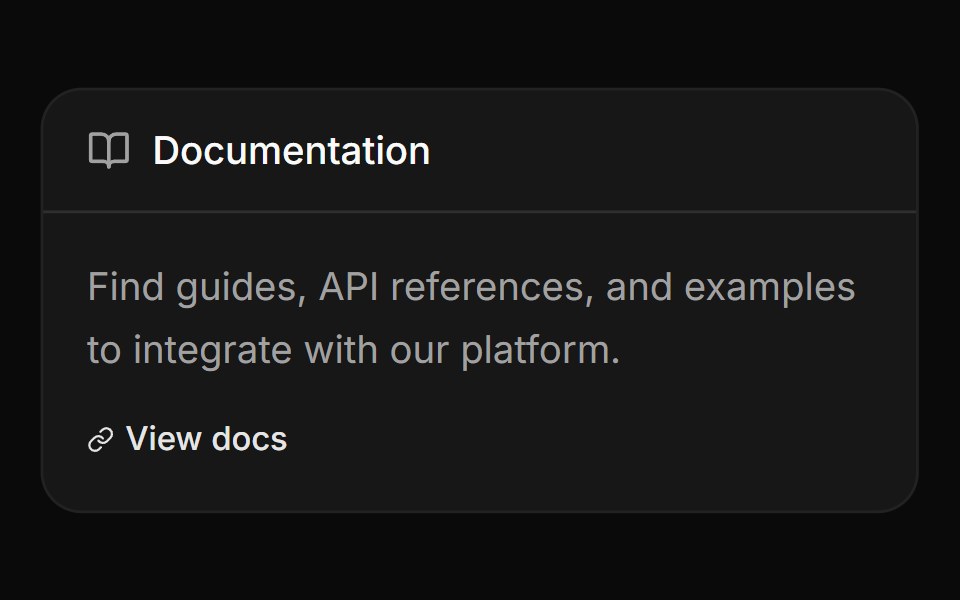 Card with header label and linkReUI · ReactCard with header label and link
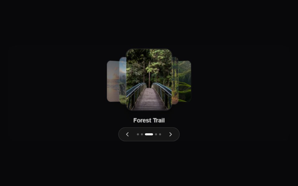 CoverFlow CarouselAmicro Micro Transitions · ReactA premium 3D CoverFlow carousel displaying cards along a perspective path.
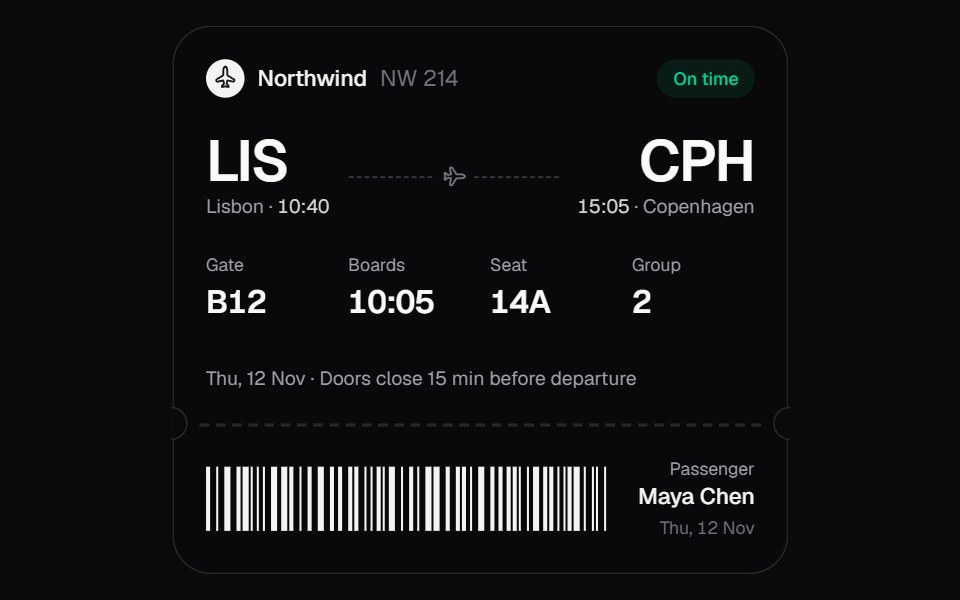 Boarding PassKokonut UI · ReactA boarding pass that keeps itself current. When the gate or times change, only the changed characters roll over, the…
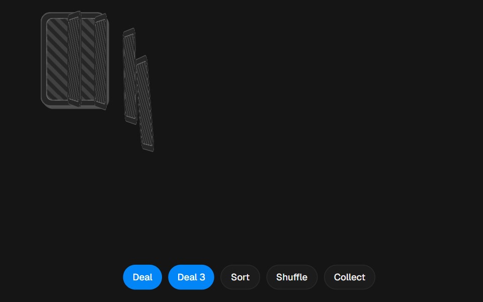 Card DealerbeUI · ReactA card table with a face-down deck, a fanned hand and a discard pile. Cards arc across the table between them and flip…
 Animated CardSpectrum UI · Reactcomponent for the Animated Card
 Tilt CardSpell UI · ReactInteractive 3D tilt card with perspective hover effect and spotlight.
 Interactive BookVengeance UI · React3D page-flip style book
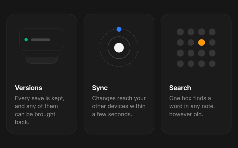 Web Tilt CardPanel UI · React Native
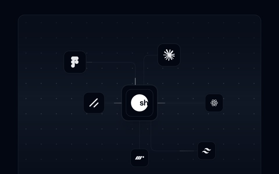 Card 16 - Integration CardShadcn Space · ReactAn animated integration card with SVG connection paths, floating integration icons, and a pulsing center logo.
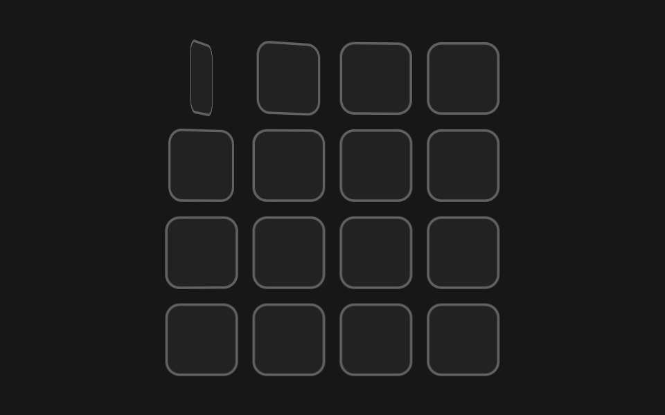 Flip Tile WavePixel Perfect · ReactA grid of two-faced tiles flipping in a diagonal 3D wave, revealing their dark side and back again.
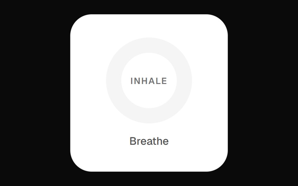 Focus Breath WidgetOpenSourceUI · React
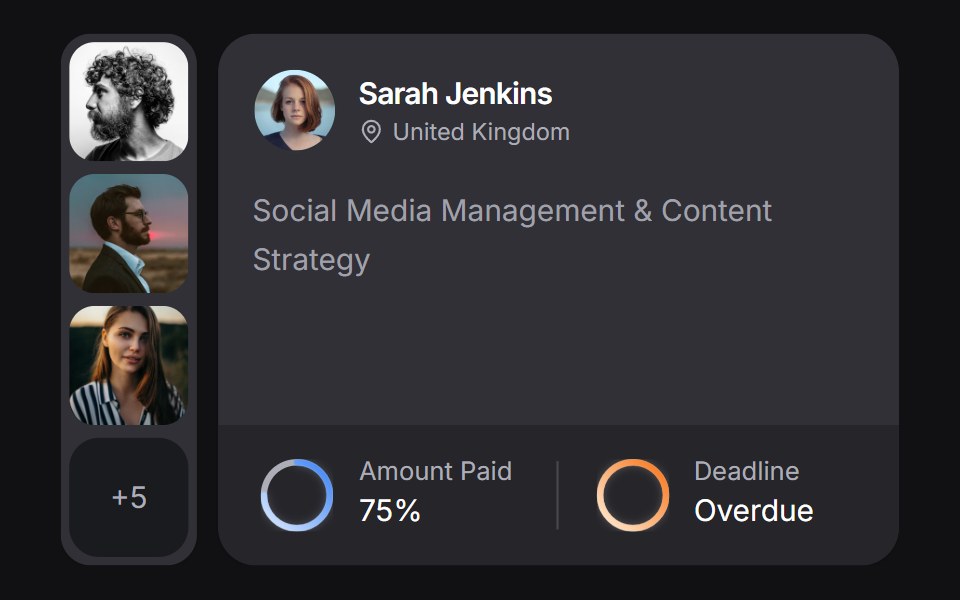 Client Carduselayouts · ReactA client CRM card with payment and deadline rings, plus a morphing avatar stack.
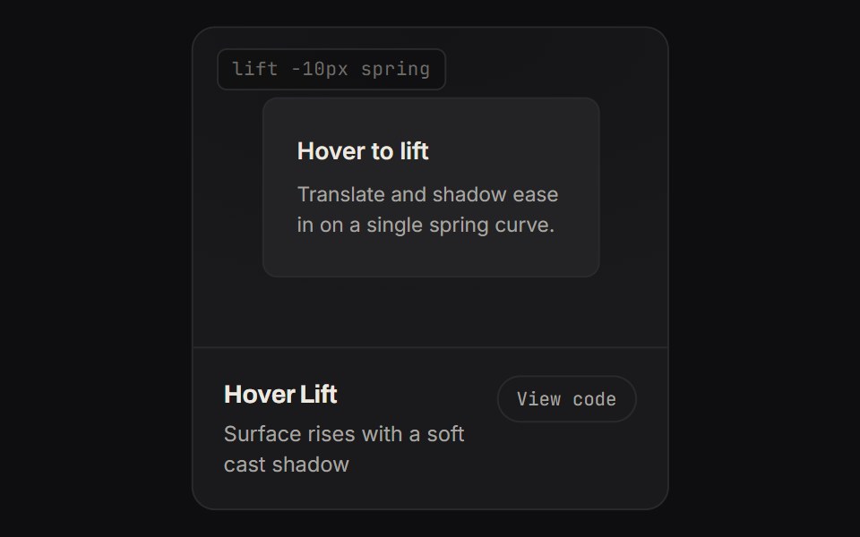 Hover LiftKinetics · HTML/CSSSurface rises with a soft cast shadow
 Pricing 02Componentry · ReactA compact pricing table with separated plan summaries, detailed feature lists, and an animated billing-cycle switch.
 Warp BackgroundAnimations (Svelte) · SvelteA 3D perspective grid background with animated light beams that create a warping effect.
 Parallax CardSwiftPieces · SwiftUIAn image card whose picture and liquid glass caption drift at different speeds as you scroll, so the card reads in…
 Flipping CardBadtz UI · ReactA two-sided card component that flips on hover, revealing content on its back face. Ideal for interactive displays or…
 Github CardGreatUI · React
 Onboard CardForge UI · ReactAnimated onboarding progress card showing three steps with visual loaders, transitions, and completion indicators.
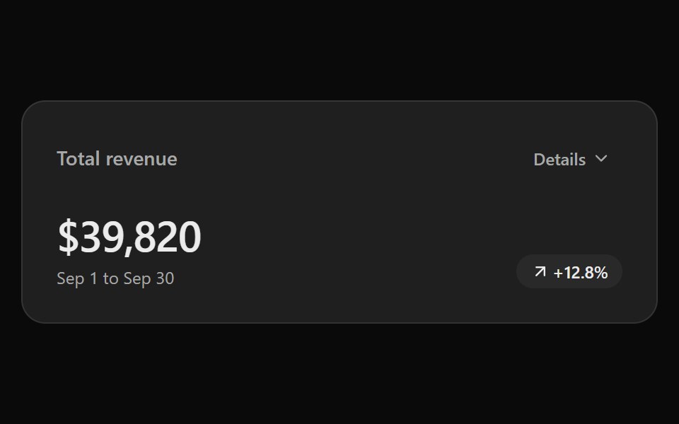 Expandable Data CardSona UI · React
 FlipWatermelon UI · ReactFlip button with a front face and a back face that turns over to show the other side.
 Expandable cardArc Library · ReactGive a dense card more room when requested.
 Pricing ToggleUI Lab · ReactEach digit rolls to its new price on its own, and new digits grow in.
 Content 09FLX UI · ReactTwo-column icon card grid with serif section header and subtle entrance motion.
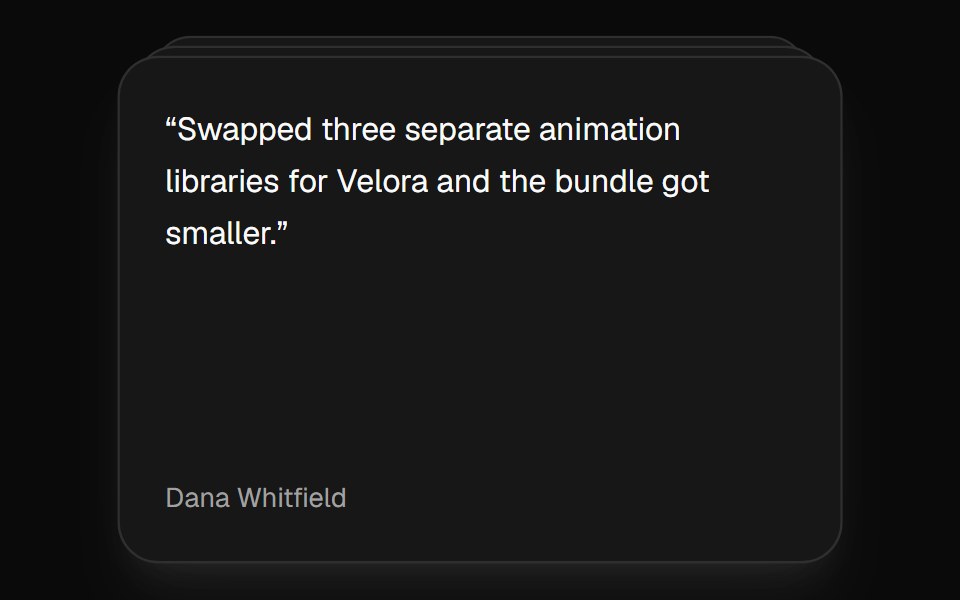 Card StackVelora UI · ReactDeck that shuffles the top card to the back on a timer.
Libraries with Animated card components
Related categories
- Card Components
- React Card Components
- Tailwind CSS Card Components
- Svelte Card Components
- React Native Card Components
- shadcn/ui Card Components
- Animated Data Display Components
- Animated Chart Components
- Animated Carousel Components
- Animated Accordion Components
- Animated Stat Components
- Animated Collapsible Components
- Animated Card Stack Components
- Animated Counter Components
- Animated List Components
- Animated Avatar Components
- Animated Table Components
- Animated Tree View Components
- Animated Avatar Group Components
- Animated Line Chart Components
- Animated Timeline Components
- Animated Testimonial Components