 Dev Design Library
shadcn/ui Card Components
Dev Design Library indexes 172 shadcn/ui card components from 17 open-source UI libraries, with the most coming from Watermelon UI, FLX UI, Shadcn Space, Spectrum UI and Velora UI. Each one links to its page with the source code, a live preview where available, the library license and the install command. They follow the shadcn/ui conventions, so most install with the shadcn CLI and drop into a Tailwind project. Card components belong to the Data display group.
Showing 120 of 172, a mix from every library. Open a library to see all of its components.
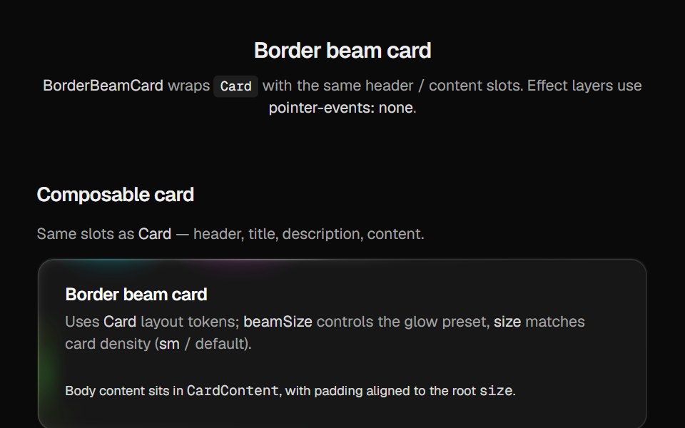 Border Beam CardCult UI · Reactborder-beam around compound Card API with balanced title and description
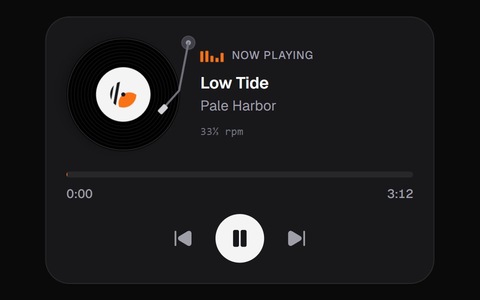 Now PlayingKokonut UI · ReactMusic card with a spinning disc you can grab and turn to scrub, built with React and Tailwind CSS.
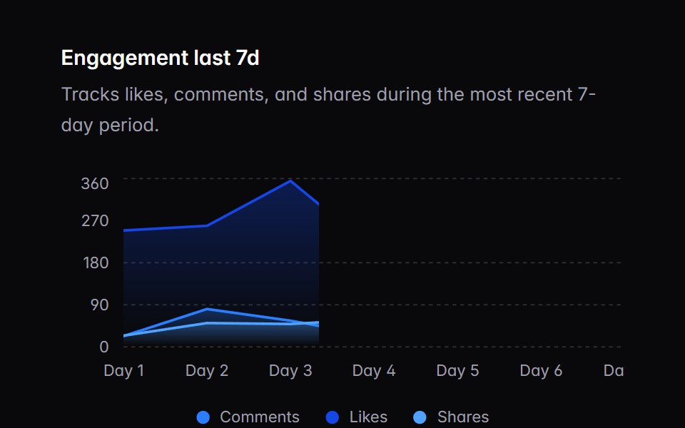 chart-01Intent UI · Reactchart-01
 Animated TestimonialsSpectrum UI · Reactcomponent for the Animated Testimonials
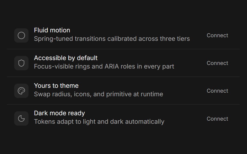 CardFluid Functionalism · Reactshadcn's compositional card (Card, CardHeader, CardTitle, CardDescription, CardAction, CardContent, CardFooter) with…
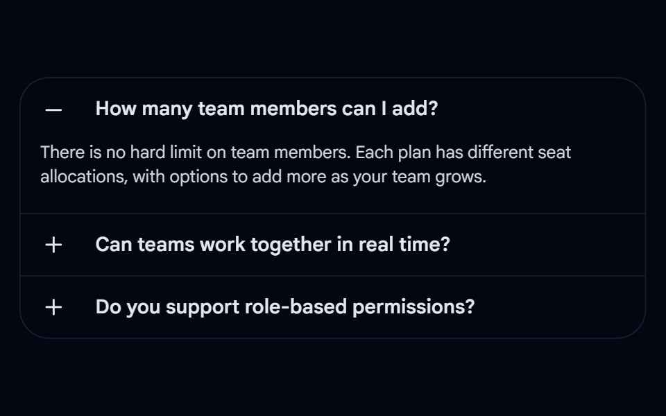 Accordion-04 - CardShadcn Space · ReactAccordion wrapped in a rounded card with left-aligned +/- icons and border dividers
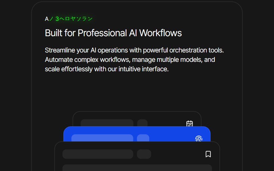 Card AnimationPixel Perfect · ReactFramer Motion card animation.
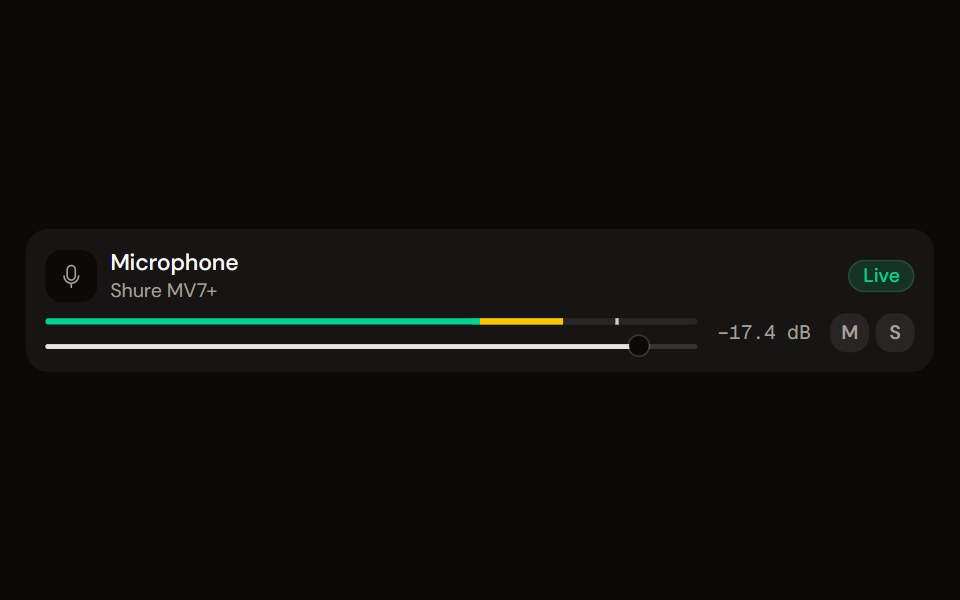 Channel Stripaudiocn · ReactOne channel of a mixer: header, status, meter, fader, value, controls and a notice, as a row or a console strip. The…
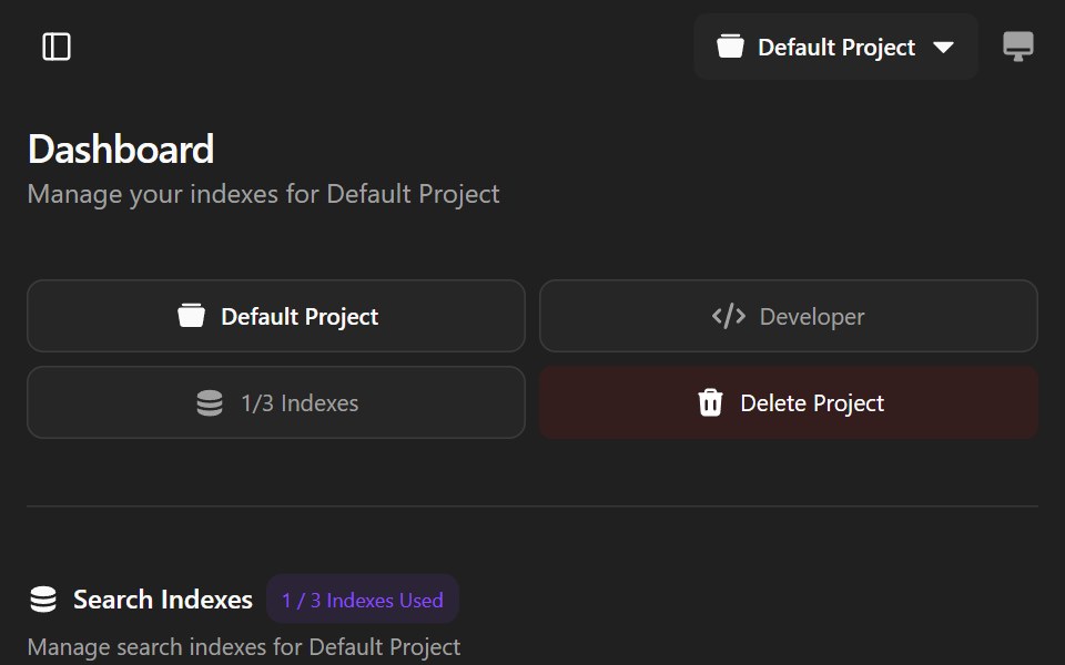 Agndex DashboardWatermelon UI · ReactA developer portal for managing search indexes, API credentials, billing, and project settings with light and dark…
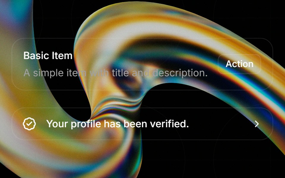 Itemglasscn · React
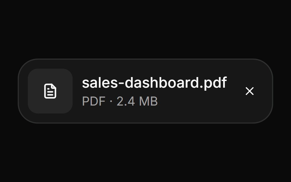 AttachmentHextaUI · ReactFile and image cards for uploads, with progress, states, actions, a full-card trigger and names that keep their…
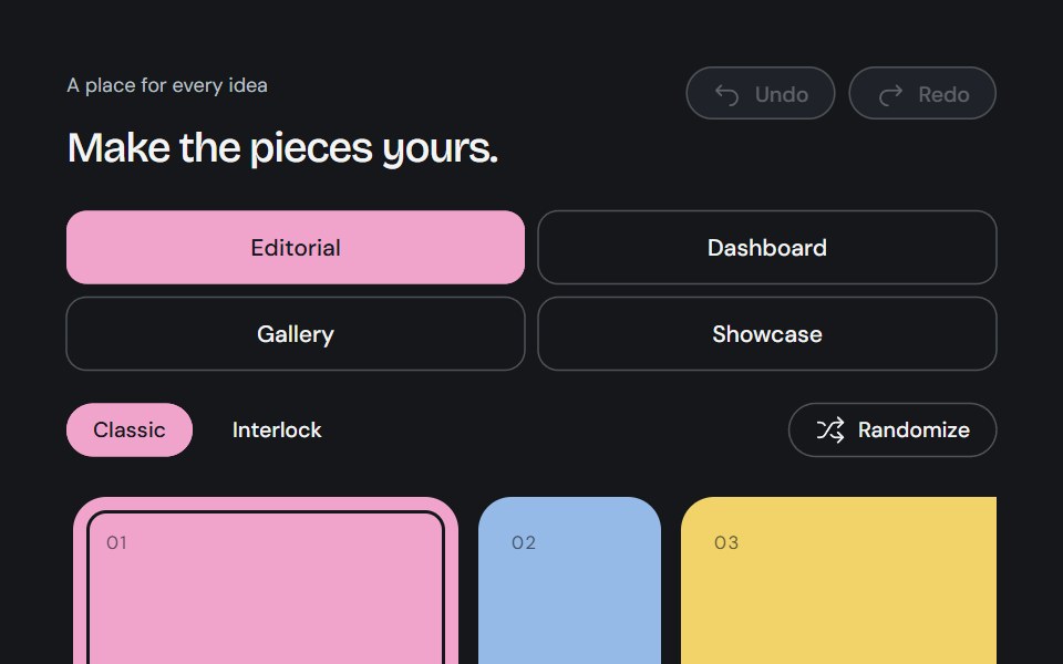 Bento GridCojeev UI · ReactA complete canvas of rounded cards or organically interlocking pieces. Compose a layout, then install just the…
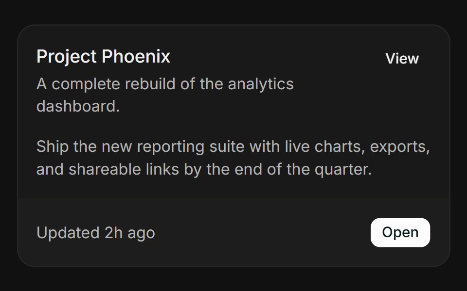 BasicFLX UI · ReactHeader, action, content, and a bordered footer.
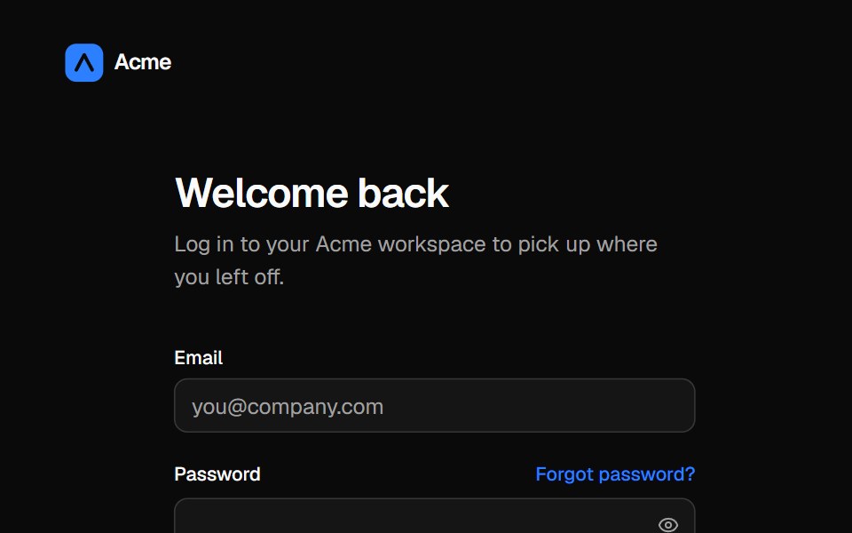 Split login pageVelora UI · ReactLogin form with password reveal, remember-me and social sign-in beside an aurora testimonial panel.
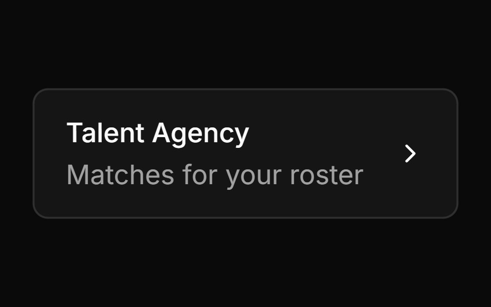 Card Style Buttonsv-particles · Svelte
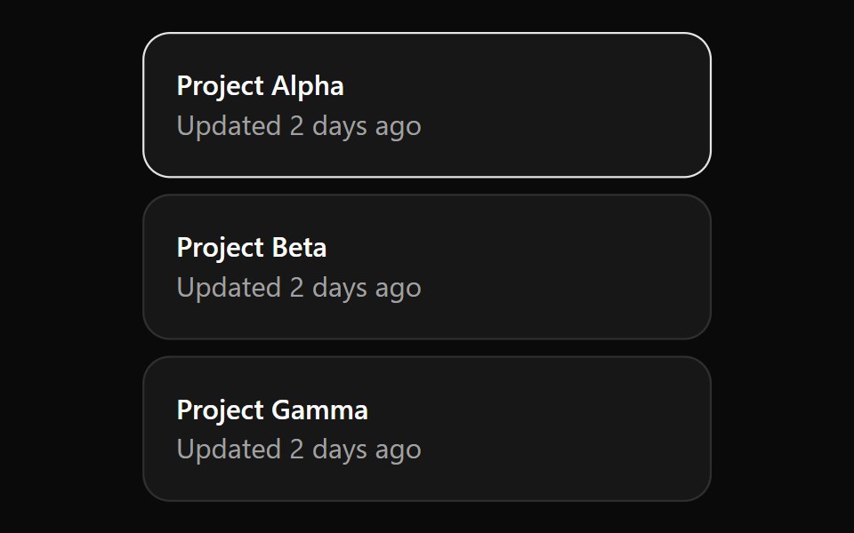 CardOUI · ReactCardGridListItem for shadcn Card.
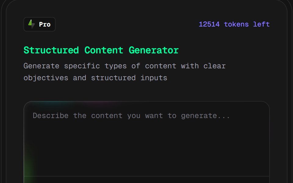 AI Content Creator CardD2Studio UI · ReactPro version content creation card
 Mouse Effect CardKokonut UI · ReactInteractive card with an animated dot pattern that repels away from the cursor, powered by React, Tailwind CSS and…
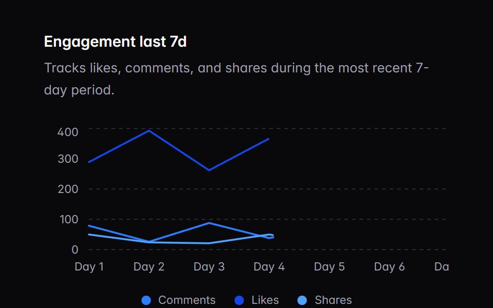 chart-02Intent UI · Reactchart-02
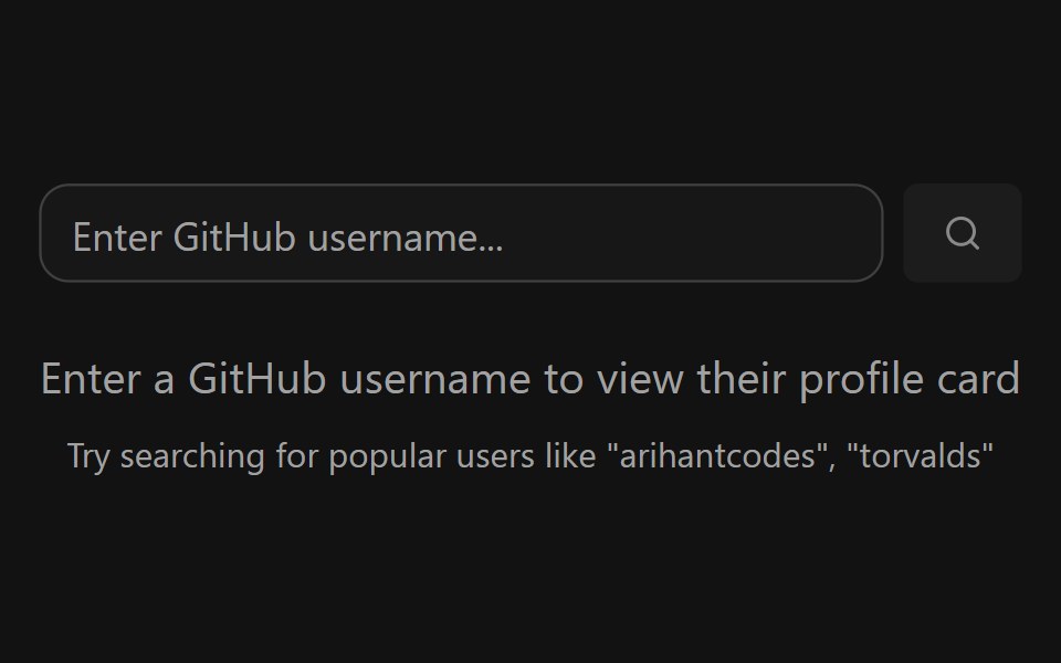 GitHub Profile CardSpectrum UI · ReactA GitHub profile card with account stats, a contribution graph, and social links.
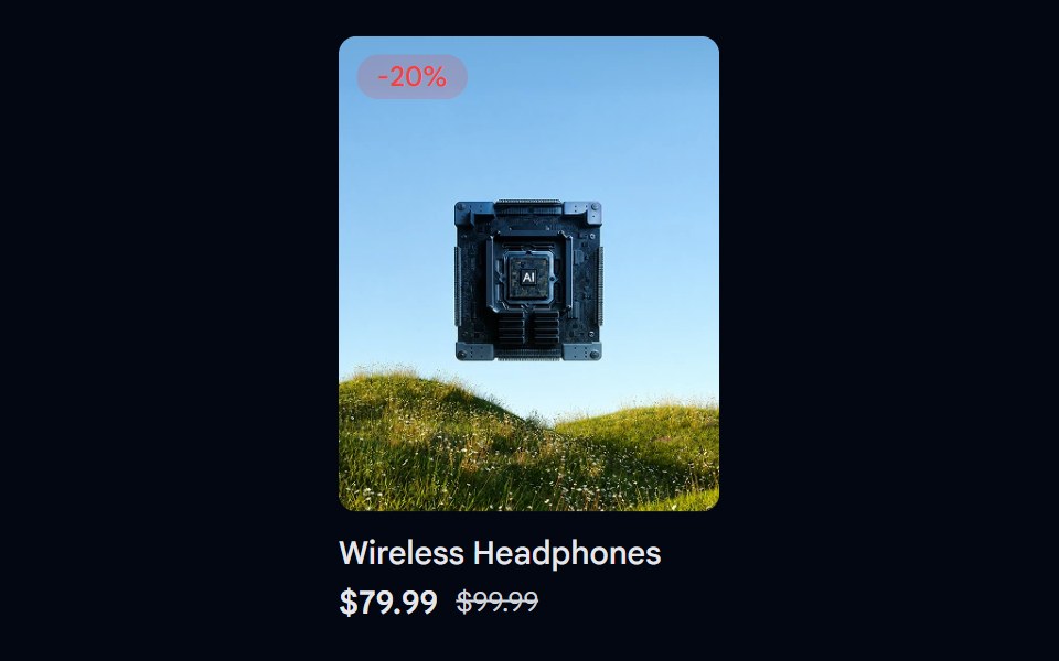 Aspect Ratio 06 - Product CardShadcn Space · ReactA product card using a 4:5 aspect ratio image with a discount badge and pricing details.
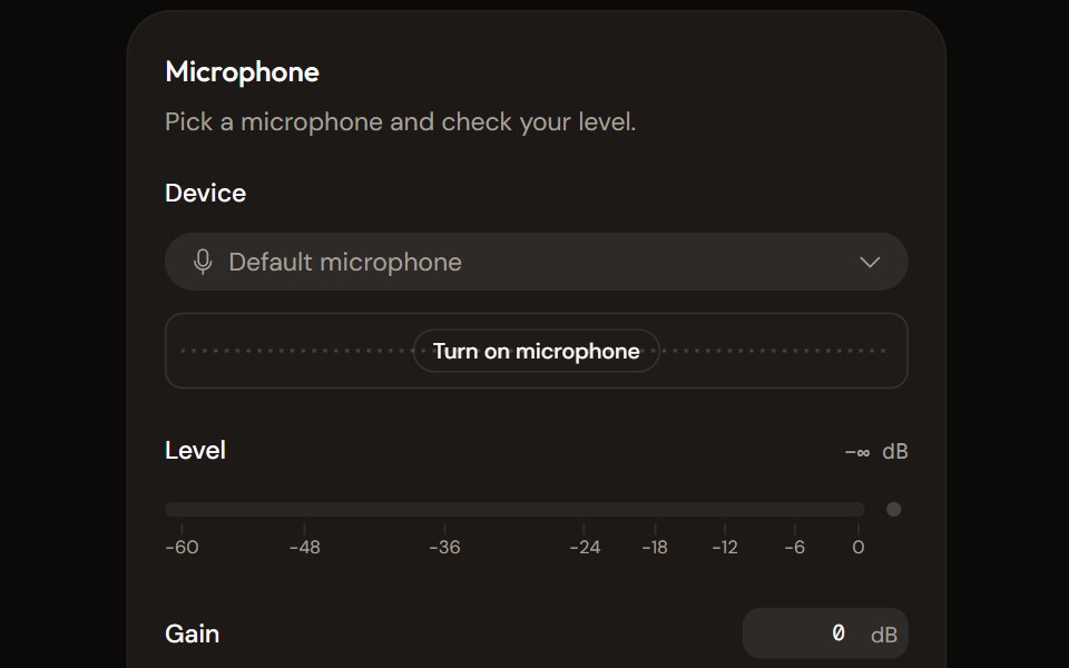 Microphone Setupaudiocn · ReactChoose and check a microphone: device select with a live preview, a level meter, gain, mute and a level check that…
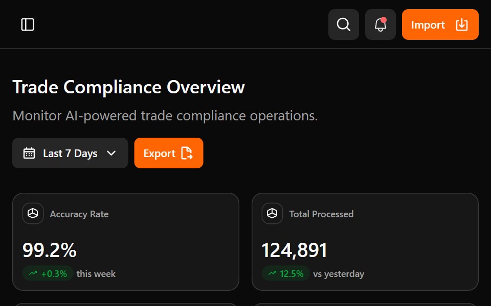 Astrix DashboardWatermelon UI · ReactA trade compliance workspace with AI classification metrics, a live pipeline, HS code stream review, and light and…
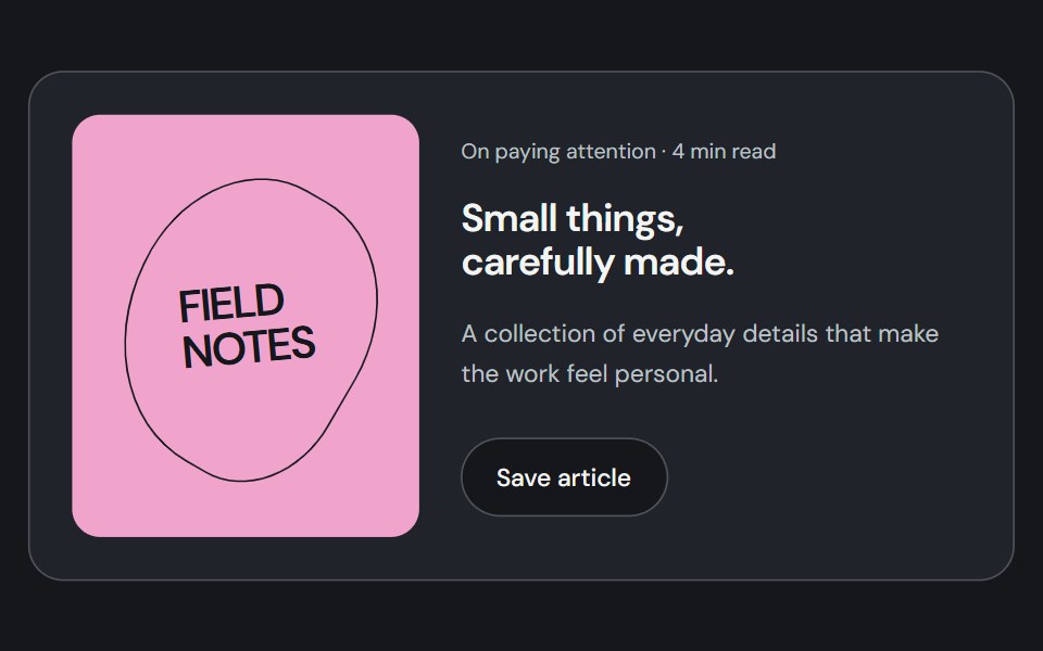 CardCojeev UI · ReactGroups related content, metadata, and actions into a distinct surface.
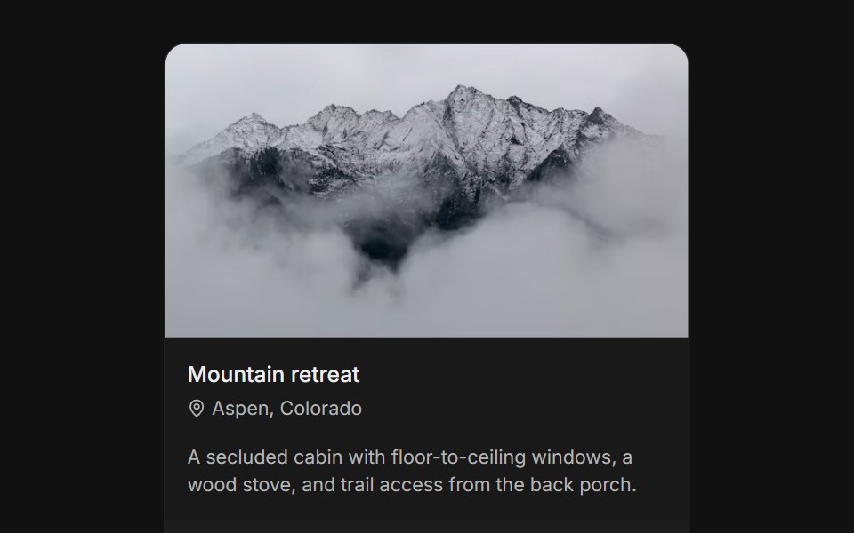 With imageFLX UI · ReactTop media banner above title, body, and a CTA footer.
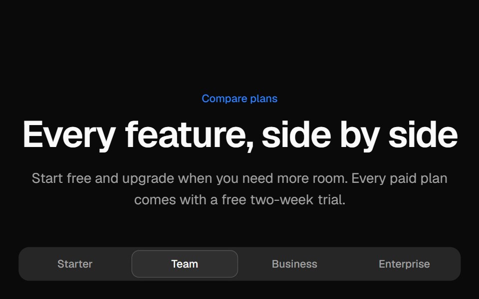 Pricing comparison tableVelora UI · ReactGrouped feature comparison table with a sticky plan header, and per-plan tabs on mobile.
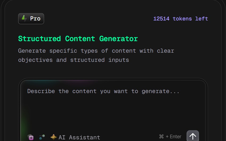 AI Content Creator Card v2D2Studio UI · ReactGlassmorphic AI content generator card with content type and tone pickers and a prompt field.
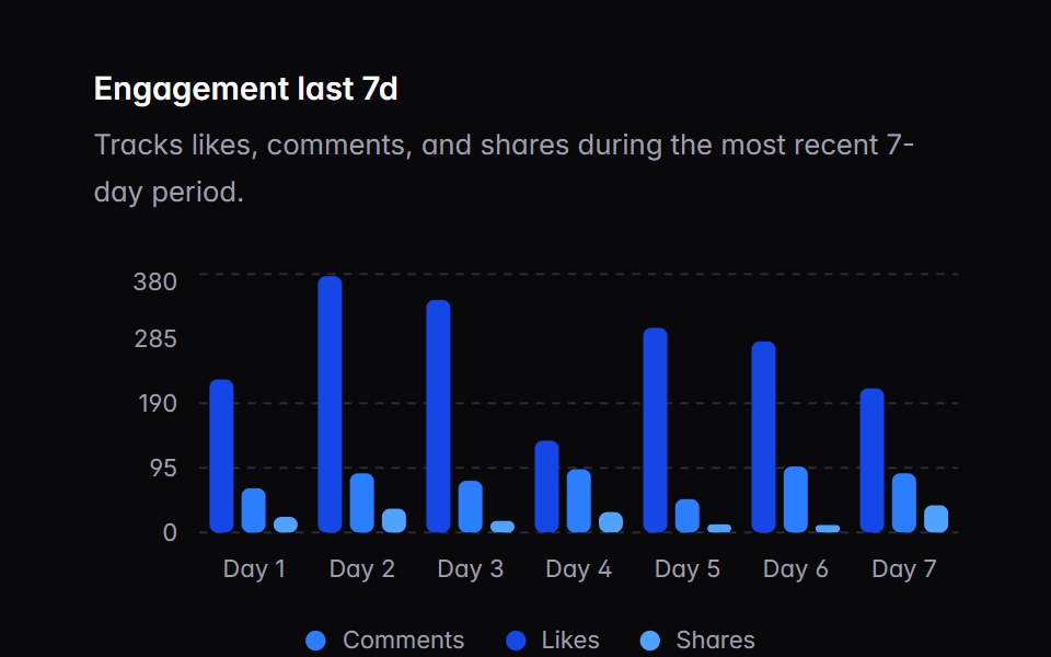 chart-03Intent UI · Reactchart-03
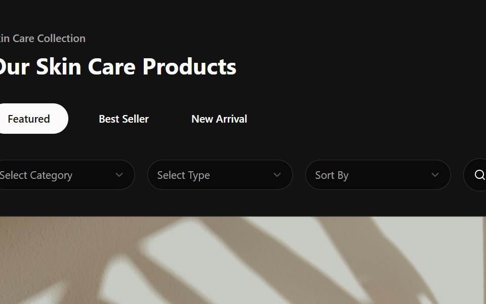 Product CardSpectrum UI · Reactcomponent for the Product Card
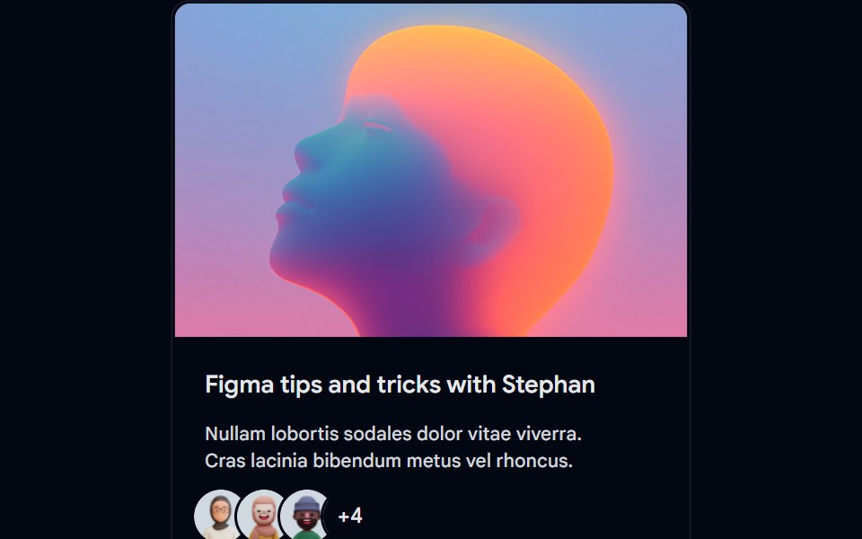 Card-01 - ArticlePreviewCardShadcn Space · ReactCard component
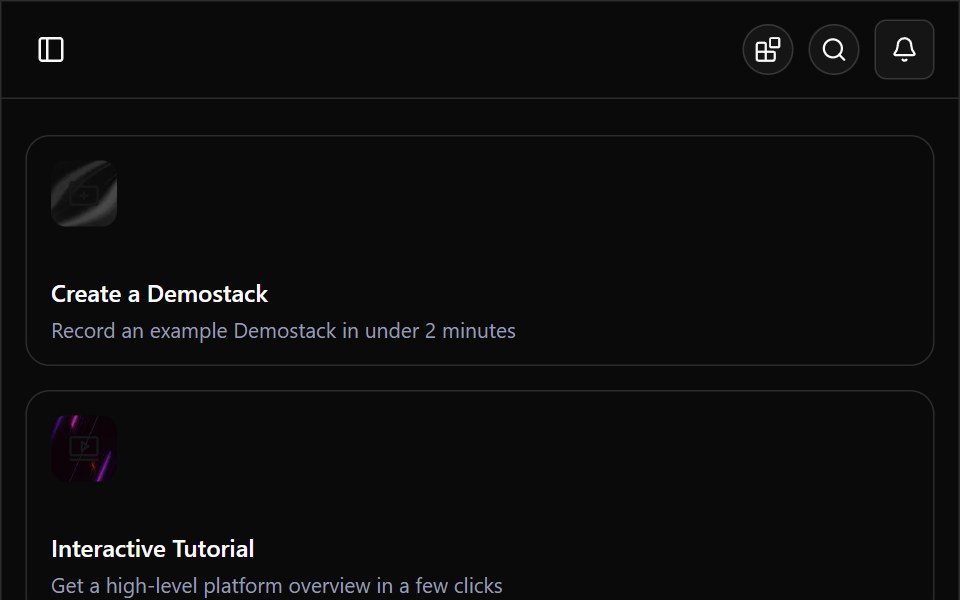 Demostack DashboardWatermelon UI · ReactA responsive product-demo workspace with organization switching, resource discovery, team filtering, and light and…
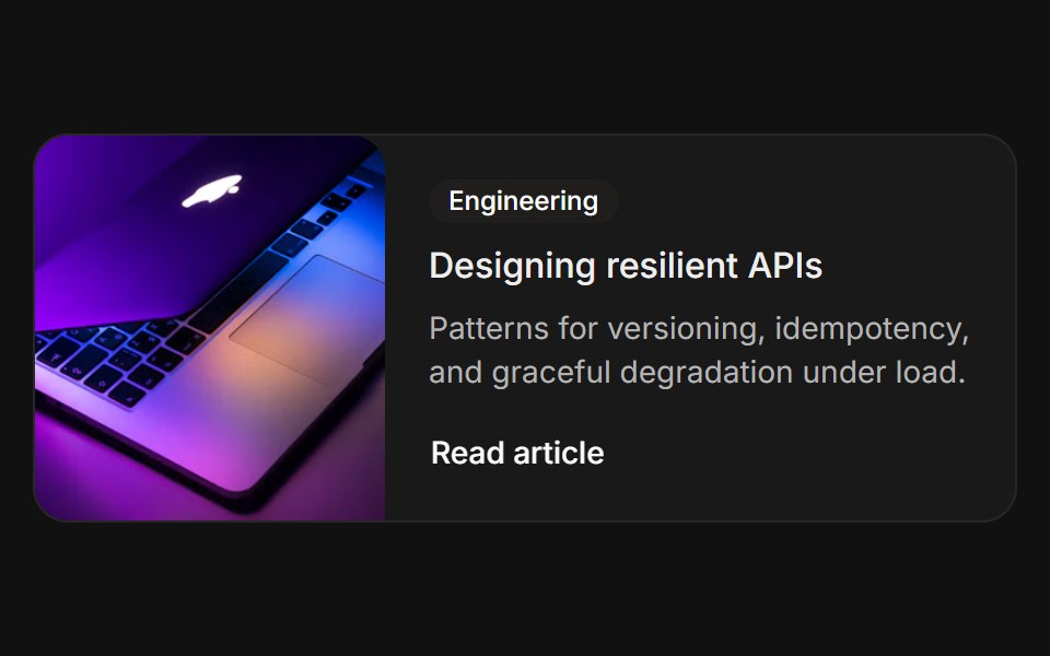 HorizontalFLX UI · ReactImage on the left beside a category, title, and link.
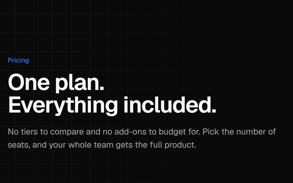 Single plan pricingVelora UI · ReactOne all-inclusive plan card beside a benefit list and short reassurance answers.
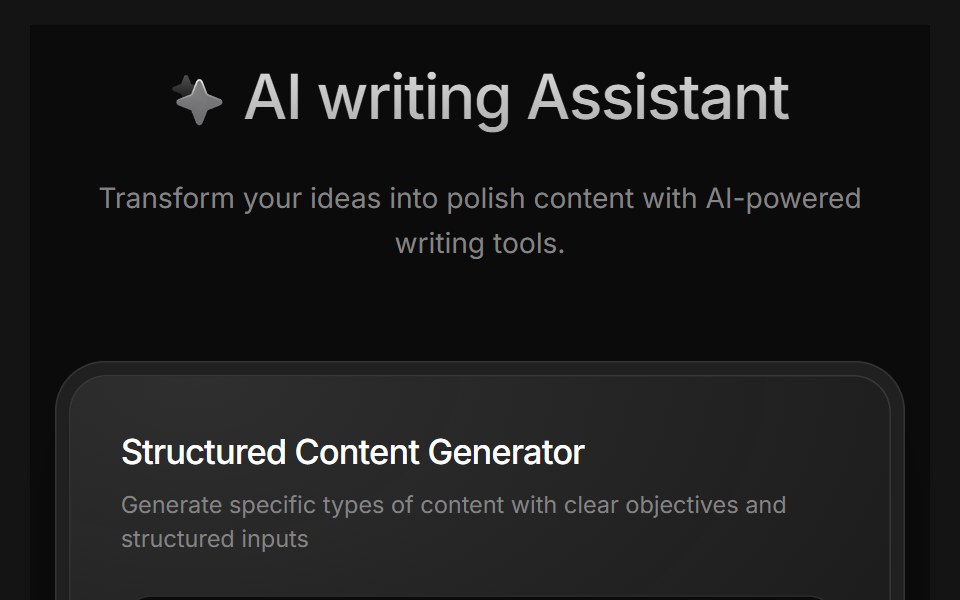 AI Writing AssistantD2Studio UI · ReactAI writing assistant panel with assistant, blog and pro modes and a prompt field.
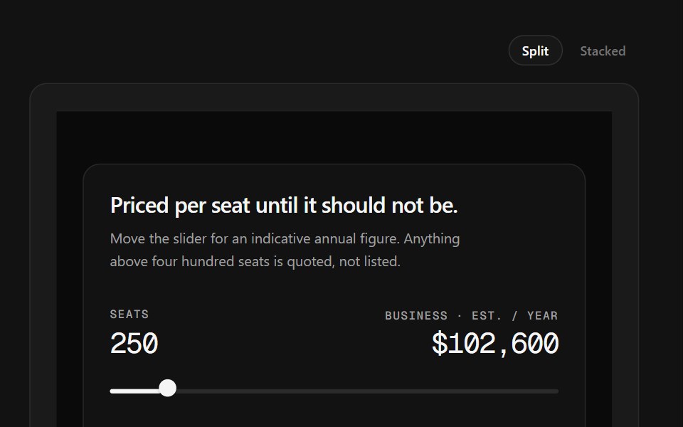 Sales CTA FooterSpectrum UI · ReactA seat slider that prices a tier live, beside the link grid.
 Card-02 - Preview CardShadcn Space · ReactCard component
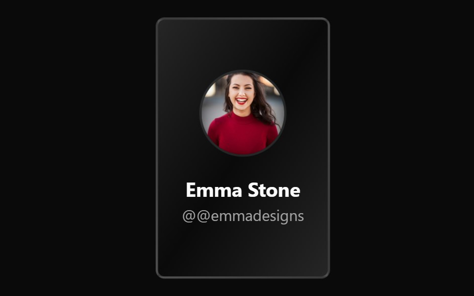 Flip CardWatermelon UI · ReactCard that flips over in 3D to show its back face.
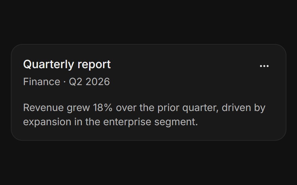 With action menuFLX UI · ReactThree-dot icon button in the header corner opens a dropdown with rename, share, and delete options.
 Three-tier pricingVelora UI · ReactThree plan cards with a monthly/yearly switch, a savings badge and a highlighted middle plan.
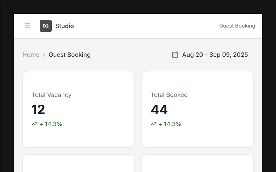 Dashboard 01D2Studio UI · ReactHotel booking dashboard with guest and vacancy stats, booking search and a check-in and check-out table.
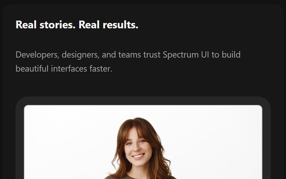 TestimonialsSpectrum UI · Reactcomponent for the Testimonials
 Card-03 - Product CardShadcn Space · ReactCard component
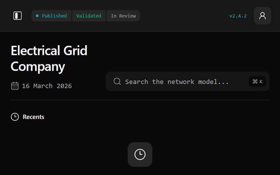 Gridline DashboardWatermelon UI · ReactA responsive electrical-grid workspace for network modelling, asset flexibility, planning, operations, and stakeholder…
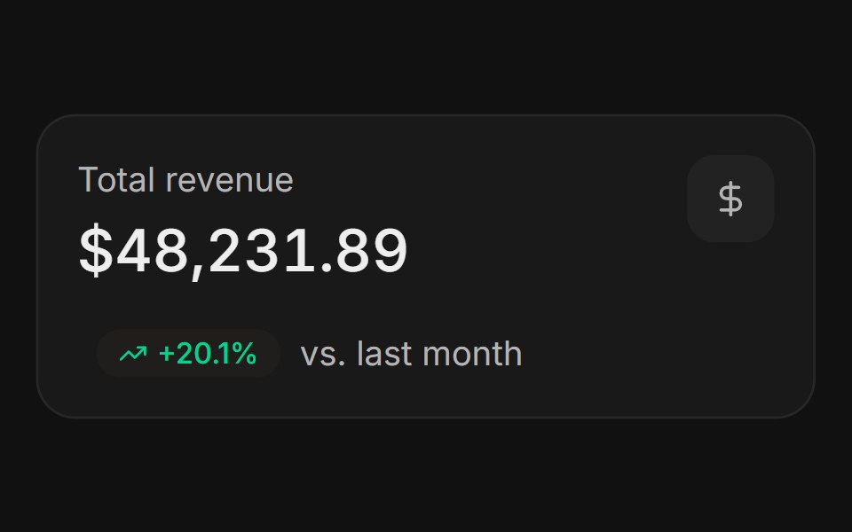 StatFLX UI · ReactKPI value with an icon and a tinted trend badge.
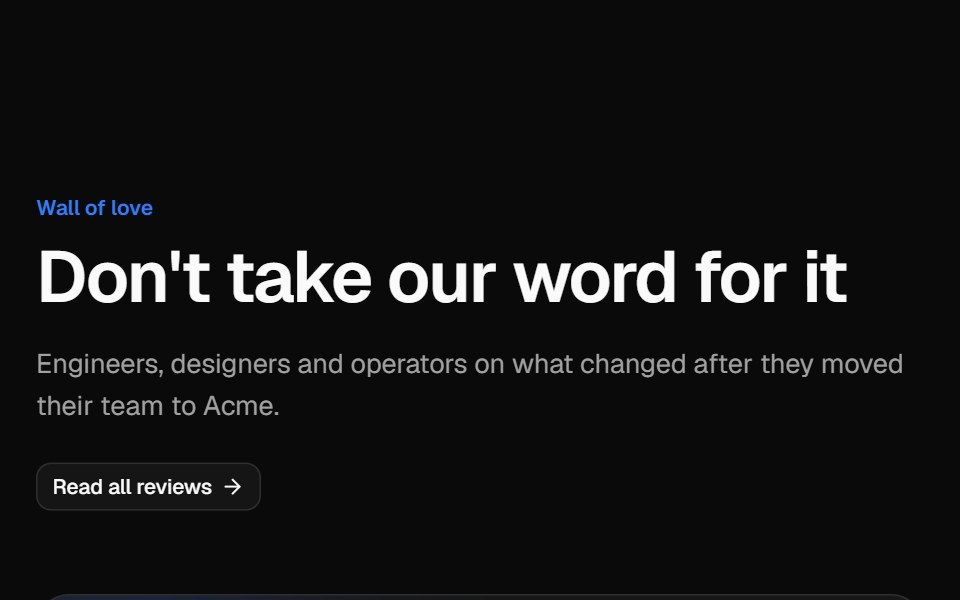 Testimonial gridVelora UI · ReactMasonry wall of social posts and quote cards, led by a wide case-study quote with a headline metric.
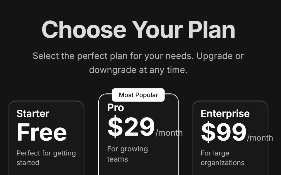 Pricing CardsD2Studio UI · ReactResponsive three-tier pricing cards with feature comparison and popular plan highlighting
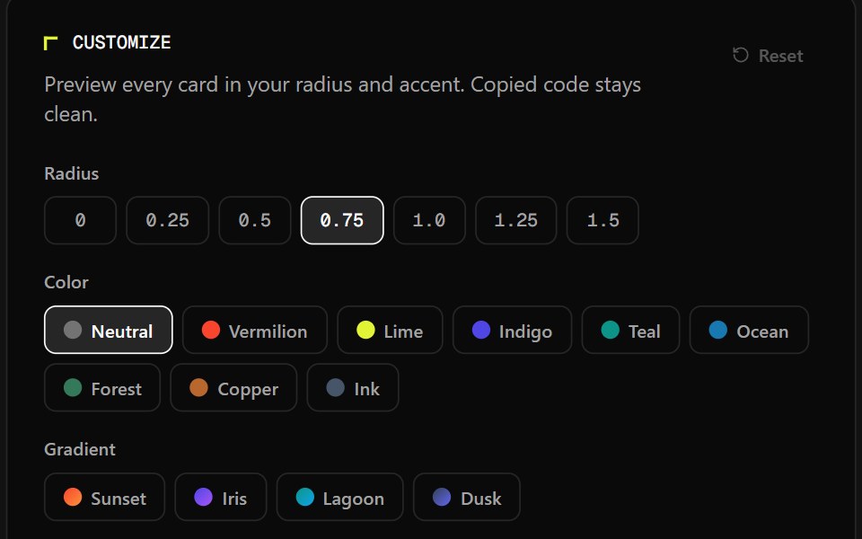 Card CollectionSpectrum UI · React
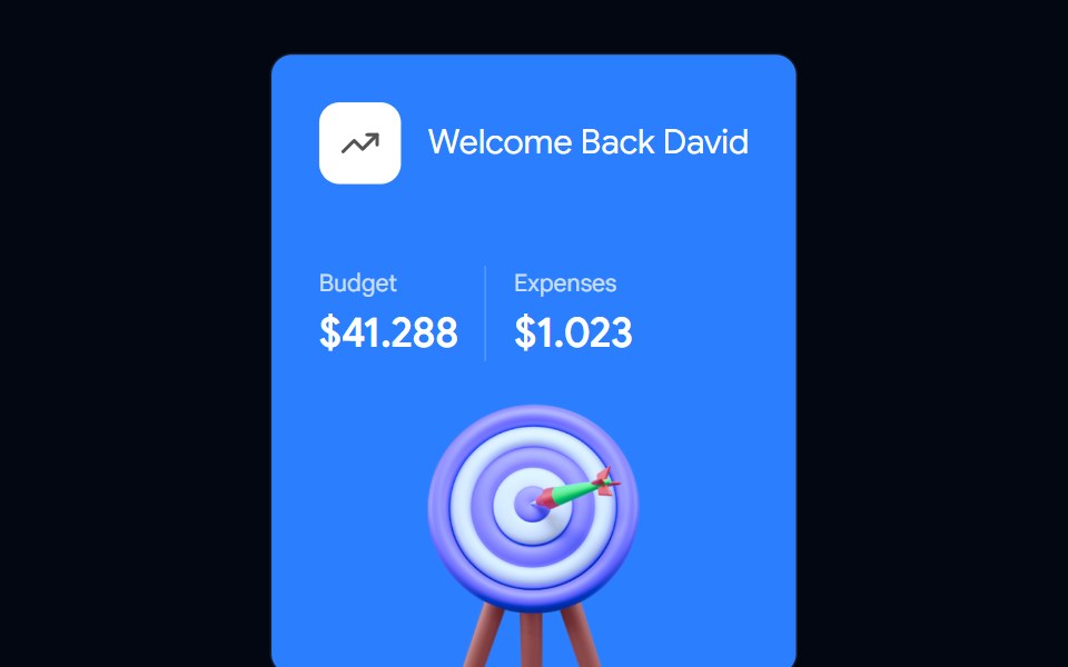 Card-04 - Welcome CardShadcn Space · ReactCard component
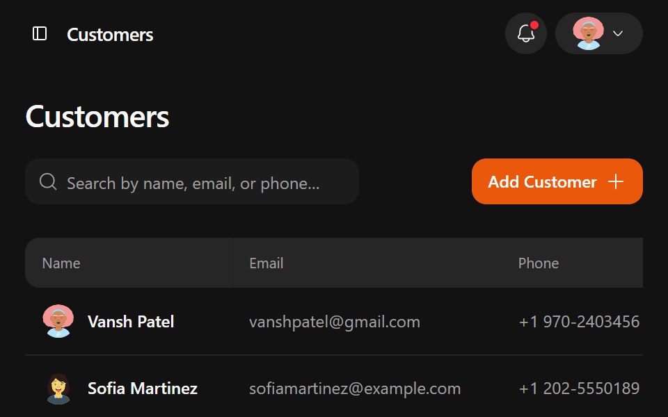 Jobtracker DashboardWatermelon UI · ReactA responsive job management workspace with customer records, job pipelines, estimates, drag-and-drop line items, and…
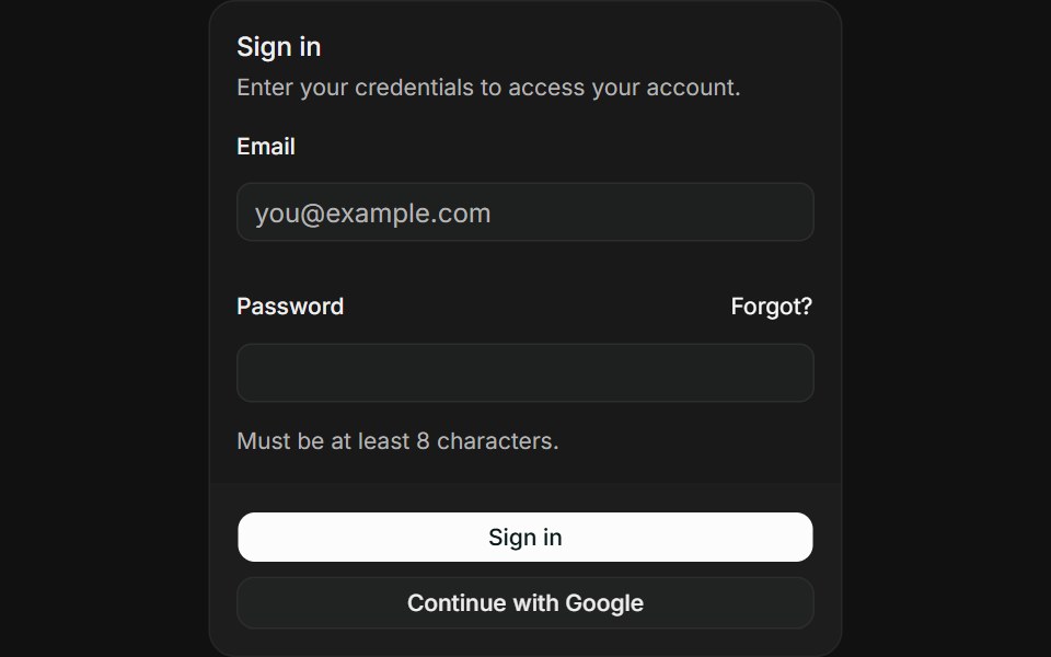 Login formFLX UI · ReactEmail and password fields with sign-in and OAuth buttons.
 Testimonial marqueeVelora UI · ReactTwo rows of review cards scrolling in opposite directions, with faded edges and pause on hover or focus.
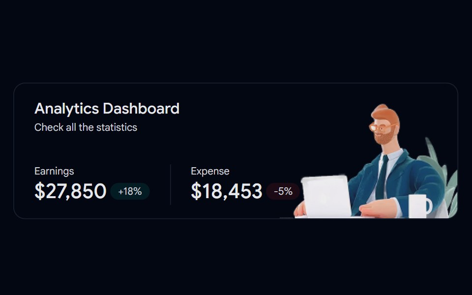 Card-05 - Analytics CardShadcn Space · ReactCard component
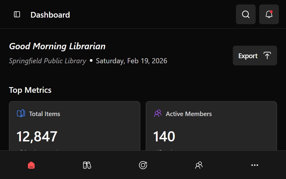 Library DashboardWatermelon UI · ReactA responsive library management dashboard with collection metrics, circulation charts, branch switching, and…
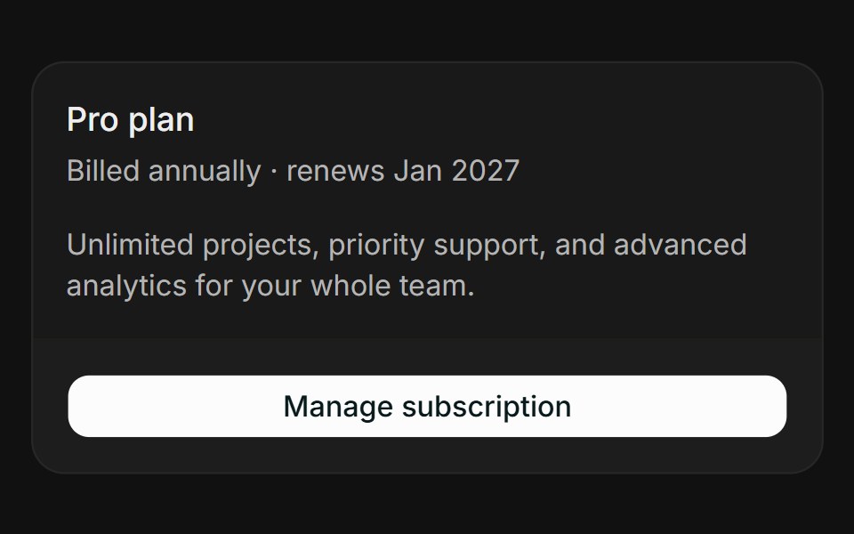 Opens in dialogFLX UI · ReactA footer button launches a modal with subscription detail.
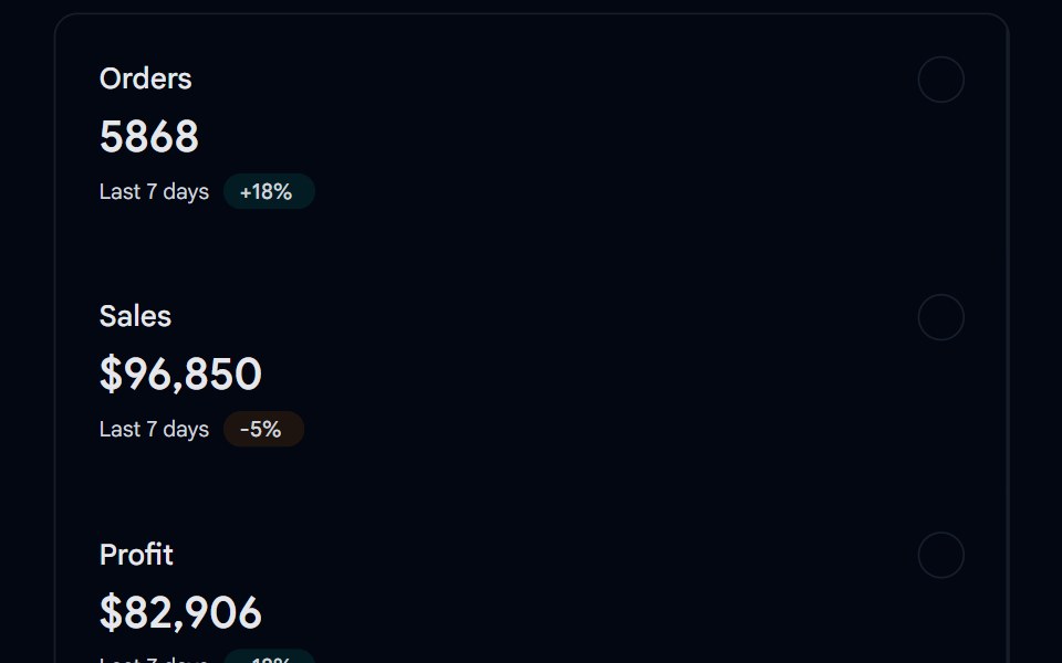 Card-06 - Statistics CardShadcn Space · ReactCard component
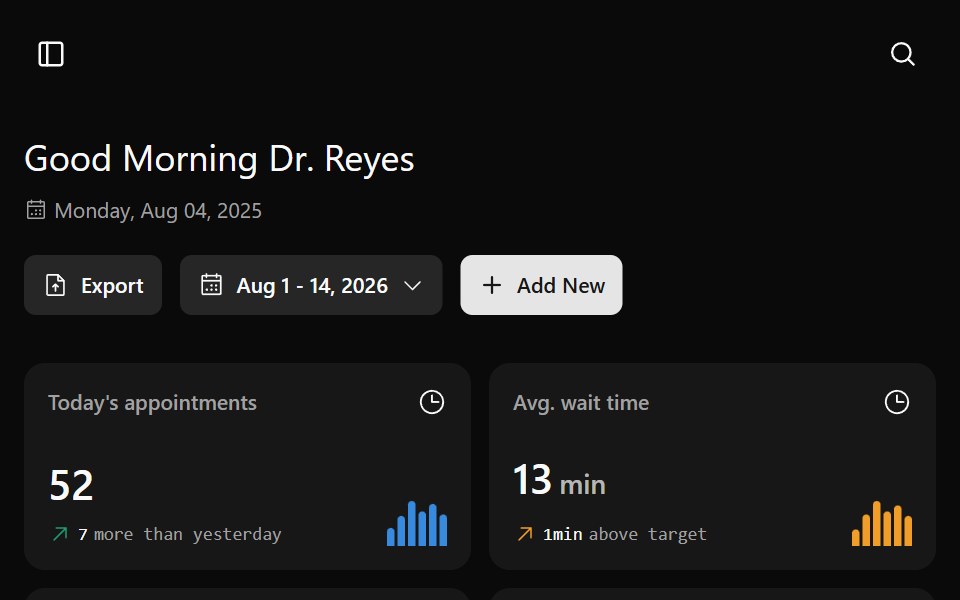 Medesk DashboardWatermelon UI · ReactA healthcare operations dashboard for appointments, staff performance, department load, resources, and patient flow…
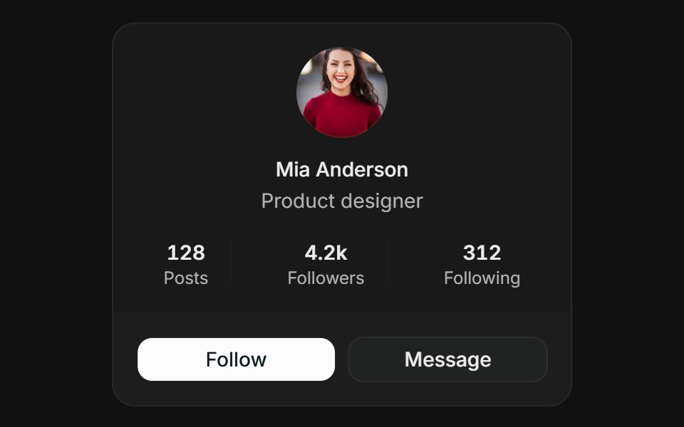 ProfileFLX UI · ReactCentered avatar, stats row, and follow / message actions.
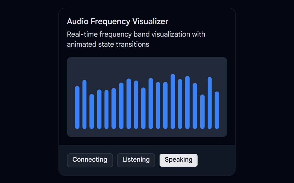 Card-07 - Audio Frequency VisualizerShadcn Space · ReactCard component
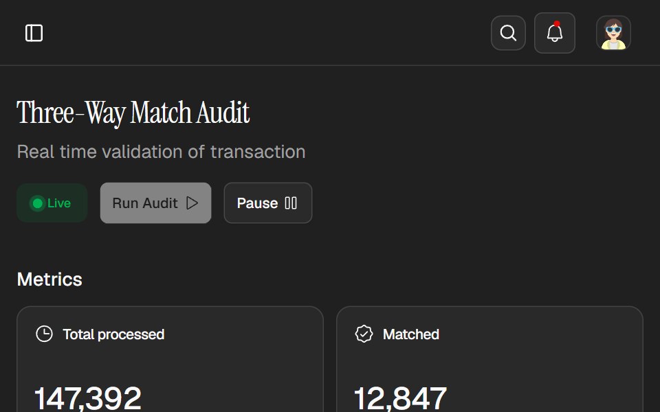 Tallie DashboardWatermelon UI · ReactAn expense audit workspace with live controls, exception tracking, transaction review, and light and dark themes.
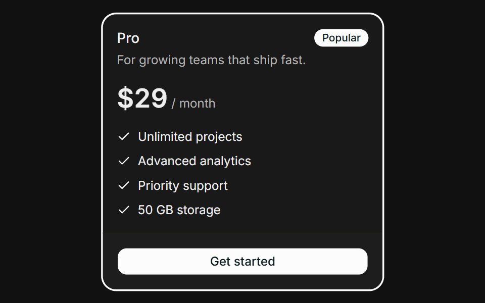 PricingFLX UI · ReactHighlighted plan with a Popular badge and feature checklist.
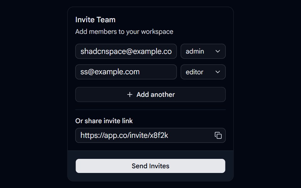 Card-08 - Invite CardShadcn Space · ReactCard component
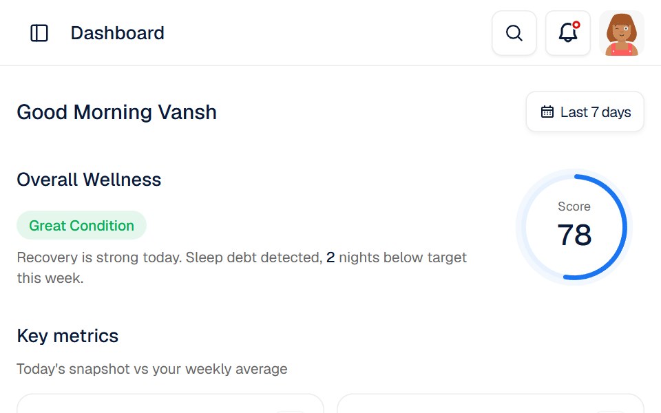 Bionis DashboardWatermelon UI · React
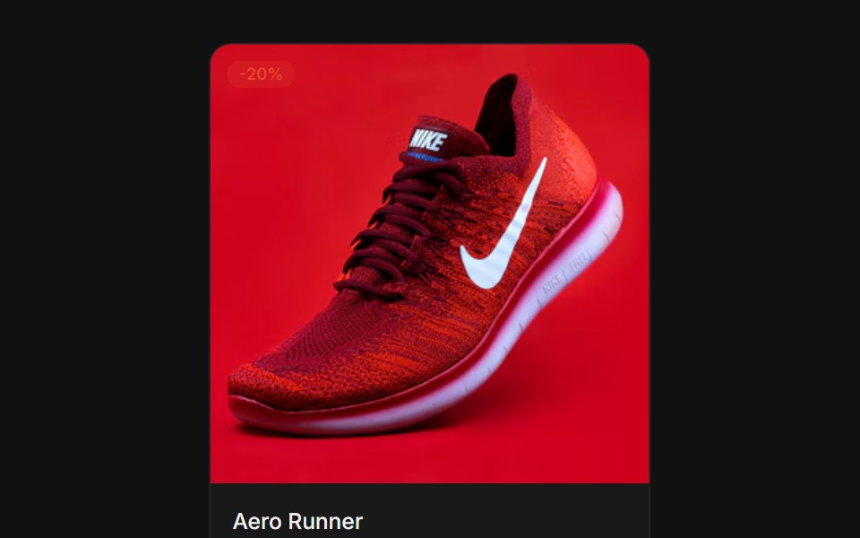 ProductFLX UI · ReactSquare image with a sale badge, price, and add-to-cart.
 Card-09 - Invite Member CardShadcn Space · ReactCard component
 Blog 4Watermelon UI · React
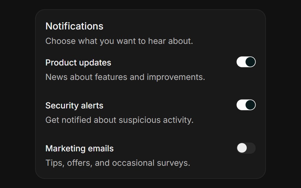 Notification settingsFLX UI · ReactHorizontal field rows each toggled with a switch.
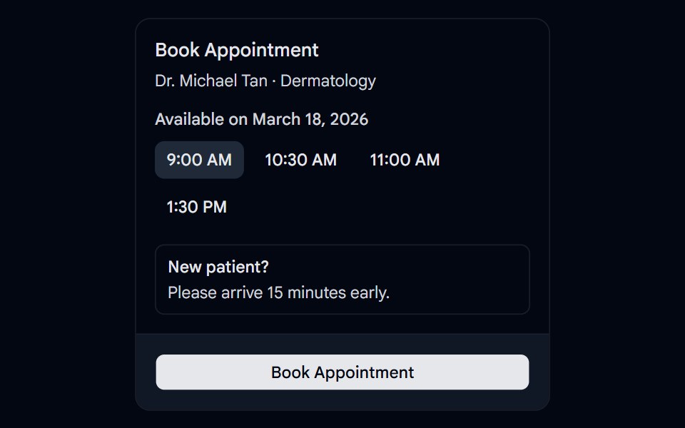 Card-10 - Appointment CardShadcn Space · ReactCard component
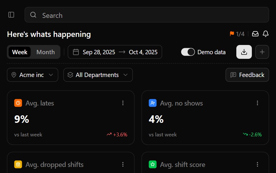 Business ManagementWatermelon UI · React
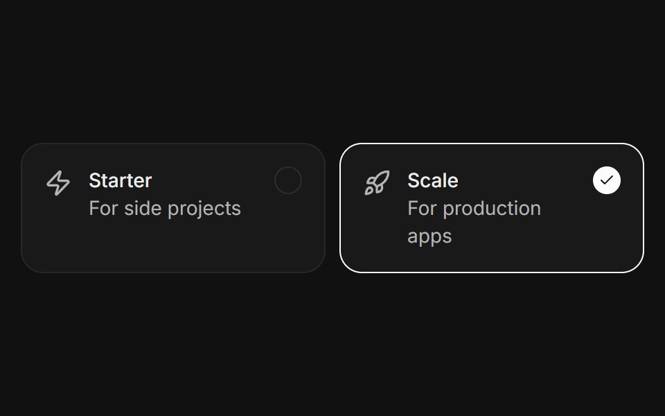 SelectableFLX UI · ReactClickable plan cards with a ring and check on the active one.
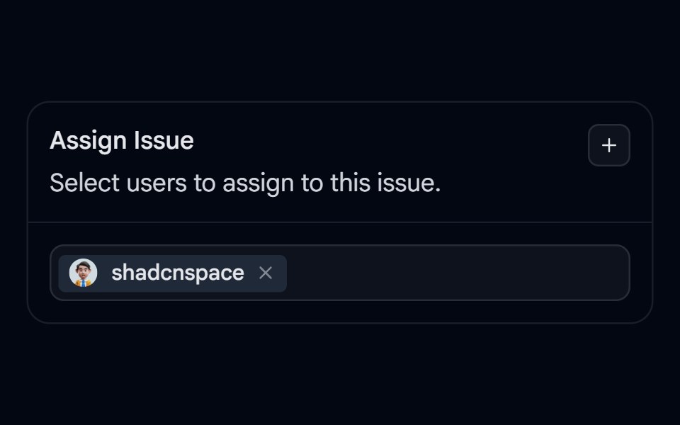 Card-11 - Assign Task CardShadcn Space · ReactCard component
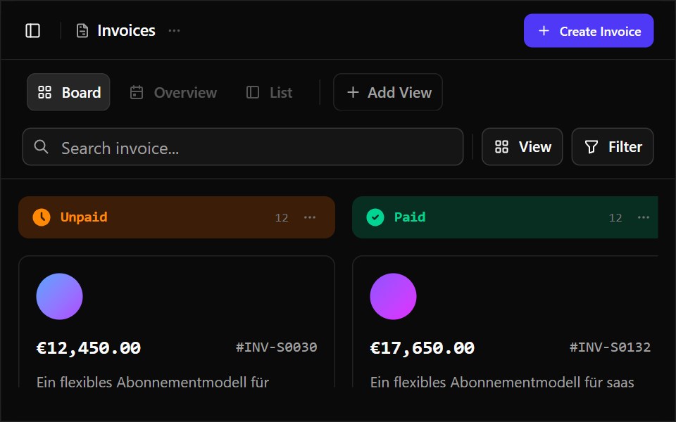 Business Operations DashboardWatermelon UI · React
 Image overlayFLX UI · ReactText and a CTA over a gradient-darkened cover image.
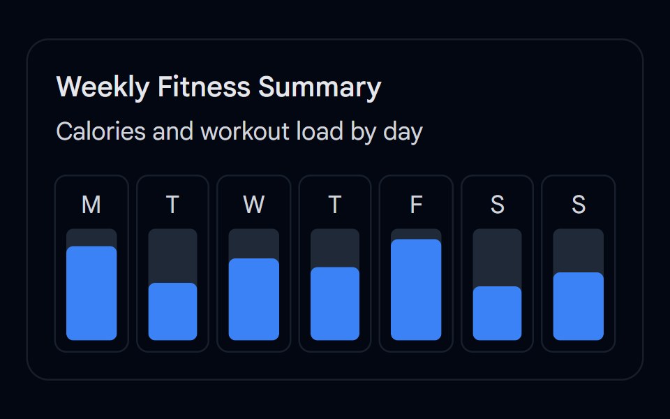 Card-12 - Weekly CardShadcn Space · ReactCard component
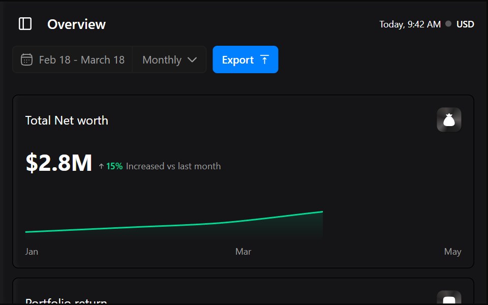 Capitalio DashboardWatermelon UI · React
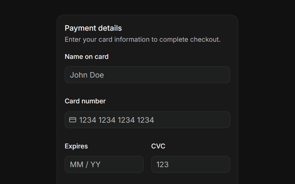 Payment formFLX UI · ReactName on card, card number with icon, expiry, CVC, and country select fields with a pay button.
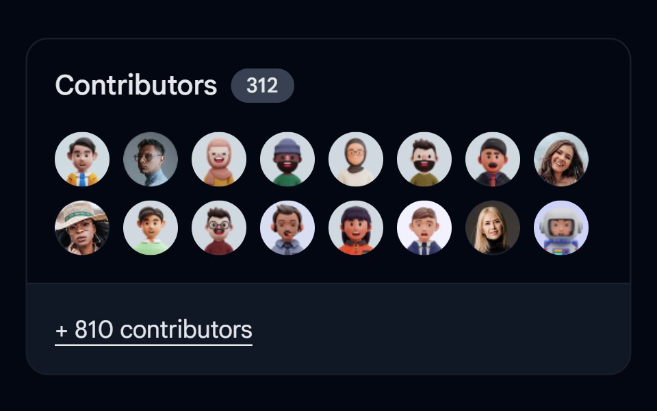 Card-13 - Contributed CardShadcn Space · ReactCard component
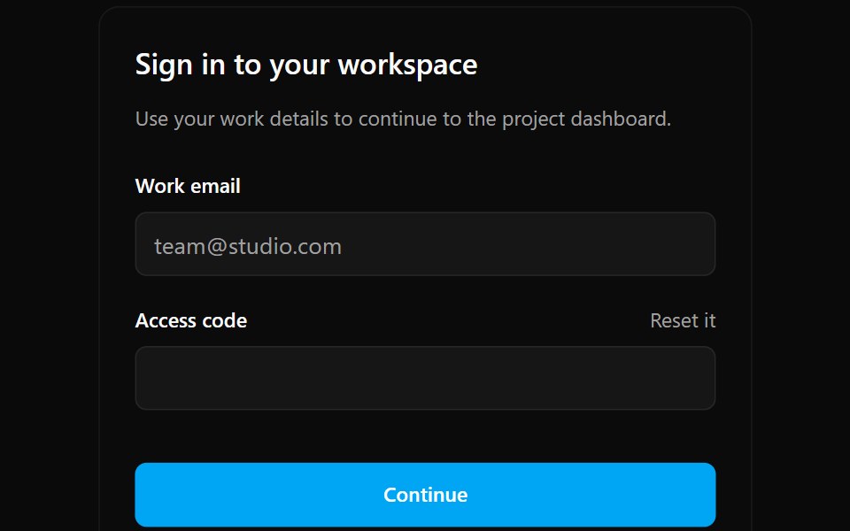 Card 1Watermelon UI · React
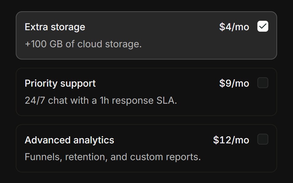 Choice cardsFLX UI · ReactBordered add-on cards that highlight when checked.
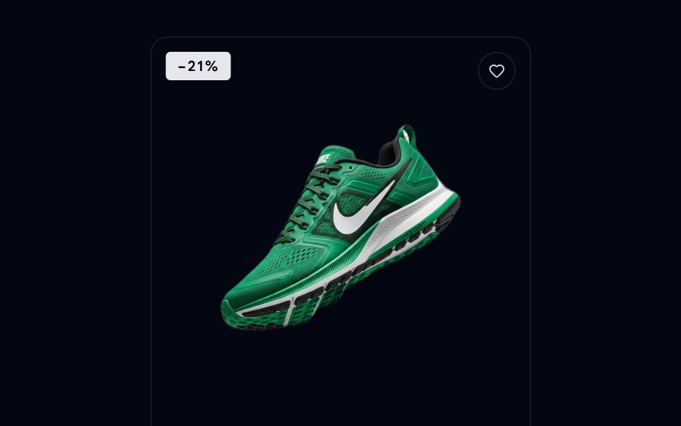 Card-14 - Ecommerce Product CardShadcn Space · ReactA clean editorial ecommerce product card with slide-up CTA, color swatches, sale badge, and wishlist.
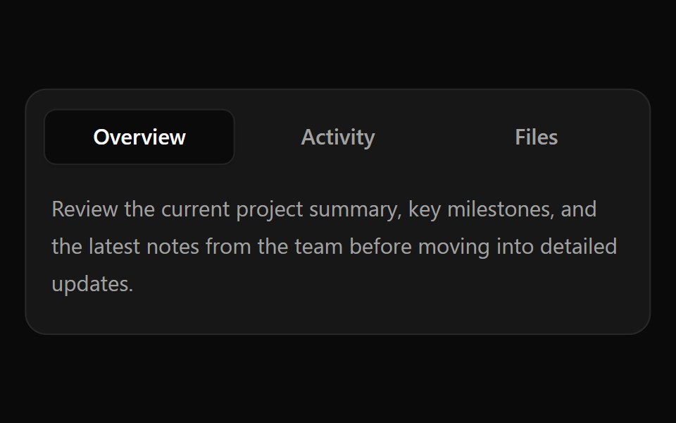 Card 10Watermelon UI · React
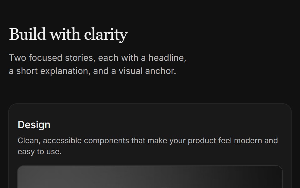 Content 04FLX UI · ReactTwo-column card grid with a serif section header and copy above each image.
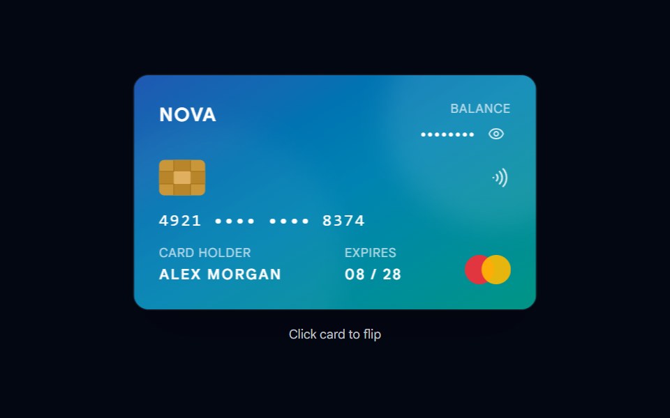 Card-15 - Credit CardShadcn Space · ReactAn interactive credit card with 3D flip animation, masked card number, balance toggle, and quick action buttons.
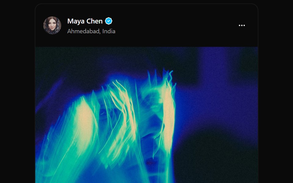 Card 11Watermelon UI · React
 Content 06FLX UI · ReactTwo-column split with serif headline, supporting copy, optional CTA, and a media panel.
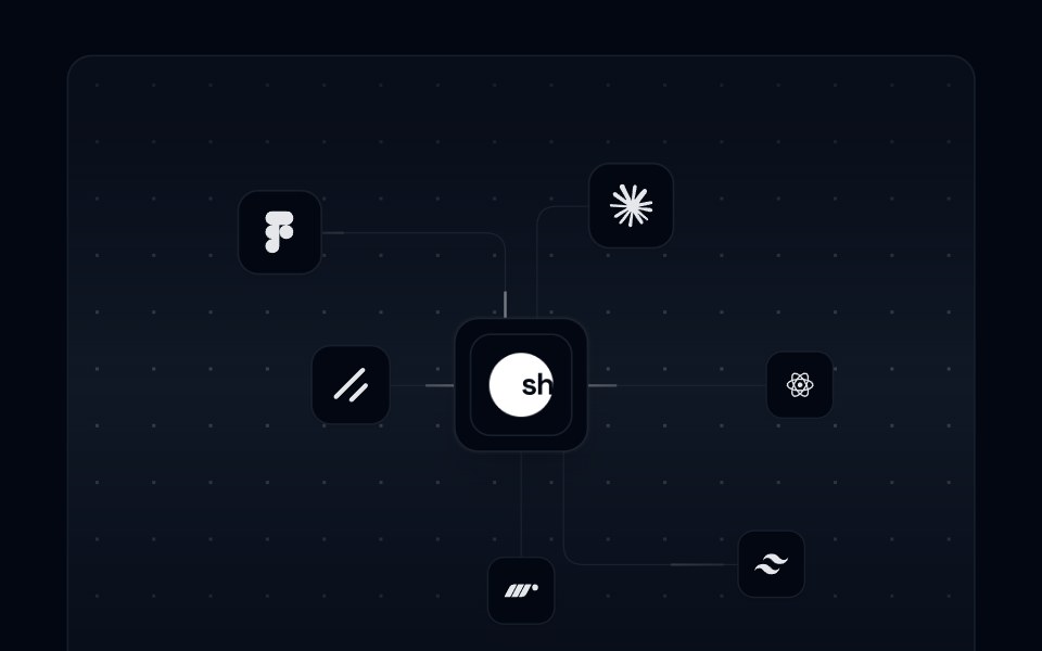 Card 16 - Integration CardShadcn Space · ReactAn animated integration card with SVG connection paths, floating integration icons, and a pulsing center logo.
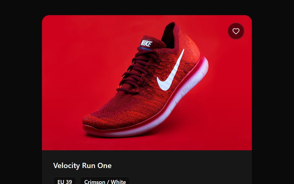 Card 12Watermelon UI · React
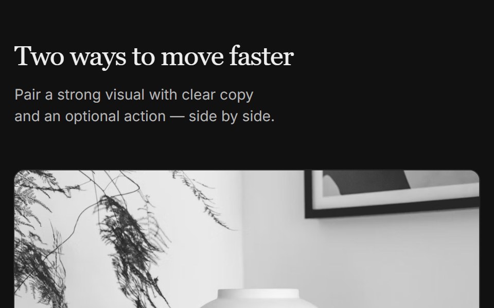 Content 07FLX UI · ReactTwo-column grid with serif header, media on top, copy, and optional CTA per column.
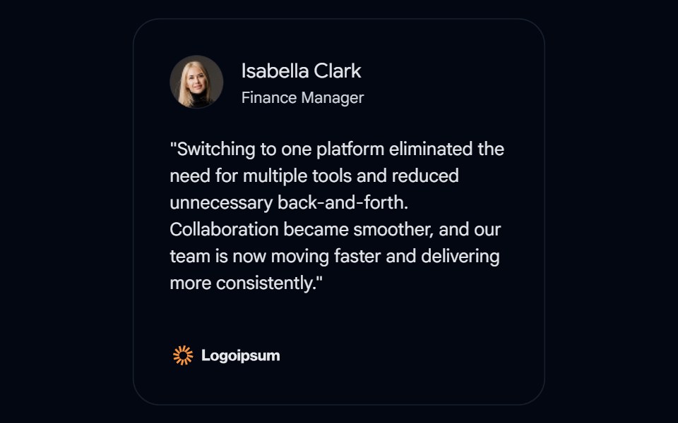 Card 17 - Testimonial CardShadcn Space · ReactAn animated integration card with SVG connection paths, floating integration icons, and a pulsing center logo.
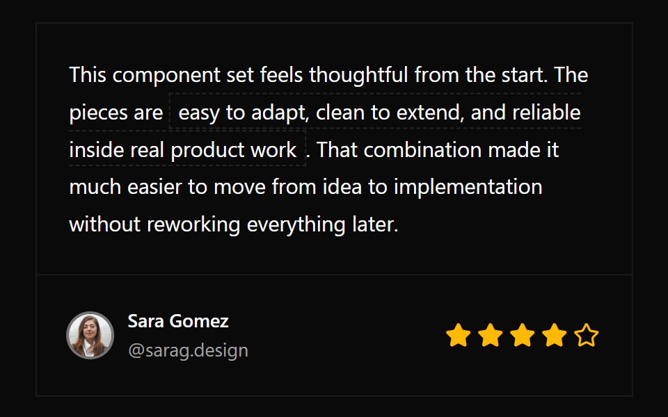 Card 13Watermelon UI · React
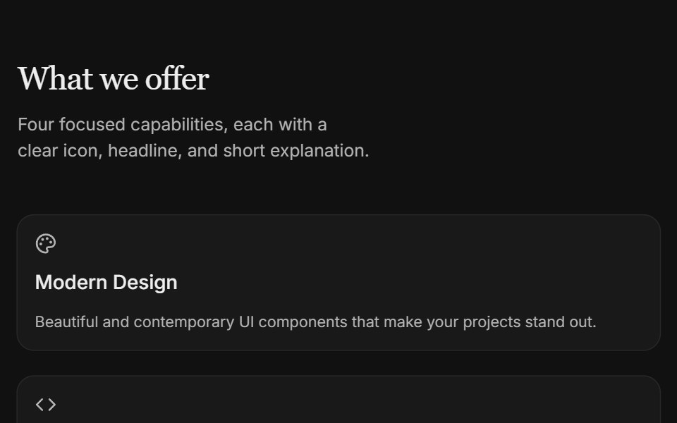 Content 09FLX UI · ReactTwo-column icon card grid with serif section header and subtle entrance motion.
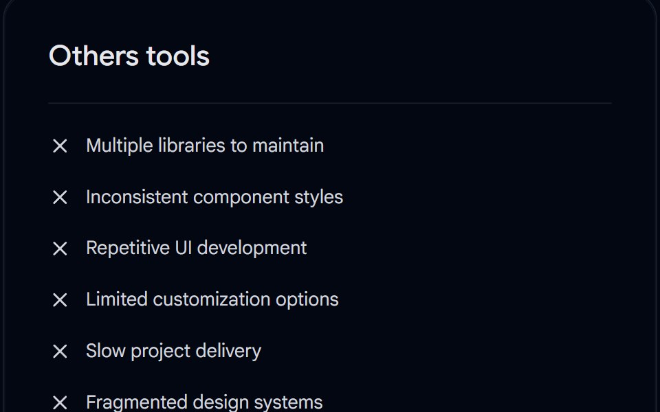 Card 18 - Highlighted Comparison CardShadcn Space · ReactA comparison card comparing other tools vs Shadcnspace, featuring custom dark theme transition, checklist, and dynamic…
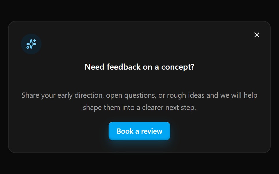 Card 14Watermelon UI · React
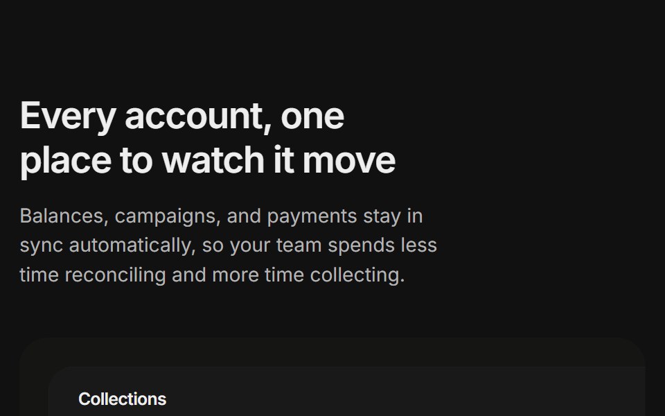 Content 11FLX UI · ReactA billing overview split with a dashboard preview card and two feature highlights, built for the app-shell preset.
 Card 19 - Place CardShadcn Space · ReactA place/location card whose grayscale image turns to color and scales up on hover using pure Tailwind transitions…
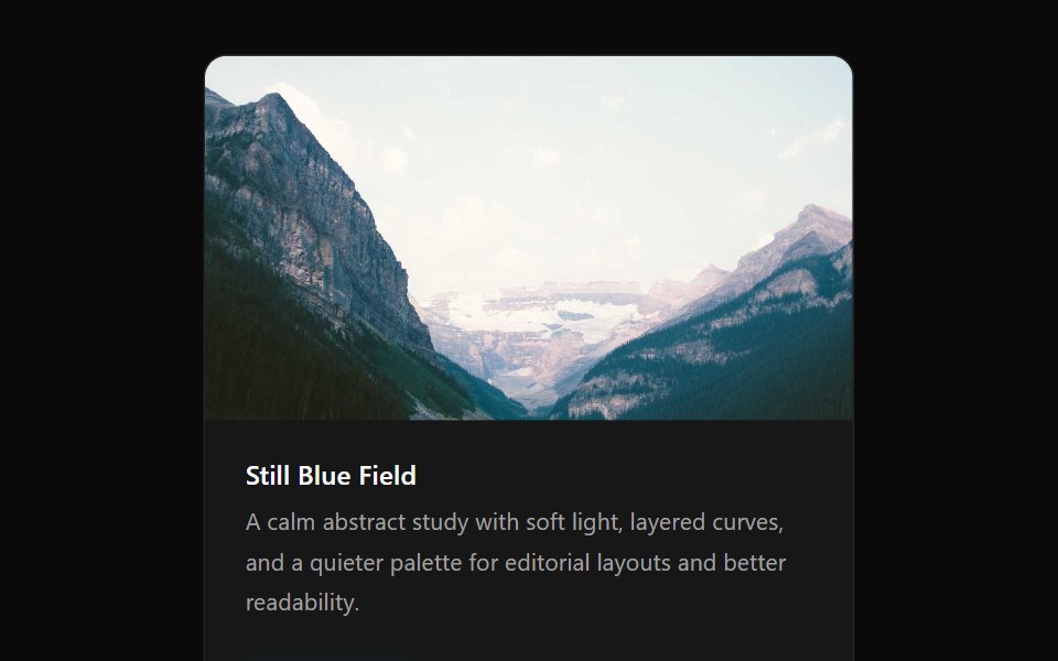 Card 15Watermelon UI · React
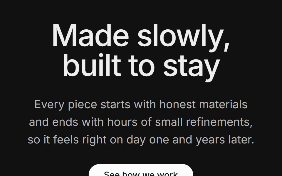 Content 12FLX UI · ReactA centered section header with supporting copy and a CTA, followed by two large side-by-side photos.
 Card 20 - Animated Event CardShadcn Space · ReactAn animated event card with a cover image, floating date badge, staggered content reveal, time and location details…
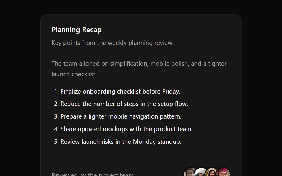 Card 2Watermelon UI · React
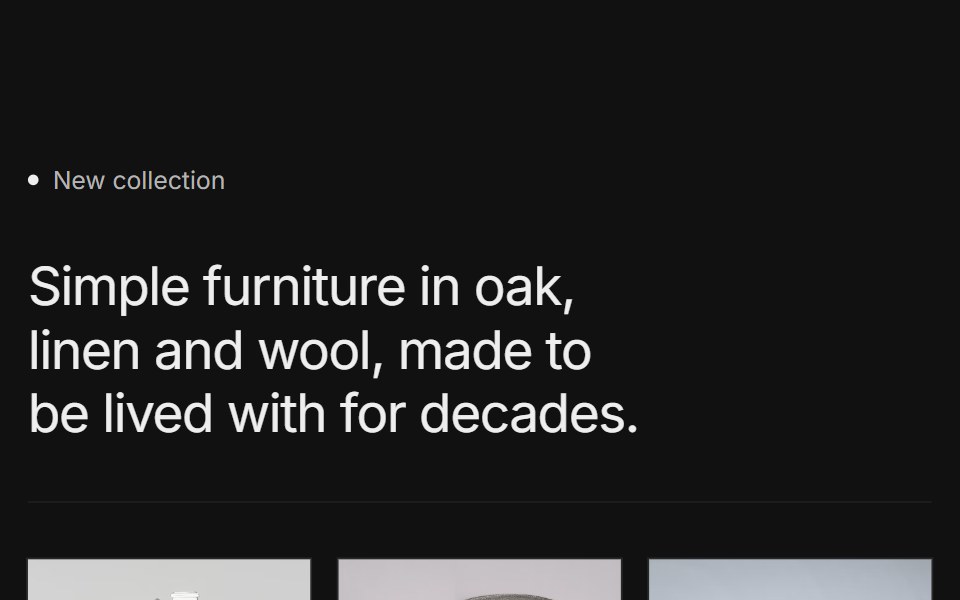 Content 15FLX UI · ReactA labeled collection intro with a short headline, a row of three product photos with names, and a CTA, framed by thin…
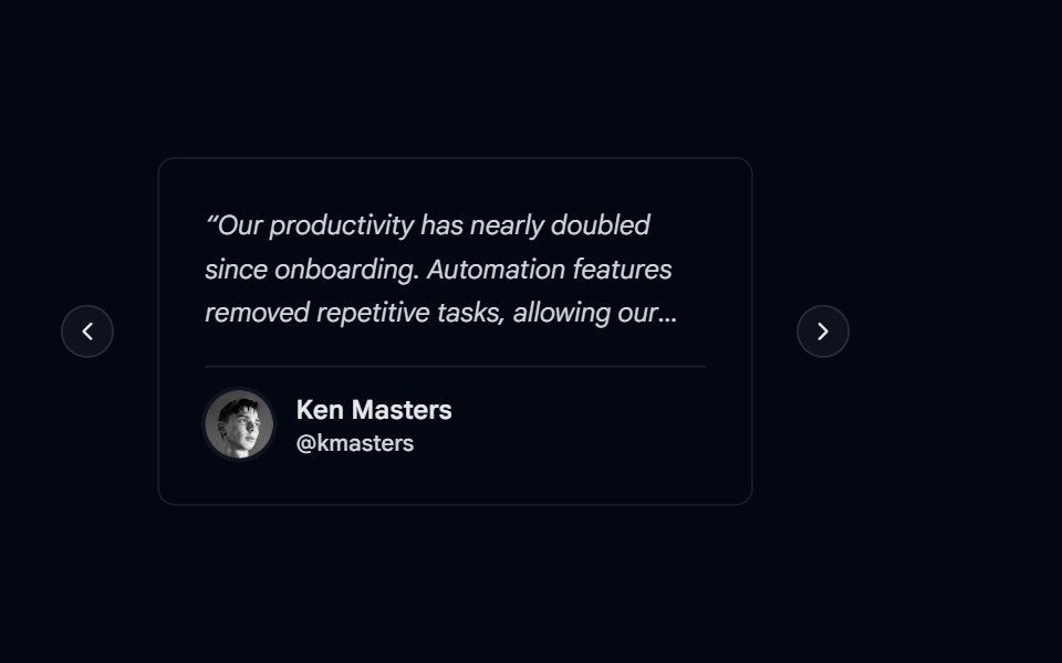 Carousel-04 - CardsShadcn Space · ReactCarousel component
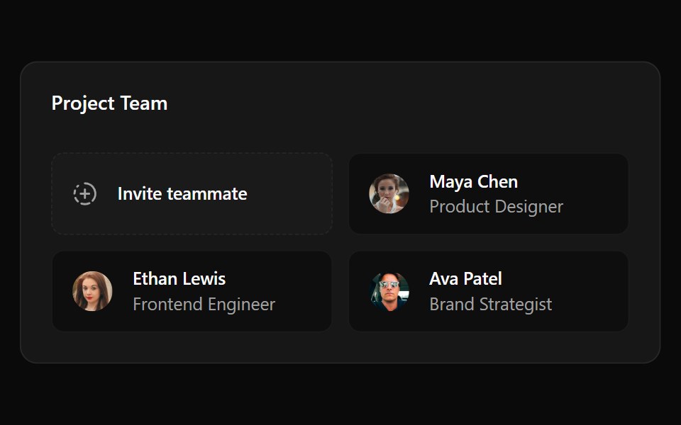 Card 3Watermelon UI · React
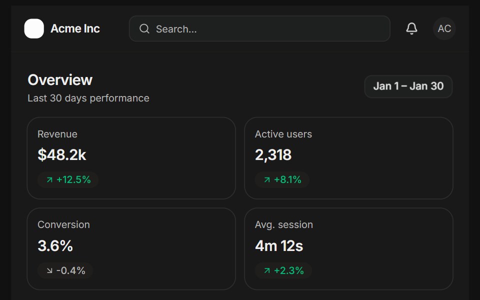 Analytics overviewFLX UI · ReactSidebar, KPI cards, a bar chart, and a recent activity list.
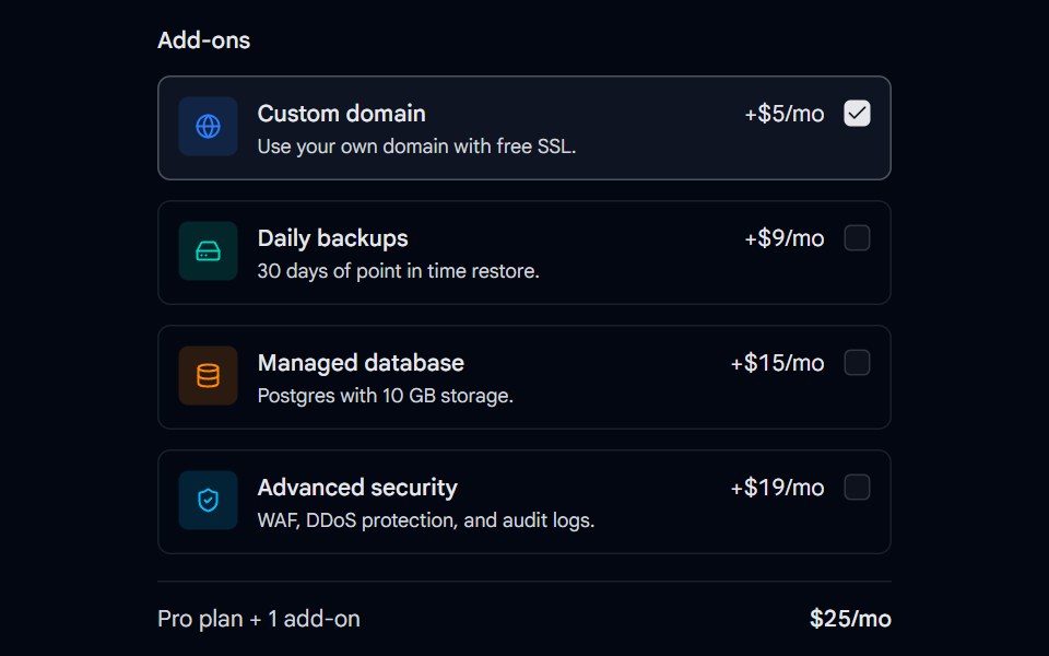 Checkbox 10 - Add-on CardsShadcn Space · ReactSelectable add-on cards with icons, descriptions, and prices that update the monthly total as you check them.
 Card 4Watermelon UI · React
 Edit profileFLX UI · ReactFieldGroup form with Save and Cancel footer.
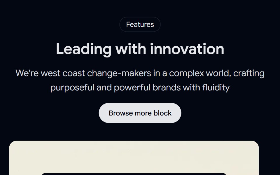 Feature 01 - Feature with TestimonialsShadcn Space · ReactA trust focused feature section combining a highlighted customer testimonial with supporting benefit cards, perfect…
 Card 5Watermelon UI · React
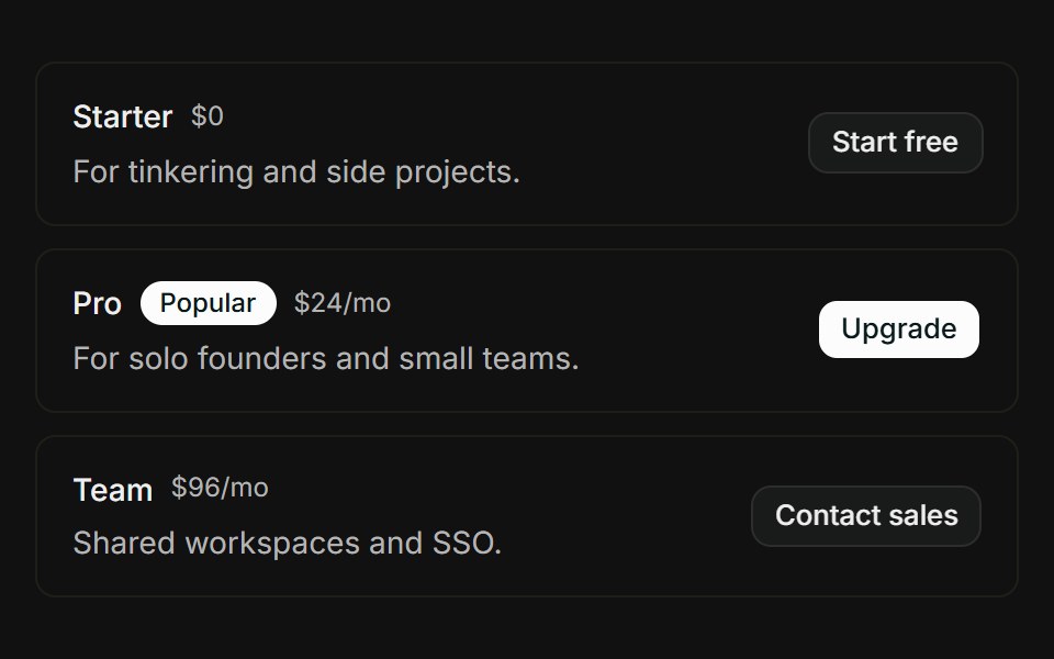 Pricing tiersFLX UI · ReactStacked tier rows with Popular badge, price, and CTA button.
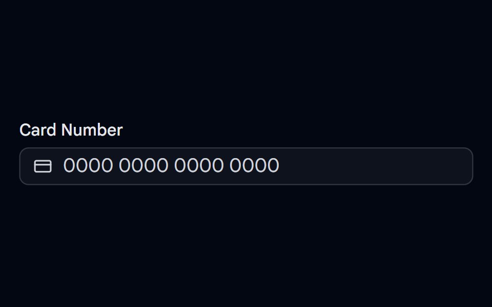 Input Mask 01 - Card NumberShadcn Space · ReactCard number input mask with #### #### #### #### format.
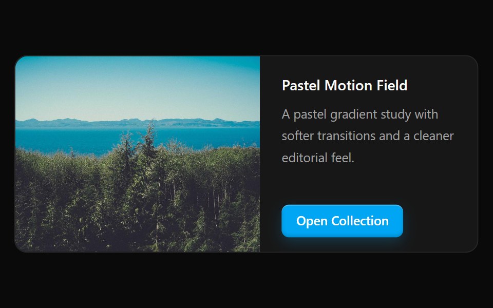 Card 6Watermelon UI · React
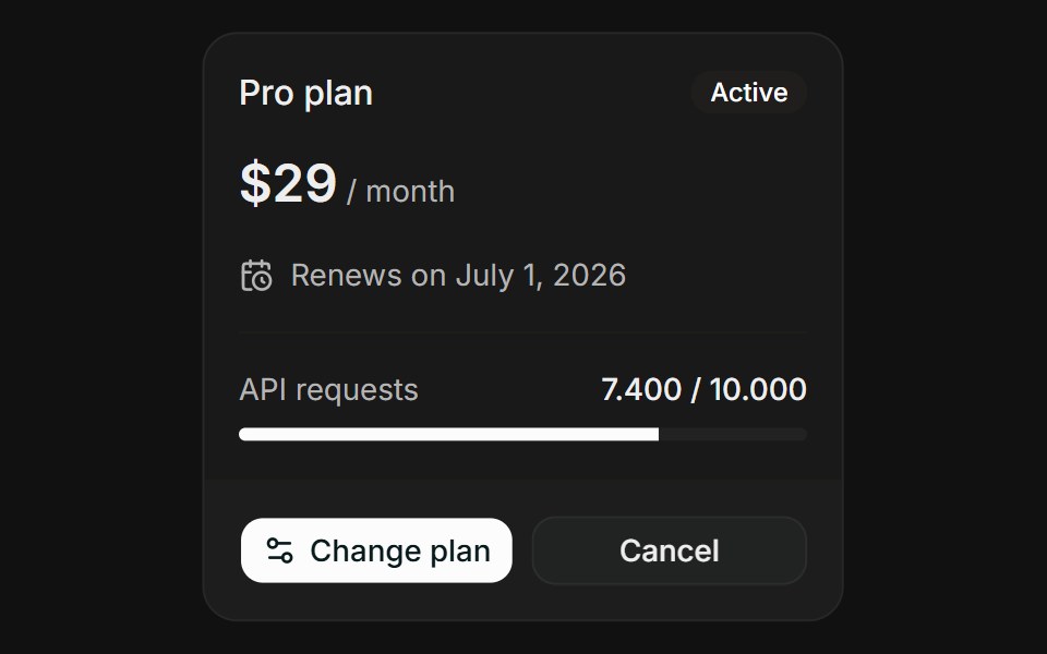 Plan OverviewFLX UI · ReactPlan Overview for Manage Subscription.
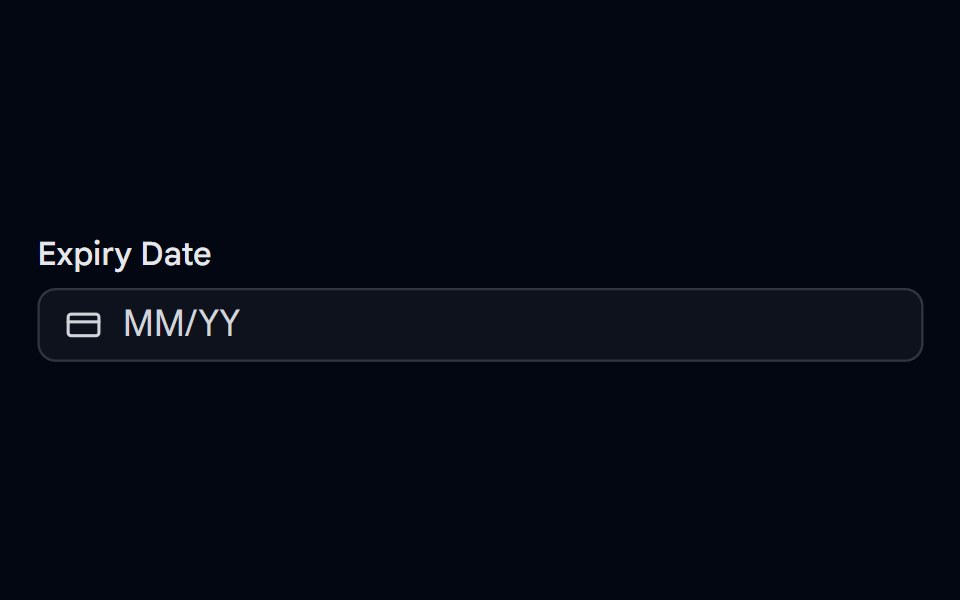 Input Mask 02 - Card Expiry DateShadcn Space · ReactCard expiry date input mask with MM/YY format.
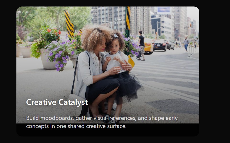 Card 7Watermelon UI · React
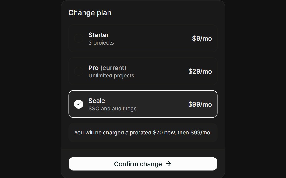 Change PlanFLX UI · ReactChange Plan for Manage Subscription.
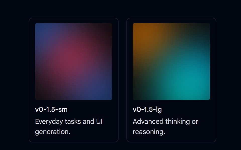 Item 02 - Model Grid CardsShadcn Space · ReactA grid of model cards built with the Item primitive, showing a gradient preview thumbnail, name, and description per…
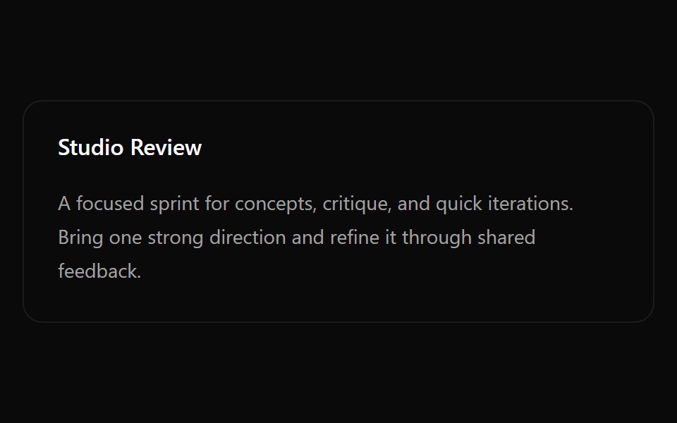 Card 8Watermelon UI · React
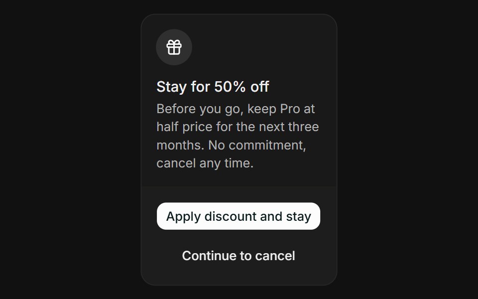 Cancel FlowFLX UI · ReactCancel Flow for Manage Subscription.
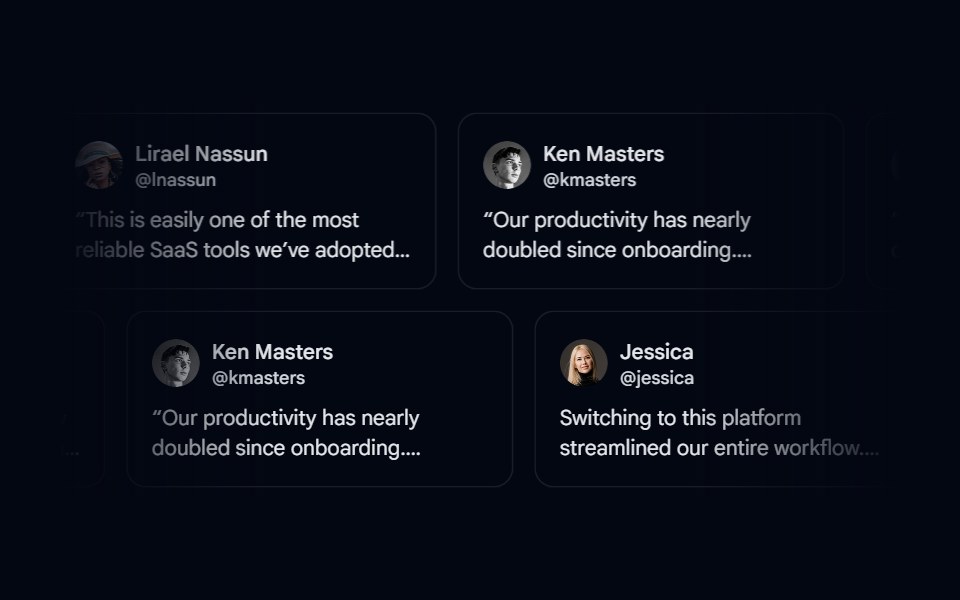 Marquee 01 - TestimonialsShadcn Space · ReactTestimonials marquee component
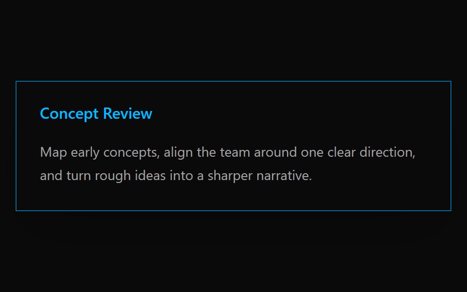 Card 9Watermelon UI · React
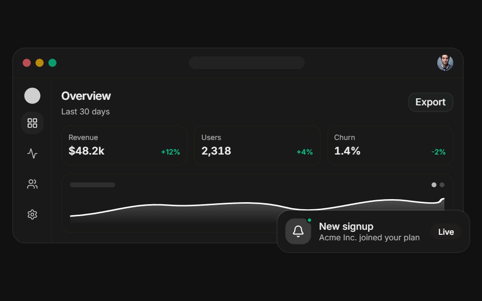 Dashboard previewFLX UI · ReactA layered app dashboard with a floating notification.
Libraries with shadcn/ui card components
Related categories
- Card Components
- React Card Components
- Tailwind CSS Card Components
- Svelte Card Components
- React Native Card Components
- Animated Card Components
- shadcn/ui Data Display Components
- shadcn/ui Table Components
- shadcn/ui Avatar Components
- shadcn/ui Data Table Components
- shadcn/ui Accordion Components
- shadcn/ui Stat Components
- shadcn/ui List Components
- shadcn/ui Chart Components
- shadcn/ui Calendar Components
- shadcn/ui Collapsible Components
- shadcn/ui Stat Card Components
- shadcn/ui Avatar Group Components
- shadcn/ui Tree View Components
- shadcn/ui Carousel Components
- shadcn/ui Testimonial Components
- shadcn/ui Filter Bar Components