 Dev Design Library
shadcn/ui List Components
Dev Design Library indexes 48 shadcn/ui list components from 14 open-source UI libraries, with the most coming from FLX UI, Shadcn Space, Watermelon UI, Notra and Cult UI. Each one links to its page with the source code, a live preview where available, the library license and the install command. They follow the shadcn/ui conventions, so most install with the shadcn CLI and drop into a Tailwind project. List components belong to the Data display group.
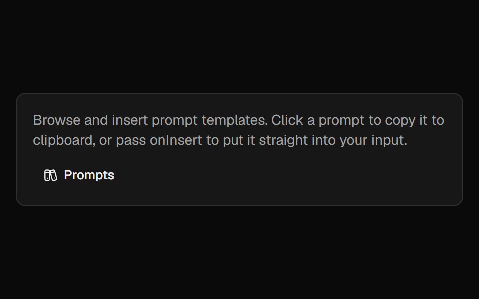 Prompt LibraryCult UI · ReactBrowse, insert, and manage prompt templates with categories and custom prompts
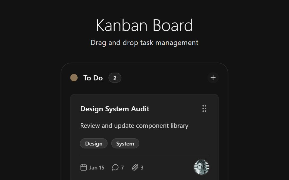 Kanban BoardSpectrum UI · Reactcomponent for the Kanban Board
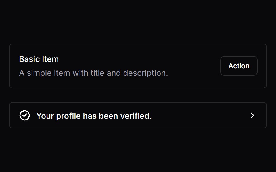 ItemVengeance UI · React
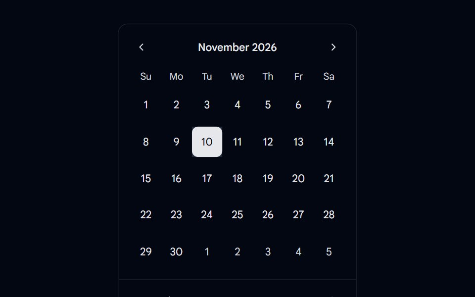 Calendar 08 - With Event ListShadcn Space · ReactCalendar component
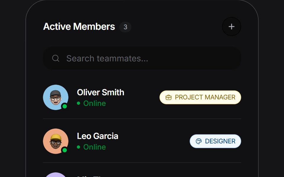 Stacked Listuselayouts · ReactAn expandable list widget with a stacked layout and smooth morphing transitions.
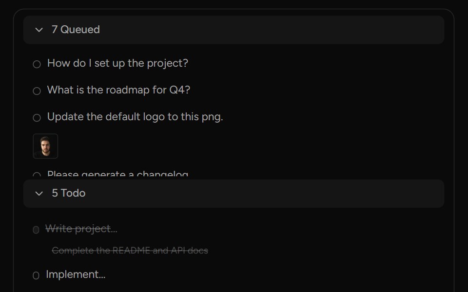 QueueAI Elements (Svelte) · SvelteA structured queue view with sections, items, attachments, and action controls.
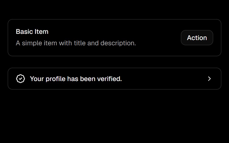 ItemObsidianUI · React
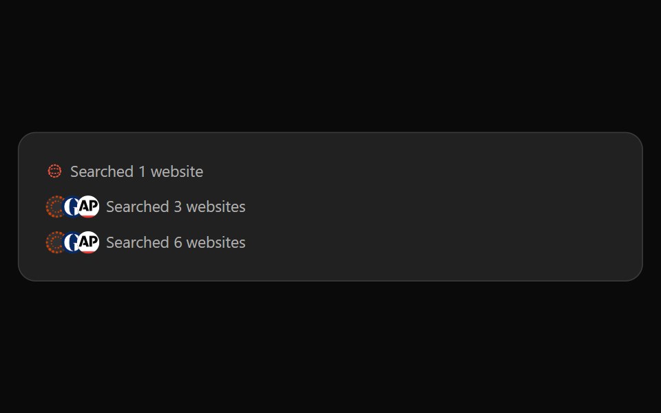 ChatGPT SearchNotra · ReactThe "Searched N websites" line, built on shadcn Button.
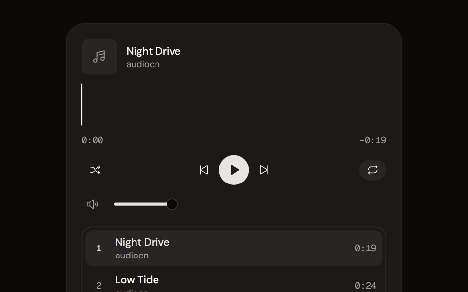 Music Playeraudiocn · ReactA playlist player with a waveform seek bar, shuffle, repeat, volume and optional ducking under the microphone.
 Career 2Watermelon UI · React
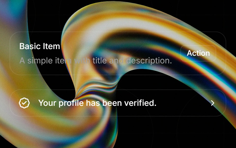 Itemglasscn · React
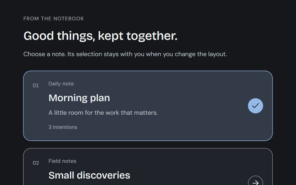 ItemCojeev UI · ReactA notebook ledger, an illustrated collection or an actionable detail. Three readable arrangements for the things you…
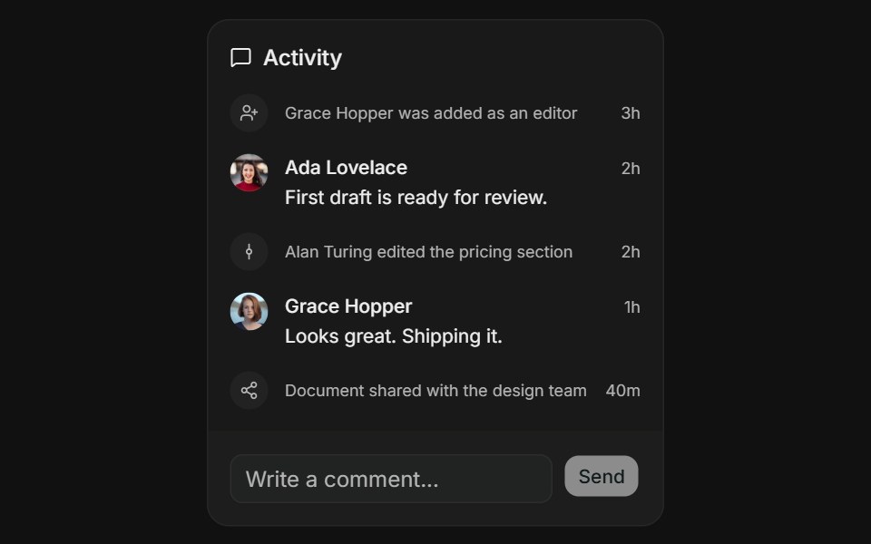 Activity FeedFLX UI · ReactActivity Feed for Comment Thread.
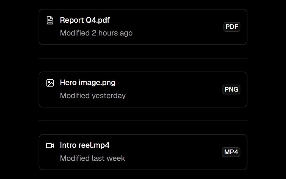 Itemark-cn · ReactComposable list item with media, content, title, description, and action slots.
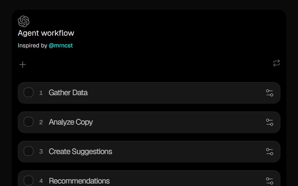 Sortable ListCult UI · ReactDrag-and-drop sortable list component with smooth animations and reordering
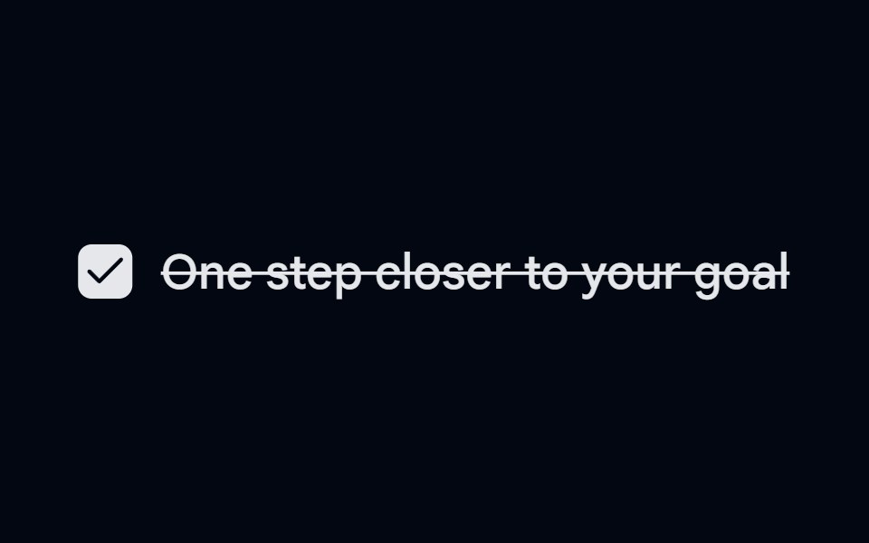 Checkbox-04 - Checkbox with todo listShadcn Space · ReactCheckbox component
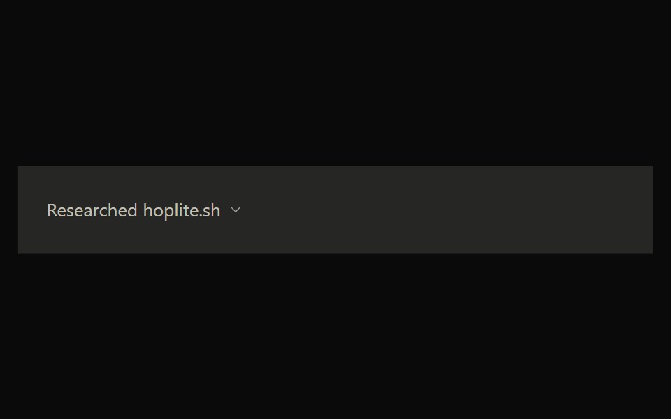 Claude SearchNotra · ReactClaude's web search timeline with queries, result cards and status steps.
 Career 3Watermelon UI · React
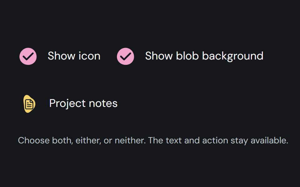 Item adornmentCojeev UI · ReactColoured organic shapes for list items, with deterministic automatic selection and custom icon or no-icon options.
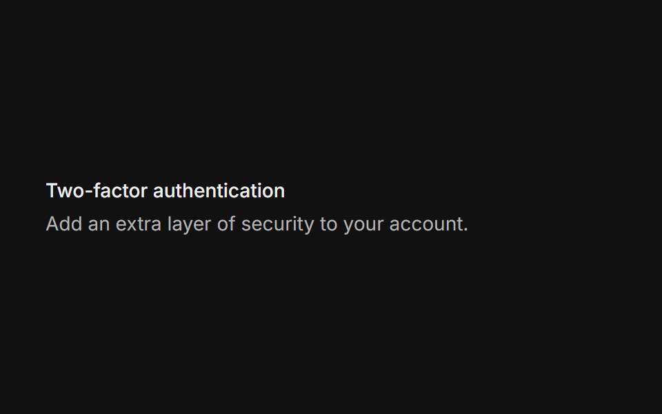 BasicFLX UI · ReactTitle plus supporting description.
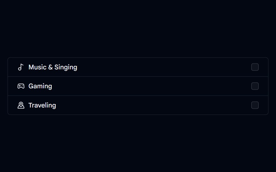 Checkbox-05 - Checkbox with list groupShadcn Space · ReactCheckbox component
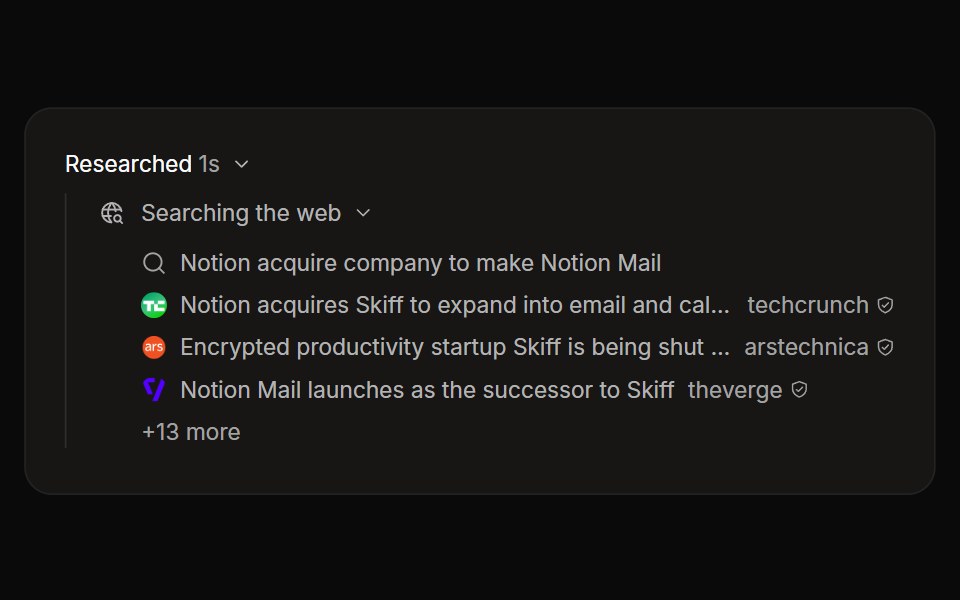 Perplexity SearchNotra · ReactThe globe search step with queries, source rows and a +N more expander, built on shadcn Collapsible.
 Career 4Watermelon UI · React
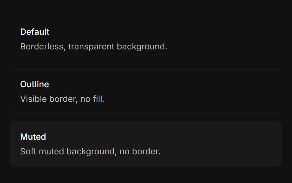 VariantsFLX UI · ReactDefault, outline, and muted variants side-by-side.
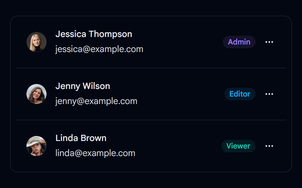 Item 01 - Team Members ListShadcn Space · ReactA team members list built with the Item primitive, showing avatar, name, email, role badge, and a dropdown menu with…
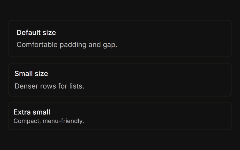 SizesFLX UI · ReactDefault, sm, and xs sizes side-by-side.
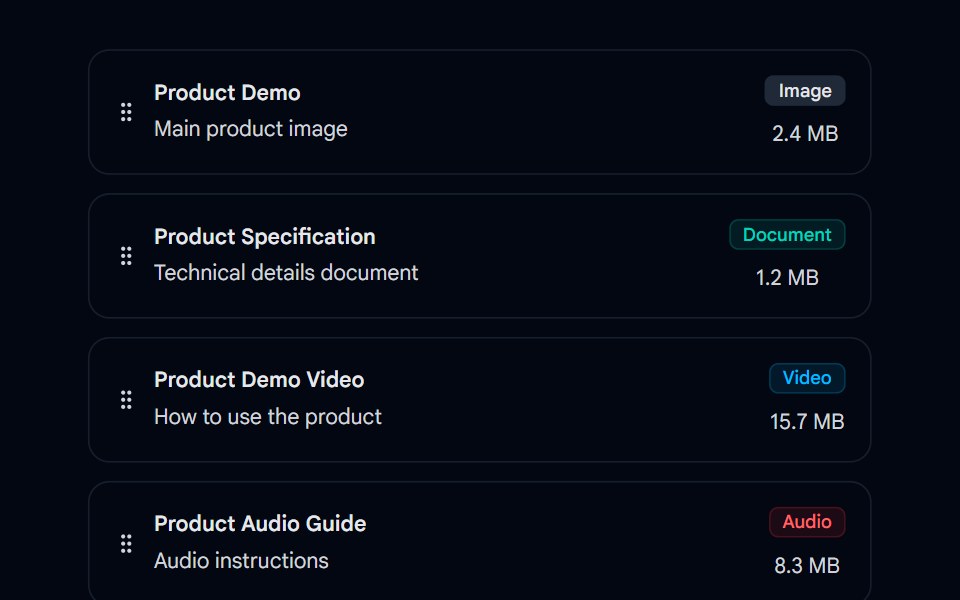 Sortable 01 - Sortable Asset ListShadcn Space · ReactA drag-and-drop sortable asset list component using @dnd-kit with drag handles, file type icons, status badges, and…
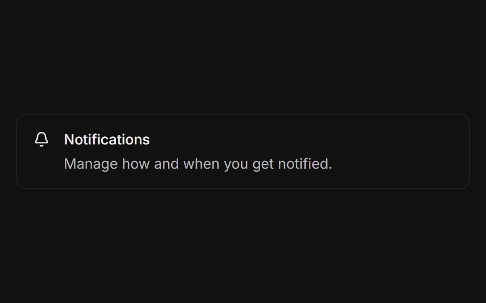 With iconFLX UI · ReactLeading icon placed before the title and description.
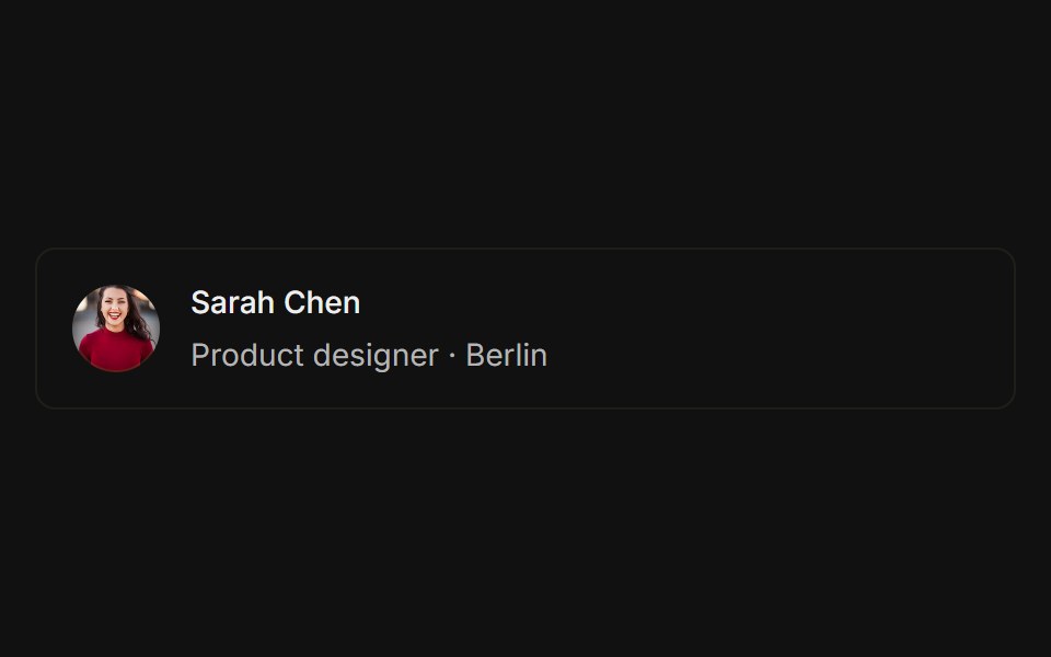 With avatarFLX UI · ReactUser avatar photo placed before the name and subtitle.
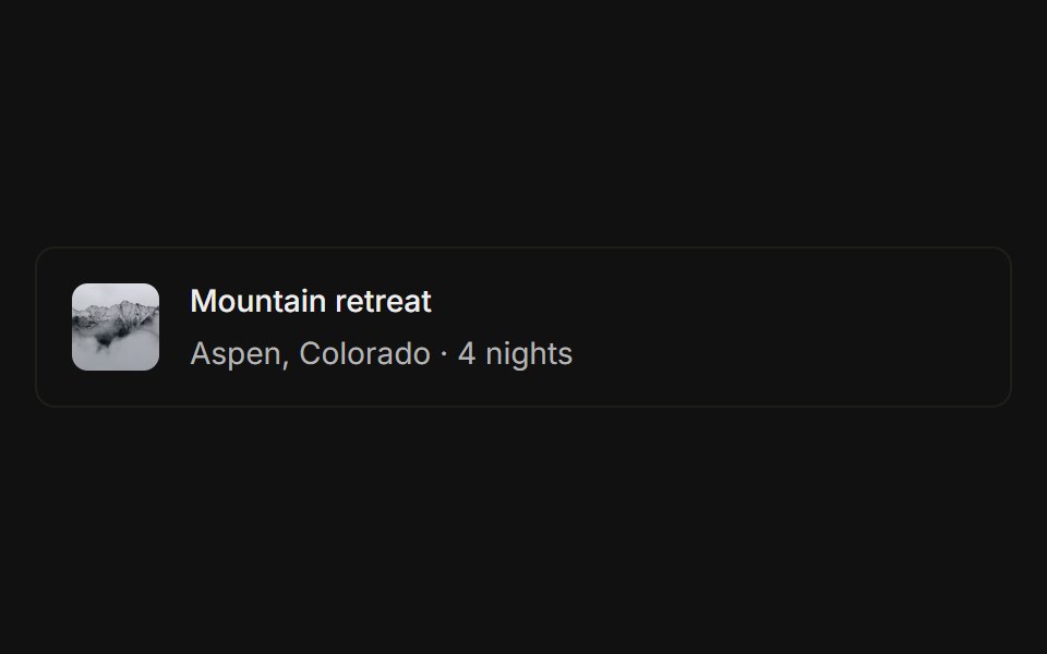 With thumbnailFLX UI · ReactSmall image thumbnail placed before the title and subtitle.
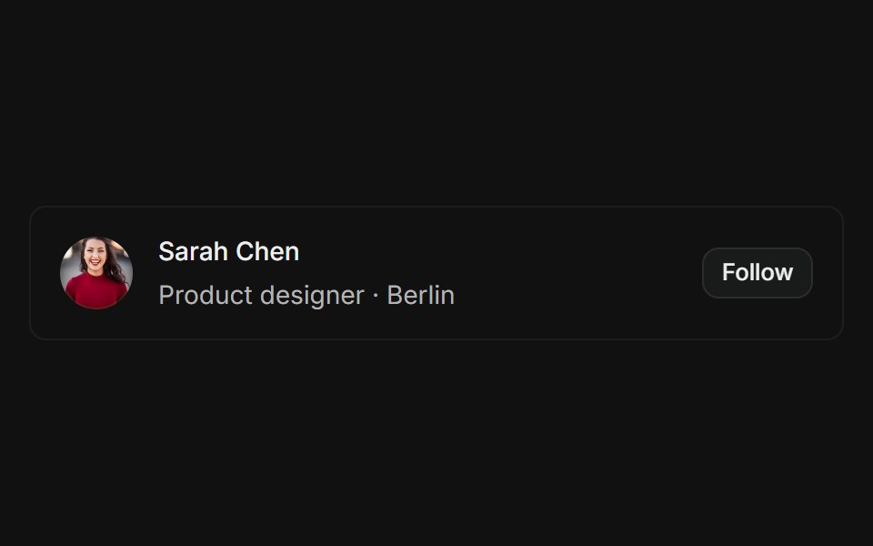 With actionsFLX UI · ReactAvatar, name, role, and a trailing action button.
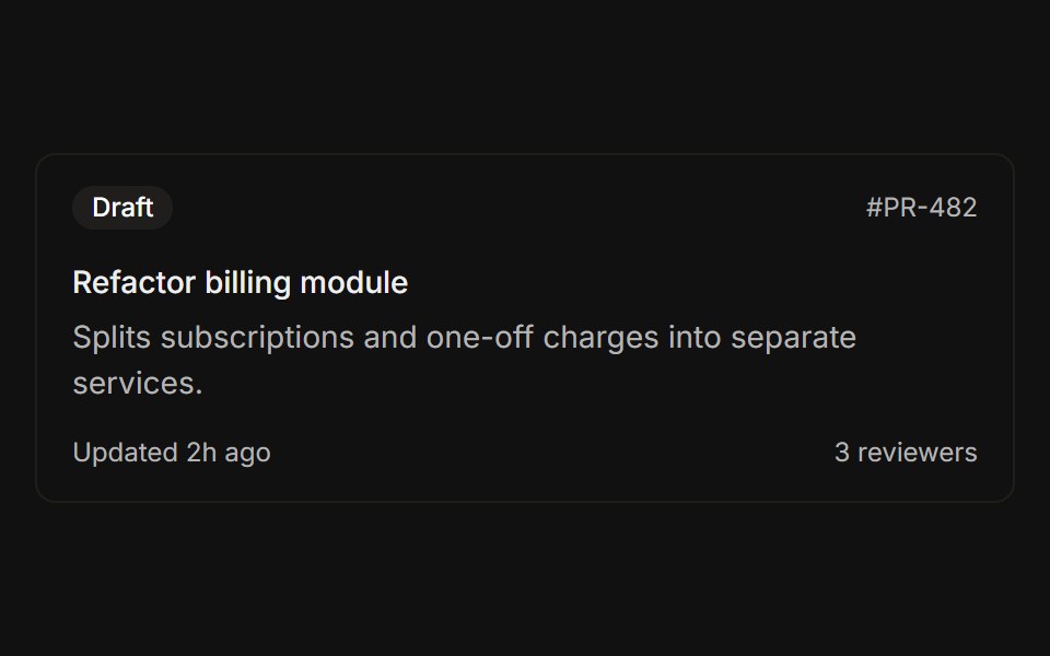 Header and footerFLX UI · ReactStatus badge above the title and a metadata row below the description.
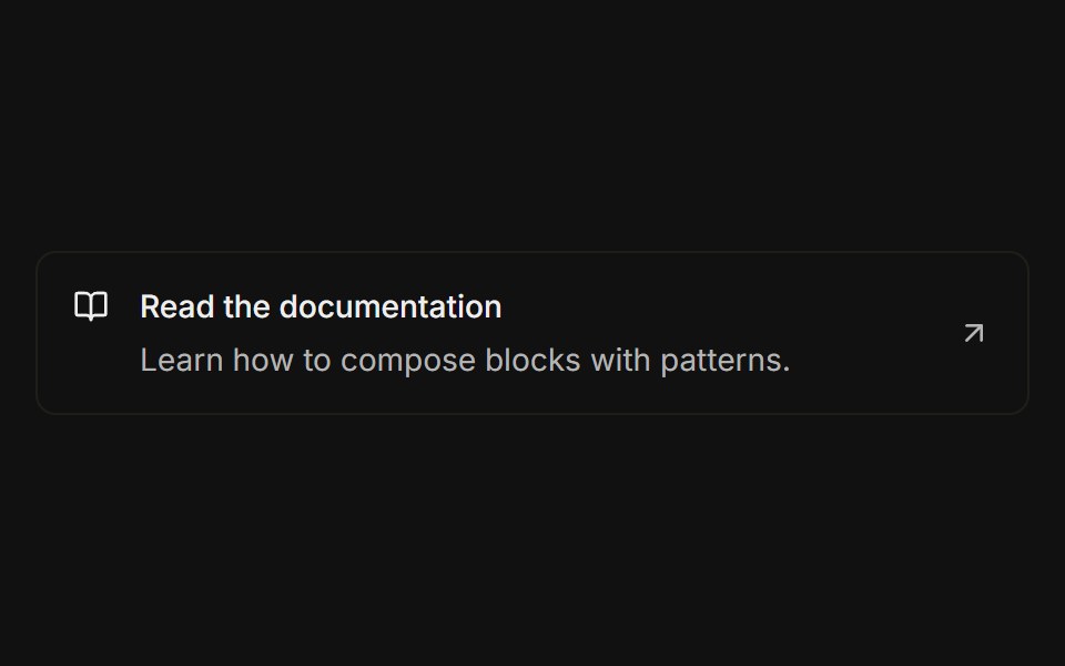 As linkFLX UI · ReactThe entire row is clickable, navigating to a URL with a trailing arrow icon.
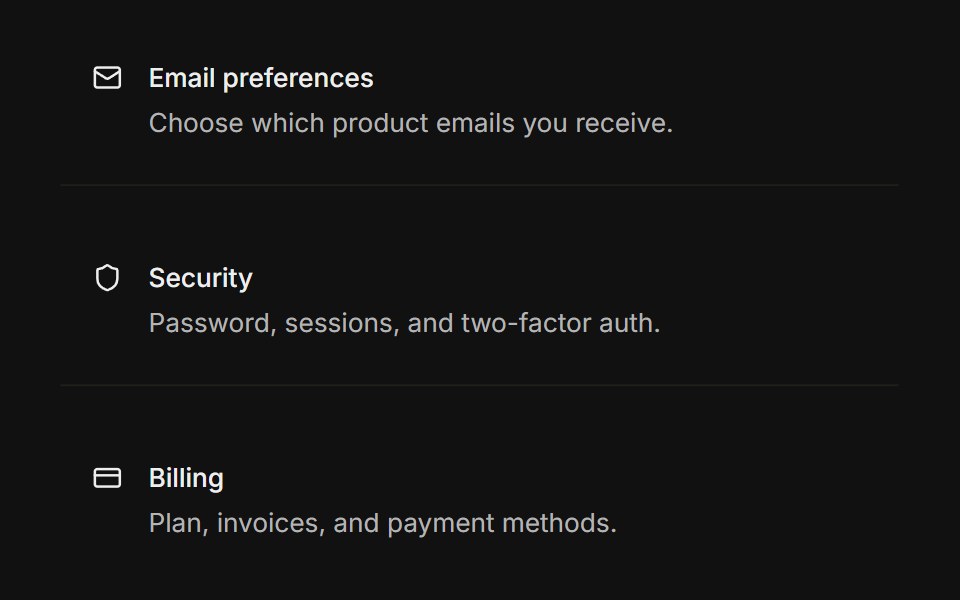 GroupFLX UI · ReactMultiple rows grouped together with thin dividers between each row.
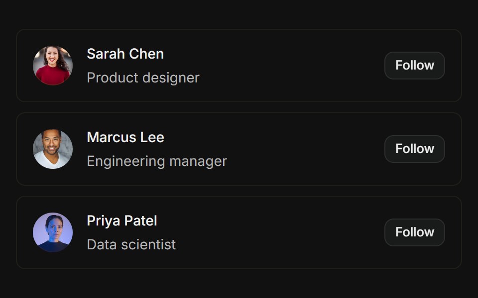 User listFLX UI · ReactAvatars with name, role, and Follow action per row.
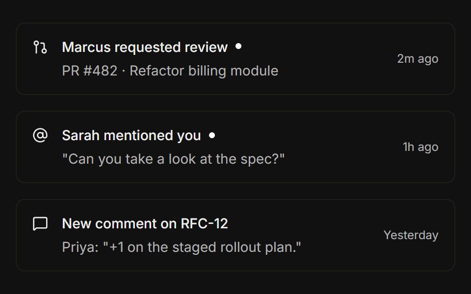 NotificationsFLX UI · ReactLeading icon, title with an unread dot indicator, and a trailing timestamp.
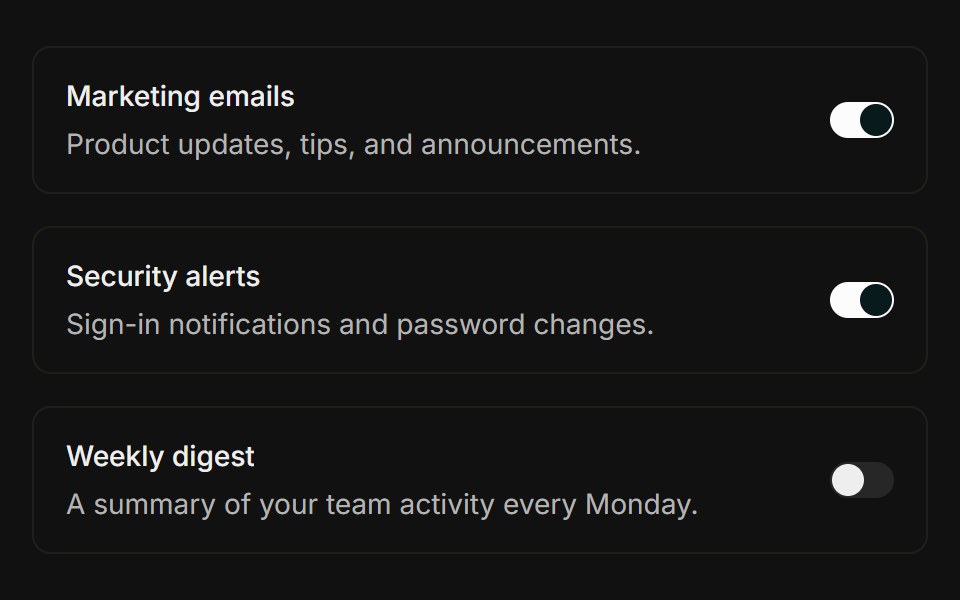 Settings rowFLX UI · ReactTitle and description with a trailing Switch.
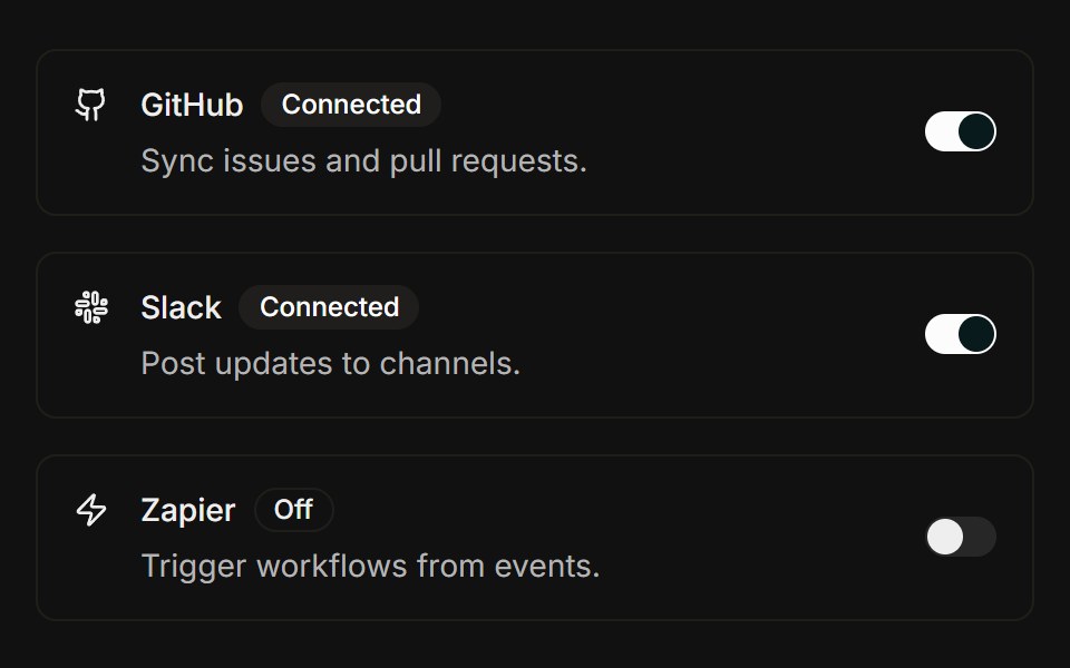 IntegrationsFLX UI · ReactBrand icon, status badge in title, connect Switch.
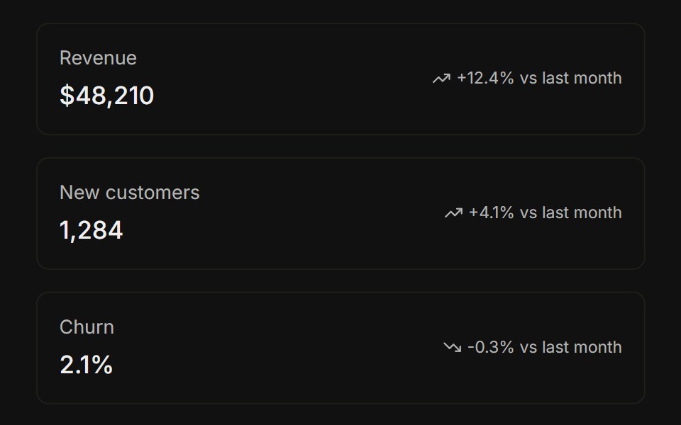 Stat rowsFLX UI · ReactStacked KPI rows with label, value, and trend delta.
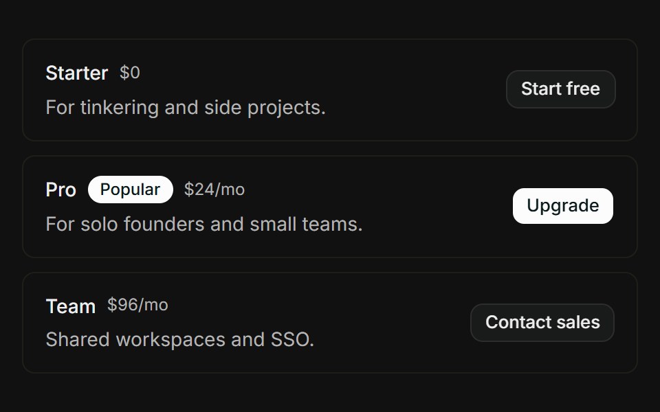 Pricing tiersFLX UI · ReactStacked tier rows with Popular badge, price, and CTA button.
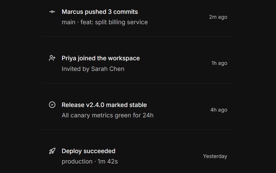 Activity feedFLX UI · ReactIcon timeline rows with relative time footer.
 In dropdown menuFLX UI · ReactCompact user avatar and email placed at the top of a dropdown menu.
 In popoverFLX UI · ReactFile rows with image thumbnails displayed inside a floating popover panel.
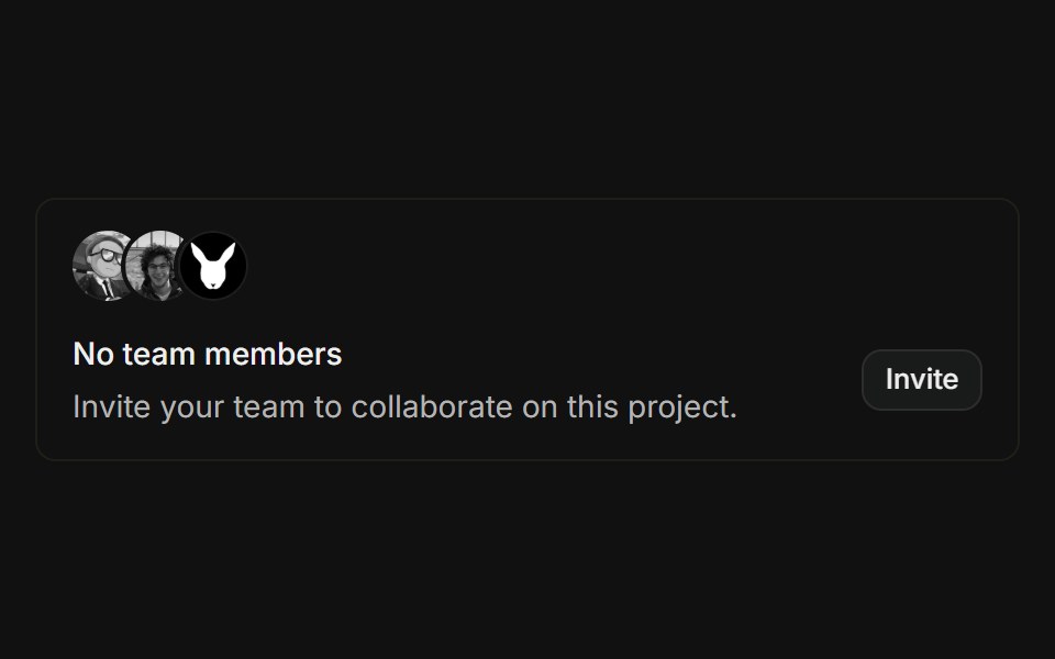 Empty teamFLX UI · ReactOverlapping avatar stack above an empty-state message with an invite button.
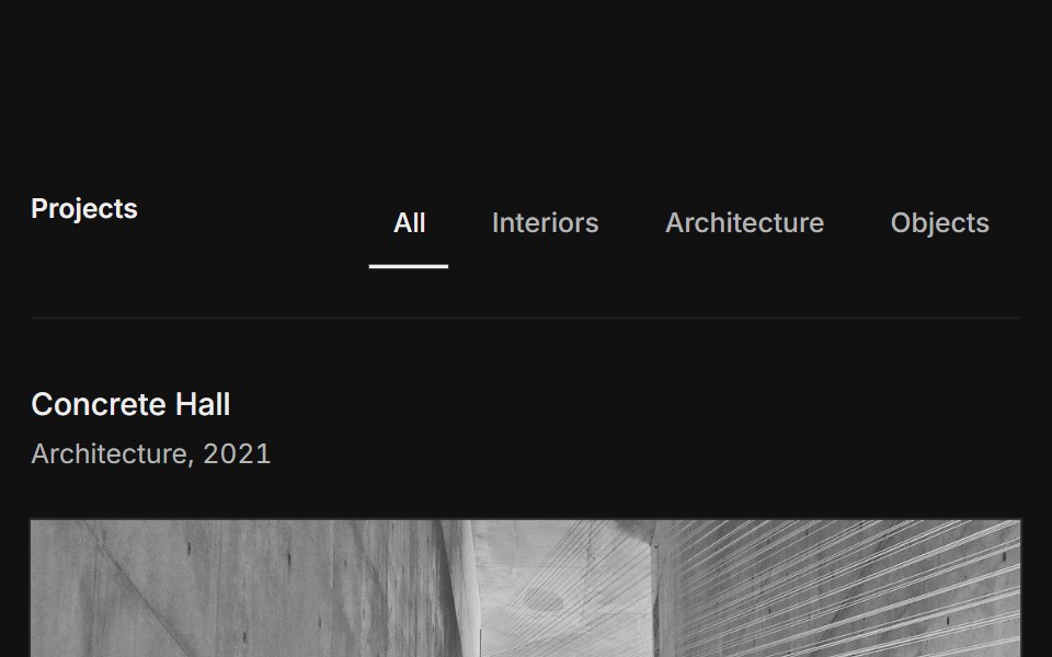 Lists 01FLX UI · ReactA filterable list of projects with a row of line tabs, then ruled rows pairing a title and meta, a short description…
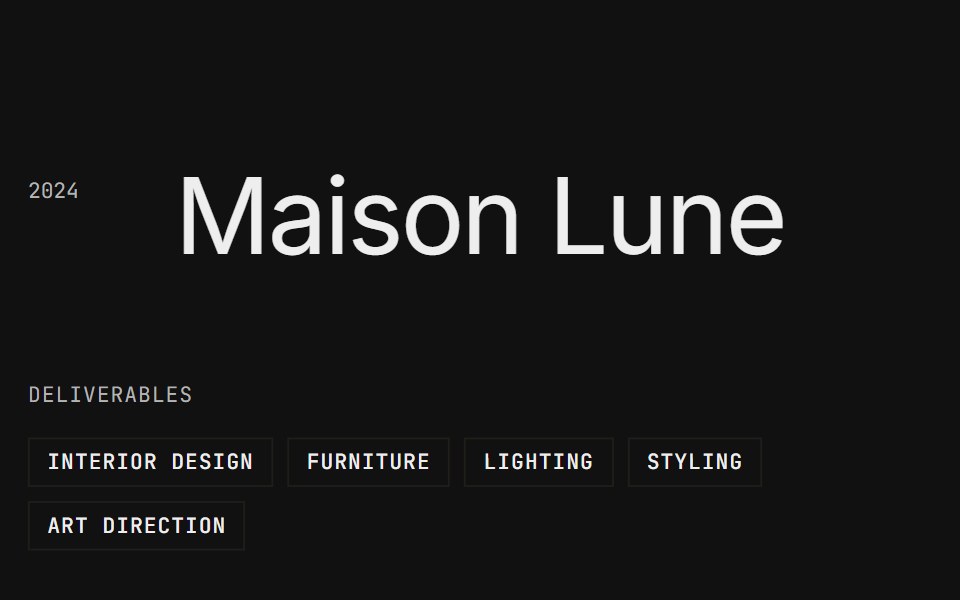 Lists 02FLX UI · ReactA centered title with a year, a column of boxed tags beside a large paragraph, and a ruled description list of…
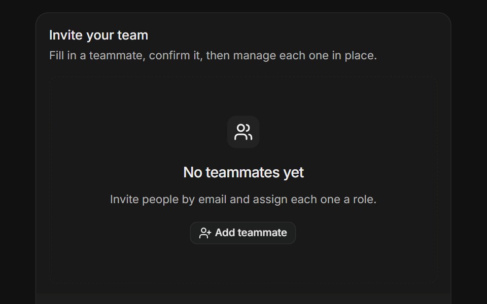 Dynamic Field ArrayFLX UI · ReactStart from an empty state, then add and remove teammate rows with per-item validation.
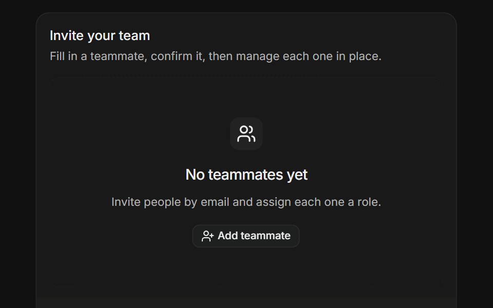 Dynamic Field ArrayFLX UI · ReactStart from an empty state, then add and remove teammate rows with per-item validation.
Libraries with shadcn/ui list components
Related categories
- List Components
- React List Components
- Tailwind CSS List Components
- Animated List Components
- shadcn/ui Data Display Components
- shadcn/ui Card Components
- shadcn/ui Table Components
- shadcn/ui Avatar Components
- shadcn/ui Data Table Components
- shadcn/ui Accordion Components
- shadcn/ui Stat Components
- shadcn/ui Chart Components
- shadcn/ui Calendar Components
- shadcn/ui Collapsible Components
- shadcn/ui Stat Card Components
- shadcn/ui Avatar Group Components
- shadcn/ui Tree View Components
- shadcn/ui Carousel Components
- shadcn/ui Testimonial Components
- shadcn/ui Filter Bar Components