 Dev Design Library
shadcn/ui Data Table Components
Dev Design Library indexes 65 shadcn/ui data table components from 11 open-source UI libraries, with the most coming from FLX UI, sv-table, Watermelon UI, sv-particles and Velora UI. Each one links to its page with the source code, a live preview where available, the library license and the install command. They follow the shadcn/ui conventions, so most install with the shadcn CLI and drop into a Tailwind project. Data table components belong to the Data display group.
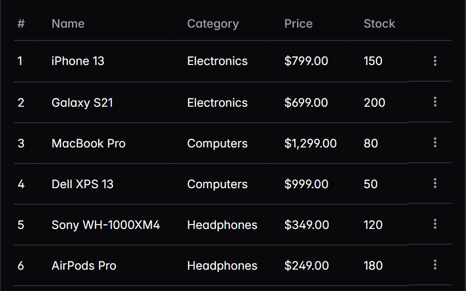 tableIntent UI · Reacttable
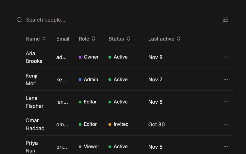 Data TableFluid Functionalism · ReactTanStack Table drawn with the library's Table: the fluid hover row highlight plus resizable, draggable columns…
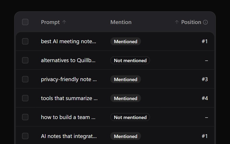 Data TableNotra · ReactA sortable, selectable table with a sticky header, virtualized rows, pagination with a page-size select, and an…
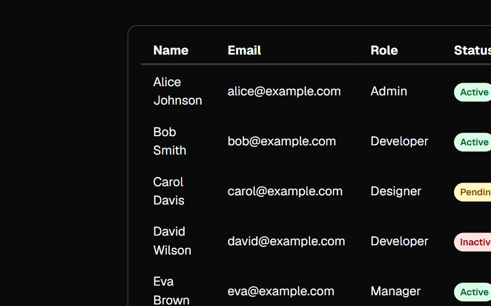 tableBaseLayer · ReactA table displays data in rows and columns and enables a user to navigate its contents via directional navigation keys…
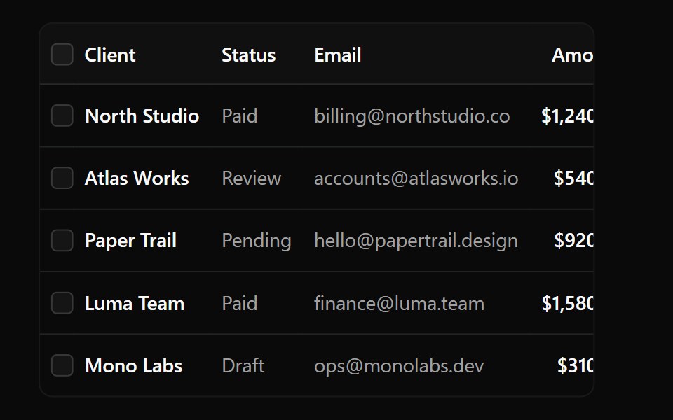 Data Table 1Watermelon UI · React
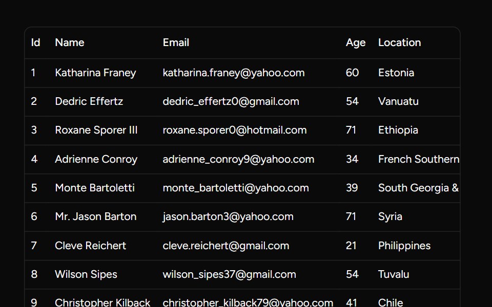 Basic Data Tablesv-table · Svelte
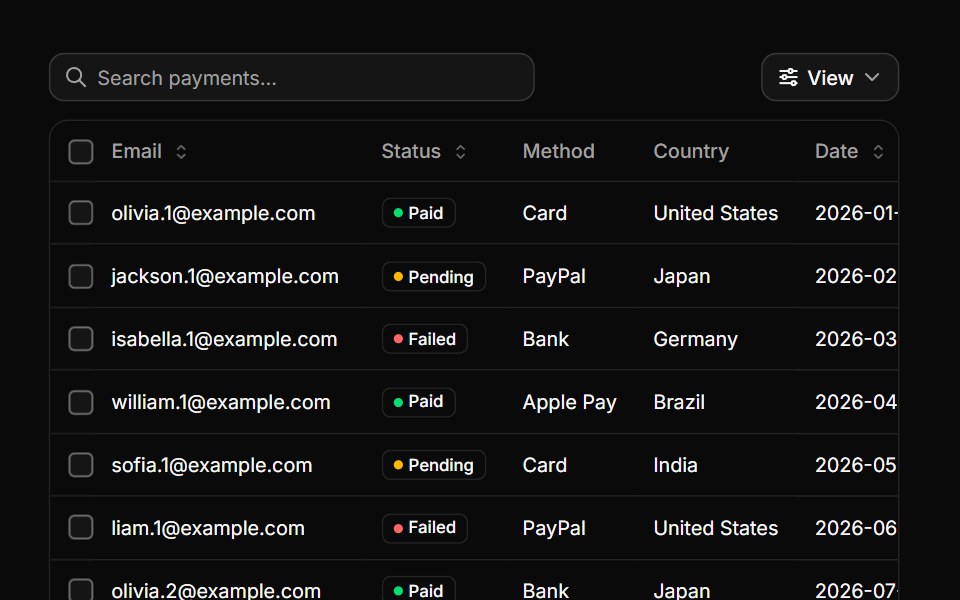 Data tableHextaUI · ReactA table for real data, with sorting, search, row selection, pinned columns, a sticky header and pagination.
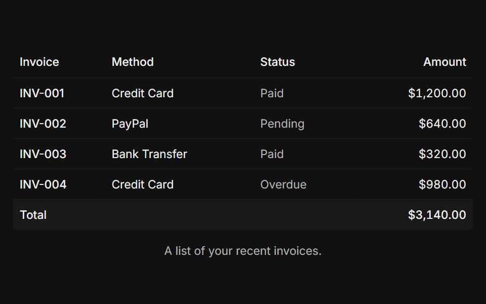 BasicFLX UI · ReactCaption, header, and a footer total row.
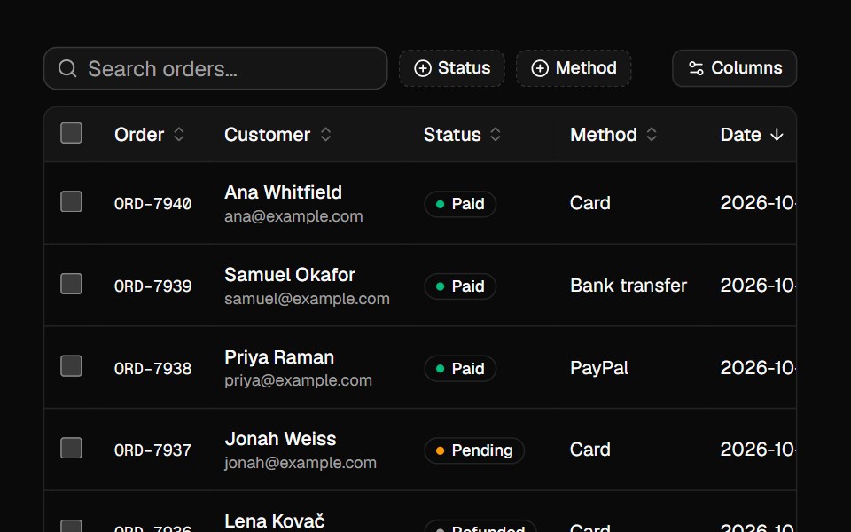 Data GridVelora UI · ReactSortable, searchable, filterable table with selection, column toggles and pagination, built on TanStack Table.
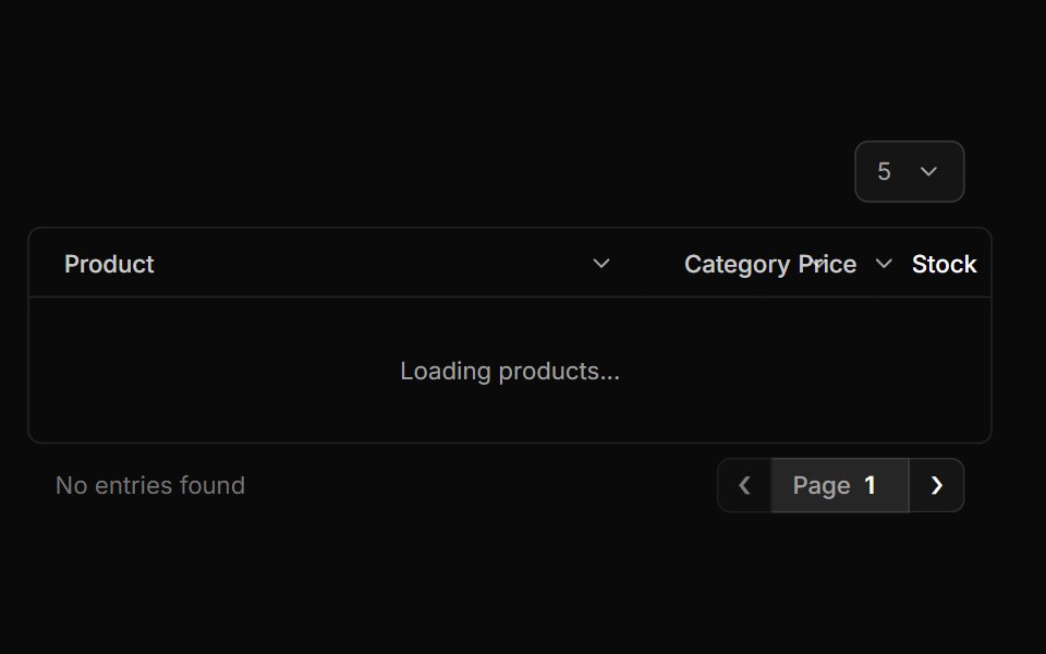 Basic Tablesv-particles · Svelte
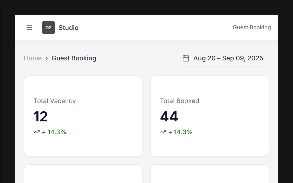 Dashboard 01D2Studio UI · ReactHotel booking dashboard with guest and vacancy stats, booking search and a check-in and check-out table.
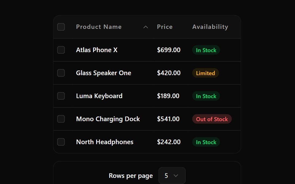 Data Table 10Watermelon UI · React
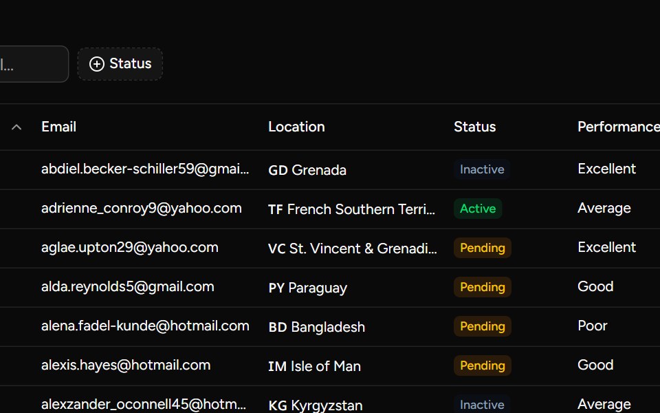 Complex Examplesv-table · Svelte
 With imagesFLX UI · ReactAvatar thumbnails beside name and email in each row.
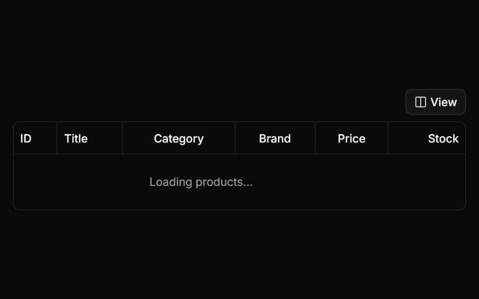 Column Visiblity Tablesv-particles · Svelte
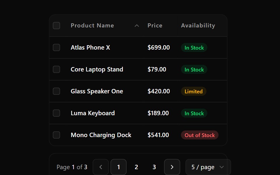 Data Table 11Watermelon UI · React
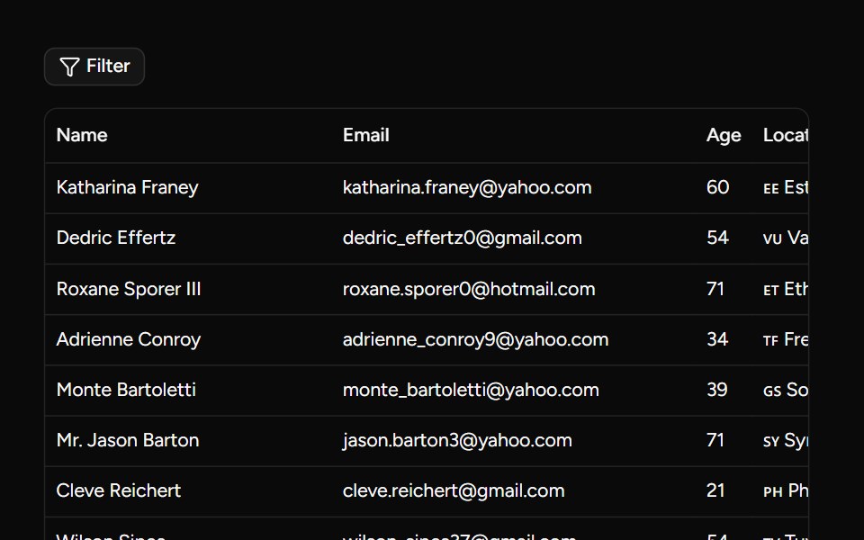 Custom Filters Examplesv-table · Svelte
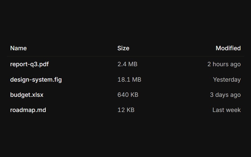 Without dividersFLX UI · ReactBorderless rows for a clean, list-like layout.
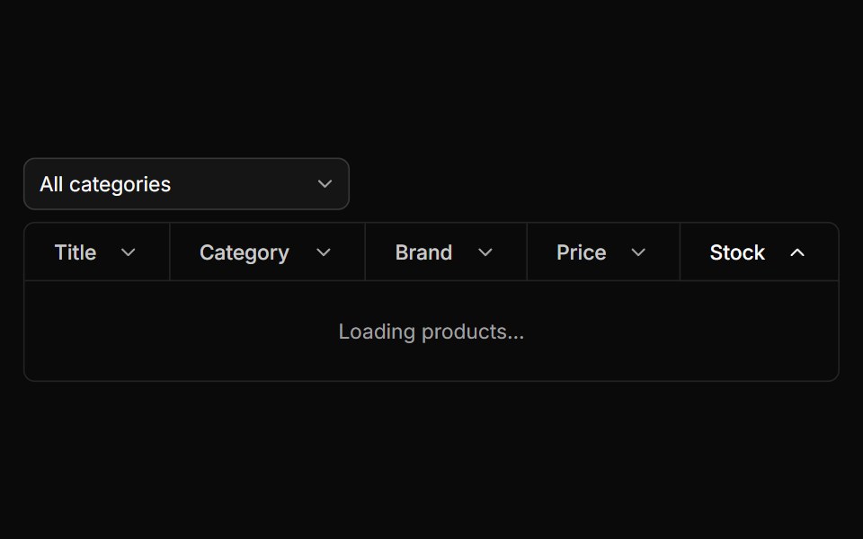 Filter Tablesv-particles · Svelte
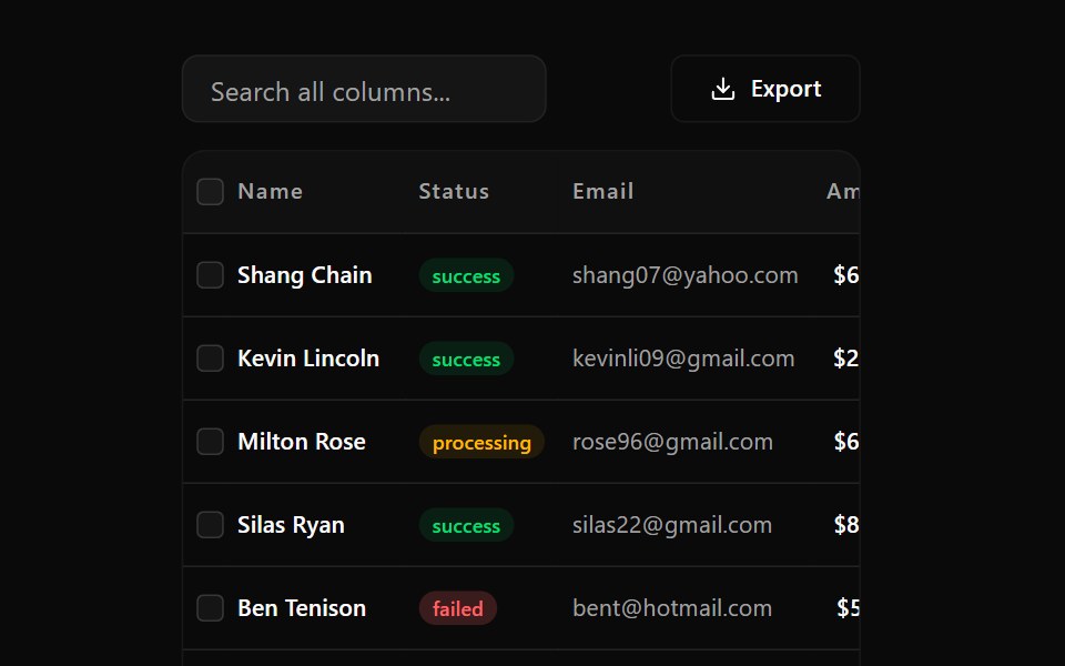 Data Table 12Watermelon UI · React
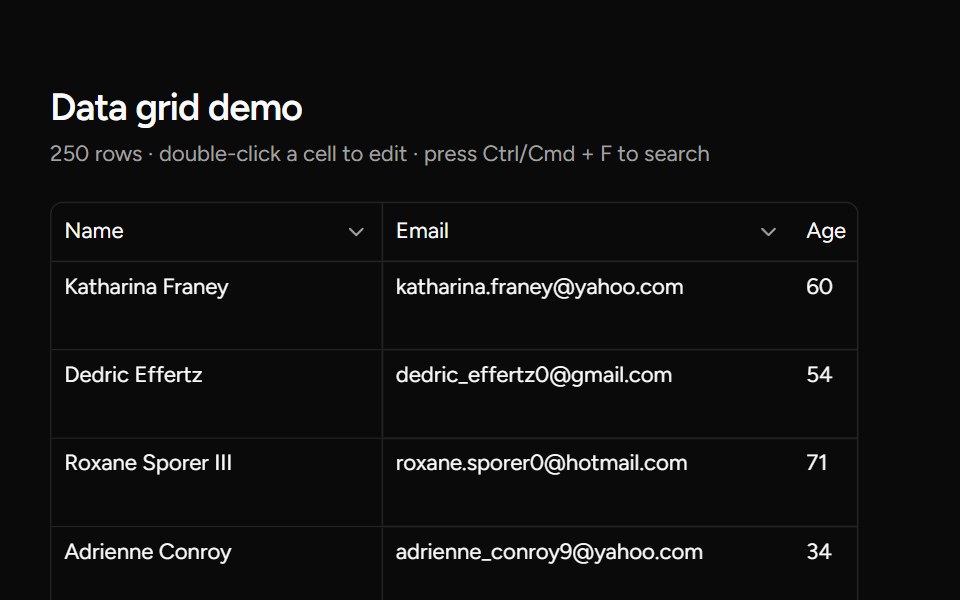 Data Gridsv-table · Svelte
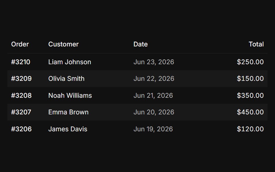 Striped rowsFLX UI · ReactZebra striping tints every other row.
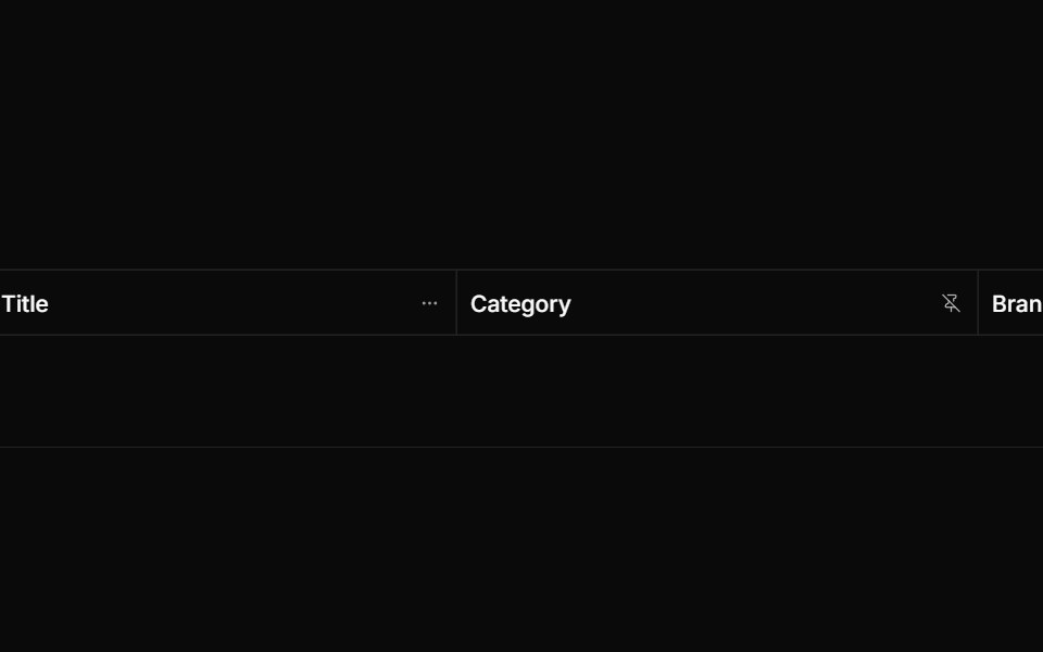 Froze Column Dropdownsv-particles · Svelte
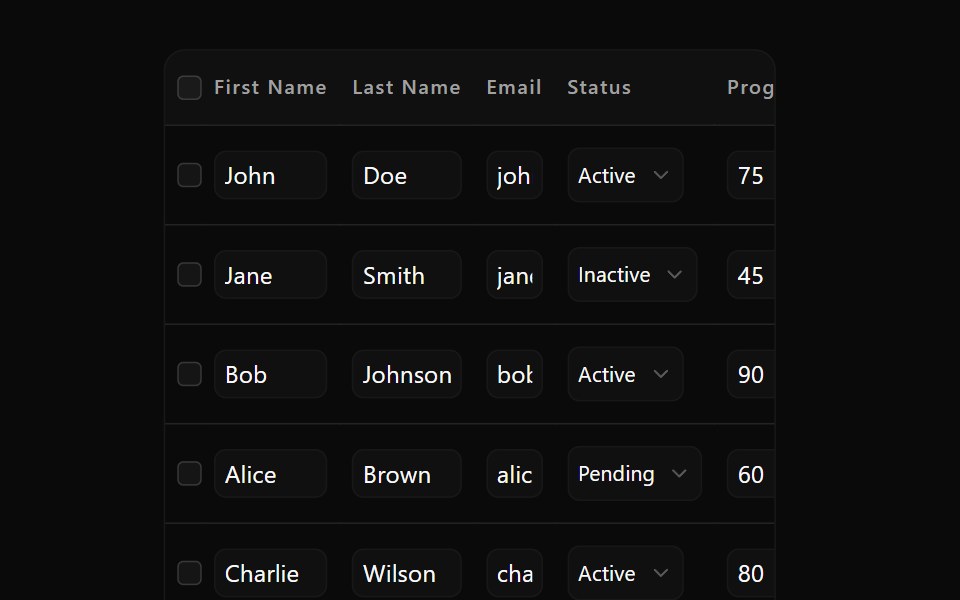 Data Table 13Watermelon UI · React
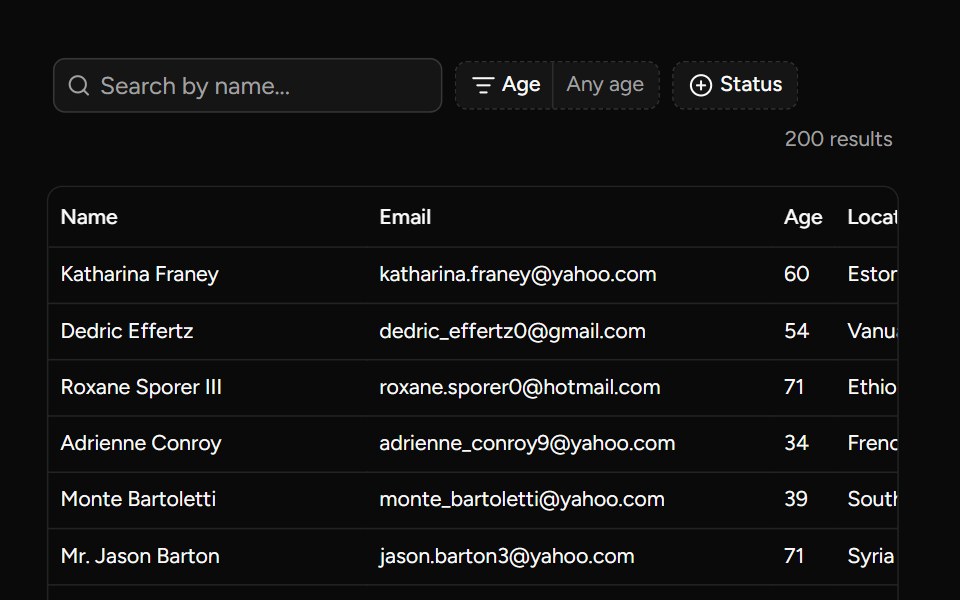 Data Table Filters Examplesv-table · Svelte
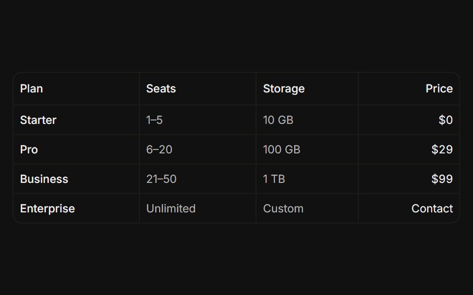 With vertical linesFLX UI · ReactColumn grid lines via per-cell right borders.
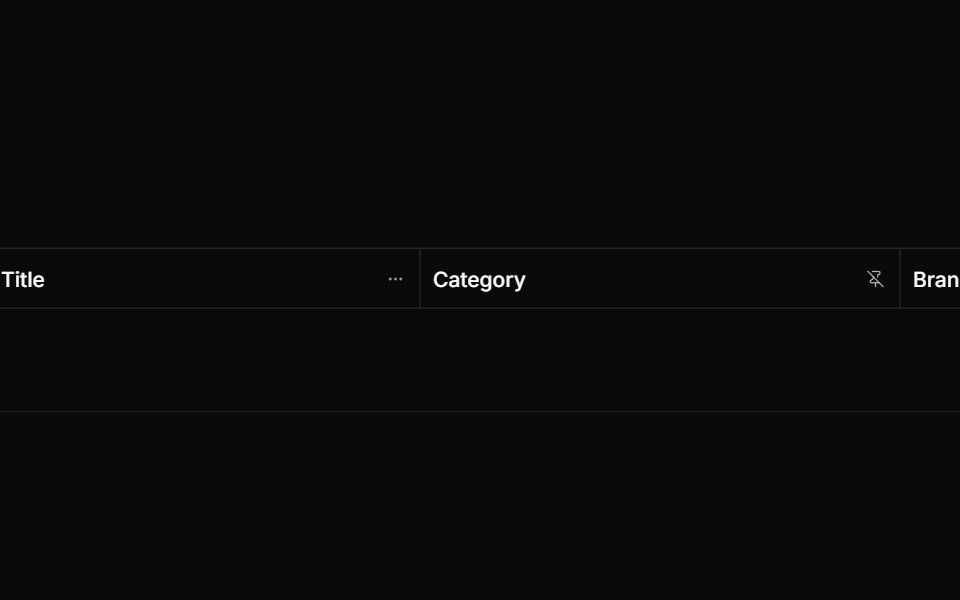 Frozen Column Tablesv-particles · Svelte
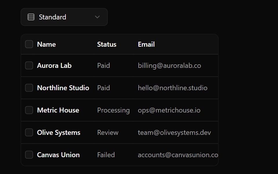 Data Table 2Watermelon UI · React
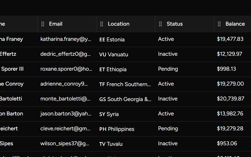 Dnd Kit Examplesv-table · Svelte
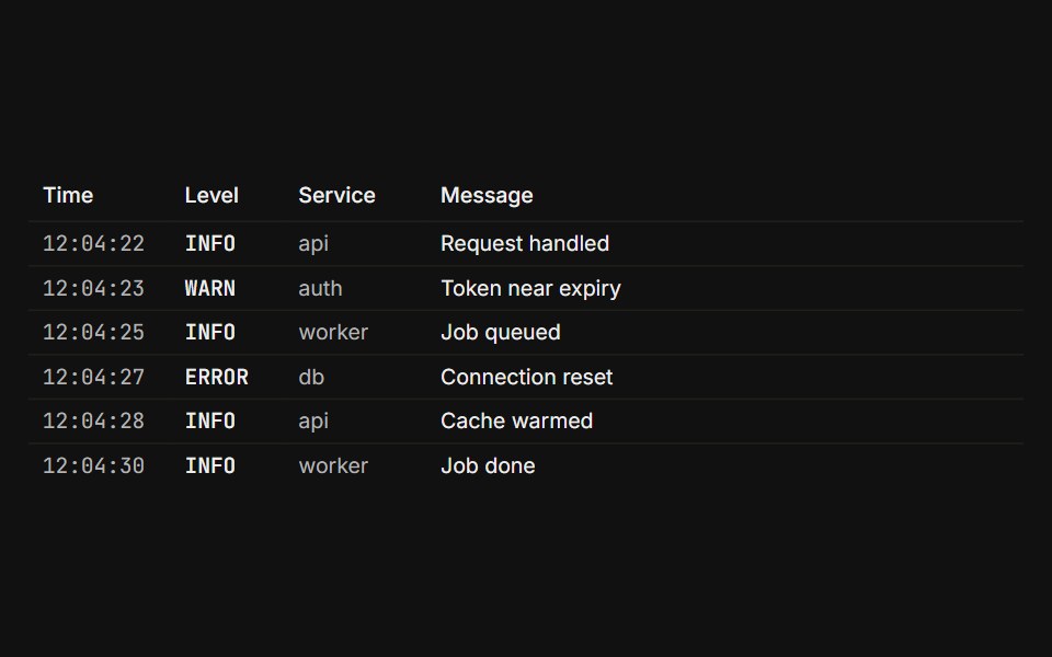 DenseFLX UI · ReactCompact padding and type for high-density data.
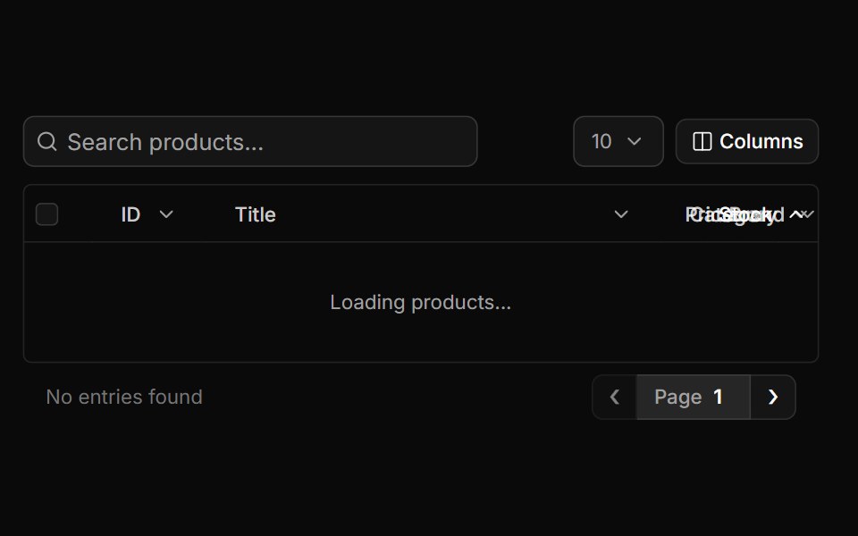 Full Tablesv-particles · Svelte
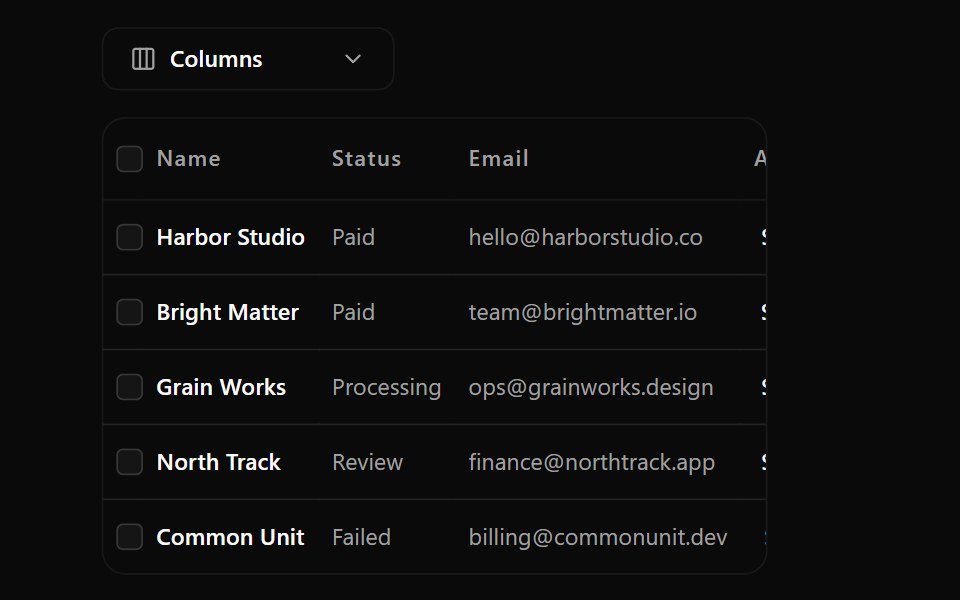 Data Table 3Watermelon UI · React
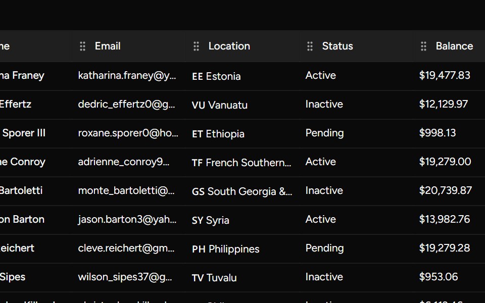 Draggable Examplesv-table · Svelte
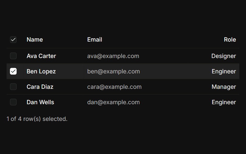 With checkboxFLX UI · ReactSelect-all header, per-row checkboxes, and a selection count.
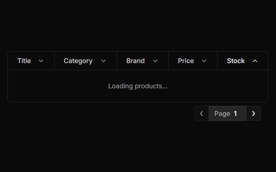 Pagination Tablesv-particles · Svelte
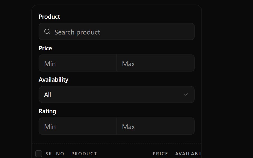 Data Table 4Watermelon UI · React
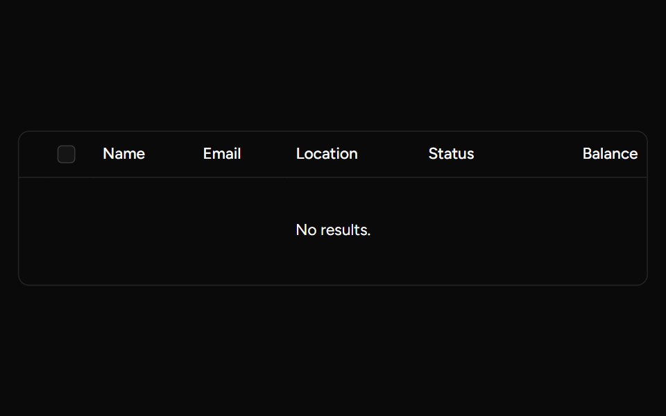 Expanded Sub Rowssv-table · Svelte
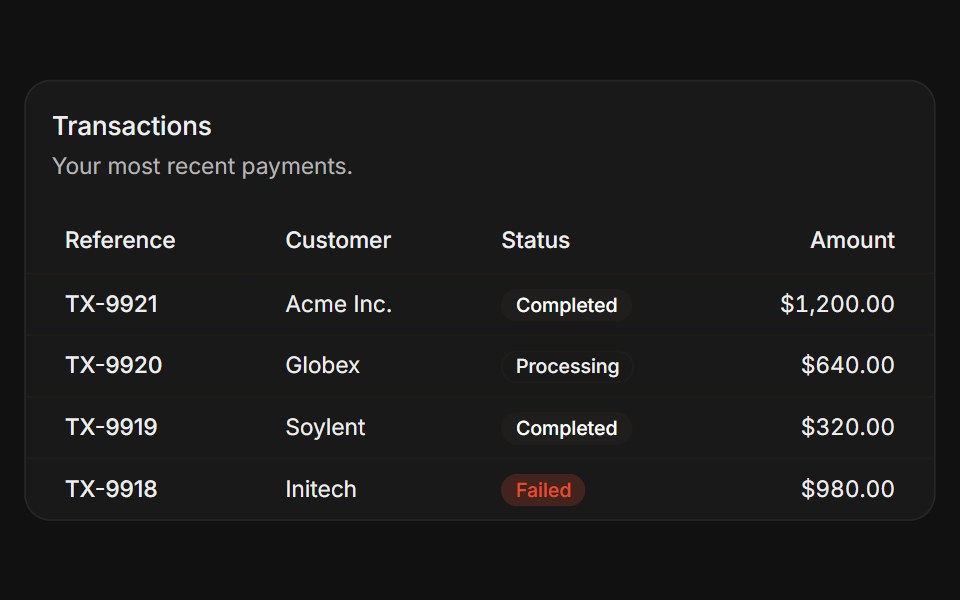 Card tableFLX UI · ReactTable inside a Card with title and status badges.
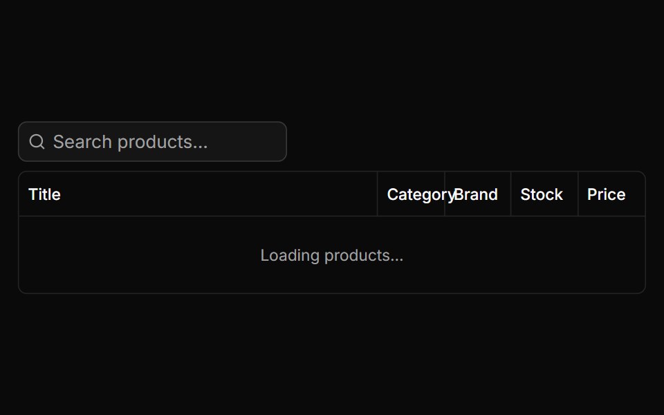 Search Tablesv-particles · Svelte
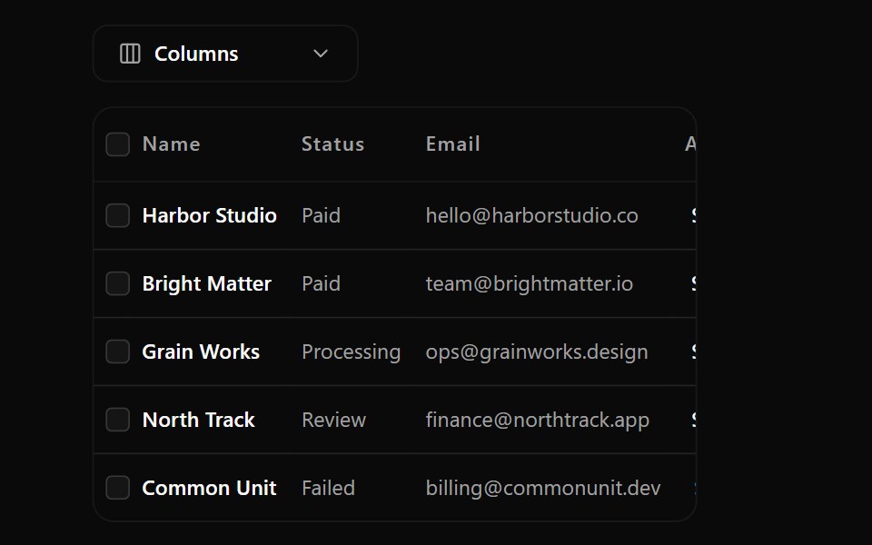 Data Table 5Watermelon UI · React
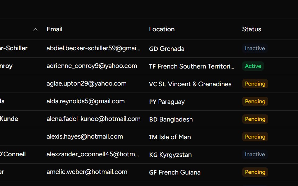 Numeric Pagination Examplesv-table · Svelte
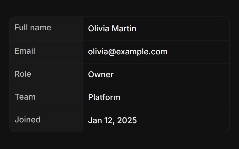 VerticalFLX UI · ReactKey-value details with row headers down the left.
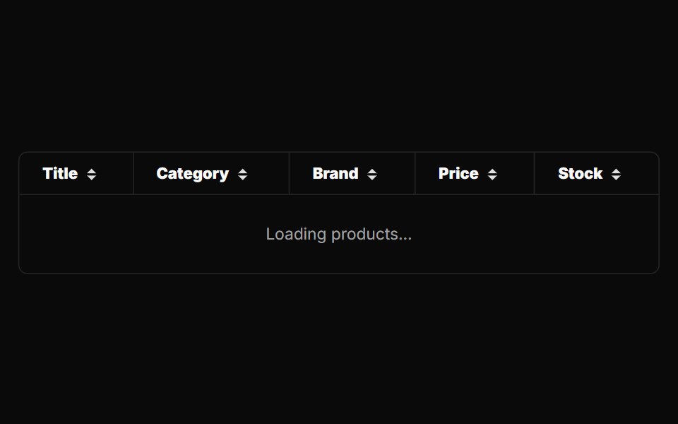 Simple Tablesv-particles · Svelte
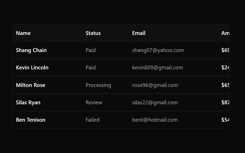 Data Table 6Watermelon UI · React
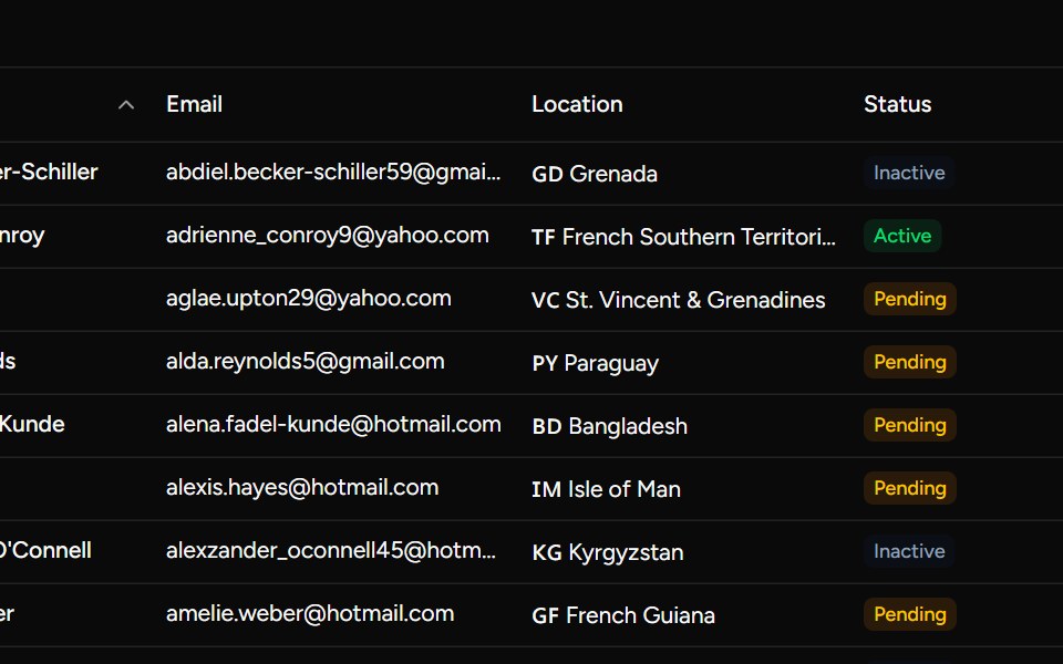 Paginated Examplesv-table · Svelte
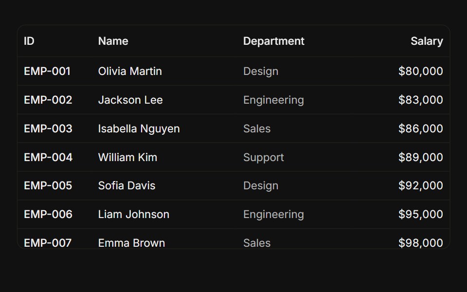 Sticky headerFLX UI · ReactHeader pinned while the capped body scrolls.
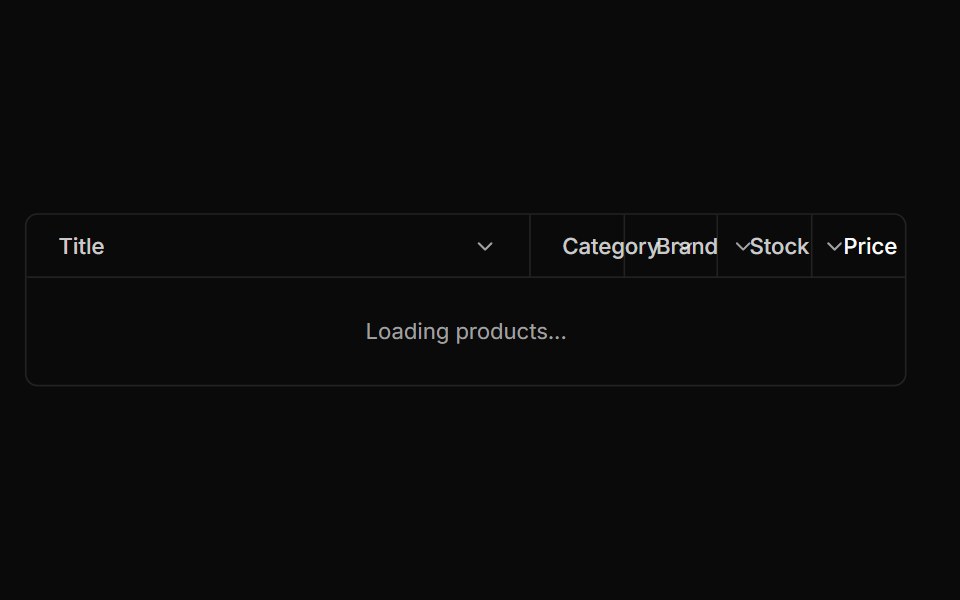 Sortable Tablesv-particles · Svelte
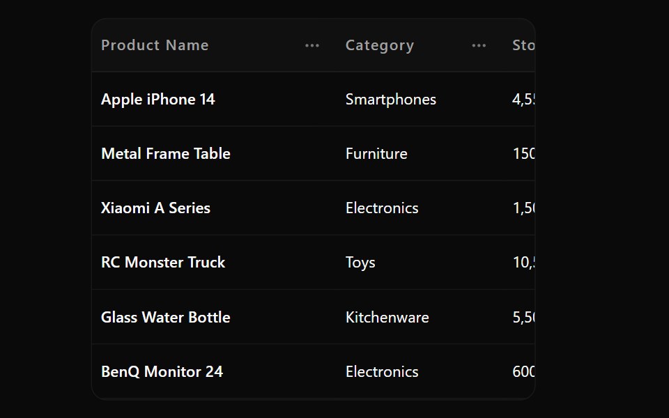 Data Table 7Watermelon UI · React
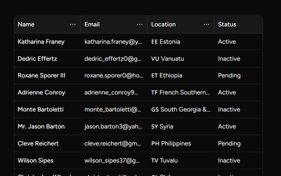 Pinnable Columnsv-table · Svelte
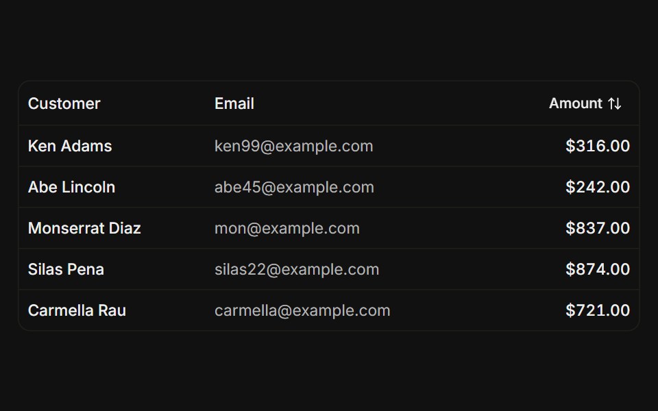 SortableFLX UI · ReactTanStack Table, click a column header to sort ascending or descending.
 Sticky Column Dropdownsv-particles · Svelte
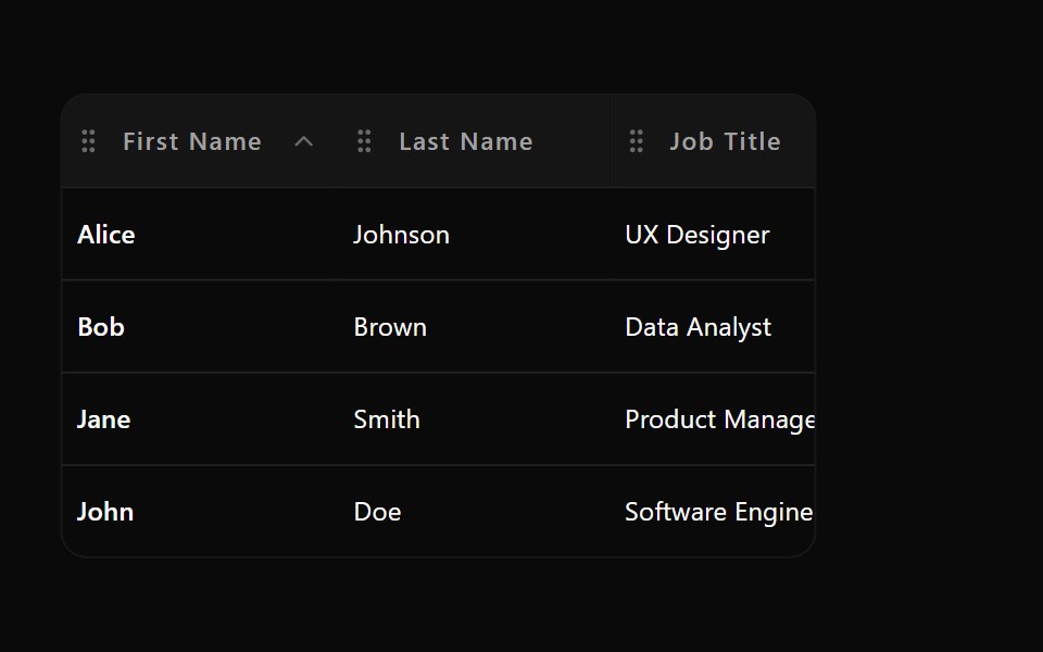 Data Table 8Watermelon UI · React
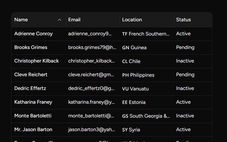 Resizable Sort Examplesv-table · Svelte
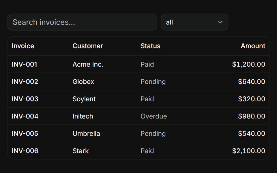 With filtersFLX UI · ReactTanStack Table, global search input plus a status column filter dropdown.
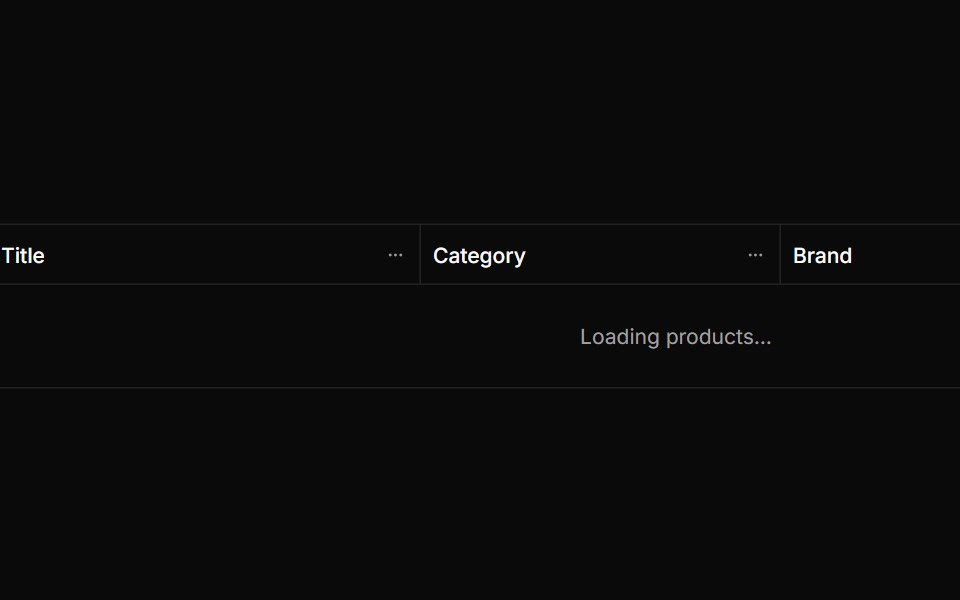 Sticky Horizontal Tablesv-particles · Svelte
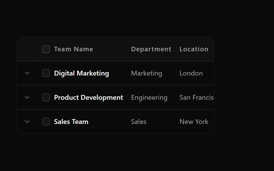 Data Table 9Watermelon UI · React
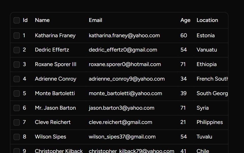 Row Selectionsv-table · Svelte
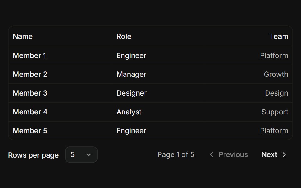 PaginationFLX UI · ReactTanStack Table, prev / next controls with a rows-per-page select.
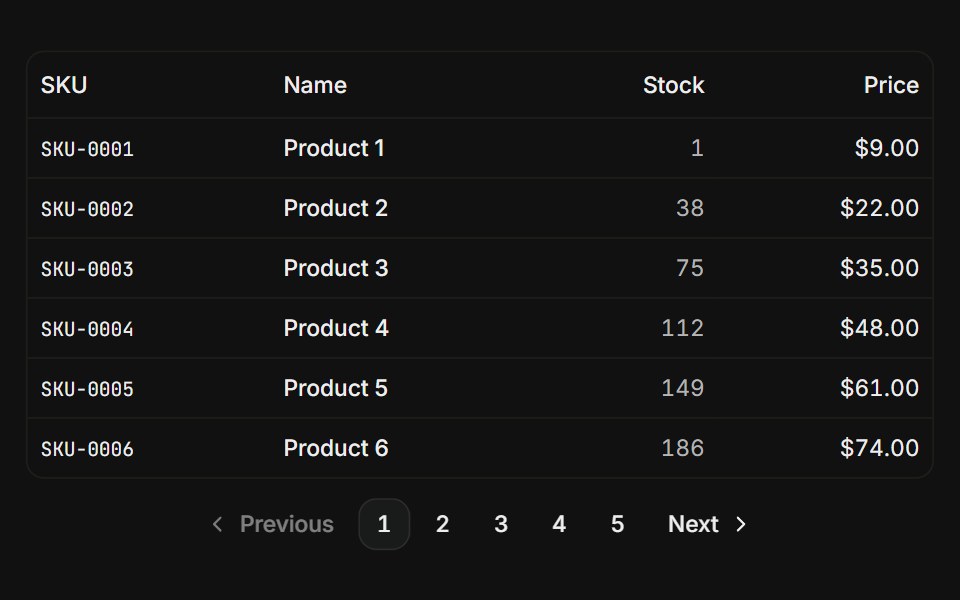 Numeric paginationFLX UI · ReactTanStack Table, numbered page buttons with prev / next arrows.
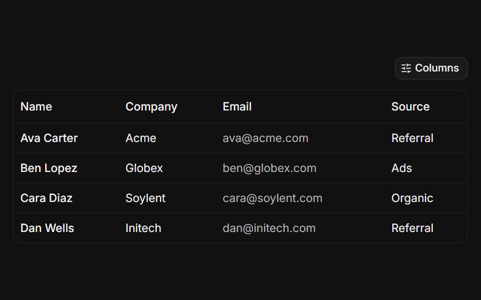 Column visibilityFLX UI · ReactTanStack Table, toggle individual columns on or off from a dropdown menu.
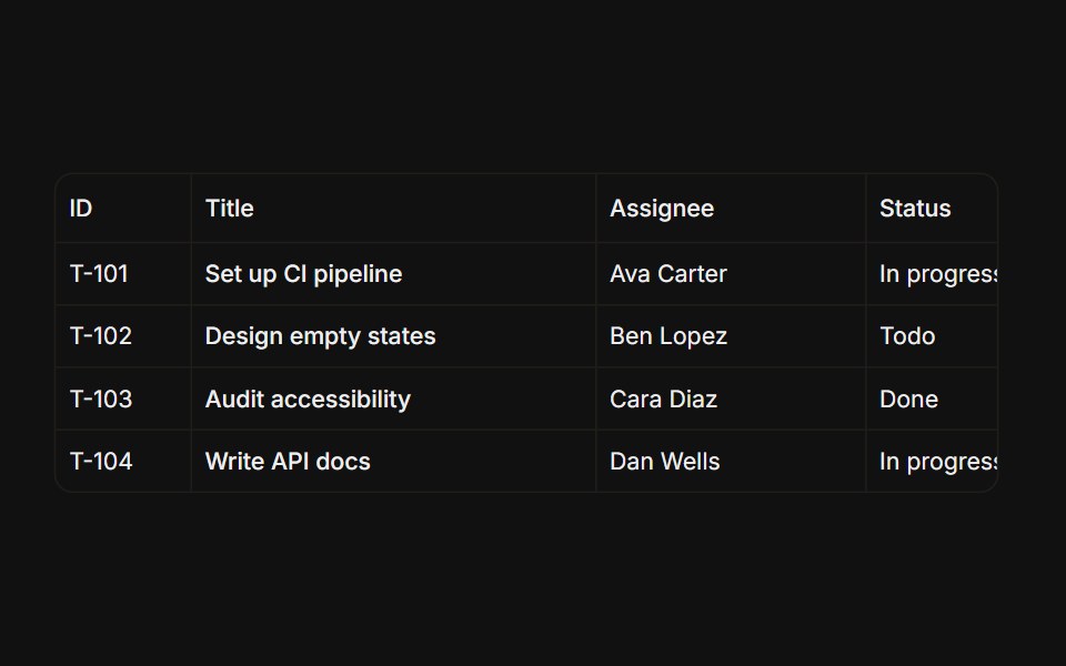 Resizable columnsFLX UI · ReactTanStack Table, drag the header edge to resize column widths.
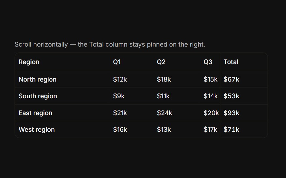 Pinnable columnsFLX UI · ReactTanStack Table, a column pinned to the right stays visible while scrolling horizontally.
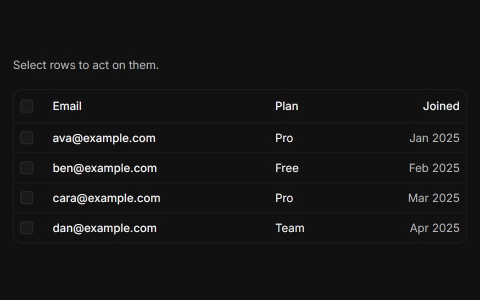 Row selectionFLX UI · ReactTanStack Table, row checkboxes with a bulk actions toolbar showing count, clear, and delete.
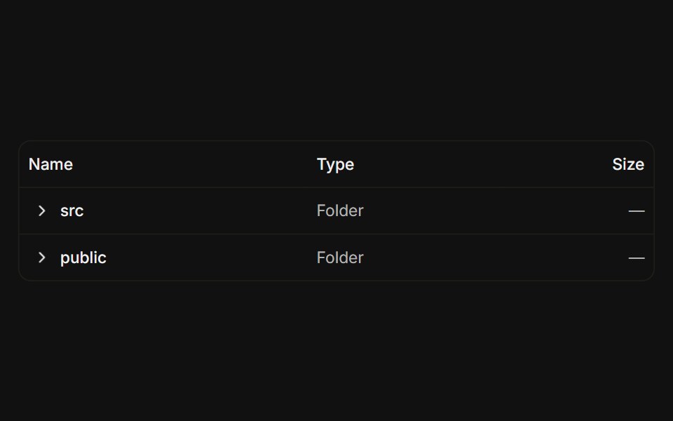 Expanding sub-rowsFLX UI · ReactTanStack Table, expandable parent rows reveal nested child rows for tree-shaped data.
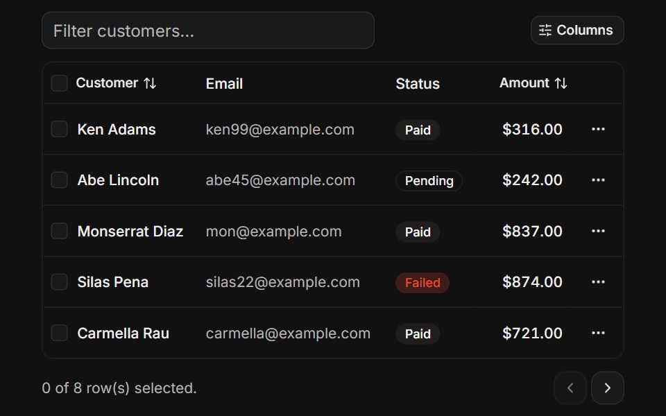 Complex data tableFLX UI · ReactTanStack Table, combines sorting, column filter, pagination, row selection, column visibility toggle, and per-row…
Libraries with shadcn/ui data table components
Related categories
- Data Table Components
- React Data Table Components
- Tailwind CSS Data Table Components
- Svelte Data Table Components
- Animated Data Table Components
- shadcn/ui Data Display Components
- shadcn/ui Card Components
- shadcn/ui Table Components
- shadcn/ui Avatar Components
- shadcn/ui Accordion Components
- shadcn/ui Stat Components
- shadcn/ui List Components
- shadcn/ui Chart Components
- shadcn/ui Calendar Components
- shadcn/ui Collapsible Components
- shadcn/ui Stat Card Components
- shadcn/ui Avatar Group Components
- shadcn/ui Tree View Components
- shadcn/ui Carousel Components
- shadcn/ui Testimonial Components
- shadcn/ui Filter Bar Components