 Dev Design Library
shadcn/ui Avatar Group Components
Dev Design Library indexes 34 shadcn/ui avatar group components from 8 open-source UI libraries, with the most coming from FLX UI, sv-particles, D2Studio UI, Spectrum UI and Watermelon UI. Each one links to its page with the source code, a live preview where available, the library license and the install command. They follow the shadcn/ui conventions, so most install with the shadcn CLI and drop into a Tailwind project. Avatar group components belong to the Data display group.
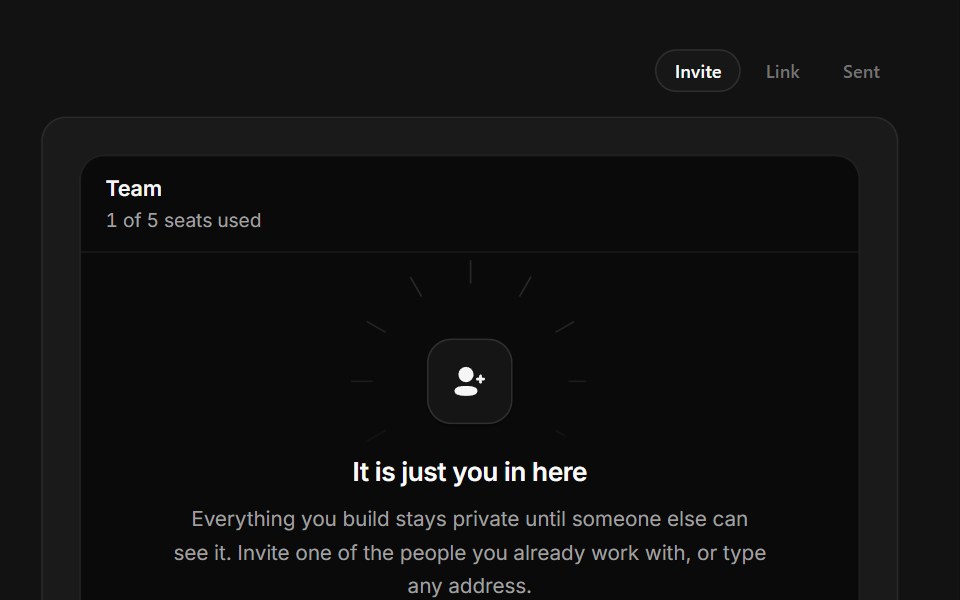 Invite TeammatesSpectrum UI · ReactA one-seat team with an avatar rail, live invite field and copyable join link.
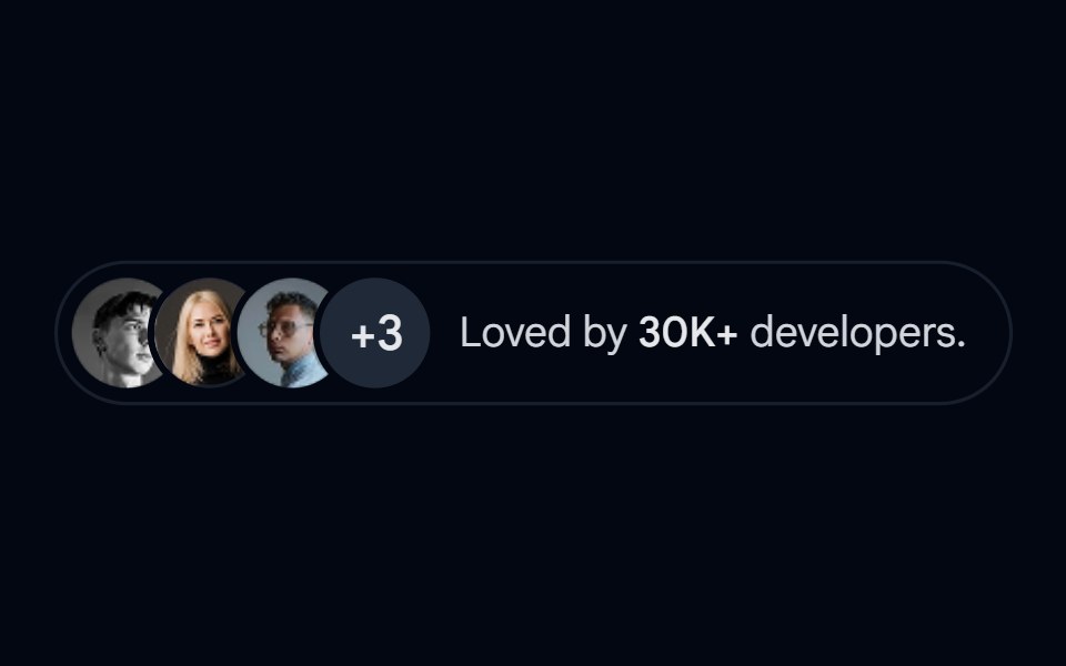 Avatar-08 - Avatar stackShadcn Space · ReactStacked avatar group with overflow count and popularity indicator
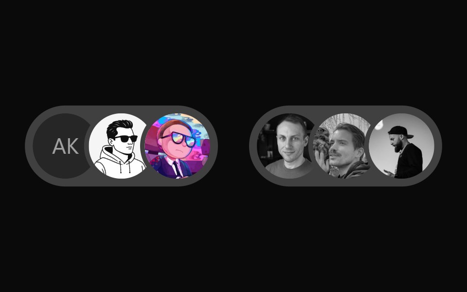 User Presence AvatarWatermelon UI · React
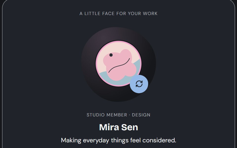 AvatarCojeev UI · ReactPortraits, identity rows and participant groups that keep the person recognizable—with artwork, initials and…
 BasicFLX UI · ReactImage avatar with an initials fallback.
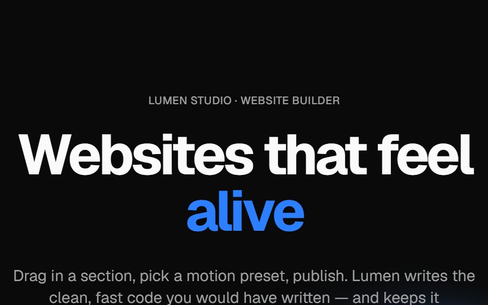 Wavy heroVelora UI · ReactBold centered hero over flowing waves, with a rotating headline word and avatar social proof.
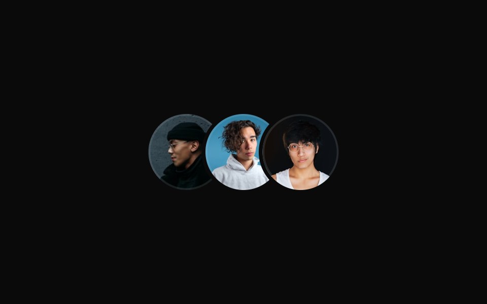 Large Overlapping Avatar Groupsv-particles · Svelte
 Hero 01D2Studio UI · ReactStartup mentorship landing hero with a headline, call to action and mentor avatar group.
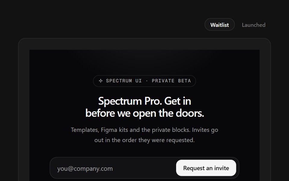 Waitlist FooterSpectrum UI · ReactWaitlist capture with an avatar stack and a live position counter.
 Fallback initialsFLX UI · ReactMissing image falls back to initials.
 Overlapping Avatar Groupsv-particles · Svelte
 Hero Section 01D2Studio UI · ReactPremium landing page hero with a serif accent headline, badge and mentor avatar group.
 Icon fallbackFLX UI · ReactGeneric user icon when there is no image or name.
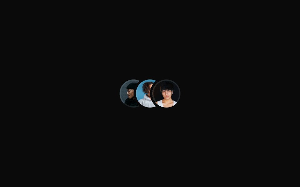 Small Overlapping Avatar Groupsv-particles · Svelte
 Hero Section 02D2Studio UI · ReactModern landing page hero section with badge, headline and avatar social proof.
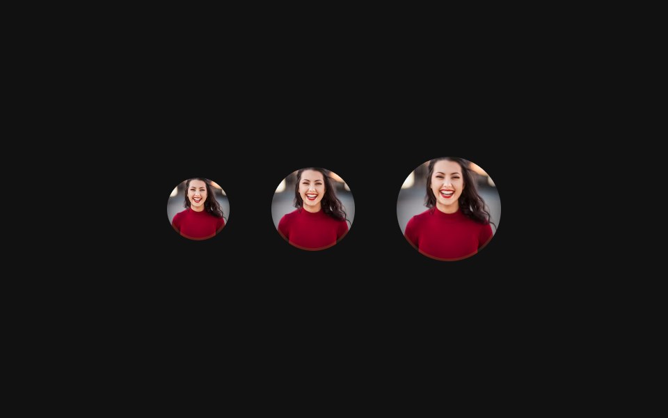 SizesFLX UI · ReactSmall, default, and large sizes side-by-side.
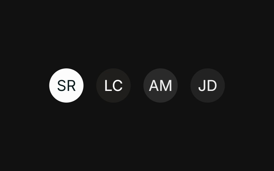 Colored fallbackFLX UI · ReactTinted initials fallbacks using semantic tokens.
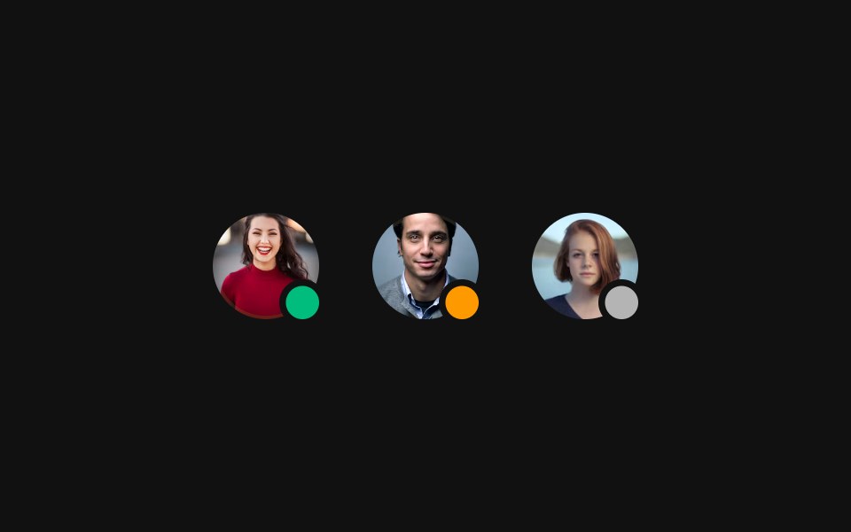 Status badgeFLX UI · ReactPresence dot in the corner showing online, away, or offline.
 Badge with iconFLX UI · ReactVerified check icon inside the AvatarBadge.
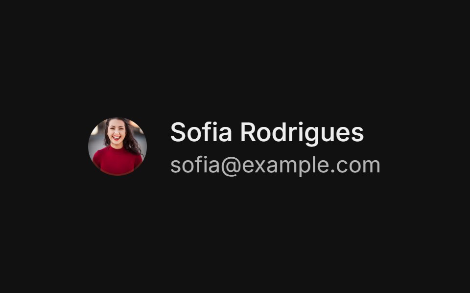 With nameFLX UI · ReactAvatar beside a name and email, forming a user row.
 GroupFLX UI · ReactOverlapping AvatarGroup stack of members.
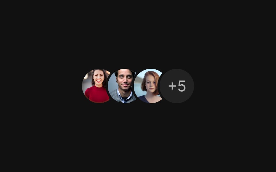 Group with countFLX UI · ReactOverlapping group with a +N count for the remaining members.
 Group with tooltipFLX UI · ReactHover each avatar in the group to reveal its name.
 Loading skeletonFLX UI · ReactSkeleton placeholder while the avatar loads.
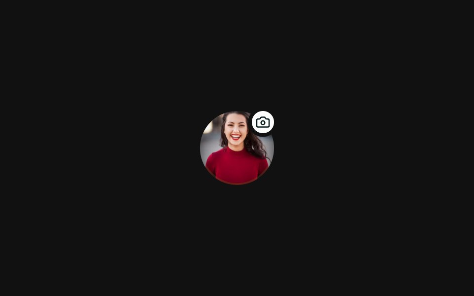 Icon on topFLX UI · ReactIcon badge pinned to the top-right corner.
 Invite teamFLX UI · ReactIcon header plus email field.
 Hero 08FLX UI · ReactA split hero with a bold headline, avatar social proof, and two image cards with invertible overlay text and CTAs.
 Hero 10FLX UI · ReactA centered hero with a highlighted headline, dual CTAs, social proof, and a fanned collage of three overlapping images.
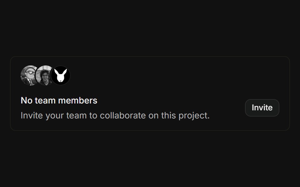 Empty teamFLX UI · ReactOverlapping avatar stack above an empty-state message with an invite button.
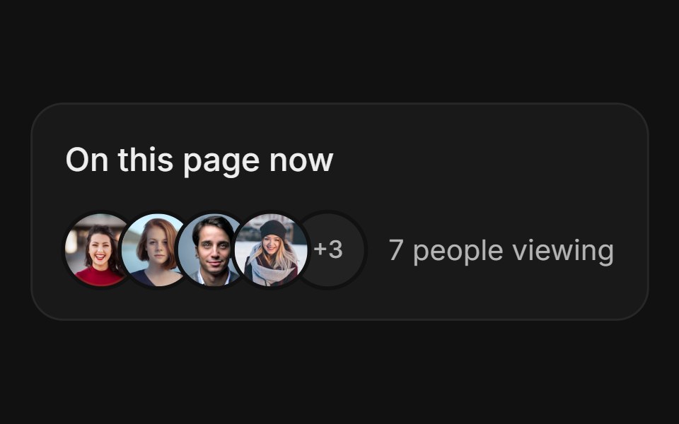 Avatar StackFLX UI · ReactAvatar Stack for Live Presence.
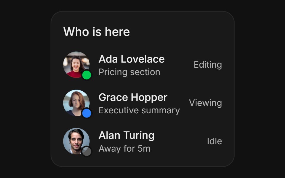 Activity StatusFLX UI · ReactActivity Status for Live Presence.
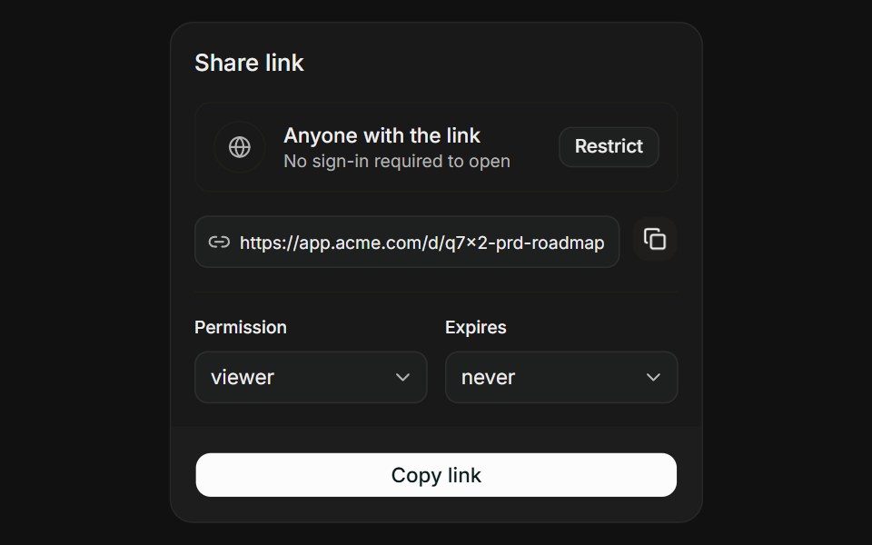 Link with ScopeFLX UI · ReactLink with Scope for Share Access.
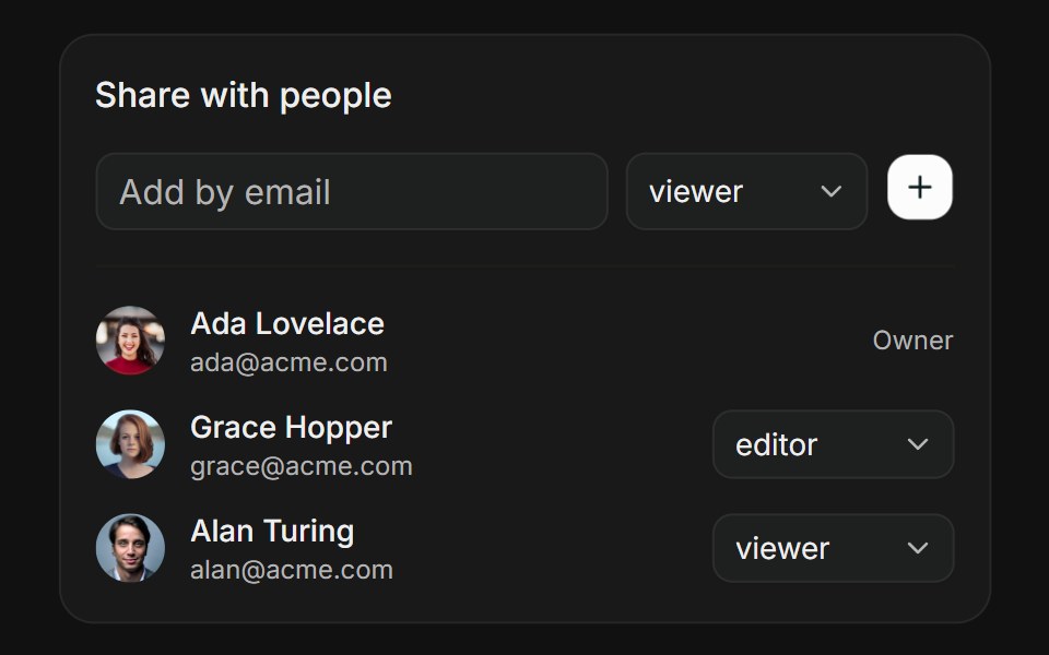 People PickerFLX UI · ReactPeople Picker for Share Access.
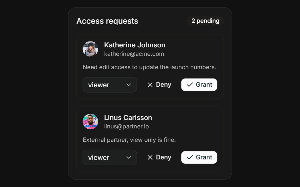 Request AccessFLX UI · ReactRequest Access for Share Access.
Libraries with shadcn/ui avatar group components
Related categories
- Avatar Group Components
- React Avatar Group Components
- Tailwind CSS Avatar Group Components
- Animated Avatar Group Components
- shadcn/ui Data Display Components
- shadcn/ui Card Components
- shadcn/ui Table Components
- shadcn/ui Avatar Components
- shadcn/ui Data Table Components
- shadcn/ui Accordion Components
- shadcn/ui Stat Components
- shadcn/ui List Components
- shadcn/ui Chart Components
- shadcn/ui Calendar Components
- shadcn/ui Collapsible Components
- shadcn/ui Stat Card Components
- shadcn/ui Tree View Components
- shadcn/ui Carousel Components
- shadcn/ui Testimonial Components
- shadcn/ui Filter Bar Components