App Shell
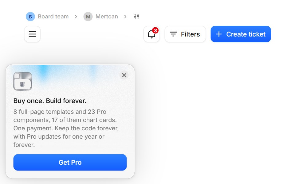
The page standard every BoardUI template follows, free or Pro: content sits directly on the page background inside a 1300px column, so cards and tables carry their own surfaces; above it a breadcrumb trail (team, member, page) and the page heading. Pages pass what differs and get the rest.
- Library
- BoardUI
- Framework
- React
- Type
- component
- License
- MIT
- Install
npx boardui@latest add app-shell- Files
components/application/app-shell/app-shell.tsxcomponents/application/app-shell/components-catalog.tsxcomponents/application/app-shell/notification-bell.tsxcomponents/application/app-shell/pro-offer-card.tsxcomponents/application/app-shell/starter-notifications.tscomponents/application/notification-center/notification-center.tsxcomponents/foundations/template-copy/template-copy.tsxcomponents/base/avatar/avatar.tsx
- Source
- https://github.com/BoardUI/boardui
Categories
- App Shell Components
- React App Shell Components
- Tailwind CSS App Shell Components
- Data Display Components
- React Data Display Components
- Tailwind CSS Data Display Components
- Kanban Components
- Tailwind CSS Kanban Components
- Layout Components
- React Layout Components
- Tailwind CSS Layout Components
- Navbar Components