 Dev Design Library
React Layout Components
Dev Design Library indexes 545 React layout components from 72 open-source UI libraries, with the most coming from ReUI, Watermelon UI, Shadcn Space, FLX UI and Tremor Blocks. Each one links to its page with the source code, a live preview where available, the library license and the install command. Every library in this list targets React.
Showing 120 of 545, a mix from every library. Open a library to see all of its components.
 Aspect Ratioshadcn/ui · ReactDisplays content within a desired ratio.
 ContainerMUI / Material UI · React
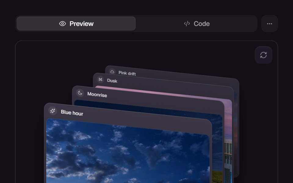 Card SwapReact Bits · ReactCards animate position swapping with smooth layout transitions.
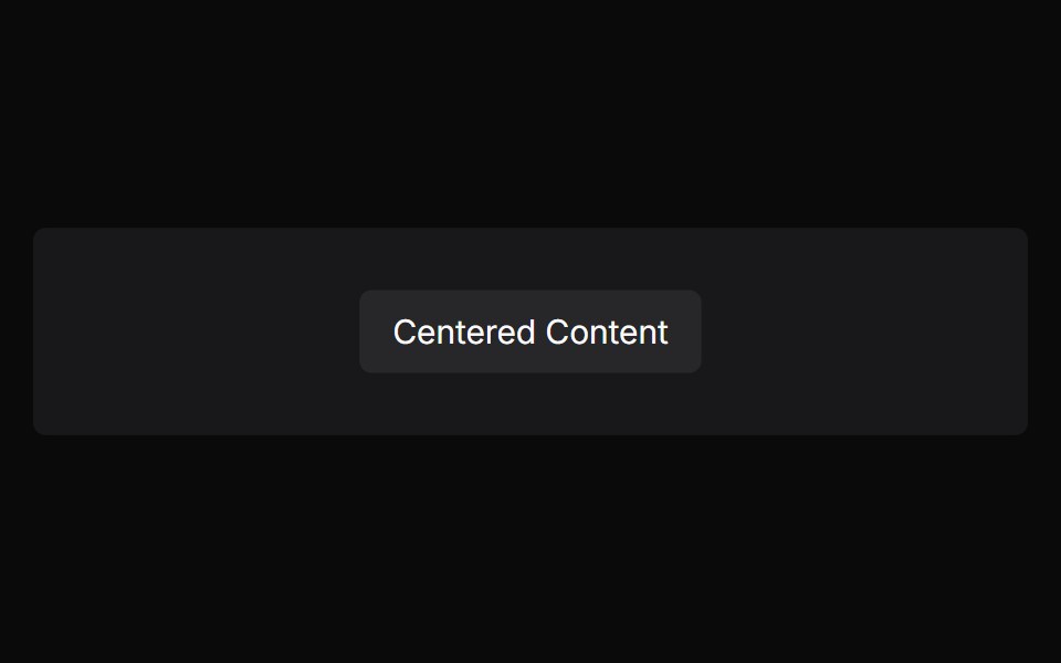 Absolute CenterChakra UI · ReactUsed to horizontally and vertically center an element relative to its parent dimensions using absolute positioning.
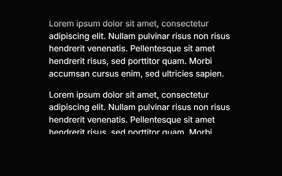 Scroll ShadowHeroUI · ReactAdds dynamic gradient shadows to scrollable content based on scroll position and overflow.
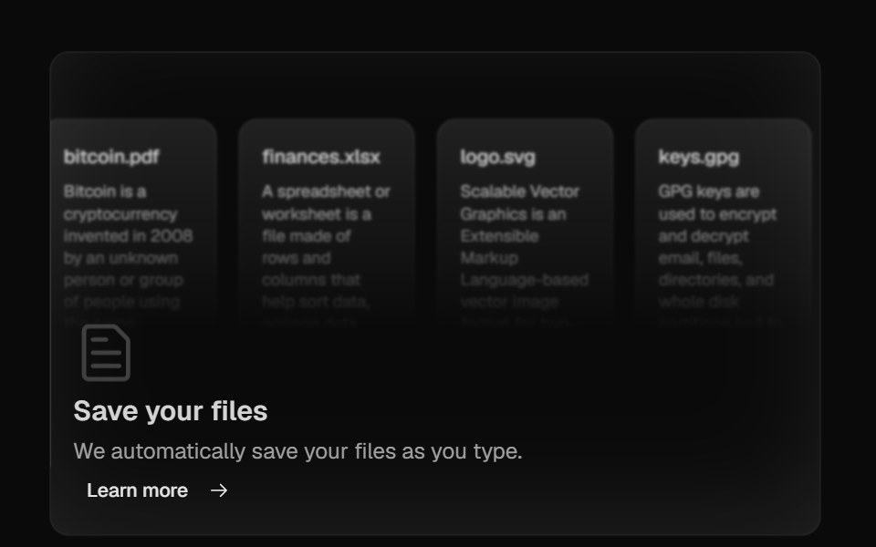 Bento GridMagic UI · ReactBento grid is a layout used to showcase the features of a product in a simple and elegant way.
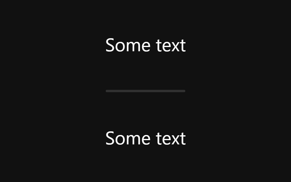 DividerReact Spectrum · ReactDividers bring clarity to a layout by grouping and dividing content in close proximity. They can also be used to…
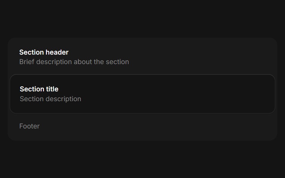 Framecoss ui · ReactA framed container for grouping related information.
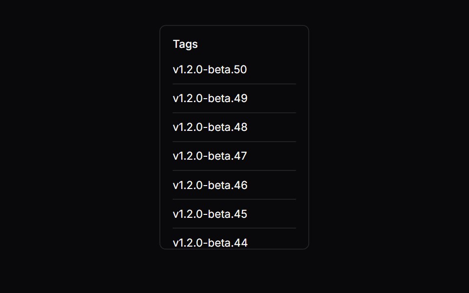 Scroll AreaOrigin UI · ReactA native scroll container with custom scrollbars.
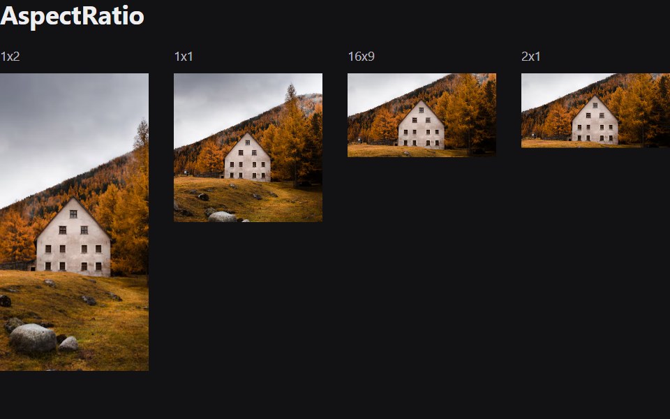 Aspect RatioRadix Themes · React
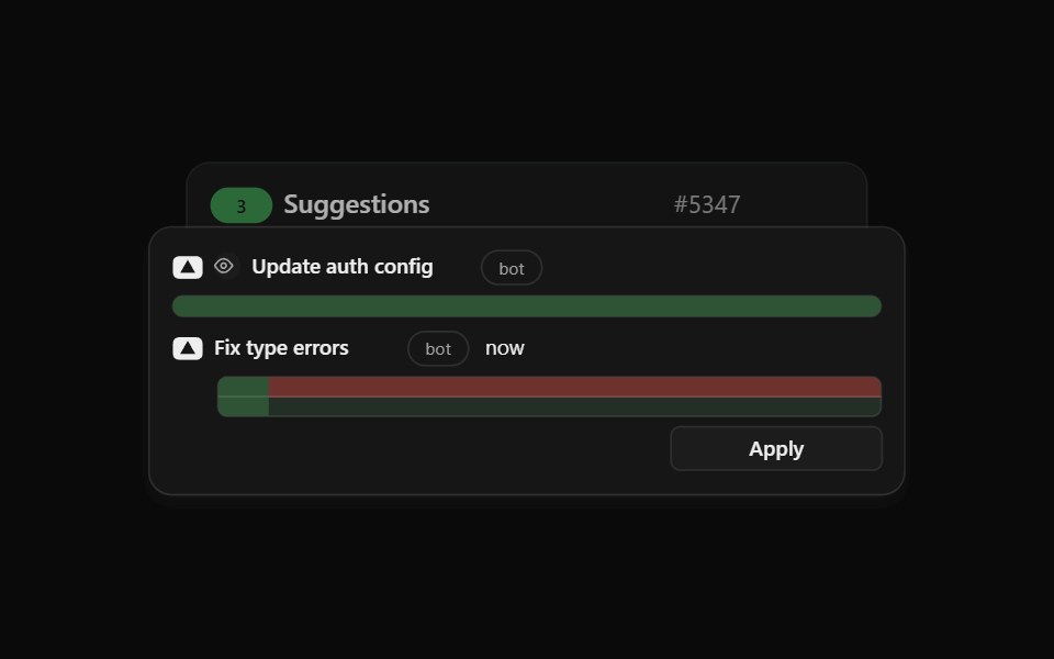 Agent Suggest Card StackCult UI · ReactStack of suggestion cards for AI agent responses
 Floating PanelArk UI · ReactUsed to display content in a non-modal floating window.
 DividerTremor · React
 16:9 widescreen aspect ratioReUI · React16:9 widescreen aspect ratio
 Dividerpdfcn · ReactDivider PDF component (forme)
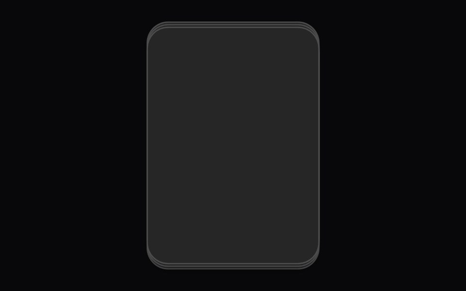 Card Cascade StaggerAmicro Micro Transitions · ReactStack of cards that cascade into place one after another.
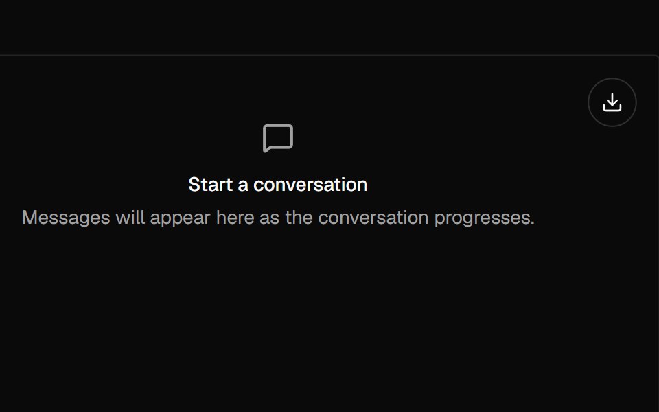 ConversationAI Elements · ReactWraps messages and automatically scrolls to the bottom. Also includes a scroll button that appears when not at the…
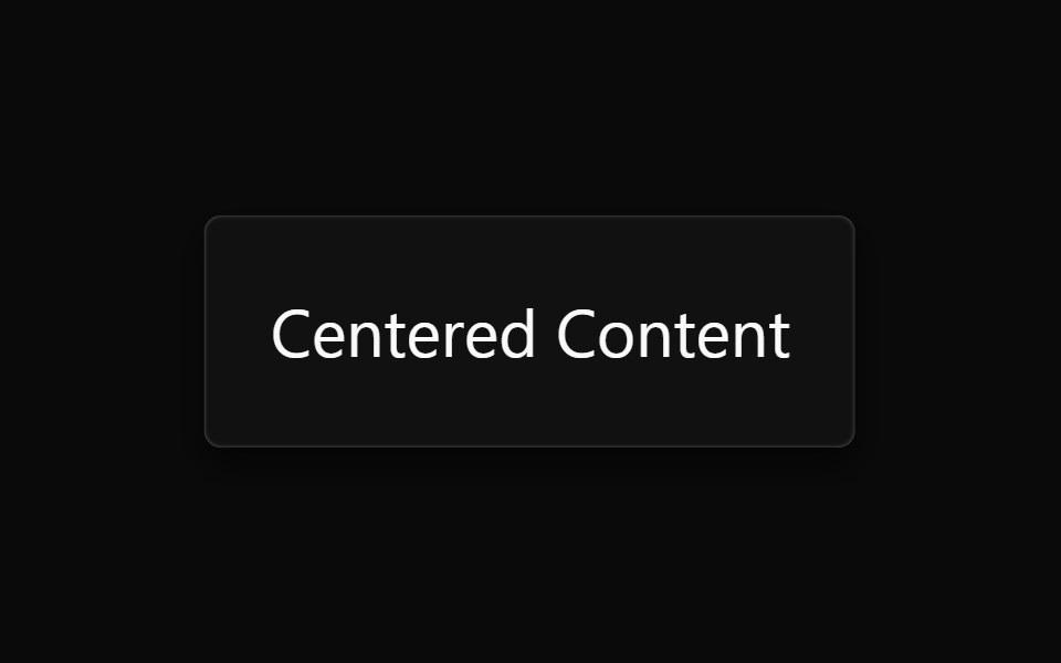 Absolute CenterPark UI · ReactA utility component for centering content within its parent container.
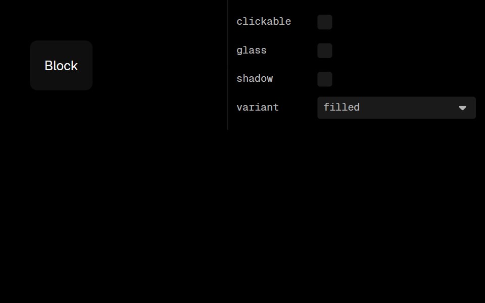 BlockLobe UI · ReactA flexible container that extends Flexbox with variants, shadows, and glass effects.
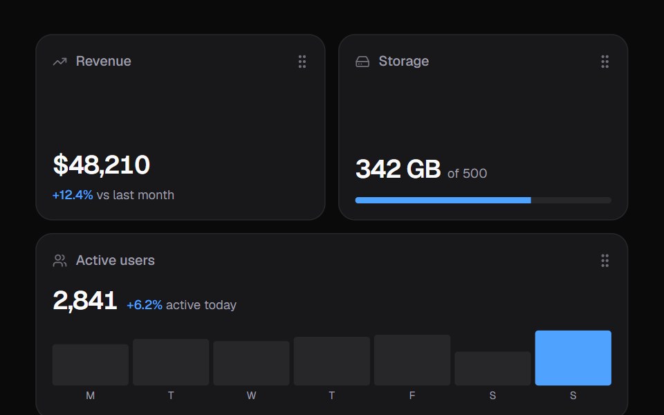 Widget GridKokonut UI · ReactDashboard widgets you lift, drag and resize on a 6-column grid, with spring physics and full keyboard support.
 containerIntent UI · Reactcontainer
 Section DividerUntitled UI React · React
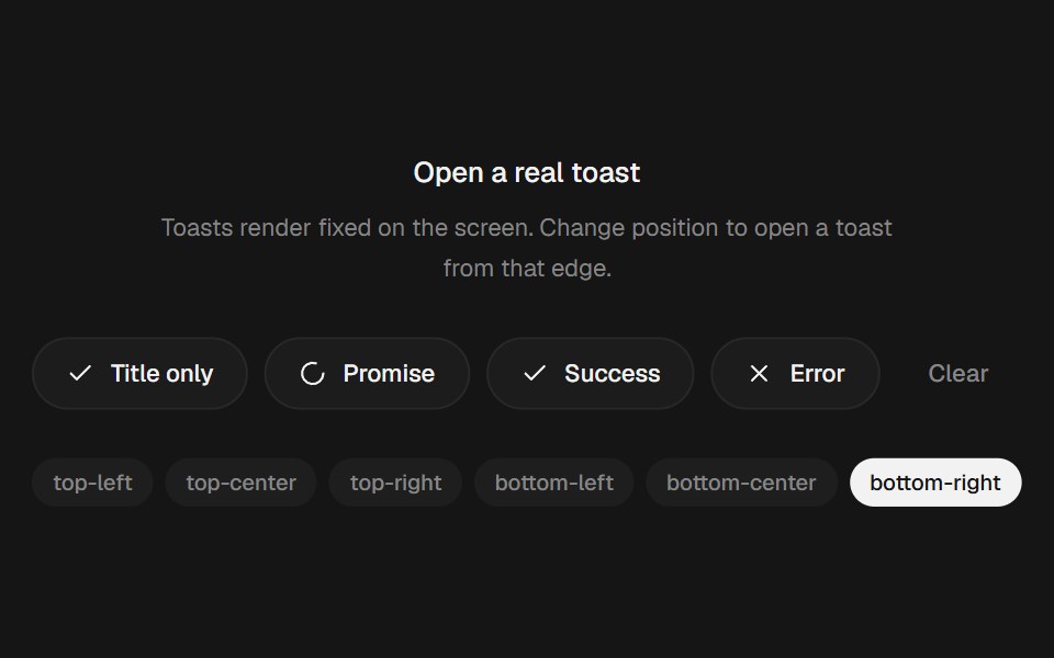 Animated Toast StackbeUI · ReactStacked toasts with status morphs, swipe dismissal, actions and layout-aware motion.
 Aspect RatioTailGrids · ReactAspect ratio component to maintain the aspect ratio of an element.
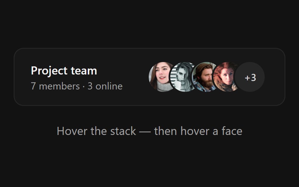 Avatar StackSpectrum UI · ReactAn overlapping avatar stack that fans apart on hover, springs name tooltips over each face and expands hidden members…
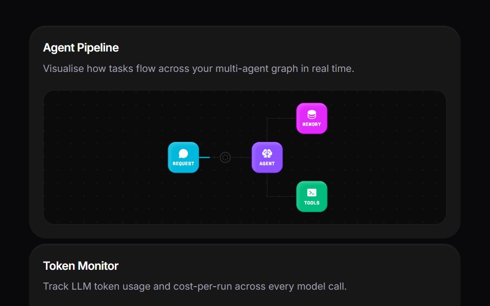 Agent Bento GridVengeance UI · ReactMulti-agent workspace grid layout
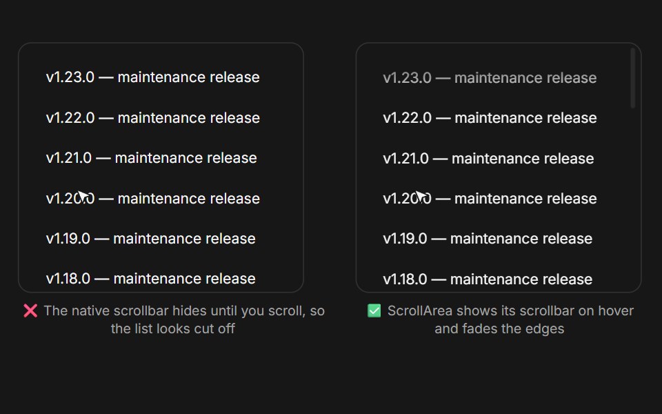 Scroll AreaFluid Functionalism · ReactScroll container with a restyled overlay scrollbar that stays discoverable on hover and follows the shape system…
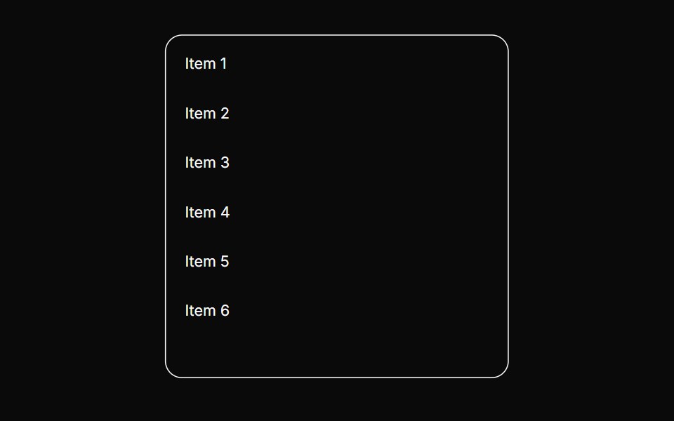 Scroll FadeToolcraft · ReactScroll area whose edges fade out to hint that there is more content to scroll.
 Layout LinesLaunch UI · React
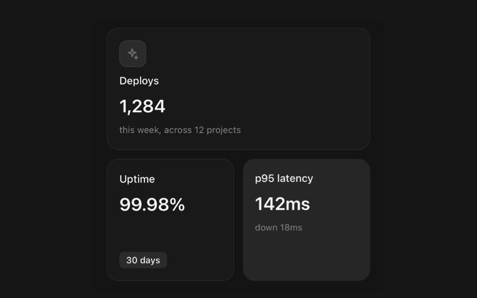 Grid ItemPanel UI · React NativeBento tiles, and the grid that places them.
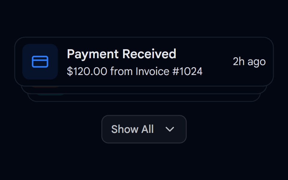 Animated List 03 - Expandable StackShadcn Space · ReactExpandable stack of cards showing notifications with dynamic spring layouts
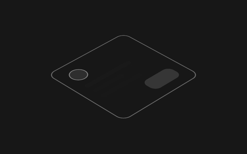 Hover Layer StackPixel Perfect · ReactAn isometric stack of UI layers that lifts apart on hover, exploding the interface into its depth layers.
 Browser Mockup CardOpenSourceUI · React
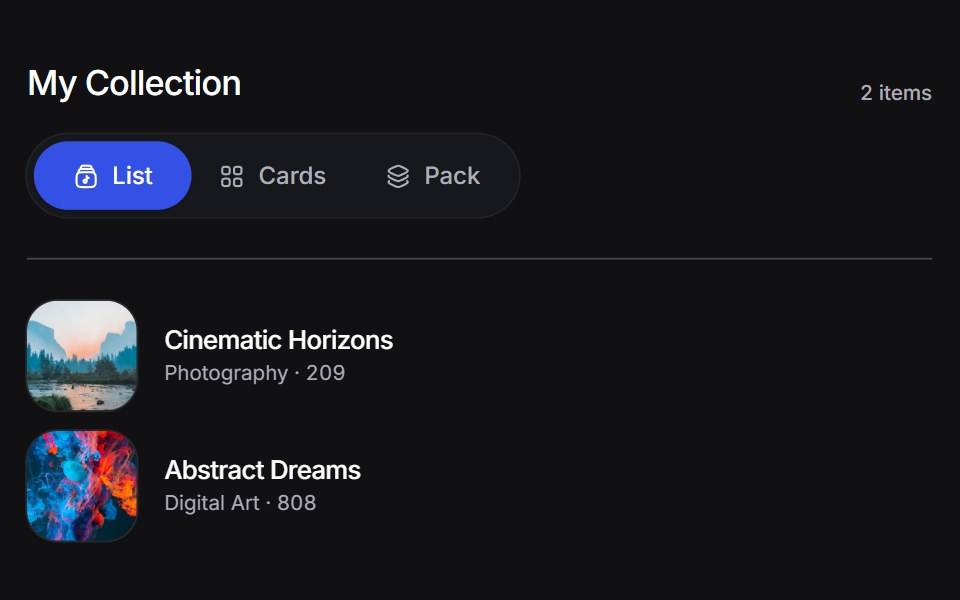 Animated Collectionuselayouts · ReactA collection of items with smooth layout transitions and animations.
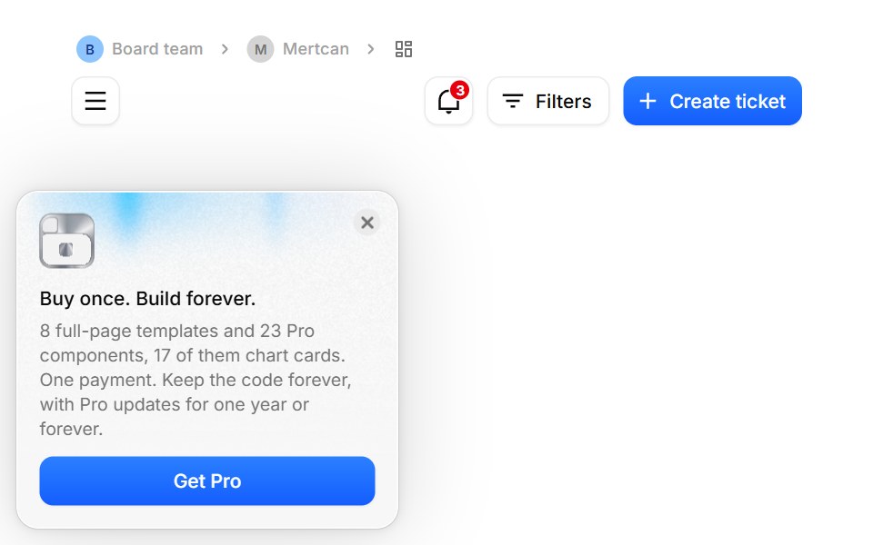 App ShellBoardUI · ReactThe page standard every BoardUI template follows, free or Pro: content sits directly on the page background inside a…
 Collection SurferComponentry · ReactSmooth surfing interaction for browsing collections.
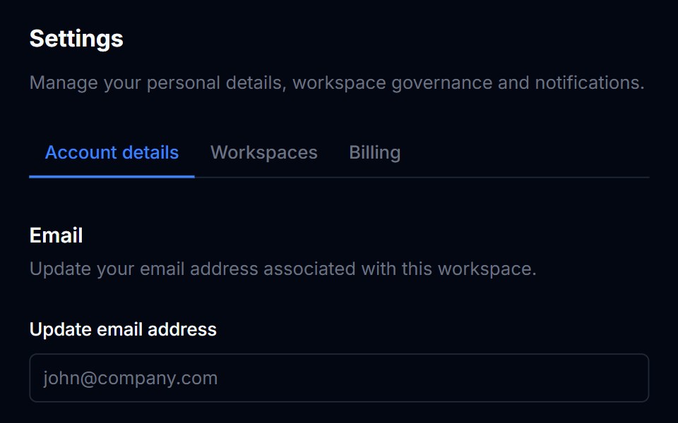 DividerTremor Blocks · React
 Aspect RatioShadcn Dashboard · React
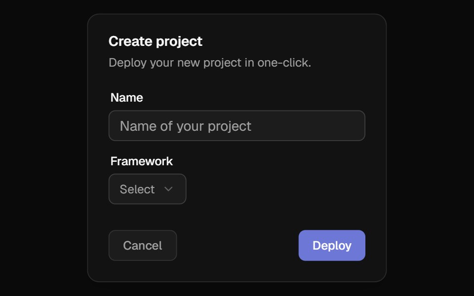 3D WrapperBadtz UI · ReactThis component transforms any content into an immersive, interactive 3D experience. It tracks cursor movements to…
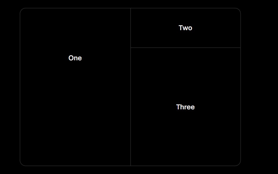 ResizableObsidianUI · React
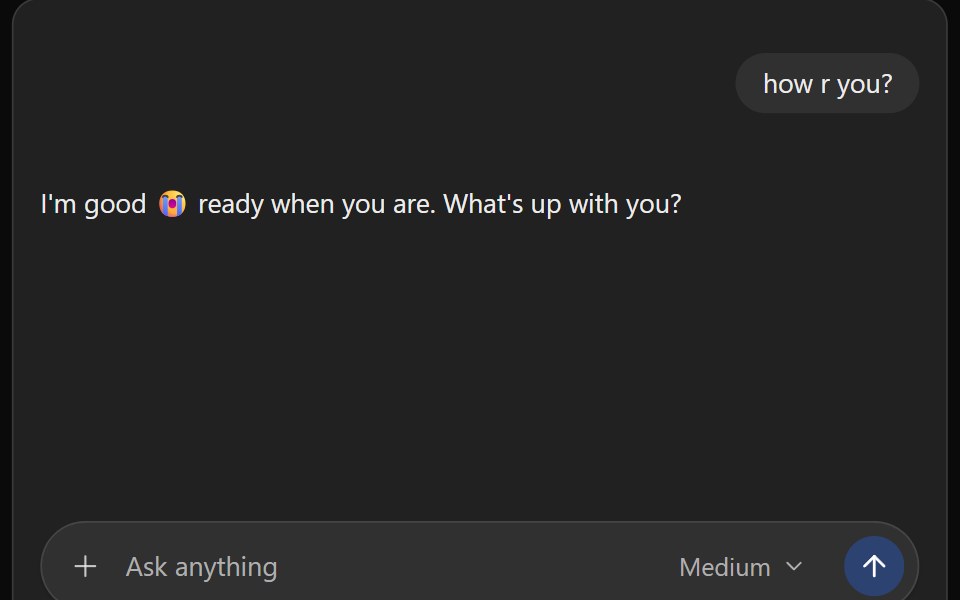 ChatGPT ThreadNotra · ReactThe ChatGPT conversation column with auto-scroll, a scroll-to-bottom button and a pinned footer.
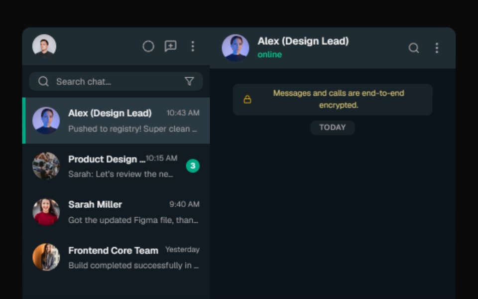 Macbook MockupGreatUI · React
 Laptop MockupNexvyn UI · ReactA laptop device-frame illustration for showcasing app screens.
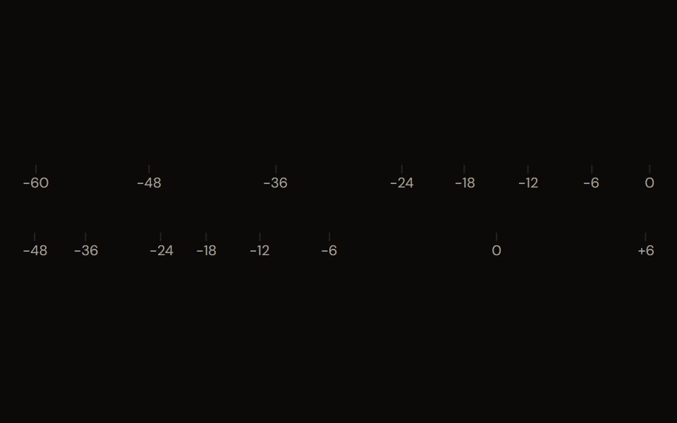 dB Scaleaudiocn · ReactTick marks and labels for a decibel range, shared by meters and faders.
 Aspect RatioShark UI · ReactWrapper that maintains aspect ratio for content.
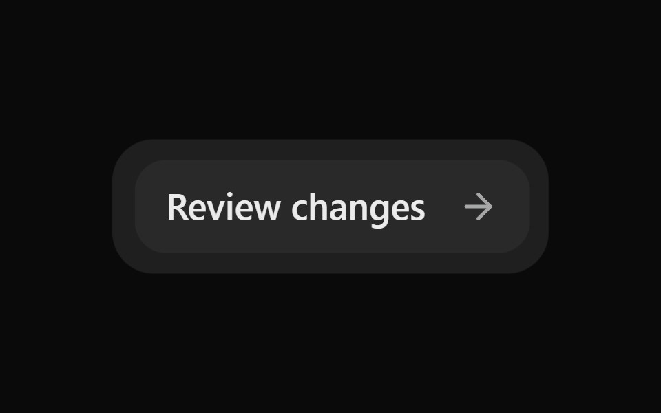 Morph SurfaceSona UI · ReactAn unstyled layout primitive that grows, shrinks, clips, and updates the content of one persistent consumer-styled…
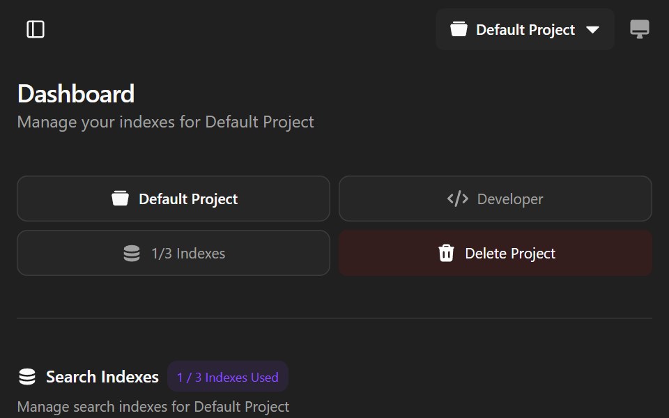 Agndex DashboardWatermelon UI · ReactA developer portal for managing search indexes, API credentials, billing, and project settings with light and dark…
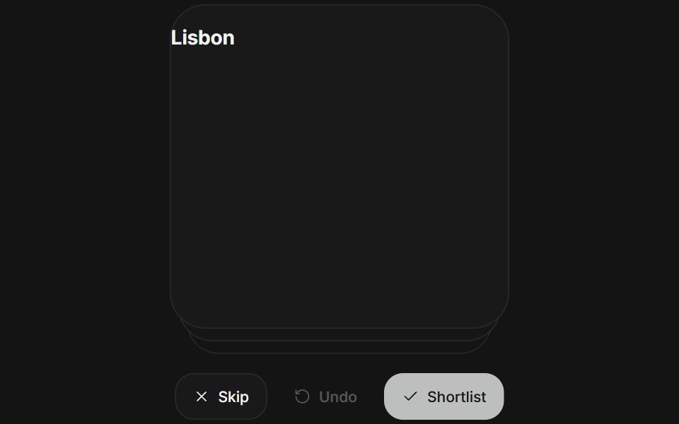 Card stackArc Library · ReactReview a deck one card at a time, with a throw and an undo.
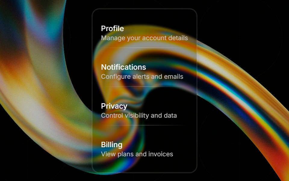 Glass Separatorglasscn · ReactGlass Separator with five variants: clear, frosted, subtle, liquid, and liquid-refract
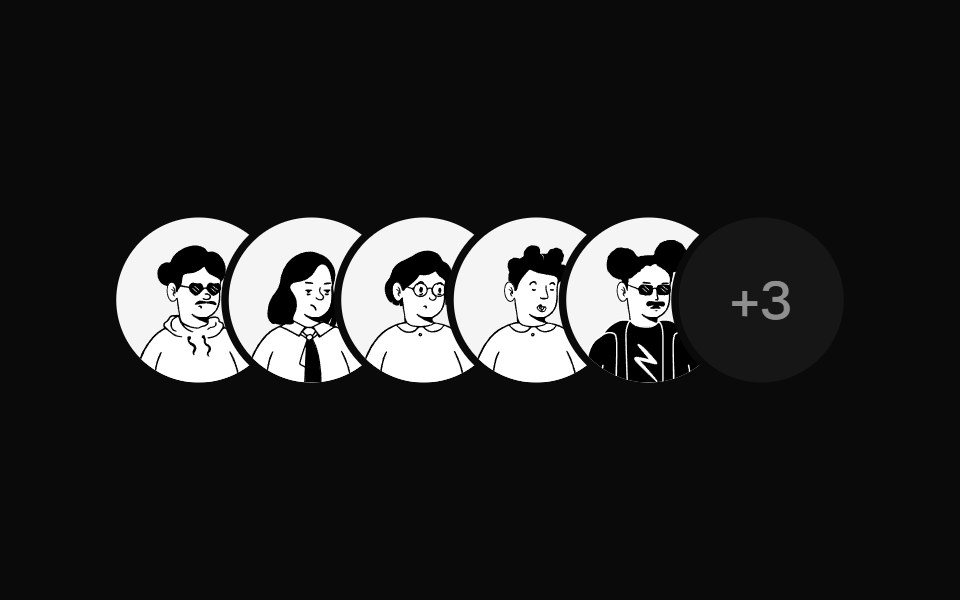 Avatar StackUI Lab · ReactFans open when you reach for it, with a name above each face.
 Aspect ratioHextaUI · ReactA box that holds its shape before media loads, shimmers while loading, fades the media in and falls back when it fails.
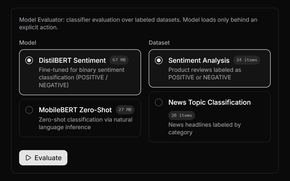 Model Evaluator BlockLocalMode · ReactEvaluate a selected classifier over a selected labeled dataset via useEvaluateModel, reporting accuracy plus macro…
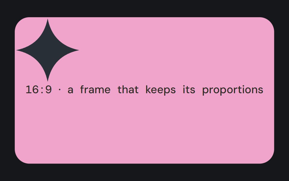 Aspect RatioCojeev UI · ReactKeeps a media container at a chosen width-to-height ratio as its available width changes.
 Card Image SectionROI UI · ReactA section with 4 image cards in a masonry layout.
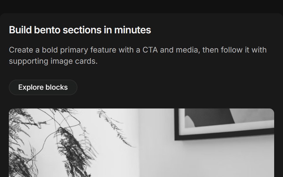 Bento grids 01FLX UI · ReactThree-column bento: primary tile (two-thirds) with title, description, CTA and media, plus supporting image cards.
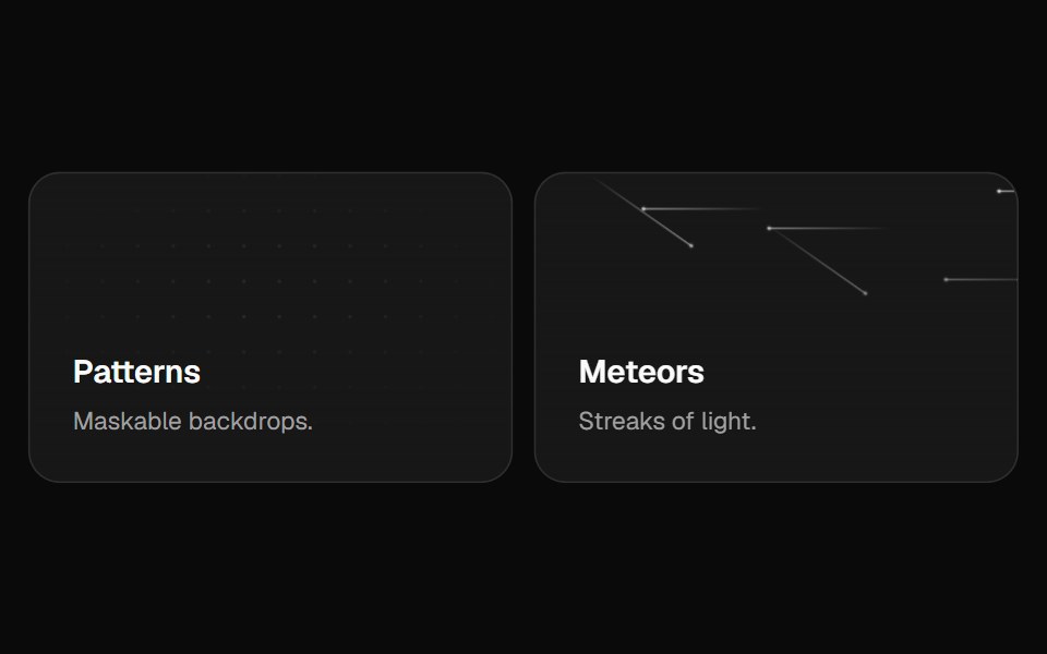 Bento GridVelora UI · ReactFeature bento with hover-reveal CTAs and rich backgrounds.
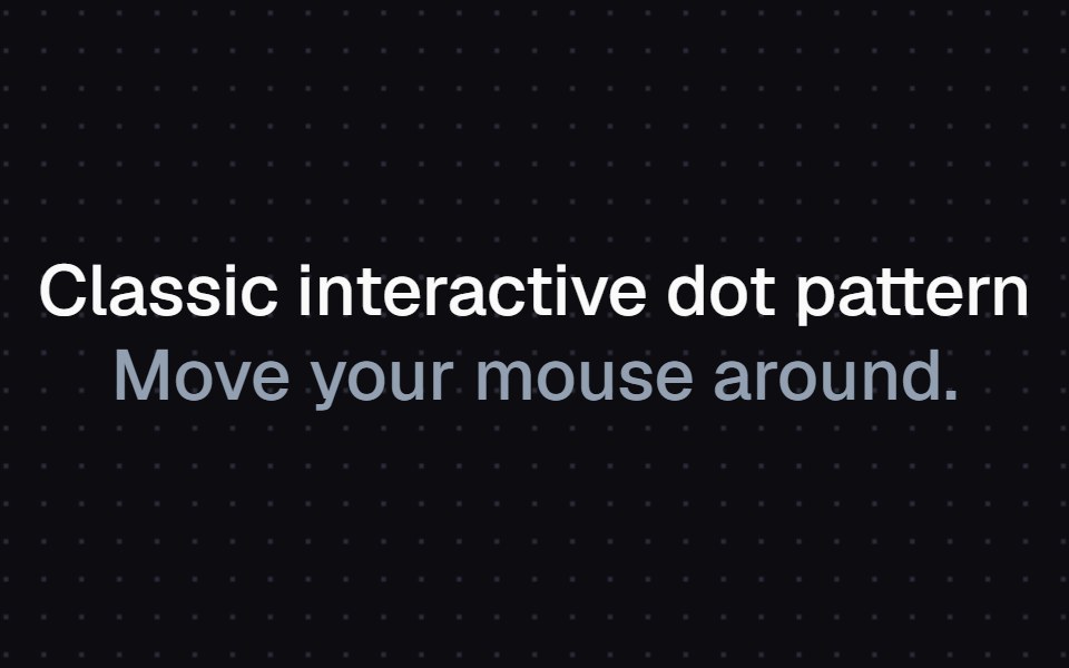 Magnetic Dot GridAtelier UI · React
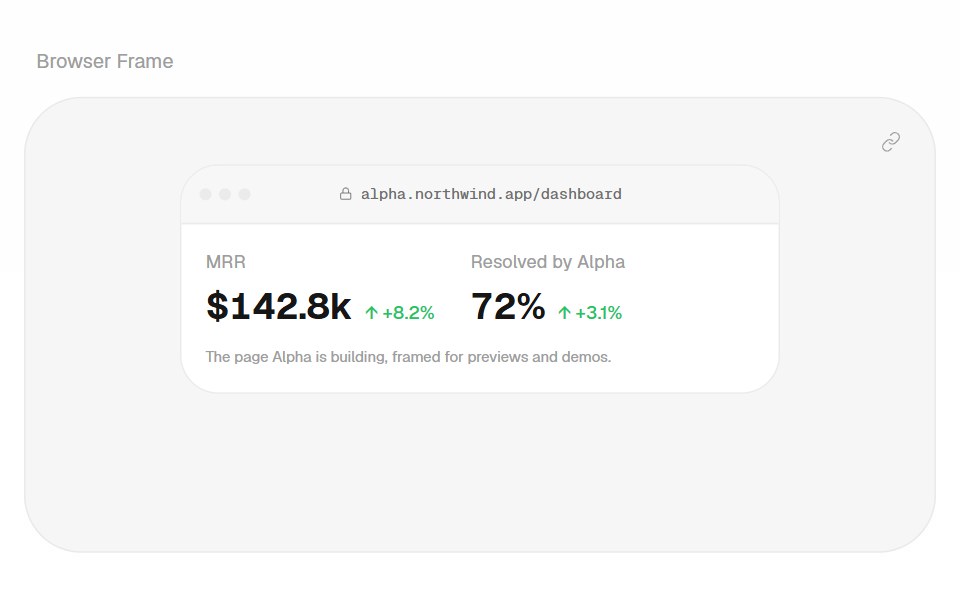 Browser FrameHalaska UI · React
 RuleMetal UI · React + SwiftUIAn engraved groove between groups; graphite on dark chrome.
 Adaptive Density GridSpaceUI · ReactA fluid polymorphic grid featuring velocity-driven spring pill tabs, staggered layout reflow animations, and built-in…
 Aria Aspect RatioReScript shadcn · ReScript
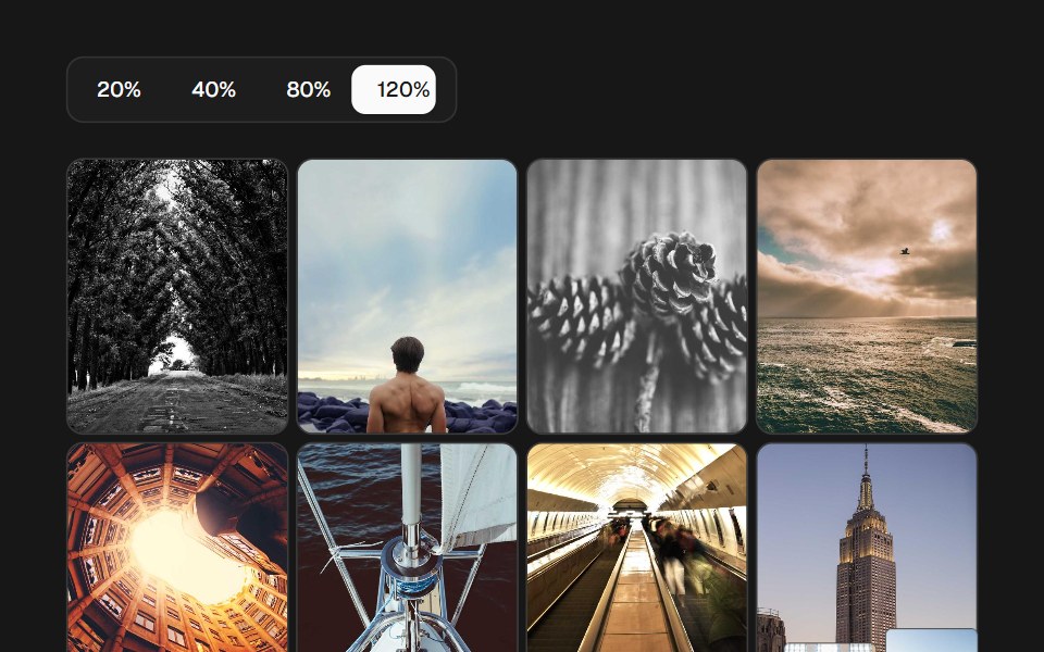 Image Density GridSkecher UI · ReactA percentage-controlled image grid with animated density changes, soft focus, and optional controls.
 Fisheye Chromatic Card GridCue Foundations · React
 SeparatorOUI · ReactReact aria components Separator with shadcn characteristics.
 Liquid DividerLiquefy UI · ReactDivider line in liquid glass style. Linha divisória em estilo vidro líquido.
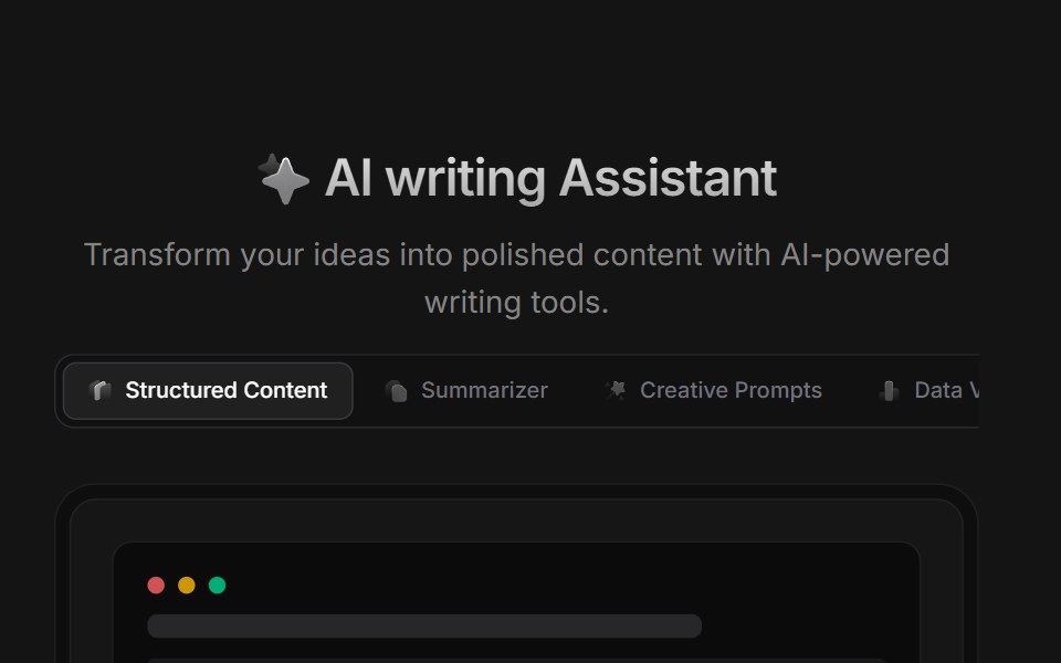 AI BlockD2Studio UI · ReactAI prompt template grid with creative prompts, summarizer, story, poetry and study presets.
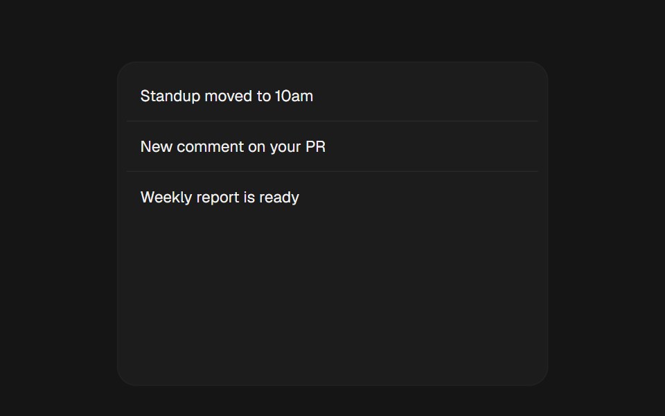 Pull To RefreshEaseUI · ReactA pull-down gesture over scrollable content: the indicator tracks the finger 1:1, then resists past the trigger…
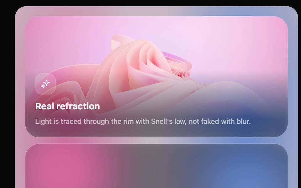 Glass Bento GridOpaline · ReactFeature tiles on glass in a bento layout, with a pointer light and a call to action that slides in.
 SeparatorFibo · ReactA thin rule between groups of content, across or down, with an optional label.
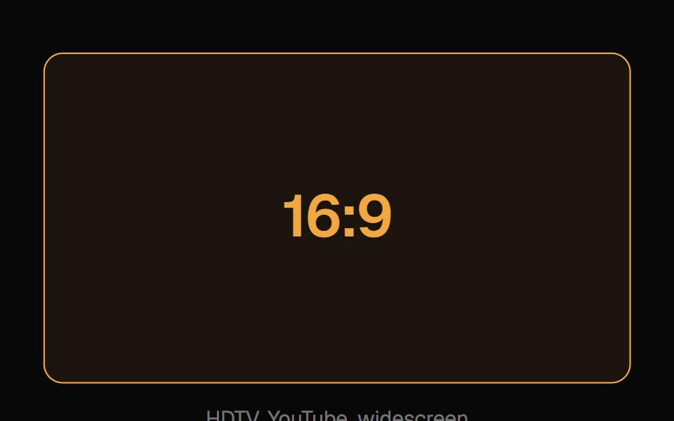 Aspect RatioReactFrame · ReactA container that locks its content to a fixed width/height ratio (a preset like video or square, or a custom number)…
 Container Text FlipAceternity UI · ReactBoxed word inside a sentence that flips through a list of words, with the box resizing to fit each one.
 Floating Panelark-cn · ReactA shadcn-style floating panel component built with Ark UI primitives.
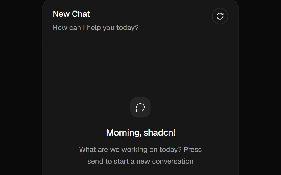 Message Scrollershadcn/ui · ReactA chat scroll container that anchors turns, opens saved transcripts, follows streamed responses, loads history without…
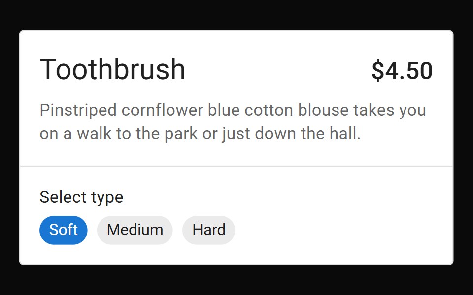 DividerMUI / Material UI · React
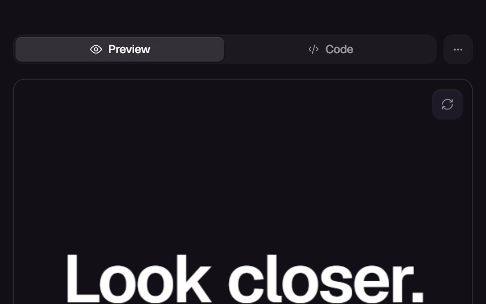 Fluid GlassReact Bits · ReactGlassmorphism container with animated liquid distortion refraction.
 Aspect RatioChakra UI · ReactMaintain a consistent aspect ratio for embedding videos, images, maps, etc.
 SeparatorHeroUI · ReactA simple line to separate content visually.
 SafariMagic UI · ReactA safari browser mockup to showcase your website.
 Scroll Areacoss ui · ReactA native scroll container with custom scrollbars.
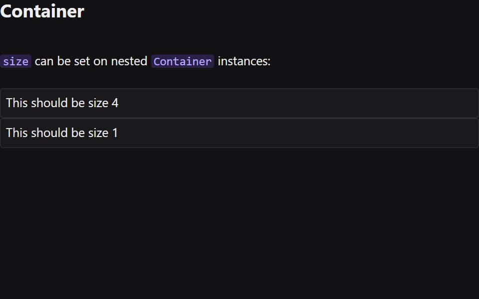 ContainerRadix Themes · React
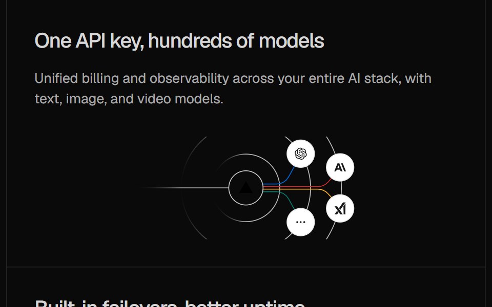 Illustration Card GridCult UI · ReactGrid of cards with gateway illustrations
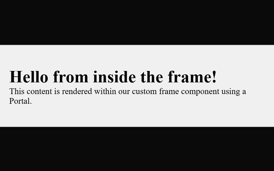 FrameArk UI · ReactUsed to render a component in an iframe
 4:3 standard aspect ratioReUI · React4:3 standard aspect ratio
 Keep Togetherpdfcn · ReactKeep Together PDF component (forme)
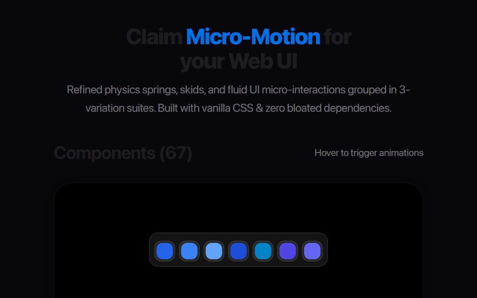 Card Stack PeelAmicro Micro Transitions · ReactLayered card index tab that peels down in 3D perspective to reveal underlay.
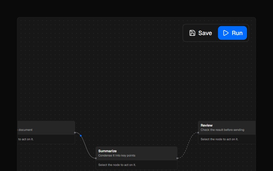 PanelAI Elements · ReactA styled panel component for React Flow-based canvases to position custom UI elements.
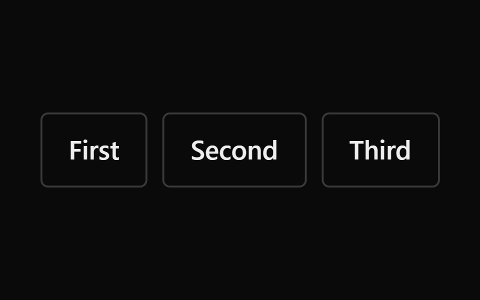 GroupPark UI · ReactA layout component for grouping related elements visually.
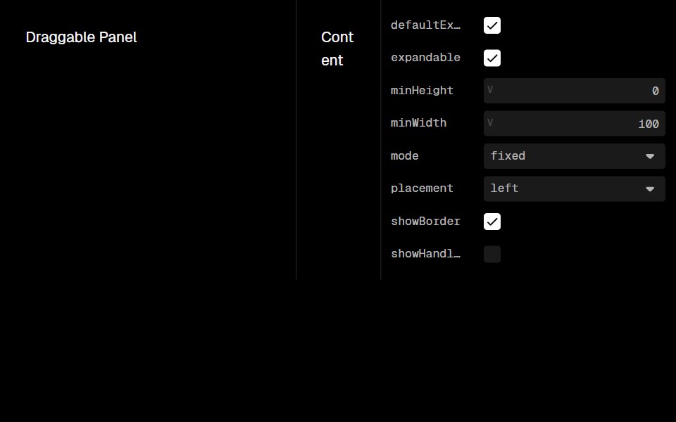 Draggable PanelLobe UI · ReactAn edge-anchored panel that can be resized by dragging, by keyboard, or collapsed. Built on motion values, so a drag…
 Lightbox GridKokonut UI · ReactA photo grid whose thumbnails grow into a full view and fly back to their slot when you drag them down.
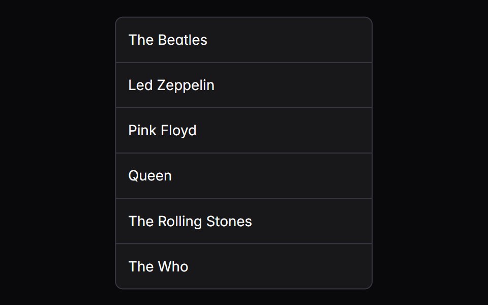 grid-listIntent UI · Reactgrid-list
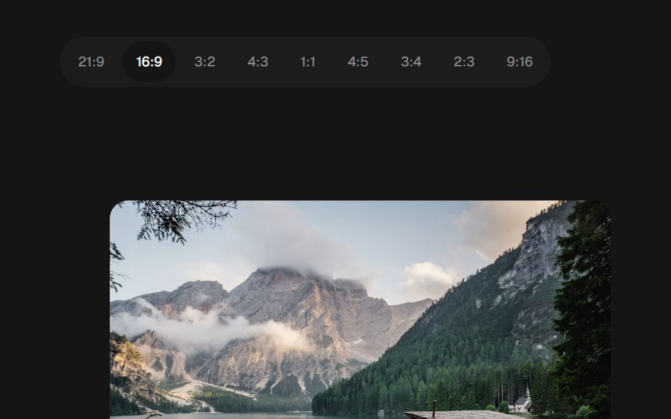 Aspect RatiobeUI · ReactResponsive media with smooth aspect ratio transitions.
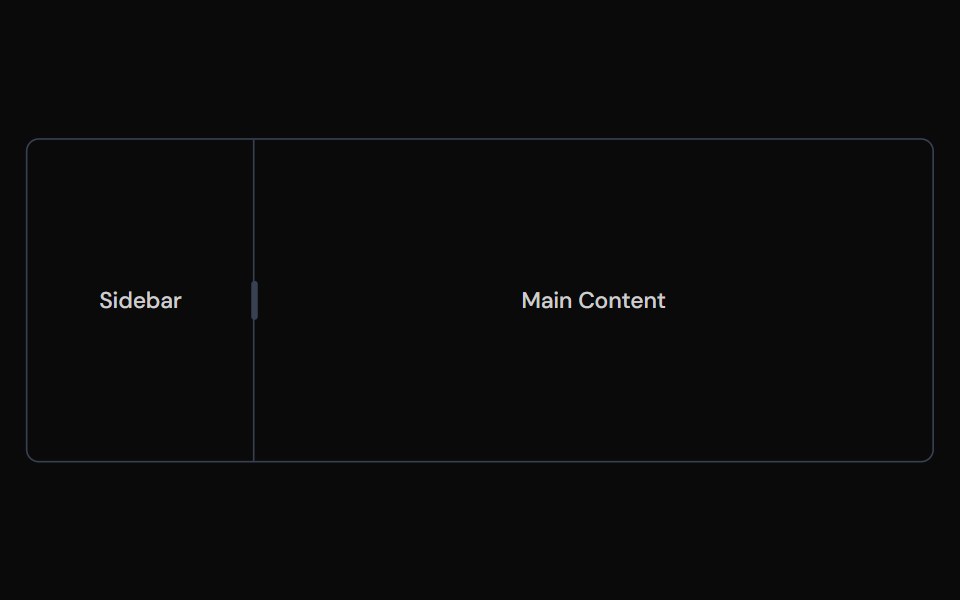 ResizableTailGrids · ReactAccessible resizable panel groups and layouts with keyboard support.
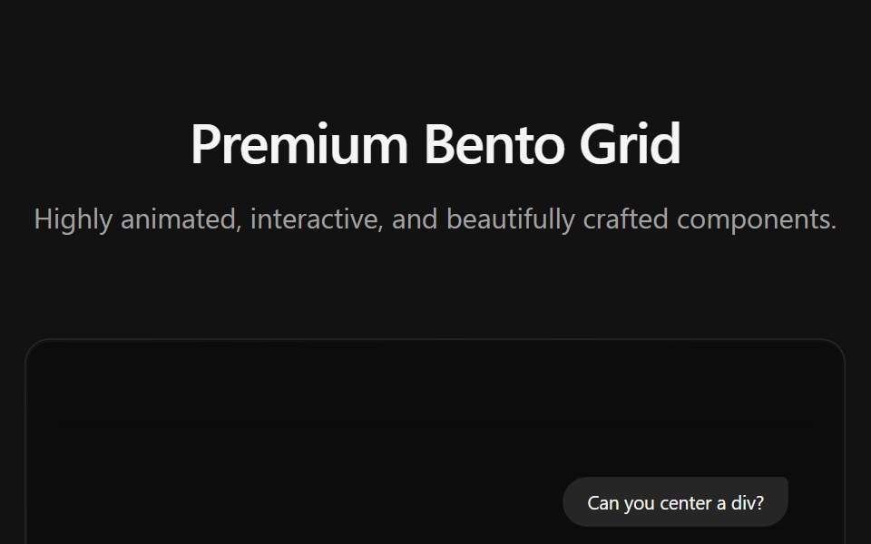 Bento GridSpectrum UI · ReactA premium interactive Bento Grid component
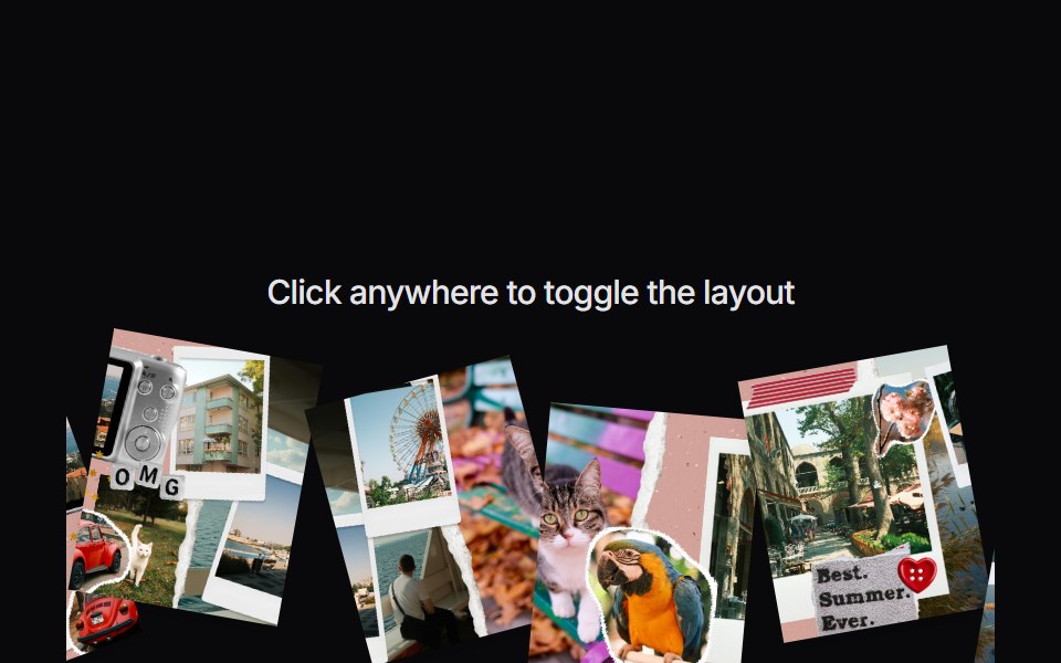 Image CollageVengeance UI · ReactInteractive scattered image collage toggle
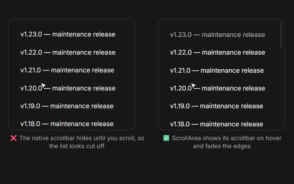 Scroll Area (Base UI)Fluid Functionalism · ReactScroll container with a restyled overlay scrollbar that stays discoverable on hover and follows the shape system…
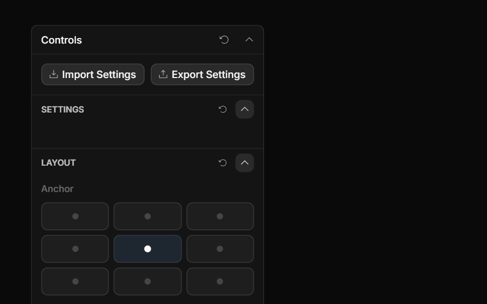 Anchor Grid ControlToolcraft · React
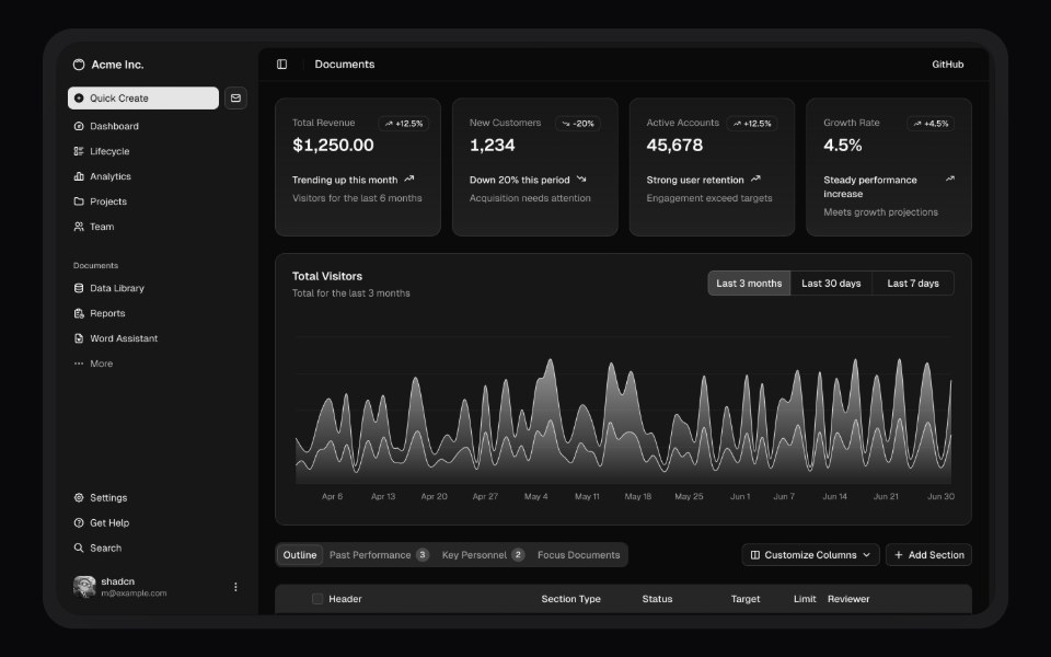 MockupLaunch UI · React
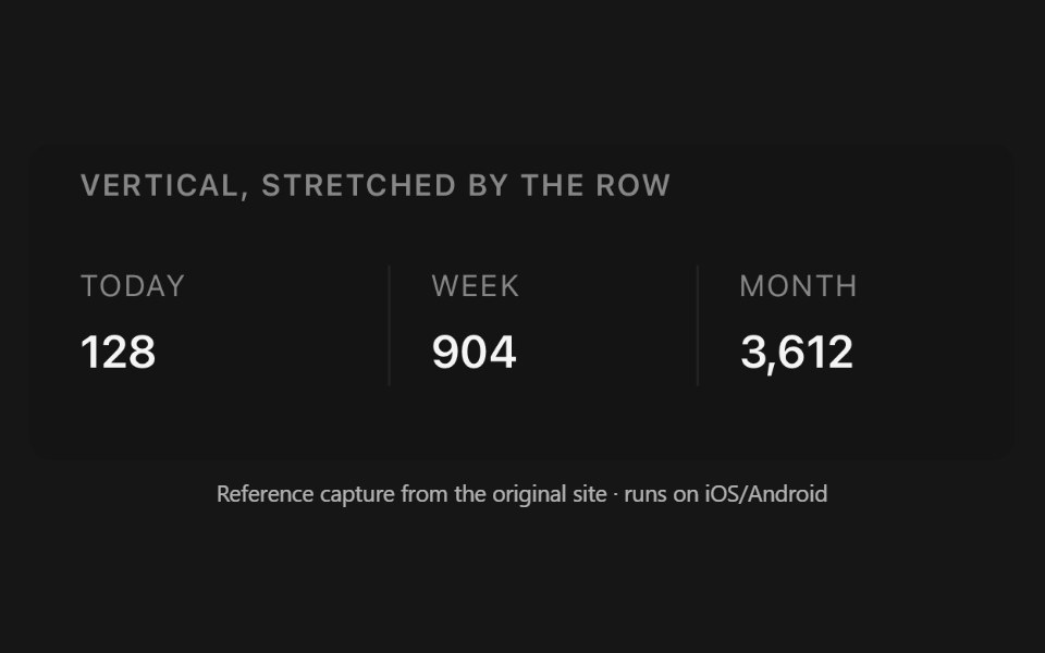 SeparatorPanel UI · React NativeHorizontal or vertical rule between content, optionally labelled.
 Aspect Ratio 01 - DefaultShadcn Space · ReactA simple image constrained to a 16:9 aspect ratio.
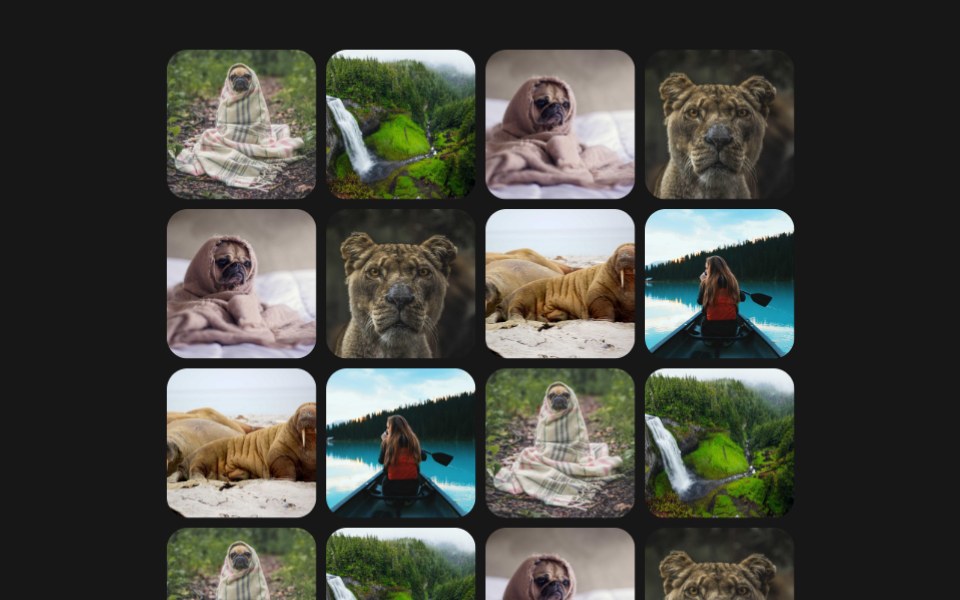 Photo Magnet GridPixel Perfect · ReactA tidy grid of photos that scatters away from the cursor like same-pole magnets, each tile leaning away in 3D as it…
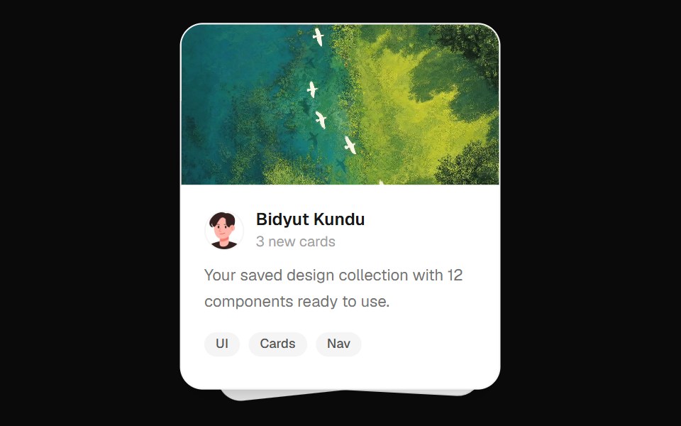 Stacked Cards EffectOpenSourceUI · React
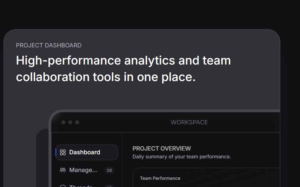 Bento Carduselayouts · ReactAn interactive bento card with animated tabs and workspace preview.
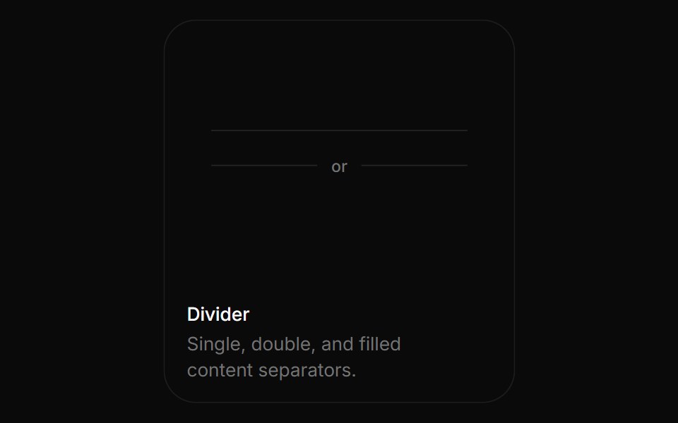 DividerBoardUI · ReactSingle, double, and filled content separators.
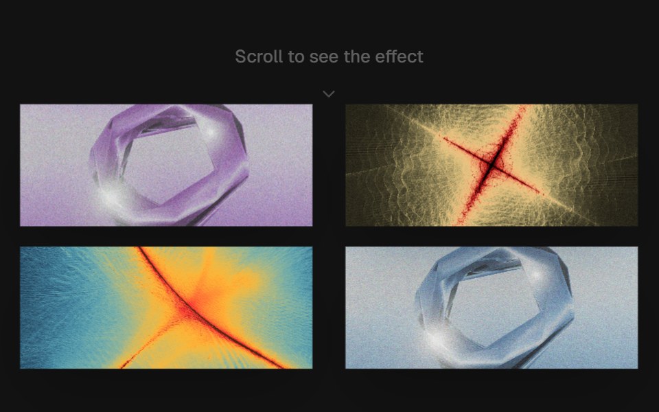 Scroll ChoreographyComponentry · ReactA smooth, scroll-driven image choreography component using Framer Motion.
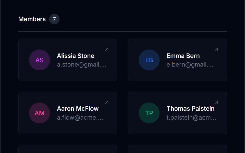 Grid List 01Tremor Blocks · React
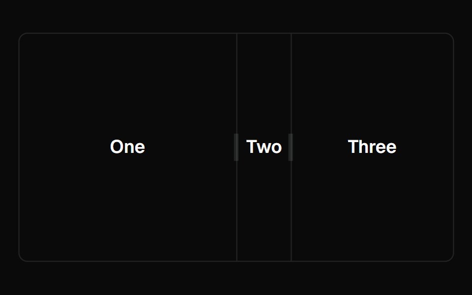 ResizableShadcn Dashboard · React
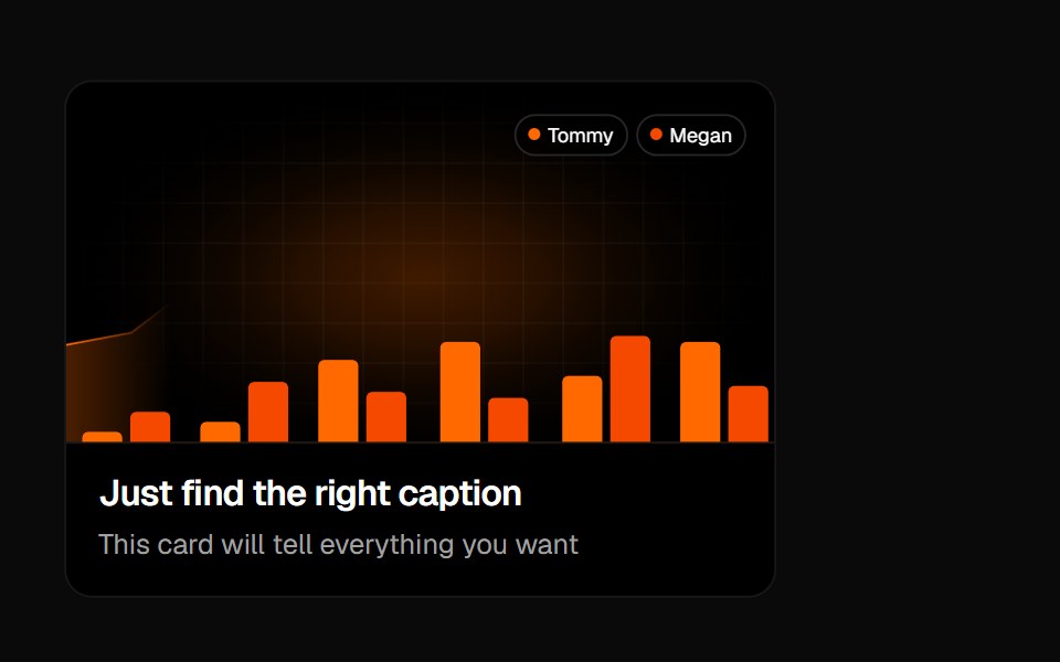 Animated Card 1Badtz UI · React
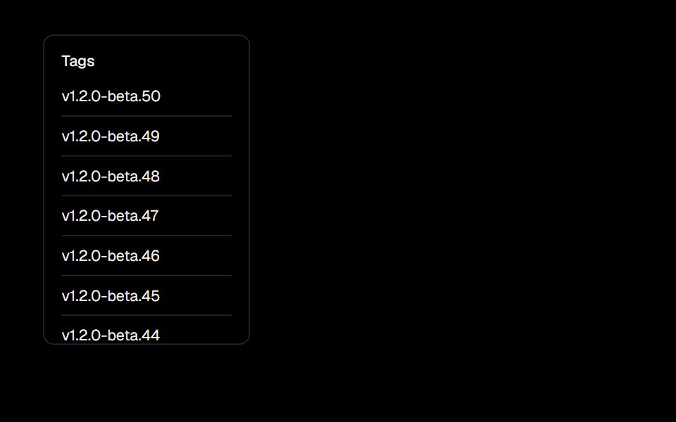 Scroll AreaObsidianUI · React
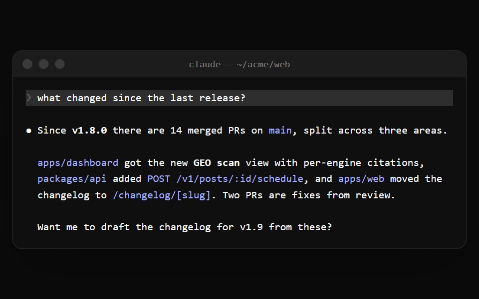 Claude Code TerminalNotra · ReactThe terminal window with traffic lights and a title bar for Claude Code sessions.
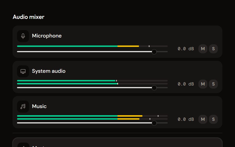 Mixeraudiocn · ReactThe container for channel strips: shared meter settings, keyboard navigation between strips, a master area and an…
 FloatShark UI · ReactAnchor an element to the edge of a container.
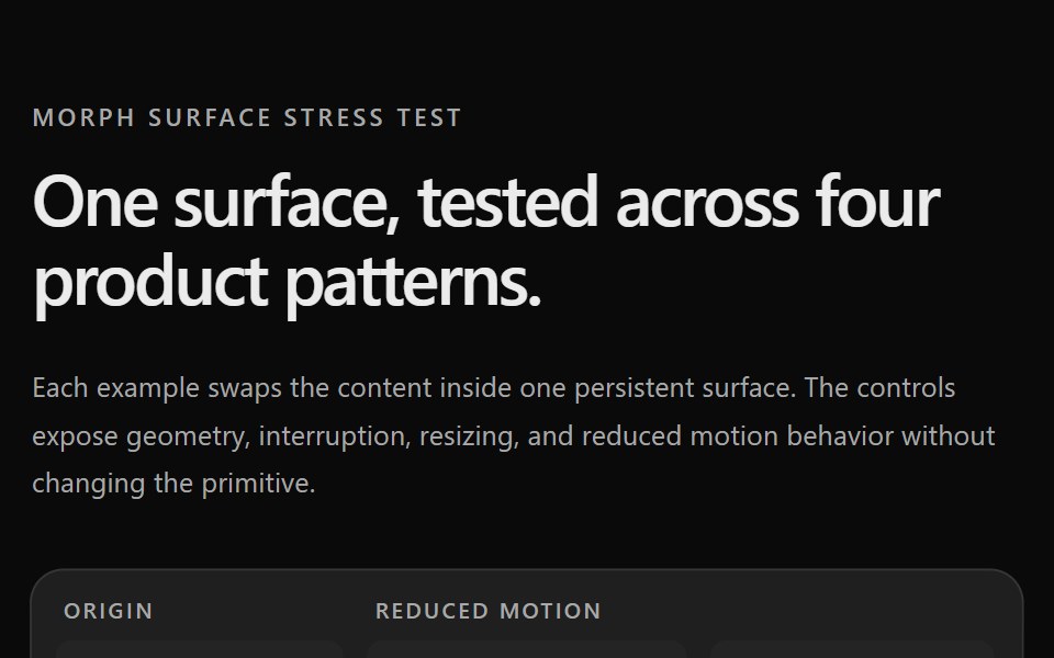 Prototype Morph SurfaceSona UI · ReactStress tests for the Morph Surface primitive. Página de testes de estresse do primitivo Morph Surface.
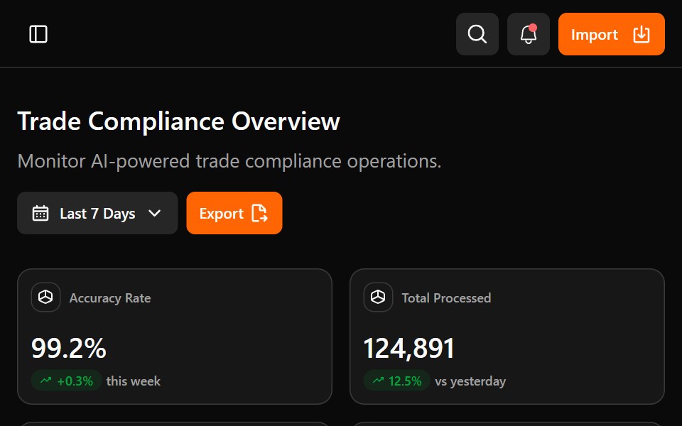 Astrix DashboardWatermelon UI · ReactA trade compliance workspace with AI classification metrics, a live pipeline, HS code stream review, and light and…
 Newsletter signupArc Library · ReactAn email signup framed by a stack of past issues; subscribing drops the next issue, addressed to you, onto the front.
 Separatorglasscn · React
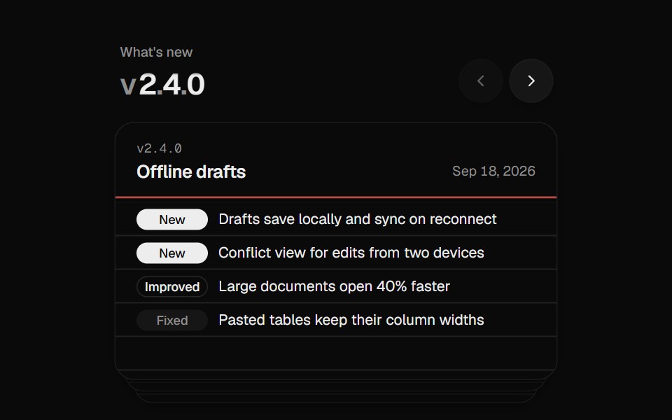 Changelog StackUI Lab · ReactFiles each release card behind the stack like a hand riffling index cards.
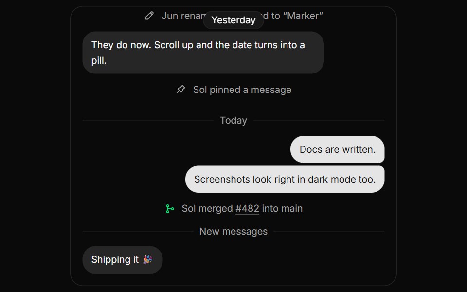 MarkerHextaUI · ReactQuiet notes between content, like date dividers and system events, with sticky dates and times that read as Today or…
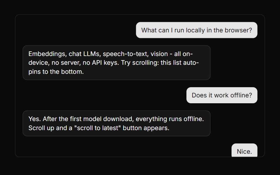 ConversationLocalMode · ReactScrollable message-display surface with first-class scroll-anchoring: auto-pins to the newest content while tokens…
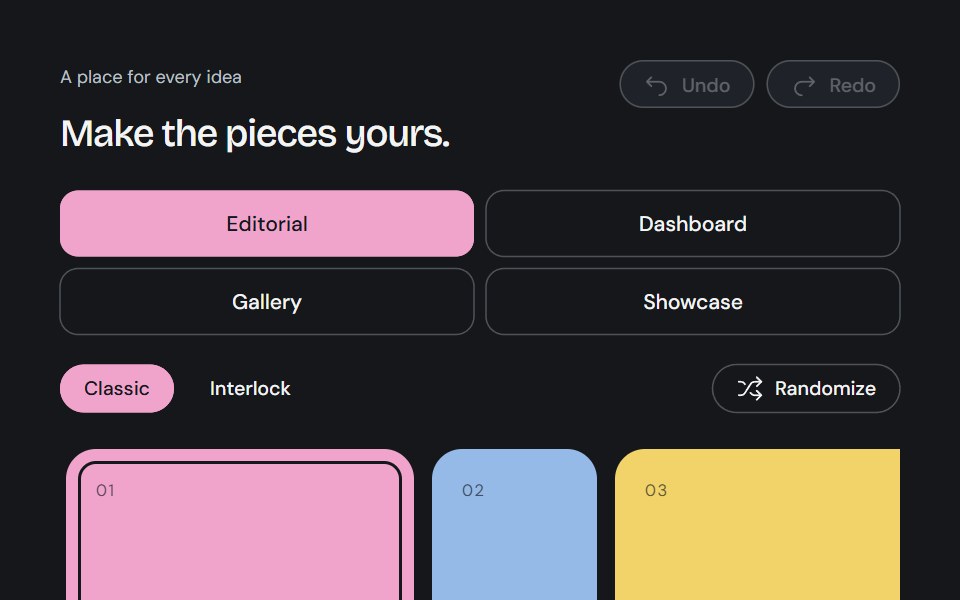 Bento BuilderCojeev UI · ReactAn editable Bento canvas with complete partitions, content swapping, snapped neighbor resizing, history and usable…
 Scroll AreaROI UI · ReactA native scroll container with custom scrollbars.
Libraries with React layout components
Related categories
- Layout Components
- Tailwind CSS Layout Components
- Svelte Layout Components
- Animated Layout Components
- shadcn/ui Layout Components
- React Grid Components
- React Bento Grid Components
- React App Shell Components
- React Separator Components
- React Stack Components
- React Split Pane Components
- React Window Frame Components
- React Masonry Components