 Dev Design Library
shadcn/ui Layout Components
Dev Design Library indexes 121 shadcn/ui layout components from 14 open-source UI libraries, with the most coming from Watermelon UI, Shadcn Space, Intent UI, FLX UI and audiocn. Each one links to its page with the source code, a live preview where available, the library license and the install command. They follow the shadcn/ui conventions, so most install with the shadcn CLI and drop into a Tailwind project.
Showing 120 of 121, a mix from every library. Open a library to see all of its components.
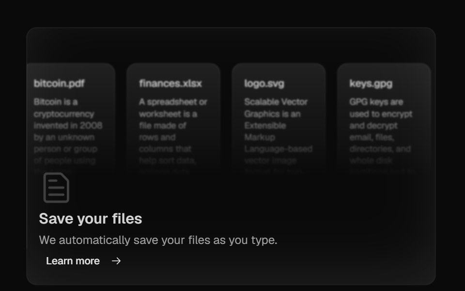 Bento GridMagic UI · ReactBento grid is a layout used to showcase the features of a product in a simple and elegant way.
 previewIntent UI · Reactpreview
 App SidebarFluid Functionalism · ReactA complete app shell: workspace header with the peek cross-fade, search on the menu rows' rhythm with a hover-revealed…
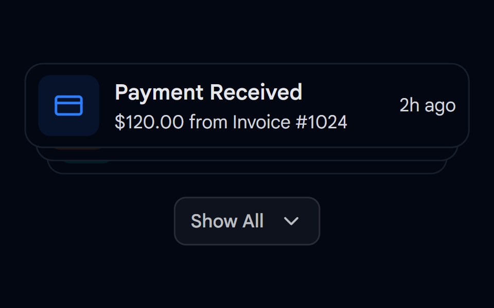 Animated List 03 - Expandable StackShadcn Space · ReactExpandable stack of cards showing notifications with dynamic spring layouts
 Bento GridAnimations (Svelte) · SvelteA flexible grid layout with interchangeable BentoCard items for showcasing content in a responsive masonry style.
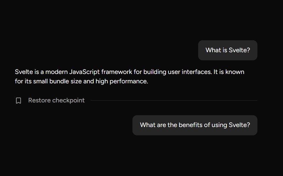 CheckpointAI Elements (Svelte) · SvelteA compact checkpoint component that pairs a separator with icon and trigger helpers for workflow checkpoints.
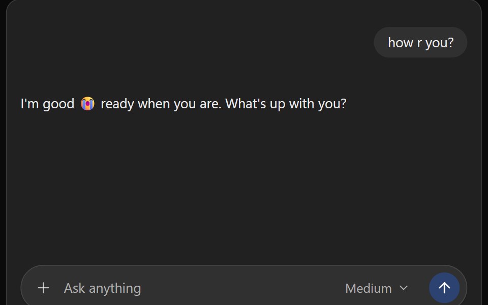 ChatGPT ThreadNotra · ReactThe ChatGPT conversation column with auto-scroll, a scroll-to-bottom button and a pinned footer.
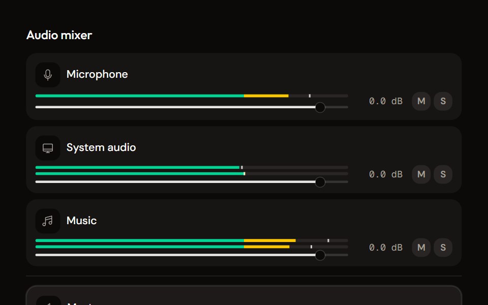 Mixeraudiocn · ReactThe container for channel strips: shared meter settings, keyboard navigation between strips, a master area and an…
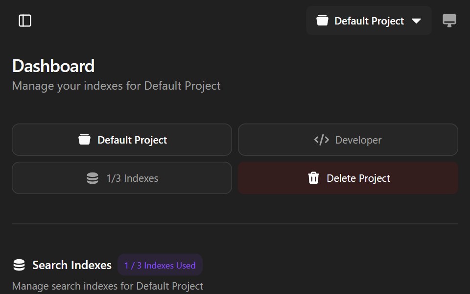 Agndex DashboardWatermelon UI · ReactA developer portal for managing search indexes, API credentials, billing, and project settings with light and dark…
 Aspect ratioHextaUI · ReactA box that holds its shape before media loads, shimmers while loading, fades the media in and falls back when it fails.
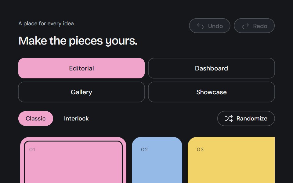 Bento GridCojeev UI · ReactA complete canvas of rounded cards or organically interlocking pieces. Compose a layout, then install just the…
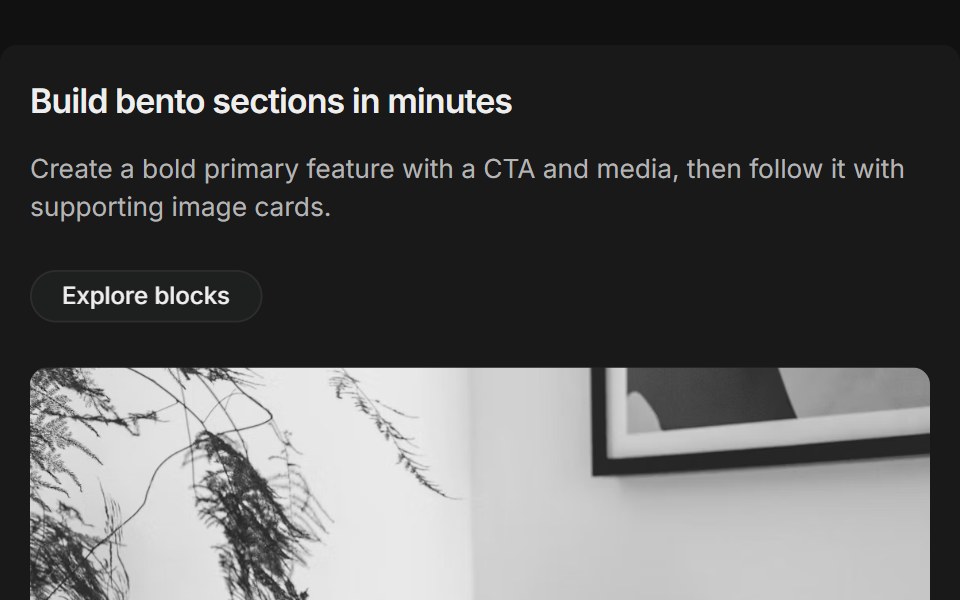 Bento grids 01FLX UI · ReactThree-column bento: primary tile (two-thirds) with title, description, CTA and media, plus supporting image cards.
 Alternating screenshot rowsVelora UI · ReactTwo alternating rows of copy with a checklist beside a browser-framed dashboard mock, sides swapped.
 Bento 01D2Studio UI · ReactBento grid for an education program platform with admin overview, faculty view and a program form.
 sidebar-01Intent UI · Reactsidebar-01
 Aspect Ratio 01 - DefaultShadcn Space · ReactA simple image constrained to a 16:9 aspect ratio.
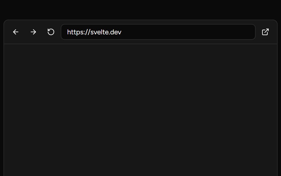 Web PreviewAI Elements (Svelte) · SvelteA browser-style preview frame with navigation controls and a log console.
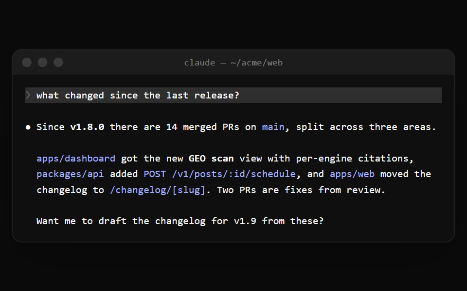 Claude Code TerminalNotra · ReactThe terminal window with traffic lights and a title bar for Claude Code sessions.
 Sound Padaudiocn · ReactA trigger pad with one-shot, toggle, hold and loop modes, a hotkey, playback progress and an accent colour, plus a…
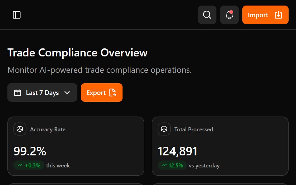 Astrix DashboardWatermelon UI · ReactA trade compliance workspace with AI classification metrics, a live pipeline, HS code stream review, and light and…
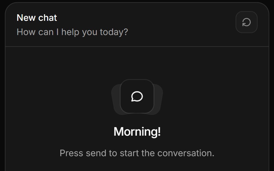 Message scrollerHextaUI · ReactA chat scroll area that follows new messages, keeps your place while you read back, and counts what you missed on the…
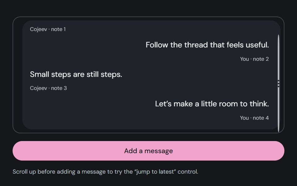 Message ScrollerCojeev UI · ReactKeeps a conversation near its latest content while allowing readers to scroll back without being pulled down.
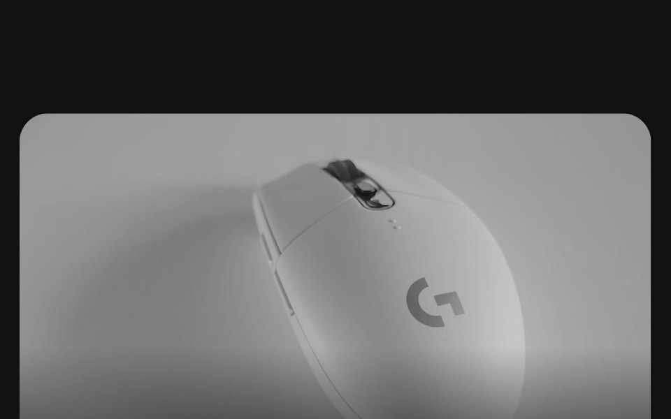 Bento grids 02FLX UI · ReactA row of collection cards, one twice as wide, each with a product photo bleeding off the top, a title, a short…
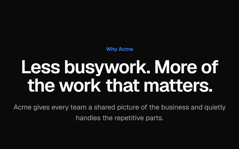
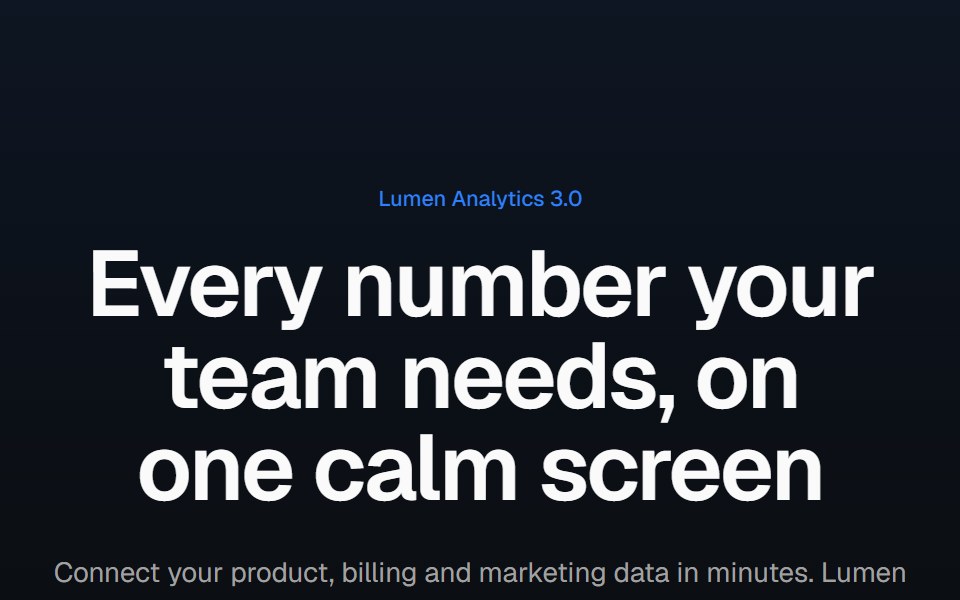 Product screenshot heroVelora UI · ReactCentered headline above a dashboard in a browser frame with a border beam and a logo row.
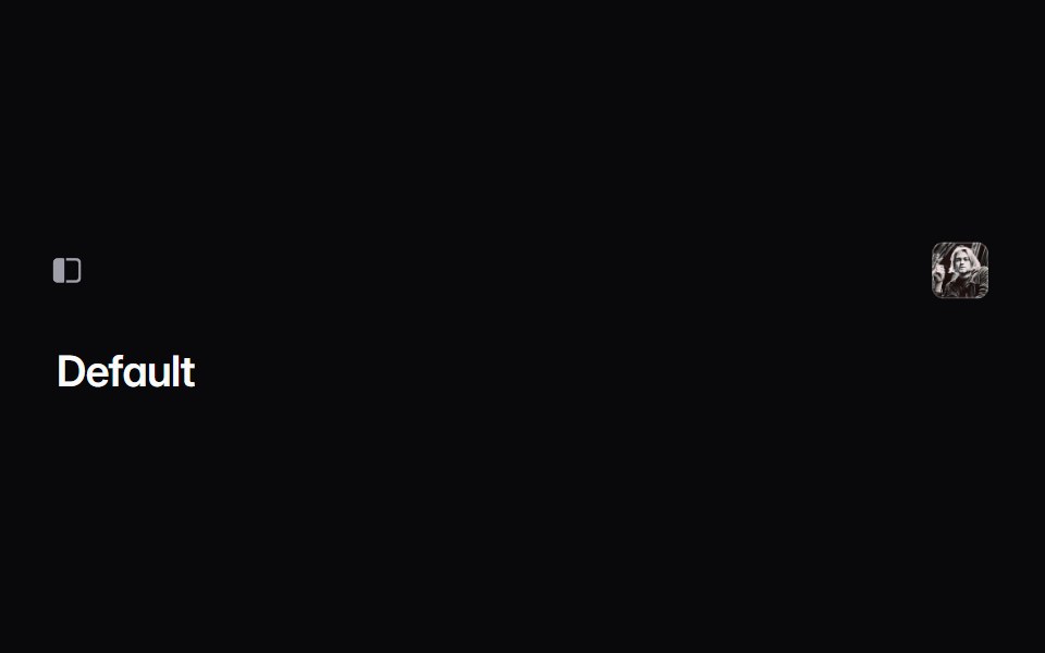 sidebar-02Intent UI · Reactsidebar-02
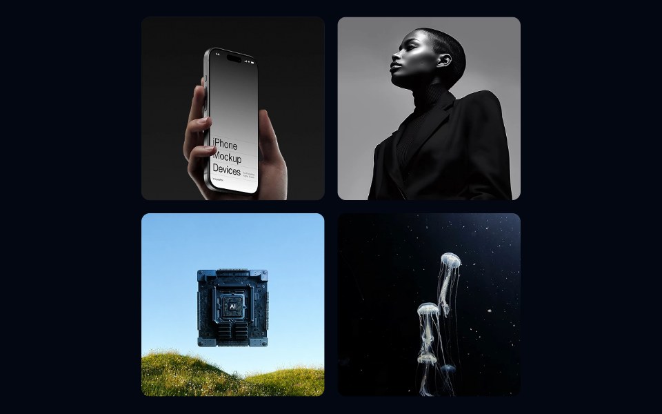 Aspect Ratio 02 - Square GridShadcn Space · ReactA responsive photo gallery grid using square aspect ratio tiles with a hover zoom effect.
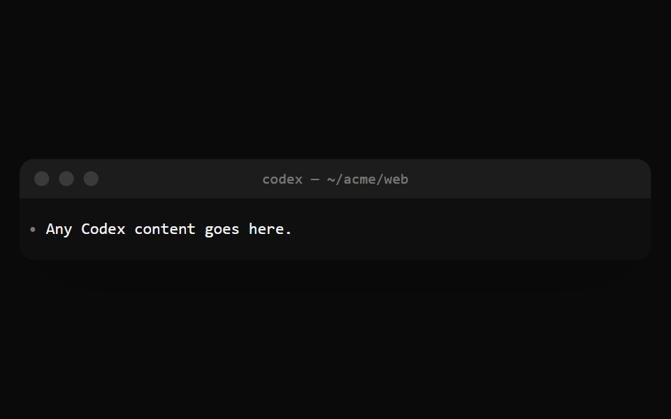 Codex TerminalNotra · ReactThe Codex window: a title bar, a scrolling transcript and a pinned footer for the prompt.
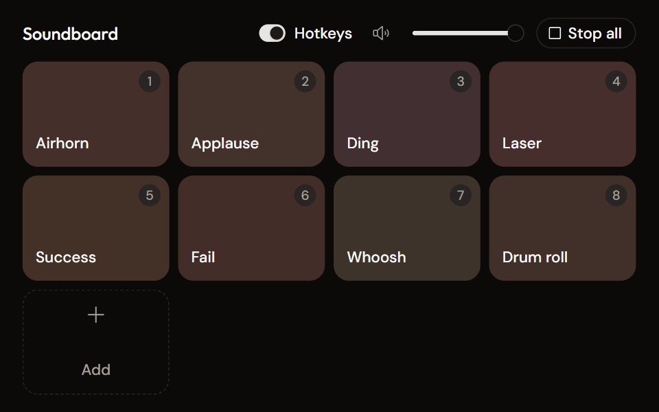 Soundboardaudiocn · ReactA grid of sound pads with global hotkeys, per-pad mode and volume in a context menu, master volume, stop all, and…
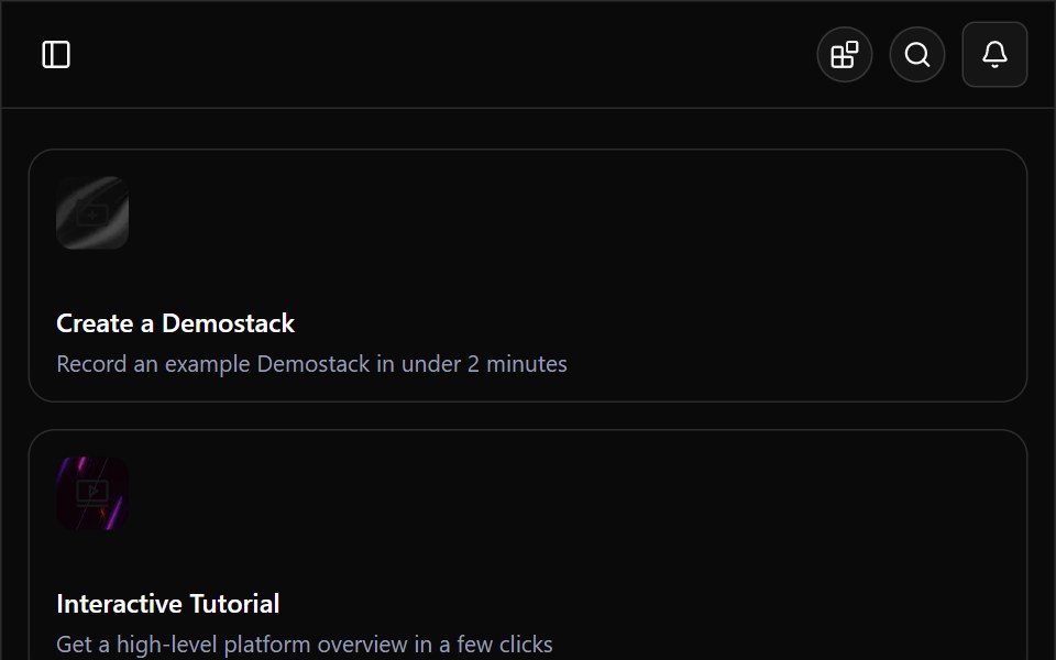 Demostack DashboardWatermelon UI · ReactA responsive product-demo workspace with organization switching, resource discovery, team filtering, and light and…
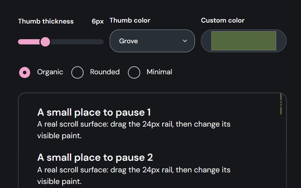 Scroll AreaCojeev UI · ReactContains overflowing content in a bounded viewport with styled scrollbars.
 Bento grids 03FLX UI · ReactA product grid with a tall featured item in the center, four smaller items around it, category badges, prices and names.
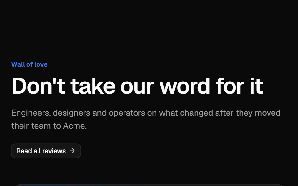 Testimonial gridVelora UI · ReactMasonry wall of social posts and quote cards, led by a wide case-study quote with a headline metric.
 sidebar-03Intent UI · Reactsidebar-03
 Aspect Ratio 04 - Video ThumbnailShadcn Space · ReactA 16:9 video thumbnail with a play button overlay and duration badge.
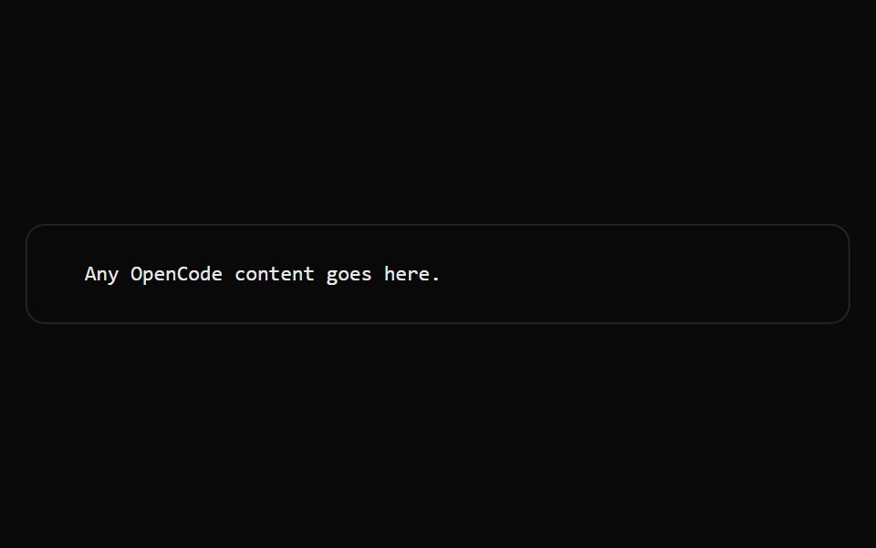 OpenCode WindowNotra · ReactThe OpenCode terminal surface that sets the background, monospace font and line grid.
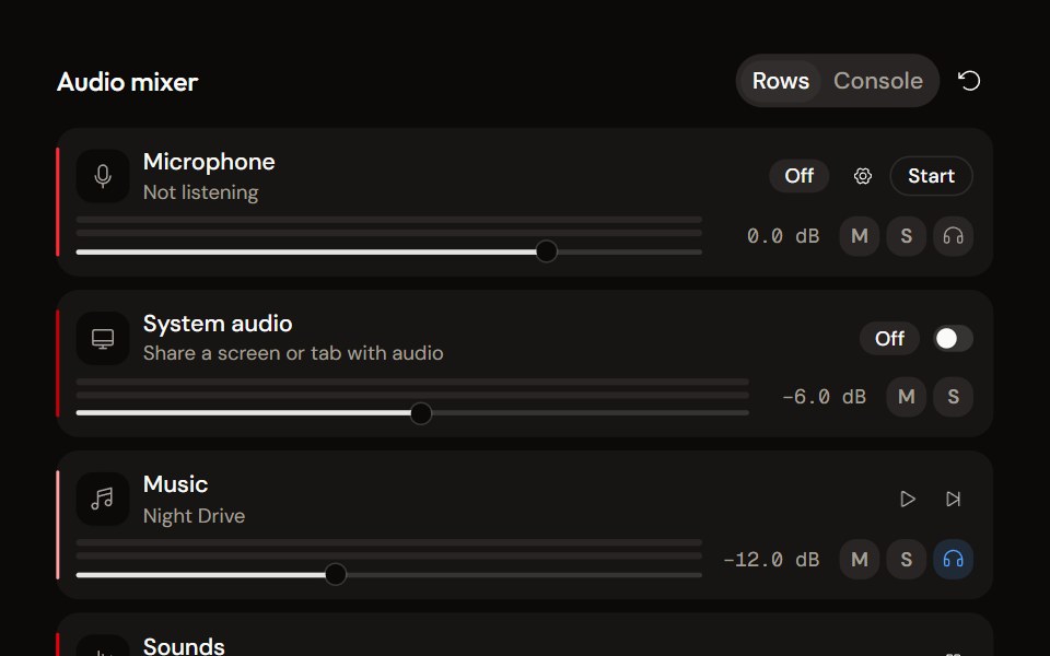 System Audio Mixeraudiocn · ReactThe complete mixer: microphone, system audio, music and sound pads with meters, faders, mute, solo, monitor and…
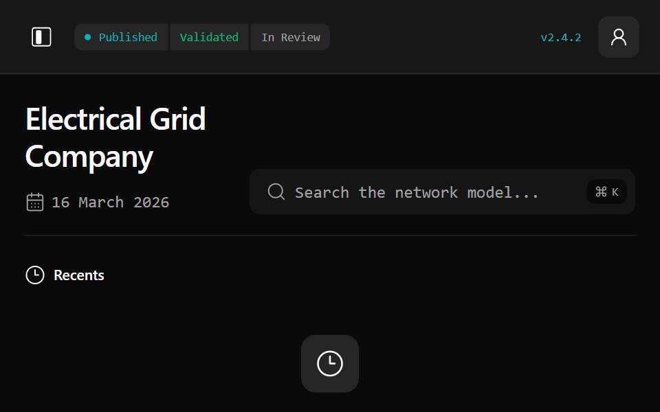 Gridline DashboardWatermelon UI · ReactA responsive electrical-grid workspace for network modelling, asset flexibility, planning, operations, and stakeholder…
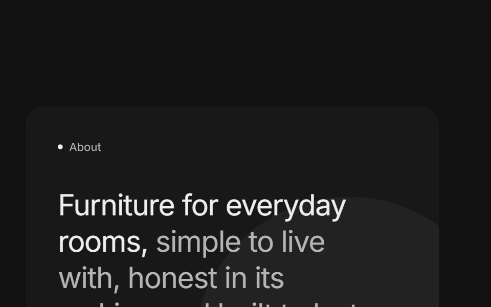 Bento grids 04FLX UI · ReactTwo stacked cards with a two-tone title, a paragraph and a pill button beside a product photo surrounded by short…
 sidebar-04Intent UI · Reactsidebar-04
 Aspect Ratio 05 - Ratio SwitcherShadcn Space · ReactAn interactive demo that lets you switch an image between common aspect ratios like 1:1, 4:3, 16:9, and 21:9.
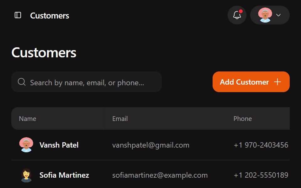 Jobtracker DashboardWatermelon UI · ReactA responsive job management workspace with customer records, job pipelines, estimates, drag-and-drop line items, and…
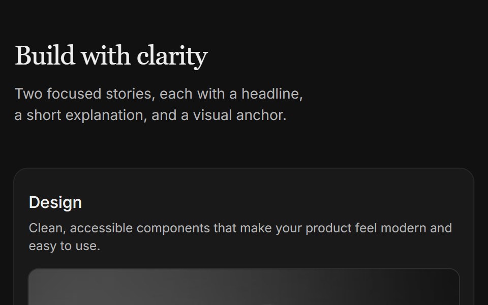 Content 04FLX UI · ReactTwo-column card grid with a serif section header and copy above each image.
 sidebar-06Intent UI · Reactsidebar-06
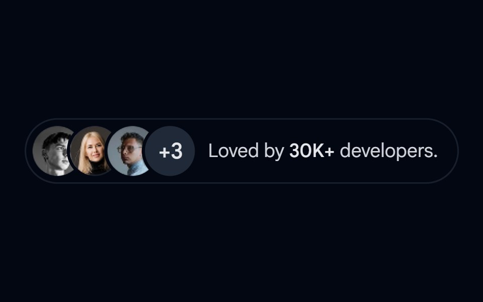 Avatar-08 - Avatar stackShadcn Space · ReactStacked avatar group with overflow count and popularity indicator
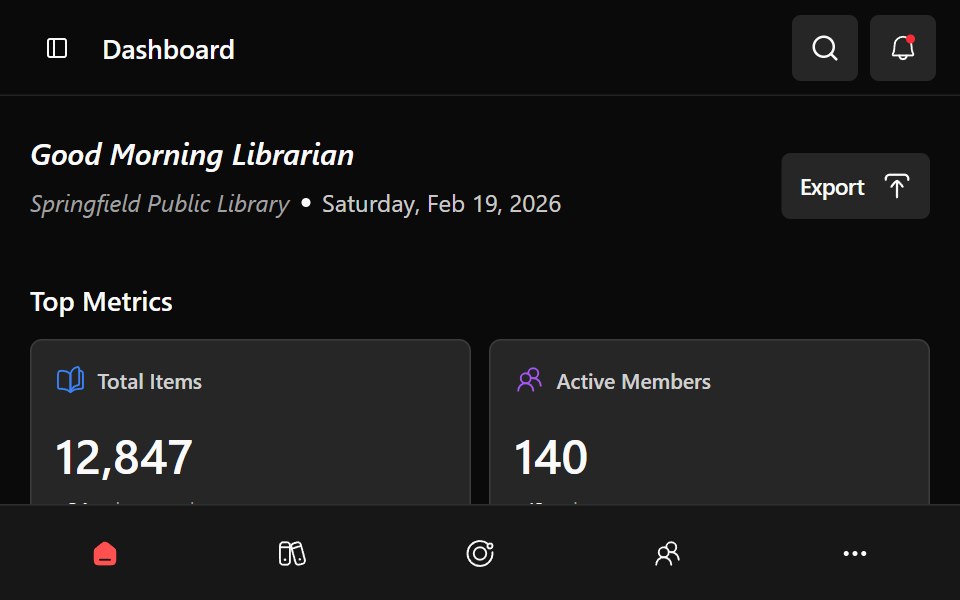 Library DashboardWatermelon UI · ReactA responsive library management dashboard with collection metrics, circulation charts, branch switching, and…
 Content 06FLX UI · ReactTwo-column split with serif headline, supporting copy, optional CTA, and a media panel.
 sidebar-08Intent UI · Reactsidebar-08
 Blog 01 - Latest Blog & News GridShadcn Space · ReactA modern blog section with featured posts, large thumbnails, publish dates, and headlines, ideal for sharing agency…
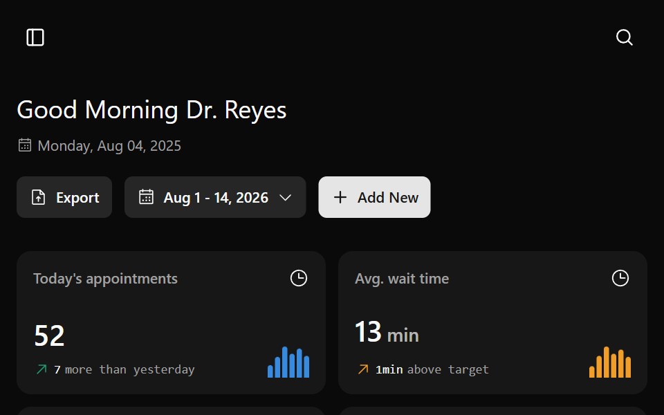 Medesk DashboardWatermelon UI · ReactA healthcare operations dashboard for appointments, staff performance, department load, resources, and patient flow…
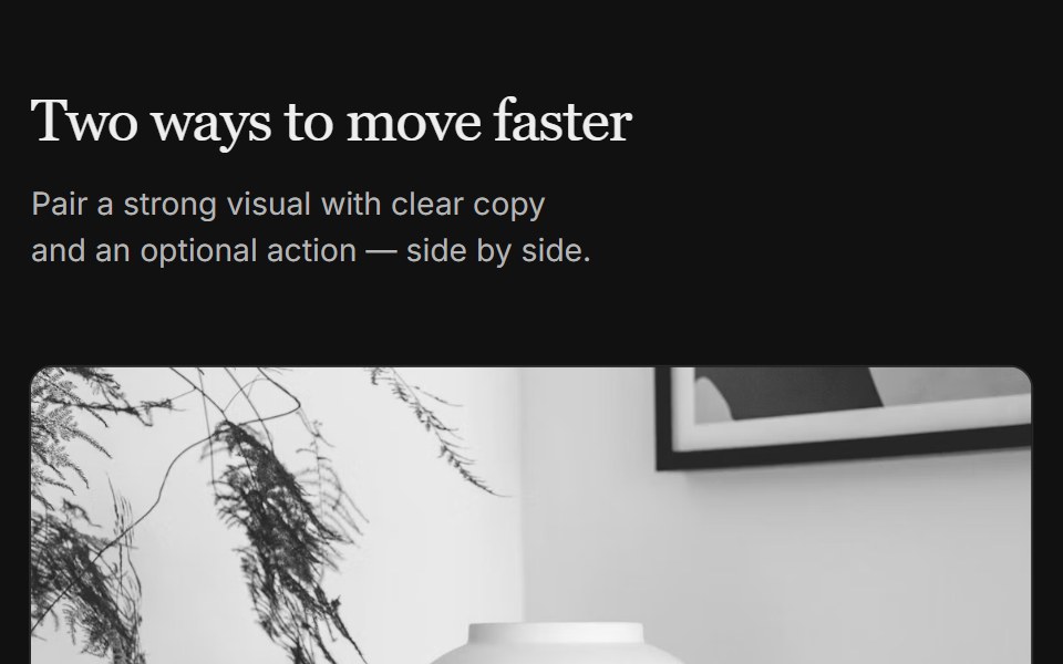 Content 07FLX UI · ReactTwo-column grid with serif header, media on top, copy, and optional CTA per column.
 sidebar-09Intent UI · Reactsidebar-09
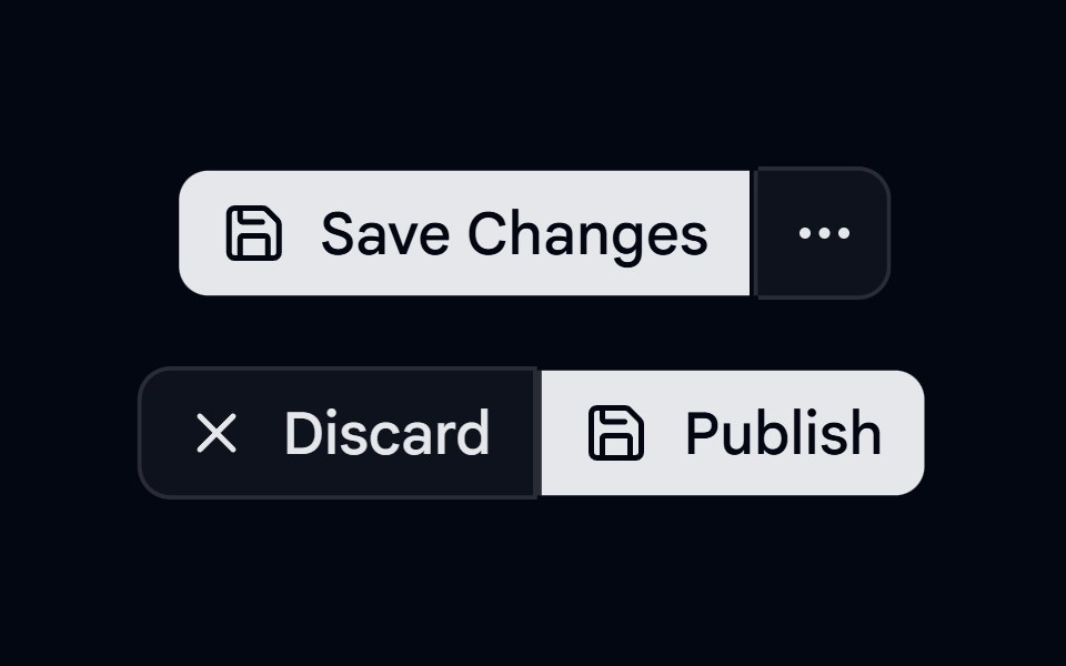 Button Group-04 - SeparatorShadcn Space · ReactButton group with separators
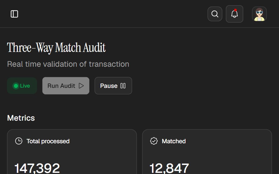 Tallie DashboardWatermelon UI · ReactAn expense audit workspace with live controls, exception tracking, transaction review, and light and dark themes.
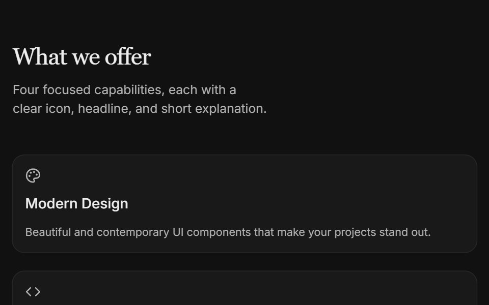 Content 09FLX UI · ReactTwo-column icon card grid with serif section header and subtle entrance motion.
 sidebar-12Intent UI · Reactsidebar-12
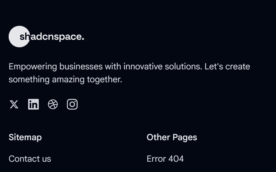 Footer 01 - Agency Footer LayoutShadcn Space · ReactA clean multi column footer with brand summary, sitemap links, legal pages, contact details, and social icons, perfect…
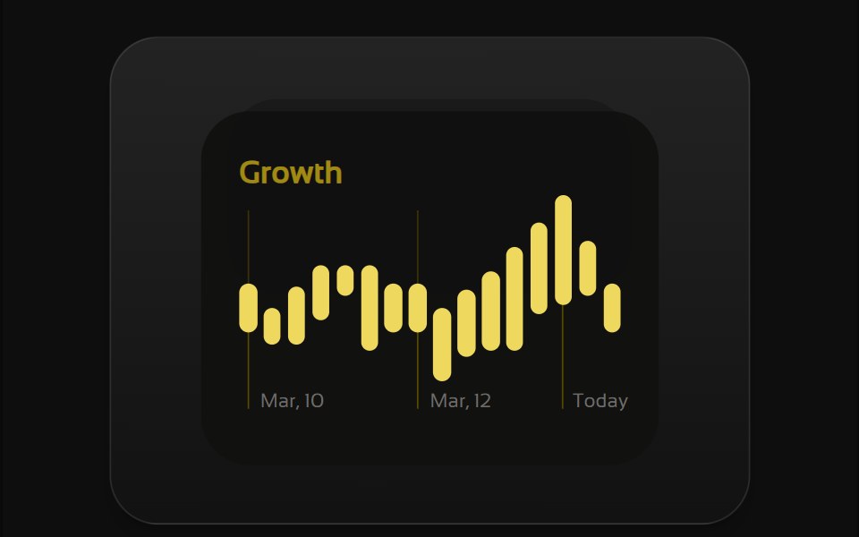 Bento 1Watermelon UI · React
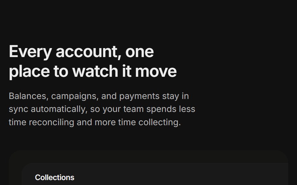 Content 11FLX UI · ReactA billing overview split with a dashboard preview card and two feature highlights, built for the app-shell preset.
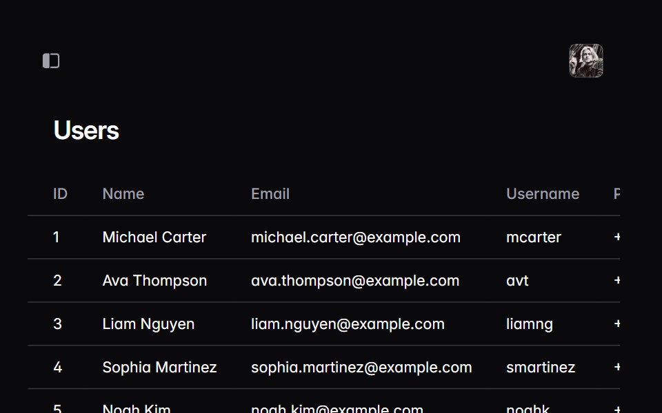 sidebar-15Intent UI · Reactsidebar-15
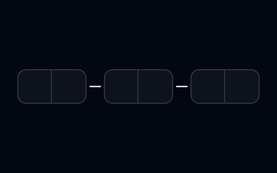 Input OTP-03 - With SeparatorShadcn Space · ReactInput OTP component with separator between segments
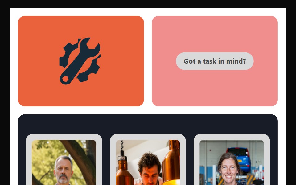 Bento 10Watermelon UI · React
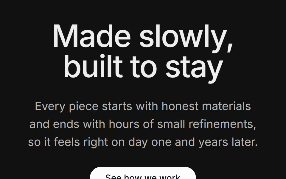 Content 12FLX UI · ReactA centered section header with supporting copy and a CTA, followed by two large side-by-side photos.
 sidebar-16Intent UI · Reactsidebar-16
 Portfolio 01 - Clean Portfolio GridShadcn Space · ReactA modern portfolio section displaying featured projects with tags, visuals, and categories, ideal for agencies or…
 Bento 11Watermelon UI · React
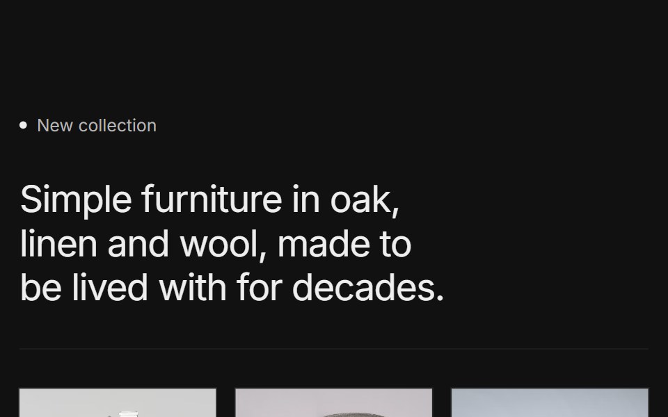 Content 15FLX UI · ReactA labeled collection intro with a short headline, a row of three product photos with names, and a CTA, framed by thin…
 sidebar-17Intent UI · Reactsidebar-17
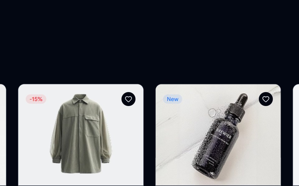 Product Listing 01 - Multi Column GridShadcn Space · ReactA multi-column layout featuring product cards with images, reviews, and pricing details, helping users scan, compare…
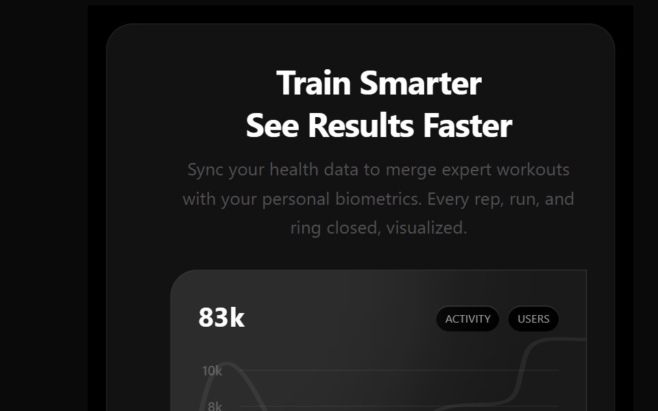 Bento 12Watermelon UI · React
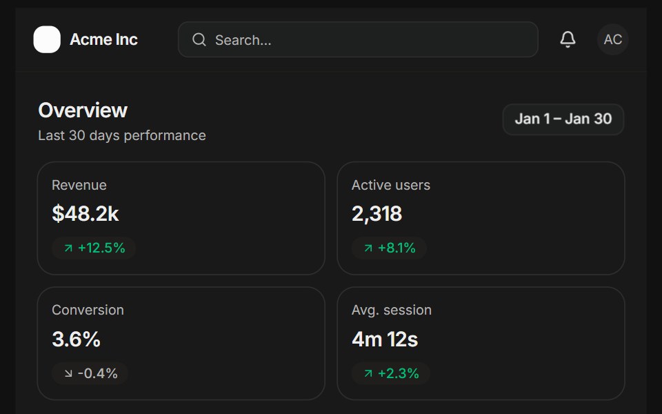 Analytics overviewFLX UI · ReactSidebar, KPI cards, a bar chart, and a recent activity list.
 sidebar-18Intent UI · Reactsidebar-18
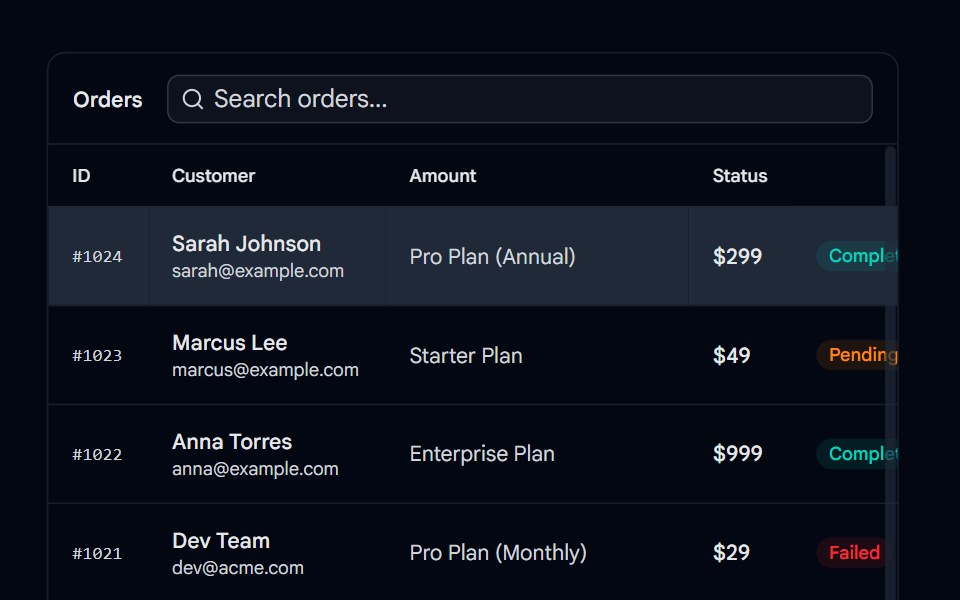 Resizable 01 - Master-Detail Split PaneShadcn Space · ReactA horizontal resizable layout featuring a searchable order list table on the left and a detailed order inspector panel…
 Bento 13Watermelon UI · React
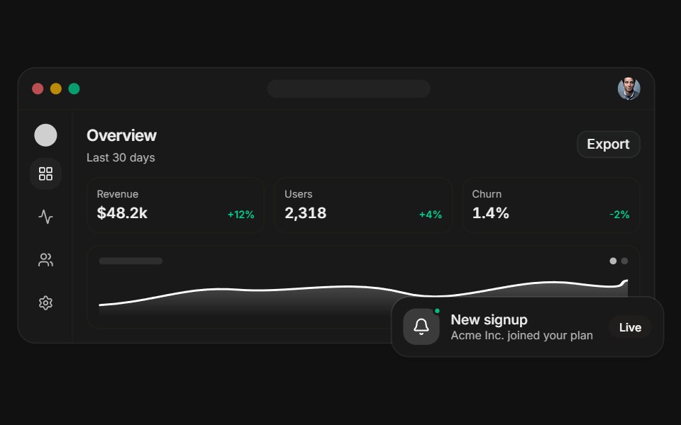 Dashboard previewFLX UI · ReactA layered app dashboard with a floating notification.
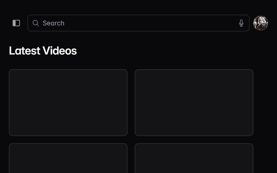 sidebar-19Intent UI · Reactsidebar-19
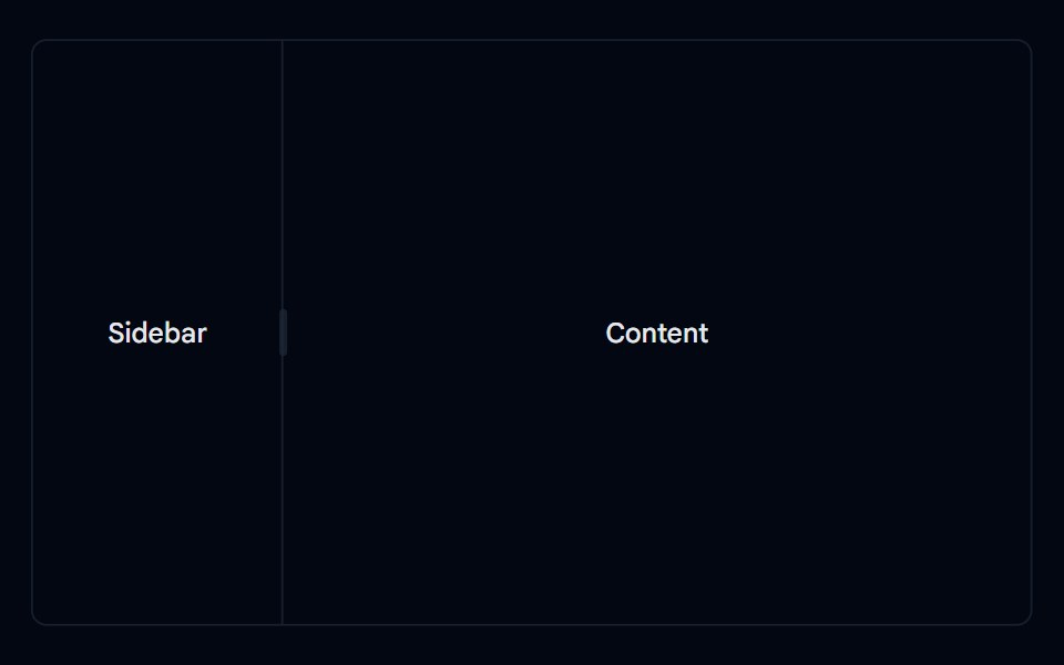 Resizable 02 - Horizontal SplitShadcn Space · ReactA simple horizontal resizable layout with a sidebar and content panel.
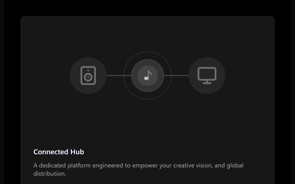 Bento 14Watermelon UI · React
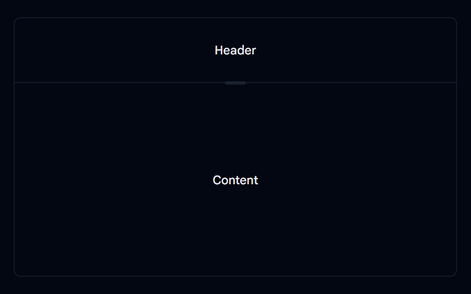 Resizable 03 - Vertical SplitShadcn Space · ReactA simple vertical resizable layout with a header and content panel.
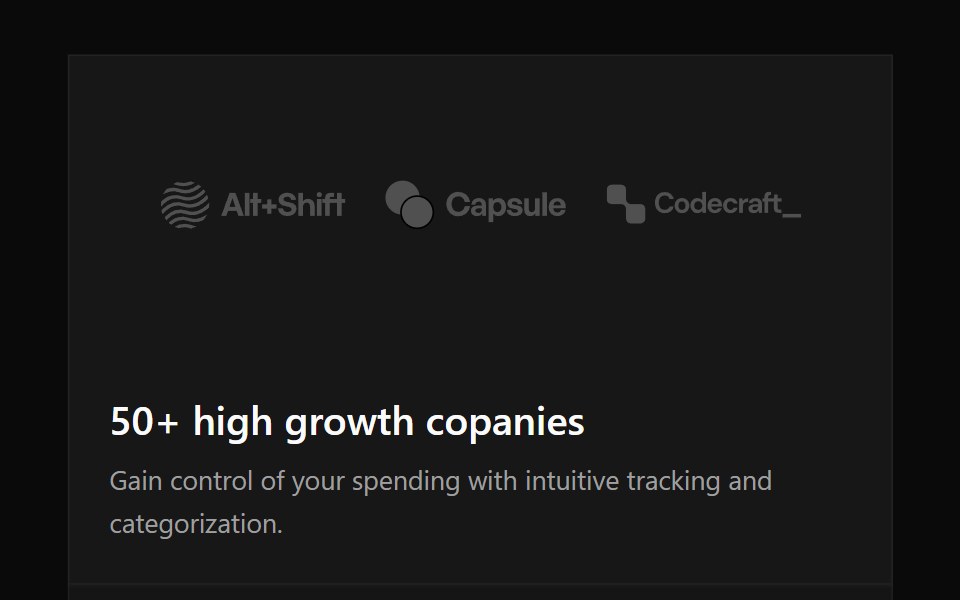 Bento 15Watermelon UI · React
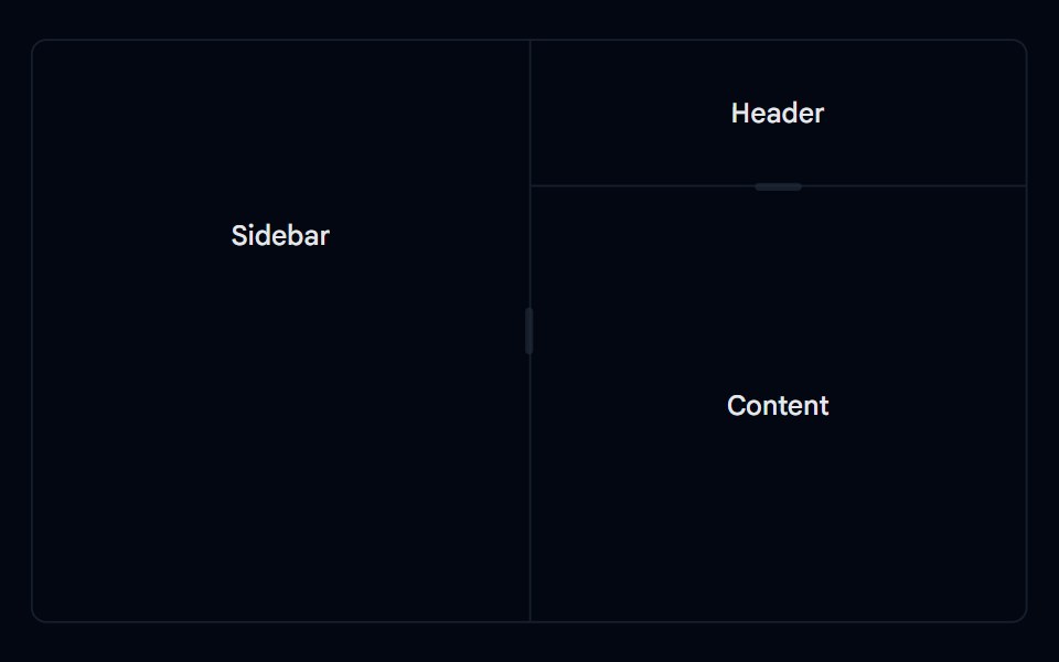 Resizable 04 - Nested PanelsShadcn Space · ReactA nested resizable layout combining horizontal and vertical panel groups for a header, sidebar, and content area.
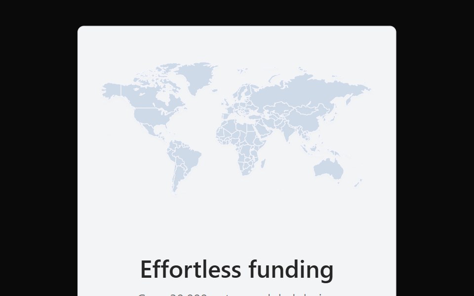 Bento 16Watermelon UI · React
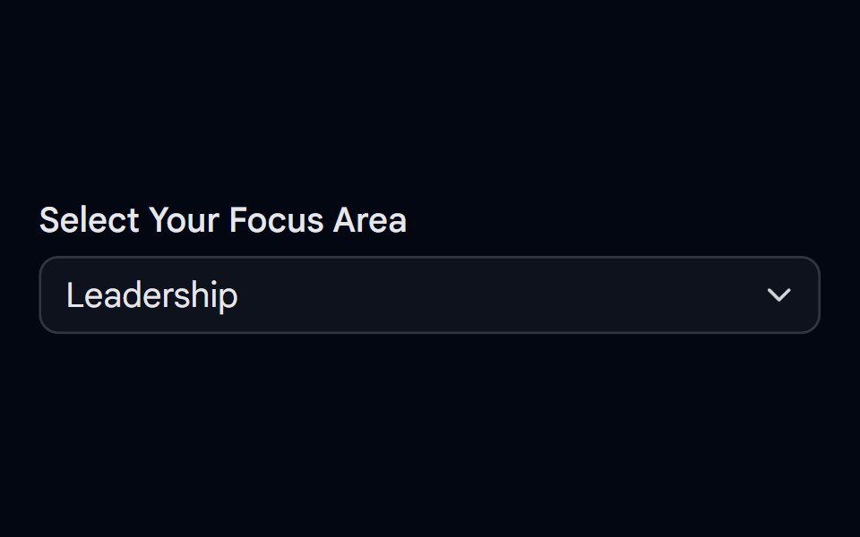 Select-09 - Select with separatorShadcn Space · ReactSelect component
 Bento 17Watermelon UI · React
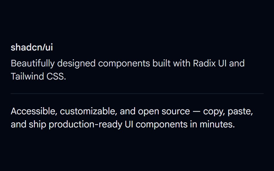 Separator 01 - DefaultShadcn Space · ReactBasic horizontal separator dividing content sections
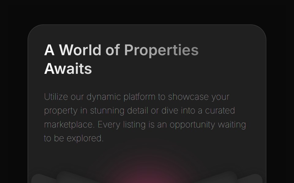 Bento 2Watermelon UI · React
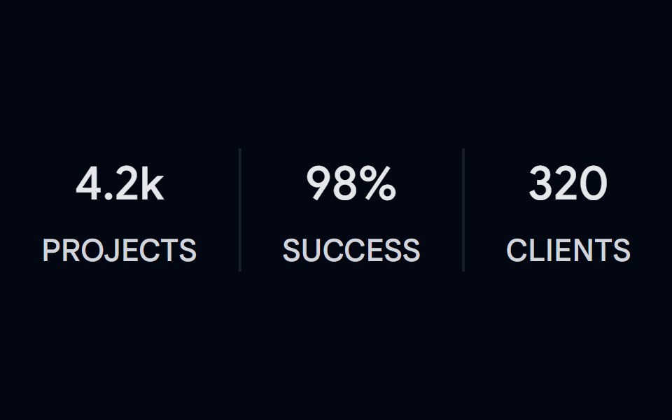 Separator 02 - VerticalShadcn Space · ReactVertical separators between stat columns with label and value
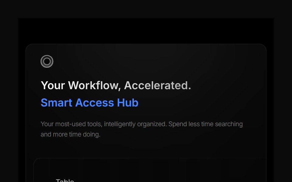 Bento 3Watermelon UI · React
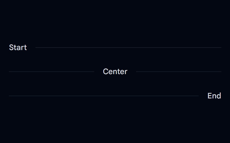 Separator 03 - Horizontal Label PlacementShadcn Space · ReactHorizontal separators with inline start, center, and end text labels
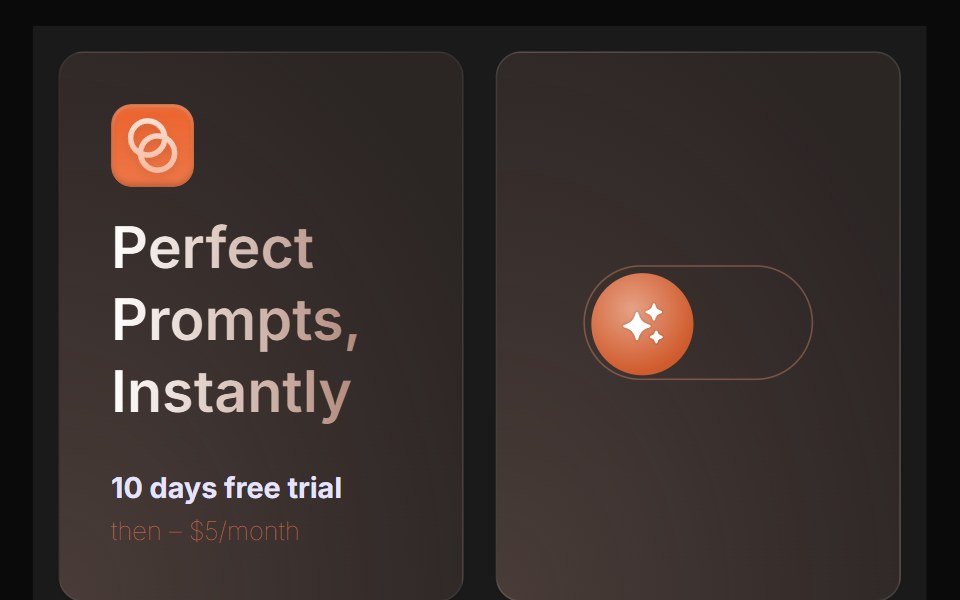 Bento 4Watermelon UI · React
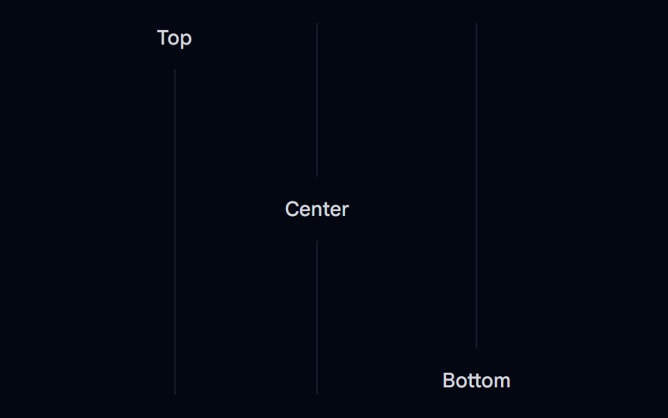 Separator 04 - Vertical Label PlacementShadcn Space · ReactVertical separators with top, center, and bottom text labels
 Bento 5Watermelon UI · React
 Separator 05 - DashedShadcn Space · ReactDashed horizontal separator
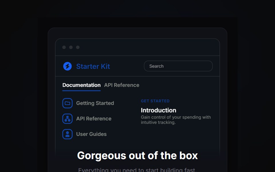 Bento 6Watermelon UI · React
 Separator 06 - Gradient FadedShadcn Space · ReactGradient faded horizontal separator that fades from transparent to border color
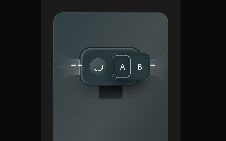 Bento 7Watermelon UI · React
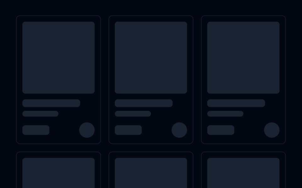 Skeleton 04 - Product Card GridShadcn Space · ReactResponsive product grid skeleton with square image, title, subtitle, price, and add to cart button placeholders.
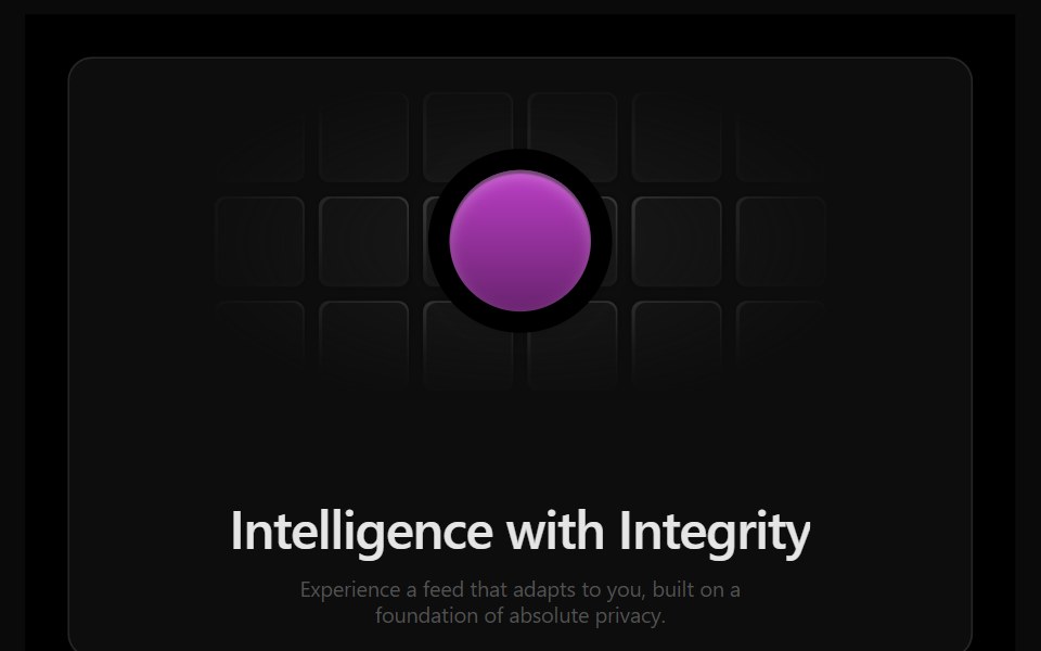 Bento 8Watermelon UI · React
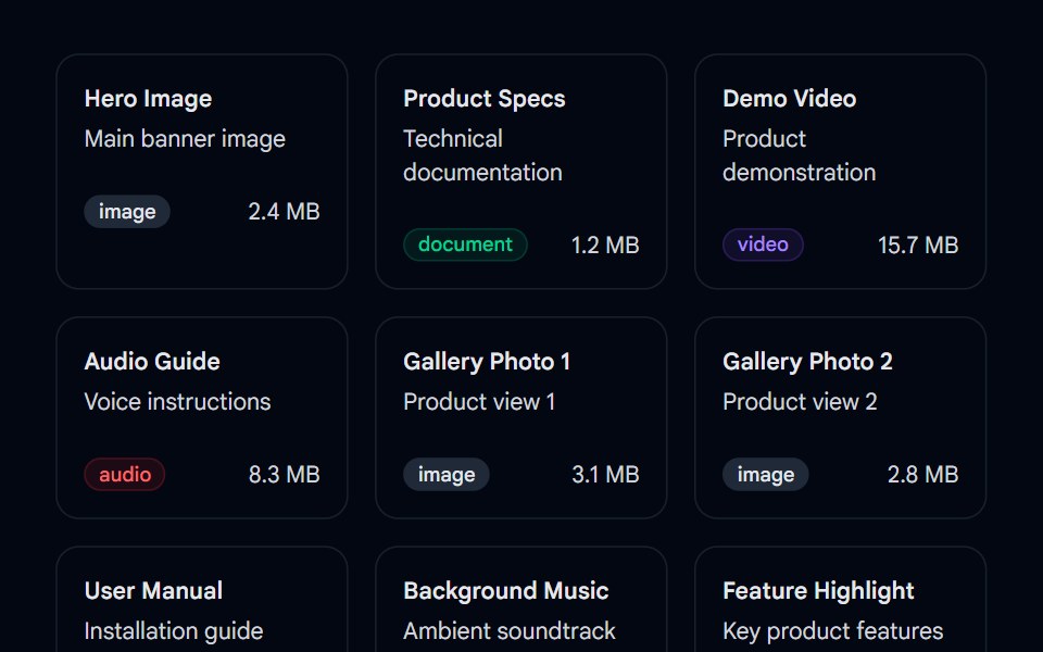 Sortable 02 - Sortable Asset GridShadcn Space · ReactA drag-and-drop sortable asset grid component using @dnd-kit with type badges, file sizes, and smooth reordering…
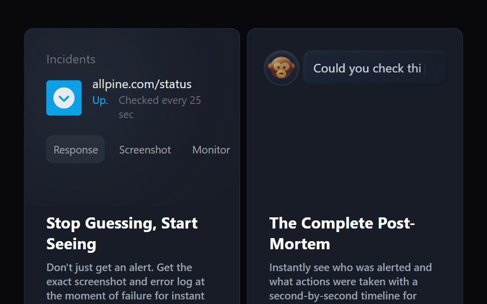 Bento 9Watermelon UI · React
 Team 02 - Modern Team GridShadcn Space · ReactA clean team grid with large profile cards, roles, and social icons, ideal for agencies or SaaS companies to introduce…
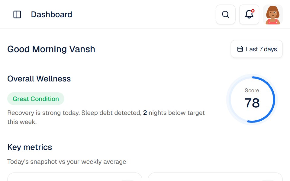 Bionis DashboardWatermelon UI · React
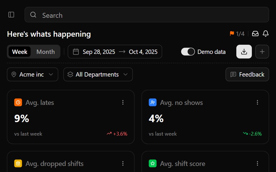 Business ManagementWatermelon UI · React
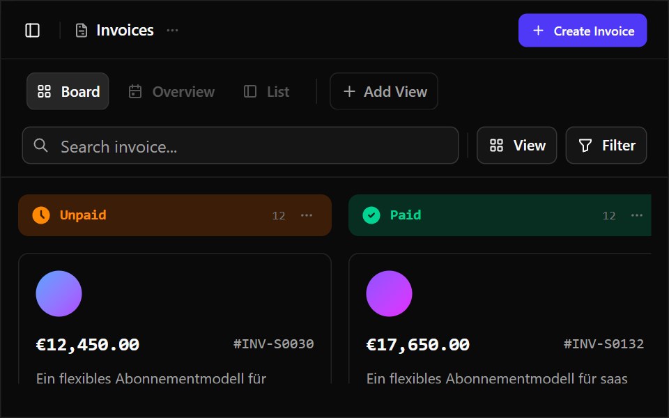 Business Operations DashboardWatermelon UI · React
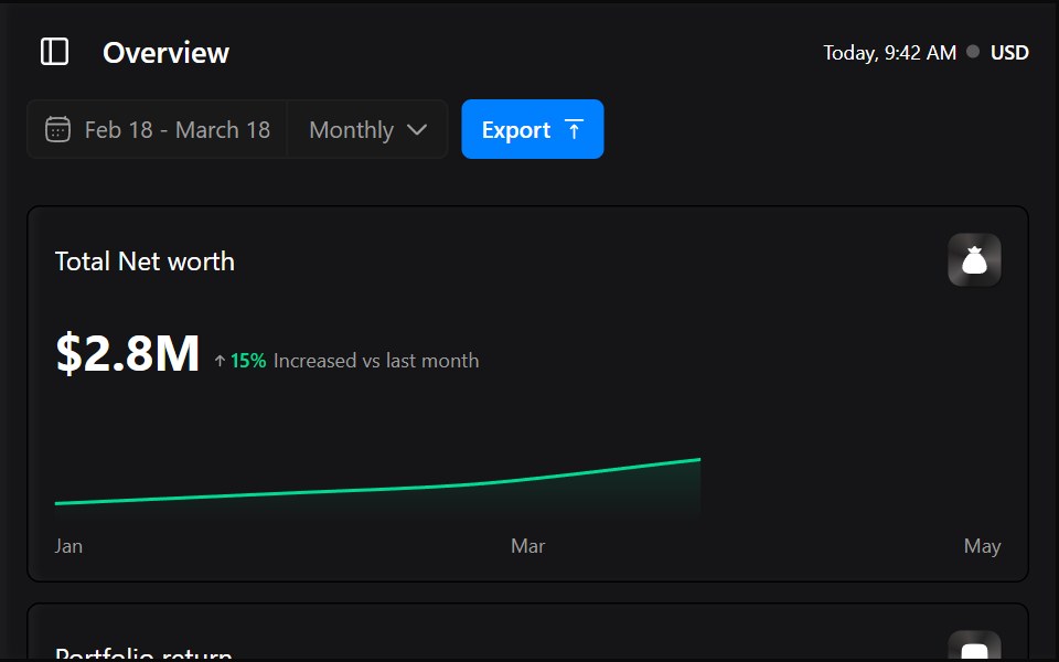 Capitalio DashboardWatermelon UI · React
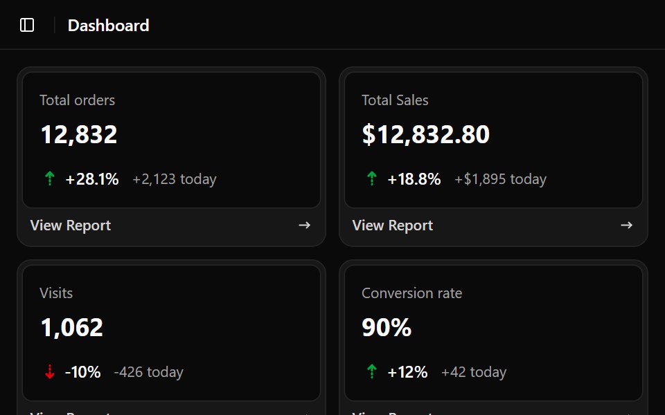 E Commerce DashboardWatermelon UI · React
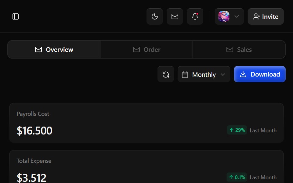 Erp DashboardWatermelon UI · React
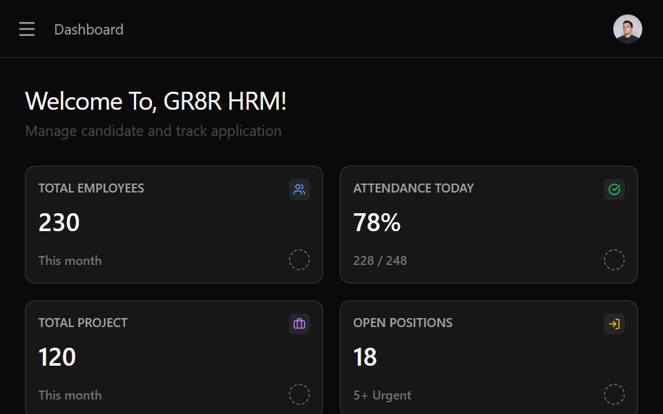 HrmWatermelon UI · React
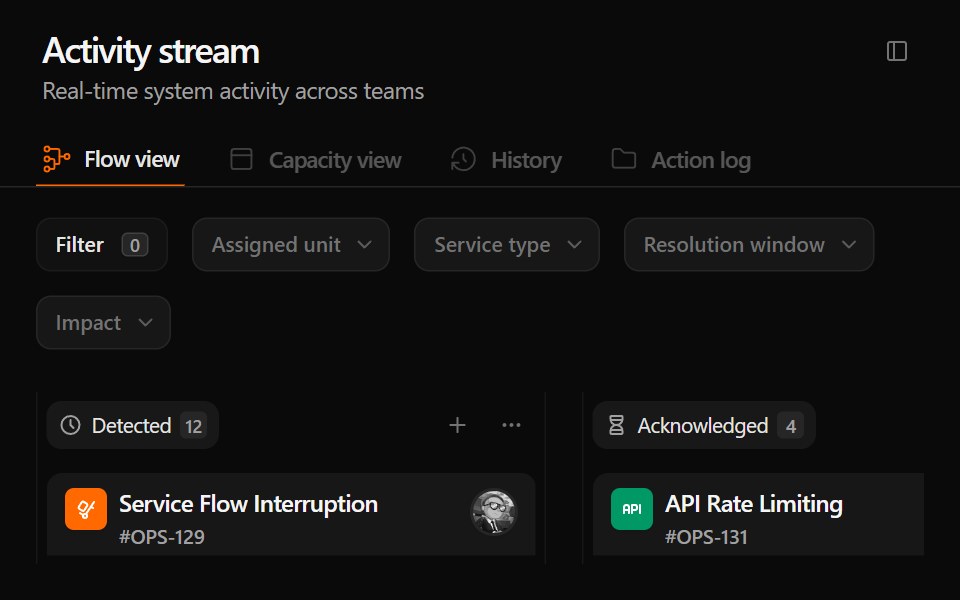 Incident ManagementWatermelon UI · React
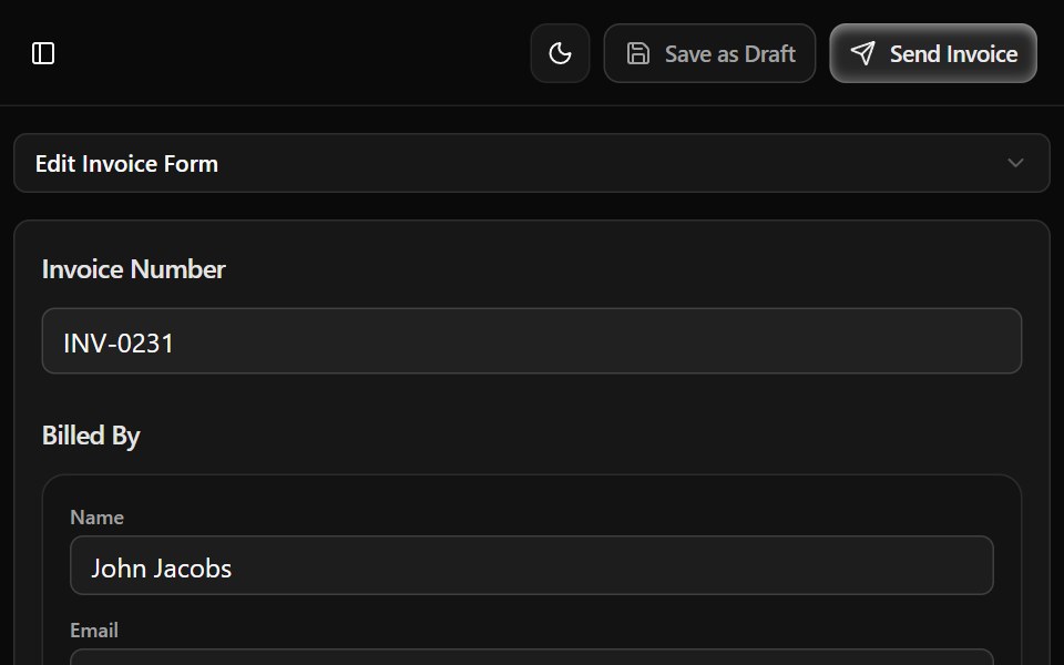 Invoice Generator DashboardWatermelon UI · React
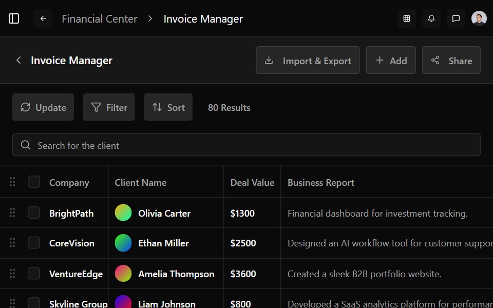 Invoice Manager DashboardWatermelon UI · React
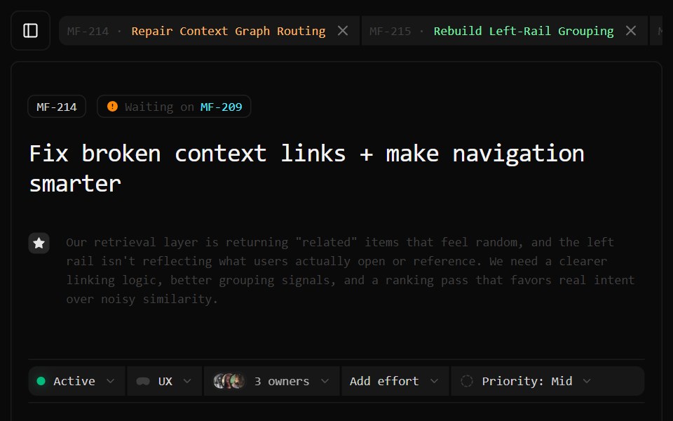 Issue TrackingWatermelon UI · React
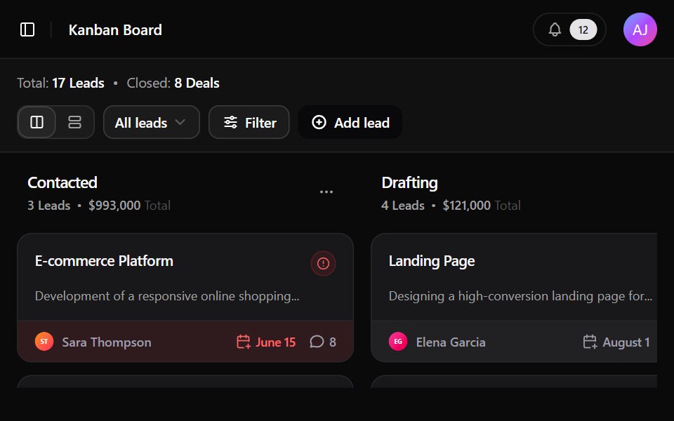 Lead DashboardWatermelon UI · React
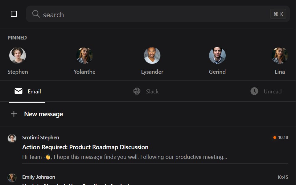 Mail DashboardWatermelon UI · React
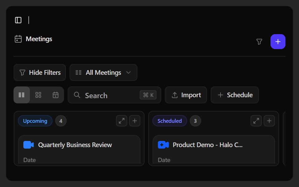 Meetings DashboardWatermelon UI · React
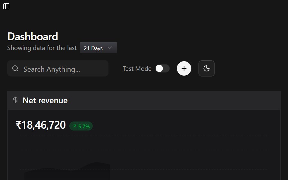 Payment Operations DashboardWatermelon UI · React
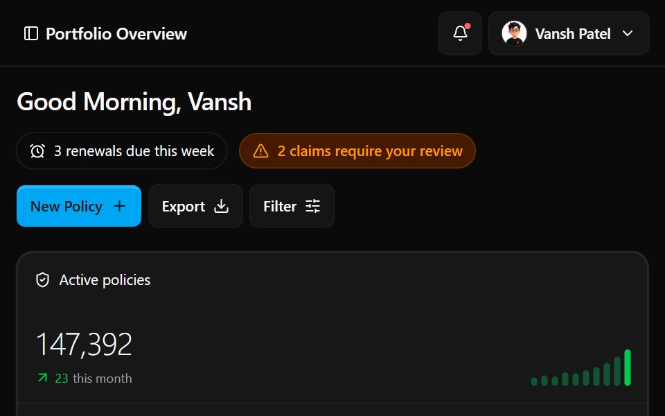 Portfolio DashboardWatermelon UI · React
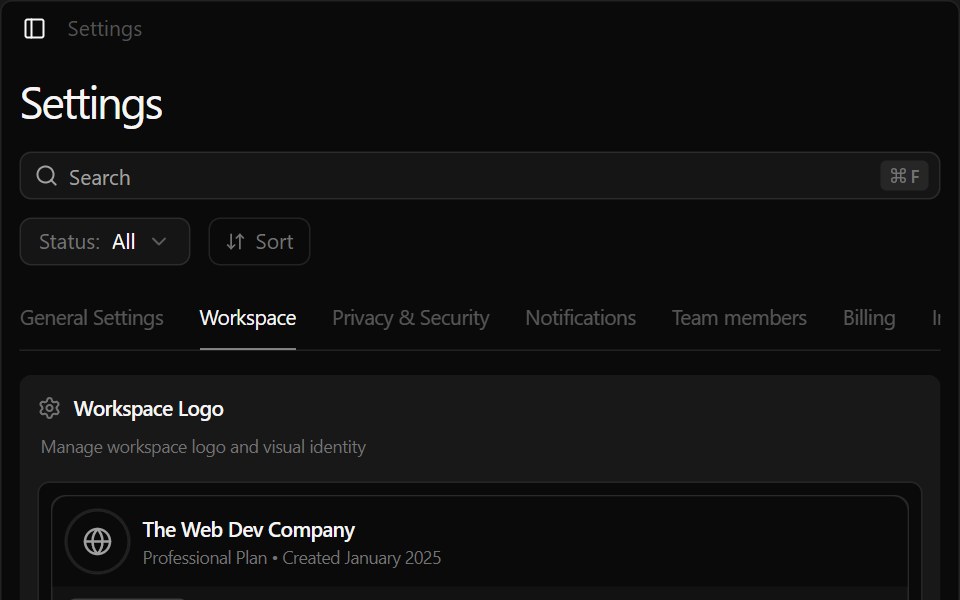 Project Management DashboardWatermelon UI · React
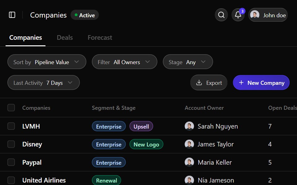 Sales DashboardWatermelon UI · React
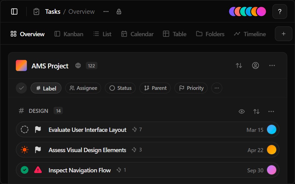 Task Management DashboardWatermelon UI · React
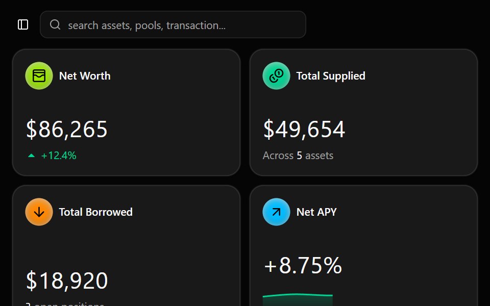 Web3 DashboardWatermelon UI · React