 Dev Design Library
shadcn/ui Separator Components
Dev Design Library indexes 10 shadcn/ui separator components from 2 open-source UI libraries, with the most coming from Shadcn Space and AI Elements (Svelte). Each one links to its page with the source code, a live preview where available, the library license and the install command. They follow the shadcn/ui conventions, so most install with the shadcn CLI and drop into a Tailwind project. Separator components belong to the Layout group.
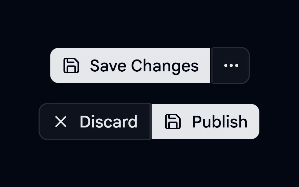 Button Group-04 - SeparatorShadcn Space · ReactButton group with separators
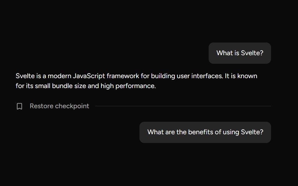 CheckpointAI Elements (Svelte) · SvelteA compact checkpoint component that pairs a separator with icon and trigger helpers for workflow checkpoints.
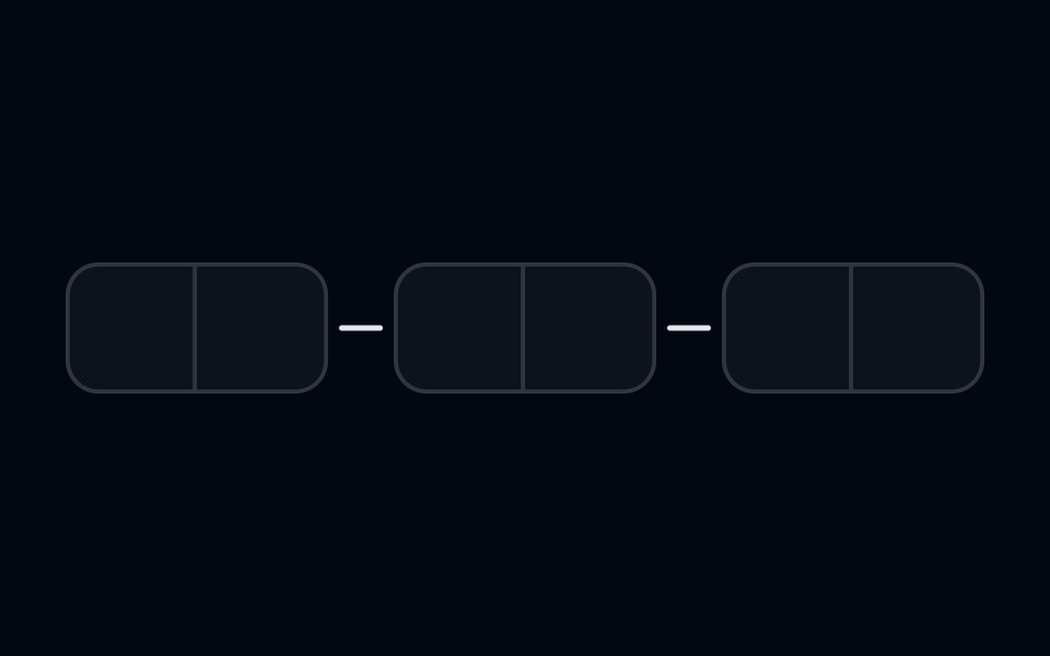 Input OTP-03 - With SeparatorShadcn Space · ReactInput OTP component with separator between segments
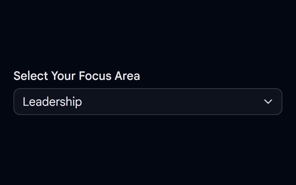 Select-09 - Select with separatorShadcn Space · ReactSelect component
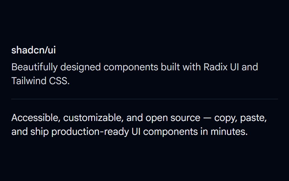 Separator 01 - DefaultShadcn Space · ReactBasic horizontal separator dividing content sections
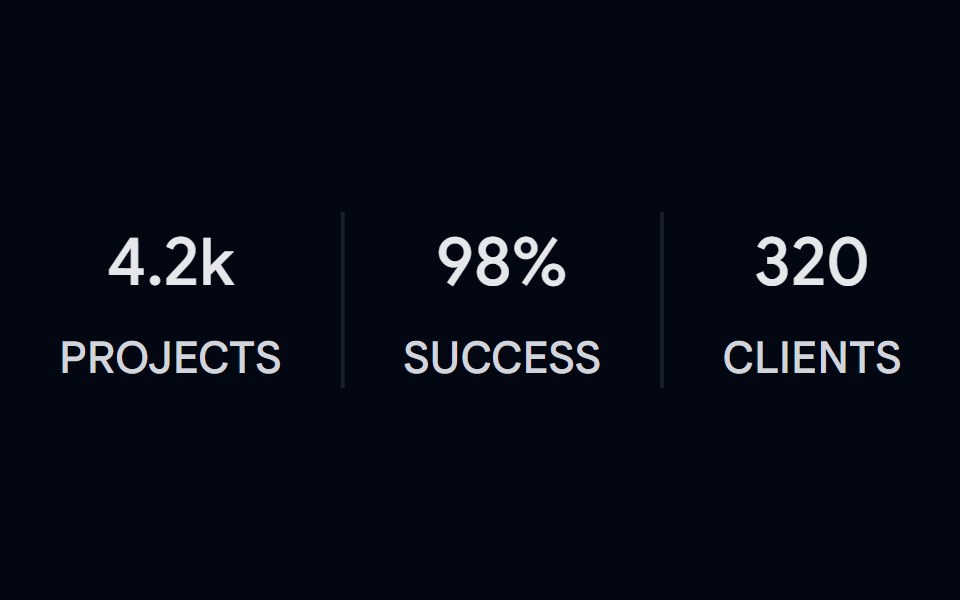 Separator 02 - VerticalShadcn Space · ReactVertical separators between stat columns with label and value
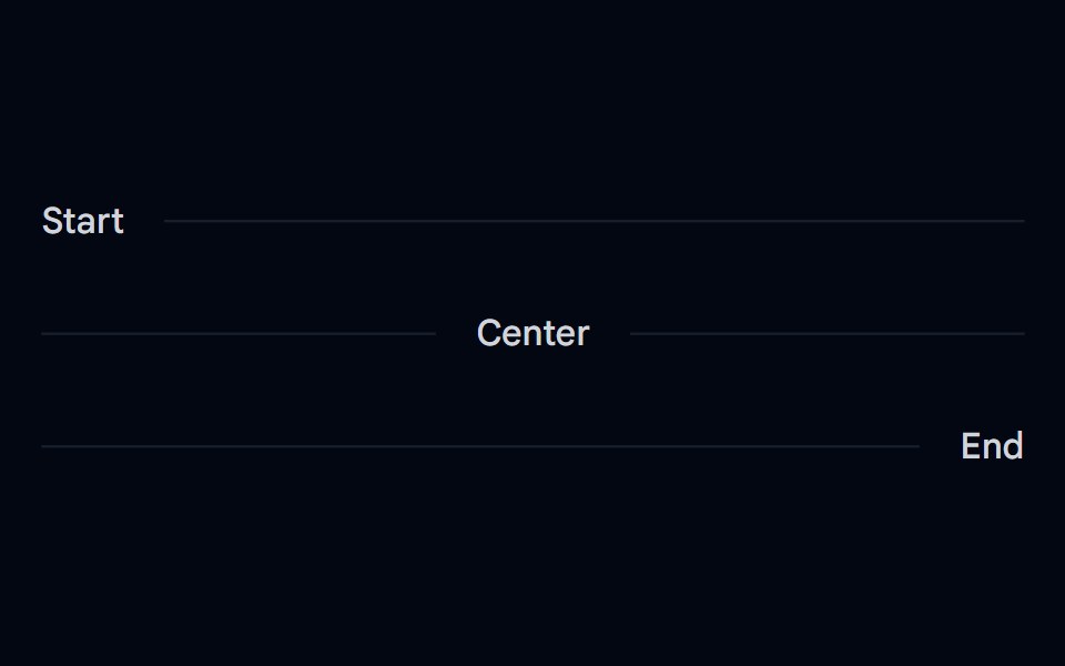 Separator 03 - Horizontal Label PlacementShadcn Space · ReactHorizontal separators with inline start, center, and end text labels
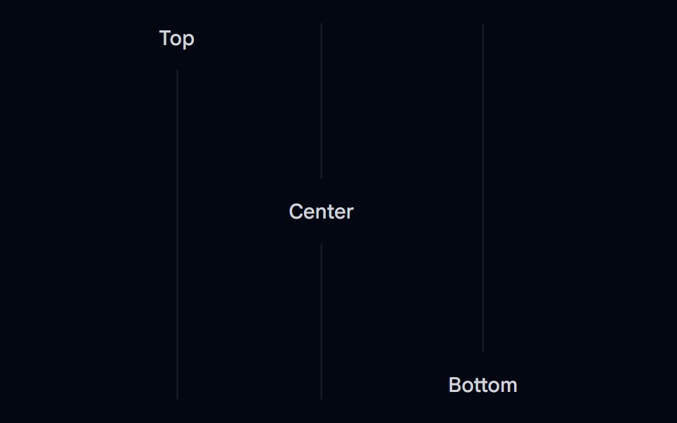 Separator 04 - Vertical Label PlacementShadcn Space · ReactVertical separators with top, center, and bottom text labels
 Separator 05 - DashedShadcn Space · ReactDashed horizontal separator
 Separator 06 - Gradient FadedShadcn Space · ReactGradient faded horizontal separator that fades from transparent to border color